Monthly ArchiveJanuary 2006
Daily post 31 Jan 2006 08:43 am
Nominations
The 5 Oscar nominations for Best Animated Short Film went to:
“9″ directed by Shane Acker
Badgered directed by Sharon Colman
The Moon and the Son: An Imagined Conversation directed by John Canemaker
The Mysterious Geographic Explorations of Jasper Morello directed by Anthony Lucas
One Man Band directed by Mark Andrews & Andrew Jimenez
-
The 3 Animated Feature nominees include:
Howl’s Moving Castle directed by Hiyao Miyazaki
Tim Burton’s Corpse Bride directed by Tim Burton and Mike Johnson
Wallace & Gromit: The Curse of the Were-Rabbit directed by Nick Park and Steve Box
-
- On a strictly personal note, I couldn’t be happier for my friend, John Canemaker. He’s a fabulous person who’s continued making films for many years. His enormous and deserved success in animation history only informs the films he’s done. This film had to have been difficult for him to make, and I’m absolutely pleased at the success it’s having.
I’m also happy to see another 2D animated film, Badgered, nominated. Two out the five nominations are 2D, and the predominance of cgi is gone from these categories. None of the cgi features made it. This is interesting.
Commentary &Theater 30 Jan 2006 07:24 am
Scumbling some more
Monday rambling:
Tom Sito‘s excellent blog at the G7 site is really wonderful. If you don’t visit it regularly, I suggest you take a look. It features good, entertaining, informative reading daily. Here is just one small posting from the last few days:
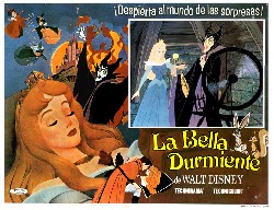 1959- Disney’s ” SLEEPING BEAUTY ” opened. Despite earning the fifth highest box office for that year it finished a million behind what it cost to make. The animation staff had swollen to its largest to finish the production. It’s disappointing box office soured Walt Disney on feature animation. Walking out of the premiere he went up to Milt Kahl and grumbled:” Well Milt, is THAT what I spent $4million for?!” After the film was finished the studio had a massive layoff, dropping from 551 to just 75. Artists employed since the Silly Symphonies found pink dismissal slips on their drawing tables when they came to work. One inker committed suicide. Staff level will not return to these same levels until 1990.
Tying this back to my overlong rant from yesterday: Last year, I’d seen a production Off-Broadway of Sleeping Beauty.  It was by the Young Vic Theater Company out of England and was written and directed by Rufus Norris. The audience was mixed from a one year old to grandparents. As I sat, the audience was noisy – some particularly loud teenagers behind me. However, as soon as the show started, they were spellbound and silent. The one year old had to be held high through the entire production.
This was a reconstructed version of the tale. It felt both absolutely faithful and, at the same time, wholly revisionist. Actors, other than the leads, played multiple parts; all were delightful characters and completely original. The set was little more than a turntable with room for actors under the stage to stick their heads through that turntable. These heads played flowers and thorn bushes. There was a short, spiral staircase in the center of the turntable that was the castle.
The show was brilliant on a small budget completely pulled from imagination and daring. It inspired my animation for at least six months; even thinking of it again, now, gets me charged. You never know what you’ll find, but all forms of art can bring great influence to your work.
Richard Williams &Theater 29 Jan 2006 07:44 am
Apple Tree and Aronson
Broadway Rhythms:
Broadway entered my life a long time ago. After seeing a BBC tv special, a tour of Richard Williams‘ Soho studio, I learned about his animated titles for A Funny Thing Happened On The Way To The Forum. Seeing the film, reintroduced me to Tony Walton‘s name. I knew his name from Mary Poppins where he acted as a “design consultant” for sets & costumes.
 When the musical, The Apple Tree, opened on Broadway in 1967, I went. Richard Williams had designed an animated piece that illustrated the rise to super-stardom of Barbara Harris‘ character, Passionella. A young Alan Alda also starred in the show. Robert Klein was in one of his first shows.
It was the set and the costumes that I really took home with me. I became a new fan of musical theater and at least as much a fan of Tony Walton‘s work.
the logo designed by Dick Willliams
It took another three years before I found a musical to top that experience. Company was my first Stephen Sondheim show. In 1970, suddenly, theater had grown up for me. The story, songs and direction were sophisticated, urbane, and intelligent. The set by Boris Aronson had challenged everything I knew and took it to a new level. Chrome, glass, elevators and projections. The set seemed to constantly reconstruct itself and shift to something else: an apartment complex, an apartment, a disco, a bedroom, 42nd Street. It was all of these things with the help of my imagination.
I saw this show five times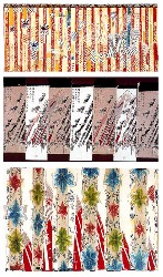 over the course of its run. For a young student, this was a large financial investment on my part, but I was hooked on Boris Aronson and planned to follow his work religiously.
Pacific Overtures (the original production in 1976) took theater to another level of sophisitcation. Aronson‘s set was overwhelming for me, and completely integral to this show. It was as much an necessary part of the show as the brilliant writing, songs, and direction.
He brought pre-Industrial Japan to the stage and moved the characters into the Industrial revolution. Aronson gave us dragons that were warships, a tree that expanded to a Japanese fan, a small meeting house and a throne room. We saw the simplicity of the culture and the complexity of 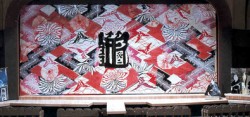 the big changes dev-
eloping.
-
Aronson designed several curtains for this production. The final one used is depicted on the left in a photo of the model.
In 1981 Richard Williams introduced me to Tony Walton. Tony needed a character animated for the show, Woman of the Year. They’d planned on six minutes of animation in the show; I ended up producing roughly 12 minutes in six weeks. The key spot was a song and dance duet that lead actor, Harry Guardino, would do with the character, Katz. Tony Charmoli danced a number he had choreographed for me, and I filmed it with a 16mm camera. We started animating.
There was no time for Pencil Tests. We did it, and I raced to Boston to put it into the show’s try-outs there. It took another couple of days for the actors to rehearse the dance with the film, and I saw it in front of a live audience for my first viewing. They loved it.
Immediately, more animation was added to the show: several short sequences which allowed for set changes, behind the screen. Two weeks before opening, writer Peter Stone, composers Kander & Ebb, and director Robert Moore had concocted a new song and dance which would open the second act. I had to have it ready for the Broadway opening. I did, but there wasn’t enough time for Harry Guardino to rehearse with the animation. The number was cut.
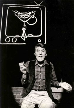
Bran Ferren was a technical genius I met and first worked with on this show. He was credited with designing “projections” for the show. He did a lot more.
The film was rear-screen projected. This meant I had to animate everything in a flopped postion. The projector was up and projected down, and it was only about six feet from the 42 foot screen. The film keystoned like a large triangle. I had to draw the piece in a reverse keystone to accomodate for the technical problem.
Our sound track had to have two tracks completely separated: on one, the voice went to the audience; on the other, a click-track went to the conductor. Since dolby had some leakage of one track to the next, Bran created a new form of dbx processing for the optical track. It was a technical nightmare that the audience never saw.
Here, a character animates to life behind Harry Guardino as he sings about the creation of it. – photo by Martha Swope
The seemingly chaotic and hectic world of Broadway was a delight. There was little money in it and less time, but I loved every second.
I gained an endless amount of respect for Tony Walton and the brilliant design he contributed, as he has done for every piece he’s created. I also found that there wasn’t a far distance between the designers of live theater and those of animation. Obviously, the link is closer with puppet animation (sets, costumes, et. al. ), but as one who has been there I don’t feel that wide a gap. There are just different needs all in pursuit of art for an audience. I’ve learned a lot from the set design and production of live theater, and this I’ve applied to my films.
I still closely follow Tony Walton‘s career and work as I have watched numerous brilliant designers over the years. Theater has often enlightened some bits of my animation work, and I encourage everyone to see as much live theater as possible.
Animation Artifacts &Commentary 28 Jan 2006 09:30 am
Work
My suggestion yesterday was that we should stay linked to our roots.
In the past few years animation has taken so many turns that it’s hardly the same business anymore. Yet, oddly things haven’t really changed that much in my view. It’s still about telling a story.
 The TV work isn’t too far from the Hanna & Barbera material of the early 70′s except that it moves a lot faster – in Flash, so it looks more fluid. It’s all about how fast it can move not how a character should move.
Back in the 70′s, I remember thinking that the H&B animation wasn’t too far from the silent film animation of the 20′s. It’s done in the same cookie-cutter way on an assembly line of sorts. It didn’t take long before the animation was sent Overseas. Animators stopped animating and did layouts, until the layouts were done Overseas. Now animators do the storyboards.
But wait! Today we have Flash. Does that go Overseas,too? I’m sure most of it does, but in New York, we have Curious Pictures doing a series with 100 Flash animators on staff. Big business. Back to the 70′s.
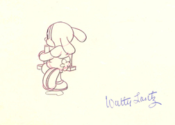 Theatrical works have definitely gotten smaller since Walt’s death. Animated features used to be special when they were released. I can still remember the thrill of going to Radio City Music Hall to see Sleeping Beauty on its opening week. I had the 1958 book, Art of Animation, by Bob Thomas, with all those wonderful stills. Before going to see it, I knew everything about the film.
Does anyone own the books about the making of Hoodwinked or Chicken Little or Madagascar. Are there books on the making of these films? Some young animation enthusiast?
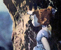 Don’t get me wrong, there are beautifully crafted films still being made. Just this last year we had the Wallace and Gromit feature and The Corpse Bride. One was visually arresting, the other offered genuine humor out of character animation and craft.
These were both puppet animation films. Though technically more sophisticated in the making, with many more advantages helping the animator, neither has moved beyond anything Jiri Trnka was doing 60 years ago. This is not a bad thing; it just illustrates my point.
We keep reinventing the wheel. We have to stay in touch with our past to see where we can move beyond it.
Animation &Books &Puppet Animation &Trnka 27 Jan 2006 08:22 am
Buyout
Rambling News:
 – The Pixar buyout by Disney has all the message boards soaring and the blogs guessing. I’ve already put my two cents worth of thought into the pot and find that there’s nothing much more to say about it. However, it has made for some entertaining reading; let’s hope it’ll make for entertaining films.
- I found a great site well worth visiting linked to the Sundance website: Daniel Sousa’s Fable. This site offers a couple of clips and links to Daniel’s primary site. It features a lot of beautiful artwork worth a trip.
I’d like to see the whole film.
.
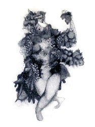
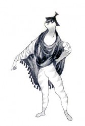
I illustrate this page with a couple of puppet designs by Jiri Trnka for his film, A Midsummer’s Night Dream.
– The Jacob Burns Film Center Presents 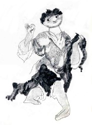
Early Silent Animation
February 5th, Sunday 3pm
All the films will be accompanied by music composed
and performed on the piano by Ben Model.
The Burns Film Center will show five rare silent animated shorts as well as a very special treat – film historian Steve Massa’s reenactment of the live stage show that accompanied Winsor McKay’s groundbreaking film,
Gertie the Dinosaur (1909).
A Q&A with host, Steve Massa, and pianist, Ben Model , will follow the screening.
Jacob Burns Film Center
364 Manville Road
Pleasantville, NY
914.747.5555
 - Speaking of Gertie, John Canemaker‘s revised book is a gem: Winsor McKay, His Life And Art. Like all the other books he has written this one is gloriously illustrated and adds an enormous contribution to animation history. This book is a rarity, and every animator should own a copy. We have to stay linked to our roots.
McKay fans should also know (and probably do) about the book: Daydreams & Nightmares This is a collection McKay’s political and editorial cartoons.
You can also find a nice collection of Little Nemo strips in Little Nemo in Slumberland – So Many Splendid Sundays. Of course, Little Nemo was McKay’s first comic strip; this book reprints the Sunday color strips in a large format.
Animation Artifacts &Illustration 26 Jan 2006 08:12 am
Steig too
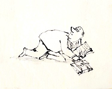 I decided to add another layout by William Steig for a different commercial.
I’m pretty sure it’s also an Alka Seltzer spot, but I can’t verify that. I do know it is an Elektra Studio spot, like the ones posted yesterday.
It was drawn using the same pen and is on rice paper, not punched.
Steig‘s artwork was especially strong after the ’60s. By then the personality of his art certainly moved him into the forefront of national cartoonists.
He was an interesting man and led an interesting life. His devotion to the psychoanalyst, Wilhelm Reich, brought him and his artwork places they might not have otherwise gone.
Here, I quote the NY Times obituary for Steig:
“In the 1940′s, Mr. Steig discovered Wilhelm Reich, who became a psychological mentor for him.
“Mr. Steig saw Dr. Reich for therapy 40 times and credited him with saving his life as well as his mother’s. He also bought an orgone box, a booth made of cardboard, steel wire and metal that is supposed to collect the world’s orgone, or orgasmic energy. He sat in his orgone energy accumulator every day. He also owned an orgone blanket.
“Long after Dr. Reich died in prison, convicted of mail fraud for using the United States mail to sell his orgone boxes, Mr. Steig still believed he would be vindicated one day. In the 1950′s Mr. Steig illustrated one of Dr. Reich’s books, ”Listen, Little Man!” He also wrote ”Agony in the Kindergarten,” dedicated to Dr. Reich, about the repressive comments parents make to or about their children.”
For me, this information brought new meaning to many of the Steig children’s books – certainly some of those I adapted. I did the films with the same intention as the author regardless of the fact that I do not believe in Reich‘s theories.
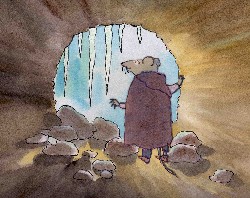 Abel’s Island: In the middle of the winter, Abel takes refuge within his log and spends many hours meditating on his love for his wife from whom he is separated. The log, I saw, as Abel’s “Orgone box” enabling him to emerge stronger and more capable of resolving his future.
The Amazing Bone features a pig, Pearl, who is captured with her talking “bone”. They’re locked in an enclosed room while they hear the wolf in the next room preparing the meal that Pearl is going to be part of. The long moments in the tight, enclosed room allow the bone to concoct a plan to overtake the wolf.
There’s quite a bit behind most artwork, and the more we delve, the more we should be able to reveal – at least to ourselves. That was certainly true of most of Steig‘s work, and I try to bring the same intensity to every illustrator I adapt.
_
By the way, I’ve just learned how to place links in the stills so you can enlarge them when you click them. I’m a slow learner, but it gives a better look at some of the art, now.
Animation Artifacts &Illustration 25 Jan 2006 09:29 am
Steig Alka Seltzer
 I thought today I’d post some layout drawings done by William Steig for an Alka Seltzer commercial produced in the early 60′s.
Obviously, for the purpose of viewing, I’ve reconfigured the poses so that several of them are on each set-up. There are actually 15 drawings to the commercial, all on separate sheets of paper.
 The commercial was done by Elektra Studios. Steig worked with a bamboo reed cut to form a point. He dipped that in ink and drew. The paper is particularly thick and is designed to absorb the ink. They’re punched with Oxberry peg holes top and bottom. I have one of the “pens” he used to draw these layouts. The final comercial was basically an ink line drawing against a white field.
 I’ve been a big fan of Steig‘s since my earliest days when I first discovered him in the New Yorker Magazine. By the time I’d made it to college, I’d already seen two art exhibits of his artwork.
 By the time I saw my third exhibit of his work, I was able to barely afford one of the New Yorker drawings. It’s done on rice paper with the same type of “pen”. Years later, when I told Steig that I’d bought it, he said that it was the only drawing to have sold at that exhibit.

It was real luck for me to have been able to adapt a couple of his children’s books to animation. I not only got to meet him and his wife, Jeanne, but worked with his flutist son, Jeremy, on a number of projects.
I’m rather partial to Abel’s Island as a film. There were only about two dozen B&W pen and ink illustrations in the book, so we had to do quite a bit of designing in the style of Steig Bridget Thorne, who art directed the film, did some of her finest work ever on the backgrounds – beautiful pieces that I still treasure. I think this is one of Steig‘s best books, and I think we did it justice. - I still wonder what Shrek might have looked like if they’d followed Steig‘s book illustrations.

Animation Artifacts &Hubley 24 Jan 2006 10:02 am
Babbitt Mime
Michael Barrier‘s posted response to Karin Babbitt‘s letter, yesterday, brought back memories. This story has followed me most of my career and always has me a bit split. Since I both direct films and animate them, I see both sides of a coin. I dont remember ever talking about it to anyone.
The picture Michael Barrier painted of Art Babbitt and the letter sent him by Steve Worth both talk about the same man I came to know during the making of Richard Williams‘ film, Raggedy Ann & Andy. Whenever Art was in town there was always a dinner at Tissa David‘s or my apartment, or there was jazz late nights with Dick & Art. Some of these moments were part of the treasure of my life.
 However years before meeting him, I got to know Art Babbitt’s animation. I, of course, already knew about his animation from books and films. I’d been watching it carefully for over 20 years before working on John Hubley‘s film, Everybody Rides The Carousel. On that film we became a bit more intimate.
Art was animating the narrator of the film, a mime. The mime had no mouth, but we heard his voice (actor, Alvin Epstein) throughout the show. After art completed his first animation, it was photographed in LA by Nick Vasu at Dickson/Vasu, and it was one of the first pencil tests to come back to us. (As a matter of fact, it was one of the only pencil tests to be shot for that film.)
 I worked two rooms away from the editing room (two upright moviolas, one with an animation paper-sized viewing screen) across from the kitchen in the art room. One day, John came running in to call me out – this was unusual. It was obviously urgent and I ran behind him to the editing room. When we got into the close quarters, he asked if I wanted to see “one of the greatest peices of animation you’ll ever see.” I knew it’d be the mime. The moviola buzzed and played that opening scene. It was stunning.
John was right, the scene was beautiful. It was all on ones and twos, mostly twos. All the drawings were tightly placed and beautifully – I mean beautifully – traced back. Art had done all of the drawings himself.
After it finished playing, we just looked at each other. John had to share it with someone who he knew would appreciate the virtuosity on display. I did. We ran it a couple more times, and I went back to work inspired.
 Months later – most of Art’s work had been completed and was already colored. The untrained inker had loosened the line a bit using colored marky brand markers, though a light watercolor wash had softened the line. Gold and blue were the watercolored washes that had colored the mime’s blouse. Charcoal grey tights. Drawing for drawing, I thought it still looked stunning.
The program was scheduled as three half-hour shows on CBS. They would air just prior to their new season. Roughly 18 minutes of new material per program with reuse bits from the previous shows filling the three 24 minute episodes. But just as we were coming to the deadline, CBS had decided to air it all at once – a 90 minute program. Lots more had to be added to the overall length to make it work – rushed animation to make an incredible deadline!
Suddenly it was decided that more of Art’s mime would have to appear. John came up with a technique he said he’d developed on Fantasia. John said he’d shown it to Dick Williams; now he was showing it to me. Basically, it was a camera trick that amounted to 2 frame disssolves from one drawing to the next. Animation was slowed down. I was the one forced to reexpose Art’s scenes and prepare them for the cameraman, Nick Vasu. He couldn’t make any mistakes in the double exposed photography or it’d be difficult to correct.
The budget and schedule had forced John to resort to a trick on animation that he thought was perfect when it had first arrived. Believe me it worked stunningly well within the scenes Art had done. Barrie Nelson had animated a lot of the other mime scenes, but his movement was different and couldn’t be successfully shot the same way. Nor could the budget afford more of the same.
 Art, of course, was upset. He knew he had done a good job and didn’t like that the timing on his animation had been changed. This information came to me via Dick; I’d brought him to the premiere screening of Carousel.
I understood Art’s complaint. He had made something he felt was wonderful, and it had been damaged. It wasn’t what he had wanted it to be. I also saw the dilemma John had faced with his budget, his schedule, his need to make the best possible film under the circumstances given him.
And I saw the film. The scenes not only work, but they still have the majesty that Art wanted and the length John needed.
Illustration &Theater 23 Jan 2006 09:06 am
Aronson Designs
- Cartoon Brew has a number of insightful comments about the Disney/Pixar buyout. All of the markers seem to be designed to make a good marriage, but I always fear the worst. We can only hope that Pixar will maintain the same autonomy it’s had in the past and continue to produce excellent films.
– I’d like to recommend a stunning art book that’s been out  there for years: The Theater Art of Boris Aronson by Frank Rich & Lisa Aronson (Knopf, 1987). The book is a bit difficult to get and expensive. If you can’t afford it, go look at in a library.
Aronson was one of theater’s greatest designers; it was a privilege to have seen a number of his theatrical productions from Company on up.
He and Tony Walton are the only designers that have ever brought me into the theater especially at current prices.
A collage for “A Little Night Music.”
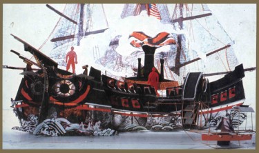
A model for Admiral Perry’s ship in “Pacific Overtures.”
The book is rich in photos of actual sets as well as background material to illustrate how Aronson came up with the set he did. For many shows, he produced a collage of the theme of the production. Then he did models from his paintings of the sets, and finally the sets were constructed.
This is not unlike the process that an animation designer should be using to make sets and costumes. It’s not always easy to do, especially on some of the over-rushed jobs we have to do, but it certainly will help the art expand and develop. I hope to offer more samples of this brilliant artist’s work this week.
 The Man Who Walked Between The Towers is having enormous success at film festivals; I’m always a bit embarassed to toot my own horn, but this news is special for me. We just won the Carnegie Medal, an award presented by the American Library Association. It’s the film equivalent of the Caldecott Award. It’s a real treat. Congratulations to my two other producers, Paul Gagne and Melissa Reilly and all the other great artists who worked on the film.
Daily post &Puppet Animation &Trnka 22 Jan 2006 08:32 am
Rambling & Trnka
More rambling:
 The illustration to the left is by Jiri Trnka.
- Speaking of Dumbo, this is by far my favorite of the Disney dvd releases. Aside from the fact that it’s probably my favorite of the Disney features, John Canemaker does a solo addition of a commentary through the entire film.
It reminds me a bit of the pieces the NY Times used to do. They would have a celebrity watch an older film of their choice, and the writer and star would talk through the film. We’d get to read what the writer quoted from the viewing. Here we actually are watching the film with Canemaker and get to enjoy all his knowledge of this film at the same time. It’s informative, casual and enjoyable.
Would that the Disney studio would do more of the same. Oh, wait. No. They don’t give us commentary tracks anymore, at least not on their “Treasure” series, but they do add more games and puzzles for the children.
- I’m still traveling through the most recent WB collection – vol. III. I like about half of the films on this collection. My preference is for the earlier films. I wouldn’t mind seeing some of the m a n y black and white shorts that were made. All those great Porky films – as long as they don’t force the colorized ones on us – with costar Gabby. I love them and would certainly buy up any dvd’s.
I’ve gone through all of the commentary tracks and have enjoyed some of them. The Michael Barrier commentaries are a treasure of information; it’s almost like he can’t get it all in (and I’m sure he can’t) before the film ends. His audio highlights from some past interviews, add an original touch to the experience. Likewise Milt Gray. His is a new voice that I’d like to hear more from: lots to say and articulates it well. I’ve also gotten to enjoy the amiable style of Greg Ford‘s comments. He gives us a hell of a lot of information while at the same time absolutely loving every second of every short he views with us.


The stills above come from the Jiri Trnka film, The Archangel Gabriel and Ms Goose. It’s a remarkably beautiful film in which puppets play out a story from Boccaccio’s Decameron. The film takes place in Venice (are there any other animated films set in Venice?)
- Cartoon Brew Amid Amidi has a scathing and absolutely astute response to Cory Edwards’ whining on Animation Nation that his film, Hoodwinked, has been disrespected by animators. I wonder when Edwards or his brother, Todd Edwards, will complain about the treatment the critics have given his film. Go Amid, go.
