Category ArchiveIndependent Animation
Animation &Commentary &Events &Independent Animation 13 Feb 2010 09:16 am
Anti-Valentine
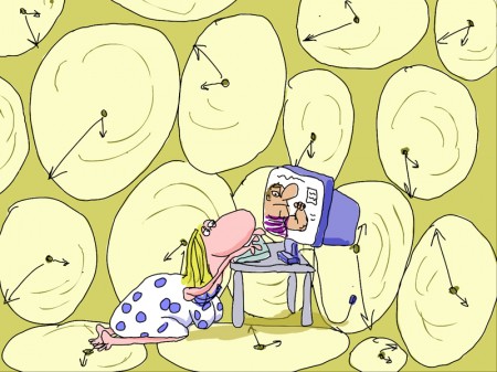
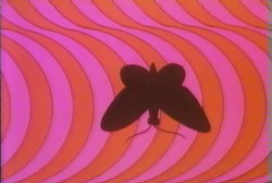
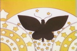
 - On Sunday night, Valentine’s Day, Debra Solomon‘s show, Getting Over Him In 8 Songs or Less, premieres on HBO 2 at 7:30pm. The film offers a musical trip through the last couple of years of Debbie’s life as she regroups from a divorce with her husband. (Animation as therapy.)
On her site, she writes this synopsis:
- In my new film, I animated myself out of heartbreak. The animated journey was also my emotional journey. In GETTING OVER HIM IN 8 SONGS OR LESS the main character is caught in a
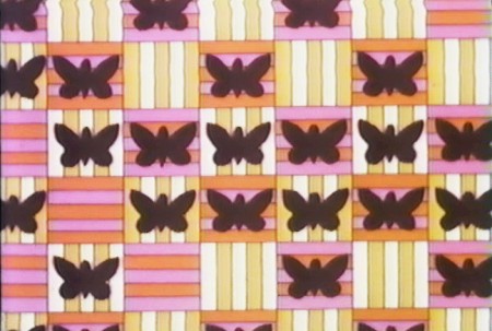
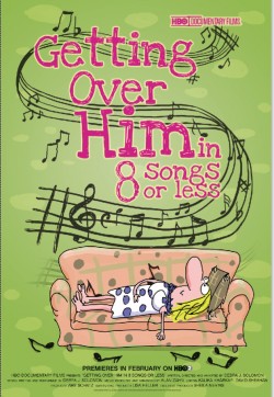 woman’s worst nightmare, wandering around the neighborhood undressed and exposed after being left by her husband. Through the use of brightly colored patterns that wash away section after section of the film, mimicking the ebb and flow of feelings, the viewer passes through the crisis with the main character.
 I know firsthand how intensely Debbie worked to pull this show together. She singlehandedly animated the entire show in Flash in a sort of stream-of-conscious linear style that pulsates with a nervous energy (not unlike her own). The entire story is told through a pastiche of funny songs that she wrote, performed and produced. In short she bares her soul via a quick moving, funny animated film. It’s an animated diary of Debbie’s life in the year after her marriage. She lived through it as she animated it.
It’s brilliant that HBO helped finance this animated and personal film. This is a bittersweet bon bon of a tv show. Tune in.
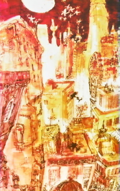
Here are a couple of other images from the show:
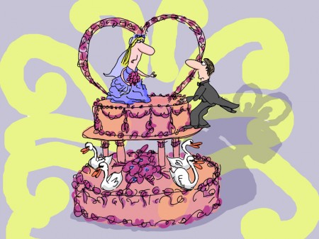
(Click any picture to enlarge.)
There’s a short interview with Debra in MovieMaker Magazine.
This is the complete show schedule for the rest of this month:
7:30pm Sunday Feb 14th HBO2
9:30am Tuesday Feb 16th HBO Signature
6:00am Friday Feb 19th HBO2
10:00am Sunday Feb 21st HBO Signature
Animation Artifacts &Commentary &Frame Grabs &Independent Animation 05 Feb 2010 08:53 am
Shinbone Alley
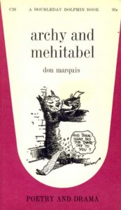 - Don Marquis‘ book, Archy and Mehitabel, garnered fame quickly and not least because of the extraordinary illustrations of George Herriman, the creator of Krazy Kat.
The first book was published in 1927 and others followed in 1933 and 1935. It wasn’t until the third book that Herriman took over the characters created by Marquis in his book of short stories, developed mostly, in poetry. An on-again off-again love affair, the story had two principal characters: a cat, Mehitabel, and Archy, cockroach. (You can read these poems on line here.)
In 1953, writer Joe Darion along with composer George Kleinsinger (the creator of Tubby the Tuba) created a musical theater piece. Tenor Jonathan Anderson played Archy and soprano Mignon Dunn was Mehitabel. At about the same time a recording of the showtunes was recorded with Carol Channing as Mehitabel and Eddie Bracken as Archy. The record was a success.
With the help of the young writer, Mel Brooks, they were able to get their show to Broadway in 1957, but it was now named Shinbone Alley. After 49 performances, the show closed, but the original cast album was recorded that same year. The songs stayed in the permanent repetoire of Carol Channing and Eartha Kitt.
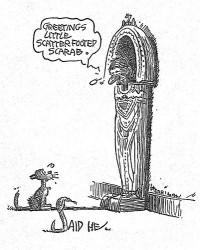 In 1971, John Wilson directed an animated feature starring the voices of Channing and Brackett and using the songs from the musical. The love affair between Archy and Mehitabel was penned by Archy, the cockroach; his poems tell their story.
The film suffers from its music. The songs are simple and sound as if they’re written for children, but the lyrics pull from the poems which are definitely designed for adults. It gets a bit confusing, as a result, and is a bit picaresque; the poems are short and illustrating them in animation would take more adaptation than seen here.
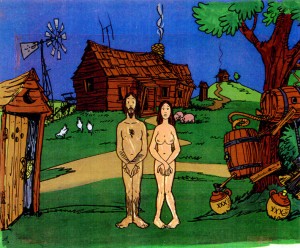 John Wilson had developed his studio, Fine Arts Films, on the back of the weekly, animated, music videos he did for The Sonny and Cher Show, an enormous hit in the early 70s.
These music videos were loose designs animated quickly and lively around the songs Sonny & Cher would schedule each week. There would always be one or two of these pieces, and they were highlights in the weekly one-hour musical/variety program.
 The graphics of Shinbone Alley aren’t too far from these Sonny & Cher videos. Loose design and animation with a design style not too far from the Fred Wolf’s made-for-ABC feature, The Point. This was the first feature made for television and featured the songs and story of Harry Nilsson, although Shinbone Alley featured a wilder color pallette.
Jules Engel, Corny Cole and Sam Cornell all worked in design on the film. The long list of  animators included Barrie Nelson, John Sparey, Spencer Peel, Eddie Rehberg and Jim Hiltz. Mark Kausler was an assistant on the show.
The film wasn’t an enormous success, but that was probably explained much by the limited distribution and the poor marketing of the film.
The Jacob Burns Film Center will host Shinbone Alley on Tuesday Feb. 16th. The screening will be at 5:30 & 7:25 pm.
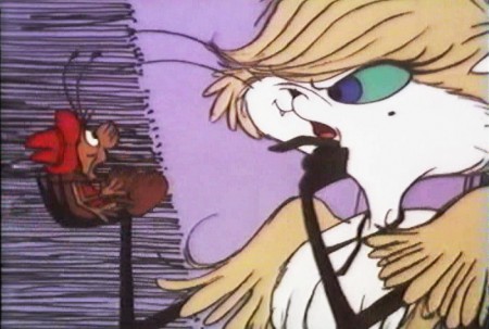
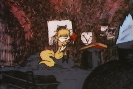
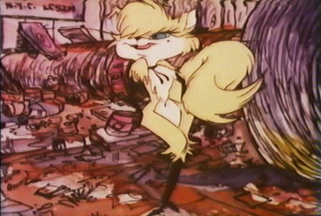
Here are some frame grabs from the first 1/4 of the film:
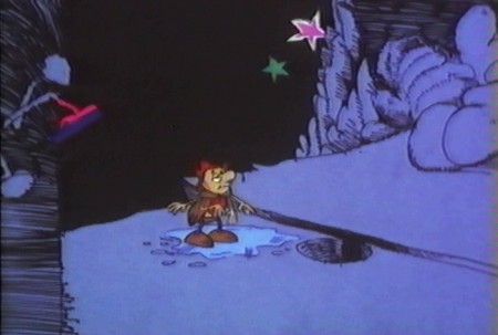
We’re introduced to Archy right off the bat as he
flies out of the river onto the dock. He realizes that he,
the poet, tried to kill himself and was sent back as a cockroach.
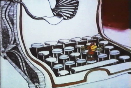
He soon finds a typewriter and goes straight back to work.
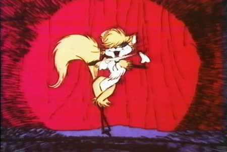
Mehitabel is a performer – with Carol Channing’s voice.
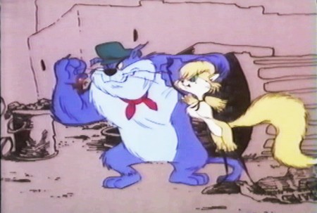
She has another boyfriend, voiced by Alan Reed,
who is also the voice of Fred Flintstone.
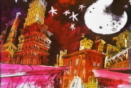
A song video takes us outside.
Independent Animation 30 Jan 2010 09:32 am
It’s Still Me
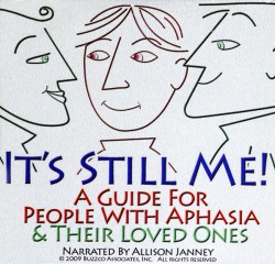 -Candy Kugel‘s made a short film to honor the memory of her late mother who developed severe Aphasia after having a stroke. The film was done in conjunction with the National Aphasia Association.
Allison Janney narrated the film.
Recently, having to self-promote her own film, support for the film came her way from a couple of celebrities, Michael Douglas and Lee Woodruff, the wife of journalist Bob Woodruff. I thought it worth showcasing these comments given Candy.
Here’s the tribute given by the actor, Michael Douglas.
-
After my father, Kirk Douglas, had a stroke, I learned how truly frustrating it is to try to communicate with a loved one without words. My dad was still my dad, he just could not express himself, initially after the stroke, the way he had communicated so eloquently
his whole life. And we, his family, were frustrated by the struggle to understand him.
The DVD, “It’s Still Me”, would have been a welcome tool to help us incorporate novel and effective strategies to improve communication with each other. Luckily, my father can speak again, but many people with aphasia are not so lucky.
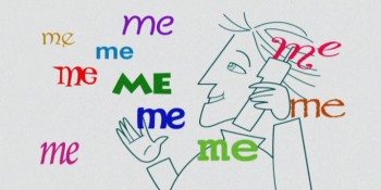 This was true of my neighbor, Adelaide (Chig) Kugel, who was the inspiration for “It’s Still Me”. Chig was a wonderful and sophisticated lady who developed severe aphasia after a stroke. Never able to speak fluently again, this former professional dancer learned to express herself beautifully without words while maintaining relationships with her family and friends.
Chig’s daughter Candy created “It’s Still Me” in partnership with the National Aphasia Association in memory of her mother in order to share with others the lessons they earned to communicate with each other and to maintain their loving bond. I highly recommend “It’s Still Me” for families facing communication challenges brought on by stroke, aphasia and related conditions.
And this is the tribute by Lee Woodruff, wife of television journalist Bob Woodruff
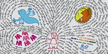 Candy Kugel and the National Aphasia Association have done a masterful job on their DVD “It’s Still Meâ€, which gives people with aphasia and their families effective ways to communicate when words are not available. It is very well done, simple and has lots of useful information. I wish I had a resource like this when Bob was recovering from his traumatic brain injury and dealing with aphasia.
While I was reviewing the DVD, Bob passed by and became transfixed by the images and messages of “It’s Still Me.†The DVD’s information and style is powerful on many levels, especially when emphasizing the fact that the intellect, personality and heart of your loved one is still there, even without words. My family and I know this firsthand.
More information about the dvd can be found here.
The dvd can be purchased here.
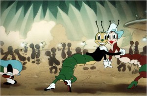 - Tomorrow, Sunday, at Lincoln Center there will be a program of Dance in Animation (particularly Disney). Mindy Aloff will talk about the cartoons and will sign copies of her new book, Hippos in Tutus.
Along with about 40 mins. of Disney animation there will be some newer Independent films that also focus on dance:
En Tus Brazos by Edouard Jouret, Matthieu Landour, and Fx Goby, France, 2006; 4m
Trash Dance by Oliver Fergusson-Taylor, UK, 2008; 1M
Entanglement Theory by Richard James Allen, Australia, 2009; 9m
She by Kathy Rose, USA, 2009; 4m
Romeo & Juliet Before Parting by Jay Field, Canada, 2009; 5m
Gabrielle by Stephanie Weber Biron, Canada, 2009; 4m.
Introduced by the director.
Today’s NYTimes has a feature article on this program.
Articles on Animation &Independent Animation 21 Jan 2010 08:29 am
Len Lye
- Len Lye, one of the original experimental animators, has rarely gotten the acclaim from the animation community that he has certainly deserved. Rarely is his name mentioned in animation books or articles. As a matter of fact, in more than 50 years of reading about animation, I can only remember two significant magazine articles about the man and his work that appeared in animation magazines. (If you really go looking you’ll find a lot written in art publications – not animation mags.)
Here, I’m posting one fof those two that I think is a significant and clear article, and I hope it will give the man another five minutes of your attention. The article was written by Joseph Kennedy for the February 1977 issue of Millimeter Magazine.
by Joseph Kennedy
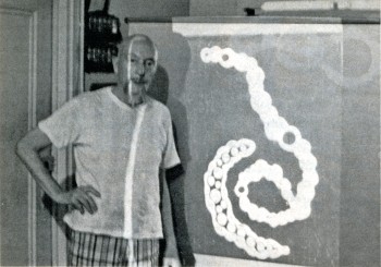 Len Lye‘s Greenwich Village loft is an airy workshop, filled with the tools of the artist’s trade: machine saws, diagrams, models of projected works, and several silvery kinetic pieces glistening in the summer afternoon’s light. Len Lye himself is the Renaissance Man of the avant-garde, his prolific skills having manifested with equal success in diverse media: sketches and paintings, eel animation, paint of film, live-action films, essays and kinetic sculpture. Always the innovator, he has never bound himself to one mode of expression, choosing instead that which best suits his creative need.
For more than 50 of his 75 years he has pursued his quest of motion composition. As a teenager in Wellington, New Zealand, he had his first glimpse of the potential of this art form while delivering newspapers at sunrise. His attention was caught by the movement of clouds and he began to ponder creating artificial clouds to achieve that same quality of motion. “I thought then and there, ‘Why clouds? Why not try to compose motion yourself? — compose motion!”
After this “revelation”, he found the idea was not so easy to implement. “I tried to control motion, and I nearly broke my back. Christ, how do you? So I worked out shafts and handles that could be turned and stuck through shafts so the turning shaft could turn the particular stuff you’d stuck to it; and it was a crazy kind of attempt to control motion and compose it. I was having a ball nevertheless.”
Hoping to learn more about film, Lye moved to Australia in 1922, because New Zealand had no cinematic equipment. He worked at a Sydney studio that made animated advertising shorts. “I learned animation in Sydney, not too much because I was doing storyboards. But I took the job just to be around where people were handling film, just to see.”
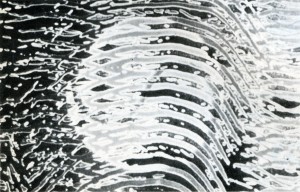 Here he chanced upon the concept of “cameraless animation”: “I didn’t invent scratching on film. I saw some guys that had made some marks on it and I rather liked the way they went (through the projector) wiggling like that, you see. I scratched a few feet of film myself, so I kept that in the back of my mind. And then I saw something like it again from a German film crowd. I think it was also some kind of scratching that they did on film. I kept that in mind too.”
These experiments inspired him to adapt his own kinetic works to cinematic technique: “I suddenly realized that films had cuts and sequences. Editors can chop it where they want to. So, instead of having handles and shafts to control motion, I could just swing (objects) on a string or hold them in a black velvet glove against black velvet or whatever; you could really control and make things happen in terms of sequential motion.”
The Russian Revolution had at first created an amazingly fertile environment for the arts, and for the first time film was being considered from an artistic rather than a commercial viewpoint. Later came barbaric suppression. Lye originally planned to travel to Russia, where he hoped to get a job with the Meyerhold Theatre. He worked his passage from Sydney to London on the White Star liner EURIPEDES as a stoker, arriving in 1926. Some fortunate events enabled him to remain in London to work on his first film, TUSALA VA. “I got all sorts of fabulous help that nobody would get now. For example, as a kind of caretaker, I got a rent free barge to work on, plus the use of part of a studio to which the barge was moored on the Thames. I got a promise from the first film society in the world (London Film Society) that they would pay for the photography. And so I settled down for two years worth of animation drawings.”
One of Lye’s early stylistic influences was primitive African and South Seas tribal art. “When I first came to London I didn’t quite know what sort of imagery would carry my figures of motion. I had lived in Australia and often wondered what on earth an Aussie ‘aboe witchitty grub’ dance looked like. To get the spirit of the imagery I also imagined I was myself an Australian aboriginal who was making this animated ritual dance film.” The articulated grublike forms in TUSALA VA are reminiscent of designs on aboriginal shields, but they are dynamic moving forms. The animation was painstakingly tedious. “These goddam grubs were animated sideways, like cogs in a bicycle chain. Each cog had to be animated separately. And there were about 20 of these bloody cog-links, they all had to be animated. Why the hell I picked on that I don’t know. Well, I just plodded on, about 16 hours a day; it turned out to be both the slowest motion and the slowest animation on God’s earth!”
TUSALA VA was received rather coolly after its 1928 premiere. “Except for the art critic Rogar Fry, there was just a big silence, a complete and utter silence.” Lye found himself without the means or the support to produce another film by eel animation, and he began to consider animating without a camera, recalling his Australian experiences. “I had already used up all my goodwill stuff with the Film Society. I didn’t have much spare cash and I used to go out to some friends in Baling Studios, London, and hang around — anything to get a job in films. I used to get the old n.g. sound takes, that is, clear film with just a skinny track on one side. I would then scratch and paint and mess around with these bits of film. I would join them together and take them up the GPO Film Unit where I had some friends and run it. All this was done under the counter, you know, on lunch hours.
“I hit some marvelous effects (with) wet paint on a strip of clear film; for instance, you take an ordinary fine tooth comb and just wriggle it as you go down the length of film in the wet paint and it makes a lot of striated wavy lines. So you run it. With all these fancy abstract designs going on, the film had a very peculiar abstract quality. I was very taken by it, but didn’t have much chance of developing it.”
With the help of a composer named Jack Ellit whom Lye had met in Australia (“he was the only fellow there of the whole lot of people I knew who had any understanding of contemporary art”), he ran his film to a catchy recording of a Cuban beguine. He presented it to John Grierson and Alberto Cavalcanti at the British Government’s Post Office Film Unit. He suggested they add some slogans to the end of it. Then, with the help of Ellit, he synchronized his painted film and turned it into a public service film; and so COLOUR BOX was released in 1935, informing delightful audiences about new low parcel post rates. “A Utopian bit of public service,” thinks Lye.
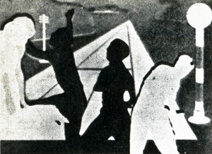 The success of COLOUR BOX resulted in subsequent films for the GPO: RAINBOW DANCE (1936), TRADE TATTOO (1937), and MUSICAL POSTER ttl (1939); as well as several advertising films: KALEIDOSCOPE (1935), for Churchman’s Cigarettes and COLOUR FLIGHT (1939) for Imperial Airways. All these films have in common the abstract “cameraless” technique used in COLOUR BOA’as well as an infectious synchronized score taken from classic jazz and Latin recordings.
TRADE TATTOO is Lye’s most ambitious film (“That one’s got to be the most complex film ANYBODY’S ever done”). Lasting but six minutes on screen, it employs some of the most sophisticated editing, montage and processing effects yet seen. Using black-and-white footage from GPO documentaries, Lye combines stencilled patterns, titles and animated effects to form a brilliant montage. Each of the four layers of images that make up the final print had to be exposed three times via the old 3-color Technicolor process, requiring a total of 12 separate processes to arrive at the final color print (“the lab went crazy”). In addition, the footage was tightly edited, employing jump cuts and color reversal to synchronize with the highly percussive Rhumba and Conga beat of the score; once again, Lye was assisted by Jack Ellilt as music director. As one can imagine, the total effect is startling. Even today, some 40 years after its conception, its avant-garde approach still seems fresh and contemporary, capable of rousing an audience to cheers.
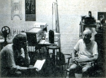 Len Lye turned his hand to live action films, directing several shorts for the GPO. In 1944, he was invited to America to direct films for the “March of Time”. Although his 1958 short abstract film FREE RADICALS won the Silver Medal at the Brussels World’s Fair, Lye began devoting more of his time to kinetic sculpture. “My type of film, which is a short film, might take me eight months; and it’s very definitely fine art, not folk art in any shape or form. I take eight months to make five minute’s worth of film. Nobody is going to pay me for any of those eight months. And in any case, it’s a pain in the neck to have a five-minute film. How’s it going to be laced up and tied in with the rest of the program? People go to a movie house to see a program of at least ninety minutes, and they couldn’t care less whether they miss a five-minute fine art job. So my films were a complete anomaly.”
Nevertheless, Len Lye is still deeply involved in the creation of a new iconography, encompassing all the arts — a new understanding of the relationship mankind, myth, and creativity have in the scheme of life. “I think Art is the only way you can isolate the creative essence of humanity. This essence, like happiness, is individuality. Civilizations and religions may fall down the drain, but their arts remain. It takes the avant-garde to best symbolize the vitality of creativity. There are a lot of great parallels between great, or everlastingly evocative, happiness and great art. This relationship is mainly about value — human value, and it can teach us how to get the most out of ourselves, and life, that we can.”
Photos:
1. Len Lye and a slide from Tusalava (1928) (Photo by John Canemaker)
2. Trade Tatoo by Len Lye (Courtesy of Cecile Starr)
3. Rainbow Dance by Len Lye (Courtesy of Cecile Starr)
4. Joseph Kennedy (L) interviews Len Lye (photo by John Canemaker)
Joseph Kennedy is a New York City schoolteacher and a freelance writer. He has taught film history at Regis High School and he reviews films for Film news.
The magazine gave the above short bio about Mr. Kennedy in the Contributors column. Joe is a friend, and I am aware of how limited this makes his work seem (given that it was written in 1977.) He subsequently became a public relations executive and now has his own corporate communications practice; he worked with John Canemaker and Peggy Stern on The Moon and the Son and Chuck Jones: Memories of Childhood.
There is more information about Len Lye at several websites.
The Govett-Brewster gallery gives some good information about the man and his work.
Senses of Cinema offers an extensive bibliography of books and articles about the man.
Several of his film are available on YouTube (of course) in slightly degenerated versions:
Color Box
Swinging the Lambeth Walk
Particles in Space
Kaleidescope
Articles on Animation &Independent Animation 13 Jan 2010 09:02 am
Canemaker meets Dunning – 1980
The Jan-Mar 1980 issue of Animafilm included this interview with George Dunning by John Canemaker. John was very taken by the Dunning film in progress, The Tempest, and he starts off his interview with questions about that film.
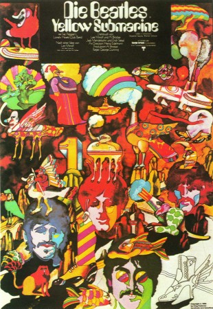
One has to live
George Dunning talks with John Canemaker
JOHN CANEMAKER: I saw a pencil test of “The Tempest” five years ago on CBS-TV. Are you still working on this film?
GEORGE DUNNING: I am indeed. More so, stronger on it than I was then. I’ve got a few hits and pieces in a rather unfinished state and some more going on now. It’s an attempt to he as personal as I can be. My approach is to do a few minutes to present to hackers. To justify doing Shakespeare as an animated film. Obviously live-action with stars and so on is a great advantage in box-office terms. People ask me why do it in animation. It’s all very well with the fantasy side of it, that seems appropriate. But beyond that, it’s something that I think should be demonstrated. And that’s what I’m doing, and then that helps open a technical line on it as well so that others can carry on.
J.C.: Will you be removing the words as you did with the poem you based “Damon the Mower” on?
G.D.: This is a difficult thing to make a statement about cause I’m in the middle of it. I might change my mind and do it all differently. But at this stage I find that I’m always taking out. I’ve taken a sequence of dialogue and cut it enormously -taken out half of it. Then I look at it and I take out more. I keep taking chunks away. I think this is legitimate but I am worried because it is tampering. But at the same time I think the verbal side of it, from a stage point of view, has a kind of function that on film is not necessary, if I could put it that way. I mean it sounds like I’m saying I know how to rewrite Shakespeare and I’m a bit timid about that. I just feel that in the end it is a film that one is making. I’m not rewriting Shakespeare, I’m making a film. In that sense it’s to use the dialogue but to pull a lot of it.
J.C.: The clip I saw showed a tree-like creature walking.
G.D.: That’s Caliban. He’s a tree through the whole thing. I just got carried away with that one phrase where he says, “This island is mine”. It just suddenly hit me, I saw this image of this tree, which is full of creatures as well. It’s sort of an ecology thing all together. And in the end of the play they leave and you have this island with Caliban left. And it’s sort of a hack-to-nature situation.
J.C.: Will you he mixing graphic techniques in the film?
G.D.: At this point it isn’t that far-out as far as technical things are concerned. I’ve been using ccl levels and Xerox drawings. It’s an attempt to keep things handle-able and in a condition where others can help. Cause if you get to do it in a technique which only one person can do it’s very limiting obviously.
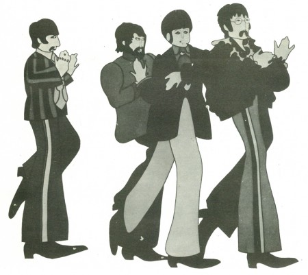
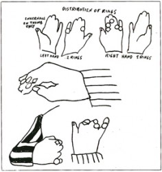
(Click any image to enlarge.)
J.C.: Do you work out of a studio in London?
G.D.: Yes, our studio is TVC London. It’s based on the name TV Cartoons. Auspicious name! And we’re having our twenty-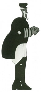 first birthday this year. In June we had it. It’s really a studio Dick Williams has had a lot to do with in the sense that he did a great deal to help in the early days to get it started. When I got to London he was working on “The Little Island”, and I helped him a little bit on that. Then he did a lot of commercials, a lot of stuff sort through our studio. I was sent over to London by Bosustow and UFA to set up a UFA satellite. They wanted to get some more footage for the “Gerald McBoing Show” on CBS. In those days Bosustow was on a big expansion drive and he sent Leo Salkin and me over to set that up. We set it up and seven months later UFA was practically bankrupt. This was ’56 or ’57.1 was in this position of going around to agencies cause we were doing commercials at that time and doing very well. Everyone was very glad that UFA was in London and so on. And Dick was doing commercials with us. So then I went around to all the agencies to say good-bye and they said, “Oh, stay. Can’t you keep this thing going? It’s marvelous”. So it was a matter of trying to make a set-up which I did with some businessmen. I had long talks with Dick, saying “What’ll I do…” And he said “I’ll help you and stick with it. This is great and you should stay on.” The prospect otherwise was
 to go back to New York in tatters. It all seemed downhill. I remember Dick came to me exactly a year later and he said, “The year is up.” And I said, “What do you mean, the year is up?” He said, “I said I’ll help you, and give you a push. Now I really want to do stuff through my own company’s name and things like that.” We went on collaborating on some things but he was much more active with the Richard Williams Studio and developed it and so on. I have always had the greatest respect for all his abilities.
J.C.: So you set up your own company and were doing commercials?
G.D.: Lots of stuff like that and industrial films.
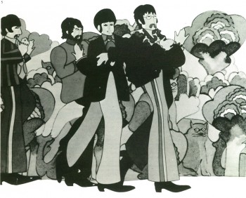
J.C.: Did you do features before the “Yellow Submarine”?
G.D.: No, we did a Saturday morning (TV) series
J.C.: Did you do features before the “Yellow Submarine”?
G.D.: No, we did a Saturday morning (TV) series for the Beatles music. King Features organized that with the Beatles and got permission to do cartoon versions of the four of them. It was terrifying. It was a very poor kind of design, but there it was. The show was very ordinary, very cheap cut-rate kind of thing. It was that kind of show with two numbers set into fifteen minutes framing it then another fifteen minutes to make the half hour. We made up a new half hour show one way or another each week, got to the lab then got that onto the plane, had the day off, then started in again, grinding on with this. It was King Features (newspaper syndicate) that had the idea to do a feature-length film and they kept hammering away to Brian Epstein (Beatles’ manager). He didn’t want to buy that for the longest time. Then finally agreed.
J.C.: Which would be around 1967?
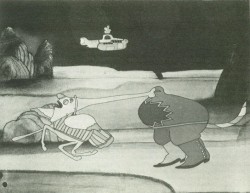 G.D.: Yes. So that’s why our studio did the thing. As I said, the design of the characters in the TV show was hopeless, although King Features had no objection. They were completely without any point of view on the thing. It was sort of business. We were desperate and I was jumping around like mad because I knew that had to be really well solved or we were dead. I tried with different kinds of designs. We got a bit of track of the four boys talking after they’d left the pot open once on a recording. So we took this talk and animated to it and kept testing and trying different things. We saw and had admired Heinz Edelmann’s graphic designs in “Twin” magazine. And thought why don’t we even try him. So we got in touch with him, he flew over and we showed him what we were doing and he disappeared for two weeks. I remember this brown envelope arrived with four drawings in it, one of each Beatle. It was really marvelous cause it had that solved, attended-to quality. You could see it wasn’t Mickey Mouse, it wasn’t this, it wasn’t that – it was just there! The film is very much a phenomenon.
J.C.: It’s a time capsule of the sixties.
G.D.: It is that. That’s the contribution of many people. The film would have had a life because of the Beatles music.
That’s a separate consideration. And the fact that Heinz solved that side of it was so great and that was marvelous.
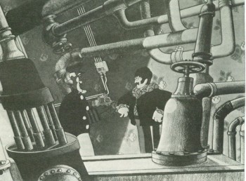 We had a budget of a million dollars, and eleven months to do it. The Beatles took $ 200,000, off the budget. There were three animation directions on it: Jack Stokes, who learned his trade with a group of people – a whole generation of animators in London – from a Disney man who came over, David Hand (Director of “Snow White”). Eddie Radich was another animation director on “Submarine”; Bob Balser, who has been for a long time in Barcelona. He’s the third director.
There was a period of about five months where we had 200 people working together in out studio in Soho Square. My memory of that time is that it was amazingly unfrantic, in the sense of devoted and productive. Everybody was very grim, hardworking. The whole atmosphere was “We’ll show them” meaning the rest of the world “that we can do this in London.” This odd thing of making a feature.
J.C.: This was the first British feature since “Animal Farm”?
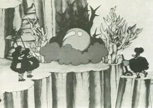
G.D.: Absolutely yes. The film made money left and right. But it didn’t for TVC and very nearly bust us. That’s a very long and very bitter story. We had a really nasty time of it. We went over the budget, not a large amount over. The producer people through King Features organized to take over the company. And we learned an awful lot. Very bitter situation. After it was all over it got smoothed down. We repaired our relationship with King Features. But the whole thing was very sour.
 J.C.: You have retained your credentials as a film artist by making personal films. Is your work at TVC to help you to continue as an independent artist?
G.D.: I would guess that is the answer, yes. One has to live. I had a long stint at the Canadian Film Board. I learned a lot and enjoyed that kind of existence – government backing, budgets for films and all kinds of special facilities that you could get that way, that you don’t get out in the cold world of commerce.
J.C.: Who were some of the artistic influences in your career?
G.D.: McLaren. Alexeleff. Bartosch. Then there’s that whole world of Disney stuff that we’d all he poorer without, and I think in hits and pieces and in various ways it’s been an enormous influence.
J.C.: What is your age?
G.D.: 57
J.C.: Thank you very much for your time.
G.D.: Pleasure.
GEORGE DUNNING (1920-1979): FILMOGRAPHY
1943: J’AI TANT DANSE (I have danced so much), AUPRES DE MA BLONDE (By my blonde, Chants populates), 1944: GRIM PASTURES, 1945: THREE BLIND MICE, 1946: CADET ROUSSELIE, (UPRIGHT AND WRONG), 1947: THE ADVENTURES OF BARON MUNCHHAUSEN, FAMILY TREE (with Evelyn Lambard), 1959: THE WARDROBE, 1962: THE FLYING MAN, THE APPLE, 1968: CHARLEY, THE LADDER, THE YELLOW SUBMARINE, 1970: MOON ROCK, 1973: THE MAGGOT.
Publicity and sponsored films including: 1946: DISCOVERY – PENICILLIN, 1958: THE STORY OF THE MOTOR-CAR ENGINE, 1962: THE EVER-CHANGING MOTOR-CAR, 1962-65: THE ADVENTURES OF THUD AND BLUNDER (safety film for the Coal Board), 1966: BEATLES (TVseries with Jack Stokes), CANADA IS MY PIANO (with Bill Sewell).
Animation &Independent Animation &Layout & Design 23 Oct 2009 07:47 am
Pups of Liberty – Production Art
 - Yesterday, I posted the first part of a look at a short film, Pups of Liberty. It included an interview with Bert & Jennifer Klein the Producer/Directors (and so much more).
Along with the interview response, they sent me a wealth of gorgeous artwork from various phases of the production, and I’ll try to get most of it in today. The text descriptions, below, are written by their Production Designer, James Lopez.
You can view a trailer from their film here.
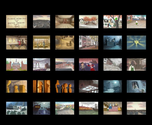
Pups of Liberty Color Script by James Lopez
For the colors, warm colors were chosen to represent the dogs’
surroundings and, in contrast, cool colors to represent the cats.
To start the film, the colors were to portray a pretty town but not
a vibrant one. Only as hope comes alive and tensions run high (The
Boston Tea Party & The Riot) are the more vibrant colors introduced.
Color influences came from some classic Disney films and a desire to
use natural lighting (direct & indirect) as opposed to “staged†lighting.
The story of the movie is left somewhat unconcluded so at the finale,
rather than going full-blown with color, there is a hint at what would be
to come (as the story’s narration suggests).
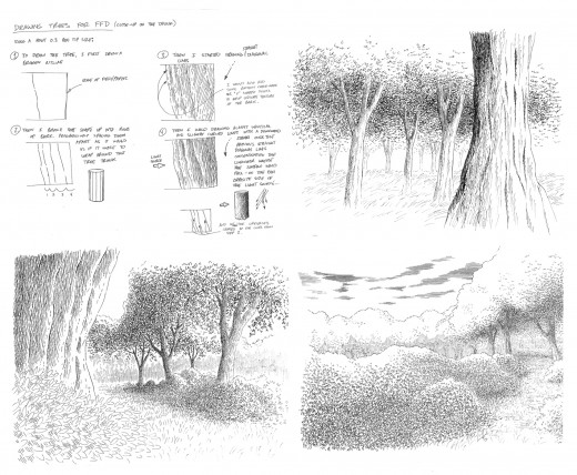
Pups of Liberty - Drawing Trees
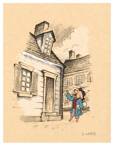
Pups of Liberty - In the style of Anton Pieck
Initally, the backgrounds were going to be influenced by the stylings
of Dutch artist Anton Pieck. Studies were made to see what the style
would look like with a Colonial theme.
A composite was made with the paint study and the character over
a parchment texture. We we were happy with the result of how the
drawn character married into the drawn environment.
It was a nice style but it involved a unique application that was a labor
to produce and proved to be impoprobable so we explored other, more
traditional styles.
We later settled for a pen and ink application on vellum paper in the
rough drawing style of the late Ken Anderson. It allowed us to stay
loose and if there were any mistakes or changes to be made, they
could still be done on paper.
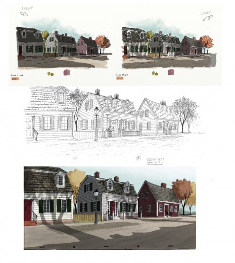
The top two illustrations are visual development for the color and
lighting treatment on the houses. The desired effect was trying to
capture the drama of the shadows cast from the trees by the sun
set low on the horizon.
The middle illustration is a clean-up layout by James Lopez
The bottom illustration is a Production Background painted by James Lopez
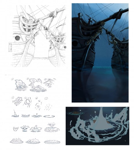
Pups of Liberty - Water Effects
Illustration (upper left) Clean-Up Layout by James Lopez
(upper right) Production Background by Barry Atkinson
(below left) water studies by James Lopez
(below right) Production still
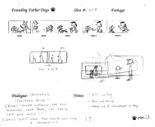
The above images represent a page from the Director’s workbook
for Sc. 17. Storyboard drawings are by Jennifer Klein.
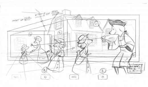
This is the Layout for Scene 17
done by James Lopez.
The QT movies below are Pencil Tests of scenes by
Mark Henn.
Right side to watch single frame.
Animation &Independent Animation 22 Oct 2009 07:53 am
Pups of Liberty – Interview
- I’m an Independent Director/Animator/Producer of animated films. As such I watch closely what else is going on independently in the world of animation. I try to keep up with most of the short films made and being made; I try to keep up with all the people involved in that world.
 In the old days, one had to go to the Festivals around the world to see these films. ASIFA East often brought some of these films and filmmakers to our local meetings, but generally you had to travel to see the average film. The big, famous award winners would always show up somewhere. Nowadays, the Internet has brought more films and artists into my life, and I get to see more of the less than sterling flms from around the world. Ian Lumsden’s Animation Blog has introduced me to many films I wouldn’t have even known to look for including many gems. Niffiwan‘s Animatsiya in English brings Russian films that would otherwise escape my notice. There’s a lot out there, and I keep looking.
The fortune of having a modestly successful blog is that some filmmakers actually approach me. Such was the case with Jennifer & Bert Klein‘s Pups of Liberty. They sent me a link to their site which offered a trailer for their short film, and they offered to send me a DVD of the entire film.
When I looked at their site and trailer, it was obvious this wasn’t your average short. I saw the very full animation, beautiful backgrounds, and I looked deeper.
I saw the credit list and the names of James Lopez (Animator on Hercules, Emperor’s New Groove, Flushed Away and Princess and the Frog), Eric Goldberg (Animator on Aladdin, Fantasia 2000, and Princess and the Frog), Barry Atkinson (BG artist on Prince of Egypt, American Tail and The Lion King), and Mark Henn (Animator Ariel, Belle, Jasmine, Mulan and Tiana) among others. I had to see this film.
I wasn’t disappointed. The animation is sterling in the richest of full animation; the Bg’s are beautifully styled to feel like the period (the Revolutionary War) they’re meant to suggest, and the Direction couldn’t be cleaner or clearer or more focused. The film doesn’t waste a shot, but drives itself through the story in a very economical approach. Yet not a dollar seems to have been spared in making this the extraordinarily lush film it is.
I had to respond to Jennifer and Bert Klein to ask for a short interview and they responded with answers to any question I posed and plenty of supportive material. Hence, I’ll post that Q&A today with some stills from the film, and tomorrow some amazingly attractive pre-production artwork. This film deserves a book of its own.
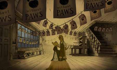
All images copyright © 2009 Picnic Productions
The Interview
Michael – What prompted you to develop this story? It reminds me a bit of Disney’s Johnny Tremaine in the way that it focuses on a particular craftsman and his daughter, just as the live action film focused on a silversmith and his apprentice. Was there any inspiration from that film/book? Animation wise, it feels a bit like Ben & Me. Perhaps that’s because of the subject.
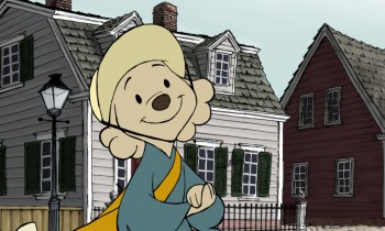 Jennifer – I have always loved this era of history (Colonial/Revolutionary America) so when I first began developing an idea for a new short it was the first setting that came to my mind. I wanted to make a story that was quality and that a viewer would feel good about watching; I was also very interested in how to teach people concepts (like taxation and representative government) with a media like animation.
The story of the Boston Tea Party seemed like an iconic event to start with, since most American school kids learn about it pretty early on. The more I researched the more I was drawn to the story of the printer who started the Sons of Liberty. I love the idea of a group of ordinary people getting together to motivate change in their world, and I liked that that is something that translates internationally, to everyone.
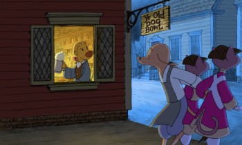 I grew up watching Robin Hood because it was the only Disney movie we had. At some point I saw Ben and Me and I have always liked that one a lot too. I like allegorical story telling, fables… so it seemed natural to tell the story with animals. In a way it lightens up the mood of it having a political bent- because really, they are talking dogs and cats.
Bert – We initially considered making a film about the first Thanksgiving with cats as pilgrims and birds as the native Americans. We moved ahead in time a bit and did the Boston Tea Party instead.
I’m sure you don’t want to discuss your budget, but you must have gotten a lot of incredibly talented people to volunteer to help you make the film. (Eric Goldberg, Mark Henn et al). The expense easily looks quite high.
Michael - Was the budget completely out of pocket?
- How did you create such enthusiasm for the project to do so?
- Now that you’ve finished what is your hope for distribution or future development?
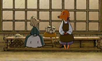 Jennifer – Our budget was all out of our own pocket. We might be a little crazy I guess, but this is what we do. It’s our hobby. Bert and I are very passionate about making shorts, and when we began the project we were also very interested in keeping ourselves in practice for 2d animation at a time when there weren’t any other 2d features being made at any of the studios. Our friends who worked traditionally started to hear about the film and we would have evenings with everyone over and do pencil tests and see them cut into the storyreel – and we’d always have pie, I would bake every night for the crew. The nights started to take on a family atmosphere, and I think everyone felt very comfortable to come and practice their art that they had been trained to do. Everyone was working at their highest skill level– Mark Henn was doing 20 feet a week, James Lopez stretched himself and all of our layouts, we had cleanup people doing the most beautiful work I had ever seen from them. I can’t say how we “created” enthusiasm because you can’t consciously create something like this. You’re just darned lucky that it happens.
We are submitting the Pups to film festivals, so we will have about 2 years worth of that, and then we’ll see what happens. My biggest hope would be for a series. I would also love to see it in the classroom one day.
Michael – It must have taken quite some time since I doubt you were able to work steadily on the film and had to fit it in between other jobs. (I’ve seen your resume and know you’ve been busy outside of this film.)
- How long did it take to make, given your work schedule?
- How were you able to maintain such a consistent (and consistently high level) look while working on it on a long, piecemeal schedule? (Assuming that was the case?)
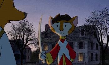 Bert – Most of the production took place during spare time over a two year period. The births of our two kids stretched out the last bits almost another two years.
One way we ensured consistency was having Jennifer do clean up keys over the different animators’ drawings to maintain the style. Mark Henn did a lot of animation on the film and helped raise the bar for everyone else. One person (James Lopez who was a supervising animator at Disney for a decade) did all of the layouts. I animated a lot of it myself and just kept working on it until it was done. Our assistant director Hyun-Min Lee was invaluable to us in getting this done, tackling technical problems, organizing scenes and x-sheets, and trackreading amongst many other jobs.
Jennifer – I took some time off to work on the film, so I was able to dedicate all of my time to it. I did the boards, designed the characters, did reds for the cleanup keys. I think that the simplicity of the characters saved us a lot of line mileage and made it possible for the artists to get through the footage quickly. They also look best against the backgrounds, which are done in a hand drawn pen-and-ink style and required something simple to contrast with them. We looked at the printwork from the time for inspiration- Paul Revere’s engravings especially really had a ‘homemade’ colonial feel, and you can see his personality in them and in the brush strokes of color used that we tried to invoke.
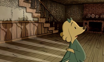 It is hard to sit down and work after you have worked a full day, but I always remembered something Bert would say- “Even if you just get one drawing done you are one drawing ahead.” So I’d try and get one scene’s worth of layouts done a night, or read a track, or just something, and we’d inch forward until we were done.
Michael – Just as American Tail was compared to MAUS, your film has already received a comment on Cartoon Brew comparing it. There are very obvious differences, but I wonder if you thought about this possibility?
- Or worried about it?
- Did you ever question the idea of doing it with humans?
- Or would that have made you focus even more on historical accuracy?
Bert – I heard of MAUS, but I’ve never read it. Our main reason to make this was purely a labor of love. I watched Jennifer do great work as a story artist on lots of feature projects for studios that never got made or changed radically from the first inception. She was one of the original story artists on Where the Wild Things Are when it was a fully animated feature back in 2001. I wanted to produce a film that was a showcase for her story sensibilities because I felt that it might be the only way to get that pure vision to the screen. We also hope that people and their kids can enjoy it.
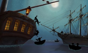 Jennifer – Honestly I never heard of Maus. Whatever subject matter you make a film about though, there will always be something to compare it to — how many films are there about aliens? Or zoo animals? A setting is just a setting- it’s how you hook the audience in, how you make them really feel for and believe in your characters, and the experience that you give them that matters.
Doing a historical film with humans instantly makes it more serious- doing it with animals, you can’t take it as seriously and you can have more fun with it. Why animate humans when you can animate talking dogs? It made us laugh. We did it this way so that we could have some fun, and do what we love to do.
Articles on Animation &Independent Animation &Tissa David 29 Aug 2009 07:45 am
Sightlines – Women
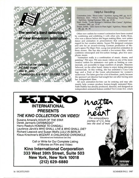
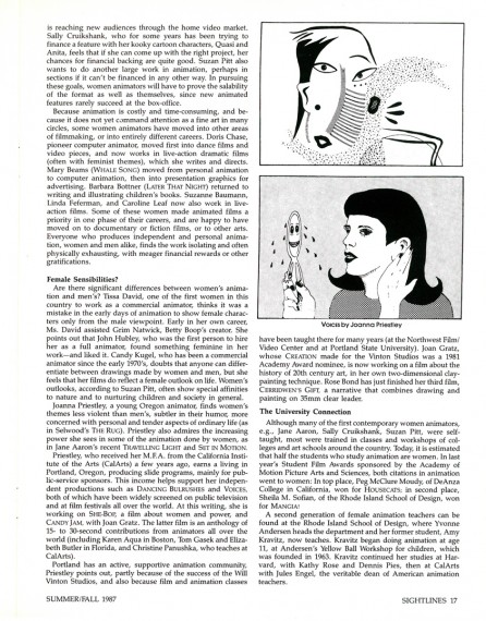
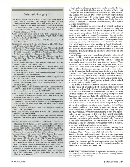
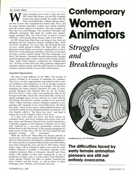
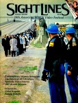 - The Summer/Fall 1987 issue of Sightlines magazine had an article about women in animation. The article is by Cecile Starr who wrote frequently about Independent Animation. This feature was a companion piece to one the magazine offered about Snow White’s 50th anniversary.
Back from the 70′s through the 80′s there were a number of articles and features about women animators, and it was welcome. However since then the notice has been limited. Rarely are there articles about women animation artists (other than the infrequent Mary Blair article).
I’d like to see more of them, and it’s not a bad start by posting this article. (I’ve decided to show ads and all.)
 1
1(Click any image to enlarge.)
Books &Commentary &Independent Animation 19 Jul 2009 07:32 am
Book of Kells
- Having seen The Secret of Kells yesterday, I felt it was time to take another look at The Book of Kells. It’s been a while for me, though the book has been sitting on my shelves for the past 35 years or so.
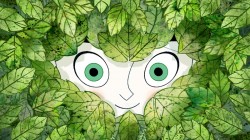 The artwork in the film is luxurious (although the characters tend toward the big-eyed cute side), but no matter how daring the style could have been, it didn’t quite match the absolute daring and drive of the original illustrations.
The Book of Kells is a hand written – drawn is actually the more appropriate word – transcription of the new testament. It was done by monks who might have spent an entire lifetime illustrating one page. The purpose was to save a written transcription of the Christ story despite the invasions of the Norse pagans.
This is essentally the story of the film, though the Christ-story part is left out. There is an 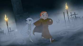 unusal mysticism within surrounding wooded areas in the film, but the mystical is left out of the Christian complex despite the fact that this is their primary mission.
The most amazing part of the film is that it’s a telling of the story behind a work of Art. Of course, the monks didn’t think of it as art. To them it was just a telling of the Gospels. I’m not sure I can think of any other feature animated film that tries to relay the creation of an artwork.
I found the film beautiful, scene for scene, but felt there was, for me, no emotional connection. I might have preferred the film set in a slightly more realistic setting to separate the world of the gospels and spirituality from the real world. Others I spoke with didn’t have that reaction, so it’s no doubt my problem.
The film does feel, at times, a bit like Gennady Tarkovsky’s Samurai Jack (or, for that
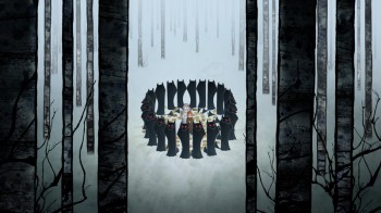 matter, Mr. Magoo’s Christmas Carol) and is undoubtedly a virtuoso performance of flat animation. It seems to mix traditional with Flash with CGI for the end product. Some CG scenes of waves washing on the shore were beautifully constructed. Scenes of the dark, heathen woods were also beautiful.
However, it’s all very heavy design all the time. In fact the design seems to resolve some of the conflicts that occur in the film. At least, I wasn’t able to quite get what happened several times, except that the climaxes were waved over the abstractions of some of the scenes and everything was taken care of. It did seem to work, in a not very physical way. I’m not sure how much our predecessors, in the animation industry, would have accepted it. Not quite as satisfying as actually being able to defeat the enemies (except in an allegorical way) though even the visualization of the enemy wasn’t quite physical enough for my taste – given that so much of their art went into the Book of Kells, itself.
The film, unlike most recent animated films (Miyazaki excluded) has a sense of depth that is quite comforting to see again. I’d recommend it wholeheartedly to anyone despite my few gripes.
My guess is that it will get a larger release this year. They’ve just gained a distributor and there is that Buena Vista logo at the head of the movie. Hopefully it’ll show up at Oscar time.
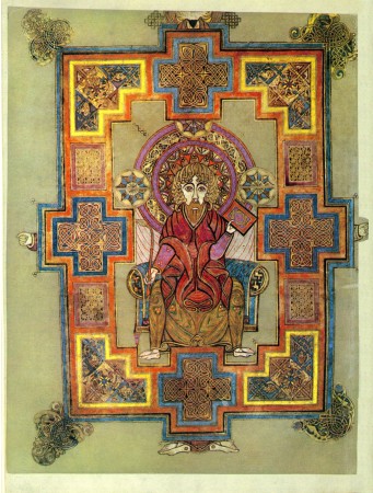
Now to some of those illustrations from The Book of Kells:
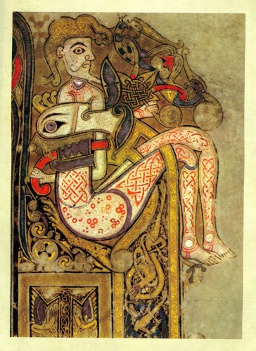
(Click any image to enlarge.)
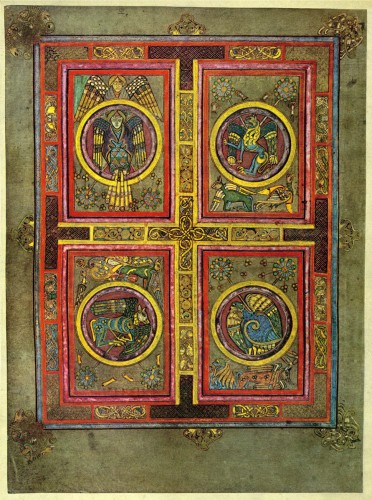
Of course, the four Evangelists, who wrote the gospels,
are depicted throughout The Book of Kells.
A man, a lion, a calf and an eagle.
John, Luke, Mark and Matthew
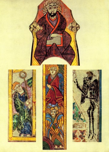
The design is quite extraordinary and should have inspired
many a modern work of art.
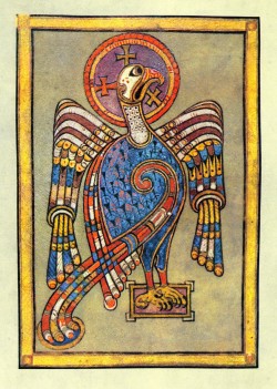
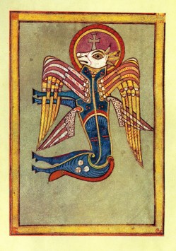
The Evangelists, again.
Matthew and Mark.
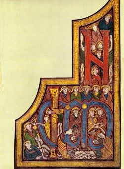
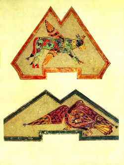
The book, for the most part, is a written manuscript of the Gospels.
Plenty of little and beautiful iconic figures wrap around and within the
hand-drawn type.
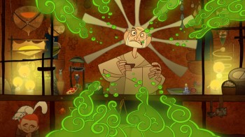
How could I resist adding this still from the film?
Books &Daily post &Independent Animation 18 Jul 2009 07:40 am
Kells
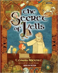 - This morning in New York, Tomm Moore’s The Secret of Kells will be playing the first of two shows at the IFC Center. The second show is tomorrow, Sunday, at 11am. (Reserve a ticket for that show here.) I intend to be at the screening this morning and maybe later in the day I’ll add some comments to this post about my thoughts on the film. I’m hoping it’ll be good, though I have to admit that I have some trepidations with the character design. A bit too cute for my taste, but I can’t judge until I properly see the film. The overall production design looks impressive.
You can read the NYTimes review here. They’ve given the task to a second-string reviewer and treat it as a children’s film despite how positive the review is. At least the paper gave it some attention.
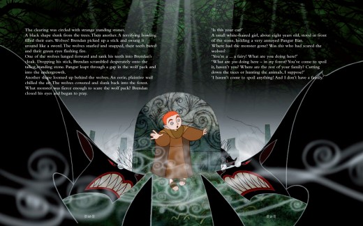
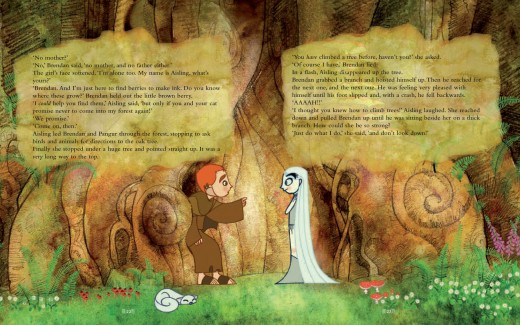
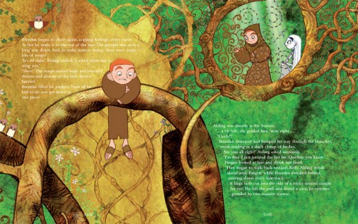
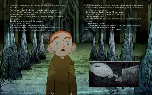
For now, I’ve noticed that a picture book of the film is available. On the site, they’ve given a couple of the double page spreads to check out. I’ve copied them below to give you an idea of this book, which looks as impressive as the film.
The book sells at this site for £12.99 (about $25.00); the same book on Amazon is selling for $125.00. They’ve also posted the trailer for the film at the book’s site, so it’s worth a visit.
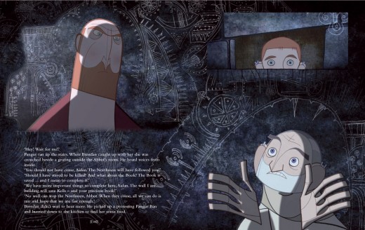
(Click any image to enlarge.)
