Search ResultsFor "good housekeeping"
Photos &Steve Fisher 16 Dec 2012 06:58 am
Out & About
- Friend Steve Fisher continues about town with some ver interesting photos.
For the bulk of the photos he had joined the Landmarks Conservancy’s tour of the Hearst Building at 57th Street and Eighth Avenue yesterday, Dec. 13th.
 1
1Six-story restored base façade of
the original building was designed
by Max Urban in the 1920s.
 2
2
The tower was designed by Norman Foster
 11
11
Art work installation on wall designed by muralist Ben Long.
 12
12
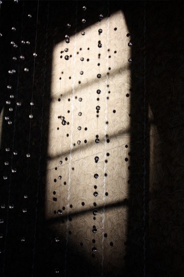
Water sculpture installation designed by Jamie Carpenter.
 16
16
Test laboratories for Good Housekeeping on 29th Floor.
 21
21
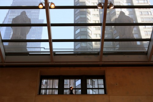
Views from the 29th floor of the Hearst Bldg
 1
1
At the MTA Transit Museum in Grand Central Terminal
Steve found a model train of the very terminal
where the train set was standing.
 3
3
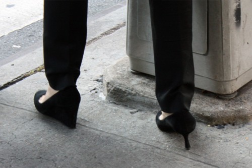
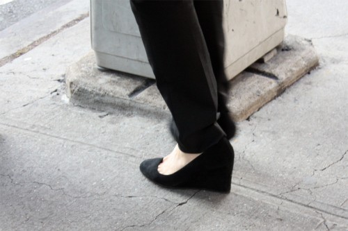
Steve writes: “You may ask why I took this photo.”
“If you thought it was because of the style of the shoe,
that’s only half of it.”
Bill Peckmann &Books &Illustration 21 Feb 2012 06:45 am
Harrison Cady
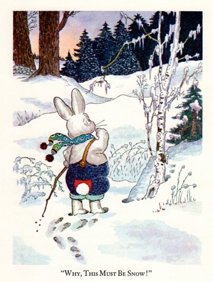
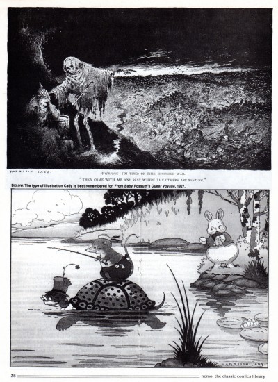
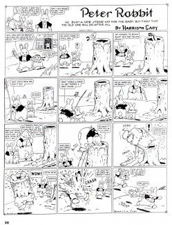
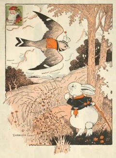 - W. Harrison Cady was a well-known illustrator for over 70 years. He illustrated for The Saturday Evening Post, Ladie’s Home Journal, Good Housekeeping, St. Nicholas Magazine and the Herald Tribune Syndicate. Cady was born in Gardner, Massachusetts and best known for his works in Bedtime Stories, a daily-newspaper created by book and magazine writer Thornton W. Burgess. Burgess conceived the character of Peter Rabbit (not to be confused with Beatrix Potters creation of the same name), and each of these Bedtime Stories was illustrated with a drawing by Cady, who had illustrated some of Burgess magazine stories as early as 1911.
Bill Peckmann has generously sent me an article on Cady and the illustrations from one of his books,
- When I first came across Fritz Baumgarten, years ago, the first thing I thought was, that I was looking at the German Harrison Cady. Unfortunately, I only have this one book of Cady’s, it’s a reprint, but I also have a Cady article that appeared in Nemo magazine, together they’ll make a neat post.
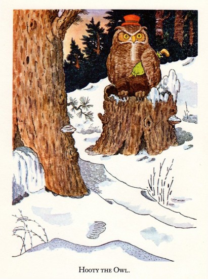
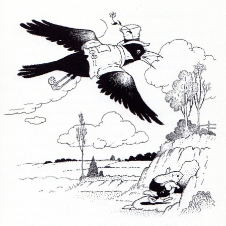
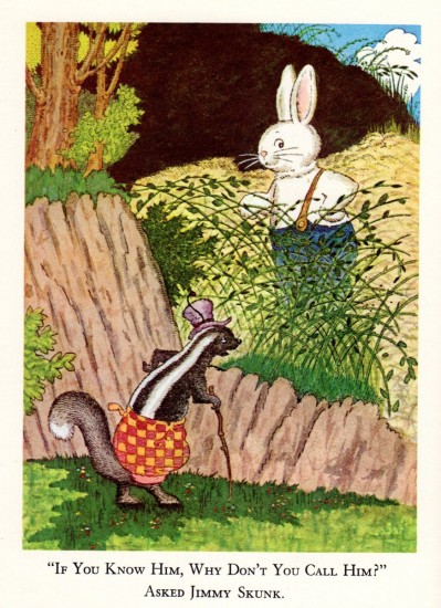
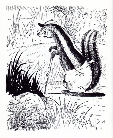
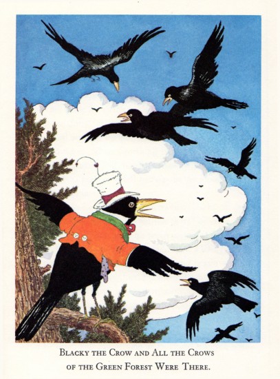
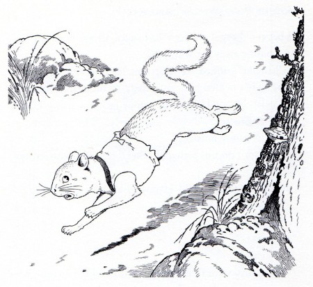
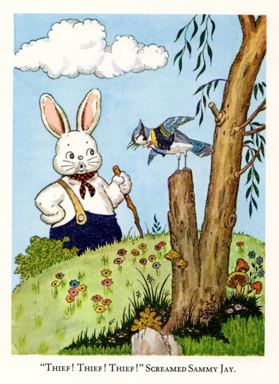
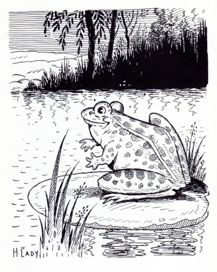
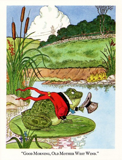
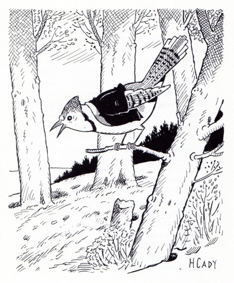
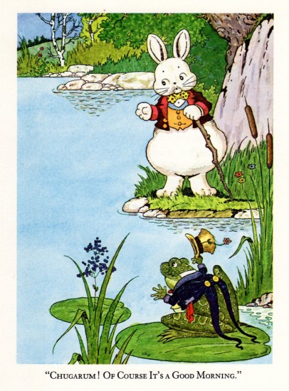
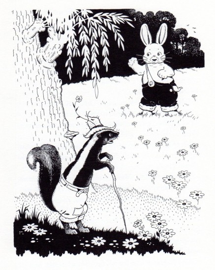
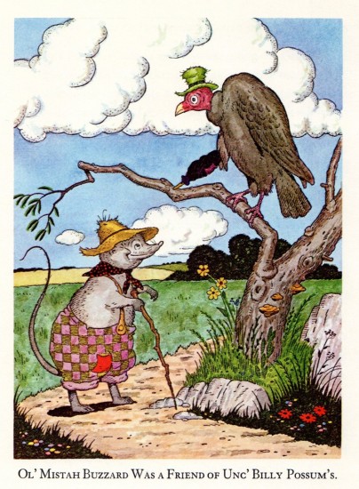
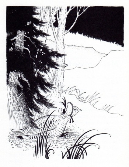
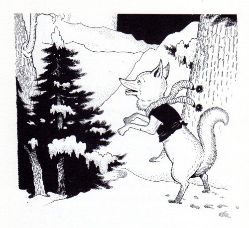
Here are Harrison Cady’s illustrations from “Mother West Wind’s Neighbor’s”. There are eight color plates and the equal number of black and whites.
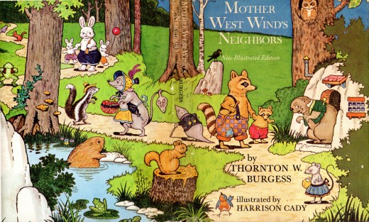
The book’s cover. .
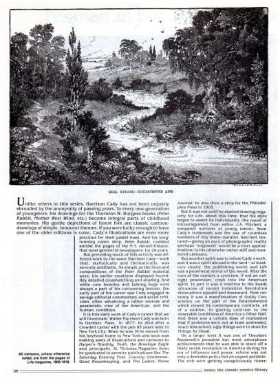
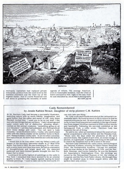
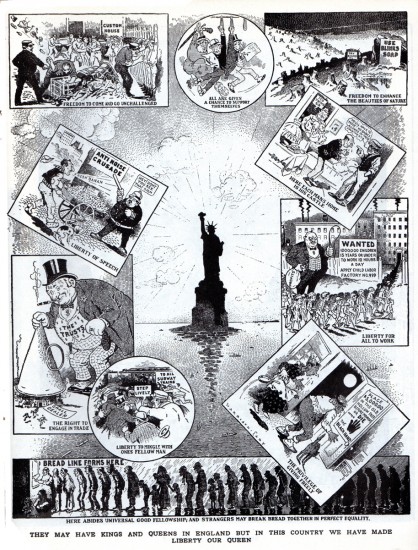
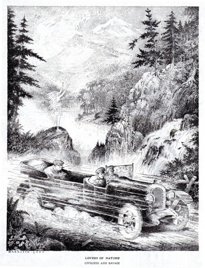
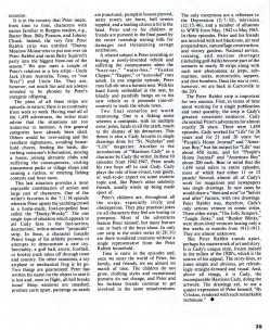
What follows is an eight page Cady article by Richard Marshall;
it’s from Richard’s magazine, Nemo, No. 4, Dec. 1983.
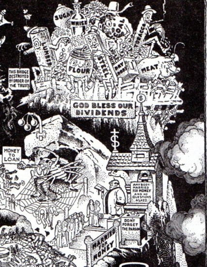
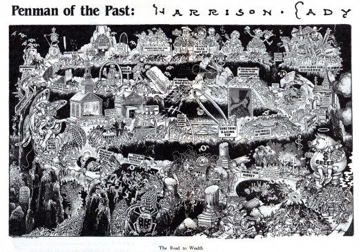
A blow-up of one corner of the illustration to show the detailing.
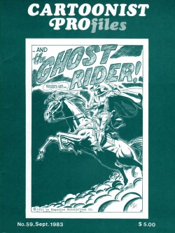
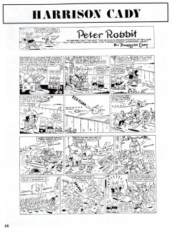
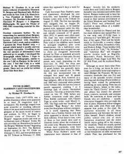
Finally, here is a CARTOONIST PROfiles article about Cady.
Bill Peckmann &Books &Illustration 17 Sep 2009 07:39 am
Good Housekeeping 3
 - Bill Peckmann loaned the book of collected Good Housekeeping illustrations that were publishrf bryeen 1938 through 1944. (The illustrations actually began in 1934 and were printed complete in an interesting recent book called Mickey and the Gang which was edited by David Gerstein. That book includes so much more than these illustrations – including the text that went with the illustrations. However, I like the printing, on non-glossy paper, of the 1987 book.)
I’ve done two other posts of these illustrations (part 1, part 2) and finish them up with this piece.
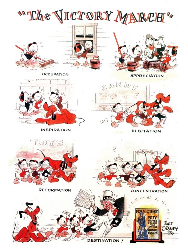 1
1The Victory March, August 1942
 2
2
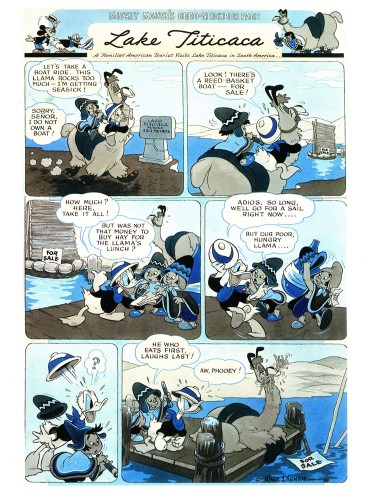
Lake Titicaca, December 1942
 3
3
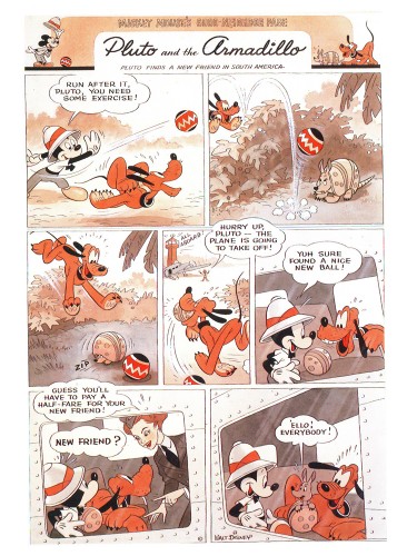
Pluto and the Armadillo, February 1943
 5
5
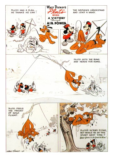
Pluto wins A Victory Through Air Power, April. 1943
 6
6
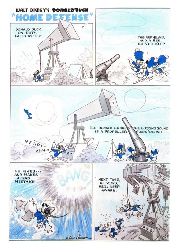
Donald Duck Home Defense, August 1943
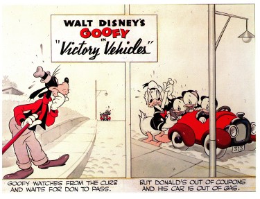 7
7
Victory Vehicles, September 1943
This edition, published in trhe Alexander Gallery catalogue
is really just the upper half of the strip.
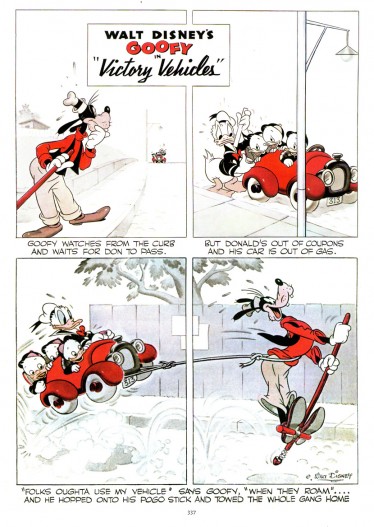
Here’s the whole strip as printed in
Mickey and the Gang.
More white no colored grays.
 8
8
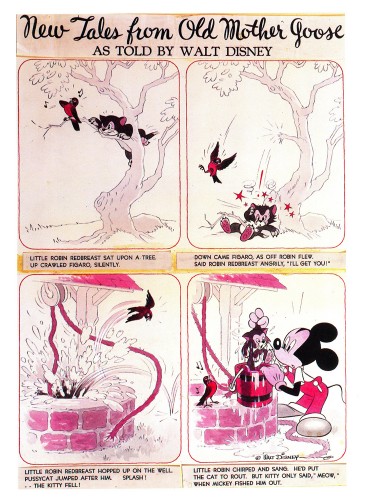
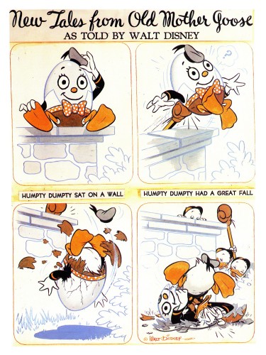
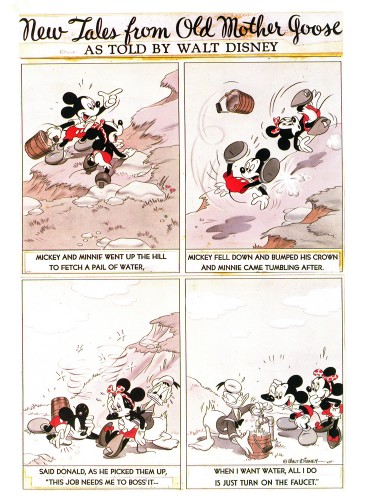
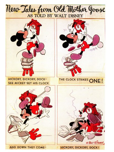
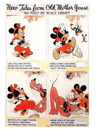
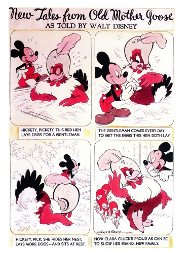
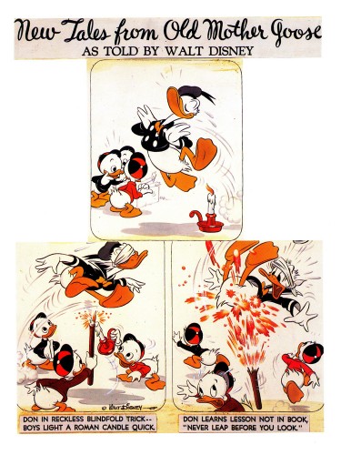
From 1943 on, the illustrations became “New Tales from Old Mother Goose.”
This was a revision from “Donald Duck’s Mother Goose” that had
appeared in Mickey Mouse Magazine, published in the 1930′s.
Hank Porter and his writers dealt with a more limited subject in a
more comic-strip sense and used the two color process during the war.
Mickey an Minnie Went Up the Hill, October 1943
 9
9
Hickory Dickory Dock, February 1944
 10
10
Little Miss Muffet, May 1944
 11
11
Hickety, Pickety, June 1944
 12
12
Don be Nimble, Don be Quick, July 1944
Articles on Animation &Bill Peckmann &Books &Disney &Illustration 27 Aug 2009 07:26 am
Good Housekeeping 2
- Before getting into today’s post, I want to make sure you’ve all seen the notation on Tom Sito‘s great blog today. (An amazing and unique blog if there was one.)
- 1968- Former master animator Bill Tytla’s request to return to Disney was turned down. The artist who animated Grumpy the Dwarf, Dumbo and the Devil on Bald Mountain even offered to do a free “trial animation test” to show he still had it. Disney exec W.H. Anderson wrote him:” We really have only enough animation for our present staff.”
Tytla died later that year.
 - This is the second part of my posting of the illustrations from Good Houskeeping Magazine.
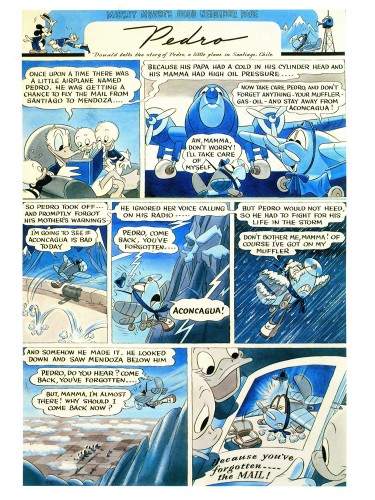
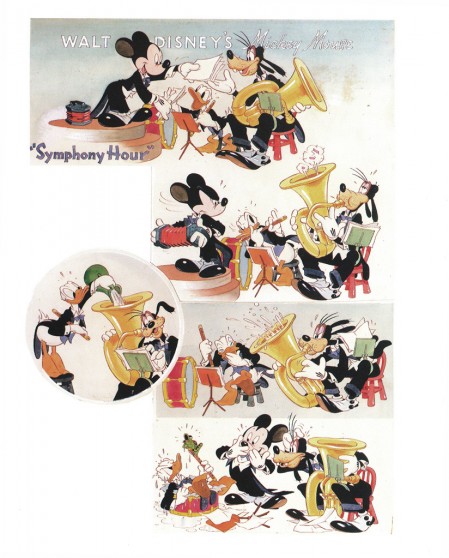
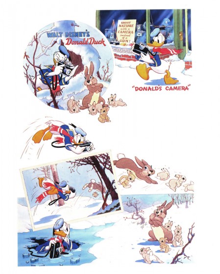
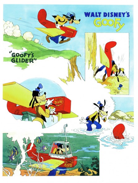
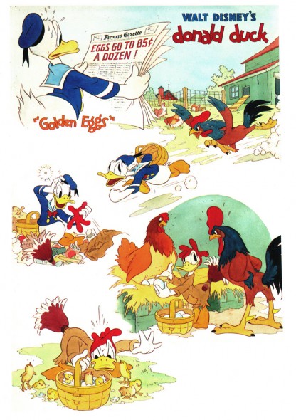
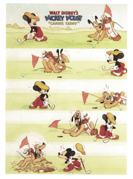
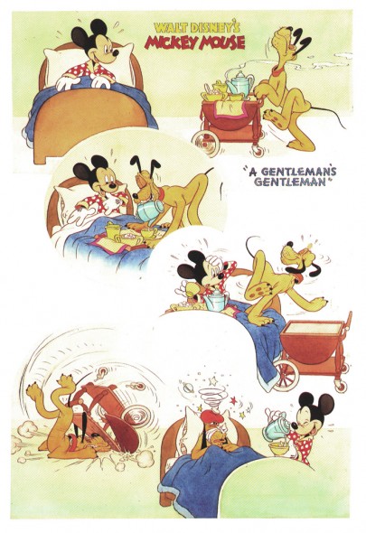
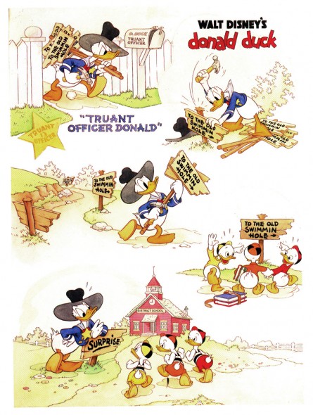
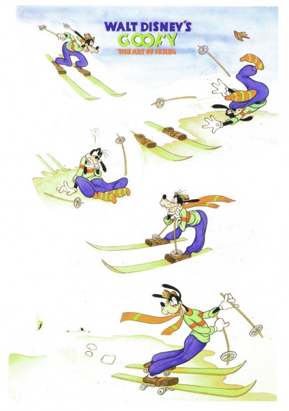
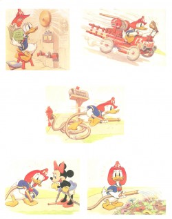
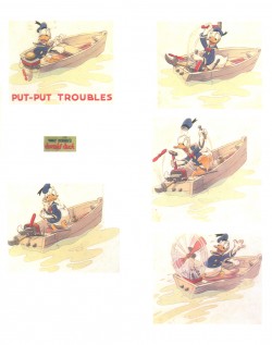
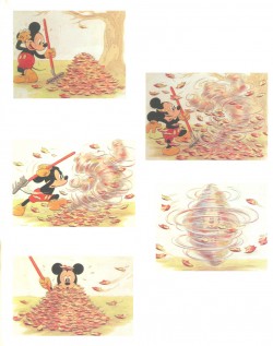
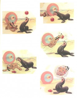
From 1934 continuing into the late 1940′s, they printed four-color full page previews of newly-released Disney shorts. These illustrations were, at first, painted by Tom Wood, and later by Hank Porter.
The Alexander Gallery collected these illustrations in 1987 for an exhibition, and they published a book of them. Bill Peckmann has kindly loaned me his copy of the book.
These illustrations were published recently in the book, Walt Disney’s Mickey and the Gang. It’s a good book which publishes more art than the Alexander Gallery collector’s item. However, the printing in this book feels more glossy and contrasty. The delicacy of the watercolors is sacrificed. That’s why I’m intent on posting them in the better form. However, this book also includes a lot of other info on the animated films and it includes the text originally published in Good Housekeeping.
Here is the second group of pages:
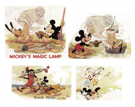
Mickey’s Magic Lamp 1940 | Beach Picnic 1938
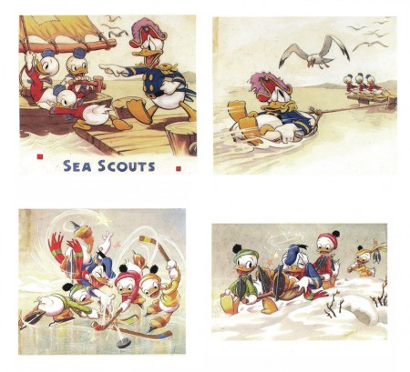
The Sea Scouts 1939 | The Hockey Champ 1939
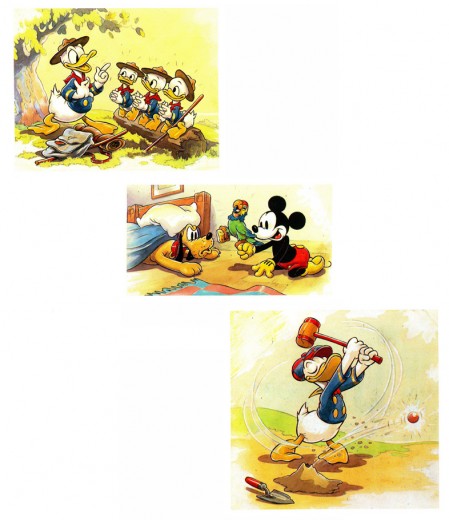
The Good Scouts 1938 | Mickey’s Parrot 1938 | Donald’s Golf Game 1938
Interesting to note the play with Mickey’s ears. These are the ears
with three dimensions used in only a couple of shorts.
Another play on Mickey’s ears – very different.
.
Articles on Animation &Bill Peckmann &Comic Art &Disney &Illustration 20 Aug 2009 07:20 am
Good Housekeeping 1
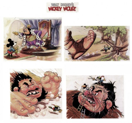
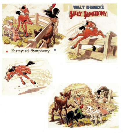
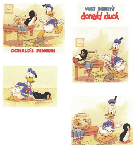
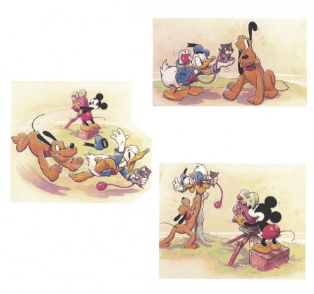
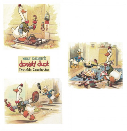
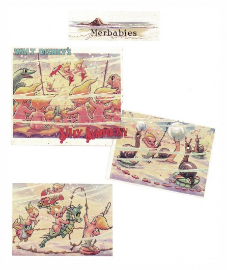
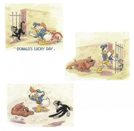
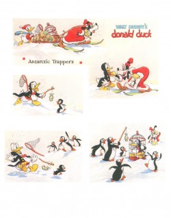
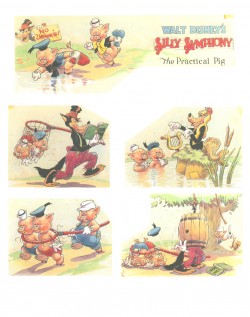
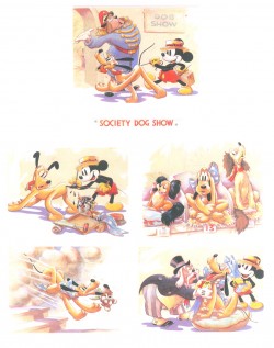
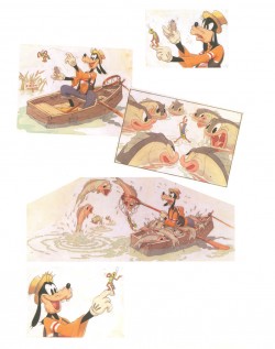
 - From 1934 continuing into the late 1940′s, Good Houskeeping Magazine printed four-color full page previews of newly-released Disney shorts. These illustrations were, at first, painted by Tom Wood, and later by Hank Porter.
Here’s information from the book on Wood and Porter:
- Tom Wood came to Disney Studios in 1932 from his position as a Los Angeles daily newspaper artist. A quiet, hardworking individualist, he was well liked and highly regarded by those who knew him both personally and professionally. He worked at the Studio until his untimely death in 1940 and, as publicity artist, assumed primary responsibility for the monthly Good Housekeeping page as well as the creation of publicity stills for the theater. Since Good Housekeeping was the only magazine for which Disney produced these monthly watercolor sequences, we recognize their scarcity.
Wood typically worked on each of these pages for a full week. Beginning with sketchy, pencilled drawings which he would then ink himself, he also created the final watercolors which represented a 7-minutc Disney film short. Assisted by an “idea man” and a third person who wrote the story or dialogue, the publicity artist had the final approval on the finished version. After Wood’s death Hank Porter would continue working with the magazine well into the late 1940′s. Thereafter, production of these shorts was discontinued as costs became prohibitive and the Studio refused to compromise on quality.
The Alexander Gallery collected these illustrations in 1987 for an exhibition, and they published a book of them. Bill Peckmann has kindly loaned me his copy of the book, so I’ll post the illustrations over a number of posts.
Here are the first group of pages:
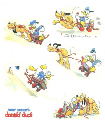 1
1
Donald Duck in “The Delivery Boy” 1938
(L) Donald Duck – Antarctic Troopers 1938
(R) Silly Symphony – The Practical Pig 1938
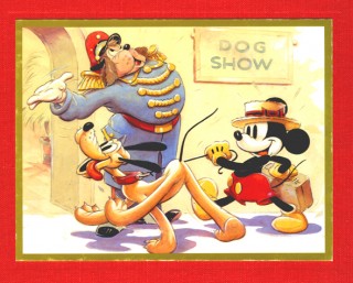
(L) Mickey Mouse – Society Dog Show 19389
(R) Goofy and Wilbur – Goofy and Wilbur 1939
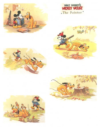
Mickey Mouse – The Pointer 1939
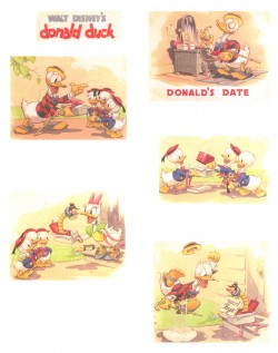
(L) Donald Duck – Donald’s Date 1939
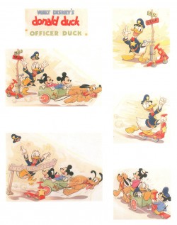
(R) Donald Duck – Officer Duck 1940
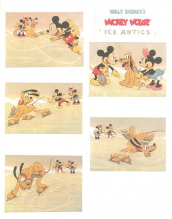
(L) Mickey Mouse – Ice Antics 1940
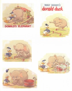
(R) Donald Duck – Donald’s Elephant 1940
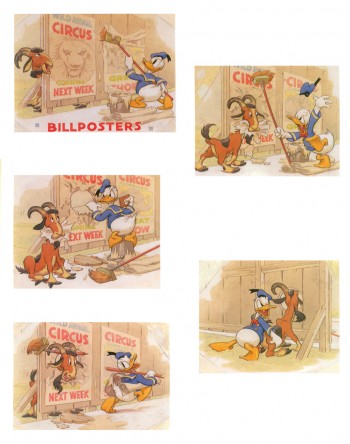
Donald Duck – Billposters 1940
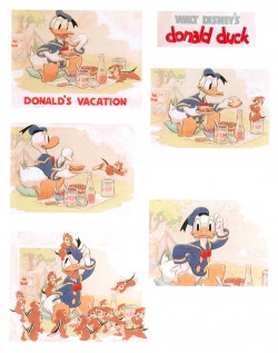
(L) Donald Duck – Donald’s Vacation 1940
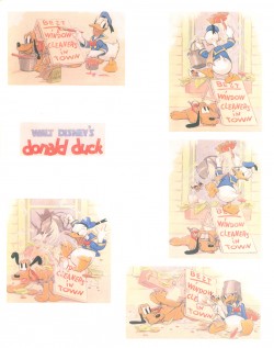
(R) Donald Duck – Window Cleaners 1940
(L) Donald Duck – Fire Chief 1940
(R) Donald Duck – Put-Put Troubles 1940
(L) Mickey Mouse – The Little Whirlwind 1941
(R) Mickey Mouse – Big-Hearted Pluto 1941
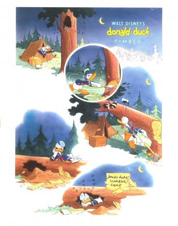
Donald Duck – Timber 1941
Daily post 04 Feb 2008 09:16 am
Some Sites in my Sight
- There are a couple of sites that I visit regularly and don’t mention often enough in my writing. Let me try to remedy that here.
 Tulgey Wood is a fine Disneyana site on which Jim Fanning posts plenty of remarkable material. His posts often get a rise out of me.
Those about actor, Roger Mobley, brought back curious memories. I don’t think I’ve thought about the Disney TV series Gallegher, Boy Reporter in the 40-odd years since it aired.
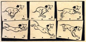
Likewise, his post of the page from the 101 Dalmatians comic book popped that magazine back into my mind all these years since I saw that strip as a child. This is an appealing site that I enjoy visiting.
Every day I stop off at Alan Cook’s blog, Cooked Art. Alan often posts some of his own fine art and he keeps us up to date with the development of his own film. I enjoy seeing his progress. However, he also directs us to other items he sees out there. He informs of interesting posts, movies and art. I usually like to see what he suggests so that I can keep current with the hot spots.
Most recently, Alan has highlighted Randall Sly’s excellent site Character Design. The most current posts there are worth a look. You can see the development of a couple of recent characters. Ursula from The Little Mermaid slowly takes shape through many rejected forms. It really is informative to see. This site also features a lot of interviews worth checking out, and portfolio reviews of newer designers.
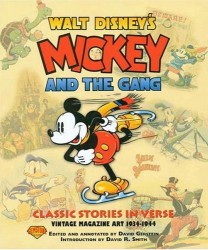 - David Gerstein has an extraordinary site that I haven’t featured often enough. It includes lots of animation history with a number of key pages to scour. I particularly liked one he has which features early animation music.
David has a large number of books on the market that are worth knowing.
His Mickey and the Gang, is an excellent book which was designed initially to collect the Good Housekeeping monthly pages produced by the Disney studio between 1934 and 1944. These pages highlighted the latest Disney release. This book features a lot of information to be found nowhere else. I highly recommend it for any animation or Disney enthusiast.
 My strong interest in Russian animated films brings me often to Animatsaya In English. “Niffiwan” hosts this site out of Canada. It features the latest in Russian animation bringing information about many new and excellent filmmakers, all translated into English.
I can’t tell you how much of a resource this site is for someone interested. Currently featured is a film by artist, Aleksey Karayev. He animates with paint on glass. This is his third film, Dwellers of the Old House, and it’s a gem. The photographs on this site illustrating Norstein’s work methods is a gem. Any fan of this master has to treasure it. For a short YouTube moment, you might look at this Russian commercial by Yurij Norstein.
_
If you haven’t seen the coke ad featuring the cartoon balloons, Amid Amidi has posted it on Cartoon Brew. Look at it; it’s hilarious. Great use of cgi. Maybe there’s a feature in there?
_
Animation &Commentary &SpornFilms 10 Jan 2008 09:45 am
Tyer Breaking Joints
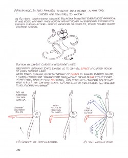
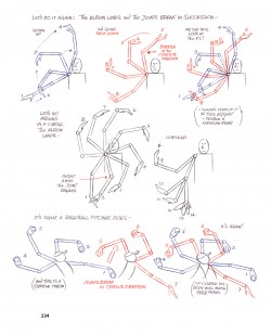
- Let’s talk about the breaking of joints. No, I haven’t entered Tony Sopranoland. This is an animation blog, so I’m obviously talking about the animation principle that deals with the “breaking of joints” to create any arcs or curves in animation. All human action is controlled by this method of movement. A body can only bend at joints – knees, wrists, elbows etc. Any other break is artificial and verboten in trying to make your character seem real. Any animator of the human form would swear by it.
Here’re four pages from Dick Williams’ book which illustrate the principle. Though if you look at his book – all those walks, all those bent wrists – this is one of the backbones of Dick’s training/education.
 1
1 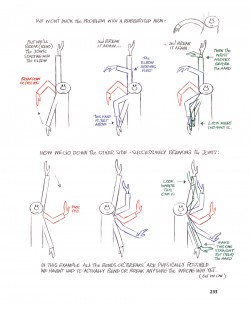 2
2
___(Click any image to enlarge.)
_
 3
3 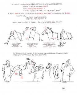 4
4
This is something I learned early on – long before I entered the business professionally.
I wasn’t sure it was spelled out in the Preston Blair book and went back to see, but it wasn’t. I don’t know where I originally read about it, but I must have somewhere – probably one of those old animation books I’d borrow from the library.
I’m sure they created it when animators at Disney in the early 30′s decided to get rid of the rubber-hose animation they’d been doing. It was a bit of rebellion. They followed the natural rules of physics. Today anything other than this would be the rebellion.
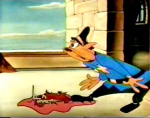 The one guy who broke this rule, and is just about idolized for it today, is Jim Tyer. His many distortions and odd working of his characters was an end in itself. This is probably what I liked about him.
I’ve always seen animation as a way to caricature life not to recreate it.
Sidenote: This is why I don’t like most cgi films. They’re just trying to reproduce their form of life. Sure, Surf’s Up got those waves down pat; it’s almost perfect. Unless, of course, you’re looking for them to say something about waves rather than realistically rendering them and their movement.
Sorry, I respect it, but it’s like super-realistic painting done today; I have difficulty getting into it.
Animation is drawn. Drawing invites nonsense – even in the most serious of situations.
Tyer uses his graphic distortions to make scenes funny. In Fritz the Cat he handled some serious scenes with a quieter distortion, though it’s there just the same. It’s the acknowledgement that we’re watching an animated film that gets me charged. I like being in the moment and outside of it all at the same time.
Does that make sense?
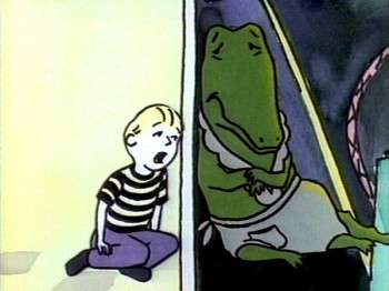 Lyle Lyle Crocodile was about a housekeeping, dancing crocodile that shares his house with a child. When his original owner comes to take Lyle away, the child gets upset, sings a song of remorse and cries. Lyle hides in a broom closet while the child sings from the other side of the door. I chose to view this as a cartoon. For god’s sake, it’s a cartoon crocodile that dances! For anyone who wants to see it, I’m mocking the situation. Visions of candy canes and ice cream cones dance around the croc’s head as he remembers the good days. I asked the composer to use a harmonica and a saxophone to pull the tears. Every time I see the scene I laugh hysterically. Most audiences don’t see this, and they weep for the boy and his pet.
This is what I love. Something for me and something for people who don’t want that extra bit of separation. It’s actually a hard thing to pull off, but it’s great when you do.
The same bit is true about the breaking of joints. In every film, I go out of my way to break that rule and see if it’s noticeable. I’m not even trying to be as blatant as Jim Tyer. To be honest, I don’t think it is noticeable, although I see it every time. Tissa David hates when I do such things, but I can’t help it. I love the graphic distortions animation encourages, but I also love the rules of behaviour that help me tell staid stories. Hey, it’s great being the boss of me.


