Animation Artifacts &Disney &Frame Grabs 17 Jan 2013 07:20 am
Mickey Mouse Club Abstract
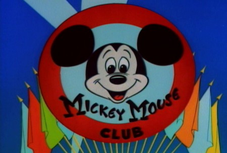
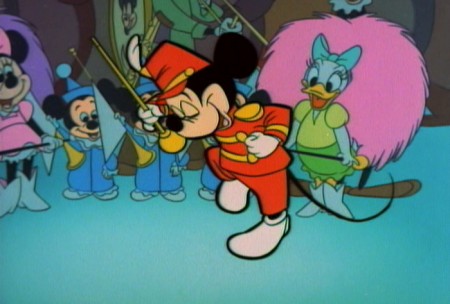
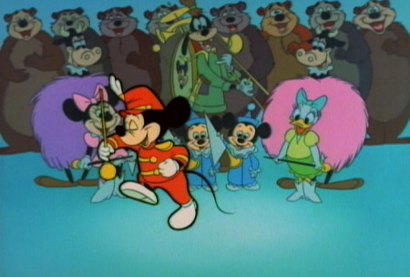
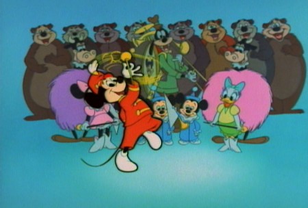
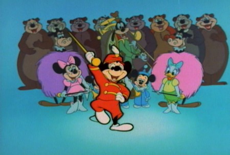
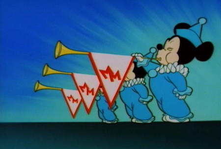
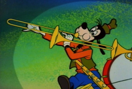
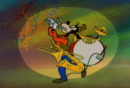
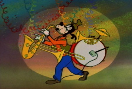
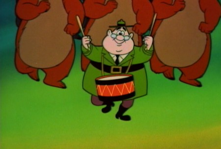
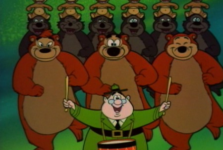
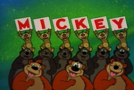
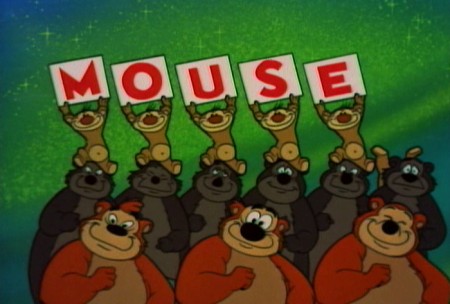
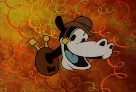
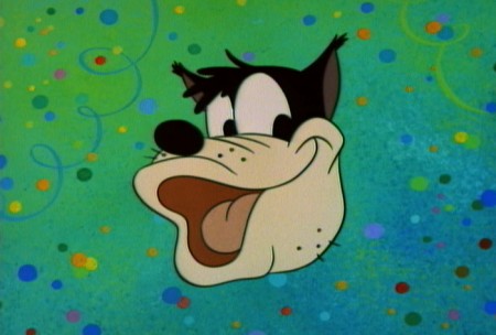
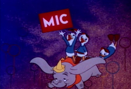
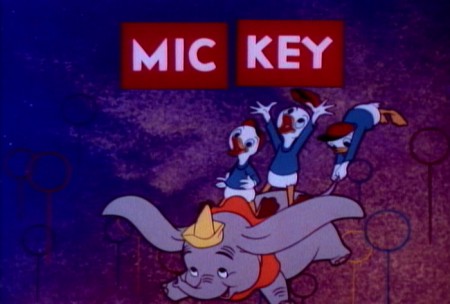
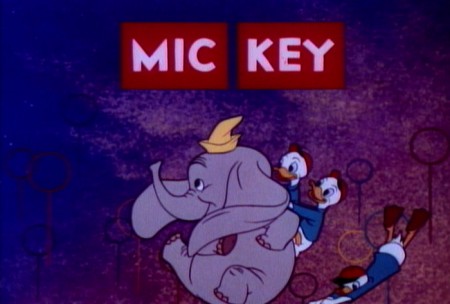
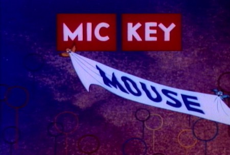
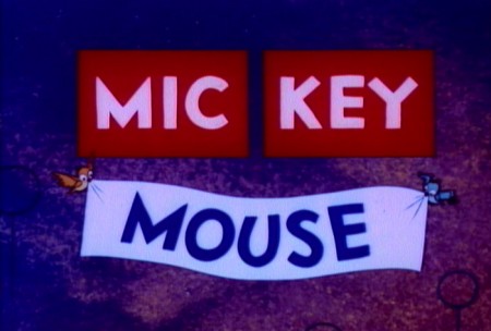
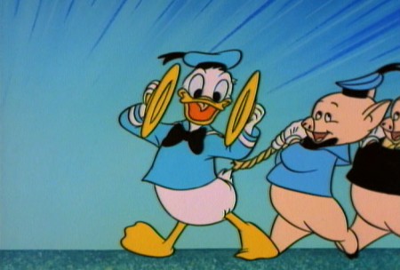
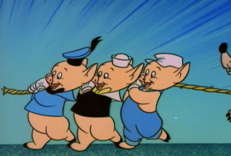
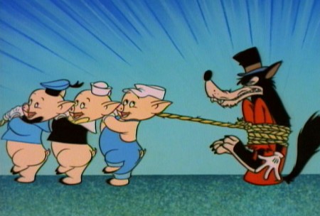
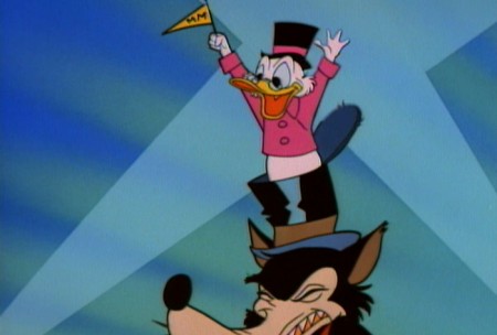
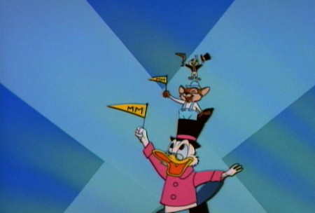
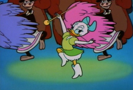
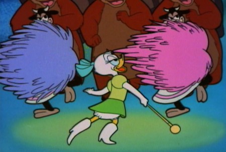
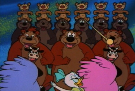
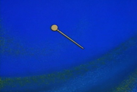
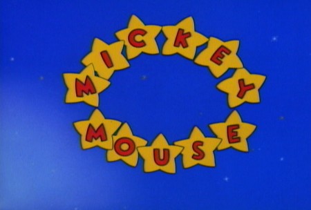
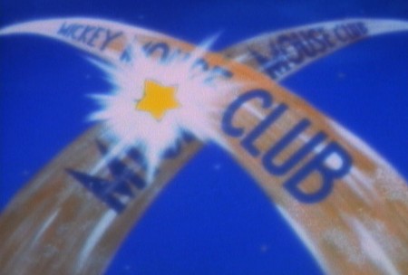
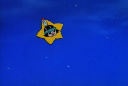
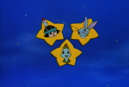
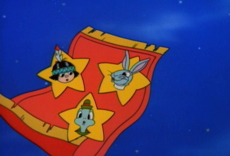
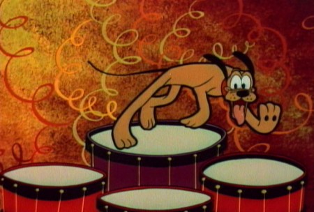
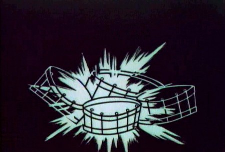
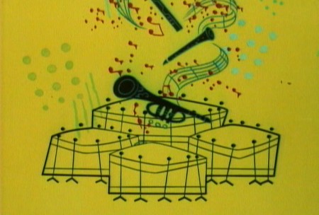
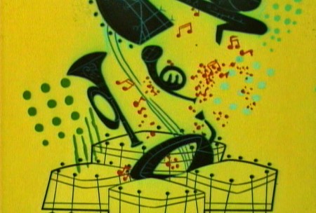
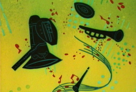
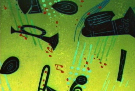
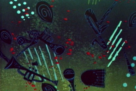
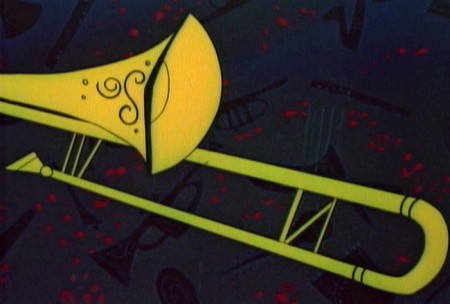
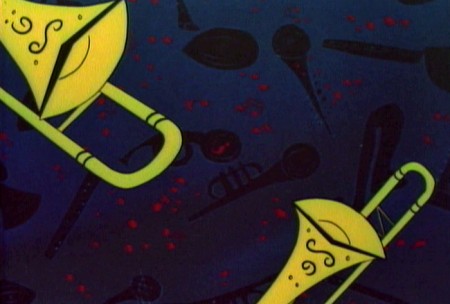
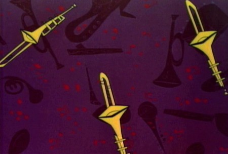
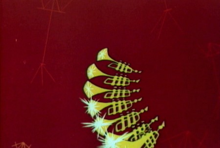
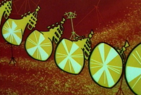
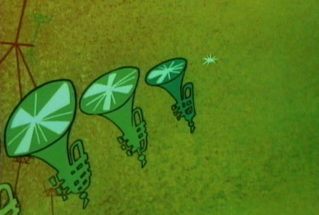
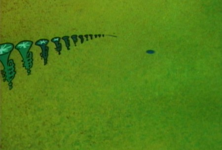
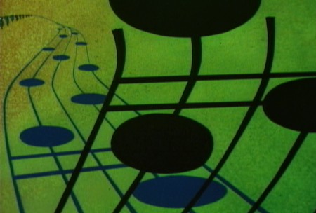
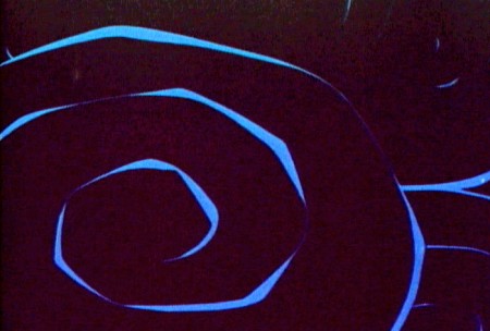
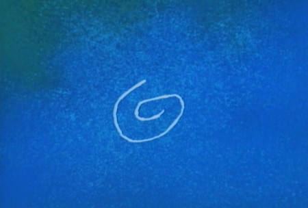
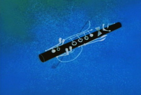
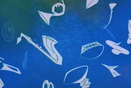
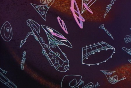
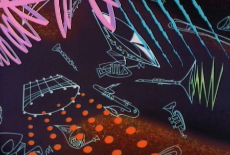
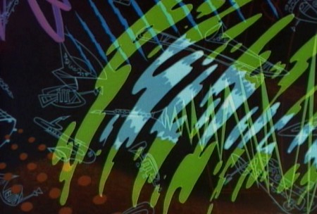
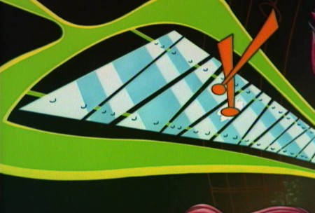
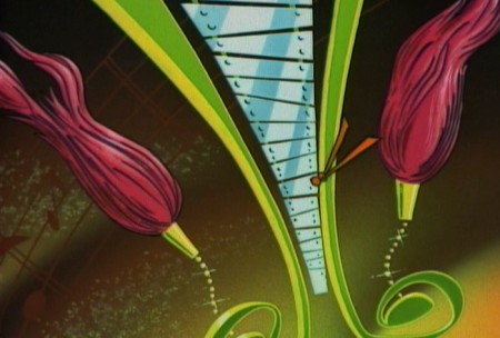
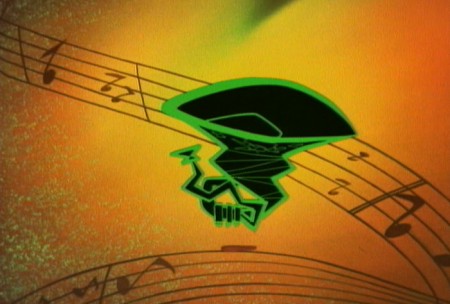
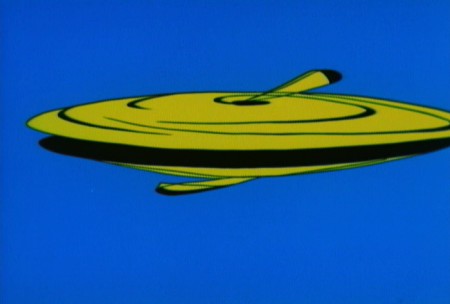
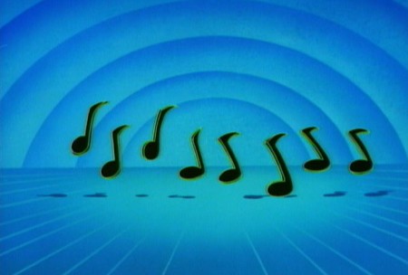
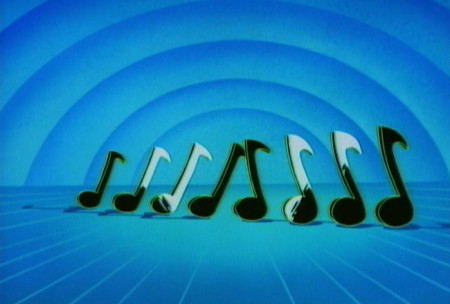
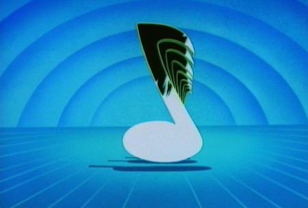
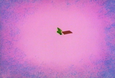
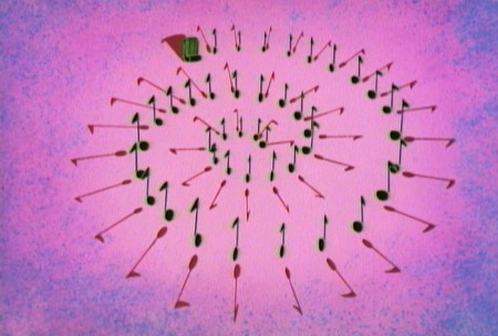
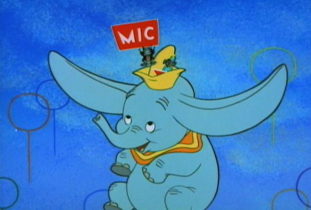
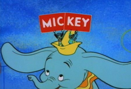
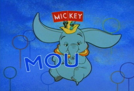
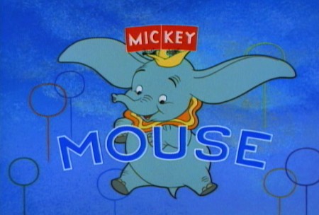
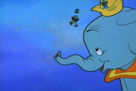
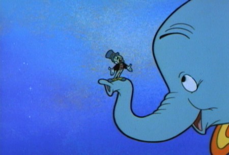
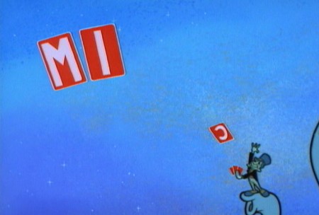
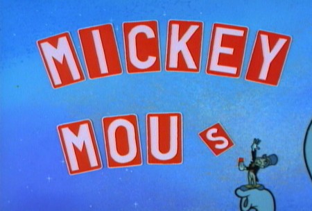
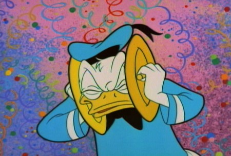
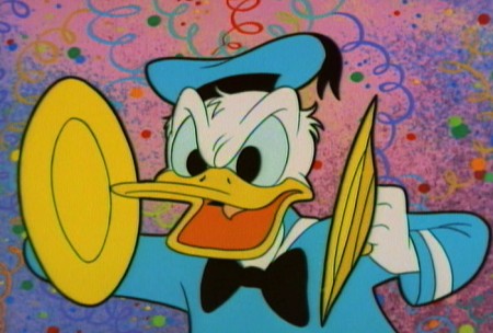
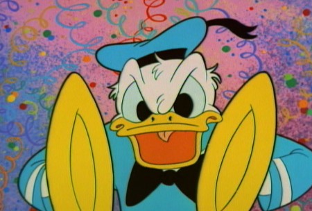
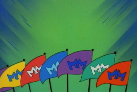
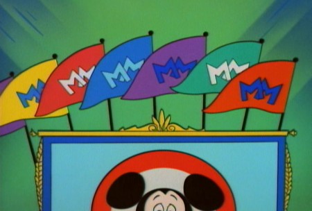
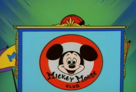
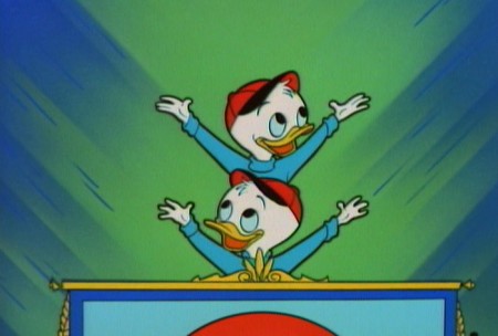
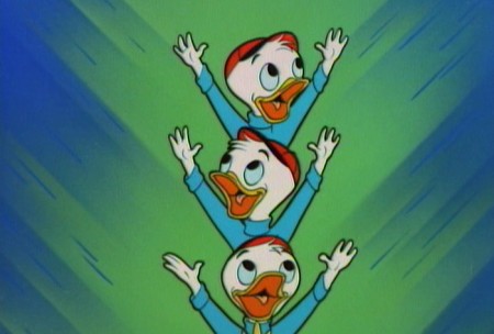
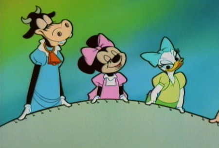
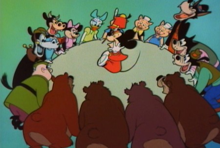
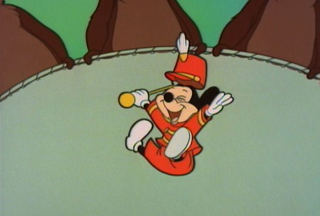
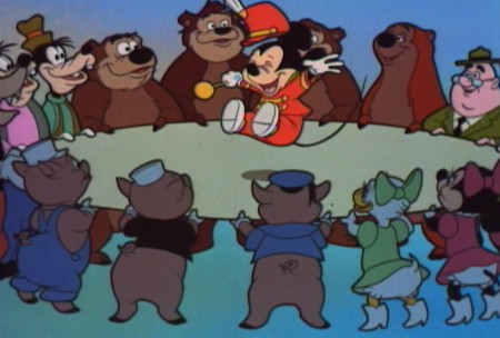
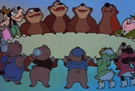
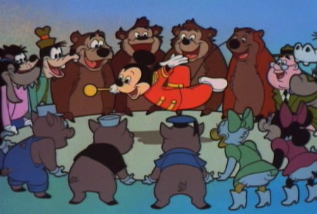
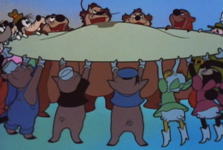
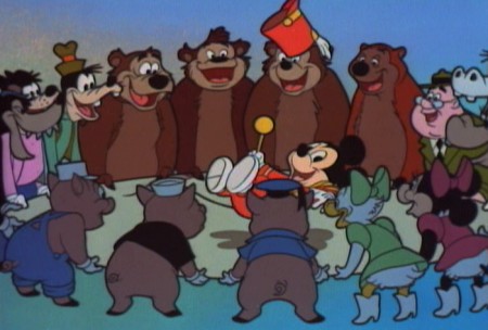
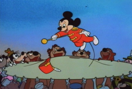
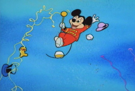
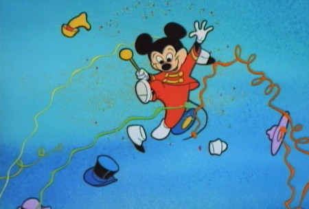
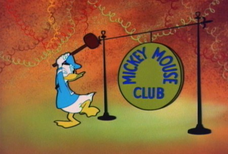
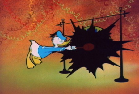
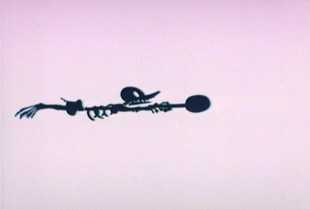
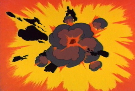
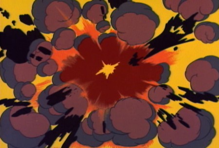
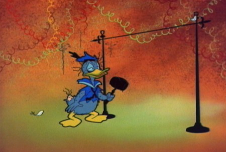
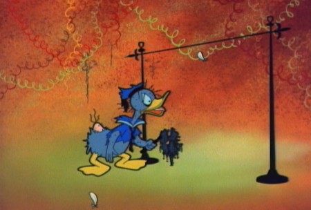
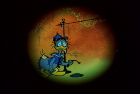
- Back during the black out of Hurricane Sandy (when we had no electricity or heat), John Canemaker invited us up to his apartment to use his computer so that we could check email etc. I spent a nice couple of hours with John that day, and one of the things he pulled out was the DVD of the Mickey Mouse Club. (One of those expensive, tin boxes I didn’t own.) On the extras of the program was a colored version of the animated opening to the show. The original Mickey Mouse Club aired in B&W, which is how I remember it. It was fun sitting through that piece of animation, and I was charmed by a somewhat abstract section, a musical interlude that was rarely shown in the B&W version. It reminds me of Toot Whistle Plunk & Boom in its styling.
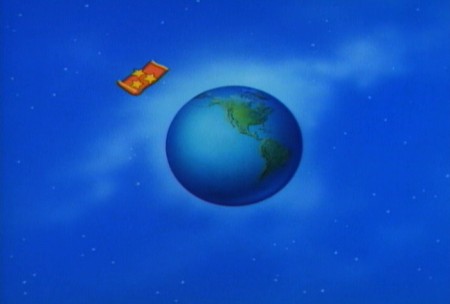
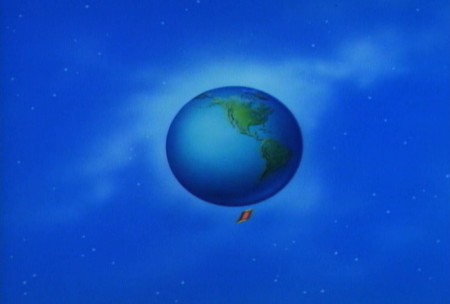
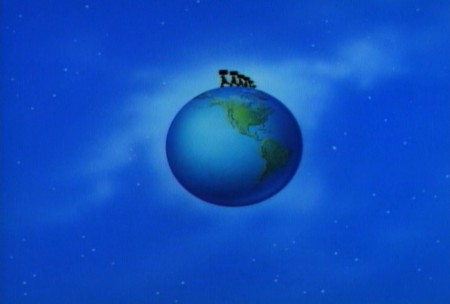
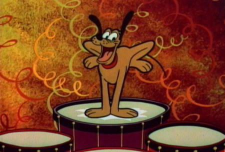
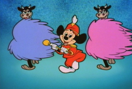
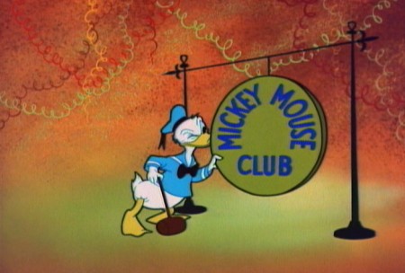
I recently bought a copy of that DVD and went directly to that extra. I’ve pulled some frame grabs of the center sequence and will post those here. But then I couldn’t stop there. I went back and did the entire piece. The abstract sequence stands away from the poorly designed Mickey, Donald & Goofy. Those thick outer lines against the thin inner lines reminds me of the bad imitation UPA art that was going on at the time. It was their idea of “modern art,” I guess.
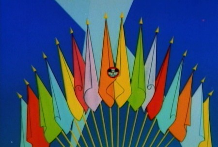 1
1
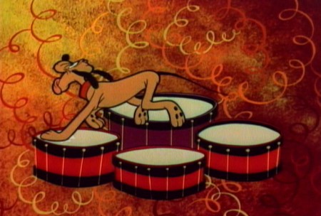 44
44
Pluto’s drums burst in a B&W flash.
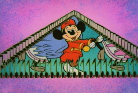 75
75
Mickey comes back in with an awkward optical.
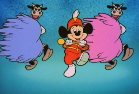 77
77
. . . and the song continues.
I wonder if Ward Kimball had anything to do with this.
Ken O’Connor was the Art Director for Kimball including:
Mars and Beyond, Man in Space and Man and the Moon
Victor Haboush was the Asst. Art Director, and he had an important role
in the Mr. Magoo TV show as well as the Dick Tracy show back in 60s.
He was also the Art Director on Gay Purr-ee.


on 17 Jan 2013 at 9:26 am 1.John said …
The first time I saw the color version was back in the 1970s, when Disney did their Mickey Mouse Club revival, using the original opening. By the mid-60s when the original show was in repeats TV already was pairing back extended show openings/closings, so it’s no surprise the abstract sequence and part of the initial chorus of the song fell to the editing knife.
on 17 Jan 2013 at 10:27 am 2.Oswald said …
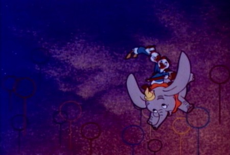
I always thought that the heavy black outline was there to make sure that silhouettes read on a black and white tv screen (low res, low contrast) as well. Such thick outlines can be seen on almost any tv animation of the period. Much of the color work in this intro does not look like it was really conceived for black and white (Dumbo in frame 83, for example). In fact, Disney paid more attention to contrasting values (dark characters against light BG and vice versa) in about every theatrical feature at the time, even though those were hardly ever shown in black and white.
I don’t think that thicker outlines are necessarily a bad thing in illustration, but with moving characters they tend to be distracting.
on 17 Jan 2013 at 4:56 pm 3.Ray K. said …
Those “hep, daddy-O” angular musical instruments are even more obnoxious than the ones in “Toot, Whistle, Plunk and Boom.” It’s an unwitting poke in the eye of progressive design — the petulant, superficial concession to fashion of a lazy man with no wish actually to understand or respect it.
(They DID get it, finally, by “One Hundred and One Dalmatians” — after the growing pains of “Sleeping Beauty”; but the era of the studio’s first efforts and becoming “modern” was more or less an embarrassment.
on 17 Jan 2013 at 5:34 pm 4.Michael said …
I think they pretty well got it with SLEEPING BEAUTY too, thanks to the dictatorial reign of Eyvind Earle. No designer ever had that power before or after him, and he took full use (or abuse, if you don’t like it) of it.
It wasn’t Picasso but neither was Picasso. And it was more original than stealing from Steinberg.
on 18 Jan 2013 at 6:22 pm 5.Floyd Norman said …
The Disney house style was entrenched and one would have to fight long and hard to create anything progressive at the studio. Even those who were successful were not always rewarded. The brilliant Eyvind Earle was pretty much shown the door after Sleeping Beauty.
I’ve written about the efforts of Victor Haboush, Walt Peregoy, Tom Oreb and others. The battles continued into the sixties when we hoped to do something more progressive in Mary Poppins, but to no avail. Don’t be too hard on the Disney designers for their “lazy” approach to design.
on 18 Jan 2013 at 7:09 pm 6.Michael said …
Of course, ou’re right Floyd. Any large studio would be set in its ways, and the new always takes a back seat to the progressive approach. I remember my delight when I saw Windwagon Smith on the big screen. It played with the other Disney short, A Symposium on Popular Songs. That film had both the new and the old (like all of the Justice/Atencio films). I went to see PT 109 and got two exciting Disney shorts for the same price. Both shorts showed me that there could be some small change coming to Disney.