Animation Artifacts &commercial animation &Layout & Design &Models &UPA 21 Nov 2012 06:56 am
Robert Lawrence Prods. – part 1
- Robert Lawrence Productions was a thriving studio in New York in the days post-UPA. Many of the animators moved from UPA, once they closed, to Robert Lawrence. Grim Natwick/Tissa David worked there (freelance), Lu Guarnier/Vince Cafarelli worked there, and consequently, Vince collected a lot of artwork from the spots he did. This post features a lot of that artwork. You’ll see how great the design and styling was at the studio, even though I don’t know what clients or sonsors they were done for. The designers certainly took off where UPA left off.
But first, let me share two in-house studio gags done at UPA.
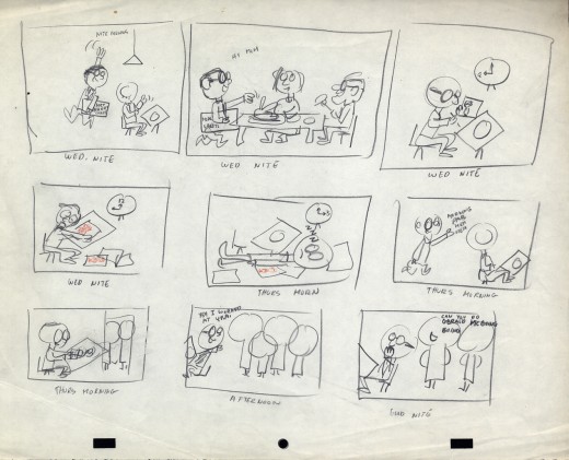 1
1
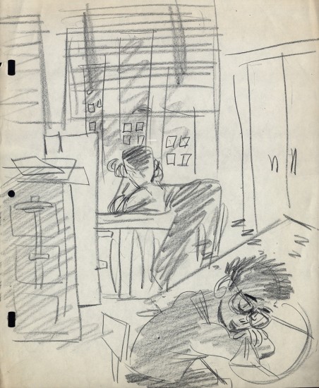 2
2
At UPA – NY, Lu Guarnier was the only animator
who had a window. Vince Cafarelli and Pablo Ferro
were Lu’s Assistants/Inbetweeners, so they also
had the luxury of a window.
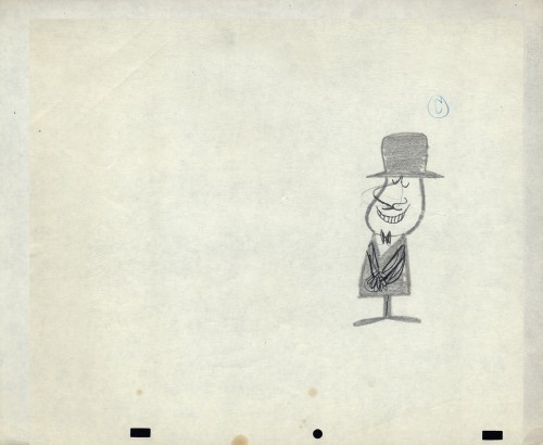
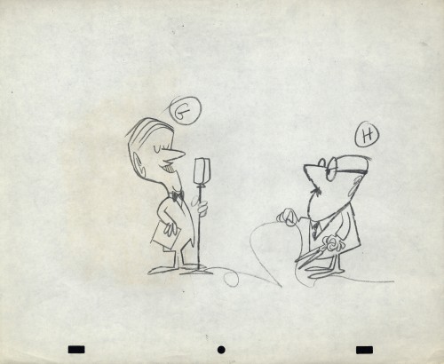
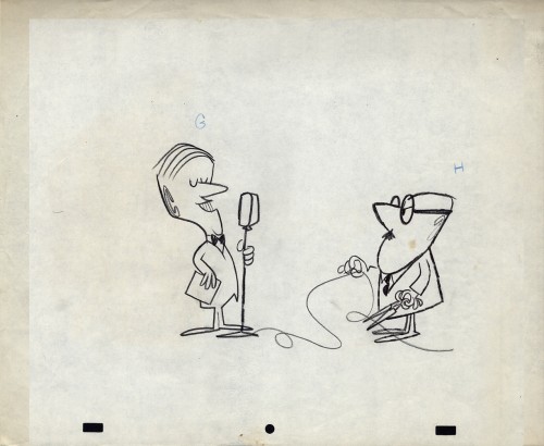
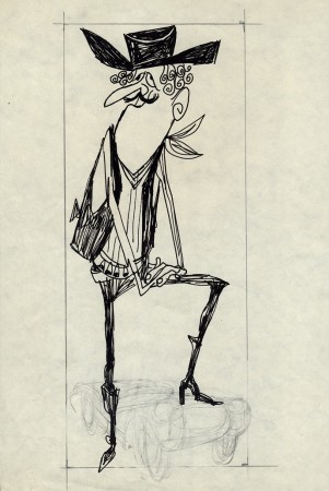
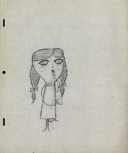
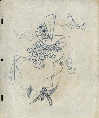
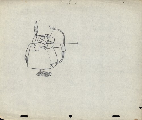
- OK, now onto Robert Lawrence. The more I look into this company’s work the more impressed I am. The quality of designers and animators on board was extraordinarily high. I have a lot of Layouts for films that are completely lost. I’m not sure what most of the images are for or what the stories of the spots was. I just have drawings, and most of them are impressive, even more so in some ways than much of the UPA work I’ve seen.
So let’s take a look.
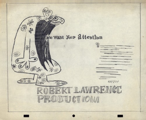
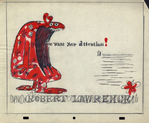
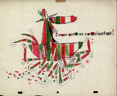
First there is the promo art. As an introduction to the company, here are four self-promo pieces that were used as trade ads for the company.
I’ve assumed that these images were created for a print ad in some magazine or another. There are three of them; one comes in a 2-color version.
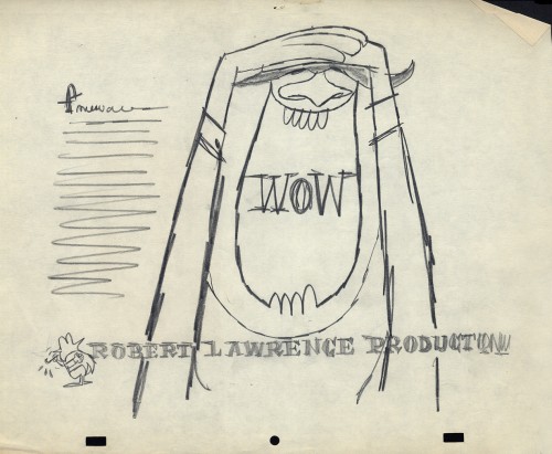 1
____________________________
1
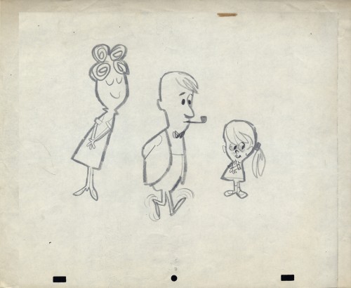
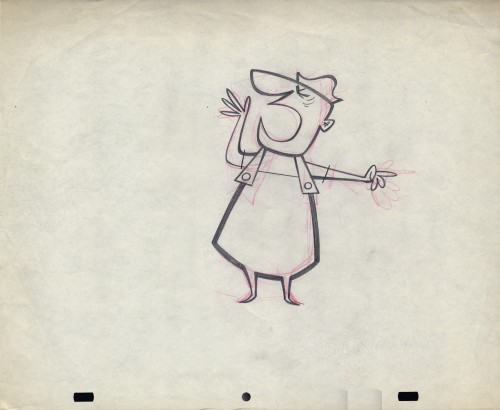
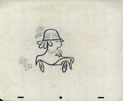
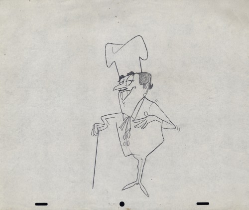
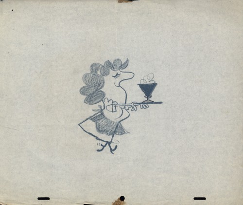
____________________________Now we get into some of the fun stuff. Here are the layouts done in a million styles, all beautifully drawn and designed. I feel like I want to say thank you to some of the artists involved. If only I knew who the artists were. The drawings and cels were all done on paper with a “Signal Corps” hole-punch. (Looks like Oxberry, but the center hole is the same diameter thickness as the square pegs.)
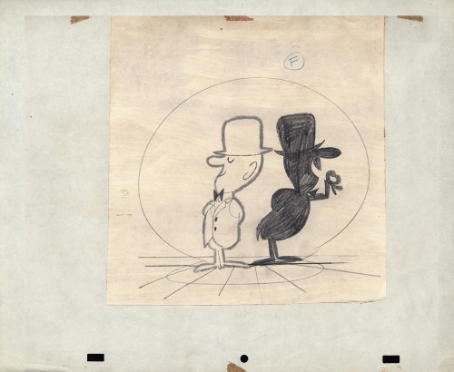 1
1This is a beautiful gag told a million times,
but done perfectly in this drawing.
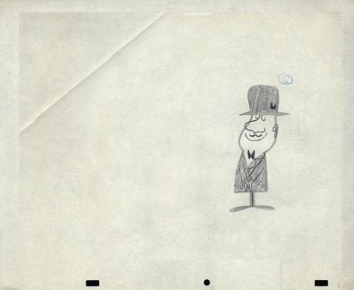 3
3
The inked arms in #1 are the variant. (Possibly a correction?)
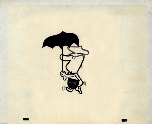 4
4
A cel not opaqued but beautifully inked.
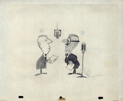 5
5
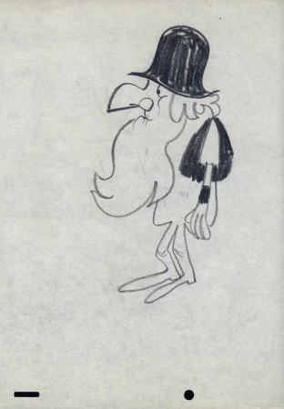
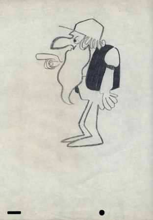
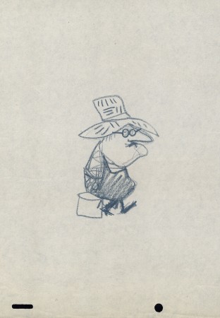
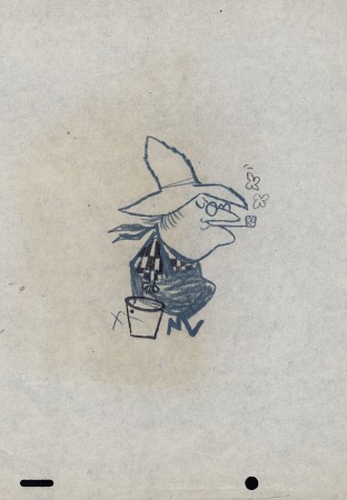
Obviously #5, 6, & 7 are the same characters in development.
It looks like #5 is probably the finished model.
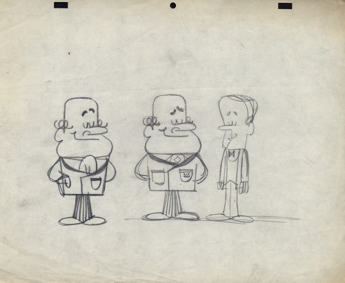 10
10
This looks a bit like Howard Beckerman’s style, but I’d
probably bet against that. The characters aren’t cute enough
 12
12
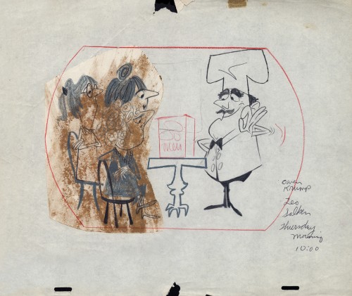
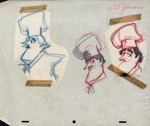
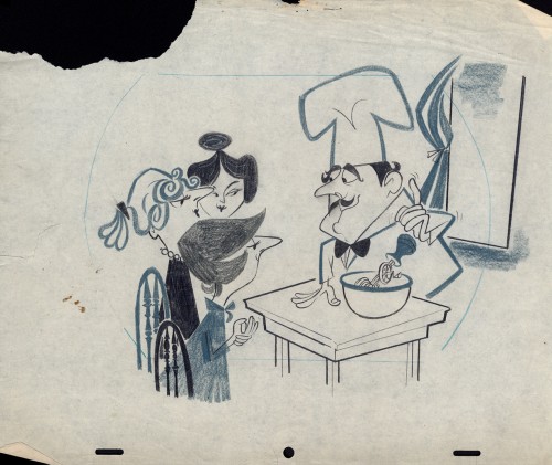
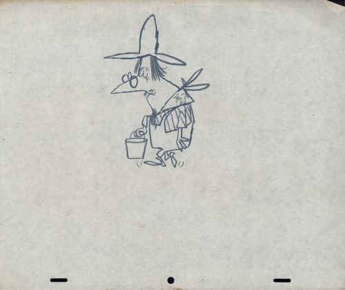
There’s a whole series of chef models
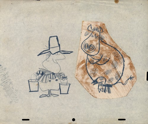
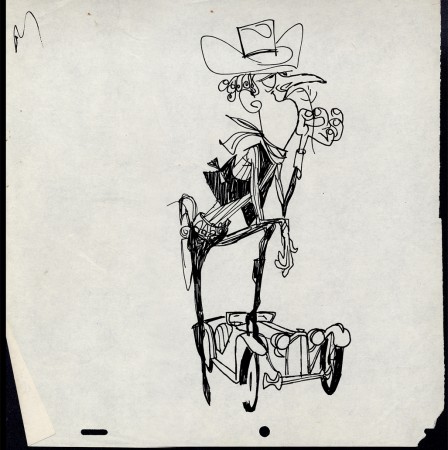
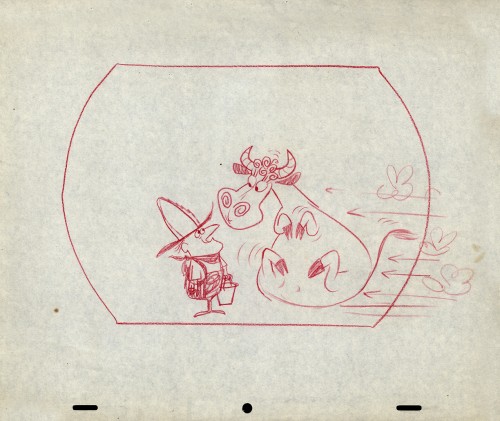
Then there’s a series of Cowboys.
 24
24
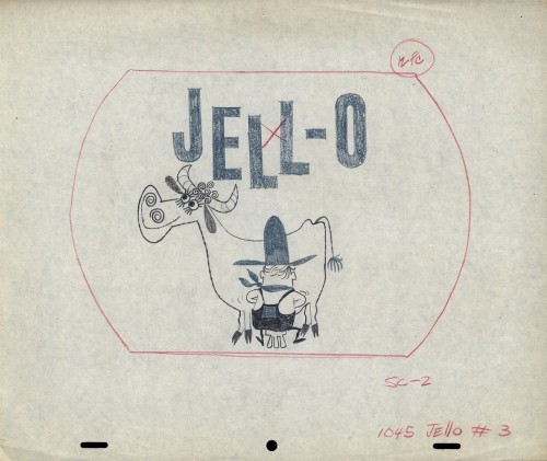
Then there’s the farmer milking the cow. Casting problems.

on 21 Nov 2012 at 7:56 am 1.D.M. Yowp said …
I suppose Gene Deitch could tell you more. He joined Robert Lawrence in March 1956 as creative supervisor, with responsibility as well for Grantray-Lawrence on the other coast.
A neat little piece by Lawrence in an old edition of Billboard (July 1, 1957) goes into his background. He was the east coast vp for Jerry Fairbanks until he struck out on his own in 1952. He was doing industrials in addition to commercials by 1957. His Canadian studio was in operation by then.
on 21 Nov 2012 at 10:26 am 2.Vik M. said …
Wonderful piece! I’d love to know more about the Lawrence studio and its artists! What fantastic drawings! Thank you for sharing them.
on 21 Nov 2012 at 10:35 am 3.Ignacio Ochoa said …
Terrific character desings!!
Great stuff!!
Thanks.
on 21 Nov 2012 at 11:24 am 4.Ray K. said …
Beautiful and accomplished work–a treat for the eyes!
on 21 Nov 2012 at 2:42 pm 5.Larry Ruppel said …
What’s incredible is how appealing so many of the character designs are – you want to see them moving or, if you’re an animator, get your hands on them and start animating!
on 21 Nov 2012 at 8:35 pm 6.Andreas Deja said …
Incredible drawings!
Very inspiring, thank you!
on 21 Nov 2012 at 10:40 pm 7.hans bacher said …
these are masterpieces, michael. and they look drawn so effortless. I am grateful that advertising made that possible in those years. hope you have some more…thank you
on 22 Nov 2012 at 4:18 pm 8.Tom Minton said …
A nice use of grays is evident in this selection of designs, a skill that sort of fell by the wayside once broadcast television went full color a few years after these examples were presumably drawn.