Animation Artifacts &Bill Peckmann &commercial animation 31 Aug 2012 05:51 am
Combs and Plotzen – Part 2
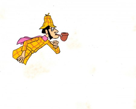
- Last week, Bill Peckmann forwarded a number of pieces of art by Rowland B. WIlson which was preliminary work for a commercial at Phil Kimmelman and Associates. The commercial, for Vote Toothpaste, was a parody of Sherlock Holmes called Combs and Plotzen. More art surfaced this week for that spot, and I thought it worthwhile to extend the post for a second part. (See Part 1 here.)
Bill Peckmann writes:
- Combs & Plotzen was the second TV commercial that print cartoonist Rowland B. Wilson designed in 1969 and his grasp of the animation production steps was truly amazing. No crash course in storyboarding, model charts, Layouts etc. was necessary. It was like he was doing it all of his life. We were in total awe.
- At that time, Rowland was always very comfortable doing his animation drawings on the paper he knew best, tracing paper. He would work up roughs on layering tracing paper panels without having the need of a light box. No pegs for him in those days.
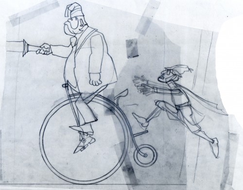 1
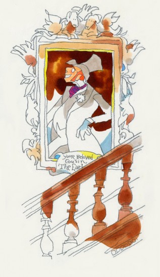
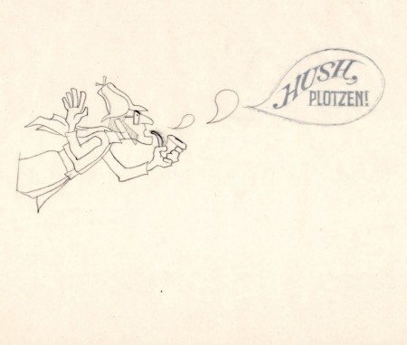
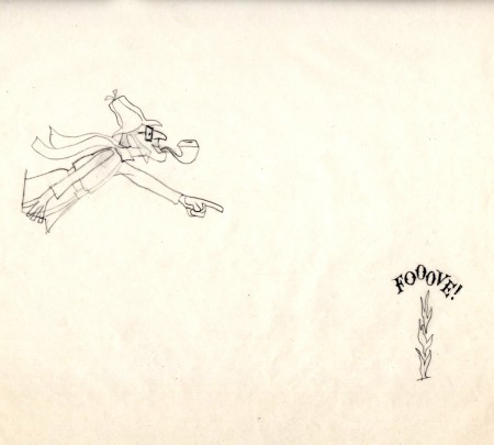
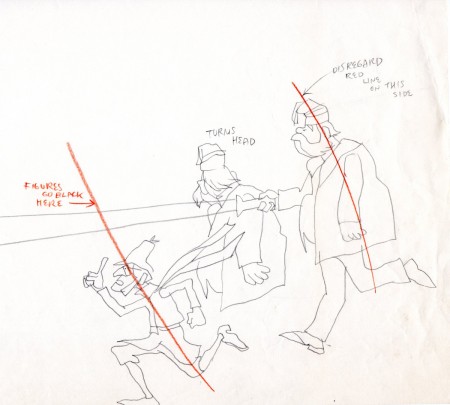
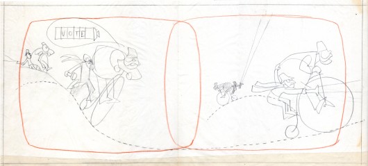
1These first five drawings are Layouts by Rowland Wilson.
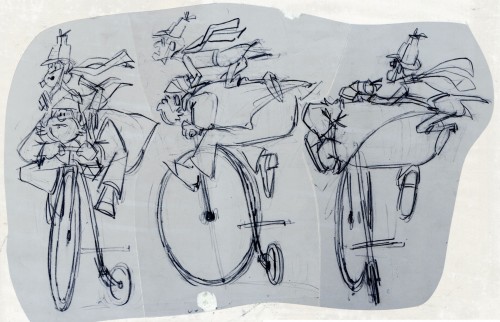 6
6
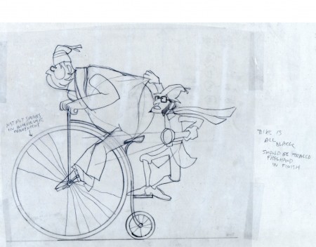
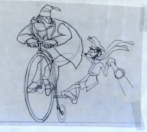
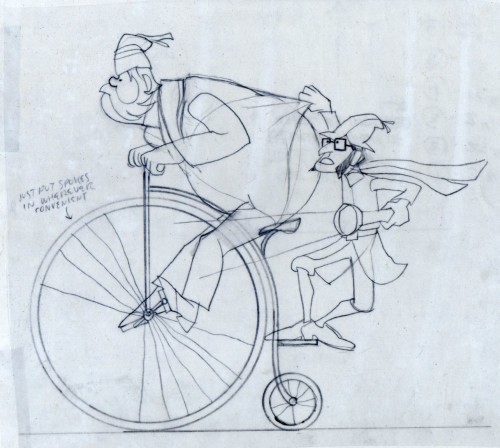
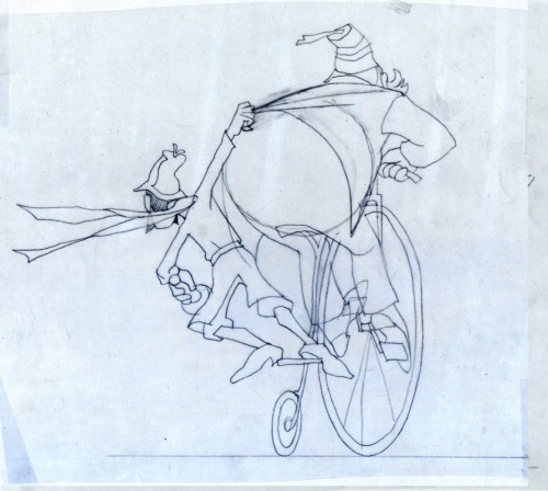
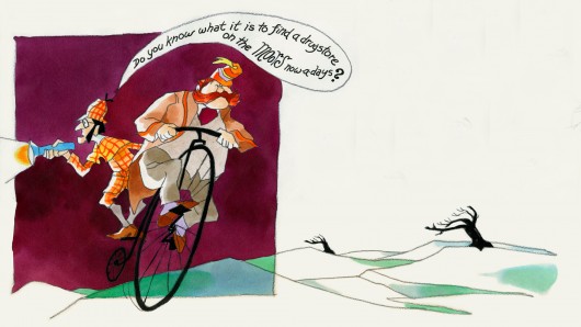
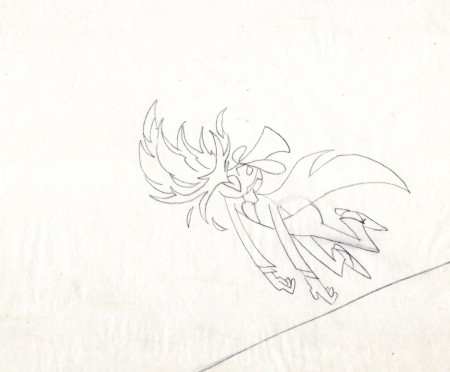
These are Jack Schnerk‘s roughs of the bicycle scene.
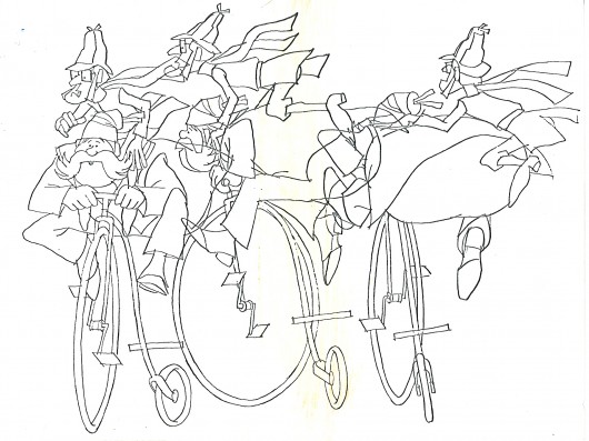
These are Bill Peckmann’s clean ups of Jack’s roughs.
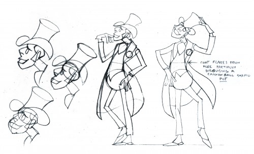 8
8
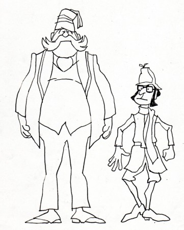
A model sheet from Rowland Wilson.
 9
9
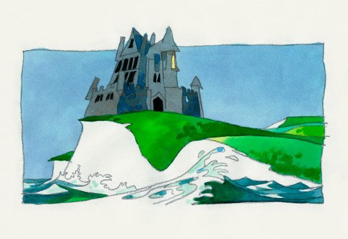
These three color sketches are in the new book,
Trade Secrets, by Rowland Wilson and Suzanne Lemieux Wilson.
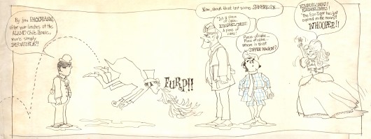
I found the original drawing I did of the crew that worked on Combs & Plotzen
way back then. It’s Vic Barbetta commenting on my lunchtime eating habits,
Jack and Phil’s anticipating the most important part of the day, the coffee wagon
bell, and Agnes hearing the good news of not having to draw anymore tiger stripes.
.
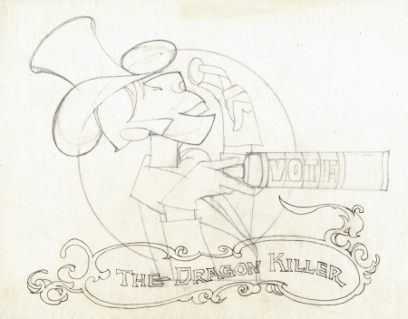
At the time that Rowland designed his Utica Club Beer ‘Mountie’ spot, he also did another U. C. Beer spot where the two adversaries were a Knight and a dragon.
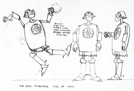
Unfortunately the only remaining piece that
I have from it is this stat of the Knight.
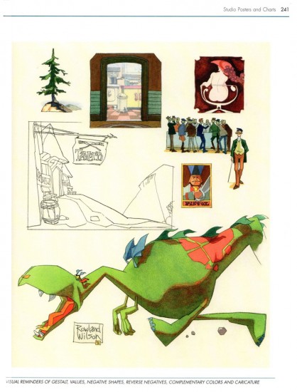
As for the dragon, all I can do is show you this page from
Suzanne Wilson’s ‘Trade Secrets’, where Rowland didn’t
forget his old friend from that commercial and gave him a
new coat of paint. One of his best character designs ever.
The tavern panel is a bg. from the same spot.
The Vote spot starts at 0:37 on this Jack Schnerk sample reel.

on 01 Sep 2012 at 1:41 am 1.Denis Wheary said …
Thank you for showing the Combs & Plotzen Vote Toothpaste materials. That commercial is one of my favorite films. Seeing Rowland’s work with Jack Schnerk’s rough animation and Peckman’s clean ups, gives me an appreciation for their respective roles in and contributions to the making of this little gem. Absolutely tops! I liked that castle on the moors so much in the YouTube video that I painted my own version two years ago so I could look at it every day. Now I can study Rowland’s original in detail. He captured the essence of a castle on the cliff yet his drawing is simple, free and it look easy.
RBW made 30 second mini classic films, with setting, characters, plot, resolution… splendid examples of all the insights found in his (and Suzanne’s) Rowland B. Wilson’s Trade Secrets book. And while I’ve never had access to the products, I will always remember Utica Club beer and Vote toothpaste, just as his New England Life (of course) ads are stuck in my brain forever. Designer, filmmaker, cartoonist and AD-man, RBW was an all around remarkable communicator.
I would love to see that Utica Club dragon and knight commercial. I wonder: does Jack Schnerk’s daughter have another sample reel of his studio’s work that she would share?