Frame Grabs &Models &UPA 14 May 2012 05:16 am
Magic Fluke Color Continuity
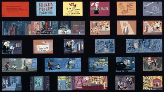
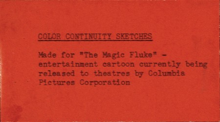
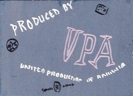
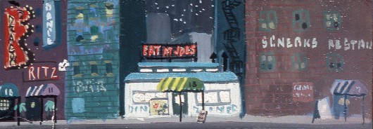
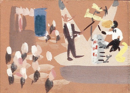
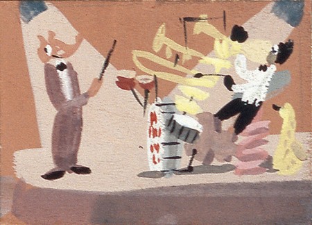
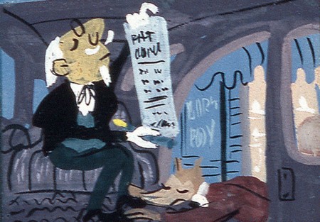
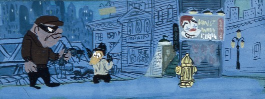
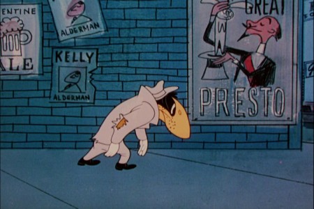
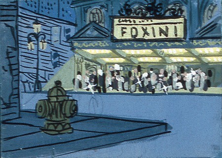
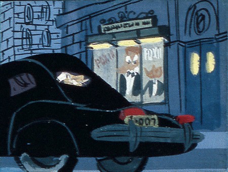
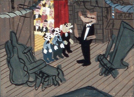
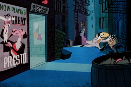
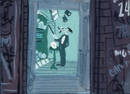
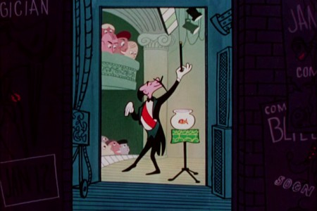
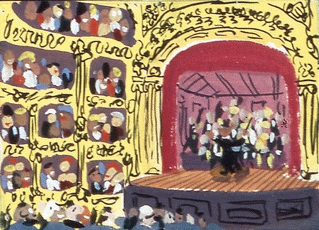
- The UPA Jolly Frolics DVD set includes a set of extras which showcases a good deal of artwork from the films. For the Fox & the Crow film, The Magic Fluke, there is a color continuity board by Herb Klynn which indicated how the art should be painted for the individual scenes.
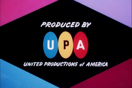
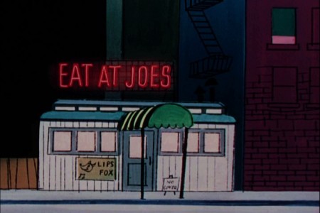
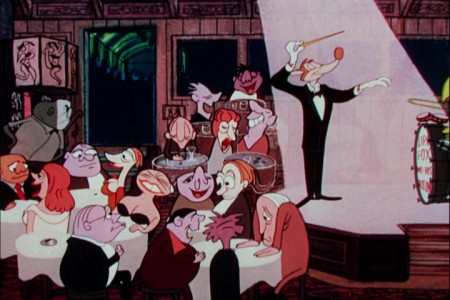
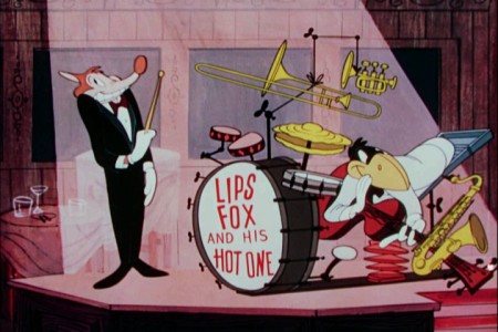
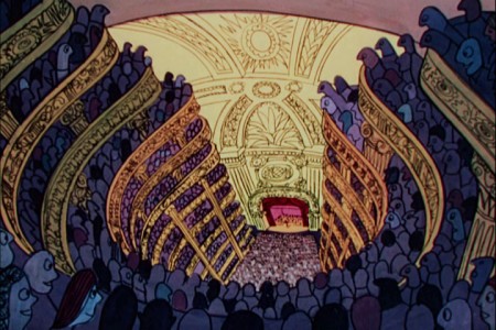
This gave me the opportunity of putting the finished film side-by-side with the color continuity boad and find out where they diverge. (The numbered images with a letter attached {e.g. “2a”} are frame grabs from the movie.)
 2
2
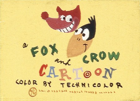
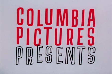
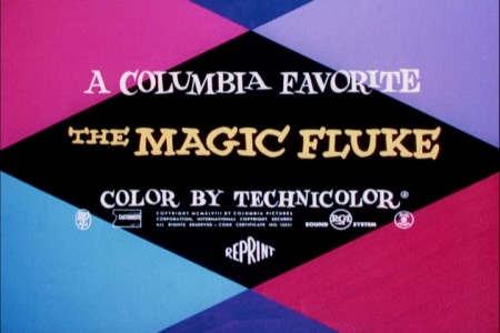
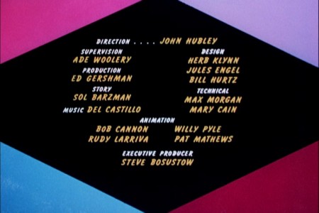
The differences start with the titles, right from the get go.
 3
3
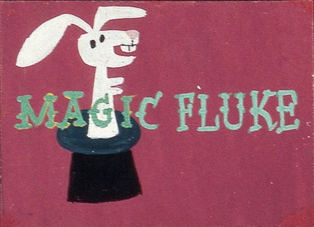
The color continuity board is much more creative.
 4
4
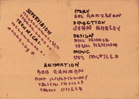
The final titles are a little dull. Fortunately, UPA’s films got
more creative with their titles once they really got going.

The final BG has the same move and ends with a truck in . . .
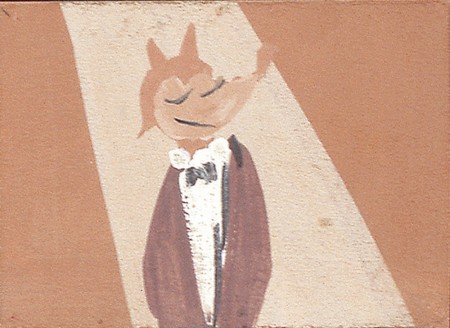 9
9
There’s no close up in there now.
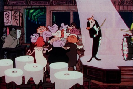 9a
9a
The audience pops from listeners to jazz dancers.
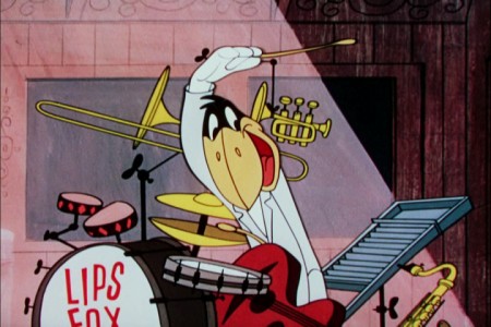 10b
10b
There is a close up of the crow playing wildly.
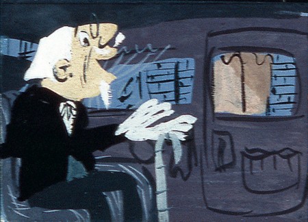 11
11
The impresario is no longer in the film.
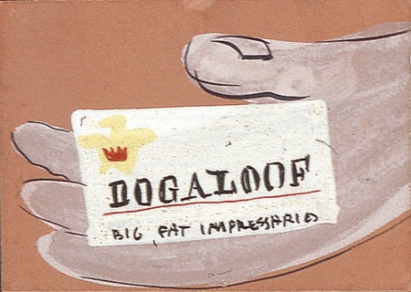 12
12
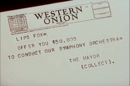
And he message comes from a taxicab, not a limo.
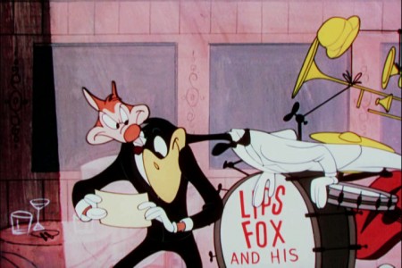 13b
13b
The fox reads the telegram from the stage and hides it from the crow.
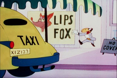 13c
13c
The crow chases the fox out the door as he leaves in a cab.
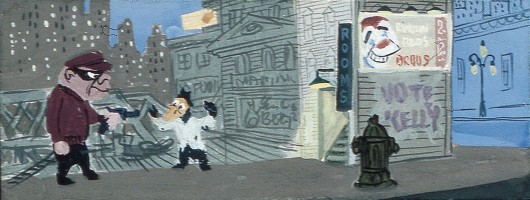
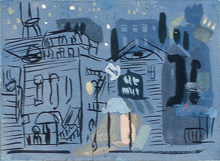
there’s no robbery in the film now. It just rains on a blue street.
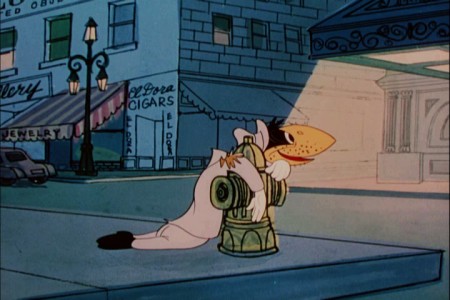 18a
18a
The crow ends up at the spark plug down and out.
He sees . . .
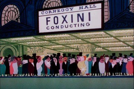 18b
18b
. . . the Foxini ppremiere.
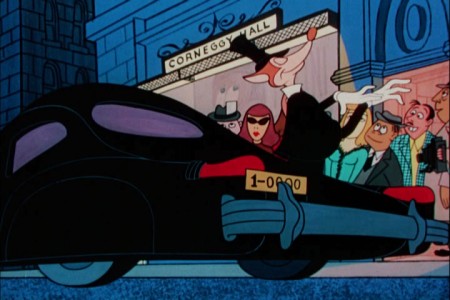 19a
19a
The Fox gets out of the limo.
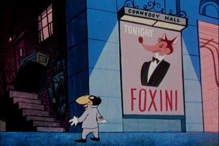 19b
19b
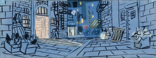
The crow looks up at the backdoor alley.
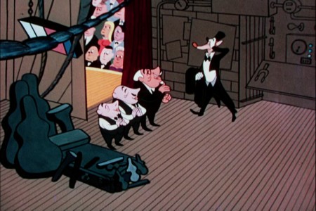 20a
20a
Foxini is greeted by his entourage, and he takes advantage of them.
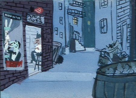 21
21
The back alley is about the same.

We no longer see a pan of the inside of the theater.
 23a
23a
There is a pan up the concert hall.
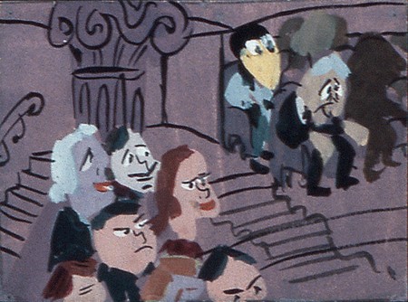 24
24
Crow arrives at the upper upper balcony . . .
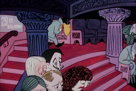 24a
24a
. . . and gets a last row seat.
Unfortunately, they only offered the color continuity board for the first half of the film,
and that’s as far as we could go.


on 14 May 2012 at 6:51 am 1.Yowp said …
Nice that the board gives an indication of what the original titles looked like, instead of the “Columbia Favorite” cards we’re stuck with.
on 14 May 2012 at 8:29 am 2.Ray Kosarin said …
These are beautiful and fascinating to look at.
According to Ade Woolery (by way of Mike Barrier and Adam Abraham) John Hubley disliked Herb Klynn’s paintings. “I cannot stand another touch of that Klynn green!” That said, the colors here — including the green — seem to serve the film well.
That added tilt shot panning up, and up, and up inside “Corneggy Hall” is (for me) one of UPA’s funniest gags. No doubt only someone who has spent some time in Carnegie Hall, doggedly climbing past balcony after balcony to get to the cheap seats, could have come up with it.
on 17 May 2012 at 9:03 pm 3.Liim Lsan said …
Fascinating to see how they worked! Herb does have this unique gift of arranging colours in real-time succession. The same colour is different depending on what colour you looked at last…
There has to be a word for ‘the kind of work you produce when you anticipate it will be altered significantly with no time to change it.’ John Hubley, I hear, in these days (being fresh from Layout man) would order the layouts redone after the animation was completed. Then I realize how much of this animation occurs in the clear, without having to match the layout all that much. Did he still do that – change them – when you were working for him (the animators would complain about it, maybe), or did all those years of keeping good schedule kinda wean the instinct out of him?
Because people say Friz Freleng and Shamus Culhane (in his New York days) would order animation redone on a whim, and quite often… I notice in both the Noah series and Friz’ cartoons, the breakdowns are very stock, and there’s not much overlap and followthrough, plus if an agitated motion is desired, it’s a flurry whose individual drawings don’t really hold for much. It’s the sort of animation that looks like it was made with the purpose of saving the animator work during endless revisions (without the overlap, you only need to change so many drawings, eh?).
Just throwing this out there. (BTW, this looks absolutely beautiful. The fact that this stuff is available on the DVD only makes me all the more want to give it to people. ^^)
on 17 May 2012 at 10:27 pm 4.Michael said …
Hubley’s layouts were a wild mass of rough drawing that the animator would put together after discussing it with John. If the scene was important to him, he might have asked me to clean up his drawing. Never once in all the time I worked for him did he have animation redone. There were several times when I was asked to rework a scene (based completely on John’s flipping of the scene.) It was rare for us to do a PT. These were the days before the computer, and the budgets were always ridiculously low. If John had anything to be reworked, there was a good reason. He was no diva, but he was a brilliant director and artist.
on 15 Dec 2012 at 10:51 am 5.howlin' hoosier said …
I’m wondering when the triangular credits (3A and 4A)were cut into the print of The Magic Fluke – was this a way to show Columbia had re-released this theatrically ala Blue Ribbon re-releases of Warner Brothers cartoons? Frame 3A has the word Reprint towards the bottom of the drawing – what did the first set of credits look like? Those triangles aren’t on the print of the earlier released Robin Hoodlum. The credit frames look like later artwork to me. I’d have to dig out my dubiously sourced Columbia and UPA cartoons, but I’m sure that a number of shorts I have bear those same type of credits with Reprint on them.
on 16 Dec 2024 at 2:10 pm 6.Mejo Kallamthanam said …
The titles are the reissue ones, as Yowp pointed out