Animation &Frame Grabs &Independent Animation &SpornFilms 08 Mar 2012 05:48 am
Fritz BGs & Set Pieces
- For some reason I was inspired to watch some of Bakshi‘s Fritz the Cat, this past week. I remember posting in the past on a couple of the sequences.
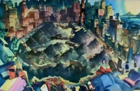
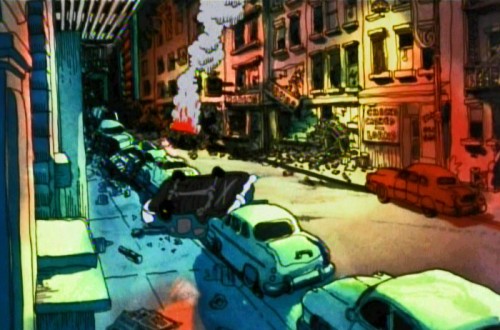
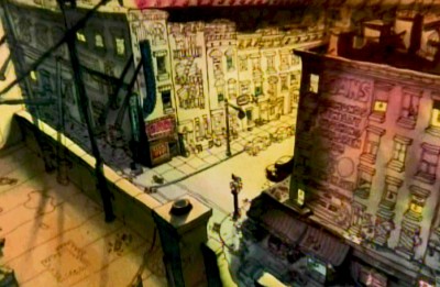 There was one on Johnny Vita‘s dynamic BGs at the time. They were a bit revolutionary for what they were. Johnny had gone through Greenwich Village with Bakshi photographing the environs. He then did a line drawing over the photos and painted the art under the lines, using Luma dyes. Bright shiny colors that he sometimes was able to mute. (It’s hard to tell the real colors from the DVD which all look like mud. I enhanced everything in photoshop to try to get colors that I remembered from 1972.) These were almost ragged versions of what Ken Andersen had done on 101 Dalmatians, but they were done on the fly. No time or money. Here’s that original post.
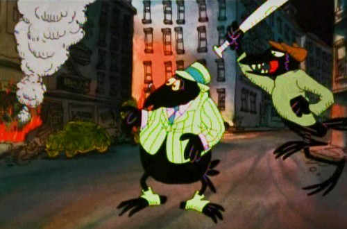
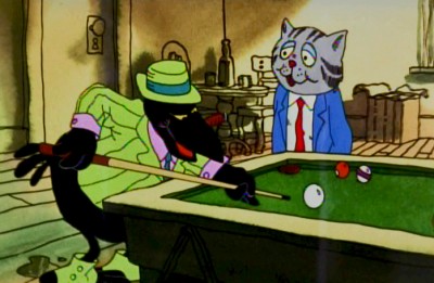 Then I did one on a scene in a bar where Fritz meets Duke, the crow, who will not only save his life but will take a bullet at Fritz’ sheer stupidity. Here are some drawings from Marty Taras of that scene.
Then, I also did a post on some storyboard drawings of the bathtub orgy at the film’s beginning. You can find those drawings here.
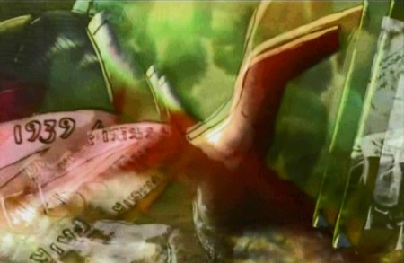
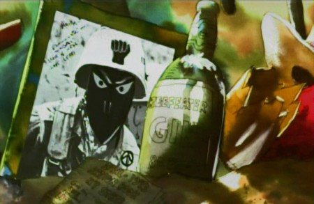
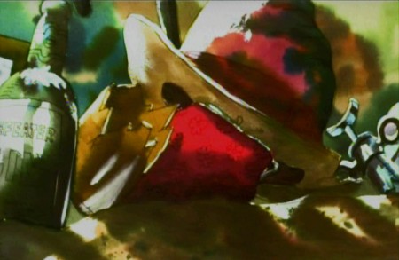
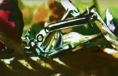
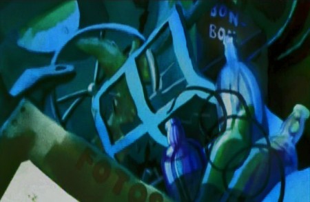
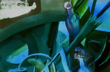
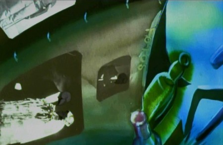
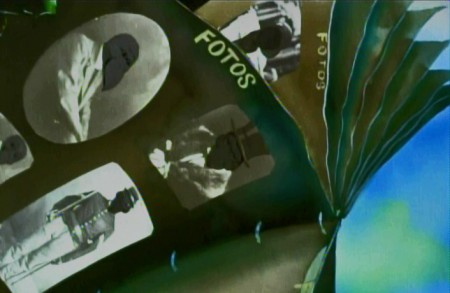
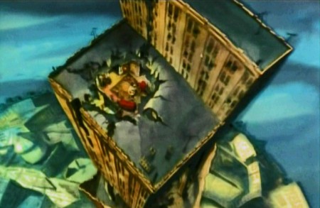
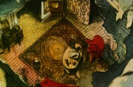
Here’s another set piece, a series of pans. I’ve hooked a couple of the pans together, but have kept many as single frame elements to be better seen. A whole melange of styles mixed in here, and no doubt Bakshi had seen what Hubley was doing to pan through screen time.

Opening part of a multiple exposure pan.
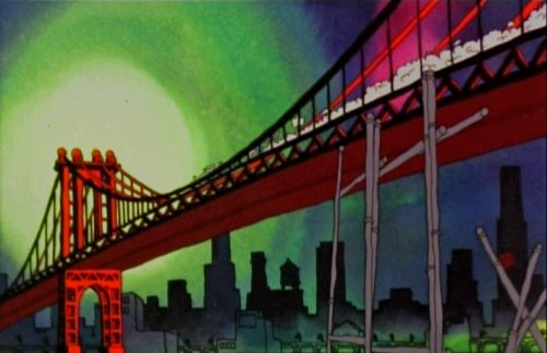
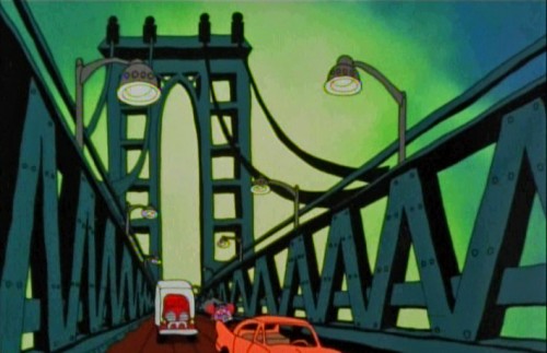
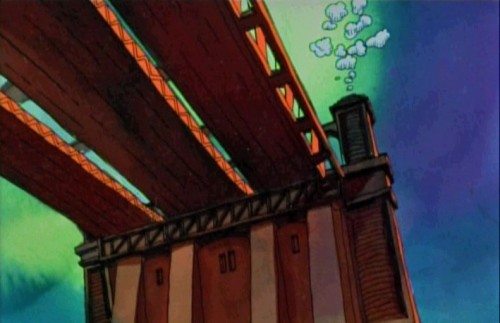
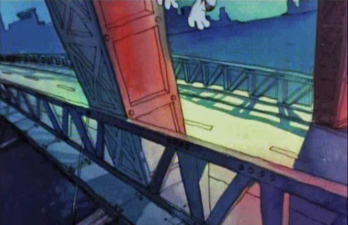
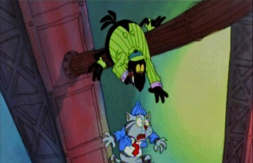
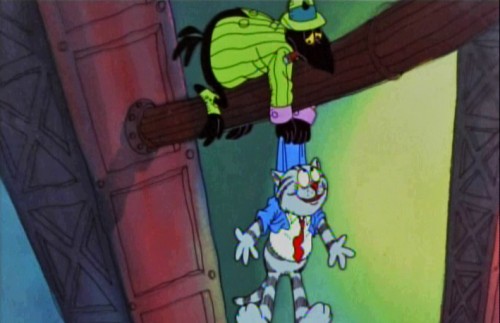
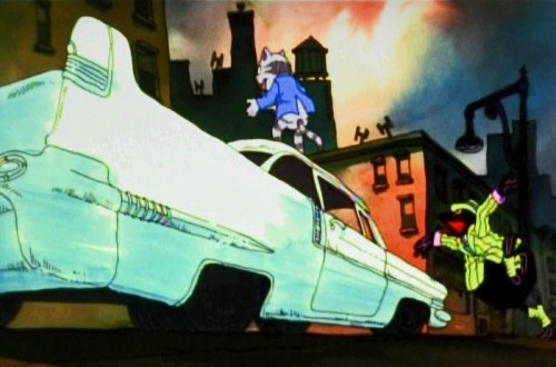
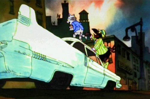
Then there’s the flight over the Brooklyn Bridge where Fritz crashes the car and the Duke saves Fritz’ life.
 1
1
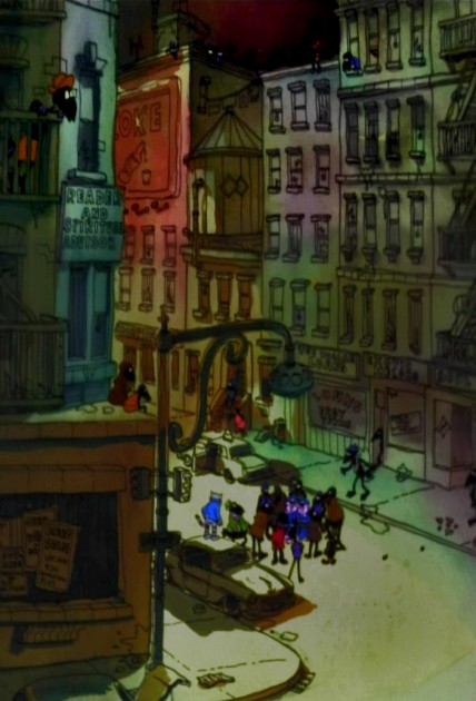
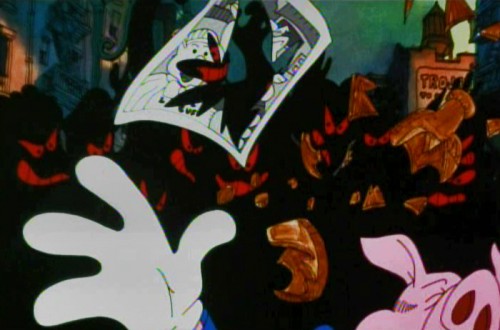
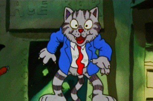
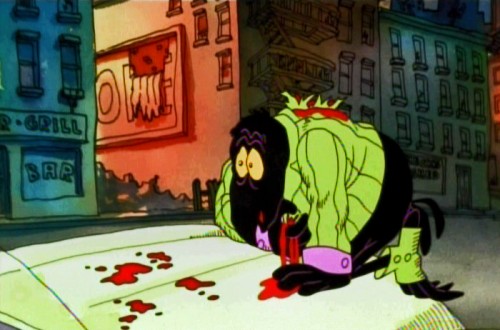
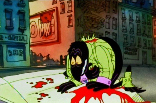
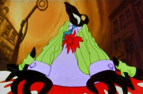
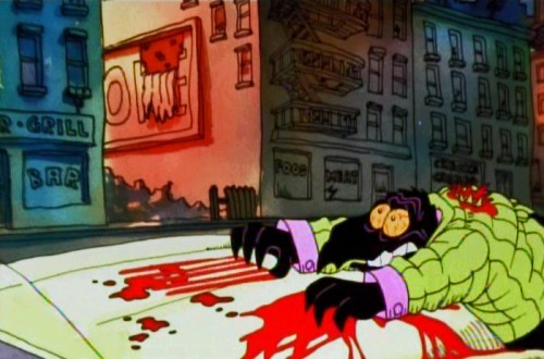
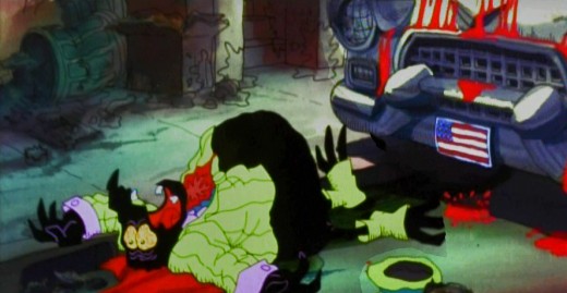
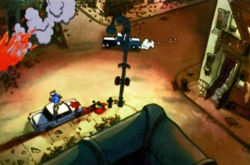
And finally, we have the best set piece of the movie. The climax that falls in the middle of the film, and the rest of the film can’t get over it.
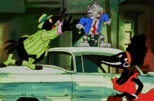
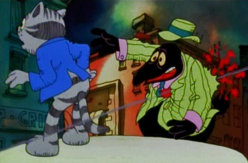
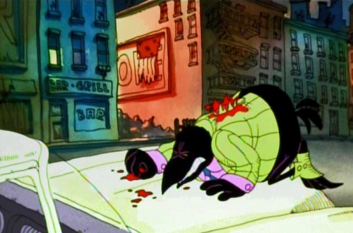
Minor mayhem breaks out in Harlem, Duke gets killed, accidentally, and a riot breaks out. It’s all Fritz’ fault, of course, and he naturally runs from the scene at the end of the sequence.
Cosmo Anzilotti, the AD told me that this was Jim Tyer‘s scene. It doesn’t quite look like his work – rock steady and beautiful. I can and do believe that it is his work. Some great great poses.
Supposedly, Tyer hated working on the film. He was a die-hard Catholic who hated the cursed animation being done. Bakshi loved Tyer, as well he should have.
 1
1
 2
2
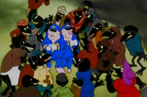
The cops are pushed into a corner.
 4
4
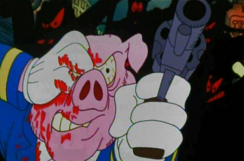
. . . who pulls out a gun and fires.
 15
15
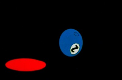
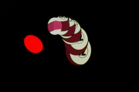
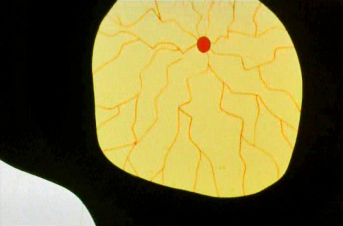
The metaphor of pool balls sinking into their holes
represents Duke’s last breaths on earth.
The most important piece of writing on Fritz the Cat is an older piece done by Mike Barrier and readily available on his site. Read it if you have any interest in the film. Part 1 – Part 2 – Part 3 -Part 4 – Part 5
- Ah you didn’t think I’d forget the HARD SELL, did you? Unfortunately, I can’t. I am trying to get my little epic into the production hard line.
POE is a telling of Edgar Allan Poe’s short life story, and we’ve done a lot of art and preparation. Now we want a couple of minutes of good final product to show how great it’ll be.
Kickstart POE is the project in the works, and I need your help. Please take a look at the page, give any small support you can, even if it’s just to tell your friends about it.
Many thanks.


on 08 Mar 2012 at 8:44 am 1.Stephen Macquignon said …
Fritz the Cat is one of favorites.
I always loved the artwork
I have posted you Kickstart on almost every media site I belong too. I might even join twitter just to post it there
on 08 Mar 2012 at 12:41 pm 2.Stephen Worth said …
Johnny Vita’s backgrounds are amazing. I’ve seen other people try to imitate the style, but they use the bright colors arbitrarily and it doesn’t work at all. There are a million ways for this syle to look bad, and only one way for it to look good. Vita gets it right every time.
on 08 Mar 2012 at 1:05 pm 3.Charles Brubaker said …
And to think this was (supposedly) the last cartoon that Jim Tyer worked on.
on 08 Mar 2012 at 2:38 pm 4.Tom Minton said …
Another thing that set Fritz apart from more conventional animated features of its day was the fact that Ralph, as a former cel painter, knew about ultra-thin animation cels, which camera people hated because the pegs ripped easily but which were so very thin that color compensation didn’t have to be done. The ultra thin cels also meant that Johnny Vita’s high saturated ink hues, as well as the character colors, all came blazing through onscreen. None of the faded prints available today equal how very saturated and sharp that film looked in June of 1972, on its original release, when it was the top grossing picture in the USA. Ralph mentioned that “you can save 70 thousand bucks by not compensating for cel levels” in an animated feature. The camera people may have not cared for thin cels but the results at that time could not have been obtained in any other way. It’s too bad that Fritz was shot in Eastmancolor and no YCM negative was done to back it up. We may never again see a properly color saturated version of it, unless that Eastman negative is in perfect shape, wherever it may be.
on 08 Mar 2012 at 4:55 pm 5.The Gee said …
On the grabs Nos. 20, 21 and 22:
Were those fast cuts? Before #21, does the crow already hit the pavement before the cut, or, was there an additional different angle shown when he was sliding off?
I can “see†19 going into 20 working out but the scenes in the next two…
I ask because I (intentionally? coincidentally?) haven’t seen the movie.
on 08 Mar 2012 at 5:24 pm 6.Ray Kosarin said …
These backgrounds are stunning. Like so much from Fritz the Cat — a strange and beautiful wreck of a movie — they are vivid and, 40 years later, still not quite like anything else.
Fritz is a fascinating film. Like a Broadway flop from which, years later, people still sing the one or two good songs, Fritz’s best set-pieces (for me, Fritz’s beautifully staged rant in his dorm, Duke’s death, and the exuberantly looney sequence of Fritz and Duke’s car careening over the George Washington bridge) stick in our heads for years. Johnny Vita’s stunning backgrounds are perfect for the world of this movie: the clash of muted tones with explosions of saturated color are a perfectly extravagant match to the characters’ reckless, misdirected outbursts of emotion, violence and sex.
Fritz is an important film. Structurally it’s a royal mess, and, like much of the underground comics universe it comes from, flails between approaching sophisticated moral and psychological issues with, at moments, great originality and insight and, at others, a troubling adolescent exhibitionism, as if simply parading “adult” content (Get a load of this! Cartoon characters! With sex organs! Having sex! Get it?!) in and of itself earns it a badge of honor. It doesn’t.
But it does reach for, and sometimes touch, issues and emotions out of reach of almost all commercial animation before and since, and does so in a way (unlike, say, Bakshi’s own Lord of the Rings) that celebrates, rather than apologizes for, being animated. Its best moments are still an inspiration of where animation can go.
on 08 Mar 2012 at 8:23 pm 7.Eric Noble said …
Ray, I think that’s the exact sentiment that Michael Barrier expresses in his article on Fritz the Cat. I can’t say that I disagree. Unfortunately, the film never led to any great renaissance period of adult animation. I do think this film can be a good learning tool for future animators on what to do and what not to do when creating an animated feature film, especially if you read Michael Barrier’s article along with studying the film.
on 08 Mar 2012 at 8:41 pm 8.Dan said …
There are some great sequences and backgrounds in Fritz the Cat, despite the loose narrative and rough quality of the animation. It doesn’t compare to Heavy Traffic and Coonskin, however.
It’s just too bad that Bakshi became too reliant on rotoscoping as time went on. His pre-Wizards films have some very inspired animated sequences, even if they lacked the precision or professionalism of, say, Disney.
on 08 Mar 2012 at 10:12 pm 9.Stephen Worth said …
Ralph’s films still point the way animation should go. It’s a shame that CZgI seems intent on remaking princess and talking dog pictures. Imagine what CGZi could do with ideas like Bakshi’s!
on 08 Mar 2012 at 10:14 pm 10.Stephen Worth said …
By the way, Wizards is about to come out on bluray and Coonskin is being prepared for a DVD remaster. I’ve seen the hidef Wizards and it looks great.
on 09 Mar 2012 at 4:50 am 11.Michael said …
Ray, I believe that Fritz was a seminal film when it came out. Only Hubley in the US had done such a low budget small feature, and Bakshi took his raw subject out there to the general public.
Barrier’s extensive and strong piece marks this film for what it was, an important part of the way away from Disney’s choke hold on the animated feature.
It was only Bakshi who could live up to the promise of Fritzand he did that with his next film, Heavy Traffci. Everything Bakshi did after that, to me, seems muddled in some way. Sloppy thinking in an attempt to catch the raw nerve again, instead of well thought out films.
Unfortunately, what followed were a lot of very bad, small features that fell on their faces – the best of which might have been Will Vinton’s Mark Twain feature. (Though this still wasn’t good.)
Hubley, at least, was able to talk CBS into the Carousel feature. One brief shining light. Too bad there wasn’t more. Though I suppose Watership Down kept things moving forward.
on 09 Mar 2012 at 11:05 am 12.Ray Kosarin said …
Michael, what you say about FRITZ’s place, in shaking free of the Disney monopoly as well as proving that animation can tackle adult stories, is, of course, both true and extremely important!
Animation continues to be caught in an uphill struggle against the prejudice (here in the west) that animation is a children’s medium, a self-perpetuating prophecy endlessly reinforced by nearly all animated features being kids’ films. As someone who, like Hubley and Bakshi, has faithfully campaigned against this prejudice —and often prevailed — you know this territory better than anyone.
FRITZ was a brave and valuable accomplishment that no doubt helped very much, in ways that are probably impossible to measure. Its being X-rated is enough of a Macguffin to cloud the issue: it’s too easy for those who don’t consider animation a valid adult medium to chalk up FRITZ’s notoriety to this trivial, but still significant, novelty. Clearly, the film is far more important than that.
But it also teaches us about the problem of small-budget films having to fight the war against this cultural prejudice. Disney budgets allow the luxury of scrapping thousands of feet of animation and rerecording dialogue mid-production to improve the story. Bakshi had to make do with the uneven, though often brilliant, film he made; and the Hubleys’ CAROUSEL, too, had to take the bullet, financially and creatively, when CBS late in the game decided it was an hour-and-a-half film instead of the three-part serial the Hubleys had already substantially finished. The last-mimute footage spun together to make up the shortfall both rescued the film and took its toll.
These compromised films are as a rule the ones that go into battle against the hegemony of the well-financed kids’ features. Like the Polish infantry gamely showing up on horseback to meet Germany’s tanks, the odds are not in their favor.
Still we must fight the good fight — and there are signs of hope. Disney’s distributing Miyazaki’s films is a small, but encouraging, sign that attitudes can change!
on 09 Mar 2012 at 12:00 pm 13.Michael said …
I’ve never fought a fight of children’s versus adult animation. That’s something that others find more important. I look for good versus bad. Bakshi was never more adult than anything as smart as PRINCESS MONONOKE, regardless of the X rating of FRITZ.
I’ve felt that audiences know the difference immediately. There aren’t too many children searching out Plympton’s IDIOTS & ANGELS. Though I did have a parent rush a child out of my film CHAMPAGNE, after mom killed the drug dealer. CHICO & RITA hasn’t gone out there screaming “no children allowed” despite the nude, sex scenes. It’s just a good film, and that’s that. How audiences arrange themselves is their business.
That, to me, is the side-show of animation, and nothing worth my bother.
on 08 Jul 2012 at 12:24 am 14.Liim Lsan said …
I do love the boost it gave to ‘adult’ animation…whatever its faults, I’m still goddamn GLAD it was made. ^^
Ultrathin colours? That explains how they could do long background pans without dealing with awful cel edges…(Even if the legendary desert cactus was made to hide that…)
But here’s the thing about Duke’s death sequence – this doesn’t look at all like Tyer. The hands in particular look more like Nick Tafuri than anyone else, and ‘Unfiltered’ credits it to Tafuri.
If it is Tyer, it’s astoundingly on-model for what we’ve come to expect from him.