Animation &Commentary 24 Feb 2012 07:51 am
Pops and Smears
- In reviewing The Secret World of Arrietty, the brilliant new Ghibli film, I wrote about the fluidity of their animation and its basis in a real rather, than a cartoon world. Unfortunately, most of the animation done in features coming from the Western world (specifically the US world) is done in a cartoon way using pops and smears. This affect creates cartoon characters and clichéd ones at that. It’s not a type of animation I love for feature films.
Of course, if you’re designing an Aladdin, where the Robins Williams/Eric Goldberg Genie is a hyper cartoon character, that’s the only way to go – stylized cartoon. That was its natural design. But for 101 Dalmatians/Peter Pan/Beauty and the Beast – no. That’s not what you should be doing. However, it seems to be the only way to go in the films coming out of Hollywood.
I thought, over the course of a couple of posts, I’d give a couple of good examples of these pops and smears I’ve been bothered with in the recent past. Let’s start with “smears” 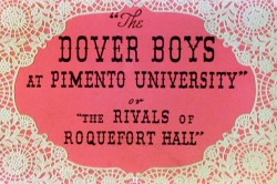 something I find particularly egregious in animation pretending to create a “real” world.
To show what I’m talking about, here’s an example from the first real – and I might say brilliant – use of this technique.
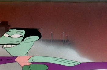
Animator, Bobe Cannon, together with director, Chuck Jones, came up with the technique for the outstanding Dover Boys film.
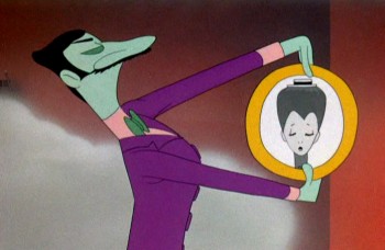
Here’s our villain, the main target of the smeared frames:
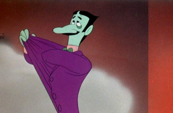 1
1It’s the villain that moves in exaggerated smears.
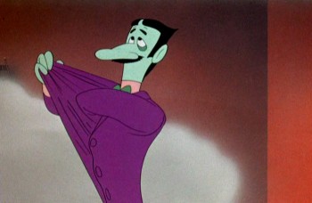 2
2
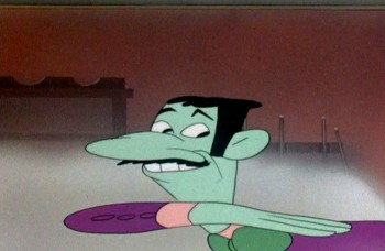
He moves slowly at start and stop of moves.
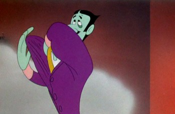 3
3
But moves wildly in between phrases of dialogue.
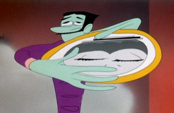 4
4
The middle poses couldn’t be wilder or faster.
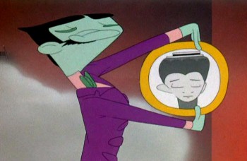 5
5
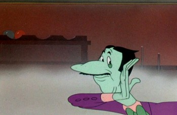
And comes to quick halting stops with small patches of dialogue.
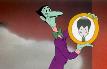 7
7
Then, if anything, we’re going wilder.
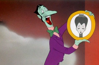 8
8
Slowly out of quiet hard pose . . .
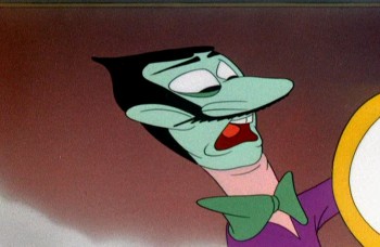 9
9
WILD as Jones backs the animation move with a tighter cut . . .
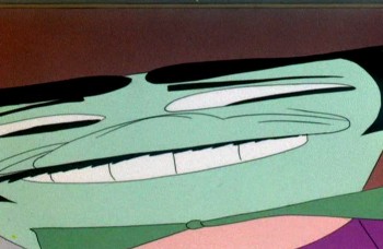 10
10
. . . and a wild camera move.
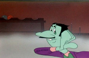 14
14
Come down to another solid, hard pose and move dialogue.
Here’s a later sequence as the villain kidnaps our heroine.
All cartoon, all comedy, all arch, all on purpose.

He moves wildly via smears inbetween phrases of dialogue.

Line of dialogue – move – dialogue – move.

Every action comes off the exaggerated speech by the arch ( and I do mean arch) villain.
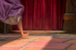
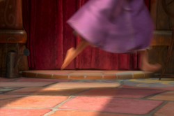
 Tangled is a tangled version of the brilliant fairy tale, Rapunzel. The makers have completely distorted the tale to a mish-mash point where it makes no sense, but that’s irrelevant to this post. What is relevant is that they continually rob the characters of a reality by pushing, rubbing and smearing them throughout.
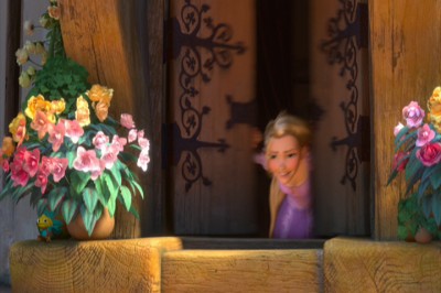
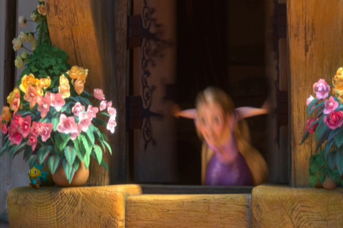
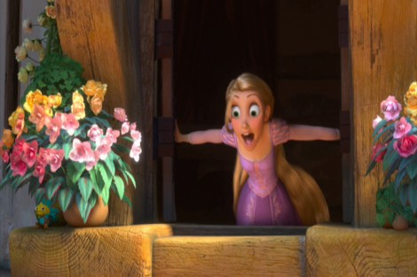
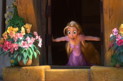
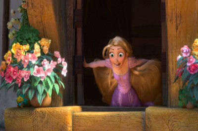
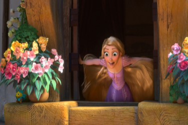
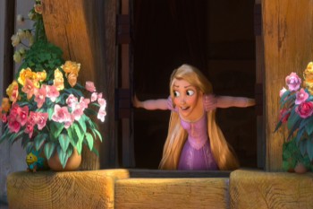
The first example of this technique shows up as Rapunzel opens her window. Technically, you start slow, you compress the middle to one or two images, and you slow out over a long beat. The inbetween chart would look something like this:

Here’s Rapunzel opening her window:
It’s not really a human motion; it’s a cartoon motion. But it’s subtle enough this first time, that we can get away with it. Let’s just call it fast. However, too often the animation falls into this mode, and by midway through the film, there are no real characters left; just cartoon characters.
I take that back. Mother Goethels is always true to a human animation style. She is a real character, and Donna Murphy’s performance grounds it behind the fine animation by Jamaal Bradley, Nik Ranieri and others.
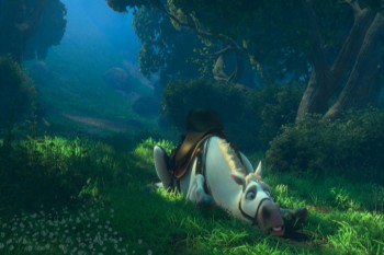
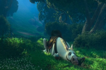
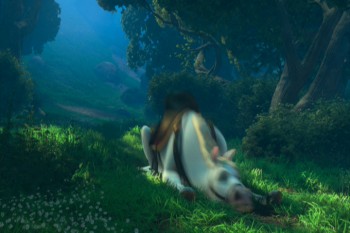
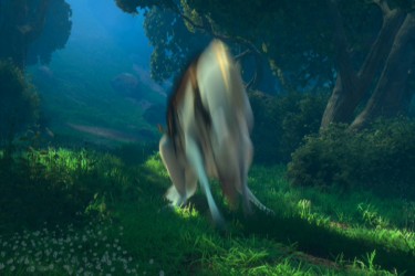
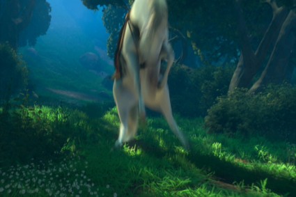
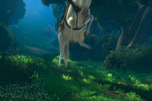
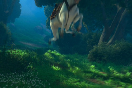
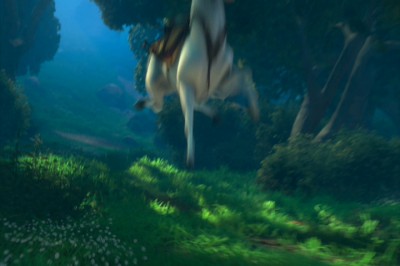
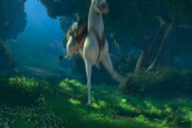
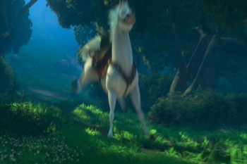
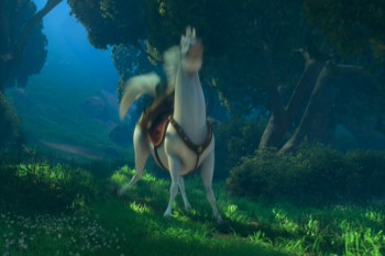
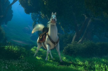
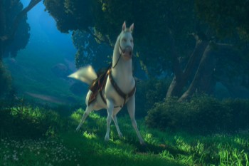
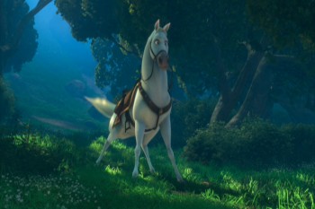
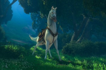
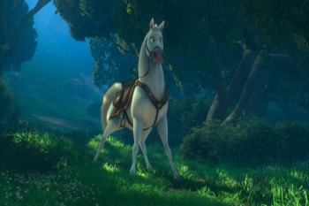
The most egregious in using these smears is the horse character, but if it were only that one, it would work. The horse is a stand-alone. It’s personality IS a cartoon. The horse, after all, isn’t a horse in this film. It’s shaped like another Disney horse, but it moves more like a dog. And it’s ALL pops and smears.
Look at these frames of it getting up from the ground, lickety-split:
 1
1
The move above is funny, not based in reality. What we have is a cartoon horse. This is not the horse Prince Phillip rides in Sleeping Beauty. It’s not even a good caricature of it.
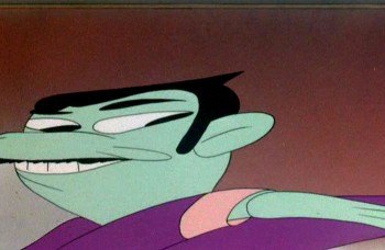
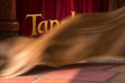
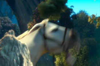
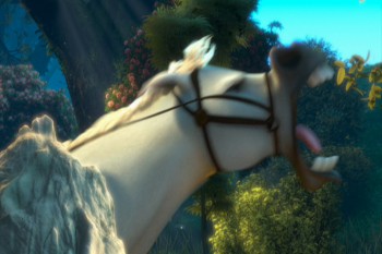
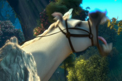
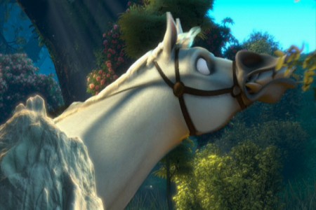
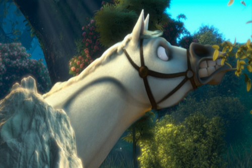
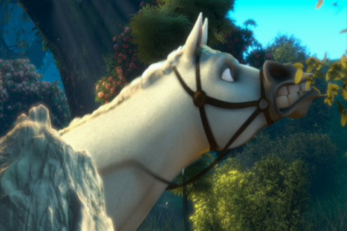
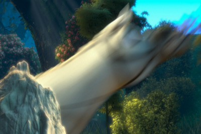
The unfortunate part is that what Bobe Cannon did in the Dover Boys can’t easily be done in cgi. The Dover Bioys employed the brilliant cartooning of Cannon; cgi is really just a playing with computerized puppetry. You can stretch and squash somewhat, but distorting as desired isn’t always possible. So they stretch and squash and do very fast motions and hide it all under a veneer of out-of-focus. It ends up looking like just fast motion and not a true distortion – as they probably desired. The best you can hope for is image #3 just above. Now compare that to image #10 in the Dover Boys group. Not quite the same are they.
God forbid someone in cgi wants to do what Jim Tyer did. It’s impossible.
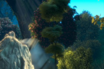
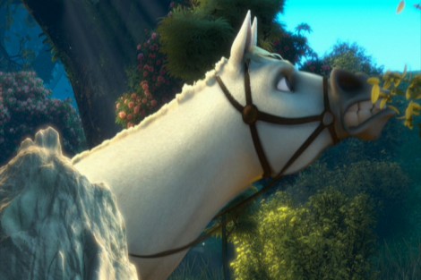
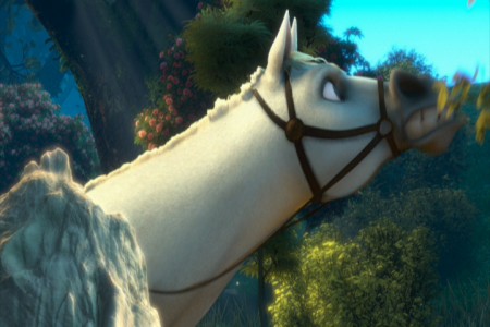
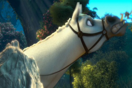
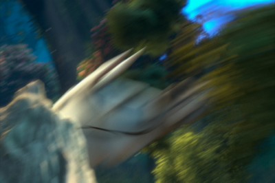
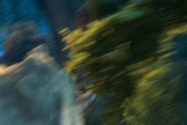
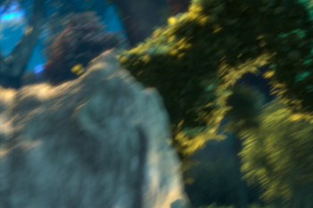
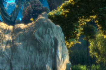
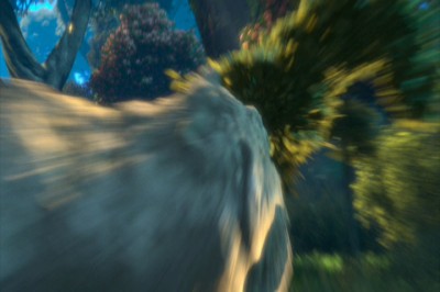
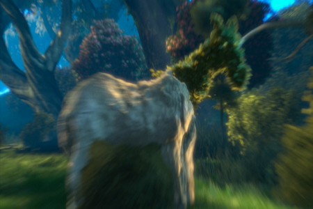
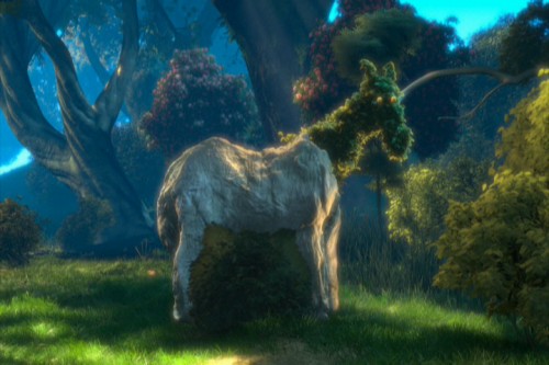
Here’s one last horse. We start rock steady – then zip, blur, stream. Ease in and race back out – zip, blur, stream. To be honest, I’m not sure what’s even happening in this scene (the horse is somehow changing into rock and vegetation?), but I let it go past as cartoon.
 1
1
To sum up what I’m trying to say. Animated features have sunk their heads into the ground. Everything has become arch and stupid. We’re not trying to develop characters but, instead, trying to do some wild movement. Movement that has nothing to do with character development. That’s a problem, if you ask me.
If you want to imitate Tex Avery or Bob Clampett, fine. If you want a seriously developed non-cartoon character, then stay away from pops and smears. It works for Aladdin, but it also limits feature films. I think Tangled is a good example of that. Outside of a few characters, I see little believable animation there. It’s all just tricks and stunts that pulls away from true, honest animation. It’s a comment on a character rather than a development of the character.
Of course, that’s my opinion. It’s so obvious to me when you see a Ghibli product like The Secret World of Arrietty or anything Mayazaki does. Their animation grows more and more subtle while Hollywood moves in the opposite direction – gags and clichéd actions. I don’t understand why Disney product approves of this. Thank god for animators like Andreas Deja who refuses to go this route, and is in absolute control of the characters he animates. There are others like him, and I applaud those artists. I wish they were all of that shape and belief.






on 24 Feb 2012 at 9:19 am 1.Mark Mayerson said …
There is one fundamental difference between the smears in The Dover Boys and in Tangled. In drawn animation, any distortion is controlled by the animator. Bobe Cannon controlled how much distortion was going into his animation.
In cgi, smears are the result of motion blur. This is decided on at the rendering stage, which comes after the animation is complete. The animator may not have any control over this and it is most likely done by somebody else.
The animator is not seeing the results of the blur at the time he or she is animating. It is only after texture and lighting have been added that motion blur gets calculated.
Whether the animator gets a say as to how much blur is applied depends on how a project is organized. It’s not a question of the pipeline so much as it is who gets to approve things.
on 24 Feb 2012 at 9:53 am 2.Michael said …
There’s also no real way for drawn distortion in cgi except using digital distortion, which looks ridiculous.
on 24 Feb 2012 at 11:33 am 3.Nick Fox-Gieg said …
I used to think I didn’t like 3D CG, but these days I’ve come around a bit. Now I really love working in “2.5D” (2D drawings on “cards” in 3D space), and I even do lots of rigging for 2D puppet characters…what I still don’t like about 3D is the _modeling_. I think you’ve beautifully illustrated the problem–do something too creative and spontaneous with a 3D model (without a great deal of advanced rigging and probably some custom programming, at least) and it turns into abstract art. I’m guessing that’s why the distortions in your CG examples are so crude, compared to the sophisticated hand-drawn ones.
I do think this is a temporary limitation of an immature technology, though…I was at a conference last fall and somebody showed me MeshLab, a free program that “heals” broken 3D geometry as if by magic. The only catch is that, if a current computer had to run it on every frame as you were working, it would slow your 3D animation program down to an impossible crawl. (And I’m sure there are other good technical reasons–probably beyond my understanding–why something like this isn’t already part of every big studio’s pipeline.) But I’m pretty confident that given enough computer power, that’ll be the future of animating in 3D CG–you’ll draw what you want in 3D space (using something like a Sandde controller, maybe) and the computer will just chew through the math to make it work behind the scenes.
(I suspect it’ll be kind of like how 2D computer animation changed after 24-bit graphics became easy for the hardware to do. All the crazy, time-consuming palette manipulation tricks you used to have to do when computers were slower became irrelevant–now you had 16 million colors to work with, instead of 256 or fewer.)
on 24 Feb 2012 at 11:44 am 4.Elliot Cowan said …
Heya Michael.
Some interesting stuff covered here.
I’m sure you’ve seen this test of Roger Rabbit directed by Eric Goldberg
http://youtu.be/d1QC2KMJndw
At the time, to achieve any of the cartoony distortion I believe they had to build a different model frame by frame (or something like it).
Clearly it’s still an issue with CG.
Tangled is not a film I much like (even less so after Hugo took a shining to it and we had it on 35 times a day).
I walked out of it after 25 minutes.
One point I’d disagree with you on is the portrayal of the villain, who I feel makes the film 106 times worse.
I’m not sure when Disney films became these faux Broadway shows, but the Gothal character in this is, I think, the worst example.
When an actress is on stage she can create a connection with her audience that can accommodate the kind of nudge nudge wink wink performance we see from Gothal.
The audience knows that the peformance is all fakery but the connection the actress can create bridges the gap.
But I don’t get it in an animated film where we’re supposed to believe these are real characters in their own world.
The Flynn character is the same, really.
on 24 Feb 2012 at 12:14 pm 5.Pierre said …
I understand your issue with the lazy and inappropriate use of Pops and Smears in today’s animation but I don’t agree with your assessment entirely. A film like “Entangled” is a farce as much as its a fantasy. A film like Arrietty (or just about any Ghibli film) is a fantasy and has entirely different aims.
For me personally, part of the charm of doing “pops and smears” in a CG film like “Entangled” is that these actions would be impossible in the real world, so it reinforces the fantasy of CG, as well as the farcical nature of a film like “Entangled”. So, the horse snaps to his pose because it reinforces his heroic nature in a cartoony and farcical manner, even if the gag is confusing.
I adore most Ghibli films because of the natural way characters move. I haven’t seen Arrietty yet but a sequence like the girls exploring the house in Totoro is just incredibly beautiful because the animators injected so much joy into the simple act of exploration.
I would love to see how the Ghibli handles straight farce. Perhaps I need to track down a film like My Neighbors The Yamadas to see how they approach something designed for laughs.
on 24 Feb 2012 at 12:17 pm 6.Michael said …
Elliot, Roger Rabbit was hand drawn and computer colored. Distortion can be done with drawing not with cgi.
on 24 Feb 2012 at 12:33 pm 7.Elliot Cowan said …
Roger Rabbit was originally hand drawn yes, but the clip I included was a CG test done, I believe, to specifically examine if it was possible to treat the movement like traditional “cartoony” movement.
on 24 Feb 2012 at 1:16 pm 8.Ray Kosarin said …
This is a really interesting and important discussion! Michael: I must agree with nearly everything you’ve said, most importantly about “smearing” used as a gimmick–as comment on a character rather than an authentic action that comes from the character. It’s one example of many techniques that too many animators now, whose aim seem more to replicate old animation they admire than to build something grounded in something more real. It’s not only smearing; it’s zip-and-pose, exaggerated Tex-Avery-takes, exaggerated squash and stretch, and so on: a long list. What seems most often abused are those sleights of hand that are interesting to discover but have in themselves no more meaning than a magician pulling a rabbit from a hat. Proving we can do them too when they were done 70 years ago is no great feat. It’s a little obnoxious.
But I’m not sure we should go so far as to rule out any technique altogether, including smearing, as invalid for expressive character animation. DOVER BOYS was a brilliant experiment, but as a one-off, the cartoon is itself largely a gimmick (though a very funny one). However, we need look no further than Chuck Jones again for how well his Warner team, Ken Harris especially, later integrated the smear technique as part of a larger, brilliantly nuanced (though broad) and fully realized character animation. LONG HAIRED-HARE (where Bugs impersonates Leopold Stokowsky) is an obvious example — where the smear technique is front and center but, unlike DOVER BOYS, part of a fully-considered performance with slow moments to balance the fast. The smears not only add a visual edge to the humor: they’re in character. Jones, Harris, et al. used this tool again and again throughout the fifties cartoons, often more subtly where viewers would sense more than see it, and not as a gimmick so much as part of a larger language.
on 24 Feb 2012 at 1:20 pm 9.Daniel Caylor said …
Great post! Could have used this as a resource a few months ago when I was tackling smears in CG for the first time. Tough task to say the least. But it is not impossible. It’s on the way. May take a while, and a lot of trial and error, but it’s possible.
It’s mind boggling how incredibly complicated it is to create a CG rig that can handle both the incredible subtlety that is necessary for CG (can’t hold in CG, everything dies) as well as the cartoon possibilities that appeal to us all in smears. The riggers are the unsung heroes of any production and in my opinion never get the credit they deserve. One day those geniuses will figure out how to give the artists exactly what they want. That will be a wonderful day for CG.
I also wouldn’t say anything in CG is covered up with motion blur. The use of that is deliberate and part of the world of each film. It would look much worse without it. And once they are able to build controls for the animators to manipulate the rigs intuitively (in a way not far off from quickly sculpting or drawing) they will likely ease up on the motion blur and things will continue to look better and better.
Tangled was a massive leap forward for CG. And apparently Disney is out to take another leap forward with Wreck it Ralph, while the new John Kahrs short, “Paperman” is hyped as something revolutionary for the medium as well.
on 24 Feb 2012 at 2:07 pm 10.Michael said …
Ray, so far you seem to be the only one who understands what I was getting at. I don’t care if the screen is an absolute blur 100% of the time, as long as character development is happening on the screen. I suspect that with any cgi it’s virtually impossible at this early stage to control it. Too many hands have to do the work to get a simple smear, yet the ability to distort the drawing is virtually impossible. Brilliant animators like Ken Harris and Bobe Cannon could do anything and pull it off, especially working alongside someone as talented as Jones. However, I still doubt you’d see much of that in non-comic acting as in feature animation.
on 24 Feb 2012 at 3:26 pm 11.Anik said …
Great post, especially the paragraph “To sum up…” I agree it’s partly caused by the technical evolution of the animation production, 3D or digital cut-out techniques result in distancing/disconnecting the animator from the character. Rather than feeling the character through drawing every pose, animators now manipulate/bend it into pose, and the movement is more thought through rather than felt through, loosing some of it natural intuitive charm. To compensate for this sterility animators try different exaggerated cartoony tricks to “spice-it-up” and avoid generic inbetweens (smear being one of them). Which is like adding emoticons to your SMS in hopes of making it look like a love letter – kinda cute but somehow doesn’t seem very felt through.
on 24 Feb 2012 at 5:49 pm 12.Ricardo Cantoral said …
I agree with both Mark and Mike here. Mark is right about his assessment of the Tangled animation, it’s a cold and mechanical blurring technique and not a smear handled by a creative animator. And Mike is right about this overall message, Tangled is not concerned with character animation at all but just moving “wildly”.
And to address Ray who dismissed Dover Boys as a gimmick, sorry man but you are dead wrong. Look at the poses after the smears, they are specific and well constructed. The Dover Boys expressing their disgust at the bar, The Boys in shock of Dora being kidnapped, and of course the highlight of the film, Dan Backslide’s rant. I never laugh at the smears in Dover Boys but the reaction of the characters and that why it’s still funny after 70 years. Long Haired Hare is good but it’s not even half the cartoon Dover Boys is; It’s technically brilliant but it’s very conservative in nature. That Leopold Stokowsky bit was defintely the high light but it can’t beat Dan Backslide in the bar.
on 24 Feb 2012 at 11:33 pm 13.Stephen Worth said …
I can’t think of a more seriously developed character than Bob Clampett’s Bugs Bunny, if you mean serious in the sense of “thought out”. I’m pretty much bored with stiff Sleeping Beauty style high splats on the wall. I’d rather see animation used to do things only animation can do. If that means a smear or pop, great. As long as it’s contextual, I’m all for it.
on 24 Feb 2012 at 11:36 pm 14.Stephen Worth said …
P.S. I didn’t go see Tangled, but I’d guess that the smears were the least of its problems.
on 24 Feb 2012 at 11:40 pm 15.Stephen Worth said …
By the way, Virgil Ross’s smears in A Hare Grows in Manhattan were perfectly contextual and emphasized the contrasts in an excellent vocal performance by Mel Blanc.
on 25 Feb 2012 at 12:37 am 16.The Gee said …
sorry to be longwinded on this. but….
S.W., I might be wrong* but I think part of what he is getting at is Pops and Smears don’t work as well in CG and that they are overused.
Plus, like he points out, often the smears in CG/3D aren’t smears, they are blurs.
The Cannon/Jones smears, the Lichty-like smear, that seems to be used in hand drawn. And, I agree and think most everyone would agree that when used smartly the technique works great. It probably is way too common in CG though. It might be over-used today, as a cheat goes.
I was gonna hold off chiming in (at the risk of removing all doubt of my foolishness).
Pose-to-pose and smears of all sorts, including dry brush ones, works well in graphic animation. The stuff with lines that allow the eye to both read it well and to distinguish between the subject and the background can allow for awesome squash and stretch and exaggeration and all of the fun stuff. I guess that is obvious though.
In CG work, to my eyes and to my understanding, there’s a lot of cinematic and camera techniques being used. The backgrounds are lush, compare the Roger Rabbit CG Test to how the scene in 101 Dalmations was staged. (http://www.michaelspornanimation.com/splog/wp-content/B/101-274743.jpg) Roger has simple framing that is just good negative space.
Also, I wonder if the main point—which is a totally valid critique–is recognizing that most likely the recent TV, feature and short animation which use/over-use this method of animating is likely, completely, utterly intentional; and is probably considered a Best Practice for the storytelling. I hate to say this is where it currently is because there’s plenty of exceptions. But, it seems to be part of a formula.
I haven’t seen Princess and the Frog yet. Does it use these techniques for antics or just cuz? *
*and, he’s welcome to tell me I am wrong. I’d rather know better than mislead anyway.
on 25 Feb 2012 at 12:44 am 17.The Gee said …
bleh. confounded keyboard makes non-mirth making attempts more difficult for my fingers!
I should have wrote “misinterpreted†instead of “misleadâ€.
Also, upon re-reading part of it, it all should have been better written, or typed.
For what it is worth, I’d like to think when I’ve used pose-to-pose which Pops, and doesn’t always slow in/out, and when I use smears for my own stuff it fits the tone of what I do and what I want people to see. It is perfectly fine to mix in limited animation with animation on ones or twos. in my opinion.
Doing what works best and doing the best you can, I s’pose.
on 25 Feb 2012 at 4:49 am 18.Eddie Fitzgerald said …
Fascinating! Michael makes a good point here. Elliot’s link to Eric Goldberg’s cgi animation was a revelation. I’ve never seen 3D animation done so well.
on 25 Feb 2012 at 9:15 am 19.slowtiger said …
I think the motion blur in CGI shouldn’t be compared to “smear”, but to “dry brush” instead, because the smear still has defined outline and features, whereas the dry brush doesn’t.
I could think of methods of rigging characters in a way to create “smear” poses in CGI, which would include volume changes. But why bother? To test the feasability, I’d do some scene in claymation. Would it give a good result if there are frames incorporated with a “smeared”, well-defined character in 3D?
Anyway, it’s always interesting to see specialities of one type of animation applied or faked in another type. Sometimes it works, often it does not. In any case, I’d prefer the director to have a clear vision of his or her characters, then decide which animation features are needed, and as a result the overall style and production technique is chosen. On very rare occasions I’ve seen animation which used a certain technique like a quote, in the way an actor would use a clichéed mannerism, and that was fun. But I doubt that mainstream/feature animation would ever reach this level of sophistication.
on 25 Feb 2012 at 3:07 pm 20.Stephen Worth said …
The problem with smears in CG is that the algorithm designed to render them was designed to look realistic by non-animators. Just about every George Pal Puppetoon has ample proof that cartoony animation works great with 3D models. If only CG effects designers would study those instead of modern live action effects movies.
on 25 Feb 2012 at 4:43 pm 21.The Gee said …
“It’s not really a human motion; it’s a cartoon motion. But it’s subtle enough this first time, that we can get away with it. Let’s just call it fast. However, too often the animation falls into this mode, and by midway through the film, there are no real characters left; just cartoon characters.
“… Mother Goethels is always true to a human animation style. She is a real character …
“The most egregious in using these smears is the horse character, but if it were only that one, it would work…â€
Contrast.
That’s an important part of what is needed, too, right? And, not just between characters but with each character, from start to finish. (for example, if they have more confidence by the end, they will carry themselves differently as the story unfolds, etc)
I
on 25 Feb 2012 at 7:42 pm 22.Ricardo Cantoral said …
I saw that CGI Roger Rabbit test. I must admit, it was pretty damn good and it was in 1998 ? Wow.
on 26 Feb 2012 at 7:22 pm 23.Liim Lsan said …
Motion Blur was created when CGI was admittedly the bastard spawn of Stop Motion and Live-Action, and was an attempt to emulate go-motion.
These days, because no one can actually squash and stretch a CGI character without relying on poses and timing tricks to illusion it, they use this to paste over the finished animation to keep your eyes from hurting when you see it in motion.
Ward Kimball is their god.
on 26 Feb 2012 at 7:40 pm 24.The Gee said …
“It’s not really a human motion; it’s a cartoon motion…. by midway through the film, there are no real characters left; just cartoon characters.â€
“I see little believable animation there. It’s all just tricks and stunts that pulls away from true, honest animation. It’s a comment on a character rather than a development of the character.‖M.S.
______
Is the onus entirely on the animator though?
Admittedly, when I first read the piece it certainly seems like you are saying something along those lines. That makes sense … but there are others involved in the process, too. You point out some who make/made the right calls,the directors you mentioned.
(though, I also wonder if the general audience cares and/or does it expect the animation in CG features to be like this and for the characters to act as they do.)
on 26 Feb 2012 at 10:45 pm 25.Bill Perkins said …
Hi Micheal. I read this posting and the comments string with a great deal of interest. I could be going off on a tangent here but about a year and 1/2 I watched “The Princess and the Frog” and while I could appreciate the fact that 3D has raised the bar in terms of visual sophistication leaving the look of the “The Princess and the Frog” on the flat side ( I do however feel as you do that 3D is high tech puppetry manipulation ) I also sat their and thinking about it, I was in complete awe of the craft of 2D traditional animation. By that mean, the level of draughtsmanship required and the amount of discipline required on the part of the artists working on the film. Drawings from “The Princess and the Frog” passed down thru an entire hierarchy of Animators, Breakdown artists, Assitant Animators, In-betweeners and Cleanup artists, and the result was that the film looked like it had been done by one hand. The artists involved were strong enough draughtsmen and as well had the discipline to suppress there own natural bent / style and adapt to the look dictated by the designs of the characters for the film. Chuck Jones being interviewed by Charlie Rose referred to Animators as “A strange kind of Cat” for that very reason, one week they could be drawing Bugs Bunny, the next a three toed sloth, the next a roadrunner. Being a 2D animator is quite unlike, for the reasons above, a newspaper cartoonist, or an Illustrator. I also wondered if the artists in 3D could do the same if it was asked off them. In 3D the model is built and set for them. There only concern is movement, keeping on model is of no concern to them at all. And as well I often wonder how much emphasis is placed on drawing in educational institutions currently. If drawing has become a secondary non-prerequisite to be an animator that is a very very sorry and sad state of affairs. It would be criminal if students abandoned sketchpads, life drawing, gesture sketch drawing etc in favour of “learning the Software”. Drawing is in my mind a fundamental form if not the first form in which humans communicate their thoughts and visions, think of a child’s first scrawl with crayons on whatever surface he can find. People draw far much earlier then they write. And writing, (calligraphy) in my mind is a form of drawing. The magic of the art-form itself for me, and again talking more about hand drawn traditional animation, is that it transcends itself. In reality 2D Animation is nothing more then a series of hand drawn images on sheets of paper, be it of Bugs Bunny, Daffy Duck, Fred Flintstone etc. If you spread them out on a floor that’s all you have …a bunch of individual drawings. However if you take those drawings, expose them in the correct order under a film camera onto 35 MM film. Wed that film with the accompanying recorded soundtrack / voice track and then project that film at 24 frames a second all of a sudden you have a living entity…again Bugs Bunny, Daffy Duck, Fred Flintstone etc. I’ve always maintained that on some level people really do believe that, again, Bugs Bunny, Daffy Duck, Fred Flintstone and more characters then I could mention really do exist… we suspend beleif when watching them. When I was a child I didn’t watch drawings of Bugs Bunny I watched Bugs Bunny. Years ago, when I was instructing a animation class to prove that point I called out in front of the class”‘Fred Flintstone”.. tell me where he lives, his wife’s name, his daughters name, the name of his pet, his best friend, his wife, there son, his boss’s name, the fraternity to which he and his best friend belong to…etc. When I finished going thru the list of questions, all answered correctly I asked “How many persons can you tell me that much information about”… . you could have heard a pin drop. They knew more about an animated character then they did about most persons in there lives. I had made my point. That is magic if it does exist. The other thing about 2D hand drawn animation is that it is tactual. You can pick up the drawings and flip them. CGI characters exist as only sum total of electronic computations on a monitor. Tactility is limited to the touch of a mouse or the holding of a electronic stylus. One of my favourite quotes from again Chuck Jones and this is not taken verbatim, was” If someone says animation is not an artform he has never held one of those big 16 field scenes from the Disney features in his hands and flipped it. If thats not art I don’t know what is”.
on 26 Feb 2012 at 11:27 pm 26.Mark in NYC said …
Funny, just today I was lamenting to myself about the absence of Looney Tunes-style animation these days; I appreciete Kahl/Deja verisimilitude, but aren’t we due for a zany comedy with Rod Scribner distortion and smears, where you can pause and land on a hilarious image no matter what?
Anyway, I think 3D movies are inherently less forgiving of fast motion, because they’re trying to simulate a real camera at 24fps. So, you A) apply a motion blur and it looks “realistic” but highlights how unnaturally fast the motion was, or B) you *don’t* apply a blur and it highlights the sparkly CGI-ness of it all.
So yes, I do think it’s on the animators to tailor their timing to suit the medium.
on 29 Feb 2012 at 5:45 pm 27.West said …
Thanks for this much needed perspective on the current CG model. I thought maybe I was being crazy for thinking these kind of moves in CG are WAY overdone and take away from the believability of most characters. I have a hard time empathizing with many cg movie characters nowadays because they’re doing all these zippy smear takes and moves constantly. I love when I see a scene in a CG movie and I forget that it’s animation, because the character is so believable and full of life. I hate to get pulled out of this by an unnecessary zippy smeary take/motion unless it somehow contributes to the character’s personality.