Bill Peckmann &Comic Art &Illustration &Rowland B. Wilson 10 Feb 2012 06:16 am
RBW TV Guide ruffs
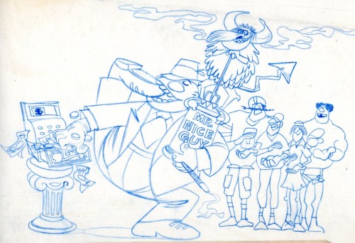
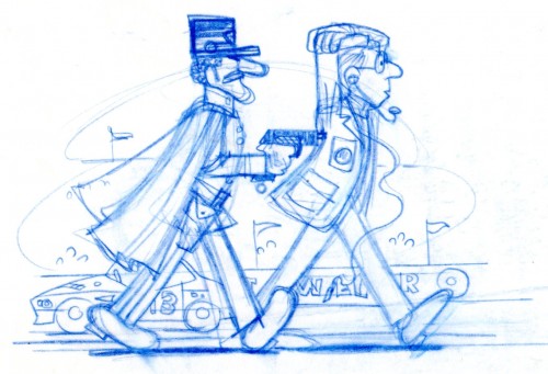
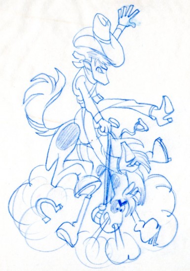
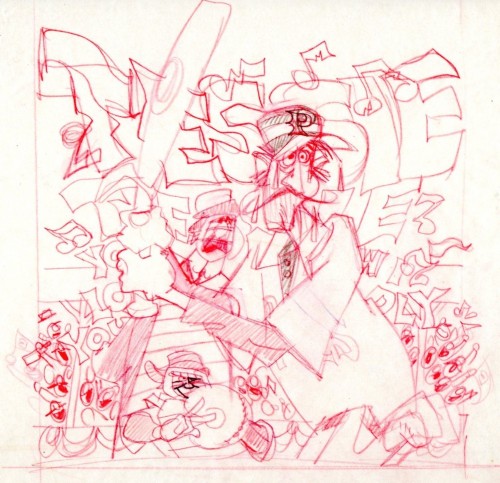
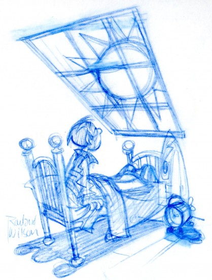
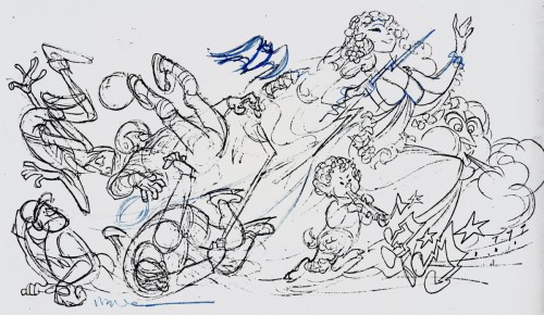
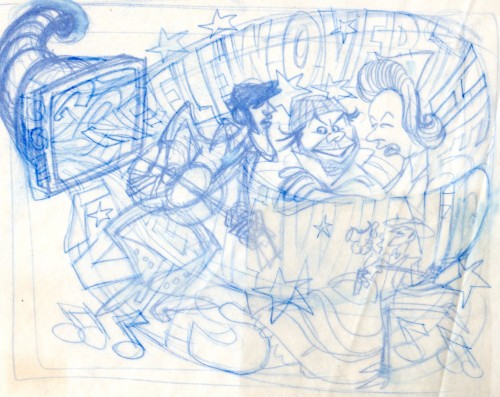
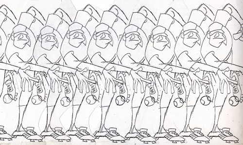
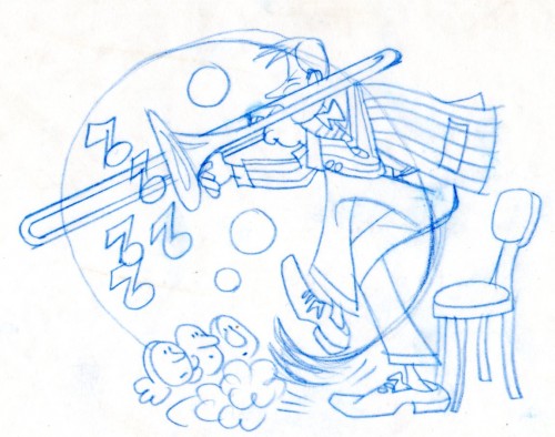
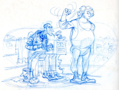
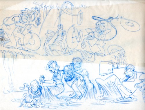
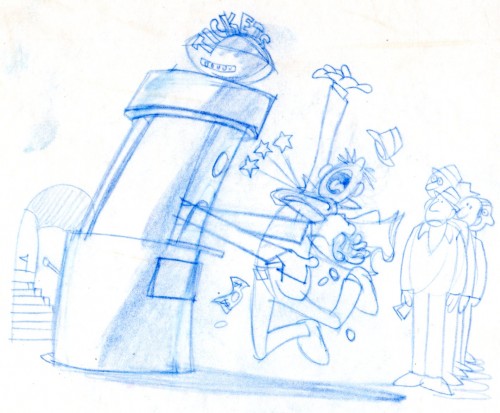
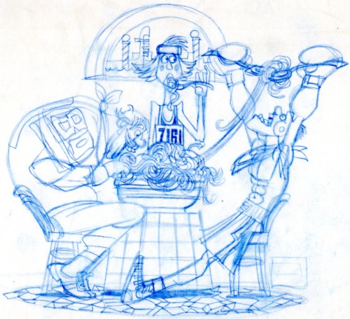
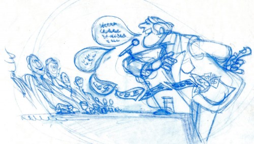
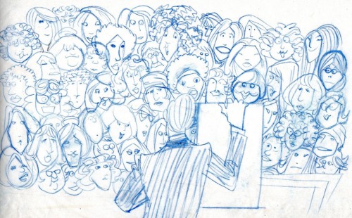
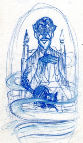
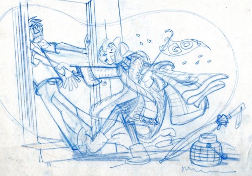
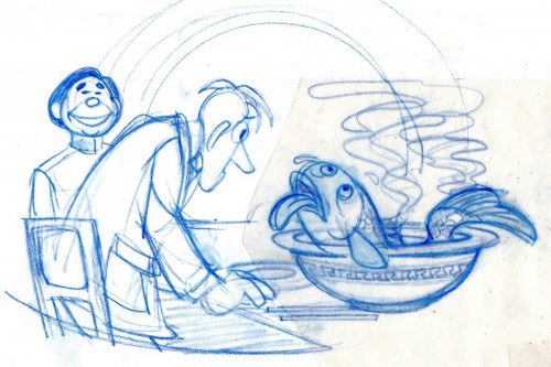
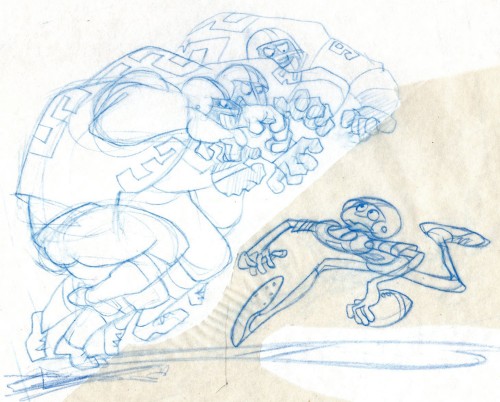
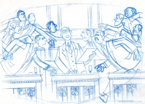
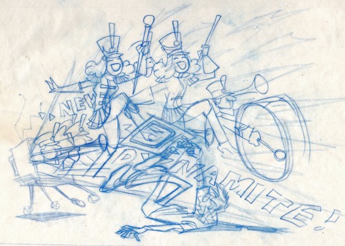
- The following are a collection of rough sketches that Rowland B. Wilson did in creating illustrations for TVGuide. These come from the extraordinary collection of Bill Peckmann. I’ve been searching for final, colored images to match these but haven’t successfully found any as yet. You’ll have to look at them for what they are: rough prep drawings for finals. In the past I’d posted a number of these with some of the final cartoons, so you can go there, if you like, to see how he built up from the initial sketches.
In all, I find it enormously informative to see the process from the beginning from such an artist as Rowland B. Wilson.
 1
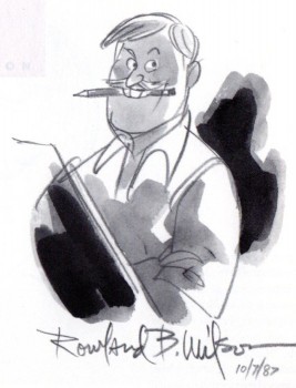
1Here is a self-caricature from 1987. (It’s from R.C. Harvey’s wonderful book
“A Gallery of Rogues: Cartoonists’ Self – Caricatures”
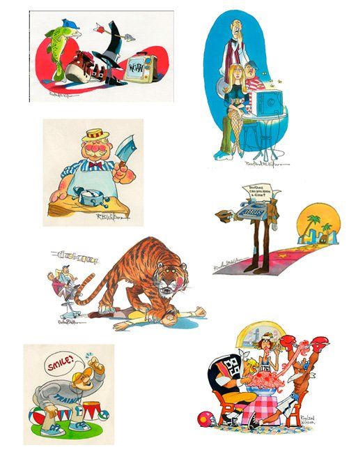
This card shows a number of the TVGuide illustrations
that were done by Rowland B. Wilson. Notice #14
is the last one on thias card. Unfortunately, this
is the largest size I have of the color version.
To close it out, I have this image from Suzanne Wilson, from an original of a RBW TV Guide illustration:
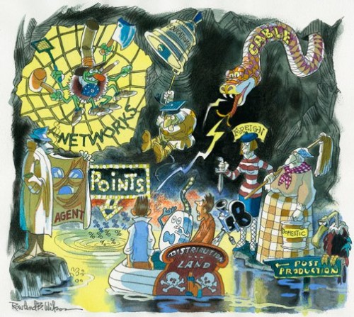
Many thanks to Bill Peckmann for the hard work in putting this post together, and thanks to Suzanne Wilson for the final image.

on 10 Feb 2012 at 11:33 am 1.Joel Brinkerhoff said …
Terrific!
on 10 Feb 2012 at 3:16 pm 2.The Gee said …
For sketch Number 10 of the trombonist…
is the image backwards? Or did he intentionally draw the notes that way?
(sorry if I’m wrong and it is oriented properly.)
————-
I guess a minor benefit from looking too hard at that one is that in looking at the others, it is interesting to figure out the general types of composition he used. There’s a lot of these illustrations/cartoons which read from left to right and force the eyes to move at an sharp (enough) angle. Number 21 with the person speaking is an exception to that, yet, it also shows a trait in a lot of his work you guys are spotlighting.
The characters are drawn grouped together or with objects in a smart, clean way….with a nice hierarchy of design throughout, I guess.
Like in No. 20, there’s three large football players rushing but really it is one huge imposting thing and it is smartly drawn like a big beast of a player.
And, so many of these characters are in the middle of an action. Not many non-dynamic poses or portraiture-like depictions of people.
Really nice stuff. Much,much better than my clutzy word choosing and finger button clicking on this keyboard.