Commentary 08 Oct 2011 06:33 am
Really Rambling
- I enjoy reviewing and assessing the past week on these Saturday blog posts. It gives me a chance to reflect on what had happened in the recent past and spilling my thoughts out here.
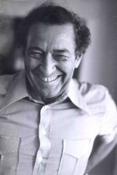
 In the last week, I purposefully put John Hubley front and foremost on my blog’s mind. With the upcoming AMPAS show on Monday, I found a good excuse to pull together a lot of the past pieces I’d done on Hubley’s work and drawing. He was one of the foremost fine artists of animation’s past, and it seems to me his name, like many others of the period, are falling into the historic dumpster of time. His accomplishments were many that helped shape who and what we and animation are today. Yet, it feels as though we’ve stepped back into the mid-thirties with the computerized-accomplishments of cgi.
Animation HAS taken an enormous step backward, yet it keeps the future-seeking part of the business in the line of vision.
By that I mean that cgi has forced a concentration of life-like looking little puppet characters that appear superficially “real.” It’s nothing more than a cartoon version of 19th century illustration. Gone are
John Hubley all the strides that 2D animation had made
are left to the 2nd rate TV animation or the small-time boutique filmmakers. Any progress that graphic stylization and animation graphic motion has developed over the years has been put out to pasture in the business model of 2011 and sent to the low-budget creators. This, to me, is probably a sure sign that animation will wither, at least for a while, except in the hands of the creative entrepreneurs and feisty animators.
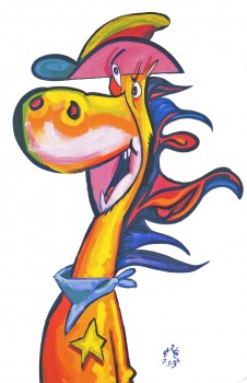
 John Kricfalusi has this week shown off a nice graphic piece of animation he did for Cartoon Network’s Adult Swim. He’s successfully experimented with movement and has fallen back on his usual sense of graphic design. The piece is a real contribution to the language of animation (perhaps equal to a new punctuation mark), but we have to take note that this is relegated to a bumper for a lot of terrible TV animation designed for 16 year old boys. It’s wasted there. In a way, more successful was his guest animation for the __________John Kricfalusi
opening titles of The Simpsons. Actually,
this animation in its content and stylization (both graphic and animated) were more daring. It brought back memories of the coarse and graphic animation done by Klasky-Csupo for the first incarnations of The Simpsons. One wonders whether the show would have been as successful if they had continued doing what they’d done in those first pieces and episodes of Matt Groening’s work.
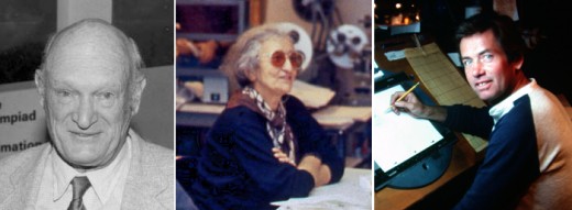
But back to John Hubley. He has to have been the finest artist and the best draw-er I’ve met in animation. His loose scribbles revealed worlds beneath them and his oil paintings burst with imagination and lively colors. Nothing was unintentional although it all worked in an improvisational way. Like the ad-libbed voices, Hubley liked seeing his artists improvise their way out of scenes. He called on the creativity of the lowliest employee to create those wonderful films. For those who didn’t want every 16th frame drawn out and planned for them, Hubley’s method was liberating and challenging and wonderful. Animators like Tissa David and Bill Littlejohn and Barrie Nelson thrived on the way they were handed whole films and pushed to create. Films like Windy Day or Cockaboody or Of Stars and Men glowed off this improvisation, and whole new bits of language sprouted from these works.

Animators: Bill Littlejohn, Tissa David, and Barrie Nelson
Those who worked for Hubley felt as though they were creating something important, films that had something to say and looked beautiful. Needless to say, they (we) loved the experience. Isn’t that all we could hope for in this business?
.

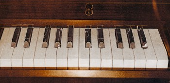
- Talking about extreme design, John Schnall has to be one of the most entertaining guys out there. He continually comes up with funny and artful pieces which he puts on his website. His most recent piece is an interactive keyboard called The Interactive Crappy Piano. I suggest you try playing it and see where it gets you.
- J.J. Sedelmaier has an entertaining piece on the Imprint site about the first elements used to showcase the sale of Hanna-Barbera and the rise of Cartoon Network. You’ll be entertained by the beautiful cards on display. (Especially if you have a fondness for the early HB years.)


on 08 Oct 2011 at 6:03 pm 1.The Gee said …
“It’s wasted there.â€
Well, yeah and no.
As it goes, it looks like he had a chance to experiment. Even if the intended or expected audience doesn’t appreciate it beyond being the odd eye candy in it, it probably accomplishes at least two things:
It gave him a chance to build on his next works and will likely inspire someone else to add the innovations and touches he did to what they are doing.
That’s not so bad. As long as whoever is inspired builds off of the good parts with innovation in mind for what they are working on, it should be positive. Hopefully, people won’t just try to build off of the good parts and mimic those elements. That would do much good.
As it goes, on the Hubley films, not only are you doing much to add to the historical record, this internet thingamajig is preserving a lot and there is what I guess could be called Peer Review which occurs. Or, maybe collaborative researching. But, there is certainly a great amount of archiving of important stuff.
Bad metaphor but: it takes a spark to make light begin to shine.
on 08 Oct 2011 at 6:22 pm 2.The Gee said …
Gaagh!
I intended to type: hopefully…people…won’t just..mimic those elements because that would NOT do much good.
Oh well, so it goes.
Since I pulled the lever one more time, let’s see if i can get a joker or the devil.
What you wrote about the current state of CG being in a development period that is akin to the mid-1930s….
with CG cartoons for features, I guess it hasn’t made its high water mark film yet.
To me, that’d be “Pinocchioâ€. But, to pinpoint that is also kind of depressing. But, most everything in that film works, in my opinion. Hand drawn/classic Character animation, also in my opinion, has many, many great examples since then. But, the whole shebang….
With CG animated cartoons the main concern/the main problem isn’t just character design, acting, it is the character animation, right? Then there’s the heavy reliance on established movie stars for voice acting and that sameness in character design (which is weird and which happens with handdrawn, too). It can’t be enough to just say evidence of the hands that created should be there or more life/ avoid that uncanny valley, right?
So: what should be next? What matters that CG works are missing? That they need to become better?
on 08 Oct 2011 at 6:44 pm 3.Stephen Worth said …
John has another bumper that hasn’t aired yet. He’s posted bits of it on his blog though. It’s a blend of UPA and fourth dimensional movement theories. It’s simultaneously flat and dimensional with an organic sort of shape shifting that I’ve never seen before. Kind of like Picasso meets Tom Terrific. It’s the experiment that led to the Simpsons couch gag. Hopefully it will air soon.
on 09 Oct 2011 at 2:08 am 4.Michael said …
Unfortunately they’re all trying to do the sequel to Gulliver’s Travels and no one is aiming at Snow White yet. Nevermind Pinocchio. Pixar did something with Toy Story; Brad Bird tried with a couple of films. Now they’ve all given up except to try to make money.
on 09 Oct 2011 at 2:27 pm 5.Stephen Worth said …
Studios are dying. Indies are the hope for the world.
on 09 Oct 2011 at 10:14 pm 6.Paul Spector said …
What is “fourth dimensional”?
on 09 Oct 2011 at 10:17 pm 7.Paul Spector said …
Uh, I meant to add, Time? Timing? Or what?