Bill Peckmann &Comic Art &Disney 15 Sep 2011 06:55 am
Luck of the North – Part 3
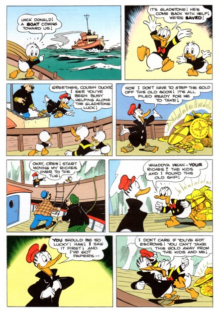
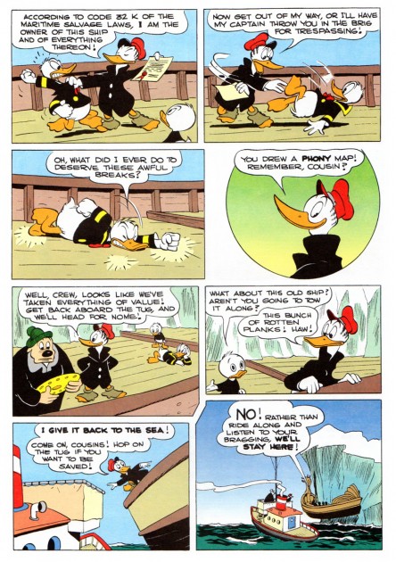
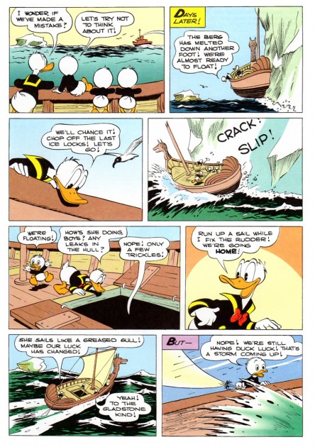
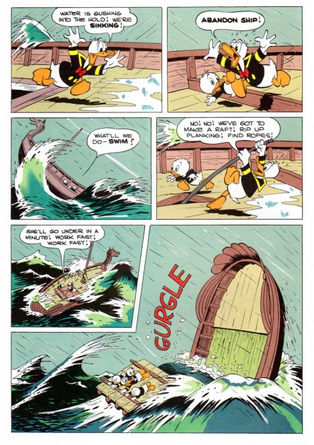
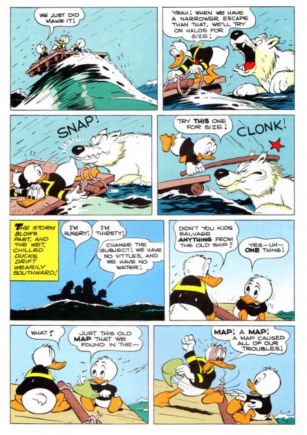
- We’ve come to the end of the posting of the great Carl Barks story, Luck of the North. Bill Peckmann, has been so kind as to send these scans on to us to post. We’ll finish with the newly recolored version of the story complete with airbrushed backgrounds. However, because of the complaints about this version – particularly in regard to the airbrushed backgrounds – we’re showing some of the other versions of the first of the pages in this section. We’ll start with these originals.
Let’s start with the cover. First, I’ll repost the background I’ve shown in the past. Following this is the newer version done for the Gladstone Giant reprint.
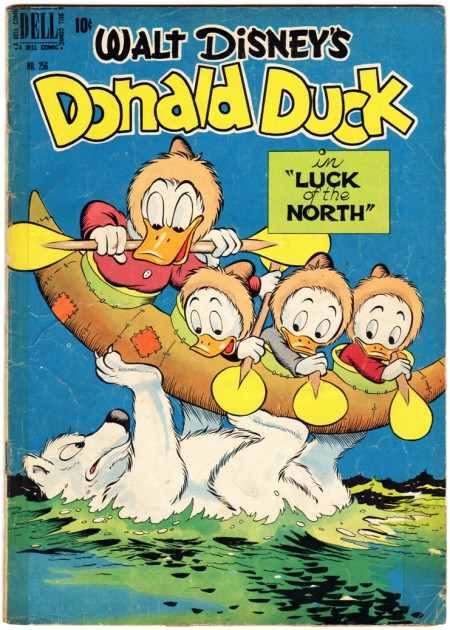
The original comic cover.
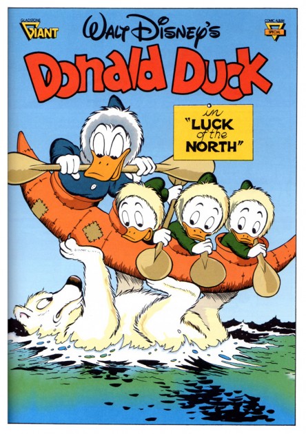
Bill Peckman wrote: This is the cover of the Gladstone Giant reprint, Nicely done.

B.P. wrote: With the Part 1 commentary about
original color printing vs. reprint color vs. a black and white print job,
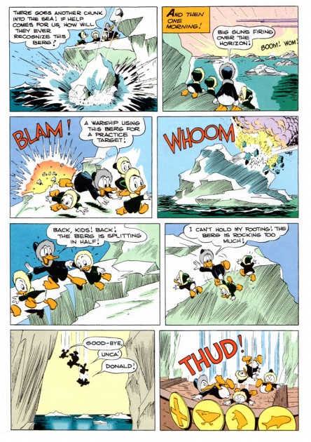
I figured we could open with the first page of Part 3 shown in three versions.
Here’s the B&W page.
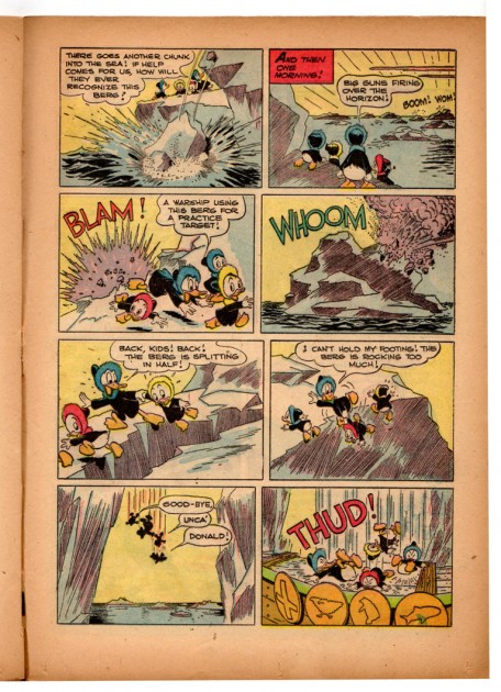
This is the original comic book.
 23
23
This is the Gladstone Giant reprinted page
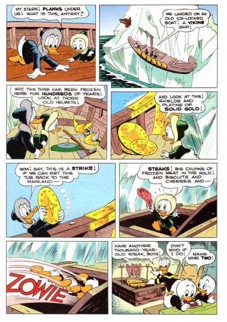
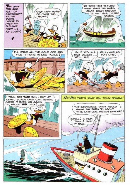
followed by the remainder of the story.
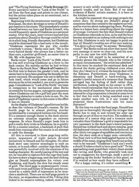
B.P. writes: One of the best reasons for getting the Gladstone reprints was the excellent and knowledgeable running editorial commentary by Geoffrey Blum in each Barks issue.
Only right that it should be included here.
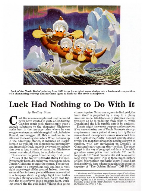 1
1
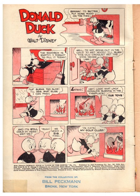
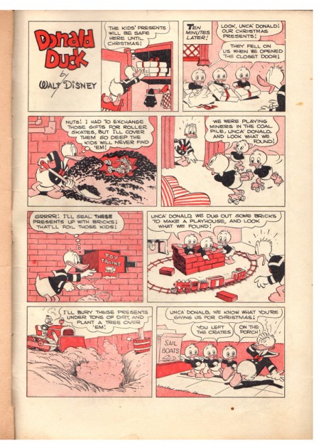
B.P. writes: Here are the endpaper and back cover gags from the original comic book.
(Sorry about my blue rubber stamping but even as kids we knew that these books were pure golden treasure!)
 1
1
You can find the first two parts here: Part 1 & Part 2.




on 15 Sep 2011 at 1:16 pm 1.Stephen Worth said …
Gladstone totally missed the color harmony that groups the canoe and ducks together to support the opposing composition of the bear vs the kayak. That was typical. They made presentable color, but not particularly artistic color.
on 15 Sep 2011 at 5:15 pm 2.Thad said …
This is from the Gladstone I era. The Gladstone II era improved the computer coloring dramatically. The work by Sue Daigle-Leach and Scott Rockwell in many of the Gemstone books of the 2000′s is downright gorgeous. There’s no substitute for the original painted covers, but the original Western coloring of the stories was absolute garbage with no artistry whatsoever.
But. Since [most of] the original art has been collected in the Carl Barks Library, I find myself almost never wanting to look at any color versions of his stories.