Commentary 27 Nov 2010 08:52 am
How To Dragon – Movie
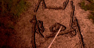 – It’s taken me a while, but I’ve finally seen How To Train Your Dragon, albeit in DVD form. The film’s reputation preceded it when everyone from A.O. Scott to Mike Barrier have praised it. (Sometimes in both reviews it seems faint praise, but praise just the same.) I have to say I have a similar position on the film. It’s a frustrating affair.
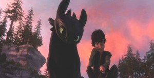
It all starts with loud and violent warfare, Vikings vs Dragons. Lots of screaming, fireplay, quick cutting, aggressive movement all set to cacophonous music. John Powell, who did one of his first animation scores for my “Goodnight Moon,” has given a mixed bag of a score for Dragon. Excellent and delicate parts
 vs the loud and booming music which is played low in the background so as to create a bed of noise.
Then there’s the meeting between the hero, Hiccup, and “Toothless,” the dragon. These are fine sensitive scenes with interplay between human and dragon cleverly done without the need of dialogue.
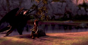
(I suppose I’m supposed to say “Spoiler Alert” here.) However it doesn’t take long for the shouting to return as a trumped up ending resolves the film. (Hiccup having lost his leg took me by surprise and made me think of those in Iraq and Afghanistan, and I wasn’t sure I liked the comparison.)
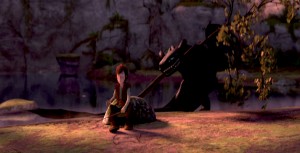
Looking at the film from a distance, there’s a different feel to the big picture. Yes, you can see the “Acts” change in the script with all the clunking machinery dragged in behind it, but the Art Direction, I think, is so original that it makes you feel something else. It’s a real positive for the movie.
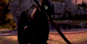
Directors Chris Sanders and Dean DeBlois have done a job equal to what they did on the Disney film, Lilo and Stitch. All the outer space nonsense from that film dragged it down to middling, when the scenes on earth between Lilo and Stitch were excellent. A similar problem holds true for Dragon. All the
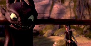 tiresome fighting between dragons and Vikings is tedious to get through for the friend-making scenes between Hiccup and Toothless.
There’s a touch of Miyazaki’s design in Sanders’ sketchbook. The face of “Toothless” looks not unlike “Stitch” which looks very much like “Totoro.” However, there’s something
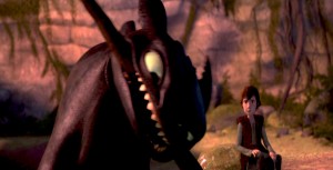 comforting in that look, and it’s certainly not a negative.
As a matter of fact, the character design is extraordinarily playful. The drawing can be felt through the cgi puppet-like creatures, and there doesn’t seem to be the visual “attitude” given most animated characters these days. (Take a look
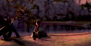 at Tangled to catch the “attitude” quotient for the year. Glen Keane should have looked a fourth time at his models; they’re embarrassing when compared to any pre-Keane designer.) Dragon seems to have left the visual clichés on the drawing table, and they produced an original. As I pointed out yesterday, when reviewing the “Art of Dragon” book,
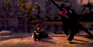 the artwork is all exemplary. It seems there isn’t a wasted sketch or painting that didn’t make it to the film. Of course, that means the book is well constructed and lets it feel naturally connected to the movie.
As a matter of fact, there are only a couple of the typical “Dreamworks” – type 20th century* jokes dragged
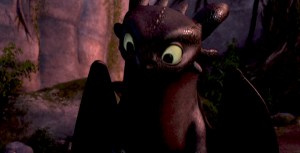 into the film, and that is a blessing. However, as each one – dropped by Craig Ferguson’s character – falls, one can’t help but grimace. They’re so clunkily placed into the movie – something about his “underwear” is the only one I can remember. We can deal with a surfer-dude, as one of the trainee kids, as long as his dialogue seems appropriate to the
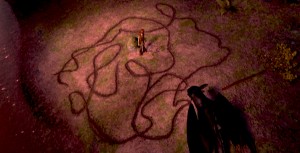 film as a whole. Without these ties to the modern world, the film would have felt more timeless and have lasted longer on the shelf.
This film far excedes Toy Story 3 in all departments and is very much the better film. However, neither comes close to The Illusionist for originality and filmmaking ability.
* Note: I meant to say “20th Century” not “21st Century.”
Note that the sequence of frame grabs is the same as the storyboard section I reproduced from the book, yesterday. Compare and contrast.

on 27 Nov 2010 at 9:19 am 1.Elliot Cowan said …
As I said yesterday, I like this film a lot even though I do find it incredibly frustrating.
* The young vikings, the adult vikings, the dragons and separately Toothless don’t seem to have a common design.
They all look like they’re from four different films.
I’m also not sure the “regular dragon” designs translate well into 3D, but I think I’m the only one who feels this way.
* Particularly in the first act, we’ve seen this material so many times before. Do we really need another misunderstood inventor character with a disapproving father? Do we really need another “meet and mimic” scene? Do we really need the forced romance?
* Wouldn’t it have been nice if the film makers had created a complete, enclosed universe and had given the characters all the same accent?
* Why, after spending a goodly portion of the film showing Hiccup learning how to train his dragon do they throw it all away by letting the other kids learn to do it in an afternoon.
Anyway.
I’m getting nitpicky now and it’s mostly through frustration.
I would be pleased if the sequel was called “How To Train Your Giant” or “How To Train Your Troll” and so on…
on 27 Nov 2010 at 11:05 am 2.Michael said …
Of course, I have to agree with you on all counts. But the problem is almost all animated films have the same troubles. Accents and dialects come from all over the world in every film. The Australian playing a Brit while the Brit plays a Southerner. It’s hard to keep them straight, and the end note is that they all meld together.
I felt the design styles mixed better than the past films. Look at the styles in MULAN or LILO & STITCH. You can only scratch your head. The one dragon that doesn’t seem to blend in with the others is the lead, Toothless. He comes out of Miyazaki and certainly doesn’t blend with the other CalArts dragons.
I hear your pain, but we’ve been so inundated with these problems I’ve become inured to them and almost dismiss them. However, I don’t ever seem to get past the story problems of any movie. This film’s story is ripe with clichéd nonsense that is the hardest element to forgive. Other than the touching silent parts, the is annoyingly familiar.
on 27 Nov 2010 at 3:06 pm 3.Wouter Morris said …
” (Hiccup having lost his leg took me by surprise and made me think of those in Iraq and Afghanistan, and I wasn’t sure I liked the comparison.)”
Ridiculous, oddly misplaced hypersensitivity.
on 27 Nov 2010 at 4:21 pm 4.Michael said …
Wouter Morris, who are you to tell me what I should feel? If I felt the “oddly misplaced hypersensitivity” I assume that others have as well. Perhaps this is why the directors, on the DVD, talk about the “touchy” decision as to whether he should lose the leg and the fact that they tested it several times.
As it turns out, they left it. I’m glad they did, despite the cold chill it gave me; at least something original came through. Will he have the amputated leg in future episodes?
on 27 Nov 2010 at 4:25 pm 5.Marcus said …
It’s a cute film for kids, but it’s NO “Toy Story 3.” The cinamatography is confusing, and lighting TOO dark. The animation is spotty, and it’s purpose decidedly mixed. A handful of wonderful scenes do NOT a movie make.
Whereas “Toy Story e” excells in every department–especially where story and character are concerned. And a diverse palette of color and lighting, and the sure-footed camera work runs RINGS around Dragon.
Dragon is a cute kids cartoon. But “Toy Story 3″ is a great FILM.
on 27 Nov 2010 at 4:37 pm 6.The Gee said …
Not having seen the movie, I’d agree that having a character that’s missing a limb is additive. If it were a superfluous thing, that might be bad but if it is a consequence of part of the story/pre-story then that’s a bold choice.
(I think there is a PBS kids-in-school cartoon with a character who is missing part of his arm. It goes unexplained. And the character is athletic–I think he plays basketball. Go for it, I say.)
As for coming down on being “hypersensitive”….sheesh….if a film evokes something within the audience or in part of the audience…well, isn’t that what film, good or bad, is going to do?
Wouter, just like you felt the need to express what you did, Michael just felt something and felt the need to express it. What’s it to you to express yourself in the first place?
The way I see it: he’s an artist–most of us are artists– expressing is what we do. If what one of us expresses–especially the person who runs the site– don’t jibe with you, jump. You didn’t need to bother to type even one letter…
on 27 Nov 2010 at 4:47 pm 7.The Gee said …
Ack.
Sorry about that.
Prior to reading the comments I had intended to post:
That excerpted scene…if I saw it straight out of the movie or in it, I would not have thought of Winsor McCay. The pencil roughs/thumbnails evoke that but it didn’t translate so good to my eyes. (and those grabs are kind of murky but I guess that is in consequential)
on 27 Nov 2010 at 5:21 pm 8.Elliot Cowan said …
Marcus – I’m with Michael on this.
I do not think Toy Story 3 is a very good film, or at least I can’t see why it’s so particularly beloved.
At it’s core, Dragon is about a friendship.
For all its faults, it’s easy to buy that friendship. which gives it a little heart.
on 28 Nov 2010 at 5:08 pm 9.Mario NC said …
I agree with you, Michael. HTYD is vastly superior and more exciting that Toy Story 3. You felt that it was a “frustratingly affair”, I felt surprised and excited that a movie with 120 million budget managed to have hearth and be kind of unique.
The problem with the animation industry will always remain the same. It’s an expensive medium, so you have to balance artistic sensibilities with a success in the box office. Pixar managed to do this to a certain degree, but indie animated films can’t play in the same field. For the most part, independent films like The Ilusionist, The Secret of Kells or Fantastic Mr. Fox are risk and unique movies. They are relatively cheap, but they’re never big hits with the casual audience. Risk and originality never translates to millions of tickets being sold. The families that go to the movies want accessible, big budget movies with a lot of jokes and action sequences. In an interview, Chris Sanders mentioned that when he went to work for Dreamworks, Jeffrey Katzenberg said to him that he wanted three specific things in HTYD:
1. A father and son relationship.
2. A world similar to the one present in the Harry Potter films (meaning that is both magical and scary).
3. An action movie for boys with a little romance and comedy thrown in.
I find this statement both terrifying and infuriating. After all, these are three of the biggest clichés in animation. In other words, make it safe and marketable, boys! With that said, it’s almost a miracle that Sander and DeBlois managed to go way with some of this stuff (the no-dialogue bonding scene, Hiccup missing a limb). It’s really a shame that we will never see a film where Sanders is given full reign to his potential. That was supposed to happen in American Dog, but I guess we all know what happened to that.
If you’re interested Michael, here’s the full interview http://www.speakingofanimation.com/2010/06/podcast-how-to-train-your-dragon/
on 28 Nov 2010 at 6:42 pm 10.The Gee said …
Well, with the exception of Harry Potter and magic, what Katzenberg requested seems to also apply to Mark Twain’s “Huckleberry Finn.”
So, I think just dismissing story advice as cliched out-of-hand isn’t warranted. Without having read the interview you posted, those three things come across as a supporting framework to me.