Books &Disney &Layout & Design &Mary Blair 26 Jul 2010 06:31 am
Mary Blair – 3.
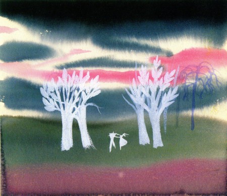
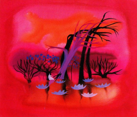
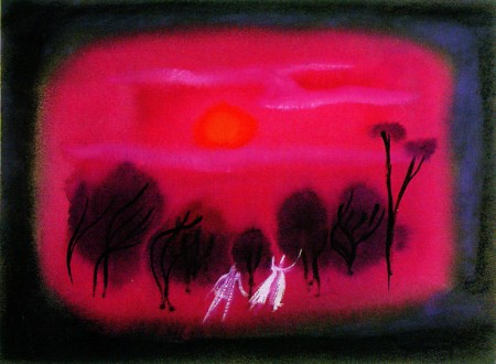
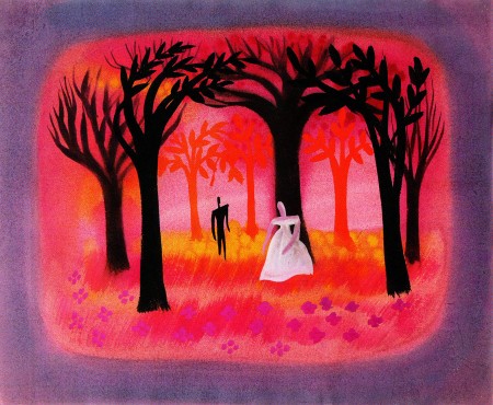
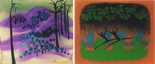
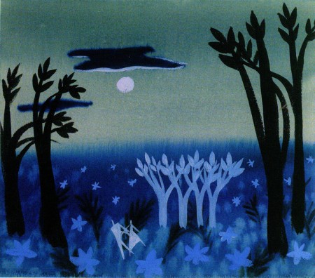
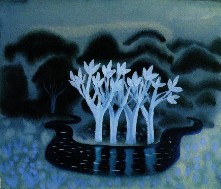
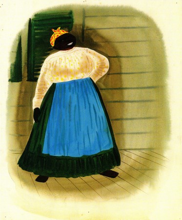
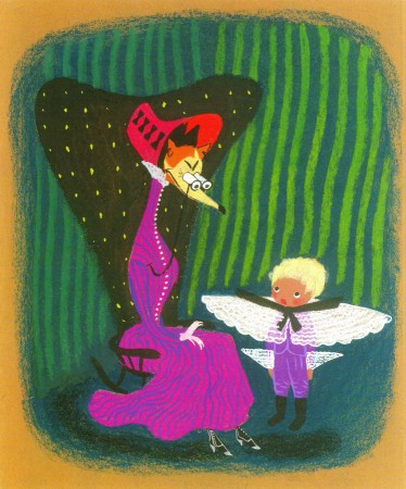
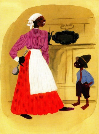
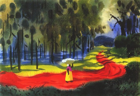
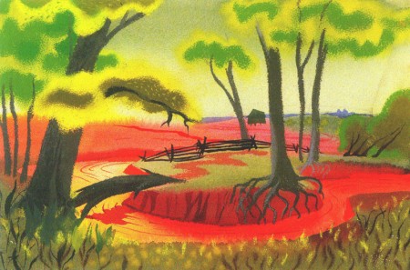
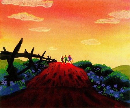
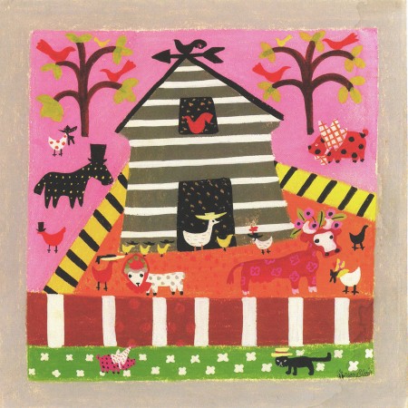
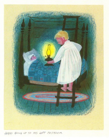
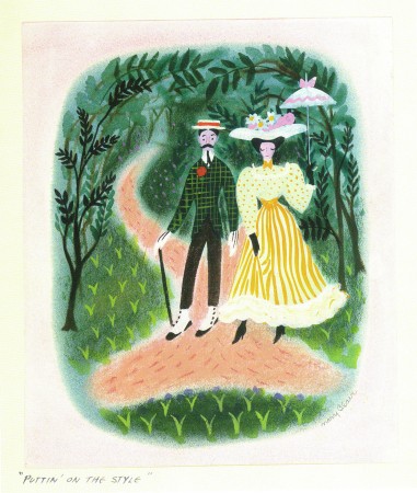
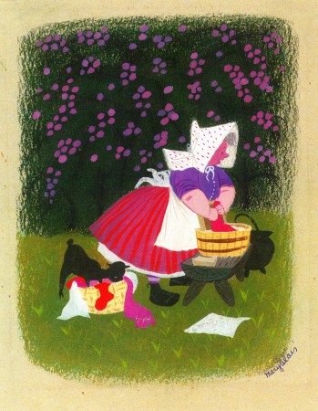
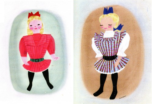
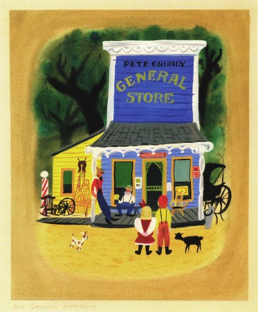
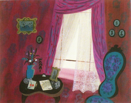
- Continuing gwith some selected stills from the Japanese book, The Colors of Mary Blair, I’ve chosen concept art for three films; one animated: Two Silhouettes, two live action: Song of the South and So Dear To My Heart.
Concept art for MAKE MINE MUSIC’s Two Silhouettes
Concept art for SONG OF THE SOUTH
Concept art for SO DEAR TO MY HEART.



on 26 Jul 2010 at 8:38 am 1.Mark Mayerson said …
The concept art for Two Silhouettes is way better than the resulting film.
I’ve always thought that film was the best possible argument against rotoscoping. The live actors are dancers, definitely more graceful than the average person. However, they look positively clumsy next to the animated characters.
on 26 Jul 2010 at 10:25 pm 2.Michael said …
Boy, do I agree with you, Mark. I have trouble looking at those compilation features despite some good design and some good animation. (It’s amazing how poor some of the drawings from Peter and the Wolf are in the Kimball scene I’ve been posting.)
Posting all this work from them has forced me to go back and look at the final films again – or try to. I keep falling asleep. (How different I am from the 12 year old kid watching Disneyland or The Wonderful World of Color.)
on 27 Jul 2010 at 1:42 am 3.Andy Menter said …
I love these Mary Blair posts! Her work always puts a smile on my face.
on 27 Jul 2010 at 9:27 pm 4.Eddie Fitzgerald said …
Biss! Pure bliss! Thanks for putting these up! I guess I lke the compilation films better than you and Mark do. Who’d want to do without Pecos Bill and All the Cats Join In? I just wish Disney had used better judgement about what shorts to use. If the choices were right I wouldn’t mind seeing compilation make a comeback.