Animation &SpornFilms 04 Feb 2010 08:47 am
Moving feet – using it
- The other day I’d written about a pet peeve of mine. This is when animators take the poor layouts they’re given and simply inbetween them. As a result, the feet on two related layouts slide from one position to another. This is not something real people could or would do, yet animators do it out of laziness. It’s a sure sign that the animator isn’t thinking of the character as a living/breathing organism. It’s just a bunch of drawings to that guy.
How to fix the problem; it’s easy.
On an early short film of mine, I worked with an illustrator, Rosemary Wells. It was her first time seeing her characters animated. Consequently, she had a lot of involvement in the process. I ended up having to take drawing lessons from her – how to draw her characters. I travelled upstate at least half a dozen times to watch her at work.
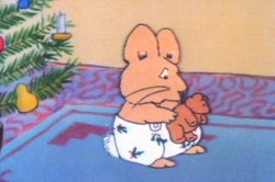
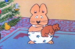
In the end, she gave me a bunch of drawings that she hoped I would follow. In one key scene, she drew her character, Max, with feet facing one direction. Then in the next layout, his feet are facing another direction.
 1
1 2
2 I could have just inbetweened his feet, or even let them pop from one position to another (as Elmer does in that GEICO spot). It would have looked horrible. Instead, I chose to treat the positions as animation moving from one foot to the other. I added a stop position in the middle for a reaction – pause.

Then I let the scene play out.
Right side to watch single frame.
The end result gave a bit of character to Morris, and worked within the needs of the scene. A few extra drawings paid off. (This, of course, is not something you’d see in Flash – it’d just pop.) The way I handled the move made Rosemary Wells happy, and it made me happy. It took the monkeywrench she’d thrown at me to make something more alive, and I was happy for it.
Note that I’m not patting myself on the back. I’m just saying that this is something that should be second nature to anyone out there that considers themself an animator. If a layout you have to follow indicates feet moving, either change them or make them work.

on 04 Feb 2010 at 9:20 am 1.Mike Rauch said …
Perfect illustration of what you were talking about the other day! I was hoping you would give an example of a solution to avoid the moving feet, so this is great.
It would be interesting to read your thoughts on other common mistakes, or lazy habits along with illustrated solutions like this one.
on 04 Feb 2010 at 11:46 am 2.Dave Levy said …
Great lesson and follow up to yesterday’s post. At Blue’s Clues we used to have the opposite problem. Some animators would animate as if a character was nailed down to floor with spikes. There was never a small step to the side. In a long scene it was really deadly.
on 04 Feb 2010 at 4:51 pm 3.Nick said …
I know exactly what you’re saying but what can you do when most of the animation today is being done overseas by people who really couldn’t care less?
on 04 Feb 2010 at 5:22 pm 4.Michael said …
Though most of what I’ve said has to do with animators and their animation, layout artists are guilty of supplying them with layouts that are poorly planned.
Just as a script writer for films thinks out the direction and cutting while writing the script, the layout person should also be thinking of the animation while planning those poses. If there is no layout person planning for the overseas studio, the storyboard artist should be thinking poses for the animator.
The problem is one within the system for everyone to think about.
on 05 Feb 2010 at 12:07 am 5.Thad said …
I can’t even see how a quick in-between would even be considered as a solution to the movement. I admit I have a hard time visualizing in my head “how could this scene be made worse”.
on 05 Feb 2010 at 7:50 am 6.Suvarna said …
Nice Blog!!!
Thanks For Great Information
on 05 Feb 2010 at 2:06 pm 7.skyman said …
First off, i love your blog michael, the disney stuff is amazing.
About the layouts, as an animator i know what you’re talking about. I was working on a tv show the other day, and got a 15 second shot to animate. the layouts (done at a studio out of country) were bad,off model, and out of drawing. I could have inbetweened them anyway and passed it on. Instead i rethought some of them, redrew the rest and went to work on the timing and inbetweening. The shot came out really nice, but I ended up woefully behind, and had to pass off some of the other shots that i’d been assigned. I’m still upset about it. If i had to do it all over again, I’m not sure what the right move would be, i did ask the director before i started redrawing stuff and he approved, but he was upset later when i got behind. I guess what i’m saying is i can understand when people take big shortcuts. A lot of the time, the budget doesn’t allow us to do the job we’d like to. In this case I ended up working 11 hour days and on the weekend to make up for my mistake. Should this be the norm?
Hey also,
that job was animated in Flash, with tons of redrawing. As somebody who’s worked in Flash, on Paper and in other programs much closer to paper(tvpaint) I’m still not buying you trashing anything and everything done in that program. Blame the budgets, or the animators, but don’t blame the tools. I’ve seen plenty of low budget crap done traditionally, as well as really polished, hand animated stuff done digitally.
on 05 Feb 2010 at 2:11 pm 8.Swinton Scott said …
Great post Michael. I think one problem with layout artists of the last 30 years is that they did not start out as inbetweeners and assistant animators and work their way up to layout and storyboard jobs. It certainly gives you a different view of how the process works. So that rather than just doing great drawings for their own sake, you know how they fit into the whole picture and what happens to them when they leave your desk.
Again, great postings about this problem.