Bill Peckmann &Books &Illustration &Rowland B. Wilson 03 Dec 2009 07:37 am
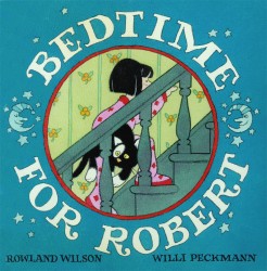
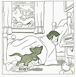
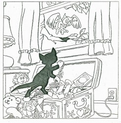
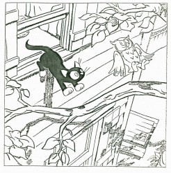
Bedtime for Robert – 1
- Bill Peckmann collaborated with Rowland Wilson, back in the early ’80s, on a charming little book for children that never found a publisher and, consequently, never was completed. Bill had a bound copy of the book – in a mockup form – and sent it to me. I, naturally, would like to share it.
So here’s the first part. There are about 90 pages, so it’ll probably take three posts to complete them all.
First, here’s the note on the inner sleeve of the cover:
- ABOUT BEDTIME FOR ROBERT, A WORDLESS BOOK
Bedtime for Robert is intended to bring to small children an early experience of the special personal relationship one has to a book; the availability and flexibility that a book enjoys over a fixed-time medium such as television.
Being wordless, the book needs no translation. The child has access to it at any time without relying on adults. This early exposure to the physical reality of books will, we believe, enhance the experience of reading later on.
The story combines the pull of a narrative with information that appeals to a child’s curiosity: in this case what goes on at night in the adult world. Although the child must go to bed (reluctantly), Robert the cat’s curiosity leads him into this forbidden adult world. Robert is all cat with cat qualities, not a little person in a cat suit as most cartoon cats are. The child can project his own emotions into the character.
The authors are booklovers with extensive experience in both print and film. We have both won Emrnys and other awards for our animation designs for educational TV.
We believe this is the first book to utilize the principles of film continuity in a printed form. This continuity is vital to the understanding of a narrative without the aid of words.
The use of film pacing supports the unfolding of adventure and humor in a wordless story.
The book is planned to be in color. The pages up to 17 are in finished linework and the rest is in rough layout form.
Robert is conceived as a series. The character and structure would remain constant. The variables would be in the cat’s adventures in various places, seasons, times of the day, and occupations.
Please contact either of us at the addresses below. This is a simultaneous submission.
Yours truly,
Rowland Wilson
Willi Peckmann
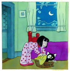
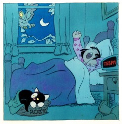
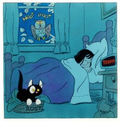
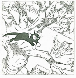
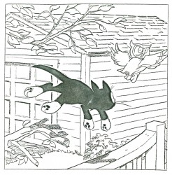
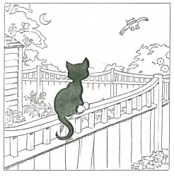
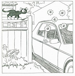
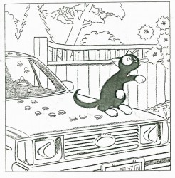
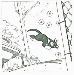
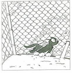
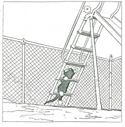
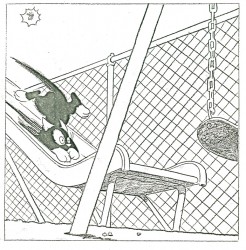
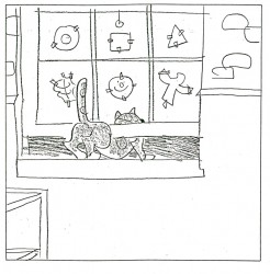
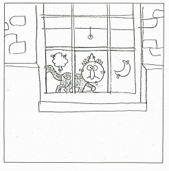
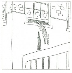
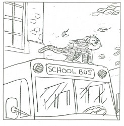
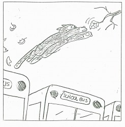
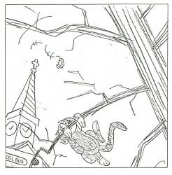
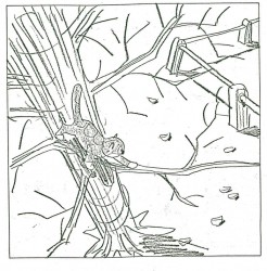
Here, then, are the first 20 or so pages. You’ll see immediately how original this book is:
 3
3(Click any image to enlarge.)
Rowland was so brilliant with color; it would have been wonderful if he’d been able to complete the book. At least we have this much.
Many thanks to Bill Peckmann, again, for sharing this gem.
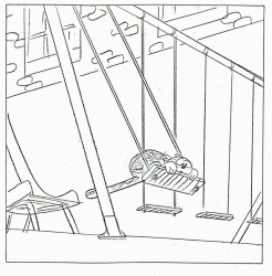
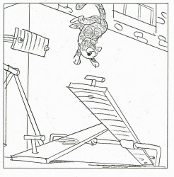
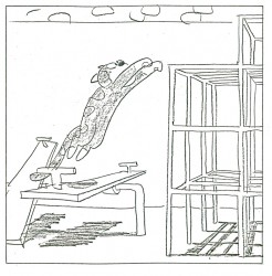
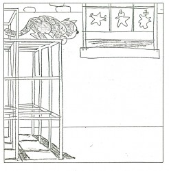

on 03 Dec 2009 at 8:23 am 1.willva said …
i really like it =), wish it was finished. the story is nice and clearly told, intresting and dynamic =).
thanx
on 03 Dec 2009 at 10:04 am 2.Stephen Macquignon said …
I love the look
Why don’t they use LULU?
http://www.lulu.com/
on 03 Dec 2009 at 10:23 am 3.Ray Kosarin said …
A fine book! A charming, vivid character, and beautifully staged adventure (and a master class in layout, to boot!).
Thanks, Bill, Michael, for sharing.
on 03 Dec 2009 at 3:12 pm 4.Michael said …
Needless to say, Steve, there were no computers when this book was created. It’s a different world today.
on 03 Dec 2009 at 10:53 pm 5.Ignacio Ochoa said …
Really beautifull.
It is very difficult to make something so simple and clear as these illustrations. The page 17 is my favorite one, the cat pose is unique.
Thanks for sharing Michael
on 04 Dec 2009 at 10:21 am 6.Charles Brubaker said …
Wow, I enjoyed this. I can imagine it being animated.
on 04 Dec 2009 at 12:37 pm 7.scott caple said …
Yeah, SO HOW COME there’s never been anything animated in Rowland’s style?
I know he designed stuff at William’s , but was any of that true to his style?
speaking of which, does ANYONE have those Pushkin Vodka commercials?
on 04 Dec 2009 at 1:14 pm 8.Michael said …
There’ve been quite a few pieces animated in Rowland Wilson’s style. You can start simply by looking at the Scholastic Rock pieces from the 70′s. “Lucky 7″ is pure Rowland. He designed quite a few commercials for PK&A and Richard Williams’ studio. The Pushkin Vodka spots you mention are also in his style. He designed for Bluth in Ireland and Disney in Hollywood. I think he’s pretty well represented in animation. You just have to look for it.
on 18 Dec 2009 at 12:26 am 9.scott caple said …
Ok, thanks Mike, I stand corrected.. you’re right , there’s alot of roland in the Thumbelina film…and i was with him at Sullivan Bluth, fer petes sake.
I ‘ll look up the others. But wouldn’t something like the book illustrations here be great animated as is?