Animation &Animation Artifacts &Richard Williams &walk cycle 28 Aug 2009 07:34 am
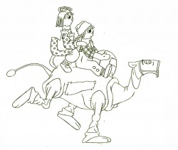
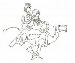
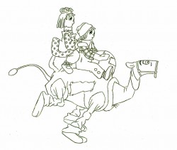
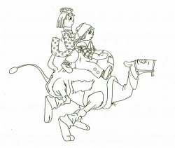
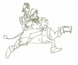
Babbitt Camel Run
- Art Babbitt supervised and animated large sections of Raggedy Ann & Andy featuring the Camel with the Wrinked Knees. He developed the character and gave it the form it finally took in the film. Other animators followed his directions throughout the film.
It was his idea to work the Camel as if there were two people within its body so that the front half didn’t always do what the back half did. As a result, runs and walks were usually peculiar. Often the front would move and the back half would have to catch up. Art never quite understood (nor did he try to understand) what other animators were doing with Ann and Andy. Consequently his version of these characters stood out like unconscious orbs floating around his camel.
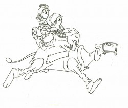
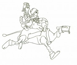
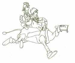
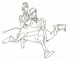
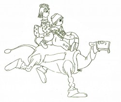
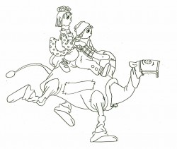
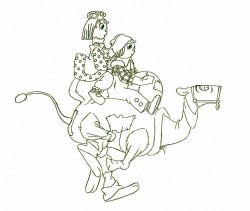
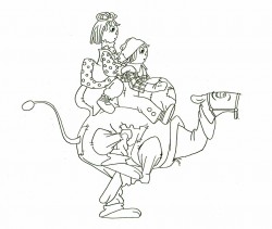
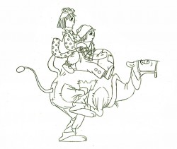
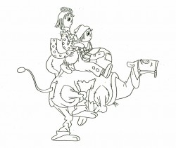
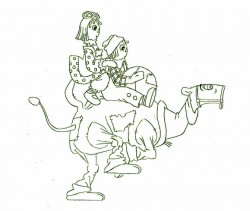
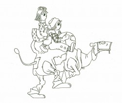
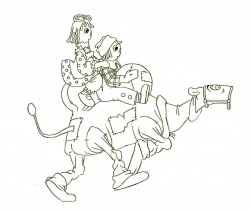
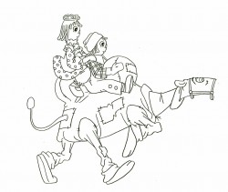
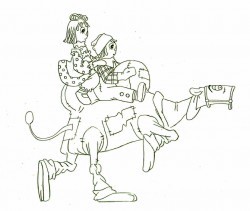
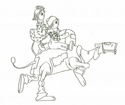
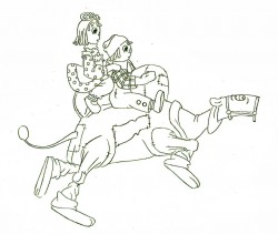
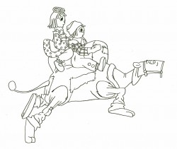
Here’s a run cycle he did. The camel’s hind front leg is on another level as is his talking mouth.
The tight tight tight style is Art’s; the assisting is by David Block.
 1
1 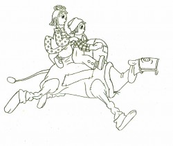 2
2(Click any image to enlarge.)
Here’s the final QT of it all together:
Babbitt’s Camel Run
Click left side of the black bar to play.
Right side to watch single frame.

on 28 Aug 2009 at 9:54 am 1.Richard O'Connor said …
Incredible gallop. What does the back leg do?
I’m assuming it was not part of the cycle, but engaged in another action.
There’s a stretch in Andy’s leg which doesn’t work (for me). It looks like a straight inbetween from the passing point, when the leg probably should have been swinging like Anne’s.
on 28 Aug 2009 at 9:59 am 2.Michael said …
Andy’s leg does grow and shrink, doesn’t it.
If I remember correctly, the back leg accented a bit of the dialogue when it wasn’t running with the other three.
on 28 Aug 2009 at 10:10 am 3.Mark Mayerson said …
Those polka dots and stripes on Ann and Andy are a nightmare.
on 28 Aug 2009 at 11:12 am 4.Dan Caylor said …
There’s no weight…
on 28 Aug 2009 at 11:50 am 5.Michael said …
Ann & Andy are horribly drawn; the stitches on the humps move on their own; the spots and dots and stripes move on their own, but I certainly feel weight. A double hit on both the front and back legs, and it feels strong to me. Maybe you need to see it with the BG move.
on 28 Aug 2009 at 11:53 am 6.Richard O'Connor said …
I don’t see the weight issue either. Especially as an animation like this inherently slows down and gains weight in art production.
on 28 Aug 2009 at 12:11 pm 7.Tom Minton said …
Wonder why there’s no follow through on Ann’s hair? Ann and Andy could be CGI in this scene.
on 28 Aug 2009 at 1:23 pm 8.Jonah Sidhom said …
Technical issues aside, it’s fun to watch.
on 28 Aug 2009 at 1:40 pm 9.Michael said …
Despite any comments, I think it’s still pretty great.
on 28 Aug 2009 at 1:52 pm 10.Rudy Agresta said …
For me, Andy’s “leg shrink” is quite consistent with his anatomy being that of a rag doll, loosely stitched together. I don’t know if that was what Art was thinking about when he did it – I kind of doubt it since his animation of Ann and Andy was the weakest in the film – but the impression I got from the leg was a pulling of an already weak, poorly sewn leg to hip on a rag doll. It worked splendidly for me. Overall, the action is quite smooth and the weight is much more apparent in color against the BG.
on 28 Aug 2009 at 5:14 pm 11.Jason said …
The tail is hypnotic… I… can’t… look…. away.
on 28 Aug 2009 at 6:22 pm 12.David Nethery said …
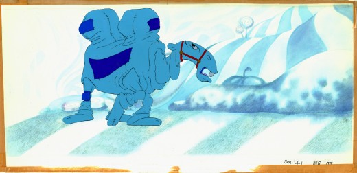
Look at it in context, with the BG :
Babbitt Camel Run in Color
on 28 Aug 2009 at 10:12 pm 13.Daniel Caylor said …
Thanks David. Let me clarify. I can see weight in the individual drawings. But I don’t feel it in the animation. It looks sort of bland to me. Almost like he’s kind of gliding along. The down positions, in my mind, should be a lot more…down. But I’m a student, what do I know…?
on 28 Aug 2009 at 10:47 pm 14.Charles B. said …
That looks like a couple of rag dolls on a stuffed toy camel. Brilliant!
on 29 Aug 2009 at 9:12 am 15.Dan Caylor said …
>That looks like a couple of rag dolls on a stuffed toy camel. Brilliant!
Touché
on 29 Aug 2009 at 9:34 am 16.John Celestri said …
I remember cleaning up Willis Pyle’s Ann, Andy, and Camel scenes. I was particularly conscious of studying how Babbitt drew the Camel’s face (which was so different from Corny’s design). But I followed Tissa’s Ann and Andy as close as possible. David’s link above points out a very important aspect of animation: being able to depict the weight or the weightlessness of the character/object your animating.
on 29 Aug 2009 at 6:54 pm 17.Charles B. said …
Like in Disney’s Winnie the Pooh, when Christopher Robin touches/picks up one of the toys/characters, they become limp and toy like–and a bit more seemingly weightless. When he sets them back down, they come back to life. Very subtle bit of wonderful thought by the Disney animators.