Animation Artifacts &Disney &Illustration &Story & Storyboards 27 Apr 2009 07:46 am
Some Lady drawings
 - The recent DVD of Lady and the Tramp includes some preliminary artwork for the film. I collected a bunch of it and am breaking it into a couple of posts. It’s easier to read off a blog than a tv screen, especially when the DVD tries hard to reduce them to the smallest size they can muster within an overworked border that is virtually pointless.
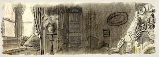
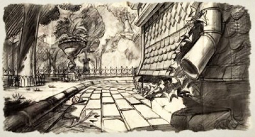
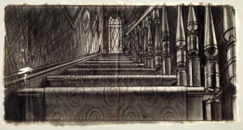
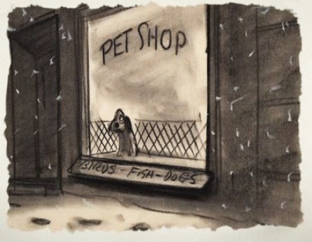
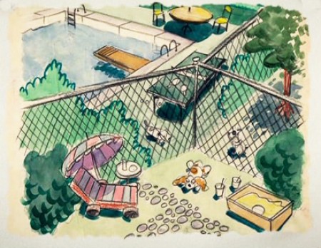
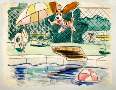
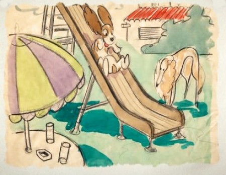
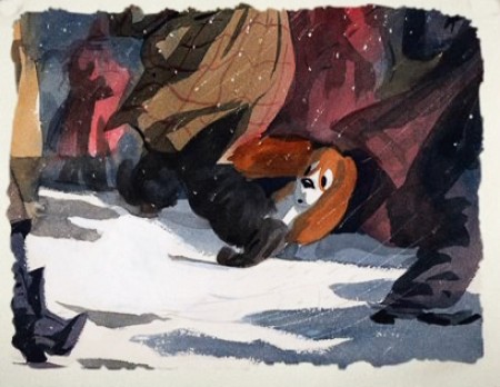
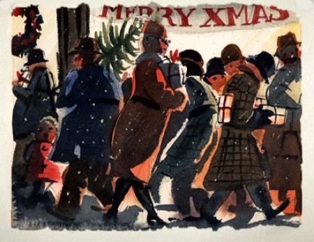
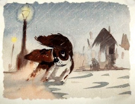
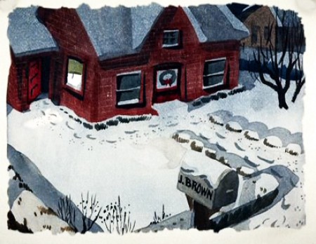
The illustrations – some are obviously BG layouts, others storyboard drawings – have a light and jaunty feel. They’re very cartoon in nature, and belie the actual feature they produced which, at times, is quite beautiful. Disney truly got the feel of “Main Street, USA” in this film.
I’m interested that most of the images don’t take in Cinemascope (since they were probably done before the decision to go Scope.) Most of them are also fast drawings that don’t feature the Tramp as we know him, and even Lady takes on a different form.
You get the feeling this film was pushed out relatively quickly. The results are excellent, regardless. Sonny Burke and Peggy Lee wrote an excellent pop-song score that doesn’t quite capture the turn-of-the-century, but it does capture the atmosphere of early 50s USA.
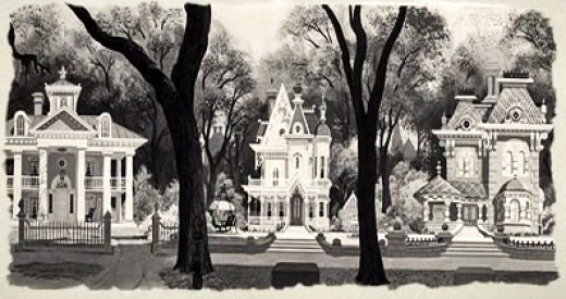
This drawing is in B&W on the DVD, but it appears in
Bob Thomas’ 1958 book, “The Art of Animation.”

Bg for The Princess and the Frog.
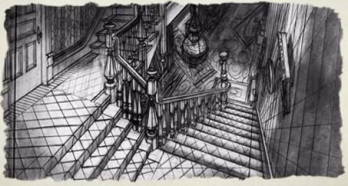
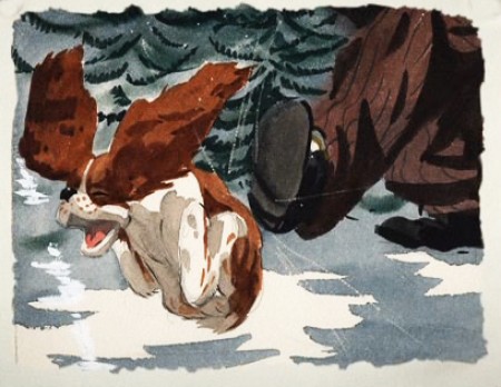
This looks not too different from a shot in Hitchcock’s Psycho.
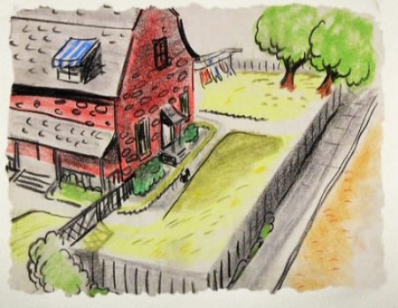
We seem to be in the Little Golden Book territory
with some of these images.
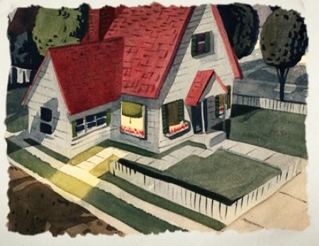
An earlier and different view.
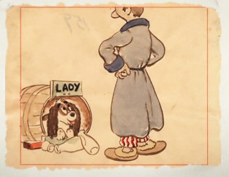
Or did I mean the New Yorker circa 1948?
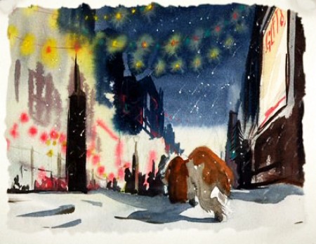
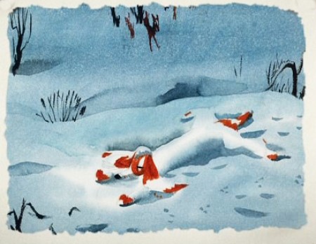
I love weather and would have applauded more of it in the film.
To be continued tomorrow.



on 27 Apr 2009 at 11:40 am 1.Eddie Fitzgerald said …
Holy Mackerel! These pictures are great! Thanks for putting them up!
on 27 Apr 2009 at 2:17 pm 2.Hans Perk said …
I love the images, of course!
I don’t know if I care for what they have done to the edges, as all have the same mask applied, as if the drawing really ended there, giving a false impression of the artwork. Why not just extend it, letting us see the entire drawing instead of having our minds made up for us what we should look at?
Probably again a “our audience is not the discerning, historically interested person, our audience is the 7-year-old who just will not be satisfied with our favorite “four color artwork on disc” special feature.” They probably meant well – I guess we have to be glad we got something at all…
on 27 Apr 2009 at 3:05 pm 3.Michael said …
There’s a lot to be annoyed with in the way these images are offered.
- They’ve reduced them all to such a tiny part of the picture that I don’t think any image is given half the screen. To zoom in on them you have to distort the picture.
- The images are framed in a god-awful setup so that they’ve made all of them the same size. As if a storyboard drawing were the same size as a detailed layout. There’s no way to get a proper relationship.
- Of course, none of the drawings have peg holes in them. Wait, there was one on side-pegs.
- No information is given, so we have no idea whatsoever as to who painted what. It’s disrespectful, if you ask me.
However, I thank heavens they include these images instead of some other video game.
on 28 Apr 2009 at 7:48 am 4.Stephen said …
Maybe in the 51st edition they will show you the rest of the artwork.