Commentary 03 Dec 2008 09:23 am
SB Pro & Con
- The new dvd of Sleeping Beauty has prompted a number of opinion writings on the blogs. Many of them are thoughtful, but they’re full of the usual ranting comments added on.
- The most articulate of the cons is certainly Mark Mayerson ‘s “Sleeping Beauty Puts Me To Sleep.”
The positive piece “Once Upon A Dream” appears on Brian Sibley‘s excellent blog.
As for me I understand both viewpoints, but I am an enormous fan of Eyvind Earle’s work and having seen this film many many times I have grown attached it. I love the subdued nature of it all, the use of the Technirama camera, the stunningly attractive design, and some brilliant animation. It has a majesty and a formality to it that is unique unto itself. I frequently compare the film to opera whereas most of the others are musicals.
I once posted a piece (see it here) by Marc Davis wherein he compared animating Cruella deVil vs Malificent. He said Malificent was always giving speeches whereas Cruella was conversing with others. Two very different moods. That also, in a nutshell, describes the two films. 101 Dalmatians is chatty while Sleeping Beauty is presentational. Opera vs musical theater.
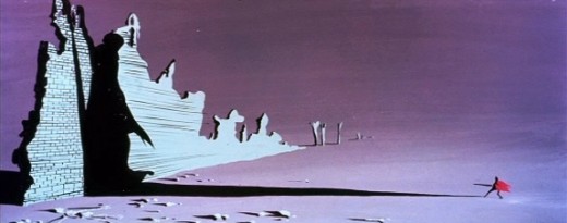
 The film was born into struggle. The animation industry was challenged by a new modernity. The art was moving away from the 19th century graphics and into the 20th century. UPA wrought Toot Whistle Plunk & Boom which led to this film. Oddly enough, Sleeping Beauty aimed its art at the 15th century style of illustration; at least that was Eyvind Earle’s aim in designing the backgrounds. Tom Oreb’s character design was angled to try to work with the backgrounds almost as an amalgam between 15th & 20th centuries. For me, it works very well; others seem bothered by it.
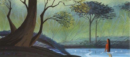
I suspect that the general love of this film’s style has strongly influenced modern animation. Pocahontas, it seems, took it’s backgrounds directly from Earle’s work.

Pocahontas concept art by Michael Giaimo from the book “The Art of Pocahontas.”
The angled squirrels, owls and other forest animals, appeared in many other Disney features & shorts. Those characters were perfect designs to build on, and, what I call the CalArts style, seems to have grown out of that. Angles not circles. Flash was ideal for angles; so was this design. And so it goes. (Or, at least, that’s how it feels to me.)
- Speaking of Brian Sibley‘s blog, he has a fine piece on Eyvind Earle on his blog. His is a regular and enjoyable stop in my weekly internet reading.


on 03 Dec 2008 at 2:00 pm 1.Luke Farookhi said …
I’m afraid I’m in the camp that finds ‘Sleeping Beauty’ to be a hollow film. At the same time I can understand its appeal to many, and can sympathise with those who find certain aspects of it inspiring. I love Tom Oreb’s designs, particularly for the Goons.
The backgrounds are filled with detail that is sumptuous and concentrated enough to be compared to a Van Eyck painting. For me this is part of the problem with the design of the film; the backgrounds seem to me to have been designed to act on their own. Placing moving characters in front of them sort of disrupts them. I feel this is particularly true of the scenes set in the castle. I would quite happily frame any of the backgrounds from the film and hang it on my wall, but I don’t think they worked as animation backgrounds.
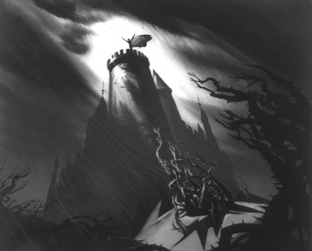
A more interesting direction for the design of the film to have gone in, in my opinion, would have been something rather like the image at the top of this post. This seems to me as though it would be no less impressive or awe-inspiring, yet would not detract from the animation. At the same time it would have been something new and would have retained Earle’s signature style.
on 04 Dec 2008 at 6:35 pm 2.Eric Noble said …
I’m in the camp that is awed by the film’s magnificent artistic beauty and great animation, but left cold by its characters and story.
on 05 Dec 2008 at 9:28 am 3.Simon W-H said …
I read with interest your thoughts and Mark Mayerson’s on Sleeping Beauty. I enjoy both your blogs and regularly drop in to see what’s being talked about. In this instance I am more in agreement with you than Mark. It is true that Sleeping Beauty, in contrast to 101 Dalmations, is more like theatre. Mark Mayerson writes of the story flaws, the over simplification and lack of strong motive for Maleficents actions….looking at opera and ballet, the same criticisms can be aimed at most of the plots employed in those arts. Most Opera is ludicrous, it is the spectacle and the music that matters and I feel it is the same with Sleeping Beauty. The set pieces are beautiful and Eyvind Earles styling is, love it or hate it, (I love it), at least not wishy washy and half arsed. Tom Oreb’s character designs understood and complimented this very well.
It is a simple movie, in spite of the lavish look. I much prefer Marc Davis’ Cruella to his work on Maleficent, well, she is a far richer character; but Sleeping Beauty is, as a whole, a different approach. It is the strength of the best Disney animated features, that they were not formulaic and tried new things within their own self imposed parameters of family entertainment. Sleeping Beauty, with its theatrical type presentation, echoing the Tchaikovsy inspired score, and it’s gorgeous crafting (the last wholly hand traced Disney feature), is a treat for the senses…too rich for some tastes, but certainly deserving of respect.
on 03 Jun 2009 at 11:07 am 4.Muir Hewitt said …
Sleeping Beauty is my second favourite of all Walt Disney’s animated masterpieces ( Snow White being my number one Disney movie! ) I love the Eyvind Earle background paintings , and I particularly enjoy the marvellous Marc Davis Villainess Maleficent.
To me the film is a beautiful gem , so many elements to enthuse about : the splendid score adapted by George Bruns from the Sleeping Beauty ballet by Tchaikowsky the detail and colour of Eyvind Earle’s work is breathtaking , I enjoy the forest scenes , and the darker elements of the movie with Maleficent and her minions the goons.
I still have a beautiful book of the movie I had as a child. A large volume with many Eyvind Earle pre-production paintings reproduced. I enjoy most elements of the film , the three good fairies can be a little cloying , but the movie is very much a period piece though it’s imagery is medieval it’s mixed with a 1950′s style too.