Books &Disney &Models &Story & Storyboards 24 Apr 2008 08:10 am
Owls
- Given the article that appeared in yesterday’s NYTimes re Disney’s nature films, including and highlighting Bambi, I have to say that it’s the naturalistic sections of that film that I most love. Of course, it’s not because of the “nature” part but because of the poetic approach that was designed and overseen by Tyrus Wong.
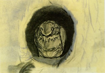 - On Monday, I posted some color sketches from Disney’s Bambi by Ty Wong, and I’d like to continue with some attractive sketches that appear in the Bambi Sketchbook and/or Frank Thomas & Ollie Johnston’s Bambi: The Story and the Film.
These sketches are very informative. How wide the gulf between storyboard and animator. I find Bambi a somewhat schizophric film. It has the absolute finest Disney has to offer, and it also has some of the most obvious and cloying work. I find most of the owl sequences fall into the latter category.
The owl is quite nice at the film’s start, but once we get to the “twitterpatin’” sequence things turn dreadfully cute and, for me, it’s a real let down. Preston Blair’s animation is good of a sort, but I think it belongs in another film. I can’t say I’ve ever spoken about this, so I don’t know if anyone else feels the same or is now convinced that I’m an idiot.
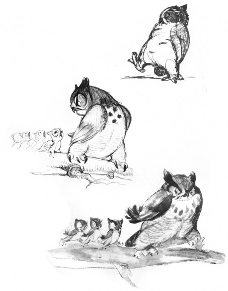
Here are some owl design sketches; they are beautiful. It’s a shame the underlying beauty of these drawings didn’t make it to the screen, just the surfaces.
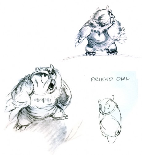
(Click any image to enlarge.)_______________________
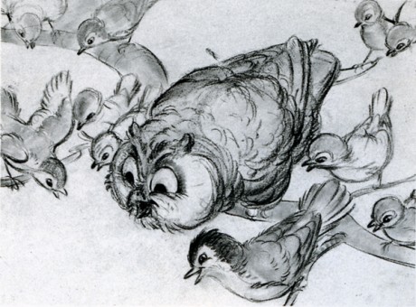
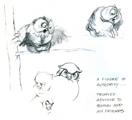
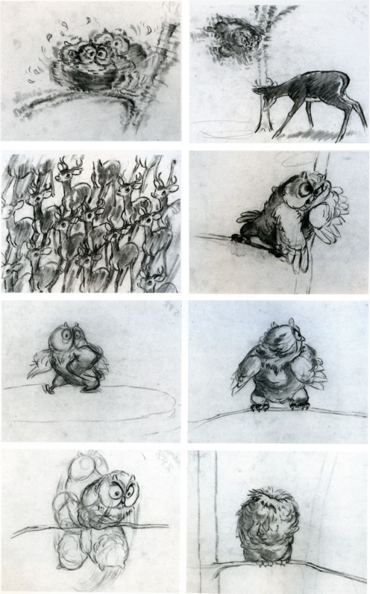
And here’s the board for the owl’s “twitterpatin’” sequence. It leads out of and into two of the great sequences of this film – the death of Bambi’s mother, and the battle of the stags.

on 24 Apr 2008 at 10:17 am 1.Tim Rauch said …
Actually, Michael, that was one of the few things that made me “blink” in the film the first time I saw it (this past fall). I remember seeing the owl and it did stand out to me as almost not belonging to the same film… Any idea who drew these boards? I particularly love the one of the owl spinning on the branch.
on 24 Apr 2008 at 3:27 pm 2.Jenny Lerew said …
No, you’re not the only one, I’m sure.
I love “Bambi”, revere it in fact for its beauty and execution; I love Preston Blair too, for his best work–but both the design and the treatment of Friend Owl was way out of whack with the rest of the film. Bambi has such delicate, careful animal drawing–huge pains taken with the caricature–and then there’s a completely cartoony-MGM-looking owl in it. I guess given the predator status of such an animal the guys decided that they had to goof him up to make his presence less threatening-or completely UNthreatening…but it’s the only part I find annoying in the film, especially, as you mentioned, the posing of his “love” speech. Yeesh.
on 24 Apr 2008 at 5:31 pm 3.Mike Kazaleh said …
I thought Bambi was a beautiful film in terms of art direction. Skillful drawing and layout, fabulous color, excellent use of value and diffussion. But I thought the story was soppy, and the “twitterpated” sequence was a real low point. Some of the famous sequences like the forest fire and the battle of the stags actually look more impressive OUT of context than in (like when they were shown in the compilation episodes of “The Wonderful World of Color”). To me, the parts of Bambi are greater than the work taken as a whole.
on 25 Apr 2008 at 1:42 am 4.Michael said …
Thanks for your thoughts, Mike. I must say I disagree. As much as I dislike the “twitterpatin” sequence, the battle of the stags is so much the better for its placement just after that sequence. You’re not prepared for it, and the drama is so much larger.
I have to say the same for the sequence just prior to the “twitterpatin”, which is the death of Bambi’s mother. It’s quite upsetting when seen in its proper place in the film. Outside, as just a clip, it’s artfully and brilliantly crafted and completely unemotional and detached.
Bambi, I think, is a great film and offers so much more than most of the Disney features – including Fantasia. It offers real poetry – despite the “twitterpatin” sequence which I dislike but tolerate for the progression of the film’s story.
on 25 Apr 2008 at 11:50 pm 5.Pete Emslie said …
I’ll be the voice of dissent here and defend the characterization of Friend Owl. Looking at one of the above sketches that portrays him as “A figure of authority”, I’m actually glad that they ended up pushing him in another direction in order to contrast him with the ultimate figure of authority in the forest, The Great Stag.
The resulting character has always put me in mind of actor, Lionel Barrymore, as I suspect they were deliberately intending that impression through the similar voice, and I quite enjoy him as a benign curmudgeon who occasionally lets his soft side show. If this were a live action drama of the period, featuring human actors rather than these anthropomorphic counterparts, I really don’t think that such a character would seem out of place there either. “Bambi” is certainly a film I admire very much, but I believe that without a few light comedic touches it might come off as a bit stuffy and pretentious. Just my opinion.
on 26 Apr 2008 at 11:46 am 6.Michael said …
You’ll remember, Pete, that the ice-skating scene in Bambi is played for laugs and is wonderful. The cartoonish “twitterpated” sequence is just that – a cartoon in the middle of something else. It works as it is, but not in this movie. It just plays too braodly for my taste.
on 26 Apr 2008 at 2:42 pm 7.Pete Emslie said …
I think the “Twitterpated” sequence demands a very light touch. They chose a safe way to deal with the delicate subject of rutting season in a cute and appealing manner with the comic relief they provided. I think it works well. I certainly wasn’t forgetting the other comedic sequences you cite, by the way, but I’m arguing that collectively they all keep the film from being too stuffy, which is the way it might come across if only the dignified approach were maintained throughout.
on 28 Apr 2008 at 1:00 pm 8.David Nethery said …
I can see why the “Twitterpated” sequence is a little over-the-top CUTE for some people … it doesn’t ruin the picture for me, but it’s definitely one of the things people react against when they think of Disney as being “too cute”.
I don’t think Preston Blair deserves any “blame” for the design and animation of the Owl. He was animating the material he was given from the Story Dept. (actually I think the guy credited with being the Lead on Friend Owl was Eric Larson )
I don’t really see Blair’s drawings as any more “cartoony” than Flower or the Thumper’s Girlfriend (love that naturalistic rouge on her cheeks and the false eyelashes) or even Thumper himself .
Preston Blair’s Owl roughs
on 28 Apr 2008 at 1:20 pm 9.David Nethery said …
Just to clarify: I was kidding when I said I loved the “naturalistic” rouge and false eye-lashes on Thumper’s Girlfriend . To me that is a design which goes a bit over-the-top and makes that moment in the film a little too jokey/cartoony. (and I say that as a card-carrying member of the Cute Cartoon Coneys Club )
Thumper’s Girlfriend