Animation Artifacts &Articles on Animation &Disney 13 Oct 2007 08:00 am
Very Special Mouse
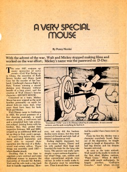
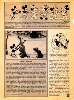
- This article came into my hands, and, unfortunately, I have no way of knowing where it was published. It apparently was published in the 50′s or early 60′s (the clue is the drawing on the last page of Mickey through the ages.)
At any rate I thought it was worth sharing. Interesting that it talks, predominantly, about Mickey in the 30′s.
 _
_ 
(Click any image to enlarge.)

on 13 Oct 2007 at 11:11 am 1.Catherine said …
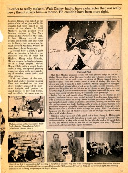
Good Eye, that final drawing in the Mickey through the ages drawings there was from the fifties, “which is how he appears today”, as the caption says.
On the first page, not too far down from the top, it says Mickey has “reigned as the most familiar personality on Earth for nearly [or almost] 46 years.” Assuming the writer is counting from 1927, the article was written/published in 1973ish.
on 13 Oct 2007 at 1:00 pm 2.David Nethery said …
I think that article is from one of the versions of The Saturday Evening Post which continued to be published sporadically throughout the 70s.
I’m almost certain I have that same article around here someplace and I think it’s in The Saturday Evening Post.
on 13 Oct 2007 at 2:34 pm 3.Eddie Fitzgerald said …
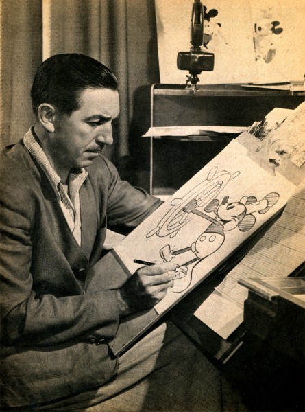
That’s the best picture of Walt that I’ve ever seen. I’m amazed that it’s been out of circulation for so long!
on 13 Oct 2007 at 8:37 pm 4.Galen Fott said …
Top caption: “While a team of artists is responsible for the bulk of the artwork in Disney’s films, Walt always insists on drawing Mickey’s left shoe himself.”
on 15 Oct 2007 at 3:44 pm 5.Tom Minton said …
Another clue to the article’s publication date is the Chartpak press-on, 1970′s revisionist Art Deco, camera-ready lettering used for the upfront title. Many people very nearly went blind in advertising, working with that stuff in that era. Had to rub it on with a little tool with a microscopic metal ball at one end, some of the fonts were ridiculously tiny and things like ampersands were prone to cracking and separation. But that was simply how it was in graphic arts before computers. The digital world is a marked improvement in certain ways.
on 15 Oct 2007 at 3:51 pm 6.Michael said …
Ah, the days of “Instant Lettering!” I remember desinging titles for a feature and doing every letter by hand using that type of type. I did some redesigns, myself, and reconstructed the letters on the go. Everything’s too much easier these days with digital type.
on 15 Oct 2007 at 7:42 pm 7.Tom Minton said …
Yeah, I used to do small market ads using that stuff in the Midwest as a young person, before I went to California and got into animation. It was the only way to get anything remotely different looking with the lead plates that were still in use thirty six years ago. Offset printing was a radical upstart novelty in those parts at that time.
on 16 Oct 2007 at 2:31 am 8.David Gerstein said …
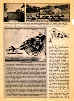
Hmm. Notice the reference to SHANGHAIED being a “re-release” in its pictured still. SHANGHAIED and a handful of other BW Mickeys were rereleased to theatres in the 1970s, THE MAIL PILOT and TOUCHDOWN MICKEY among them. These were the re-releases where the posters had MM’s name relettered in a standardized logo; pie-eyes were added when they were lacking on the original posters (BUILDING A BUILDING), and kitschy slogans were added (“A Minnie-Classic from the Flirty Thirties”).
But in what year, exactly, did these re-releases take place? Seems to me they pre-dated Mickey’s 50th, though I might be wrong. They were an early acknowledgement that the “retro” early Mickey had become popular enough for the studio to capitalize.
on 22 Oct 2007 at 10:59 pm 9.Jim Engel said …
It looks like an article from NOSTALGIA ILLUSTRATED or FLASHBACK…
on 17 Mar 2012 at 9:03 am 10.julia said …
Very good post, Thanks. Pls also visit my site for fun flash games here moofreegames.blogspot.com