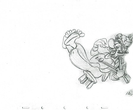
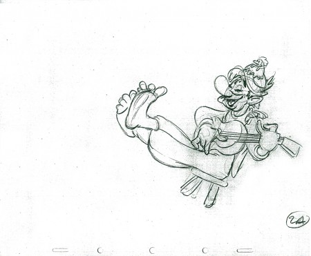
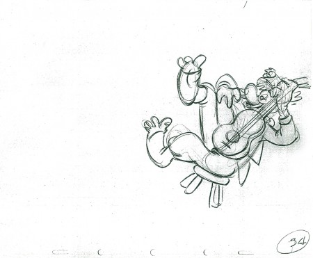
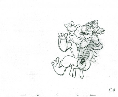
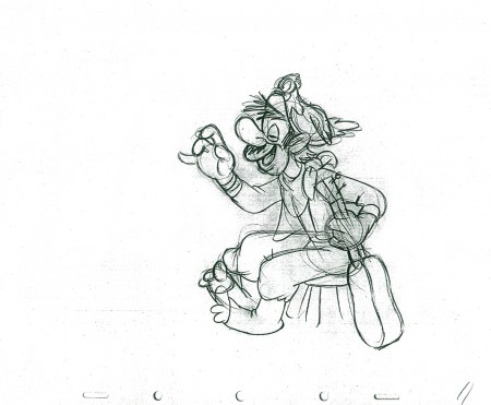
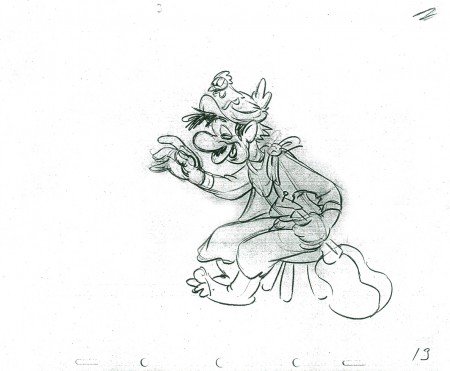
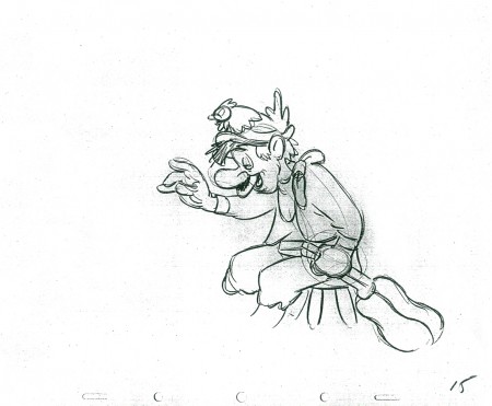
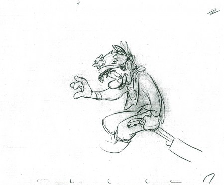
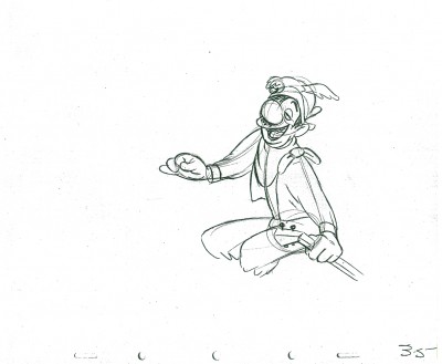
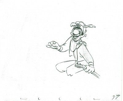
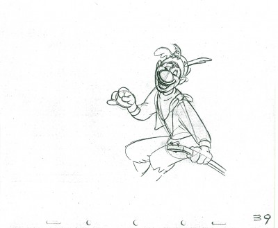
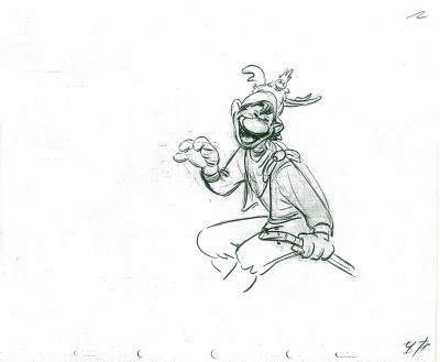
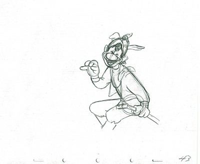
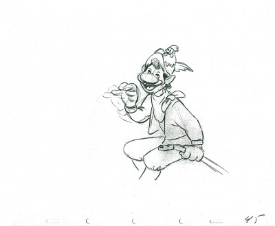
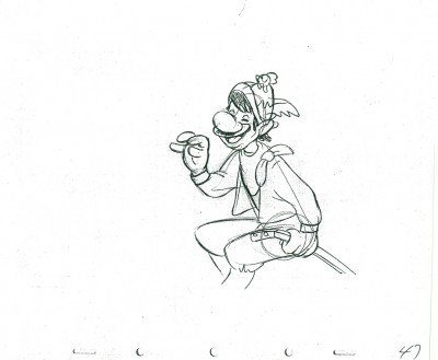
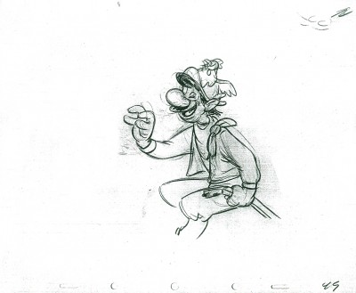
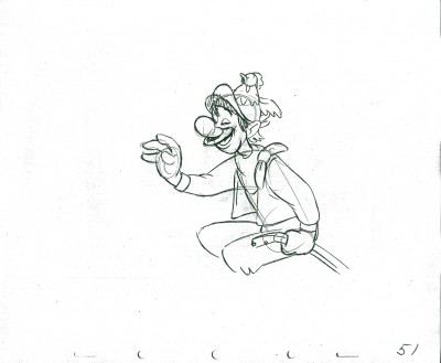
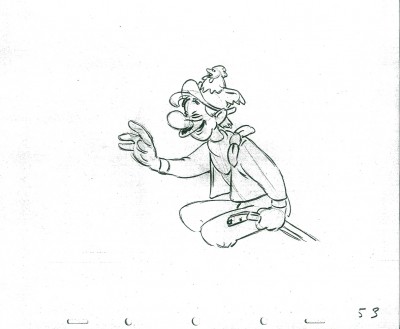
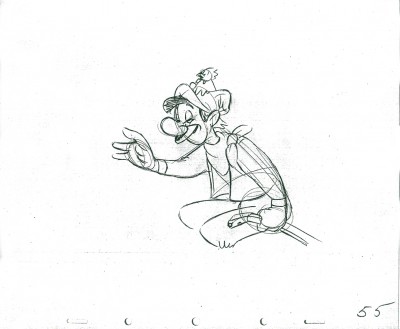
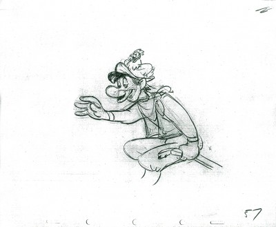
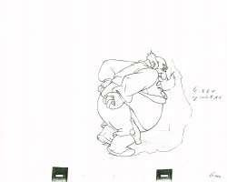
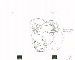
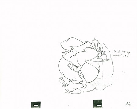
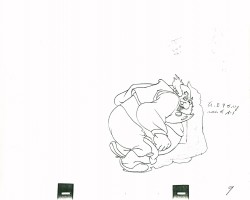
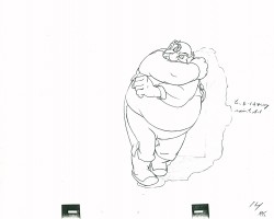
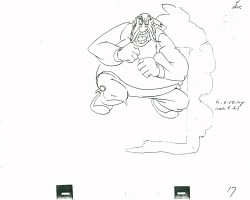
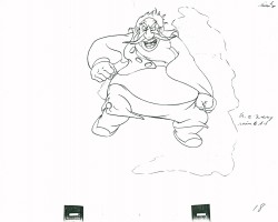
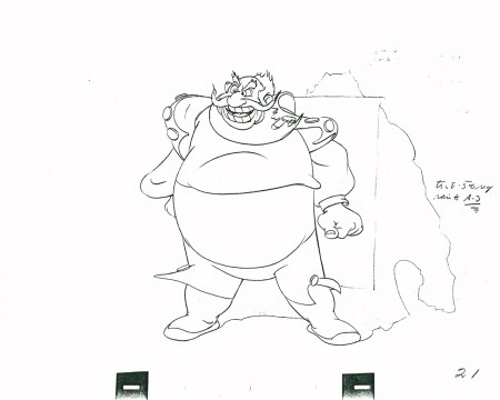
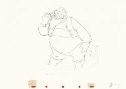
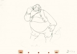
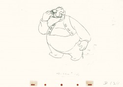
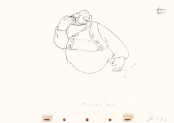
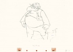
Search ResultsFor "stromboli"
Books &Commentary 13 May 2013 05:36 am
Illusions of Thomas, Johnston & Disney
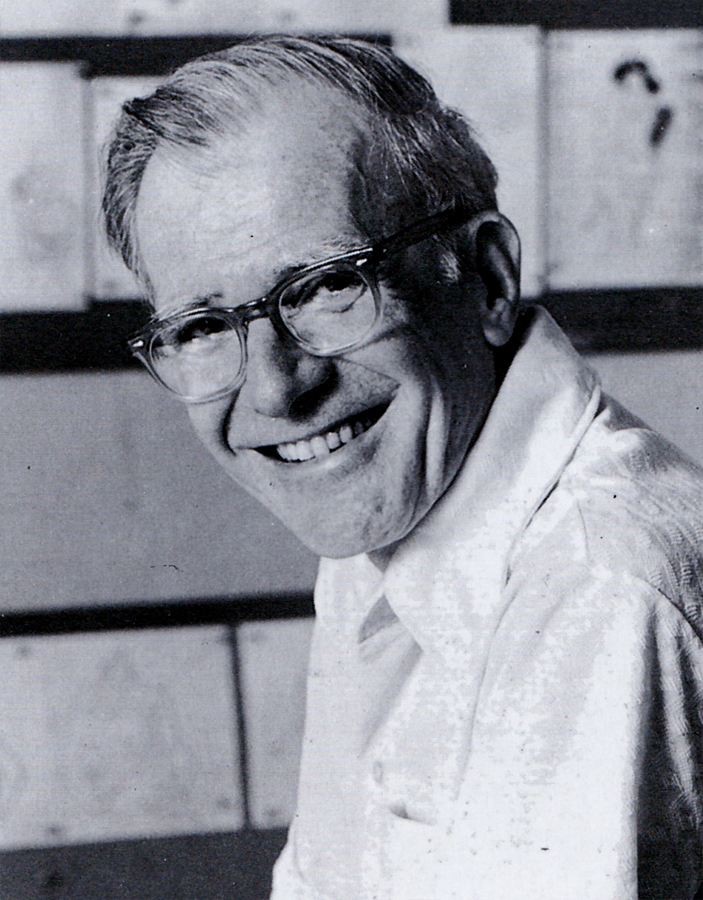 - The Illusion of Life by Frank Thomas and Ollie Johnston was first published in 1981. The book came out with a large splash and overwhelming acceptance by the animation community. It’s since remained the one bible that animation wannabees turn to as a source of inspiration and an attempt to learn about that business.
I admitted a couple of weeks back that though I must have been one of the very first to have bought the book, I’d never actually read it. I spent hours poring over the many pictures and the extensive captions, but the actual book – I didn’t read it. I can’t say why, but this was my reality.
Then not too long ago, Mike Barrier wrote that he was not a supporter of the book and its theories, I wondered about that writing and decided to reconsider reading it. I knew I had to go back to find out what I’d stupidly ignored, so I started reading.
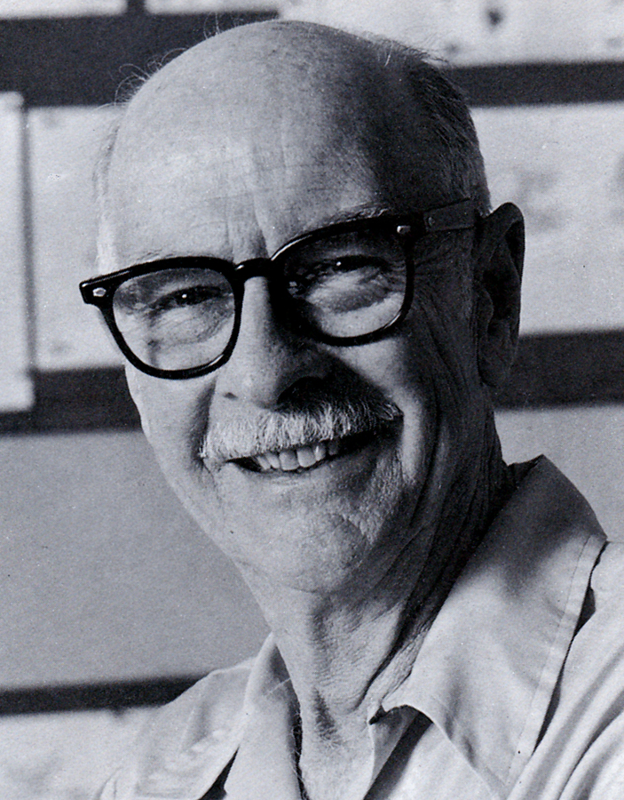
The book starts out with a lot of history of animation, something routine and expected from the two animators that lived through a good part of the story. As a matter of fact Thomas and Johnston were at the center of the history. It didn’t take long for the animation “how-to” to kick in. For the remainder of the book, using that history, the two master animators explained how and why Disney animation was done, in their opinions. They write about processes and systems set up at Disney during their tenure there. They write about theories and methods of fulfilling those theories. There’s a lot for them to tell and they’ve succinctly organized it into this book, as a sort of guide.
However, at two points they go wildly into a divergent path from the one that they started building. Their methods altered and, to me, seemed to be about the finances of doing the type of animation they did, rather than the reason. Impractical as those original theories were, I’d believed in the myth all those years to start changing now. So I want to review these two stances instead of outwardly reviewing the book. Besides it’s too long since the book has stood in its own royal space for me to pretend that I could properly review it.
The growth of animators at the Disney studio relied on a system wherein each of the better animators was assigned one character. Unless there was a minimal action by some external character, the one animator ruled over the character.
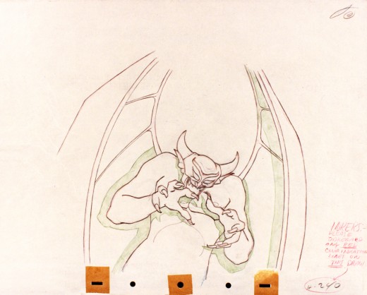
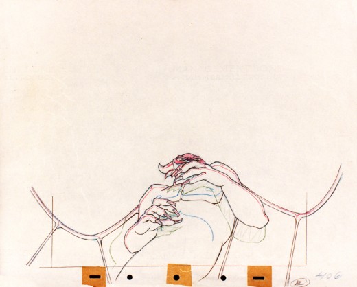
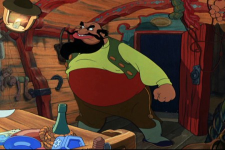
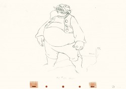
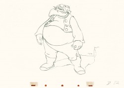
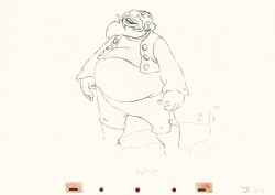
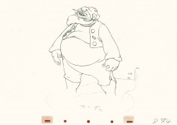
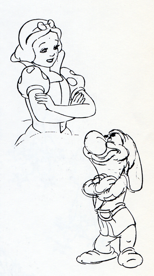 - Bill Tytla did Stromboli in Pinocchio. He did principal scenes of Dumbo in that film. He handled the Devil in Fantasia (as well as all his twisted mignons within those scenes.) Tytla worked on the seven dwarfs but was the principal animator of Grumpy.
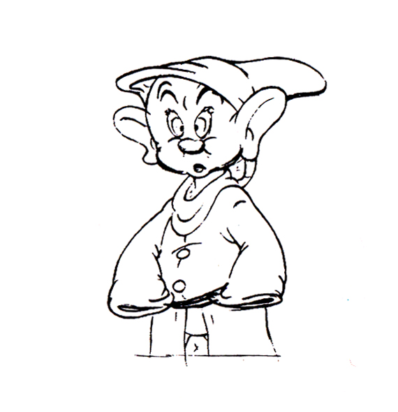
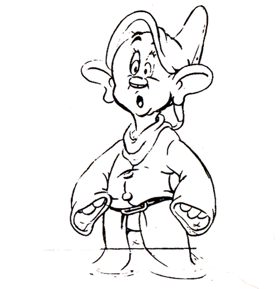
- Fred Moore also did the dwarfs in Snow White but seemed to focus on Dopey. He did Lampwick in Pinocchio and Mickey in The Sorcerer’s Apprentice.
- Marc Davis started as an assistant under Grim Natwick on Snow White. He became the Principal artist behind Bambi, the young deer. He did Alice in Alice in Wonderland, Tinkerbell in Peter Pan, Maleficent in Sleeping Beauty and Cruella de Ville in 101 Dalmatians.
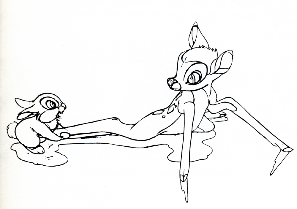
- Frank Thomas did Captain Hook in Peter Pan, the wicked Stepmother in Cinderella, Bambi and Thumper on the ice in Bambi.
- Ham Luske and Grim Natwick did Snow White. The two sides of her personality came about because of conflicts between the two animators. This was a way for Walt to complicate Snow White’s character; he employed two animators with different strong opinions about her movement. By putting Ham Luske in charge, he was sure to keep the virginal side of Snow White at the top, but by having Natwick create the darker sides of the character, Disney created something complex.
Many animators fell under these leaders’ supervision and tutelage, also working on one principal character in each film. This system was something they swore by and broadcast as their way of working at the studio. It would allow the individual characters to maintain their personalities as one animator led the way.
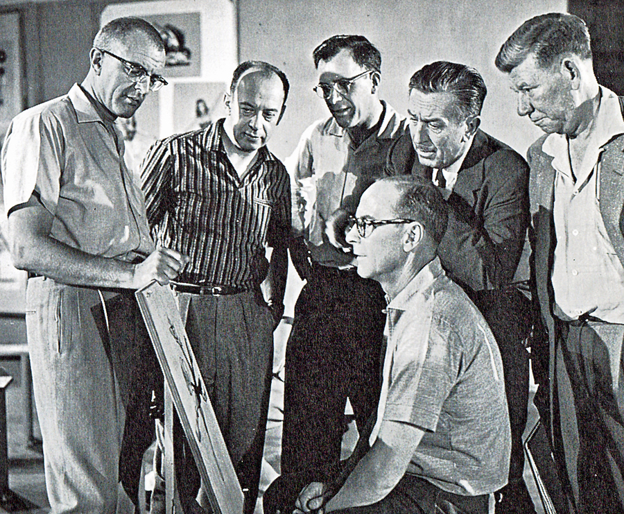 But as Walt grew more involved with his theme park and his television show and the live action movies that were doing well for the studio, things changed at the animation wing of the studio. It became clear, with the over budgeted spending on Sleeping Beauty and the new demands for a different look once xerography entered the picture in 1959. The rhythm and personality of the productions changed, and their methods of animation changed. Walt also sorted out nine loyalists to be his “Nine Old Men” thus dividing the animators into groups, a hurtful way of setting up competition among the animators. ________________________Kahl, Davis, Thomas, Walt, Jackson, Johnston seated
Thomas and Johnston get to justify this
in their book.
Let me read a section from the book to you:
- “Under this leadership, a new and very significant method of casting the animators evolved: an animator was to animate all the characters in his scene. In the first features, a different animator had handled each character. Under that system even with everyone cooperating, the possibilities of getting maximum entertainment out of a scene were remote at best. The first man to animate on the scene usually had the lead character, and the second animator often had to animate to something he could not feel or quite understand. Of necessity, the director was the arbitrator, but certain of the decisions and compromises were sure to make the job more difficult for at least one of the animators.
“The new casting overcame many problems and, more important, produced a major advancement in cartoon entertainment: the character relationship. With one man now animating ever character in his scene, he could feel all the vibrations and subtle nuances between his characters. No longer restricted by what someone else did, he was free to try out his own ideas of how his characters felt about each other. Animators became more observant of human behavior and built on relationships they saw around them every day.”
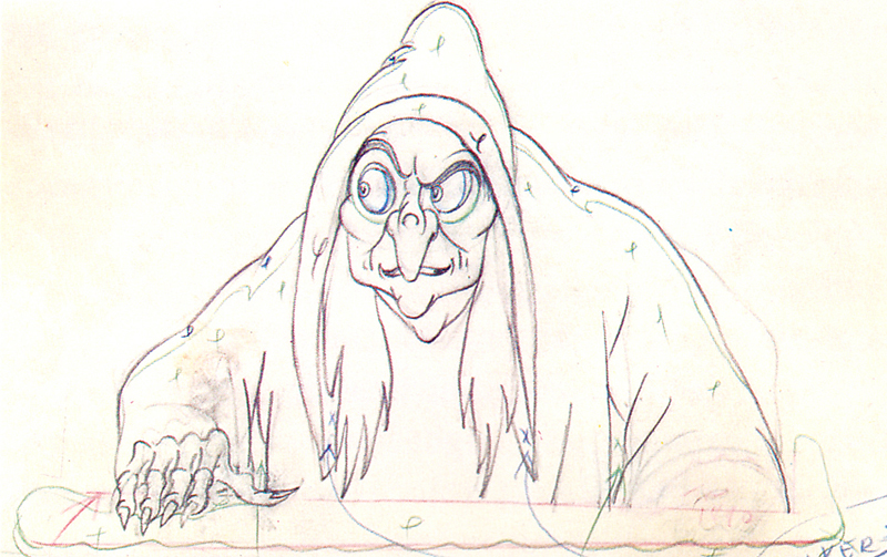 The question is, now, what are we to make of this statement? Do Thomas & Johnston mean for us to believe that they do more than the single character per film? Does it mean that, like all underprivileged animators everywhere, they now receive scenes rather than characters? Are they trying to tell us that the old, publicized method of animation they did during the “Golden Days” no longer exists?
To be honest I don’t know. Also when are they talking about? At the start of the Xerox era? In the days since Woolie Reitherman has been directing? Do they mean ever since they’ve retired and started writing this book?
Let’s go back a bit.
- In 101 Dalmatians, Marc Davis did Cruella de Vil. That’s it. That’s all he was known for in that film. Oh wait, there were a couple of scenes where he did the “Bad’uns,” Cruella’s two sidekicks. He did these ging into or out of a sequence. In Sleeping Beauty (if we’re going back that far) Davis did Maleficent. Oh, he also did her raven sidekick.
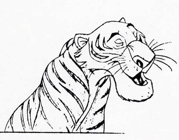 - Milt Kahl did Prince Philip in Sleeping Beauty – and every once in a while his father. He did key Roger and Perdita scenes in 101 Dalmatians. He did Shere Khan in The Jungle Book.
Kahl also seems to be the go-to-guy when they’re looking to have the character defined. The closest thing to Joe Grant’s model department in the late Thirties. If you weren’t sure how Penny might look in a particular scene, you might go to Kahl who’d draw a couple of pictures for you. But that was Ollie Johnston‘s character. You’d probably go to him first, but Johnston would go to Kahl if he needed help.
Kahl also did Robin and some of Maid Marian in Robin Hood. I could keep going on, but let’s take a different direction.
 Look at one of Thomas’ greatest sequences, the squirrels in the tree. Starting with Seq.006 Sc.23 and almost completely through and ending with Seq.06 Sc.136 Frank Thomas did the animation. That’s a lot of footage. Yes, that represents four characters: Merlin and Wart as squirrels, as well as the older and younger female squirrels. He did the whole thing (and it’s one of the most beautifully animated sequences ever.)
But when he was done with that and needed work, he didn’t stop on this film; he also did a bunch of scenes in the “Wizard’s Duel” between Merlin and Mad Madame Mim. Another big chunk.
Hans Perk has done a brilliant service for all animation enthusiasts out there. On his blog, A Film LA, he’s posted many of the animator drafts of feature films. You can find out who animated what scenes from any of the features.
However as Hans posts the batches of sequences, he gives little notes about what we’ll find when we open the drafts. In my view, Hans’ notes are also a treasure.
You can read remarks such as, “Masterful character animation by Milt Kahl and Frank Thomas, action by John Sibley and a scene by Cliff Nordberg.” That seems to tell us everything.
In Sleeping Beauty we can read, “This sequence shows, like no other, the division between Acting and Action specialized animators. Or at least it shows how animators are cast that way. We find six of the “Nine Old Men”, and such long-time Disney staples as Youngquist, Lusk and Nordberg, each of them deserving an article like the great one on Sibley by Pete Docter.”
Or in The Rescuers we read, “Probably the most screened sequence of this movie, the sequence where Penny is down in the cave was sequence-directed by frank and Ollie. They would plan their part of this sequence in rough layout thumbnails, then continue by posing all scenes roughly as can be seen in this previous posting.
“They relished telling the story that Woolie told them the animatic/Leica-reel/work-reel was JUST the right length, and when they posed out the sequence and showed it to Woolie, he said: “See? Just as I said: just the right length!” They kept to themselves that the sequence had grown to twice the length!”
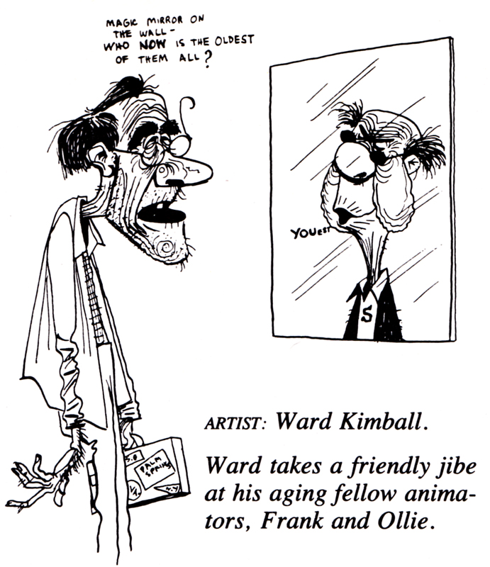 The work, right to the retiring of all of the “Nine Old Men,” would seem to me to prove that these guys, regardless of whether they added one or two other characters to the scenes, did, in fact, take charge of the one starring character.
This continues past the retirement of all the oldsters: Glen Keane animated the “beast” in Beauty and the Beast. He animated Tarzan in Tarzan, Aladdin in Aladdin, Ariel in The Little Mermaid, and Pocahontas in Pocahontas. Andreas Deja animated Jafar, the Grand Vizier in Aladdin, Scar in The Lion King, Lilo in Lilo and Stitch, and Gaston in Beauty and the Beast. Mark Henn animated Belle in Beauty and the Beast (from the Florida studio), Jasmine in Aladdin, young Smiba in The Lion King, and Mulan and her father in Mulan.
Need I go on? What are Frank Thomas and Ollie Johnston talking about in their book? I’m confused.
I have a lot left to say about this book, much of it good, but next time I want to write about something else that confuses me with another somewhat contradictory statement in the book.
This has gotten a bit long, and I have to cut it here.
Action Analysis &Animation &Animation Artifacts &Commentary &Tytla 15 Apr 2013 05:25 am
Tytla Distorts – 5
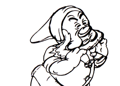
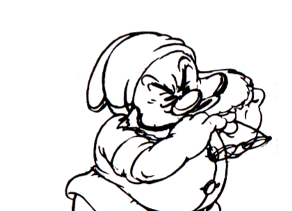
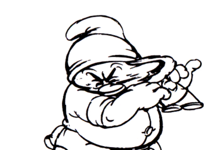
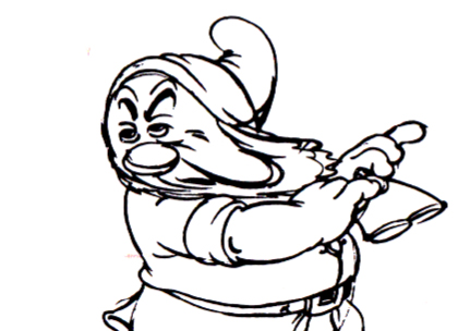
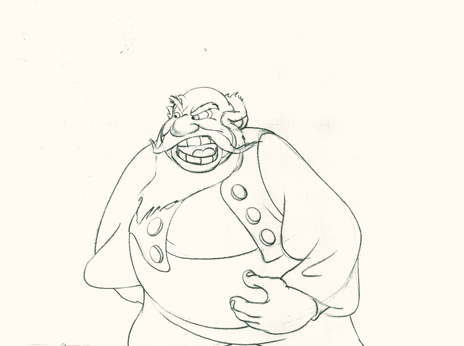
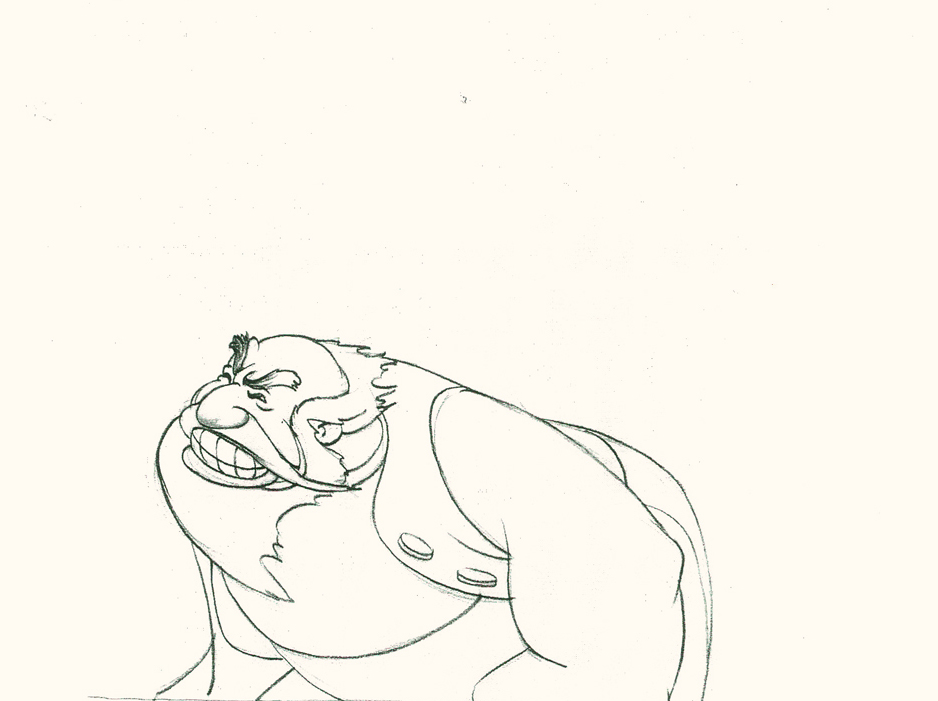
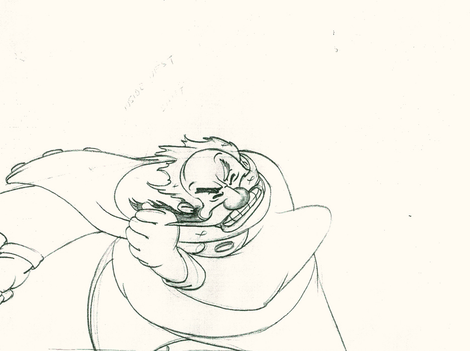
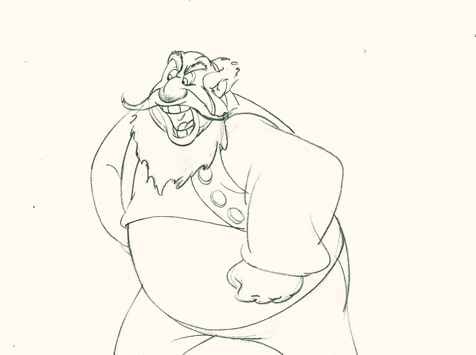
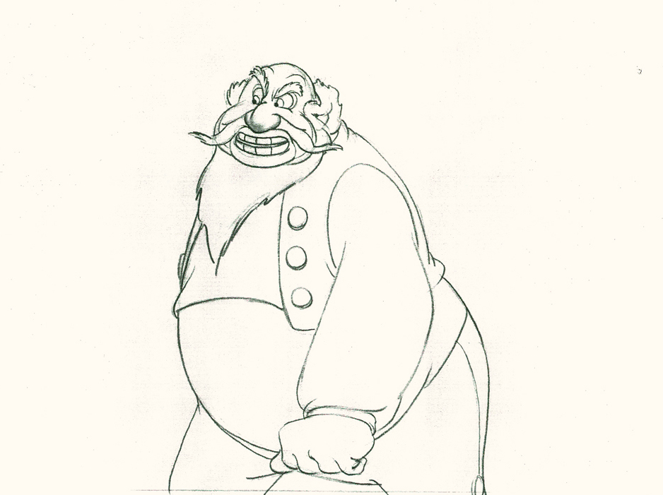
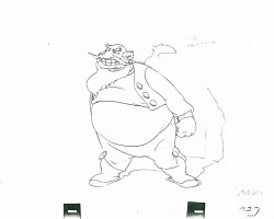
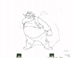
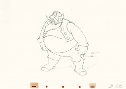
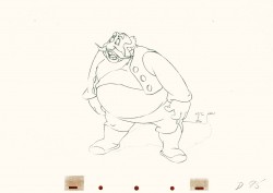
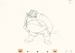
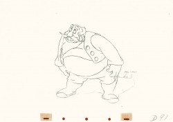
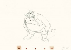
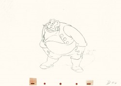
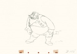
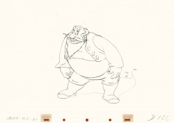
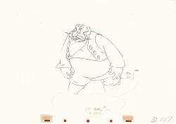
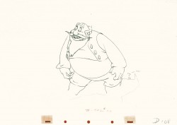
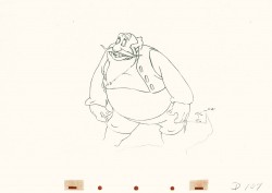
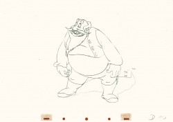
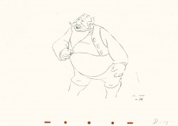
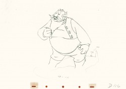
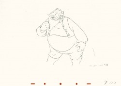
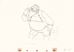
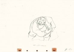
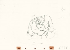
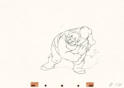
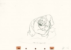
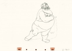
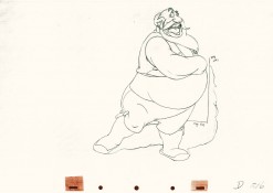
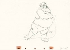
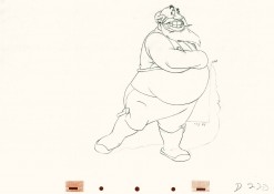
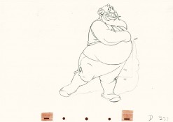
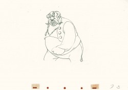
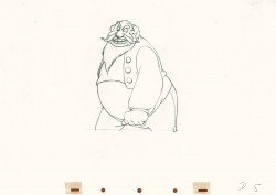
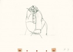
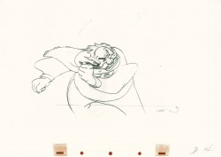
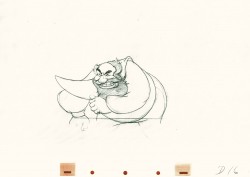
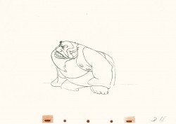
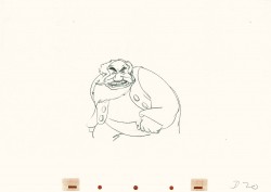
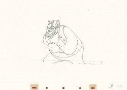
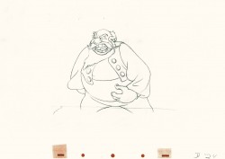
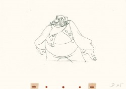
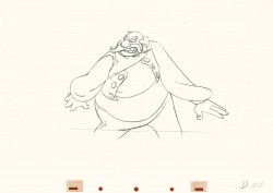
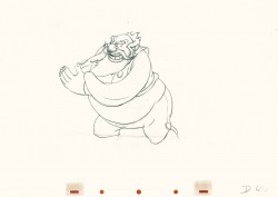
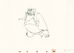
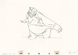
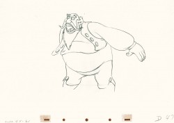
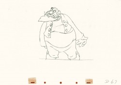
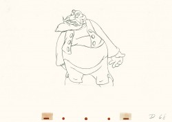
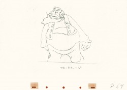
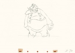
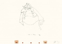
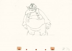
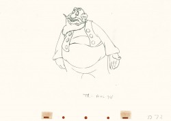
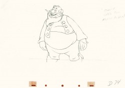
- I thought it’d be a little fun to give a little showing of some of the distortion and stress Bill Tytla did on some of his drawings. He didn’t feel the need in all of his characters to actually distort and stretch the character completely out of shape as he did in a character like Stromboli.
There were times when he could use the limbs of the character and the flexibility of the movement to provide the looseness that he was searching for. Cartoon characters like the seven dwarfs or Stromboli allowed a wildness that another, such as the devil in Night on Bald Mountain offered.
Let’s just jump into it and take a look at some drawings.
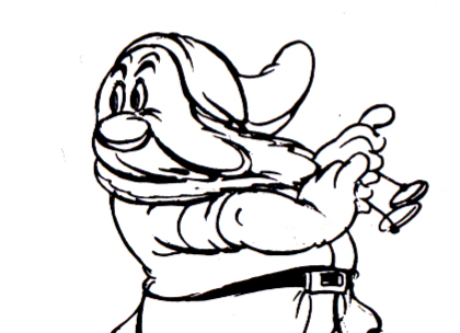
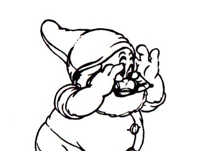
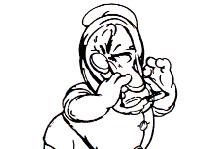
Obviously, this first one is Doc from Snow White
as he drains some water from his face:
 1
1
 3
3
Immediately we can see a flexibility in the jowls of Doc’s face,
and Tytla has plenty of fun with it.
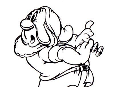
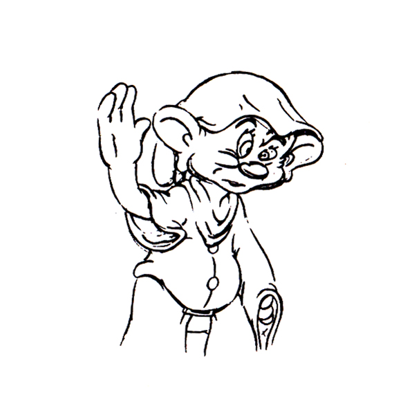
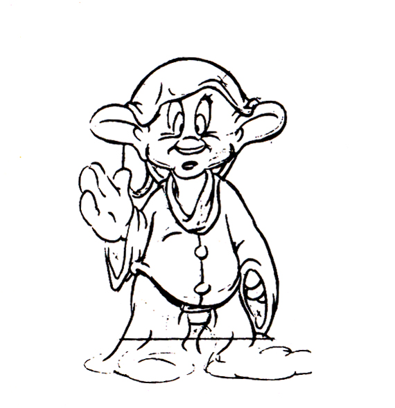
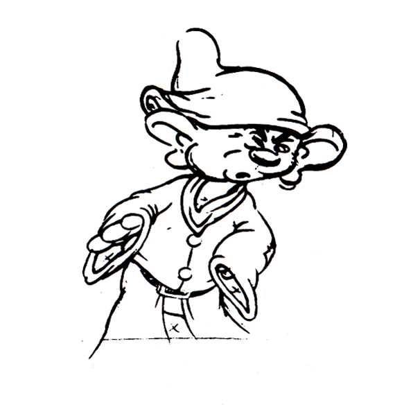
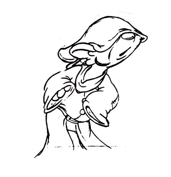
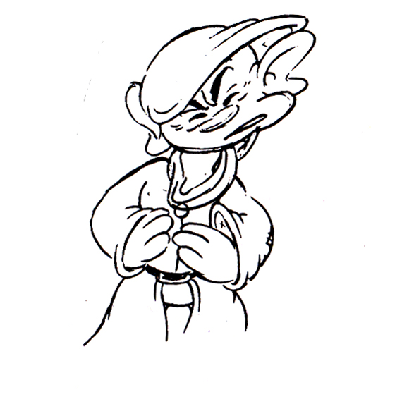
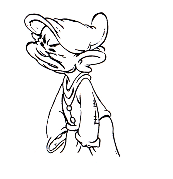
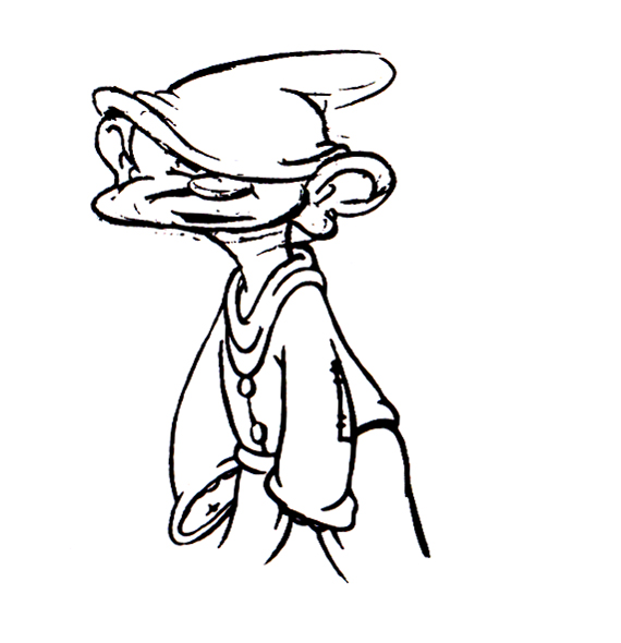
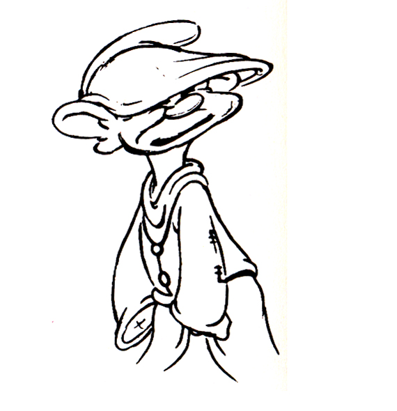
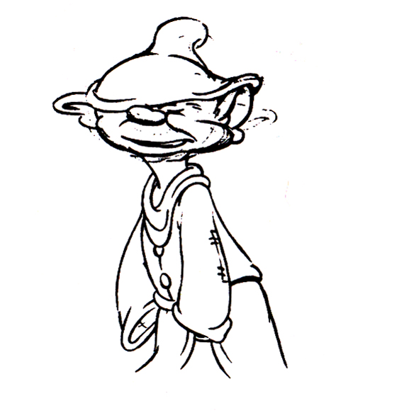
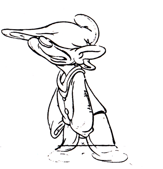
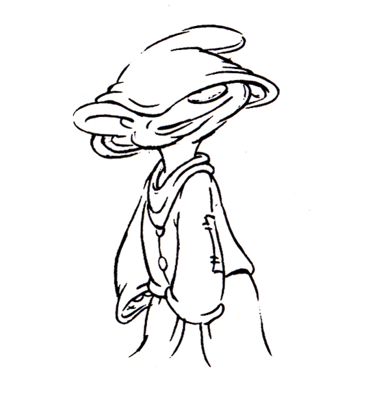
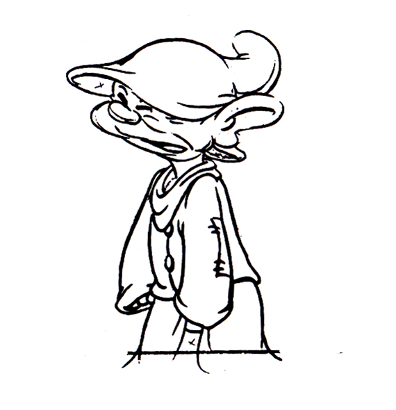
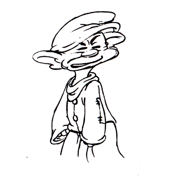
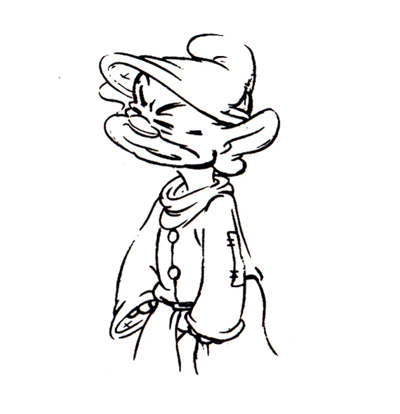
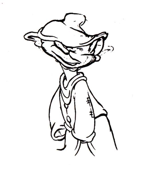
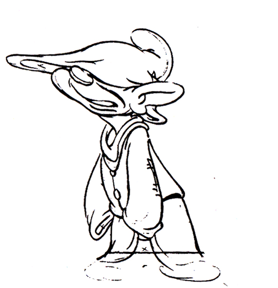
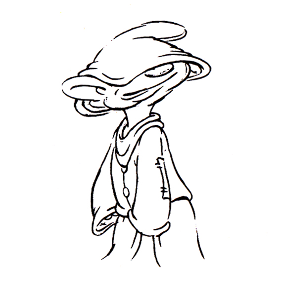
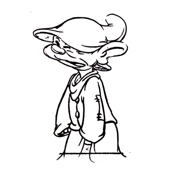
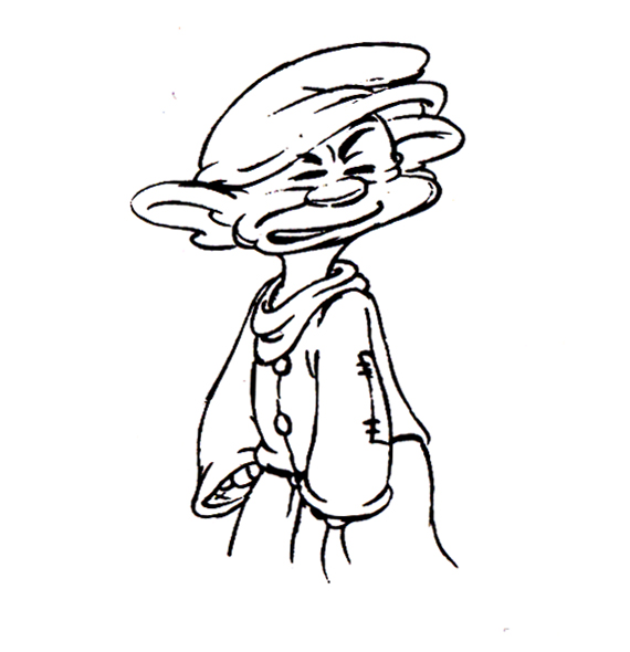
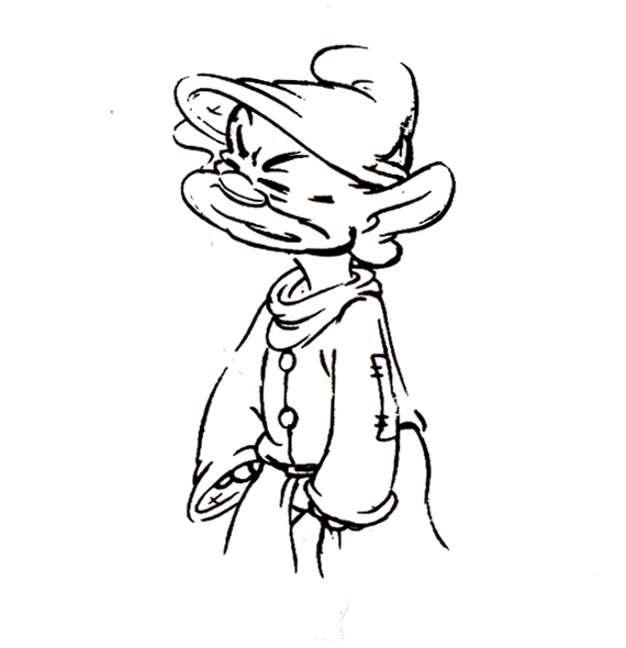
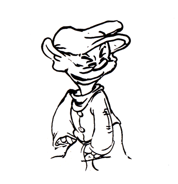
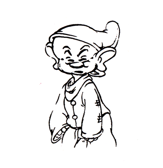
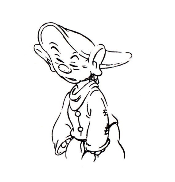
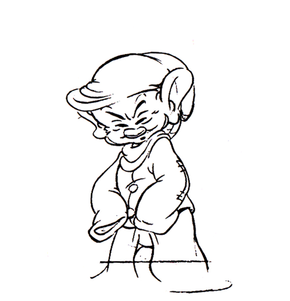
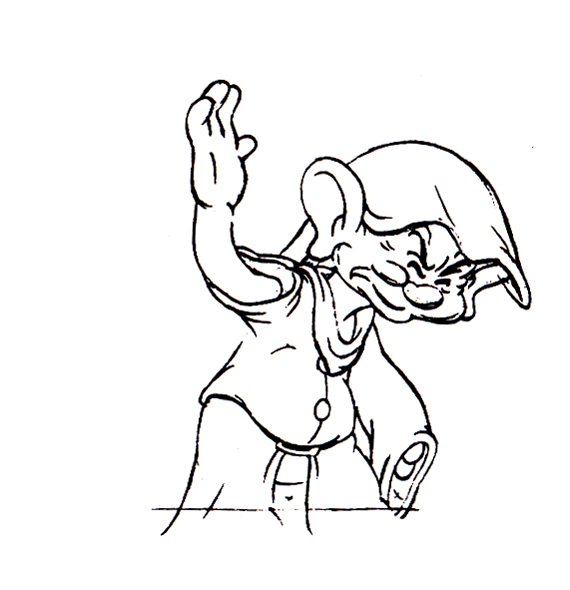
Now here’s a similar thing with Dopey shaking the water out of his head.
 1
1 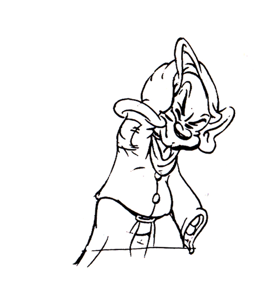 2
2
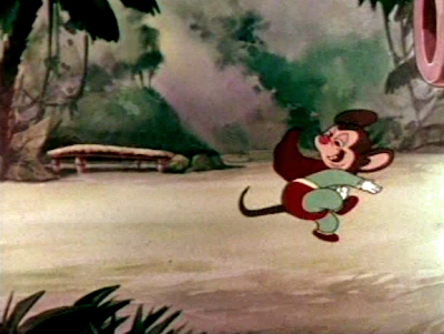
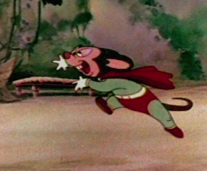
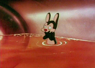
I also thought I’d pick out a nice frame grab or five of Tytla’s animation for a Mighty Mouse cartoon when he later went to Terrytoons.
 1
1
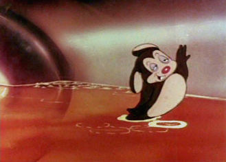
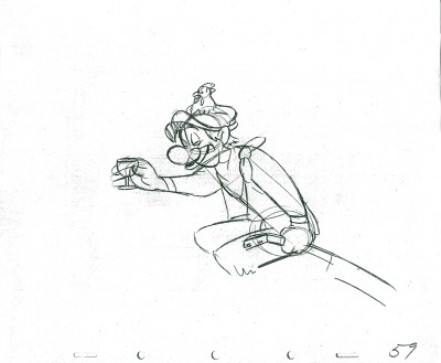
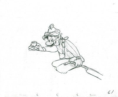
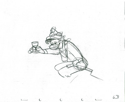
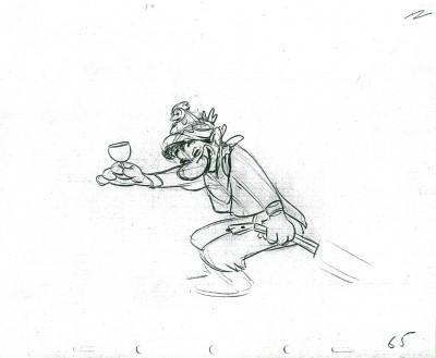
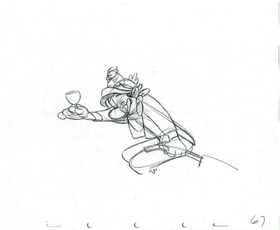
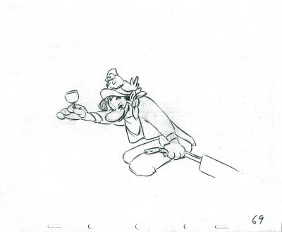
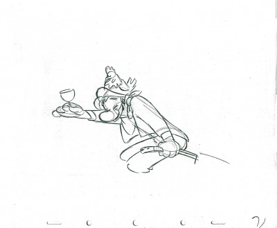
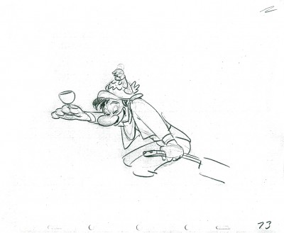
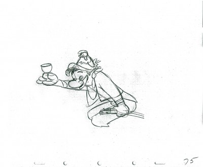
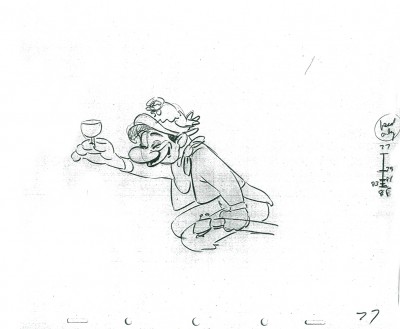
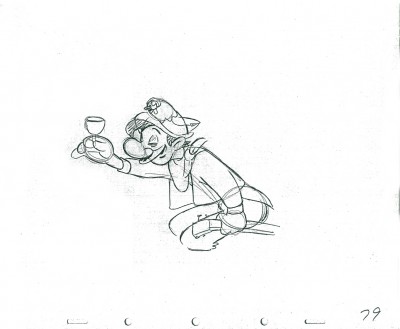
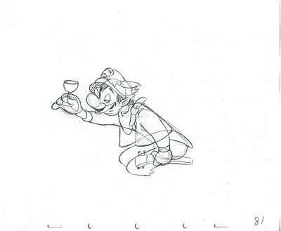
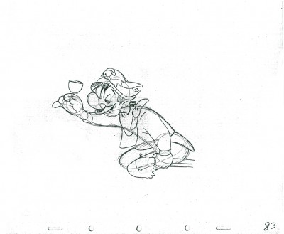
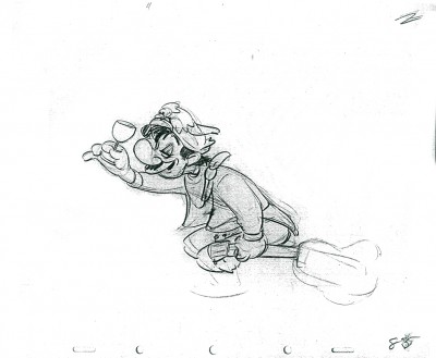
If we’re going to look at Tytla’s play on a drunk character, let’s look at this beauty of a scene. It’s from a film that was never completed, The Laughing Gauchito. This was one of the short pieces being developed during the period when the South American themed films, Saludos Amigos and Three Caballeros, were in production.
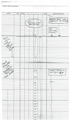
For this scene Tytla uses the rubbery feel for the face, but keeps the looseness in the character for the arms and legs. There’s quite a bit of depth he writes into the scene. The character is drinking (and a little tipsy) loses his balance and tries to regain it without spilling his drink. There’s a lot there, and it’s beautifully developed, yet still not a finished scene.
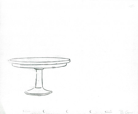
The Background
 1
1 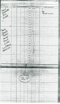 2
2
These are the X Sheets for the scene.
Here’s a QT of the scene with all the drawings included.
I strongly suggest you take a look into J.B. Kaufman‘s excellent book, South of the Border; it gives a full accounting of this film and Disney’s tour of the South American countries in preparation for the film.
Action Analysis &Animation &Animation Artifacts &Commentary &Disney &Peet &Tytla 08 Apr 2013 05:05 am
Stanislavsky, Boleslavsky and Tytla’s Smears & Distortions – 4
Boleslavski was a great admirer of Stanislavsky and his acting techniques. When he, Boleslavsky, came to the United States, he taught the Stanislavsky technique to his students. These included Lee Strasberg, Stella Adler and Harold Clurman; all were among the founding members of the Group Theater (1931–1940). The Group Theater was the first American acting ensemble to utilize Stanislavski’s techniques, and its members all went off to espouse their own versions of the “method.” American acting had taken some real turns into the creation and development of a true system for getting the best performance out of the actor.
In animation, there was animation technique and styles. These rarely had anything to do with acting. However, there were a number of animators at the Disney studio who wanted to put the focus on their acting and actually studied Stanislavsky and Boleslavsky so that their characters would give a great performance. Tytla was certainly a leader among the animators to do this.

Whereas in Pinocchio, while working with such a flamboyant and
eccentric character, Tytla stretched and distorted Stromboli to
get the necessary and sudden emotional mood shifts desired.

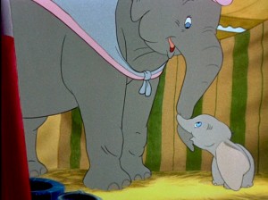
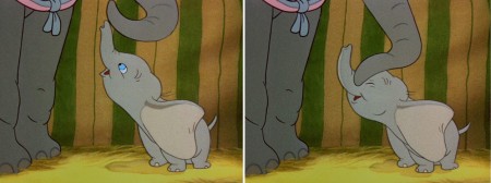
With Dumbo, Tytla modeled the character after his own son,
and he animated this scene wholly on the two characters
given to him on the strong storyboard by Bill Peet.

He didn’t use distortion, because it wasn’t the character he was animating.
Dumbo was gentle, all truth. The honest performance meant keeping everything
above board and on the table. That is undoubtedly the performance Tytla drew.

In my opinion, it has to be one of the greatest animation performances
ever drawn for a film. It’s quite extraordinary and cannot be undercut
in any possible way.
(Click any image to enlarge.)
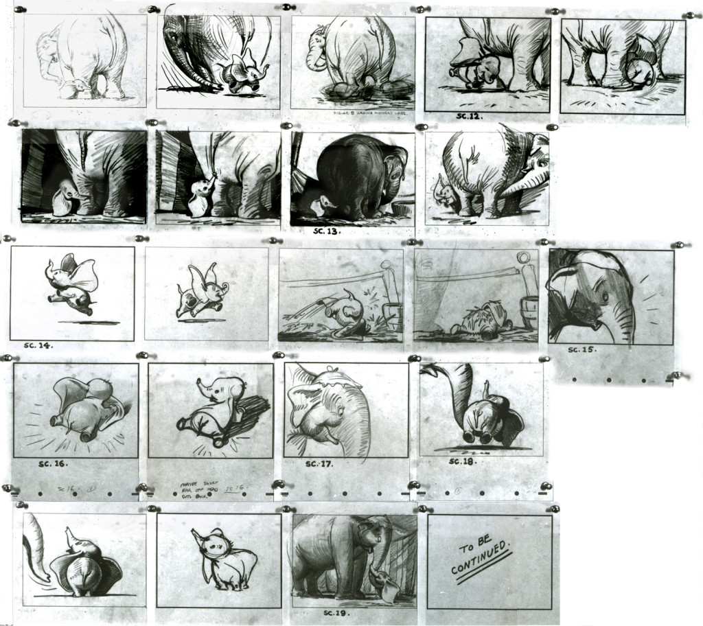
You can see that Bill Peet’s storyboard was certainly an inspiration,
at the least, for Tytla to follow, if not to equal.
Let’s move to another film. Fantasia.
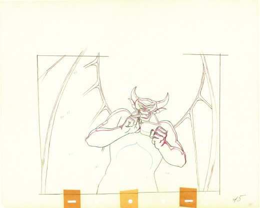
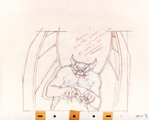
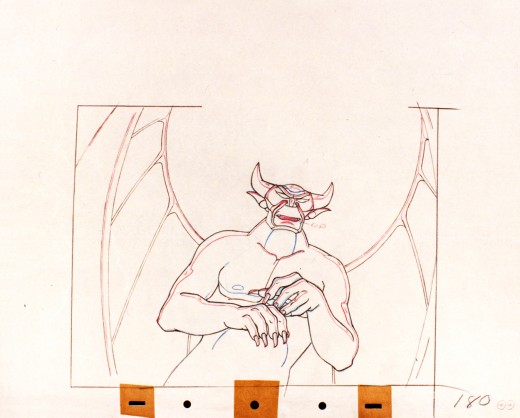
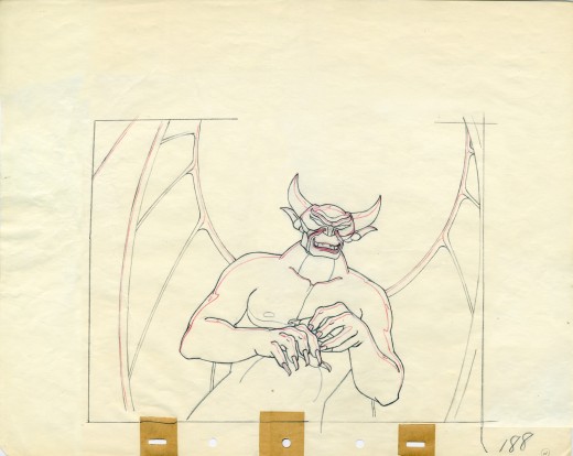
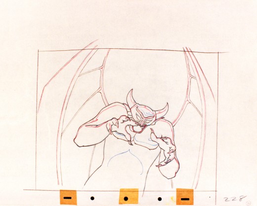
Vladimir Tytla worked on the devil in Mussorgsky’s – Night On Bald Mountain.
Here are some drawings for the scene. They’re part Tytla and part clean up by his assistant.
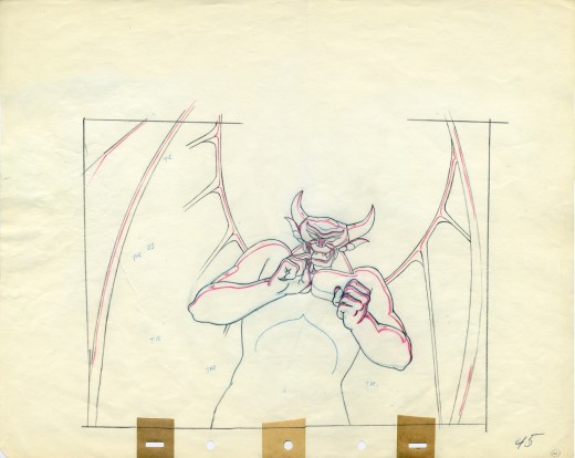
A good example of a Tytla drawing.
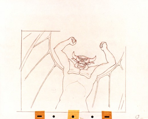
They’re pretty damned impressive drawings. If there is any distortion,
it comes from making a body builder’s shape stronger. There’s no violent
flexing of those muscles, just the natural thing on display in the middle
of a dance sequence. Strong and forcefully beautiful drawings. The
distortion is done by the other spooks floating out of their graves on
the way up to their leader.
The devil’s motion throughout this piece is very slow, tightly drawn images of the devil lyrically moving through the musical phases. It’s pure dance. Any distortion is done via the tight editing that Tytla has constructed. Very close images of the hands with the flame shaped dancers moving about in tight close up as Chernobog’s large face with searing eyes closely watching the fallen creatures dancing in his hands. It’s distortion enough.
Tytla has constructed the most romantic sequence imaginable, and the emotion of the dance acts as the climax for all of Fantasia, and it succeeds in spades. All hoisted by the animation, itself. No loud crushing peak, just a dance done in a tightly choreographed number completely controlled by Tytla. It’s the ultimate tour de force of animation, and we’ll never see the likes of it again.
So essentially I’m pointing out that Tytla used distortion in the animation drawings to execute his acting theories, but as he grows, he not only uses his animation (and animation drawings) to “Act”, he uses his abilities as an Animation Director. The cutting and the movement of the scenes is used for the Acting, as well.
Action Analysis &Animation &Commentary &Tytla 01 Apr 2013 04:55 am
Stanislavsky Boleslavsky and Tytla’s Smears & Distortions – 4
 I would guess an actor, one who was truly devoted to their craft, would try to assume the full personality of the character he or she is playing. For an actor who felt devoted to the craft, they’d veer toward some specific acting school. Stanislavski or Boleslavsky, Actor’s Studio, Meisner, Chekhov or whatever combination thereof, the actor would use these schools of approach trying to fully possess the soul of the character.
Marlon Brando, Julie Harris, Paul Newman, John Garfield, Clifford Odets, Montgomery Clift and Marilyn Monroe all these acting greats had their techniques, and all those methods did start with Stanislavsky.
The question for us is how did this affect animation’s actors – the animators? Or did it? I’ve only seen this discussed in depth in one book, Mike Barrier‘s Hollywood Cartoons. Barrier shows a real understanding of Stanislavsky and Boleslavsky when he discusses the overt course of action taken by one animator, in particular, Bill Tytla.
We know that there were plenty of others that were excited by the newly discovered techniques, though we don’t know how wide spread this influence was. My first realization that it was a strong influence came from a joke John Hubley shared with me. He said that the animators broke into two groups, those that were interested in Stanislavsky and those that couldn’t spell it. Hubley was friends with Tytla. Tytla had been the close roommate to Art Babbitt, and Babbitt was close with Hubley, right to the near end.
But Tytla. Let’s look into what he was doing with his animation. I’m going to make a lot of suppositions to tell you what I think he believed . . . the reasoning and the way he worked.
Now, let me show you something.
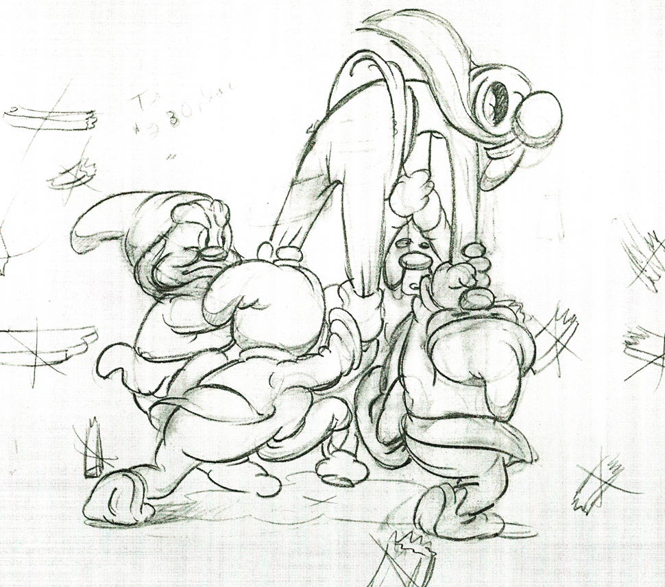
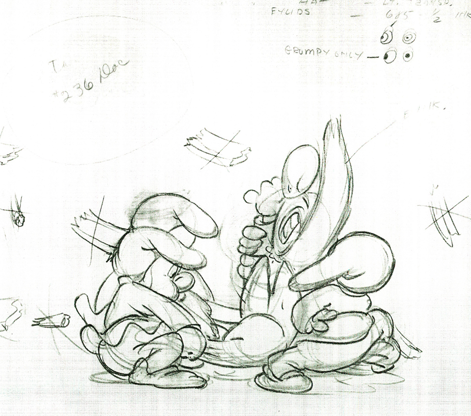
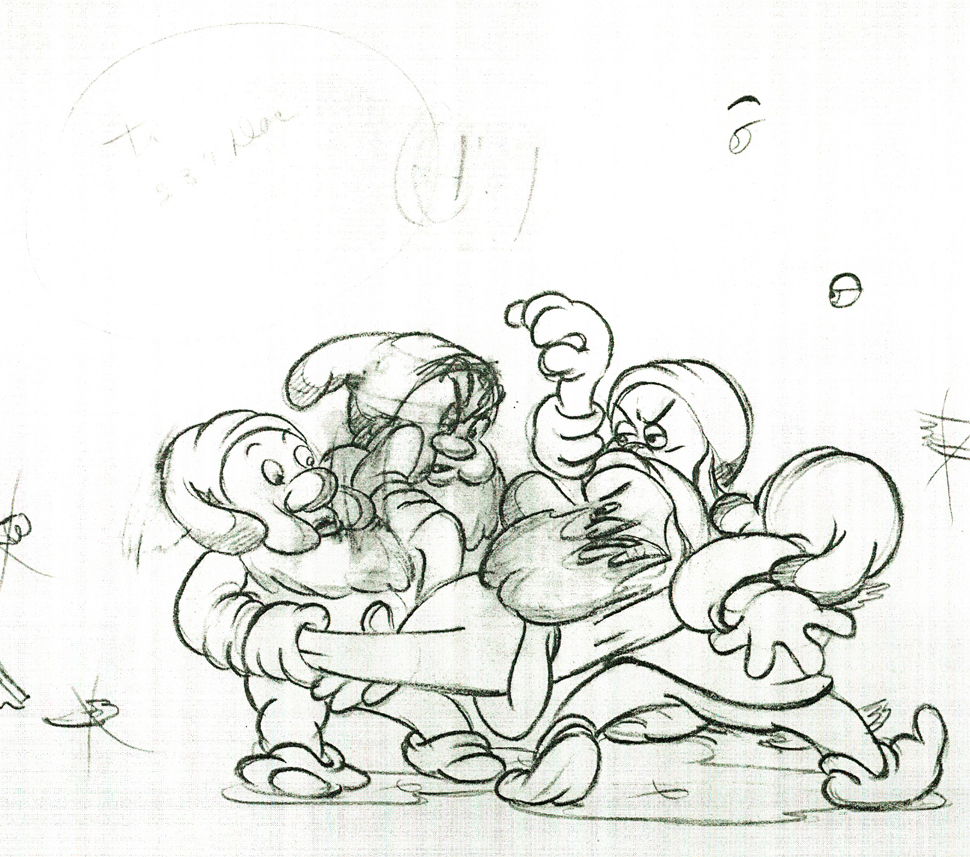
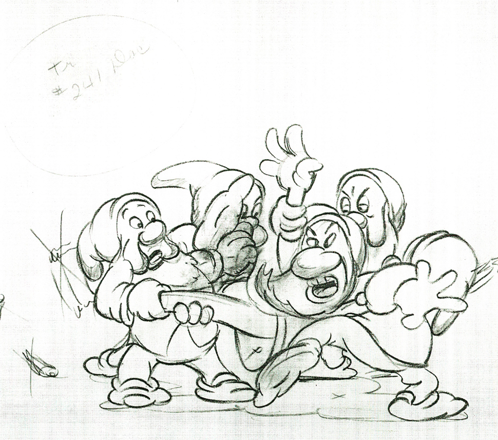
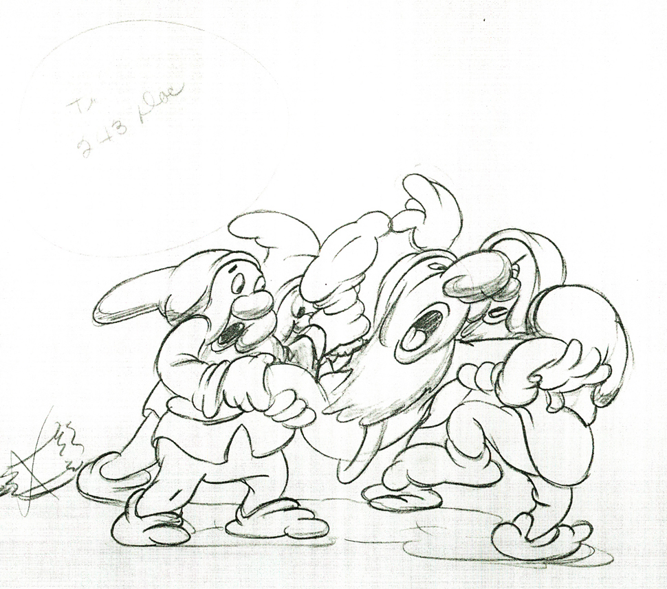
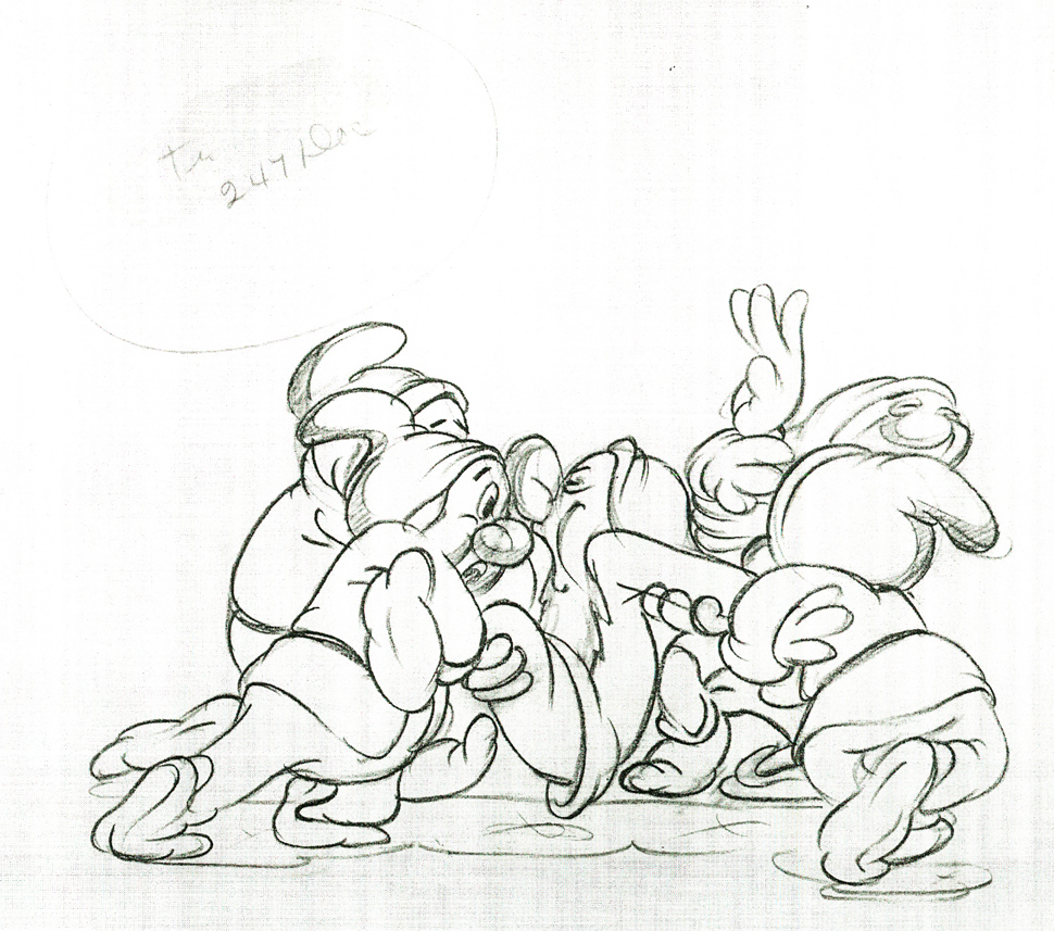
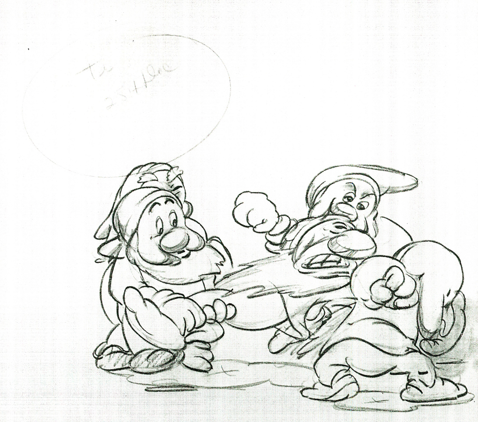
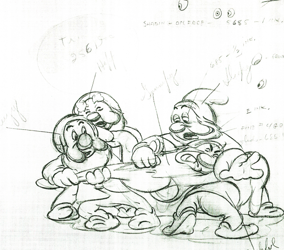
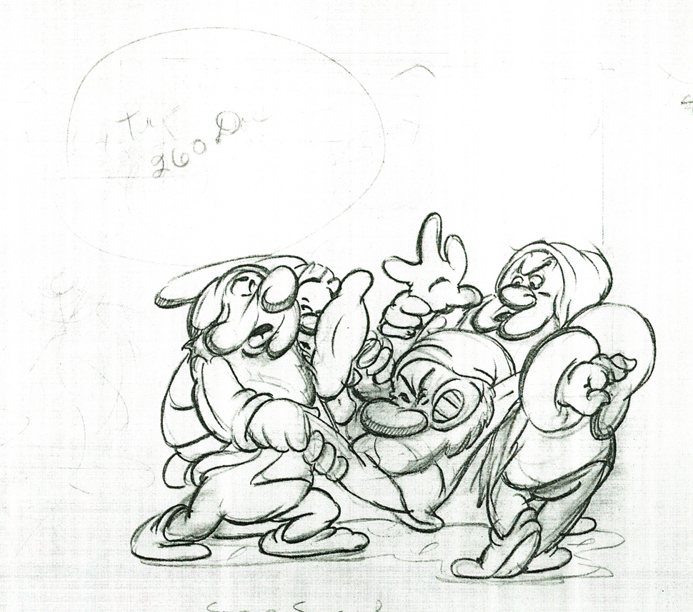
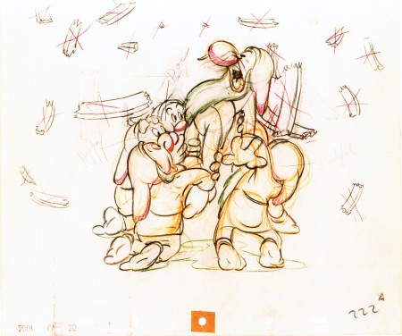
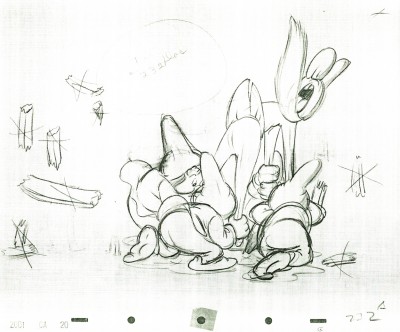
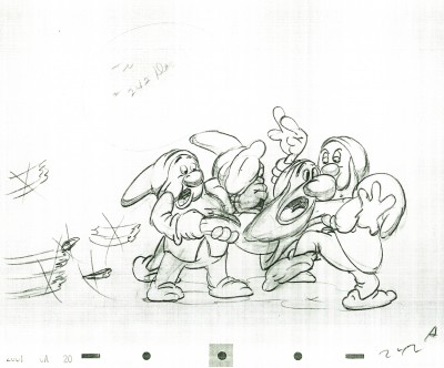
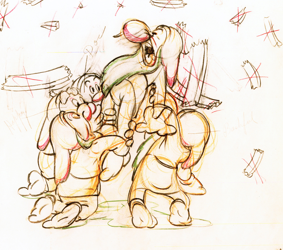
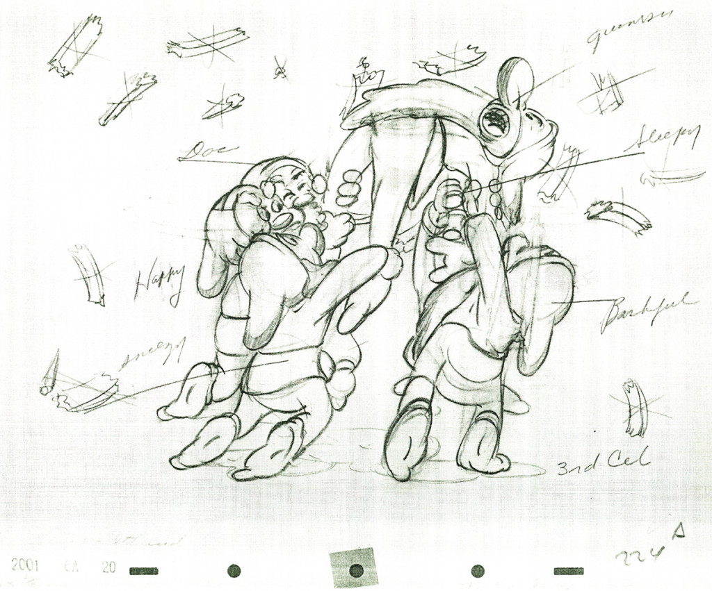
Here are some drawings and a QT movie of the seven dwarfs. Six of them are carrying Grumpy to the wash basin to clean him despite his violent protests.
Note the distortion on many of the drawings. #239 & 241 for example. #254 & 256 as well.
 222
222
Here’s the QT movie of the full scene:
The P.T. is exposed on ones at 24FPS.
Note the buttons on the bottom far right will allow you to
advance (and reverse) the action one frame at a time. You
should go through this to see the distortion on the inbetweens
and how it works when the animation is in full motion.
There’s a great deal of distortion and smearing in Tytla’s work. I think he uses it to heighten the acting moments that his characters are performing. This particular scene is more action than acting, so other than to show off his distorting the characters, it isn’t a great example of acting, per se. Bt that drawing #239 is a good example of what he’ll do, even to the face of the principal character in the scene, to get his animation to work.
It’s almost as if he’d studied live action frame by frame and represents all those motion blurs in live action by smearing the face. The dwarfs are probably the first time complicated acting is successfully achieved. They’d done it before with many of the characters in the Silly Symphonies, but these are characters who sustain strong personalities over a long period of film. They also go through strong emotional changes which underline and works off their personalities.
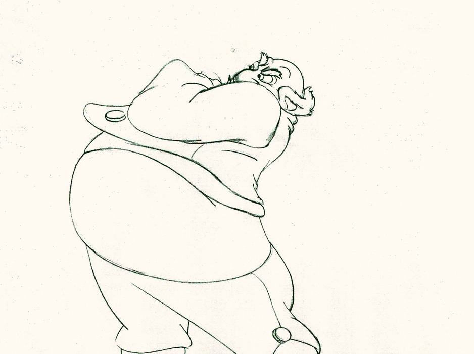
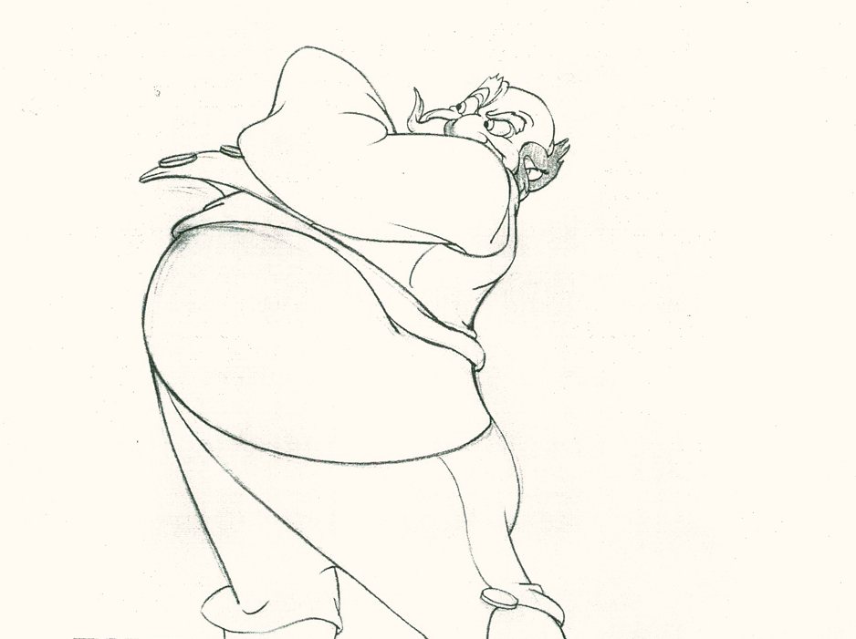
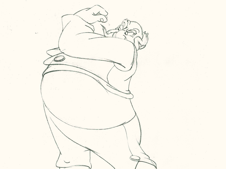
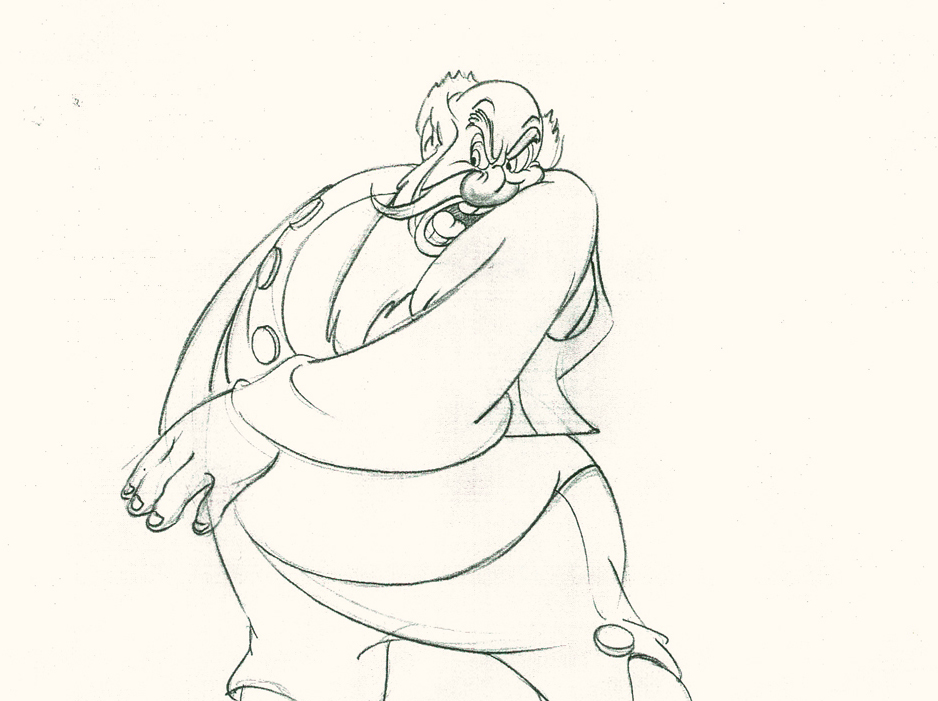
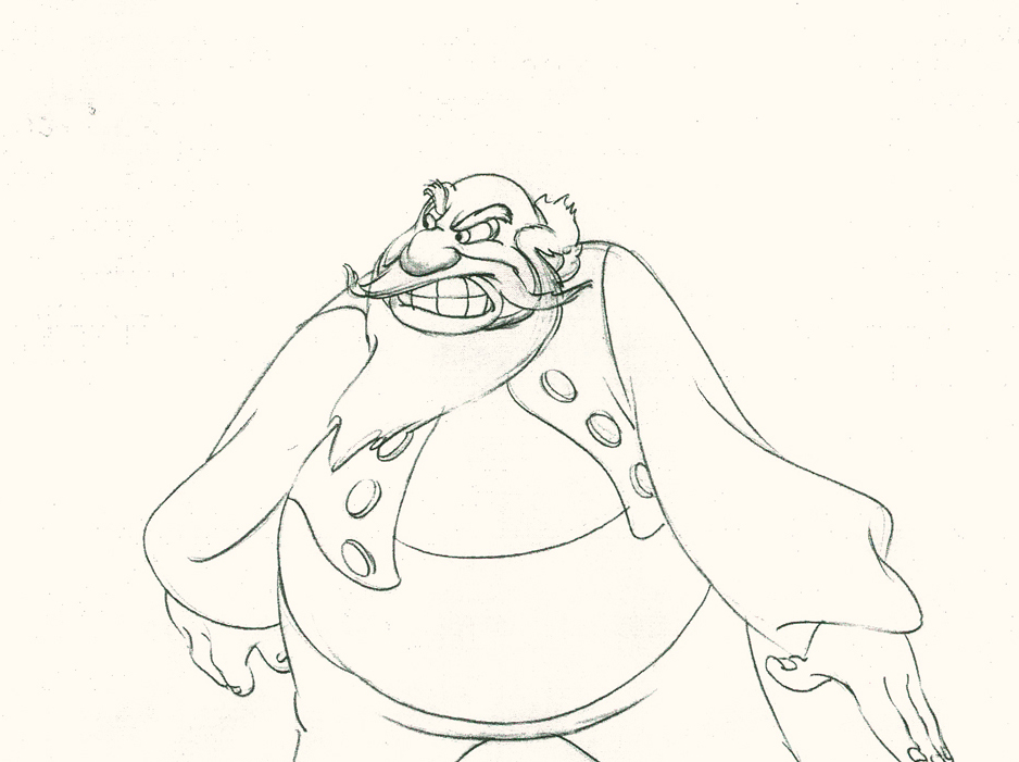
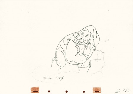
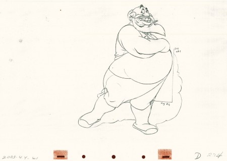
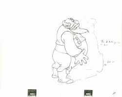
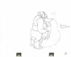
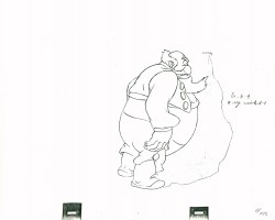
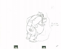
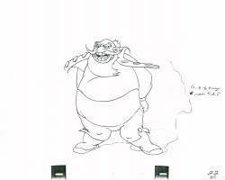
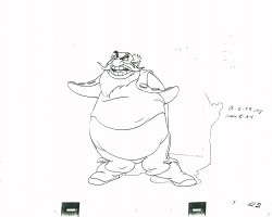
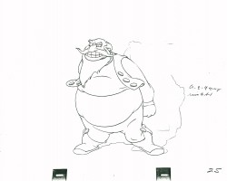
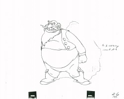
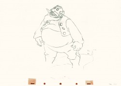
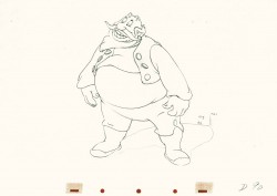
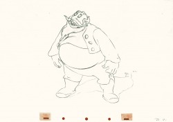
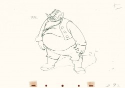
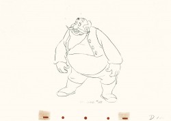
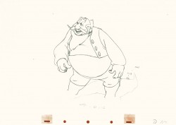
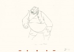
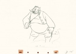
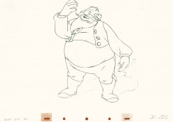
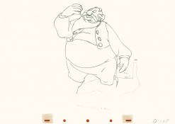
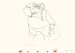
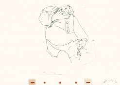
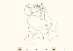
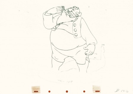
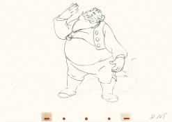
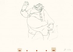
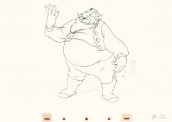
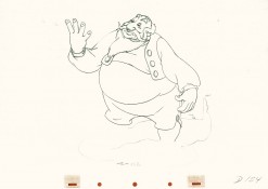
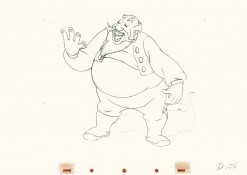
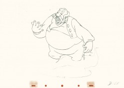
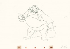
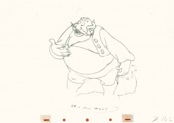
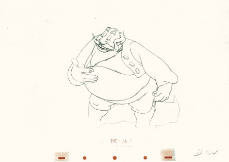
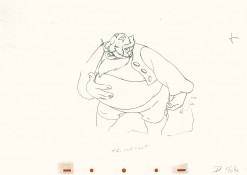
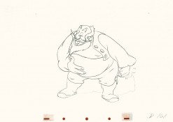
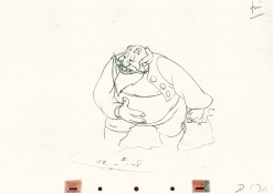
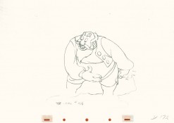
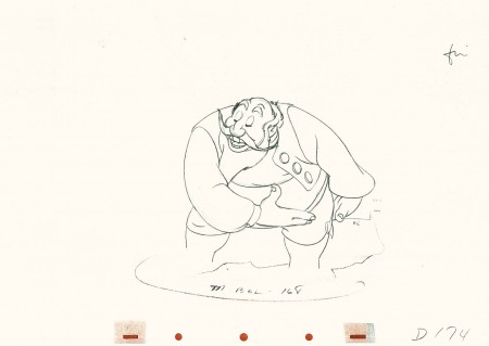
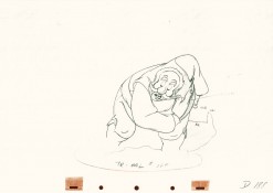
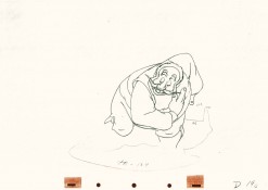
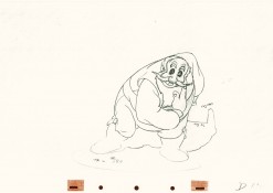
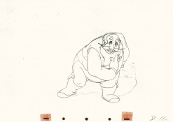
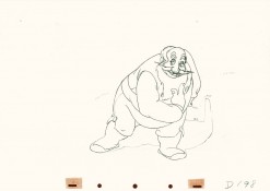
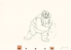
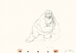
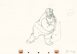
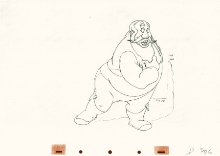
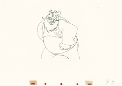
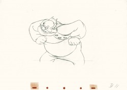
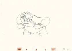
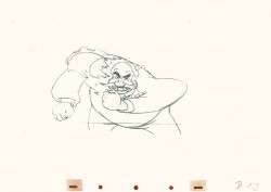
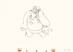
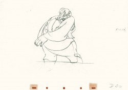
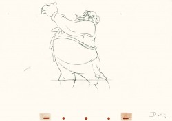
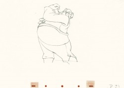
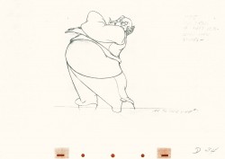
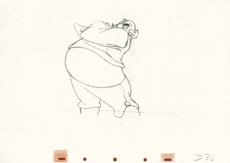
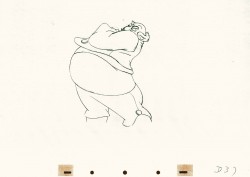
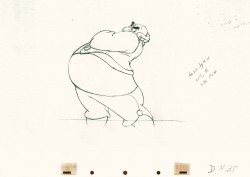
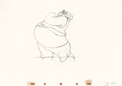
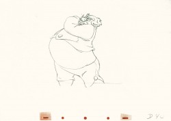
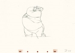
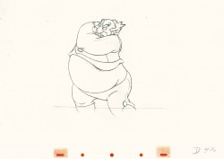
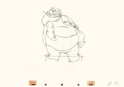
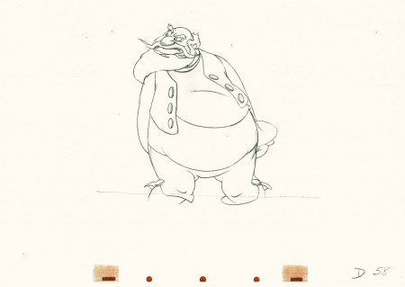
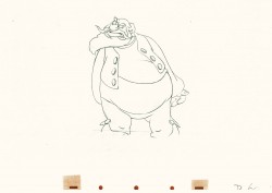
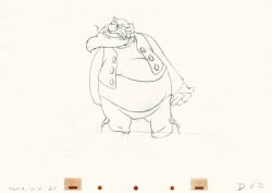
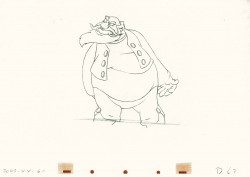
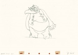
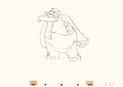
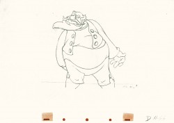
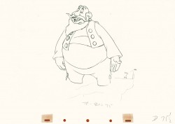
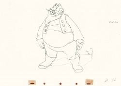
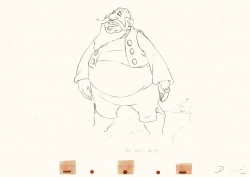
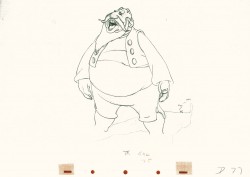
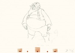
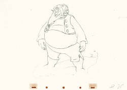
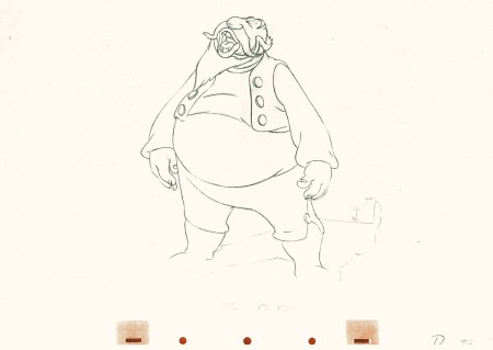
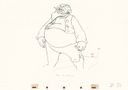
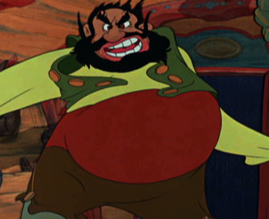
Tytla had a very different character in Stromboli for Pinocchio. He was a theatrical type, very changeable personality with emotions going all over the place – from high to low in the bat of an eye.
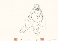
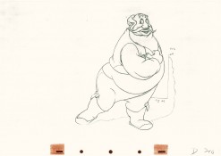
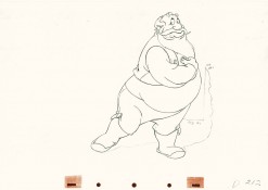
Tytla brought beautiful distortion to many of the drawings he did, using it as a way to hammer home some of the emotions in the elasticity he was creating. Yet, the casual observer watching this sequence in motion doesn’t ever notice that distortion yet can feel it in the strength of the motion.
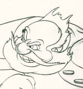
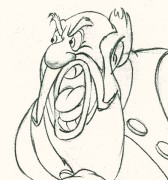
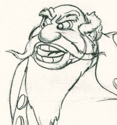
Four drawings (#1, 11, 22, & 48) that shift so enormously but call no attention to itself.
Brilliant draftsmanship and use of the forms.
After I first posted some of these drawings and spoke a bit about the distortion Tytla would use to his advantage – for emotional gestures – I received some comments. I’d written that . . . “It’s part of the “animating forces instead of forms†method that Tytla used. This is found in Stromboli’s face.
This note arrived from Borge Ring after my first post Bill Tytla’s scene featuring Stromboli’s mood swing:
- The Arch devotees of Milt Kahl have tearfull misgivings about Wladimir Tytla’s magnificent language of distortions. ‘”Yes, he IS good. But he has made SO many ugly drawings”
Musicologists will know that Beethoven abhorred the music of Johan Sebastian Bach.
yukyuk
Børge
Note in one of these arms (right) Tytla uses Stromboli’s blouse to make it look like there’s distortion. It barely registers but gives strength to the arm move before it as his blouse follows through in extreme.
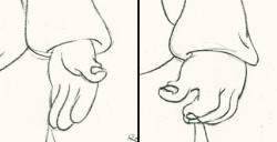 There’s also some beautiful and simple drawing throughout this piece. Stromboli is, basically, a cartoon character that caricatures reality beautifully. A predecessor to Cruella de Vil. In drawings 76 to 80 there’s a simple turn of the hand that is nicely done by some assistant. A little thing among so much bravura animation.
Many people don’t like the exaggerated motion of Stromboli. However, I think it’s perfectly right for the character. He’s Italian – prone to big movements. He’s a performer who, like many actors in real life, goes for the big gesture. In short his character is all there – garlic breath and all.
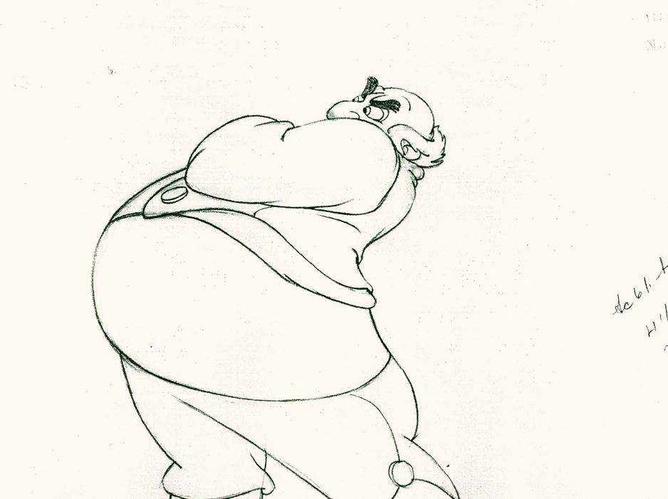
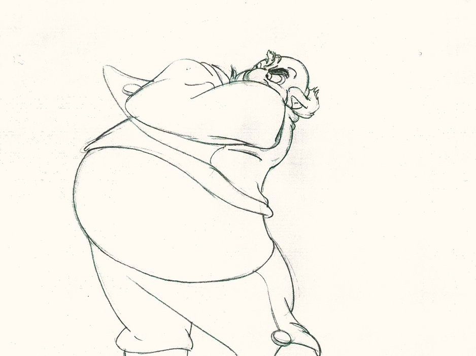
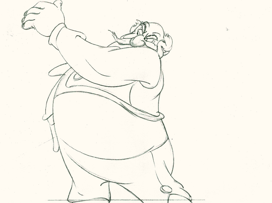
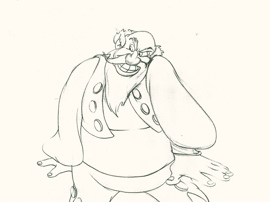
Here’s a short part of another scene. I’ve enlarged the images a little so that the thumbnails are more revealing. Just look at the distortion on the heads and how he stretches the arm to give it a violent emphasis.
 1
1Tytla starts with arm and head all the way back to
the character’s right. It’d be hard for Stromboli to
reach any further back without real distortion.
 5
5
He then slowly advances the head inbetweening slowly.
The arm hasn’t moved very much – maybe what they
call today a “moving hold.”
 11
11
Now the arm comes out swiping violently.
The head’s almost complete in its turn to the left.
 13
13
The arm rips across in three drawings.
The head has gone too far.
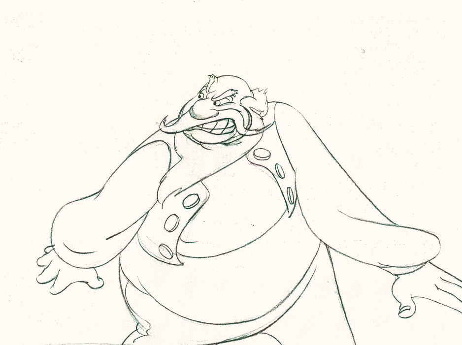 14
14
The head goes back to where it should – almost no inbetweens
for Stromboli to get ready for speech. He’s taken 14 drawings
to display his anger.
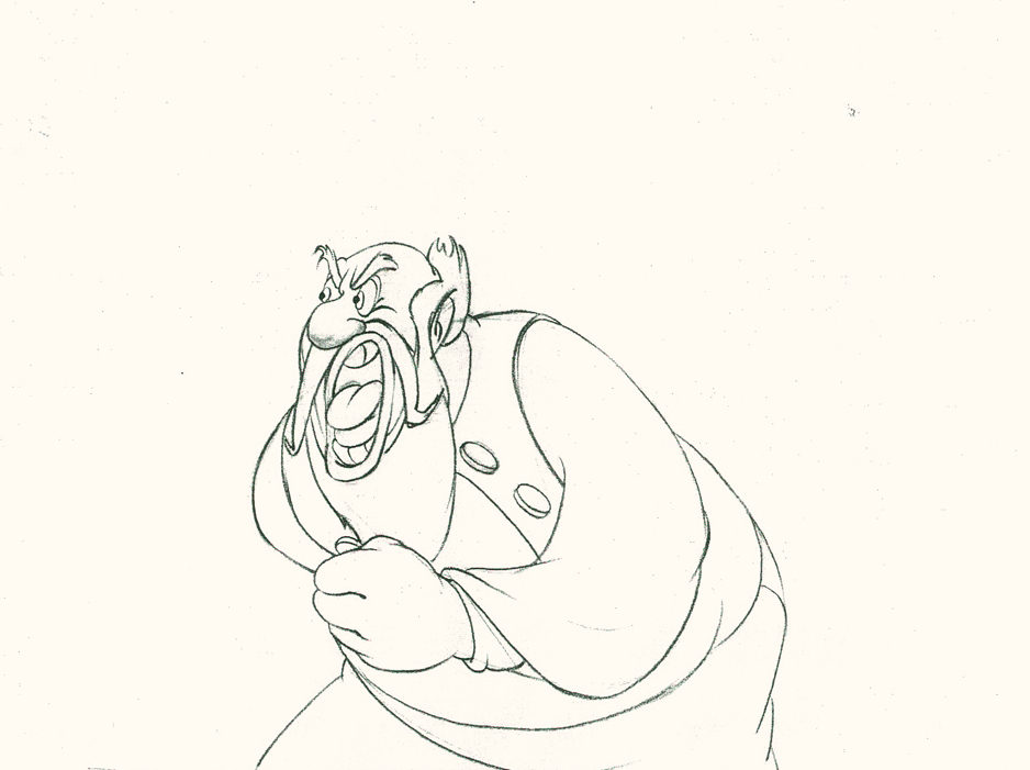 20
20
The arm comes back into a near fist; the expression is violent.
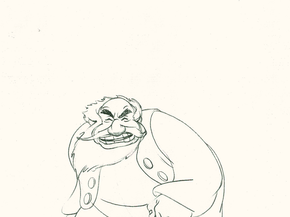 22
22
The head starts shaking in a “no” gesture.
Violent.
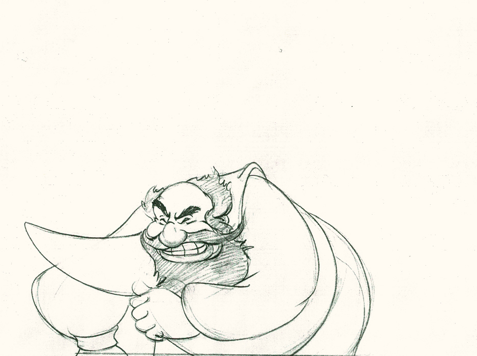 25
25
The head and arm are all the way back.
The vest has been set up to make a violent move.
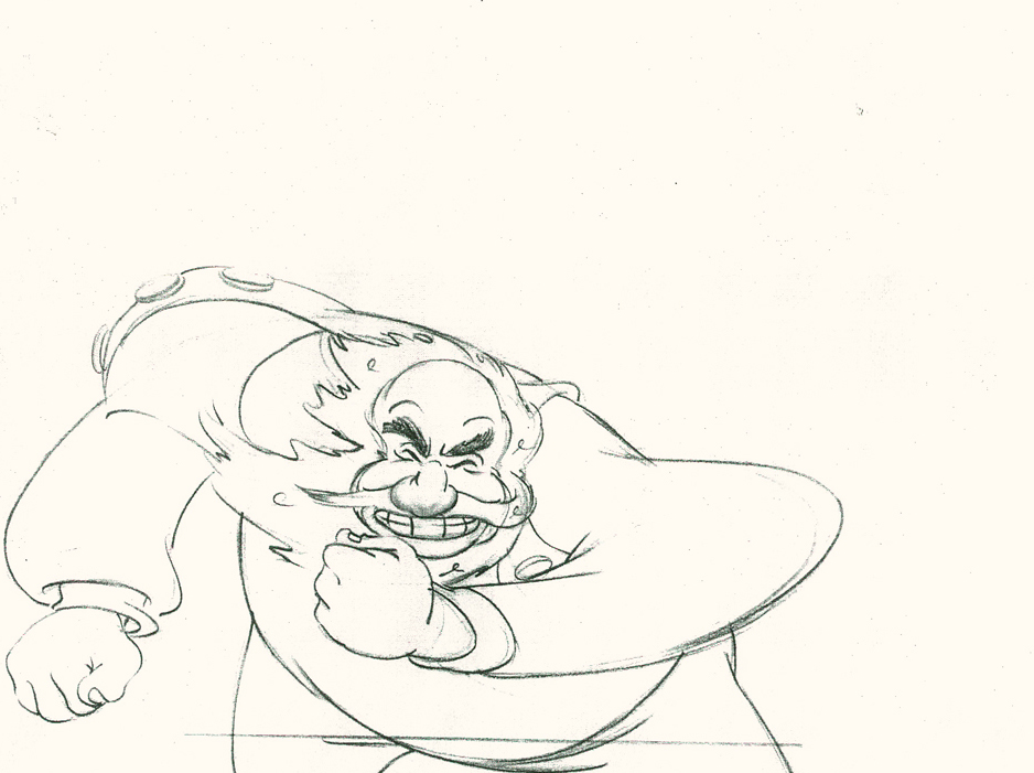 28
28
Now the arm and fist swipe across in violence.
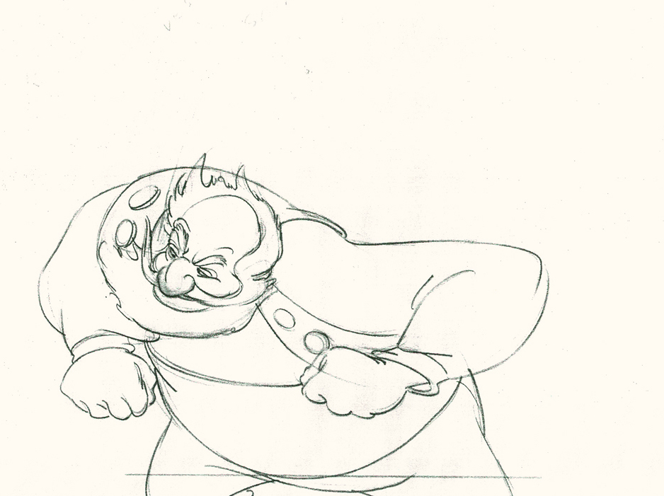 30
30
He’s completely pulled his angry head in to his neck.
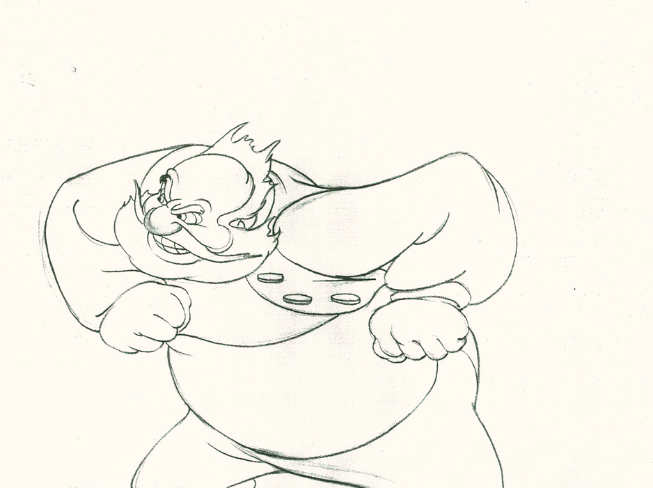 32
32
Both arms, moving violently, are suddenly restrained.
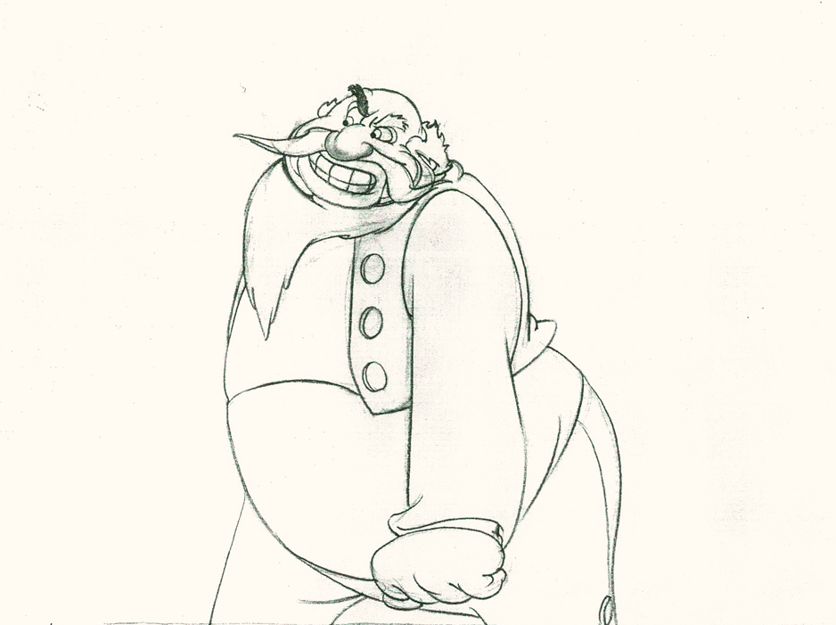 34
34
He hits a full stop with his arm.
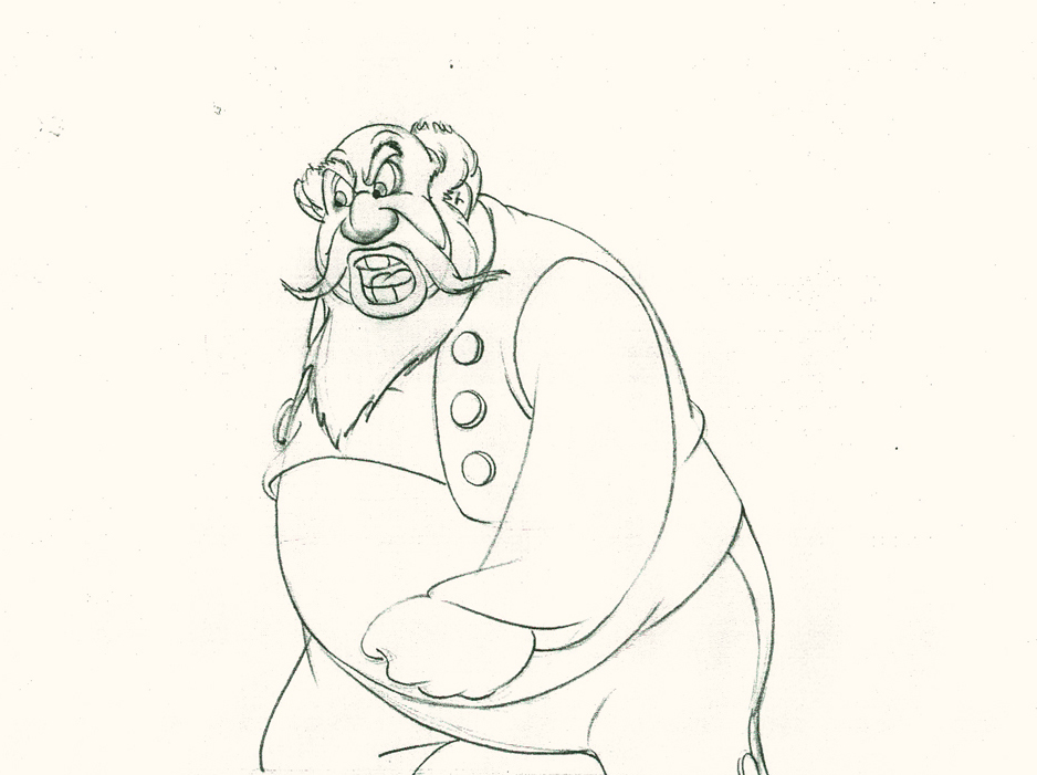 37
37
He’s made the realization that he has to change his expression
so that he doesn’t lose the frightened kid – completely.
Here’s the final QT of the entire scene.This part comes at the very beginning:
Stromboli
Click left side of the black bar to play.
Right side to watch single frame.
David Nethery had taken my drawings posted and synched them up to the sound track here.
It’s not clichéd, and it’s well felt and thought out. Think of the Devil in “Night on Bald Mountain” that would follow, then the simply wonderful and understated Dumbo who would follow that. Tytla was a versatile master.
We’ll continue next time with Dumbo Fantasia and other Tytla gems.
Articles on Animation &Books &Commentary 18 Feb 2013 04:59 am
Appreciation
The deeper you go, the deeper you go.
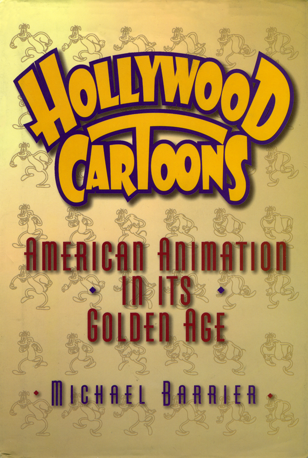 In reviewing the two J.B. Kaufman books on Snow White and the Seven Dwarfs, I found them impeccable in their attempt to reconstruct the making of this incredibly important movie. They followed a strict pattern of analyzing the film in a linear fashion going from scene one to the end.
 However, the analysis Kaufman offered brought me back to the bible, Mike Barrier‘s Hollywood Cartoons. Rereading his chapter on Snow White, you realize how much depth he offers in a far shorter amount of space. Of course, there are few illustrations in Barrier’s book, but what writing is there is golden. He meticulously analyzes the work of different animators using a very strict code of principles. If you can agree with him, the book he’s written opens up enormously.
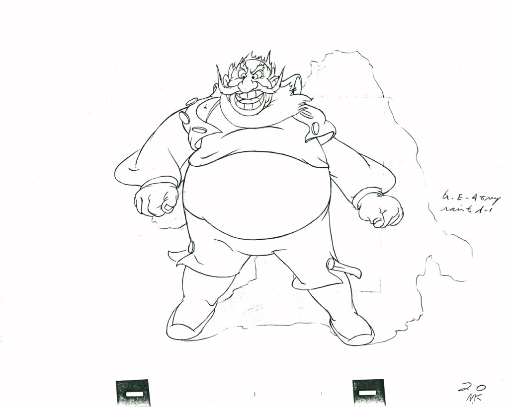 Once you get to the chapter, post-Snow White, which catalogues the making of Pinocchio, Fantasia, Bambi and Dumbo you are in the deep water. Mike pointedly criticizes some of the greatest animation ever done. His analysis of Bill Tytla’s Stromboli is ruthless. Though I am an enormous fan of this animation, I cannot say I disagree with what he has to say. Though I think differently of the animation.
Here’s a long excerpt from this chapter:
- No animator suffered more in this changing environment than Tytla. His expertise is everywhere evident in his animation of Stromboli—in the sense of Stromboli’s weight and in his highly mobile face—but however plausible Stromboli is as a flesh-and-blood creature, there is in him no cartoon acting on the order of what Tytla contributed to the dwarfs. At Pinocchio’s Hollywood premiere, Frank Thomas said, W. C. Fields sat behind him, “and when Stromboli came on he muttered to whoever was with him, ‘he moves too much, moves too much.’” Fields was right-although not for the reason Thomas advanced, that Stromboli “was too big and too powerful.”
- In the bare writing of his scenes, Stromboli, more than any of the film’s other villains, deals with Pinocchio as if he were, indeed, a wooden puppet—suited to perform in a puppet show, and perhaps to feed a fire—rather than a little boy. But the chilling coldness implicit in the writing for Stromboli finds no echo in the Dutch actor Charles Judels’s voice for the character. Judels’: Stromboli speaks patronizingly to Pinocchio, as he would to a gullible child, and his threat to use Pinocchio as firewood sounds like a bully’s bluster. As Tytla strained to bring this poorly conceived character to life, he lost the balance between feeling and expression. The Stromboli who emerges in Tytla’s animation is too vehement, “moves too much”; his passion has no roots, and so he is not convincing as a menace to Pinocchio, except in the crudest physical sense. There is nothing in Stromboli of what could have made him truly terrifying: a calm dismissal of Pinocchio as, after all, no more than an object.
- To some extent, Tytla may have been overcompensating for live action that even Ham Luske acknowledged was “underacted.” But Luske defended the use of live action for Stromboli by arguing that it had kept Tytla on a leash: “If he had been sitting at his board animating, without any live action to study, he might have done too many things.”
I agree, as Barrier says, that Stromboli is a flawed character, and I agree that the movement is broad and overstated. However, I think that this was Tytlas’s only possible entrance into the material, into trying to further the characterization. No, it could not be as deep as the work he’d done on Grumpy in Snow White, but the character of Stromboli isn’t as small as that name, “Grumpy”. A lot more was offered and had to be circled to simplify as best as possible for the small amount of screen time he would have in Pinocchio. And, yes, he comes off like a blowhard with a lot of bluster. But that’s not the way Pinocchio sees him. Pinocchio is made of wood, as Stromboli reminds us, but he is also an innocent, a child learning about the world.
Barrier’s chapter, as I said, moves quickly through this material covering four of the greatest Disney films; no, four of the greatest animated features ever done. In relatively few pages you feel as though he’s gotten it all in there and has even said more in depth than almost any historian about this period of Disney animation. I’ve read this chapter at least a dozen times, and it continues to grow richer for me. I think it’s possible the greatest piece ever written about animation.
Barrier’s writing, vocabulary, choice of phrase is all charged to keep the material tight. He’s writing a large book, and he has to get a lot in.
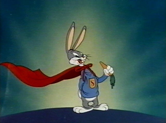 Perhaps some day he will have one of those big picture books to write where he will have the freedom to expound on the material. I did once read such a book. Mike Barrier had been employed to write a history of the Warner Bros. studio, and I got to read the first draft of the manuscript. I had a couple of hours and sat in a chair, thumbing pages. The images that were to be in the book were on large chromes. It was all an extraordinary experience for me, and I remember it somewhat hazily, as if remembering a golden afternoon. Of course that book was cancelled when management changed hands, and the world lost a great book.
Can there be any wonder that I go to the Barrier website daily, knowing full well that it’s often months between posts? I just keep looking for new material from him, and will continue my daily routine hoping for the small brightly colored package on his site. It’s almost important for there not to be frequent posts or the new ones wouldn’t always shine as well. However, two or three times a year, there is something rich there, and my search has brought the golden fish. (Yes, I’m exaggerating somewhat like Tytla did in his animation of Stromboli. But the point gets made.)
Even if there’s nothing new there, there’s plenty old. Many old Funnyworld articles or interviews done with Milt Gray. It’s a deep site full of deep writing.
Books &Daily post 29 Sep 2012 06:55 am
Egos, Books, and Michel Ocelot
There’s been a relatively short conversation going on at the comment section of my blog for an older piece I’d repeated this past week. The discussion has been about Eyvind Earle. The first few visitors who commented all wanted to express their dislike of this film (particularly the story) and Eyvind Earle’s design work, in particular. “Scott’s” dislike of Mr. Earle’s work extends to his personal attitude while working on the film. He, according to “Scott”, was thick headed and wouldn’t listen to any requested changes to his designs, allowing his ego to take charge of the work. (I’m not sure that I see that on the screen, nor did I really feel that when I met the man when I got to spend an afternoon with him as I accompanied Mike Barrier on an interview. I admit it is possible though.)
In fact, I think the ego is essential in breaking new waves and advancing the art form. Adam Abraham in his book When Magoo Flew writes about the ego of John Hubley in running his productions at UPA. If he wanted a specific blue, that’s all that he would settle for. The report is that he was oppressively insistent on it being his way only. I worked for Hubley for years and never got to see that side of the man. Oh, there was a well deserved and big ego there, but it never got in the way of the art being created.
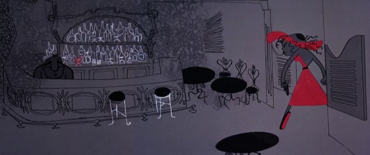
Rooty Toot Toot
We’ve seen Bill Peet complain about Bill Tytla‘s use of his (Peet’s) drawings while working on Dumbo. According to what I’ve read, Peet complains that Tytla took full credit for the sequence of baby Dumbo running in and around his mother’s legs, when Peet felt it was his scene, his key drawings that made the scene the perfect piece that it was.
Chuck Jones, while working briefly for Disney (on Sleeping Beauty), told Walt that he had to leave the studio. When Disney asked what job Jones really wanted at the studio, Jones said, “Yours.” He felt that only Disney’s job was suitable for him. Talk about ego. The ego was even larger than that when you realize that it was Jones, hmself, that told me that story – however real it actuall was. The egos of Jones and Clampett and even Freleng vie over who created what character.
Egos are necessary in an industry of craftspeople and artisans, especially when an artist is trying to get something brilliant out of them. Thomas, Johnston, and even Kahl were brilliant actors with amazing abilities of draftsmanship. But the film, the bigger picture, needed a direction which Earle gave it. Just look at the wretched Reitherman films to see what Thomas, Johnston and Kahl turned out without the strong, smart director who was also an artist. Tytla took animation to another level, he was truly an artist, himself, but look at the miserable little films he directed when he left Disney’s studio. Even the support system of that studio wouldn’t have helped Leprechauns Gold or Snap Happy. (Mind you, I love Snap Happy, but it has no relation to art.)
Here’s a small piece David Parfitt wrote:
- Tytla was a tough guy who used abusive language and irritated his fellow animators. Ken Anderson (Disney Legend for Animation and Imagineering) went to Walt Disney to express frustration at the way Tytla treated his coworkers. Walt Disney replied, “What do you think of Chernabog, the God of evil, in ‘Fantasia’? What do you think of Stromboli in ‘Pinocchio’?†Anderson (the art director for both films) replied, “They are some of the most powerful and vicious villains we’ve ever done.†Walt Disney looked at Anderson and said, “Where do you think all that anger comes from?†Vladimir Tytla was a maverick who needed to release anger and energy to manifest some of the most powerful imagery ever produced by the Disney Studios. A maverick is difficult for a company to grapple with because of their abrasiveness and the way they go against the way things typically run. Yet out of the agitation and irritation often comes a new direction that could secure a company’s future.
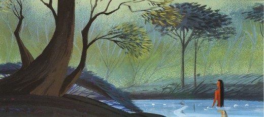
Sleeping Beauty changed the Disney studio forever. The animators and artists there, with the exception of Ward Kimball and a few others, fought against the use of 20th century graphics in their films, yet UPA’s influence slowly crept into the mix. Finally when Walt Disney, himself, chose Eyvind Earle and put full support behind him to design this film as he saw fit. The animators all fought Earle and continued to bad mouth him to the end of their days. Yet Earle’s style, as well as Tom Oreb‘s great character designs for that film, are frequently copied by the new generations of artists. The backgrounds and some of the character design are stolen directly from Sleeping Beauty. Even though the SB art is a play on 15th Century manuscripts and art, it was used for the Pocahontas forests.
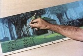
Painting Sleeping Beauty
Nothing at Disney, with the possible exception of Bedknobs and Broomsticks went back to the past to illustrate their films henceforth. Until, of course, today’s new artists in animation who just steal from other past films. Bluth‘s Small One or is virtually without style. Tim Burton is possibly the only exception I can see of this current view of the state of animation. The regurgitated past of other artists who deservedly had egos aglow. We go on. Perhaps someone like Genndy Tartakovsky will bring some of the panasche he brought to Samurai Jack.
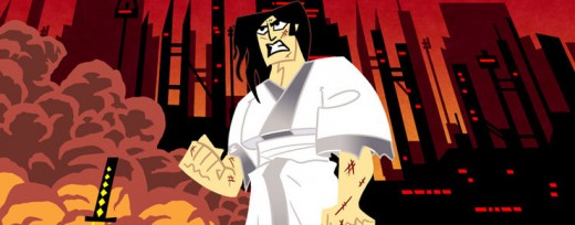
Samurai Jack
By the way, there’s a good interview with Tartakovsky on this week’s on-line version of the Village Voice.
Books
.
- There are a couple of books I’d like to write about.
.
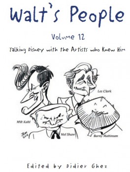
- Let me mention Didier Ghez‘ latest volume of his interview series, Walt’s People.
Just released is Walt’s People – Vol. 12. Just the idea of 12 volumes of any book in print, is quite extraordinary, and amazing feat for Didier Ghez to pull off.
I own about a half dozen of this series and have read all of them at least twice. Most of the interviews are exceptional, some are smart, and the rest are just very good. In all there are those interviews that give us some real insight into the process and history of the making of animated films by the professionals who did it. Les Clark, Larry Clemmons, Charlie Downs, Al Eugster, Sammy Fain, Milt Kahl, Burny Mattinson, Paul Murry, and Mel Shaw are among the many who are interviewed in depth for this new volume. Some of our greatest historians (Robin Allan, Michael Barrier, Albert Becattini, John Canemaker, John Culhane, Pete Docter, Chris Finch, J.B. Kaufman, Jim Korkis, Dave Smith, and Charles Solomon among others) conduct the interviews.
It’s just another great volume in the series. You should own them all; I should own them all, to be honest, and I will.
Ganesha’s Sweet Tooth
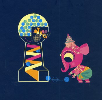
- As previously reviewed on this blog, Sanjay Patel will see his first children’s book, Ganesha’s Sweet Tooth released this week by Chronicle Books. I have a sore spot for Mr. Patel’s work. He’s an artist who works by day at Pixar and is an artist, with his own very defined style, working extensively after hours.
I’ve reviewed many of his books and have a real fondness for The Ramayana. Were I you, looking to explore this artist’s work, I’d buy Ganesha’s Sweet Tooth. Once you have it and want more – you will – go for The Ramayana. It’s a brilliant masterwork.
Snow White x 2
- Unless you’ve been hiding under a rock, if you’re an animation fan, you know that the brilliant historian, J.B. Kaufman, has not one but TWO books on Snow White about to appear on the market.
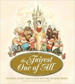
The Fairest One of All: The Making of Walt Disney’s Snow White and the Seven Dwarfs and
Snow White and the Seven Dwarfs: The Art and Creation of Walt Disney’s Classic Animated Film
are the two titles by Kaufman that focus in great depth on that film and its development. This is to celebrate the 75th anniversary of the feature, and will coincide with a display that will appear soon at the Walt Disney Family Museum in San Francisco.
Both books come from the Walt Disney Family Foundation in conjunction with the Walt Disney Family Museum. I’ve seen the Art of Creation book, and was completely taken with it. I will most definitely own both books. The film means much to me, and I want to own anything Kaufman writes. It’s a no-brainer – double my pleasure.
By the way, part of the reason I’m looking forward to reading these two books is to compare it with Michael Barrier‘s amazing writing on this period at Disney’s studio. In Hollywood Cartoons, there’s a large part of the book dedicated to the development andcreation of this particular film. Then in The Animated Man: A Life of Walt Disney Barrier tells the same information but from a different perspective entirely. This biography of Disney is wholly involved with Walt Disney, the man and artist. It’s a unique turn that we only see in the poorly written Diane Disney Miller book, The Story of Walt Disney. As Walt’s young daughter she could see the story no other way than from his perspective. While waiting for the Kaufman books to come out, read either of Barrier’s books for the best, to date, version of the Snow White story. It’s strong writing.
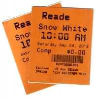 It’s appropriate that I was invited to a 10am screening of Snow White at Lincoln Center this morning. It’s part of the NY Film Festival’s 50th anniversary celebration. Eric Goldberg introduced the film with a brief and smart little talk about the animation. Talking about The Old Mill as a test run for the Multiplane Camera, talking about the Three Little Pigs first offering characters that looked alike but had characterization defined by their animation (as did the dwarfs), talking about The Goddess of Spring being an enormous failure for Ham Luske who succeeded animating Snow White. It was nice to say hello to Eric prior to the film. We haven’t seen each other in about five years. It was nice also to see the film projected. I saw the movie on tv/dvd only a couple of weeks ago, but it’s a very different experience on the big screen. The digital transfer was glorious, merciless and disastrous. The ink lines were so sharp that you could actually feel how deeply the crow quills cut into the cels. However there were many points where individual frames had slight digital distortion to hurt the ink lines, and the magic mirror actually had the detritus of digital compression across the center of the mirror. Someone should have been there to supervise the transfer.
Paperman played prior to Snow White. It was animated cgi, then flattened and lines were added atop the flattened drawings. I can’t for the life of me understand why it wasn’t just animated by hand. It would have cut the cost in half and had more life to it. Sorry, I don’t think it worth the Oscar. Though you never know it may be the best film, this year.
Tales of the Night
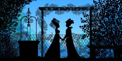
- Michel Ocelot has received another excellent review from the NYTimes. Tales of the Nightis reviewed by Andy Webster in the Times, and is Ocelot’s latest feature length animated film – his first in 3D – and the reviews are sensational. It’s screening as part of the Children’s International Film Festival and plays at New York’s IFC Theater through next Tuesday. This is a silhouette film in brilliant color.
His films are beautiful and deserve to be seen in a theater. I’d heartily recommend getting to the theater if you have the chance. Hopefully the distributor will submit this one for Oscar consideration. Though the look is 2D, the graphics are done via cgi as was the case with his past films, including Azur & Asmar, Kirikou et les betes sauvages, Princes and Princesses, and Kirikou and the Sorceress.
Some amazing animation is coming out of France these days.
More Reviews
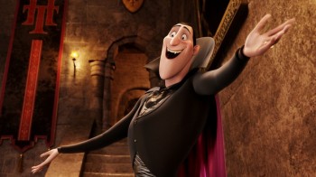 Now to the bigger release for the smaller film department:
Adam Sandler‘s second animated feature, Hotel Transylvania, opened to mostly poor reviews by 2nd string reviewers.
NYTimes sent Neil Genzlinger to give his negative review. The most positive line is: “The movie loses its originality as it rolls toward its predictable conclusion, but it’s still lovely to look at.”
Someone named Sara Stewart reviews the film for the NYPost and gives it a middling 2½ stars. “Director Genndy Tartakovsky (“The Powerpuff Girls,†“Samurai Jackâ€) is a natural fit for this kid-and-parent-friendly flick. The animator’s wit and attention to detail enliven a collection of well-known ghosts and ghouls. (Though Tartakovsky’s more traditional TV-cartoon style is still superior, as evidenced by his playful closing credits.)”
Joe Neumaier, the 2nd rate first stringer of the NYDaily news gave it a mostly positive 3 star review. “This being a Sandler movie, the humor skews toward the infantile (fart jokes, peeing baby werewolves). But the sleek visuals are rich and glossy, placing the characters, who look like Halloween door decorations, in baroque hallways or secret passageways.”
I enjoy the reviews in The Onion, and their review for this film by Tasha Robinson doesn’t disappoint. A C+: “Tartakovsky gets a long way on wild design and visually daring sequences. His work has always been adventurous, experimental, and conceptually creative, and he hasn’t lost any of his energy or capacity for staging a memorable setpiece.”
Whatever happened to the feature length version of Samurai Jack that J.J. Abrams was going to produce wth Tartakovsky directing?
Action Analysis &Animation &Animation Artifacts &Disney &Tytla 13 Sep 2012 05:48 am
Tytla’s Terry-Disney Style
- Bill Tytla is probably the finest animator who has graced the history of the medium. He was a brilliant actor who dominates most of the classic early films of Disney work. Snow White, Pinocchio, Dumbo, and Fantasia are all appreciably greater films because of his work. In studying this master’s work frame by frame you can see a real elasticity to the character, one that is not apparent in the motion of those same characters. There’s true emotion in the acting of these characters, and it’s apparent that he uses that elasticity to get the performances he seeks.
There’s something else there: Tytla’s roots were in Terrytoons: I have no doubt you can take the guy out of Terrytoons, but it seems you can’t take the Terrytoons out of the guy.
Let’s look at some of the drawings from some of the scenes I posted here in the past.
Where better to start than with those gorgeous dwarfs from Snow White. Here’s a scene I posted where all seven are animated on the same level as they carry Grumpy to the wash basin. If he won’t clean himself, then the other six will do the job for him. Take a look at some of the distorted characters in this scene, then run the QT movie. Look for the distortion in the motion.
As for the drawing, like all other Tytla’s scenes it’s beautiful. But tell me you can’t find the Terrytoons hidden behind that beautiful Connie Rasinski-like line.
Flipping over to Stromboli, from Pinocchio, we find animation almost as broad as many Terrytoons, the difference is that Tytla’s drawing that roundness and those enormous gestures on purpose. He knows what he’s doing and is looking to capture the broad immigrant gestures of those Southern European countries. Stromboli goes in and out of distorted drawings, as I made clear in a past post.
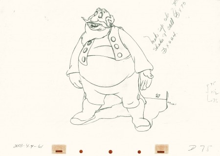 75
75
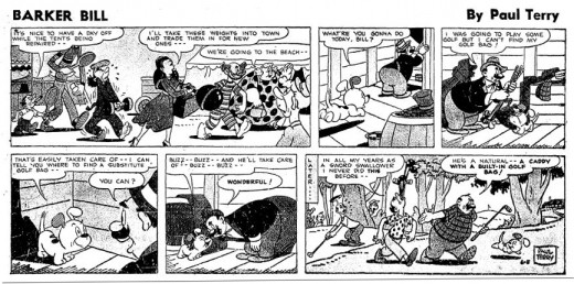
A strip by “Paul Terry”as starring his 1930s character, Barker Bill.
Borrowed from Mark Kausler’s blog It’s the Cat.
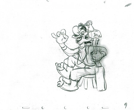
The Laughing Gauchito was a short that was, no doubt, going to be part of The Three Caballeros. Tytla, Frank Thomas and Ollie Johnston had all animated for the short before Disney, himself, cancelled the production.
Here are three drawings from the film, and they are all beautiful extremes from the scene. (Tytla marked his extremes with an “A” to the right of the number, or at other times with an “X” in the upper right.) The beautiful roundness does not come at the expense of his drawings. Below the Laughing Gauchito we see a cartoon drawing by Carlo Vinci from a 1930′s Terrytoons short.
 9
9
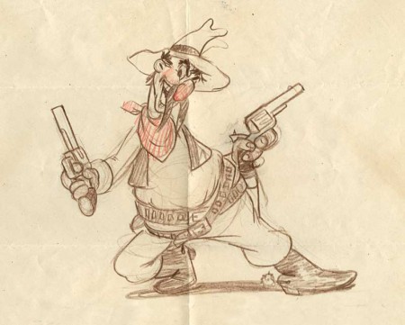
A Terrytoons drawing by Terry artist Carlo Vinci from a mid ’30s short.
borrowed from Animation Resources
Here’s a scene Bill Tytla did for a Harman-Ising cartoon. He was the supervising animator, and the lack of Disney becomes evident in the drawings. The animation is closer to a Terry short than what he did at Disney’s. The movement feels muddy in that actual cartoon. I’m sure it was his own animation trying to blend with the style of Harman’s work.
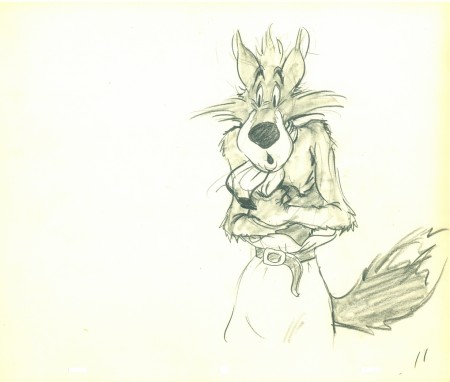 11
11
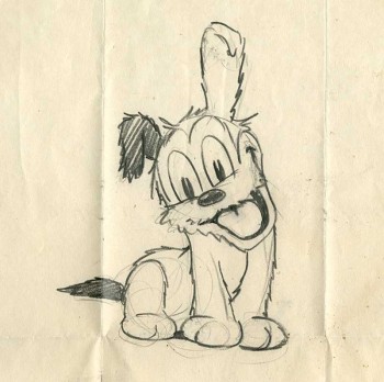
Another beautiful Carlo Vinci drawing from a 30′s Terry short.
borrowed from Animation Resources
And here’s a drawing out of a Little Lulu cartoon. I’s not a film directed by Tytla, and is not a good drawing. But Tytla’s influence on all the Lulu shorts at Paramount at the time can’t be denied. It certainly looks more Terrytoon than Paramount. This is not even a good Terry drawing – though its for a Paramount cartoon.
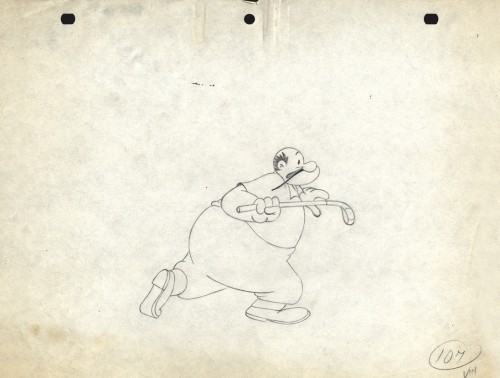
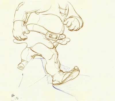
Back at Disney, Tytla animated Willie the Giant from the Mickey short, The Brave Little Tailor. This character, like Stromboli, owes a lot to Terrytoons. I felt this when I first saw the short as a child, and I still think it true. The same, I think, is also true of the same Giant character when he appears in Mickey and the Beanstalk, which Tytla obviously didn’t animate but would have handled if he’d stayed at the studio.
 3
3
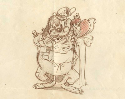
Another Carlo Vinci sketch.
borrowed from Animation Resources
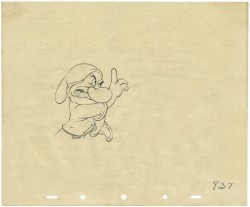
This following, last drawing is a Tytla drawing I own. I know Tytla did it. He gave it to Grim Natwick who gave it to Tissa David who gave it to me. It’s a gem.
Animation &Animation Artifacts &Disney 27 Jul 2011 07:16 am
Stromboli Jump Recap
As I pointed out a couple of weeks back, I’m going forward with recap posts of the Tytla scenes I’d previously posted. They should be seen and studied often. They’re too good.
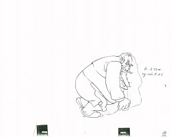
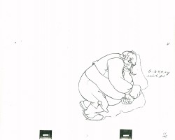
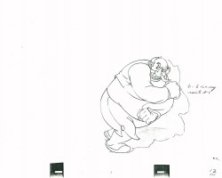
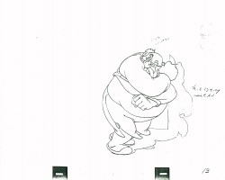
- Here’s a scene all of 29 drawings in length, but if you check it out in the film it’s enormous. Everything’s moving – the wagon they’re standing in, the pots & pans, things on the table and most definitely Stromboli who in one enormous drawing changes the scene, Pinocchio’s world and the mood in the audience. “Quiet!” is all the dialogue shouted in the scene. It”s frightening.
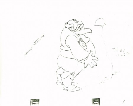
(Make sure you click to enlarge every drawing here.)
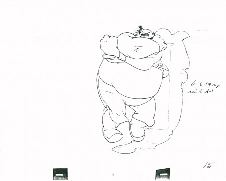 15
15
Closed position starting to open his body – legs first.
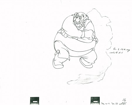 16
16
Pulling it all into a ball,
he shouts, “QUIET” – the dialogue for the scene
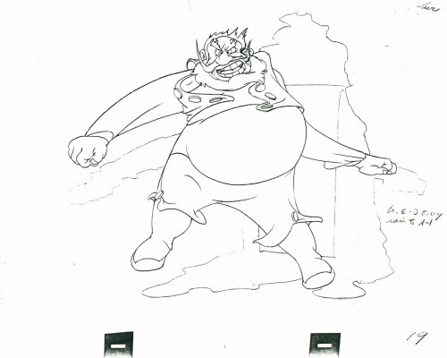 19
19
Couldn’t open up more than this.
Just look at the distortion in this drawing. Magnificent.
Open, loud, ready to burst. One frame only.
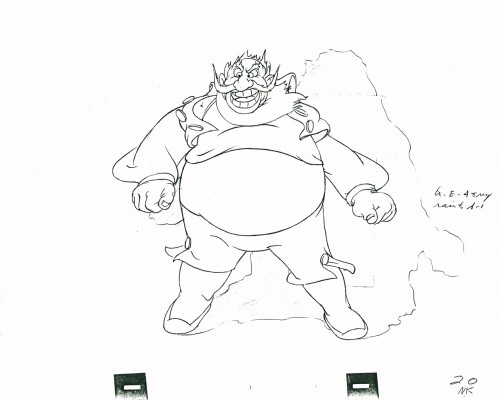 20
20
Next frame he’s landed and gathered himself.
Only the secondary action – vest, pants, beard –
echo the outburst.
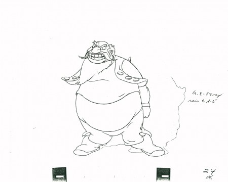 24
24
His clothes lag behind in pulling themselves together.
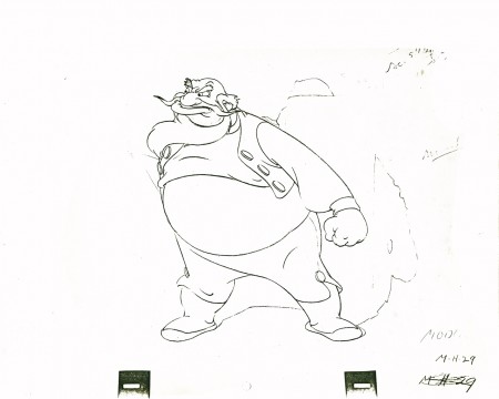 29
29
He’s set to give the demand and end the scene.
The following QT movie represents the entire scene from Pinocchio.
Click left side of the black bar to play.Right side to watch single frame.
Here are frames from the actual scene:
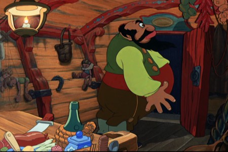 1
1.
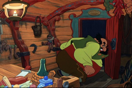 8
8.
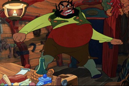 19
19.
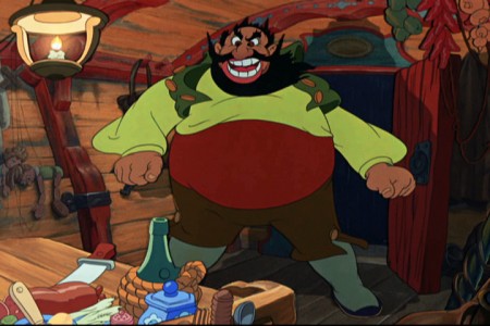 20
20.
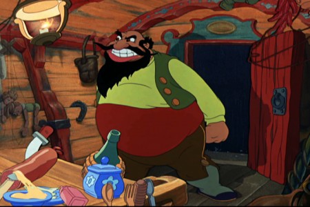 26
26
What a difference the shake of the coach and the
bounce of the hanging utensils make to the scene.
There’s danger everywhere, here.
It’s scary.
Many thanks to my friend, Lou Scarborough, for the loan of this scene.
Animation &Animation Artifacts &Disney &John Canemaker &Tytla 21 Jul 2011 06:30 am
Tytla’s Stromboli – the Second half
This is a continuation of yeserday’s recap post. Tytla was a genius and this scene is proof. Originally in five parts, here are the final three.
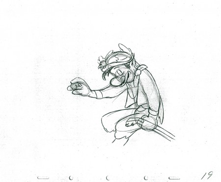
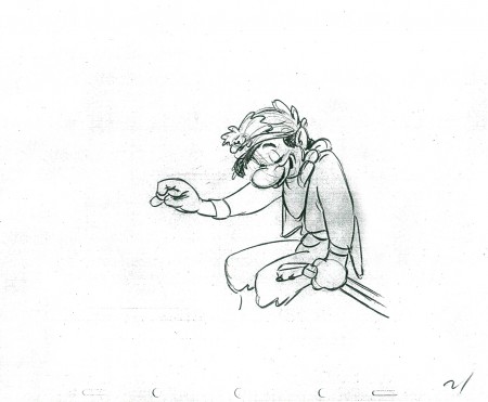
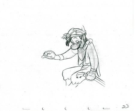
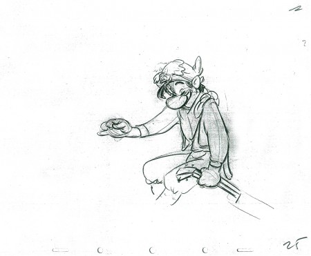
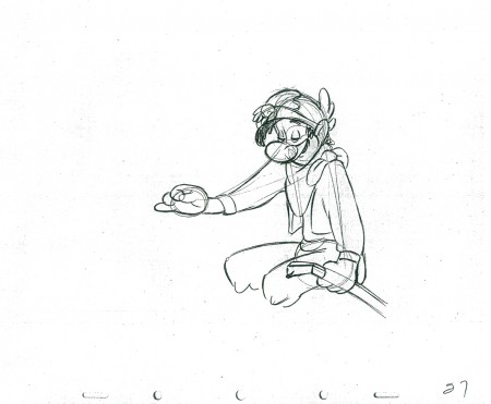
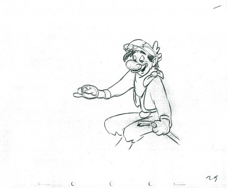
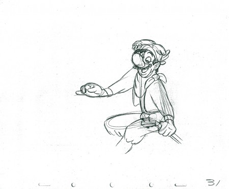
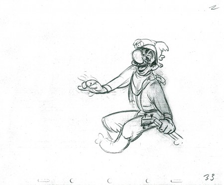
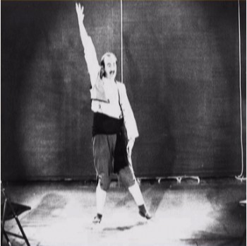
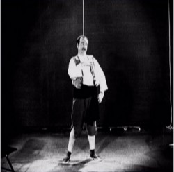
Nancy Beiman brought to my attention that T.Hee did some live action reference for Tytla as Stromboli. Here are some stills I located:
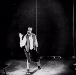
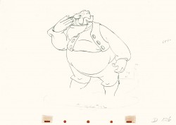
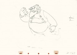
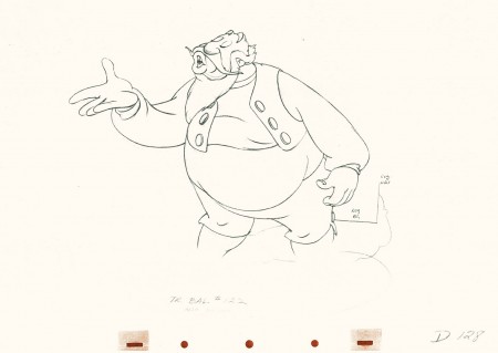
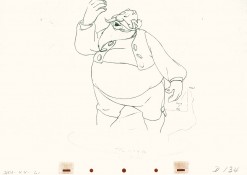
- This is part 3 of this large scene by Bill Tytla of Stromboli. The scene started in Part 1 with thoroughly frenetic anger from Stromboli. In Part 2 he tries to catch himself and get a grip on his emotions. Here in Part 3 he moves slowly and takes a 180° turn from where he started. The line against the curve. All this while playing out the lines from the scene. The drawing is stunning, the motion is brilliant, and the acting is the best animation has to offer. Those hands are just great; look at 126.
I pick up with the last drawing from Part 2.
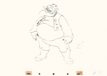 86
86(Click any image to enlarge.)
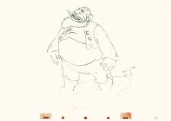 87
87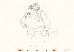 88
88
Tytla made sure he firmly planted Stromboli’s feet (in part 2)
before he attempted this firm bow.
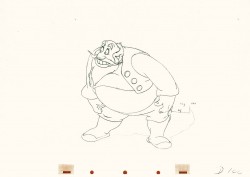
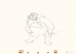 101
101
He’s made a solid line of the back, the strength of this move,
by using the left arm held firmly in place.
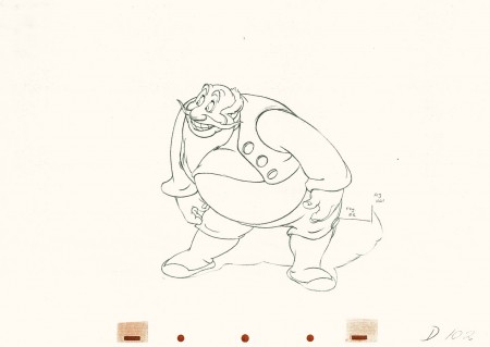 102
102
This is the bottom of the bow, now he goes back up.
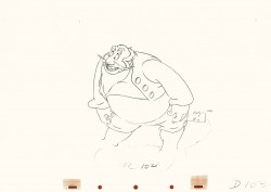
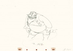 104
104
All of the shapes change naturally in the bow, though it looks
as if it remains a solid. No noticeable change. Solid weight.
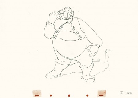 122
122
Watch the timing on the hand from here to #128
as Stromboli blows a kiss.
Many an animator today would pop it and call it animation.
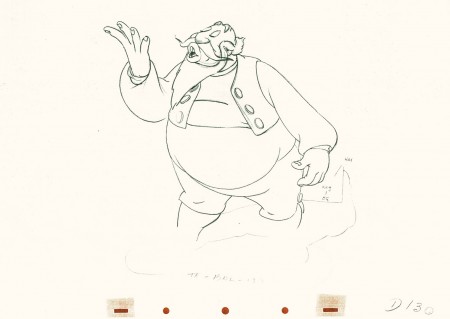 130
130
(Click any image to enlarge.)
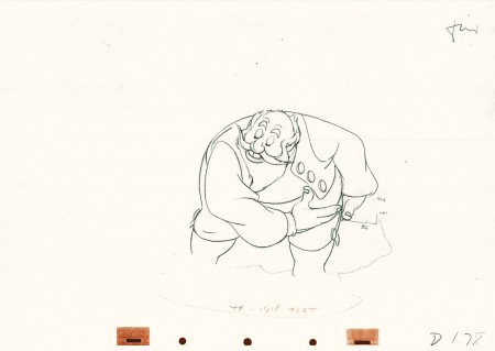 178
178
(Click any image to enlarge.)
Here’s the final QT of it all together:
Stromboli
Click left side of the black bar to play.
Right side to watch single frame.
David Nethery had taken my drawings posted and synched them up to the sound track here.
Animation &Animation Artifacts &Disney &John Canemaker &repeated posts &Tytla 20 Jul 2011 07:31 am
Tytla’s Stromboli – the First half
As stated last week, I’m recapping some of my Tytla posts from the past. This very long scene was originally in five parts. Today and tomorrow all five parts will be posted.
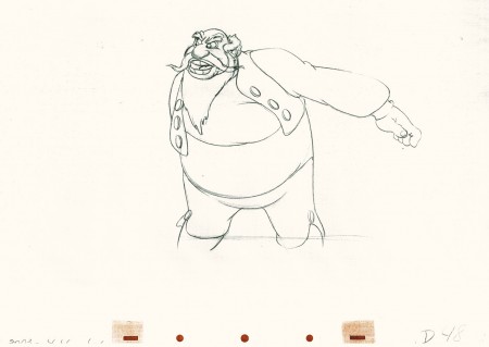
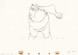
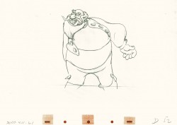
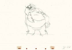
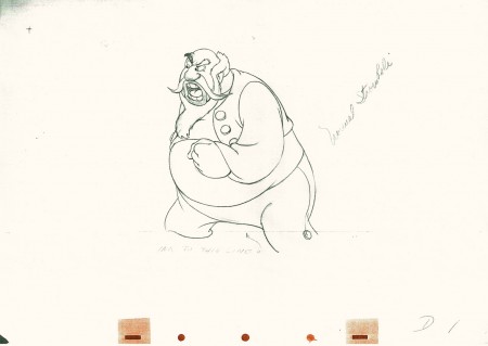
 - Bill Tytla‘s work has to be studied and studied and studied for any student of animation. He was the best, and it’s pretty doubtful his work will be superceded. He brought beautiful distortion to many of the drawings he did, using it as a way to hammer home some of the emotions in the elasticity he was creating. Yet, the casual observer watching this sequence in motion doesn’t ever notice that distortion yet can feel it in the strength of the motion.


Four drawings (#1, 11, 22, & 48) that shift so enormously but call no attention to itself.
Brilliant draftsmanship and use of the forms.
Here we have the beginning: drawings 1-48. More will come in the future.
 1
1(Click any image to enlarge.)
This note arrived from Borge Ring after my first post Bill Tytla’s scene featuring Stromboli’s mood swing:
- The Arch devotees of Milt Kahl have tearfull misgivings about Wladimir Tytla’s magnificent language of distortions. ‘”Yes, he IS good. But he has made SO many ugly drawings”
Musicologists will know that Beethoven abhorred the music of Johan Sebastian Bach.
yukyuk
Børge
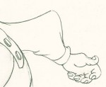
My first post spoke a bit about the distortion Tytla would use to his advantage to get an emotional gesture across. It’s part of the “animating forces instead of forms†method that Tytla used. This is found in Stromboli’s face in the first post. In this one look for this arm in drawing #50. It barely registers but gives strength to the arm move before it as his blouse follows through in extreme.
 There’s also some beautiful and simple drawing throughout this piece. Stromboli is, basically, a cartoon character that caricatures reality beautifully. A predecessor to Cruella de Vil. In drawings 76 to 80 there’s a simple turn of the hand that is nicely done by some assistant. A little thing among so much bravura animation.
Many people don’t like the exaggerated motion of Stromboli. However, I think it’s perfectly right for the character. He’s Italian – prone to big movements. He’s a performer who, like many actors in real life, goes for the big gesture. In short his character is all there – garlic breath and all. It’s not cliched and it’s well felt and thought out. Think of the Devil in “Night on Bald Mountain” that would follow, then the simply wonderful and understated Dumbo who would follow that. Tytla was a versatile master.
Here’s part 2 of the scene:
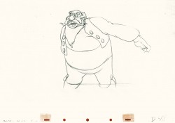 48
48 49
49(Click any image to enlarge.) The full scene with all drawings.
Click left side of the black bar to play.
Right side to watch single frame.
David Nethery had taken my drawings posted and synched them up to the sound track here.
