Search ResultsFor "bill peet"
Commentary 14 Oct 2013 09:20 am
Give me a good drawing
As animation left thee Thirties proudly moving into the Forties there was a lot to be proud of. In a short period, the animators had moved from stick figures to rubber hoses to fully rounded individuals acting through their pieces. The animation had gotten a bit sentimental (as were many live action pictures of the day), but they handled their tasks well.
The acting had grown full throated and offered more than just the surface performances.
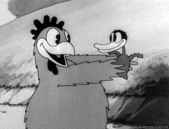
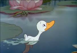
The early version of Disney’s Ugly Duckling and the Later one.
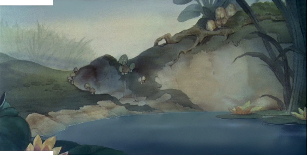
Hans Bacher’s beautiful reconstruction of the BG from the latter film.
Looking at a film like The Old Mill we see rich scenics animated, a film that played against The characterizations of the The Ugly Duckling or Ferdinand the Bull. Warner Bros were starting to slip into their Looney Tunes period as their characters grew smart and zany. This movement was led by Bob Clampett with Tex Avery showing him how to deal out wild paced timing and surrealiztic movement to play for any joke they could get. Disney was straight as an arrow but went for the beauty thing and achieved it as peers competed with each other in the varied studios.
Even Terrytoons were stealing Hollywoods gaga and pulling them off in a somewhat retro manner.
After the Disney strike and the entrance into WWII design and stylization started to grow up. They saw what the Russians had been doing in their attempts to animated the state-run propaganda, ad the art left some inspired, though it was obvious that the animation was living up to their designs.
Some of the animators on the sidelines pushed themselves into the forefront of graphic evolution in animation. Leading the pack in America were the free lanced group working for UPA and the military. The use of strong graphics allowed the aniamtors to get awa with a bit less animation while keeping the films strong. People like Hilberman and Zach Schwartz may have been on the wrong side of Disney’s politics, but they pulled out the stops with their pen and inks.
Films like Hell Bent for Election or A Few Quick Facts About Fear gave the artists the right to move daringl forward with their very strong artwork.
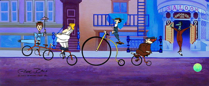
These led Chuck Jones to follow his designers like John McGrew to change the face of the animation. With The Dover Boys of Piemento University all of animation took notice and immediately tried to replicate the work going more and more daring with each film.
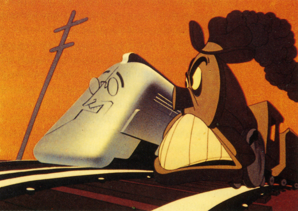
Hell Bent for Election
Immediately after the War, these new graphics returned with the troops as Disney made strong colored works dominated by the likes of Mary Blair and the story structure of Bill Peet. Warner Bros., mostly under the guidance of Chuck Jones brought their abstract art to the BGs with similarly strong painters like Paul Julian leading the way. Under John Hubley at UPA he had not only designed and painted films but also co directed the Oscar nominee The Tell Tale Heart.
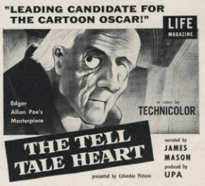
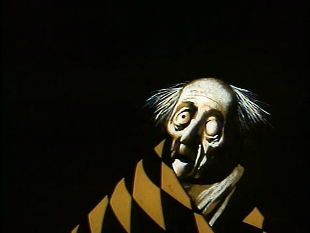
Poster and art for The Tell Tale Heart by Paul Julian at UPA.
Animation went such a distance in a short period of time. From the ball of uncontrolled mass called Oswald the Rabbit, to a rubber hose Mickey & Minnie Mouse to well defined circular characters. It led to more and more sophistication in the scripts and stories with the graphics trying to keep up.
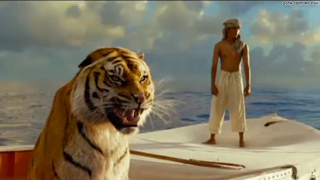
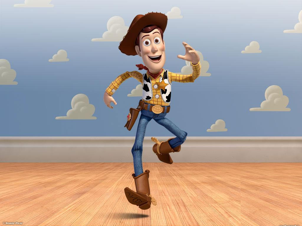 This all ended in 1995 as Toy Story burst onto the screen. The cgi graphics took time to grow up to the sophistication we have today with the likes of Brave or Despicable Me. Seeing the incomparable work in the 2012 Oscar winner, the even more precocious The Life of Pi, gives us pause for thought. We have no idea where animation is going, but for the moment it is definitely not graphically forward. It is difficult to sit by and watch when I have only my meager tools to work with – a pad and pencil. But I continue forward and hope wheat I do will be accepted.
Give me a good drawing. That’s all I ask.
Commentary &Layout & Design 13 Oct 2013 08:17 am
Just Give Me A Good Drawing
I want to write a couple of pieces about design and stylization in animation. This will start us off.
As animation left the Thirties, proudly moving into the Forties there was a lot to be proud of. In a short period, the animators had moved from stick figures to rubber hoses to fully rounded individuals acting through their pieces. The animation had gotten a bit sentimental (as were many live action pictures of the day), but they handled their tasks well.
The acting had grown full throated and offered more than just the surface performances.


The early version of Disney’s Ugly Duckling and the Later one.

Hans Bacher’s beautiful reconstruction of the BG from the latter film.
Looking at a film like The Old Mill we see rich scenics animated, a film that played against The characterizations of the The Ugly Duckling or Ferdinand the Bull. Warner Bros were starting to slip into their Looney Tunes period as their characters grew smart and zany. This movement was led by Bob Clampett with Tex Avery showing him how to deal out wild paced timing and surrealistic movement to play for any joke they could get. Disney was straight as an arrow but went for the beauty thing and achieved it as peers competed with each other in the varied studios.
Even Terrytoons were stealing Hollywood’s gags and pulling them off in a somewhat retro manner.
After the Disney strike and the entrance into WWII design and stylization started to grow up. They saw what the Russians had been doing in their attempts to animated the state-run propaganda, ad the art left some inspired, though it was obvious that the animation was living up to their designs.
Some of the animators on the sidelines pushed themselves into the forefront of graphic evolution in animation. Leading the pack in America were the free lanced group working for UPA and the military. The use of strong graphics allowed the animators to get awa with a bit less animation while keeping the films strong. People like Hilberman and Zach Schwartz may have been on the wrong side of Disney’s politics, but they pulled out the stops with their pen and inks.
Films like Hell Bent for Election or A Few Quick Facts About Fear gave the artists the right to move daringly forward with their very strong artwork.
These led Chuck Jones to follow his designers like John McGrew to change the face of the animation. With The Dover Boys of Piemento University all of animation took notice and immediately tried to replicate the work going more and more daring with each film.

Hell Bent for Election
Immediately after the War, these new graphics returned with the troops as Disney made strong colored works dominated by the likes of Mary Blair and the story structure of Bill Peet. Warner Bros., mostly under the guidance of Chuck Jones brought their abstract art to the BGs with similarly strong painters like Paul Julian leading the way. Under John Hubley at UPA he had not only designed and painted films but also co directed the Oscar nominee The Tell Tale Heart.


Poster and art for The Tell Tale Heart by Paul Julian at UPA.
Animation went such a distance in a short period of time. From the ball of uncontrolled mass called Oswald the Rabbit, to a rubber hose Mickey & Minnie Mouse to well defined circular characters. It led to more and more sophistication in the scripts and stories with the graphics trying to keep up.
 This all ended in 1995 as Toy Story burst onto the screen. The cgi graphics took time to grow up to the sophistication we have today with the likes of Brave or Despicable Me. Seeing the incomparable work in the 2012 Oscar winner, the even more precocious The Life of Pi, gives us pause for thought. We have no idea where animation is going, but for the moment it is definitely not graphically forward. It is difficult to sit by and watch when I have only my meager tools to work with – a pad and pencil. But I continue forward and hope what I do will be accepted.

Give me a good drawing. That’s all I ask.
Animation Artifacts &Books &John Canemaker 08 Oct 2013 02:17 pm
a Coupla Board Gag-stas
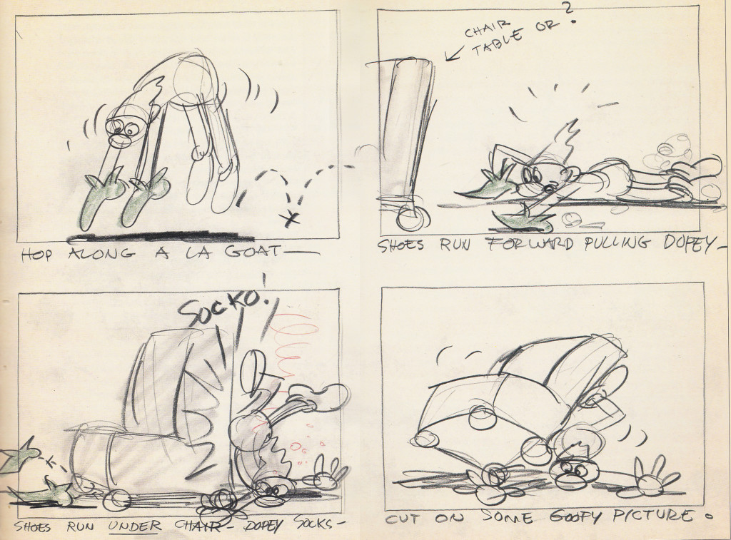
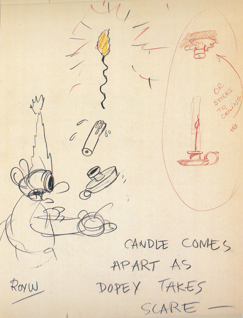
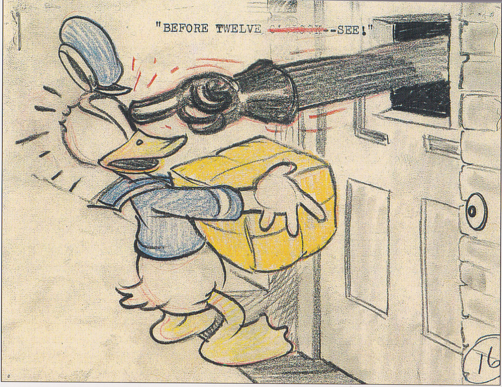
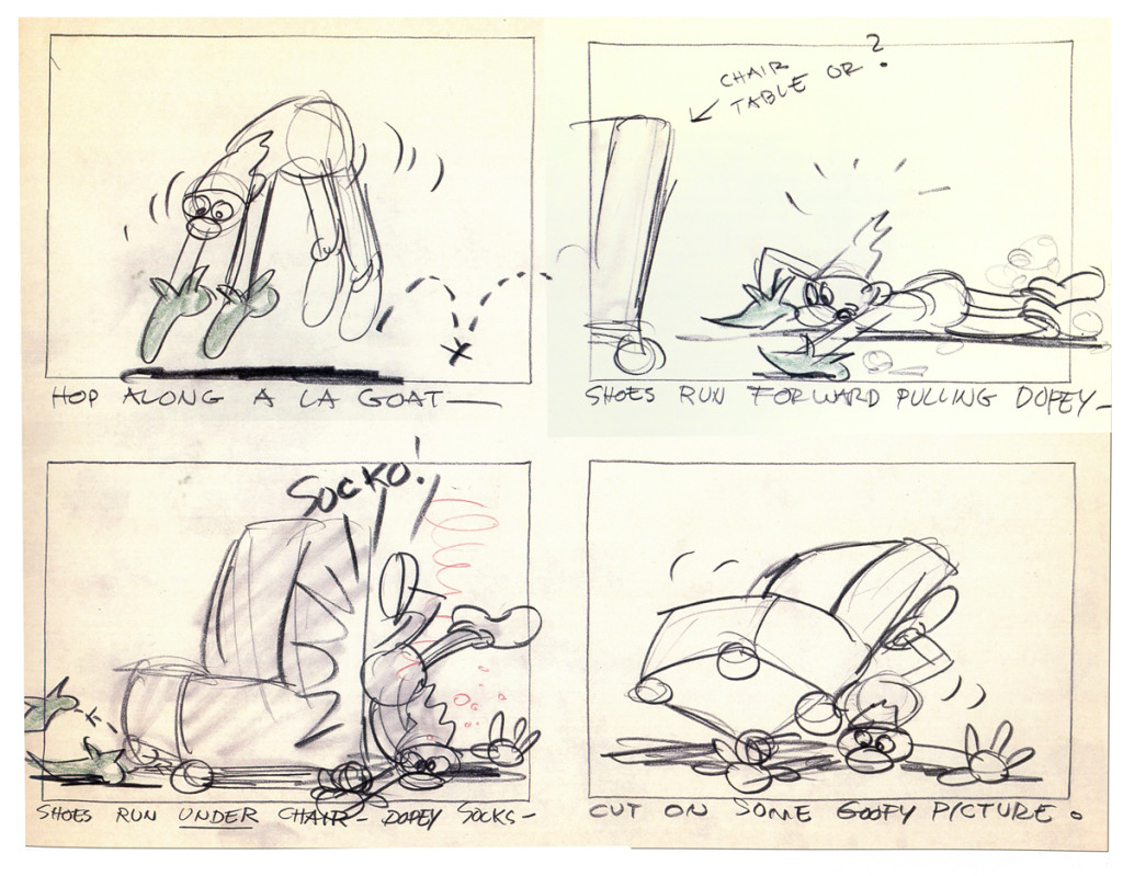
Aside from formulating the inventors of the storyboard for animation, the Disney studio had some amazing talent in their group of “funnymen.” Most of the “gag writers” that took over the animation industry, came 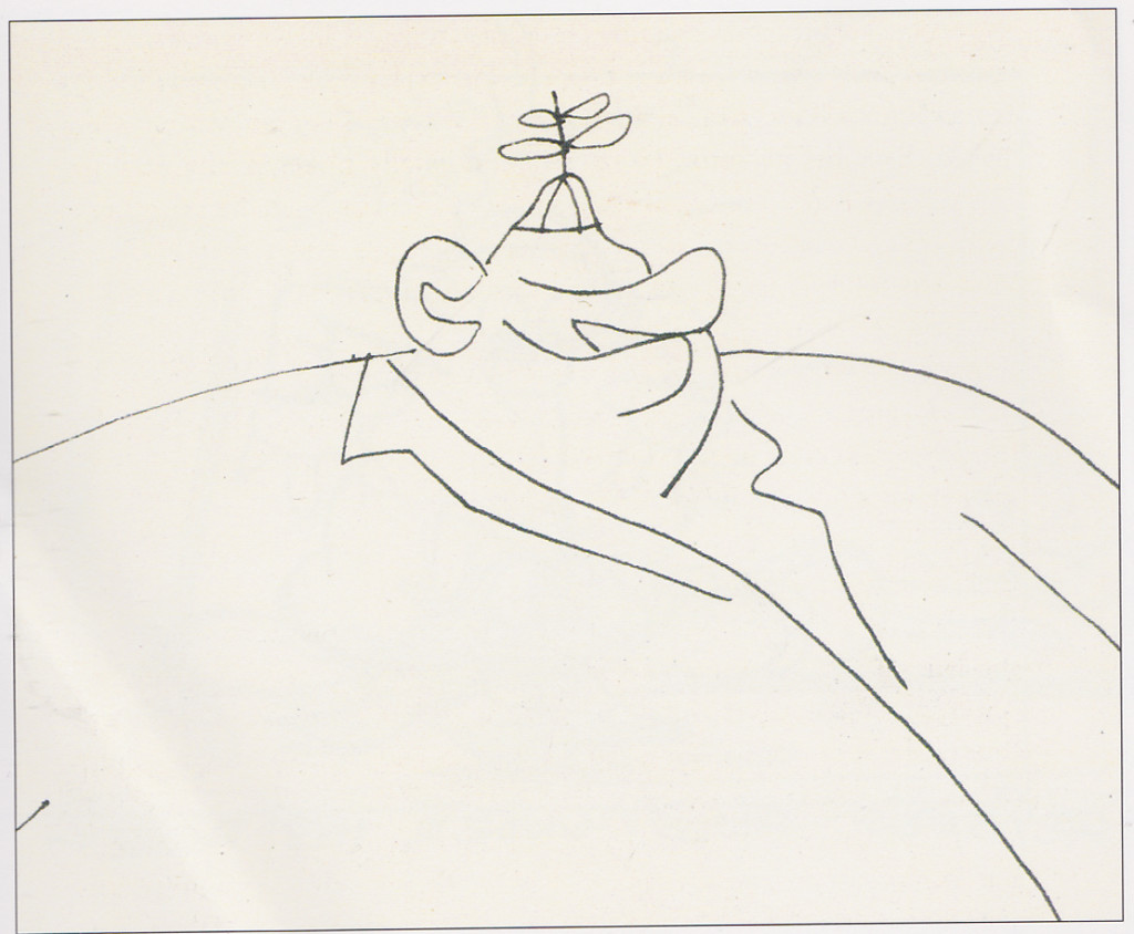 fresh from the Disney Bros. studio. You can start with Dick Huemer who virtually invented the form. There was Tedd Pierce who brought his own style and a rich sense of humor. Between him and Bill Peet there were a wild row of styles and intelligence from the Urbane to the Hayseed.
Here I’d like to show two of the richest and most colorful artists.
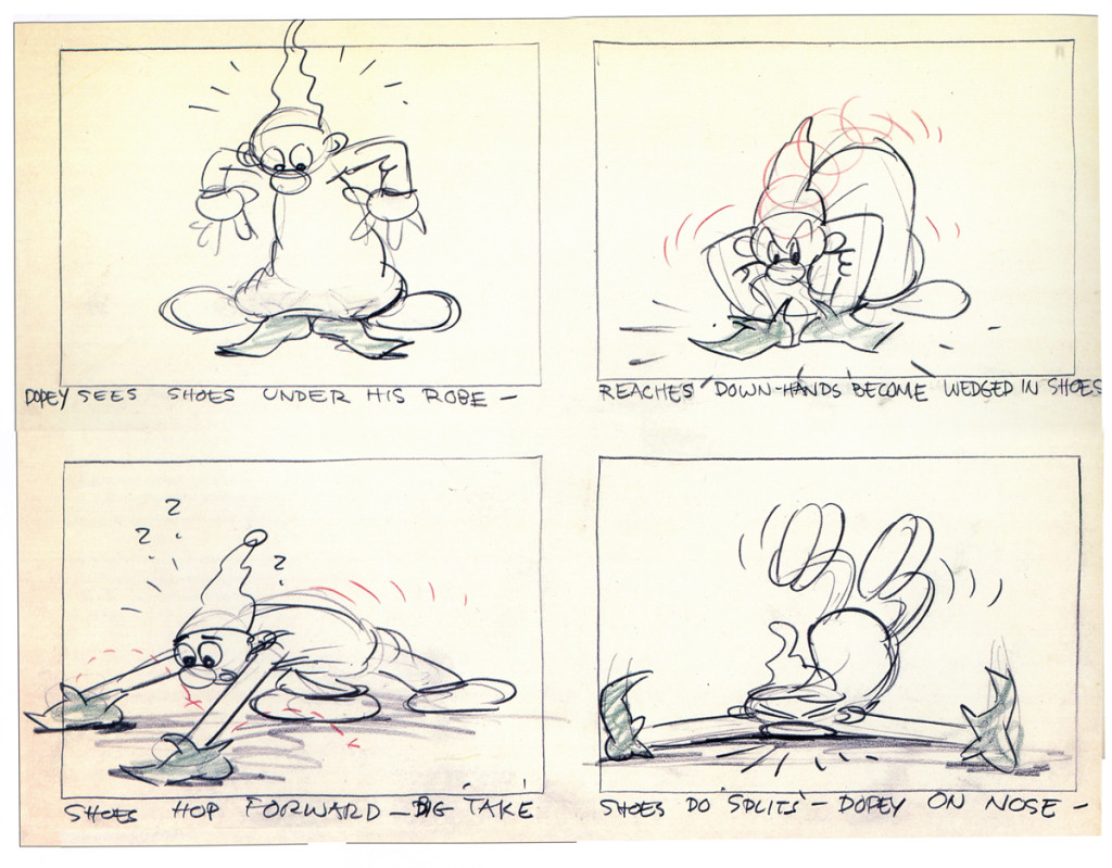
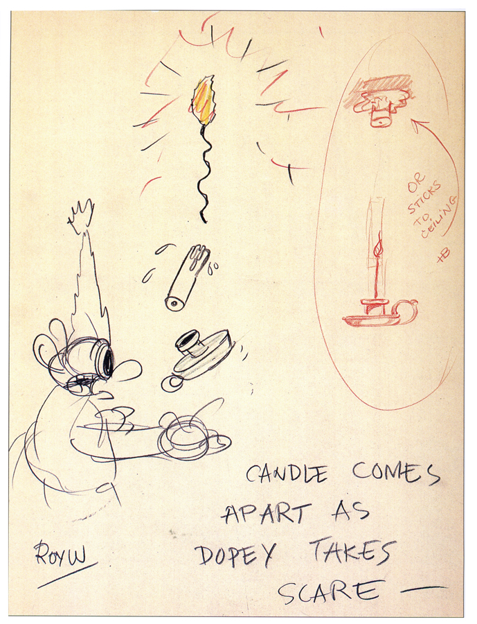
First we have one of the better “dwarf” writers – Roy Williams, Many of us know him as the oversized and goofy “Mousketeer,” Uncle Roy. This is a small piece done for Snow White, trying to get a gag out while giving some personality to Dopey.
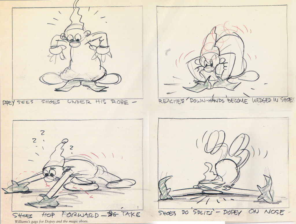 1
1
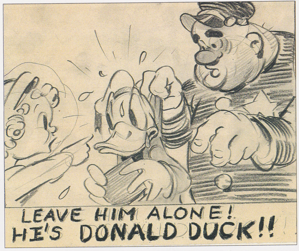
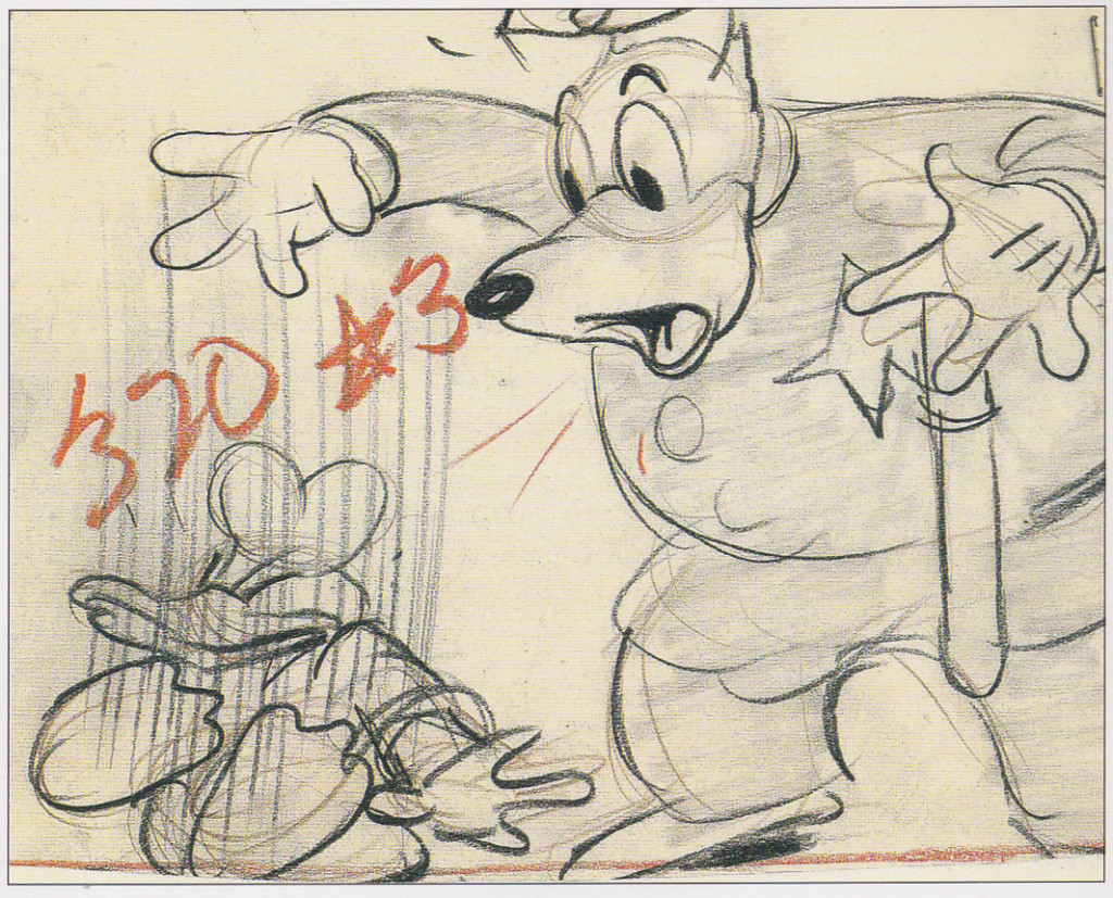
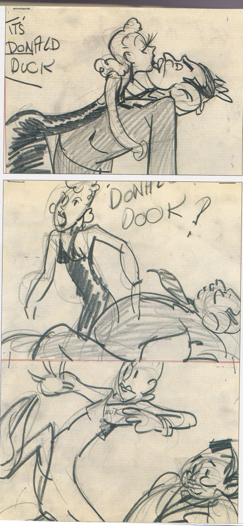
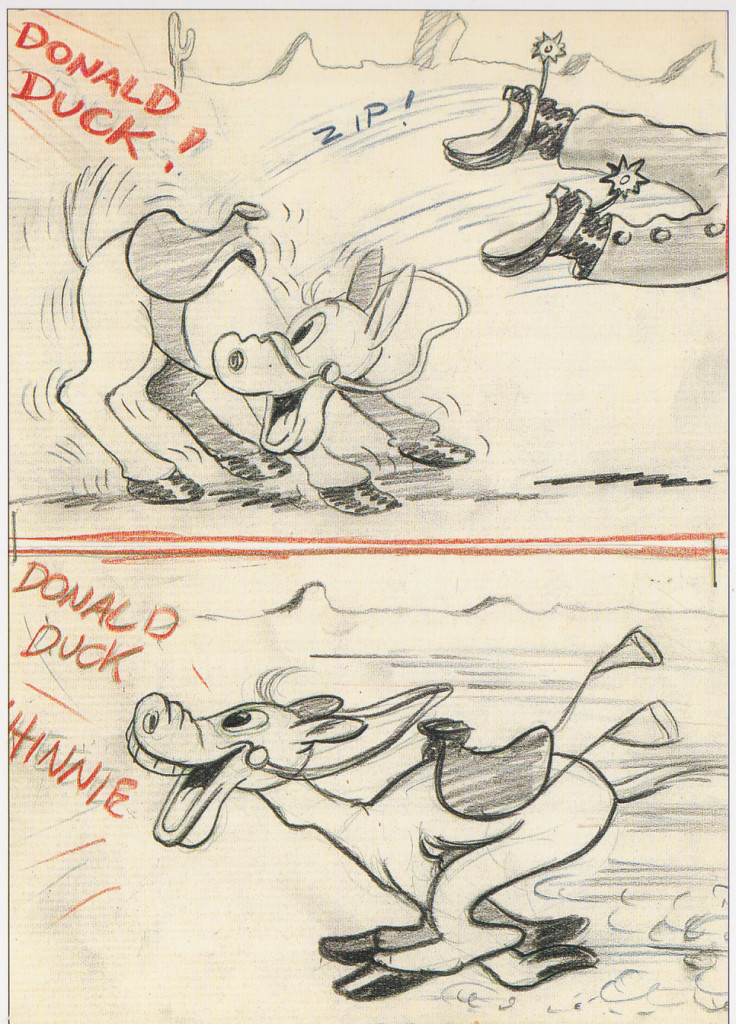
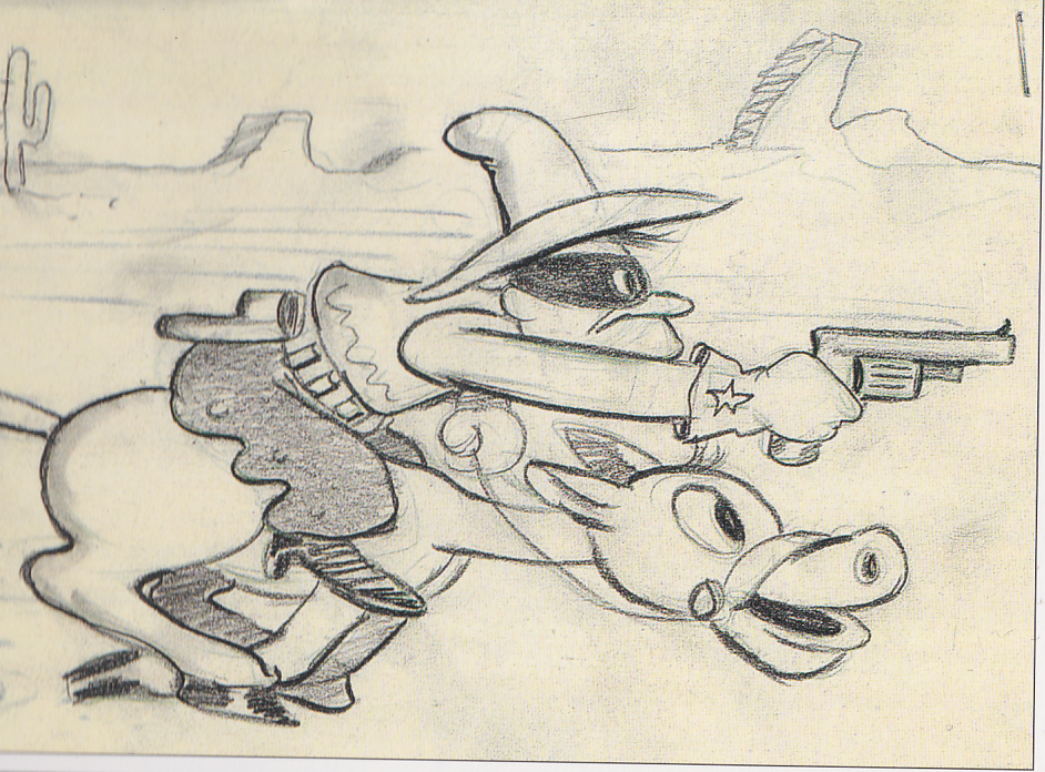
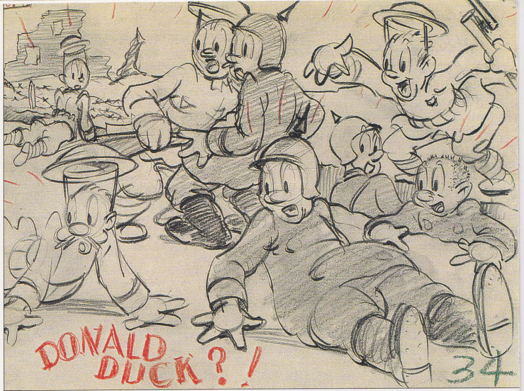
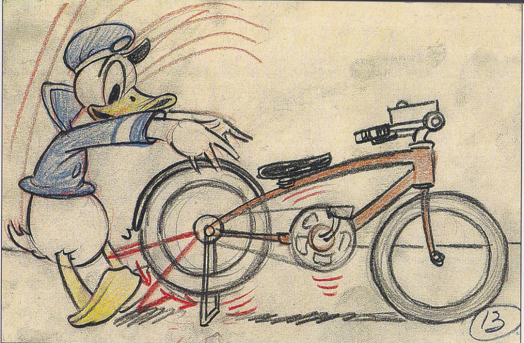
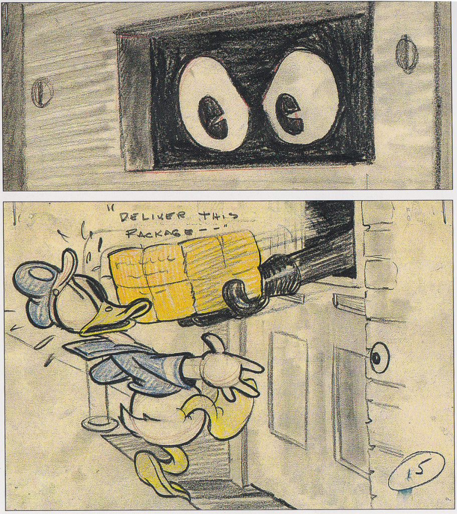
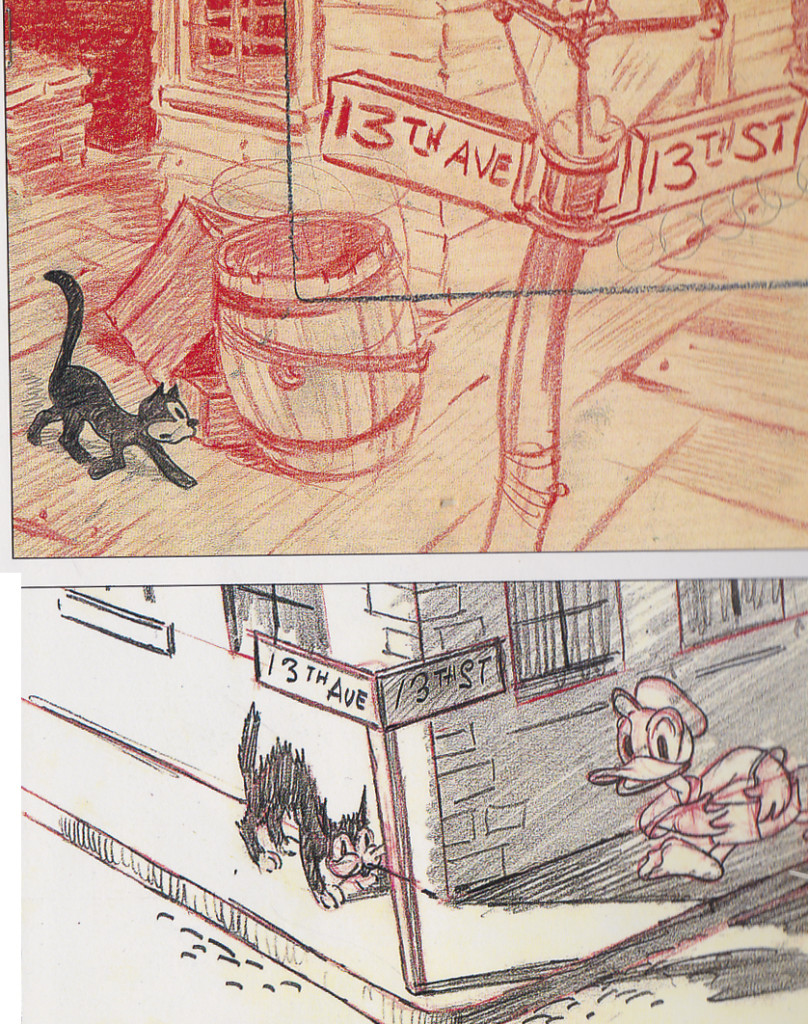
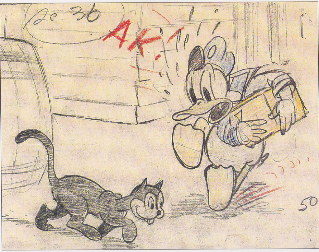
From “Unca Roy,” we can go to one of the most identifiable artists from the studio. Just take a look at the last two images posted here. If you don’t recognize the gag as one from the pen of foremost Donald cartoonist, Carl Barks. If not for some of the gags, here, the drawing style is dead giveaway. One can only sit back gawking at how great it is.
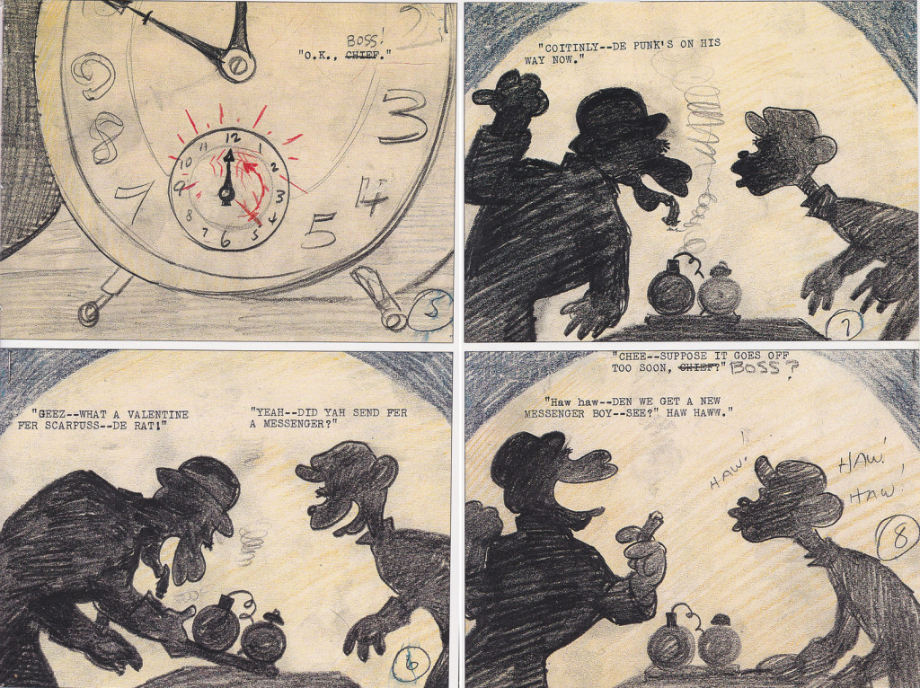
I will show off the work of a couple more of these great artists before I’m done. They keep me laughing all the while admiring them.
All material thanks to John Canemaker whose brilliant book, Paper Dreams, supplied just about everything for this post.
Daily post 18 Aug 2013 04:54 pm
Sounds in the Stone
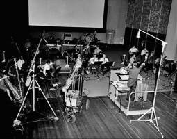
- Here are a number of photos that concentrate on the sound work done for THE SWORD IN THE STONE. Actors’ stills, recording images and sound effects production. The Sword and the Stone. =None of the people are identified in these photos, and I recognize too few of the people to ID them.
_____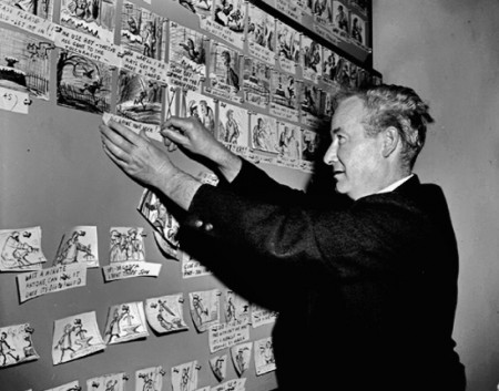
_________________Here’s Bill Peet at the storyboard he drew.
_____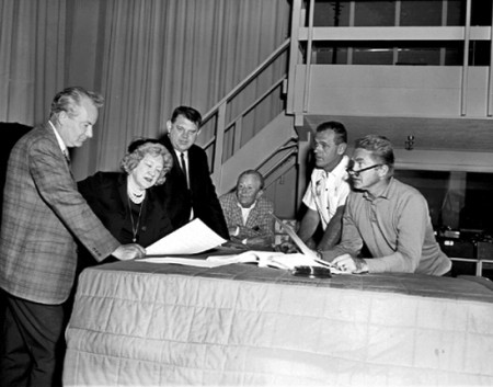
______________Bill Peet (left) and Woolie Reitherman work with the actors.
______________Karl Swensen (Merlin) is far right next to Woolie. I think that’s
______________Barbara Wentworth (Mim) talking to Peet.
_____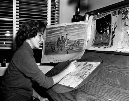
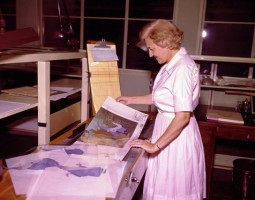
_______A Bg LO artist (anyone recognize her? Sylvia Cobb, perhaps?) at work.
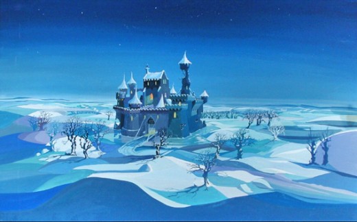
___________________________The final BG.
 _
_
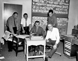
(Amid Amidi posted this in the comments section:The left hand photo below the painted bg is in Blast 9. I don’t have a copy handy but the two guys sitting are Woolie Reitherman and John Sibley. I think the two guys on the left are Basil Davidovich and Don Griffith but I don’t remember. If anybody has the issue, perhaps they can post the correct idents.)
_____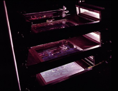
______________The Multiplane camera with only a couple of levels in use.
 _
_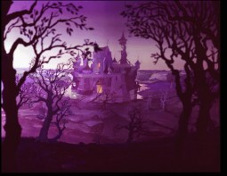
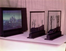
______________The horizontal Multiplane camera and the final scene.
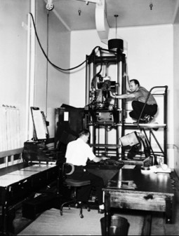 _
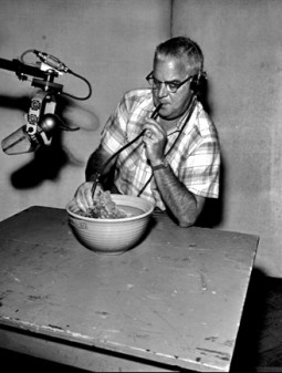
_
___________Left: cameramen shoot at the Multiplane Camera.
_____________________Right: Jim MacDonald creates a sound effect.
_____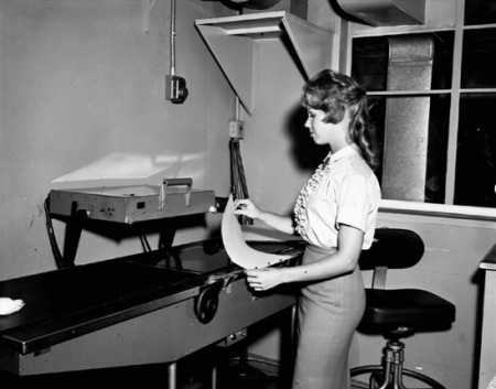
_______Xeroxing a drawing onto cel. This is not something often photographed.
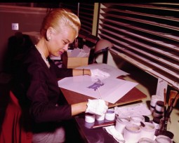 _
_
________A Painter and a Checker in action (Sorry, I don’t know their names.)
Daily post 24 Jun 2013 06:58 am
Old Boards at Disney’s
I’ve recently been reading John Canemaker‘s excellent book, Paper Dreams: The Art & Artists of Disney Storyboards. This book not only examines the history of the Disney storyboard but the artists who drew them, as well. We get tp examine the lives of people like Tee Hee and Ted Sears, Webb Smith and Pinto Colvig, Roy Williams, Bianca Majolie, Carl Barks, and, of course, the great Bill Peet.
Along the way we see shorts like Elmer Elephant, Playful Pluto (fly paper sequence), Brave Little Tailor, Mother Goose Goes Hollywood, The China Shop, and Donald’s Lucky Day develop. Fetures like Snow White, Fantasia, 101 Dalmatians, Pinocchio and Lady & The Tramp all took shape.
I’ve pulled some of the great art from these films for you to take a look at.
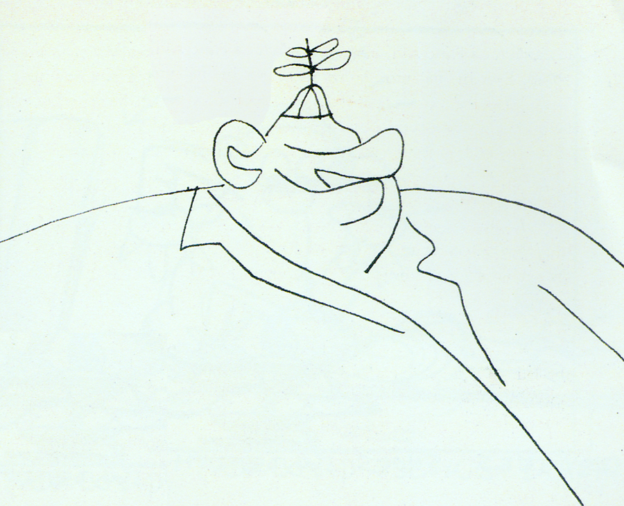
Don Williams (the “old Mousketeer” self-portrait)
Snow White gags.
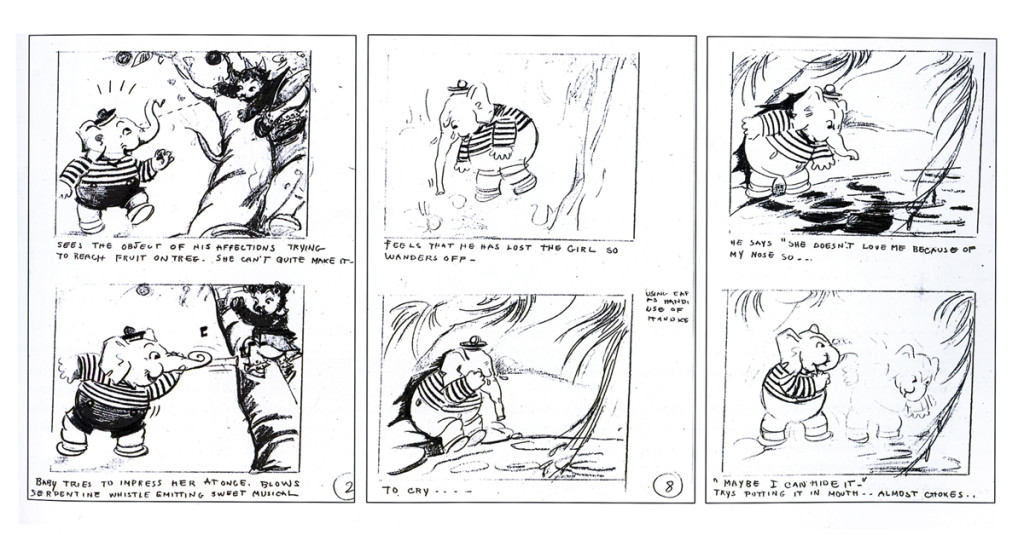
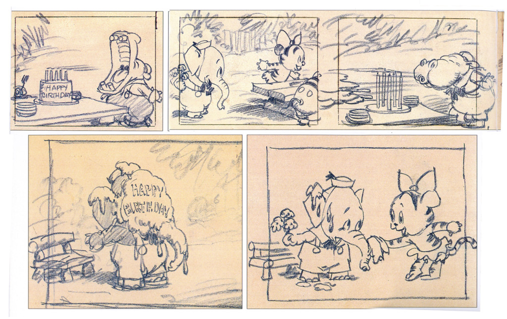
Elmer the Elephant
The board for this Silly Symphony is attractive.
The Western Publishing book edition is a gem, as well.
Beautiful W/C illustrations.
Flowers and Trees
Done in 1932, it was the first animated short done in Technicolor.
Still, the board is a beauty.
The Old Mill
An Oscar Winner done just prior to Snow White. It acted, in a way,
as a test for ther feature and its effects. The film’s a beauty, yet
the board looks not too distant from Flowers and Trees.
Action Analysis &Animation &Articles on Animation &Books &Commentary &Disney &Illustration &Richard Williams &Rowland B. Wilson &SpornFilms &Story & Storyboards &Tissa David 10 Jun 2013 03:31 am
Illusions – 3
I’ve written two posts about Frank Thomas and Ollie Johnston‘s book, The Illusion of Life the last couple of weeks. I came to the book only recently and realizing that I’d never really read the book, I thought it was time. So in doing so, I’ve found that I have a lot to write about. The book has come to be accepted almost as gospel, and I decided to give my thoughts.
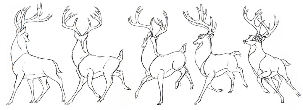
There were two major complaints I’ve had with what I’ve read in their book so far, and I spent quite a bit of time reviewing those.
- First out of the box, I was stunned to read that these two of Disney’s “nine old men” said that they’d originally believed that each prime animator should control one, maybe two characters in the film. Then, later in life they decided that an animator should do an entire scene with all of the characters within it. This is not what I’d seen the two (or the nine) do in actual practice. post 1
Secondly, they argue for animating in a rough format, and they give solid reasons for this. As a matter of fact, it was Disney, himself, in the Thirties who demanded the animators work rough and solid assistants who could draw well back them up. Then much later in the book the two author/animators suggest that it’s better for an animator to work as clean as possible with assistants just doing touch-up. This helped out the Xerox process, but didn’t necessarily help for good animation. post 2
The book starts out sounding like it’s going to be a history of Disney animation, but then starts getting into the rules of animation (squash and stretch, overlapping action and anticipation and all those other goodies) exploiting Disney animation art in demonstration. Soon the book moved into storytelling and how to try to keep the material fresh and interesting. It all becomes a bit obvious, but you keep hoping that some great secret will be revealed by the two masterful oldsters.
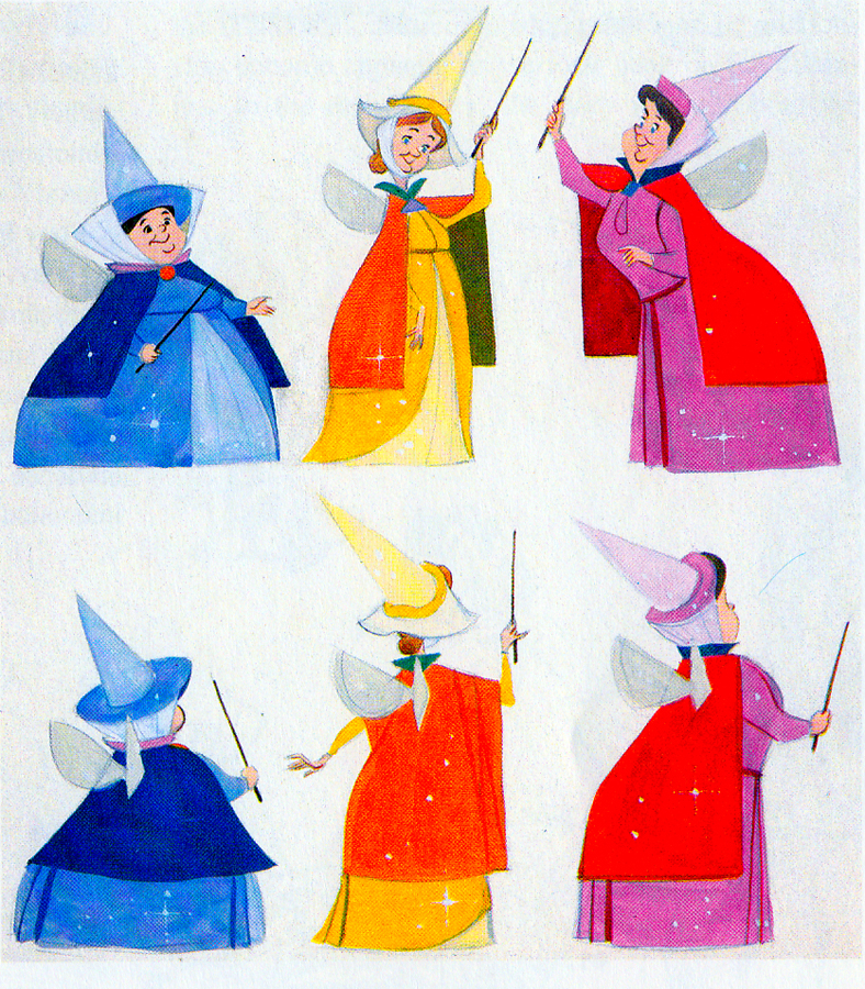 They do go into depth about how to develop characters when making animated films. They offer lots of examples from Orville, the albatross in The Rescuers to the three fairies in Sleeping Beauty, but their greatest attention goes to Baloo the Bear in The Jungle Book. They were having a hard time with this guy; they had been trying to do an Ed Wynn type character, until Walt Disney, himself, suggested Phil Harris. Once they auditioned Harris, they knew they were on the right track, and the character kept grabbing more screen time and grew ever larger. In the end, audiences just loved him.
Personally, I’ve always hated Phil Harris’ performance in this film. What was it doing in Rudyard Kipling’s book? When I was a kid, Harris and Louis Prima were the perfect examples of my father’s entertainers. He loved these guys and spent a lot of time in front of the family TV watching the Dinah Shore Show______Tom Oreb designs for Sleeping Beauty.
and other such entertaining Variety Shows with
lots of little 50′s big-band jazz-type acts. I hated it; this was my parent’s kind of music and humor and had nothing to do with me. I was the kid who paid his quarter to see the Walt Disney movies (that was the children’s price of admission in 1959.)
In their book they say they knew he was perfect because generations of kids later (who have no idea who Phil Harris was) still take joy from Baloo. What they forgot is what I knew all along. This was The Jungle Book. If they had been truly creative, they would have developed a character in line with Kipling’s material that would have been an original, not an impersonation of Doobey Doobey Doo, Phil Harris. The same is true of Louis Prima as a monkey. (There was a time when Disney said that they should never animate monkeys because monkeys are funny on their own, in real life. Animation wouldn’t make them funnier.) Sebastian Cabot, as Bagheera, works as does George Sanders as Shere Khan.
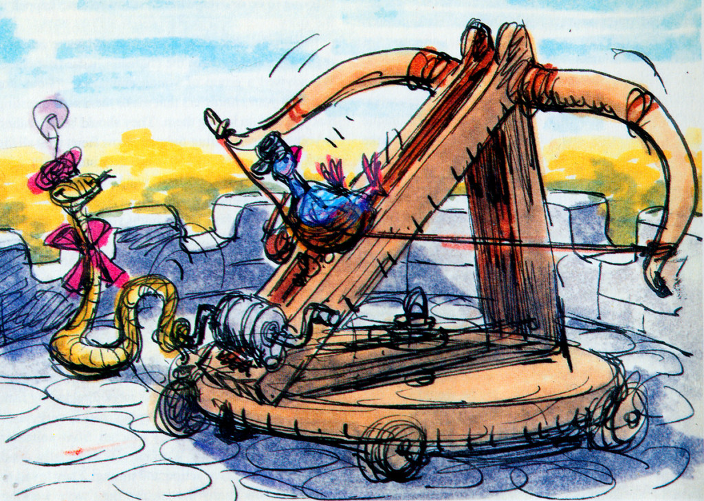
- Right: A discarded sequence from Robin Hood showed a messenger pigeon so fat and heavy he had to be shot into the air. This gave the animators the beginnings of The Albatross Air Lines in The Rescuers.
Phil Harris was so successful, they dragged him into Robin Hood as well. Robin Hood. The very same character from The Jungle Book is now Little John! All those cowboy voices in Robin Hood don’t work either, especially when you mix them up with Brits like Peter Ustinov and Brian Bedford. When these two thespians work against Pat Buttram, Andy Devine and George Lindsey, it’s one thing. Throw in a Phil Harris, and you have something else again. Where are we, the audience, supposed to be? Is it “Merry Ol’ England”? Or is it the lazy take on character development by a few senior animators who have taken license to jump away from the story writers for the sake of easy characters of the generation they’re familiar with. Robin Hood is a mess of a story – even though it’s a solid original they’re working from, and I find it hard to take written advice from these fine old animation pros who take an easy way out for the sake of their animation; shape shifting classic tales to fit their wrinkles.
At least, that’s how I see it – saw it. And perhaps that’s why it’s taken me so long to read this book. I felt (at the age of 14 when these films came out) that the Disney factory had turned into something other than the people who’d made Snow White and Bambi and Lady and the Tramp.
They had, in fact, become the nine old men.
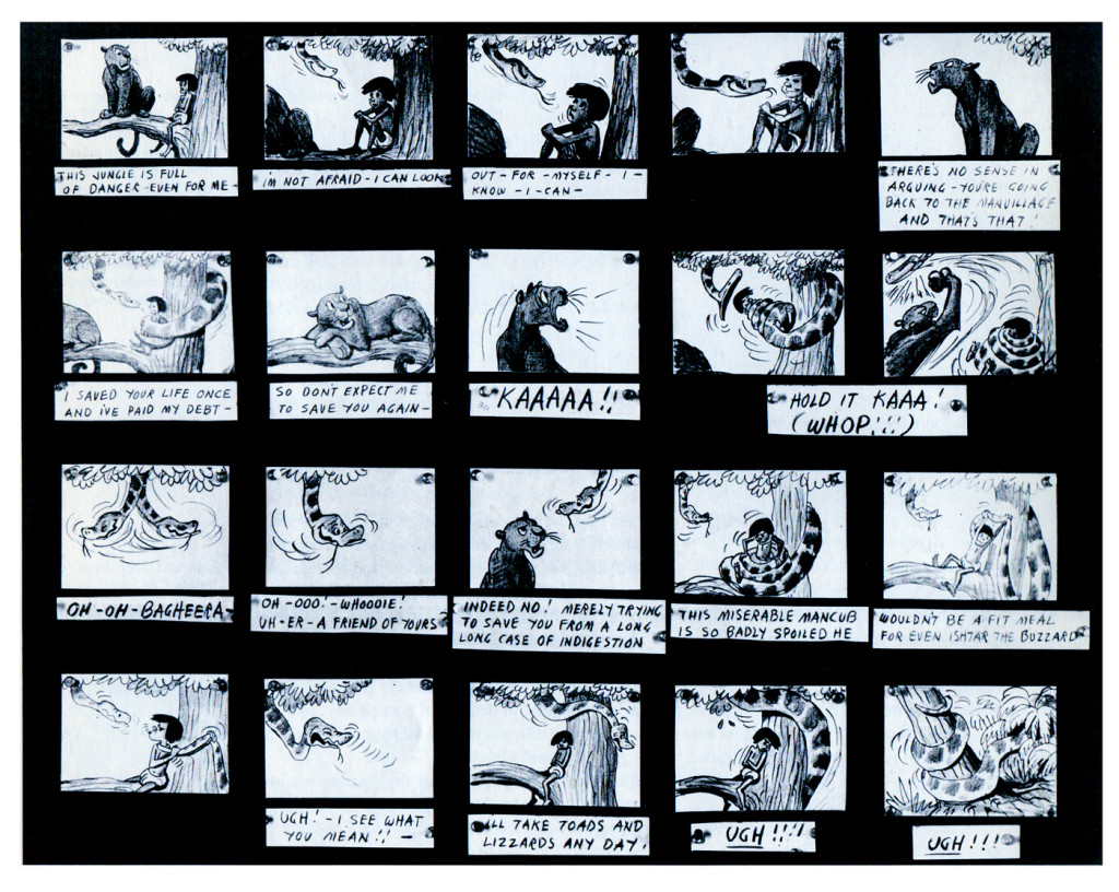
The Jungle Book was the last film Bill Peet worked on. He left
before the film was done. He’d had a long, contentious relationship
with Disney. He never felt he’d gotten the respect he deserved.
They were incredibly talented animators, and they certainly knew how to do their jobs. The animation, itself, was first rate (sometimes even brilliant as Shere Khan demonstrates), but try comparing the stories to earlier features. Even Peter Pan and Cinderella are marvelously developed. Artists like Bill Peet and Vance Gerry knew how to do their jobs, and they did them well. When Peet quit the studio, because he felt disrespected, Disney’s solid story development walked out the door.
The animators were taking the easy route rather than properly developing their stories. The stories had lost all dynamic tension and had become back-room yarns. Good enough, but not good.
Today was Nik Ranieri‘s last day at Disney’s studio. He’s definitive proof, in the eyes of Disney, that 2D animation is dead as an art form. This is the end result of some of the changes Thomas and Johnston suggest in their book. The medium took a hit back then; it just took this long for the suits to catch up. Good luck to Nik and the other Disney artists who no longer work steadily in what is still a vitally strong medium.
Commentary 01 Jun 2013 04:47 am
Posty Posts
- I received a couple of dispatches from the great Borge Ring. Of course, I’d like to share them with you.
- hi MICHAEL
I enjoyed reading your article about clean lines and ruff animation at Walt’s
Disney Studio:
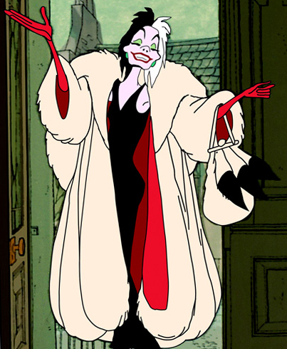
At Annecy I asked Marc Davis how many men he employed on the animation of
Cruella de Vil.
“None whatsoever. – The number of scenes showing Cruella was not more than one
artist could handle. (then with a laugh) there wasn’t even a modelsheet”
“But she interacted at times with other characters such as the two villains”
“That’s right – they were animated by John Lounsbury – He and I worked well
together even though he was seated in another wing.There was a scene where the
two villains get slapped in the face by Cruella. I made Cruella do the tho slaps
and brought the drawings over to John. It was up to him to see that the villain
heads were there where the slaps hit.”
greetings
Borge
PS
That which I’m quoting here may not tie in directly with your article, but I
thought that you (of all people) aught to know about it because you already have
so many pieces of the allbeloved jigzawpuzzel we call The Golden Years.
And then I received this note on the Martin Toonder post.
- hi Michael
Marten Toonder and I became close friends over the years and we played the game
of “Do You Remember?”
Marten said: “If you will write a book about me as a filmmaker, I will finance
it – It will take you a year.”
I once said: “Marten, why did we clash so often?”
“Ach, Ring, that was my mega ego”.
best
Borge
Lotsa Cartoons
Jerry Beck‘s excellent blog, Animation Scoop, has an interesting post by Charles Kenny. It questions the abundance of animated features rushing out to the theaters. Just this Thursday there was a report that Disney/Pixar plans on releasing 15 features in the next six years. According to Cartoon Brew, they’ve released the titles and the release dates for all of them. That seems to support Mr. Kenny’s comment.
Jeffrey Katzenberg has already stated that he hopes for Dreamworks to start producing two features a year starting next year.
We can question the quality of these releases but this really isn’t the point as I see it. Live Action features come out by the hundreds each year. From that large number maybe a dozen are really good films, maybe a hundred turn a profit, and far fewer are the sought after block busters.
Animated features have been fewer, far fewer released each year. It was just two years ago that we ere astonished to see 18 films qualify for the Oscar. That, of course, had nothing to do with quality. They just had to be eligible according the Academy’s rules, which basically means they had to be the right length, have the right release date at the right theaters and be animated.
Just as with the Live Action films the animated films will naturally fall into similar categories: the good the bad and the ugly. Bu we already have that, in my view. There will just be more of them.
If animated features increase their production, it means more work for animators, more of a chance for a couple of really good films to get produced. The hope would be that there would also be the opportunity of more films getting released that aren’t all big studio movies. That’s probably where our gems will come from. If there are more animated films being produced the likelihood of a greater sample might encourage the smaller distributors.
Whatever we think of it, it’s probably going to happen.
Lady Drafts
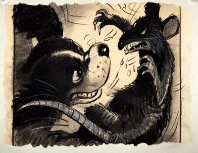 I just thought I’d post a quick note. Hans Perk has been currently posting the drafts for Disney’s Lady and the Tramp on his blog A Film LA.
This film was such a landmark for anyone of my generation who sought out the Disney features back in 1955. All those incredible ads and tv shows we saw on the Disneyland show make it really stand out from many of the others. It was, consequently, and enormous success for Disney. (It’s also a pretty great film.) Bill Peet’s work is sensational.
To coincide with Hans’ blog I’m going to post a couple of pieces on Lady and the Tramp, as well. Starting Monday.
Mantoloking Memories
A letter from Friend, Tom Hachtman, from the New Jersey Shore.:
- HI Michael, Joey and I were working in Toms River so we took Rt. 35 South through Mantoloking. It has been seven months since Sandy.
I shot these from the window of Joey’s truck. There are over 500 houses in Mantoloking and all of them were damaged. Over fifty houses totally vanished.
The name Mantoloking, according to Wikipedia, is derived from Lenni Lenape Native American language and possibly means ‘sand place’.
 1
1
Bill Peckmann &Books &Rowland B. Wilson 31 May 2013 05:28 am
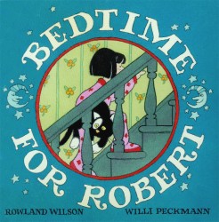
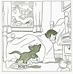
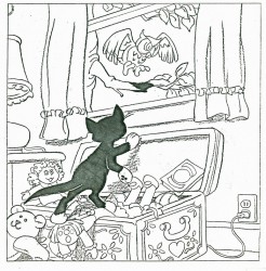
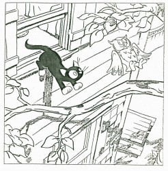
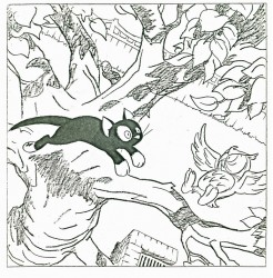
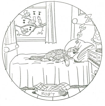
Bedtime for Robert
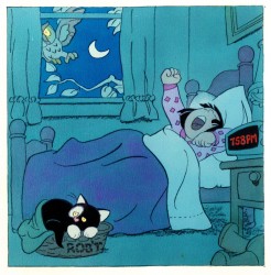
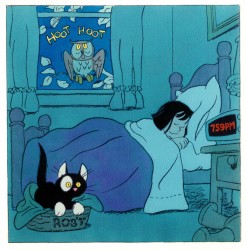
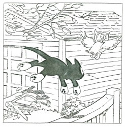
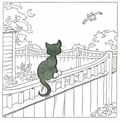
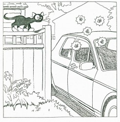
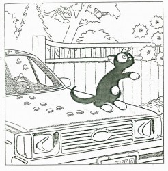
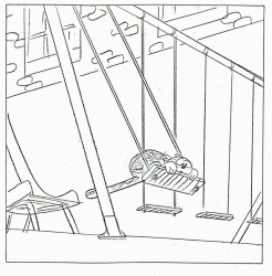
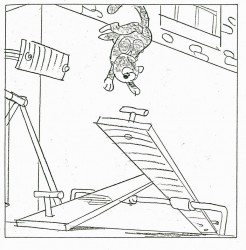
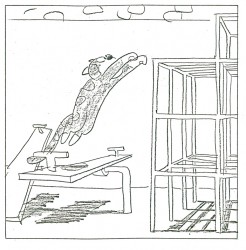
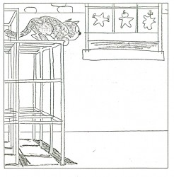
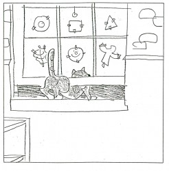
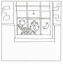
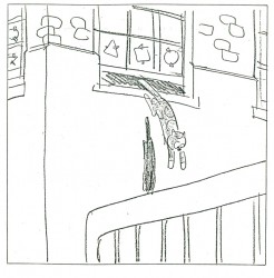
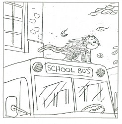
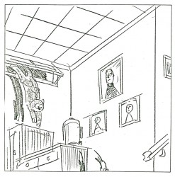
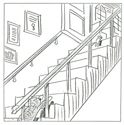
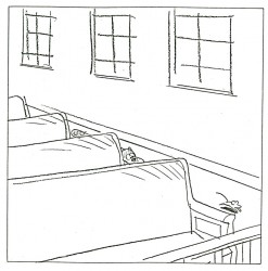
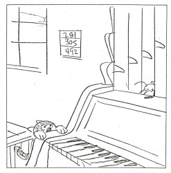
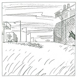
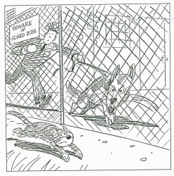
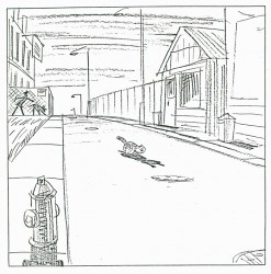
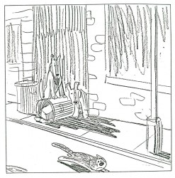
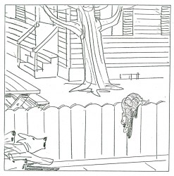
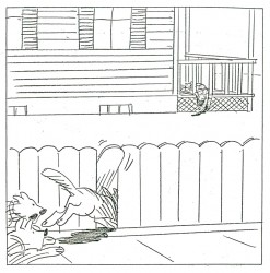
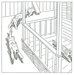
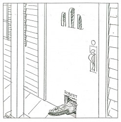
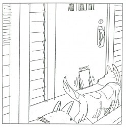
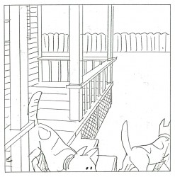
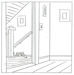
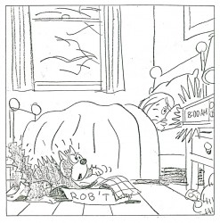
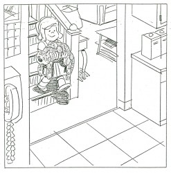
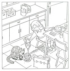
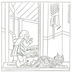
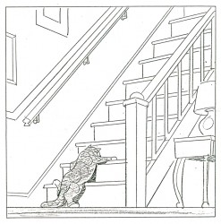
- Bill Peckmann collaborated with Rowland Wilson, back in the early ’80s, on a charming little book for children that never found a publisher and, consequently, never was completed. Bill had a bound copy of the book – in a mockup form – and sent it to me. I, naturally, would like to share it.
First, here’s the note on the inner sleeve of the cover:
- ABOUT BEDTIME FOR ROBERT, A WORDLESS BOOK
Bedtime for Robert is intended to bring to small children an early experience of the special personal relationship one has to a book; the availability and flexibility that a book enjoys over a fixed-time medium such as television.
Being wordless, the book needs no translation. The child has access to it at any time without relying on adults. This early exposure to the physical reality of books will, we believe, enhance the experience of reading later on.
The story combines the pull of a narrative with information that appeals to a child’s curiosity: in this case what goes on at night in the adult world. Although the child must go to bed (reluctantly), Robert the cat’s curiosity leads him into this forbidden adult world. Robert is all cat with cat qualities, not a little person in a cat suit as most cartoon cats are. The child can project his own emotions into the character.
The authors are booklovers with extensive experience in both print and film. We have both won Emrnys and other awards for our animation designs for educational TV.
We believe this is the first book to utilize the principles of film continuity in a printed form. This continuity is vital to the understanding of a narrative without the aid of words.
The use of film pacing supports the unfolding of adventure and humor in a wordless story.
The book is planned to be in color. The pages up to 17 are in finished linework and the rest is in rough layout form.
Robert is conceived as a series. The character and structure would remain constant. The variables would be in the cat’s adventures in various places, seasons, times of the day, and occupations.
Please contact either of us at the addresses below. This is a simultaneous submission.
Yours truly,
Rowland Wilson
Willi Peckmann
You’ll see immediately how original this book is:
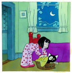 3
3(Click any image to enlarge.)
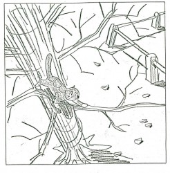 28
28 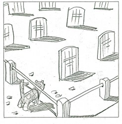 29
29
And just to put everything in proper perspective, here’s a letter they received from Houghton Mifflin rejecting the book. He was Rowland B. Wilson, for god’s sake!
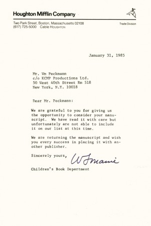
Bill Peckmann added this background info: “The rejection slip from
Houghton Mifflen really hurt the most because our thinking at the time
was that since they were publishing Bill Peet’s books (my all time
favorites), we thought they would understand the concept of “Robert”
better than anyone else. Go figure”
Disney &Peet &Story & Storyboards 15 May 2013 05:54 am
Peet’s Susie Board
- In yesterday’s post, we saw artwork that Bill Peet had done. It was obviously art that was prepared for a book. Whether he was doing this for himself or the studio I can’t say. I do know for sure that it didn’t become a book, but I do know it did develop as a film completed in 1951.
That film was directed by Clyde Geronomi.
The Layout was by Don Griffith and Hugh Hennesy.
The animation was by Bob Carlson, Ollie Johnston, Hal King and Cliff Nordberg.
The backgrounds were by Ralph Hulett.
The music was composed by Paul Smith.
Thanks again to John Canemaker, I have the storyboard by Peet for this short Disney film.
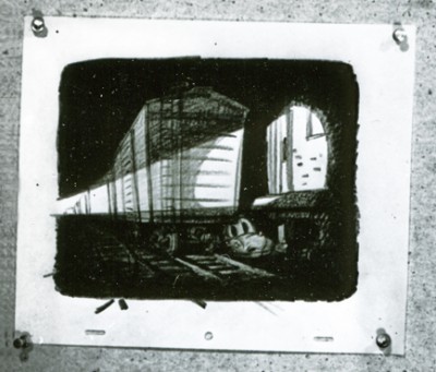
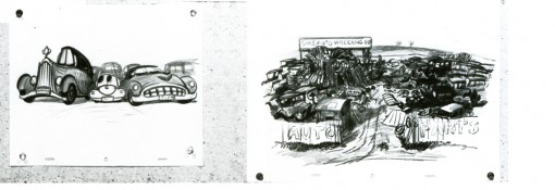
As in the past I’ve broken the board down so that I could post it as large as possible so that you can read it when the images are enlarged. Enjoy.
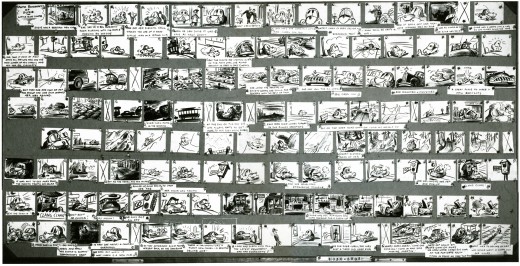
This is the complete board. I’ve broken up each individual row, they appear below.
The following seem to be LO drawings and don’t appear to be part of the storyboard. Perhaps it was prepared for a Leica reel? Regardless, the drawings are interesting, though I doubt Bill Peet did them all.
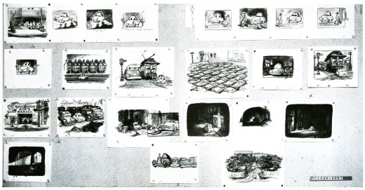
As with other recent posts of storyboard material, I’ve
broken it up and repositioned the images so that you can
enlarge them for better viewing. The above image represents
what the photo given me looks like.
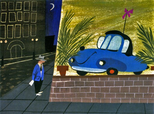
Finally, I wanted to give an indication of the film’s color, so
I’ve gone back to John Canemaker’s book,
The Art and Flair of Mary Blair,
and have taken this color sketch she did in styling
to represent the film as a whole.
Daily post 14 May 2013 05:23 pm
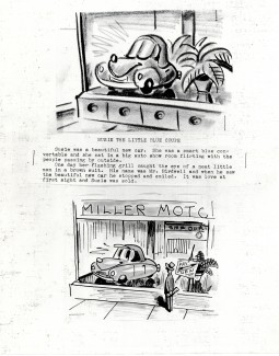
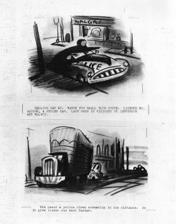
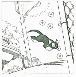
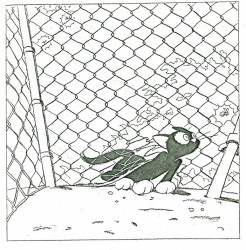
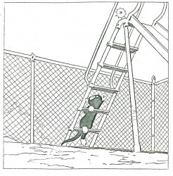
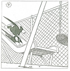
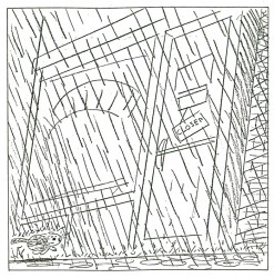
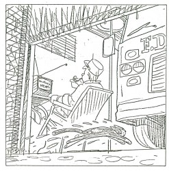
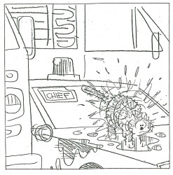
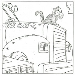
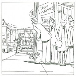
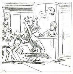
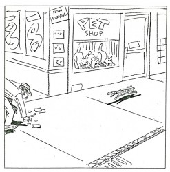
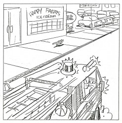
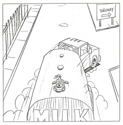
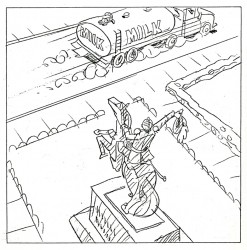
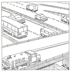
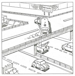
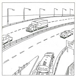
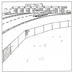
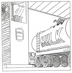
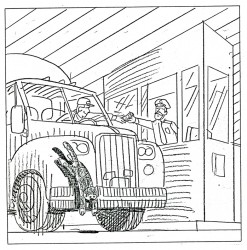
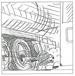
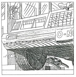
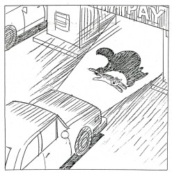
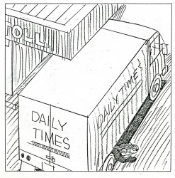
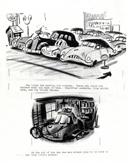
Peet’s Susie Book
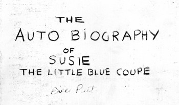 – Well, here we have an oddity to add to the Bill Peet playbook.
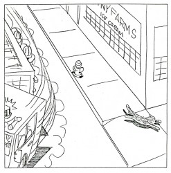
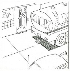
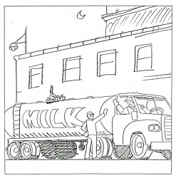
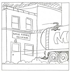
Susie the Blue Coupe was a short written by Peet and animated as a Disney short released in 1951.
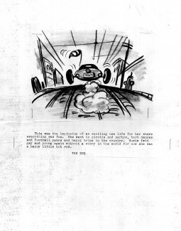
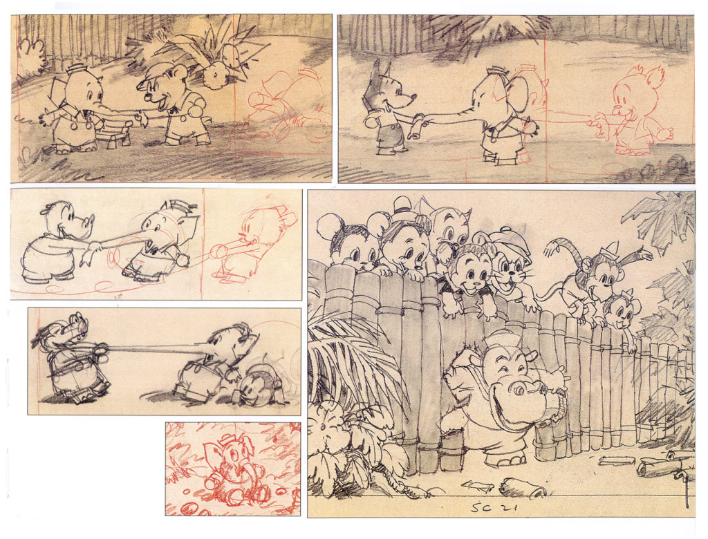
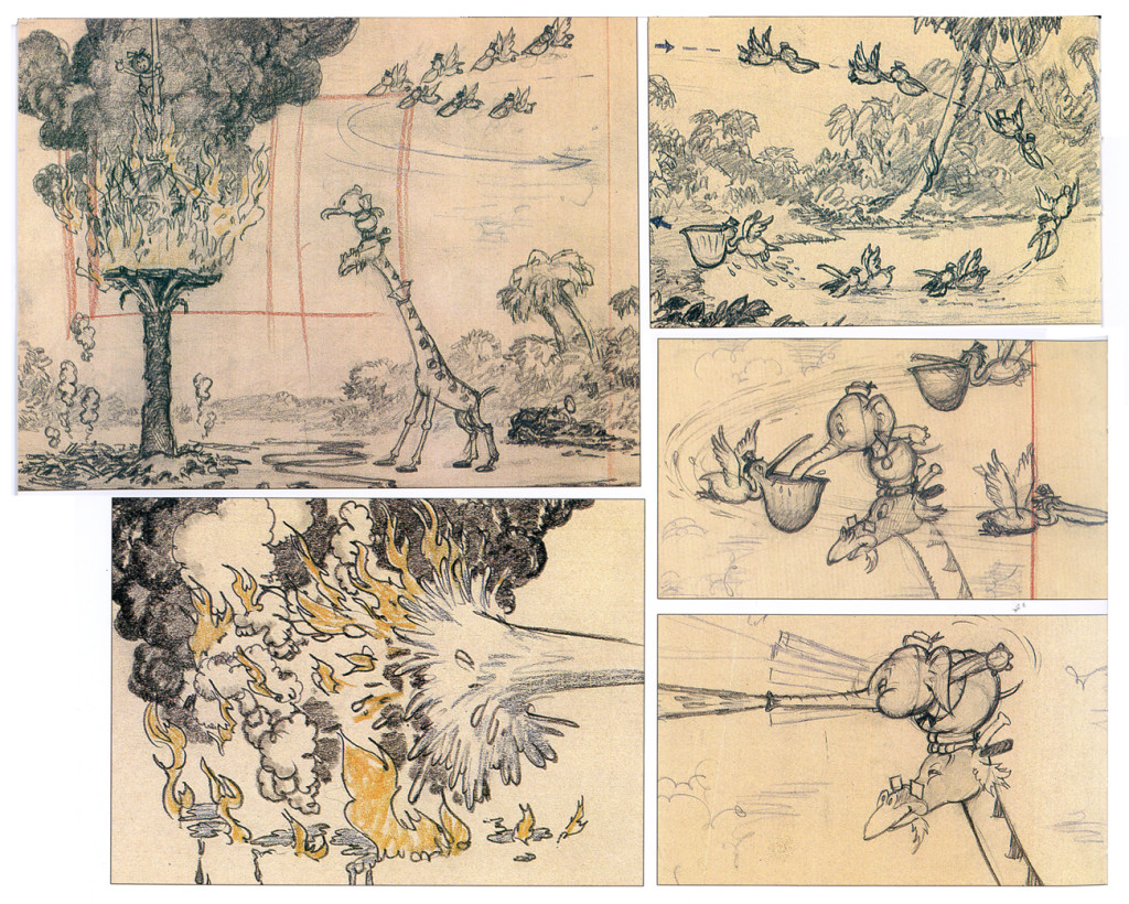
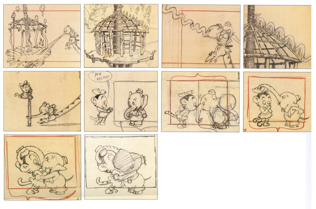
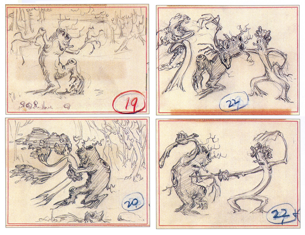
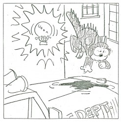
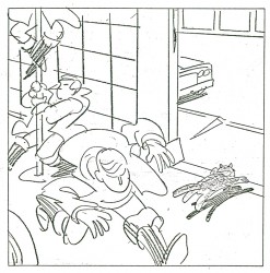
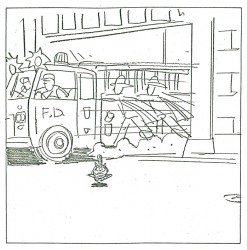
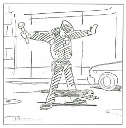
Obviously Peet had planned this as a children’s book. For quite some time he wanted to separate from Disney, and he saw children’s books as a way out. He writes about _______ Don’t you love the title Auto ___ Biography !
In his actual autobiography, Peet used Lambert the Sheepish Lion to try to move out of the studio. Disney sort of co-opted that story which Peet had written, and it became a studio film. It’s obvious that Susie was another attempt by him to move out.
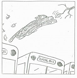
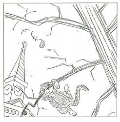
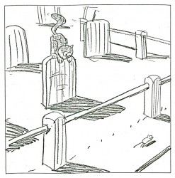
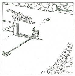
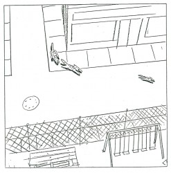
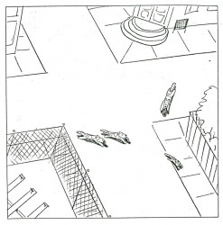
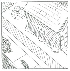
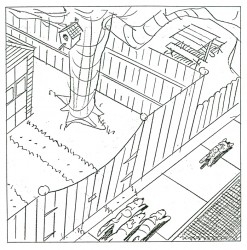
Here’s the mock up for a book by Bill Peet. I don’t know if the book came before the board or the board before the book. Again, this comes from the collection of John Canemaker as does the storyboard from the film which I’ll post next week. Thank you, John, many times over.
Animators included Ollie Johnston, Cliff Nordberg, Hal King and Bob Carlson with backgrounds by Ralph Hulett. Clyde Geronomi directed it.
 1_
1_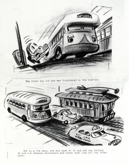 2
2
___________________________(Click any image to enlarge.)
 11_
11_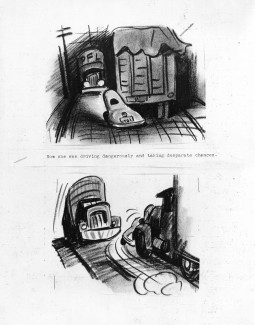 12
12
_____________(Click any image you like to enlarge it to a legible size.)
 21
21
_
The plan for this book is excellent, and gives a good indication of the great books Mr. Peet would do after leaving animation. Many thanks to John Canemaker for the loan of this rare material; it makes an unusal post.
The video is available all over the internet. You can watch it currently on YouTube or buy the dvd at Amazon.



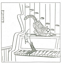
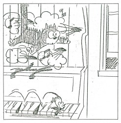
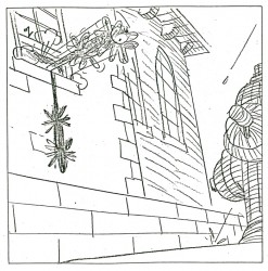
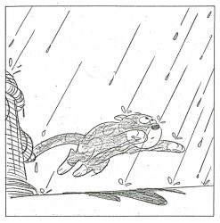


 3
3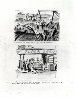 4
4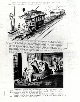 5
5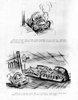 6
6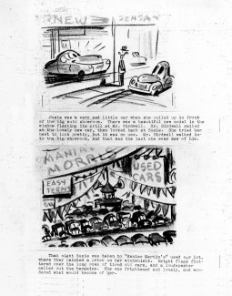 7
7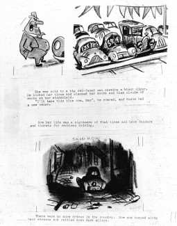 8
8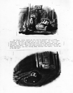 9
9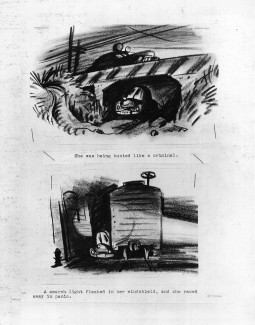 10
10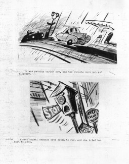 13
13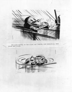 14
14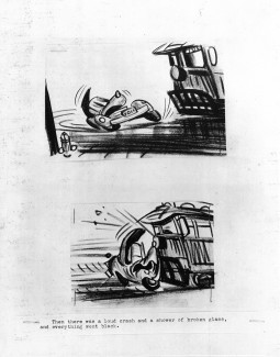 15
15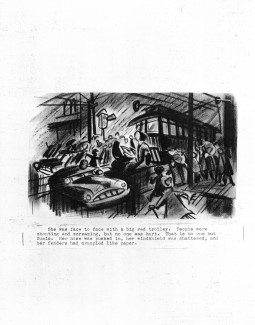 16
16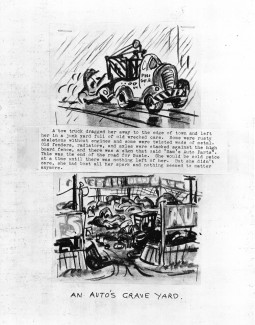 17
17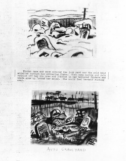 18
18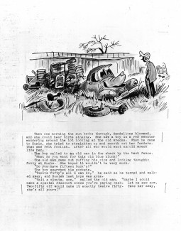 19
19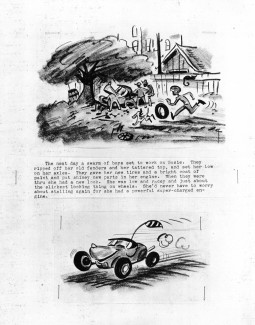 20
20