Search ResultsFor "Blair Alice"
Books &Commentary &Disney 19 Feb 2013 05:17 am
Jim Korkis’ Song of the South
 As the War came to an end, Walt Disney realized that he needed to find a way to raise money for his movies or, at the least, make films more profitably. One idea he chose to employwas to make more live action film.
He’d had some modest success with The Three Caballeros and Saludos Amigos by combining live action and animation.
For years he’d thought of doing a combination film with Alice In Wonderland placing a live action Alice in an animated world, not unlike the early silent films Alice in Cartoonland.
Disney also thought of going to the stories of Joel Chandler Harris. By making the story of the humans in live action and the stories of Br’er Rabbit, Br’er Fox and Br’er Bear in animation, as told by Uncle Remus who would star in the significant part of the story told in live action. Thus he could easily work as the voice over narrator for the animation.
The film went into production in 1945 and pulled Disney down a harsh and difficult path.
Now, some 70 years later, studio head, Robert Iger, has vowed numerous times to keep Song of the South (the film’s title) on a shelf in the Disney vault, which is where it remains.
Disney historian, Jim Korkis, has written a series of excellent essays which act as chapter in a new book about the making and unmaking of this film. In his book, Who’s Afraid of Song of the South, a great weight of information completely informs us about this movie while being written in a positive and gentle approach.
Were the film as bad as Iger and other Disney executives want us to believe, here would still be a good reason for this book’s existence. Perhaps, though, it might have been a larger and more colorful tome.
The live action, representing about 60% of the film is not well conceived. It is terribly out of date and not well directed. Most importantly, the film is not well written. It’s somewhat confusing as to when the story takes place (pre- or post-Civil War?) What are the father’s resources, who owns the plantation where they’re living and where is the story trying to take us.
The acting by James Baskett as Uncle Remus is superb and wholly deserving of the Special Oscar he received. Child actor, Bobby Driscoll, is also fine, but many of the other performances are bland and not very noteworthy. The film is horribly dated. The Disney people sought the finest cinematographer they could get, and they did find him in Gregg Toland. He was the brilliant photographer of Citizen Kane and How Green Was My Valley. However, Song of the South was his first color film, and that was an enormous leap to make at the time. Toland had good reason to want to do the movie, but the film feels like Gone With the Wind – lite and helps to make it feel dated.
 However bad the live action was, the animation was the polar opposite. The stories are told very economically with lots of excitement and life in the storytelling. All those who worked on it spoke openly about how much fun they had in doing it. Those results showed up on the screen. The characters are delightful and beautifully developed. This was certainly the spark everyone in the animation department needed as they came off years of toiling away at dry, training films for the military.
While the live action dates the material and plops it in a marginally racist context, the opposite is true of the combustible animation.
The Disney studio has hidden the DVD of this movie from the General Public. There are illegal copies of film circulating the Internet, but the quality could never be as good as a studio sanctioned copy of the movie. It’s truly unfortunate, for the sake of that great animation, that the film is inaccessible.
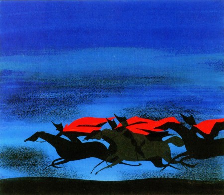
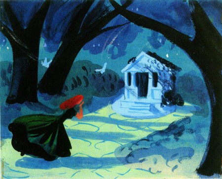
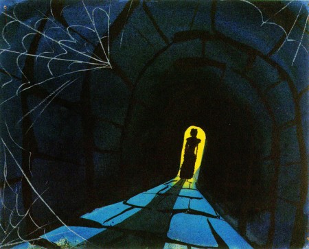
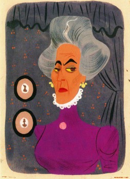
Korkis’ book is a very quick read and he seems to cover the story well. One would have liked a richer book with glossy images, especially of the beautifully designed Mary Blair animation.One wishes that there were lots of stills of the great Bill Peet storyboard or those great animation drawings by the Nine Masters who were truly in their prime. But we have what we have, and we’re thankful for that.
If you have any interest in this film you will have to get your hands on a copy. The last half of the book if filled with some essays about other, lesser films. Some of th essays are truly excellent and feel hidden in the back of this book. One, for example, about a commercial producing studio Walt had on the lot. Learning that Walt’s daughter, Sharon, worked as an assistant to his sister-in-law’s sister, who ran the company, would seem to be a key piece of information. But when you start to learn who Walt used to do the animation work (Tom Oreb designing for Charles Nichols directing with Phil Duncan, Amby Paliwoda, Volus Jones and Bill Justice all were among those animating. There’s even the story of Bill Peet being punished by Walt and made to work on a Peter Pan peanut butter campaign.) This is an excellent piece. As is the story behind The Sweatbox, the feature documentary that was hidden by the Disney studio about the adventures in the making of the Emperor’s New Groove. Lots to read here.
All in all, this book is an excellent bargain.
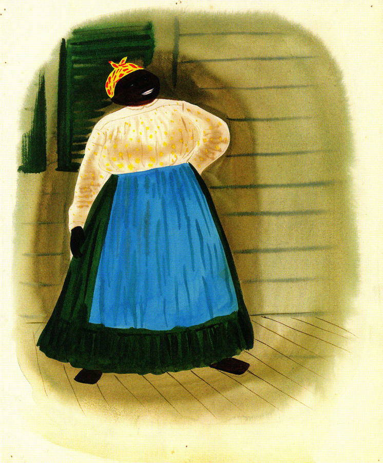
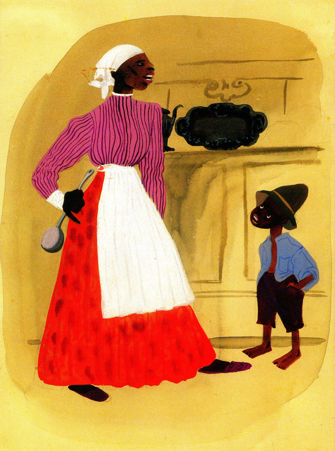
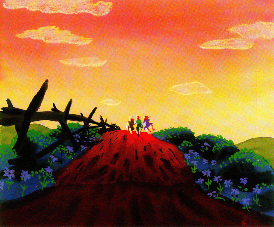
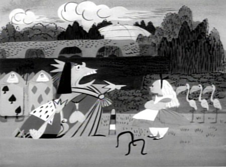
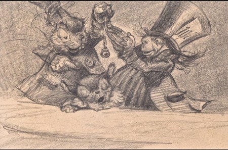
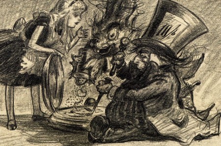
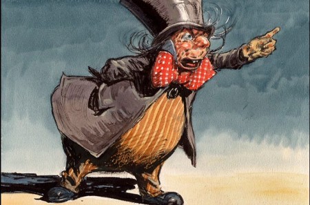
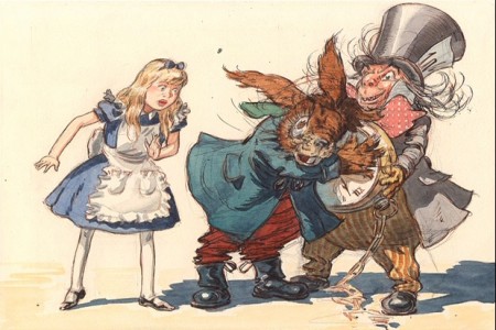
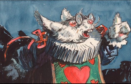
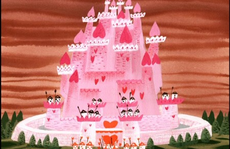
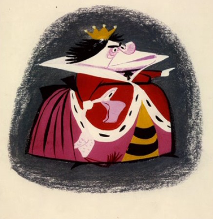
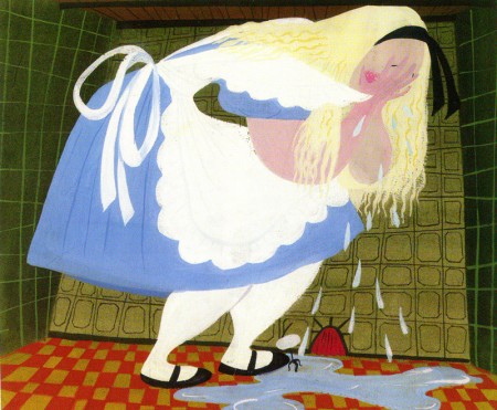
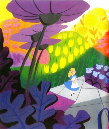
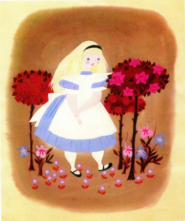
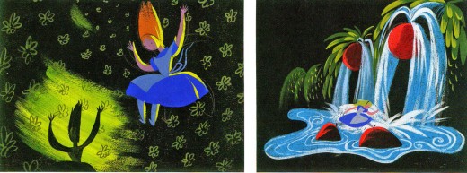
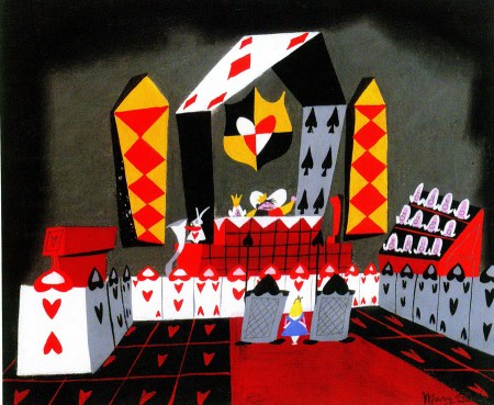
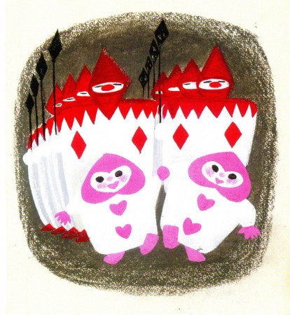
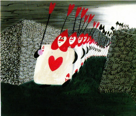
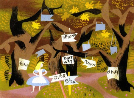
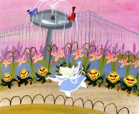
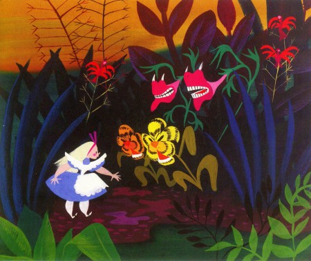
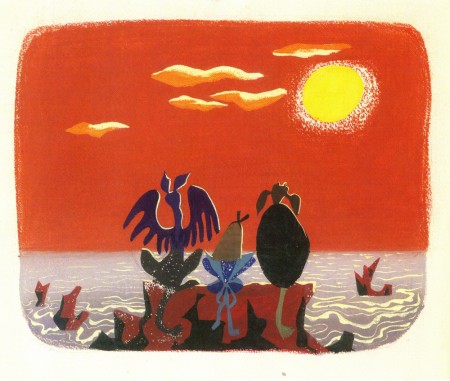
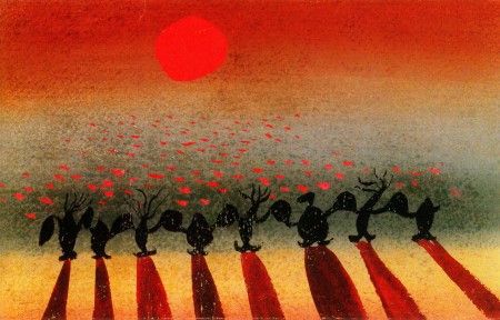
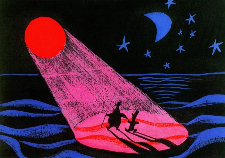
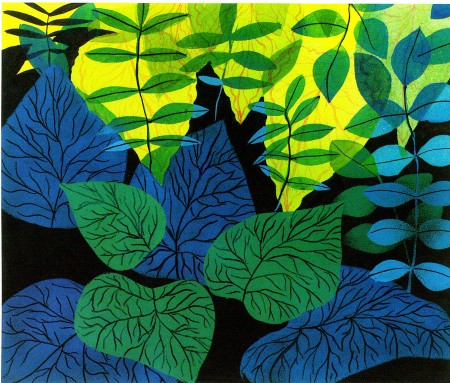
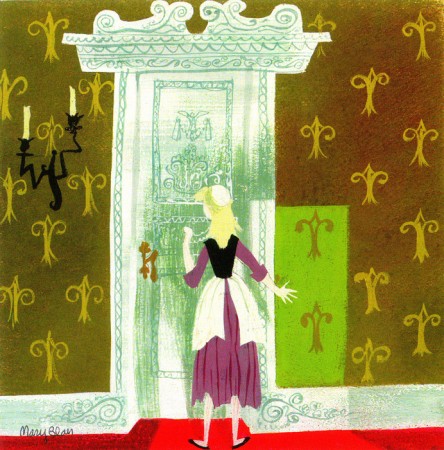
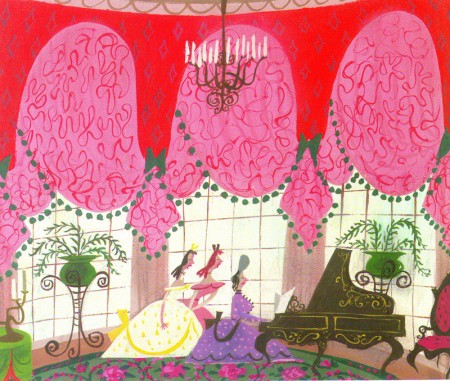
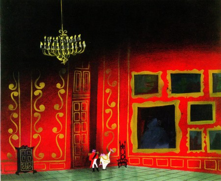
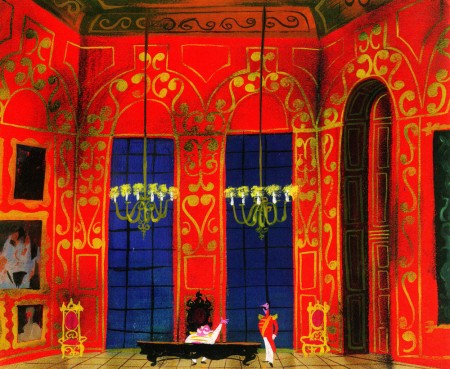
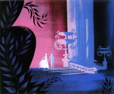
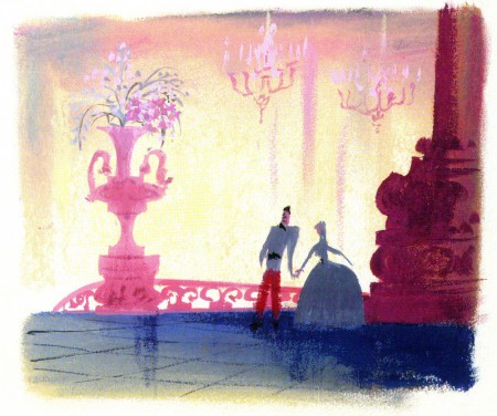
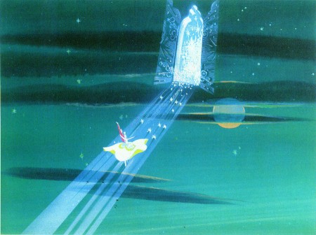
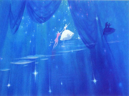
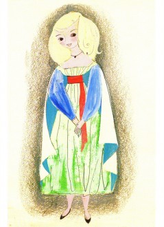
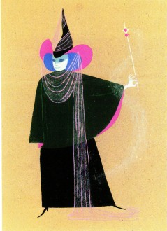
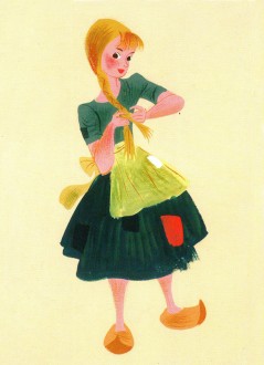
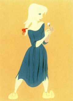
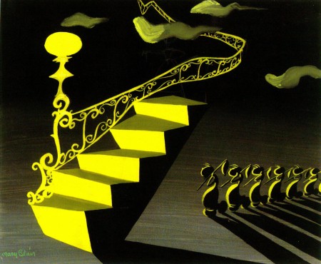
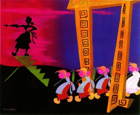
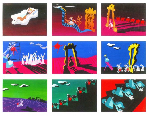
All of these illustrations were done by Mary Blair for the film.
They’re not part of Jim Korkis’ book.On Thursday I’ll repost Bill Peet’s storyboard for The Tar baby.
Disney &Frame Grabs 31 Jan 2013 06:35 am
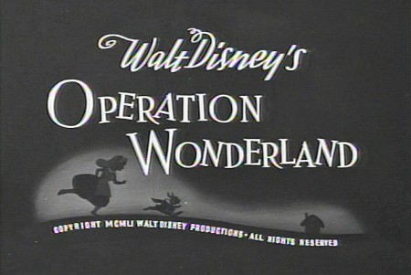
Operation Wonderland Redux
- On the DVD of Alice in Wonderland, there’s an extra little short that supposedly gives you a tour of the studio and a lesson in how animated films are made. (Do you think we’ll ever see one about Dreamworks or Pixar? I’d like to get a video tour of either studio.)
Since I’ve been focussing on Alice’s Milt Kahl scenes, I thought it’d be interesting, as an accompaniment, to post some frame grabs from this theatrical short that was done to promote Alice.
 1
1(Click any image to enlarge.)
 2
2
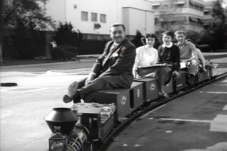
Of course, the film has to start with Walt
riding a toy train around the studio.
 3
3
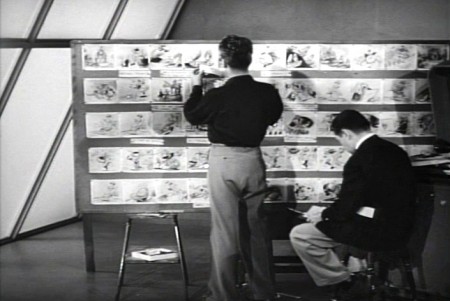
Two storyboard guys sitting in the middle of the studio.
 4
4
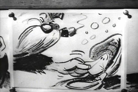
Storyboard: the walrus grabs a clam.
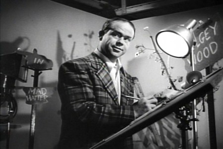 5
5
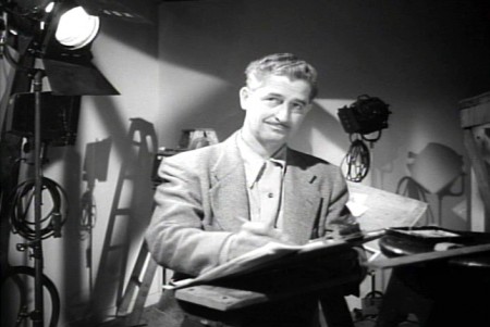
Ward Kimball in a funny jacket.
 6-7
6-7
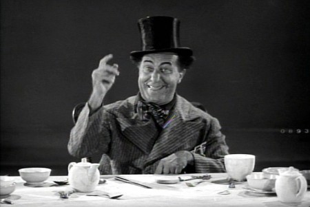
The actor posing as the Walrus for the camera.
 9-10
9-10
The Walrus & Carpenter sequence.
 12
12
Walt and Winston Hibler. Hibler eventually narrated
most of the Disneyland shows and True-Life adventures.
 14
14
Flowers from storyboard to final film.
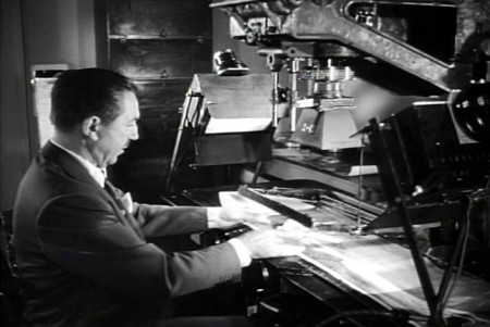 15
15
Walt gives a demo of the animation camera and
seems to be wrinkling the cels as he does this.
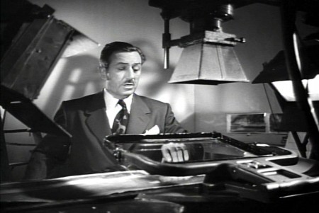 16
16
Walt operating an animation camera. Ludicrous.
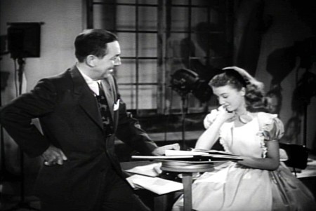 17
17
Walt and Kathryn Beaumont (who’s
supposed to be doing schoolwork.)
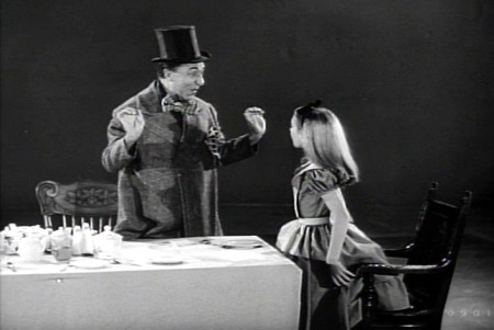 18
18
Kathryn Beaumont and Ed Wynn.
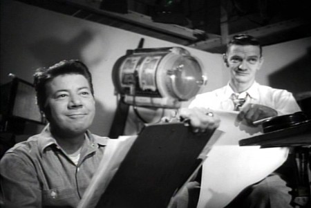 20
20
John Lounsbery on the right. The other animator looks to be
Fred Moore. Older and heavier than we’ve seen him in the past.
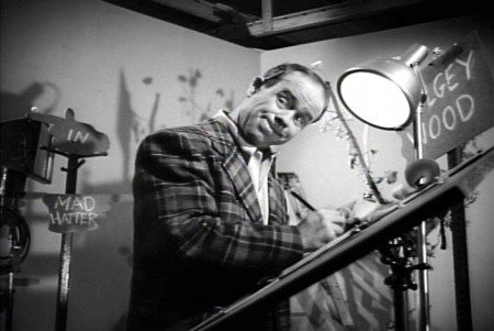 22
22
More of wacky Ward Kimball pretending to draw.
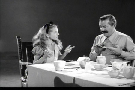 23
23
Kathryn Beaumont and Jerry Colonna.
 25
25
Jerry Colonna leads us into pencil test of the scene.
 27
27
This scene was animated by Ward kimball & Cliff Nordberg.
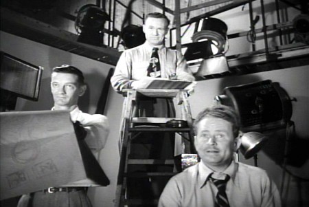 46
46
John Lounsbery is on the left.
I’m not sure who the other two are.
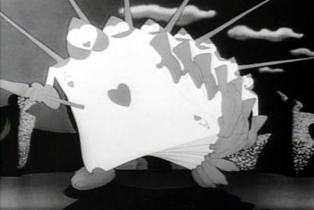 47
47
The cards in action in the film.
 49
49
One of the highlights of the film is this dancer doing
march steps for the cards – to be studied.
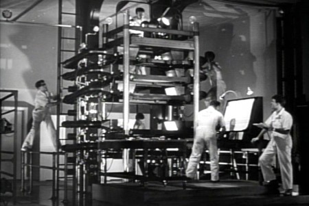 50
50
The multiplane camera in operation.
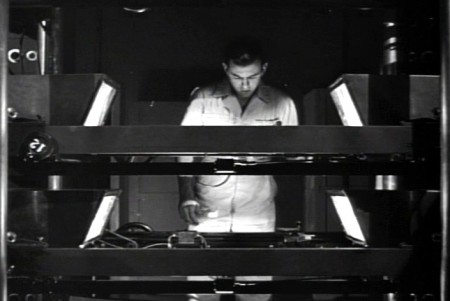 51
51
The cameraman at the top always looks a bit devilish.
 52
52
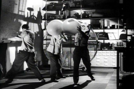
No “how animation is made” film would be complete
without the sound effects guys making a racket.
 54
54
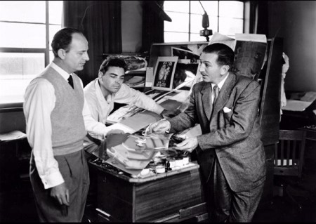
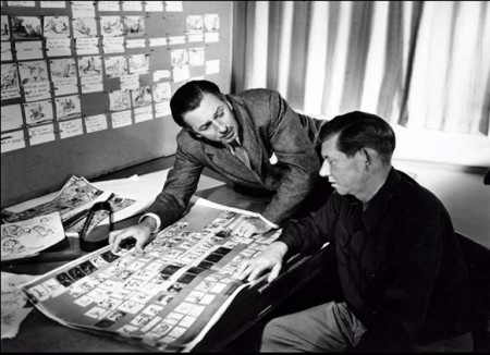
Walt going over some artwork with
John Hench (L) and Claude Coats (center)
Thanks to Hans Bacher and Gunnar Andreassen for identifying them.
 55
55
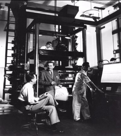
Before riding his toy train into the sunset, Walt sits
in front of his real toy, the multiplane camera.
If anyone can identify any of those I couldn’t, or if you think I’ve mistakenly identified anyone, please leave a comment.
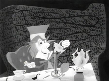
There’s an art gallery of images, many of which are by Mary Blair (and I’ve already posted her pictures a while back.) I’ll finish this post with some more of the images on the dvd.
 1
1Mary Blair in B&W.
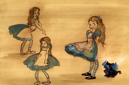 4
4
Thiis looks like it comes from HOPPITY GOES TO TOWN.
To see more Mary Blair designs for Alice go here.
Commentary &Disney 22 Jan 2013 08:28 am
Rambling on some Disney Features
 - A stash of Disney animated features were on television this Sunday. Hercules, Lady and the Tramp, Alice in Wonderland, Aladdin, Cinderella, and The Lion King all followed each other immediately, one on top of the other. Actually some of them even overlapped each other. The credits for Hercules (miniscule and too tiny to read) played on the left half of the screen while the opening credits for Lady and the Tramp played on the right half of the screen. They were going to milk every ounce of Disney Family viewing they could for the money.
I was pretty sick on Sunday, the flu has struck our little home hard, and I’m not yet down for the count but feel pretty close. So I could see how much of this 2D mania I could stomach – flu and all. I didn’t come in to it until the very end of Hercules, which is probably the one film I would have liked seeing again, but virtually missed.
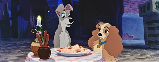
Some quick notes: It was nice to see Lady and the Tramp letterboxed for Cinemascope. The opening is still as tender as ever, and the Siamese cats are beautifully layed out for scope. The layout, backgrounds and animation – particularly the effects animation of the chase for Tramp in the dog pound wagon is exceptional. I think it’s probably one of the best sequences in the film. “Bella Notte,” of course, works well, but except for the sentimental emotion the sequence was never one of my favorites. There isn’t much for the dogs to do while the singing continues. They do pull a lot out of the spaghetti, but for much of it, the dogs just sit there, or in closer shots chew their food.
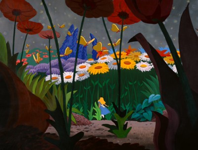 Alice seemed loud and aggressive though some of the coloring seemed inspired, and it’s amazing to see how much of Mary Blair is still in there in some parts – particularly the end of the caterpillar sequence. I found the Cheshire Cat a blessing in the wilderness. A lot is done with little subject matter, and it’s all in the excellent animation, of course. It’s obvious that Alice is a tough character to animate, but she’s done brilliantly. Essentially, she’s the “straight man” for everyone else in the film. She just sits there while the other characters bounce their schtick off of her. As I noted in a past post I am intrigued by the use of shadows in the transitional parts of the film. It works stunningly well , and this device virtually holds a lot of the film together in some odd quiet little way. I’d be curious to see more of this done with other films. You need a director with a big vision watching out for the film as a whole. I’m not crazy about a lot of the wild animation of the many zany characters that seem more cartoon to me than do they feel like Lewis Carrol creatures. There’s an interesting little scene where Alice sits down to cry in the woods. At first, she’s alone, then like Snow White in a similar situation feels sorry for herself and lets go. Little woodland creatures, deer and squirrels and rabbits and birds surround Snow White. Alice greets the odd little cartoon characters which feel as though they’d escaped from Clampett’s Porky in Wackyland. The woodland characters in Snow White serve the purpose of moving the heroine forward in the story to the dwarfs’ cottage. The zanies in Alice just disappear before she stops crying. Essentially, they’re pointless little creatures that offer nothing to the film. Fortunately the Cheshire Cat returns at this point. He fades in just as all the others have faded off.
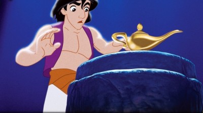 Aladdin has always bothered me. It feels more like a Warner Bros film than a Disney feature. The wild animation and even the style of the animation gives me good reason to feel this way. However, I think I came to terms with that in watching it again (maybe my 12th time?) mixed in with these other movies. The film is what it is and does it well. Eric Goldberg’s genie is a classic combination with the Robin Williams voice over, and Eric gets full use of that voice and the business happening on screen. The material presented has dated some, though not as bad as I expected. How lone before kids don’t know who people like Ed Sullivan are? Though I suppose this is similar to the personalities left over from the celebrity cartoons of the 30′s & 40′s. Mother Goose Goes Hollywood needs a program of its own to tell us who half of those caricatures represent. And they are great pieces of art that Joe Grant did for them. The villain in Aladdin tries hard but he’s not menacing just threatening. There was never anything that I worried about with him, and this feeling goes back to my very first viewing of the film. I do like the tiger in the film, Jasminda’s pet. That cat makes up for the ineffectual father. His character is not anything I can really associate with.
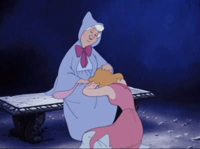 Cinderella is a very interesting film. I go into it thinking I hate it and get completely tied up with the extraordinary pacing of the film. Every scene is so exact and tight. They really knew what they were doing. I’m not the biggest fan of the human animation, but at the same time I’m in awe of it. It isn’t really rotoscoping, but it’s so beautifully pulled off the live action they shot, that it feels completely fresh. The cartoon animals play off the humans as the dwarfs did in Snow White. They look as they they come from different films and the style of animation is so different. The set pieces are exquisite. That entire piece with Cinderella locked in her room, the animals fighting to release her all those stairs away and the final reveal of her own glass slipper. It’s so beautifully melodramatic and so perfectly executed. Yes, this is an odd film for me to watch.
I didn’t make it to The Lion King. I’ve seen that about half a dozen times in the last few months so preferred watching my soap opera – Downton Abbey.
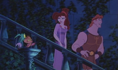 Watching these films back to back to back like this sort of lessens them but at the same time one is overwhelmed by the amazing craftsmanship held so high for so long. For years I felt the modern films, Aladdin, Beauty and the Beast, Hercules were lesser efforts compared to what the “masters” did. But now I’m sure they’re every bit as good as some of the later classics. No, I don’t think Snow White, Pinocchio, Fantasia, Dumbo and Bambi can be beaten today, but the new films are definitely equal to Lady and the Tramp, Cinderella, Alice In Wonderland and anything later than that. (I actually think Sleeping Beauty is in a class of its own and haven’t seen the equal to that from the more recent people. Actually, I take that back. I think Prince of Egypt is right up there. That’s a magnificent film, and it’s one I’d like to discuss more in depth sometime soon.)
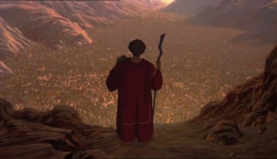 Oh, of course, this is all my own opinionated nonsense. Someone else would have a completely different list. I’m, obviously, leaving cg films out of this discussion. To be honest, I can’t even find a story there that I think measures up to most of the Disney classics. I’m also not thinking much about non-Disney works, but there’s an obvious reason for that. However, some of those Dreamworks 2D films are exceptional and deserve a lot of attention. Attention they haven’t received. Spirit has stunning animation, as do a number of others. They really need a bit of time.
I had some bigger thoughts brought on by watching them all, but I’ve gone on too long already. So I’ll let this rambling post fizzle out. Hope you don’t mind, but I’m getting to enjoy writing these diatribes.
Commentary 04 Oct 2011 06:39 am
Hubley/Blair
- Two shows are about to take place; one in New York (Monday October 10th An Academy Salute to John Hubley), another in Los Angeles (Thursday October 20th, Mary Blair’s World of Color; A Centennial Tribute). I wish I could attend bothh of them; I’m happy to be in NY to attend the John Hubley program (and be a small part of it.)
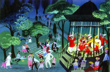
Interesting that these two shows appear in the same month at two different AMPAS stations. Yet, the two artists couldn’t be more diametrically opposed in their work. One was more of an illustrator, albeit a brilliant illustrator, and the other was more a fine artist.
.
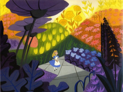
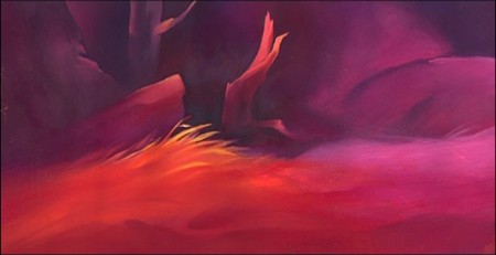
Everything about Blair’s work, from The Little Golden Books to the designs for the Disney features of the early 50′s to the overall design for It’s a Small World in Disneyland, are all glorious testaments to a first rate, gifted illustrator of the highest caliber. She radically changed her style on the trip to South America with the Disney group, and she brought these brilliant color mixes back with her to the work she did at Disney. The colors were almost there for the sake of the colors, alone. The work developed and grew more sophisticated with all that she did, and her color schemes became more radical as she designed for the Disney features.
.
.
The grand statement of the art . . . well, there was no grand statement. It was done to further the films or the projects, and had no message. It was beautiful production art, but it was not really “Art.”
.
.
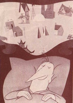 Hubley’s work sought to create art, and the style and growth continued upward through his years. The work at Disney’s studio started as gifted illustration (Snow White), then turned to a looser feel with oils (Pinocchio) and watercolor (Bambi). As he moved to UPA, the art followed Steinberg and Picasso closer to the world of abstraction. Ultimately, with Adventures of an * and films that followed (done by and for himself and his wife Faith) the Abstract Expressionists ruled, and Hubley’s art went far into that direction and stayed there through most of his films.
.
Tender Game, which followed Adventures of, was a variation that seemed to emulate some of the work of Baziotes. Moonbird was where Hubley came into his own and created a very rich style that was all his own. Variations on it came with The Hat, The Hole and Of Stars and Men. A new direction came with Windy Day. By the time we reached Cockaboody, a softness settled into that very same style and watercolor backgrounds dominated. There was throughout all this work a beautiful development where one phase grew out of another which had grown out of another.
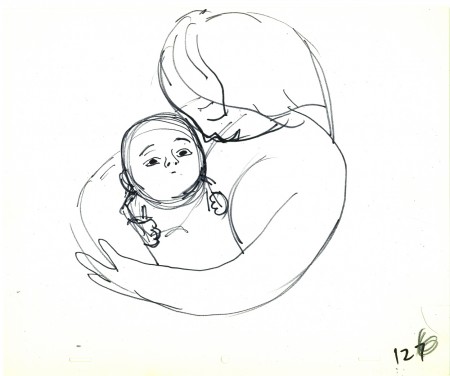
.
And there was a grand statement: all art, abstract or realistic was an abstraction and it touched all of our lives regardless of our thoughts about it. Picasso could be dismissed by those not in the know, but eventually the masses would warm up to him and eventually take it for granted that this, too, was Art. Hubley helped make that world – this world – so. Acceptance and understanding was part of his oeuvre.
.
One wonders if Hubley had remained at Disney’s as long as Blair had whether any of his rich design style would have controlled the films as her work had. Of course, the answer is obvious. He never would have been able to remain at Disney’s studio. His penchant for the further development of the art – out of the 19th century illustration – would not have allowed him to sit still there. By leaving, he not only pushed his own work into a higher realm, but he pulled animation there with him.
.
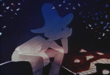
.
In a sense, without his work, animation would still be stuck in the 19th Century graphics and would not have moved into the 21st Century. We can see evidence of this with all the cgi features being done today. Those little fabricated computerized puppets are wholly stuck in 19th Century art, yet 2D has moved on. We accept “Beavis & Butthead” or “Aqua Teen Hunger Force” (both badly drawn works that are most definitely 21st century graphics) because Hubley changed things. Not that John Hubley was the only one who wanted to do more, graphically, in animation, but others seem content with modernized cartooning. Chuck Jones, for example, who led the way in 1941 settled into a stylized cartooning in the 1950s. Hubley sought art – something different and deeper than was acceptable to others.
Picasso led to acceptance of Andy Warhol and Robert Rauschenberg; Hubley led to acceptance of “South Park” and Yurij Norshtein.
.
Pictures:
1. Mary Blair – personal painting
2. Mary Blair – Alice In Wonderland
3. John Hubley – Bambi
4. John Hubley – Brotherhood of Man
5. John Hubley – Everbody Rides the Carousel
6. John Hubley – Moonbird
Animation Artifacts &Disney &Frame Grabs 18 Nov 2010 08:37 am
Operation Wonderland
- On the DVD of Alice in Wonderland, there’s an extra little short that supposedly gives you a tour of the studio and a lesson in how animated films are made. (Do you think we’ll ever see one about Dreamworks or Pixar? I’d like to get a video tour of either studio.)
Since I’ve been focussing on Alice’s Milt Kahl scenes, I thought it’d be interesting, as an accompaniment, to post some frame grabs from this theatrical short that was done to promote Alice.
 1
1(Click any image to enlarge.)
 2
2
Of course, the film has to start with Walt
riding a toy train around the studio.
 3
3
Two storyboard guys sitting in the middle of the studio.
 4
4
Storyboard: the walrus grabs a clam.
 5
5
Ward Kimball in a funny jacket.
 6-7
6-7
The actor posing as the Walrus for the camera.
 9-10
9-10
The Walrus & Carpenter sequence.
 12
12
Walt and Winston Hibler. Hibler eventually narrated
most of the Disneyland shows and True-Life adventures.
 14
14
Flowers from storyboard to final film.
 15
15
Walt gives a demo of the animation camera and
seems to be wrinkling the cels as he does this.
 16
16
Walt operating an animation camera. Ludicrous.
 17
17
Walt and Kathryn Beaumont (who’s
supposed to be doing schoolwork.)
 18
18
Kathryn Beaumont and Ed Wynn.
 20
20
John Lounsbery on the right. The other animator looks to be
Fred Moore. Older and heavier than we’ve seen him in the past.
 22
22
More of wacky Ward Kimball pretending to draw.
 23
23
Kathryn Beaumont and Jerry Colonna.
 25
25
Jerry Colonna leads us into pencil test of the scene.
 27
27
This scene was animated by Ward kimball & Cliff Nordberg.
 46
46
John Lounsbery is on the left.
I’m not sure who the other two are.
 47
47
The cards in action in the film.
 49
49
One of the highlights of the film is this dancer doing
march steps for the cards – to be studied.
 50
50
The multiplane camera in operation.
 51
51
The cameraman at the top always looks a bit devilish.
 52
52
No “how animation is made” film would be complete
without the sound effects guys making a racket.
 54
54
Walt going over some artwork with
John Hench (L) and Claude Coats (center)
Thanks to Hans Bacher and Gunnar Andreassen for identifying them.
 55
55
Before riding his toy train into the sunset, Walt sits
in front of his real toy, the multiplane camera.
If anyone can identify any of those I couldn’t, or if you think I’ve mistakenly identified anyone, please leave a comment.
There’s an art gallery of images, many of which are by Mary Blair (and I’ve already posted her pictures a while back.) I’ll finish this post with some more of the images on the dvd.
 1
1Mary Blair in B&W.
 4
4
Thiis looks like it comes from HOPPITY GOES TO TOWN.
To see more Mary Blair designs for Alice go here.
Books &Illustration &Layout & Design &Mary Blair &Models 09 Aug 2010 06:35 am
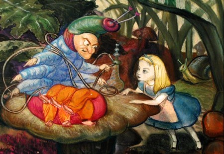
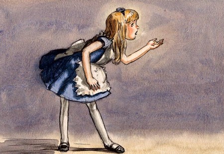
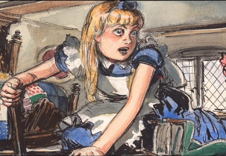
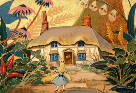
Mary Blair – 5
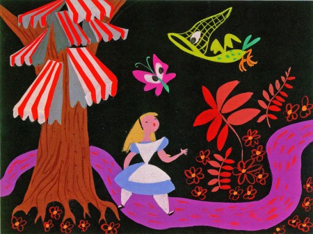
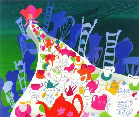
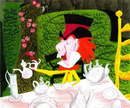
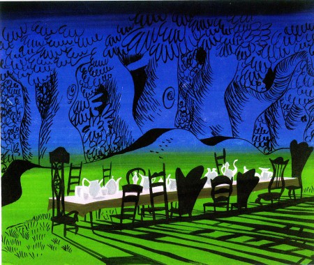
- Alice. More pictures from the Japanese book, The Colors of Mary Blair. There are lots of pictures from this book that I’m not posting; I’d urge you all to buy it.
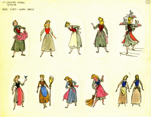
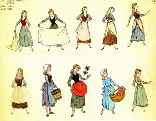
The three key feature films that were influenced by Mary Blair are Cinderella, Alice In Wonderland and Peter Pan. There’s a wealth of model drawings from each of these three available in various books. John Canemaker‘s brilliant work, The Art and Flair of Mary Blair, pulls all three together into one chapter and handles them beautifully.
Each of the films has a companion storybook that is illustrated with Mary Blair’s models. Peter Pan, Alice In Wonderland, Cinderella.
These Alice drawings are overexposed, but I picked a bunch I like.
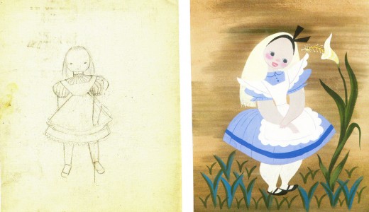
(Click any image to enlarge.)
Books &Disney &Illustration &Layout & Design &Mary Blair &Models 02 Aug 2010 07:22 am
Mary Blair – 4.
This continues my series of color stills from some of the beautiful work in the exquisite Japanese book on Mary Blair, The Colors of Mary Blair. If you have the resources to buy this book, you should.
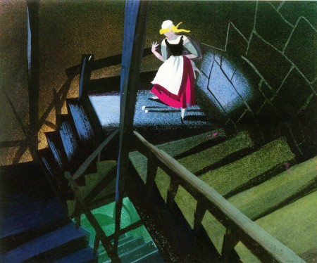
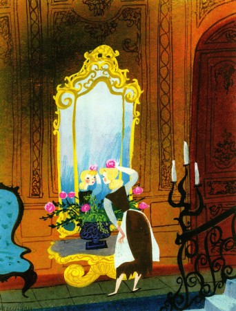
- The big three for Mary Blair, as a designer of Disney animation, were Cinderella, Alice in Wonderland and Peter Pan. We’ll spend all of this post on Cinderella. Many of these illustrations made it into John Canemaker‘s invaluable book, The Art and Flair of Mary Blair. Others have made it into a Cinderella storybook with text by Cynthia Ryant. Still others appear only in this Japanese edition.
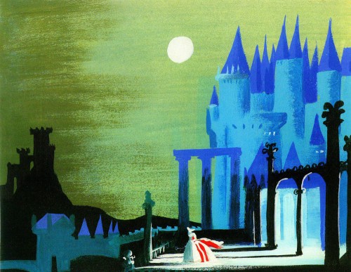 1
1
Animation Artifacts &Books &Disney &Mary Blair &Models 24 Jun 2008 08:03 am
Mary Blair Boards
- Let’s imagine.
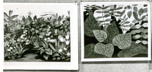
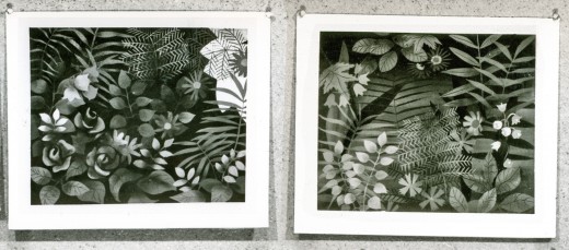
Mary Blair is the most brilliant of all the color stylists to have worked at the Disney studio during its heyday. Among the photographed storyboards loaned me by John Canemaker was this board of Mary Blair images. The only problem is that it’s B&W. So, we have to imagine the array of greens and blues and yellows the designer would have used for this very colorful sequence.
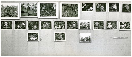
This is the board in it’s entirety. Now, to split it up so you can look at the images a bit more closely.
 1a
1a
_____To enlarge any of the images, click on them.
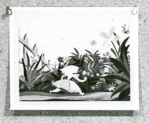 3c
3c

Here’s an image from Canemaker’s book, The Art and Flair of Mary Blair. I just wanted to remind you of how these other images probably look in color.
Animation Artifacts &Disney &Mary Blair &Story & Storyboards 23 Jun 2008 07:59 am
Alice Boards 3
- This is the third photo of the board for Alice In Wonderland. Once again, I think it was drawn by Joe Rinaldi. I have no evidence to prove otherwise, and that guess makes the most sense to me at the moment.
As with past posts, I show the storyboard photo as is, then reproduce it one section at a time so that I can enlarge it to the largest size.
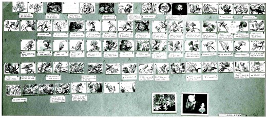
____________(Click any image to enlarge.)
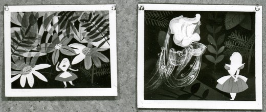
At the base of the storyboard are these two Mary Blair images. I did a bit of a search (and I do mean “a bit”), and I wasn’t able to find color reproductions of these two pictures. So I’m posting them as they appear in this photo. They’re a bit blown out in the photo in hand, so I did a little work in photoshop to pull out a bit more of the grays.
There is another photo which includes a bunch more of Mary Blair’s designs for Alice. I’ll post that soon (though I also have to search to see if any of those are printed in color elsewhere.)
Daily post 21 Jun 2008 08:21 am
Hopping Skipping & Jumping
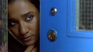 - Thursday night I went to the Academy screening of Get Smart (which turned out to be a zero of a movie. I should have expected that despite the J. Hoberman/Village Voice rave.) There was another film playing that evening, Brick Lane, a small British movie about an Indian woman who is sent to England at age 17 to marry a cousin she has never met.
That short synopsis was all I knew about the film. Rotten Tomatoes gave it a 63% on the “tomatometer,” and I expected something small and hoped for the best. I was in the mood.
The film turned out to be great. The music by Jocelyn Pook virtually lifted this film to one of the best films of the year. It’s excellent, and I thought I should tell you all to look out for it. If you’re thinking of going to Get Smart, don’t. Go to see Brick Lane, if it’s available near you. If it isn’t, keep the film in mind for the future. There’s real poetry and heartbreak there, and it’s a fine film.
I’ll get to see Wall-E next Tuesday and will probably comment on it afterward.
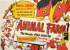 - I don’t have to repeat myself. I like Animal Farm a lot. That’s why I like to visit Chris Rushworth‘s excellent site, animalfarmworld.
Chris regularly posts lots of images from his collection of artwork from this film, and continually adds to it. I amazed at the number of cels and drawings up on this site. He has recently added some new pages for links to other sites and posters.
I’ve added Animalfarmworld to my list o’ links.
 – Almost as a companion piece, Thad Komorowski has complimented my posts of the storyboards for Alice In Wonderland. He’s posted David Hall’s boards for sequence 1 and sequence 2.
This film, Alice In Wonderland, has generated a lot of beautiful artwork. David Hall’s boards are so illustration-like as compared to the energetic boards roughed out by Joe Rinaldi. (At least I think they’re Joe Rinaldi’s work.) Compare both to the amazing color styling of Mary Blair. (Check out Canemaker’s book, The Art and Flair of Mary Blair.
Note: after I post the third and final of the boards John Canemaker has loaned me I’ll post a bunch of Mary Blair images.
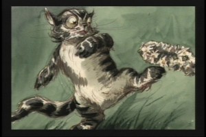
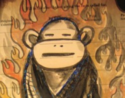 Lynda Barry has an interesting essay on “the power of the paintbrush” on the Tricycle archive. Read it. After you read that go out and get her new book, What It Is.
I was sent to the article via a link on Drawn. I learned of the book from Matt Clinton, a principal animator in my studio, who stood on line for a while to get Barry’s signature. She spoke at length to each of those on line, so there was a bit of a wait. She drew a cartoon for Matt, making it all worth waiting for.
Lynda also recently spoke at NYU as part of a symposium on the cultural importance of comics. Annulla tells the tale on her great blog, Blather from Brooklyn.


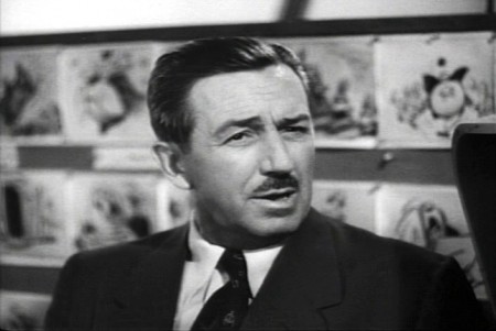


 1b
1b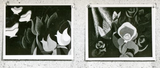 1c
1c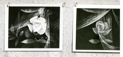 1d
1d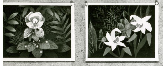 2a
2a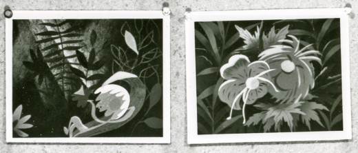 2b
2b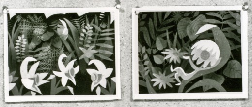 2c
2c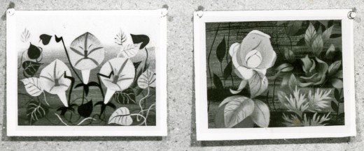 2d
2d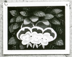 3a
3a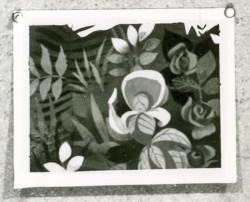 3b
3b 1a
1a 1b
1b 2a
2a 2b
2b 3a
3a 3b
3b 4a
4a 4b
4b 5
5