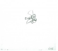
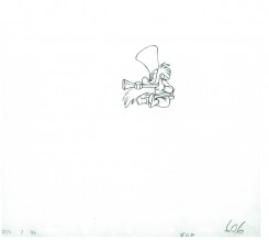
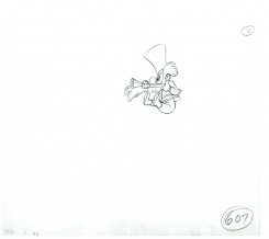
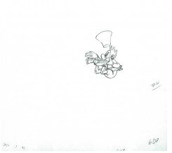
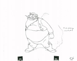
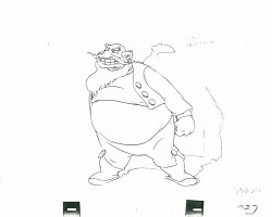
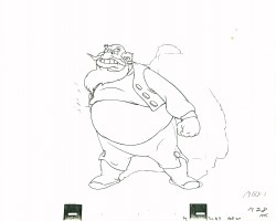
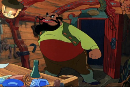
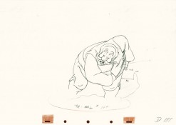
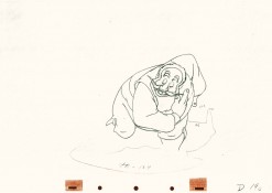
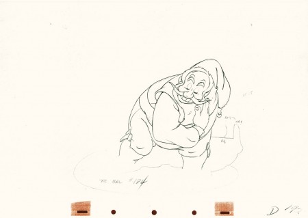
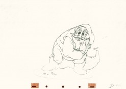
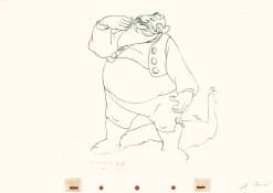
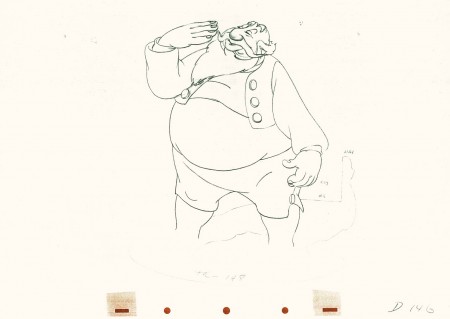
Search ResultsFor "stromboli"
Animation &Animation Artifacts &Disney &Tytla 13 Jul 2011 06:50 am
Tytla’s Dwarf Fight – recap
As I noted last Saturday, I intend to repost a number of the Bill Tytla animated pieces I have in the history of this blog. His work, at least to me, is too important to let just sit there. This post was originally published on this blog in March 2009.
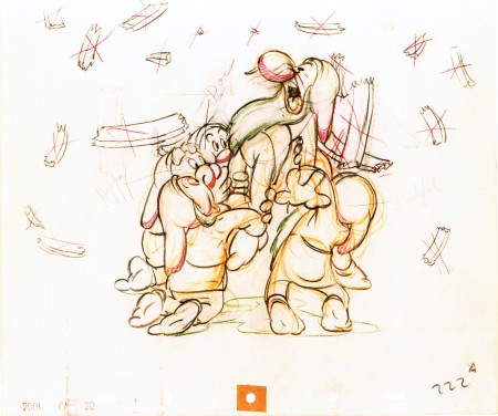
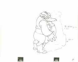
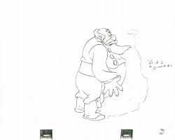
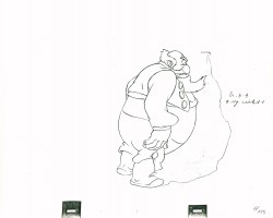
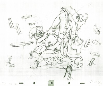
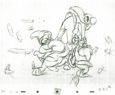
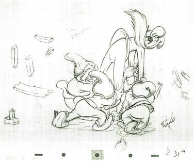
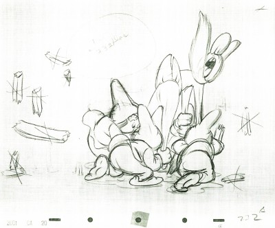
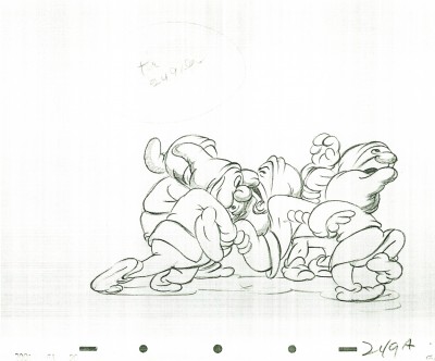
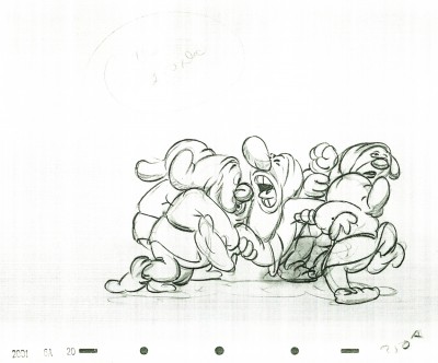
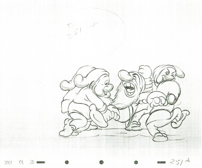
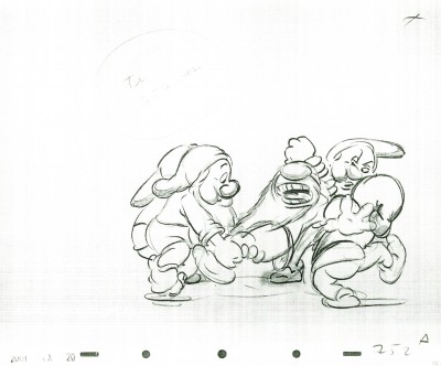
Here is a scene from Snow White, animated by Bill Tytla, in which four of the dwarfs fight Grumpy. The drawing above is the first of these drawings and it shows what it looked like in color – lots of red pencil notes, yellow pencil for rough structural lines. The rest of the drawings I have are B&W copies.
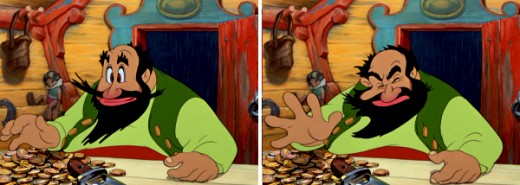
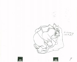
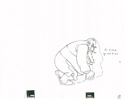
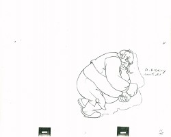
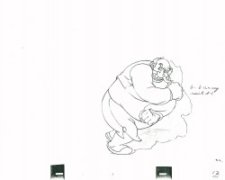
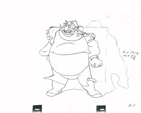
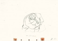
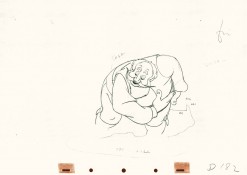
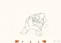
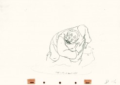
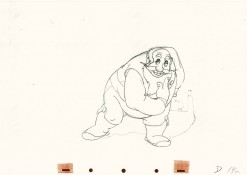
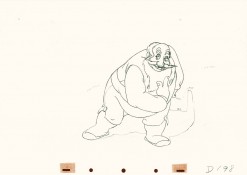
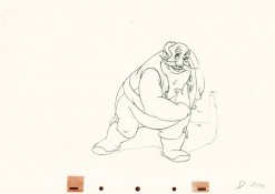
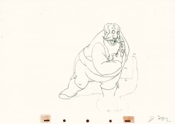
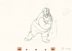
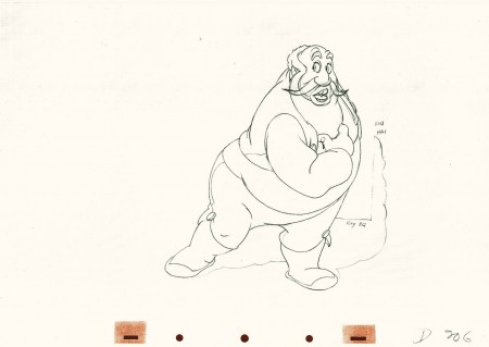
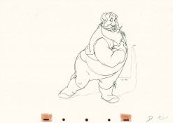
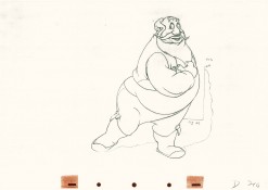
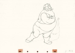
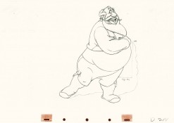
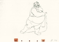
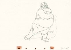
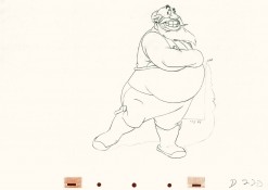
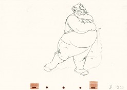
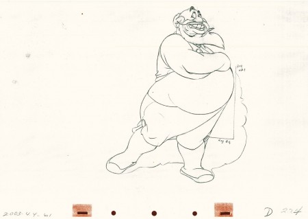
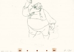
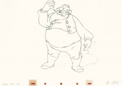
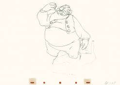
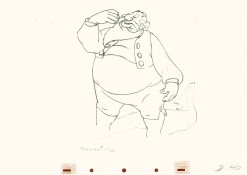
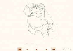
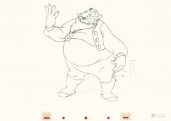
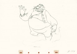
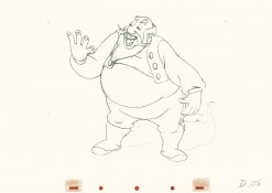
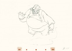
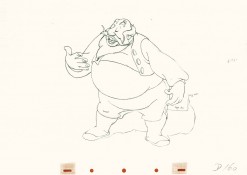
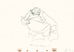
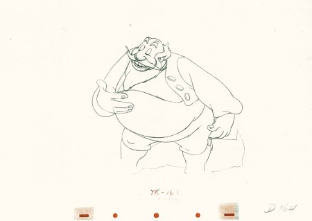
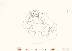
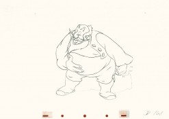
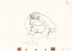
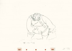
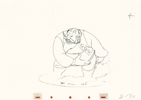
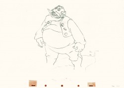
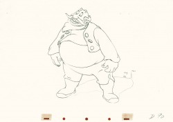
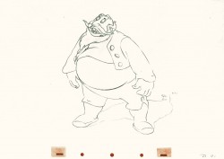
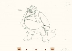
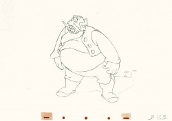
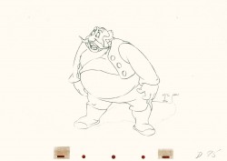
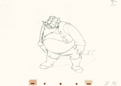
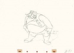
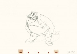
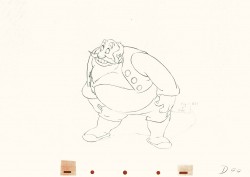
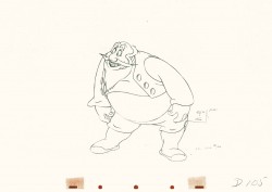
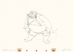
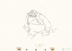
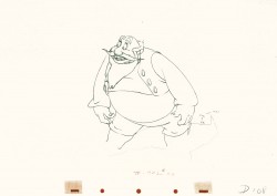
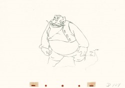
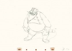
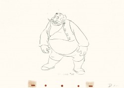
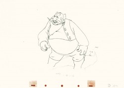
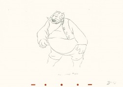
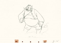
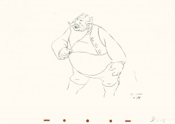
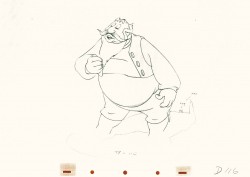
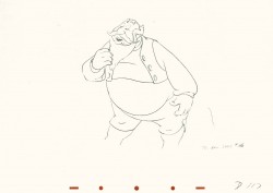
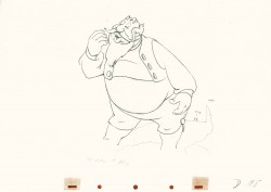
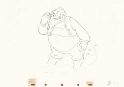
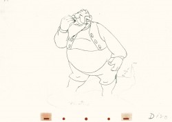
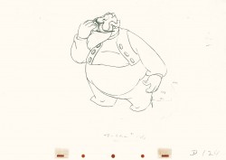
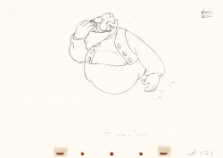
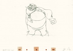
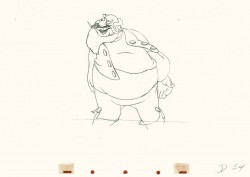
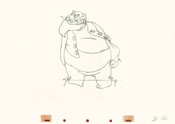
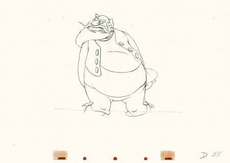
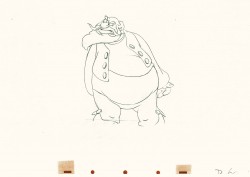
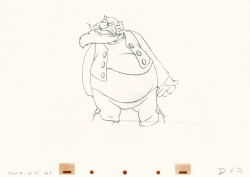
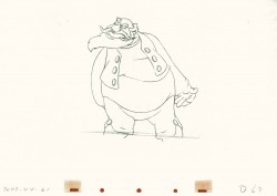
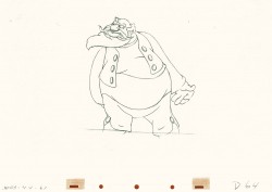
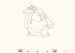
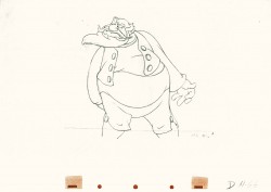
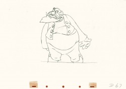
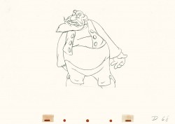
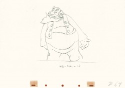
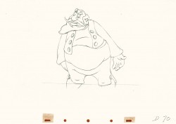
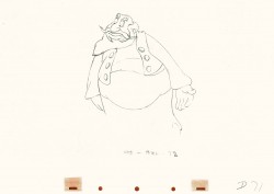
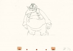
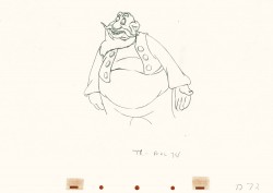
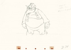
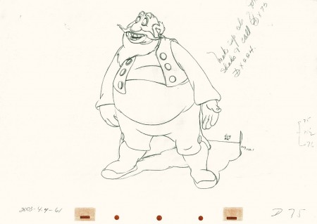
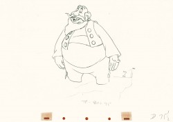
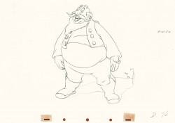
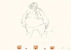
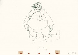
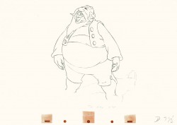
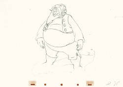
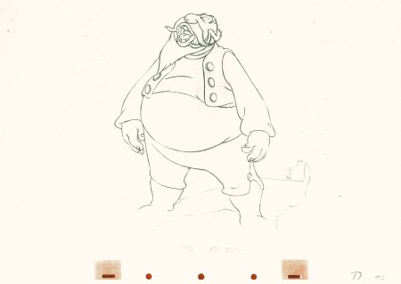
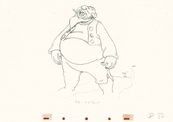
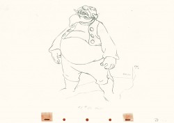
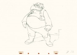
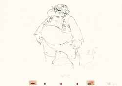
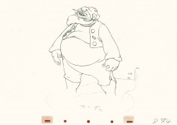
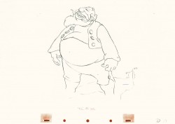
One of the things about Tytla’s work that I just love is the built in distortion he does to the characters. Check out Happy’s face (upper left) in drawing #227. Or Grumpy’s face in #260. They’re beautiful, and when the animation is moving, the distortion doesn’t show. He did as much with Stromboli. I’m convinced this is one of the ways he pulled the inner character out, trying to get Stanislavski’s theories into animation. It’s wonderful.
By the way, if you like this material check out Hans Perk ‘s site. Tytla talks about dealing with forces vs. forms in animation. This is what Tytla was all about in animating.
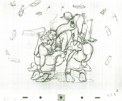 222
222(Click any image to enlarge.)
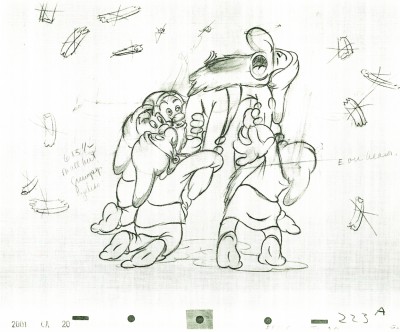 223
223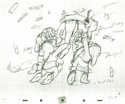 224
224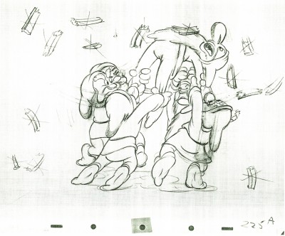 225
225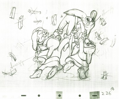 226
226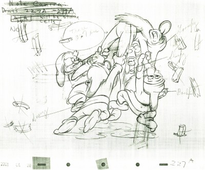 227
227Check out Happy’s face on this inbetween.
Then check out Tytla’s drawing (the next one) of Happy.
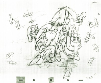 228
228
Tytla marked his own drawings with an “X” in the upper right corner.
The other drawings are the work of inbetweeners. The writing looks
to be all the work of Tytla.
 229
229
 230
230
 231
231
 232
232
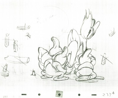 233
233
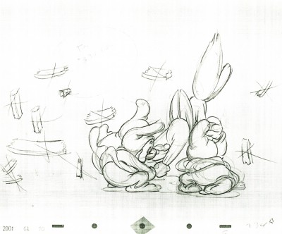 234
234
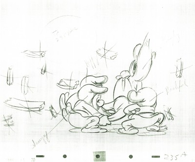 235
235
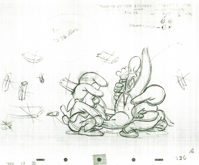 236
236
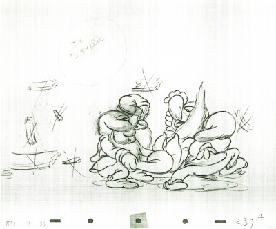 237
237
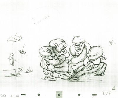 238
238
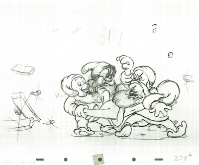 239
239
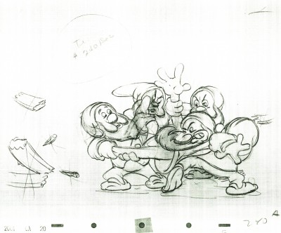 240
240
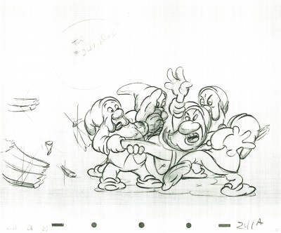 241
241
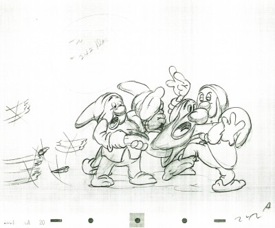 242
242
Some of these drawings are just hilarious in their own right.
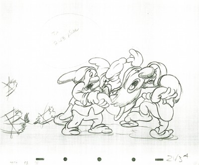 243
243
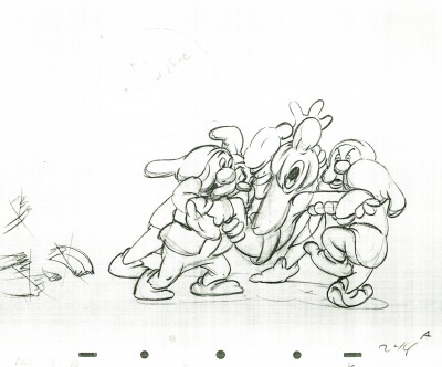 244
244
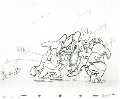 245
245
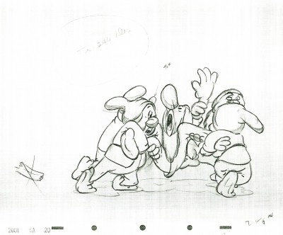 246
246
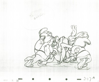 247
247
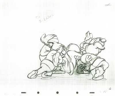 248
248
 249
249
 250
250
 251
251
 252
252
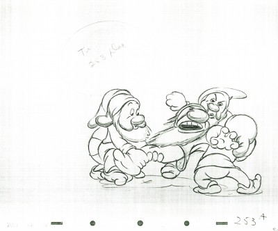 253
253
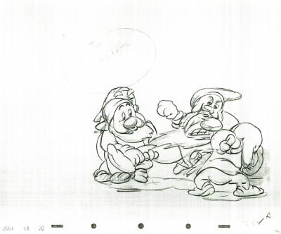 254
254
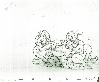 255
255
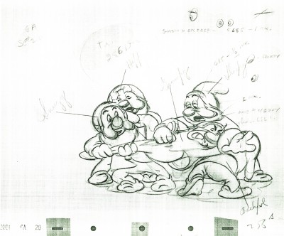 256
256
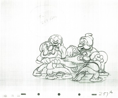 257
257
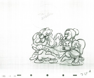 258
258
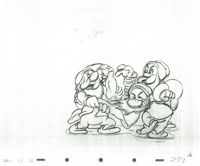 259
259
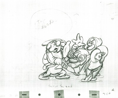 260
260
Animation &Disney &Frame Grabs &Layout & Design 20 Jun 2011 06:56 am
Pinocchio – Multiplane
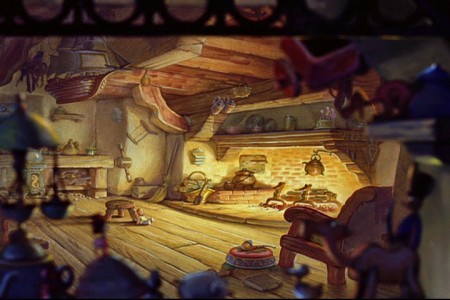
- In highlighting the use of the multiplane camera in Disney’s animated films, the pinnacle has to be Pinocchio. Two specific scenes jump out in any mention of the multiplane camera: the move in to Gepetto’s workshop and the awakening of the village.
So let’s get right into it:
Sequence director: Ham Luske
Layout by Hugh Hennesy
Animated by “Music Room 2″
 1
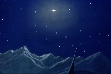
1Start in the sky with the wishing star that will play
a large part in the film in a couple of moments.
 2
2
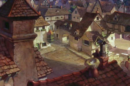
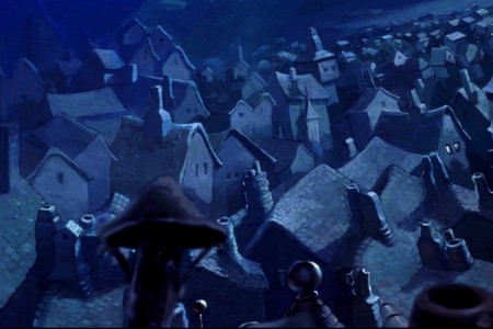
Circle down from the sky field to an overhead of the village.
 3
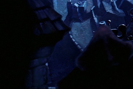
3
Continue moving down over the rooftops.
 5
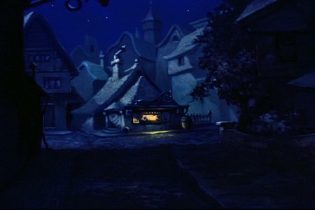
5
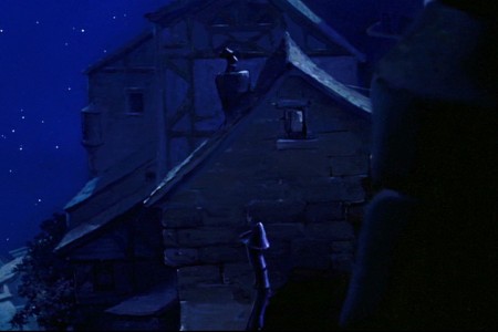
We first see Gepetto’s workshop from a distance.
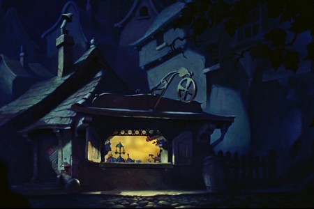 6
6
There’s a matching cut and we continue to move in.
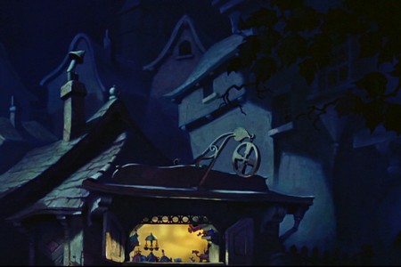 7
7
The POV of the camera is through Jiminy’s eyes.
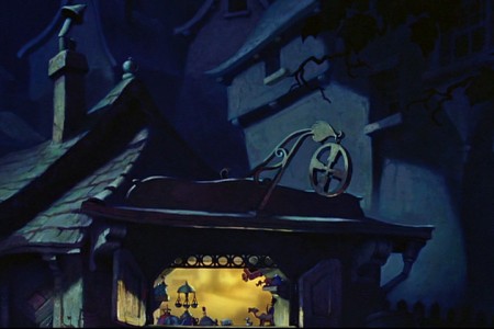 8
8
When he moves in, it’s in hops.
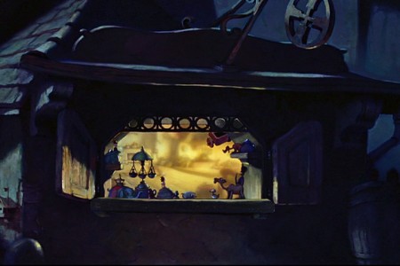 10
10
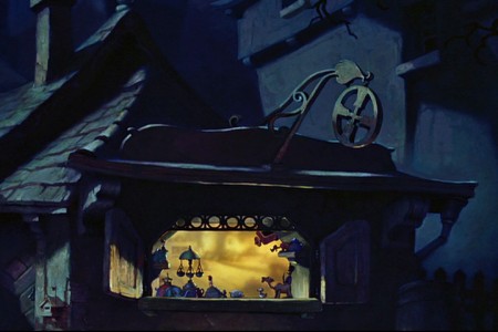
Leaps and bounds as he (through our camera’s eye) gets closer.
 12
12
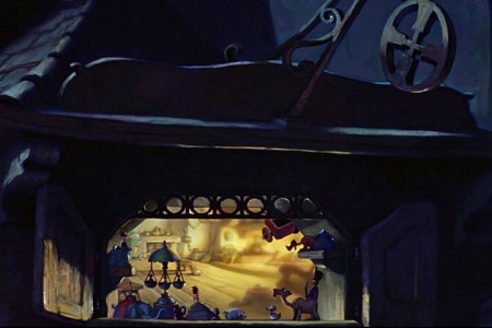
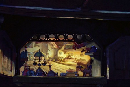
The warm window into the workshop begins to fill the screen.
 15
15
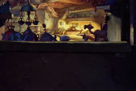
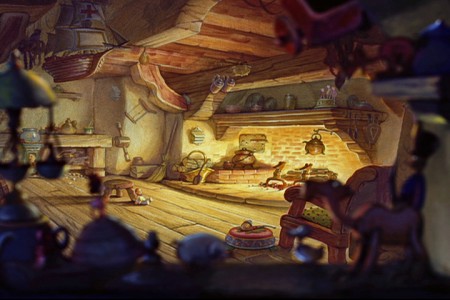
. . . looking into the workshop through the window.
 16
16
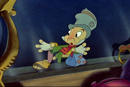
Cut to an interior shot – the interior side of the window.
Jiminy Crickey, with hands and face up to the glass.
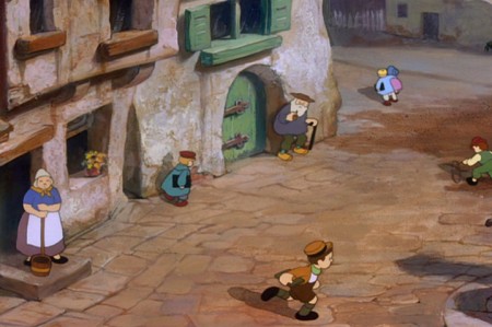
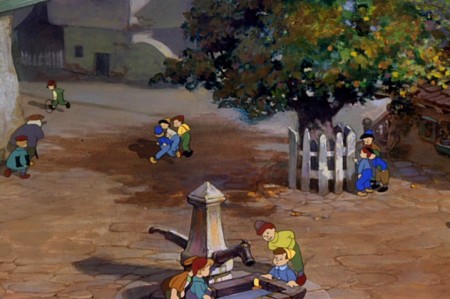
Then we move onto a miracle of a shot that would be hard even for computer users. Today, we wouldn’t anchor the feet properly on all those kids walking and running about. It’s an amazing piece of animation history.
The sequence director was Wilfred (“Jaxon”) Jackson.
Layout by Thorington C. “Thor” Putnam.
The animators involved in this scene include: John McManus, Jack Campbell, Cornett Wood, John Reed, Art Babbitt, Milt Kahl, Don Lusk, and Sandy Strother.
 1
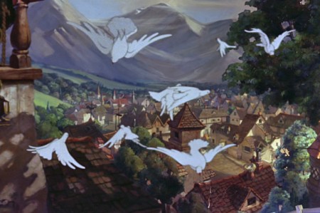
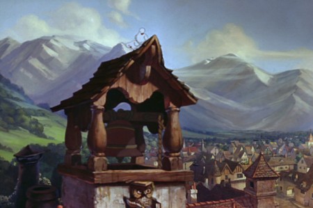
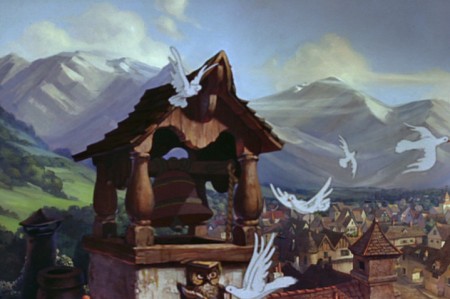
1The camera starts at the bell tower over the sleeping village.
 2
2
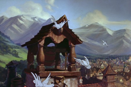
Doves fly out as the bell starts to chime.
 3
3
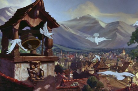
The birds fly out of focus as they move forward.
 4
4
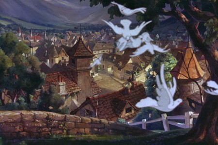
This allows the camera to start the big move
with the birds covering the tower.
 6
6
The camera pushes in to cross the
little footbridge to enter the town.
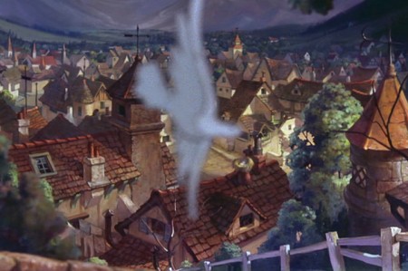 7
7
The last bird leaves us, and . . .
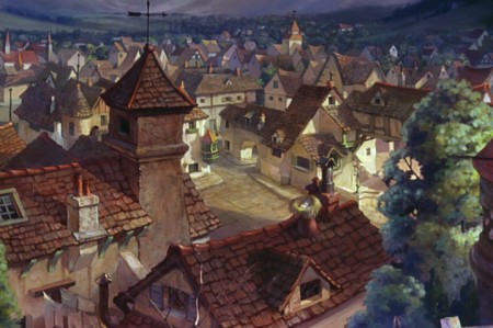 8
8
. . . we’re into the village.
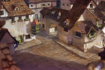 10
10
We move in toward the cross section of the town . . .
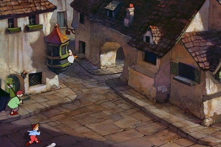 11
11
. . . as people start to come out of their houses.
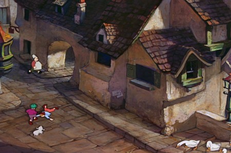 12
12
The camera moves to the right.
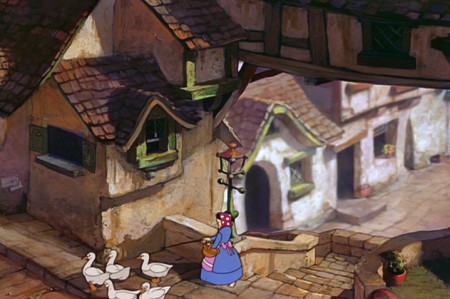 13
13
We move toward a woman with geese as the
camera goes under an overpass.
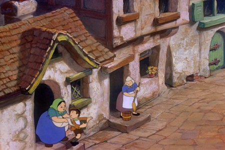 15
15
We head a few steps down as more
chldren come out running to school.
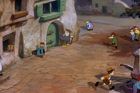 17
17
The camera continues to the right
seemingly led there by one running boy.
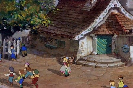 19
19
. . . reaching Gepetto’s house.
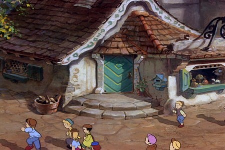 20
20
The camera moves in on the house.
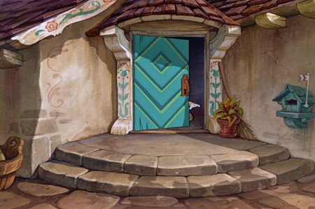 21
21
At this time we cut in and the big-time animators take over.
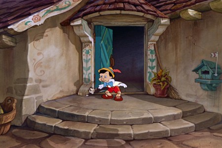
Milt Kahl handles Pinocchio, Art Babbitt does Gepetto, Don Lusk animates Figaro.
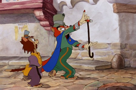
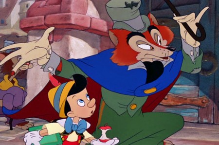
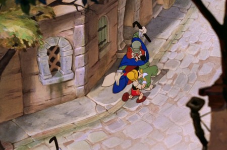
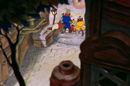
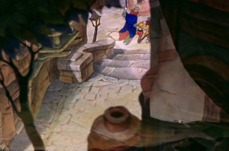
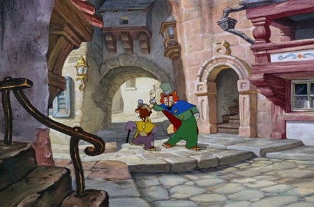
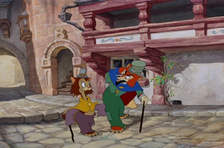
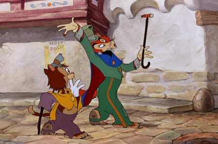
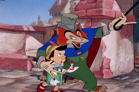
Although there are numerous beautiful scenes from Pinocchio that employ the multiplane camera, there’s one last sequence I’d like to concentrate on. This is where J. Worthington Foulfellow (“Fox”) and Gideon the cat cajole Pinocchio into following them so that they can sell him to the puppetmaster, Stromboli. This is a particularly interesting scene for the multiplane camera.
The sequence director was T. Hee.
Layout by Ken O’Connor.
The animators involved in this scene include: Ugo D’Orsi, Jack Campbell, Hugh Fraser, Charles Nichols, Marvin Woodward, Preston Blair, Milt Kahl and Charles Otterstrom and
Phil Duncan.
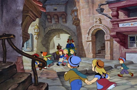 1
1The multiplane camera scene is several away from this,
but I feel as though this scene really sets up the big one.
 2
2
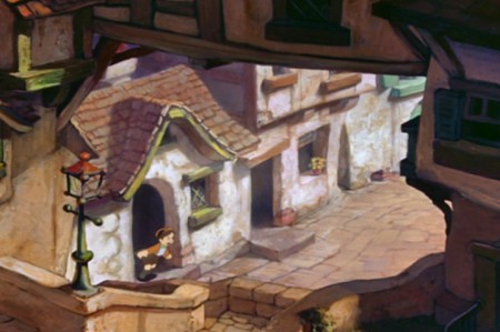
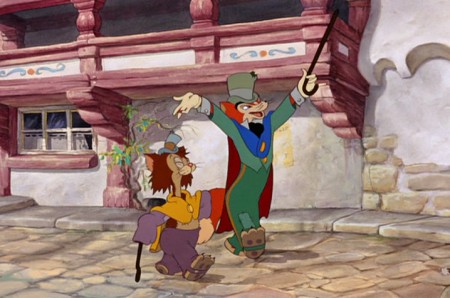
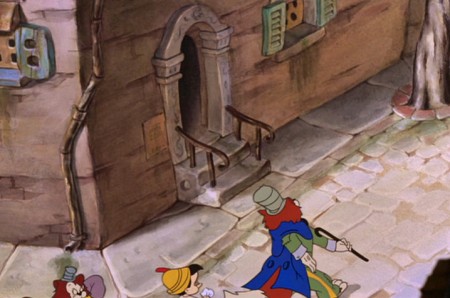
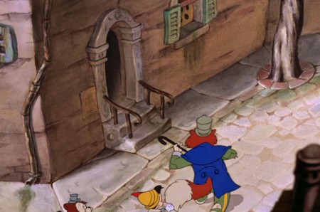
We properly meet the fox and cat as they walk through the town.
 3
3
They are well into conversation.
 5
5
The fox picks up a cigar stub, telling us about their financial state.
 7
7
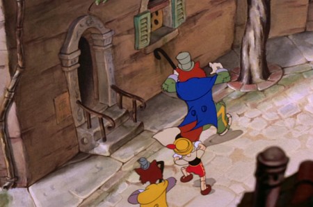
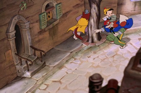
Several short scenes later, they run into Pinocchio and
coax him away from school to follow them to the theater.
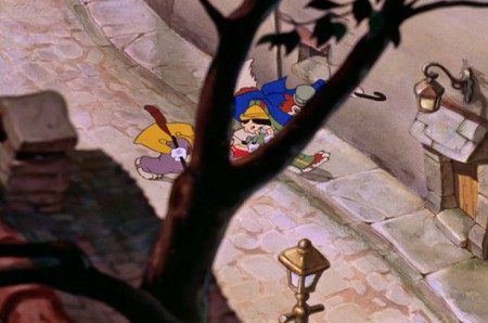 9
9
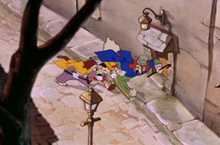
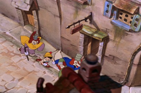
This cuts into the overhead multiplane shot.
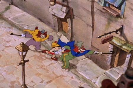 11
11
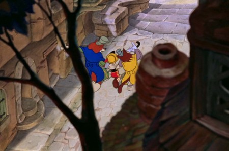
We watch from overhead with trees and ornaments
marginally blocking our vision of the characters.
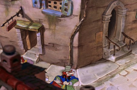 13
13
They turn a corner and the camera follows them.
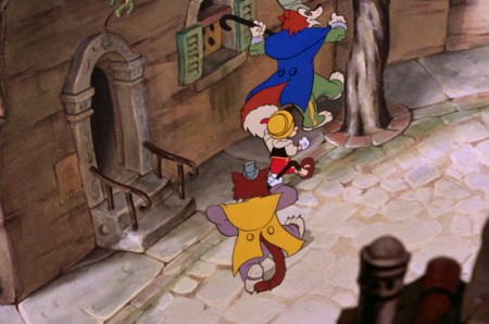 17
17
A quick circling of the tree.
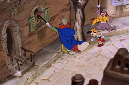 19
19
They do it again, but . . .
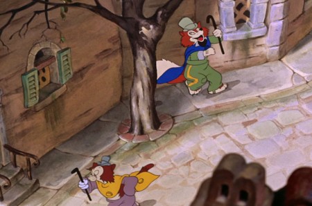 20
20
. . . Gideon the cat continues forward moving off screen.
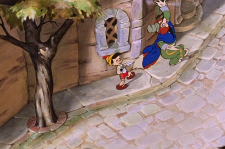 21
21
The fox and Pinocchio continue on the path.
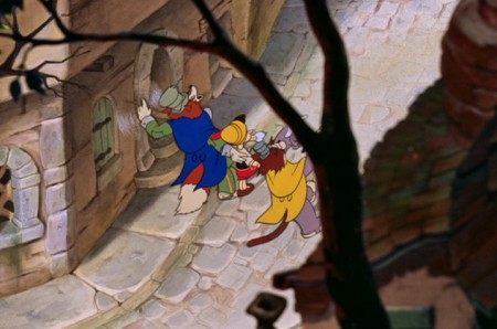 23
23
. . . catching up with them.
 24
24
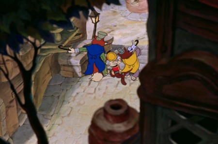
We view them through a tree and the side of a building.
 25
25
They go up several steps, but the camera stops.
 28
28
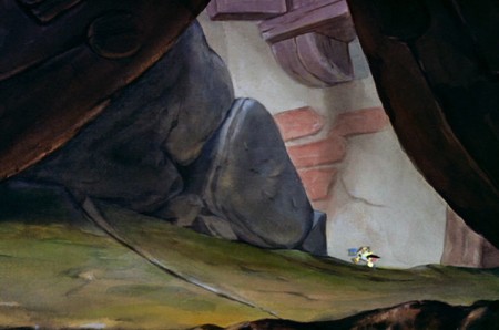
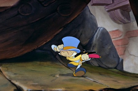
. . . the next scene, Jiminy Cricket is running. He’s late trying
to catch up to Pinocchio, thinking he’s on the way to school.
 29
29
Jiminy is animated here by Phil Duncan.
David Nethery correctly points out in the comment section,
that Milt Kahl animated this scene.
Animation &Commentary 15 Mar 2011 07:35 am
The Insanity Defense
- Mike Barrier recently posted two interviews on his website: Robert McKimson and John Hubley. On Saturday, I added a few small comments about the interviews. This caused a couple of comments from readers who got into the McKimson interview with some strong statements about McKimson’s treatment of animator, Rod Scribner. Scribner had taken a 3 year break from animating to treat his Tuberculosis. When he came back to the studio, he no longer was able to work in Clampett’s unit – he’d left the studio -, so Scribner found himself, ultimately, in Robert McKimson’s group. Seen as a wild animator by McKimson, Scribner was molded into something much less violent. It seemed the juice was taken out of his animation.
The question was whether it was the TB, heroin, electric shock therapy, or just McKimson that caused this enormous change in Scribner’s style. If we go back to the interview, I think we can find the answer. In McKimson’s words:
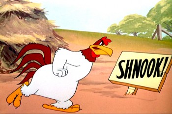 I had one animator, who thought he was better than he was, and I’d just flip it through, and I’d say, well, this has got to be changed, it won’t work this way. He said, “I think it will.” I said, “All right, Rod [Scribner], you go and test this”—cheap negative testing—”and we’ll run it on the movieola, and I’ll show you what I mean exactly.” He said, “All right, but I know it’s right.” Every three to six months, he’d come up with one of these things. So I’d just tell him to go ahead and shoot it. We’d put it on the movieola and run it through and through, on the loop; every time, he’d say, “Yeah, yeah, I see what you mean.” And then the next time, he’d say, “Well, I think it’s right.” But that was the only way it worked against me. I had to take guys with a little less ability and try to make something out of them.
McKimson, the director, couldn’t work with the strong presence of Scribner – in fact he saw it as bad animation – and had to train Scribner into settling down to a less noticeable style of movement. Perhaps, Scribner was well ahead of his time and McKimson was behind the times?
The two animators I see closest in style to what Scribner did were Bill Tytla and Jim Tyer. All three worked in very different ways, and Scribner had more in common with Tytla and Tyer than Tytla and Tyer had with each other.
I believe there are two very different styles of animation: in one, all movement and thought is designed for the development and construction of the character; in the other, 2D animation is seen as a graphic challenge, and the shape and graphics of the character are above and beyond even the character, itself.
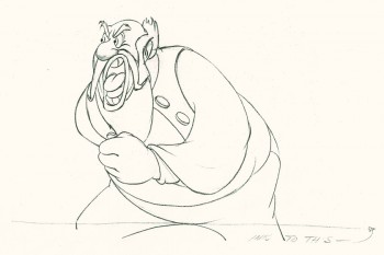 Bill Tytla worked at Disney for all his famous years. Within those walls the character was EVERYTHING. Tytla found that by distorting the character, in a very malleable way, he was able to accent traits of the characterization he was aiming for. Hence, a Stromboli would completely distort between two poses to accent a bit of violence. The character would come back together, on model, as soon as the strong gesture was made. Normal viewers, not looking for the distortion, didn’t see it but probably felt it. The strength of the movement was successful. I think Tytla saw this as a way of getting his animated character into the model Stanislavsky had suggested. This theory of acting was just starting to break through the Hollywood gates.
At least, this is my theory. John Hubley once told me that “… a small group of them at Disney were strongly into Stanislavsky. The rest,” he said, “couldn’t spell it.” I know that Hubley and Tytla were friends as was John Hench, and I’m sure they are who he meant. All you have to do is look at the Devil in NIGHT ON BALD MOUNTAIN for obvious evidence of this.
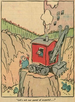 Rod Scribner seemed to have an innate sense of this, but took it a bit further. I don’t think he thought of Stanislavsky, but he did think of graphics. In Barrier’s masterpiece of a book, Hollywood Cartoons, he tells a story about Scribner and Clampett. Apparently, Scribner approached Clampett and asked if he could introduce a “Lichty” style into his animation.
George Lichty was a well-known comic strip cartoonist (Grin and Bear It) who had a very loose, linear style. Scribner, obviously, was going for a two dimensional graphic style that he thought would work well in animation. Clampett understood what Scribner wanted and decided when to go along with it. It would take some careful editing to get it to work. Consequently, Clampett would reserve specific scenes and times to use the style which Scribner developed for those particular scenes the director gave him.
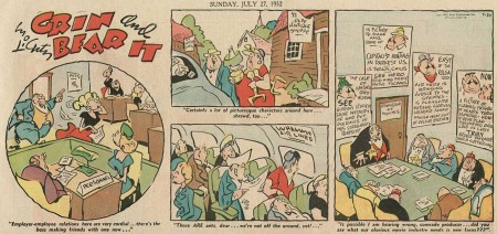
Lichty’s style
Consequently, Clampett was using Scribner, just ast Tytla designed for himself, getting the most out of the graphics without calling attention to the wild change in stylization. This first appeared in A Tale of Two Kittens then in Coal Black and de
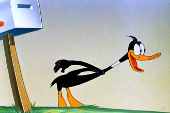 Sebben Dwarfs. For me, The Great Piggy Bank Robbery is one of the highlights of this wild style as Daffy Duck transforms violently before our eyes – for frames only – before returning to himself. Even then, it isn’t quite the same Daffy that other animators drew. The two, Clampett and Scribner, used it outrageously in many of their films together; some work, some don’t.
Robert Mckimson was a mundane and lackluster director who, quite frankly, didn’t understand the stylization that Clampett and Scribner had developed. It’s no wonder McKimson broke it out of Scribner’s art when he became the director. To him it was just distortion, for its own sake.
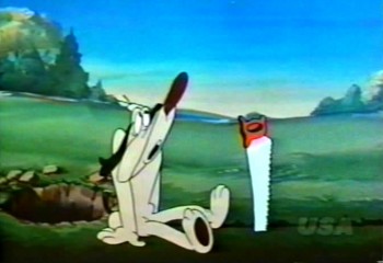 Jim Tyer was a different animal. His distortion seems to be completely and wholly graphic. He doesn’t use it to develop a character; he uses it as the embodiment of the character. The character starts off-model and goes from there wildly and totally beyond the model sheet. It’s wholly graphic embellishment, and character be damned. This is something that Bill Tytla would have disliked, and many others within Terry’s studio as well. I remember Johnny Gentilella telling me that they couldn’t keep Tyer on model. Another assistant animator told me it was a hell of a job for her to bring Tyer’s character back, closer to the model sheet. I can imagine.
All three of these animators have gained fame in the current state of the art. Young bloggers post frame-by-frame detailed distortions by Tyer, animators break down Scribner’s work with Clampett to see how exactly he did it. Tytla’s work is praised to the hilt drawing by drawing with delight taken in every distortion.
I have to say that I have always been a fan of Tytla’s and Tyer’s work. When I started doing animation professionally, I found people praising Tytla and putting down Tyer. I kept my love of Tyer secret. Over time, I grew to love Scribner. With all three I studied their animation frame by frame over and over. I was pleased that the folk who did The New Adventures of Mighty Mouse on CBS had found Tyer and used him as a model. To me it was the perfect model for series animation, and, no doubt under the influence of Ralph Bakshi they glorified their model.
It is interesting how many try to imitate the styles of all three and very few approach the level of any of them. I hope those imitators keep triying. To me, it’s the essence of 2D animation, and perhaps within this graphic medium one of those imitators will break through and we can relish such achievements. Achievements which are virtually impossible in the puppet-computer animation of Pixar and Dreamworks. But within that imitator, 2D animation will stay alive.
A couple of screen grabs were borrowed from the sites of
Thad Komorowski and Kevin Langley. My appreciation and thanks.
.
Animation &Animation Artifacts &Disney 04 Aug 2010 06:21 am
P&W-Kimball Scene – 8
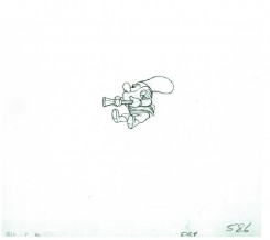
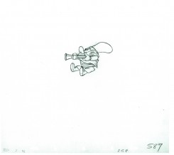
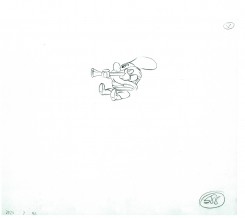
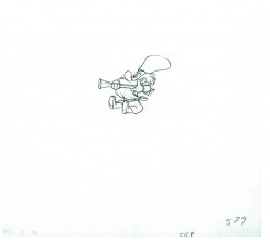
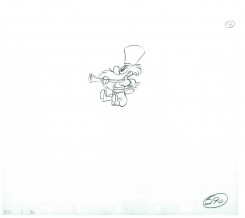
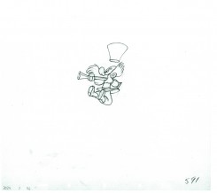
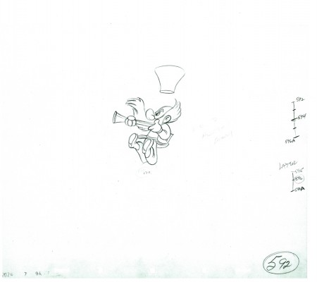
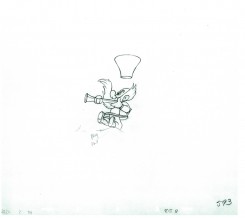
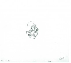
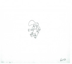
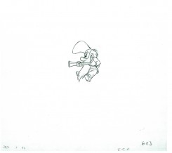
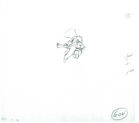
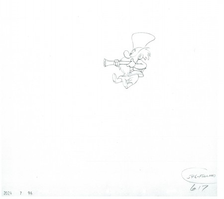
- Production #2024, MAKE MINE MUSIC, “Peter and the Wolf”. Sequence 7, Scene 96. Animator: Ward Kimball.
Completing the post of the little guy on the separate level, here are the final drawings of the scene. There are other levels of snow animation and footprint animation, but I won’t post those. This scene was large enough.
As usual, we start with the last drawing from last week’s post.
Enjoy.
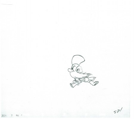 581
581
The following QT movie represents all the drawings of the bottom level
as well as the drawings of the Little Guy, on another level,
who comes in and out where he should.
I exposed all drawings on ones.
Right side to watch single frame.
To see the past five parts of the scene go to:
Part 1, Part 2, Part 3, Part 4, Part 5, Part 6, and Part 7.
My thoughts on this scene – just my opinion
I’m pretty disappointed in what I’ve seen here. The work has the obvious flair and panache of a typical Ward Kimball scene. The movement is funny and creative. Kimball did his work. The assistants were out to lunch.
The drawing in the scene is not the top notch material I’d expect of a Disney team. Seeing it drawing by drawing I get to see what I don’t like from a lot of the work in this period. The drawing just changes and doesn’t live up to the originals. Just looking at the fingers you get to see them turn into, what we in NY call, “Banana fingers” – they flatten out. This is part and parcel of the work at Terrytoons or Paramount, but we’re talking Disney here. You wouldn’t catch that in Sleeping Beauty or Bambi or Dumbo or Snow White or 101 Dalmatians. But it’s there in these compilation features.
Now going through the many drawings I’ve posted by Bill Tytla, I notice a distinct tie to Terrytoons. In the dwarves and especially in Stromboli a soft roundness comes into his drawings (and the assistant keeps it) at times. It’s probably the influence of Connie Rasinski while Tytla was there. It isn’t a bad thing, it’s certainly part of the style Tytla brought to his work. He took something good from Terry (the bottom) and brought it to Disney (the top), and he made it work into something glorious. If anyone was an artist in animation, it was Bill Tytla. But that isn’t what I’m talking about with the work in this Kimball scene.
All right the schedule was probably ridiculously tight – it was – and the budget was probably underbudgeted – it was. But I remember Jack Schnerk (who assisted at Disney) telling me about the last six months of work on Bambi when work went into overdrive. Everyone was forced to work seven days a week and most slept on their desks to get it done. The work was so heavy he quit after the film was finished. But then that was pre-IATSE and the compilation features were not. That was also when Walt was intimately involved in the films and he was not so involved in the compilation films.
Something different: for some reason WordPress will not let me save the word “‘O’nion” (replace a “U” for the “O” and you’ll have the word I mean.) If I try to save a piece with that word in it, it erases the material. I’ve used IATSE in its place for this piece. This has gone on for the last year. Anyone with a suggestion?
Animation &Animation Artifacts 22 Mar 2010 08:01 am
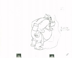
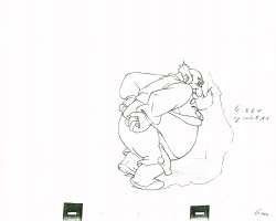
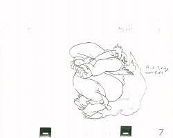
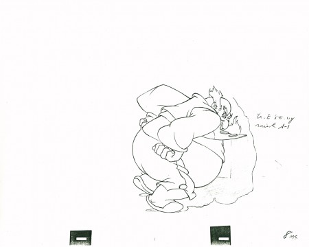
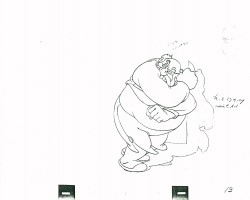
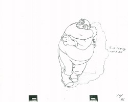
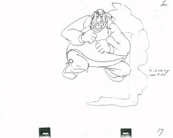
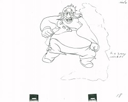
Stromboli Jump
- Here’s a scene all of 29 drawings in length, but if you check it out in the film it’s enormous. Everything’s moving – the wago they’re standing in, the pots & pans, things on the table and most definitely Stromboli who in one enormous drawing changes the scene, Pinocchio’s world and the mood in the audience. “Quiet!” is all the dialogue shouted in the scene. It”s frightening.
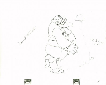
(Make sure you click to enlarge every drawing here.)
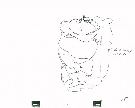 15
15
Closed position starting to open his body – legs first.
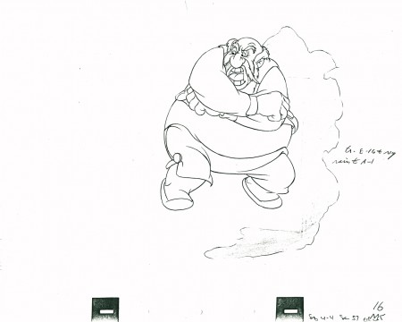 16
16
Pulling it all into a ball,
he shouts, “QUIET” – the dialogue for the scene
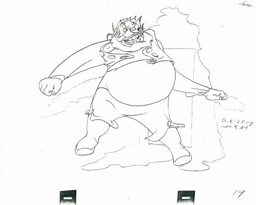 19
19
Couldn’t open up more than this.
Just look at the distortion in this drawing. Magnificent.
Open, loud, ready to burst. One frame only.
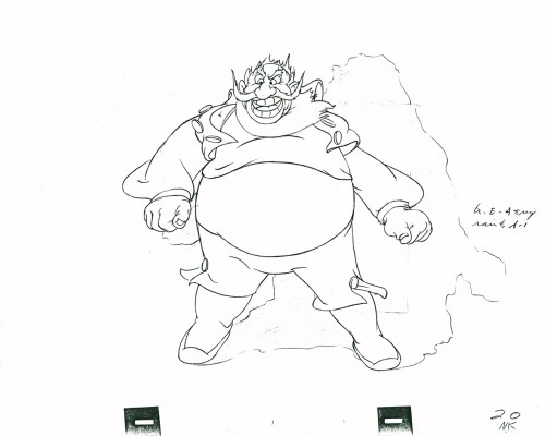 20
20
Next frame he’s landed and gathered himself.
Only the secondary action – vest, pants, beard –
echo the outburst.
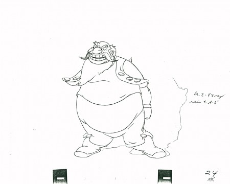 24
24
His clothes lag behind in pulling themselves together.
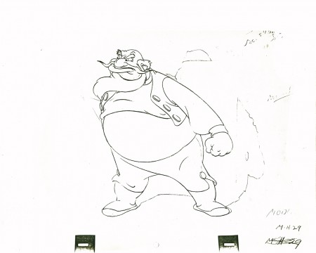 29
29
He’s set to give the demand and end the scene.
The following QT movie represents the entire scene from Pinocchio.
Click left side of the black bar to play.Right side to watch single frame.
Here are frames from the actual scene:
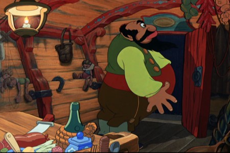 1
1.
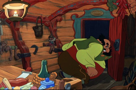 8
8.
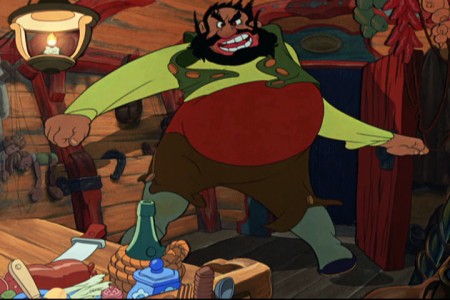 19
19.
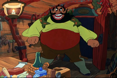 20
20.
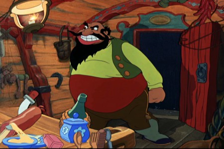 26
26
What a difference the shake of the coach and the
bounce of the hanging utensils make to the scene.
There’s danger everywhere, here.
It’s scary.
Many thanks to my friend, Lou Scarborough, for the loan of this scene.
Animation Artifacts &Bill Peckmann &Disney &Story & Storyboards 16 Sep 2009 07:31 am
Pinocchio Bd
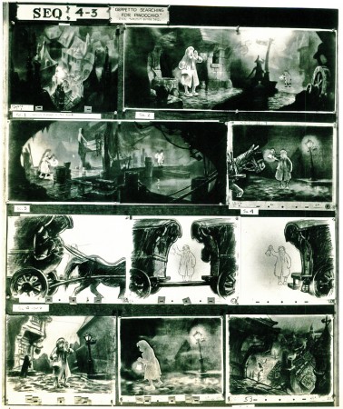
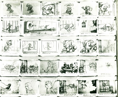
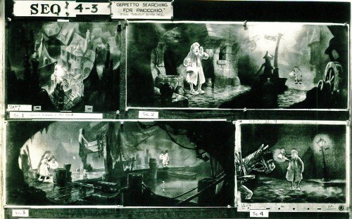
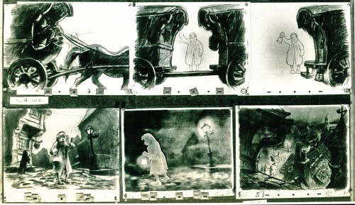
- Here are a couple of Pinocchio storyboard sequences from the collection of Bill Peckmann. The boards are stated in a relatively small format. I’ve scanned them in at a high res and am placing them here in smaller sections so that they’re legible – at least in the blown-up versions.
Pinocchio is duped by some cads. These are the three full sized boards which take us through the nose-grows sequence (minus Stromboli).
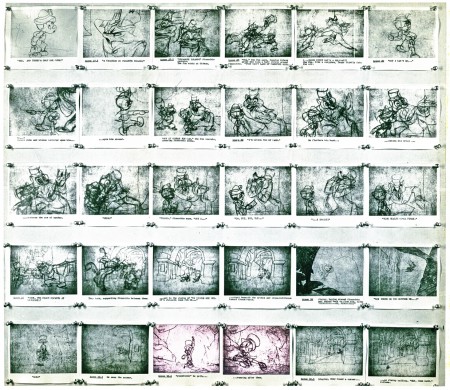
(Click any image to enlarge.)
Now here are those same three boards broken into sections.
 11a
11a
Of course, if we’re talking about studying Pinoochio, I have to direct you back
to the drafts on Hans Perk‘s great site and
the mosaics on Mark Mayerson‘s equally excellent blog.
Animation &Animation Artifacts &Disney 01 Jul 2009 07:55 am
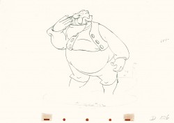
Stromboli – Part 5
- This is Part 4 of this large scene by Bill Tytla of Stromboli.
Part 1 saw a frenetic anger from Stromboli;
Part 2 he caught himself to get a hold on his emotions.
Part 3 he slowed down and prepared for the kiss (a break)
and the bow featured in Part 4.
This final part is on twos, as he slowly slowly moves across in the bow and gets up to salute.
It’s obviously beautiful work and a gem of scene.
There’s no doubt the key Assistant had a lot to do with the final scene as displayed here. Tytla had enormous respect for his clean up assistants and gave such credit. (You can read it in the Action Analysis class, posted on Hans Perk’s A Film LA site.)
-
“The first assistant must know as much as possible about animation. I think first assistant’s experience is the most practical way to get animation – you have everything that the animator has been working on – his exposure sheets, drawings, etc., and you know what he is trying to do.”
David Nethery has added the soundtrack from the final film and synced it up to this Pencil Test here.
We pick up the rest of the scene with the very next drawing.
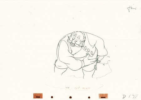 178
178(Click any image to enlarge.)
Here’s the final QT of it all together:
Stromboli
Click left side of the black bar to play.
Right side to watch single frame.
Animation &Animation Artifacts &Disney 24 Jun 2009 08:19 am
Tytla’s Stromboli – 4
- This is Part 4 of this large scene by Bill Tytla of Stromboli.
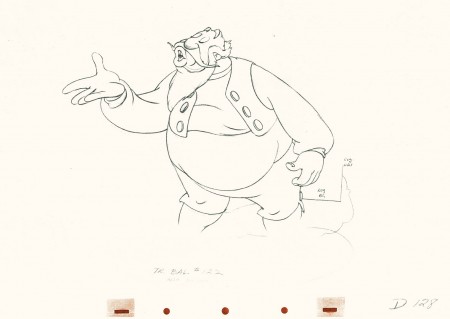
Part 1 saw a frenetic anger from Stromboli; Part 2 he caught himself to get a hold on his emotions. Part 3 he slowed down and prepared for the kiss (a break) and the bow upcoming in this, Part 4. Much of this part is on twos, as opposed to part 3 all on ones.
This is animation tour de force and there’s one part left to go next week.
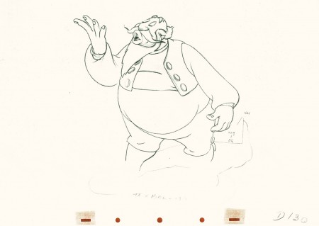 130
130(Click any image to enlarge.) The full scene with all drawings.
Click left side of the black bar to play.
Right side to watch single frame.
Animation &Animation Artifacts &Disney 17 Jun 2009 07:39 am
Tytla’s Stromboli 3
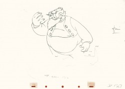
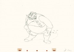
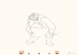
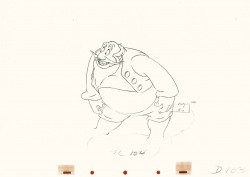
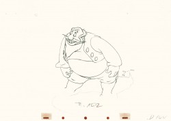
- This is part 3 of this large scene by Bill Tytla of Stromboli. The scene started in Part 1 with thoroughly frenetic anger from Stromboli. In Part 2 he tries to catch himself and get a grip on his emotions. Here in Part 3 he moves slowly and takes a 180° turn from where he started. The line against the curve. All this while playing out the lines from the scene. The drawing is stunning, the motion is brilliant, and the acting is the best animation has to offer. Those hands are just great; look at 126.
I pick up with the last drawing from Part 2.
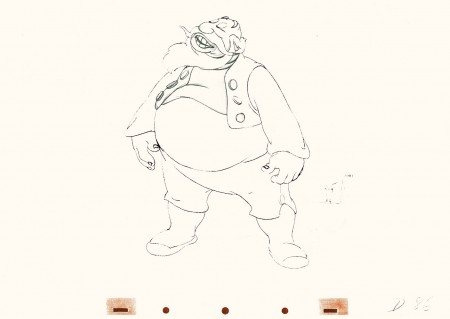 86
86(Click any image to enlarge.)
 87
87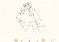 88
88
Tytla made sure he firmly planted Stromboli’s feet (in part 2)
before he attempted this firm bow.
 101
101
He’s made a solid line of the back, the strength of this move,
by using the left arm held firmly in place.
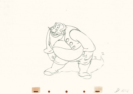 102
102
This is the bottom of the bow, now he goes back up.
 104
104
All of the shapes change naturally in the bow, though it looks
as if it remains a solid. No noticeable change. Solid weight.
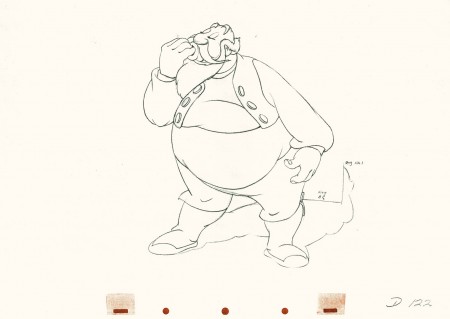 122
122
Watch the timing on the hand from here to #128
as Stromboli blows a kiss.
Many an animator today would pop it and call it animation.
Click left side of the black bar to play.
Right side to watch single frame.
Animation &Animation Artifacts &Disney 10 Jun 2009 07:34 am
Tytla’s Stromboli 2
This note arrived from Borge Ring after my first post Bill Tytla’s scene featuring Stromboli’s mood swing:
- The Arch devotees of Milt Kahl have tearfull misgivings about Wladimir Tytla’s magnificent language of distortions. ‘”Yes, he IS good. But he has made SO many ugly drawings”
Musicologists will know that Beethoven abhorred the music of Johan Sebastian Bach.
yukyuk
Børge
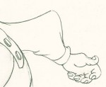
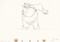
My first post spoke a bit about the distortion Tytla would use to his advantage to get an emotional gesture across. It’s part of the “animating forces instead of forms†method that Tytla used. This is found in Stromboli’s face in the first post. In this one look for this arm in drawing #50. It barely registers but gives strength to the arm move before it as his blouse follows through in extreme.
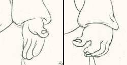 There’s also some beautiful and simple drawing throughout this piece. Stromboli is, basically, a cartoon character that caricatures reality beautifully. A predecessor to Cruella de Vil. In drawings 76 to 80 there’s a simple turn of the hand that is nicely done by some assistant. A little thing among so much bravura animation.
Many people don’t like the exaggerated motion of Stromboli. However, I think it’s perfectly right for the character. He’s Italian – prone to big movements. He’s a performer who, like many actors in real life, goes for the big gesture. In short his character is all there – garlic breath and all. It’s not cliched and it’s well felt and thought out. Think of the Devil in “Night on Bald Mountain” that would follow, then the simply wonderful and understated Dumbo who would follow that. Tytla was a versatile master.
Here’s part 2 of the scene:
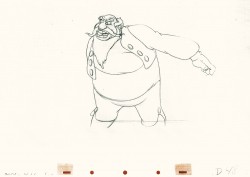 48
48 49
49(Click any image to enlarge.) The full scene with all drawings.
Click left side of the black bar to play.
Right side to watch single frame.
