Search ResultsFor "sleeping beauty"
Animation Artifacts &Articles on Animation &Disney &Illustration &John Canemaker &Story & Storyboards 29 Apr 2013 06:19 am
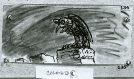
Sleeping Beauty Storyboard – seq 19
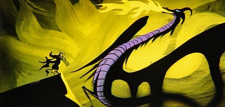
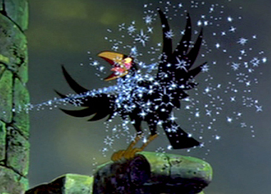 - John Canemaker had loaned me the final sequences of the storyboard to Sleeping Beauty, detailing the dragon fight and climax of the film. I originally posted this in three parts. I’ve combined them all here, making for one long post.
I’m not sure who did the artwork, but there’s a good chance it’s Ken Anderson‘s work.
As with past boards, I’ll post the whole photograph as is, then take it apart row by row so that you can enlarge them as much as possible. Here’s the storyboard sequence #19 from Sleeping Beauty.
The full board follows below:
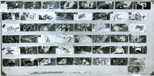
(Click any image to enlarge.)
The breakdown of that full board follows:
 1a
1a
Here’s the next full page of storyboard as is:
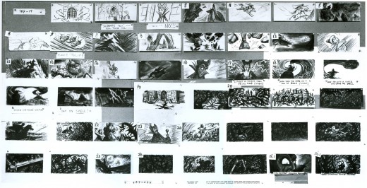
(Click any image on the page to enlarge.)
Again, I follow with the board broken up into segments, half a row at a time.
 1a
1a
This is this photo of the next page of the board as it came to me:
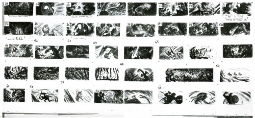
(Click any image to enlarge.)____________
Here are the rows of the board broken into two so that I can post them a bit larger.
 1a
1a
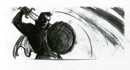
If only he knew what he was going to face next.
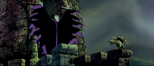
I’ve decided to get the frame grabs for the sequence and post them as well. I thought the comparison of board to actual film would be interesting.
__________
These images come from the “Special Edition” of the dvd, not the “Platinum Edition” now on the market. Using Hans Perk‘s posts of the drafts for these scenes, on his blog A Film LA, I was able to identify the animators’ names.

sc 82 (L) Milt Kahl – sc 82.1 (R) Frank Thomas

sc 82.2 (L) Kahl & Thomas – sc 82.3 (R) George Nicholas & Jerry Hathcock

sc 82.4 (L) Nicholas – sc 82.5 (R) Nicholas & Hathcock

Nicholas & Hathcock (L) sc 82.6

sc 84 (L) Ken Hultgren – sc 85 (R) Nicholas & Hathcock

sc 87 (L) Nicholas & Sibley – sc 88 (R) Nicholas & Hathcock

(L) Nicholas & Hathcock – sc 89.1 (R) Hultgren

sc 89 (L) Nicholas & Hathcock – sc 91 (R) Hathcock

sc 91 (L) Hathcock – sc 92 (R) SA sc 49 seq 8

sc 95 (L) Hathcock – sc 93 (R) Hathcock

sc 96 (L) Hathcock – sc 97 (R) Dan MacManus

(L) MacManus – sc 97.2 (R) Hathcock

sc 98 (L) Hathcock – sc 99 (R) Sibley

sc 100.1 (L) Hathcock – sc 101 (R) Les Clark & Fred Kopietz

sc 102 (L) Hultgren & Kopietz – sc 104 (R) Hathcock

sc 107 (L) Hathcock – sc 108 (R) Hultgren

(L) Hutlgren – sc 109 (R) Hathcock

sc 110 (L) Ollie Johnston & Blaine Gibson – sc 110.1 (R) Gibson

sc 110.2 (L) Johnston – sc 110.3 (R) Johnston & Gibson

sc 110.4 (L) Johnston – sc 111 (R) Johnston & Gibson
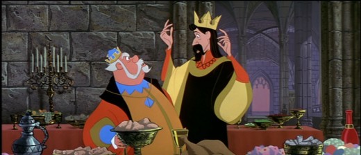
- Let’s end this post from Sleeping Beauty by posting a couple of drawings I have for the “Skumps” sequence. Again, Hans Perk on his blog A Film LA, posted the animator drafts for this sequence and I was able to I.D. the animators. (I have to say I guessed correctly in three out of four shots, so I’m pleased with myself.)
I’m posting closeups of the drawings. By clicking on any of them you’ll see the full sized animation paper. I’m also posting frame grabs beneath the drawings so you can see how they looked in the film.
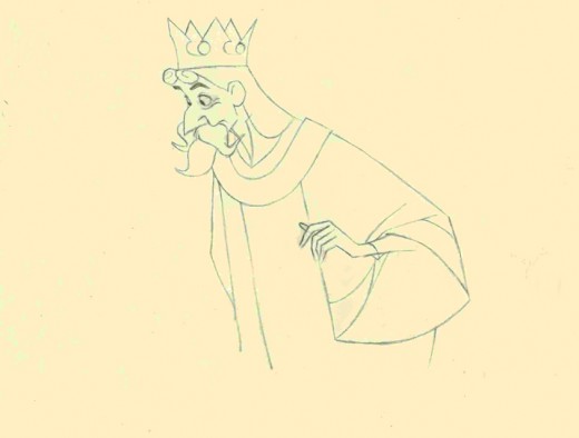
This is a Milt Kahl scene, seq 13 sc 8. This drawing is undoubtedly a clean up,
so it’s not one of Kahl’s drawings – just his pose. It’s an extreme.
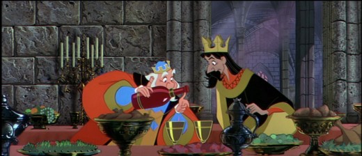
It is interesting that Kahl animated both characters.
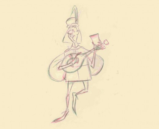
This is a John Sibley ruff. Seq 13 sc 17.
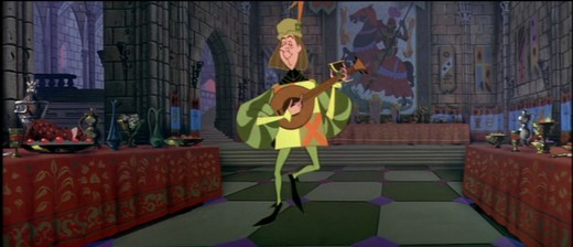
It’s a very odd, uncoordinated dance number by the drunk lackey.
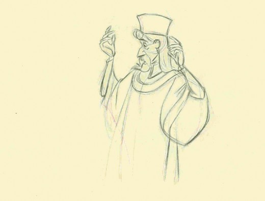
This is my favorite of these four. It’s a John Lounsbery ruff of King Stefan.
Another extreme from seq 13 sc 26.
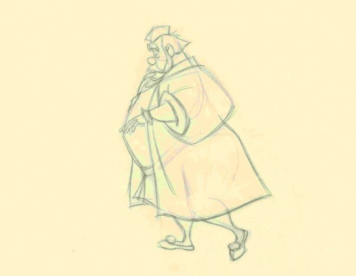
This is also another beautiful ruff by John Lounsbery. It’s King Hubert in the
very last scene of seq 13, sc 57.
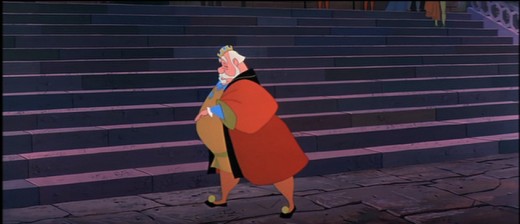
it comes just prior to Hubert’s turning and sitting on the palace steps.
Commentary &Layout & Design &repeated posts 14 Mar 2013 04:38 am
Tubby – looking back
Sometimes the bad films we work on leave the greater mark, and it’s good to look back, infrequently, to assess the damages.
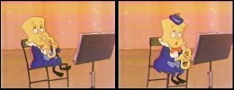
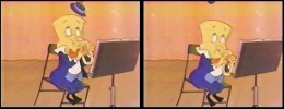
- I was reading the 1957 Disney Studio Directory posted on Joe Campana‘s site, Animation – Who & Where. when I came upon the name of Howard Diettrich. This threw me back to 1973 and Tubby The Tuba.
 I’d just been layed off at the Hubley Studio, after completing the first 20 (of 60) episodes of Letterman. Officially, I had been categorized as an “inbetweener” in the u-nion. I’d done everything from animate to ink at Hubley’s, but that was my category. I received a call from Johnny Gentilella. We’d met through Hubley, and he was now working for NY Institute of Technology. They were in the early stages of production on their feature, Tubby The Tuba, and I was offered the job of Assistant Animator, a categorical promotion.
NYIT was the school I’d graduated from and received my BFA; it was located in Old Westbury, Long Island – about an hour’s drive from Manhattan. It’d be interesting, returning to my old school just to see how it had changed. By taking the Long Island Rail Road, I was able to cut down that ride by a few minutes and leave the driving to someone else. I was picked up at the station and driven to the animation building, a small cottage on the campus. Everyone was out to lunch except for Johnny Gent(ilella), and he drove me (about a couple hundred yards) to meet Sam Singer, the producer recently hired to do the film.
 Singer had done all those Courageous Cat cartoons that had infested children’s programming back in the late 60s/early 70s. Oddly, I enjoyed them; I always was a glutton for bad animation. Love those cel flares, shadows, scratches and cel edges.
I was directed to his office. In there was another producer, Barry Yellin, who had broken his ankle and was on crutches. I got to meet the two of them and listen to them kibbitz around me, virtually ignoring me for a few minutes. Singer was chewing on a cigar, and I couldn’t take my eyes off the spittle that seemed to be moving down the cigar in his mouth. When I finally left to return to the animation building, I saw that Singer was also on crutches. He had a clubbed foot.
I sort of remembered that meeting as an omen of things to come. The entire place, while I was there, felt like it was on crutches.
I liked Johnny Gent a lot; we got along well at Hubley’s; on Letterman I got to mangle quite a few scenes by him as I learned how to inbetween properly.
There were only about 8 others at NYIT at the time. Other people I met included Walt Kubiak, another assistant who I enjoyed talking to; animator, Chuck Harriton, who I’d met at Hubley’s (and never really was crazy about); Lou Marcus who was filming the work on an Oxberry. Lou had gone back in animation for many years and had plenty of stories to tell. (See Andrew Marcus’ comment below.)
The person I most associated with was the editor of the film, Phillip Schopper. He was a young guy who took the LIRR everyday from Brooklyn to Old Westbury. We’d meet daily on the train and laugh over the events of the days out there. I’ve stayed friends with Phillip, who has become a first-rate filmmaker; we rarely talk about those days at NYIT.
It was not a fun place to work. At the time, everyone chatted over their cubicle walls. I was in the front of the studio with full view of the front door. I was constantly getting notes from Chuck Harriton who persistently altered the models of the characters in ways that no one else was drawing. I was forced to work his scenes off-model. Johnny Gent always had a beautiful drawing style and made it easy for assistants to follow and inbetween. He and I spent most of our lunch hours alone together in the studio. We were able to have quite a few conversations; I loved that part.
Everyone seemed to back talk everyone else as they walked out the front door. I couldn’t help wondering what they said about me when I left. Too much swiping makes for an unpleasant working condition.
At one point, Sam Singer brought in a number of his people from California. I’d already been there about four weeks so was glad to see some new blood. Many of the few people were ex-Disney people, so there was a lot for me to learn. Nino Carbe, was a good example of this. He had done some incredible work at Disney’s on Fantasia and other films. He was an artistic force and a nice guy to meet.
Howard Diettrich was a virtuoso assistant who had worked on Sleeping Beauty. Unfortunately, he was an alcoholic who had a big problem. Sam Singer took him under his wing and had decided to cure him. Hypnotherapy came in, and Howard went through the mill for Singer. It made a soap opera of a story for all of us working there, and it was hard for me to watch.
I decided to leave. They wouldn’t allow me to quit without going to Alexander Schure. He was the President of the school – yes, NYIT was still predominantly a school – and he was financing the whole thing. His idea, ultimately, was to introduce computer animation to the world, and he invested heavily there. Some of the brilliant people who grew out of this department moved on to develop Lucas and Pixar.
So I went to Alexander Schure, and he argued with me for about 30 minutes. I told him that the travel time was too much. He didn’t accept that. He liked the fact that I was an art school grad from his school and was working there. He offered to have his son pick me up and drive me.
I knew that there was no solid directorial voice coming from the top, and the film could never be good. My artless tactic was to say as much. He told me that he was going to take over from Sam Singer, and he would be the voice of clarity. Now I knew I really had to get out. He finally surrendered, and I left. Happily.
I was back with Hubley within two weeks. Even better.
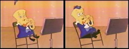 I didn’t get to see the film until I borrowed a vhs copy from Dante Barbetta, who eventually joined their staff to animate when it got significantly larger.
That was not a good film, as a matter of fact it was incredibly bad. I’m not sorry I left, though I would have enjoyed more time with Johnny Gent; it was the last time I worked with him. I also still wonder what happened to Howard Diettrich.
Note: Last year, John Celestri wrote about the later period in the making of this film on Mark Mayerson‘s site. Part I and Part 2.
Animation Artifacts &Comic Art &Disney 05 Mar 2013 03:38 am
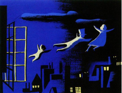
a Peter Pan Strip Book
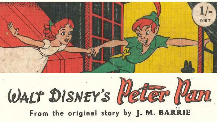
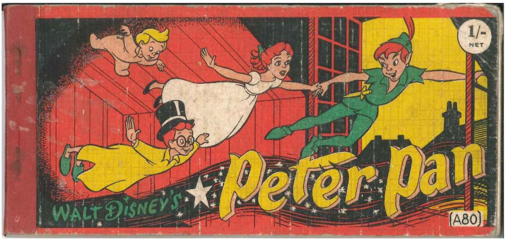
I received a wonderful email from Peter Hale. He wanted to send me this beautiful booklet adapting Peter Pan for children. What follows is Peter’s letter accompanying the book.
- Dear Michael
Following on from Hans Perk‘s recent drafts of Peter Pan, I thought you might be interested in this curious book, published in Britain in 1953.
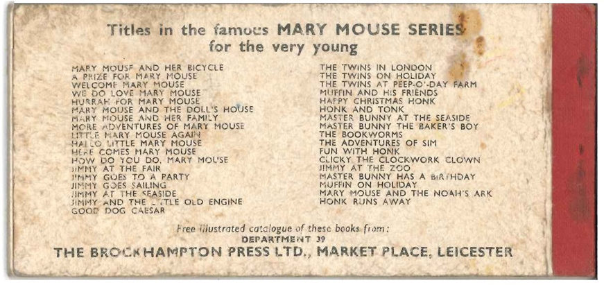
Curious, not so much in it’s format (15mm x 7mm, landscape, 2 staples on left
covered by cloth binding, and consisting of two panels per page with text beneath – Brockhampton Press produced a series of these, primarily featuring stories about Enid Blyton’s “Mary Mouse”, then “Jimmy and his Little Old Engine”, and subsequently some other one-offs) but in the fact that although drawn in the style of the completed Disney cartoon the story sticks closer to J M Barrie’s novelisation of the play (including building the Wendy House, Peter’s rescue by the Never Bird, and Tinkerbell’s drinking the poisoned medicine – see scans).
The story adaptation is by Irene Pearl, a children’s writer whose other works
include a series of ‘Nursery’ classics – retellings of such traditional stories as Alice in Wonderland, The Snow Queen, Sleeping Beauty, etc. – in the late 30s, for publishers Hodder & Stoughton, and later, in the 50s and 60s, some original stories of her own.
I had wondered if the “Nursery Classics” series that Irene Pearl had worked on in 1938 might have included “Peter Pan”, and if so whether the text might have come from it. A Google search revealed there had been a “The Nursery Peter Pan and Wendy”, but that it had been ‘retold’ not by Irene Pearl but by May Byron, who hadalso done other books in the series. The Publisher was given as Brockhampton, rather than Hodder & Stoughton, but I think that might just be a cataloguing error.
The book was a one-off intended to capitalise on the release of Peter Pan (there are no other Disney books in the series as far as I know) so the adherence to the Barrie version, with its need for drawings not derived from the film, is curious – perhaps it was thought that the British would not accept Disney’s deviations from Barrie in book form.
I do not know who the artist was. This version does not appear to have been printed in any other form.
I originally had a copy of this book as a child, but although I kept it for a long time it final got lost. I recently found another copy and have had the opportunity to regain my childhood!
 1
1
Many thanks to Peter Hale who took great care in scanning and preparing the material to present it all in its best possible light.
Animation &Commentary &Daily post &Errol Le Cain &Richard Williams 25 Feb 2013 05:28 am
POV
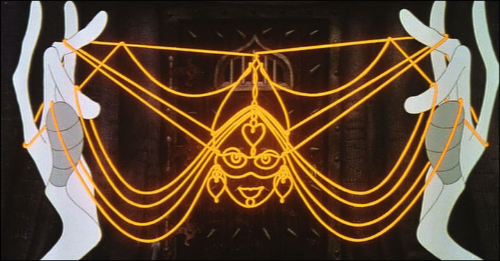
Next Friday, at the invitation of filmmaker-editor-director, Kevin Schreck, I’ll have the pleasure of seeing his recently completed documentary, Persistence of Vision. This is the story of the making of Richard Williams‘ many-years-in-the -making animated feature, The Cobbler and the Thief. I’m not sure of the film maker’s POV, but I somehow expect it to be wholly supportive of the insistent vision of Richard Williams in the making of this Escher-like version of an animated feature. A work of obsession.
It’s the tale of an “artist”, someone who sees himself as an artist, and continually pushes through the world with what would seem to be evident proof of such. After all, this man had single-handedly altered the face of 2D animation in a world that was about to throw it away with all its rich history and artistry and strengths. A medium that had developed through the years of Disney with giant, filmed classics such as Snow White, Pinocchio, Fantasia and even Sleeping Beauty. A medium that had drastically changed to 20th century graphics under the hands of people like John Hubley, Chuck Jones, George Dunning and many others and had just about reached a zenith where it was moving toward something wholly new, something adult.
Instead the medium took a turn in the wrong direction. The economics of television brought us back almost 100 years as films became more and more simplistic and simpleminded in the rush to be cheap. Even the Disney studio went for the poorest subject matter using cost-saving devices to sell their films. Films became shoddier and shoddier, and the economics ruled. The closest the medium would come to art was Ralph Bakshi‘s Fritz the Cat and Heavy Traffic, low budget movies that traded on racy material in exchange for an attempt at something adult, stories barely held together with editing tape. Animation was getting a bad name from every corner whether it was the sped-up graphics of Hanna-Barbera, the reach to the lowest common denominator with poor animation from Disney, or the shock and tell of Ralph Bakshi‘s filmed attempts at what he saw as art.
Williams took a different turn. He went back to the height of animation’s golden era, inviting artists such as Grim Natwick, John Hubley, Ken Harris and Art Babbitt to his London studio to lecture on the rules and backbone of the animation. He brought some of these people to work on a feature that he’d decided to create within his studio on the profits of commercials. These very same commercials financed the training of Dick and his young staff.
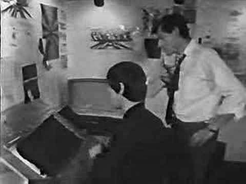 A documentary done in 1966, called The Creative Person: Richard Williams offers an excellent view of his studio. We see snippets of shorts Dick made with his own coin: Love Me Love Me Love Me (1962) or The Sailor and the Devil (1967) wherein we see the training of a young and brilliant illustrator named Errol le Cain. (Le Cain became known for his magnificent, glimmering children’s book illustrations. He was doing most of the backgrounds for The Cobbler and the Thief, and had certainly had a large part in its design.)
 We see in this documentary the first hint of The Cobbler when it was called Nasruddin. It was based on a book of middle eastern tales of a wise fool whose every short story tells a new and positive anecdote. Dick had illustrated several books of these tales with many funny line drawings. The book was written by the Idres Shah who had undertaken a role within the Willams studio finding funds for the feature. Eventually, the two had a falling out, and Idres Shah left with his property. Williams took the work he had done as Nasruddin and reworked it into The Cobbler and the Thief. ________________________________Errol le Cain
Meanwhile the work within his studio continued to develop, growing more and more mature. The commercials became the highlight of the world’s animation. Doing many feature film titles such as What’s New Pussycat (1965), A Funny Thing Happened on the Way to the Forum (1966), The Charge of the Light Brigade (1968) led to Dick’s directing a half-hour adaptation of The Christmas Carol (1971). Chuck Jones produced the ABC program, and it led to an Oscar as Best Animated Short.
Through all this The Cobbler and the Thief continued. Many screenplays changed the story and the stunning graphics that were being produced for that film were often shifted about to accommodate the new story.
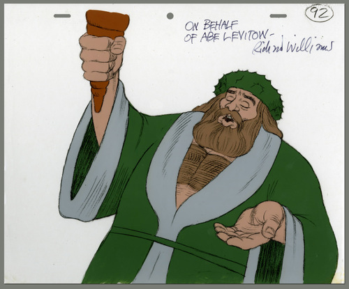 By this time, Williams had developed something of a name within the world of animation. Strong and important animation figures went to his studio to work for periods of time. Someone like Abe Levitow taught and animated for the studio. (His scenes for The Christmas Carol are among the most powerful.) Many of the Brits that worked in the studio and then left to start their own companies were now among the world’s best animators.
Williams had the opportunity of doing a theatrical feature adaptation of the children’s books The Adventures of Raggedy Ann and Andy and took it. A large staff of classically trained animation leaders such as Art Babbitt, Grim Natwick, Tissa David, Hal Ambro, Emery Hawkins and many others worked out of New York or LA as the company set up two studios to produce this film. Working for over two years, Dick’s attention was diverted to work away from his London studio, where commercials and some small devotion was given to The Thief by a few of the key personnel working there. Dick spent a good amount of his time in the air flying from NY to LA to NY to London and back again and again. He concentrated his animation efforts on cleaning up animation by some of the masters, rather than allow proper assistants to do these tasks. By doing this he was able to reanimate some of the work he didn’t wholly approve of. Entire song numbers were reworked by Dick as the film flew well behind its budget and schedule.
Eventually, the film finished in confusion and mismanagement, and Dick moved to his LA studio where he continued commercials and began Ziggy’s Gift, a Christmas Special for ABC.
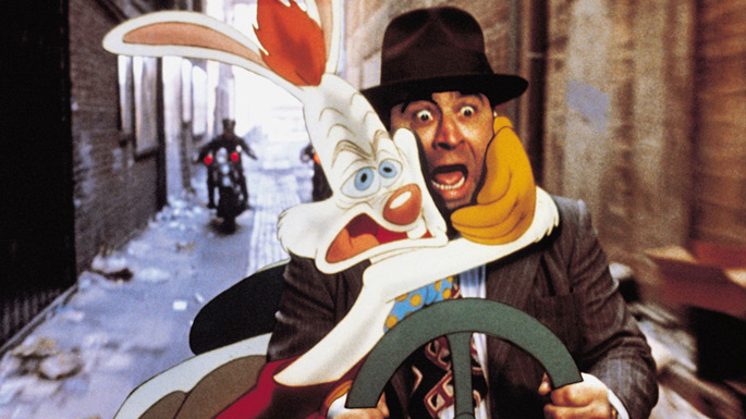 From this he went back to his London studio and did the animation for Who Framed Roger Rabbit for producer/director Robert Zemeckis. He hoped that work on this feature, which won three Academy Awards, including a special one for the animation, would be the triumph he needed to help him raise the funds for The Thief and the Cobbler. Now that he was safely back in his own studio in Soho Square he felt more focused.
A contract came from Warner Bros., and the work began in earnest.
Dick’s history wasn’t the best working on these long form films. Chuck Jones replaced him on The Christmas Carol to get it finished when work went overbudget and schedule. Dick was putting too much into it. Gerry Potterton finished Raggedy Ann when the budget went millions over with less than a third completed. Eric Goldberg took over Ziggy’s Gift, the Christmas Special for ABC, to get it done on time. On Roger Rabbit, the live action director stayed intimately involved in the animation after his shoot was complete. When it became obvious that things weren’t going well, he stepped in to complete that film.
In all cases of all of these films, Dick never left. He stayed on working separately on animation or assisting to try to keep a positive hand in the quality of the work that was done.
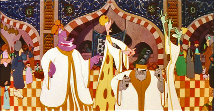 When The Cobbler and the Thief ran into very serious trouble, there was no secondary Director or Producer to come in and complete the work. Instead that job fell to the money men. The completion bond company, essentially an insurance company for Warner Bros. to make sure they wouldn’t lose their money if things didn’t go well, stepped in. They closed Dick’s studio and removed Dick from the premises. The boxed up and carted off all animation work done or in progress. It was all moved back to Los Angeles.
The Weinsteins, through their company, Miramax bought the film at auction and completed it with a poor excuse of an animation outfit they set up in LA. Work was also sent to Taiwan. The script was reworked trying to capitalize on the success of Disney’s Aladdin that had recently opened in the US. If Robin Williams‘ ad libbing could be such a success, imagine how well Jonathan Winters could do repeating that for a character who, in Dick’s original version, had no voice. Now he didn’t stop talking.
The new film failed miserably and deserved to do so. The primary audience, I would suspect, was the entire world animation community coming to look down on the artificially breathing corpse.
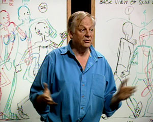 Richard Williams, himself, retired and moved far from the mainstream. He continues to work on small animation bits, but his primary work has been in making a series of DVD lectures revealing how animation should be done. This accompanies a well-received book he wrote and illustrated. Meanwhile, the animation community still hopes that something will emerge from that corner.
Dick turns 80 years old on March 19th. He’s still an amazing forceful and exciting personality. I wish I had more access to him (as does most of those who knew him back then.) He’s had probably the greatest effect on the animation industry of anyone since the late sixties. There are still studios thriving today on information they learned from Dick and his teaching.
If you’re unfamiliar with the blog, The Thief, I suggest you take a look.
Commentary &Disney 22 Jan 2013 08:28 am
Rambling on some Disney Features
 - A stash of Disney animated features were on television this Sunday. Hercules, Lady and the Tramp, Alice in Wonderland, Aladdin, Cinderella, and The Lion King all followed each other immediately, one on top of the other. Actually some of them even overlapped each other. The credits for Hercules (miniscule and too tiny to read) played on the left half of the screen while the opening credits for Lady and the Tramp played on the right half of the screen. They were going to milk every ounce of Disney Family viewing they could for the money.
I was pretty sick on Sunday, the flu has struck our little home hard, and I’m not yet down for the count but feel pretty close. So I could see how much of this 2D mania I could stomach – flu and all. I didn’t come in to it until the very end of Hercules, which is probably the one film I would have liked seeing again, but virtually missed.
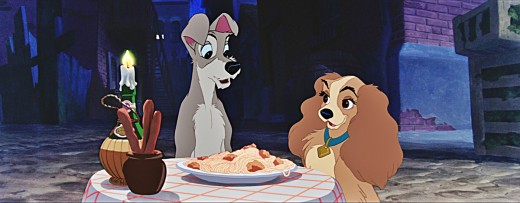
Some quick notes: It was nice to see Lady and the Tramp letterboxed for Cinemascope. The opening is still as tender as ever, and the Siamese cats are beautifully layed out for scope. The layout, backgrounds and animation – particularly the effects animation of the chase for Tramp in the dog pound wagon is exceptional. I think it’s probably one of the best sequences in the film. “Bella Notte,” of course, works well, but except for the sentimental emotion the sequence was never one of my favorites. There isn’t much for the dogs to do while the singing continues. They do pull a lot out of the spaghetti, but for much of it, the dogs just sit there, or in closer shots chew their food.
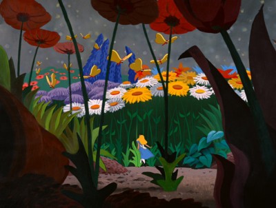 Alice seemed loud and aggressive though some of the coloring seemed inspired, and it’s amazing to see how much of Mary Blair is still in there in some parts – particularly the end of the caterpillar sequence. I found the Cheshire Cat a blessing in the wilderness. A lot is done with little subject matter, and it’s all in the excellent animation, of course. It’s obvious that Alice is a tough character to animate, but she’s done brilliantly. Essentially, she’s the “straight man” for everyone else in the film. She just sits there while the other characters bounce their schtick off of her. As I noted in a past post I am intrigued by the use of shadows in the transitional parts of the film. It works stunningly well , and this device virtually holds a lot of the film together in some odd quiet little way. I’d be curious to see more of this done with other films. You need a director with a big vision watching out for the film as a whole. I’m not crazy about a lot of the wild animation of the many zany characters that seem more cartoon to me than do they feel like Lewis Carrol creatures. There’s an interesting little scene where Alice sits down to cry in the woods. At first, she’s alone, then like Snow White in a similar situation feels sorry for herself and lets go. Little woodland creatures, deer and squirrels and rabbits and birds surround Snow White. Alice greets the odd little cartoon characters which feel as though they’d escaped from Clampett’s Porky in Wackyland. The woodland characters in Snow White serve the purpose of moving the heroine forward in the story to the dwarfs’ cottage. The zanies in Alice just disappear before she stops crying. Essentially, they’re pointless little creatures that offer nothing to the film. Fortunately the Cheshire Cat returns at this point. He fades in just as all the others have faded off.
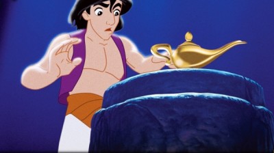 Aladdin has always bothered me. It feels more like a Warner Bros film than a Disney feature. The wild animation and even the style of the animation gives me good reason to feel this way. However, I think I came to terms with that in watching it again (maybe my 12th time?) mixed in with these other movies. The film is what it is and does it well. Eric Goldberg’s genie is a classic combination with the Robin Williams voice over, and Eric gets full use of that voice and the business happening on screen. The material presented has dated some, though not as bad as I expected. How lone before kids don’t know who people like Ed Sullivan are? Though I suppose this is similar to the personalities left over from the celebrity cartoons of the 30′s & 40′s. Mother Goose Goes Hollywood needs a program of its own to tell us who half of those caricatures represent. And they are great pieces of art that Joe Grant did for them. The villain in Aladdin tries hard but he’s not menacing just threatening. There was never anything that I worried about with him, and this feeling goes back to my very first viewing of the film. I do like the tiger in the film, Jasminda’s pet. That cat makes up for the ineffectual father. His character is not anything I can really associate with.
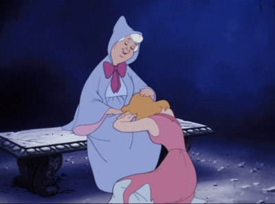 Cinderella is a very interesting film. I go into it thinking I hate it and get completely tied up with the extraordinary pacing of the film. Every scene is so exact and tight. They really knew what they were doing. I’m not the biggest fan of the human animation, but at the same time I’m in awe of it. It isn’t really rotoscoping, but it’s so beautifully pulled off the live action they shot, that it feels completely fresh. The cartoon animals play off the humans as the dwarfs did in Snow White. They look as they they come from different films and the style of animation is so different. The set pieces are exquisite. That entire piece with Cinderella locked in her room, the animals fighting to release her all those stairs away and the final reveal of her own glass slipper. It’s so beautifully melodramatic and so perfectly executed. Yes, this is an odd film for me to watch.
I didn’t make it to The Lion King. I’ve seen that about half a dozen times in the last few months so preferred watching my soap opera – Downton Abbey.
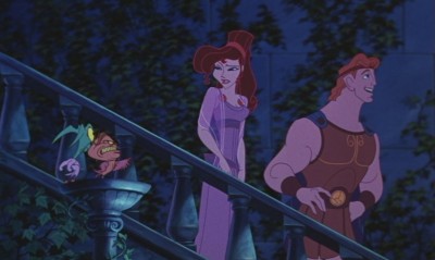 Watching these films back to back to back like this sort of lessens them but at the same time one is overwhelmed by the amazing craftsmanship held so high for so long. For years I felt the modern films, Aladdin, Beauty and the Beast, Hercules were lesser efforts compared to what the “masters” did. But now I’m sure they’re every bit as good as some of the later classics. No, I don’t think Snow White, Pinocchio, Fantasia, Dumbo and Bambi can be beaten today, but the new films are definitely equal to Lady and the Tramp, Cinderella, Alice In Wonderland and anything later than that. (I actually think Sleeping Beauty is in a class of its own and haven’t seen the equal to that from the more recent people. Actually, I take that back. I think Prince of Egypt is right up there. That’s a magnificent film, and it’s one I’d like to discuss more in depth sometime soon.)
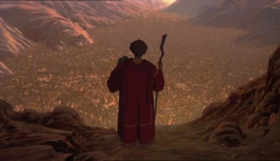 Oh, of course, this is all my own opinionated nonsense. Someone else would have a completely different list. I’m, obviously, leaving cg films out of this discussion. To be honest, I can’t even find a story there that I think measures up to most of the Disney classics. I’m also not thinking much about non-Disney works, but there’s an obvious reason for that. However, some of those Dreamworks 2D films are exceptional and deserve a lot of attention. Attention they haven’t received. Spirit has stunning animation, as do a number of others. They really need a bit of time.
I had some bigger thoughts brought on by watching them all, but I’ve gone on too long already. So I’ll let this rambling post fizzle out. Hope you don’t mind, but I’m getting to enjoy writing these diatribes.
Books &Daily post 29 Sep 2012 06:55 am
Egos, Books, and Michel Ocelot
There’s been a relatively short conversation going on at the comment section of my blog for an older piece I’d repeated this past week. The discussion has been about Eyvind Earle. The first few visitors who commented all wanted to express their dislike of this film (particularly the story) and Eyvind Earle’s design work, in particular. “Scott’s” dislike of Mr. Earle’s work extends to his personal attitude while working on the film. He, according to “Scott”, was thick headed and wouldn’t listen to any requested changes to his designs, allowing his ego to take charge of the work. (I’m not sure that I see that on the screen, nor did I really feel that when I met the man when I got to spend an afternoon with him as I accompanied Mike Barrier on an interview. I admit it is possible though.)
In fact, I think the ego is essential in breaking new waves and advancing the art form. Adam Abraham in his book When Magoo Flew writes about the ego of John Hubley in running his productions at UPA. If he wanted a specific blue, that’s all that he would settle for. The report is that he was oppressively insistent on it being his way only. I worked for Hubley for years and never got to see that side of the man. Oh, there was a well deserved and big ego there, but it never got in the way of the art being created.
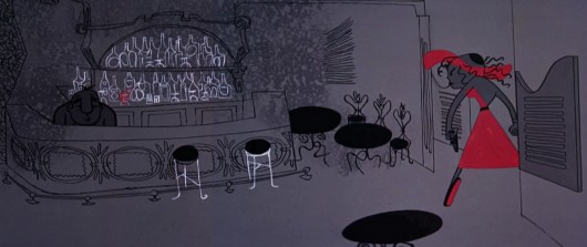
Rooty Toot Toot
We’ve seen Bill Peet complain about Bill Tytla‘s use of his (Peet’s) drawings while working on Dumbo. According to what I’ve read, Peet complains that Tytla took full credit for the sequence of baby Dumbo running in and around his mother’s legs, when Peet felt it was his scene, his key drawings that made the scene the perfect piece that it was.
Chuck Jones, while working briefly for Disney (on Sleeping Beauty), told Walt that he had to leave the studio. When Disney asked what job Jones really wanted at the studio, Jones said, “Yours.” He felt that only Disney’s job was suitable for him. Talk about ego. The ego was even larger than that when you realize that it was Jones, hmself, that told me that story – however real it actuall was. The egos of Jones and Clampett and even Freleng vie over who created what character.
Egos are necessary in an industry of craftspeople and artisans, especially when an artist is trying to get something brilliant out of them. Thomas, Johnston, and even Kahl were brilliant actors with amazing abilities of draftsmanship. But the film, the bigger picture, needed a direction which Earle gave it. Just look at the wretched Reitherman films to see what Thomas, Johnston and Kahl turned out without the strong, smart director who was also an artist. Tytla took animation to another level, he was truly an artist, himself, but look at the miserable little films he directed when he left Disney’s studio. Even the support system of that studio wouldn’t have helped Leprechauns Gold or Snap Happy. (Mind you, I love Snap Happy, but it has no relation to art.)
Here’s a small piece David Parfitt wrote:
- Tytla was a tough guy who used abusive language and irritated his fellow animators. Ken Anderson (Disney Legend for Animation and Imagineering) went to Walt Disney to express frustration at the way Tytla treated his coworkers. Walt Disney replied, “What do you think of Chernabog, the God of evil, in ‘Fantasia’? What do you think of Stromboli in ‘Pinocchio’?†Anderson (the art director for both films) replied, “They are some of the most powerful and vicious villains we’ve ever done.†Walt Disney looked at Anderson and said, “Where do you think all that anger comes from?†Vladimir Tytla was a maverick who needed to release anger and energy to manifest some of the most powerful imagery ever produced by the Disney Studios. A maverick is difficult for a company to grapple with because of their abrasiveness and the way they go against the way things typically run. Yet out of the agitation and irritation often comes a new direction that could secure a company’s future.
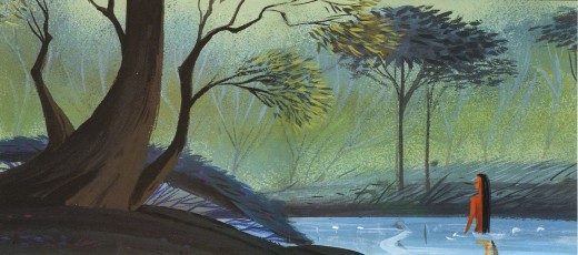
Sleeping Beauty changed the Disney studio forever. The animators and artists there, with the exception of Ward Kimball and a few others, fought against the use of 20th century graphics in their films, yet UPA’s influence slowly crept into the mix. Finally when Walt Disney, himself, chose Eyvind Earle and put full support behind him to design this film as he saw fit. The animators all fought Earle and continued to bad mouth him to the end of their days. Yet Earle’s style, as well as Tom Oreb‘s great character designs for that film, are frequently copied by the new generations of artists. The backgrounds and some of the character design are stolen directly from Sleeping Beauty. Even though the SB art is a play on 15th Century manuscripts and art, it was used for the Pocahontas forests.
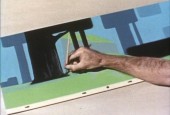
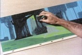
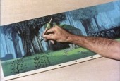
Painting Sleeping Beauty
Nothing at Disney, with the possible exception of Bedknobs and Broomsticks went back to the past to illustrate their films henceforth. Until, of course, today’s new artists in animation who just steal from other past films. Bluth‘s Small One or is virtually without style. Tim Burton is possibly the only exception I can see of this current view of the state of animation. The regurgitated past of other artists who deservedly had egos aglow. We go on. Perhaps someone like Genndy Tartakovsky will bring some of the panasche he brought to Samurai Jack.
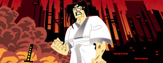
Samurai Jack
By the way, there’s a good interview with Tartakovsky on this week’s on-line version of the Village Voice.
Books
.
- There are a couple of books I’d like to write about.
.
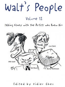
- Let me mention Didier Ghez‘ latest volume of his interview series, Walt’s People.
Just released is Walt’s People – Vol. 12. Just the idea of 12 volumes of any book in print, is quite extraordinary, and amazing feat for Didier Ghez to pull off.
I own about a half dozen of this series and have read all of them at least twice. Most of the interviews are exceptional, some are smart, and the rest are just very good. In all there are those interviews that give us some real insight into the process and history of the making of animated films by the professionals who did it. Les Clark, Larry Clemmons, Charlie Downs, Al Eugster, Sammy Fain, Milt Kahl, Burny Mattinson, Paul Murry, and Mel Shaw are among the many who are interviewed in depth for this new volume. Some of our greatest historians (Robin Allan, Michael Barrier, Albert Becattini, John Canemaker, John Culhane, Pete Docter, Chris Finch, J.B. Kaufman, Jim Korkis, Dave Smith, and Charles Solomon among others) conduct the interviews.
It’s just another great volume in the series. You should own them all; I should own them all, to be honest, and I will.
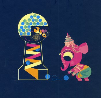
Ganesha’s Sweet Tooth
- As previously reviewed on this blog, Sanjay Patel will see his first children’s book, Ganesha’s Sweet Tooth released this week by Chronicle Books. I have a sore spot for Mr. Patel’s work. He’s an artist who works by day at Pixar and is an artist, with his own very defined style, working extensively after hours.
I’ve reviewed many of his books and have a real fondness for The Ramayana. Were I you, looking to explore this artist’s work, I’d buy Ganesha’s Sweet Tooth. Once you have it and want more – you will – go for The Ramayana. It’s a brilliant masterwork.
Snow White x 2
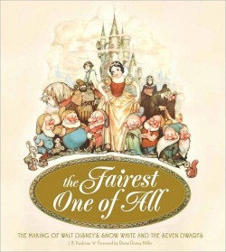
- Unless you’ve been hiding under a rock, if you’re an animation fan, you know that the brilliant historian, J.B. Kaufman, has not one but TWO books on Snow White about to appear on the market.
The Fairest One of All: The Making of Walt Disney’s Snow White and the Seven Dwarfs and
Snow White and the Seven Dwarfs: The Art and Creation of Walt Disney’s Classic Animated Film
are the two titles by Kaufman that focus in great depth on that film and its development. This is to celebrate the 75th anniversary of the feature, and will coincide with a display that will appear soon at the Walt Disney Family Museum in San Francisco.
Both books come from the Walt Disney Family Foundation in conjunction with the Walt Disney Family Museum. I’ve seen the Art of Creation book, and was completely taken with it. I will most definitely own both books. The film means much to me, and I want to own anything Kaufman writes. It’s a no-brainer – double my pleasure.
By the way, part of the reason I’m looking forward to reading these two books is to compare it with Michael Barrier‘s amazing writing on this period at Disney’s studio. In Hollywood Cartoons, there’s a large part of the book dedicated to the development andcreation of this particular film. Then in The Animated Man: A Life of Walt Disney Barrier tells the same information but from a different perspective entirely. This biography of Disney is wholly involved with Walt Disney, the man and artist. It’s a unique turn that we only see in the poorly written Diane Disney Miller book, The Story of Walt Disney. As Walt’s young daughter she could see the story no other way than from his perspective. While waiting for the Kaufman books to come out, read either of Barrier’s books for the best, to date, version of the Snow White story. It’s strong writing.
 It’s appropriate that I was invited to a 10am screening of Snow White at Lincoln Center this morning. It’s part of the NY Film Festival’s 50th anniversary celebration. Eric Goldberg introduced the film with a brief and smart little talk about the animation. Talking about The Old Mill as a test run for the Multiplane Camera, talking about the Three Little Pigs first offering characters that looked alike but had characterization defined by their animation (as did the dwarfs), talking about The Goddess of Spring being an enormous failure for Ham Luske who succeeded animating Snow White. It was nice to say hello to Eric prior to the film. We haven’t seen each other in about five years. It was nice also to see the film projected. I saw the movie on tv/dvd only a couple of weeks ago, but it’s a very different experience on the big screen. The digital transfer was glorious, merciless and disastrous. The ink lines were so sharp that you could actually feel how deeply the crow quills cut into the cels. However there were many points where individual frames had slight digital distortion to hurt the ink lines, and the magic mirror actually had the detritus of digital compression across the center of the mirror. Someone should have been there to supervise the transfer.
Paperman played prior to Snow White. It was animated cgi, then flattened and lines were added atop the flattened drawings. I can’t for the life of me understand why it wasn’t just animated by hand. It would have cut the cost in half and had more life to it. Sorry, I don’t think it worth the Oscar. Though you never know it may be the best film, this year.
Tales of the Night
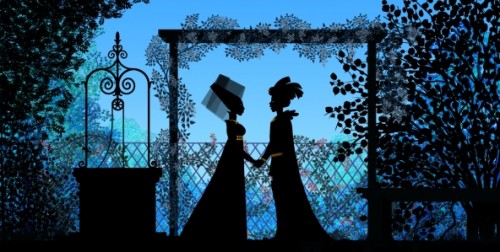
- Michel Ocelot has received another excellent review from the NYTimes. Tales of the Nightis reviewed by Andy Webster in the Times, and is Ocelot’s latest feature length animated film – his first in 3D – and the reviews are sensational. It’s screening as part of the Children’s International Film Festival and plays at New York’s IFC Theater through next Tuesday. This is a silhouette film in brilliant color.
His films are beautiful and deserve to be seen in a theater. I’d heartily recommend getting to the theater if you have the chance. Hopefully the distributor will submit this one for Oscar consideration. Though the look is 2D, the graphics are done via cgi as was the case with his past films, including Azur & Asmar, Kirikou et les betes sauvages, Princes and Princesses, and Kirikou and the Sorceress.
Some amazing animation is coming out of France these days.
More Reviews
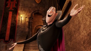 Now to the bigger release for the smaller film department:
Adam Sandler‘s second animated feature, Hotel Transylvania, opened to mostly poor reviews by 2nd string reviewers.
NYTimes sent Neil Genzlinger to give his negative review. The most positive line is: “The movie loses its originality as it rolls toward its predictable conclusion, but it’s still lovely to look at.”
Someone named Sara Stewart reviews the film for the NYPost and gives it a middling 2½ stars. “Director Genndy Tartakovsky (“The Powerpuff Girls,†“Samurai Jackâ€) is a natural fit for this kid-and-parent-friendly flick. The animator’s wit and attention to detail enliven a collection of well-known ghosts and ghouls. (Though Tartakovsky’s more traditional TV-cartoon style is still superior, as evidenced by his playful closing credits.)”
Joe Neumaier, the 2nd rate first stringer of the NYDaily news gave it a mostly positive 3 star review. “This being a Sandler movie, the humor skews toward the infantile (fart jokes, peeing baby werewolves). But the sleek visuals are rich and glossy, placing the characters, who look like Halloween door decorations, in baroque hallways or secret passageways.”
I enjoy the reviews in The Onion, and their review for this film by Tasha Robinson doesn’t disappoint. A C+: “Tartakovsky gets a long way on wild design and visually daring sequences. His work has always been adventurous, experimental, and conceptually creative, and he hasn’t lost any of his energy or capacity for staging a memorable setpiece.”
Whatever happened to the feature length version of Samurai Jack that J.J. Abrams was going to produce wth Tartakovsky directing?
commercial animation &Disney &Illustration &Independent Animation 25 Sep 2012 05:29 am
Eyvind Earle – recap
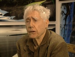 – Let’s talk a little about Eyvind Earle. This is the artist who rose to fame when he was selected by Walt Disney to set the style for the long-in-production feature, Sleeping Beauty. The animators disliked his art direction and openly protested it. Walt remained true in his stance and supported Earle to the end; though it could be said that Walt was more involved in Disneyland’s construction and gave too little attention to the in-fighting at the animation studio.
I remember Frank Thomas, specifically, stating that he had done everything possible to supercede Earle’s style after he, Thomas, had animated the Merryweather scene as she creates Aurora’s dress and cake in honor of her birthday. He felt that the black bodice that Earle had designed took all the lightness out of his character’s delicate dance.
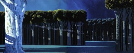
(Click on any image to enlarge.)_________________________________
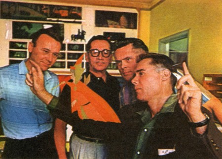
L to R: Al Dempster, Dick Anthony, Ralph Hulett and Eyvind Earle
Thomas publicly attacked Earle at the Lincoln Center celebration of Disney animation back in 1973. I’d already read something similar, and heard it privately. None of the others on stage at Lincoln Center – Woolie Reitherman, Ken Anderson or Ollie Johnston – countered in support of Earle.
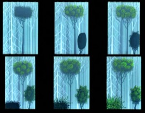 Sleeping Beauty was such a drastic change in look from the other Disney features, that I think it took deep hold in the minds of a lot of Baby Boomers growing up around this feature. Earle became a strong target of interest, and I think his reputation has grown annually.
I have to admit it was odd seeing the backgrounds of Pocohontas trying to emulate Earle’s Sleeping Beauty style, but in some ways it seemed fitting. The studio had been ripping off the films of the past for so long that it was only appropriate that they’d focus on someone who was such a dynamic force.
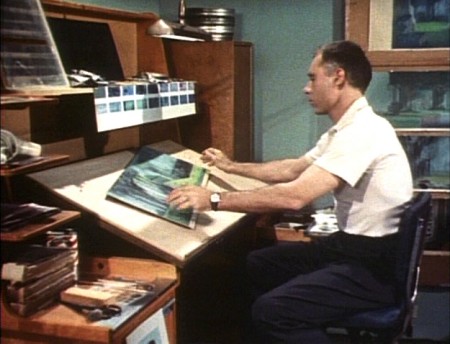
For a short period after he was released by Disney, in the post-Sleeping Beauty layoffs, he worked with John Sutherland Productions where he designed the short, Rhapsody of Steel. Then he formed his own studio, Eyvind Earle Productions, Inc. He did an animated trailer for the film, West Side Story, under the supervision of Saul Bass. He did an animated title for the Kraft Suspense Theater, and he did a Christmas Special for Tennessee Ernie Ford.
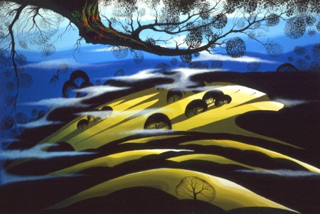
Ultimately, Earle made a success of his own art after leaving animation. He’s been represented by a number of very large galleries and has sold a lot of popular art in a style all his own. Here are a couple of examples found on line:
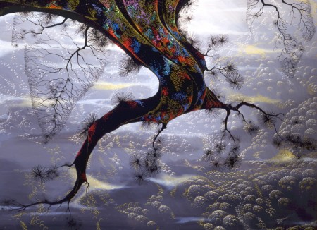
I’m not always a big fan of the color schemes in his graphics, though he always makes them work, but I have to give credit to Earle for his originality and the dynamic approach in his art.
His autobiography, Horizon Bound on a Bicycle, is a must for all real fans.
This is his animation resume:
- 1951 Started with the Walt Disney Studios as background painter on: FOR WHOM THE
__ BULLS TOIL, MELODY, and the Academy Award winner for “Best Short of the Year”
__TOOT, WHISTLE, PLUNK and BOOM which also received a Cannes Film Festival Award.
__Production Designer, Color Stylist and Background Painter for the DIsney animated __classic SLEEPING BEAUTY, as well as, PIGS IS PIGS, GRAND CANYONSCOPE,
__PAUL BUNYAN, LADY AND THE TRAMP, LONDON BRIDGE, and WORKING FOR PEANUTS.
__He designed 5 murals for Disneyland.
1958 Joined John Sutherland Motion Picture Company in Los Angeles.
1960-1966 Created 24 sheet poster for Hamm’s Beer.
__Started motion picture animation company, Eyvind Earle Productions, Inc.
__Created animated commercials for Chevrolet Motors, Chrysler Corporation, Marlboro
__igarettes, Motorola Television and the Kellogg Cereal Company.
__Created animated trailer for WEST SIDE STORY for United Artists.
1961 Created animated television special THE STORY OF CHRISTMAS starring
__Tennessee Ernie Ford and the Roger Wagner Choral.
1962 Created animated television special THE EASTER SPECIAL.
__Created title for the KRAFT SUSPENSE THEATER.
__Created the logo trademark trailer for Universal Pictures.
__Produced and created the theatrical short DEATH AND SUNRISE
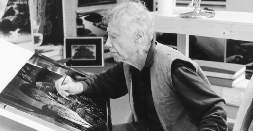
You’ll find a lot of merchandise including all the books listed here, on the Eyvind Earle website.
Commentary 23 Jun 2012 05:36 am
Sarris & Scher & Assorted Other Things
 - When I was in the Navy, 1970 to be exact, I was stationed in Adak Alaska. Adak is a small island centrally located in the Aleutian Islands. There were 250 of us on the island, separated from the principal part of the base by seven miles. A very tough ride to make on days off – if weather allowed it. Not only did I feel separated from the real world, I was.
Out of the blue, one day, I received a wonderful little package. It was copy of Andrew Sarris‘ giant of a book, The American Cinema: Directors and Directions 1929-1968. Sarris was the film critic for the Village Voice. He had introduced America to the French idea, the auteur theory of film criticism. This theory flatly stated that it was the film’s director who authored movies.
Back then, this new idea was mocked. It was easy to appreciate such thoughts about Europeans like Bergman, Truffaut or Rossellini. But how ridiculous to bestow entertainers like Hitchcock, Ford or Hawks with such esteem.
During the 60s, 70s & 80s, Sarris and Pauline Kael conducted bitter and open arguments about film theory. John Simon and Stanley Kaufman were often participants in these debates which often lifted the evaluation of many films and made film theory and criticism almost an art in its own rite.
I, personally, was just beginning to shape my thoughts about film. Sarris came to me at the perfect time. The book was broken into a number of categories like “Pantheon,” “Expressive Esoterica,” or “Less than meets the eye.” Within these categories some 200 American film directors are ranked, and more than 6000 films are evaluated. I didn’t know who many of the directors were nor had I even heard of the majority of the films.
However, I was so taken by the book’s content that I reread it at least a half dozen times – over and over and over. Having consumed the book, I rushed back to it as reference any time I saw a film or read about a director. I just about memorized what Sarris had to say about many many American film directors. What’s more I often agreed with Sarris as my opinions grew stronger.
The book directed me to a full knowledge of American cinema and a strong appreciation of its history. First I have to thank my friend, jim Weslowski, for sending me the book, but, foremost, I thank Sarris for all the information and film theory he’s given me.
I write this only a couple of days after Andrew Sarris has died of complications from an infection after a fall. Reading this news disheartened me. He was among the “Pantheon” of film critics. He didn’t resort to thumbs up or down; he turned to words which could help educate us about the Art of Film. Everything smart and good seems to be passing.
- I’ve been reading the local reviews of Brave and have found hem interesting. They seem to break into two types:
there are those that casually give it 2 or three stars and add another 500 words.
Then there are those that go into depth and analyze the film’s story and substance, including all the elements that make up the film.
It would seem that those who give the film more space seem to like it more than the quick-star reviews.
The two I particularly liked were Manohla Dargis’ review in the NYTimes.
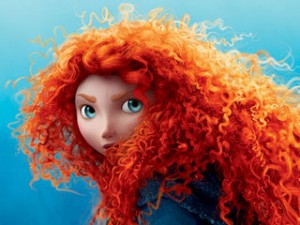 “The riotous mass of bouncy curls that crowns Merida, the free-to-be-me heroine of the new Pixar movie, “Brave,†is a marvel of computer imagineering.”
“Merida is active instead of passive, a doer rather than a gal who hangs around the castle waiting for Prince Charming to rescue her. More to the point and to the movie’s marketing, she is Pixar’s first female protagonist, which means that there’s a lot more riding on her head than that ginger mop.”
“Merida doesn’t dream that her prince will come; she doesn’t have to because it’s clear that, within the logic of the movie, the alternative is comically unthinkable. It’s no great surprise that she wins the struggle to determine her fate. But hers is a contingent freedom won with smiles, acquiescence and a literal needle and thread with which she neatly sews up the story, repairing a world where girls and women know exactly where they stand. “
and Melissa Anderson‘s review in the Village Voice.
- “Advancing the story’s Grimm-like grimness is a suitably dark color palette, hues that sometimes suggest Rorschach inkblots. For all female audience members with memories of their struggles of individuation from their mothers, Brave is its own kind of psychological projective test. But again, as convention dictates, these almost-unbearable horrors—a child’s guilt over turning a parent into something unrecognizable, of “destroying” her family—are quickly ameliorated, as Merida sets out to ‘mend a bond torn by pride.’ “
- The indomitable animation artist, Jeff Scher, has a new OpEd piece on the NYTimes. Summer Sketches. To quote Jeff: “Water is the most animated substance on the planet, and when I’m not drawing it or painting with it (watercolor) I often find myself photographing it.” Water, this is the heart of the film.
I’m a bit disappointed that the score is not by Shay Lynch – Mr. Scher’s pieces have brought me two artists, both Jeff Scher and composer, Shay Lynch. However, this score is taken from “. . . the first movement of Viktor Ullmann’s Piano Sonata No.7, performed by the concert pianist — and my old friend — Paul Orgel.” Orgel was killed in Auschwitz by the Nazis in 1944, and this sonata was never completed.
The film is short, take a look.
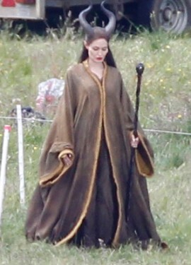
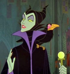
- There was a shot of Angelina Jolie photographed as Maleficent this past week. However it was a tight closeup that didn’t reveal very much. Then the newspapers offered more in the photos on Friday. The pics were from a British tabloid, so they’ve no doubt, been circulated. The one, above, was among them.
The brown costume seems wrong to me, but what do I know? As a matter of fact, another fairy tale named after the villain of the piece tells me a lot about how they’re all going wrong. A bunch of poor movies. Disney, rerelease Sleeping Beauty in 70mm and save yourself a lot of money instead of making a vanity piece for Ms. Jolie.
- I wrote a bit about Brad Bird the other day.
Harvey Deneroff has a good interview with him on
his site, harvey@deneroff.com.
The interview was conducted when The Iron Giant had just started production.
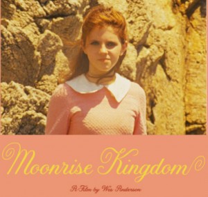
- On his site, Oswald Iten writes about Wes Anderson‘s animation for Moonrise Kingdom. It seems that the producer, director of The Fantastic Mr. Fox, is still in love with animation. In his new film, Moonrise Kingdom, his character reads aloud short snippets of several books she’s been reading. Originally, Anderson had planned just to show the books produced for the film, but ultimately he decided – regardless of the fact that they are not seen in the film – to animate the story bits. Here‘s the link to the animation.
I haven’t seen this information elsewhere, so I’m glad I read it on Oswald’s blog. He also writes in another post about the Anderson film, and its well worth reading (especially if you’re a fan of Mr. Anderson’s work.)
Commentary 25 Feb 2012 07:25 am
Cracks, Quips and Crits
- Today in Hollywood, the Animation Guild, ASIFA-Hollywood and Women In Animation will present “An Afternoon of Remembrance,” a celebration of some of those from our animation community who died in the past year. Among those scheduled to be remembered include a number of East Coast artists as well as several Independent animators.
Karen Aqua, Jordan Belson, Robert Breer, Vincent Cafarelli, Don Christiansen, Cornelius “Corny†Cole, Del Connell, Ray Dieter, Norm Gottfredson, Bill Justice, Earl Kress, Dorse Lanpher, Dwayne McDuffie, Dan Mills, Barney Posner, Hal Silvermintz, Paul Somner and others will be brought to a small communal closure.
I couldn’t praise the three organizations any more for doing such important work for the community. It’s a very sad event, but one that is an absolute necessity given the rising ages of many of our forbears. I only wish that I were in Hollywood to be able to attend such an event and to honor some of those veterans that came before us.
The Afternoon of Remembrance is free of charge and is open to all.
No RSVPs necessary.
Food and refreshments, 12 noon, Memoriams, 1 pm.
The Hollywood Heritage Museum (Lasky-DeMille Barn)
2100 N. Highland Ave. (across from Hollywood Bowl) in Hollywood, California.
The brilliantly talented Jeff Scher has posted a new advert he’s done for the latest Ann Arbor FIlm Festival. The ad, itself, should win the film festival’s top prize, if you ask me. Once again, Scher works with the very talented composer, Shay Lynch, who’s take a rock turn for the music to the spot. Hi energy for 30 secs. Worth watching a number of times.
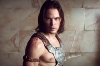 – There’s a lot of dirt being thrown about the Disney studio of late and the source of it all seems to be pointed at Andrew Stanton‘s live action film debut. John Carter of Earth, is the source of all the trouble. An article in The Beast reveals a lot when it talks about Disney Chairman Rich Ross‘ job being in trouble for the ever expanding $250 million budget.
- John Carter is . . . the kind of cautionary tale that keeps studio chiefs popping Ambien at night: a vanity project with sky-high expectations and a humongous budget* that now seems destined to land with a massive thud at the box office—unless it can somehow rake in more than $400 million to break even. In other words, it’s the kind of movie that causes heads to roll.
Stanton has denied that the budget had reached a quarter of a million dollars, but Disney seems to be stating that that’s the case. Everyone at Disney points to the film as a failure and they’re all expecting to see heads roll. Let’s hope there will be room for Stanton to get back into animation. I’m sure Pixar will be looking to do another Finding Nemo eventually.
Nothing in the trailers I’ve seen has made me excited about seeing this film, and of course I’m not being fair. However, the multiple computerized crowd scenes just reminds me of schlocky The Mummy Returns kind of thing, but this film doesn’t even have a Brendan Fraser at the center of the movie. Even that wouldn’t be enough for me to tolerate one of these overblown Hollywood epics that are never very epic – just loud. But, as I say, I might be wrong and will reserve my last judgment until I see it. I’m just not looking forward to it.
I still would have liked to have seen what Bob Clampett
would have done with this way back when.
Oh well, dreams of a rarebit fiend.
____________________
Executive Shuffle
- After Rango reaped a giddy success for Paramount Pictures, the movie company decided to set up their own Animation division. They put executive, David Swainton, in charge and they were off to the movies. Or so one would have presumed. Now Variety reports that Swainton, just four months into the job, has quit his post “for personal reasons/” Although Paramount had wanted to turn out one film a year beginning in 2014. As Variety writes:
- “At the time, the news was seen in part as a negotiating tactic with DWA, whose distribution deal with Paramount was set to expire at the end of 2012. Both parties asserted that the division would have no affect on negotiations — which weren’t even supposed to begin until early 2012. But sources outside the studio saw the initiative as leverage that Paramount could bring to the table.
“Though no film has yet been slated for release, studio has said several viable projects are in the works, including an adaptation of the graphic novel “New Kid.”
Paramount Motion Picture Group prexy Adam Goodman will take charge of the animation development team.
Fleischer Multiplane
- Looking back to Paramount Pictures animation division in 1938, Nicholas John
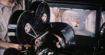 Pozega posts on his blog, Classic Cartoon Reviews, a number of screen grabs showing Max Fleischer and his 3-D setback animation camera.
The images are sharp, informative, and worth a look. Mr. Pozega pulled them from a “Popular Science” reel on the DVD “Popeye the Sailor: 1938-1940″. If you continue to scroll down on his blog there are also other newsprint images of the camera.
Spirited Away : BFI Monograph
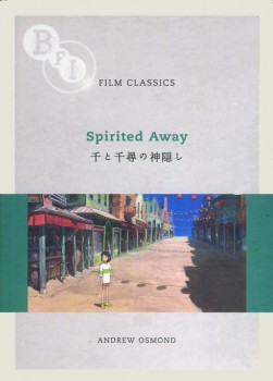 - After seeing The Secret World of Arrietty, I really got into the Miyazaki mode and have dug into a DVD set I own of his features up to including Spirited Away. They’re all in Japanese with English and/or Chinese subtitles, so there’s some purity in the viewing.
However, I’ve also been reading a wonderful monograph written by Andrew Osmond in 2008, Film Classics: Spirited Away. I raced through this book and have gone back to the front and am reading it again. It’s a very open-minded reading of the film taking in many of the negative critiques that came with the film and addressing some of them quite well. I’ve gotten quite a bit out of the book and wish Mr. Osmond had done similar works for other Miyazaki films. I’ll have to reread his 100 Animated Feature Films again. I wasn’t very positive about the book when I originally commented on it, in that I didn’t quite understand the reasoning behind the selection of titles chosen for that book. However, Mr. Osmond writes with such strength and self-confidence that he covers a lot of good territory. I’ll have to see if I think differently this time out.
I do recommend the BFI monograph, Film Classics: Spirited Away, though. It can be picked up a Amazon, of course.
A Beauty Awakens
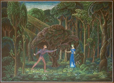
Hans Perk on his excellent site, A Film LA, has shown us another side to the development of Disney’s feature, Sleeping Beauty. For the most part, we’re accustomed to the noble and stylized images from the hand of Eyvind Earle, the stylist who ultimately dominated that feature and made it the film we all know and cherish. However, Hans features some preliminary art by Danish illustrator, Kay Nielsen. Nielsen died in 1957 during the production of the feature.
To date only the one illustration he’d done, which appeared in John Canemaker‘s book, Before the Animation Begins, had come to light. Now Hans introduces us to more of this art which has recently come to light.
This website is one of my favorites. A great resource if there was one.
Animation &Commentary 24 Feb 2012 07:51 am
Pops and Smears
- In reviewing The Secret World of Arrietty, the brilliant new Ghibli film, I wrote about the fluidity of their animation and its basis in a real rather, than a cartoon world. Unfortunately, most of the animation done in features coming from the Western world (specifically the US world) is done in a cartoon way using pops and smears. This affect creates cartoon characters and clichéd ones at that. It’s not a type of animation I love for feature films.
Of course, if you’re designing an Aladdin, where the Robins Williams/Eric Goldberg Genie is a hyper cartoon character, that’s the only way to go – stylized cartoon. That was its natural design. But for 101 Dalmatians/Peter Pan/Beauty and the Beast – no. That’s not what you should be doing. However, it seems to be the only way to go in the films coming out of Hollywood.
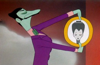
I thought, over the course of a couple of posts, I’d give a couple of good examples of these pops and smears I’ve been bothered with in the recent past. Let’s start with “smears”  something I find particularly egregious in animation pretending to create a “real” world.
To show what I’m talking about, here’s an example from the first real – and I might say brilliant – use of this technique.
Animator, Bobe Cannon, together with director, Chuck Jones, came up with the technique for the outstanding Dover Boys film.
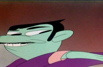
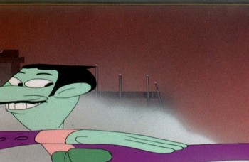
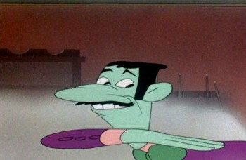
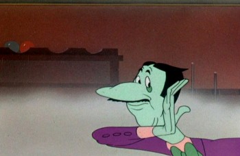
Here’s our villain, the main target of the smeared frames:
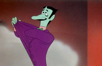 1
1It’s the villain that moves in exaggerated smears.
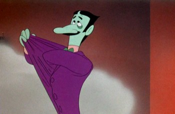 2
2
He moves slowly at start and stop of moves.
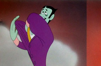 3
3
But moves wildly in between phrases of dialogue.
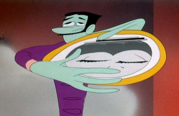 4
4
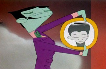
The middle poses couldn’t be wilder or faster.
 5
5
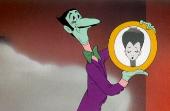
And comes to quick halting stops with small patches of dialogue.
 7
7
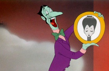
Then, if anything, we’re going wilder.
 8
8
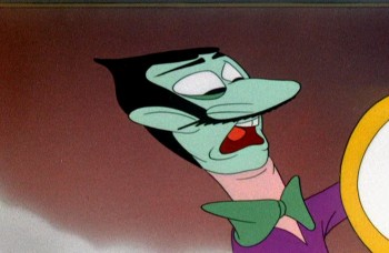
Slowly out of quiet hard pose . . .
 9
9
WILD as Jones backs the animation move with a tighter cut . . .
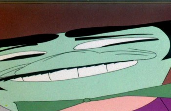 10
10
. . . and a wild camera move.
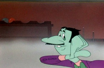 14
14
Come down to another solid, hard pose and move dialogue.
Here’s a later sequence as the villain kidnaps our heroine.
All cartoon, all comedy, all arch, all on purpose.

He moves wildly via smears inbetween phrases of dialogue.

Line of dialogue – move – dialogue – move.

Every action comes off the exaggerated speech by the arch ( and I do mean arch) villain.
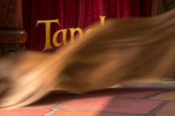
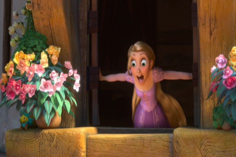
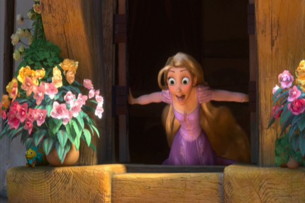
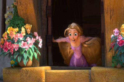
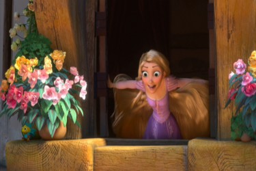
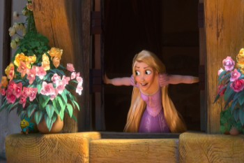
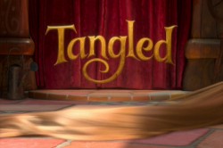 Tangled is a tangled version of the brilliant fairy tale, Rapunzel. The makers have completely distorted the tale to a mish-mash point where it makes no sense, but that’s irrelevant to this post. What is relevant is that they continually rob the characters of a reality by pushing, rubbing and smearing them throughout.
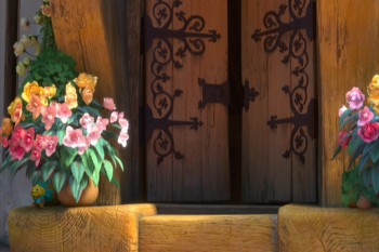
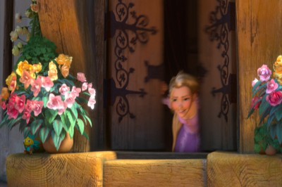
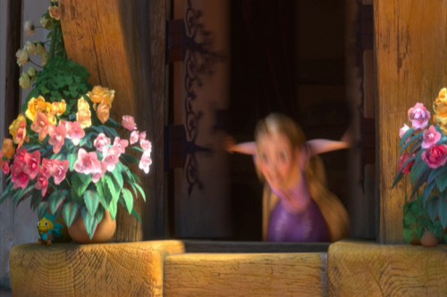
The first example of this technique shows up as Rapunzel opens her window. Technically, you start slow, you compress the middle to one or two images, and you slow out over a long beat. The inbetween chart would look something like this:

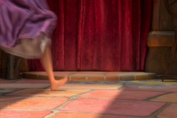
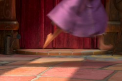
Here’s Rapunzel opening her window:
It’s not really a human motion; it’s a cartoon motion. But it’s subtle enough this first time, that we can get away with it. Let’s just call it fast. However, too often the animation falls into this mode, and by midway through the film, there are no real characters left; just cartoon characters.
I take that back. Mother Goethels is always true to a human animation style. She is a real character, and Donna Murphy’s performance grounds it behind the fine animation by Jamaal Bradley, Nik Ranieri and others.
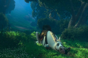
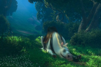
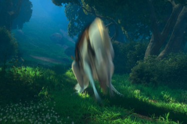
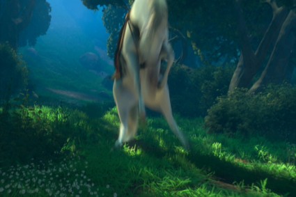
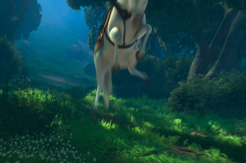
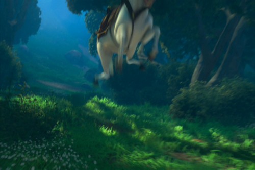
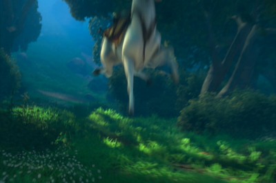
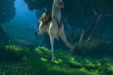
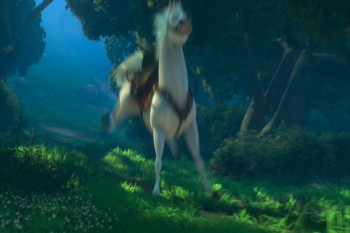
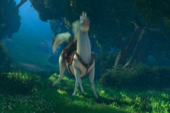
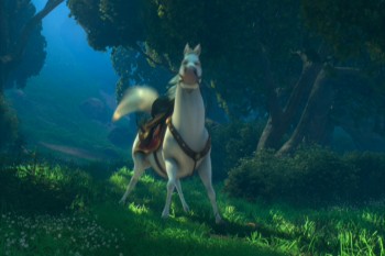
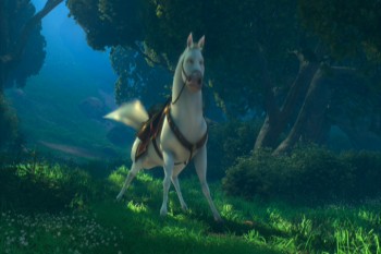
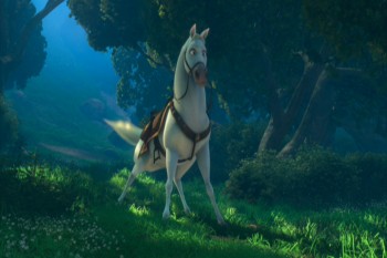
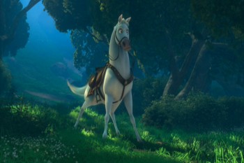
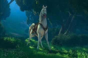
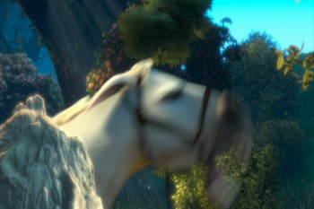
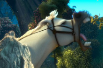
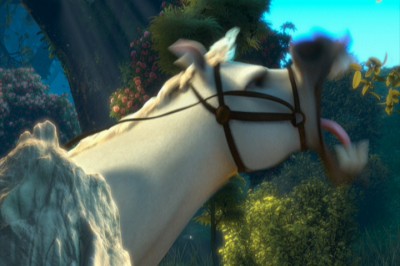
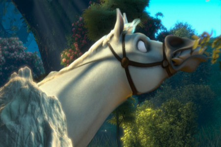
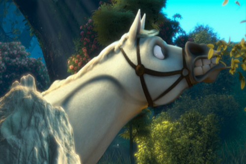
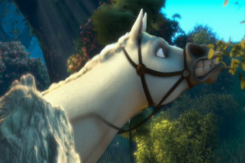
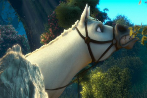
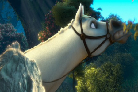
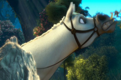
The most egregious in using these smears is the horse character, but if it were only that one, it would work. The horse is a stand-alone. It’s personality IS a cartoon. The horse, after all, isn’t a horse in this film. It’s shaped like another Disney horse, but it moves more like a dog. And it’s ALL pops and smears.
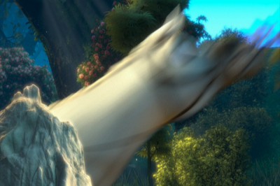
Look at these frames of it getting up from the ground, lickety-split:
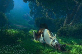 1
1
The move above is funny, not based in reality. What we have is a cartoon horse. This is not the horse Prince Phillip rides in Sleeping Beauty. It’s not even a good caricature of it.
The unfortunate part is that what Bobe Cannon did in the Dover Boys can’t easily be done in cgi. The Dover Bioys employed the brilliant cartooning of Cannon; cgi is really just a playing with computerized puppetry. You can stretch and squash somewhat, but distorting as desired isn’t always possible. So they stretch and squash and do very fast motions and hide it all under a veneer of out-of-focus. It ends up looking like just fast motion and not a true distortion – as they probably desired. The best you can hope for is image #3 just above. Now compare that to image #10 in the Dover Boys group. Not quite the same are they.
God forbid someone in cgi wants to do what Jim Tyer did. It’s impossible.
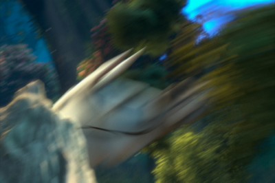
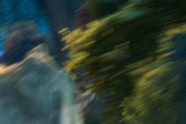
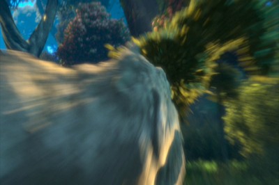
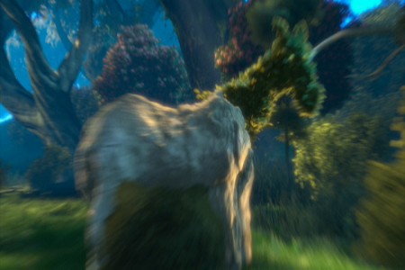
Here’s one last horse. We start rock steady – then zip, blur, stream. Ease in and race back out – zip, blur, stream. To be honest, I’m not sure what’s even happening in this scene (the horse is somehow changing into rock and vegetation?), but I let it go past as cartoon.
 1
1
To sum up what I’m trying to say. Animated features have sunk their heads into the ground. Everything has become arch and stupid. We’re not trying to develop characters but, instead, trying to do some wild movement. Movement that has nothing to do with character development. That’s a problem, if you ask me.
If you want to imitate Tex Avery or Bob Clampett, fine. If you want a seriously developed non-cartoon character, then stay away from pops and smears. It works for Aladdin, but it also limits feature films. I think Tangled is a good example of that. Outside of a few characters, I see little believable animation there. It’s all just tricks and stunts that pulls away from true, honest animation. It’s a comment on a character rather than a development of the character.
Of course, that’s my opinion. It’s so obvious to me when you see a Ghibli product like The Secret World of Arrietty or anything Mayazaki does. Their animation grows more and more subtle while Hollywood moves in the opposite direction – gags and clichéd actions. I don’t understand why Disney product approves of this. Thank god for animators like Andreas Deja who refuses to go this route, and is in absolute control of the characters he animates. There are others like him, and I applaud those artists. I wish they were all of that shape and belief.


