Photos &Steve Fisher 20 Mar 2011 08:35 am

Moon in March

- Last night we were reminded during our late night news that the moon was at its largest. It was in its closest axis to the earth, and would seem fuller than usual to us. So Heidi and I went out to take a look at 11pm. At first, in Manhattan we couldn’t see the moon and had no idea where to look for it (except up). Buildings blocked the view. We had to walk a block from our house to see it.


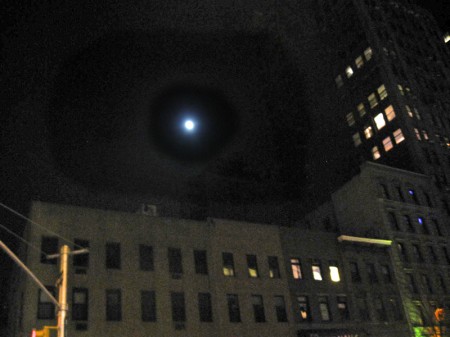
This was the view we had. The moon didn’t look very big.


And all my camera would record was a big white blob.
But we got to see it and headed back upstairs to our apartment.

I took a look on line, and sure enough Steve Fisher had sent his moon shots. Here’s what he wrote:

While the moon was certainly large last night, the atmosphere
was not as clear as I’ve seen it on other nights, so the sharpness
isn’t really what I would have hoped for. But it was beautiful.
The star the night before surprised me, though. I was actually out
photographing (I almost said ‘shooting’ and realized how awful that
would have sounded) planes because the sky was mostly white with clouds.
But through the breaks in the clouds the sky was crisply clear and when I
focused on wonderfully visible stars, I was amazed at how well I could see them.

Then, cropping and enlarging the images later yielded some cool pix.


The star


Steve’s photo of the moon.

Today’s the vernal equinox, marking the first day of Spring. Too bad there’s no real way to photograph that, except metaphorically. (Lots of shots of new flowers etc.) The weather has turned nasty cold today to remind us that Winter was tough.

Talking about going out like a lion, check out Scenes from a Tsunami in today’s NYTimes. Three Japanese artists paint what they felt.

Animation &Art Art &Commentary &Independent Animation 19 Mar 2011 07:21 am

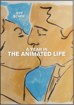
Jeff Scher

- I’ve known Jeff Scher for quite some time. In the NY animation front, he’s come to represent what I think of as the truly Independent animator. His work touches abstration, live action filmaking and an absolute love for film animation. Essentially, he’s creating Art in film.

The outlet for his work had grown enormously when he started appearning in the NYTimes. There, for a year, he did a monthly video editorial for their internet site. After the year, they reduced it to a less frequent schedule. Now his videos appear more arbitrarily. (The Times is looking to make money, which means cutting back, yet charging the readers.)

These videos are short, lyrical, animated essays all made with a strong purpose of design in Jeff’s studio in Chelsea. Most of them have music by Shay Lynch. The two artists couldn’t be a better matched pair; their work together seems inseperable.

In a recent conversation with Jeff, I learned that he is self-distributing his DVDs, which collect the many films he has done. These sales are done through his own website, Fezfilms.net.

His enthusiasm for his art has always been an inspiration for me. Jeff seems to find new and adventurous ways of doing animation, and that, no doubt, keeps him alive.


.
He also has a blog which talks about the making of his current films. The blog has the wonderful title, Reasons to be Glad. The image above comes from a Paul Simon video he did called “Getting Ready For Christmas Day”. You can find that video on the blog here.
.
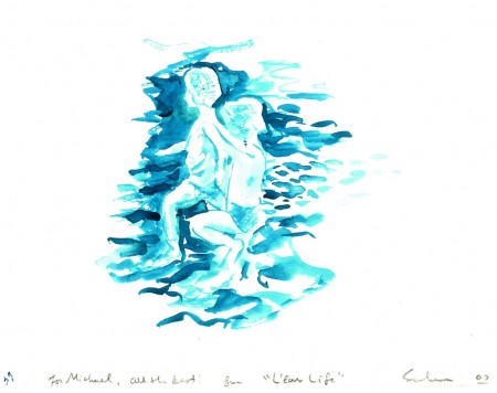
The website also features a gallery where you can watch some video and see art from many of the films (all of which is for sale.) I take pleasure in the beautiful piece of artwork Jeff gave me from his film “L’ Eau Life”.

It’s painted with watercolor on bristol, like all the other frames of this film.

.
Jeff teaches in New York at the School of Visual Arts and at N.Y.U. Tisch School of the Arts.
There’s an excellent interview with him, discussing process, here.

Bill Peckmann &Comic Art 18 Mar 2011 07:30 am

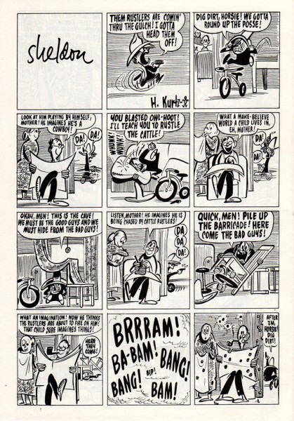
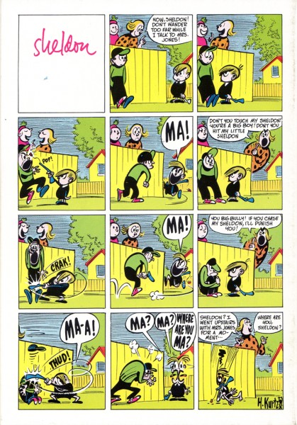
Kurtzman Kartoons

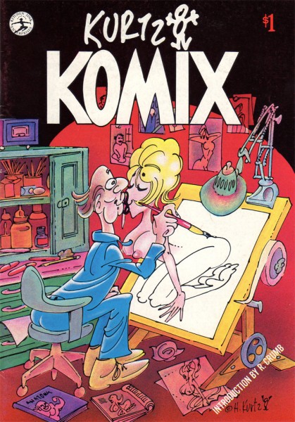
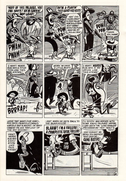
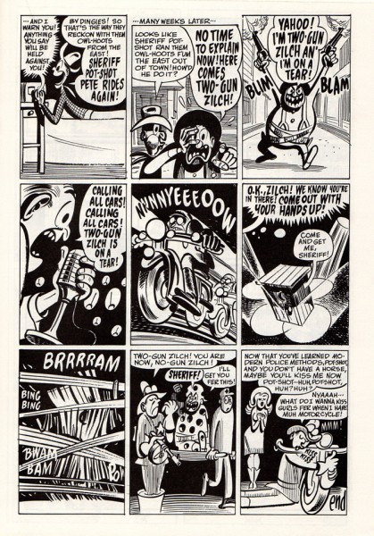
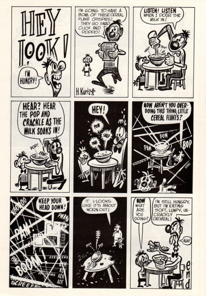
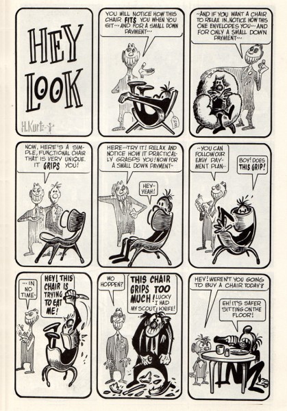
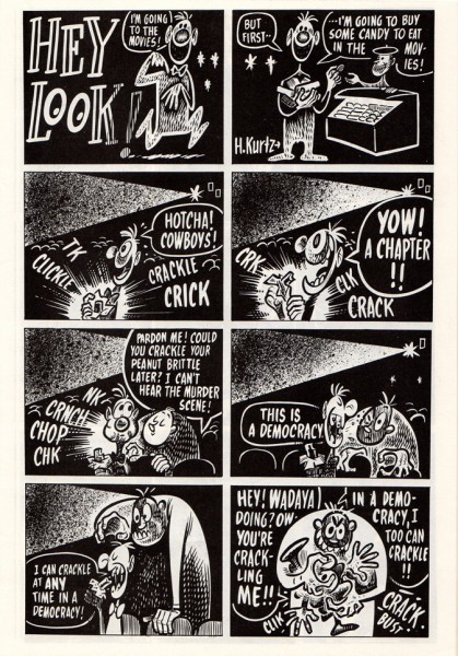
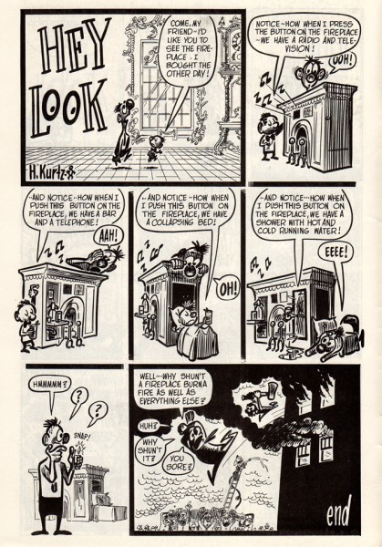
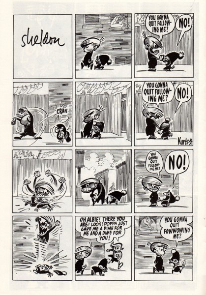
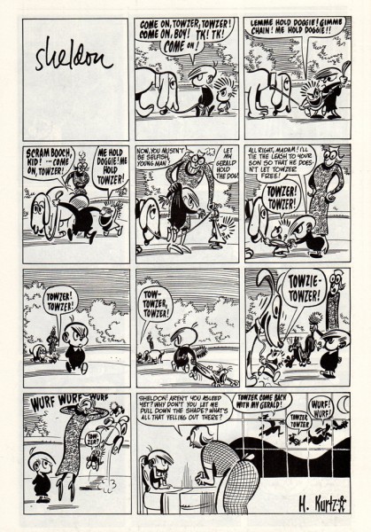
- Harvey Kurtzman offers a wealth of golden cartoons. Here’s a reprinted selection that Bill Peckmann forwarded to me; I think you’ll enjoy it. Bill wrote:

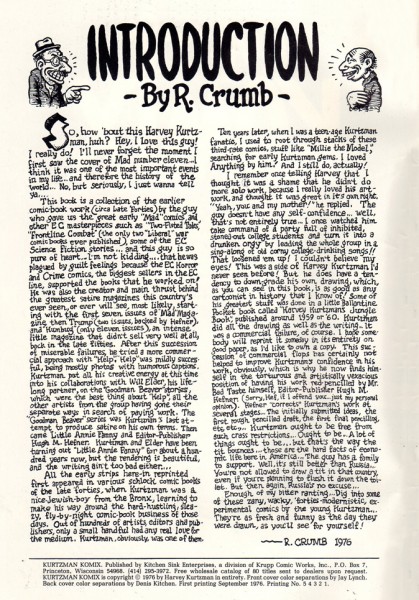
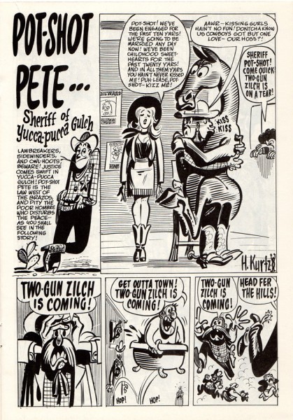
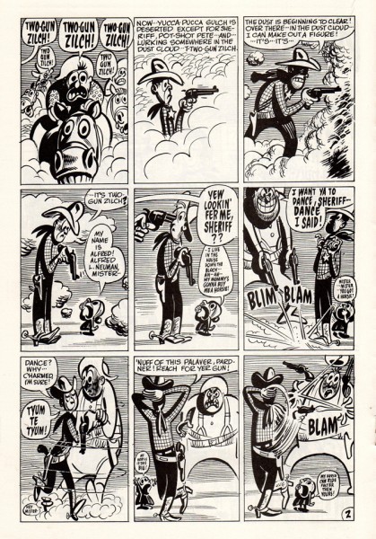
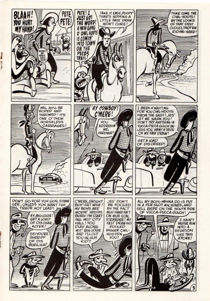
    This book of Harvey Kurtzman reprints came out in 1976. They are of three “filler” features that HK did for comic books in the late ’40′s. These pre-date the work he did at EC Comics. You can see the early seeds of MAD comics that came a few years later.

    His style is timeless, like that of Mary Blair or Bill Peet*. These could have been done yesterday. Love those animated poses. Fortunately he did do a new cover for the book when it came out. There’s also an intro by Robert Crumb.

1
The front cover

2

3

4

5

6

7

8

9

10

11

12

13

14

15
The back cover

Many thanks to Bill Peckmann for sharing.

Books 17 Mar 2011 08:15 am

Fire Dog

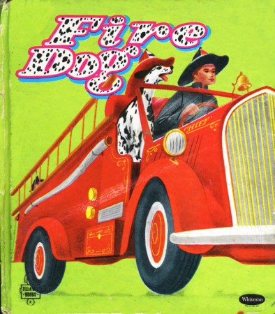
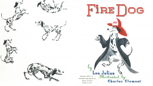
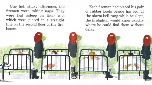
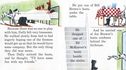
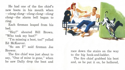
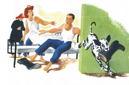
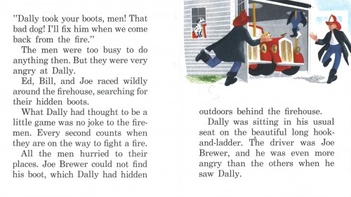
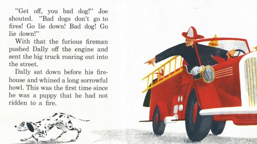
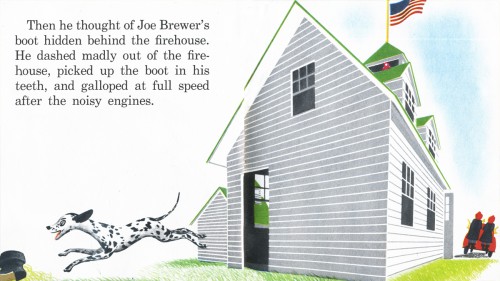
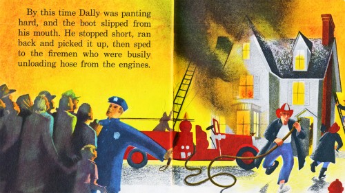
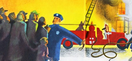
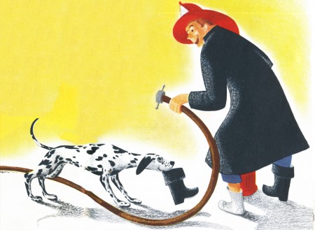
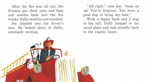
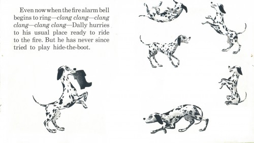
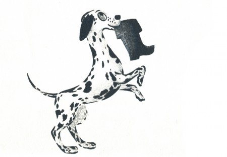
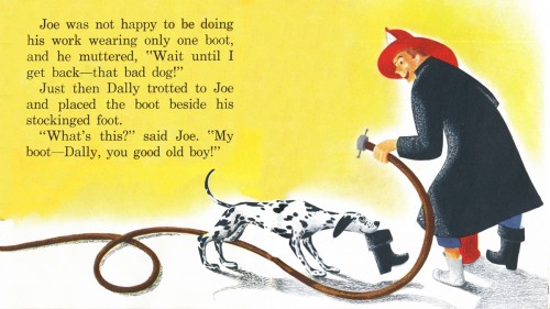
- Fire Dog is a book from Whitman Publishing. It’s not a “Little Golden Book” (Western Publishing), but it sure looks like one in many ways. The book was written by Lee Julian and illustrated by Charles Clement. Clement made a name for himself with a version of The Night Before Christmas. Fire Dog is the sequel to Dally, the successful 1951 book by the pair.

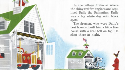
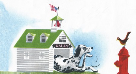
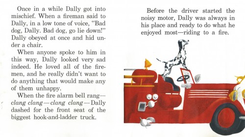
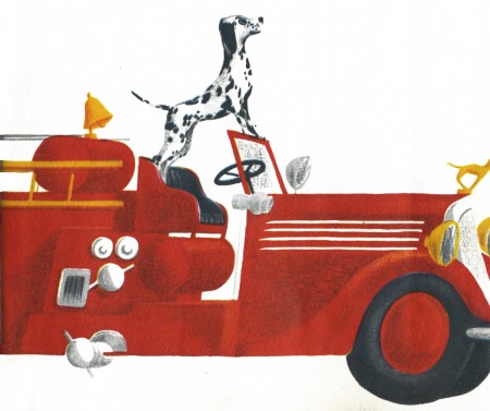
I’ve decided to post all of the illustrations. The type is built into the layout (sometimes becoming part of the illustrations) so I include the type in the post.

Here are all the images, posted as double-page spreads.


The well-worn book’s cover.

1

3


A closeup of the illustration.

5


A closeup of the illustration.

7

9

11


A closeup of the illustration.

13

15

17

19


A closeup of the illustration.

21


A closeup of the illustration

23

25


A closeup of the illustration.

Animation &Animation Artifacts &Disney 16 Mar 2011 07:32 am

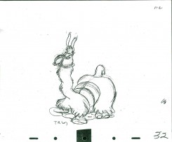
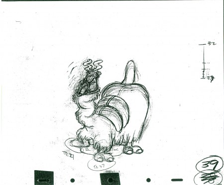
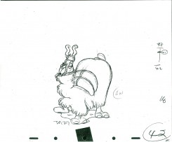
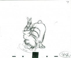
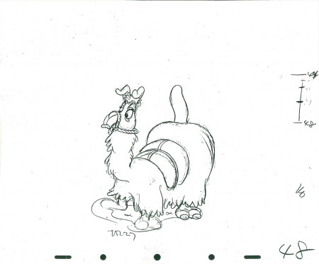
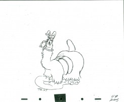
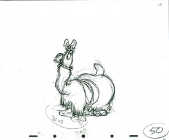
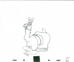
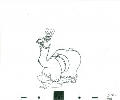
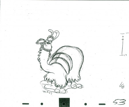
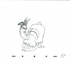
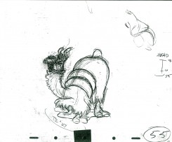
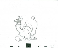
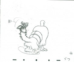
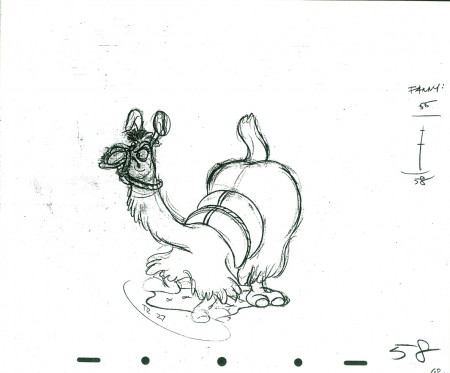
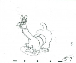
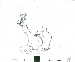
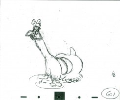
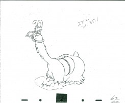
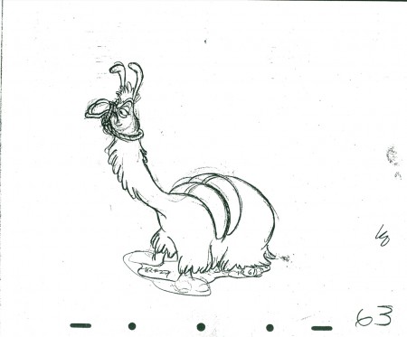
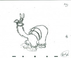
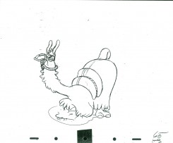
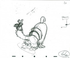
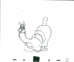
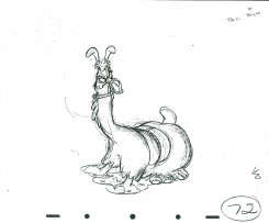
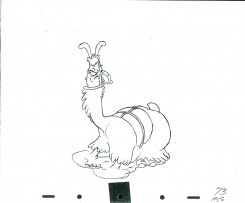
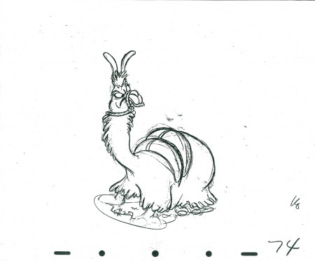
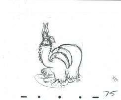
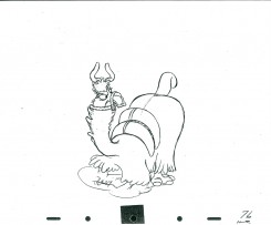
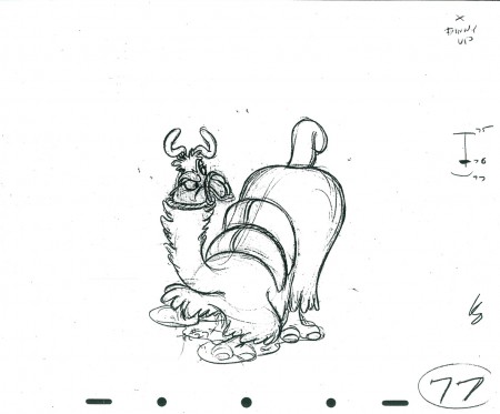
Kahl’s Llama – part 1

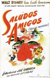
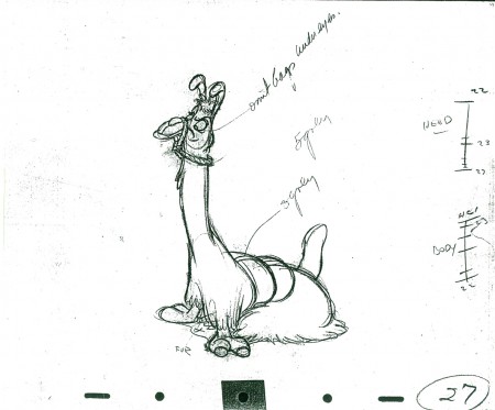
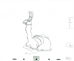
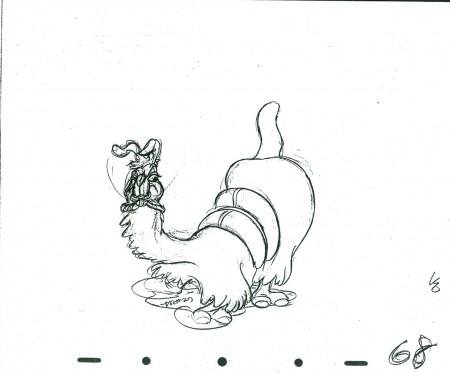
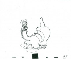
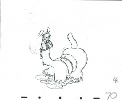
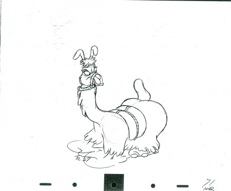
Milt Kahl animated the lion’s share of the Lake Titicaca segment of Saludos Amigos. He took the idea of a llama dancing to the panpipes of a small boy; then he exaggerated the movements for the dance to Donald Duck’s poor attempt to play the flute music.

This was the first attempt that was done to use the material gathered by the Disney Good Neighbor mission to South America. Mary Blair and Jack Miller were the two who turned their sketches into a cartoon story. Their choice of Donald playing off the Llama made for some fine comic situations.

John Canemaker gave me the drawings posted here. It’s a scene with about 400 drawings, so it’ll take some time to post them all, but we’ll do it in parts. It’s a beauty. You can almost hear the beat as you watch the silent QT movie.
.

27

3032

39

4244

48

4950

5152

53

5455

5657

58

5960

6162

63

6465

6667

68

6970

71

7273

74

7576

77

________________________

The following is a QT of this part of the scene with all the drawings posted here.

Animation &Commentary 15 Mar 2011 07:35 am

The Insanity Defense

- Mike Barrier recently posted two interviews on his website: Robert McKimson and John Hubley. On Saturday, I added a few small comments about the interviews. This caused a couple of comments from readers who got into the McKimson interview with some strong statements about McKimson’s treatment of animator, Rod Scribner. Scribner had taken a 3 year break from animating to treat his Tuberculosis. When he came back to the studio, he no longer was able to work in Clampett’s unit – he’d left the studio -, so Scribner found himself, ultimately, in Robert McKimson’s group. Seen as a wild animator by McKimson, Scribner was molded into something much less violent. It seemed the juice was taken out of his animation.

The question was whether it was the TB, heroin, electric shock therapy, or just McKimson that caused this enormous change in Scribner’s style. If we go back to the interview, I think we can find the answer. In McKimson’s words:
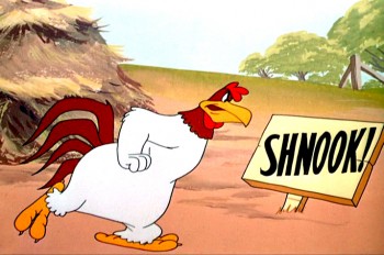
    I had one animator, who thought he was better than he was, and I’d just flip it through, and I’d say, well, this has got to be changed, it won’t work this way. He said, “I think it will.” I said, “All right, Rod [Scribner], you go and test this”—cheap negative testing—”and we’ll run it on the movieola, and I’ll show you what I mean exactly.” He said, “All right, but I know it’s right.” Every three to six months, he’d come up with one of these things. So I’d just tell him to go ahead and shoot it. We’d put it on the movieola and run it through and through, on the loop; every time, he’d say, “Yeah, yeah, I see what you mean.” And then the next time, he’d say, “Well, I think it’s right.” But that was the only way it worked against me. I had to take guys with a little less ability and try to make something out of them.

McKimson, the director, couldn’t work with the strong presence of Scribner – in fact he saw it as bad animation – and had to train Scribner into settling down to a less noticeable style of movement. Perhaps, Scribner was well ahead of his time and McKimson was behind the times?

The two animators I see closest in style to what Scribner did were Bill Tytla and Jim Tyer. All three worked in very different ways, and Scribner had more in common with Tytla and Tyer than Tytla and Tyer had with each other.

I believe there are two very different styles of animation: in one, all movement and thought is designed for the development and construction of the character; in the other, 2D animation is seen as a graphic challenge, and the shape and graphics of the character are above and beyond even the character, itself.
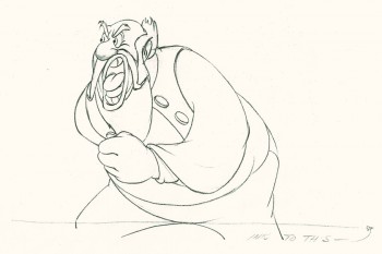
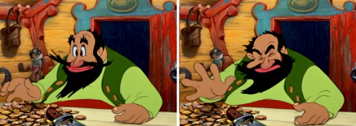
Bill Tytla worked at Disney for all his famous years. Within those walls the character was EVERYTHING. Tytla found that by distorting the character, in a very malleable way, he was able to accent traits of the characterization he was aiming for. Hence, a Stromboli would completely distort between two poses to accent a bit of violence. The character would come back together, on model, as soon as the strong gesture was made. Normal viewers, not looking for the distortion, didn’t see it but probably felt it. The strength of the movement was successful. I think Tytla saw this as a way of getting his animated character into the model Stanislavsky had suggested. This theory of acting was just starting to break through the Hollywood gates.

At least, this is my theory. John Hubley once told me that “… a small group of them at Disney were strongly into Stanislavsky. The rest,” he said, “couldn’t spell it.” I know that Hubley and Tytla were friends as was John Hench, and I’m sure they are who he meant. All you have to do is look at the Devil in NIGHT ON BALD MOUNTAIN for obvious evidence of this.
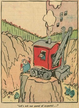
Rod Scribner seemed to have an innate sense of this, but took it a bit further. I don’t think he thought of Stanislavsky, but he did think of graphics. In Barrier’s masterpiece of a book, Hollywood Cartoons, he tells a story about Scribner and Clampett. Apparently, Scribner approached Clampett and asked if he could introduce a “Lichty” style into his animation.

George Lichty was a well-known comic strip cartoonist (Grin and Bear It) who had a very loose, linear style. Scribner, obviously, was going for a two dimensional graphic style that he thought would work well in animation. Clampett understood what Scribner wanted and decided when to go along with it. It would take some careful editing to get it to work. Consequently, Clampett would reserve specific scenes and times to use the style which Scribner developed for those particular scenes the director gave him.
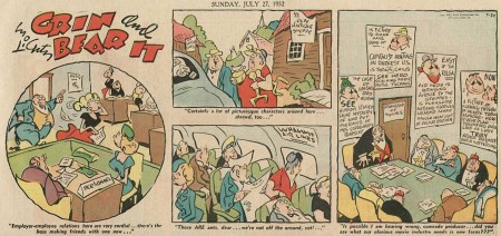

Lichty’s style

Consequently, Clampett was using Scribner, just ast Tytla designed for himself, getting the most out of the graphics without calling attention to the wild change in stylization. This first appeared in A Tale of Two Kittens then in Coal Black and de
Sebben Dwarfs
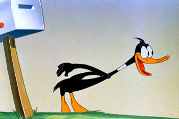
. For me, The Great Piggy Bank Robbery is one of the highlights of this wild style as Daffy Duck transforms violently before our eyes – for frames only – before returning to himself. Even then, it isn’t quite the same Daffy that other animators drew. The two, Clampett and Scribner, used it outrageously in many of their films together; some work, some don’t.

Robert Mckimson was a mundane and lackluster director who, quite frankly, didn’t understand the stylization that Clampett and Scribner had developed. It’s no wonder McKimson broke it out of Scribner’s art when he became the director. To him it was just distortion, for its own sake.
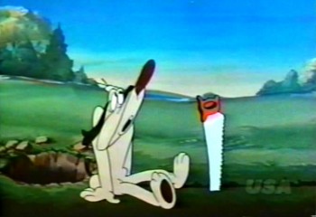
Jim Tyer was a different animal. His distortion seems to be completely and wholly graphic. He doesn’t use it to develop a character; he uses it as the embodiment of the character. The character starts off-model and goes from there wildly and totally beyond the model sheet. It’s wholly graphic embellishment, and character be damned. This is something that Bill Tytla would have disliked, and many others within Terry’s studio as well. I remember Johnny Gentilella telling me that they couldn’t keep Tyer on model. Another assistant animator told me it was a hell of a job for her to bring Tyer’s character back, closer to the model sheet. I can imagine.

All three of these animators have gained fame in the current state of the art. Young bloggers post frame-by-frame detailed distortions by Tyer, animators break down Scribner’s work with Clampett to see how exactly he did it. Tytla’s work is praised to the hilt drawing by drawing with delight taken in every distortion.

I have to say that I have always been a fan of Tytla’s and Tyer’s work. When I started doing animation professionally, I found people praising Tytla and putting down Tyer. I kept my love of Tyer secret. Over time, I grew to love Scribner. With all three I studied their animation frame by frame over and over. I was pleased that the folk who did The New Adventures of Mighty Mouse on CBS had found Tyer and used him as a model. To me it was the perfect model for series animation, and, no doubt under the influence of Ralph Bakshi they glorified their model.
It is interesting how many try to imitate the styles of all three and very few approach the level of any of them. I hope those imitators keep triying. To me, it’s the essence of 2D animation, and perhaps within this graphic medium one of those imitators will break through and we can relish such achievements. Achievements which are virtually impossible in the puppet-computer animation of Pixar and Dreamworks. But within that imitator, 2D animation will stay alive.

A couple of screen grabs were borrowed from the sites of
Thad Komorowski and Kevin Langley. My appreciation and thanks.

.
Animation &Frame Grabs &Hubley &Independent Animation 14 Mar 2011 07:22 am

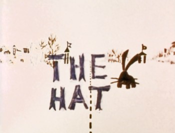
The Hat – bigger

- The recently posted interview Mike Barrier conducted with John Hubley has me thinking about Hubley and my years back there and then. You might say, I’m in a Hubley frame of mind these past few days, so I’m into reminiscing. I posted part of this back in March, 2008; here, I’ve extended the article a bit.
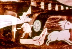
New York’s local PBS station, WNDT – that’s what it was called in the old days – used to have a talk show hosted by film critic, Stanley Kaufman.
(It turns out that this show was produced by the late Edith Zornow, who I once considered my guardian angel at CTW.)

This talk show was quite interesting to me, a young art student. I remember one show featured Elmer Bernstein talking about music for film. He gave as his example the score for The Magnificent Seven. He demonstrated that the primary purpose of the score, he felt, was to keep the action moving, make the audience feel that things were driving forward relentlessly. I still think of that show whenver I see a rerun of the film on tv.

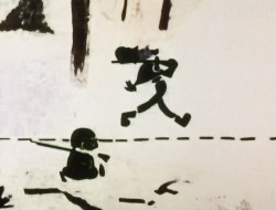
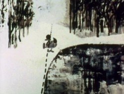
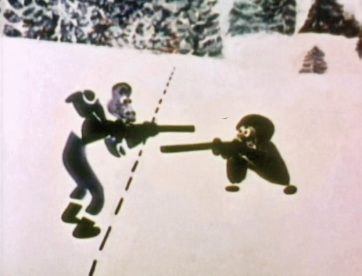
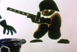
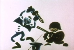
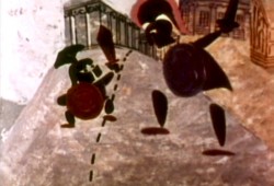
The surprise and exciting program for me came when John and Faith Hubley turned up on the show to demonstrate how animation was done. They were using as an example a film they had currently in production, The Hat. This film was about the siliness of border lines. One of two guards, protecting their individual borders, loses his hat on the other side of the line. Of course, all he needs do is to step over and pick up the hat, but he can’t. The other guard won’t allow him to cross the border illegally – even to pick up his hat.


The voices were improvised by Dudley Moore and Dizzy Gillespie (much as the earlier Hubley film, The Hole, had been done.) The two actor/musicians also improvised a brilliant jazz score.

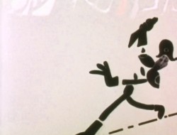
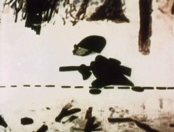
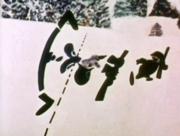
John’s design was quite original. The characters were a mass of shapes that were held to-gether by negative space on the white on white backgrounds.

The animation of the two soldiers was beautifully done by Shamus Culhane, Bill Littlejohn, Gary Mooney and “the Tower 12 Group“.

Culhane animated on a number of Hubley films during this period, most notably Eggs and a couple of commercials.

Bill Littlejohn animated on many of the Hubley films from Of Stars and Men up to Faith’s last film.

Gary Mooney animated on The Hole and Of Stars and Men. He was an Asst. Animator at Disney, animated for Hubley then moved on to some of the Jay Ward shows before moving to Canada where he continues to animate.

Tower 12 was the company formed by Les Goldman and Chuck Jones at MGM. Apparently they were between jobs when Hubley was finishing this film, and Chuck offered help.


Of course, the colors of the film as represented by the dvd are pathetically poor. It’s hard
to even imagine what the actual film looks like, and it’d be great to see a new transfer of
all the Hubley films.

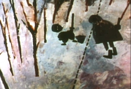
The design style of the film was an original one for 1963. It’s one that would often be copied by other animators afterwards. The characters were searated at their joints. No reel ankles, just open space. They were also broken at the wrists and belts. The taller man seems to have a collection of ribs and shoulders for his torso. Like the dotted line they walked but could not cross, these people were also a gathering of parts.

This was one step removed from the earlier film, The Hole, which had just won the Oscar and went on to enormous success for the Hubleys. That film used what they called the “resistance” technique. They first colored the characters with a clear crayon. Ten painted watercolors on top of that. The crayon would resist the watercolor and a splotchy painterly style developed. The Hat literally broke those splotches into parts of the characters and put some of the control in the animators’ hands.

The film was obviously political. Anti-nuclear politics played strongly in the story. This was a step just beyond The Hole. In that film, two sewer workers converse on what violent things might be happening above ground. The film ends with an accident, or possibly a nuclear crash.

In The Hat, the two partisan soldiers discuss a history of man’s aggression all within their reach. At one point, it would seem, each of
them is ready to press the red button calling for nuclear assistance – or, at the very least, a buildup of military force.

While walking up and down that line, they comment on how we reached the point of no return. All the while, bugs and small animals cross the line, indeed, walk on or over the “hat” lying on the ground.

The backgrounds for this history of War grow more violent, more expressionist. John’s painterly style comes to the fore, and the brush strokes take on a force we haven’t seen to this point.

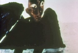
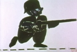
When we return to the two leads, we find that they’ve changed. They’re darker, and they both have lines scratched into the paint of their bodies. Not as much emphasis is placed on their disjointed body parts.

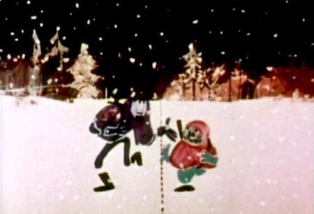
We leave them as we found them, walking that line. At this point, both of their hats lay on the ground and they’re deep into conversation. They don’t seem to notice anymore.
It has started to snow.

Animation &Independent Animation &Richard Williams 13 Mar 2011 07:32 am

Dick’s World – recapped

Here’s a piece originally posted back in March, 2007.

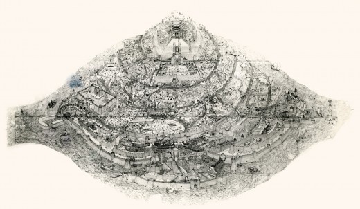
- Let me share an image with you.

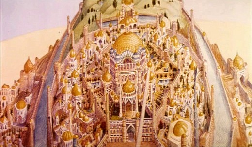
When Raggedy Ann & Andy was winding down, in 1977, Richard Williams asked me, over dinner, whether I would be interested in working in London on his feature, The Cobbler and the Thief. He had in mind one sequence which he said would be all mine. This was the film’s opening – a slow truck into the island where all the action of the film would take place.

(Click on any image to enlarge.)

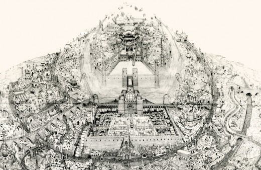
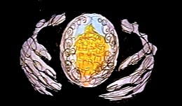
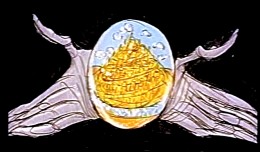
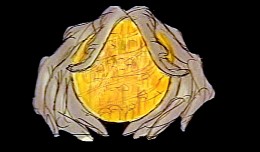
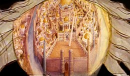
This was a photostat of this island. The original drawing, Dick had said, was enormous. It was composed of many smaller segments that were pinned together on a wall in his studio. If you look closely you can see those dividers in this photostat. To give a better indication of the detail in this drawing, I’m posting, below, a second image of a small portion of it.

The idea of it exhilarated me. The conceit of the scene was that the entire city would be animated. Hundreds of moving elements. The piece would be done in parts and optically pasted together. (This was the age berfore computers.)

I believe Dick had said that Roy Naisbitt was involved with it, and that was something to get me going. I’d read about many of Dick’s staff and had already placed them on pedestals – including Roy’s work. I would not only get to meet them but work with them as well.
I decided not to take the job. I thought it would be better to remain friends with Dick than to continue working with him. That decision is something I don’t regret. It would have been fun to have been involved with that film, but so much has happened in my life by staying put, that I have no regrets.

The storyboard for the original cut of Dick’s film included these panels which led into the image of the animated city. A still of the city remained in the Miramax/Fred Calvert version, but that’s all.

Animation &Animation Artifacts &Commentary 12 Mar 2011 08:37 am

Interviews

- On his website, Michael Barrier has been offering some of the many interviews he and Milt Gray recorded in preparation for his seminal animation history book, Hollywood Cartoons.

Two of these interviews have recently surfaced: Robert McKimson and John Hubley. Something comes across in these two interviews, something that doesn’t quite make it to the history books that try to include all the facts and figures, statements and theories. Personality is what is evident in these interviews.

I’d read about Robert McKimson for years, but I never felt much about him. To be honest, I wasn’t a big fan of the films he’d directed for Warner Bros. They’ve always seemed a bit overanimated and don’t always take the shortest route to the gags. I’ve felt a flatness in these films, something even Friz Freleng’s films don’t have. There’s a tightness to Friz’ cartoons, a tightness that shows off the director’s mastery of timing.

McKimson, to me, did incredibly beautiful artwork in those early model sheets for Bugs Bunny (well displayed on a sidebar piece on Mike’s site.) His animation certainly stood as strong in those shorts directed by Freleng. There was a bit more of a drive to the scenes he animated.

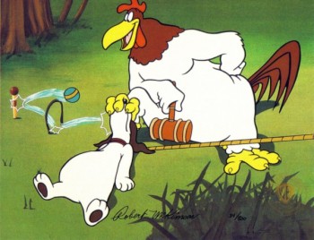
Reading the interview, I found a distinct personality. There was someone who needed to be in control, who had to take charge, yet never made waves when it didn’t happen. He quietly groused about the problem. A curiously complicated person. Suddenly, I felt more about McKimson the man than I had with all I’d read about him in the past. It makes me want to back up and revisit the shorts he’s directed. (Though not the Foghorn Leghorn films; I just flat out don’t like that character.)

The John Hubley interview is different. I knew Hubley and knew this interview. Mike gave me a copy of it many years ago, and I’ve read it over some half dozen times. However, I can attest to John’s personality being right there.

You get the feeling that it’s tough for Hubley to spare the allotted hour for the interview. He’s answering all the questions, but you feel like he wants to run to do something else. That was definitely John – always on the run. The only time he seemed at peace, to me, was when he was painting. For animation, when I knew him, that meant rushing out the Bgs for whatever piece we were working on. Given the short amount of time planned for each bit of artwork, it’s amazing how masterfully they all turned out.

The couple of times I made a comment to John about his past work – usually UPA, I was stopped. I remember riding high the day after I’d seen ROOTY TOOT TOOT for the first time. There was no doubt in my mind that I’d seen one of the great animated shorts of my lifetime. So I told John. He just looked at me for a couple of seconds, then turned and exited the room. I don’t know what was behind it, but I knew I wouldn’t get much about his past from him.

It’s amazing, then, to see how much and what detail Mike pulled out of Hubley, and it seems so effortless. In so many words, John tells Mike that he wanted no interference from others over his direction. You’re not quite sure he always fought for it, but there’s no doubt he wanted it. Information, I thought I knew, was clarified in the interview. I was and still am impressed by that information gathering.

Read these two interviews. They’re important. These people are the backbones of our industry, and we can only learn from them.

To that end, you should also know that Mike has quite a few more interviews on his site: Hugh Harman, Joe Grant, Brad Bird, Fess Parker, Frank Tashlin, John McGrew, Art Babbitt and Ward Kimball are all there, as are more. Just scroll down toward the bottom of Mike’s blog, and you’ll find quite a few links to the right of the screen. There’s a lot there on this site.

Bill Peckmann &Illustration &Peet 11 Mar 2011 06:51 am

Peet’s Capyboppy – part 2

- Here I continue posting the fine illustrations by Bill Peet for his book, Capyboppy. I’ve chosen not to put Mr. Peet’s writing in the post, feeling it isn’t quite ethical, so have condensed the story so that the illustrations make sense. I would urge you all to buy a copy of this book for the writing alone.

The book’s about 60 pages in length, so it’ll take a couple of more posts to share the artwork. It’s a gem.

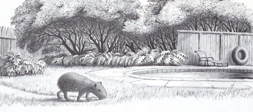
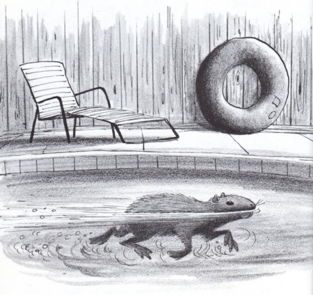
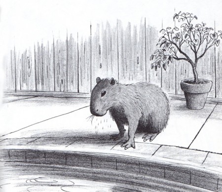
Our new South American visitor couldn’t have been happier in the yard with the swimming pool and the meatly trimmed lawn. At first he enjoyed himself swimming gracefully in the pool, but then it became obvious he needed a playmate.

22

23

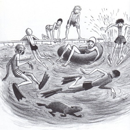
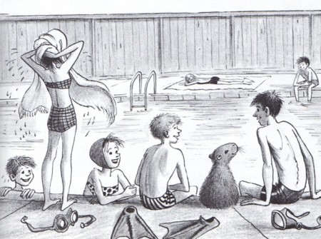
The family worked during the week, but on weekends there were plenty of visitors to keep Capy occupied. He swam when everyone swam and rested when they did, tweeting his tweets as if to join in on the conversation.

24

25

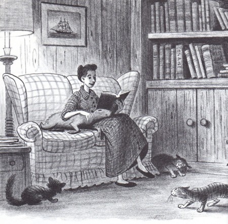
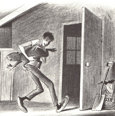
In the evenings, he joined the family in the family room watching television and sleeping in Margaret’s lap while the cats watched on jealously and miserably. At the end of the evening it was Bill’s job to take Capy out to the garage (kicking and squealing all the way) where he had his bed. He was getting spoiled.

26

27

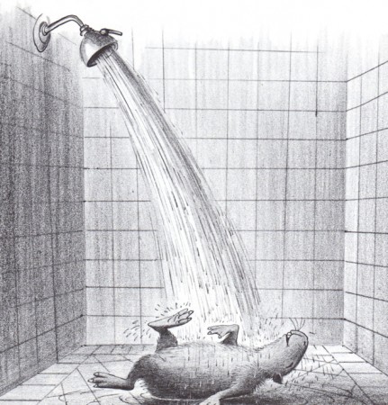
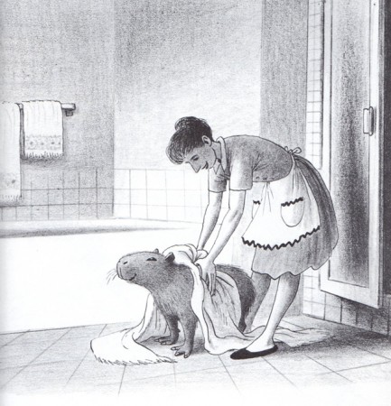
His day would begin with a warm shower, after which Margaret dried him with a fluffed towel. After this he ate a nice breakfast of barley and oats.

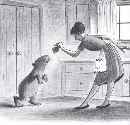
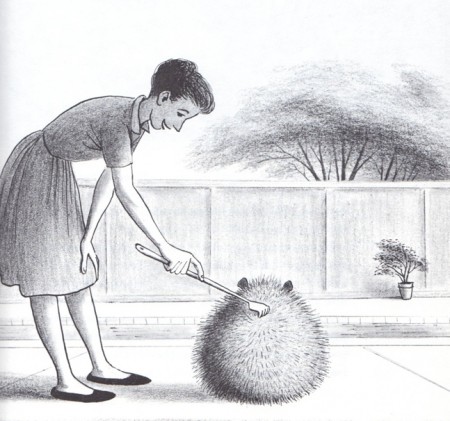
His favorite food was graham crackers, and some days Margaret would scratch his back with the back-scratcher until every one of his hairs stood on end.

28

29

30

31

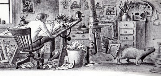
There were times we’d leave him in the yard too long until he started Tweeting madly to get us to let him in. One day he came inside the studio while I was drawing and I watched him nose about all the books, magazines and art materials. He ate a grease pencil.

I didn’t mind losing a grease pencil, but he started eyeing some drawings on the wall. I couldn’t lose a month’s work if he ate them, so I pushed him out to the stairwell and rudely shut the door behind him.

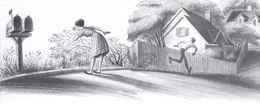
I would check on him from time to time to make sure he was safely within the yard. We had a notice on the gate to make sure it was kept closed. But one day, I saw that the gate had been left open and Capy had escaped.

Margaret and I ran out searching for him calling out “Capyboppy! Capyboppy!” No Tweeting response, so we ran to the car to slowly drive about the neighborhood in search of him. Immediately, after we pulled out of the driveway, Margaret shouted, “There he is! There’s Capy!”


Many thanks to Bill Peckmann for scanning and sharing this art with me for the blog.

« Previous PageNext Page »

eXTReMe Tracker
click for free hit counter

hit counter