Animation 09 May 2011 06:57 am

Bad Animation

- Let’s just ramble on about animation. I don’t mean animated films, I mean animation. I don’t much like watching animated films these days. I haven’t seen much that I like among recent films. All those YouTube videos and student films on Cartoon Brew. There’s so much more chaff than wheat. I get enormously impatient and dismiss films quickly. I sat through the ASIFA East animation festival award winners and got to see a number of bad films, regardless of the fact that they’d won awards. (Despite all the unknowing comments on Cartoon Brew recently, there were quite a few films among the winners. The shortage was in the Independently produced films, which is not a problem with ASIFA East’s festival but with Independent film. There were two fine films among the winners – both had problems as well – and a lot of bad films. I don’t include Student films in this discussion.)

I saw a lot of problems with these films that had won. Let’s talk about a couple of these problems without naming the films. I don’t mean to pick on ASIFA East award winners; it’s just that some bad habits showed up among some of the winners. There was lots of bad writing, but that’s not going to be my main focus. I’m concerned about the animation.

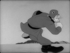
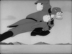
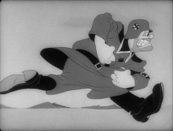
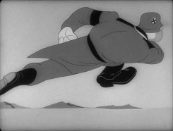
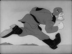
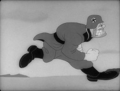
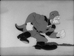
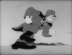
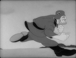
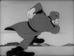
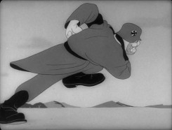
Below are the frames from John Kricfalusi‘s site of one of his favorite run cycles:
1 2

3 4

5 6

7 8

9 10

11 12
Though the original scene is and should be on ones,
I’ve exposed it on twos for the sake of my blog points.

The drawings above in a QT movie.

[ Javascript required to view QuickTime movie, please turn it on and refresh this page ]


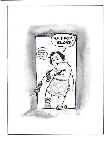
- I don’t think most people animating these days think of their drawings as characters – not really. How else could you explain the preponderance of half-walks? That is when you animate one leg crossing in front of the other, and you keep repeating this instead of then animating the back leg crossing. You’re doing half the number of drawings, but you’re showing your lack of interest in a character, rather than a graphic motion. This isn’t limited animation, it’s bad animation! It’s surprising that even in the silent days of animation, they didn’t take this crappy short cut. They didn’t really know what character animation was, back then, yet they had more concern for the characters than do the “animators” of today. It’s pathetic. Yet, I can count three times, in three different films, noticing this lousy stunt among the award winners. And you see it in so many of the new on-line films.

The drawings #7 -12 above in a QT movie. Half the cycle
as it would be animated by today’s animator.


Students: ANIMATE BOTH LEGS! “Professionals,” you should be ashamed of yourselves.

- I’ve also noticed that there are a lot of films that are animated on fours. It’s not just that the animation is on fours (and believe me when I say that I can see every one of the frames on fours!), it’s that the animators don’t make the choice. They work in flash or some other program where they choose to animate solely on fours. This means they can’t go to threes, twos or, heaven forbid, ones when they have to. It also means they don’t properly know how to animate. Since all animation is about TIMING, and since you choose not to properly time your motions, you’ve given up the most important attribute in animation. It’s not good, and it’s a real disservice to your own learning abilities. You’ve chosen to stunt your growth.

There were many films done this way. One of them also included a lot of camera moves – also on fours. It was like a staccato zoom in or out. I felt like I was jumping in and out in stages and wanted to run out of the theater – or at least stop watching these award winners.

Every other drawing above in a QT movie
exposed on fours.


There was a Disney Action Analysis class where they discussed when things should be on ones, twos, threes or fours. The decision was, originally made, that animation should be NEVER exposed on fours. That is until it was shown that very slow moving animation, animation that required MANY drawings – when lines touched lines – could get away with fours. Of course, this has to do with full animation, and the limited type of animation done today can find many uses for fours, but there has to be a choice to go in and out of that choice. Limiting yourself to ONLY animating on fours means you choose to handicap your animation, and you’re not really developing character. You can’t be.
You’re, again, animating a graphic symbol not a living thing.

- Then there were the films that treated the characters with complete hostility by pulling insufferably nasty and inhuman stunts on the characters. This IS a fault of the writing and the directing more than the animation. I do have a complaint about scripts. Why do I, as an audience member, have to sit through these terrible actions and business on the screen? This was the case with at least three of the films. The younger generation seems to delight in rotten behaviour to their “characters” indicating more of a psychological problem in the filmmaker than a choice in service of the film. Believe me this wasn’t the case ten years ago. Terribe things might happen to Daffy or Elmer, but they weren’t as vile and in your face as they are today.

One film showed a lot of promise as far as the animation – the movement – was concerned, but the principal character lived through some horrible torture. And then the happy ending had big, bright, bubbly and cute Disneyesque drawing that was equally repugnant. The film was just so easy to dismiss – yet the animation, itself, moved fairly well and showed real knowledge on the part of the animator/director/writer. The film was tedious to sit through.

This is what we have today. Violence is the last bastion of the young filmmaker. Viva la freedom! Too bad it makes for horrible filmmaking! Impossible to sit through.

Unfortunately, I can’t make an example of this from the drawings John K posted above. Also unfortunately, the violence in his films has unwittingly helped to lead to this direction, albeit the cartoon violence in his films IS character driven and works. In the best spirit of Clampett or Avery. The superviolent activity in these newer films is just repulsive and has nothing to do with character. It isn’t necessarily John K’s fault, it’s just the way it is. We all affect each other, and that’s the society we have nowadays. Too bad.
Commentary &Photos 08 May 2011 08:05 am

Creepers – PhotoSundayRecap

For today’s PhotoSunday, I’m recapping something posted back in July of 2008. This is one of many I did back then in which I took some pride. I’ll have to get back to photographing my streets of NY. Now that the weather is warming up a bit, I’ve every encouragement to do so.

- There was an excellent documentary on PBS this past Thursday. It was called, “Home.” Perhaps it was just local channel 13/WNET that aired it. The show was a documentary about New York from the vantage point of outsiders who’d moved here. The director, Alan Cooke, interviewed lots of celebrity types; Frank McCourt, Liam Neeson, Alfred Molina, Rosie Perez, Mike Myers, Colin Quinn, Susan Sarandon and Woody Allen offered choice comments throughout the show.

Malachy McCourt, at one point, said that the City was cold and difficult. Even the sidewalks were cold, hard concrete. Yet in these sidewalks there were always cracks with bits of life shooting up from the least likely places.

Wall-E offers a world of no vegetation, and we have to accept that premise. Yet, reality shows us that nothing can cede the bits of green from stopping in the coldest of extreme. George Carlin once said that styrofoam was not going to destroy life on earth. It was just going to stop HUMAN life on earth. He speculated that perhaps humans were put here specifically to invent styrofoam so that the earth could continue after all humans died off using styrofoam for whatever it needed. Even the devestated Hiroshima and Nagasaki have already recovered from the nuclear onslaught some sixty years ago. Grass grows there.
Here are bits of grass, life and plants creeping out from the least likely places.


(Click any image to enlarge.)______________

To me, it’s more likely that 700 years after the humans left earth,
the planet would have looked more like the photos below.


Madison Square Park is looking gorgeous these days.

Commentary &Puppet Animation 07 May 2011 07:01 am

Left Overs

- There should be plenty of 3D stop-motion films circling the globe ni a year or two. Recently there’s been a bit of news about a few of these animated features.

LAIKA, the company that produced Coraline, under the sturdy direction of Henry Selick, has announced a new two picture deal with Focus Features. Their first film, ParaNorman, will be released on August 17th, 2012. The second, yet-to-be-named, picture will be released nationwide in 2014. The first film is being directed by Sam Fell and Chris Butler, from his own original screenplay. Sam Fell was director of The Tale of Despereaux and Flushed Away. Chris Butler was storyboard supervisor on Coraline and storyboard artist on Tim Burton’s Corpse Bride. The voice cast includes Academy Award nominee Casey Affleck (The Assassination of Jesse James by the Coward Robert Ford), Tempestt Bledsoe (The Cosby Show), Jeff Garlin (Curb Your Enthusiasm), John Goodman (Monsters, Inc.), Anna Kendrick (Up in the Air), Leslie Mann (The 40-Year-Old Virgiin), and Tony and Emmy Award winner Elaine Stritch (30 Rock).

Meanwhile . . .

Aardman animation is producing two features in conjunction with Sony Pictures Animation. Arthur Christmas, is a 3D adventure that will hit theaters on November 23, 2011. The voice cast includes: James McAvoy, Hugh Laurie, Jim Broadbent, Bill Nighy, Imelda Staunton, and Ashley Jensen, which is currently in production. The film is being directed by Sarah Smith from a screenplay written by herself and Peter Baynham.

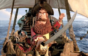
The second feature, The Pirates! In An Adventure with Scientists will be directed by Peter Lord and co-directed by Jeff Newitt. The screenplay is by Gideon Defoe, based upon his books. The vocal cast will include: Hugh Grant, David Tennant, Imelda Staunton, Jeremy Piven, Salma Hayek, Brian Blessed, and Brendan Gleeson.

And . . .

Henry Selick has recently signed to direct features for Disney/Pixar. He’ll be working out of Pixar’s Emeryville, Calif. campus and using their resources. The films he will make will be written and directed by him based on both original ideas and literary properties. This brings Selick back to many of the classmates with whom he graduated from CalArts.

_____________________

- Last week the ASIFA East Festival was held and awards were presented to the chosen filmmakers. Cartoon Brew posted a note about the winners and included a snarky comment by Amid Amidi which takes a swipe at the board members for entering their films in this local festival. And I do mean local festival. Here’s Amid’s comment:

    ASIFA-East president David Levy also won two of the top awards: Best Educational Film and 1st Place for Independent Film. He’s a nice guy so let’s all look the other way and pretend that’s not a conflict of interest…

    The quality of the film is irrelevant. Doesn’t matter if it’s the best animated short since One Froggy Evening. If the ASIFA-East leadership or board is competing against its members, that’s a serious issue that affects the legitimacy of the awards.

Here’s a response from Adrian Urquidez:

    ASIFA-East board members have always been allowed to participate in the festival and always will because the volunteer board is comprised of active members in the animation community both in their professional and personal lives. In no way are any of the awards just “given to people in their circle”, they are voted on by the hundreds of members who participate in the well-publicized jury screenings. We’ve had 42 years of successful festivals, and while always looking to improve, I believe we have a lot to be proud of
    If one wants to have a discussion on outreach, fine. But unnecessary slander gets you nowhere.
    -Adrian Urquidez ASIFA-East website manager, board member and (horror of horrors) grateful award winner.

The way ASIFA East works is this. Filmmakers are asked to submit films; board members are not discouraged. There are several nights of viewing for any member who wants to attend. Those who attend are the voters for any awards.
Just as the Oscar voters are tied to some of those entering the awards and vote for their friends, those who attend the ASIFA screenings are probably friends of some of the filmmakers and will most likely vote for their friends. This is human nature, not corruption.

This doesn’t mean that it’s a small coterie of friends who always win the awards. However, when only a small number of films are entered, the quality will be lower than usual. If board members (all 9 of them) weren’t allowed to enter their films, there would be fewer board members since they do a lot of work for no pay, and if they weren’t allowed to enter the films in the festival there would be a reason for them not to volunteer to be on the board and do all the hard, necessary work.

This is very different from the awards given out of ASIFA Hollywood. ASIFA East is a small group in New York and should be reccognized as such. When The Lipsett Diaries won the award as the Best Canadian Film at the Ottawa Animation Festival, was that suspect? Somehow I, personally, didn’t see it that way. I did see a good film win a well-deserved award. Just as I saw David Levy’s film win a deserved award.

In the past 40 years or so of ASIFA East’s festivals, I can assure you I’ve won quite a few awards, despite the fact that I’ve been a board member. Certainly all my licking of stamps for the ASIFA mailers wasn’t enough to make my films succcessful with all the voters who didn’t know me. My films won the awards, and I was pleased to be able to share them with the audience – that’s truly the prize you get. (When you win a prize, your film is usually screened in the large New School auditorium.) The awards – a piece of paper – are worthless. Hearing a large audience (about 1000) makes the win worth while and something to remember.

Bill Peckmann &Comic Art &Illustration 06 May 2011 06:54 am

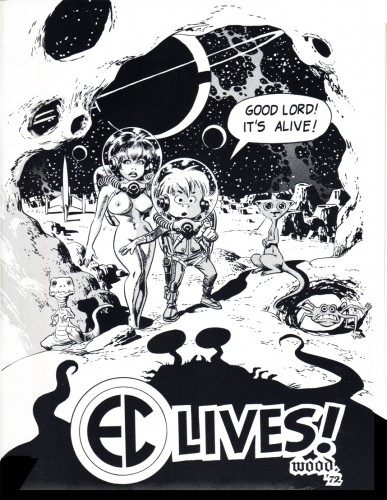
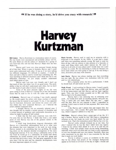
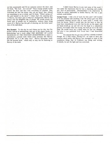
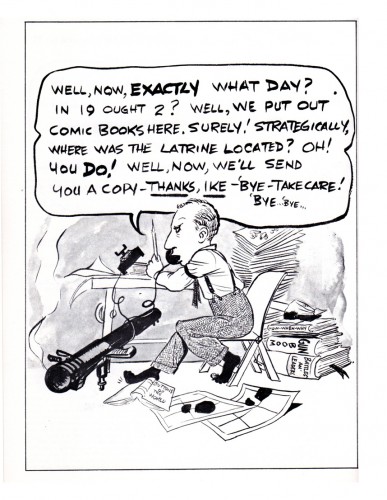
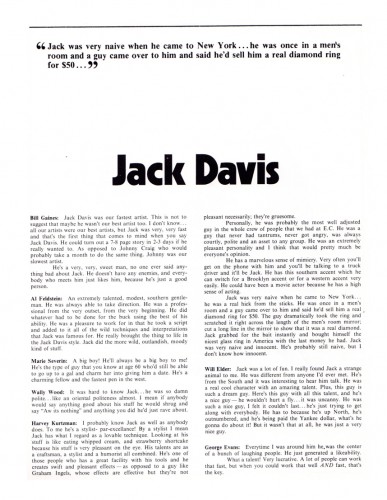
EC Comics Convention

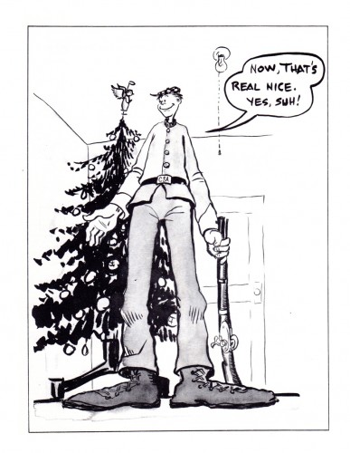
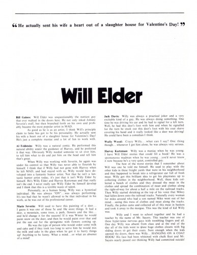
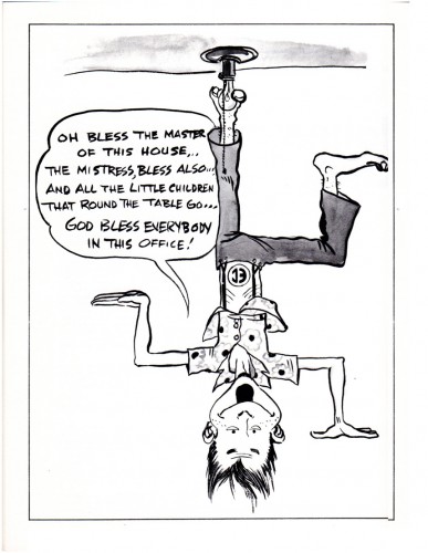
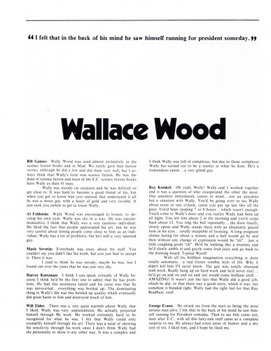
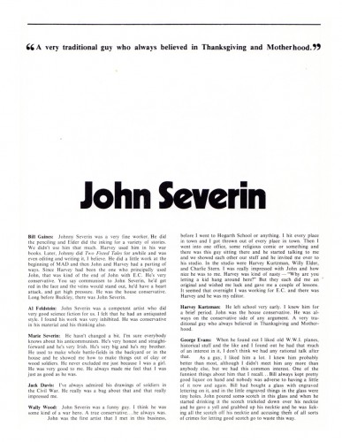
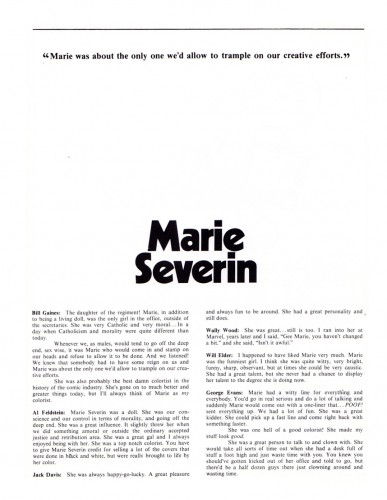
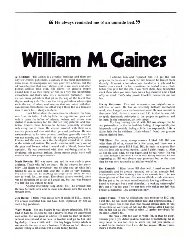
- The following piece was sent to me by Bill Peckmann. Here’s his introduction to it:

    Here’s something that might not be accessible to some of your readers.
    It’s the program booklet of the 1972 EC Comics Convention that was held in NYC.

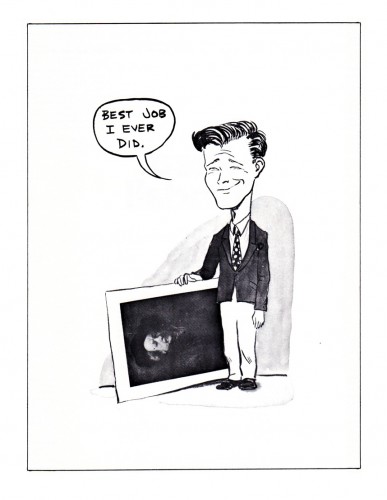
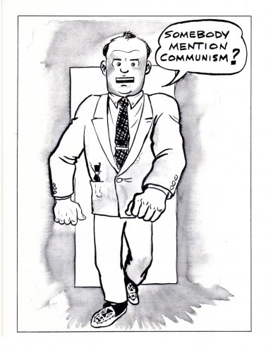
    I’ve scanned the pages pertaining to cartoonists of the early MAD comic book. The caricatures were done in the early ’50′s (EC at it’s peak) by a very young Marie Severin. (EC colorist then, went on to fame at MARVEL comics later.). The comments of the cartoonists are made by their compatriots for the Convention. Twenty years had passed but the good memories were still there.

    So here we have editor/artist Harvey Kurtzman. Artists – Jack Davis, Bill Elder, Wally Wood, John Severin, colorist Marie Severin (sister of John) and last but not least, publisher of EC Comics, Bill Gaines.

1

2

3

4

5

6

7

8

9

10

11

12

13

14

15

16


Many thanks to Bill Peckmann for sharing the material,

Books &Illustration 05 May 2011 06:41 am

Searle’s Female Approach

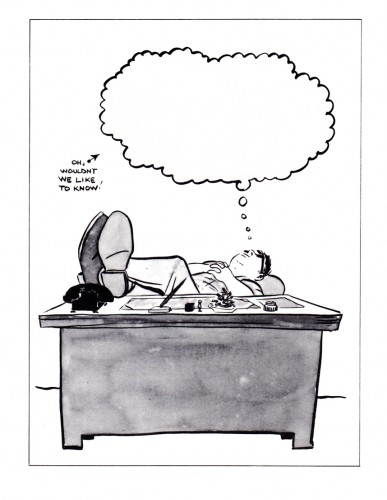
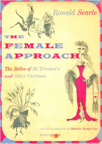
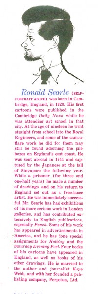
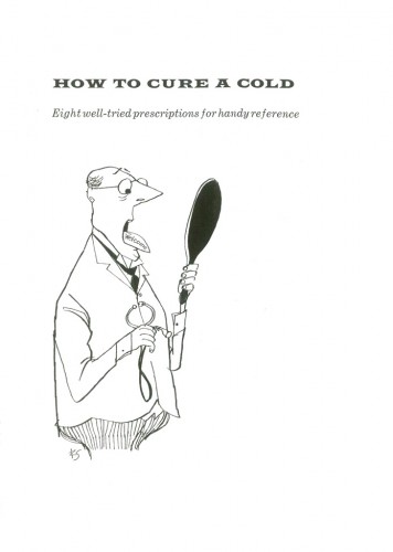
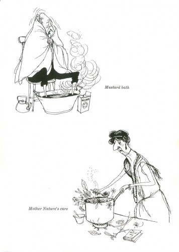
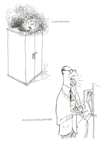
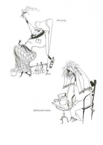
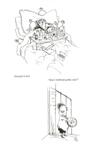
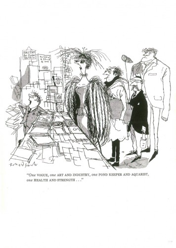
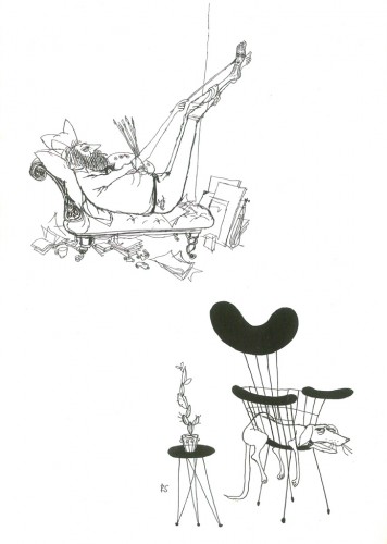
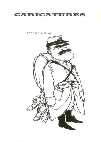
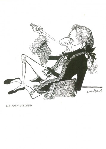
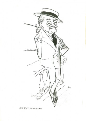
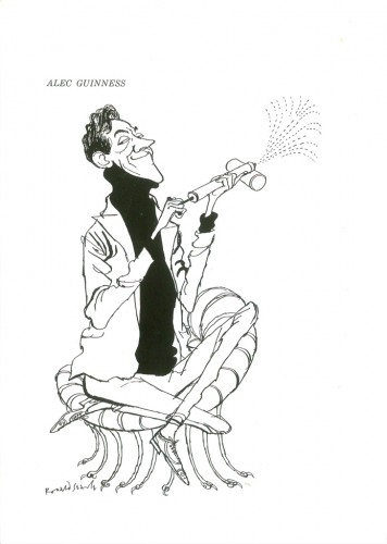
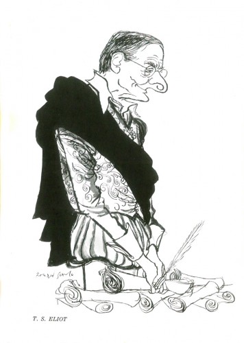
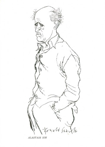
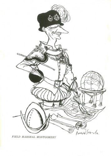
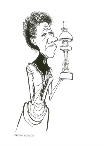
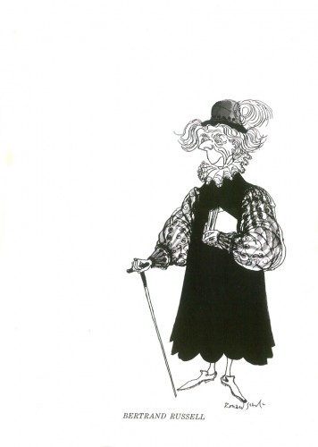
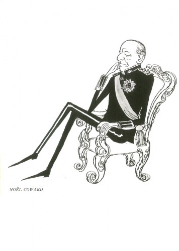
- One of the gems I received for my birthday, a week or so ago, was a beautiful and rare book of Ronald Searle’s cartoons, The Female Approach – which includes the original St. Trinian’s books. This little gem came from John Canemaker. I’d thought I’d post two small chapters from the book. One a group of Caricatures, the second a piece called How To Cure A Cold.

Here are those cartoons:


The book’s dust cover


The back, inner flap, Bio.

1

2

3

4

5

6

7

8

9

10

11

12

13
Ths caricature of Alastair Sim, alone, is worth the price of admission.

14

15

16

17

18
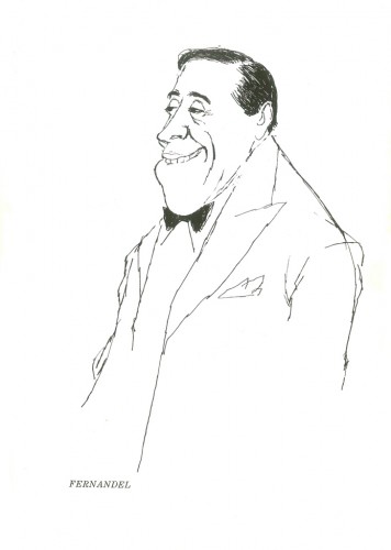
A magnificent cartoon of Fernandel. So simple and perfect.

Animation &Animation Artifacts &Disney 04 May 2011 07:48 am

Hicks’ Hippo – Part 2

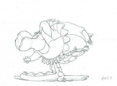
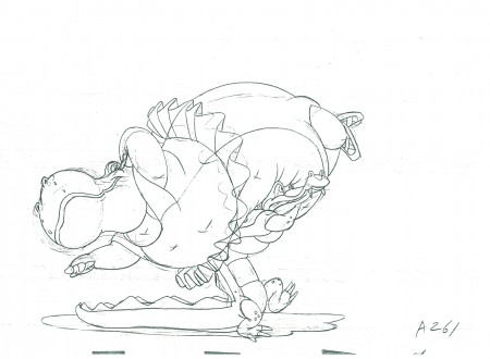
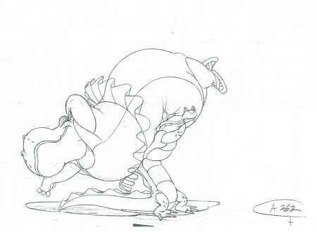
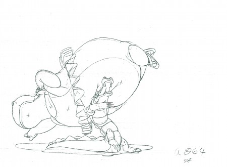
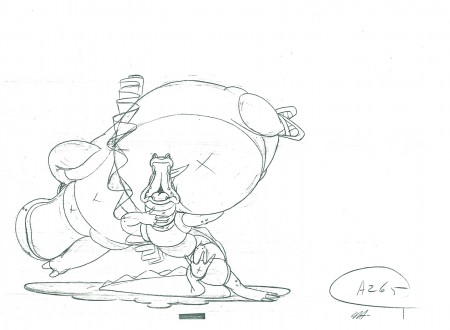
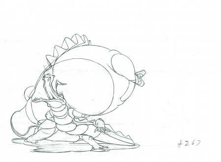
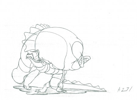
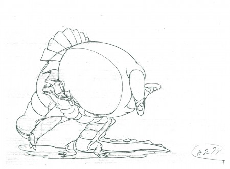
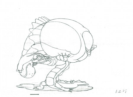
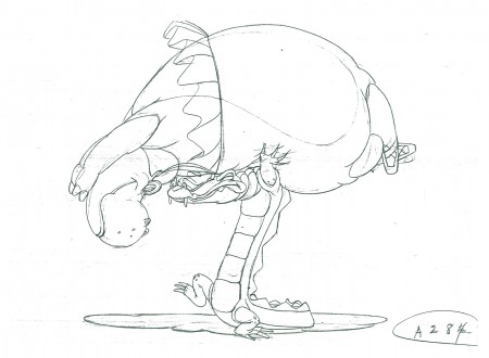
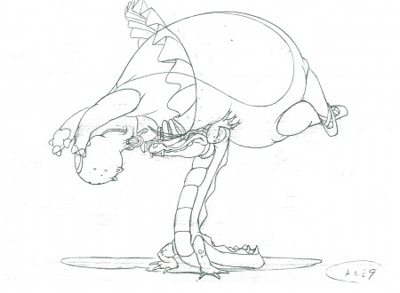
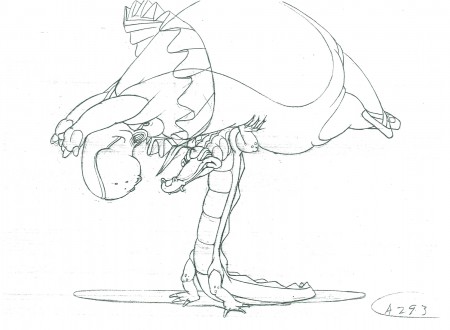
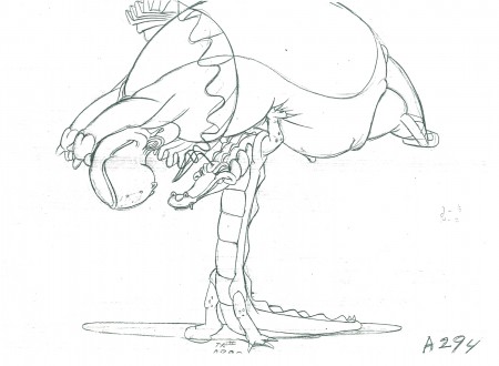
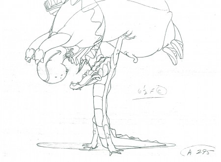
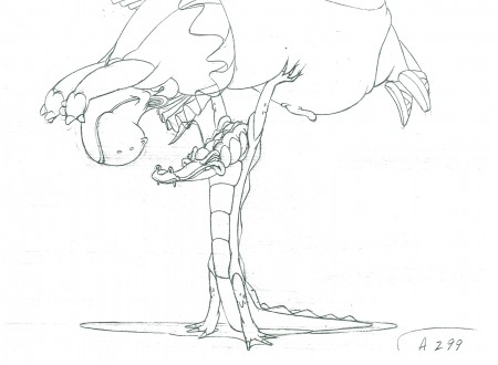
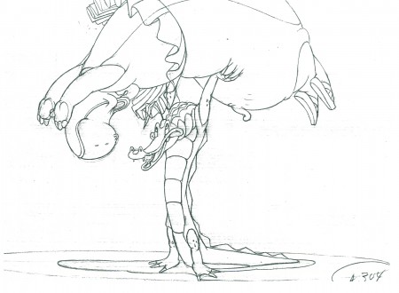
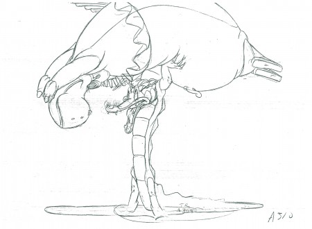
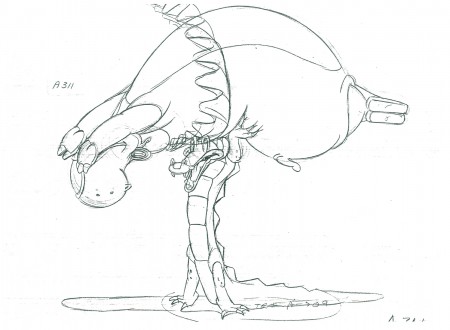
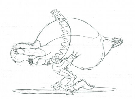
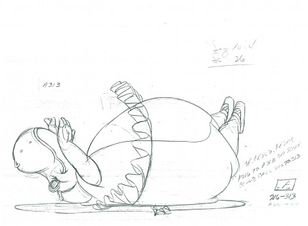
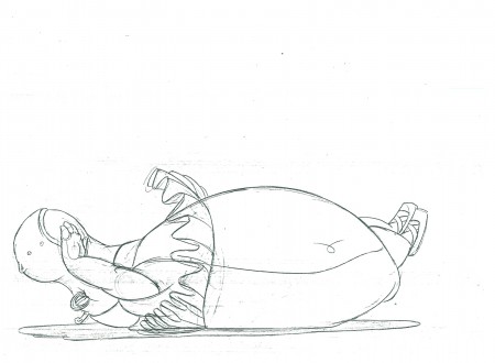
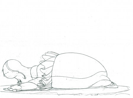
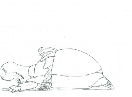
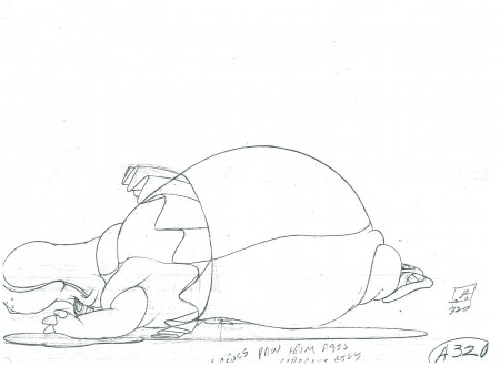
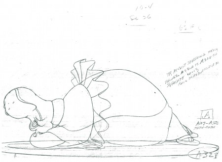
- Here are the remainder of the drawings from Hicks Lokey‘s Seq 10.4 Scene 26 from Fantasia. It represents the meeting between alligator and hippo from the Dance of the Hours section of the film. Jim Will did the effects animation in the scene.

Steven Hartley is posting a mosaic of this film on his blog, Blabbing On Arts and Culture!

As usual, I start Part 2 with the last drawing posted last week in Part 1:

257

261

262

264

265

267

271

274

278

284

289

293

294

295

299

304

310

311

312

313

314

316

318

320

328

________________________
.
The following is a QT of the entire scene with all the drawings (Parts 1 & 2) included.

Bill Peckmann &Books &Comic Art &Illustration 03 May 2011 03:08 am

Toth’s Land Unknown

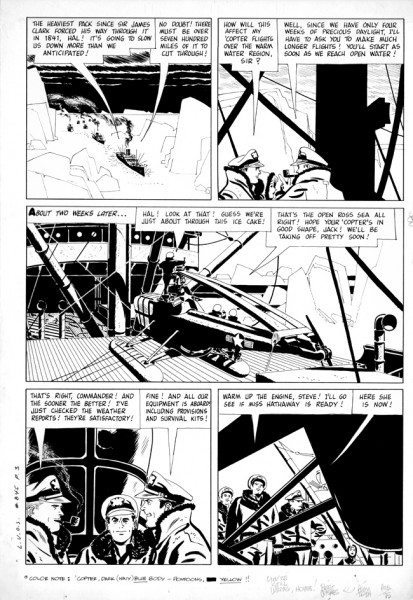
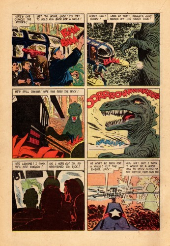
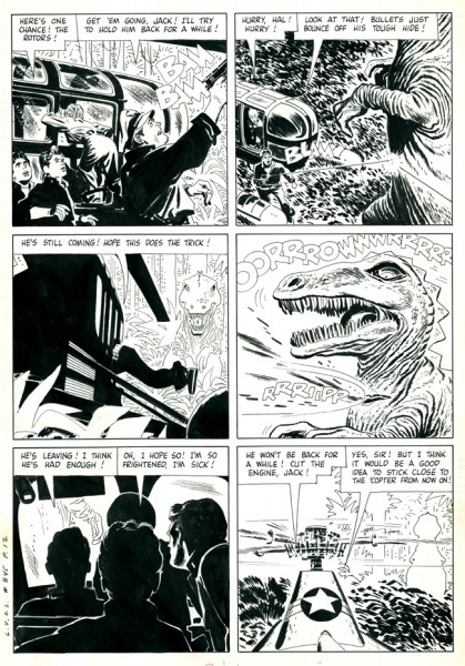
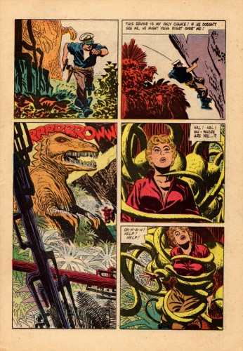
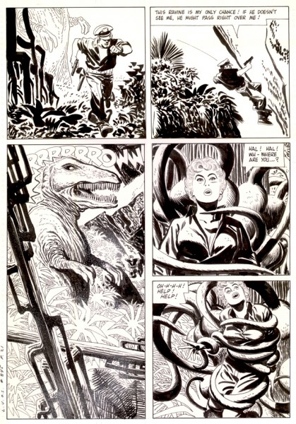
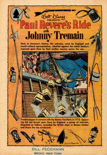
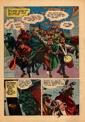
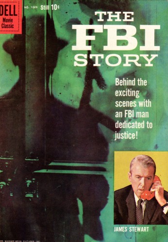
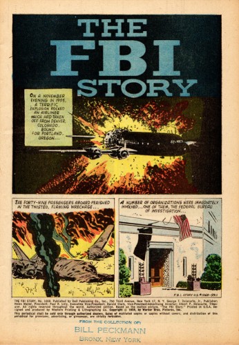
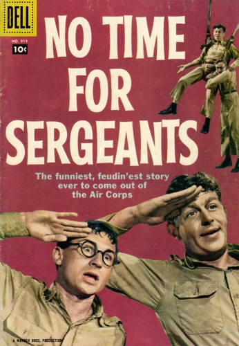
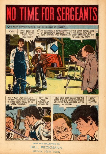
- In celebration of the new book about Alex Toth, Genius Isolated by Dean Mullaney and Bruce Canwell, we’re posting some Toth work for Dell comics in the 60s.

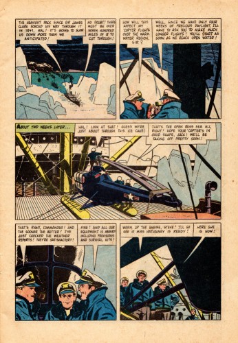
Bill Peckman has an enormous collection of comics by Toth, and with the help of Dean Mullaney, we’d like to show how beautiful Alex Toth’s originals look in comparison with the poor quality printing of the comics. You can see how degraded the lines become in the final magazines when placing them alongside the original art.

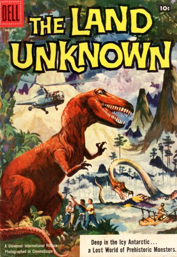
Here are three comparisons to make from the comic, The Land Unknown.


This is the published cover.

1a
Look at the soft lines printed on the poor quality newsprint.

1b
This is the original from Alex Toth.

2a

2b

3a

3b

Here are a sampling of other magazines done by Alex Toth.

4

5

6

7

8

9

10

11

12

13

14


Alex Toth also did a lot of TV titles such as: 77 Sunset Strip, Sugerfoot, The Real McCoys’, Danny Thomas, The Lennon Sisters… to name a few.

Probably his best remembered title is Zorro from the Disney TV series. This was reprinted not too long ago – the first collaboration between Alex Toth and Dean Mullaney.

Animation Artifacts &Independent Animation &UPA 02 May 2011 07:40 am

Hilberman’s Energetically Yours

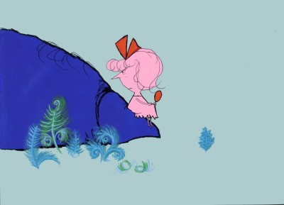
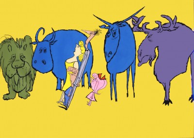
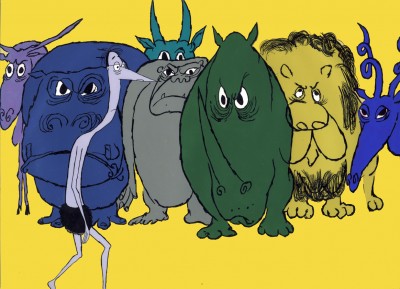
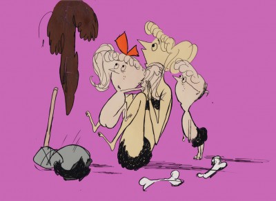
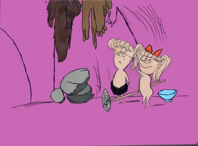
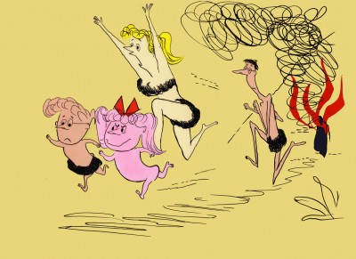
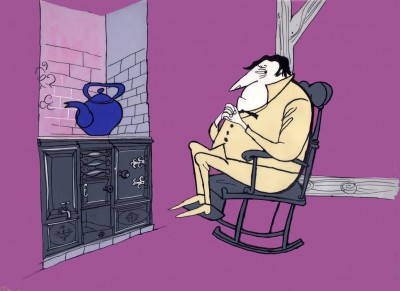
- Energetically Yours was a film produced for the Standard Oil Company and directed by UPA co-founder Dave Hilberman. Animation production was supervised at both Playhouse Pictures (suprvised by Bill Melendez) and Quartet Films (supervised by Art Babbitt).

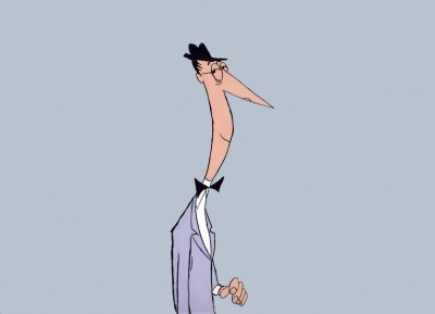
The film was designed by Ronald Searle and is, as expected, quite creative. Unfortunately, the copies of the film floating about today are all color deteriorated – everything has turned to a muddy reddish hue. In fact, the artwork for the film was very colorful. Matt Jones’
blog
Perpetua (a tribute blog to Ronald Searle) has an excellent piece about Searle and this film. It includes numerous still photos of Searle and Hilberman and gives an idea of the full production.

I’d recently been contacted by David Hilberman’s son, Dan Hilberman. He had a collection of about 50 cells from the film that had been preserved by Mary Cain in a scrapbook. She’s backed each cell with a flat colored piece of paper. _______________Mary Cain’s scrapbook
Dan has sent me scans of these cells, and
I’m going to post them here.

I did some slight adjustments in photoshop. The BG colors often had some cel flash on them or reflections. Some parts of the BG papers also had color deterioration. I replaced all with a flat color and in a couple of cases made a tighter composition. My whole purpose was to focus in on the cel colors. (I made no adjustments to any of the characters or outlines.)

I’d urge you to take a quick look at the cells, read Matt Jones’ blog and watch the pinkish film on YouTube. Then return to see what the colors actually looked like.

1

2

3

4

5

6

7

8


A sample of the color deterioration on YouTube

9

10

11

12

13

14

`15

16

17

18

19

20

21

22

23

24

25

26

27

28

29

30

31

32

33

34

35

36

37

38

39

40

41

42

43

44

45

46

47

Many thanks to Mary Cain for preserving these cells, and to Dan Hilberman for sharing them.

Bill Peckmann &Books &Photos 01 May 2011 07:06 am

Laurel & Hardy: Liberty

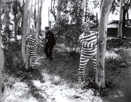
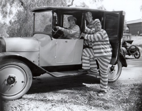
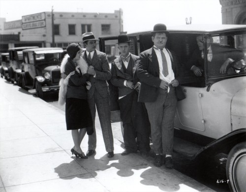
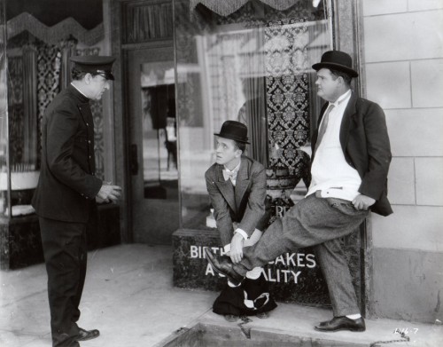
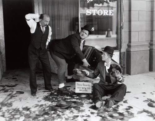
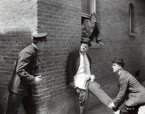
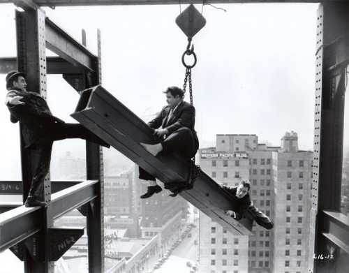
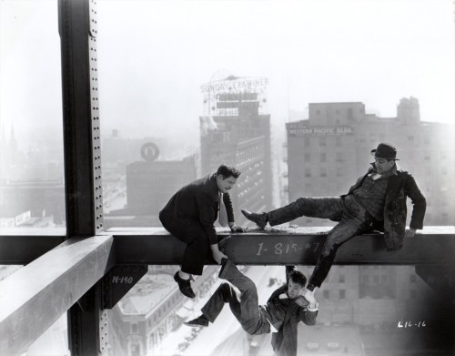
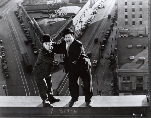
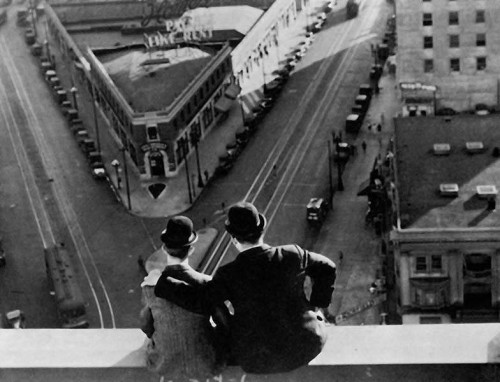
- I’ve long been a Laurel & Hardy fan. I think it’s great for animators to study this pair for their incredible timing and movement. It was kind of a surprise to receive the following material from Bill Peckmann, and it didn’t take much decision to choose to post it.

Let me allow Bill to introduce the material, himself:

    Here’s something that might be a pleasant surprise to your readers who are Laurel & Hardy fans. Attached are the 8 x 10 black and white glossy stills (10 of them) from a L&H silent two reeler titled “Liberty”. It’s considered one of their best silent shorts.(I’ll vouch for that. Back in the late ’60′s we used to run it at lunchtime at work (Focus Design) and it always brought tears to everyone’s eyes who watched it. A side perk was the fact that animator Jack Schnerk, ex LA resident, was able to tell us where all of the outdoor city locations were that they used to film the L&H shorts.)

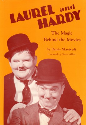
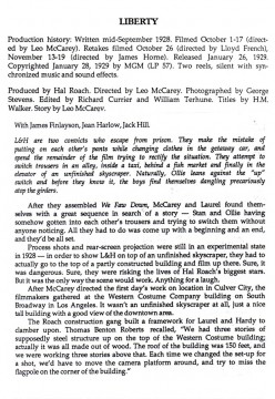
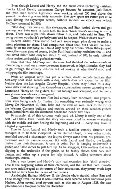
    To give some background to “Liberty”, I’ve included an excerpt from Randy Skretvedt’s excellent (my all time favorite) Laurel and Hardy book “The Magic Behind the Movies”. (1987) I believe it’s still available in paperback. (Note: three names connected with the film, Leo McCarey, George Stevens and Jean Harlow.)

    Because these marquis/publicity photos are printed from still camera film negatives (no dots), they have a great personal “Family Album” feel to them.


The book’s cover

1 2

The stills are production stills and don’t come from the book.

1

2
In escaping from jail, they mistakenly put on each others’ pants in the taxi.

3
That’s a young Jean Harlow outside the taxi.

4
They spend the rest of the film trying to get into their own pants.

5

6

7

8

9

10

11
“BennyZ” left a comment about this still, which I’ve found on-line
and have added to the post just to complete them.
(Thanks to: www.christiankessler.de/laurelhardy.html)

Books &SpornFilms 30 Apr 2011 07:49 am

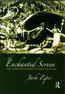
Zipes’ The Enchanted Screen

- Author, Jack Zipes, has just released a new book called, The Enchanted Screen. Mr. Zipes is a professor of German and Comparative Literature at the University of Minnesota. He is a scholar whose focus has been children’s literature and culture, and he has written at least seven other books. I’ve been aware of his work since his book, Hans Christian Andersen, the Misunderstood Storyteller. It was in that book that Mr. Zipes gave some attention to the films we’ve done in our studio. Although he felt that Andersen was often misused or misunderstood when translated to other media, he wrote that our films offered excellent adaptations. Of course, I’d be interested in anything Jack Zipes had to write in the future.

This new book, The Enchanted Screen, goes deeper than just Andersen’s tales, taking in all world literature. However, there can be no doubt that Andersen is a primary interest of Mr. Zipes’ studies. There are elaborate analyses of the various productions of The Snow Queen or The Little Mermaid or The Emperor’s New Clothes. Disney is certainly taken to task for sentimentalizing children’s literature. Indeed, there’s a complete chapter entitled, “De-Disneyfying Disney: Notes on the Development of the Fairy-Tale Film.” To be honest, it’s hard to argue with his premise, if you take Grimm and Andersen seriously. When he points out that J.M.Barrie’s Peter Pan becomes Walt Disney’s Peter Pan or Lewis Carroll’s Alice In Wonderland becomes Walt Disney’s Alice, you begin to realize the change in ownership which also recognizes a change in the values imparted in those original tales. (Shrek actually fares well under this scrutiny since it spoofs the Disneyfication of the tales.)

In short, the book is an excellent read if you’re interested in the subject – as I am. It’s especially pleasing when the author has nice things to say about your work, but that is hardly the reason I enjoyed the book. I appreciated the honest and intellectual discussion of the material, and I enjoyed some of the sources he considered at length. Since I make films using this material, I am curious to hear what critics have to say.

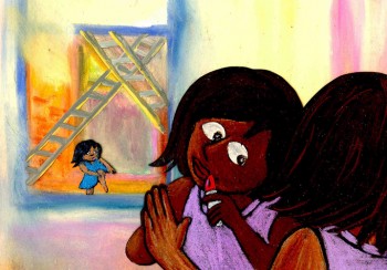
As an addendum to these comments, I thought I’d post a page from the book that talks about a couple of my films. Why shouldn’t I spread the news? I’m proud of these films. I’ve added some illustrations from a couple of these films to punch up the post. So over to Mr. Zipes:

    From 1990 to 1992 Michael Sporn, an American animator, adapted three of Andersen’s fairy tales, “The Nightingale,” “The Red Shoes,” and “The Little Match Girl” for Italtoons Corporation, and they are currently distributed by Weston Woods Studios, an educational company. The films, all about twenty-five minutes long and created for children between five and ten, have been shown on HBO, but for the most part they have not received wide public attention, and they can be considered marginal cultural products of the culture industry—all the more reason that they deserve our attention, because Sporn’s films written by Maxine Fisher are profound interpretations of Andersen’s stories that transcend age designation and keep alive Andersen’s legacy. They all use voiceover and colorful still sets as backdrops, and naively ink-drawn characters who come alive because they are so unpretentious and resemble the simple and found art of children.

    Two of Sporn’s films are particularly important because they transform motifs from Andersen’s tales to deal with contemporary social problems. Both take place in New York City, and the music and dialogue capture the rhythms and atmosphere of present-day urban life. In The Red Shoes, Sporn depicts the warm friendship of two little black girls, Lisa and Jenny, and how they almost drift apart because of a change in their economic situation. The story is narrated by Ozzie Davis as a shoemaker who lives in a poor section of New York. Lisa and Jenny often visit him, and he describes their lives and how both love to dance and play and enjoy each other’s company. One day Lisa’s family wins the lottery, and they move to another part of the city. Now that she is rich, Lisa ignores Jenny until they meet at a ballet about red shoes. The spoiled Lisa ignores Jenny, but later she returns to her own neighborhood and steals some red shoes that the shoemaker had been making for Jenny. Guilt-ridden, Lisa finds that the red shoes have magic and bring her back to the old neighborhood and help her restore her friendship with Jenny.

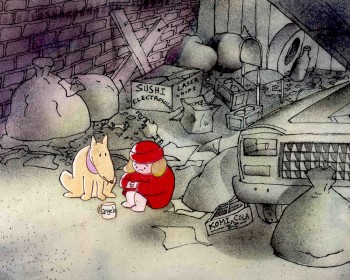
    In The Little Match Girl, Sporn depicts a homeless girl, Angela, who sets out to sell matches on New Year’s Eve 1999 to help her family living in an abandoned subway station on Eighteenth Street. She meets a stray dog named Albert who becomes her companion, and together they try to sell matches in vain at Times Square. The night is bitter cold, and they withdraw to a vacant lot where Angela lights three matches. Each time she does this, she has imaginary experiences that reveal how the rich neglect the poor and starving people in New York City. Nothing appears to help her, and when she tries to make her way back to the subway station, she gets caught in a snowstorm, and it seems that she is dead when people find her at U nion Square the next morning. However, she miraculously recovers, thanks to Albert, and the rich people gathered around her (all reminiscent of those in the dream episodes) begin to help her and her family.

    Sporn’s films are obviously much more uplifting than Andersen’s original tales. But his optimism does not betray Andersen’s original stories because of his moral and ethical concern in Andersen and his subject matter. In fact, his films enrich the tales with new artistic details that relate to contemporary society, and they critique them ideologically by focusing on the intrepid nature of the little girls rather than on the power of some divine spirit. At the same time, they are social comments on conditions of poverty in New York that have specific meaning and can also be applied to the conditions of impoverished children throughout the world. What distinguishes Sporn’s films from Andersen’s stories is that he envisions hope for change in the present, whereas Andersen promises rewards for suffering children in a heavenly paradise.

    Sporn’s films are tendentious in that they purposely pick up tendencies in Andersen’s tales to express some of the same social concerns that Andersen wanted to address. His critical spirit is maintained, and even some of his faults are revealed. Most important, he is taken seriously.

It’s a pleasure to be taken seriously, and I have to thank Jack Zipes for that.

« Previous PageNext Page »

eXTReMe Tracker
click for free hit counter

hit counter