Animation &Animation Artifacts &Disney &repeated posts 17 Aug 2011 06:38 am

Dumbo’s Bath – recap

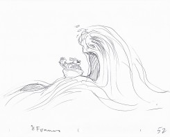
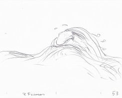
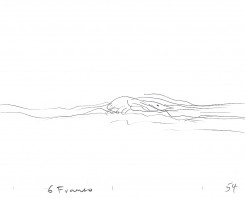
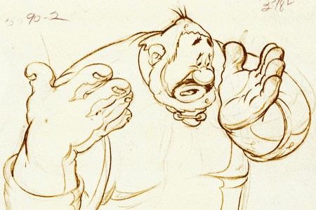
Continuing the celebration of Bill Tytla’s magnificent artrwork, I’m reposting this piece on Dumbo’s bath.

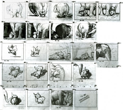
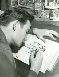
- Thanks to a loan from John Canemaker, I can continue posting some of the brilliant storyboard work of Bill Peet. The guy was a masterful artist. Every panel gives so much inspiration and information to the animators, directors and artists who’ll follow up on his work.

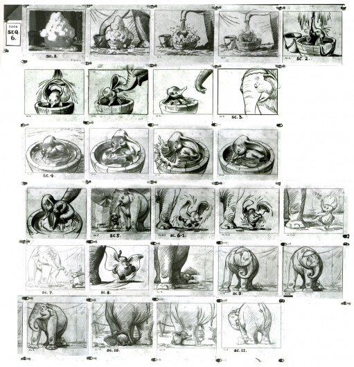
This is the sequence from Dumbo wherein baby Dumbo plays around the feet of his mother. Brilliantly animated by Bill Tytla, this sequence is one of the greatest ever animated. No rotoscoping, no MoCap. Just brilliant artists collaborating with perfect timing, perfect structure, perfect everything. Tytla said he watched his young son at home to learn how to animate Dumbo. Bill Peet told Mike Barrier that he was a big fan of circuses, so he was delighted to be working on this piece. Both used their excitement and enthusiasm to bring something brilliant to the screen, and it stands as a masterpiece of the medium.

Of this sequence and Tytla’s animation, Mike Barrier says in Hollywood Cartoons, “What might otherwise be mere cuteness acquires poignance because it is always shaded by a parent’s knowledge of pain and risk. If Dumbo “acted” more, he would almost certainly be a less successful character—’cuter,’ probably, in the cookie-cutter manner of so many other animated characters, but far more superficial.”

I had to take the one very long photstat and reconfigure it in photoshop so that you could enlarge these frames to see them well. I tried to keep the feel of these drawings pinned to that board in tact.


(Click any image to enlarge.)


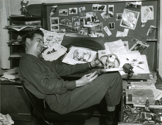
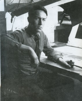
Bill Peet at his desk on Dumbo.

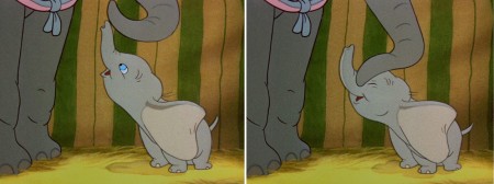
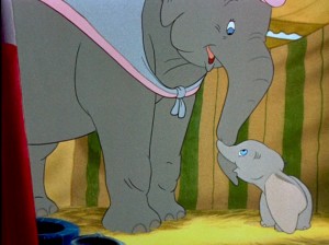
Here are frame grabs from the very same sequence of the film showing how closely the cuts were followed. Even in stills the sequence is stunning.


(Click any image to enlarge.)
.

This film is a gem.
The dvd also has one of my favorite commentary tracks throughout.
John Canemaker, by himself, talking about the film. It’s great!

From Hans Perk’s A Film LA:

Seq. 06.0 “Menagerie – Mrs. Jumbo Goes Berserk”
Directed by Wilfred Jackson, assistant director Jacques [Roberts?], layout Terrell Stapp.

Dumbo being washed by Mrs. Jumbo, animated by Bill Tytla, with effects by Art Palmer, Cornett Wood and Sandy Strother.

Independent Animation 16 Aug 2011 07:37 am

Joanna Priestley

Joanna Priestley is one of the most consistent of the Independent animator/filmmakers. Her work has gotten stronger as she goes on, and the number of films seems to grow more and greater with every year. Starting with THE RUBBER STAMP FILM in 1983, she hit the ground running. Her film VOICES (1985) won International acclaim and made her something of a star on the Festival circuit. To date she’s made some 24 animated shorts.


VOICES (1985)

This interview excited me and made me want to work. Her investment in animation should be an inspiration to anyone wanting to make a career of it, and I hope young animators will take note of the direction she followed. She always seems to have fun in the films she made, which all seem to successfully hide hard work of filmmaking. Her love of the work is obvious.

    Q. Can you tell us what brought you to animation.

    A. When I was seven years old, my parents gave me a tiny zoetrope on a beige, plastic turntable for Christmas. I loved that toy! I read mountains of comic books and watched Warner Brothers cartoons on television every day. In high school, I saw several films by Norman McLaren from our city library and fell in love with his personal style and his experimentation with various media and animation techniques.

    But I think the main factor was seeing La Jettée by Chris Marker at U.C. Berkeley. After I saw it in class, the professor let me borrow the projector and the16mm print, so I could look at it over and over. La Jettée led me to producing multi-image shows and that led to animation.

    Q. What was your initial training?
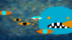
    A. After living in Paris, I moved to central Oregon and settled in Sisters, a tiny, lovely cowboy town. In Paris I went to the Cinématheque Française everyday, so I was horrified that there were no movie theaters near Sisters, in an area half the size of Nova Scotia. Martha Kelley and I started Strictly Cinema and showed 16mm movies at the local high schools. Then we put on film ______________EYELINER (2011)
    festivals and I was able to see lots
    of independent animation. At one point, I went to Safeway and bought a pack of index card and started experimenting.

    That led to a job at the Northwest Film Center (in Portland, Oregon) where I took an animation class from Roger Kukes. My index card experiments resolved into The Rubber Stamp Film, which led to the Experimental Animation MFA program at Cal Arts.

    Q. Who and/or what films were early influences?
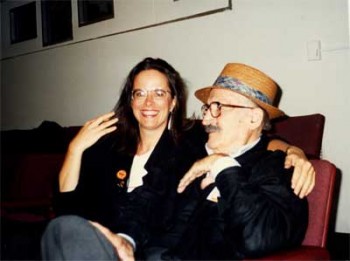
    A. I am very lucky and have had wonderful mentors. That’s why I run an internship program. My teacher at Cal Arts, Jules Engel, was a brilliant abstract artist. He was always pushing the envelope into unknown territory and I got to know the Head of the Cal Arts Film School, Ed Emshwiller, who was an inspiring, lovely man and extraordinary artist who experimented in a variety of media. ______________________________Joanna and Jules Engel

    Faith Hubley was a tremendous influence. When she married John Hubley, they agreed to make an independent film every year, and they did. When her husband died, Faith continued to make a film every year for the rest of her life. I find that truly amazing. I attempt to make a film every two to three years and when I get discouraged, I think about Faith and John.

    Other influences: Andrei Tarkovsky (especially Stalker), Werner Herzog, Hidao Miyazaki and Chris Marker. Remains to be Seen and Traveling Light by Jane Aaron, The Man who Planted Trees by Frederic Back, Lineage and Viewmaster by George Griffin and Blade Runner.

    Blab! Magazine was a huge influence (especially work by Tom Biskup, Esther Pearl Watson, Gary Baseman, the Clayton Brothers, Ryan Heshka and Mats!?) as were the Pictoplasma books, Linda Barry’s What It Is and The Woman’s Encyclopedia of Myths and Secrets by Barbara G. Walker.
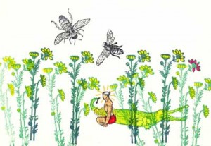
    Q. You started with films that animated non-traditional media. THE RUBBER STAMP FILM, as its title indicates, uses rubber stamps to create the art, and THE DANCING BULRUSHES utilizes back-lit sand animation. What drew you to these forms as opposed to the traditional drawing?

    A. I was deeply influenced by Norman McLaren’s deep exploration of multiple techniques. At the very beginning of my career, ___________THE RUBBER STAMP FILM (1983)
    I began experimenting with new techniques,
    new subject matter, new color palettes and new genres with each film. I want to learn as much as possible with each new project and it is very important to me that my work evolves and pushes into unknown territory. With each film, I challenge myself to learn something new. That’s what keeps it interesting.

    Q. You tried your hand at computer animation working on some hi-tech computers at CalArts making JADE LEAF (1985) and TIMES SQUARE (1986) on this system. Did you find the computer all that you’d hoped for back in those early days?

    A. I had no hopes or dreams about computer animation because it was such a complete novelty. Only a handful of people had access to the big, beige Cubicomp that Cal arts bought. We turned it on and there was a blank screen. We had to find a programmer to make it possible to create and save the digital animation we made with the keyboard. He also set up a program that would shoot single frames on a 16mm Bolex set in front of the Cubicomp’s monitor.

    That is how I made two computer films at Cal Arts, Jade Leaf (1985) and Times Square (1986) co-directed with Jules Engel. Collaborating with Jules was so much fun. We were always trying something new and every day that we worked together he would say to me: “Honey!! How can we do this differently?!” Jules always said he made another film from the footage that we shot, but I’ve never seen it.

    Q. You went completely in the opposite direction with CANDYJAM (1988) with the very low tech object animation of candy. It must have felt very different working on this film?
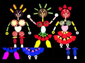
    A. Candyjam was born when Joan Gratz and I met for the first time at the Hiroshima Animation Festival in 1985 and traveled together afterwards. I was collecting gorgeous Japanese candies with delicate spirals, autumn leaves, dots and colored grids. Joan and I talked about animating with candy and we thought “Wouldn’t it be amazing to ask different people from all around the world to do something with the candy from their area?”
    _____________________________________________CANDYJAM (1988)
    So we asked filmmakers from several
    countries if they might be interested in contributing sequences and were stunned when everyone we asked said yes (David Anderson, Karen Aqua, Craig Bartlett, Elizabeth Buttler, Paul Driessen, Tom Gasek, Christine Panushka and Marv Newland).

    That’s one of the amazing things about the international animation community. People will share their talents and their time and they are willing to work together. Candyjam was a joy to make and also a bit of a nightmare because it mixed multiple techniques and two formats (35mm and 16mm).

    Q. SHE-BOP (1988) is a stunningly beautiful film combining 3D puppets with drawn animation. It mixes mythology with cartoon on its way to telling this story of controlling your own destiny. Again it’s very different from CANDYJAM and a strong, stylized design. Any comments?

    A. She-Bop (1988) is based on a wonderful poem by Carolyn Myers about the Great Goddess. I heard her perform it at a women’s gathering in the Oregon forest. I decided to experiment with puppet animation, even thought it was a bit intimidating to have the best puppet animators in the world a few blocks away at the Vinton Studio. I made a simple puppet with copper plates and lead wire and a set made with foam core board and duct tape. All of my films use very simple, inexpensive materials. Jazz composer Dave Storrs did a lovely soundtrack.

    Q. PRO AND CON (1993) combines drawing and clay painting. It’s a teaming between you and Joan Gratz. She obviously did the clay painting to work off your drawings. The film investigates life within a prison, featuring monologues by two people within that prison: an inmate and a corrections officer. You used drawings by the inmates and object animation of some of the weapons and crafts from that same prison. It’s a daring and informative film. How did it come about and what more can you tell us about it?
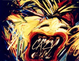
    A. Pro and Con came about when Joan Gratz and I applied for a Percent for Art funding that accompanied the construction of a new prison. We sent out several hundred questionnaires to inmates in Oregon and Joan selected a response which became the basis for her half of the film, which she animated with clay painting.

    We also toured many prisons, where we met a very interesting African American corrections officer. I based my half of the film on interviews with her. In the McLaren _____________PRO & CON (1993)
    tradition, I used a variety of techniques,
    including object animation, puppets, drawings on paper and cel animation. I selected media, like animating freshly ground hamburger, that could be seen as a metaphor for incarceration. The hamburger was a pain to animate because it gradually turned brown and stinky over the course of the two day shoot.

    I contacted the teacher of the art class at Oregon State Penitentiary and he asked his students to draw these wonderful self-portraits for the film. I also animated with contraband weapons and crafts that were confiscated from inmates.

    Q. You worked on some of the earliest computer animation done at Cal Arts, working with older systems and programs. Obviously, you’ve adapted to the digital world in drawing your films. What programs do you like working?

    A. I started working with Flash in 2002 and fell in love with it. Thank you, Macromedia! I find it easy to navigate and I never forget how it works. I also use Photoshop. I spent four months doing After Effects tutorials and trying to create work with it. Sadly, after a hiatus of six months, I’d forgotten everything.

    Q. You originally used multi-media in making the films. Cutouts, cels, 3D puppets, even candy were all used to do your animation. Do you miss these different forms in making the more digital films?

    A. I miss the elegant wheels and knobs and the clickety clack of my beautiful cameras. I still have a 16mm Bolex that I found under a table at a flea market. It came with several lenses, fabulous little metal accessories and a leather case. I also have a beautiful, stout, white, 35mm Mitchell camera. But it was expensive and exhausting to send cans of film by Greyhound bus to the lab in Seattle and then wait for weeks for them to process the film and send it back. They would always bump my little jobs for bigger commercial work.

    I miss working with watercolor and felt pens on paper and I miss moving around and using more muscles than just my right hand, wrist and arm. But the immediacy and ease of use of Flash makes up for all of that!
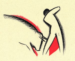
    Q. In ANDALUZ you teamed with Karen Aqua in making this valentine to Andalucia. The film was done on paper in 2004, which means it was more traditional in style. This is rather late for a hand-made film. Was this intentional? How did the teaming of you and Karen come about and how did you break the workload?

    A. Andaluz began when filmmaker Karen Aqua, her composer/musician husband Ken Fields and I were all chosen to be artists-in-residence at the Fundaçion Valparaiso in the village of Mojacar _________ANDALUZ (2004)
    in southern Spain. To honor that synchronicity, the three of us collaborated on a film.

    We began with a ritual and decided to do a film about the area. That gave us license to hike around outside and draw the architecture, animals and plants, study the sky, go swimming and study the water. We sat side by side and did about 1200 drawings together, sometimes drawing on each other’s drawings. After the residency, the three of us traveled together and lugged those drawings everywhere. We didn’t want to take a chance on losing them.

    Karen was in Boston and I was in Portland, Oregon and we found that shipping drawings back and forth made us both nervous. So we had two additional residencies, at the Millay Colony and the MacDowell Colony where we finished the artwork together. Then we turned Andaluz over to Ken Field who produced amazing music with Juanito Pascual and Lance Limbocker who did the sound design.

    Andaluz took about four years to make. During the process, Karen was diagnosed with cancer and underwent chemo several times, so there were a lot of challenges to face. Karen died on May 30, 2011 and I miss her terribly. She was a wonderful woman and a brilliant filmmaker/artist. I feel so lucky to have had this collaboration with her and Ken Field.

    Q. OUT OF SHAPE uses iconic graphic imagery that playfully moves about the screen. You’ve moved to complete abstraction, yet you give it such a personal lively, light sense of humor. The abstraction gains a personality and becomes funny. You seem to do this so naturally.

    A. Thank you. I made Out of Shape (http://www.youtube.com/user/JoannaPriestley) in two months. I was lucky to have a friend, Marc Rose, who had the time to do the soundtrack. I had just spent two years completing another soundtrack and was demoralized with how long the process took, although I love how it turned out. To refresh my enthusiasm, I made Out of Shape very quickly and joyfully and immediately posted it on YouTube.
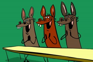
    Q. In some ways MISSED ACHES seems a bit different from your other films. It’s a play on wordplay, but you treat it almost like a Warner Bros cartoon with bright, bubbly, cartoon music. In some ways it feels more like a Chuck Jones cartoon. It’s the obvious way to do the adapted story, but I wonder how you felt about it while doing it?

    A. Missed Aches is based on a poem by Taylor Mali who led teams ______________MISSED ACHES (2009)
    to four championships in the National
    Poetry Slam. He was absolutely wonderful to work with. His words are so inspiring that the images just seemed to fall into place. I think it also helped to work at the onset with a friend who is a great storyboard artist (Dan Schaeffer). The challenge for me was to make a funny film with character animation. I am not funny. My husband, director Paul Harrod, is hilarious. Humor is extremely important to me and I think it’s the best way to cope with life.

    I had a group of collaborators who made the process a great joy. I worked with a former student, Don Flores, a great character designer and animator, and with the famous Canadian sound designer, Normand Roger, Pierre Yves Drapeau and Denis Chartrand, who made the soundtrack. Major treat! While making Missed Aches, I saw Brian Kinkley’s graduation announcement on Facebook. He did this extraordinary animation of text, which is now constantly imitated. His text animation became the perfect background for the film.

    Q. Anything you want to add?

    A. I love what I do. I love coming to work everyday. I try to stay open, curious, follow my intuition and always try new things.
Commentary 15 Aug 2011 06:54 am

Iwerks Multiplane

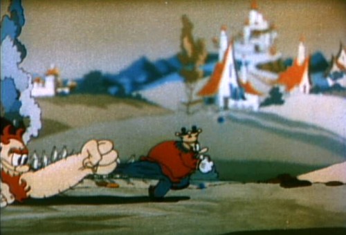
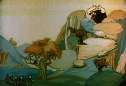
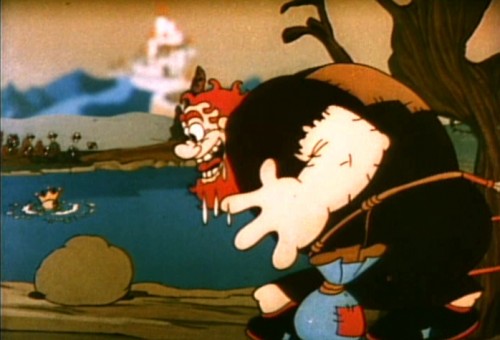
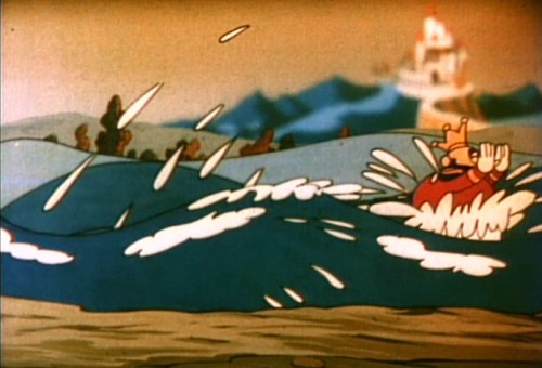
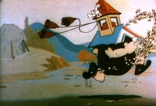
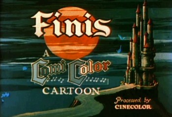
- Continuing back in time looking at the multiplane camera, you have to finally reach Ub Iwerks at his studio. It’s probable that Iwerks was the first real inventor of the idea. His studio put it into use far earlier than either Disney and Fleischer. It was most probably more limited than the other two, but the germ was there. On film, the new tool appeared in 1934. At different times, both Grim Natwick and Shamus Culhane talk about Ub working furiously in the basement on a multiplane camera built out of auto parts. The camera was a horizontal multiplane camera with the cels standing up, shot against levels of depth. Looking at the existing films it’s hard to find many uses of it. I came up with two Comicolor Films – two fairy tales, that Iwerks produced.

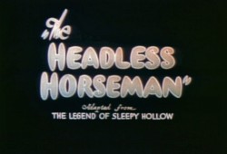
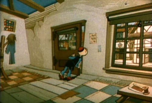
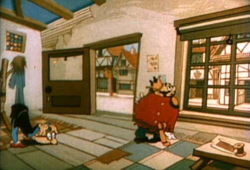
The first is The Headless Horseman (1934), and the camera is used in a very limited way, here. In fact, the scene could have been done with multiple levels panning at different speeds. This is used only in panning scenes. I’ve taken one of these repeated scenes and illustrate with that.

1
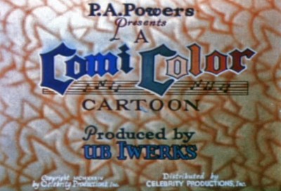
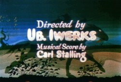
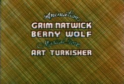
It took them a while to settle on one opening title for this series of tales.

2 3

4
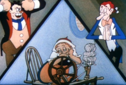
The three principal characters are introduced via
a multiple exposure three-way split screen.

5
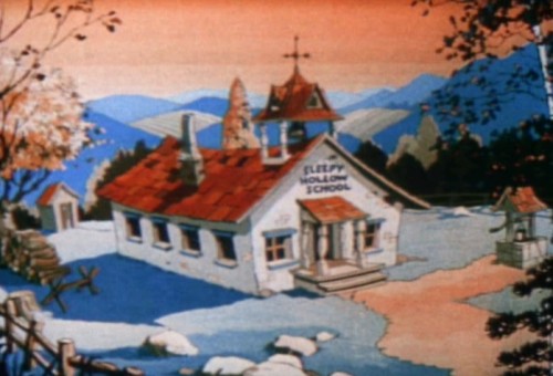
Which leads us into a flat BG of the schoolhouse.
Considering there’s a truck in, one would have thought
that the multiplane could have been used for good effect.

6
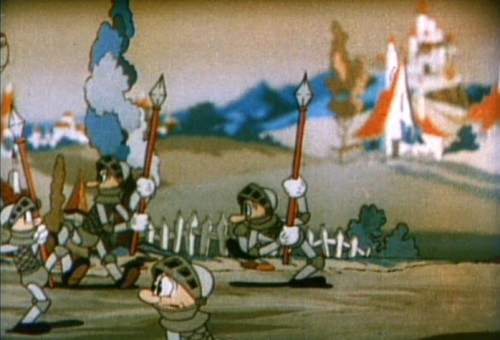
Most of its use was for these panning scenes with multiple levels
that aren’t even taking advantage of the soft focus possibilities.

7

8

9

10
This scene has nothing to do with the multiplane camera,
I just like it.

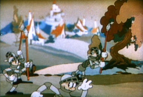
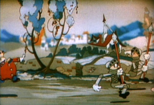
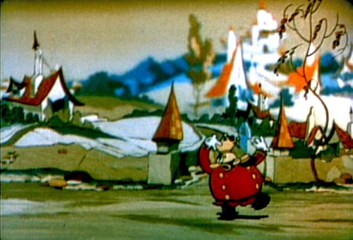
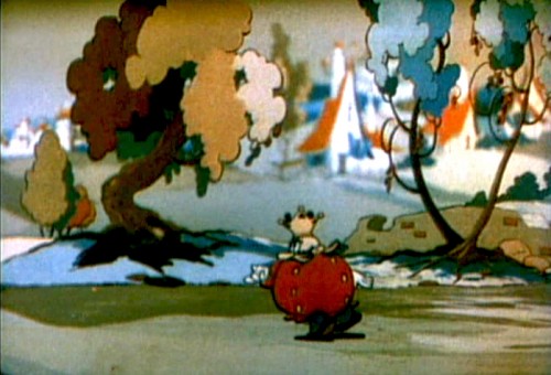
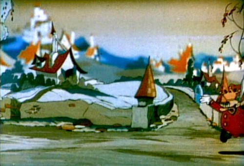
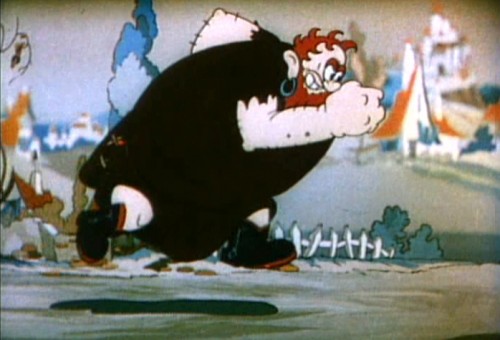
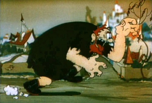
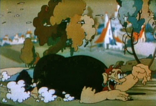
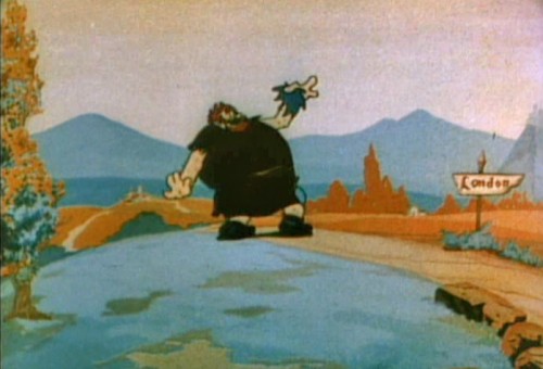
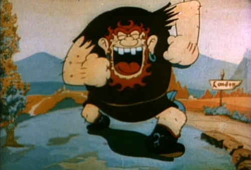
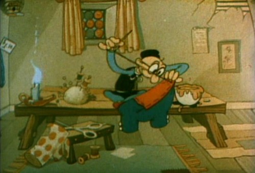
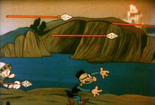
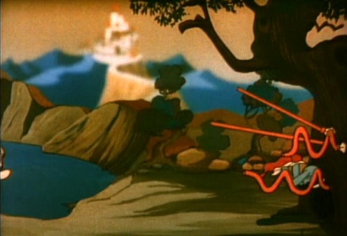
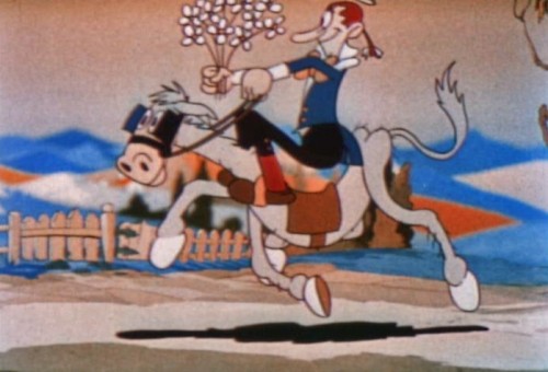
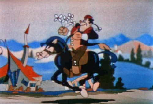
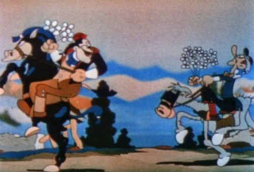
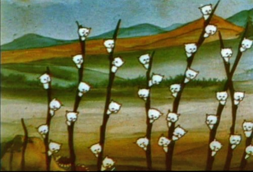
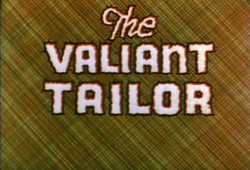
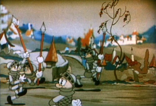
The Valiant Tailor (1934) is much more energetic. Again, the camera is used only for panning, no camera moves in or out. The BGs are broken into multiple levels and the focus is very soft in the distant background (never in the foreground.) The levels move at different speeds and oftentimes look like they’re bicycle pans in that some parts of the levels repeat in the moves. (I can’t think of any other studio that did that.) In different scenes, it also looks as though some of the back levels have been moved closer, to a more foreground position. The shadows animate over the surface of the ground they touch.

1
This is the only film that uses this criss-crossed BG.

2 3

4

5

6

7
The sharp focus of the foreground level against the soft BG
is the feature of this scene. It plays so well in motion.

8

9

10

11

12

13

14

15
We cut to this flat scene . . .
16
. . . but it’s very dynamic.
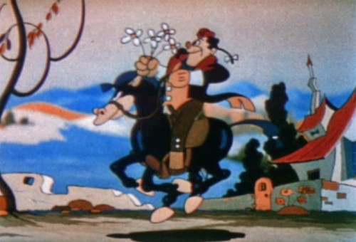
17
The tailor is flat in this first scene, but
the scene seems to be purposefully dim.

18
When he goes to the door, the bright, sharp focus outdoors
tells us this was shot on the multiplane.

19
This exposure really shows how it should’ve been exposed throughout.

20

21
Again, it’s the sharp focus against the soft that makes this effective.

22
A flat scene cut into two using multiplane.

23
These are the last multiplane scenes in the film.

24

25
It ends flat.

26

Animation &Commentary &Independent Animation 14 Aug 2011 03:08 am

Robert Breer (1926-2011)

- This note came from George Griiffin today:

    Some of you may already know Bob died yesterday. The beautiful film by his youngest daughter Sally, posted on Vimeo, made it clear but I don’t know if there has been an official announcement yet.


    Unfortunately, I did not receive a link to the video
    but Janet Benn located it. Thanks, Janet – M.S.

    He had an enormous influence on 2 generations of animation artists, constantly pushing and pulling his practice with wit and ingenuity. It was a privilege to have known him, and to have learned so much from him. A huge force in our field has left.

There is this excellent bio on AWN.

See some of his films Here.

The only obituary I’ve found thus far is an Italian one, in Italian. Here. It says that he died peacefully on August 12th.

Commentary 13 Aug 2011 06:48 am

Rambling Bits

- This past week things kept moving. It started with the news that Standard and (very) Poors had lowered the credit rating of the US, and the stock market rolled up/down/up/down ending UP. It’s frightened quite a few people waiting for the “double dip Recession”. Did John Boehner & Eric Cantor think they would have any other result than this with the past month’s game playing in Congress? Or maybe that was what they wanted, so they could blame the President for it. A made-up crisis has put the US on the brink of a real crisis, and, by nature, the Global Economy as well.

Then came the more personal news that Corny Cole had died. That was something of a shocker and a very sad one at that. Corny seemed to inspire many in animation today. As one of the heads of CalArts animation program, he’s affected many of the students lives as he inspired many of them on or into the business.

There are quite a few blog notes out there. My three favorites are

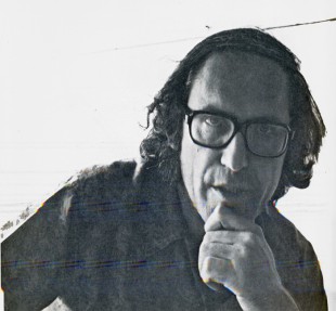
    – the odd interview posted on Mike Barrier‘s website, MichaelBarrier.com. Corny talks about his days working in Chuck Jones’ unit at Warner Bros., his ________Corny in 1976 on RAGGEDY ANN
    days at UPA on Gay Purr-ee and his work
    for Richard Williams on The Cobbler & the Thief. There’s a slight paranoia there, and Corny seems to think that others are out to beat him. I’m not sure, from what he says, that that was really an accurate reading. But what do I know?

    - On The Animation Guild Blog Dave Brain offers his memories of Corny.

    - on Cartoon Brew, Amid Amidi collects a lot of blog posts and points to many of them.

I remember Luis Bunuel‘s introduction to his great autobiography. He was aware that his death would come within another year or two, and he said that he didn’t mind dying if only he could come back once a year to read some of the newspapers because he was addicted to the news and would want to know what happened in the soap opera of life. This hit very close to home. I love the politics of the world (not so much lately now that it’s all good vs evil/black vs white) and would want to continue knowing what’s going on. When I see the culmination of one political event mesh with a friend’s passing, I always wonder about this Bunuel thought. I know, I’m nuts.

______________________

- Speaking of Michael Barrier and his site. Every time he publishes a new interview a lot of attention is garnered. What seems to be forgotten is that Mike has recorded MANY interviews and he has many in the archive of his site. Right up there at the top, on his banner, it says interviews.

There you can find quite a few that were originally published in Funnyworld Magazine: Hugh Harman, James Bodrero, Frank Tashlin, John McGrew, Art Babbitt, Dave Hand and many other key personnel from the Golden Age of animation.
They’re all there – for free. You just have to read them.

It’s an amazing resource; take advantage. (I must have read the Dave Hand and John McGrew interviews at least four times, each. I’ve memorized the Hubley interview.)

______________________

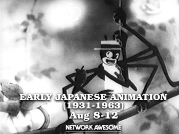
- Another very interesting site came to my attention early this week. Network Awesome features a lot of archival videos. Jason Forrest founded the site in January 2011. With it he says he’d like to: “spotlight the best from the past to create something new for the future. In a sense it’s TV about TV but our wider intent is to show something about culture as a whole. This can manifest itself in a kids cartoon from 1973, an interview from 1948 or a movie from 1993.”

You can find anything from an early Astro Boy adventure to The Grave of the Fireflies. This past week they’ve had something of a festival for very early Japanese animation, hosted by Cory Gross. All of these films are extraordinary and certainly worth viewing. Many of them seem to use an early version of the multiplane camera in shooting. The animation style starts looking like a Fleischer clone, and eventually goes more toward Disney.

Here’s what they programmed this past week:

    1. Fox and Racoon-Dog Playing Pranks on Each Other (1933)
    2. Kenzo Masaoka’s Spider and Tulip (1943)
    3. Momotaro’s Divine Sea Warriors (1945)
    4. Koneko No Rakugaki (1957)

They also have an on-line magazine which gives detailed information about each film on the site. Here’s a sample of the page for Spider and Tulip. It tells who Kenzo Masaoka was and what his role in the history of Japanese animation was. The film was animated during the height of WWII, so the implications are obvious. Yet compare it to what Disney was doing at the time; it’s an amazing piece.

______________________

- I also reviewed Timothy Susanin’s book, Mickey Before Mickey: Disney’s Early Years 1919-1928. I hardly believed that my review would lead to a conversation via email with Mr. Susanin. I have to say that it was a treat. The book made a strong impression on me.

Lately, I’d been reading a lot of interviews with people around the Disney studio in the 20′s, 30′s and early 40′s. Didier Ghez’ spectacular series of books: Walt’s People Vols 1-11. I only have three, but it gives me plenty to look forward to. Working with Walt and Working With Disney, both by Don Peri. These two are juicy books and have some excellent interviews within. Consequently, reading Mr. Susanin’s book came at exactly the right time for me. While reading that I pulled the two Barrier books off the shelf: The Animated Man and Hollywood Cartoons as well as the Kaufman and Merritt book, Walt in Wonderland. I’d already read each of these three several times, but it was fun rereading them while seeing how much Mr. Susanin added to the picture (and it often was a lot.) For some reason, this offends a number of reviewers, such as Charles Solomon in the LA Times. I don’t quite know why. Perhaps, he just wants to get the Cliff Notes in history books. I want all the meat and bones and gristle. Perhaps, Mr. Susanin wrote his book specifically for me. It certainly got me charged.


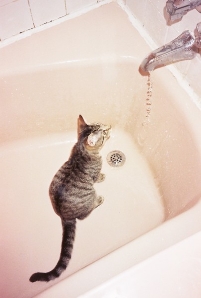
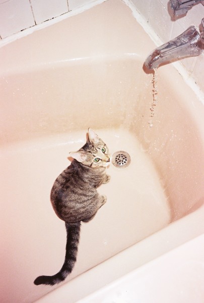
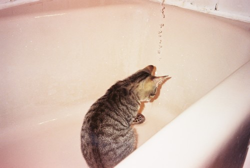
Alex, one of our cats, has always had a fascination with water.


He’s now fully grown and sits in the bathtub under the dripping water.
He comes out with a soaking wet head and
likes to hit you in the face with it.


What can you do?

Animation &Animation Artifacts 12 Aug 2011 07:10 am

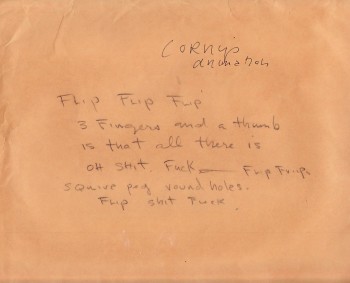
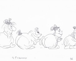
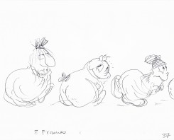
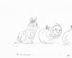
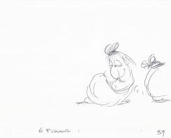
Corny’s Cartoon

Since Corny Cole died on Monday, there have been quite a few comments on various blogs. To me, the most valuable of those I’d seen was the one posted late yesterday by Michael Barrier. It is an interview done with Milton Gray and Corny in 1991. They talk primarily about the days Corny worked under Chuck Jones at Warner Bros. and the days working at UPA on Gay Purr-ee, under the recommendation of Jones. Amid Amidi also posted a fine memorial to Corny on Cartoon Brew this morning.

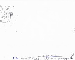
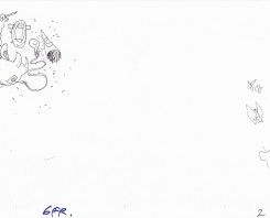
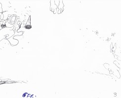
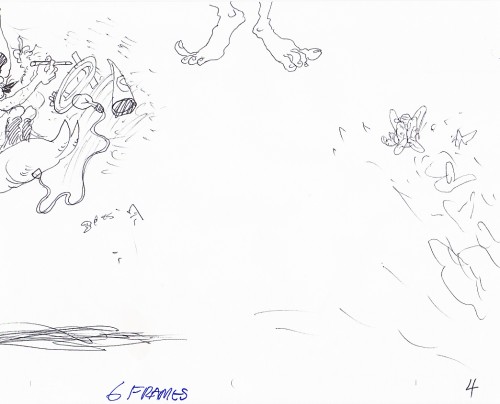
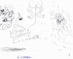
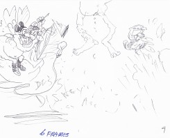
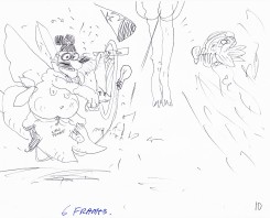
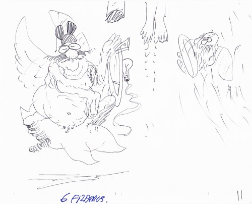
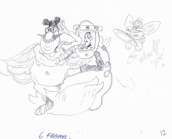
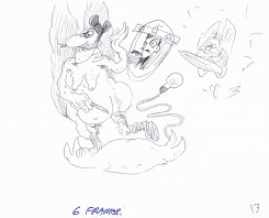
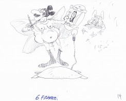
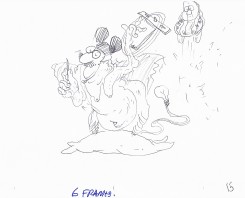
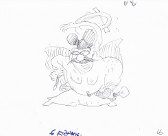
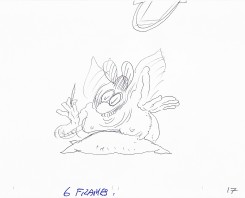
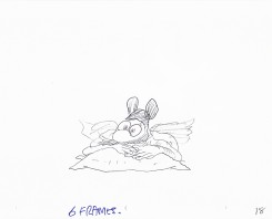
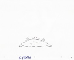
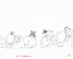
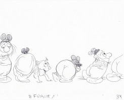
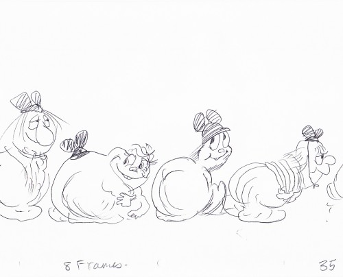
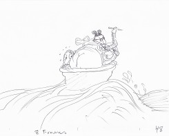
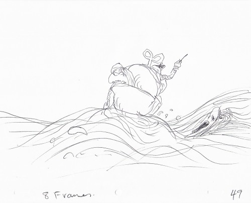
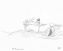
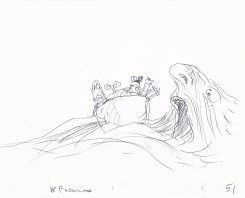
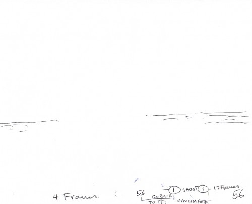
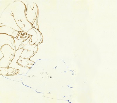
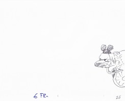
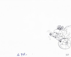
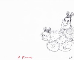
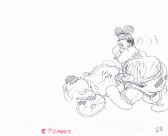
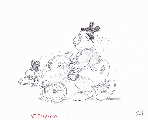
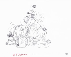
I have a few scenes done by Corny Cole from Raggedy Ann and Andy, and I hope to post some of his art. However, animator, Matthew Clinton sent me the following scene and offered it for posting. Matt had a close relationship with Corny and I thought the scene somehow special. Somehow, to me, it captures the essence of Corny’s animation, so I thought it appropriate to post this week. Here’s the comment Matt sent along with the artwork:

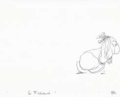
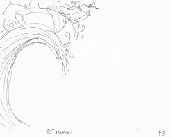
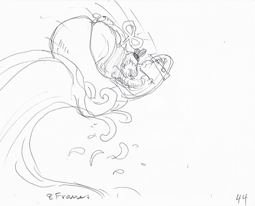
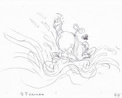
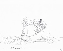
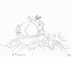
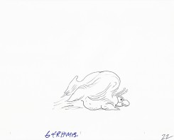
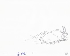
    Corny Cole gave this scene to me as a gift when I graduated. I’m guessing that it was something he worked on in his “Animation as Art” class while the students were busy drawing one day. Maybe it was for a demonstration. I included scans of all the drawings.

Corny talks, in the Barrier interview, of animating just by flipping without a bottom light. It’s easy to imagine him sitting in the front of the classroom flipping away with this artwork on his lap. It’s obviously stream of conscience. There are elements of some of Corny’s last big jobs in there: the taffy pit from Raggedy Ann and the clockwork mouse (a Disney/Mickey bastardization) from The Mouse & His Child, both features designed by Corny.


Cover sheet
.

0101a
.

0203
.

04
.

0506
.

0708
.

0910
.

11
.

1213
.

1415
.

1617
.

1819
.

20
.

2122
.

2324
.

2526
.

2728
.

29
.

3031
.

3232a
.

3334
.

35
.

3637
.

3839
.

4041
.

4243
.

44
.

4546
.

4748
.

49
The clockwork mouse about to be swallowed by the Taffy Pit.
.

5051
.

5253
.

5455
.

56

________________________
.
This is a QT of Corny’s piece. Since most drawings were exposed on 6′s,
I put one frame dissolves between each to soften the extremes.

Animation Artifacts &Books &Commentary &Disney 11 Aug 2011 06:52 am

Response

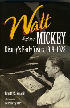
- On Tuesday, I’d posted a review of Timothy Susanin‘s excellent book, Walt Before Mickey: Disney’s Early Years 1919-1928. I loved the book and, in fact, worried that I was being too critical. I did tend to go on quite a bit about the details on details within the book.

To my surprise I’d received an email response from Mr. Susanin, and I asked him if he would mind my posting his letter. He immediately gave me permission and here’s his response to my review:

    Dear Mr. Sporn,

    Many thanks for reading my book; for writing a review; and for your kind words.

    I can’t tell you how much fun I had learning the story of Walt’s first decade. It was a most enjoyable and unexpected hobby, and I am sorry it’s over!

    I am biased about Walt, of course, so I found the subject matter thrilling and a page turner, like you.

    Your review is dead on in a number of respects. I am a Disney fan, not an animation expert, thus I was not equipped to search for the art, as were J.B. and Russell. Being a lawyer who has done many investigations, and written many detailed factual reports based on investigations, I was simply all about finding out what happened during Walt’s “missing decade.”

    There was a reference in the Laugh-O-gram bankruptcy file to a studio “minute book,” and I would have been thrilled had a daily diary of any or all of that decade still existed! For me, following Walt day by day was the way to learn the real Walt and to see how he really got started.

    So for me, a novice author and biographer — and maybe this notion would not be acceptable to other, experienced authors and biographers — there was real worth in learning all of the detail you mention in your review. Because no daily account existed, trying to find out at least what he was doing on a monthly basis helped bring this period alive for me.

    The overload of detail — again, for me — allowed the physical spaces he occupied, the friends and colleagues, the look and feel of the period, the films produced to all come together and create a real portrait of that missing decade.

    I agree that the question is: is this a viable biography for others outside this “niche market?” I didn’t set out to write a book, and once a book resulted, it was the book I would have wanted, because of the level of detail I wanted to know in order to really learn that period of Walt’s life. So, it worked for me!

    And, as you point out, there were limitations. I had no budget. I had no publisher until the book was finished. I was not sure until near the end of the process that the Disney Company would provide photos.

    So….this was very much a project where I was limited to take what others had done
    and try to build on it, add facts to it, string things together, on my own and in my
    spare time —- evenings and weekend.

    I pulled all this together to learn about Walt in the 1920s. The info turned into a timeline that turned into a more detailed chronology that turned into a book. Along the way, I tried to find answers to whatever questions I had so that the blanks could be filled in.

    I think what resulted is a work that I would have loved to come across in a book store or in a library, along with the realization that others would feel the same way, but maybe not a lot of others!

    In the end, I got a real sense of who Walt was; what the first ten years of his career were like; how they set the stage for the rest of his career; and how a lot of his original collaborators fit into the big picture. It really sets the table nicely for me to now go on and read and learn about Walt in the 30s, 40s, etc.

    Unlike you, I did not want the book to go on. After six years and many rewrites and endless proofreading, I wanted it out the door and almost got sick of it! Maybe you can predict what happened after that: I now find myself wondering with increasing frequency about the spring of 1928, and what happened —- in a detailed way, on a daily or monthly basis! —- as Mickey appeared on the scene.

    I thought that I would have nothing further to contribute to the Disney canon because, from Mickey’s appearance in 1928 til today, enormous amounts have been written about Walt’s story. Unlike the “missing decade” of the 1920s, the record is complete as far as the other decades of Walt career are concerned.

    And yet….I find myself getting the urge to dig into the spring of 1928 and see where that takes me.

    I don’t really know if I have another book in me, but my mind is starting to wander in that direction. I’ll keep you posted!

    Many thanks again for your interest and your review.

Boy, do I hope he comes up with something about those several months between the start of Plane Crazy and the premiere of Steamboat Willie. Can you imagine the pressure on Walt and Roy? They’d just been robbed of their staff and had lost a semi-lucrative job doing Oswald cartoons. They create a mouse character, and no one wants the first short. So they do a second film starring Mickey, and still they can’t sell it. They do a third one trying to capitalize on the incoming sound transition. They show the film at one theater – for free – just to get it in front of an audience. Success! That short period is a tale in its own, and it’s never really been covered by writers.

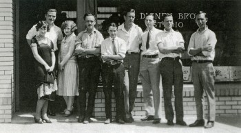
In the photo, above: LtoR – Irene Hamilton (Inker), Rudy Ising, Dorothy Manson (Inker), Ubbe Iwerks, Rollin Hamilton, Thurston Harper, Walker Harman (Inker), Hugh Harman, Roy Disney. Walt took the photo.

_________________
.

On to something else that’s related. Mark Sonntag on his extraordinary blog, Tagtoonz, has posted some rarely seen photos of the first days of Disney’s filming in Kansas City. After posting the one photo of Walt directing and Red Lyon filming the Cowles children in 1922, he was contacted by a member of the Cowles family, and they offered additional photos. Take a look.

Action Analysis &Animation &Books &Disney &repeated posts 10 Aug 2011 07:07 am

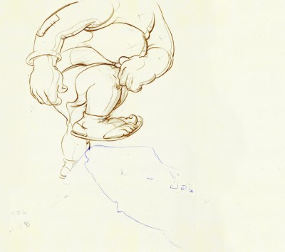
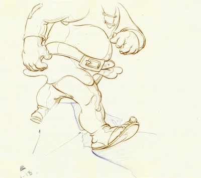
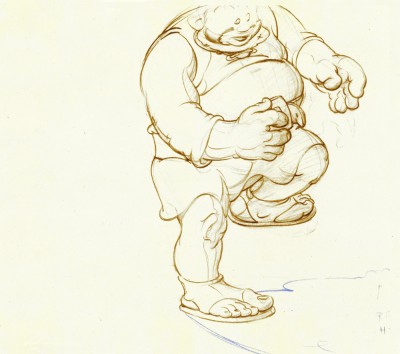
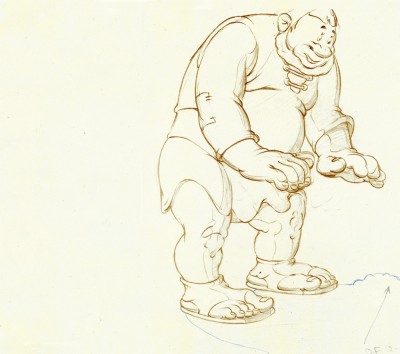
Tytla’s Willie – recap

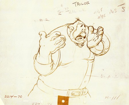
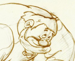
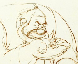
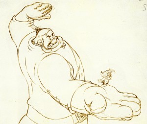
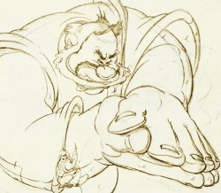
Continuing with my recap of all things Tytla, here’s a post I did on Tytla’s work on The Brave Little Tailor.

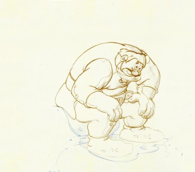
- When I was a kid, I was never a big fan of the “Willie” character, the giant in Mickey & the Beanstalk. It seemed that every fourth or fifth Disneyland tv show would have this character in it (or else Donald and Chip & Dale). As I got older and grew a more educated eye for animation, I came to realize how well the character was drawn and animated.

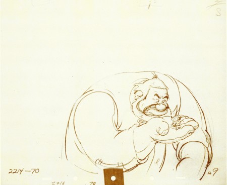
Willie first appeared in the classic Mickey short, The Brave Little Tailor, and he appeared fully formed. Bill Tytla was the animator, and he appeared to have fun doing it.

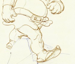
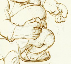
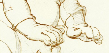
In John Canemaker‘s excellent book, Treasury of Disney Animation Art, there are some beautiful drawings worth looking at. Here they are:

1
(Click any image to enlarge.)

2

3

4

5

6

7

8

9

10

So let’s take a closer look at some of these drawings.


.

.
Drawing #3 features this weight shift. As the right foot hits the ground it pronates – twists ever so slightly inward. The hands do just the opposite. The left hand reaches in while the right hand holds back, completely at rest.

It’s a great drawing.
.

.
.

.
.
Drawing #4 shows Willie landing on that right foot, and his entire body tilts to the right. The hands twist completely to the left trying to maintain balance. The left foot up in the air is also twisting to the left before it lands twisting to the right.
.

.

I love how drawing #5 features the two hands flattened out to
make his final stand before sitting down. It’s all about gaining balance.

.

.
.
.
Just take a look at this beautiful head in drawing #6. He’s seated, his head has come forward and tilted forward. The distortion is so beautiful it almost doesn’t look distorted.
What a fabulous artist! This guy just did this naturally.

.

.
.
.
This scene begins with the seated giant eyeing the tiny Mickey Mouse in his hand. The characters are drawn beautifully almost at a rest waiting to get into the scene. The intensity of Willie’s glare is strong, and it’s obvous Mickey is in trouble.

.
Here’s the drawing of the sequence.
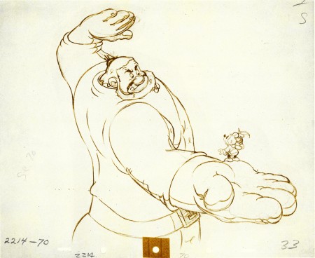
The major problem with drawing a giant is his proportion to all the other characters. The screen is more oblong and horizontalal than it is square. (Fortunately, when this film was done it was closer to a square but still not one.) Throughout the film, Tytla had to deal with a BIG Giant and little Mickey. The landscape is also small.

An obvious way of handling it – and one that would be done today, no doubt – would be to force perspective showing it from the ground up – most of the time. In the 30′s and 40′s they stuck to the traditional rule of film and editing, and they would NOT have done this.

Tytla plays with scale as the giant steps over a house and ultimately sits on it.

In this drawing, he does a brilliant drawing forcing the perspective with Mickey in the foreground and Willie’s left hand in the distance. The giant draws into this forceful perspective without calling attention to itself. Today it would be more exaggerated, but Tytla doesn’t want it to be noticed – just felt.

A real bit of art!

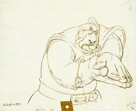
Here, Willie moves through that perspective of the last extreme, and he gets larger as he slams his hands to flatten Mickey. To exaggerate that flattening, Willie’s hands flatten for this key drawing. His head flattens as well in grimace.

The giant’s head will move in toward the hands to see the results, and the audience has a front row seat seeing Mickey escape up the giant’s sleeve. There’s a lot going on in this drawing.
.
.


Finally, Willie tries to figure out what’s happened.
The drawing loses most of its distortion and comes to rest.
(Note that there’s still perspective distancing between the two hands.)

Mark Mayerson has done a mosaic breakdown of this cartoon and adds his excellent commentary.

Hans Perk on his site, A Film LA, has just posted the drafts to the earlier Disney short, Giantland. The draft for The Brave Little Tailor was posted a while back on this great site.

Books &Disney 09 Aug 2011 06:44 am

Walt Before Mickey – a book report

- Before I write about the book, let me say that I am truly sad to hear of the death of Corny Cole, one of those great people you meet in the world of animation who seriously changes things for you. I thank Richard Williams for introducing me to him. I’ll try to post a number of his drawings later this week.

______________________

- I’ve spent a lot of time in the past two weeks reading a thoroughly enjoyable and inspiring animation book, and I wholeheartedly recommend it to anyone interested in Walt Disney or animation. Walt Before Mickey: Disney’s Early Years 1919-1928 is by Timothy Susanin, and it’s such a real treat that I had a hard time putting down. Yet I wanted to keep it alive, so I brought a bunch of other books in for the ride. I took my time reading it even though taking my time was hard to do.

The book tells in elaborate detail (and I do mean elaborate) all of the steps that Disney had taken to get started in this business. The boy who learned how animation could become much more than it was and fought with all the “jack” he had to put it all on the screen. He and Roy, partners in those early days, staked everything on their belief in what they were doing. It’s a great story and makes for something of a page turner.

In J.B. Kaufman and Russell Merritt‘s book, they open with an evaluation of the early period of Disney animation: ” . . . the first striking fact about Disney’s 1920′s films is that they take no particular direction: they don’t evolve, they accumulate.” How accurate an assessment of these films. They don’t get better, they get worse almost as though Disney soon tired of doing them. The gags become repetitive; the characters lose all sense of characterization; even the live-action “Alice” goes from having a large part in the films to flailing her arms so that we can cut back to the drawn animation. This is not the Disney we know from the Thirties & Forties – the one who pushed his people to create the Art form. Essentially, Kaufman and Merritt are looking for the “Art” and give a sharp report on their findings.

This isn’t true of Susanin. His book searches only for the facts and records. But then, let’s look at how the two books were constructed. Susanin’s interviews were limited in comparison to someone like Mike Barrier who did several hundred interviews to write Hollywood Cartoons. He helped Mr. Susanin with many an interview; he also got some help from Kaufman and numerous others in gathering the details and data for the book. Mr. Susanin said, “. . .the Library of Congress, the New York Public Library, MOMA, and the like. I visited the studio when work took me to Burbank, and the Walt Disney Family Museum construction site when work took me to San Francisco. Otherwise, it was lots of virtual work and lots of phone calls with librarians around the country! ”

A lot of the source information came from authors who’d done their own books. Susanin gathered the material – and gathered A LOT OF MATERIAL.

The accumulation of the facts is collected in an almost overwhelming fashion by Susanin. Every sentence in the book seems to have some source information backing it up. An almost minute-to-minute account of these early days is gathered and written about. Prior to this book, I found myself guessing at some of the material. I hadn’t really seen all the details until I had them laid out in this book. Add to that details upon details, and you’re breathless from the material presented. (Every person Disney meets seems to have their history displayed. And just read about the Laugh-O-Grams bankruptcy suit in the epilogue.)

Make no mistake about it, this is a period I am wholly and completely intrigued with. I’ve read every book and interview about it that I could find. Kaufman & Merritt’s Walt In Wonderland, Mike Barrier’s The Animated Man, Donald Crafton’s Before Mickey, even Canemaker’s Winsor McCay. I’ve read and read and read again through the material. Yet the way it’s ultimately presnted in this book is so involving. Perhaps it’s all those details I love reading.

In the three week period Walt and Lillian spent in New York looking to sign a second contract to produce the Oswald animation for Universal, you see all the meetings he has taken. All the visits to Universal and Charlie Mintz (who actually contracts the job to Disney and ultimately steals a large part of his staff so that he can dump Disney) and to MGM (Fred Quimby – of all people) and Fox. He spends a lot of time with Jack Alicote the editor of Film Daily who counsels Walt on the business side of the business. You see all the connections; you understand the seriousness of Walt’s situation and you ride with him trying to grasp what straws he has left. It’s hypnotic in all its detail, and it serves as a tight climax in a well written book.

This segment takes Mr. Susanin 12 pages, full of details, yet it took Mr. Barrier fewer than 2 pages in The Animated Man and fewer in Hollywood Cartoons. It took Kaufman & Merritt in Walt In Wonderland just a bit more than 2 pages to get the information across. It’s not that I needed that additional information to grasp the dire situation Disney was in, it’s that I wanted it. Yet any strong quote in Barrier’s books or Kaufman & Merritt’s has ended up in Susanin’s. It seems that ANY detail that could be found was used to tell the story.

For a geek like me who can’t get enough of this, it’s great. But I wonder about the average reader.

My only real problem with the book is that I wanted the story to go on. At least through Steamboat Willie. Susanin gives a quick sketch of the rest of Disney’s career, but I wanted to get more about that two month period when Plane Crazy was in production. After all, the staff that would leave him – Hugh Harman, Max Maxwell, Mike Marcus, Ham Hamilton and Ray Abrams – stayed on to finish the Oswald pictures while Ubbe Iwerks worked with Les Clark and Johnny Cannon to draw the first Mickey film. A real disappointment set in for me when I came to that epilogue as Disney boarded the train home to start over again.

Yet even in that epilogue there are those delicious details. All of the books personae are laid out with short bios of where they went and when they died. Everyone from Hazel Sewell to Johnny Cannon to Les Clark to Rudy Ising. What a sense of detail. I can tell you I’ll use this book for information for a long time, and there’s not doubt I’ll read it a few more times. This is a wonderful book, and I encourage you to pick it up.

There are some fine interviews with Mr. Susanin on several sites:
- Didier Ghez talks with him on his Disney History site.
- On Imaginerding there’s a nice informal interview.
- Moving Image Archive News also has a review mixed with interview.

Fleischer &Frame Grabs 08 Aug 2011 06:44 am

Fleischer Hoppity Multiplane

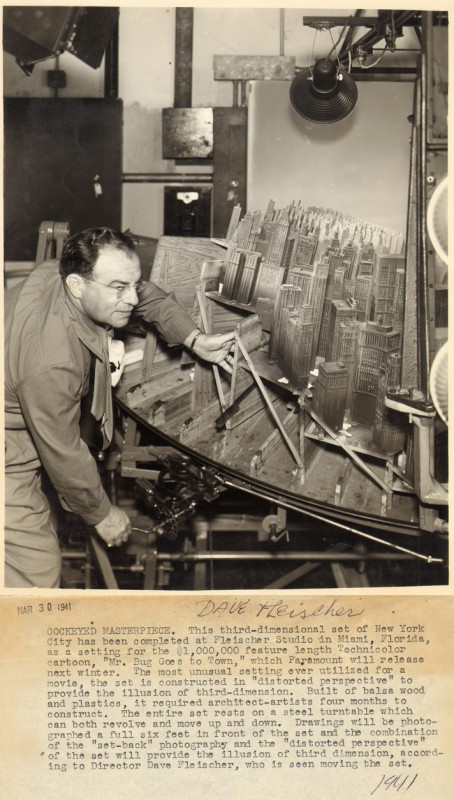
- Last week we looked at the Fleischer multiplane camera. It’s a horizontal device that shot flat animation art (cels) standing in front of 3D background constructions. Little sets that were able to add a unique look to their cartoons.

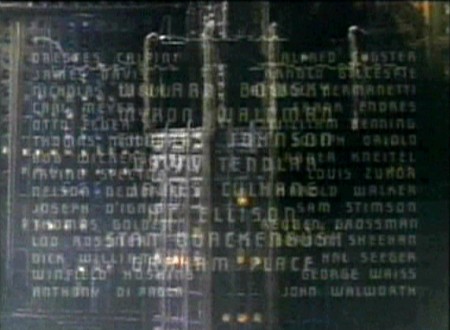
In the two Fleischer animated features, there’s only one scene that uses this multiplane camera, and that’s in the opening titles of Hoppity Goes To Town. I felt we couldn’t leave the Fleischers without a focus on that scene. So that will be the subject of today’s post.


Dave Fleischer in front of the multiplane 3D camera on Hoppity Goes to Town
Picture borrowed from: Ryan & Stephanie’s Fleischer Gallery

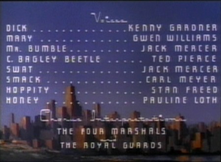
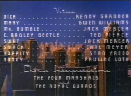
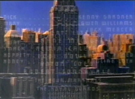
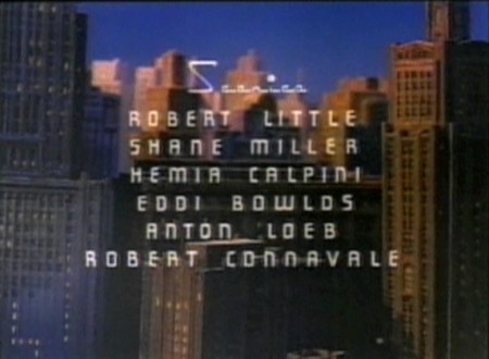
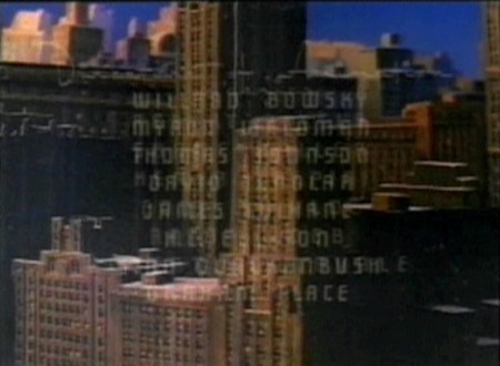
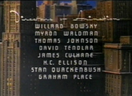
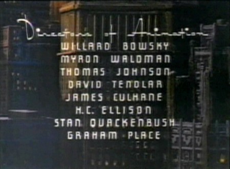
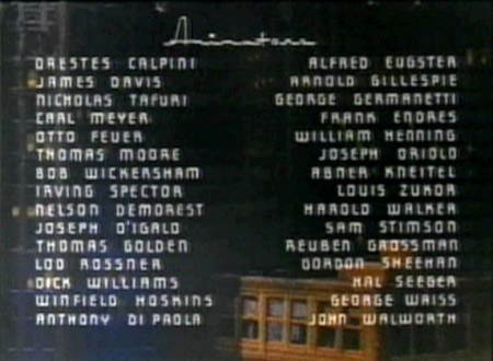
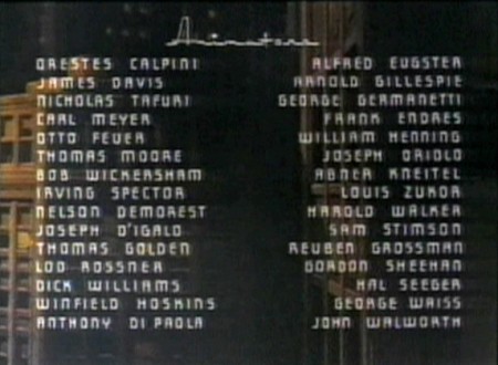
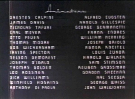
The entire multiplane pan is blocked out, in part, by the film’s credits.
I’ve taken frame grabs trying to indicate the move
while trying to accomodate the credits.

1
The opening starts over flat art coming from a star
in outer space, down to earth to this LS cityscape.

2
The multiplane scene dissolves in here . . .

3
. . . and pans down toward the street level as
it moves toward screen right.

4

5
That’s the Brill Building in the screen’s center
nopt far from the studio of the Fleischers.

6

7
As we go down, the color mix gets less golden . . .

8
. . . and sits more in shadow.

9

10

11
Here is a transition point.

12
The background darkens to accomodate the
dissolve to a flat-art pan during a credit dissolve.


The pan of the 3D setup dissolves to this flat art
which pans down to the start of the film.

There are so many good examples of the Fleischer multiplane. I just chose two in the past couple two weeks, and I hope you’ll review some that you like. There are many on YouTube.

« Previous PageNext Page »

eXTReMe Tracker
click for free hit counter

hit counter