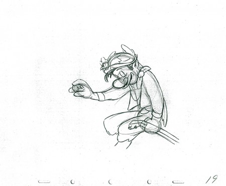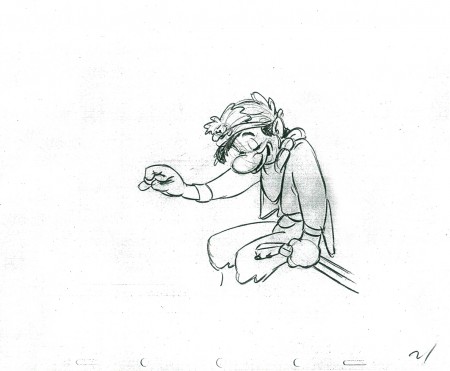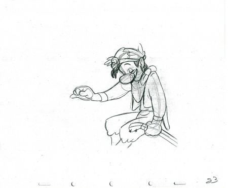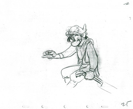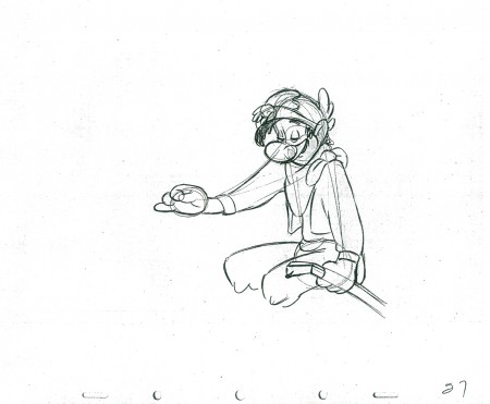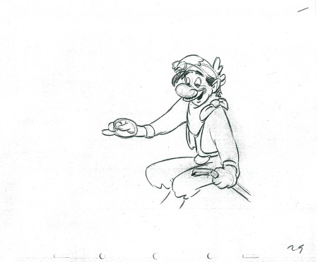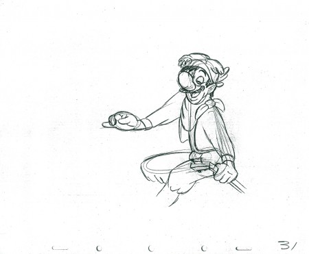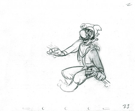
Disney &Frame Grabs 06 Sep 2011 07:04 am

Dognapper

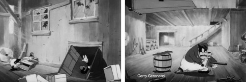
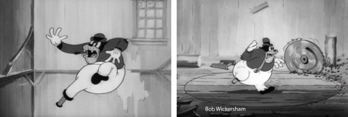
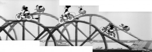
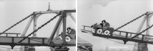
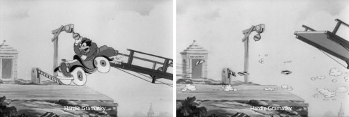
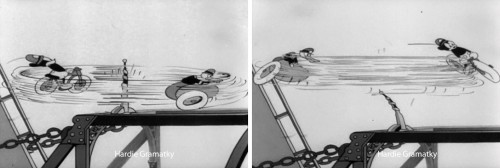
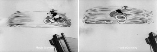
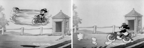
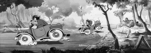
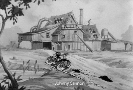
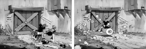
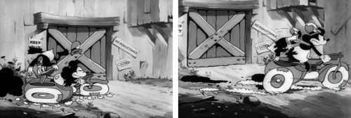
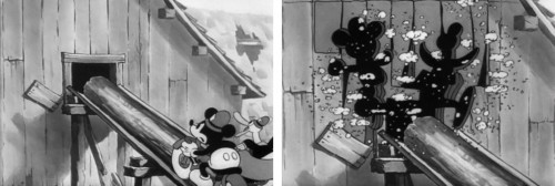
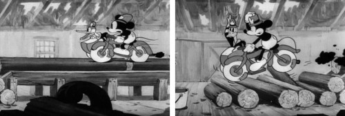
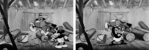
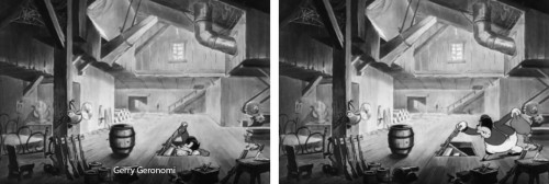
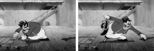
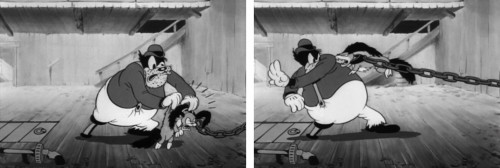
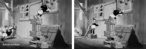
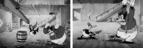
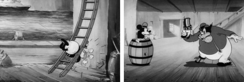
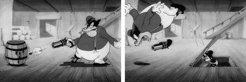
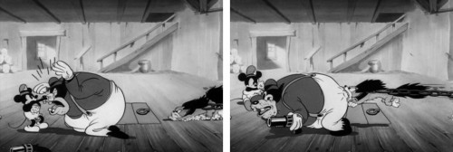
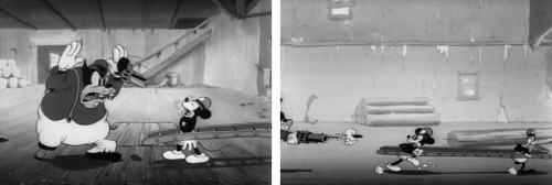
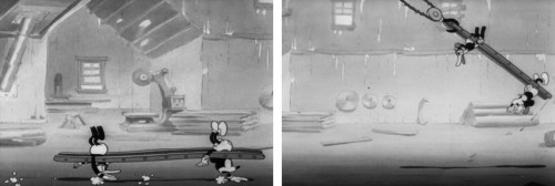
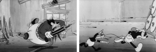
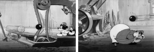
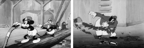
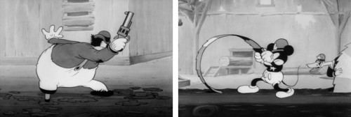
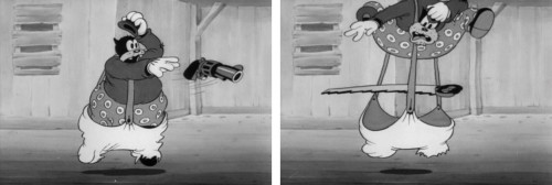
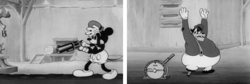
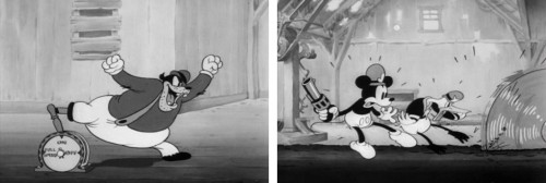
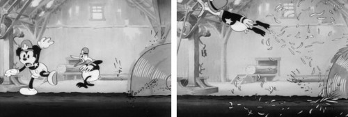
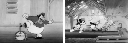
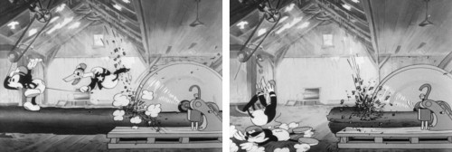
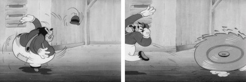
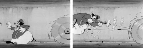
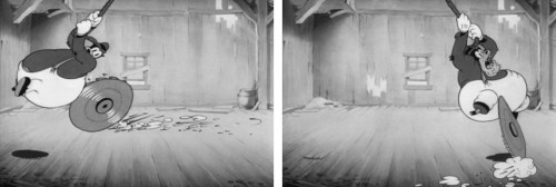
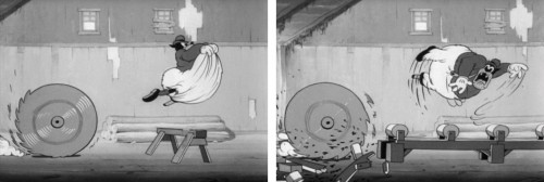
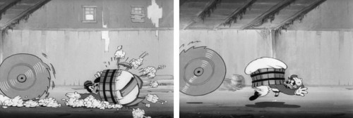
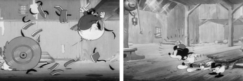
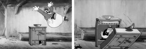
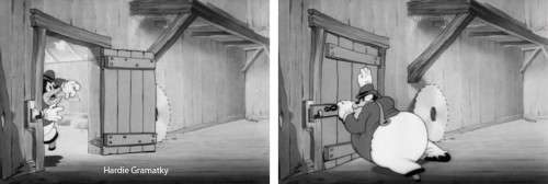
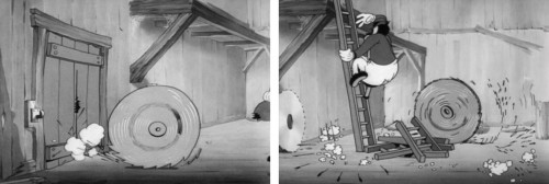
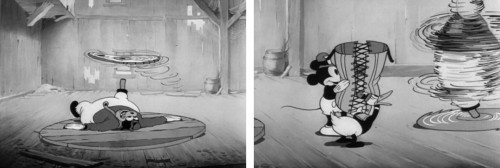
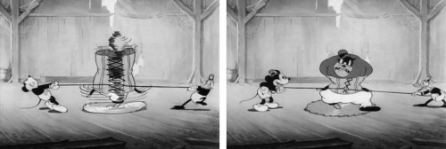
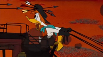
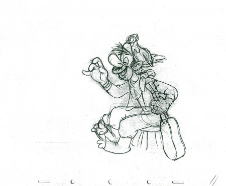
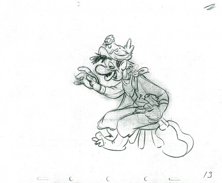
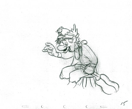
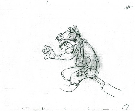
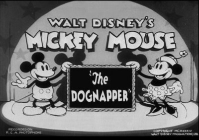
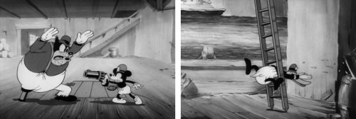
- Time to move on from the Mondays at the Multiplane Camera by putting up an enormously large number of frame grabs from this Mickey/Donald short film, The Dognapper. It’s only the third Donald Duck cartoon, (following The Wise Little Hen and Orphan’s Benefit) and already he’s co-starring with Mickey. (Although he doesn’t get billing, yet.) The short was done in 1934, and the Disney animation was just starting to get a bit more sophisticated than the rubber hose characters they’d done in the silent era. I find this a very attractive short; the Backgrounds really help. This is the Disney period that I love. I can’t get enough of the animation of Johnny Cannon and Hardie Gramatky. I’m not so keen on the non-stop action of the short, but I like the look and the imagination within the format. The film was directed by David Hand.

I’ve added animator credits to each frame. This comes from the film’s drafts as posted by Hans Perk on his site, A Film LA, a treasure of a site. (IMDB has Ham Luske and Les Clark as animators on it. I’m not sure where they got their information.)

Here are a bunch of frame grabs:


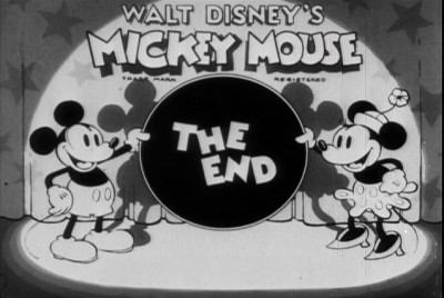
Title Card

1

2
Marvin Woodward

3
Marvin Woodward – Hardie Gramatky

4
Hardie Gramatky

5
Hardie Gramatky – Dick Lundy

6
Dick Lundy

7
Dick Lundy – Hardie Gramatky

8
Hardie Gramatky

9
Hardie Gramatky

10
Hardie Gramatky

11
Hardie Gramatky

12
Hardie Gramatky

13
Hardie Gramatky


Hardie Gramatky


Hardie Gramatky

15
Hardie Gramatky

16
Hardie Gramatky

17
Hardie Gramatky

18
Hardie Gramatky

19
Hardie Gramatky

20
Hardie Gramatky


Johnny Cannon


Johnny Cannon

23
Johnny Cannon

24
Johnny Cannon

25
Johnny Cannon

26
Johnny Cannon

27
Johnny Cannon

28
Johnny Cannon

29
Johnny Cannon

30
Gerry Geronomi

31
Gerry Geronomi

32
Gerry Geronomi

33
Gerry Geronomi

34
Bob Wickersham

35
Bob Wickersham

36
Bob Wickersham – Gerry Geronomi

37
Gerry Geronomi

38
Gerry Geronomi

39
Gerry Geronomi

40
Gerry Geronomi

41
Gerry Geronomi

42
Gerry Geronomi

43
Gerry Geronomi

44
Gerry Geronomi

45
Gerry Geronomi

46
Gerry Geronomi

47
Gerry Geronomi – Bill Roberts

48
Bill Roberts

49
Bill Roberts

50
Bill Roberts

51
Bill Roberts

52
Bill Roberts

53
Bill Roberts

54
Bill Roberts

55
Bill Roberts

56
Bill Roberts

57
Bill Roberts

58
Bill Roberts

59
Bill Roberts

60
Bill Roberts

61
Bill Roberts

62
Bill Roberts

63
Bill Roberts

64
Bill Roberts

65
Hardie Gramatky

66
Hardie Gramatky

67
Hardie Gramatky – Bob Wickersham

68
Bob Wickersham

69
Bob Wickersham

70
Bob Wickersham

71
Bob Wickersham

72


Here’s the movie.

Photos &Steve Fisher 05 Sep 2011 07:28 am

Labor Day

Happy Labor Day


Another gem from Steve Fisher. It captures
the meaning of Labor Day for me.

Photos &Steve Fisher 04 Sep 2011 07:33 am

Remnants of Irene

- It seems like it was longer than a week ago that Hurricane Irene hit the East Coast. After 24 hours of non-stop talk on all the local channels about Hurricane Irene’s impending attack, it was something of a happy let-down to only have some heavy rain in NYC. By mid-afternoon, Sunday, things had turned sunny and Heidi and I took a walk down to the studio to see what was up, there. The two mile walk gave us a good view of lower Manhattan after the storm.

I took only a couple of photos and I mix those up with others by Steve Fisher.

1
Trees and bushes went crazy in the winds.

2
There’s something about a world that’s shaking so much
and the camera is perfectly still.

3
It left a lot of fallen trees and branches.

4

5
Madison Square Park was closed for all the fallen and falling branches.

6
In Washington Square Park you could see the damage.

7
Branches and tree limbs were everywhere.

8
Signs had fallen.

9
Before Irene.

10
After Irene – not too bad.

11
Life goes on.

.

1,2,3,4,9,10,11 by Steven Fisher.
The other four by me.

Commentary 03 Sep 2011 06:55 am

Schmoozing

- Mike Barrier posted a letter on his site. Kevin Hogan questions Mike’s ability to enjoy an animated film now that his taste has been formed by a lot of information learned over a lifetime of study. Mr. Hogan gives as an example the Chip n’ Dale cartoon Two Chips and a Miss. He loved this short as a child and found himself not enjoying it quite as much seeing it as an adult. He suggests that Mike’s knowledge might get in the way of the “innocence” he had as a child in enjoying some of these films. It’s an honest question, and it opened into a full discussion with Thad Komorowski and Milt Gray among others discussing the theory. Mike talks about enjoying the Three Stooges in his younger days but not quite enjoying them as much in recent days. His knowledge of film and this thoughts on the filmmaking process inform his judgment (thank god).

I probably would have gone to Alfred Hitchcock. Here’s someone who made films that can and should be appreciated on so many levels. They’re done for the public, and the manipulation Hitchcock maneuvers to create his films gets that audience by the throat, and Hitchcock enjoys doing so. Yet that same manipulation becomes obvious to the informed film student. However, for that same knowledgeable filmgoer, it doesn’t lessen the value of the film knowing how and what is coming. It makes it more fun because Hitchcock was a Master.

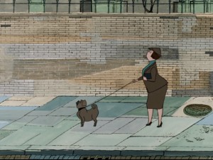
- As a 14 year old child, I was blown away by 101 Dalmatians. Those first ten minutes were heaven to me. I loved the design and the animation of Cruella de Ville, Pongo & Perdita, and even some of the pups. I was not as enthralled by the middle action-adventure section (immediately following the “Twilight Bark”). I had a lot of respect for what was being done, but I preferred the London portion of the film. I did know a lot about animation when I first saw it, but I know a lot more now. I also, now, know quite a bit about 101 Dalmatians, itself. The odd thing is that my opinion hasn’t changed a bit since that first screening. Today, I am in awe of the beautiful walk cycles Blaine Gibson animated at the beginning of the film as Pongo eyes potential mates. Throughout the film, I can see all the cuts, cel shadows, interesting effects and mistakes within them, and, yet, I still love the movie. Everything has changed within me, but nothing has changed within the movie that I first saw. It’s still excellent.

- Jeffrey Pepper’s excellent website 2719 Hyperion has featured the odd Disney short, Donald and the Wheel, in a fine analysis. The article was originally posted on the site in 2009, but this is the first time I’ve caught up with it.

I initially saw this short when it was originally released in 1961. It played locally in New York on a bill with a non-Disney live-action feature (which I can’t remember.) I have to say that I wasn’t in tune with this short, but I enjoyed the surprise of seeing it in the theater back then.

An even greater delight for me was seeing Symposium of Popular Song with the film, P.T. 109 in 1963. Also on that bill was the Disney animated short, The Saga of Windwagon Smith. I don’t remember that much about the feature (other than an image of Cliff Robertson as JFK), but I do remember the two shorts which I’ve seen many times. I absolutely love Windwagon Smith and have studied it backwards and forwards. I also bought a couple of drawings when I saw them available on ebay. Symposium of Popular Song took the TV creation, Ludwig Von Drake and introduced him to theaters in this Bill Justice/Xavier Attencio short that was primarily stop-motion cut out animation. What a double bill! And I’m talking about the shorts, not the feature.

I had seen Donald in Mathmagicland many times prior to ever seeing this newer film. I can’t say I have the same love for Donald and the Wheel. I had a very hard time accepting the two narrators: the Spirits of Progress, Sr., and Progress, Jr. They’re silhouettes done using the Sodium Process invented by Ub Iwerks and used in Hitchcock’s The Birds and Disney’s Mary Poppins. The halo around the characters is all we see of them, and they’re boring, and their song was worse. (I remember spending a lot of time back then trying to figure out how they were done.) As 2719 Hyperion points out Donald and the Wheel did some experimenting with the Xerographic process preparing the way for features like 101 Dalmatians and Sword In The Stone.

But I do pine for the time when a feature – not even a Disney feature – would be accompanied by two such animated shorts. Seeing a Pixar short attached to a Pixar long is not the same thing, believe me. 1963 was also a time beyond the Saturday morning kids matinees in theaters when 10 “Color Cartoons” were featured with a Francis the Talking Mule film. No, it was just part of the filmgoing process to be able to see an animated short on a big screen.

___________________________

- This week I received an email from Louai Abuosba. Along with a number of others, he’s come up with a “meetup.com group aimed at providing a structure for student and professional NYC area. Animators to teach each other skills they don’t have or want to sharpen.” They met this past week in Dumbo and have plans for future meetings. If anyone is interested, you can sign up using Facebook or just go to the site and send Louai a note. (Sorry I didn’t get this out in time for the Sept. 1st meeting, their first, but I got the information too late to get it on the Splog.)

___________________________

Bill Peckmann &Comic Art 02 Sep 2011 06:56 am

Kurtzman Covers

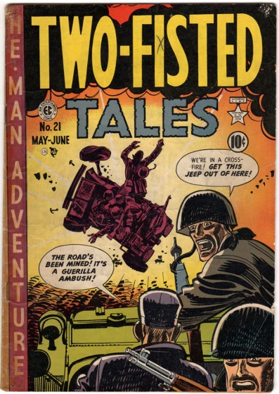
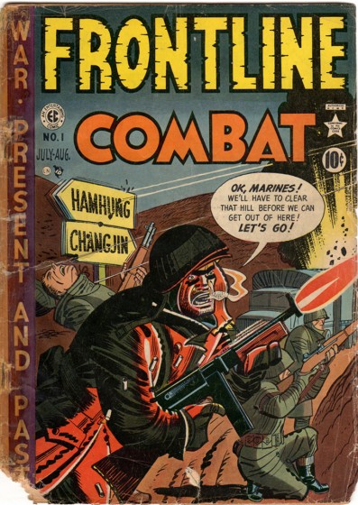
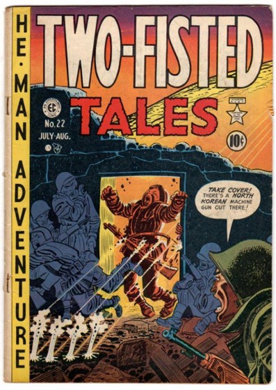
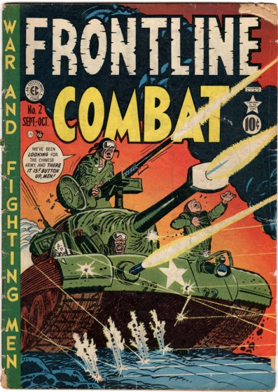
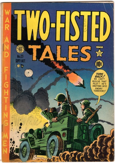
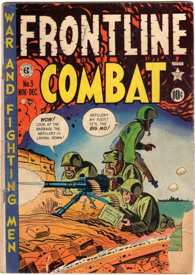
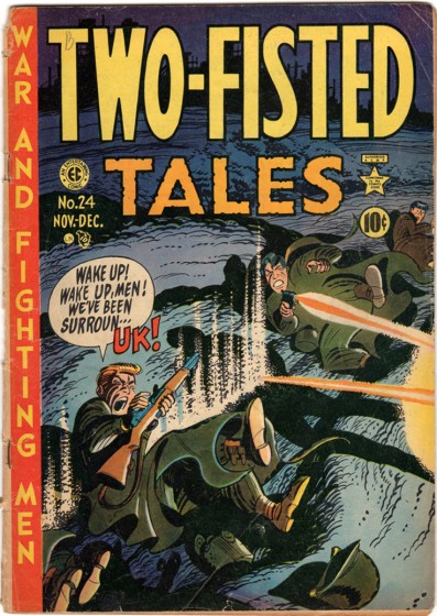
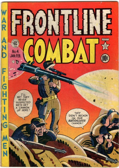
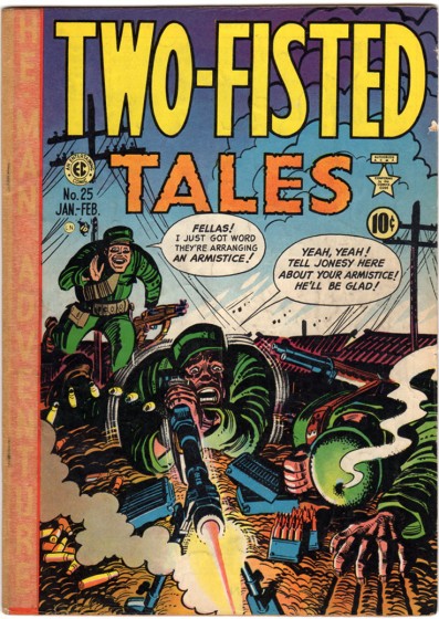
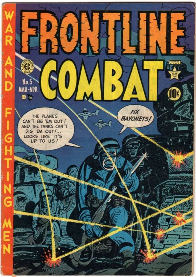
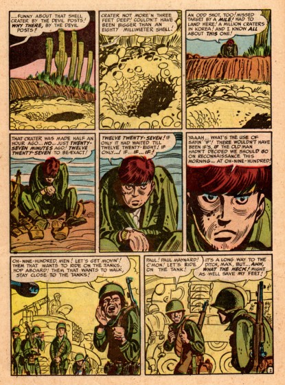
- Here are some more comic book covers courtesy of Bill Peckmann. From his incredible collection, he’s sent us a blast of early covers by Harvey Kurtzman. Bill’s note reads:

    Sorry, these covers are far from being pristine, but I thought it’d be neat to show Harvey Kurtzman’s comic book covers (TWO-FISTED TALES, FRONTLINE COMBAT and MAD) in the order that he drew them. These are from 1951.

Here comes some great drawing.

1

2

3

4

5

6

7

8

9

10

More from Bill:

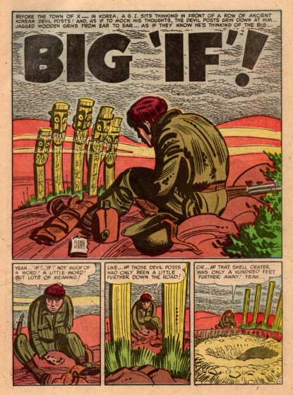
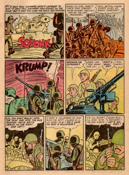
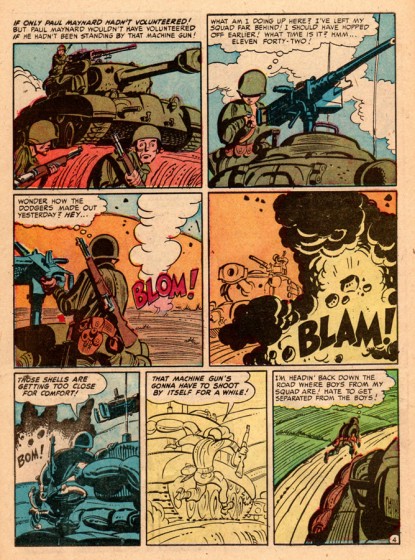
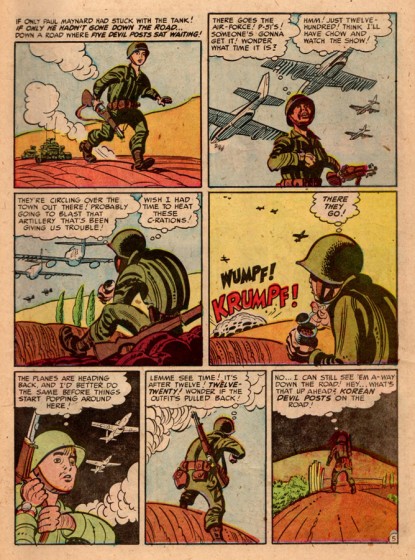
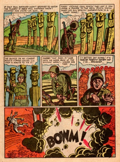
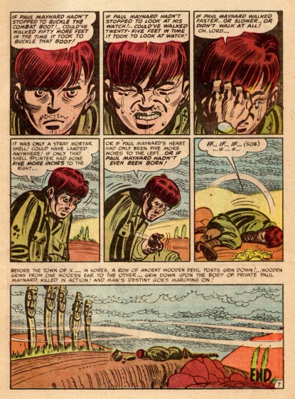
    In issue No. 5 of ‘Frontline Combat” was one of Harvey’s classic war stories titled “Big ‘If’!”. No time like the present to send it along.

1

2

3

4

5

6

7

Comic Art &Disney 01 Sep 2011 06:51 am

Luck of the North – Part 1

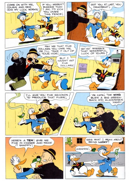
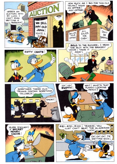
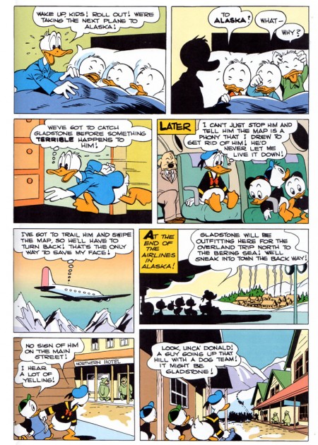
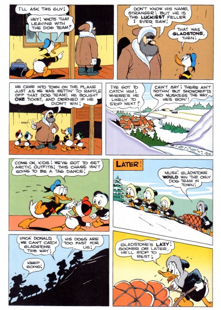
- Having pulled into the great Carl Barks story, “Sheriff of Bullet Valley,” we can’t repeat the adventure, but we can find another just about as good. “Luck of the North” is a gem. Bill Peckmann has begun sending a copy of the comic book in a reprint mode, and here are his comments:

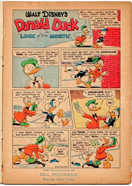
    It’s a reprint of Dell’s 1949 Donald Duck Four Color #256 titled “Luck of the North”. The cover is from the original comic, but the re colored, reprinted story is from Gladstone Publishing, LTD.’s Giant Comic Albums.

He also sends along the original comic printing of the first title page of the story. You can see how much was missing from Barks’ brilliant art in the pulp mode printing.

Anyway, here’s part 1 taken from a reprint version:


The original comic cover.


This is what the original comic looked like.

1

2

3

4

5

6

7

8
Bill’s note on the page above reads:
____________
_______________One of the all time impressive comic book pages!

____________ And I have to agree with him.

9

10


To be continued.
____________

Animation &Animation Artifacts &Disney &Tytla 31 Aug 2011 06:55 am

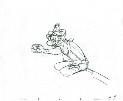
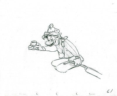
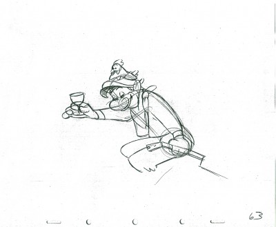
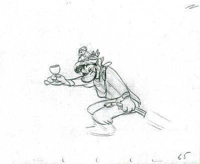
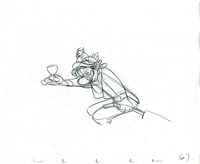
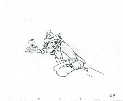
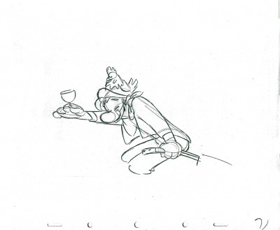
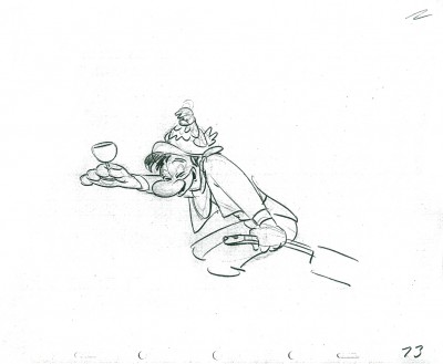
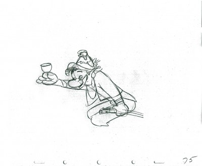
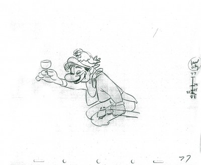
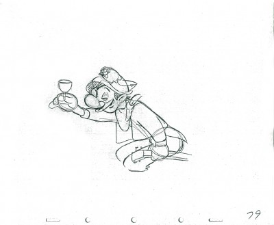
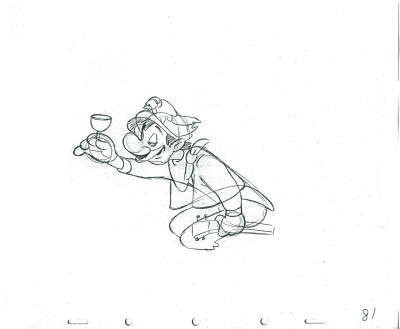
Tytla’s Laughing Gauchito – a recap

- In the past few weeks, I’ve been recapping all of the Bill Tytla scenes I’d posted in the past. This is the last of those done for Disney, and I’m pleased to have it back up again. I’ve taken both parts of the original post and have incorporated them into this one.

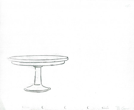
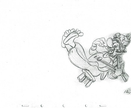
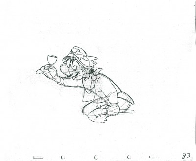
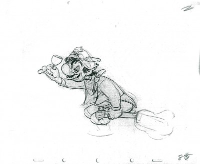
- In March of this year, I posted, in three parts, Frank Thomas‘ animation on the short that never went to completion, The Laughing Gauchito. John Canemaker brought me Bill Tytla‘s scene from this very film, and I’m posting all of the drawings here. As I’ve said, Frank Thomas animated his beautiful and emotional scene and Tytla did this one for a film that Disney, himself, cancelled. He felt it was too much a one gag story.

This one came with the exposure sheets!

You should look into J.B. Kaufman’s excellent book, South of the Border; it gives a full accounting of this film.

Here’s the artwork.


The Background


The wine glass overlay

1A

2A

3A

5A

11

13

15

17

19

21

23

25

27

29

31

33

35

37

39

41

43

45

47

49

51

53

55

57

59

61

63

65

67

69

71

73

75

77

79

81

83

85

1 2
These are the X Sheets for the scene.

________________________

Here’s a QT of the scene with all the drawings included.

These are the links to the Frank Thomas scene: Part 1, Part 2, Part 3
Many thanks to John Canemaker for the loan of the scene.

Books 30 Aug 2011 07:26 am

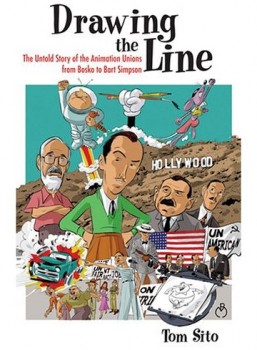
Overdue Book Review – Tom Sito’s Drawing the Line

- There are a number of books I have been remiss about reviewing. For different reasons I’ve not been able to get to reading or reviewing or even commenting on several excellent books. I’ve decided to try to catch up with some of the more important ones.

Note: I also have a problem with WordPress I am having difficulty resolving. It won’t allow me to save any post that has the word “u-nion” in it. I have to add the hyphen to get by with it. Since this book is about u-nions, please expect and forgive a lot of hyphens.

- Tom Sito‘s excellent book, Drawing the Line, is, to me, something of an important book. Other than Karl Cohen’s 1997 book, Forbidden Animation: Censored Cartoons and Blacklisted Animators in America, this is the only book to talk in depth about the Hollywood labor problems and the effect of the McCarthy-era blacklisting on animation. The politics of the different periods is crucial to the subject, and Tom Sito takes that in with ease clearly addressing the subject at hand.

My favorite chapter of the book comes at the beginning. Tom Sito has a charm and a wit in his style, and it comes across most abundantly here. He details lots and lots of small injustices the bosses have against the labor force. It’s all told with such humor, that it takes a while for the heinous conditions being described to be driven home.
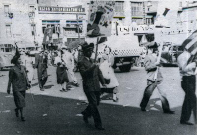
I imagine it was no mean feat to give both a history of animation, for those who are unfamiliar with it, and, at the same time, to go into depth with very specific data that breaks down the conditions and the actions that caused the strikes. There are three attempts at
u-nionizing analyzed with detail within the book. _____ Fleischer strikers in front of the Fleischer studio, NYC, 1937. *
Smaller actions like
the Van Buren and Schlesinger studio strikes are dealt with in short order. The Fleischer, Disney, and Terrytoons strikes take whole chapters to review. All three created enormously heavy feelings felt by the participants even to the end of the century, though the actions had happened more than fifty years earlier. I’d witnessed conversations with members who were holding angry grudges against other members, whether because they had been scabs or had been participants in the u-nion organizing. Sito’s book gives clear descriptions of this and the reasons that caused the friction.

The Blacklist and the Hollywood Wars are likewise detailed and broken down in specifics. Though I’d had an interest in this period of animation history some of the book’s stats are new to me. I also like Sito’s discussion of the aftermath of the period – an anti-political wave that kept people from speaking their mind about their politics. It seems like a simple observation, but it’s obvious only after it’s relayed.

My second favored chapter comes as the book goes in the second half. “Lost Generations” sees into the latter half of the Twentieth Century after the “Big Five” studios have been u-nionized. Here we look into smaller studios from Clampett to Jay Ward to Ralph Bakshi. Depatie-Freleng to Chuck Jones. We see how a ___ LtoR: Sylvia Cobb, unknown, Mary Tebb, Phyllis Craig (seated)later generation of ________and Ann Lord. Ink & Paint women at Disney, 1957.*
artists have less of a
connection to the u-nion, and this sets us up for the big chapter, “Animation and the Global Market.” Here we see the mega-money step in and just about wipe the art off the face of animation. We see how the employees turn on their own u-nion and allow the studios to hae the upper hand. As Don Bluth moves to Ireland for financial incentives with lower salaries and Steven Spielberg settles in London to make his lower budget features. Disney sets up studios in Australia and Canada to produce low budget feature sequels and reap in high grosses at the box office. (Just today I saw a TV ad for the “Special edition” of Bambi II, years after its production. If only the film were “Special.”) Tom Sito is intimately involved in this chapter having been part of the picketing work force, and you can feel it in the writing. It feels personal.

Since he had been President of Local 839 for a while, I would have expected him to be partial to the u-nion but was pleased to see a very fair view showing both sides of the u-nion’s history – positive and negative. It’s an engrossing book, and I’m sorry I didn’t turn to it earlier.

The one negative I had with the book were the many niggling little errors throughout. Some examples include:
- pg 17 says: “Ub Iwerks, working alone, animated Walt Disney’s 1929 short The Skeleton Dance.” In fact, it was Plane Crazy that Iwerks animated alone with only some small assistance from Ben Clopton. In fact, Les Clark took particular pride in animating a scene of a skeleton playing the ribs of another skeleton as if it were a xylophone
- pg 26 reads: “Mary Blair had once been called by Walt Disney ‘the best artist in the studio.’ Within a year of Walt’s death she had resigned, perhaps as a result of professional jealousy of a woman with that much importance.” In fact, Mary Blair had resigned from the studio in 1953, even before Peter Pan, a film she had designed, had been released. She came back to work with Disney on designing a couple of exhibits for the NY World’s Fair and then supervised their move to Disneyland. She was devastated by the death of Disney and left several years later. Her problems with alcohol probably had more to do with the retirement than any “professional jealousy of a woman with that much importance.”
- pg 156 calls Bill Walsh the new president of IATSE. (I was curious to know if this was the same producer who worked at Disney for many years.) No, we learn on page 158 that it’s RICHARD Walsh who is the president of IATSE.
- Page 211 goes from calling William Weiss, Bill Weiss to Bob Weiss and back again.

I also was a bit annoyed with the Index which does not list quite a few names. Mary Blair, who is mentioned at least half a dozen times doesn’t get in the Index, nor does Preston Blair. Rudolph Ising and Hugh Harman don’t make it either, Bill Walsh (who is really Dick Walsh) gets listed on pg 156 & 202, although that name is Dick Walsh on 202. I stopped looking at the Index pretty quickly.

There are many other errors like this, though all of the large and detailed, specific data about the strikes and u-nions seems accurate. This book which is filled to the brim with facts dates and figures obviously has most of them correct. Perhaps the book’s copy editor should have been more questioning.

This is a strong book, and if you haven’t already read it, I have to encourage you to do so. It’s a very particular history, and it has a lot to offer that isn’t available in other animation history books.

________________

- Tom Sito has also authored several other books:

    He is the author of the revised version of my favorite “how to” animation book, Timing for Animation. It was originally written by Harold Whitaker with John Halas attaching his name (he probably got the publisher and not much more). Tom updated the book to include the cgi world. (To be honest, I haven’t seen the book; I only know the original – very well. Consequently, I have a hard time saying much about the revised version.)

    He also has co-authored with Kyle Clark. Inspired 3D Character Animation is designed to show how to put Character into 3D animation and not just set key frames.

* picture 1 courtesy of MPSC Local 839, AFL-CIO Collection, Urban Archives Center, Cal State Univ., Northridge
* picture 2 courtesy of Anne Guenther and Archives of the Animation Guild, Local 839, North Hollywood.
Daily post &Frame Grabs 29 Aug 2011 06:41 am

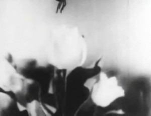
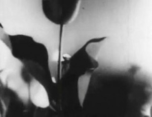
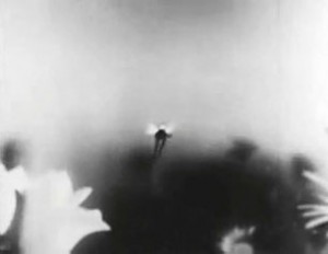
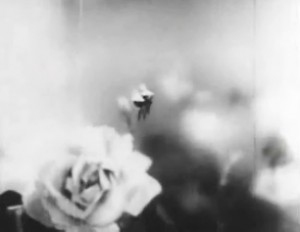
The Multiplane Camera in Masaoka’s 1943 film

- Kenzo Masaoka was an early pioneer of Japanese animation. Masaoka established Masaoka Film Production In 1932 and gained the support of the company, Shochiku; together they produced “The World for the Power and Women” in 1933, which was the first talking film in Japan. He also introduced the use of cels to Japan. He produced many other films in the thirties and was considered the “Japanese Disney”.

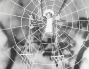
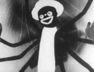
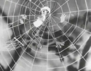
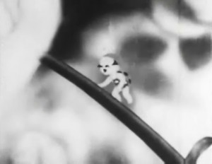
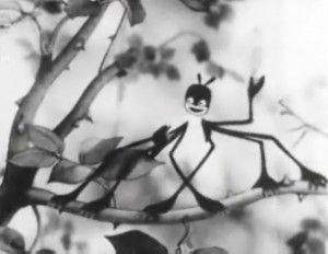
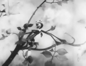
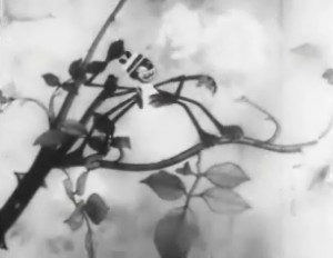
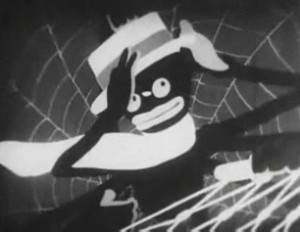
In 1943 he created the short Spider and the Tulip. The film tells the story of a spider who lures a ladybug to its web. The spider, in blackface, is obviously a representation of the the American force trying to invade Japan. The innocent ladybug does its all to fight back. The film incurred the wrath of the military since it wasn’t obviously about the war.

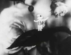
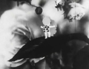
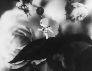
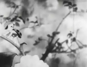
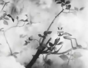
The film, has extensive use of the multiplane camera throughout. Primarily, it’s used for pans and the look of depth in many of the still setups with the BGs out of focus. I’m going to post some frame grabs culled from a streaming video copy, which I also embed at the bottom of this post, so you can watch the film. Unfortunately, the frame grabs are small. I encourage you to go to Network Awesome where I was first introduced to this and several other Japanese classics. Cory Gross did an excellent job of analyzing these films.

1
The opening titles are against a
soft BG probably multiplane.

2

3
The flower backdrops set the mood
for the delicate film to follow.

4
The last title looks to be a constructed set
as the camera moves in on the tree.

5
The camera move feels almost hand-held.

6
CU of the spider against a soft background.

7
8
There’s a long pan of flowers as the fly
flies across the screen to the ladybug.

9
Flowers pass in multiplane levels.

10

11

12

13

14

15

16

17
The pan ends on the beautiful rose.

18
The ladybug stands on a leaf in the foreground, singing.

19
She turns as the fly enters the scene.

20
The fly takes off.

21
Cut to the spider who sings a response.

22
You can see that all the Bgs use the multiplane focus.

23
The spider moves closer to her.

24
There’s a two-shot with the ladybug in focus
and the spider out of focus.

25
Rack focus and the spider comes in sharp.

26
The camera moves in on the spider.

27
It goes in full on the spider.

28

29
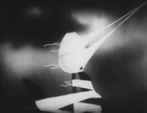
Later in the film, a storm comes up.

30
There are many attractive shots within this sequence,
and I urge you to watch the film, embeded below, for it.

31

32
This is quite an interesting film regardless
of the year it was created in Japan and the
enormous struggles going on in that country.

.

Photos &Steve Fisher 28 Aug 2011 07:21 am

European Manhole Covers + recap

But First the Hurricane


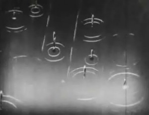
11am follow up: Just got the news from my superintendant who said there were no problems. No flood, no debris, no broken windows. All I have to do is put the books back and the rugs on the floor and we’re back in business. Funny that this Hurricane wasn’t as bad as the storm we had two weeks ago. We had 6 inches of rain from the hurricane and 2 inches from the storm, but the storm was incessantly heavy; the hurricane was on and off. It gave the sump pumps time to push whatever water out.

7am report: I’ve been inside all night Saturday and this morning, Sunday. The rain is beating loudly on the skylight. It comes in loud then soft waves. I assume the studio will reap the damage, but I won’t call the superintendant down there until this afternoon. He’ll tell me what’s what. I assume I’ll be mopping tomorrow.

We don’t expect the subway back until midday tomorrow (if the subway lines haven’t been flooded.) There’ll be a lot of walking after this storm passes later today today and tomorrow.

I don’t think it’ll be too bad.

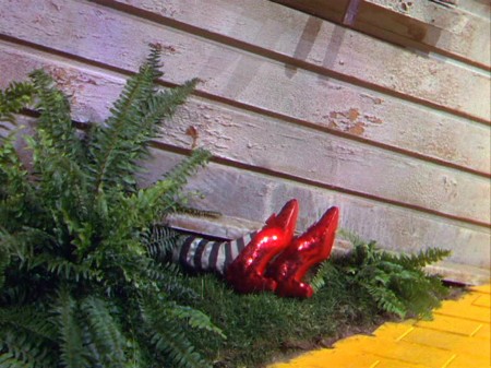
Regards to Tom Viola from whom I stole the Wiz of Oz gag. .

______________________

- Steve Fisher sent me the following shots of manhole covers he photographed in Greece and Naples. This also gives me a chance to post a recap of my post from August 2007. Thanks to Steve for the pictures of European edition manhole covers.

1
from Mykonos

2
from Rhodes

3
from Rhodes

4
from Naples

– When I was in the sixth grade, I had an extra-ordinary teacher who left me with a lot of memories. One of them was his reading of Edgar Allan Poe’s short story The Casque of Amontillado, which chilled us all to the bone as we sat in those little student desks absorbed and thrilled and forevermore fans of Poe.

Another memory was his asking us all if we knew why manhole covers were round. After a number of stupid guesses, we were told the reason – any other shape would allow the covers to fall into the hole. If they were squared or triangular, they could be maneuvered onto their side until they fell in. Round objects wouldn’t fall.

He also told us that manhole covers in NYC were like snowflakes – no two were alike. This I found hard to believe until I started looking. He was right; they were all different in design. Markedly different in design. I looked for years and thumbed my way through many books admiring the designs I found.

Times have changed. Now they come in only a couple of designs.

_
Con Edison is now the primary user for manhole covers, and they seem, these days, to have boiled down to four basic designs. See the two above and the two below.

_
(Click any image to enlarge.)


The Department of Public Works features this handy little design. I like its simplicity very much. the color also makes it unique.

_
Above left you can see an older model that is wearing down. Parts of the design are blending into other parts almost making a new shape. Above right you see an interesting model. There’s a cover within a cover. The smaller model seems to fit within the larger model, and both can be pulled out. Very interesting. There were three or four of these in the same area around 23rd Street.

_
These manhole covers have been fitted into what were obviously larger spaces.
The concrete circle, above left, fills in for an earlier, larger model manhole cover.
Above right, you see a round cover in what was once a square hole.


The busy minimalism of this design works very well with the cracked asphalt around it.


Here we have an interesting model. No design. I guess some would say that that’s
a design in its own right.

If you look on line, you’ll find a lot of information and photos of manhole covers. It’s amazing how big an industry is manhole cover watching. There are many books on the subject, many websites and lots of photographers who specialize in it. I have to direct you to one Roland Muhler. His work is stunning. I’ve posted three of his NYC photos just below. He has many international manhole covers on his site.

_

Another site which gives a lot of attention to manhole covers is Manhole Covers etc. The site is subtitled: “I’ve been looking down so long, I don’t know which way looks up.” Here you’ll find some history, links and photos from across the US as well as around the world.

Through this site I found a Russian site called Sewers of the World, Unite. There’s plenty of information and links here as well as some excellent photos. The images below are Russian designs from this site.

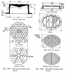
On the site, the history of sanitary sewers, I found this document (pictured to the right) which gives a good view of a plan for some manhole covers. One cover is designed for Syracuse and another for Brooklyn.

I also learned in my small amount of research that most of the covers done for NY’s manholes are made in India. I imagine the shipping charges would be enormous.

I presume that the manhole covers are now made of steel whereas they originally must have been molded of iron (and which would have broken when dropped.) I also learned that the sewers once had a hard glass built into the sidewalk openings so that light could enter. Pre electricity must have made working below ground difficult.
I should say more difficult. It’s not a job I’d like.

« Previous PageNext Page »

eXTReMe Tracker
click for free hit counter

hit counter