Animation &Animation Artifacts &Hubley 06 Oct 2011 06:46 am

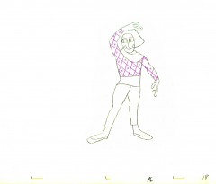
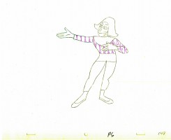
Babbitt’s Carousel Mime – revisited

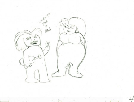
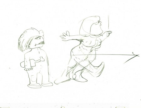
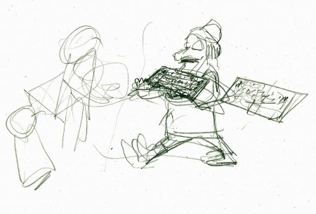
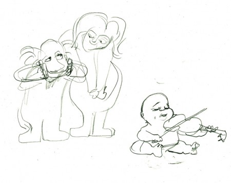
- John Hubley appreciated great animation, and consequently hired only the best of animators to work for him. During his commercial heyday in the ’50s Emery Hawkins, Art Babbitt and Bobe Cannon were regulars animating his spots. When he moved to the short subjects, Bill Littlejohn, Babbitt, Tissa David, Bobe Cannon, Barrie Nelson and Phil Duncan did a lot of the work with others such as Ed Smith and Gary Mooney filling the bills.

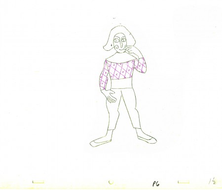
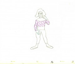
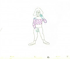
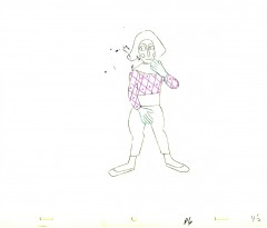
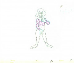
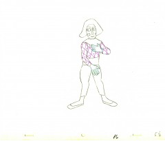
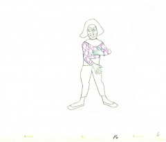
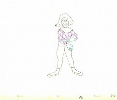
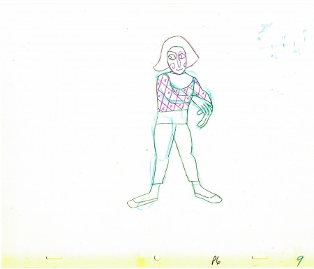
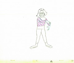
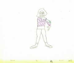
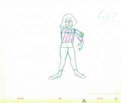
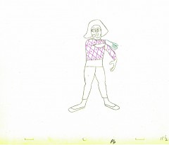
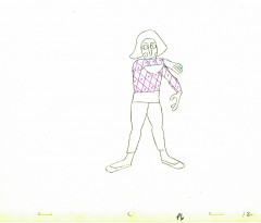
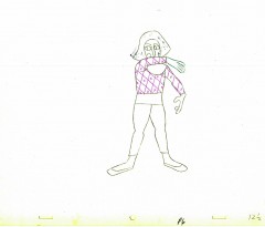
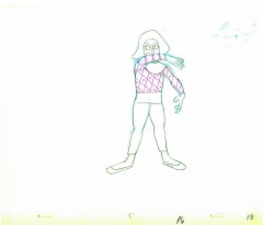
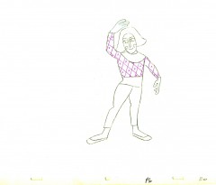
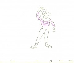
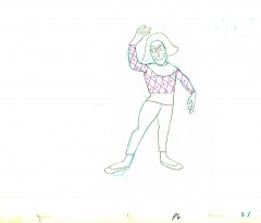
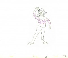
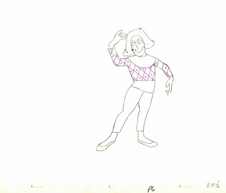
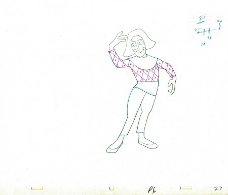
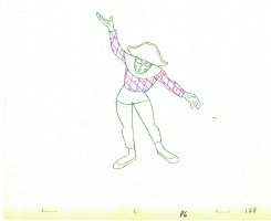
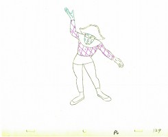
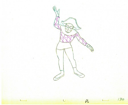
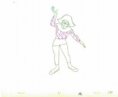
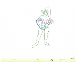
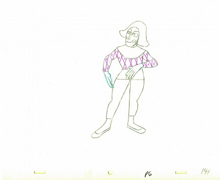
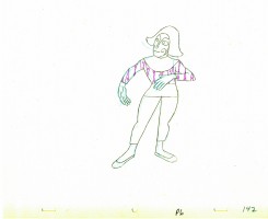
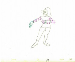
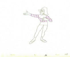
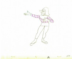
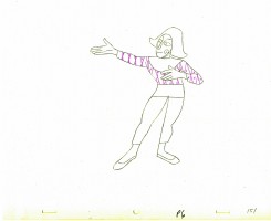
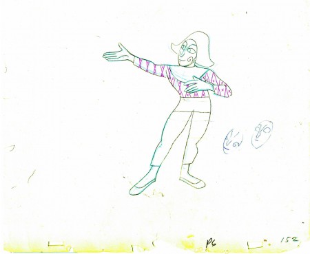
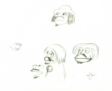
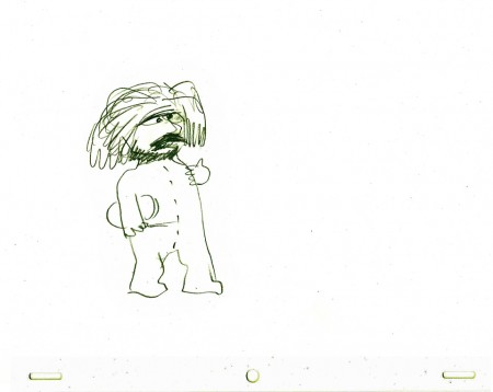
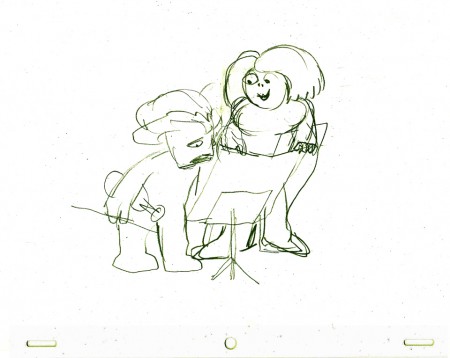
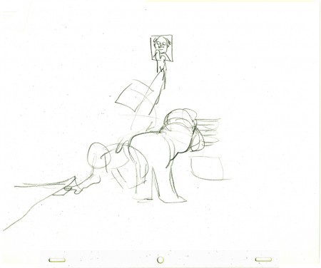
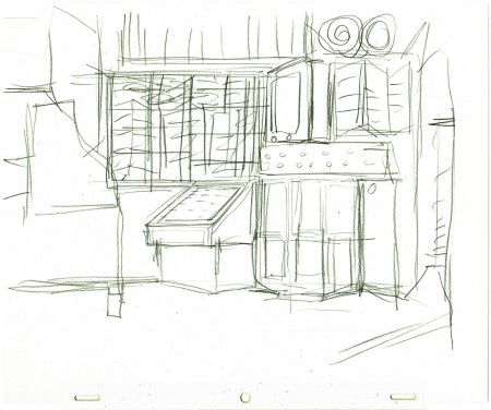
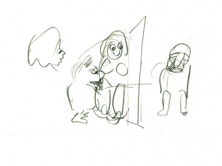
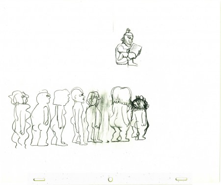
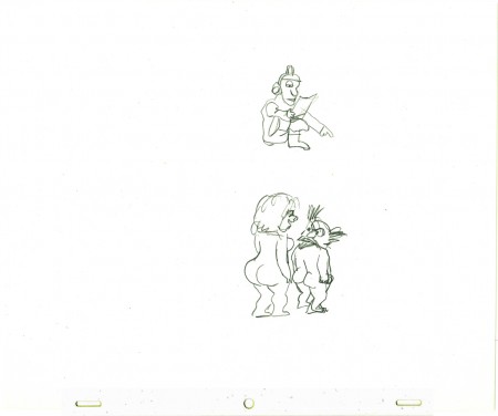
On Everybody Rides the Carousel, Art Babbitt animated the introductory scene and was displeased with what happened to the very long scene. He left the film and Barrie Nelson took over the character he was animating, the Mime/Narrator of the film.

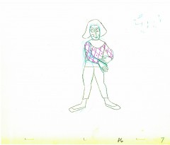
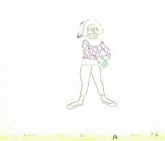
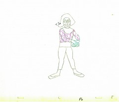
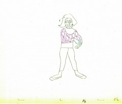
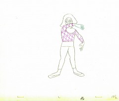
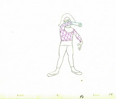
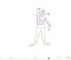
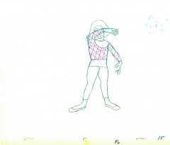
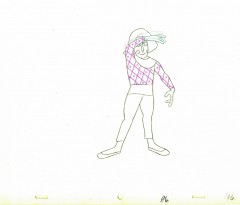
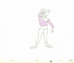
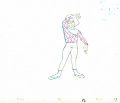
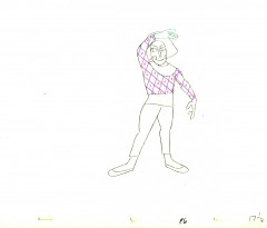
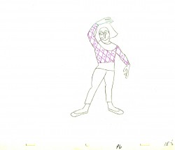
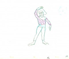
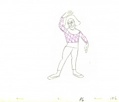
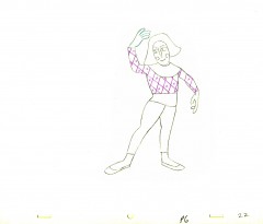
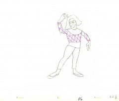
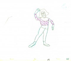
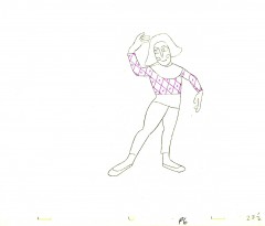
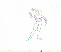
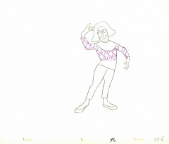
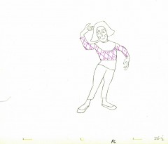
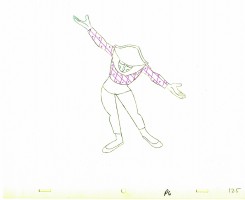
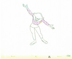
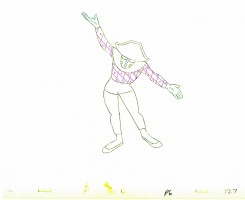
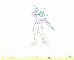
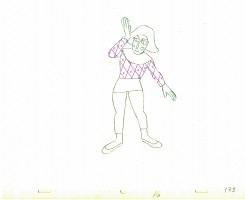
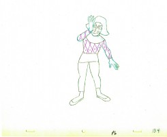
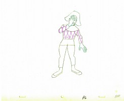
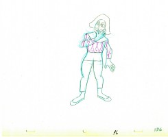
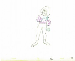
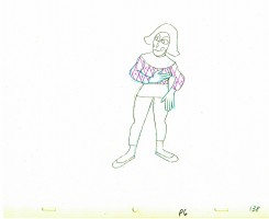
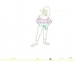
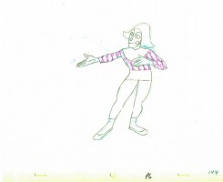
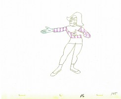
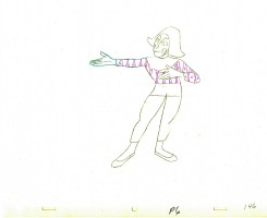
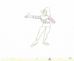
In five past posts (Sept. 2010) I put up all the drawings of the scene and added a QT movie. Rather than post all those drawings again, I offer the first and the fifth parts of the piece and give you links to the other three if you want to study the drawings more closely.

_______________________________
.

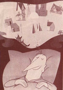
- John Hubley‘s feature film, Everybody Rides the Carousel, was adapted from Erik Eriksons’ Eight Stages of Man, a Psychosocial Theory of Human Development.

The Hubleys designed the feature (which started out as three half hours for CBS and then was rushed to fill it to 90 min feature length in the final 3 months of production) around a carousel. 8 horsees represented different stages of life. The narrator was a mime we see throughout at the carousel. Art Babbitt was hired to animate him, and things got bad pretty quickly and he left after animating a couple of early scenes. Barrie Nelson completed the character in the show.

John took one look at the pencil test of this scene on a movieola and proclaimed it to me as the greatest animation he had ever seen. It wasn’t long that he took the scene – basically exposed on twos throughout – and asked me to change it exposing it on four frame dissolves throughout. This would extend the scenes and the character and would milk the scenes for everything possible. Art Babbitt was furious and never spoke to John again. For the full story go to this past post.

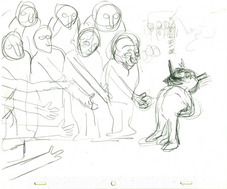
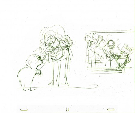
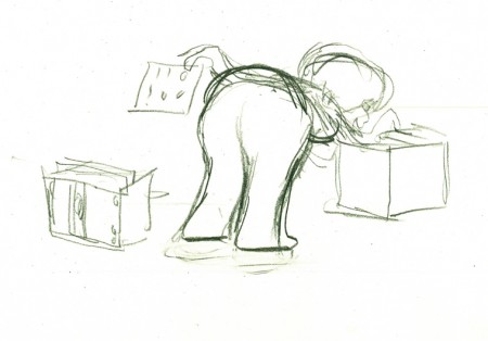
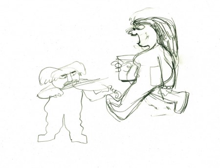
The scene is about 200 drawings long. I’ll break it into parts and post each part here in about 4 or 5 segments. Here’s the first part. As you can see there are a lot of ½ drawings. Animation extender – it’s a very slow moving character. A lot of poetry.

The QT will be done using Art’s exposure on twos.

1
(Click any image to enlarge.

E1E5
There are five pair of eyes; I give you the first and last.

1½
Lots of half drawings in the scene.

2 3

4 4½

5 5½

6 6½

7 7½

8 8½

9

1010½

1111½

1212½

1313½

1414½

1515½

1616½

1717½

1818½

1919½

2020½

2121½

2121½

2222½

2323½

24

24½

2525½

2626½

27

______________________

Part 2

Part 3

Part 4

Part 5
follows:

- The Hubley feature film, Everybody Rides the Carousel, was adapted from Erik Erikson‘s Eight Stages of Man, a Psychosocial Theory of Human Development.

The Hubley conceit was to make the 8 stages of life as a carousel with 8 horses representing those different stages. The narrator was a mime and was animated, at first, by Art Babbitt, with Dave Palmer as his personal assistant. After animating a couple of early scenes, Babbitt left annoyed. Barrie Nelson completed the character in the show.

For the full story behind the rift between Hubley and Babbitt go to this past post.

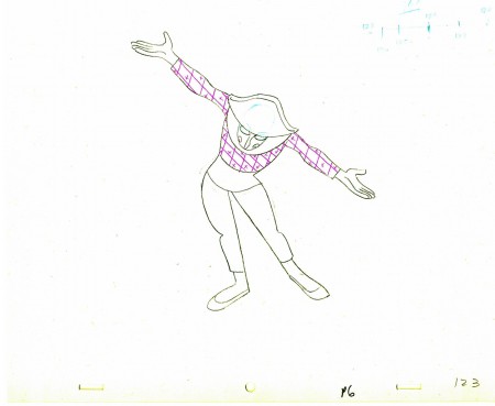
The scene is 152 drawings long. This is the final section as the mime comes to rest. It’s a very slow moving character with short quick spurts of movement.

We begin with the last drawing from last week, #123.

123
(Click any image to enlarge.)

2425

2627

2829

130

3132

3334

3536

3738

3940

141

4243

4445

4647

4849

5051

152

______________________

The following QT movie represents all of the drawings in the scene
exposed as Babbitt wanted them, on twos.

Click left side of the black bar to play.
Right side to watch single frame.

You can watch this scene from the final film here.

Animation &Animation Artifacts &Hubley &repeated posts 05 Oct 2011 06:55 am

Seeding revisited

- Tissa David did a lot of animation for the Hubleys from about 1958 through 1977. She did whole films on her own and EGGS is one of them. I posted this cycle a few years back and to tie it in with my piece on Monday and leading up to the Hubley retrospective, I’m posting it again, today. I think it’s wonderful.

Eggs

-Tissa David animated the entire film for John & Faith Hubley. This short, as I said in previous posts, was done for PBS’ Great American Dream Machine for producer, Elinor Bunin. As Bob Blechman verified, they were given very little money and time to do an 8 min. short. The Hubleys gave life to the short by putting it on the theatrical and festival circuit.

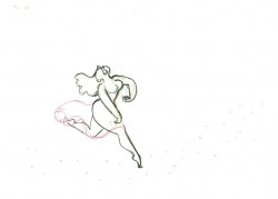
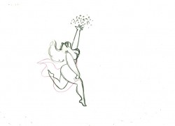
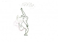
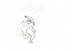
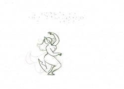
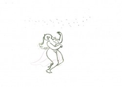
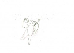
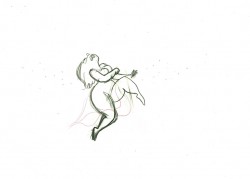
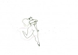
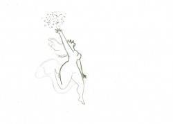
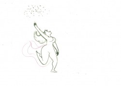
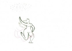
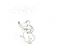
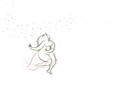
Here’s a rough run cycle Tissa did for the Goddess of Fertility, who goes about inseminating the world with her seed. Tissa adds to its eccentricity with having the low point in the cycle the passing drawing. She comes up as each leg hits the ground.


1 2

3 4

5 6

7 8

9 10

1112

1314

1516

a “Goddess” run cycle from Eggs
On threes at 24FPS
Click left side of the black bar to play.
Right side to watch single frame.

Commentary 04 Oct 2011 06:39 am

Hubley/Blair

- Two shows are about to take place; one in New York (Monday October 10th An Academy Salute to John Hubley), another in Los Angeles (Thursday October 20th, Mary Blair’s World of Color; A Centennial Tribute). I wish I could attend bothh of them; I’m happy to be in NY to attend the John Hubley program (and be a small part of it.)

Interesting that these two shows appear in the same month at two different AMPAS stations. Yet, the two artists couldn’t be more diametrically opposed in their work. One was more of an illustrator, albeit a brilliant illustrator, and the other was more a fine artist.


.
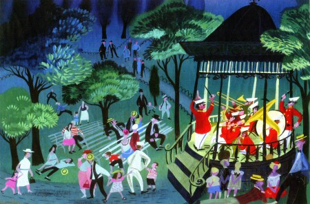
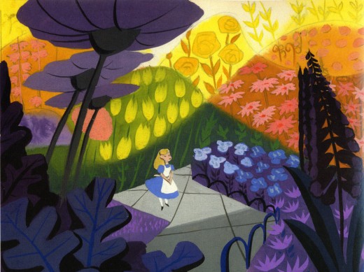
Everything about Blair’s work, from The Little Golden Books to the designs for the Disney features of the early 50′s to the overall design for It’s a Small World in Disneyland, are all glorious testaments to a first rate, gifted illustrator of the highest caliber. She radically changed her style on the trip to South America with the Disney group, and she brought these brilliant color mixes back with her to the work she did at Disney. The colors were almost there for the sake of the colors, alone. The work developed and grew more sophisticated with all that she did, and her color schemes became more radical as she designed for the Disney features.
.

.
The grand statement of the art . . . well, there was no grand statement. It was done to further the films or the projects, and had no message. It was beautiful production art, but it was not really “Art.”
.

.
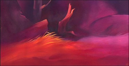
Hubley’s work sought to create art, and the style and growth continued upward through his years. The work at Disney’s studio started as gifted illustration (Snow White), then turned to a looser feel with oils (Pinocchio) and watercolor (Bambi). As he moved to UPA, the art followed Steinberg and Picasso closer to the world of abstraction. Ultimately, with Adventures of an * and films that followed (done by and for himself and his wife Faith) the Abstract Expressionists ruled, and Hubley’s art went far into that direction and stayed there through most of his films.
.
Tender Game, which followed Adventures of, was a variation that seemed to emulate some of the work of Baziotes. Moonbird was where Hubley came into his own and created a very rich style that was all his own. Variations on it came with The Hat, The Hole and Of Stars and Men. A new direction came with Windy Day. By the time we reached Cockaboody, a softness settled into that very same style and watercolor backgrounds dominated. There was throughout all this work a beautiful development where one phase grew out of another which had grown out of another.

.
And there was a grand statement: all art, abstract or realistic was an abstraction and it touched all of our lives regardless of our thoughts about it. Picasso could be dismissed by those not in the know, but eventually the masses would warm up to him and eventually take it for granted that this, too, was Art. Hubley helped make that world – this world – so. Acceptance and understanding was part of his oeuvre.
.
One wonders if Hubley had remained at Disney’s as long as Blair had whether any of his rich design style would have controlled the films as her work had. Of course, the answer is obvious. He never would have been able to remain at Disney’s studio. His penchant for the further development of the art – out of the 19th century illustration – would not have allowed him to sit still there. By leaving, he not only pushed his own work into a higher realm, but he pulled animation there with him.
.

.
In a sense, without his work, animation would still be stuck in the 19th Century graphics and would not have moved into the 21st Century. We can see evidence of this with all the cgi features being done today. Those little fabricated computerized puppets are wholly stuck in 19th Century art, yet 2D has moved on. We accept “Beavis & Butthead” or “Aqua Teen Hunger Force” (both badly drawn works that are most definitely 21st century graphics) because Hubley changed things. Not that John Hubley was the only one who wanted to do more, graphically, in animation, but others seem content with modernized cartooning. Chuck Jones, for example, who led the way in 1941 settled into a stylized cartooning in the 1950s. Hubley sought art – something different and deeper than was acceptable to others.
Picasso led to acceptance of Andy Warhol and Robert Rauschenberg; Hubley led to acceptance of “South Park” and Yurij Norshtein.
.
Pictures:
1. Mary Blair – personal painting
2. Mary Blair – Alice In Wonderland
3. John Hubley – Bambi
4. John Hubley – Brotherhood of Man
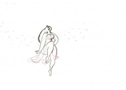
5. John Hubley – Everbody Rides the Carousel
6. John Hubley – Moonbird

Animation Artifacts &Hubley &Layout & Design &Tissa David 03 Oct 2011 06:53 am

Eggs recap

Leading up to the Hubley show next Monday at AMPAS in NY, I’ve said I’ll be posting a lot of Hubley artwork. Today and Wednesday I have a couple of pieces from EGGS.

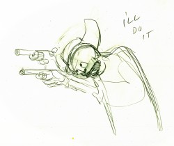
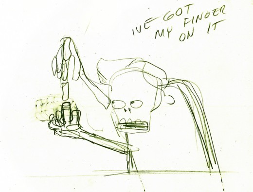
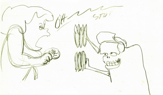
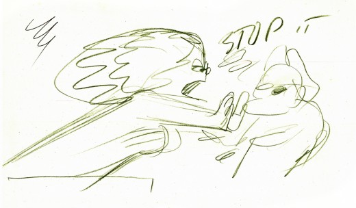
- I have a lot of artwork from the Hubley short, EGGS, which was wholly animated by Tissa David.

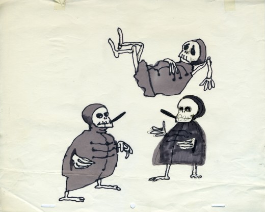
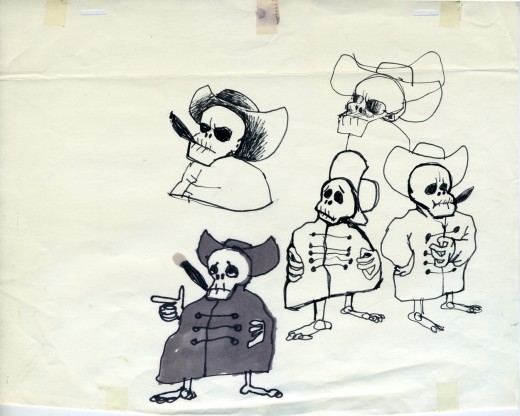
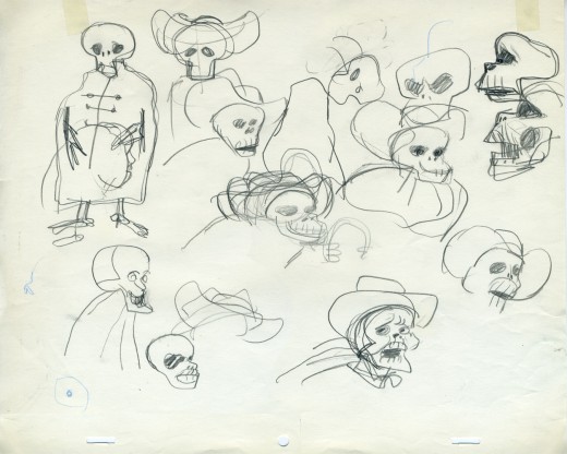
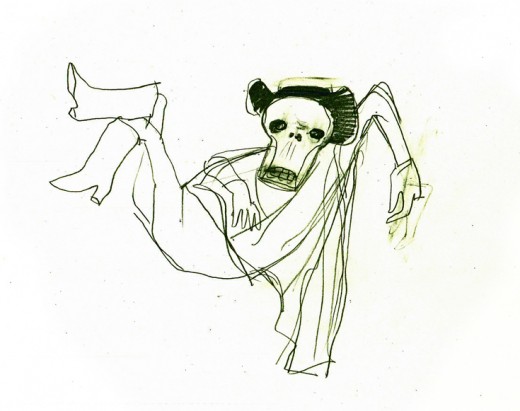
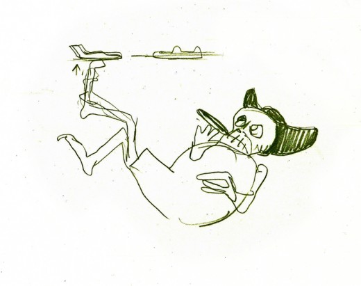
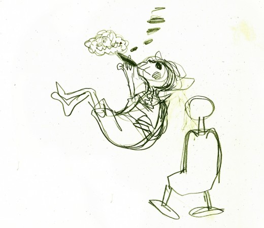
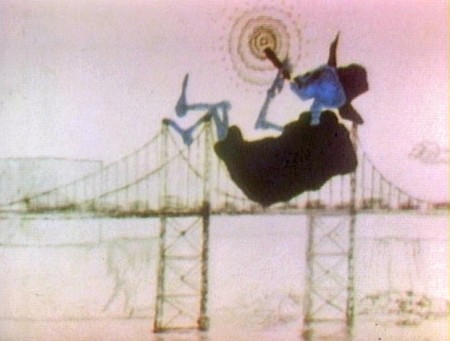
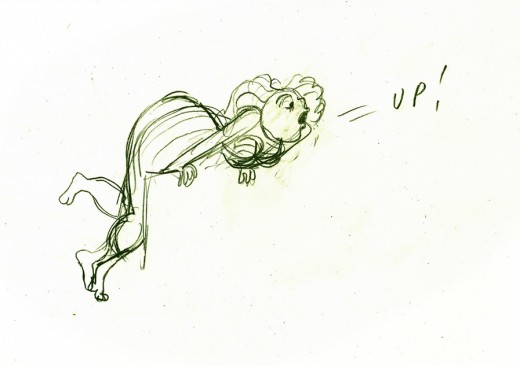
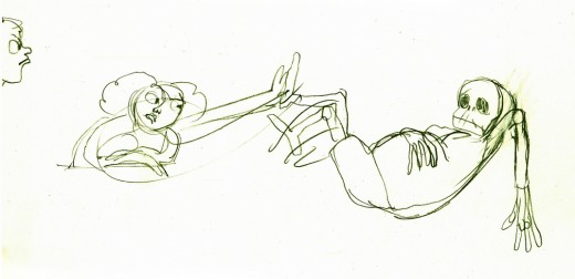
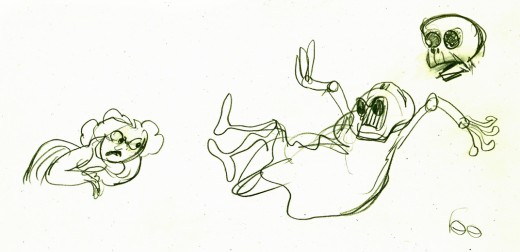
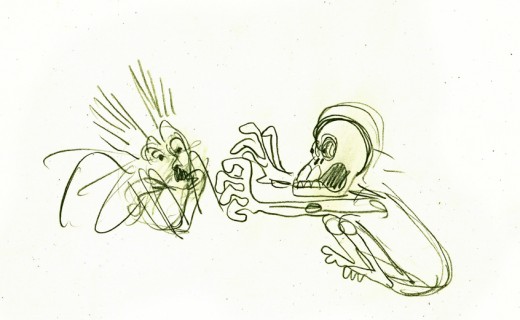
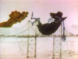
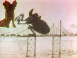
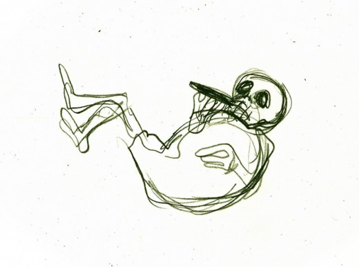
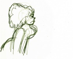
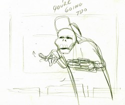
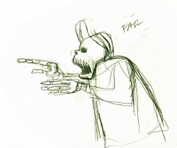
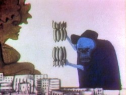
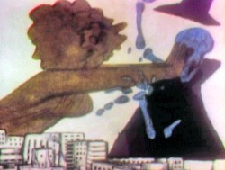
One of the two characters starring in the short is a skeleton, symbolic of death and destruction. The other is a nymph, who represents fertility. The show is basically about the complications overpopulation has presented to the world.

I thought it appropriate for today to post some of the drawings and models for the death character. The images displayed are cropped from the full animation sheets; when you click these displayed it’ll enlarge to the full page. Here they are.


The first model of the character came close to the final.
This is a drawing by John Hubley.


He soon solidified in this model by Hubley.


Tissa David finally worked out some of the problems for herself
and created this working model sheet.


Here’s a beautiful working drawing by Tissa as
she started to pose out the scenes.


Tissa’s roughs are deceptively simple but convey so much. These drawings
are for her eyes only, usually, she’ll clean it up somewhat for animation.


Unfortunately the dvd is a bit soft partially because of the nature of the
underlit final artwork. Perhaps someday there’ll be a better digital transfer.


Fertility is oozing sexuality in every drawing. This is part of the
same scene as she converses with death about the human race.


Eggs was a short film which was rushed out at a low budget for a PBS show called The Great American Dream Machine, which was produced by designer, Elinor Bunin.

The film follows the political thoughts of John and Faith; they were concerned about overpopulation (there are at least four shorts they made about the subject) and were able to blatantly make a political short for this TV series.

These three drawings are character Layouts by John Hubley.


This is a BG Layout John gave Tissa.


This drawing and all the remaining are Tissa David’s drawings.


She would block out her own rough Layout
before jumping in in to animate.


It gave her the chance to thoroughly think out what
little information John had given her. Usually just a
conversation with some very rough sketches.


This is Tissa’s Bg Layout for this scene.

Here’s a YouTube interview with John & Faith Hubley done in 1973. They discuss Eggs and Voyage to Next.
The video of EGGS starts at 4:50.

Photos 02 Oct 2011 06:55 am

Foodcart recap

Originally posted in Feb 2009, but given all the attention to mobile food vans on the Food Channels, I felt inclined to show off the NY contingent in this recap.

- Paddy Doyle’s novel, “The Van,” made me realize that we had a lot in common with our British and Irish friends. The travelling food sellers are a common dressing though the cuisine sold, I’m sure, is different.

A major part of the look and feel of New York is in the food carts that are standing everywhere. In the past, my childhood, the carts were basically hot dog vendors. Then they added the salted pretzel, and things started to develop.

With the new immigrant class in the city, lots of new foods entered the picture, and in fact, I believe, they’ve taken over. Today it’s almost impossible to find a hot dog vendor. I’ve searched for one in the last week and was coming up empty-handed until I saw one late last night. A vendor was wheeling his cart home after what was, obviously, a long and tiring day. Unfortunately, I didn’t have my camera.

They still sell the hot dog and the pretzel, but you can add “Halal” foods to that menu. Shish-ke-bob, sausages, and so much more have been added.


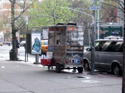
This is what carts look like today. They come in larger sizes and smaller
sizes. They sell everything from shish-ke-bob to hot dogs to pretzels.
Their prices are usually a good deal, if you trust the sanitation.


Many of these carts sell sandwiches, bagels and breakfast pastries in
the morning. Sandwiches in the afternoon. They usually are established
locations and the same people occupy a space for many years.


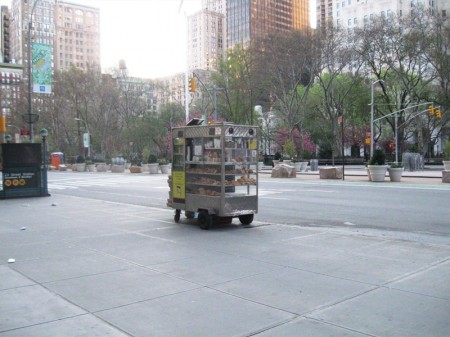
Here’s that very same cart as the vendor sets up in the morning –
I shot this at 6am. This same cart has been here for at least 12 years.


In the wee hours of the morning, carts are delivered to the requisite areas.
Oftentimes, if the cart is small, you’ll see the vendor pushing it himself.


This one is setting up early morning across from
Madison Square Park on 23rd Street and Broadway.


Stocking the shelves with pastries, preparing coffee and icing juices.
Getting ready for the morning rush about to start.


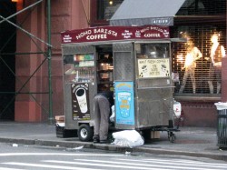
Another similar cart, in the Village, all ready for the crowds. This one has an
overhang, to protect patrons from the rain, and a external cooler with drinks.

.
This guy is parked outside the IFC center downtown.
As you can see his menu is quite varied and ethnic.
Quite tempting.


You can also find fruit vendors around town. The prices of various fruits is about
half what the local supermarkets charge, and the quality is generally good.


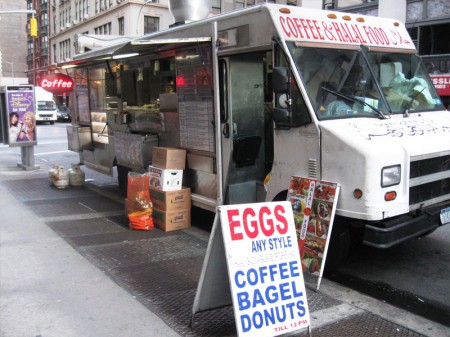
Here’s a virtual travelling store. This truck is set up daily on 28th Street
off Madison Avenue to serve breakfast. They’ll cook the eggs for you.
Later in the day they move around the corner to Madison off 28th St. to serve dinner.
They’re open all night with lines of taxi drivers waiting to buy food from them.
I have to admit, I’m always tempted but haven’t tried it yet. After all,
can all those taxi drivers be wrong? The vendor must be doing
something right.


I also caught this truck downtown and wondered if they were
establishing a spot on Bleecker Street. But they never set up.
On the move.

Commentary 01 Oct 2011 07:14 am

Animated Bits

I found this tiny piece of information in the current edition of “Kidscreen” (Sept 2011):

The science of animating emotions like elation, anger and
jealousy just got a little more exact. Disney has teamed up
with Carnegie Mellon University to develop a process for
animating the most expressive faces yet.

Using motion-capture footage that pinpoints and subdivides
key facial regions to build a full 3D model, it’s now possible to
alter just one part of an expression—say, a raised eyebrow—
instead of having to manipulate the whole face.

Duh!
Isn’t this something that 2D animation has been doing since “Steamboat Willie”? At least! Now that I think of it, there’s a scene in “Plane Crazy” that does it. It probably goes back to J.R. Bray . . . on second thought, I take that back. Bray’s films were more limited than H&B. But then, you could always raise an eyebrow in limited animation, couldn’t you. What a pathetic conversation. What happened to “animation”?

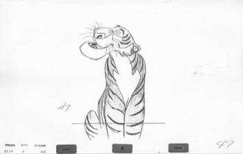
If you want to see a good example of different parts of the face moving on their own, and done to the point of brilliance, try watching this pencil test of a scene by Milt Kahl of Sher Khan. A great piece of acting, artistry, and technique combining to make something one has to watch several times just to get past the sheer power of the animation. The above illustration comes from a PT posted on Vimeo by Jamaal Bradley.
_______
As a matter of fact, you could watch any Milt Kahl scene, or Frank Thomas scene or Tissa David scene or Ed Smith scene or . . .
just watch any professional scene done in 2D animation.

___________________


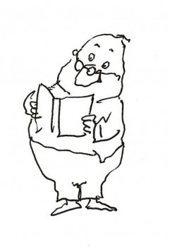
- J.J. Sedelmaier has another fine article on the Imprint blog. It’s the start-to-finish breakdown of a spot designed by New Yorker cartoonist, George Booth.
___________________
_______
.

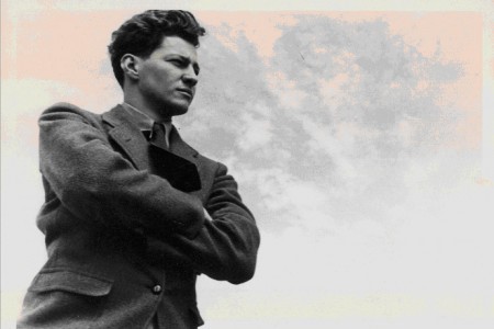
- As I wrote earlier this week, the Motion Picture Academy will present a program of Hubley films on Monday, October 10th. John Canemaker, together with Emily Hubley, has arranged an incredible show with beautiful prints. It’s also not the usual Hubley fare, with its focus on the early John Hubley, and there will be lots of surprises.

The photo, above, was in the invitation sent to me (no doubt from John Canemaker’s collection), and the information below, comes from the AMPAS magazine:

MONDAY NIGHTS WITH OSCAR PRESENTS
AN ACADEMY SALUTE TO JOHN HUBLEY

    Hosted by Academy Award-winning animator John Canemaker (“The Moon and the Son: An Imagined Conversation”). Co-curated by filmmaker Emily Hubley.
    .
    The Academy celebrates one of animation’s most innovative and influential designer-directors, John Hubley, with a special evening featuring rarely seen films and an illustrated look at his life and his art.

    .
    Hubley (1914-1977) is known primarily for two decades of film collaborations with his wife, Faith Elliott Hubley. The couple, who opened their studio in 1955, focused their animated films on such serious subject matter as the death and rebirth of the creative process, children’s awareness of their place in the world, the Cold War, overpopulation and nuclear annihilation. The resulting innovative work garnered many awards, including three Oscars (for “Moonbird,” “The Hole” and “Herb Alpert and the Tijuana Brass Double Feature”).
    .
    Their impressive body of work was, however, a second blossoming of the career and life of John Hubley, who had already personified new directions in animation and a rebellion against traditional Disney studio style and content.
    .
    During this evening celebrating Hubley’s profound and continuing impact on the art and industry of animation, Canemaker will trace Hubley’s early training and contemporary art influences, his art direction on “Pinocchio” and “Fantasia,” his involvement with the infamous 1941 strike at the Disney studio, and his innovative designs and direction in World War II training films and at the great modernist studio UPA. Canemaker will be joined onstage by one of Hubley’s daughters, Emily Hubley, and Michael Sporn, who worked closely with both John and Faith.
    .
    Films that will be shown have been generously provided by the Hubley family, the Museum of Modern Art, Sony Pictures and the Academy Film Archive.
    ___________________
    .

    Monday, October 10 7 p.m.
    Academy Theater at Lighthouse International
    111 East 59th Street (between Park and Lexington Avenues), New York City
    .
    Tickets:
    $5 general admission/ $3 Academy members and students with a valid ID.
    On sale now at oscars.org, by mail (form available on oscars.org) and at the door (subject to availability).
    Box Office opens at 5 p.m. on night of the event. Doors open at 6:30 p.m.
    .
    For more information, call (212)821-9251 or e-mail ampasny@oscars.org.

________________
.
.
- James Gurney on his blog, painter and author/illustrator of the Dinotopia books, got his start doing backgrounds on Bakshi’s Fire and Ice with Thomas Kinkade. He’s doing a whole series of posts on it on his blog, Gurney Journey. It’s well worth your visiting his site.

Part 4 with links to other parts.

Many thanks to Pat Rock for leading us to the link.

___________________
.

.
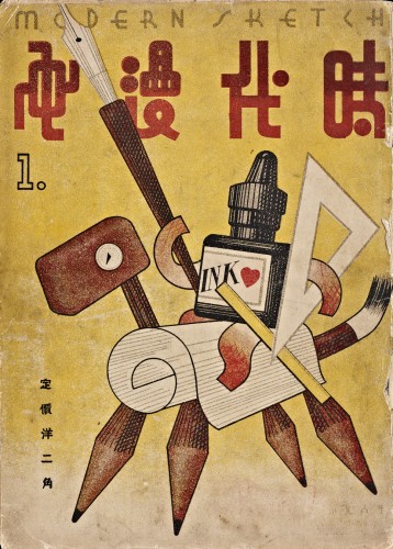
- Thanks to Greg Kelly for passing this link onto us. It’s for an issue of China’s Modern Sketch magazine. It’s published by MIT’s Visualizing Cultures, a unique website.

Essentially, this magazine is a Chinese edition of cartoons and cartoon art from 1934-1937.

As written in the post: “Published in Shanghai monthly from January 1934 to June 1937, Modern Sketch conveyed a range of political and social commentary through lively and sophisticated graphics. Topics included eroticized women, foreign aggression —particularly the rise of fascism in Europe and militarized Japan, domestic politics and exploitation, and modernity-at-large as envisioned through both the cosmopolitan “Modern Girl/Modern Boy” and the modernist grotesque.”

Much of this work is beautiful and worth spending some time poring over.

____________________
__
__

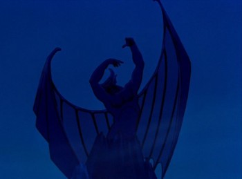
- William Benzon, on his site New Savannah, has more to say about Fantasia. The current piece is about Bill Tytla’s Chernobog in the Night On Bald Mountain segment. Beautiful images and a good read. Bill wrote me about it:
“Now I¹ve gone and done it. On the strength of Tytla¹s work I¹ve compared this segment to Milton and Shakespeare. However, since my literary critic¹s license has already been revoked (actully, I tore it up myself), they can¹t take it away from me again.”

___________________
.

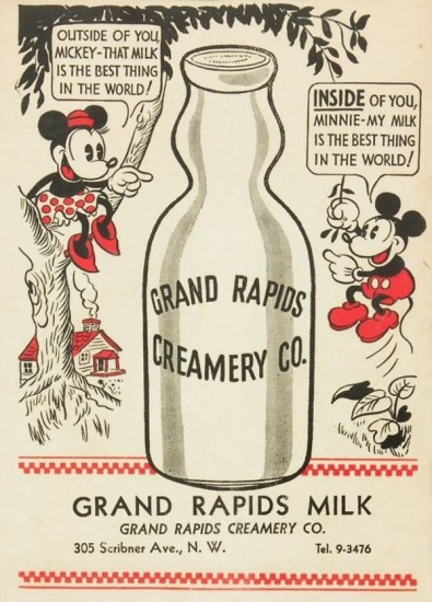
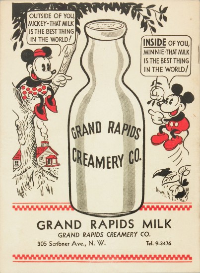
The photoshopped ad.


The original ad.

- Finally, here’s an ad that was posted on Boing Boing this week. Who knows when it was published or how Cory Doctorow discovered it, but it sure speaks to the power of language and how whimsically time deals with it.

That’s what my original post read. However, David Gerstein, in the comic section of this post, directed me to the actual ad before the photoshopped version of it appeared on Boing Boing. Nothing’s really what it seems on the internet.

Bill Peckmann &Comic Art &Disney 30 Sep 2011 06:50 am

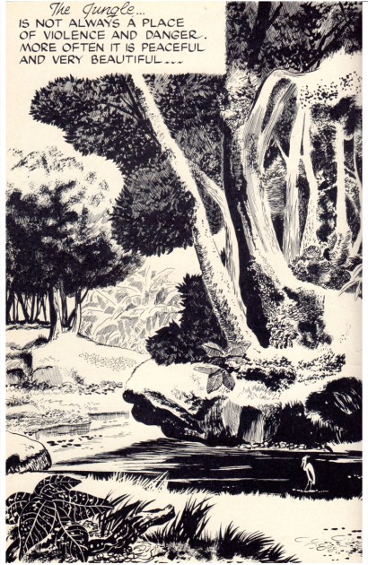
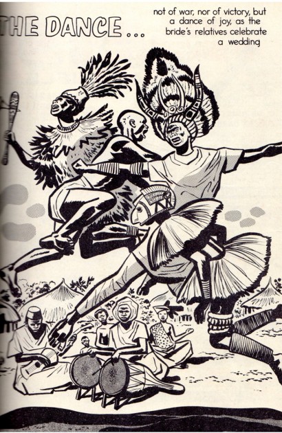
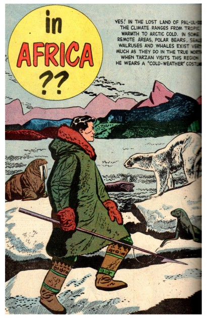
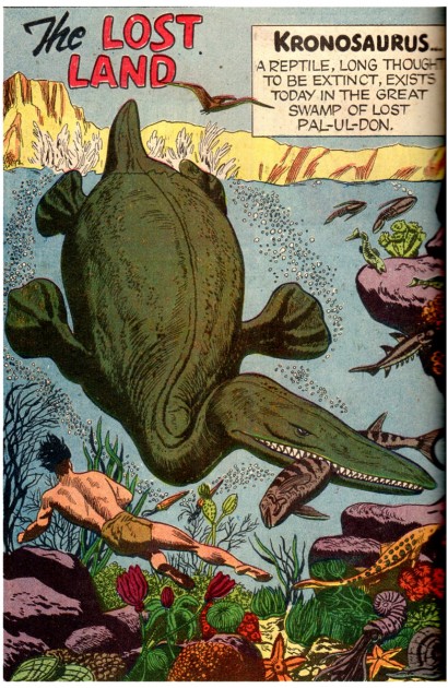
Jesse Marsh comic art

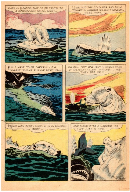
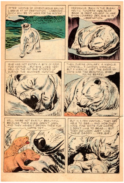
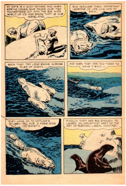
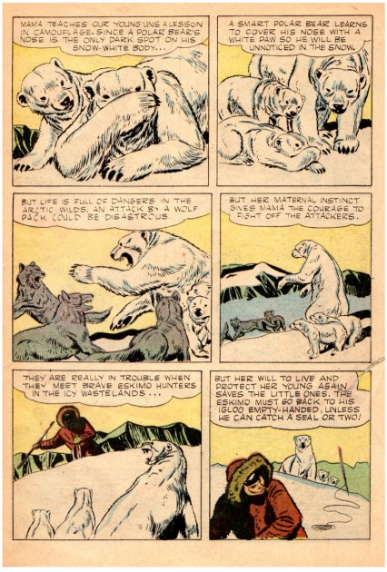
Jesse Marsh was a comic artist who, principally, is known for his work on ‘Tarzan’, the comic series published by Dell. He was a self-taught artist who started working for the Disney studio in 1939. He worked on Fantasia and Pinocchio in the story department. He served in the Army as a radar specialist and was wounded with a mortar shell. After the War and a long recuperation, he returned to Disney but also worked freelance at Western Publishing. He left Disney in 1947 to work at Western, where he took charge of the TARZAN series of comic books.


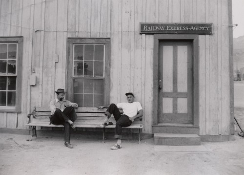
Jesse Marsh (L) and Tom Oreb (R) in the early 1940s
borrowed from Dan Nadel, posted Monday, March 29, 2010

.
Bill Peckmann sent some scans of various art by Jesse Marsh and I’m pleased to post them here. Many thanks to Bill. He writes:
    “Before gaining success as DELL Comics’ TARZAN artist in the late 40′s and 50′s, Jesse Marsh, early in his career, worked for Disney in animation. The following material is some rarely published from that time period, They are taken from Charles Solomon’s 1995 book, The Disney That Never Was.”

The following is the accompanying article by Solomon about Marsh’s artwork:

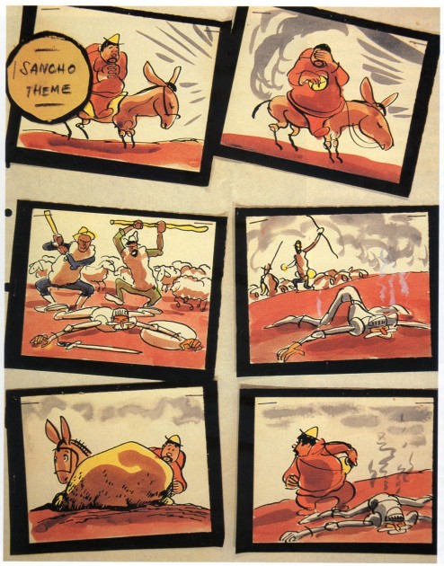
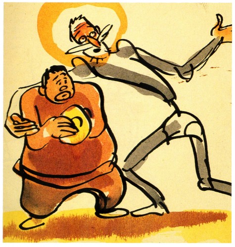
    In 1946, a second crew, under Jesse Marsh, returned to “Don Quixote.” This version would have been set to an adaptation of Richard Strauss’s tone poem Don Quixote: Fantastic Variations on a Theme of Knightly Character far Large Qrchestra, op. 35. Marsh prepared hundreds of neat pen-and-ink and watercolor cartoons, noting the musical themes that would accompany the action. He did enough rough storyboards for an entire film, beginning with a shot of the book resting on a table I flanked by suits of armor, and concluding with a sort of apotheosis: After Don Quixote’s death, he, Dulcinea, and Sancho Panza would ride through the clouds to a glittering castle beneath a rainbow. Like the earlier version, this incarnation of “Don Quixote” was apparently shelved before story meetings were held or dialogue prepared.
    .
    Preproduction work began for the third time in April 1951. This crew used an even simpler style that reflects the influence of such New Yorker cartoonists as Sol Steinberg and Otto Soglow; The rounded characters consist of little more than a few ink lines with monochromatic highlights in dull green or tan. Work on the film must have ended soon after it began, as only a few dozen drawings were completed.

1
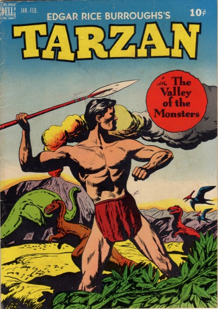
One of Jesse’s early Tarzan covers, 1949

2

3

4

5

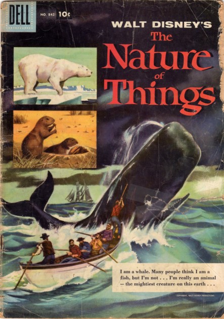
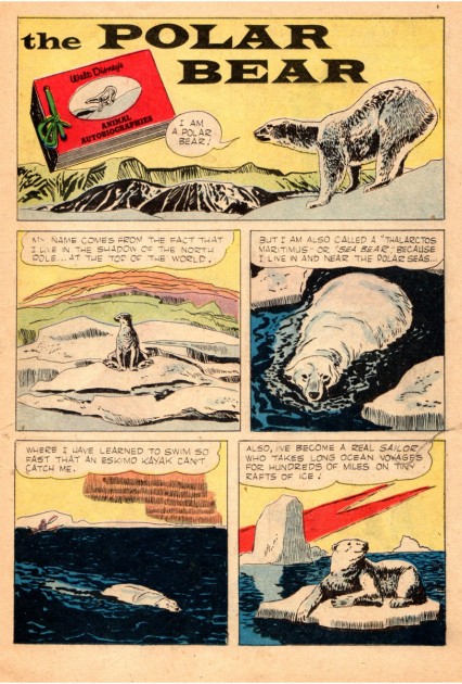
The following is from the Disney True-Life Adventure comic book, 1957.


Jesse did not do the cover of this 1957 comic,
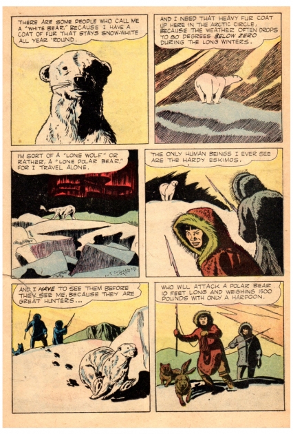
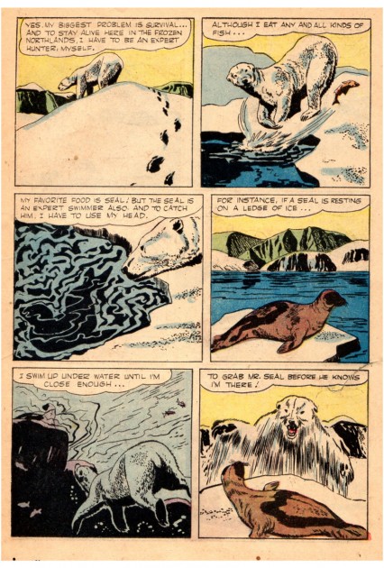
but he did do all of the 3 inside stories.

10
This is the first of the three stories in this book.

11
Combine Marsh’s “non slick” style with his beautiful panel and
page layout designs, and you got some impressive results.

12

13

14

15

16

17

18

19

20

21

A site called The Jesse Marsh Site offers the complete Dell TARZAN no. 1, from January 1948. This was actually the third TARZAN that Dell published.

Bill Peckmann &Comic Art &Illustration 29 Sep 2011 07:24 am

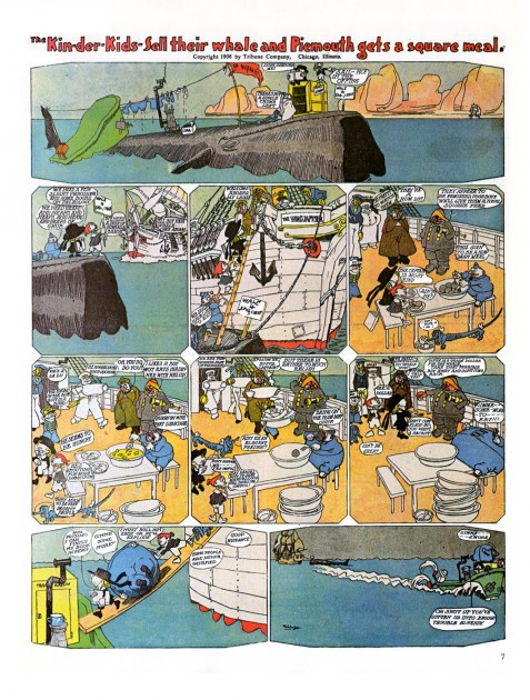
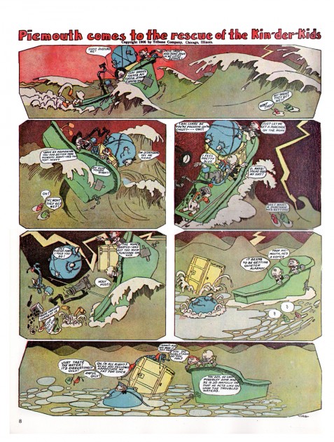
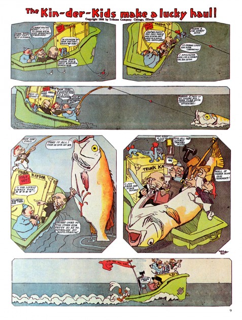
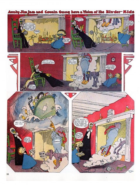
Kin-Der-Kids 2

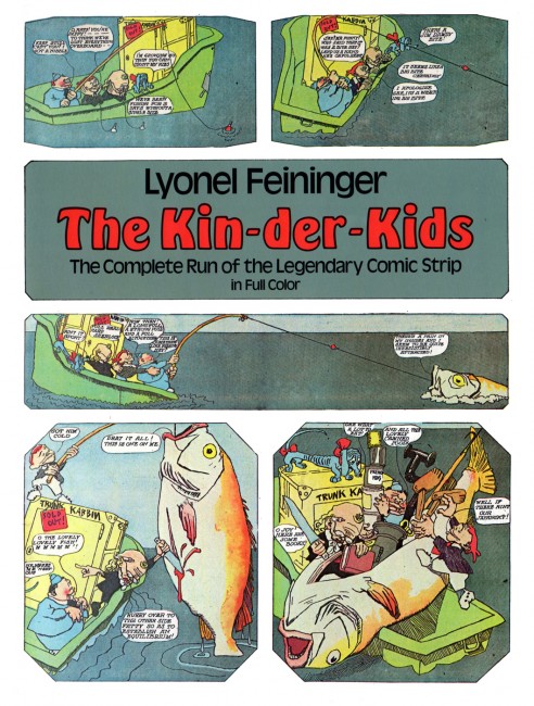
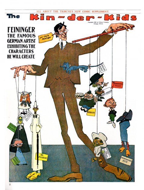
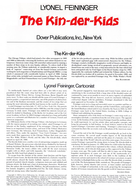
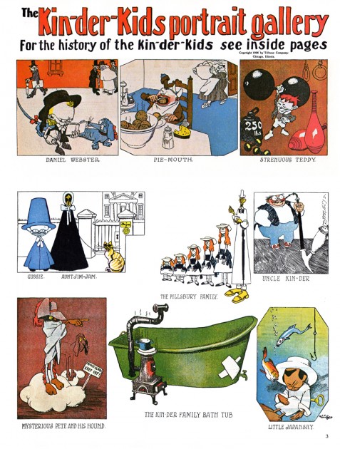
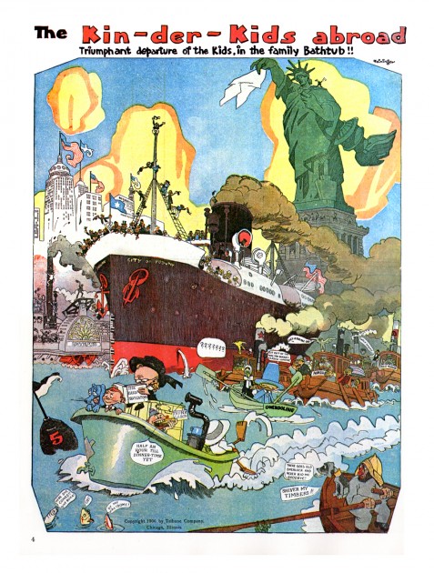
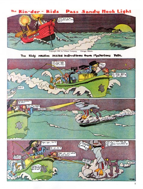
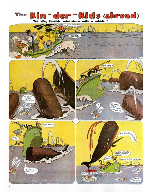
- The Whitney Museum is currently hosting a show of artwork by Lionel Feininger. To have some connection with the show, I thought it’d be a good time to post some more of the Kin-Der-Kids comic strip that he’d done in 1906. Bill Peckmann had sent more pages. I hope you enjoy this artist’s work; it was a daring comic strip for the time.

You can see my past posts on Feininger’s comic strip work at: Kin-Der-Kids, Wee Willie Winkie


The Dover book cover

1

2

3

4

5

6

7

8

9

10

Books &Daily post &Hubley 28 Sep 2011 07:33 am

The Hat – even Bigger

As I wrote on Monday, with the AMPAS show about Hubley animation coming this Oct 10th, I intend to put a lot of focus on the work of John & Faith. This piece about THE HAT was originally posted in March, 2011. I’ve added to it.

- The interview Mike Barrier conducted with John Hubley has me thinking about Hubley and my years back there and then. You might say, I’m in a Hubley frame of mind these past few days, so I’m into reminiscing. I posted part of this back in March, 2008; here, I’ve extended the article a bit.
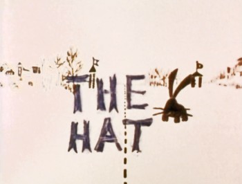
New York’s local PBS station, WNDT – that’s what it was called in the old days – used to have a talk show hosted by film critic, Stanley Kaufman.
(It turns out that this show was produced by the late Edith Zornow, who I once considered my guardian angel at CTW.)

This talk show was quite interesting to me, a young art student. I remember one show featured Elmer Bernstein talking about music for film. He gave as his example the score for The Magnificent Seven. He demonstrated that the primary purpose of the score, he felt, was to keep the action moving, make the audience feel that things were driving forward relentlessly. I still think of that show whenver I see a rerun of the film on tv.

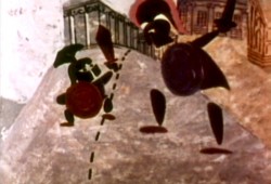
The surprise and exciting program for me came when John and Faith Hubley turned up on the show to demonstrate how animation was done. They were using as an example a film they had currently in production, The Hat. This film was about the silliness of border lines. One of two guards, protecting their individual borders, loses his hat on the other side of the line. Of course, all he needs do is to step over and pick up the hat, but he can’t. The other guard won’t allow him to cross the border illegally – even to pick up his hat.
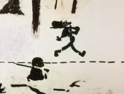
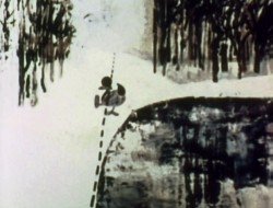
The voices were improvised by Dudley Moore and Dizzy Gillespie (much as the earlier Hubley film, The Hole, had been done.) The two actor/musicians also improvised a brilliant jazz score.
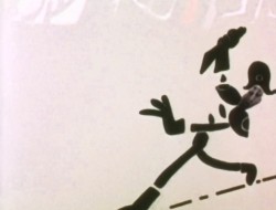
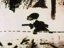
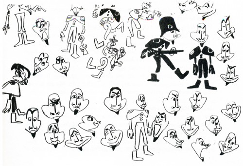
John’s design was quite original. The characters were a mass of shapes that were held to-gether by negative space on the white on white backgrounds.
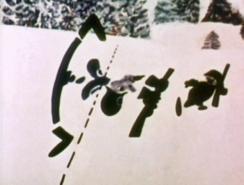
The animation of the two soldiers was beautifully done by Shamus Culhane, Bill Littlejohn, Gary Mooney and “the Tower 12 Group“.

Culhane animated on a number of Hubley films during this period, most notably Eggs and a couple of commercials.

Bill Littlejohn animated on many of the Hubley films from Of Stars and Men up to Faith’s last film.

Gary Mooney animated on The Hole and Of Stars and Men. He was an Asst. Animator at Disney, animated for Hubley then moved on to some of the Jay Ward shows before moving to Canada where he continues to animate.

Tower 12 was the company formed by Les Goldman and Chuck Jones at MGM. Apparently they were between jobs when Hubley was finishing this film, and Chuck offered help.
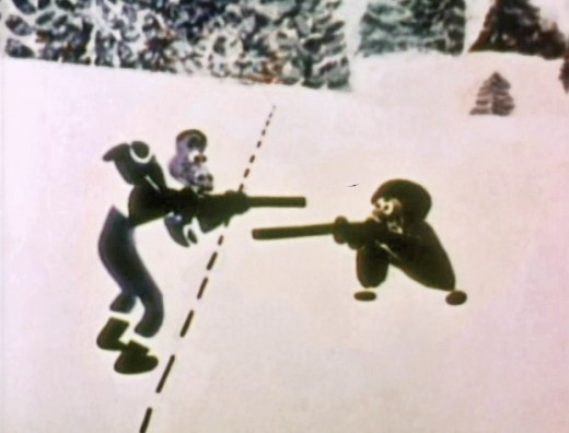

Of course, the colors of the film as represented by the dvd are pathetically poor.
It’s hard to even imagine what the actual film looks like, and it’d be great to see
a new transfer of all the Hubley films.
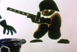
The design style of the film was an original one for 1963. It’s one that would often be copied by other animators afterwards. The characters were searated at their joints. No reel ankles, just open space. They were also broken at the wrists and belts. The taller man seems to have a collection of ribs and shoulders for his torso. Like the dotted line they walked but could not cross, these people were also a gathering of parts.
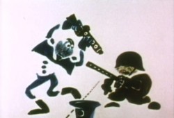
This was one step removed from the earlier film, The Hole, which had just won the Oscar and went on to enormous success for the Hubleys. That film used what they called the “resistance” technique. They first colored the characters with a clear crayon. Ten painted watercolors on top of that. The crayon would resist the watercolor and a splotchy painterly style developed. The Hat literally broke those splotches into parts of the characters and put some of the control in the animators’ hands.
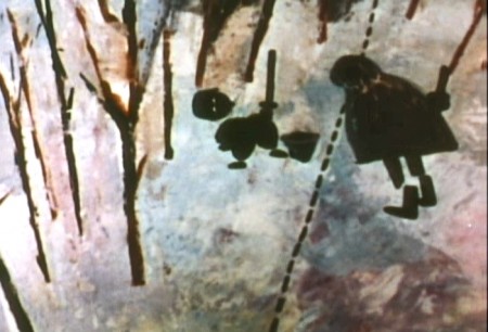

.
The film was obviously political. Anti-nuclear politics played strongly in the story. This was a step just beyond The Hole. In that film, two sewer workers converse on what violent things might be happening above ground. The film ends with an accident, or possibly a nuclear crash.

In The Hat, the two partisan soldiers discuss a history of man’s aggression all within their reach. At one point, it would seem, each of
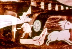
them is ready to press the red button calling for nuclear assistance – or, at the very least, a buildup of military force.

While walking up and down that line, they comment on how we reached the point of no return. All the while, bugs and small animals cross the line, indeed, walk on or over the “hat” lying on the ground.

The backgrounds for this history of War grow more violent, more expressionist. John’s painterly style comes to the fore, and the brush strokes take on a force we haven’t seen to this point.
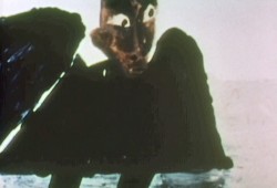
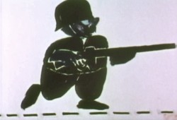
When we return to the two leads, we find that they’ve changed. They’re darker, and they both have lines scratched into the paint of their bodies. Not as much emphasis is placed on their disjointed body parts.
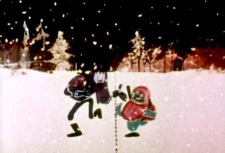
We leave them as we found them, walking that line. At this point, both of their hats lay on the ground and they’re deep into conversation. They don’t seem to notice anymore.
It has started to snow.

________________________
.
.
Shamus Culhane wrote about The Hat in his autobiography, Talking Animals and Other People. Here’s some of what he wrote:
    In 1964 the Hubleys wrote a short subject called The Hat. It was subsidized by an international peace organization. The picture featured two sentries marching on opposite sides of a boundary line. A clash occurs when one soldier’s hat accidentally rolls into enemy territory, and the other soldier refuses to return it until he has checked on the necessary protocol. During the ensuing discussion the two men become friendly, and the film ends on an optimistic note.

    Although there were other characters and animals in the picture, the two soldiers accounted for about 80 percent of the footage. When Hubley asked me if I could do all of the animation of the sentries myself, I jumped at the chance. The last time I had drawn full animation, other than one-minute spots, was about twenty years before, when I worked with Chuck Jones at Warners.

    The Hubleys were exciting to work with because they had a strong sense of adventure in their filmmaking. John was never tied down to techniques that he was already familiar with. Each picture was a new experience, because the appearance of the film was always dictated by the content. The Hat was no exception.

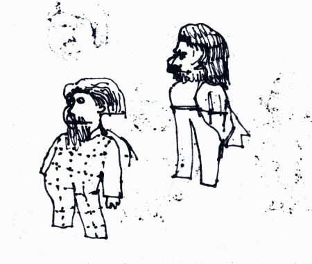
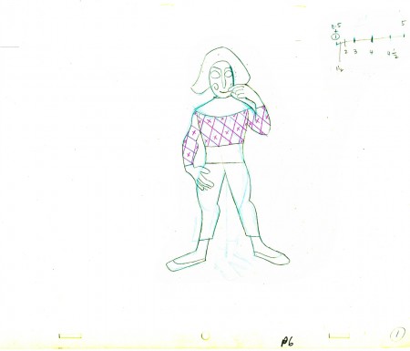
    The design of the two sentries presented some odd problems in animation, in that the action was going to be normal, but the arms and legs were not attached to the bodies. Although we had detailed model sheets of each soldier, Hub’s layouts paid scant heed to his original designs. As the picture progressed his drawings of one of the soldiers became more and more Christ-like.

    While I animated the picture at home, Hubley and I worked very closely together. Whenever I had a few scenes finished, we would have a conference on this work and the following scenes. Hubley was a very enthusiastic director. He would pick up the newly animated shots with obvious excitement, flip the drawings, and burst out laughing. His pleasure was so infectious that I would laugh, too. We shared a feeling of joy in the whole process or filmmaking.

    The animation of The Hat took many months. During that time, with my usual curiosity about the working methods of great artists I have worked with, I studied Hubley’s approach whenever I could. In the first place he worked in a room that was crammed with the largest collection of art books I have ever seen in private hands. The subjects ranged from prehistoric cave paintings to Picasso, Klee, Chagall, and other modern artists. There were books on the art of every culture imaginable, Aztec, Mayan, Chinese, Persian, Greek, etcetera.

    At the beginning of a picture Hubley would pore over a random selection of art books. Seemingly they had no relationship to each other, but he was using them to inspire his own sense of design. However, the final appearance of a Hubley film was never blatantly derivative. In The Hat, for example, I have the feeling that he was influenced (if that is the right term) by Chinese scroll painting, but that is just my own intuition.

    Since Hubley was going to paint his own backgrounds, the layouts were usually little more than a vague series of scrawls with little or no detail, unless the background and the animation were going to be closely related.

    Unlike Disney Studio, where the dialogue is broken down for the animator in meticulous detail, Faith gave me a very loose track analysis. Neither Faith nor John seemed to be concerned with precise synchronization of the mouth action and the dialogue track.

    John’s instructions for the movement of the characters were also very loosely indicated on the exposure sheets. It seemed to be his feeling that the pace of the animation should be the shared responsibility of both the director and the animator.

    The Hubley children had to be the luckiest kids in New York City. Not only were they encouraged to draw, write, and paint, but in their Riverside Drive apartment the Hubleys had built a small stage, so it must have been easy for the family to create the sound tracks for such imaginative films as Moonbird, Windy Day, and Cockaboody.

    Like John Cassavetes, the Hubleys believed in the value of ad-libbing sound tracks, so a good deal of the children’s dialogue in these pictures was completely spontaneous material.

    Whatever his formal education had been, Hubley was a very well-informed person, with a sophisticated view of life. One Saturday morning I dropped in to find John working alone, and in a very depressed mood. It happened that I was on the down side myself that morning. After we had talked over the work in the new scenes, our conversation drifted off into a very open discussion about the problem of being an alienated personality. We exchanged anecdotes about incidents that had happened to us because of alienation.

    Somehow our talking acted as a catharsis, and we both found our moods lightened. We ended up laughing, and agreed that being alienated in our kind of society had more merit than most people realized. It was a very stimulating discussion.
Comic Art &Illustration 27 Sep 2011 07:09 am

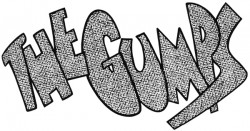
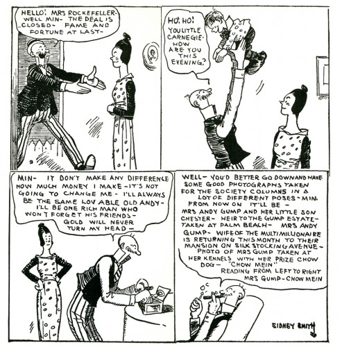
The Gumps – recap

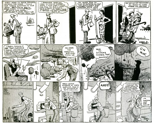
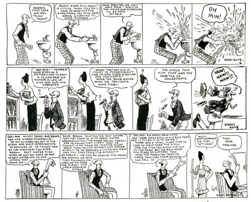
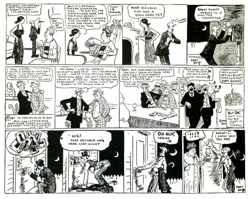
- The Gumps was the first comic strip to tell a running story. Like a serial the strip continued on a daily basis from 1917 through 1957. The story was particularly compelling; readers grew addicted to it, like a soap opera. In 1923, the Board of Trade in Minneapolis suspended operations so that the brokers could get the afternoon paper to find out whether the Gumps’ billionaire Uncle Bim had been trapped in marriage. When Mary Gold died in 1929, it was the first time a cartoon character died in a strip, and the Chicago Tribune was swamped with mail and phone calls with people threatening to cancel their subscriptions to the paper if she wasn’t brought back.

An Editor of the Chicago Tribune, Joseph Patterson, came up with the idea of having a strip that reflected the stories of “real” people. He didn’t want a daily gag with this strip and hired Sidney Smith to develop such a strip. Patterson came up with the title, “The Gumps” and brought some story ideas to Smith to develop.

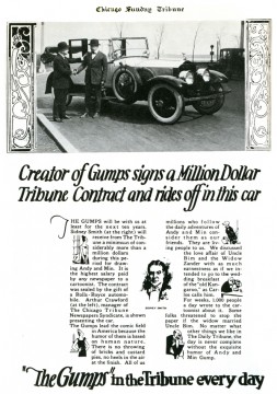
It was the first strip to make its creator, Sidney Smith, a millionaire. It was that popular, and they promoted the contract. He drew the strip until his death in 1935. Smith had just signed a new three year contract and went out to celebrate. He died in a car crash.

The strip went on to a couple of assistants who worked with Smith, Stanley Link and Blair Walliser. However, for reasons hard to understand now, it was Gus Edson, a staff artist for the New York News, who continued the strip into the 50′s. (Edson was later one of the creators of the strip, Dondi, also created with an appealing, continuous story.)

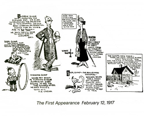
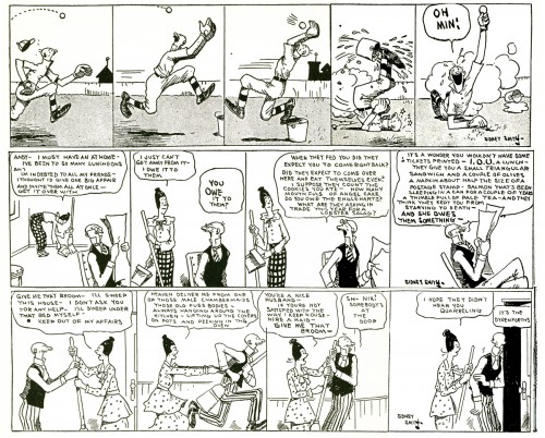
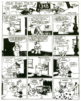
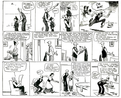
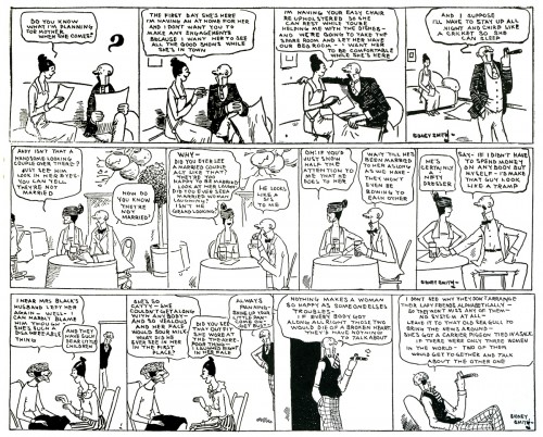
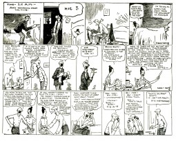
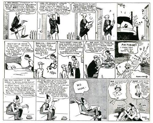
The story being everything, I thought I’d introduce the strip here with a number of panels to give you a taste, and then I’ll follow with more chunks of the story. Believe me it’s a compelling story, well told, and even the drawing style becomes pleasant as you get into it. So here are the first strips.


{Click any image to enlarge to be able to read it.)

Comic strips were more of an art form back then, when The Gumps was enormously popular. First off, they were large enough to be able to read them. Because there was no television and newspapers were vitally important to people’s lives, comic strips took on another role that has been eliminated today.

Comics had a large enough popularity that they were able to grab a regular and large readership. This allowed them to be daring enough to try to grab a larger audience through whatever means necessary.

The Gumps was clever in many ways and provided the goods with an exceptional story line that had a very large audience.

+_

« Previous PageNext Page »

eXTReMe Tracker
click for free hit counter

hit counter