Bill Peckmann &Comic Art 15 Dec 2011 06:45 am

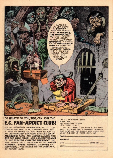
EC Fan-Addicts

Here’s a package I received from Bill Peckmann:

    In the parlance of the old MAD editors: “Hey gang, here’s some very unnecessary nostalgia for ya!”

    In their heyday, EC Comics’ hardcore readership always kept the letter columns of EC Comics packed with enjoyable, knowledgeable comments. (I’d always go to the letter columns before I would read the stories in the comic.) With those kind of responses coming in, someone at EC, fortunately came up with the idea of starting an official EC fan club in the best EC tradition. (Looking back on all this, EC always seemed to be ahead of the curve in the industry and would adapt thru all of their trials and tribulations, the proof in the pudding is the incredible run of MAD.)


1
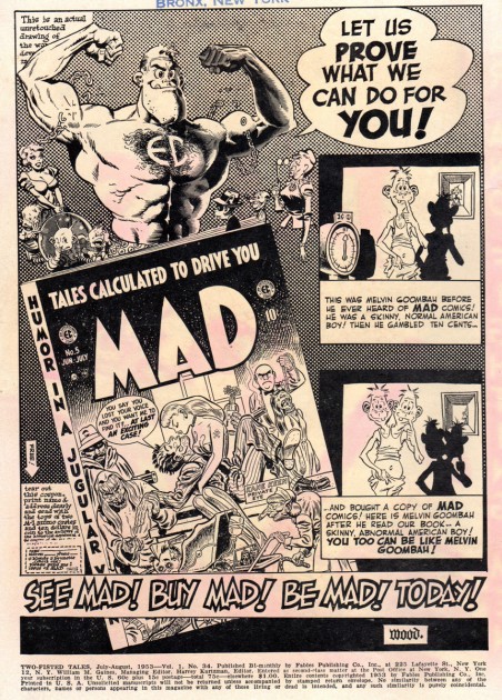
The first in-house ad is by Jack Davis
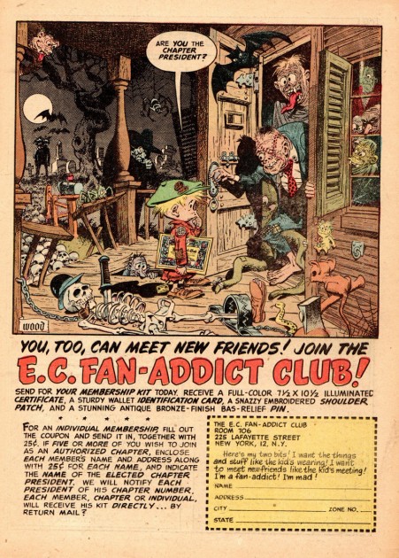
the second one by Wally Wood.

2

3
Unfortunately the only things that remain from the original
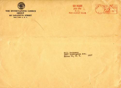
EC Fan-Addict package is the envelope everything was sent in,
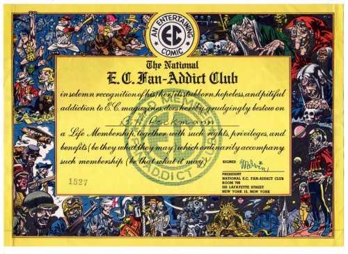
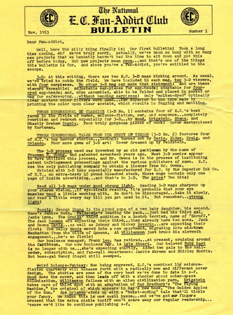
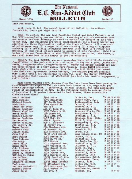
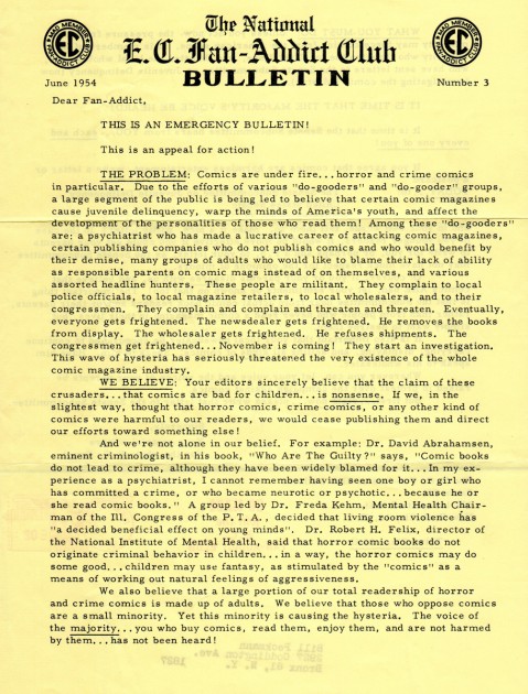
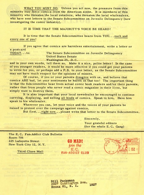
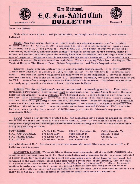
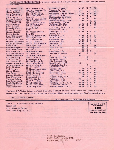
the certificate and the 5 bulletins that were published.

4
The certificate by Jack Davis.

5
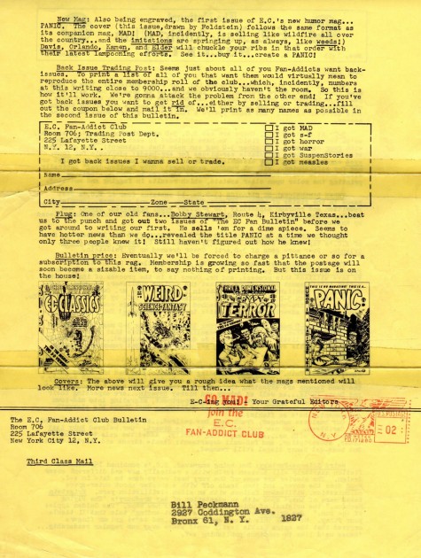
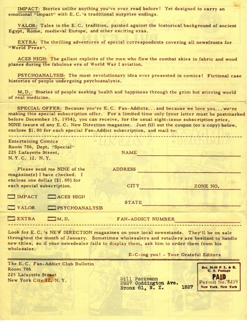
The first two page bulletin.

6

7
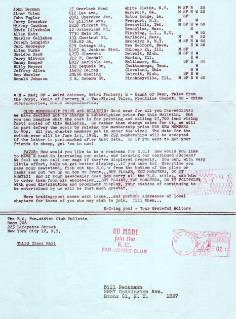
Note that in the “Gossip” column Jack Davis’ wife Deena
gave birth to their son Jack Jr., who then later made his
way in the world as an architect. It was Jack Jr. who
designed the house and porch that Jack Sr. is sitting in,
in the photo in the last JD posting. (It’s the porch that the
Gee thought was pretty cool.)

8

9

10

11

12

13
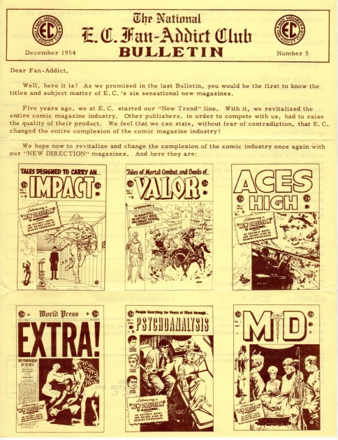
All good things must come to an end,
the fifth and final issue of the Bulletin.

14

We started the blog with inhouse ads, so we might as well end it with a few more.


15
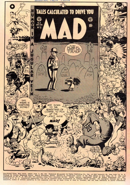
This is Wally Wood’s promo for MAD no. 3.

16
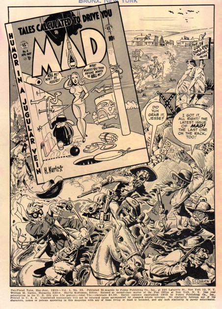
Ad for MAD No. 4 by John Severin.

17
Wally for MAD No. 5.

18
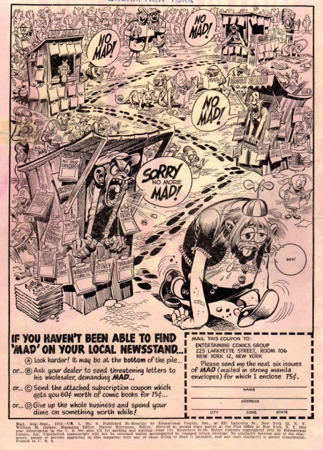
By the one and only Jack Davis.

19
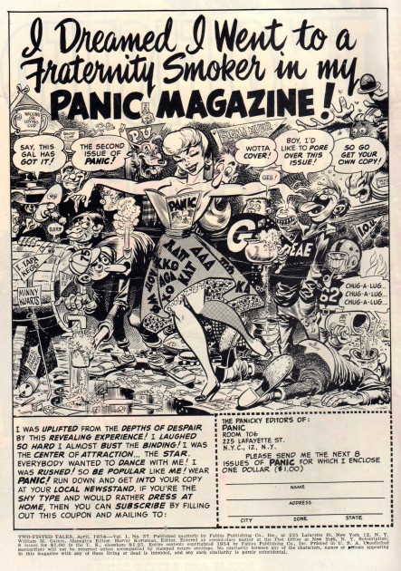
Jack Davis flogging EC’s own MAD comic book imitation PANIC.

(That’s All Folks!)

Many thanks to Bill Peckmann for sharing this great and unusual memorabilia.

Animation &Animation Artifacts 14 Dec 2011 07:03 am

Mickey and the Shadows – 3

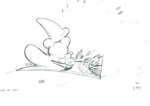
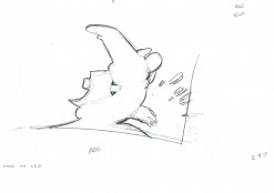
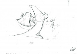
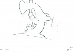
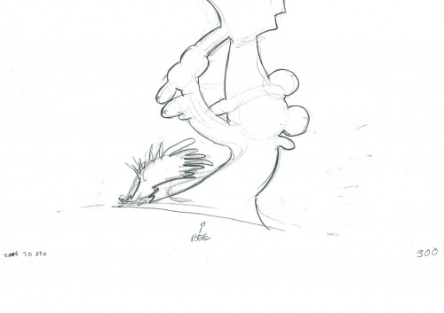
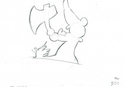
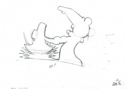
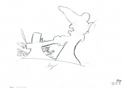
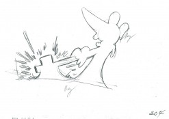
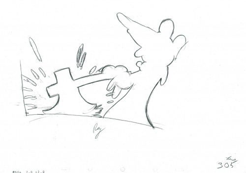
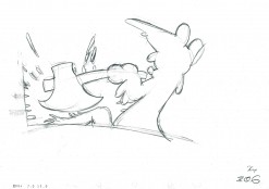
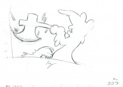
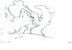
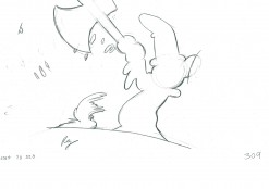
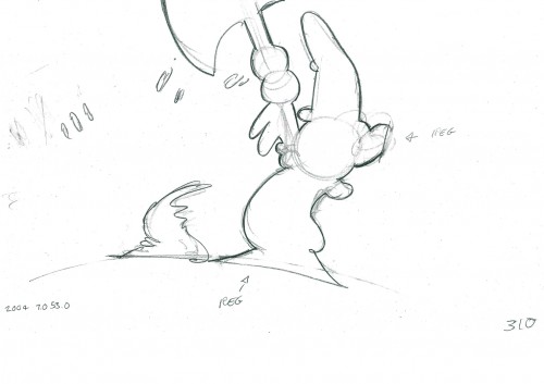
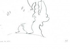
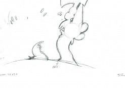
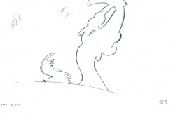
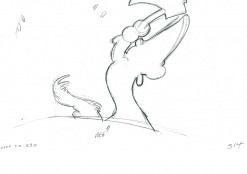
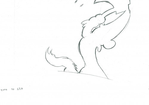
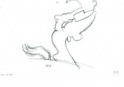
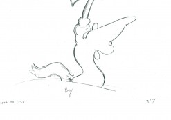
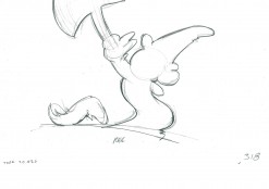
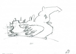
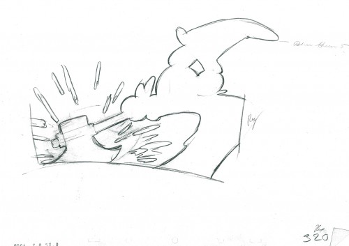
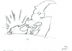
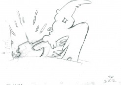
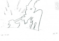
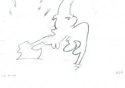
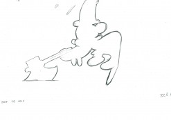
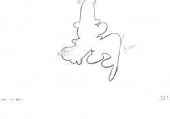
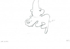
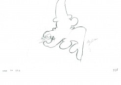
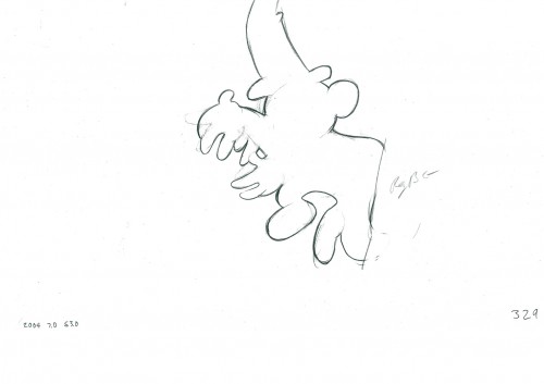
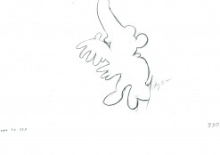
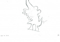
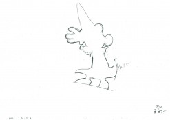
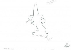
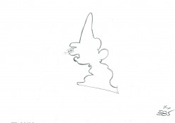
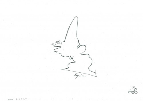
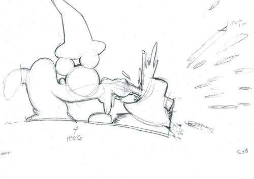
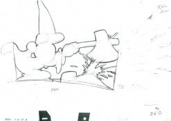
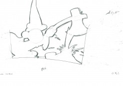
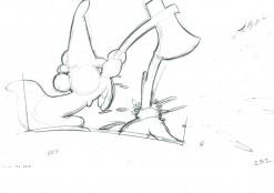
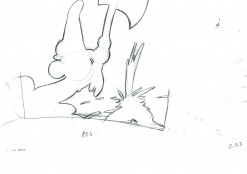
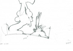
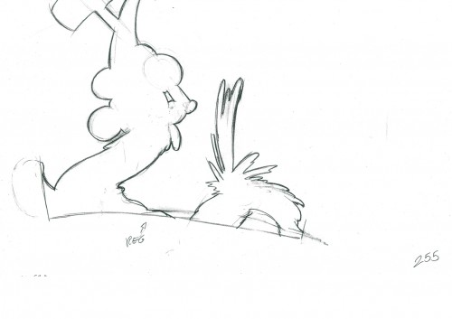
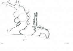
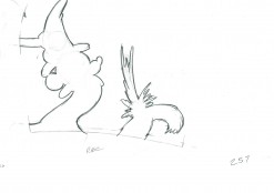
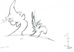
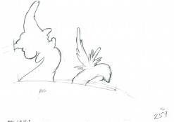
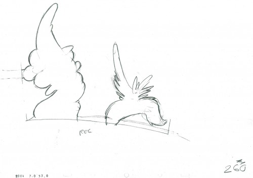
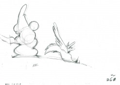
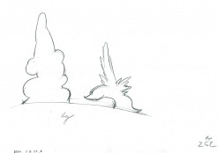
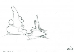
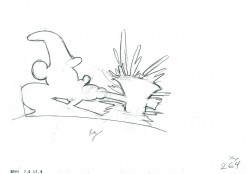
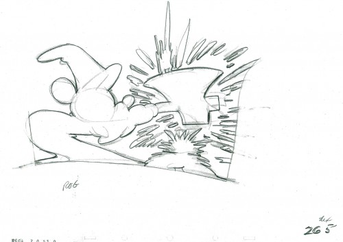
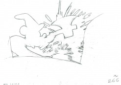
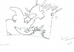
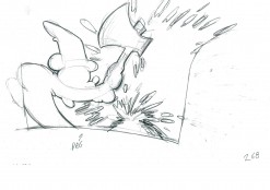
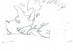
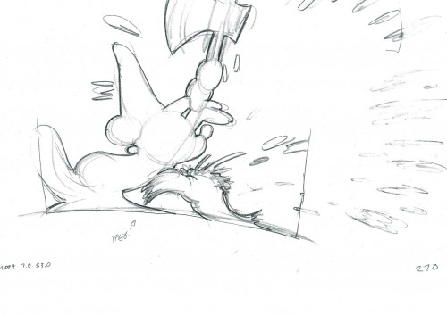
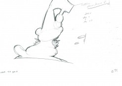
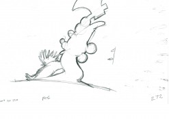
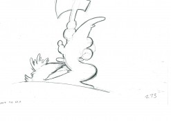
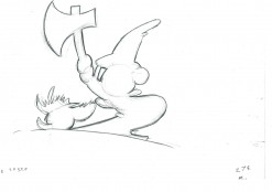
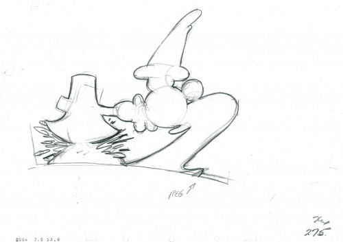
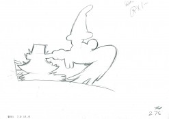
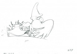
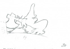
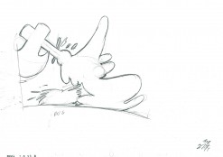
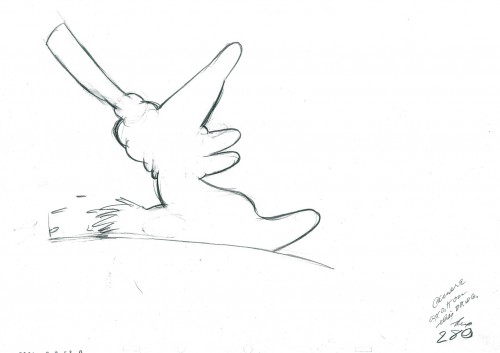
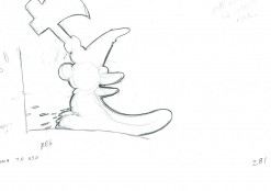
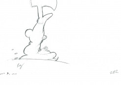
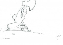
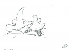
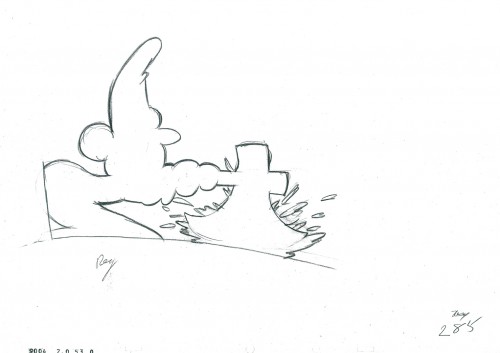
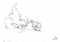
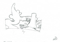
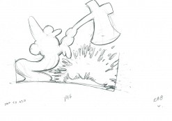
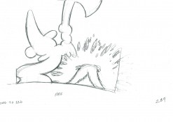
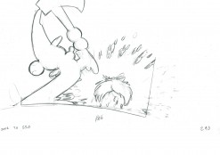
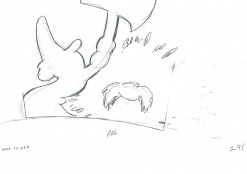
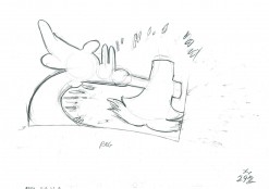
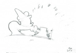
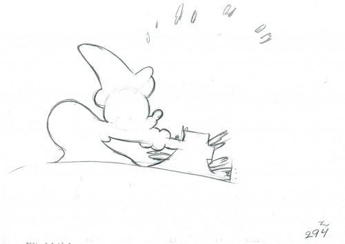
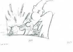
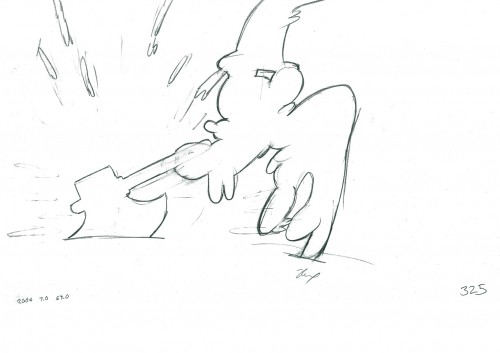
Here is the next part of the violent shadows in the scene from The Sorcerer’s Apprentice. Mickey has to put a stop to the broom before it floods the Sorcerer’s workroom.

The scene was animated by Riley Thompson with Harvey Toombs assisting. The sequence director was James Algar.

To see the last two parts of the shadow go to: Part 1, Part 2

295

96 97

98 99

300

01 02

03 04

305

06 07

0809

310

11 12

13 14

315

16 17

18 19

320

21 22

23 24

325

2626a

2727a

27b28

329

30 31

32 33

34 35

336

____________________________

The following QT incorporates all the drawings from this post
and the two earlier shadow posts.
All posts will be combined in the final piece.

All drawings were exposed per the Exposure Sheets.


this scene comes in at 5’30″

Books &Illustration 13 Dec 2011 07:05 am

Christmas Cards

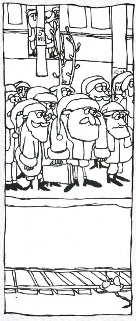
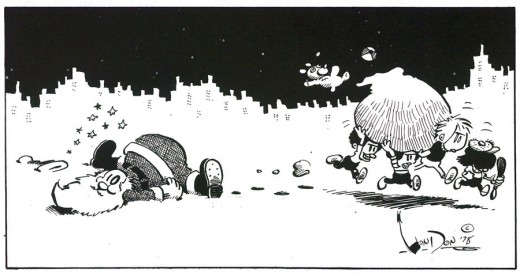
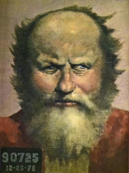
- This past Saturday, hundreds of 20 and 30-somethings filled the streets of Manhattan dressed as Santa. Apparently they were somehow raising money for “Toys for Tots” by bar-hopping in the Santa uniform (many of them very makeshift). I don’t know how it worked, though it felt a bit like the Christmas version of St. Patrick’s Day (without the parade.) A lot of white guys inebriated.

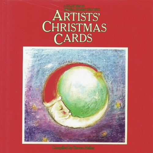
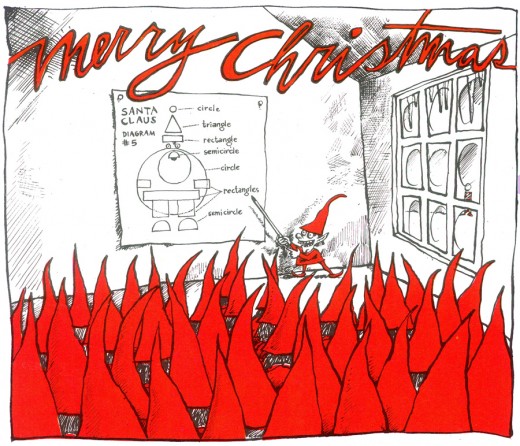
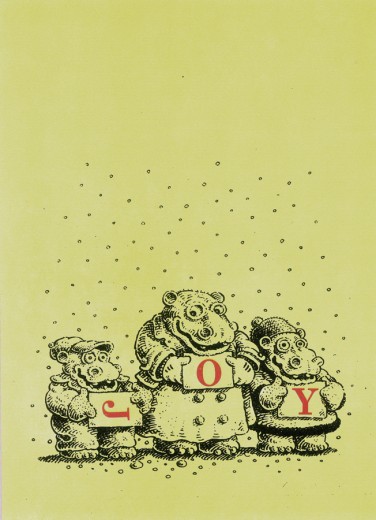
Regardless. The proliferation of Santa’s, however, reminded me of a Christmas card I did back in 1978. The card was picked up by Steven Heller and used in a book he edited called Artist’s Christmas Cards. (I always thought it should have been called Illustrator’s Christmas Cards, though I have to admit that I’d call two or three in the book “Artists”.) There was no pay for it, but there was the enjoyment of having my card connected to some great company.

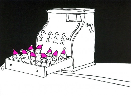
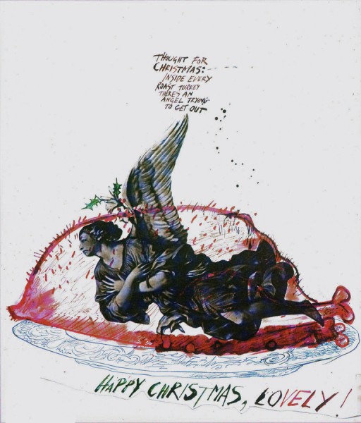
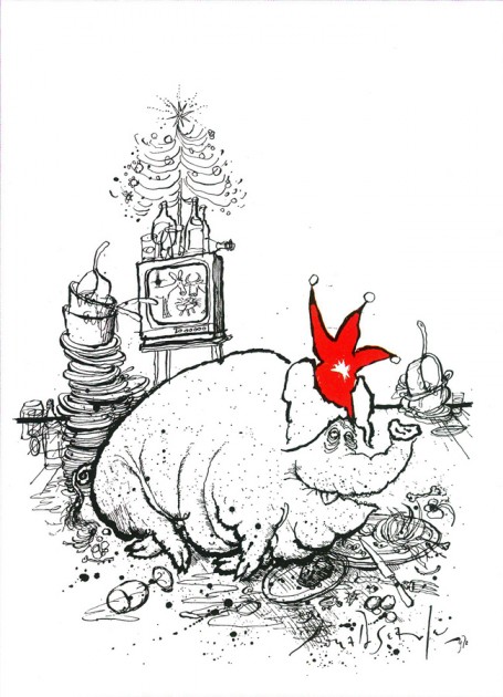
I thought it’d be interesting to post a few of the cards in the book. So here we have them:


Here’s MY card that reminded me
of Saturday’s funfest.


The original book’s cover with a card by
Paul Degen gracing the red face of the book.


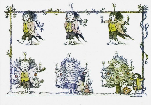
This MAURICE SENDAK card would later become the
animated opening to Simple Gifts, a show for which
I acted as Asst Director for R.O. Blechman in 1978.


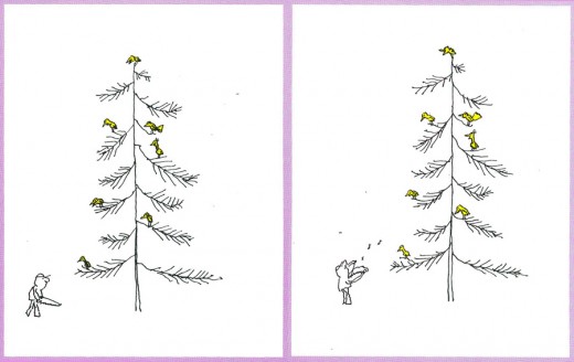
BLECHMAN’s card, which he turned into an animated
I.D. spot for CBS – which has become very visible on the net.


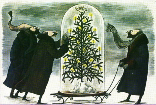
EDWARD GOREY


BOBBY LONDON


ED KOREN


TOMI UNGERER


RALPH STEADMAN


RONALD SEARLE


TOM HACHTMAN (in the days before we’d met)


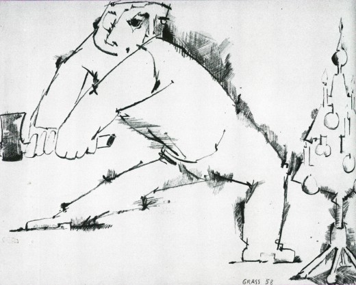
GÃœNTER GRASS


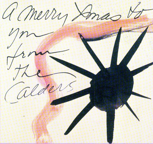
ALEXANDER CALDER


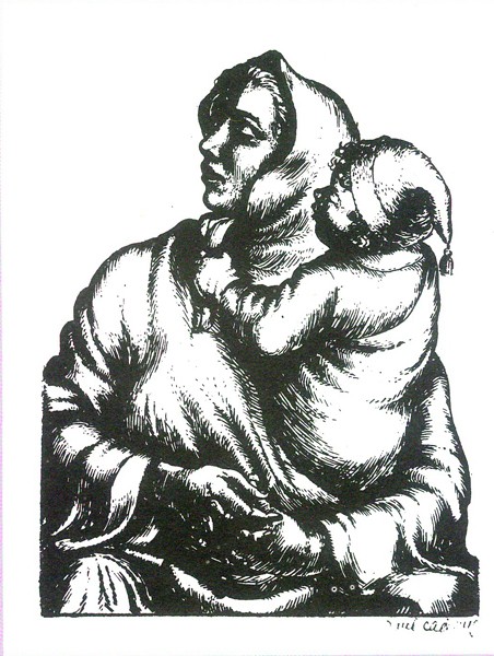
PAUL CADMUS


ELWOOD SMITH


BRAD HOLLAND

Commentary &Frame Grabs 12 Dec 2011 06:03 am

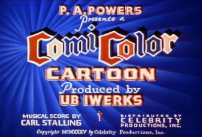
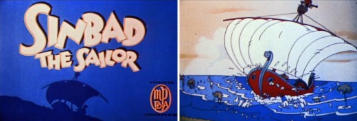
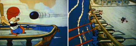
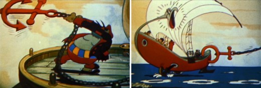
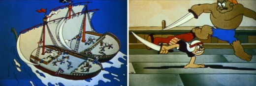
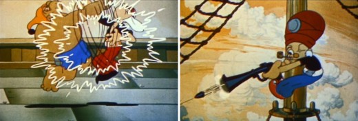
Iwerks’ Sinbad

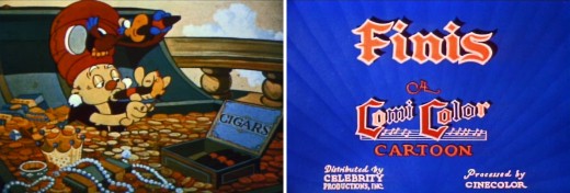
– When I was young, about 12 years old, I saved my money to buy an 8mm projector. This was long before DVDs, before VHS tapes and before even Super 8mm. The used projector cost me $20. I bought it from a NY store called Peerless Photo Equipment. They also had a large department of home market 8mm shorts that could be bought for relatively little money. Lots of Castle films (meaning Universal short subjects Walter Lantz Woody Woodpecker), a few Disney shorts, a few WB shorts and plenty of Ub Iwerks films. I was an Iwerks fan and my immediate interest was in these films which I had never seen. The same day I bought that projector, I bought a 6 min version of “Jack & the Beanstalk” as well as a 3 min version of “Sinbad the Sailor.” Both were sold only in B&W, and they were silent with a few intertitles. (It’s amazing how well they worked as silents.)


When I finally got to see both films in color it was an amazing surprise for me.
I knew they were in Cinecolor, and I expected much worse than what I got.


With Sinbad, I was surprised at how little I remembered of that film.


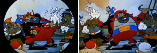
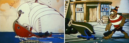
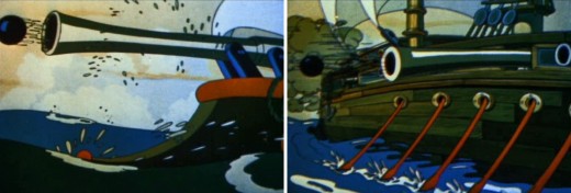
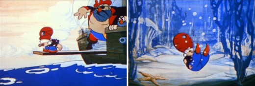
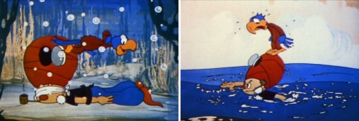
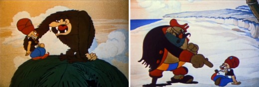
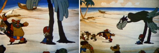
I remembered almost nothing about the pirates. I didn’t forget
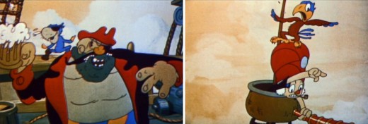
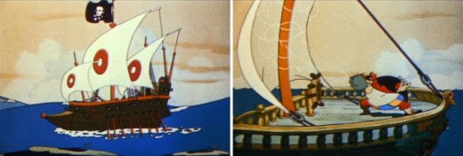
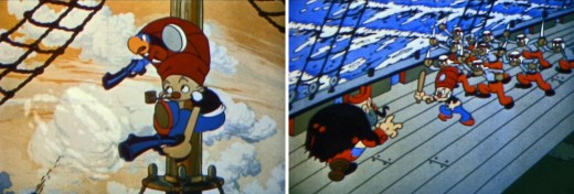
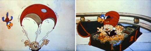
Sinbad in the crow’s nest with his parrot espying on the other ship.
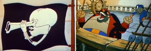
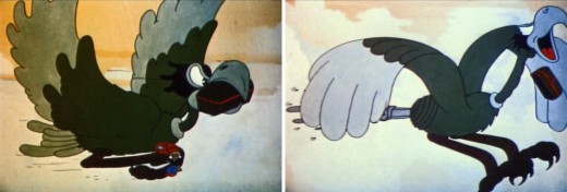
I particularly remembered the big bird at the end of the film.


The shortened version did not include this anti-gay joke in it.
Watching it for the first time, I wondered how many other such
jokes were in the films. There were plenty of racist jokes
(including the one I eliminated at the very end of this film.)


It’s amazing how much those early short films stayed with me over the years,
however this one has just left an impression without my remembering much of
the details of the story.


After all, I studied every frame of these films. I’d figured out how to
jerry-rig my 8mm projector to allow me to do that. I could watch each
film one frame at a time.


I remember when I first met Grim Natwick that I told him his was the
first animation I ever studied. “Jack & The Beanstalk” left an impression.
Grim wasn’t impressed when I told him.


The most I could learn about the crew of this film is that Grim Natwick
(who probably directed) animated along with Stephen Bosustow.
I believe Pete Burness was also with the studio at this time. Berny Wolf
was there at this time and may have animated on Sinbad.


I soon had bought a complete library of animated shorts.
Both “Jack & The Beanstalk” and Woody Woodpecker in
“Ace In The Hole” were favorites of mine back then.
Grim Natwick and Alex Lovy.


I also bought a couple of WB shorts. I particularly liked the
Chuck Jones directed films. I’d seen “Hair Raising Hare” and
“Rabbit Punch” so many times in the 8mm versions that
it’s almost hard to watch them again.


The WB cartoons handled the titles well. They did them
as subtitles, and I liked buying these films for this reason.
Of course, it was a plus that they were such good films.


I’m surprised that the Iwerks staff took no attempt to adapt the actual story
of Sinbad from the Arabian Nights, but instead they completely created their own.


Ted Sears and Otto Englander, were both doing story work for Iwerks,
so they probably had a hand in shaping this film. Eventually, both men
would move on to Disney’s studio where they did exceptional work.


By the time this film was made, Iwerks, himself, had lost interest
in the actual production of the shorts, and he’d tried to get Grim Natwick
to take a piece of the studio to run the production.


Natwick had refused knowing full well how difficult it was to
manage a studio and try to stay afloat. Especially knowing,
as I’m sure he did, that the studio was in trouble.
He rejected the offer.


In fact, within a year Natwick, Shamus Culhane and others had
migrated to the Disney studio. Culhane had a side-step going back
to NY to work under Bert Gillette for Van Buren. When that ended
badly, Culhane went to Disney to work for less than he made in NY.


Berny Wolf, Al Eugster and Steve Bosustow also moved to Disney’s.


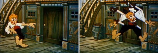
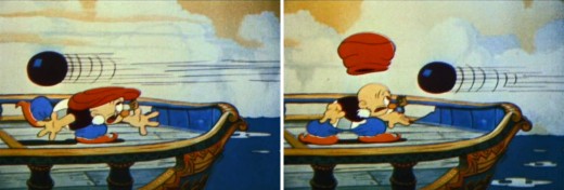
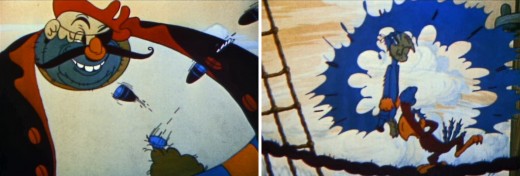
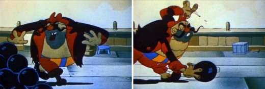
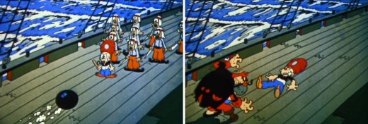
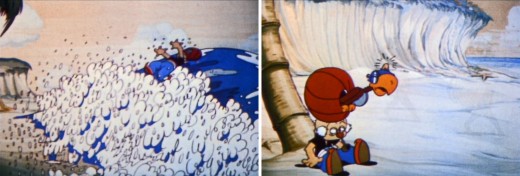
The bowling pin joke has got to be one of the older jokes used in animated films.
I’m sure the addition of sound helped sell the gag during the early sound years.


Others at the studio such as Chuck Jones and Frank Tashlin
as well as Bugs Hardaway and composer, Carl Stalling,
moved over to Schlesinger’s studio at Warner Brothers.


“Sinbad” was part of a trilogy of films Iwerks made from the
Arabian Nights. There was also “Aladdin” and “Ali Baba.”


All three were really just titles to hang a cartoon on.
These were part of the attempt to try to gain a bit of success
after Willie Whopper and Flip the Frog had both failed as series.


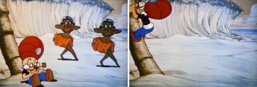
There’s no doubt that Grim Natwick did these dancing girls.
It was his signature style at the time.


Iwerks was moving his studio to the edge of the precipice.


Iwerks introduced his version of the multiplane camera about
this time, trying to offer something new to the medium.


The Headless Horseman and The Valiant Tailor both showcased
the multiplane camera in its production. Neither took off.


It wasn’t much longer before the Iwerks studio
floundered and ultimately died off.


The final joke (cut out) shows the cigar exploding leaving
Sinbad with a black face with just a touch of racist humor.

________________________

.

Here’s the YouTube version of this short.

Daily post &Photos &Steve Fisher 11 Dec 2011 07:48 am

Wild in NYC

- Steven Fisher caught the following photos in the back yards of Queens, NY.
Wildlife remains wild, even in the City. This is a hawk feeding on a small animal it’s caught.

1

2

3

4

5

6

7

8

9

10

11

12

13

14

15

Many thanks to Steve for sharing the photos.

Commentary 10 Dec 2011 07:10 am

Linkage

- There will be a memorial service for Vinnie Cafarelli at Buzzco on January 6, 2012 from 4:00 to 9:00pm. More information will be relayed at this site when we get closer to the date.

___________________________

I’ve been visiting a lot of sites and blogs lately and would like to share links and make a few comments about some of them.
Let’s start with the sites/blogs I visit every day, some of them several times a day, knowing there’s a lot to take in or there will be updates. I’m sure you visit most of these as well; they are the staples for the animation community.

The Daily Stops


Cartoon Brew, of course, is the place to get a lot of information first. Jerry Beck and Amid Amidi each has a specific taste, and together they combine to make something that captures a very wide audience. There is a lot of first-hand news flashes as well as material they’ve culled from other sites. The only annoying part of the site comes in the “comments” section where the crazies come out to make their inane comments. Of course, it doesn’t bother me enough to not read most of them.


Mike Barrier for many years was the publisher, editor and prinicipal writer for the most important magazine devoted to animation, Funny World. (I’ve been rereading several issues – currently #13 – and can’t believe how much information I’m still getting out of some of the writing.) The site is every bit the same as the magazine, except it comes more frequently. The writing and research is first rate and the material presented is always deeper than others have offered. This is a necessary stop for anyone even remotely interested in animation. He’s fiercely opinionated, but often has good reason backing up that opinion. (Though he still admits to liking POLAR EXPRESS.) His writing style is the best on the web with a superb vocabulary and well considered choice of words.

I don’t miss a day without visiting this site even though Mike sometimes will take a month off (notifying us in advance) from writing. However, I want to get the new posts the moment they’re up; it’s that important to me.

- Mark Mayerson‘s blog is my third stop, daily, on my rounds. His comments are always sharp and well thought out. His writing is done in a businesslike approach – no frills and no nonsense. His news items are often off the mainstream and definitely worth visiting. The finest part of this site is when Mark comments on a film or short or analyzes the makeup of a scene (see his 14-part take on a short sequence from Ford’s Stagecoach.) Often even Cartoon Brew lifts news items from Mark’s site. The comments section is usually from those who are knowledgeable, so they’re worth reading.

- A Film LA is Hans Perk’s great blog. This is a wonderful resource of a site. Hans posts drafts to many of the Disney films.. He also posts invaluable items from the Disney archives. I love this site for the information I pull from it and study.

Eddie Fitzgerald is one of the most creative guys on the Internet. His blog, Uncle Eddie’s Theory Corner, keeps changing about four or five times a week, and it’s always a genuine treat. He creates photo-montage essays that either are outright hilarious or somewhat serious. Just in the last two days he went from “THE AMAZING SLUMS OF RIO” to “HOW GERMANY GOT OUT OF THE DEPRESSION” to “SHOULD ANIMATION CHARACTERS WEAR WIGS?” From recipes to animation analysis to photo-cartoon comics, you never quite know what you’re going to find here, but it’s always fun.
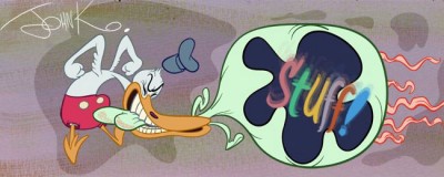
John Kricfalusi‘s blog is a must read for animators. He often gives advice, which is usually skewed to his particular style of cartoony animation. It’s a different world if you’re a Disney-esque animator, but it’s vital that even you know what’s on his mind, because it’s always written from a sure knowledge of animation theory. I would have loved seeing what he might have done with Aladdin’s Genie. Eric Goldberg did a perfect job, but John K might have take it to the farthest reaches.

The Animation Guild Blog (TAG Blog) is the animation guild’s blog which is primarily written by Steve Hulett. It changes at least once a day, and focuses mainly on the business side of animation. There are also excellent audio interviews with animation veterans who talk about their history. At times the creative side of animation is also discussed. This is an important blog to read to get information from. I find the comments generally well informed and the discussions there usually on a high level. However, most of the commentators generally label themselves as “anonymous” which is more than a little annoying. It gives a good indication of the fear floating politically in the business.

.

At least Weekly Stops

Signe Baumane‘s site, named after the feature she’s creating, Rocks In My Pockets, contains some of the best writing on the web. Signe’s stories from her life read like fantastic adventures through a unique universe. They’re all so personal and so vivid in their imagery that they could only have been written by an animator.

I’m hooked on this site and I turn up religiously to see if something new has appeared.

.

- I’ve gotten to enjoy Gene Deitch’s blog, Gene Deitch Credits. He gives commentary about a number of the people he’s come in contact with over the years and writes short essays about each of the individuals. I enjoyed his take on John Hubley, Jim Tyer, Jam Handy, Bill Hurtz and especially Phil Scheib. As a matter of fact, I like them all. So little of worth is usually written about some of these people, and Gene’s personal comments are usually gold. I do wish some of them were longer. However, that’s better than wishing they were shorter.

.

50 Most Influential Disney Animators
Countdown of the 50 Most Influential Animators in Disney Studio History

- Someone who tends to overwrite is Grayson Ponti at 50 Most Influential Disney Animators. His idea of putting out a list of the top 50 animators in Disney history is an ingenious one – except, of course, that you ultimately run out of numbers. This will happen soon, since he’s down to the top two. He’s announced a follow-up blog when he completes the top 50.

Each entry is extensive in length and usually filled with typos and hard-to-comprehend writing errors so it takes a bit of time to wade through the posts. It must take quite a while for him to write these pieces, it’d be worth his rereading them to correct errors.

Often, however, there are a lot of interesting comments that Grayson posts that make you think back to some of the scenes of the animators under discussion. I can’t say I’ve disagreed with much that he’s written, thus far.

Another problem I have with the blog is that he lifts images from many other sites without giving appropriate credit. Many of the drawings and cels lifted are in personal collections, and he should let his readers know.

- Dan Caylor has a good site called On Animation. It offers a lot of videos and news briefs. Many of these videos (all in a large format) will also show up in places like Cartoon Brew, but there are those I’ve only been able to see at this site. A good example is a wonderful piece showing the back stages of Aardman‘s puppet making for their film Pirates. This is a 17 minute piece that really gives an in depth look at the size of the puppets, not to mention the size this production. Quite informative.

The site is well worth visiting to see what new film shorts have been posted.

Steven Worth had created the site for the ASIFA Hollywood Animation Archives. That site is still up, but the links weren’t working and you couldn’t access the archive. Now Steven has started this site, Animation Resources, and is quickly posting all those original links from the old site. There’s too much valuable artwork to not see it accessible; so it’s great that we can now get to it.

Recent Finds


I came across this French title designer this past week and was quite impressed. You can see a number of Laurent Brett‘s title sequences at the site. The link appeared on the Steven Heller post about the film titles for OCS 117 on Imprint magazine. However, I found all of his work quite interesting.

Laurent Brett‘s title design.

___________________________

There are so many other blogs and sites that I can’t continue here. Perhaps I’ll pick it up at another time. I suggest you scroll through my blogroll on the right of this page to see what else is there (in case you don’t know about one or two of them.) I’ve barely scratched the surface. Andreas Deja’s blog, DejaView, is a miracle of animation drawing, Scribble Junkies is another voice for Bill Plympton and Pat Smith, Hans Bacher’s beautiful blog, One1more2time3, is necessary viewing, Alltop is a great way to surf the top few animation blogs. There are so many more; I will continue this.
Bill Peckmann &Comic Art &Disney 09 Dec 2011 06:36 am

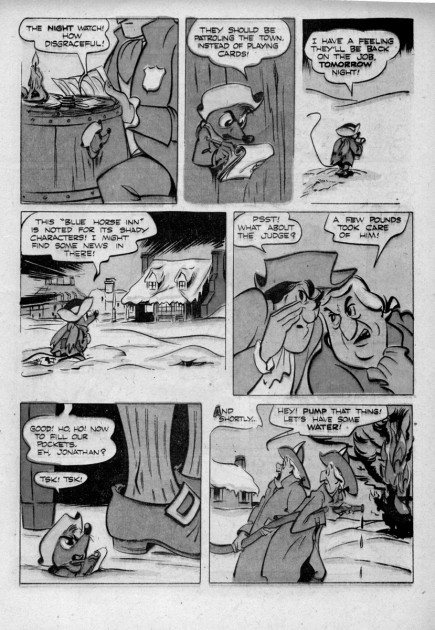
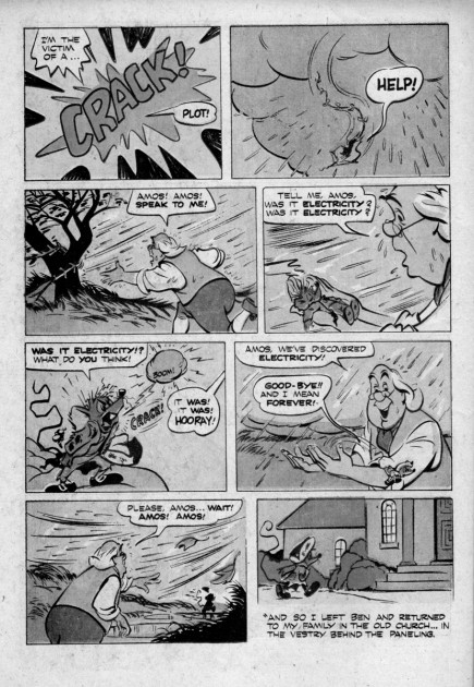
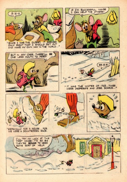
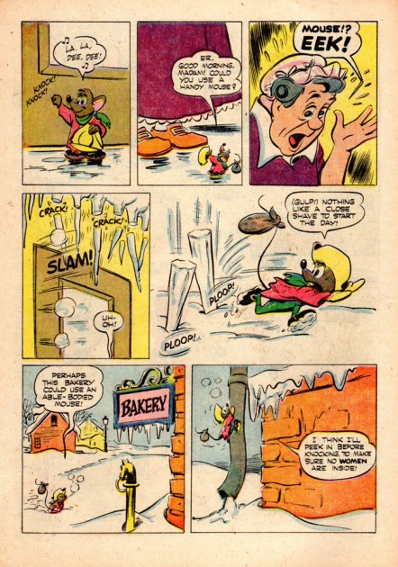
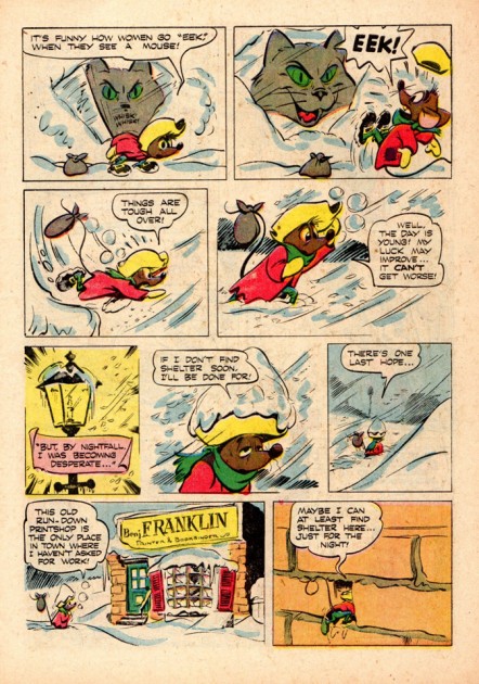
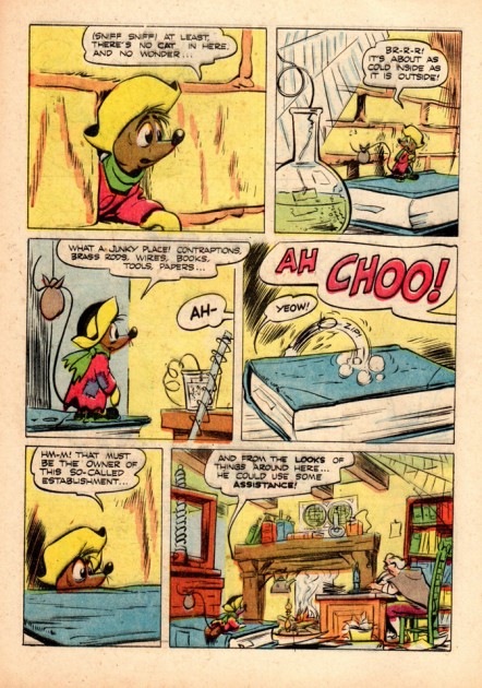
Ben & Me – Comic Book – 2


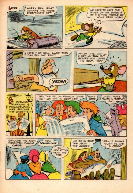
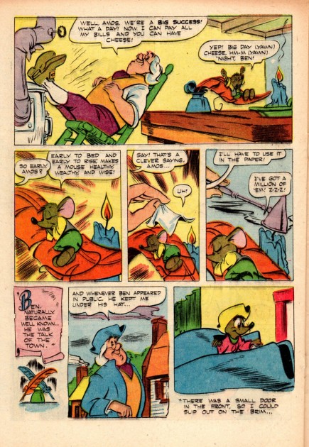
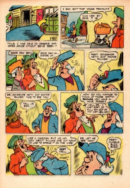
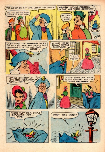
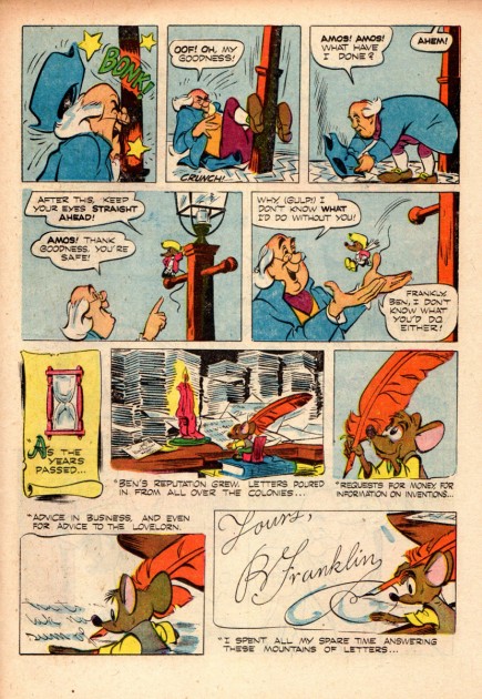
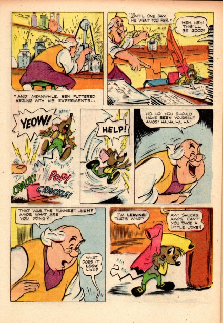
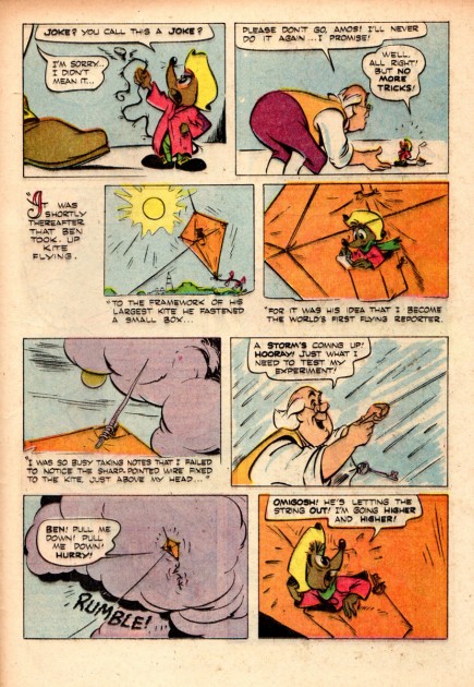
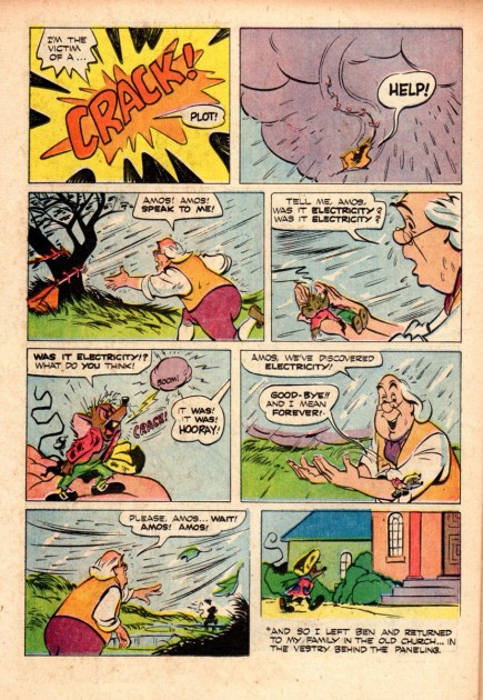
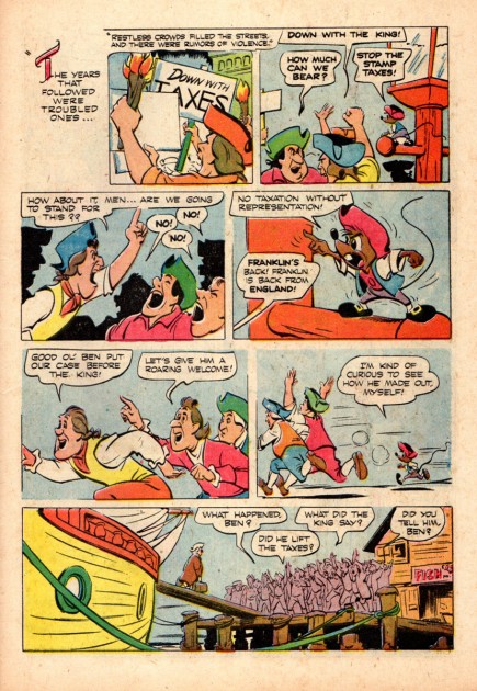
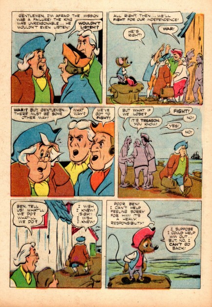
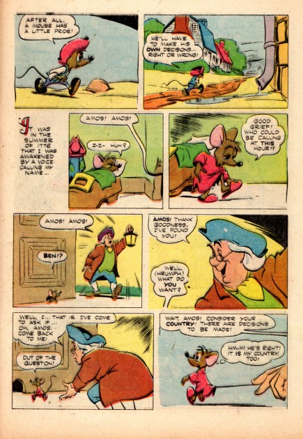
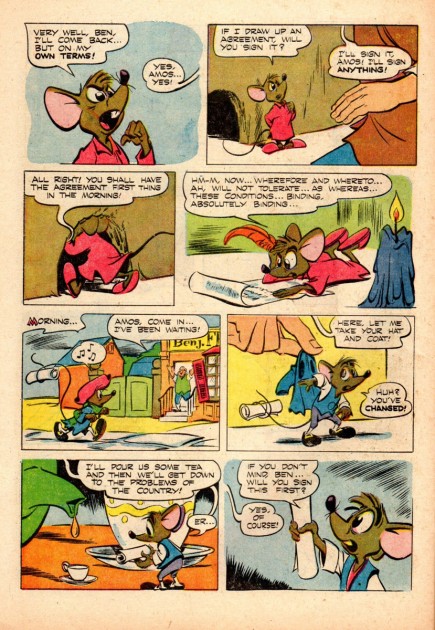
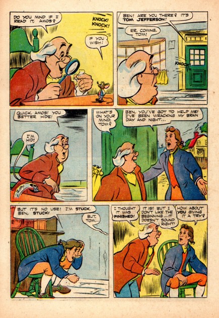
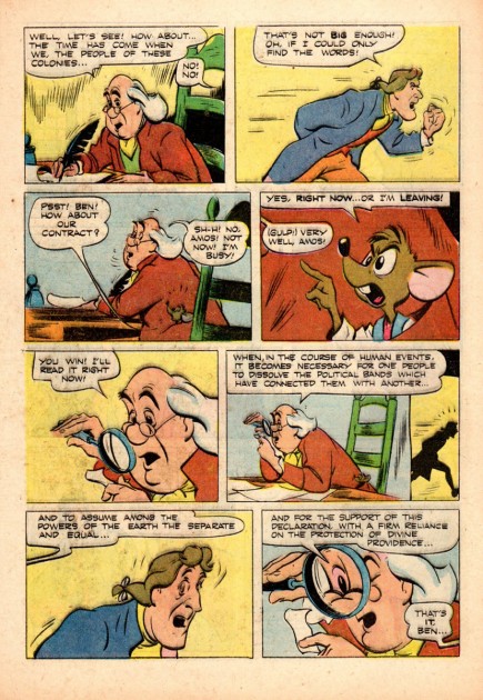
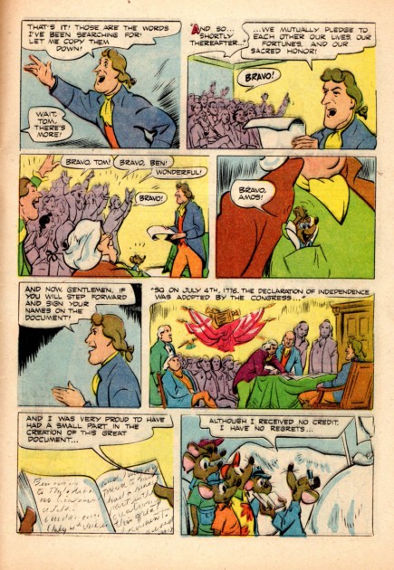
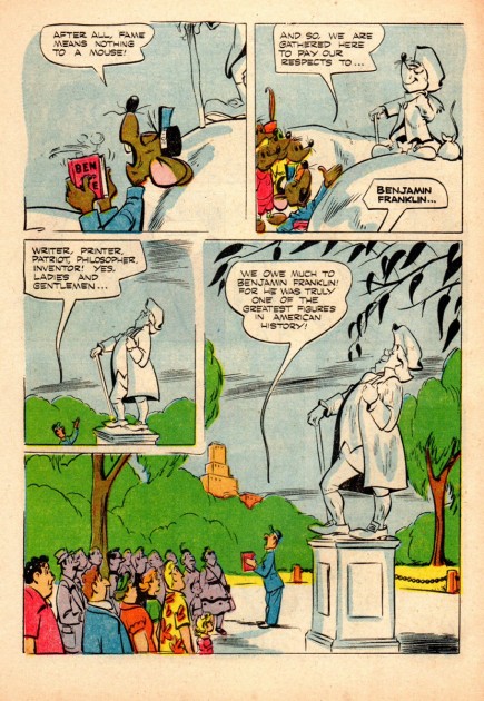
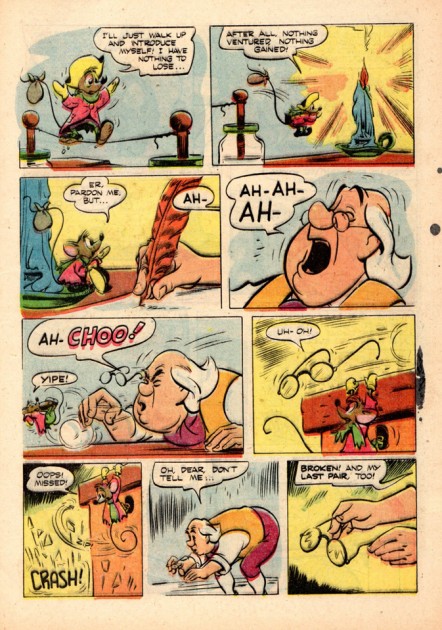
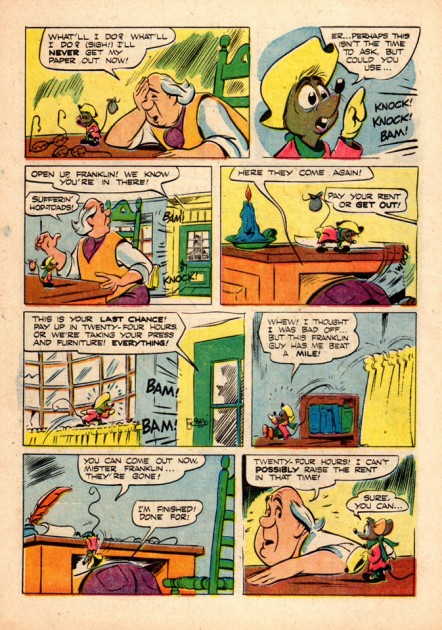
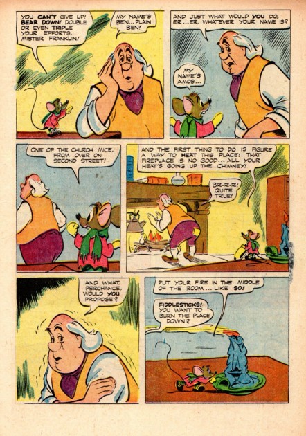
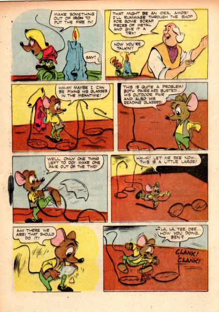
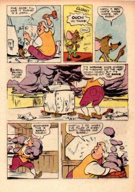
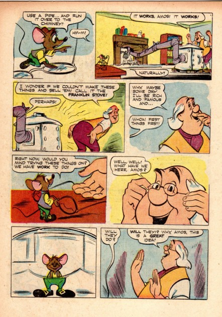
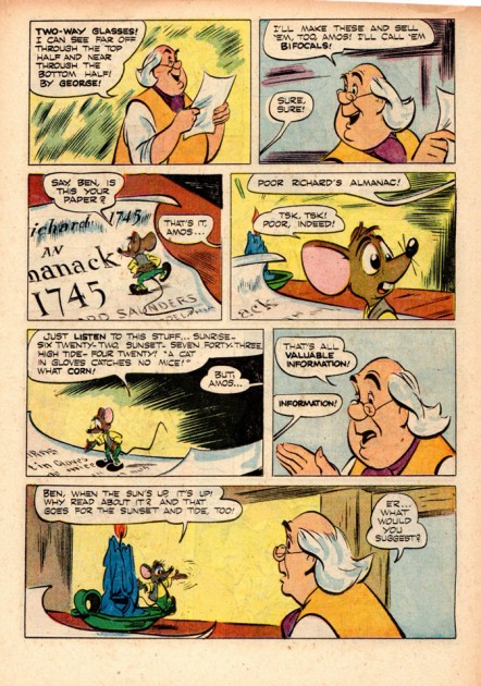
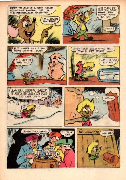
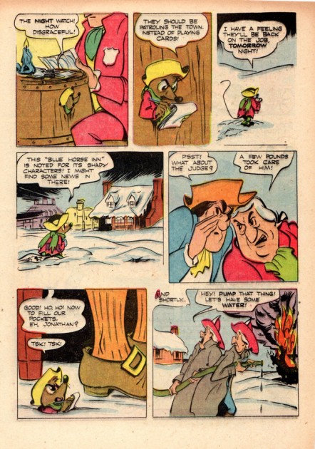
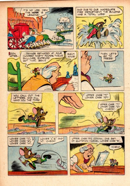
- Here we have the conclusion to the comic book version of Ben & Me. Part 1 here.
Al Hubbard was the artist behnid the work; beautiful brush inking and great compositions. The material came from Bill Peckmann‘s collection for which I’m enormously grateful. Any notes from here on come from Bill:
    Whenever Al Hubbard adapted Disney feature film characters to comic books he always gave them the authenticity they deserved. His style is deceptively loose and simple but he was always on model and his drawings are full of life.

17

18

19
20

21

22

23

24

25

26

27

28

29
30

31

32

33


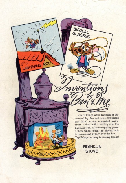
The back cover

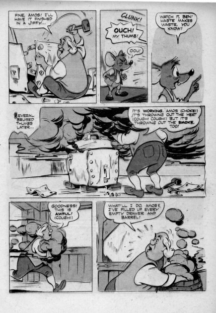
Here’s a neat way to show off Hubard’s formidable lay out ability, it’s by showing the pages in the gray scale mode so the coloring doesn’t get in the way. (Luckily the colors transform well into gray values. Let your imagination do the coloring and it also takes on the somewhat wonderful look of a production storyboard.)

His page and panel layouts are terrific. They are well designed, move the story and hold your interest. All wrapped up solid acting poses.

(Here are 3 gray scale pages.)


11

15

24

Bill Peckmann &Comic Art &Disney 08 Dec 2011 07:04 am

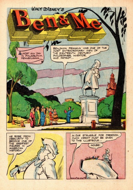
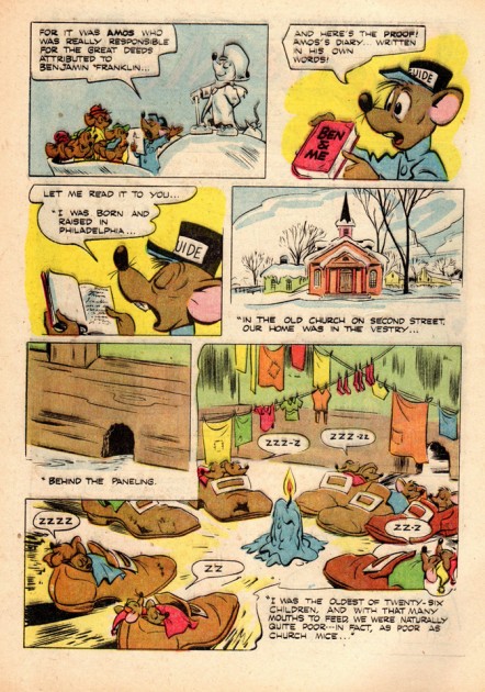
Ben & Me – Comic Book – 1

Seeing my post of Bill Peet‘s storyboard for Ben & Me, Bill Peckmann followed up with this note and artwork:

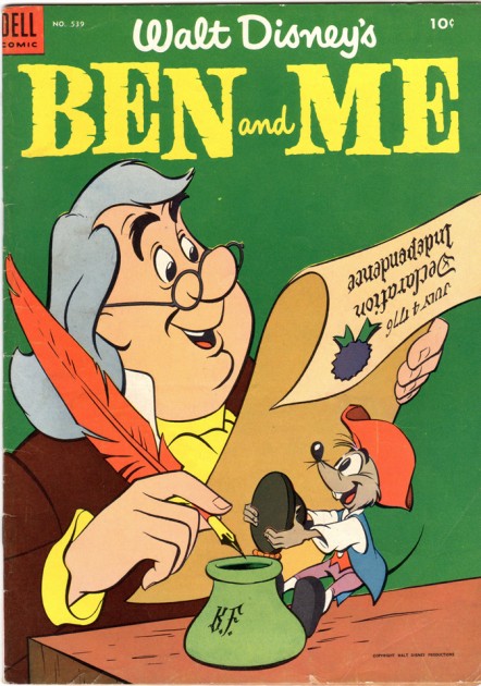
    I remember as a kid when “Ben and Me” came out it was “big doin’s”, those were the years where you had to wait 5 years between Disney features, a long time for a youngster. The short was great, it had feature length quality and it seemed that Amos the mouse just stepped off of the back lot of Cinderella.
    Needless to say when the comic book adaptation came out it was added very quickly to the stack of Disney comics at home. It was done by Al Hubbard, one of my favorite Disney comic book artists (like Carl Barks and other Disney comic book gents at the time, we did not know his name then). With his wonderful brush line, Hubbard was the next best thing to Walt Kelly. (He had successfully taken over Kelly’s “Peter Wheat” bakery character.) He also did the “Mary Jane and Sniffles” feature in the Looney Tunes Merrie Melodies comic books.
    The comic book coloring was done in the simplistic style/way of it’s day, so unfortunately, the color richness of the film is totally missing.


Cover

1

2

3

4

5

6

7

8

9

10

11

12

13

14

15

16

This is the first half of the magazine. There are another 16 pages to go. Tomorrow.
Many thanks to Bill Peckmann for scanning and sending the images to post and for sharing his collection with us.

Animation &Animation Artifacts &Disney 07 Dec 2011 07:21 am

Mickey and the Shadows – 2

- This is the fifth post of this scene, and the second that concentrates on the shadows. There are more where this comes from, and the post will continue with more parts. There are a lot of drawings to this scene (almost all on ones.)

However the scene’s a beauty. I think the animation by Riley Thomson recalls some of the earlier gutsy cartoon animation from the late Silly Symphonies. Mickey’s shadow moves several times from the right side to the left as he hacks away at the brooms. Whenever he walks, there’s always planned slippage in the movement. And the extremes are bold for a Disney cartoon. In a way, it brings Mickey back to his roots despite the high-minded subject matter of this film.

Harvey Toombs did the assisting. The sequence director was James Algar.

We start off this scene with the last drawing from the last post (Shadows Part 1):

48

49 50

51 52

5354

255

56 57

58 59

260

61 62

63 64

265

66 67

68 69

270

71 72

73 74

275

76 77

78 79

280

81 82

83 84

285

86 87

88 89

90 91

92 93

294

____________________________

The following QT incorporates all the drawings from this post and the last.
All previous posts will be combined in the final piece.

All drawings were exposed per the Exposure Sheets.

Books &Commentary &Layout & Design 06 Dec 2011 06:37 am

Setting the Scene – Book Review

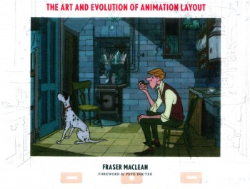
- Setting the Scene: The Art and Evolution of Animation Layout is a beautiful new book by Fraser MacClean. This is a stunningly attractive book with a great number of illustrations going all the way back to Winsor McCay right up to recent Dreamworks films.

The book talks about the history of the layout artist and gives plenty of examples from the past to the present, 2D to CG. It addresses how McCay did his films, through the silent animation era, past the Golden Age of animation, right up to the present day’s more complicated methods for computer graphics. It’s a wonderful and heavily researched book with an enormous number of illustrated examples.


A Winsor McCay LO for Gertie

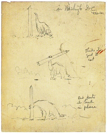
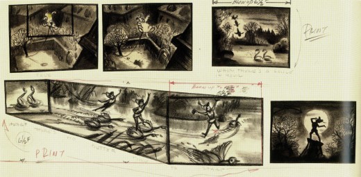
Original drawn layouts for the likes of One Hundred and One Dalmatians, Chuck Jones/Maurice Noble shorts, Betty Boop shorts, Gulliver’s Travels and The Thief and the Cobbler dress this book giving it a strength that none of the words could offer. Storyboard sequences for Peter Pan, The Rescuers Down Under, Cinderella or Song of the South help get any point across in the most visual way possible.

The book is somewhat dense and took me quite some time to go through it carefully. The material is so interesting, though, that I was ready to give it all the time necessary. Every time you turned a page there’d be another beautiful illustration that just took a lot of time to study.


A planning drawing for the great multiplane scene in Pinocchio


from B&W to color
Johnn Didrik Johnsen’s LO for Tom & Jerry “Puppy Tale” (1954)

Probably my only complaint about this book would be that the type is small and harder to read. At times even the illustrations are a bit smaller than I’d like. This, of course, is because anything larger would require greater printing costs and make the book too expensive. So, I’d rather have what sits in my hand than something I’d think hard about buying. As it is, the book is a must own for animation enthusiasts, and there’s a lot to learn for anyone interested in the process of animated film making. I wouldn’t hesitate to wholeheartedly recommend this book to anyone.


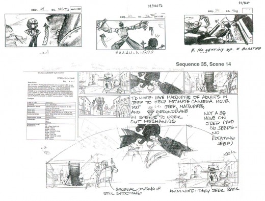
Brad Bird’s planning sketch for “The Iron Giant”

I could keep pulling more and more illlustrations from this book. They’re all unique and totally illustrate what the author is talking about at the moment. And they’re all gorgeous. You have to take a look at this book. It’s is another beautiful book from Chronicle Books. They are batting a perfect score, as far as I can see.

« Previous PageNext Page »

eXTReMe Tracker
click for free hit counter

hit counter