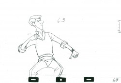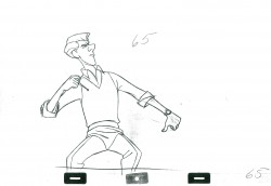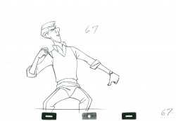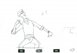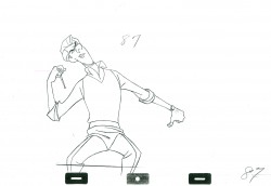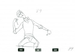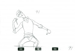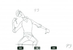
Bill Peckmann &Illustration 03 Feb 2012 07:27 am

The Artist’s Rep

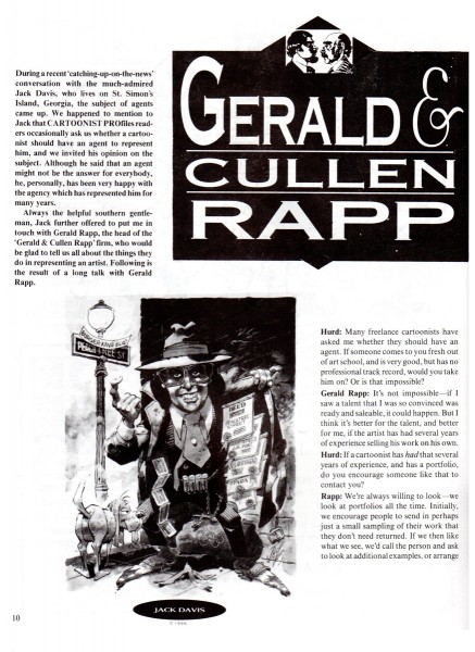
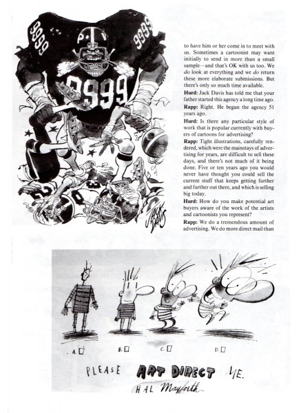
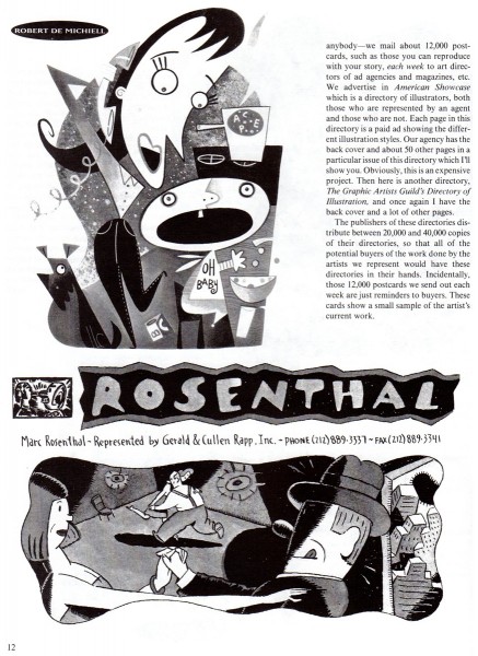
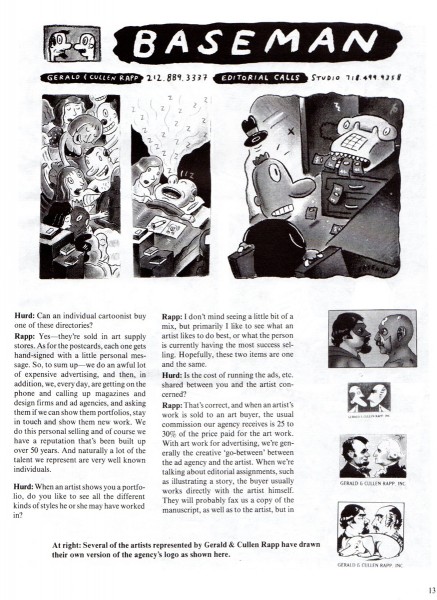
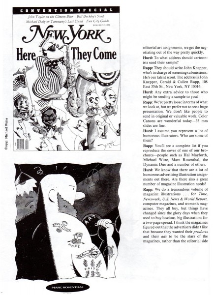
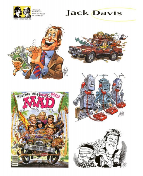
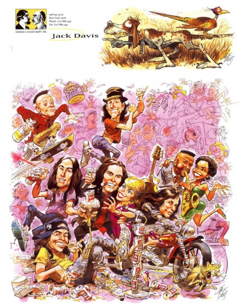
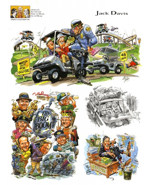
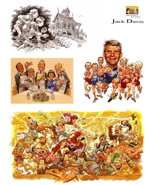
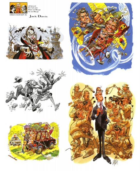
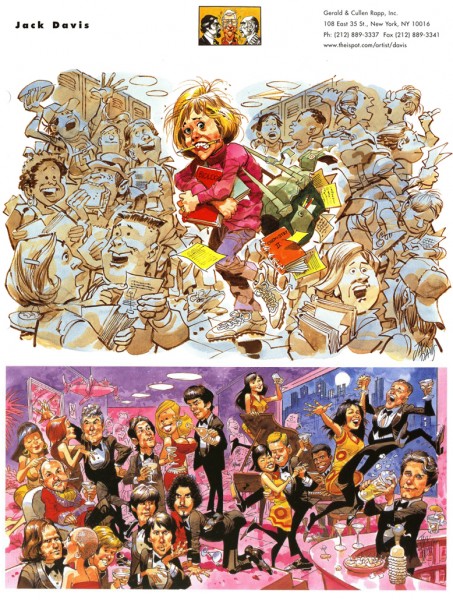
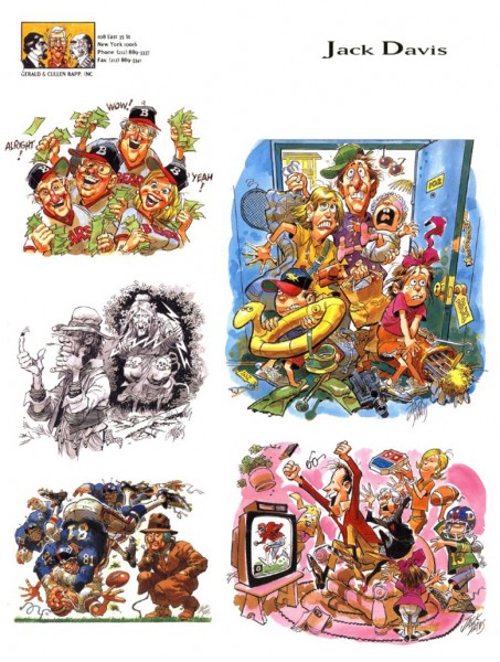
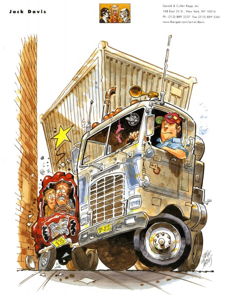
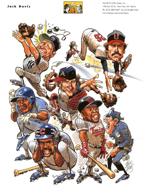
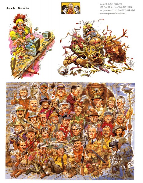
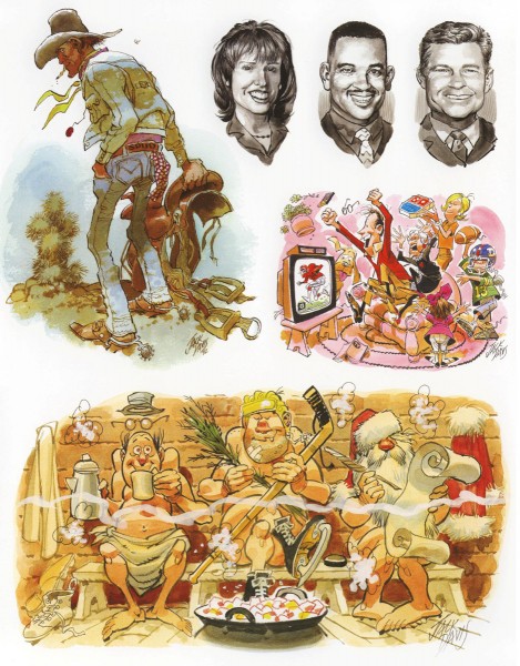
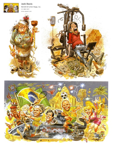
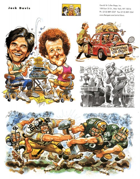
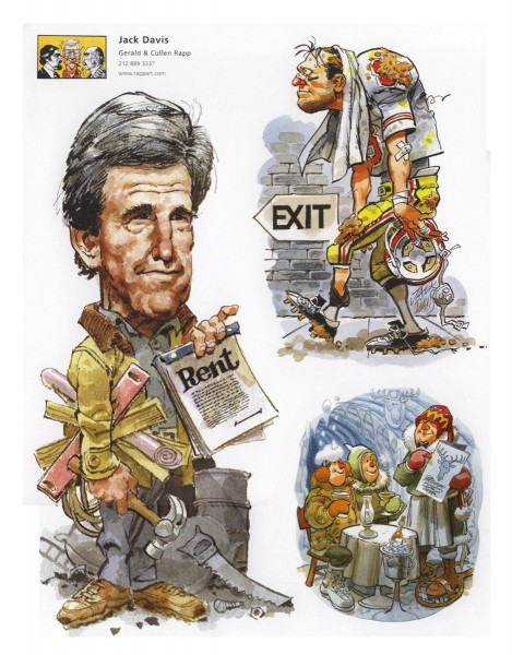
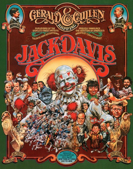
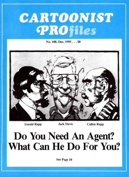
Gerald & Cullen Rapp were artists reps for a number of important cartoonists. Bill Peckmann sent me this excellent article from CARTOONIST PROfiles which details their work and some of their clients. Jack Davis is probably their biggest artist, and we follow the article with plenty of Jack’s work.


CARTOONIST PROfiles cover article about Gerald & Cullen Rapp

1

2

3

4

5

The following are printed cards highlighting the work of
Jack Davis.

6

7

8

9

10

11

12

13

14

15

16

17

18

19

Many thanks again to Bill Peckmann.

Bill Peckmann &Books &Comic Art &Daily post 02 Feb 2012 06:32 am

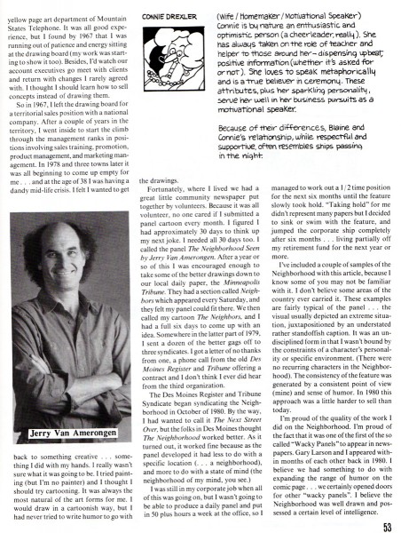
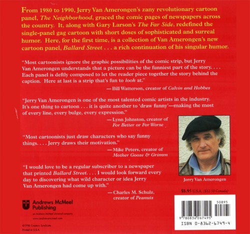
Jerry Van Amerongen

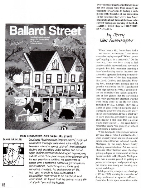
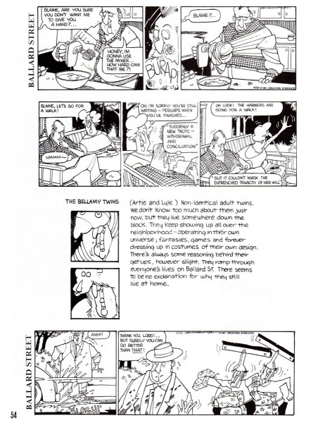
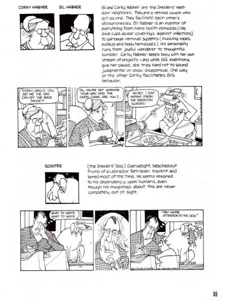
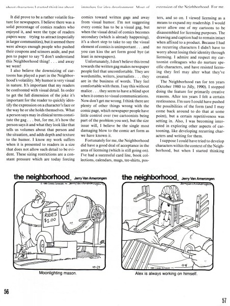
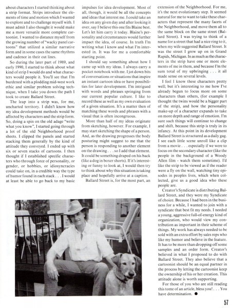
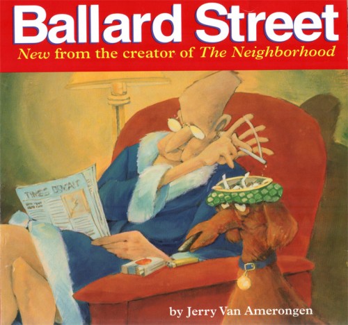
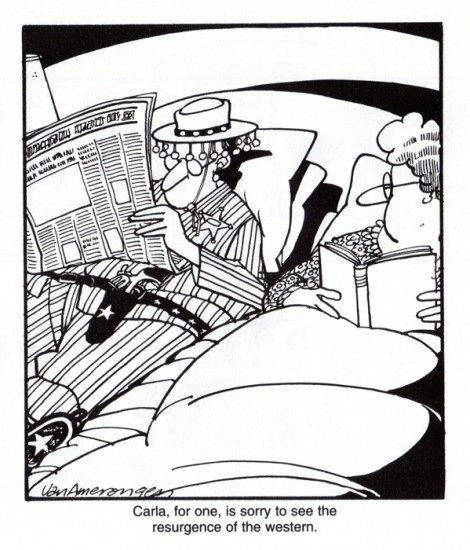
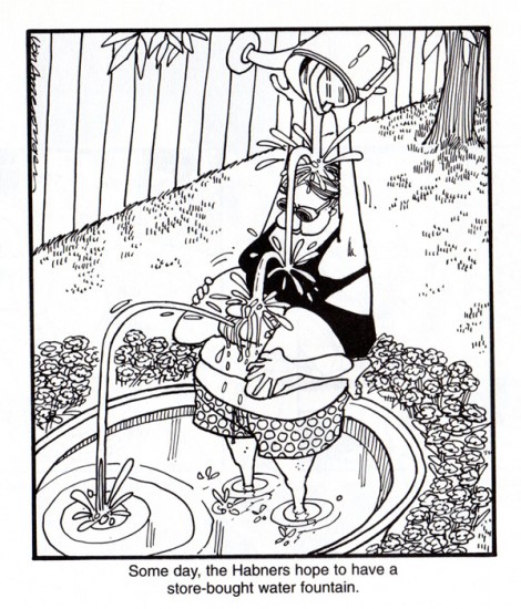
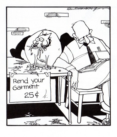
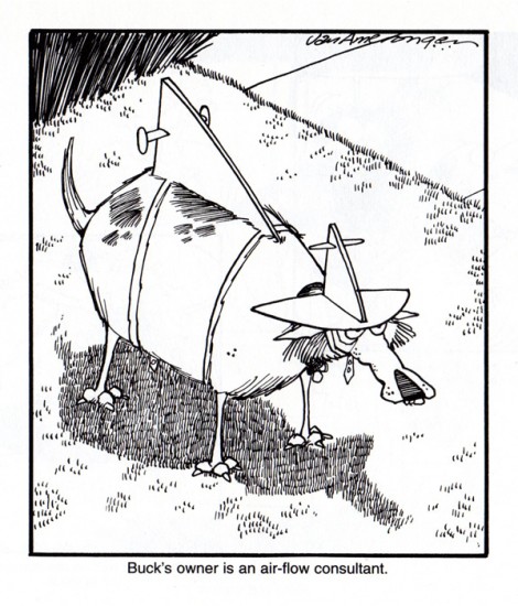
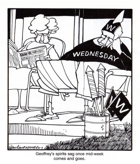
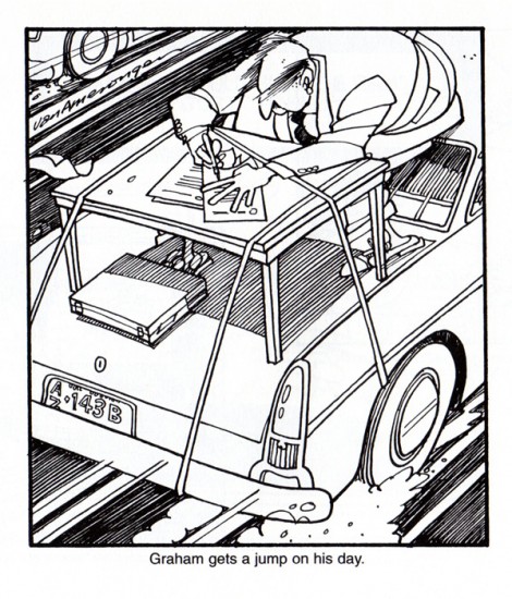
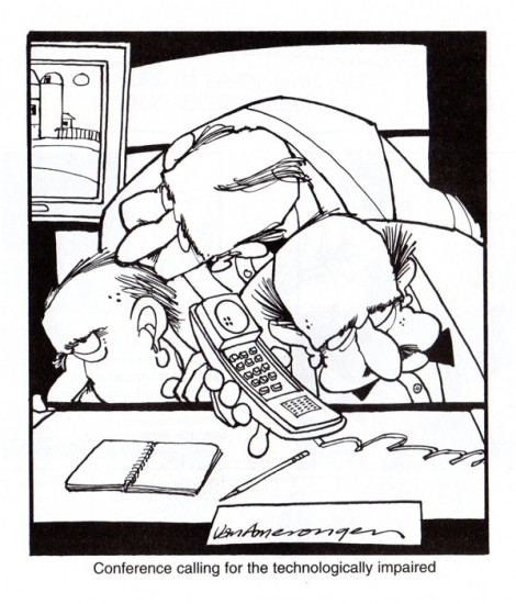
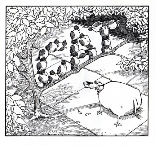
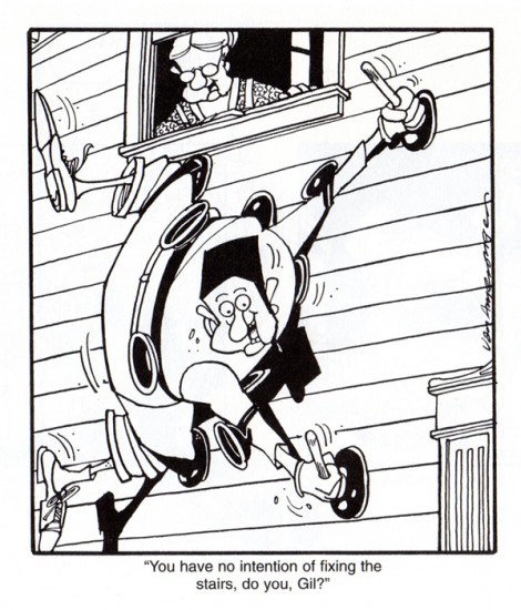
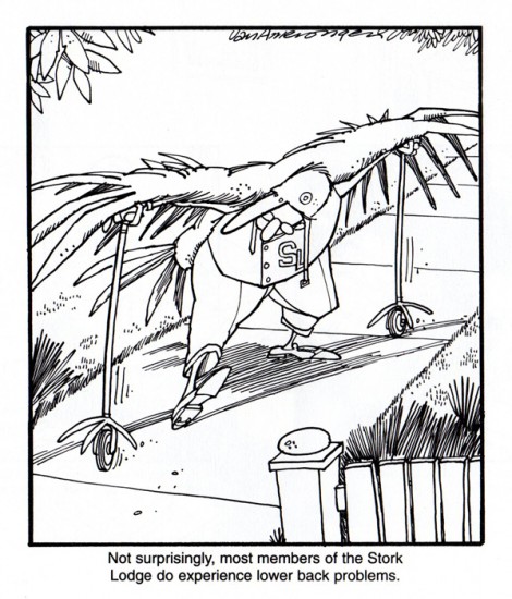
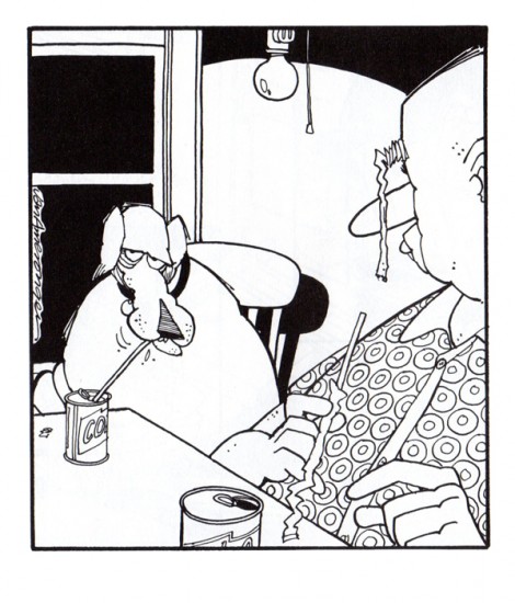
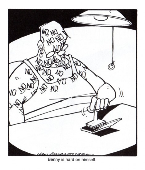
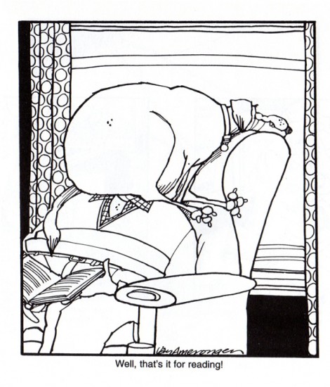
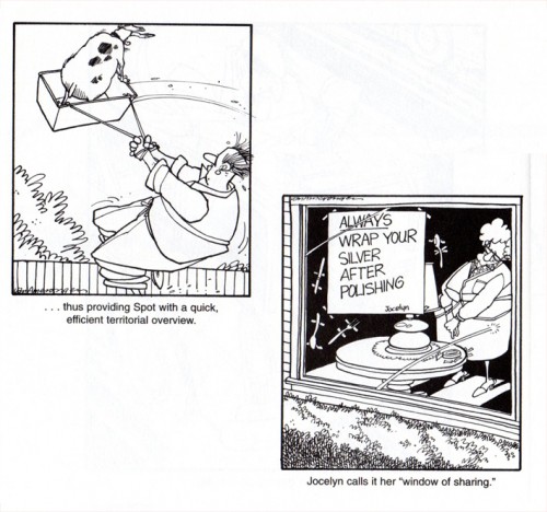
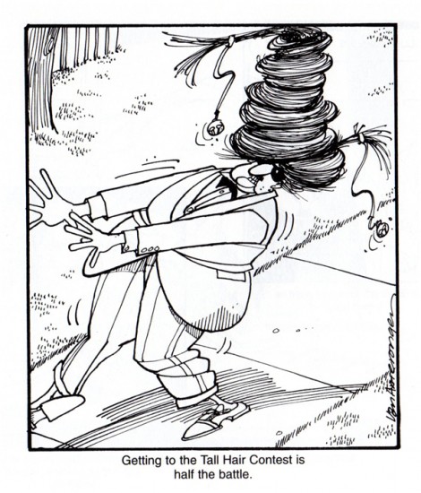
- Jerry Van Amerongen is a cartoonist whose work seems to be unfamiliar to many people. However, those who do know his work search out his cartoons. Bill Peckmann sent me this CARTOONIST PROfiles article about him and followed it with select cartoons from the pages of his book, Ballard Street. Bill wrote:

    Because of not having access to a newspaper that ran Jerry’s “Ballard Street” comic strip, this great talent flew under my radar for way too long of a time. Fortunately a good friend of mine sent me this book/collection a while back and I’ve been a fan ever since.

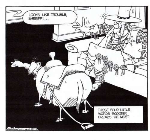
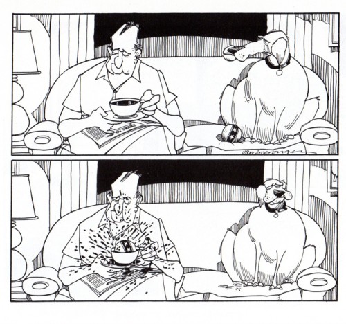
    Here’s a sampling of the way that Amerongen can freeze hilarious moments in time as only he can.

1

2

3

4

5

6


Book Cover

1

2

3

4

5

6

7

8

9

10

11

12

13

14

15

16

17


Back Cover of the book

Animation &Animation Artifacts &Disney &Layout & Design 01 Feb 2012 07:47 am

Roger – Scene 45 -part 2

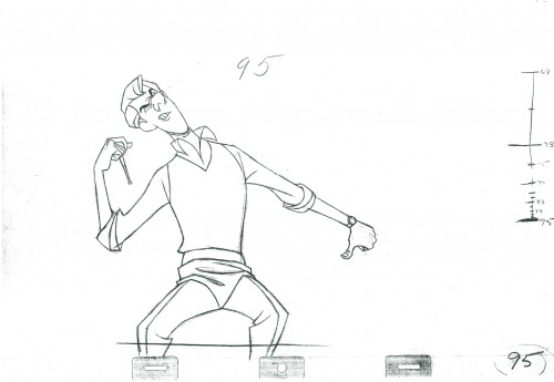
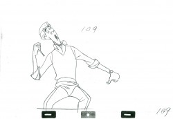
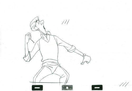
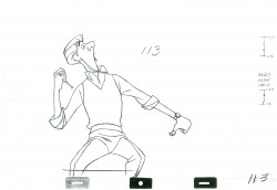
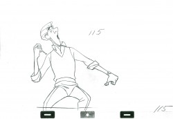
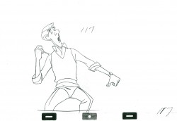
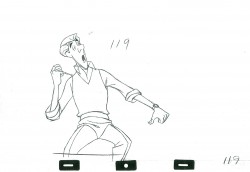
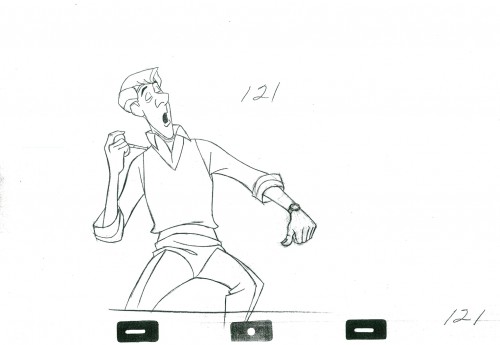
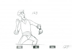
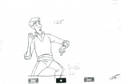
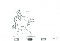
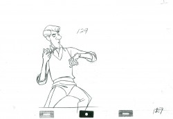
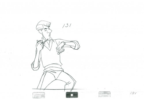
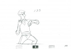
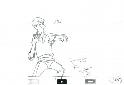
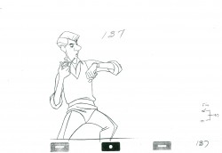
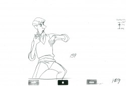
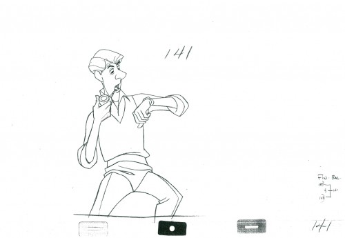
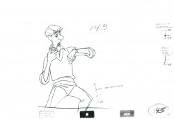
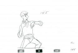
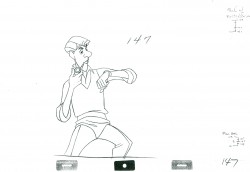
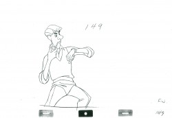
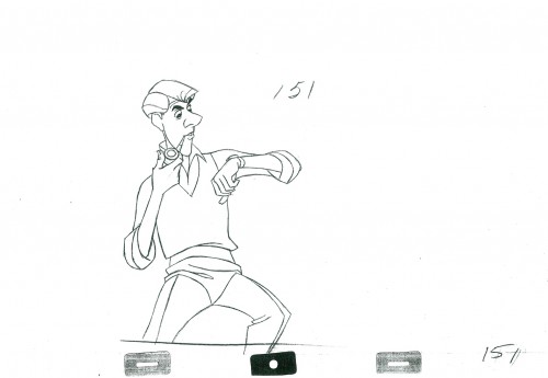
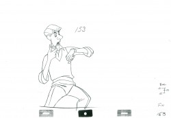
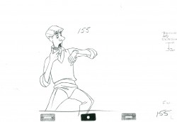
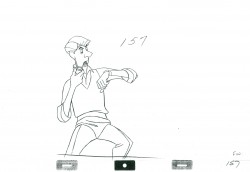
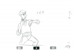
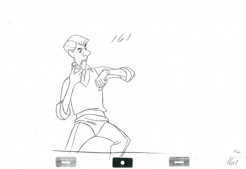
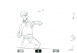
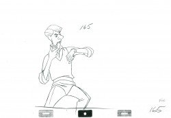
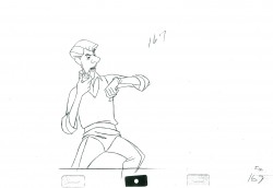
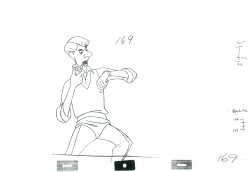
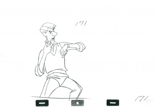
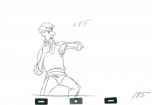
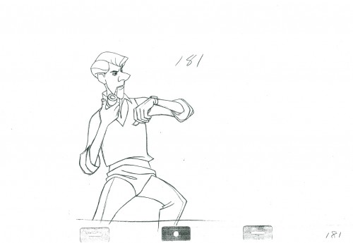
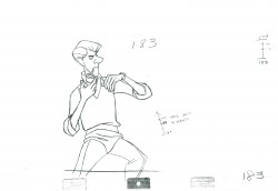
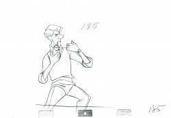
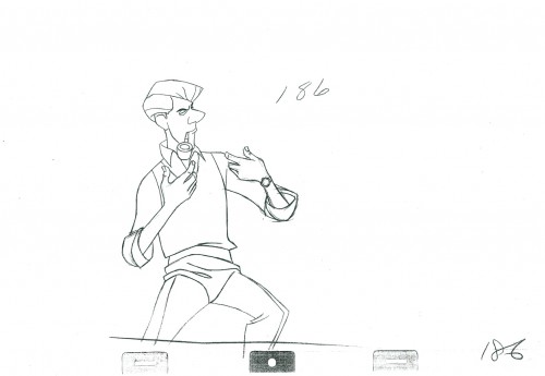
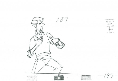
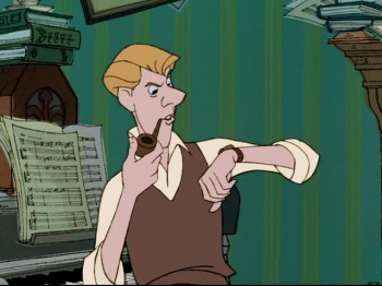
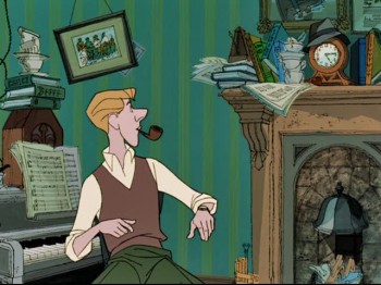
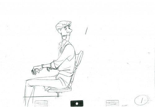
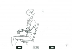
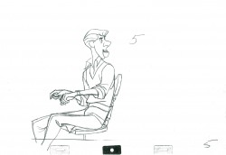
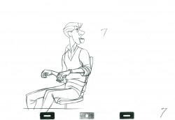
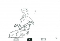
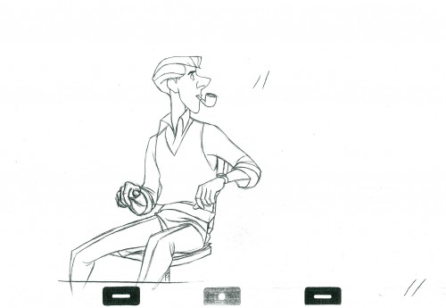
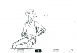
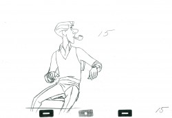
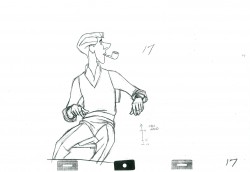
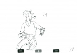
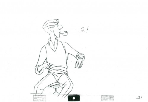
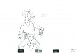
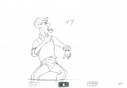
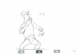
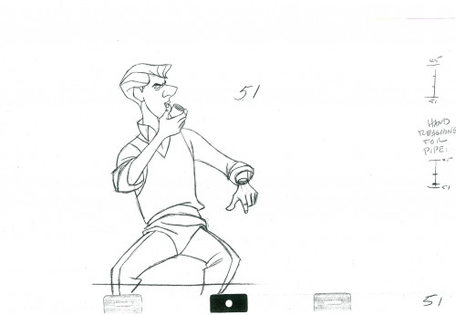
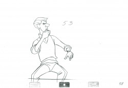
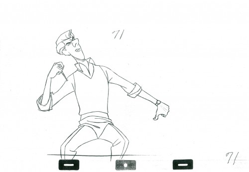
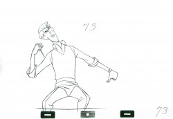
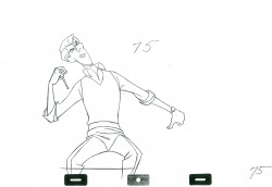
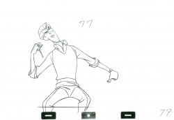
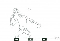
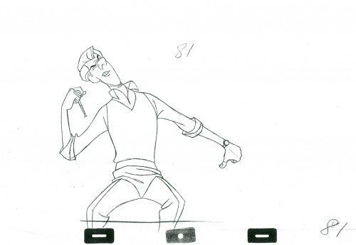
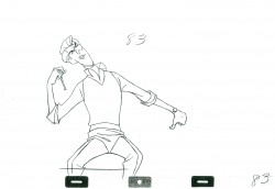
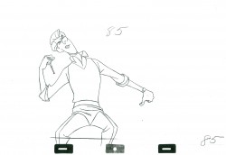
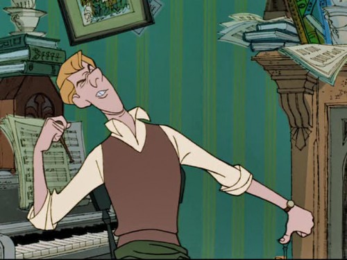
- Here is the second part of this scene from 101 Dalmatians. Roger is at the piano; Pongo has moved the mantle clock ahead by a ½ hour. Roger turns, yawns and checks his watch against the clock.

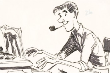
Milt Kahl animated Roger. Bill Peet did the storyboard drawing to the right. (In fact, he did the entire storyboard by himself.) This is the first of four scenes, I’ll post here – Sequence 1 Scene 45. The animation is, for the most part, on twos. There are a couple of ones at the very end ot the scene as Roger shakes his wrist. (Much of the rest of that will come with the conclusion, next week.

We start today with the last drawing from the first post.

95

101

111

121

131

141

151

161

171

175
An inbetween is missing from this part.

181

186
The goes on ones for a few frames as Roger shakes his wrist.

187

______________________

The following QT incorporates all the drawings from
this post and those in Part 1 as well.
All posts will be combined in the final piece.

All drawings were exposed on twos unless indicated otherwise.

The registration is a bit loose. Sorry but, these are copies of
copies and there’s plenty of shrinkage.


Completion of the scene will come next week.

.
For more on 101 Dalmatians check out the animator drafts on Hans Perk‘s great and resourceful site, A Film LA. Hans has also posted Bill Peet‘s story treatment for the film several years ago. See it here.
For a look at the art direction of the film including some beautiful reconstructions of the BGs as well as some of the BG layouts go to Hans Bacher‘s great site One1More2Time3.
Andreas Deja has one of the more extraordinary blogs to visit. He just posted some beautiful drawings by some of the key animators on 101 Dalmatians as they set about to find the characters. See them here as well as a comparison of Milt Kahl‘s characters against Bill Peet‘s version. here

For those who own Fraser MacLean‘s excellent book, Setting the Scene, you’ll know that on pages 182-188 there’s an extensive discussion of this opening sequence from the film with plenty of beautiful images of the set.


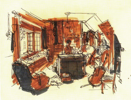
Ken Anderson’s sketch of the room.

Commentary 31 Jan 2012 07:57 am

False “Sincerity”

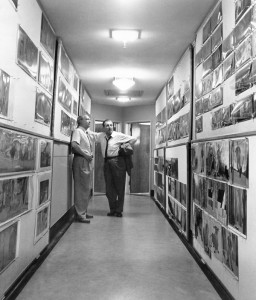
Mike Barrier, on his website, uses a photograph of Walt Disney talking in a corridor to Eric Larson to discuss the state of current day Disney. In the photo, both Walt and Eric are obviously tired at the end of a long and arduous day. Larson remembered, to Mike Barrier, that they were discussing the recently completed feature, Sleeping Beauty, and Walt surmised that at the current expense, he wouldn’t be able to continue to make animated features. That film had cost a bit more than four million dollars in 1958, a whopping sum. (Compare that to the $260 million Tangled cost in 2010.)

Mike Barrier‘s point in this article is that features, from that point on, took a slow dip in quality and never recovered. Mike says that he found a falseness setting in to the “sincerity” that Disney requested of his animators, with The Sword In the Stone and Jungle Book being virtually swallowed up by this false “sincerity”:

    “I think the falseness I saw was rooted, paradoxically, in that Disney shibboleth ‘sincerity.’ As Walt used the term, during work on the first great features, it was the characters who were to be sincere, that is, to seem to move of their own volition. Over the years, sincerity came to be valued less in the characters than in their animators (and, at one step removed, their directors), until now we are supposed to admire animation because its practitioners—assuming a high level of technical skill—are conspicuously earnest, in a way that many of the great early Disney animators were not.”

I have to agree, for the most part, with this theory. I think it most obvious in the Jungle Book. With The Aristocats, to me, they’d sunk completely and hopelessly off the map. I’ve sat through this film at least half a dozen times and have not been able to stay awake throughout it. The film is not one of my favorites.

Mike Barrier takes The Sword In the Stone as the first full on example of this problem, whereas I love that film, though I admit that it has significant problems. I agree with him on the next one, The Jungle Book, but Andreas Deja would disagree heartily – it was this film that convinced him to become an animator.

I remember discussing Beauty and the Beast with John Canemaker and my saying that I had trouble enjoying it, finding an ugliness in most of the characters – those townspeople cannot be drawn more poorly. But then John asked me if I didn’t think that this would be a film that would encourage lots of young people to want to become animators just as we had been inspired by some of the films of the fifties. It was obvious that I had to agree immediately.
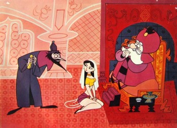
I recognize that The Sword In the Stone was right at the time that I was in love with most of the fare coming out of Disney’s studio, as a matter of fact out of most studios. 1001 Arabian Nights with Mr. Magoo was certainly an influence on me.

One of those commenting on Barrier’s column, Garry Apgar, points to Ichabod and Mr. Toad as one of the best of the Disney films, “I was enthralled by the magic of both, and to this day consider the Toad half of that combo picture, “pound for pound” . . . the greatest Disney cartoon ever. I still have the Giant Golden Book edition of that story.”

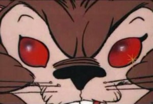
Personally, except for the ride of the Headless Horseman, I find very little inspiring in that feature. I’d guess that Mr. Apgar was influenced because he saw the film at a time when he was strongly influenced by it, just as I saw The Sword In the Stone at a susceptible time in my life. However, despite that, I have difficulty finding much bad in the film. Yes, I hear odd echos in some of the voice track; the music is completely anachronistic, and some of the animation is not up to the work of the past. I’ll even say that I have a major problem with the wizards’ duel in that the mad Madame Mim is introduced late in the film just for the sake of the set piece, the duel. She’s then dismissed. I have always found that a wart in the storytelling. Somehow the late introduction of the squirrel females doesn’t bother me. Perhaps because they’re squirrels.
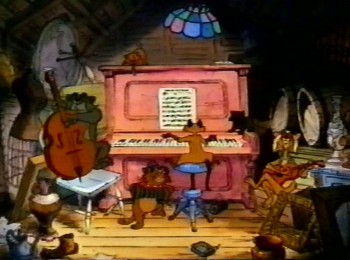
Basically, I’m saying that we’re all affected by our influences – not necessarily the quality of the actual film. Those who have seen The Aristocats at a vulnerable time in their lives, probably like that movie, and I can’t really fault them though I know it’s not a benchmark in Disney animation, and, in fact, is definitive proof of Barrier’s theory about the false “sincerity” in the animators’ work and, more to the point, the director’s work. (I can remember Ken Anderson, Frank Thomas and Ollie Johnston talking about the disco-lights used in the jazz-in-the-attic section of the film. Woolie Reitherman could not be coaxed out of the 70s effect despite the fact that it was already dated when the film was released.)

But back to the comments section of Mike Barrier’s site. Jim Korkis was surprised while teaching Animation History to a number of young interns at the Disney studio. “They had no acquaintance with any silent animated cartoons that were the foundation nor any of Walt’s competitors in the Thirties and Forties like Paul Terry, Warner Brothers, MGM and others. Even as the class approached the beginning of computer animation, they had no clue how and why computer animation developed.”

This has become the state of the world. It’s not only animation. Just focusing on the Arts, I see it everywhere.
- There’s no knowledge of Vaudeville among the young performers and creators trying to sell their wares to theatrical shows. When Stephen Sondheim, Charles Strouse and John Kander die so will the history of the theater.
- I wonder how many architecture students have read Ayn Rand’s “The Fountainhead.” Certainly not for the confused libertarian views, but for the threat of two different architectural forces that dominated the world in the early Twentieth Century.
- How many Fine Artists explore early Renaissance Art, except within their Art History classes? Do they question why and how Daumier painted as he did? What about Turner, do they understand what he was trying to do? Or David? This is our history; it’s the foundation of the future. Only by going through his apprenticeship to Thomas Hart Benton could Pollock paint his splatter paintings.

Animation students should do more than study scenes that have already been animated. By limiting yourself to how Milt Kahl or Tex Avery did something, you’ve eliminated the world. This is what you’re caricaturing in your animation, I should think. Regurgitated Jim Tyer is not only not art but it’s not Jim Tyer. And it’s not good. Art Babbitt, while at the Disney studio, took piano lessons and dance lessons knowing that it would help his animation, and undoubtedly it did. It’s more important to take those dance lessons (and more fun, too) than it is to study all of Tytla’s scenes.
I’m not saying that animators shouldn’t study past animation, but what I am saying is that it’s the world outside your body that is shaping any artistry within you. Imitating Chuck Jones’ blinks won’t help you other than knowing that Jones did it that way.

Learn about your business, but also learn about the world. That’s the only way you can relate to how your character should think and emote. All of the Disney drawings on this site and other ones really won’t help you figure out YOUR character’s development. Only you can do that.
Animation Artifacts &commercial animation &Story & Storyboards &Title sequences 30 Jan 2012 05:49 am

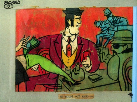
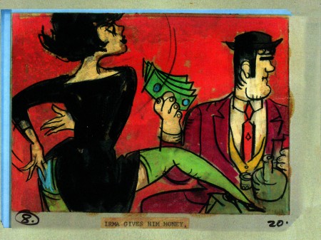
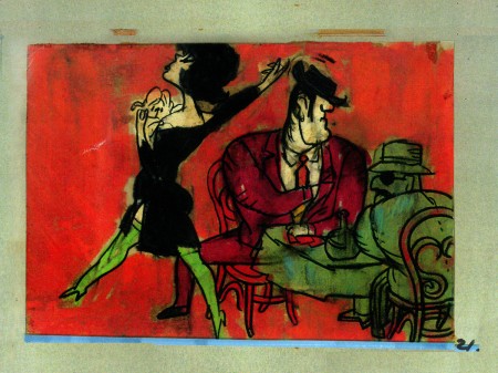
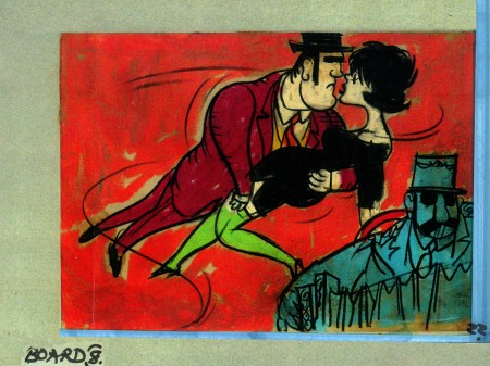
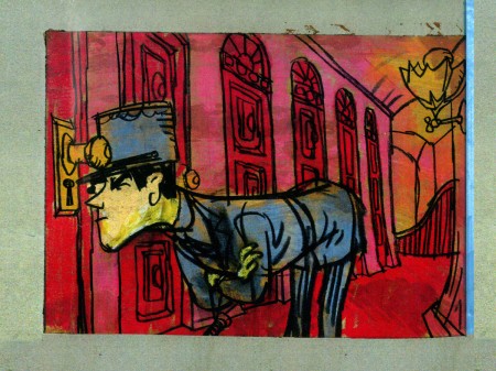
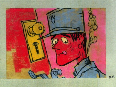
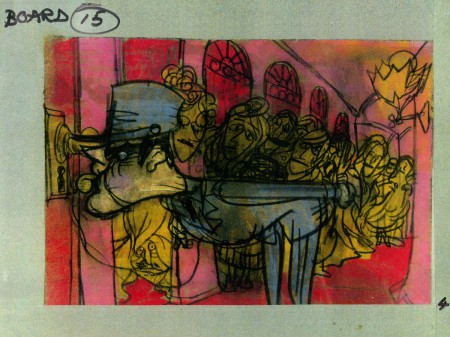
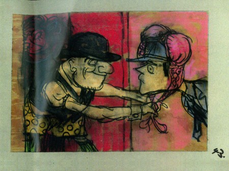
John Wilson/Fine Art Films – part 4

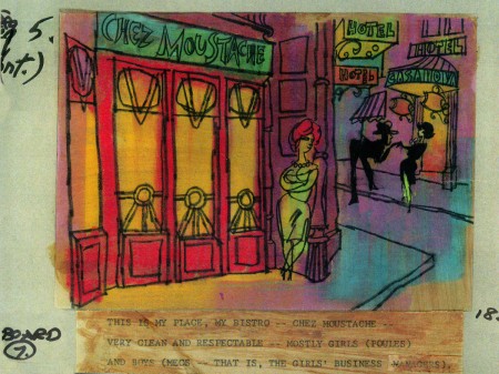
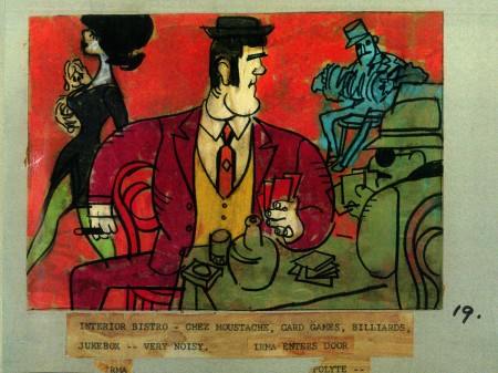
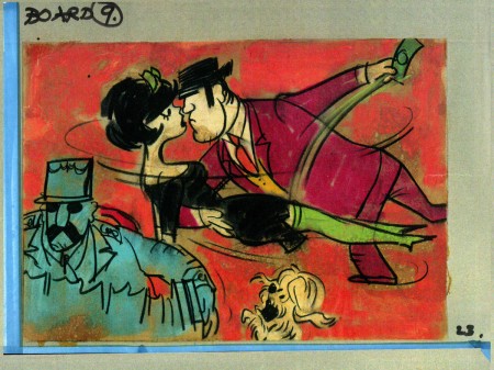
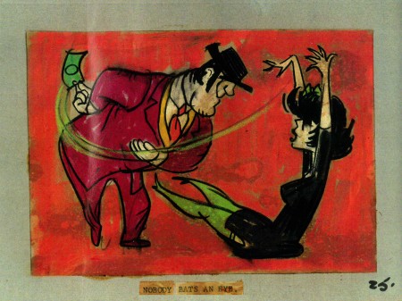
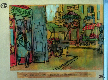
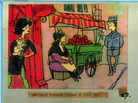
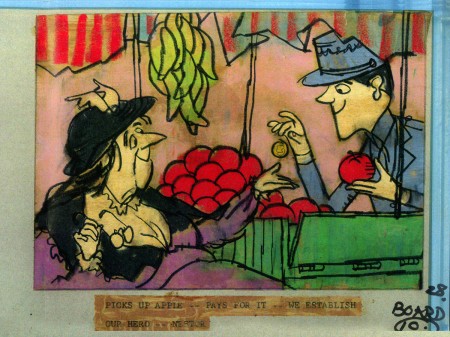
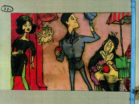
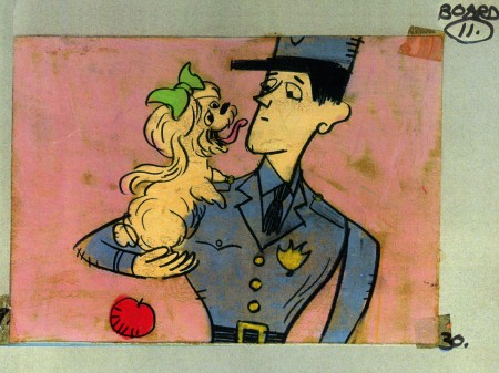
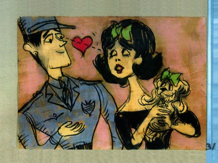
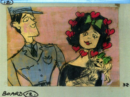
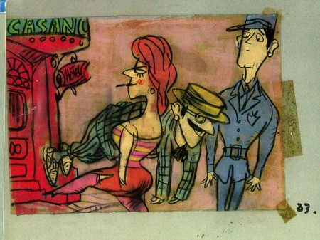
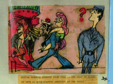
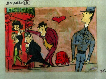
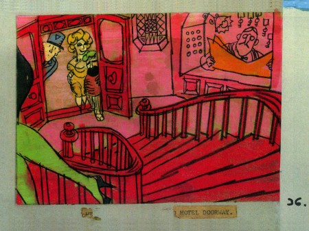
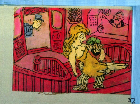
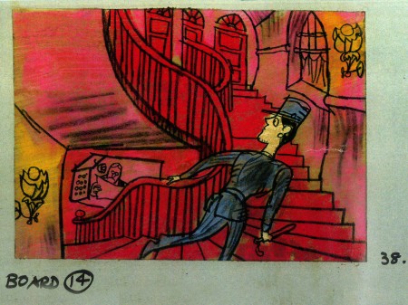
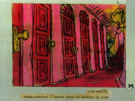
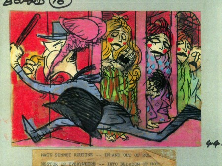
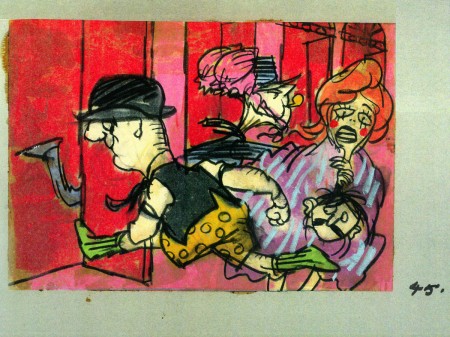
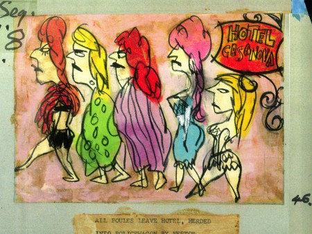
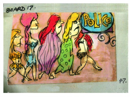
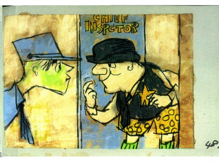
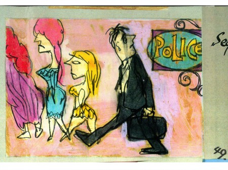
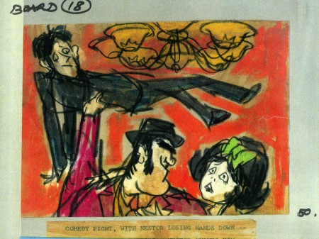
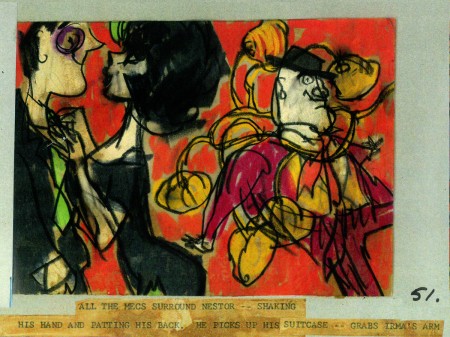
- This is the second half of the storyboard John Wilson created for the Mirisch Corp. A trailer to promote Billy WIlder‘s coming film, Irma La Douce. This was a film about a French prostitute, played by Shirley MacLaine, and a French gendarme, Jack Lemmon. Love blossoms.

As I wrote on part 3, the board comes in 18 pages of three storyboard drawings. Rather than post the sets of three images (and only being able to show them at a smallish size) I’ve taken each individual drawing and have blown them up to see them better on this blog.

Again, these were for a lengthy trailer for the film not the opening credits. The film’s credits do not use animation.

7a

7b

7c

8a

8b

8c

9a

9b

9c

10a

10b

10c

11a

11b

11c

12a

12b

12c

13a

13b

13c

14a

14b

14c

15a

15b

15c

16a

16b

16c

17a

17b

17c

18a

18b

18c
___________________________


Here’s a YouTube version of the trailer. Not the brightest quality, but you can see it.


Photos &Steve Fisher 29 Jan 2012 07:31 am

Bridges and Sunsets

Here are some new photos of my city courtesy of Steve Fisher.

The 59th Street Bridge

Sunsets

Commentary 28 Jan 2012 06:45 am

A Penny’s Worth

- This was a pretty quiet week, except for Tuesday. That was the day the Oscar nominations were revealed. I don’t think I’ve been as happy with the overall nominations since the year Doctor DeSoto got nominated. Since I’ve been a member in New York, I’ve always felt that our voice was barely heard in the Hollywood awarding of the prizes. My vote always felt like a little guppy in the salmon swim upstream. This year I feel well represented.

I had hoped that one of the French and Spanish 2D features would be nominated against the blockbuster boys club of Spielberg, Dreamworks & Disney. I was adamantly against TINTIN (first) because it was a MoCap film and (second) because it was a bad movie with a poorly realized script. This was the last thing I’d have expected from Spielberg. I’d have preferred the bad, limited animation of the TV series with a good script. And whatta you know! TINTIN and Pixar didn’t get nominated. And, even better, not one of the two foreign features but both of them got into the competition. How happy could I be?!

The same was true of the short films. The best of the Short list was nominated. I really believe that. If I had to pick five shorts from the mixed bag of films we saw, I’d have chosen four of these five. And the fifth is technically superb however trite the script. I couldn’t be more pleased.
As I said, this extends to all of the films. I’d have chosen eight of the nominated nine films for Best Picture. I know my favorite doesn’t have a shot at it, but I’m happy it got recognized.

Now to see all the docs and foreign films to vote on them. If any compare to THE SEPARATION, I’ll really be very satisfied with this year’s crop of films.

________________________

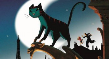
Nominations for the Cesars, the French version of the Oscars, came out this week. For Best Animated Film (they combine shorts with features for this category) the five nominees are:
- LE CHAT DU RABBIN (THE RABBI’S CAT) by Joann Sfar, Antoine Delesvaux, a 2D animated feature.
- LE CIRQUE (THE CIRCUS) by Nicolas Brault, a painterly animated short from the NFB.
- LA QUEUE DE LA SOURIS (THE MOUSE’S TALE) by Benjamin Renner
- LE TABLEAU, a 2D short. (THE PAINTING) by Jean-François Laguionie, a 2D feature from the award winning animator.
- UN MONSTRE À PARIS (A MONSTER IN PARIS) by Bibo Bergeron, a cgi feature.

________________________

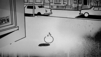
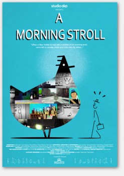
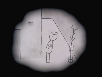
By the way, the one film that seems to be swooping it up in this Awards season is the animated short, A Morning Stroll by Grant Orchard and . This film is the only one that was nominated by the BAFTAs but also the Oscars. It won prizes at Annecy, Bradford, and Brooklyn. Congratulations to Studio AKA, director Grant Orchard and producer, Sue Goffe. I’ve seen it half a dozen times so far and could probably sit through as many again.

________________________

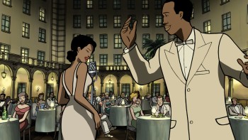
For those of you in NY who’d like to get a look at the Oscar nominated feature, Chico and Rita, it will be screened on Tuesday, February 21st, at the Jacob Burns Film Center.

Designed by Javier Mariscal and directed by Fernando Trueba (Belle Epoque) the story tells a love story about a Cuban piano player and his love of a beautiful singer with an extraordinary voice. The film features a luscious track of Cuban jazz as well as classics from Woody Herman, Dizzy Gillespie, and Charlie Parker.

The Jacob Burns Film Center
364 Manville Road map
Pleasantville, NY
www.burnsfilmcenter.org

________________________

Coming March 26th & 27th the IFC Center will present An Evening with Don Hertzfeldt

Acclaimed animator Don Hertzfeldt will appear in person to present his most recent film together with a selection of his award-winning earlier shorts Monday.

March 26, 2012 at 7:00pm! It’s Such a Beautiful Day, makes its exclusive regional premiere at IFC Center. This is the third and final chapter in a trilogy about a mysterious man named Bill. The entire trilogy will be screened together for the first time on new 35mm prints, followed by a live Q&A with Hertzfeldt

Mon, Mar 26 at: 7:00 PM and 9:30 PM
Tue, Mar 27 at: 7:00 PM

Tickets for this special event are $17.50 general admission, $15.50 seniors, $13.50 IFC Center members

The IFC Center
323 Sixth Avenue, NYC
www.ifccenter.com

________________________

- A favored blog read this week came on Cartoon Brew. Amid Amidi posted Steven Colbert‘s interview with Maurice Sendak. The second part is the better one, when Sendak starts singing. It’s a real laugh out loud. Go here to watch them.

________________________

- The post that stirred me most was on Mike Barrier‘s site. Actually, something in the comments on that post got me thinking, particularly Jim Korkis‘ note and Don Benson‘s followup. I haven’t quite yet formed my thoughts, so I won’t respond until another time, but you should go and read the post and the comments. There’s some real conversation happening there.

Bill Peckmann &Comic Art &Illustration 27 Jan 2012 04:03 am

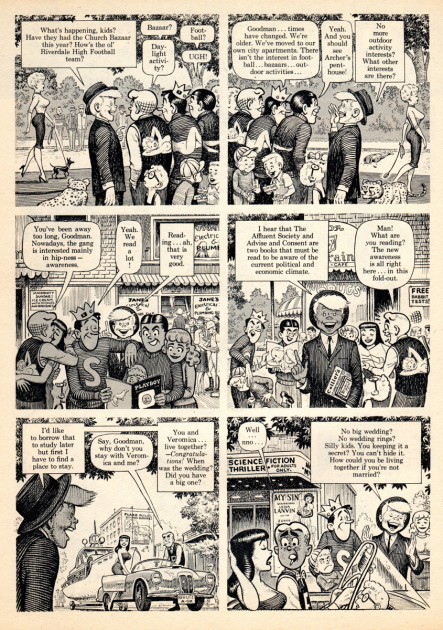
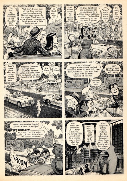
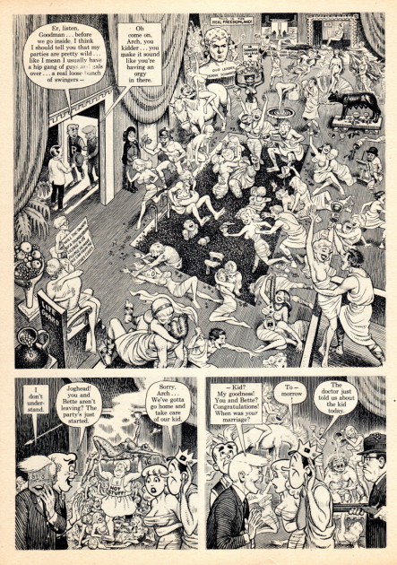
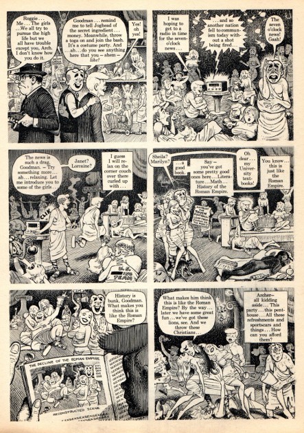
Goodman Beaver

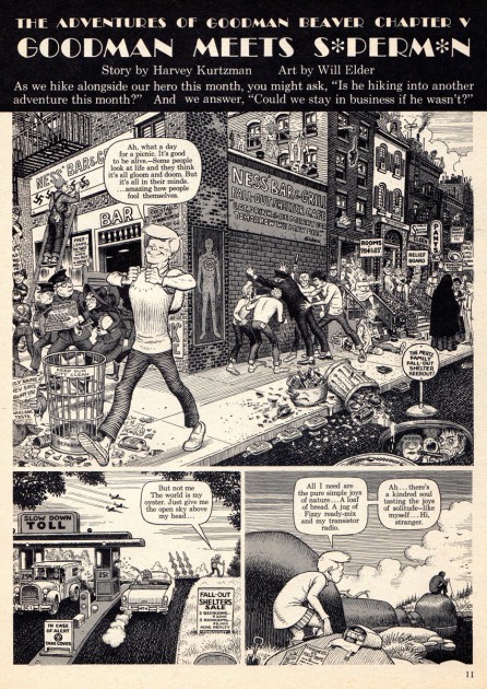
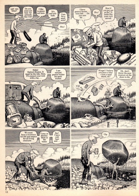
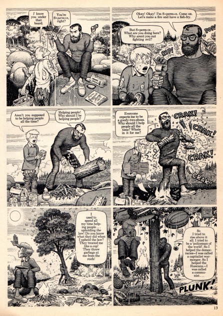
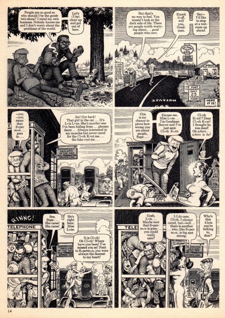
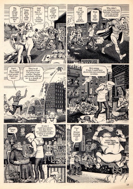
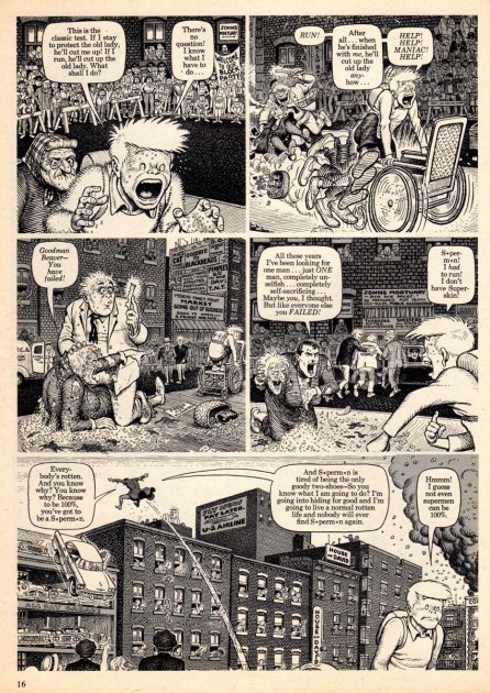
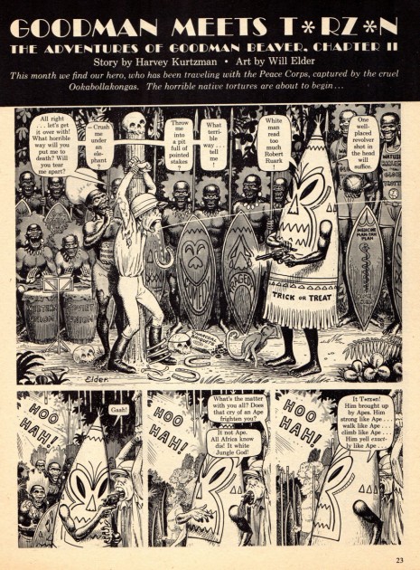
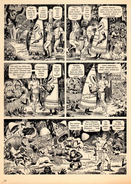
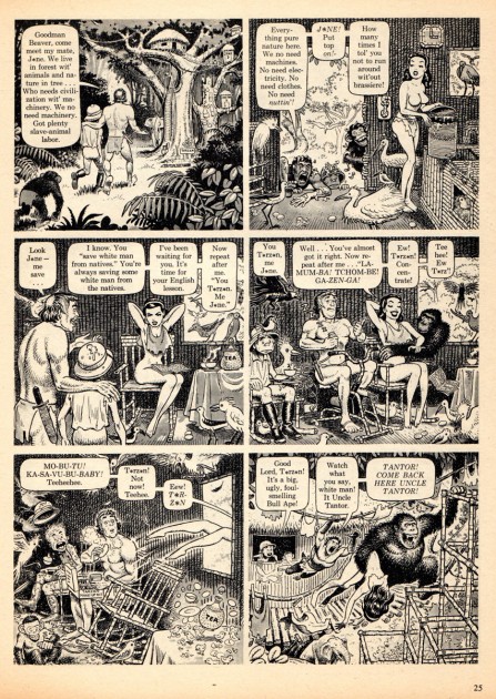
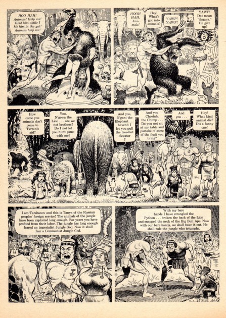
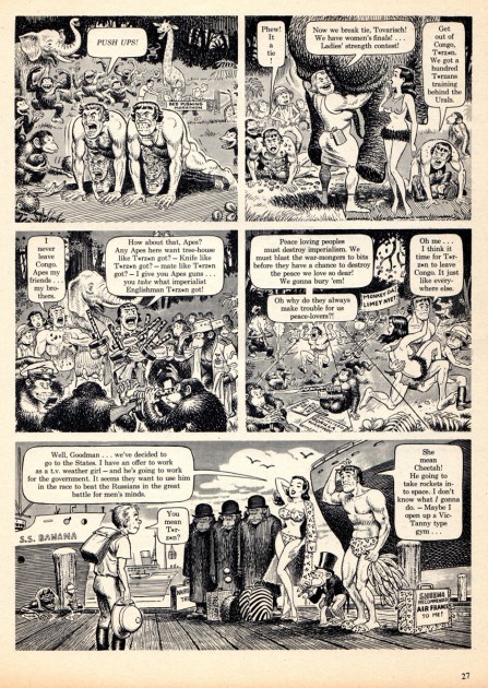
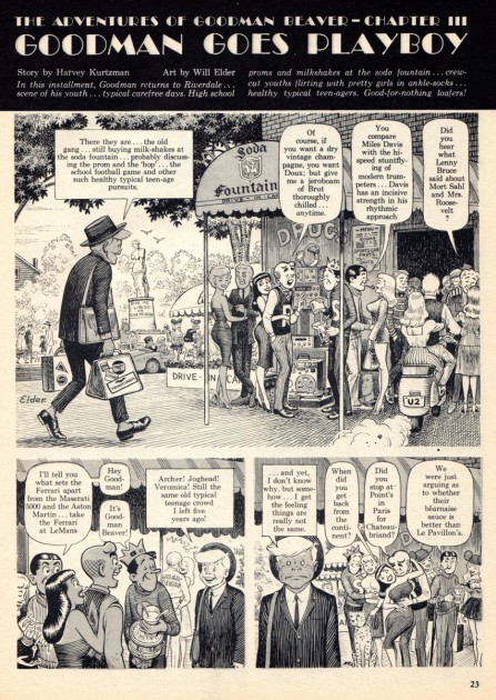
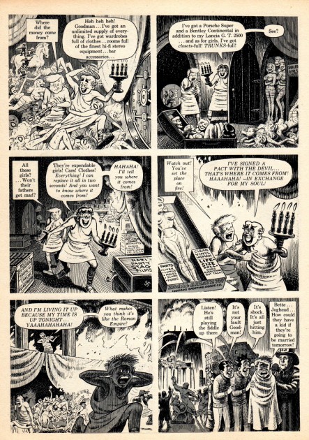
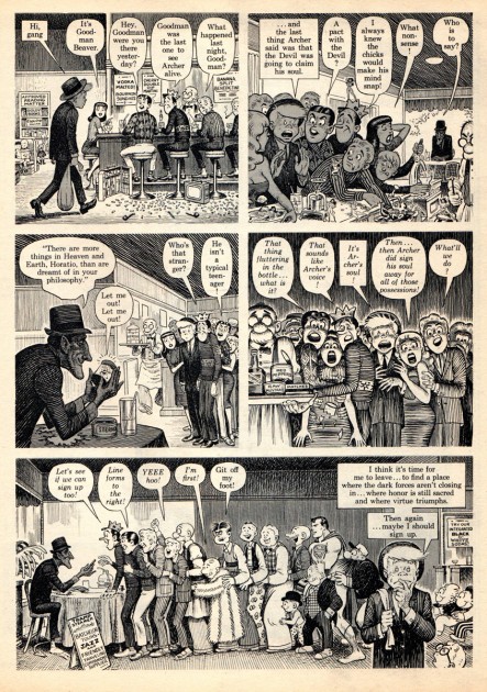
- Bill Peckmann sent another strong piece by Harvey Kurtzman.
Here’s Bill to introduce it:

    I came across my stash of Harvey Kurtzman‘s HELP! magazines that I haven’t looked at in 45 years. Surprise, surprise, what a wonderful comic cornucopia is in those forgotten books. There’s all of our favorite cartoonists and then some. As always, Harvey was ahead of the curve in format and style, there wasn’t quite anything like HELP! when it came out those 50 years ago
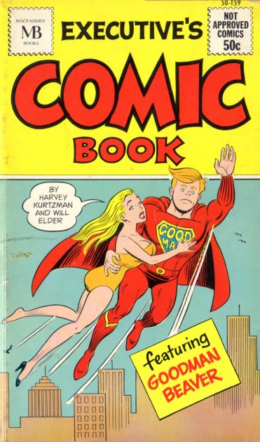
    Here’s Harvey Kurtzman’s and Bill Elder’s series “Goodman Beaver” from the magazine. The series started in 1961, towards the end of the run of HELP!.

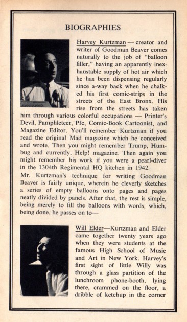
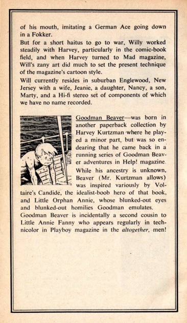
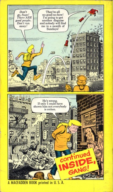
    This is the cover of the paperback that came out in 1962 which reprinted four of the “Goodman” stories. In it were also capsule bio’s of Harvey, Bill and Goodman.


Cover

2
Bios

3

Here are the “Goodman Beaver” stories as they appeared in HELP! magazine. (The paperback reprinted the stories in a one panel per page format, art was also added to fill out the page.) The pages are written an laid out by Harvey and finished off in black and white by Bill Elder. Bill’s finished art is beautifully done, especially his hand crafted grays. I believe Bill’s “engraving like” style was influenced by the terrific “antique/recycled” cartoons Harvey use to run in his early MAD magazine and in HELP! The combination of Harvey’s fluid, animated lay outs and Bill’s meticulous final art make for something quite unique.

4

5

6

7

8

9

There are two more stories to follow:

10

11

12

13

14

The last story is hilarious – especially if you’re an Archie fan.

15

16

17

18

19

20

21

22
The back cover of the paperback

Many thanks to Bill Peckmann for sharing this great material.

Bill Peckmann &Books &Illustration 26 Jan 2012 06:26 am

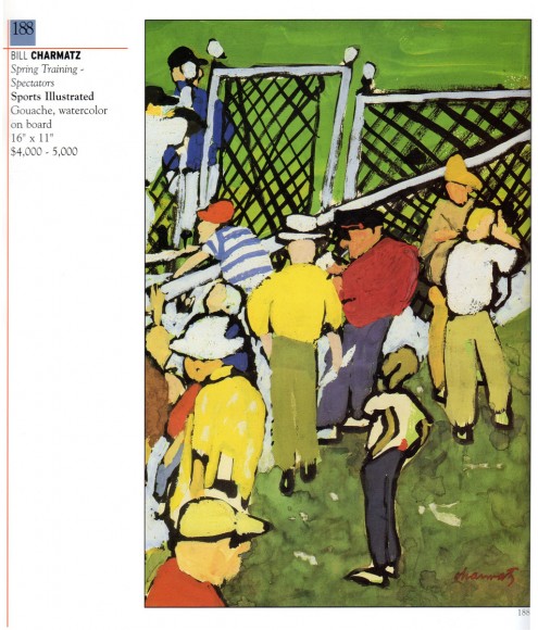
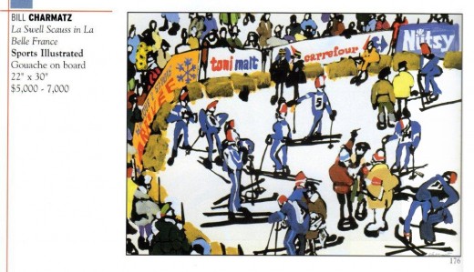
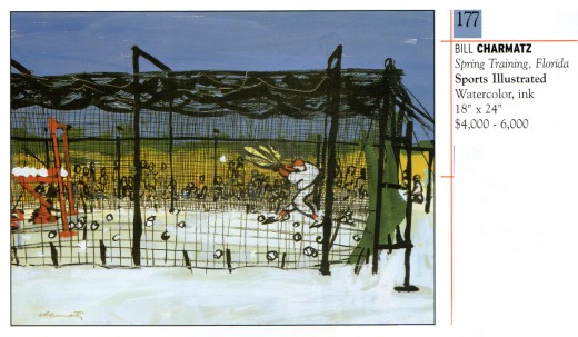
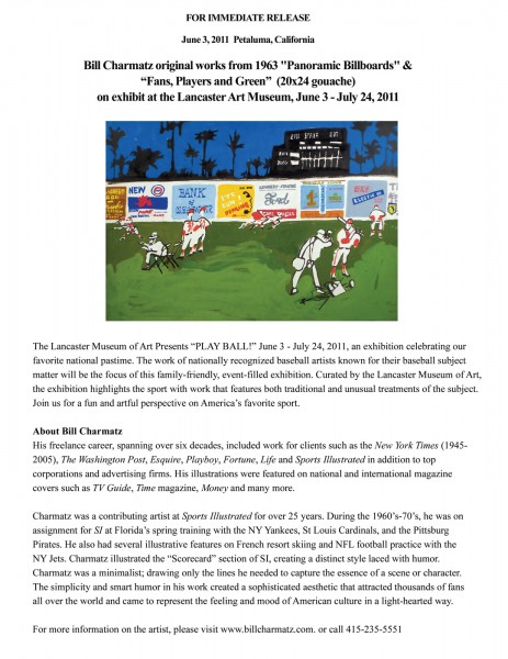
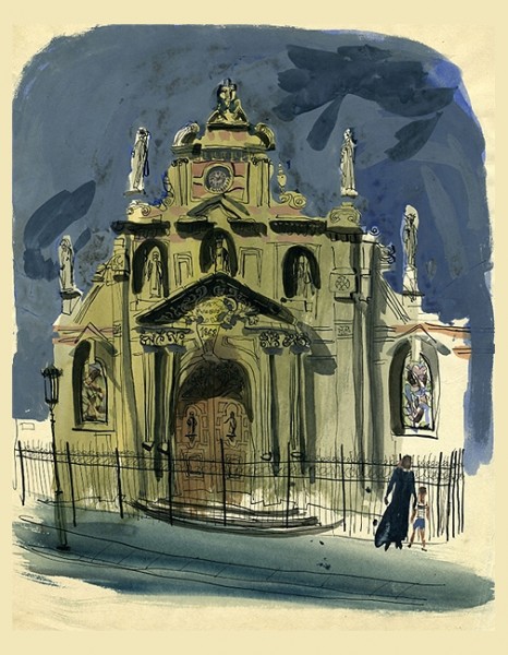
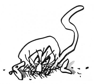
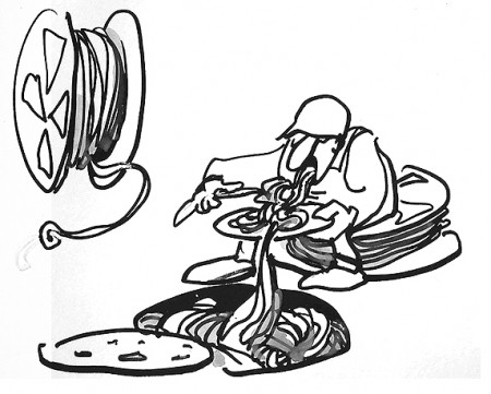
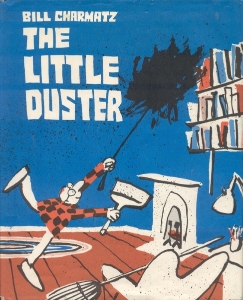
Bill Charmatz

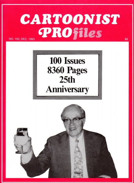
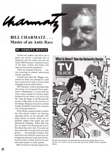
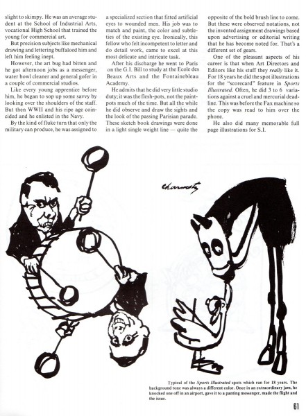
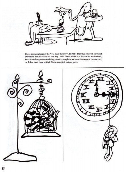
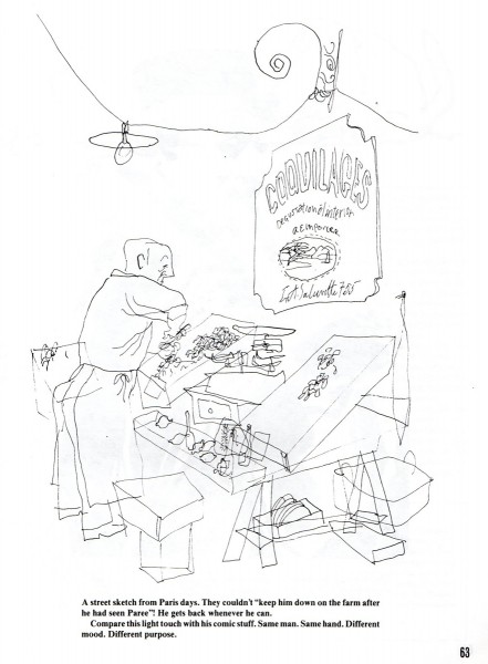
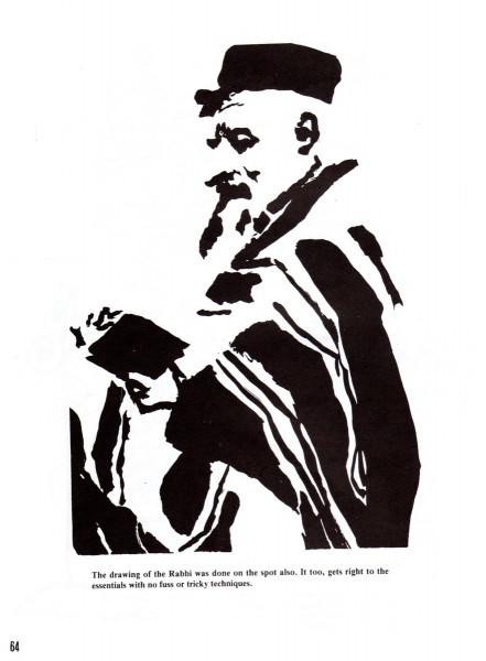
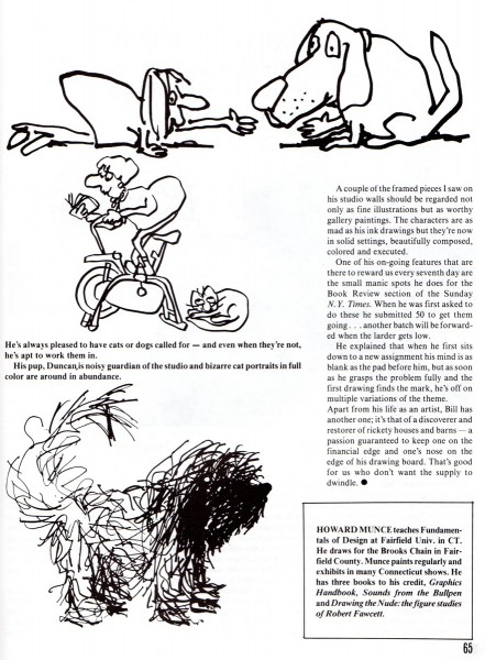
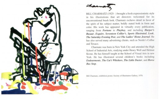
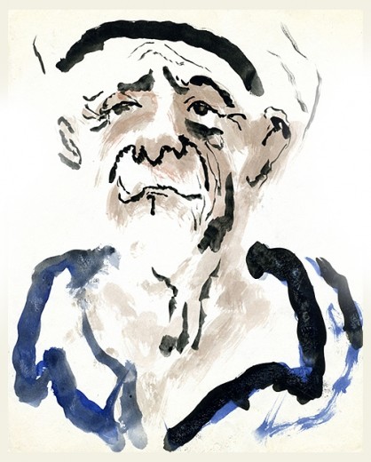
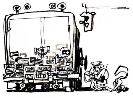
Bill Charmatz is a cartoonist/illustrator whose work has graced many high volume magazines: Playboy, the NYTimes, Harpers and the Saturday Evening Post. Bill Peckmann sent a number of pieces from Charmatz as wwell as an article in Cartoonist Profiles about him, and I’m glad to post them. Here’s Bill:


Here is Bill gracing the pages of CARTOONIST PROfiles No. 100, Dec. 1993.
My only complaint about the wonderful article, is that it is way too short,
with not enough illo’s!

1

2

3

4

5

6

When Walt Reed’s exceptional book, “The Illustrator In America” came out in 2000,
I was delighted to see that Bill Charmatz made the honor rolls of the book,
couldn’t happen to a more deserving talent!


Here’s Bill’s listing.


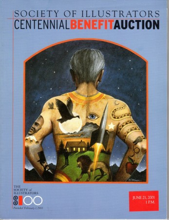
The next 3 illustrations are from a
2001 Society of Illustrators auction catalog.


The following illustrations came from Bill Charmatz‘ web site.

1

2
French Church
In his early years Bill did some personal paintings in France.

3

4
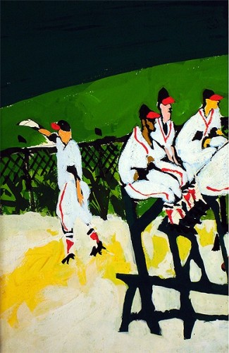
He’s illustrated for Sports Illustrated.

5
No Perching – The NY Times Book Review

6
Cat Chews on Fish – NY Times Book Review

7
Construction Worker Eats Lunch – NY Times Book Review

8
One of a number of children’s books he’s written and illustrated.

There’s a lot of art on view at Bill Charmatz‘ website. I encourage you to visit it.

Animation &Animation Artifacts &Disney 25 Jan 2012 07:42 am

Roger Sc 45 – part 1

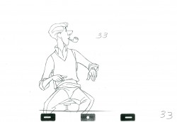
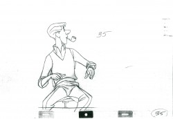
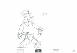
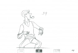
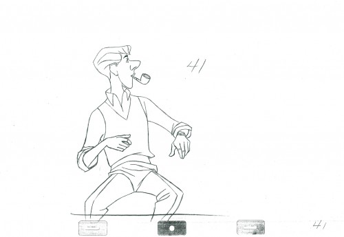
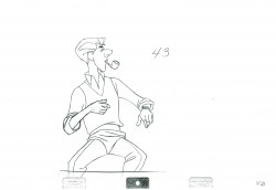
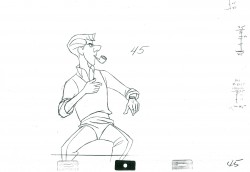
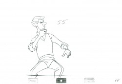
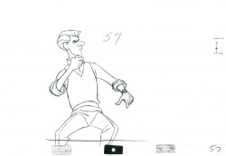
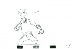
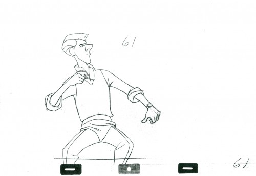
- Did I ever tell you that I love 101 Dalmatians? This film hit me hard at just the right time in my life; I was susceptible. Here was a new way of animating humans, almost a caricature but not quite. Those opening scenes of Roger playing the piano and Pongo looking out the window in search of two mates (one for him; one for Roger) are just first rate.

Milt Kahl did Roger, the human, and I have four scenes all used within the first fifteen minutes. They’re good. This is the first of them, Sequence 1 Scene 45. He’s turned to look at the clock, yawns and checks his watch. We’ll take it up to the yawn today. The animation is all on twos. The assistants were told to leave the line a bit rough, so some of Milt’s scratches were left to be xeroxed onto the cels.

1

5

9

11

15

19

21

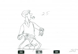
25

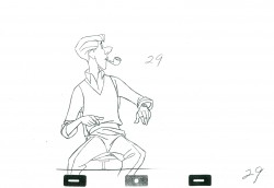
29

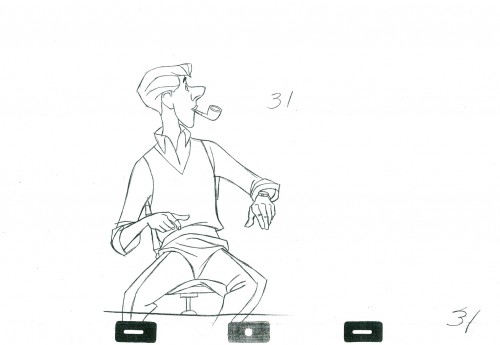
31

35

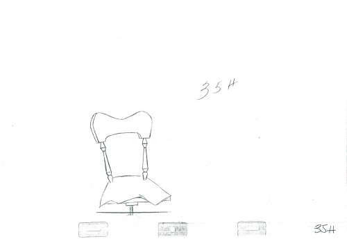
35H
The chair pops to its own level behind Roger.

39

41

45

49

51

55

59

61

65

69

71

75

79

81

85

89

93

95

______________________

The following QT incorporates all the drawings from this post
All posts will be combined in the final piece.

All drawings were exposed on twos as indicated by the numbers.

The registration is a bit loose. Sorry but, these are
copies of copies and there’s some shrinkage.


More of the scene will come next week.

.
For more on 101 Dalmatians check out the animator drafts on Hans Perk‘s great and resourceful site, A Film LA. Hans also noted, in the comments section below, that he had posted Bill Peet’s story treatment for the film several years ago. See it here.
For a look at the art direction of the film including some beautiful reconstructions of the BGs as well as some of the BG layouts go to Hans Bacher‘s great site One1More2Time3.
Andreas Deja has one of the more extraordinary blogs to visit. He just posted some beautiful drawings by some of the key animators on 101 Dalmatians as they set about to find the characters. See them here.

« Previous PageNext Page »

eXTReMe Tracker
click for free hit counter

hit counter