Commentary &Photos &Steve Fisher 22 Apr 2012 06:30 am

Sundayphoto Mailboxes – recap

- I handed a “Forward-to-the-new-address-card” to the Post Office and knew it would take weeks to get my mail. Well, surprise! Surprise! It took exactly one day. And it keeps on coming. Who says you can’t trust the post office?

In honor of the noble institution, I’ve decided to repost this 2009 group of pictures of mailboxes. It seems a bit fitting.
Mailboxes, both brown and and blue, they exist in droves holding onto the snailmail still out there. One might wonder how many more postage rate increases it can withstand before we depend allmost exclusively on internet communication.

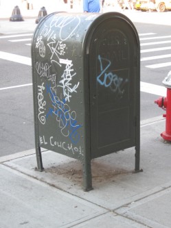
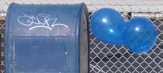
These days many of the boxes have been decorated with graffiti of different sorts. All of it seems to be some kinda message to the world.
Nice and clean with dozens of coats of paint

Given that it’s probably a federal offense, one would expect such graffiti to be limited. But I’d say that that’s not the case.

I can remember walking down the street with John Leguizamo and his director David Bar Katz as he was about to open in Freak on Broadway. Al around town his face was stenciled on sidewalks and walls promoting the show.

We passed a mailbox and John saw his image/ad. He got upset. He knew that it was a federal offense to mark up the mailbox and he asked his director to see if he could look into stopping such practices. The show opened and I suspect there was no such inquisition from the feds.


(Click any image you want to enlarge.)


One graffiti writer wanted the world to know that “Papa Loves Baby”

. . . so scrawled it up and down Houston St. in the Village – both sides of the street – on all of the mailboxes.

It certainly got the point across to “Baby”.


.

“Faro” is someone who’s been out there for quite awhile.
(S)he doesn’t just cover mailboxes. Subway walls and posters
are also fair game for this scribbler.


They can get pretty gritty.


or some get newly painted with just a touch of pink.


Sometimes they come in pairs – brown or blue.


or threes. (newly painted)


Unfortunately, clean up painting things don’t get much better. Splotchy coats
of paint that don’t match the undercoat don’t always improve things.
It’s exhausting when you think about it.


These last two photos are by Steve Fisher,
a better eye for the humorous than I.

Commentary 21 Apr 2012 06:46 am

Other Things

Indiegogo POE

- Our new Indiegogo campaign for the Poe Project will be up and running this coming week. (Just when you thought you were done with that!) Of course we’ll be shouting the news as loud as we can, so you’ll know when. I just want to add a video of me talking about the film, and it’ll be ready for prime time.

_______________________

The Fleischers


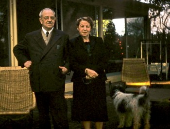
Max and Essie Fleischer at
Dick Fleischer’s house in LA, 1956.
on the Fleischer Studios site.

- There is a nice collection of photographs on display at the Fleischer Family website. For the most part, these are photos that haven’t been seen, predominantly of Max, that will certainly be of interest to any Fleischer fan.

However if it’s artwork you want to see, I suggest you look at Ryan & Stephanie Englade‘s Fleischer site. He has quite a collect of Fleischer art on display (though there are plenty of rare and precious Disney pieces toward the end of the scroll.)


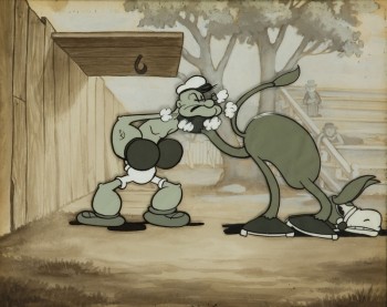
Here’s an original Popeye B&W cel from the Englade site.
You can see that the Bg is done in sepias while the
Ink & Pt of the cel is done in cold greys.
It all comes out B&W&grey on film.

_______________________


Funk & Wagnell

- After I’d completed work on Raggedy Ann & Andy, I found myself an “Assistant Director” on R.O. Blechman’s hour PBS show, Simple Gifts. This was a compilation of six short pieces about Christmas. Each had a different designer: Maurice Sendak, Seymour Chwast, Charles B. Slackman, James McMullan, Blechman and Fontaine Fox’s Toonerville Trolley.

However, before Bob could raise the money for the show, I was pulled into working on a stack of commercials where I acted more as producer and all around artist (inker, painter, assistant animator, animator, movieola operator, etc.) Here’s a commercial from that period that I did with think it was 1978(?). I just found it on YouTube. (It’s a pretty dark version of the spot.) Ed Smith animated the Van Gogh & Modigliani and Tissa David did Michelangelo & Picasso. Sara Calogero did the painting and I did all the rest of the production art. I also represented the studio on the live action to make sure it would work with the animation.


_______________________


GIRAF Animation Festival

I received the request to post this piece for the Giraf Animation Festival in Calgary, Canada. Why not? Often, it’s a festival like this that can find some of the gems that otherwise wouldn’t be seen.

    GIRAF Animation Festival

    CALL FOR SUBMISSIONS

    Deadline: August 1, 2012

    The 8th annual GIRAF (or the Giant Incandescent Resonating Animation Festival) is looking for Animation submissions, in all styles, genres, lengths, and mediums. Our programs are a strong eclectic mix of animation, representing the best of the medium from Claymation to CG.
    We focus on presenting indie, experimental, and underground animations that push boundaries through new techniques, unique visions, and stimulating subject matter. Our 2011 program featured visiting artist David O’Reilly, and 3 of the 5 Academy Award nominees for Best Short Animation!

    We DO NOT CHARGE A SUBMISSION FEE, and encourage short and feature length local, national, international, and student submissions.

    Animators can submit online at: www.giraffest.ca

_______________________

Maureen Selwood

- On Monday, April 30, 2012 at 8:30 PM, Beyond Enchantment: The Imaginary Voyages of Maureen Selwood be screened at The Roy and Edna Disney/CalArts Theater (Redcat), 631 West 2nd Street, LA.

From the program:

    “Selwood grapples with notions of dislocation, grief and loss…The result is indeed akin to poetry, in its piercing sadness that is at once palpable and ephemeral.” Holly Willis

    Maureen Selwood’s animations take us into the strange, beautiful, and sometimes terrifying lands of the mind. For her first solo show at REDCAT, she presents a selection of more recent pieces including the premiere of A Modern Convenience (2012), in which the machine becomes a substitute for intimacy against the backdrop of Niagara Falls. The piece will be accompanied by live performance. In Hail Mary (1998) a centuries old prayer morphs into a humorous black and white memoir. The expressively rendered Drawing Lessons (2006) sublimates a meditation on drawing and nature. I Started Early (2007), based on a poem by Emily Dickinson, explores sexual awakening. As You Desire Me (2009), the single-channel version of an installation inspired by her residence at the American Academy in Rome at the beginning of the Iraq War, confronts sorrow and catastrophe. The program concludes with the hallucinogenic trip of How Much Better if Plymouth Rock Had Landed on the Pilgrims (2009), and Mistaken Identity (2001), Selwood’s alluring deconstruction of 1955 noir classic Kiss Me Deadly.

A looped silent version of Rules of the Universe (2009, QT Digital) will be projected on the wall over the exit to the parking lot.

Maureen Selwood will present, in person, a selection of recent films and works with live performance.

The premiere of A Modern Convenience with a live performance by Archie Carey and Odeya Nini.

Mistaken Identity will also be performed with a live performance by Clarissa Romano and The Cathlene Pineda Trio.

_______________________

Consuming Spirits

As promised, I’m reminding you that Chris Sullivan’s Independenty produced feature Consuming Spirits is premiering at the Tribeca Film Festival this week.

The times for the screenings are:
_____Mon 4/23 6:00PM Clearview Cinemas Chelsea 7
_____Tue 4/24 4:00PM AMC Loews Village 7 – 2
_____Wed 4/25 7:00PM Clearview Cinemas Chelsea 5

_______________________

Gertrude’s Follies

- Finally, Tom Hachtman‘s great comic strip is back on sale. Gertrude’s Follies has been reprinted and is once again on sale at Amazon and Barnes and Noble. Buy it, you won’t be disappointed if you love great comic strips.

Bill Peckmann &Illustration 20 Apr 2012 04:14 am

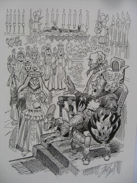
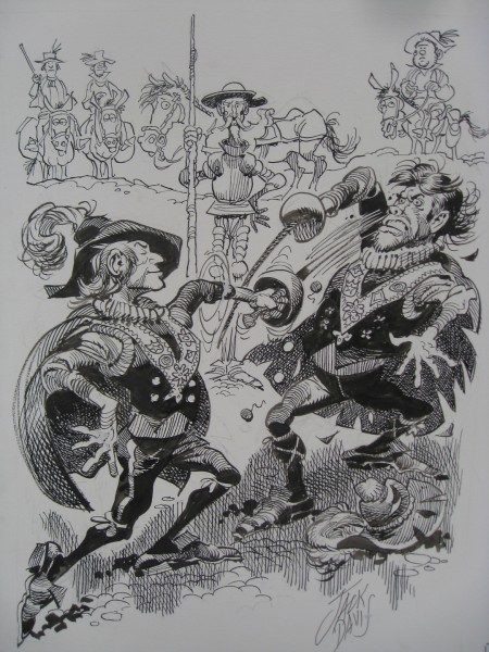
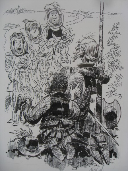
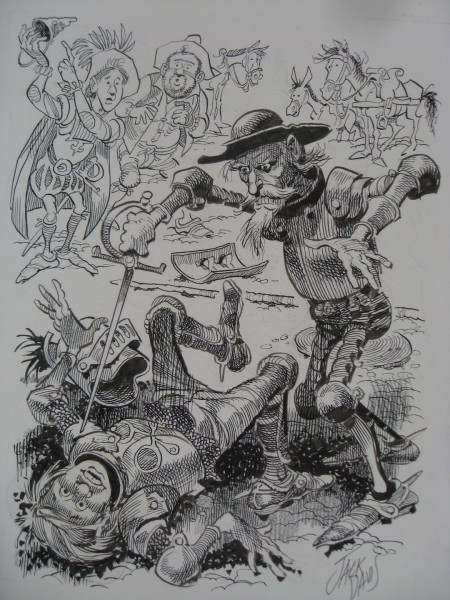
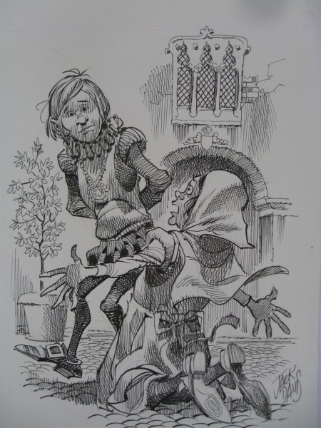
Jack Davis’ Don Quixote – pt.2

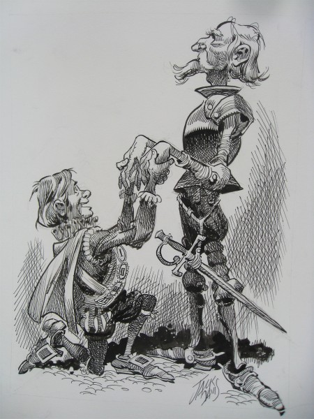
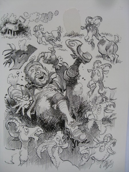
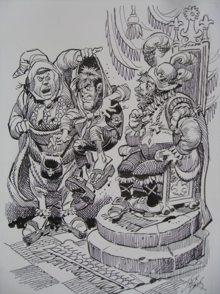
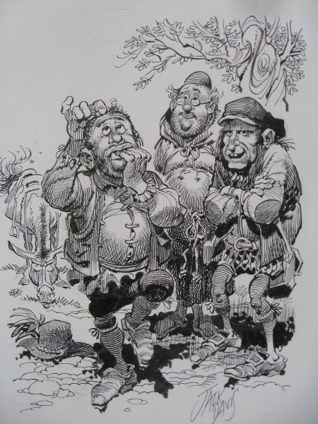
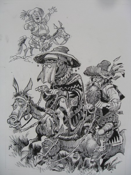
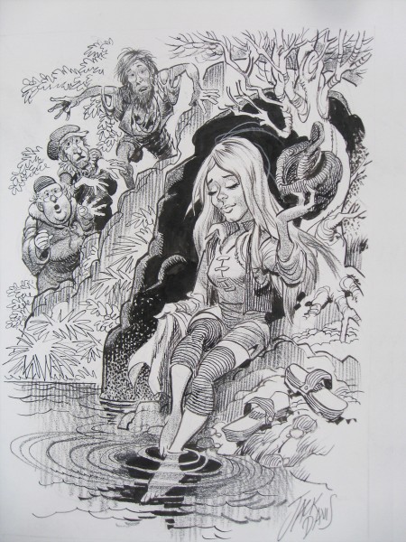
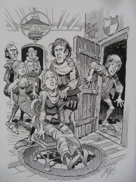
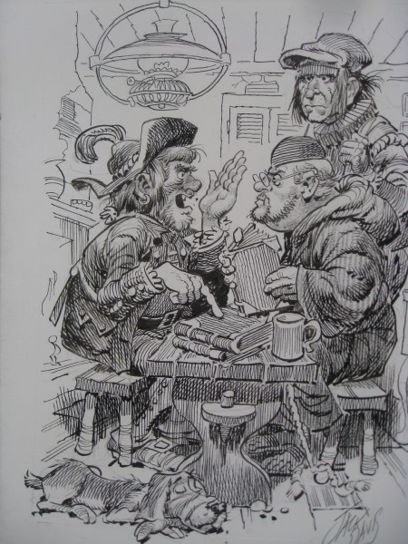
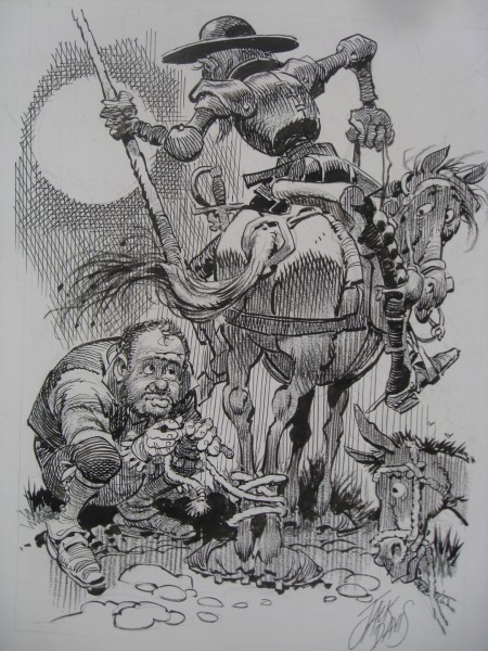
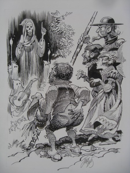
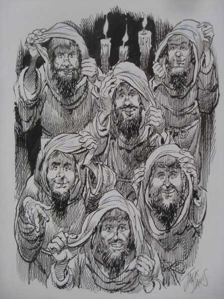
- Last week I posted some pen and ink illlustrations of Don Quixote by Jack Davis. These are not part of the book he has on the market, The Misadventures of Don Quixote. Some of them are brilliant, particularly those that feature Quixote and Sancho Panza. However, other characters sometimes look like TV Guide illustrations of other 70s celebrities. (#15 for exmple) All of these, of course, come from Bill Peckmann, who was kind enough to send them.

1

2

3

4

5

6

7

8

9

10

11

12

13

14

15

16

17

18

19

20

Animation &Animation Artifacts &Bill Peckmann &Disney &Illustration &Rowland B. Wilson 19 Apr 2012 07:18 am

Rowland Wilson Scrapbooks

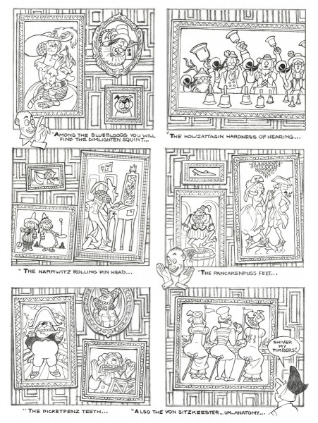
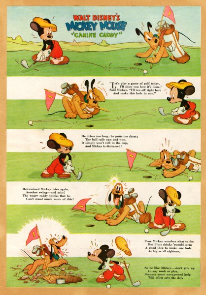
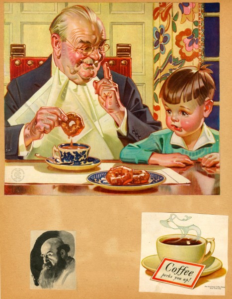
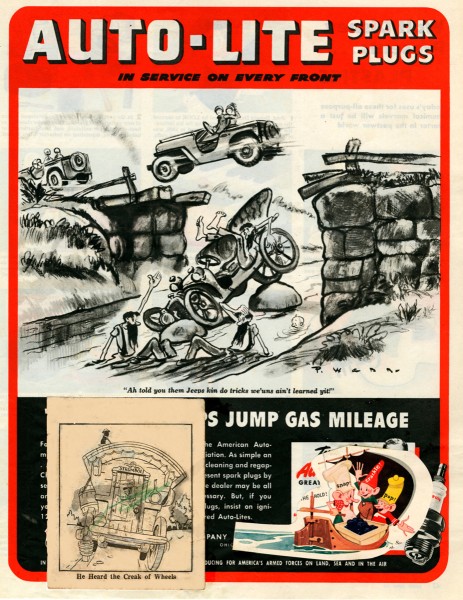
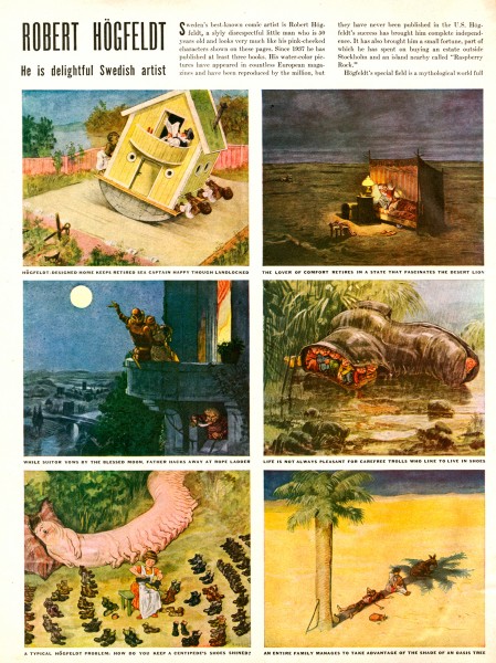
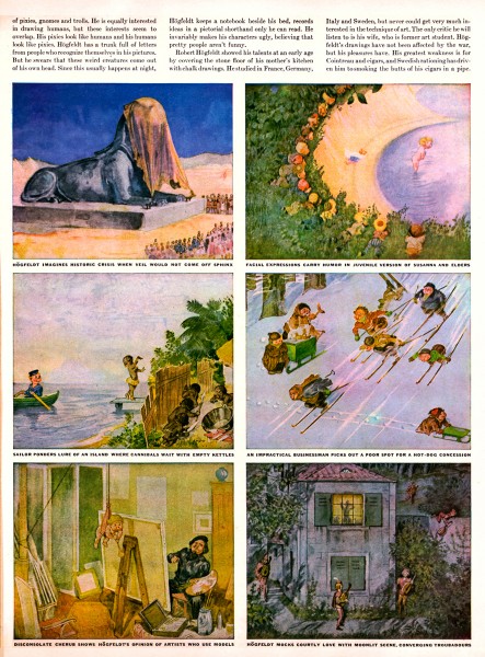
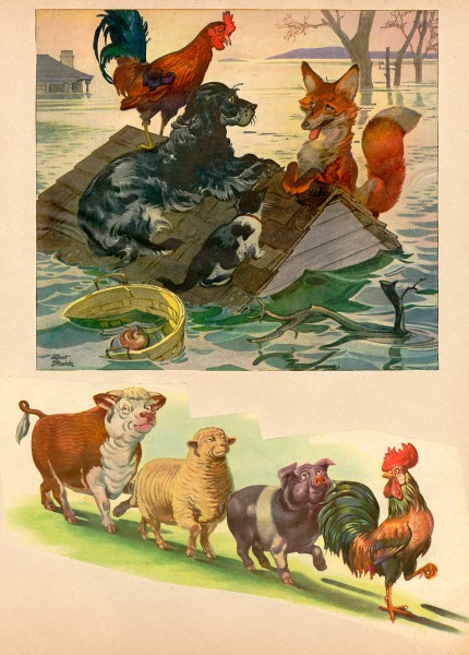
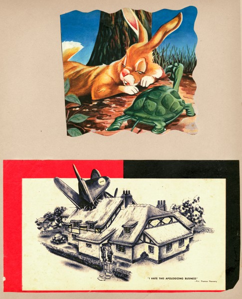
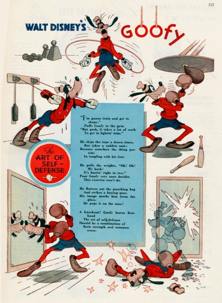
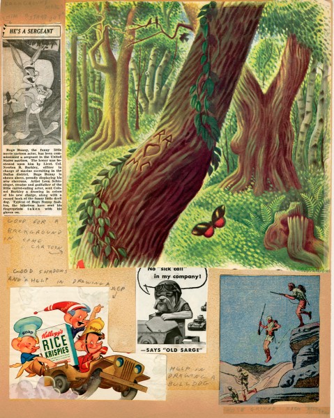
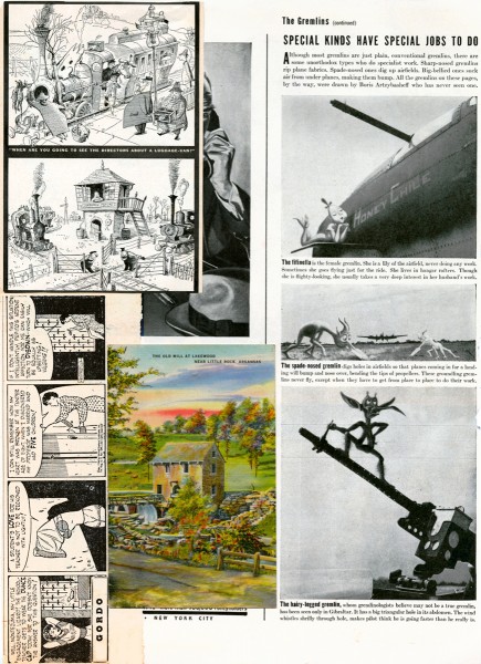
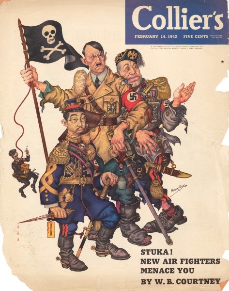
- Suzanne Wilson sent me some pages from the private scrapbook that Rowland B. Wilson kept for inspiration and reference. Seeing these pages, I was a bit surprised at what he collected. When I was a kid, I kept a scrapbook of everything – and I do mean everything – that was printed about animation. Remember, there were few books about animation back in the 60s; I had to hold onto everything available. I found looking at Rowland Wilson’s scrapbook not too different from my own, except that he kept material about the “Golden Years”. It gave me a smile.

Here are some of Suzanne’s comments:

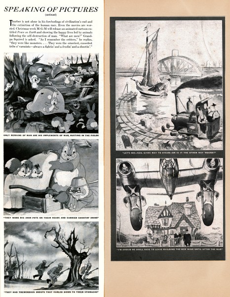
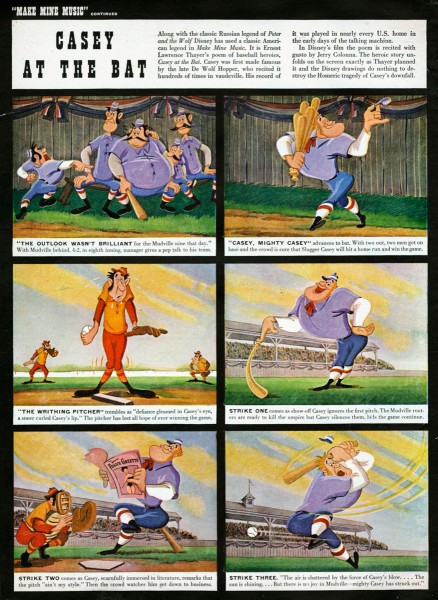
    Rowland B. Wilson, ever the contrarian, once said when speaking of deciding one’s future “Why should you expect an eight-year-old boy to decide what a grown man should do?” He may have been a bit older than that (dates of the periodicals suggest age 12 through 15) when he assembled scrapbooks of his favorite subjects and illustrations from Disney, Life, Collier’s and Look magazines and the Dallas newspapers, but one look shows the premonition of a later artistic sensibility. He zeroed in on what exactly appealed to him visually and subjectively and never deviated. The influences were taken to heart and incorporated into a personal recognizable style.

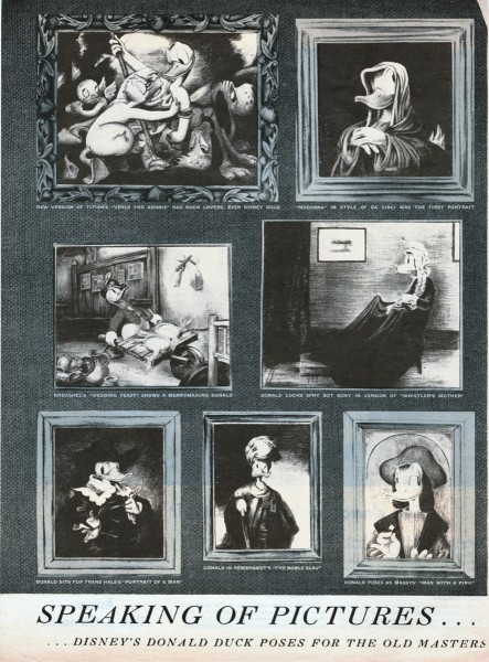
    For example, “Speaking of Pictures”, a Disney spoof on the Old Masters (Image 15) clipped from Life Magazine in 1945 can be compared to The Sneezenfitz Gallery, drawn in 2005 for the cartoon novel “Cloak and Pistol”. One only has to look at “Casey at the Bat” (Image 16 to see a gestalt that was to emerge in the definitive baseball players in TV Guide. (See Rowland B. Wilson TV Guide Originals-1, posted February 16th.)

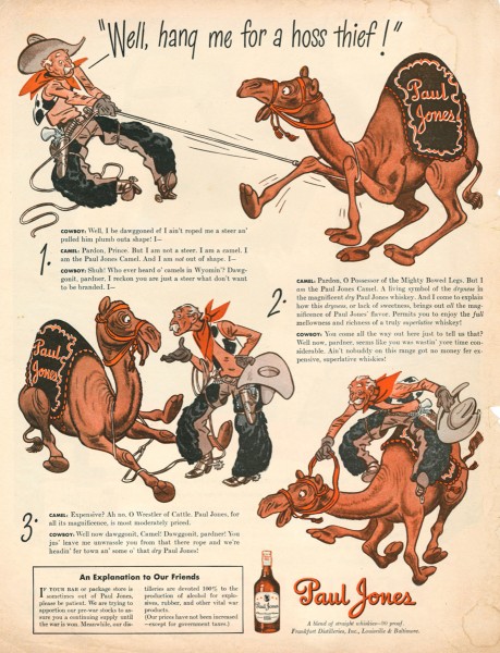
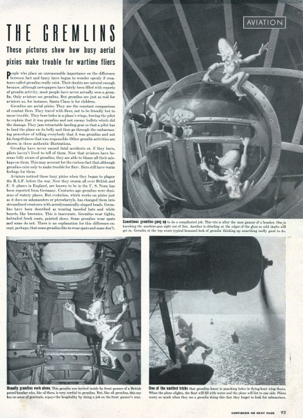
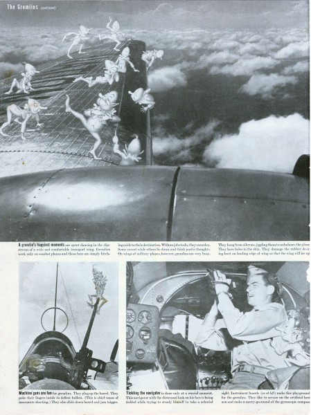
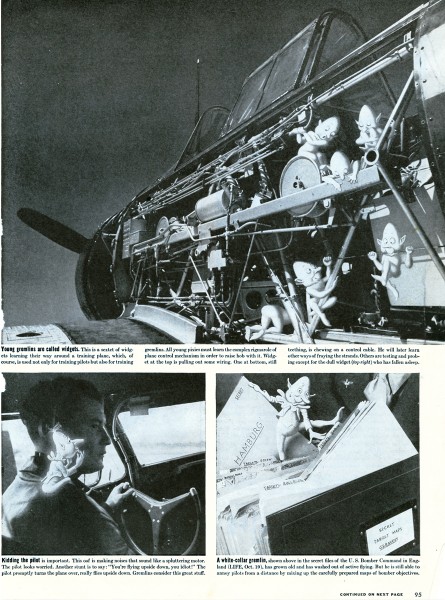
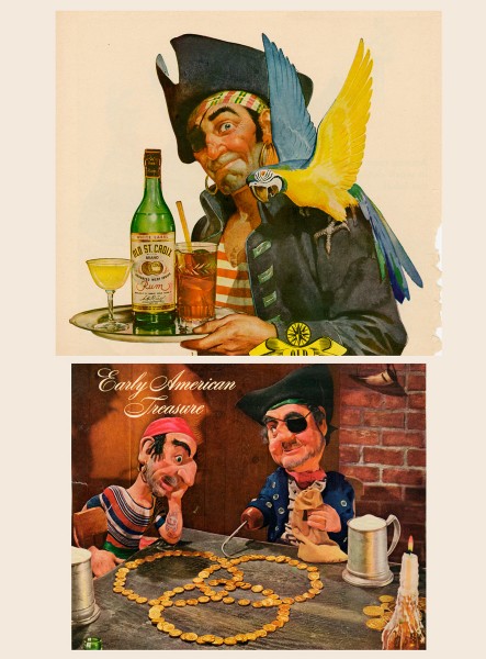
    The clippings can also be seen as interesting ephemera. Those from wartime show aircraft insignia designed by Disney, aviation gremlins and advertising of the time.

Here are some comments from Bill Peckmann, who requested Suzanne send me the material:

    I have to admit it’s been over 35 years since I last laid eyes on them when Rowland brought them in to PK&A for show and tell. He had just returned from a trip to his hometown of Dallas, Texas and couldn’t wait to show us what he brought back with him. This was just about the time in the 70′s when Disney was starting to come back into the good graces of the art world again. (Think Lincoln Center.) I remembered there was Disney and other great stuff in there, but couldn’t quite remember exactly what. Seeing the collection now after all these years, it feels like I’m looking at a precursor to the SPLOG. One can see now what a terrific eye and good taste Rowland had as a young teenager, and it’s also neat to see that animation was in his blood at such an early age, he just got a little sidetracked with very successful advertising, cartooning and illustrating careers before he went back to the first love of his life, animation. Lucky us!

1

2

3

4

5a

5b

6

7

8

9

10

11

12a

12b

12c

12d

13

14

15

16

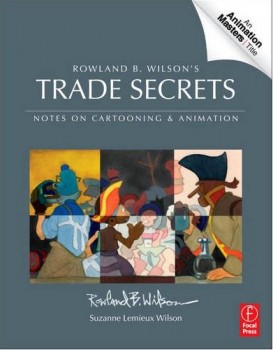
Suzanne Wilson is about to have a new book on the market: Rowland B. Wilson’s Trade Secrets: Notes for Cartooning and Animation.

It’s obvious that this book is directly related to this post. Rowland Wilson obviously kept journals in which he wrote about illustration and animation, and the information must certainly be very informative to students; some of these journals are published here. Presumably pages of the scrapbook may have made the book.

The book seems to offer quite a bit of attention to Mr. Wilson’s animation art, just as it does his brilliant illustration and cartooning. I look forward to getting my copy.

Bill Peckmann &Books &Illustration &Rowland B. Wilson 18 Apr 2012 06:33 am

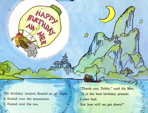
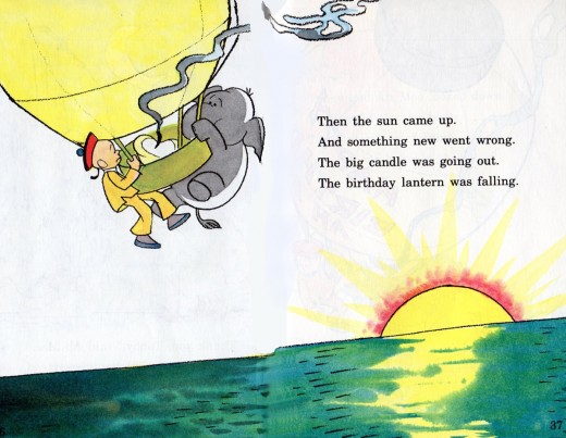
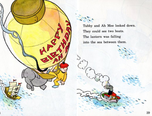
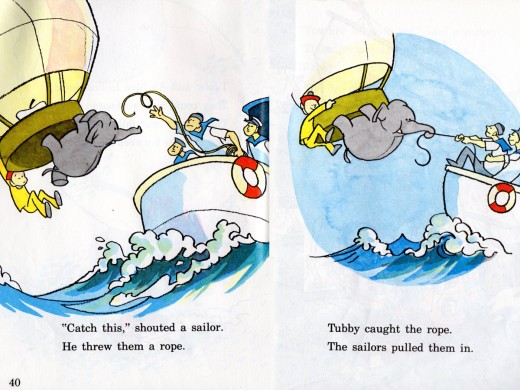
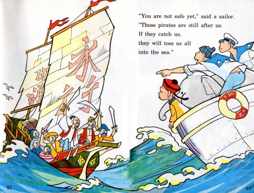
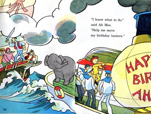
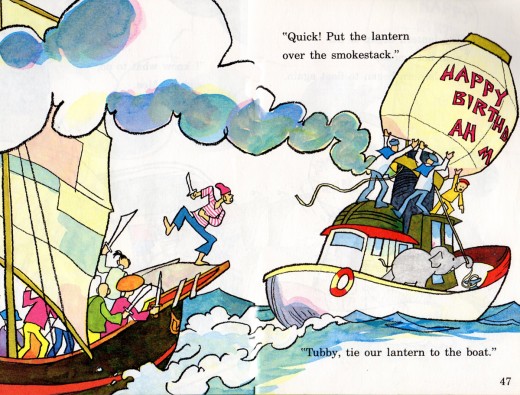
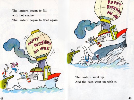
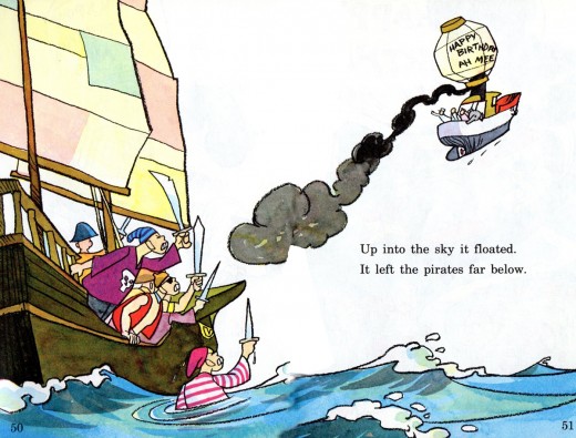
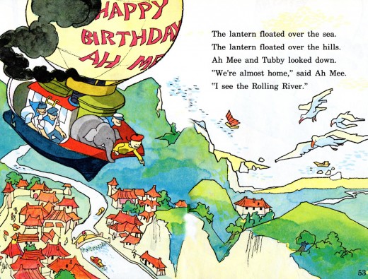
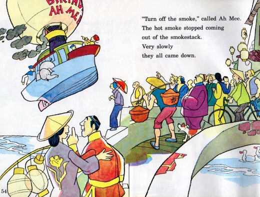
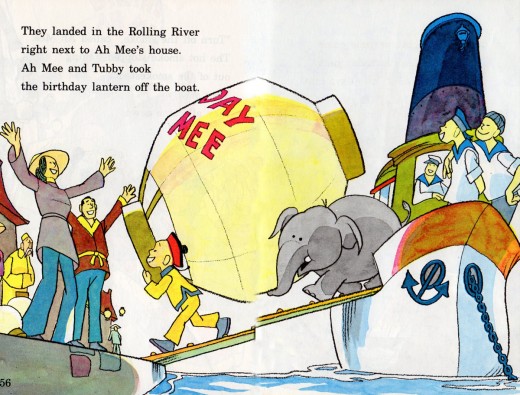
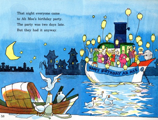
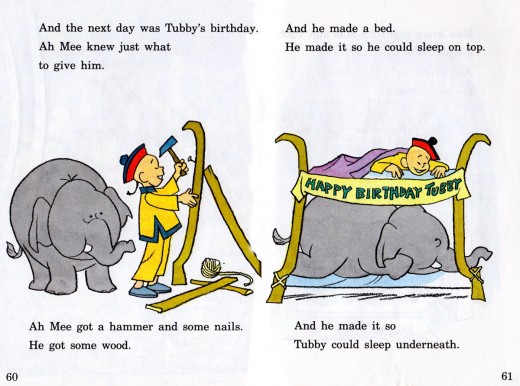
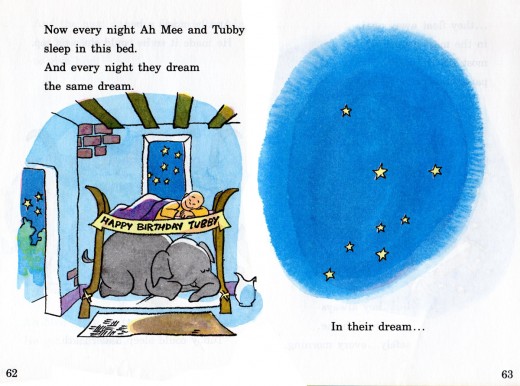
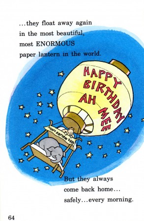
Tubby and the Lantern – pt. 2

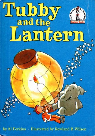
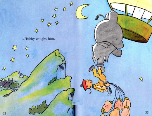
- Here’s the conclusion of Tubby and the Lantern, the children’s book illustrated by Rowland B. Wilson and written by Al Perkins. Bill Peckmann has kindly sent scans of the double paged art of the book. We pick up where we left off . . .


The book’s cover

Animation &Animation Artifacts &Disney 17 Apr 2012 05:54 am

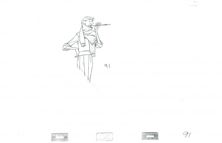
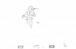
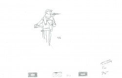
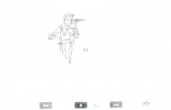
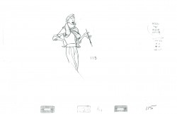
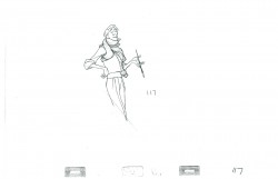
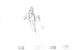
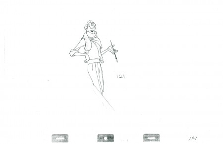
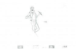
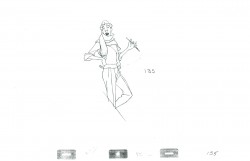
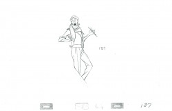
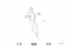
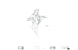
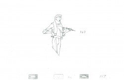
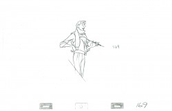
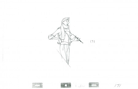
Roger’s Sc.88 – pt.2

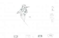
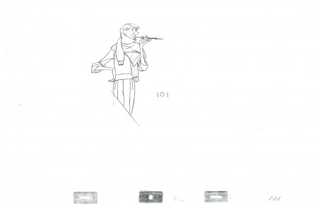
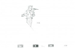
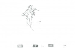
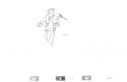
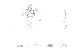
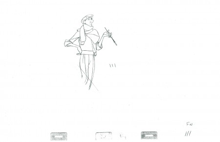
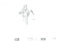
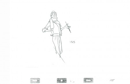
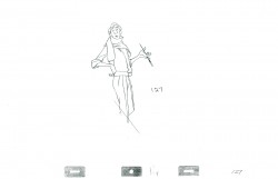
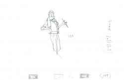
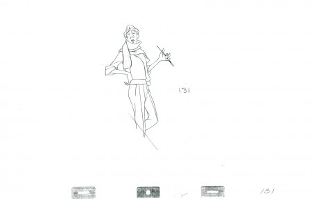
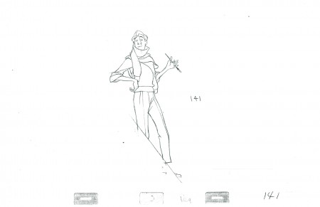
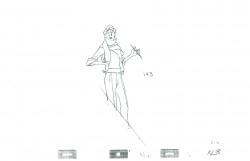
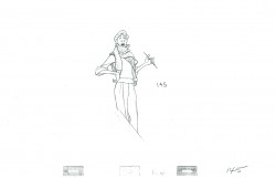
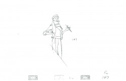
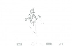
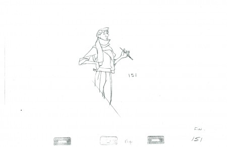
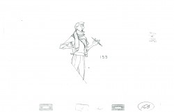
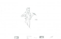
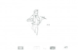
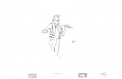
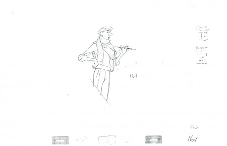
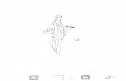
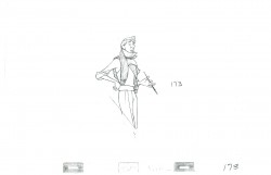
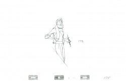
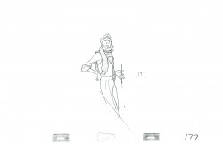
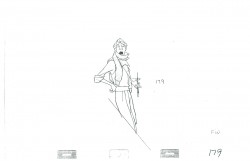
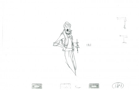
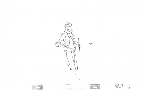
- We continue with 101 Dalmatians and Milt Kahl‘s artwork for Scene 88. This is Roger’s rendition of his song, “Cruella de Vil.” In the first half, we saw Roger flamboyantly thorw the arm of the sweater about his neck. Here, he leisurely, musically, moves down the stairs. The scene is a beauty. This second half makes the scene. We start with the final drawing from part one.

91

101

111

121

125

131

141

151

161

171

181

183

______________________

The following QT includes all the drawings posted above.

There’s a bit of distortion in the Xerox copies
so the registration goes in and out.

[ Javascript required to view QuickTime movie, please turn it on and refresh this page ]

Click on the right side of the lower bar to watch it one frame at a time.

commercial animation &Layout & Design &UPA 16 Apr 2012 04:59 am

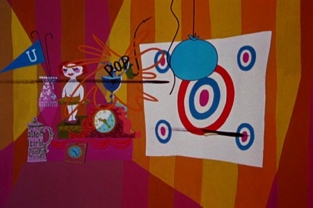
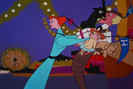
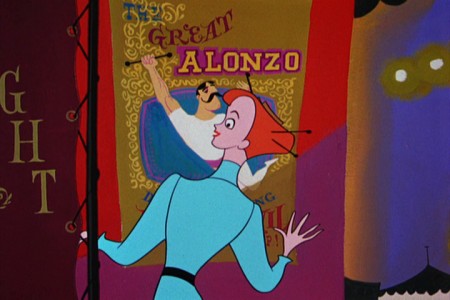
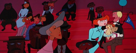
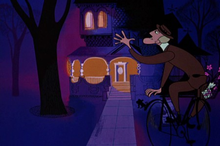
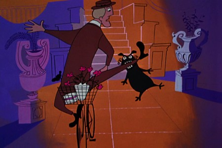
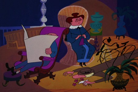
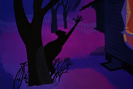
The Man on the Flying Trapeze – pt.1

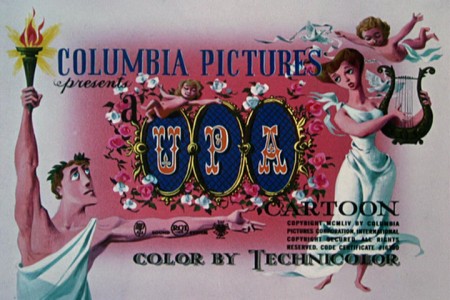
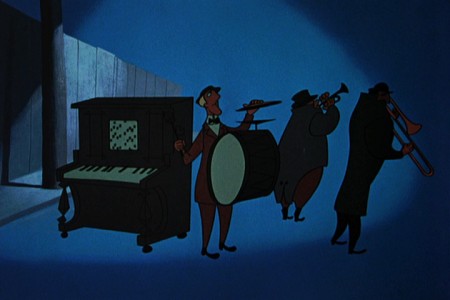
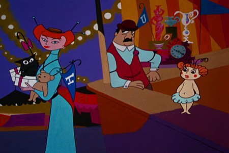
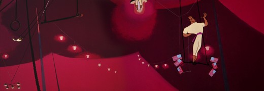
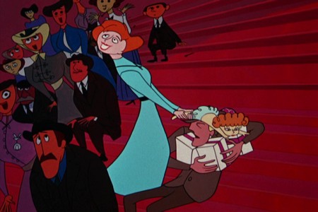
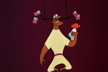
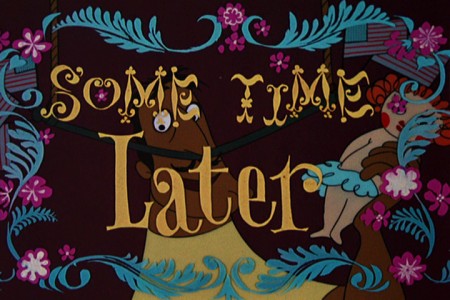
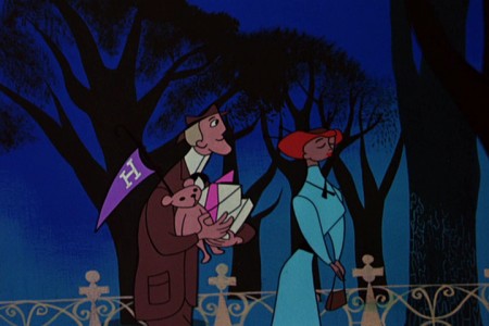
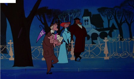
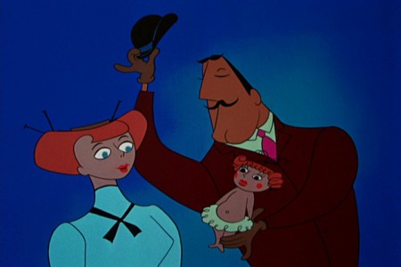
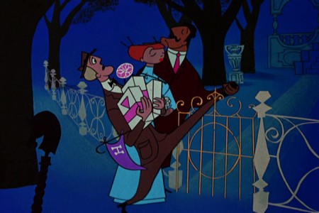
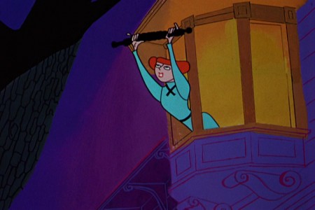
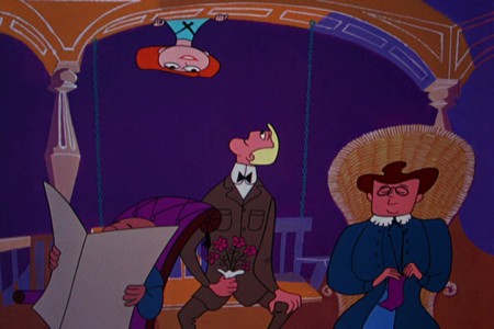
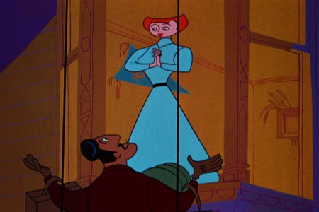
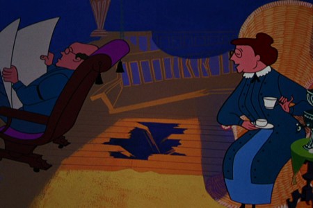
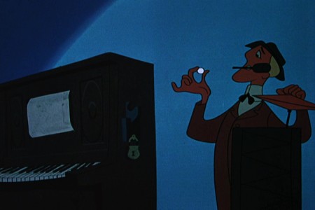
- The new UPA dvd 3-set comes in three separate categories: there are the Great films, the Good films, and the Bad films. Definitely, one of the Bad films is The Man on the Flying Trapeze. It seems to want to be either The Dover Boys or Rooty Toot Toot, and it’s most certainly neither. The film is just poorly plotted. There are some interesting transitions and some interesting set pieces. I give credit for that to the designer.

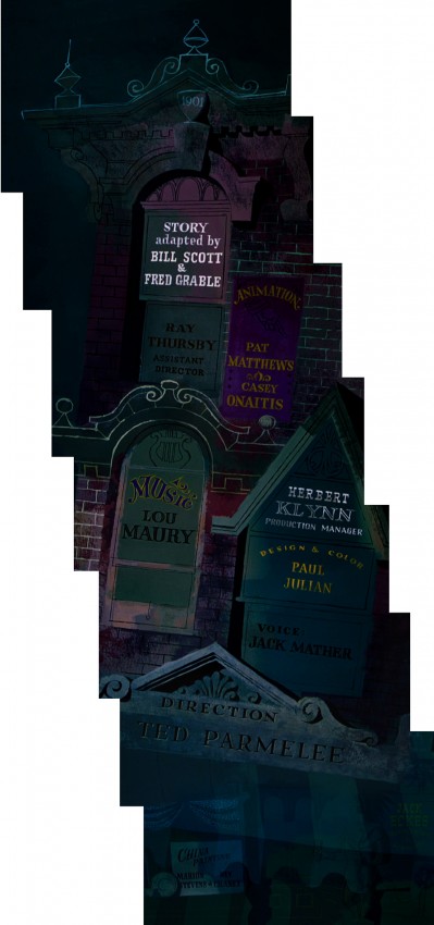
The designer is Paul Julian who also did the backgrounds, and his work, as far as I’m concerned, is brilliant. I decided to pull frame grabs of this film to highlight the beautiful design and background work of Julian. It’s taken a very long time, and I’ll have to break this post into two. I just can’t get it all done in one day. But I hope you can see the excellence of Julian’s work.

1
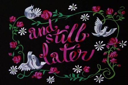
Just a brlliant title card.

2
A slow pan down over the credits.


Left to right stoppng on the main title.
Then continuing into the scene.

4

5
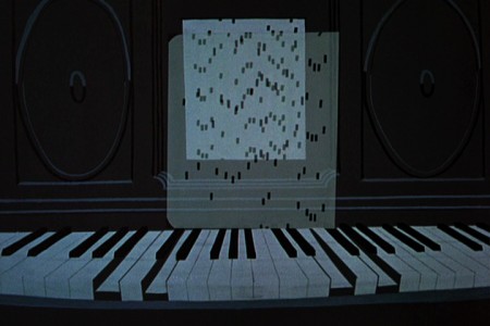
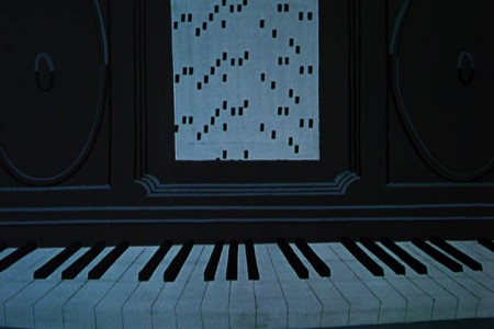
The player piano sets the mood for the entire film.
A ragtime score, piano leading, with little consequential dialogue.

6

7
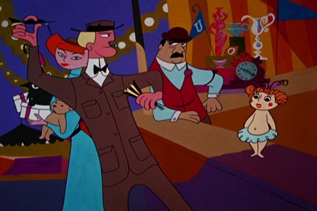
The guy just fades on, in place, ready to throw the dart.

8

9

10


Pan left to right with the Trapeze Artist.


Slow pan left to right with the audience.


Again pan left to right with the Trapeze Artist.

14

15

16

17
Beautiful trees remind me of the scene in The Dover Boys
where the villain pulls the heroine away from the tree.

18

19

20

21


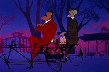
We pan with the bicyclist.

23
The man from the trapeze passes our hero . . .

24
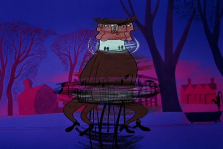
. . . who spins out of control.

25
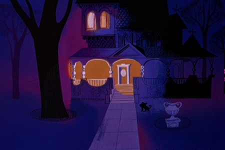
A beautiful Julian house and a great new color scheme
for this section of the film.

26

27

28
Taking advantage of the new colors to . . .

29
. . . separate the interiors from the exteriors.

30

31

32

33

34

35

to be concluded next week.

Photos 15 Apr 2012 04:13 am

Steve Fisher “Manhattan Views”

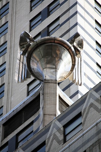
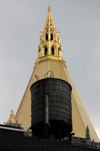
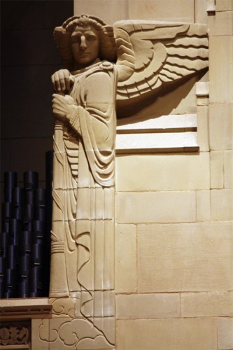
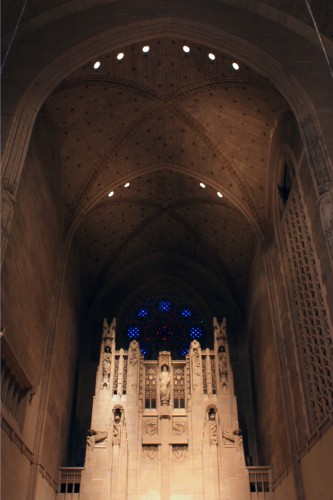
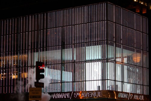
Here are some Manhattan views as photographed by Steve Fisher.

1

2

3
Photos 3-11 are of The Church of the Heavenly Rest.
Steve went there for an illustrated lecture given by David Lowe
on Art Deco in NY, sponsored by the New York Landmarks Conservancy.

4
The Church of the Heavenly Rest and its adjoining Parish House
are in a Gothic Revival style melding into Art Deco.

5

6
The Fifth Avenue façade features sculpture
by the renowned artist Lee Lawrie.

7
The church was built on land purchased by Andrew Carnegie in 1917 . . .

8
. . . to prevent the construction of a tall building on the site
which would have cast a shadow . . .

9
. . . on the adjacent Carnegie mansion and garden.

10
The Indiana limestone clad buildings were constructed
in 1927-29 by Mayers, Murray & Phillip.

11
The interior vaulting is of Guastavino tile.

12

13

14

15

Commentary 14 Apr 2012 08:10 am

Some Things

Iris Beckerman

- For so many years I’ve known Howard and Iris Beckerman as the couple who had their own studio, did a few commercials a year and usually had a personal film in the ASIFA East Festival each year. They always seemed to be doing what I hoped for my future, a world of animation – a world of Independence. In the recent past, Iris disappeared from the pair. She was diagnosed with Alzheimer’s Disease and needed help from a facility. Howard became more of a single at animation events, but he bore the pain of Iris’ illness well. He didn’t let on that there was any challenge in his life.

Iris died last Sunday, April 8th. She will be missed. Our thoughts are with Howard and their family, and all best wishes for them. There’s a wonderful obituary by Bill Lorenzo on the ASIFAEast site.

_________________________
.
More About UPA
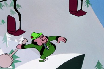
- There have been a couple of good comments on the UPA videos since last week.
Mark Mayerson writes intelligently, as usual, about the bad cartoons on the 3 disc set. There’s a lot to say about them, and Mark cogently puts it all together.
Thad Komorowski also has some smart things to say on his blog. I don’t completely agree with some of his comments, but that’s irrelevant.

I just gave Tissa David a copy of the three disc set, and I’m looking to hear her comments. She probably hasn’t seen such good prints since they were originally screened in theaters. She’s also almost too candid in her thoughts about things she doesn’t like (maybe that’s where I got the bad habit of saying what I think without sparing the hurt.) When I get her comments, I’ll share them.

I hope to soon be doing some frame grab breakdowns of some of the films in the pack. I’ll enjoy studying them that way – especially the bad ones. It’ll be fun studying some of the Paul Julian backgrounds.

_________________________
.
David Levy
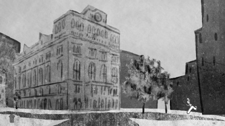
- David Levy sent me an email packed with information. The most immediately important concerns his short film, Turning the Corner, which is playing at the Tribeca Film Festival in NY. It’s part of a program called “Shorts in Competition” and is listed as a “documentary.” The film, if you haven’t seen it is about David’s father’s difficulty and path to get into Cooper U-nion School of Art. The film has a unique style combined with the typical looseness that is part of his approach. It’s a good film.

The times for the screenings are:
_____Fri 4/20 6:00PM AMC Loews Village 7 – 1
_____Sat 4/21 11:59PM AMC Loews Village 7 – 1
_____Mon 4/23 2:30PM AMC Loews Village 7 – 3
_____Sun 4/29 7:30PM Tribeca Cinemas Theater

Naturally, the film has its own Facebook page.

David also shared some personal information. I don’t think he’d mind my sharing the good news:

    I think I’m done for blogging for the time being. I feel like I’ve said everything I wanted to and it’s not giving me pleasure to keep up with it anymore.

    After five years and a good run, I closed out my home studio recently because I took an exec job at Disney. I’m the animation manager for their apps and ebooks. It’s really been a great opportunity, and forces me to stay relevant in producing animation for the newest media devices and platforms. Floyd Norman just contacted our group to rave about our Jungle Book app. That made us all really proud. I’m gonna have lots of travel to California, but my main job is based in White Plains. The long commute made me have to give up freelancing and teaching, but it feels like the right time to do so.

David, who was a smart, affable and organized President of ASIFA East for quite some time, has the good will and interest of all of us in the animation community on the East Coast. I’m sure we all wish him the best of luck in his transition to Disney and the “E” world.

_________________________
.
Consuming Spirits
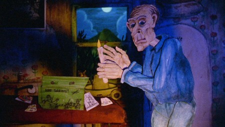
This also gives me an opportunity of stating, once again, the Chicago filmmaker Chris Sullivan has his Independenty produced feature Consuming Spirits premiering at the Tribeca Film Festival.

The Festival catalogue states:

    Nearly 15 years in the making, Chris Sullivan’s Consuming Spirits is a meticulously constructed tour de force of experimental animation. . . The pacing of Consuming Spirits unfolds in a slow, deliberate fashion, akin to the work of such independent filmmakers as Dennis Potter, Terence Davies, Robert Altman, and John Cassavetes. Like these live-action filmmakers, every frame of Sullivan’s animation film is crafted with attention to intricate detail. The accumulation of these images builds to a great atmospheric effect, achieved through an adroit combination of inventive set design, ever-shifting visual perspectives, fluid camera movements, a vivid color palette, and a haunting music track. Sullivan succeeds in creating, with great artistry, a hermetic, self-contained world emanating from his own unique and vivid imagination.

“Dennis Potter, Terence Davies, Robert Altman, and John Cassavetes” That’s a specific breed of filmmaker they’re comparing him to. This film should be good. I’ve seen about a half hour of it and enjoyed what I saw quite a bit.

The times for the screenings are:
_____Mon 4/23 6:00PM Clearview Cinemas Chelsea 7
_____Tue 4/24 4:00PM AMC Loews Village 7 – 2
_____Wed 4/25 7:00PM Clearview Cinemas Chelsea 5

_________________________

Gene Deitch and Crockett Johnson
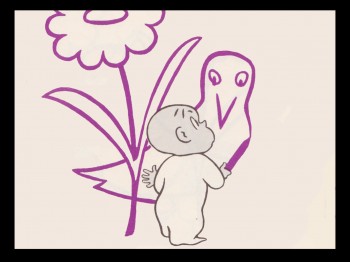
- I’ve grown to love Gene Deitch‘s weekly posts to his website. They’re all stories focussing on a particular artist or person he worked with usually reporting the making of some film or project. Many of them are my heroes like Jiri Trnka and John Hubley.

This week he talks about working with Crockett Johnson on Harold and the Purple Crayon. I’ve been a fan of Johnson’s work since I was a child. I’d already animated The Carrot Seed for HBO years ago when I’d pitched adapting Barnaby as a series. It just so happens that Sony was also pitching Harold and the Purple Crayon as a series at the same time. Guess which series they went for. However, they demanded that I represent HBO as a pair of eyes to keep abreast of what Sony was up to. So, I entered as a consultant (I can’t remember what my official title was on the films.) It meant that they sent me a lot of artwork and I say yes or no. I think my biggest contribution was in bringing Van Dyke Parks to the show as the composer of the many songs as well as the score for the series.

Needless to say, I never got to meet Crockett Johnson; he died in 1975. But it was fun to read Gene Deitch‘s report on making shorts of Harold for Weston Woods and his working with the author. As I say, these are all great stories worth reading.
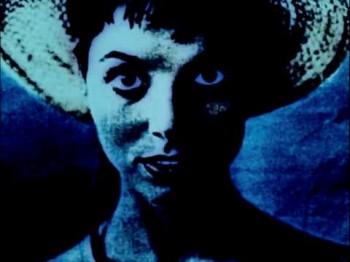
- The Polish electronic jazz group Baaba will perform live to a selection of Polish classic animated films. The program includes Academy Award-winner Zbigniew Rybczynski‘s New Book, auteur Walerian Borowczyk & Jan Lenica‘s Banner of Youth, Miroslaw Kijowicz‘s Cages (Grand Prix at Annency, 1967), as well as the visually innovative Stairs by Stanislaw Schabenbeck and Chair by Daniel Szczechura.This compilation offers a chance to see examples of “The Polish School of Animation.”

Apr 18, 7 pm
NEW YORK – Part of UNSOUND Festival
BAMcinématek
ANIMATORS
30 Lafayette Avenue, Brooklyn NY 11217
Tel 718-636-4100
Tickets: $15 general public, $10 members

Apr 27, 7 pm & 8:30 pm
DETROIT
Detroit Institute of Arts
BAABA
5200 Woodward Ave, Detroit, MI 48202
Tel 313-833-7900
Tickets: Free with museum admission.
$8 Adults, $6 Seniors, $5 Youth (6-17).
Free for children, members and Detroit residents.

Apr 29, 8 pm
LOS ANGELES – The Cinefamily
ANIMATION BREAKDOWN: Masters of Polish Animation
611 N. Fairfax Ave, Los Angeles, CA 90036
Tel 323-655-2510
Tickets: $14 / Free for members

Bill Peckmann &Illustration 13 Apr 2012 05:54 am

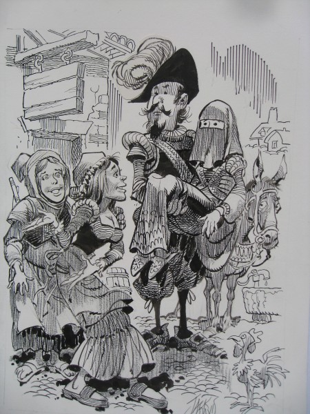
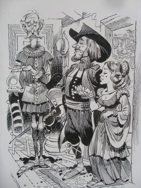
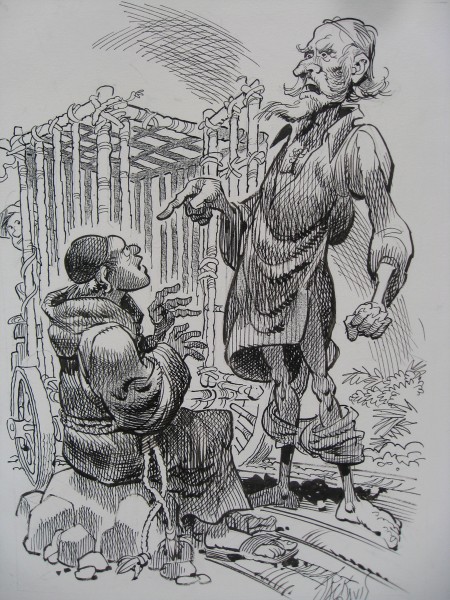
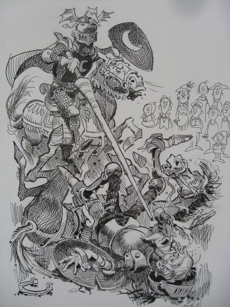
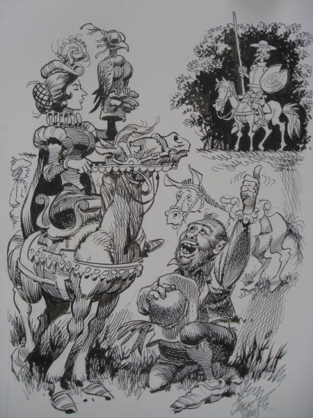
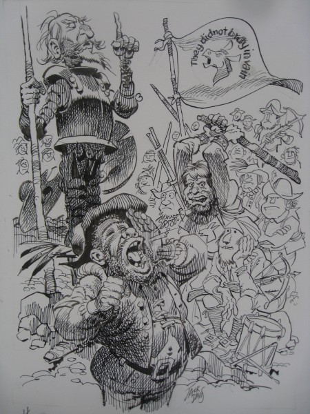
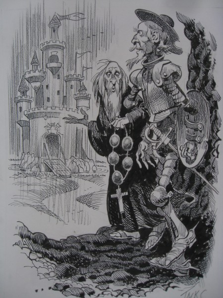
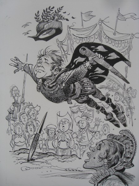
Jack Davis’ Don Quixote

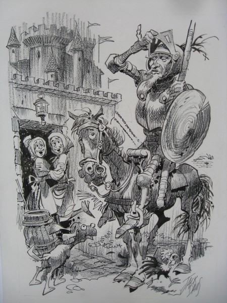
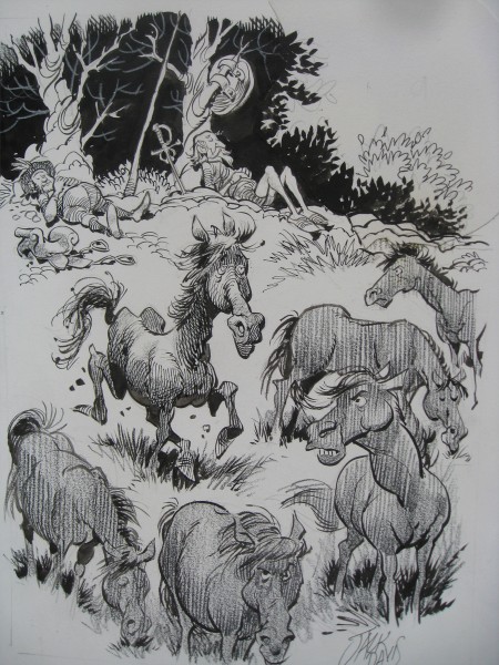
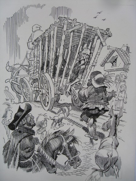
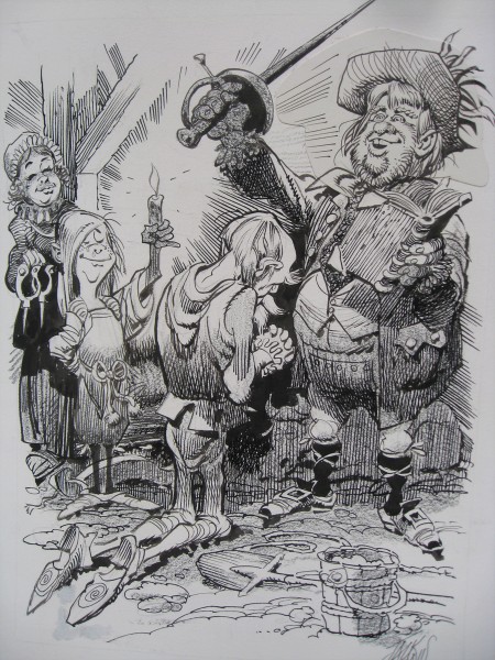
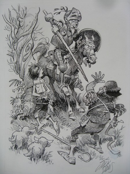
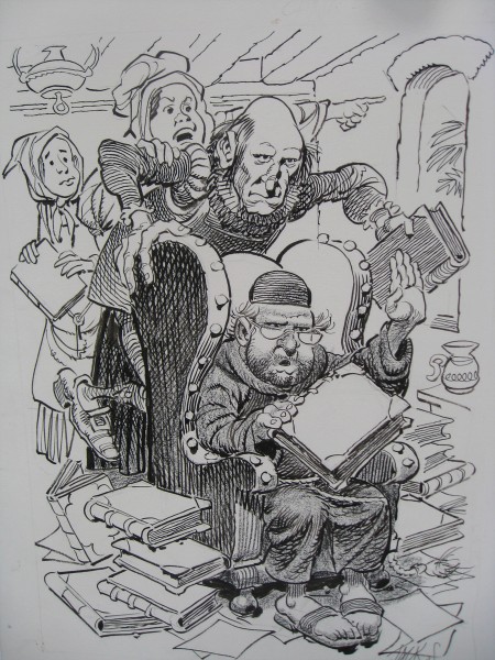
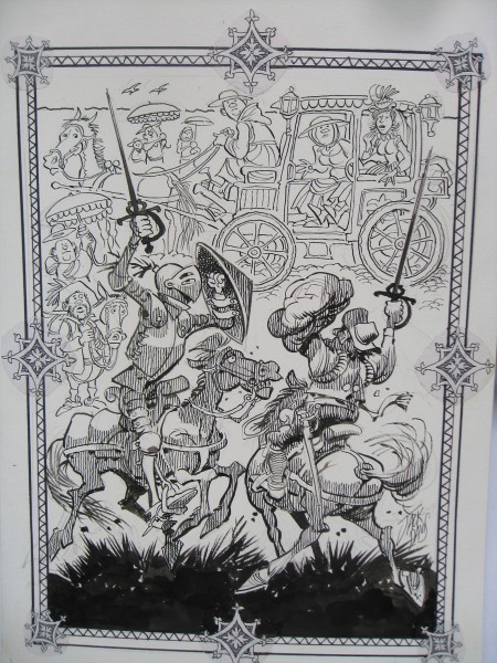
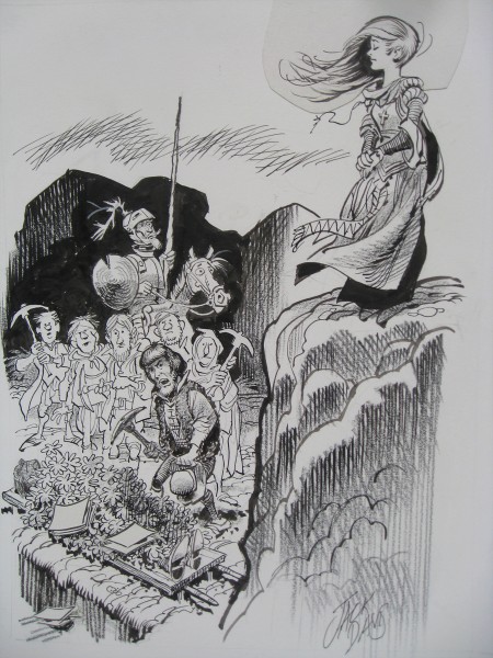
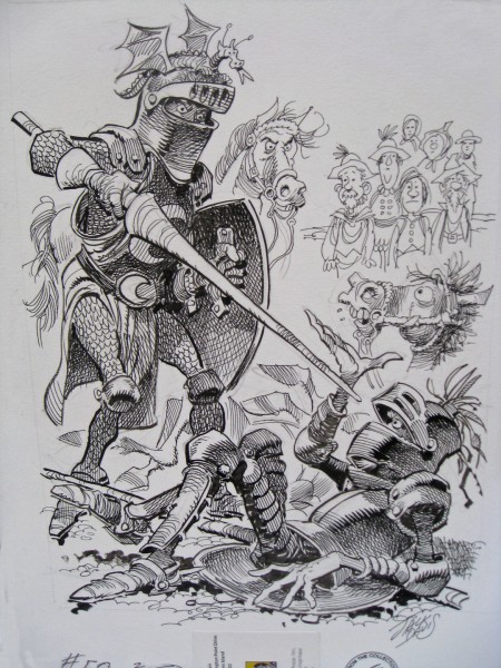
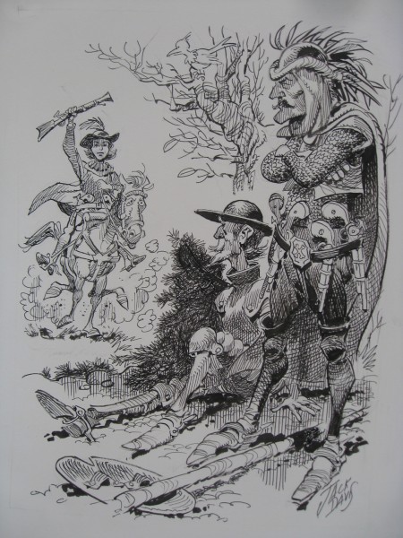
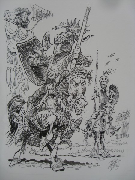
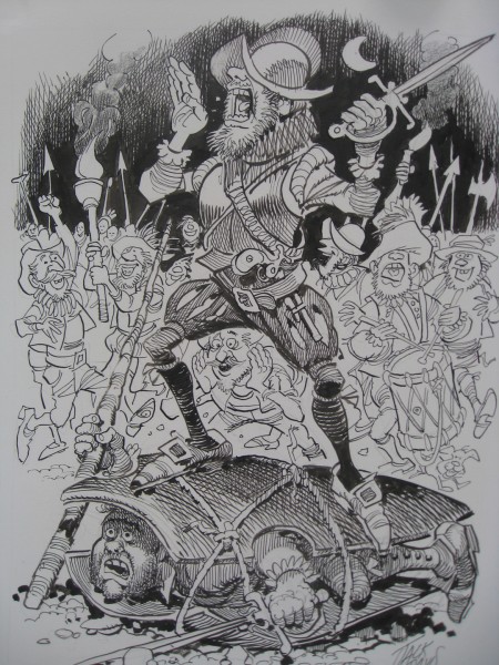
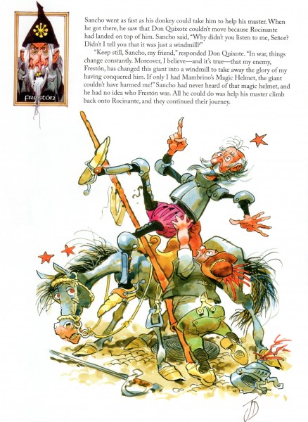
Recently, Bill Peckmann sent me the following B&W illustrations by Jack Davis of Don Quixote. These have no real relationship to the color illustrations that are part of the book currently on the market, The Misadventures of Don Quixote. They exist for themselves, alone, and they’re pretty darn good.

1

2

3

4

5

6

7

8

9

10

11

12

13

14

15

16

17

18

19

20


Here’s a sample color page from the book that was published.

« Previous PageNext Page »

eXTReMe Tracker
click for free hit counter

hit counter