Frame Grabs &Hubley &UPA 11 Jun 2012 07:01 am

The Four Poster – part 3

- I’ve located a better copy of The Four Poster, so my posts will be more in focus henceforth. I’ve gone back and replaced the images in Part 1 and will do the same for Part 2 in the next week.

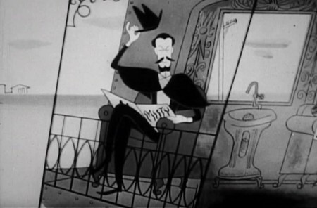
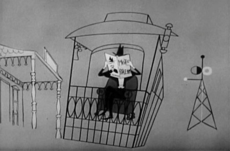
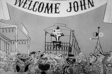
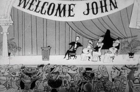
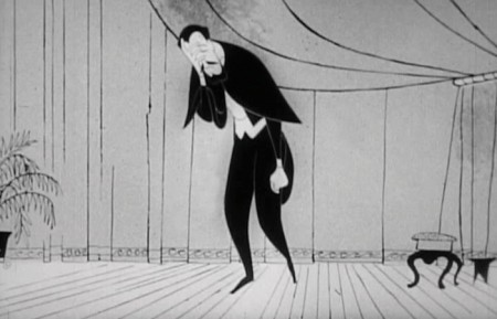
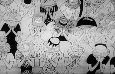
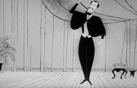
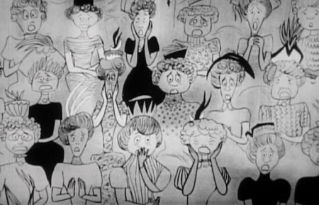
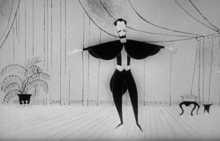
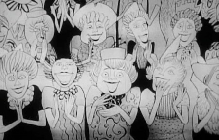
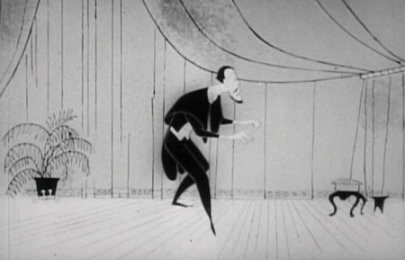
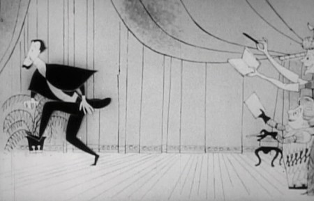
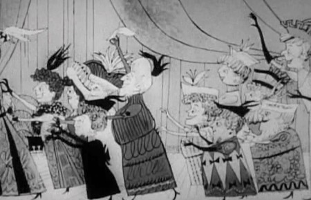
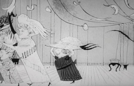
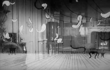
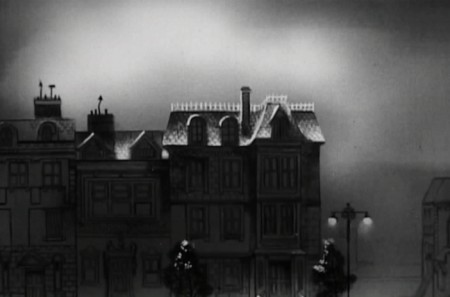
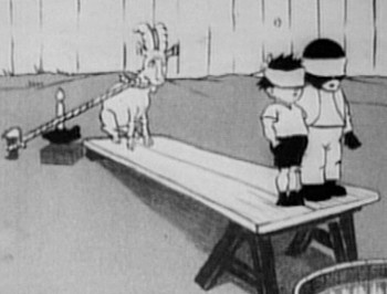
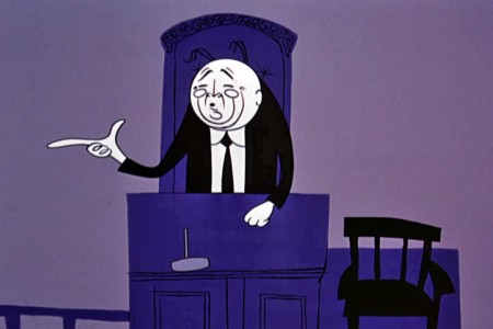
The Four Poster, in case I have to remind you, is a live action feature adaptation of a play by Jan de Hartog. It was produced by Stanley Kramer and directed by Irving Reis. The film takes place entirely within the bedroom of a married couple as they grow old together. To open up the film, they turned to animation working with the Columbia studio, UPA. John Hubley supervised all of the animation following his recently completed film, Rooty Toot Toot.

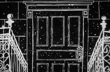
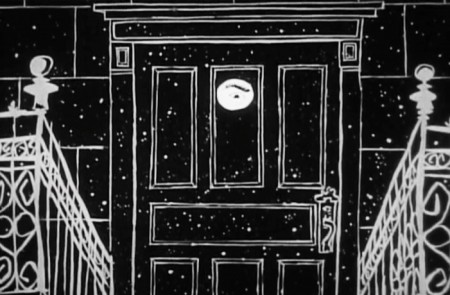
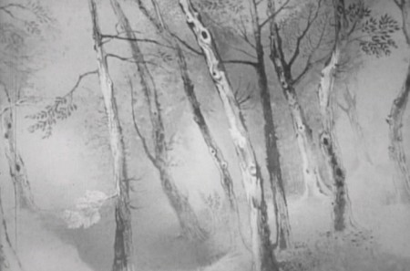
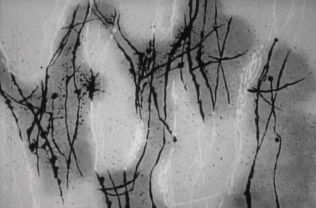
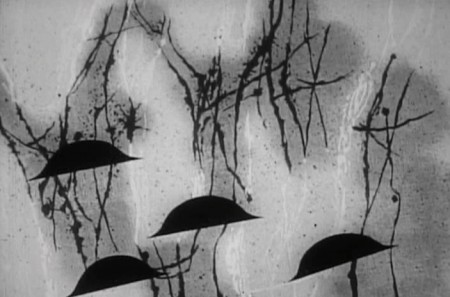
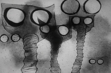
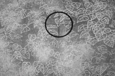
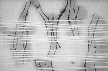
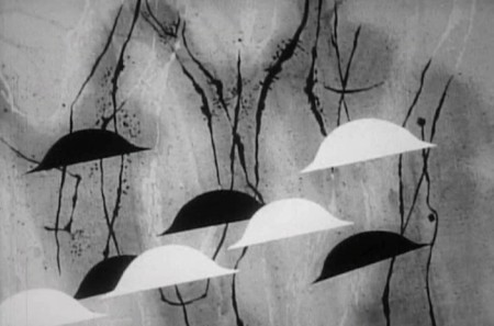
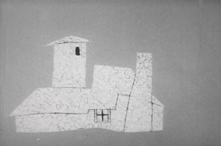
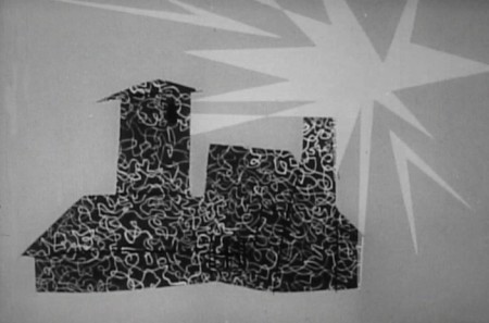
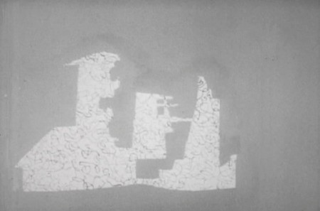
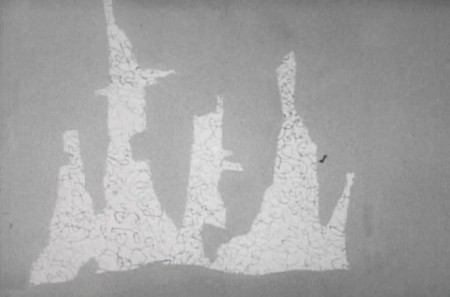
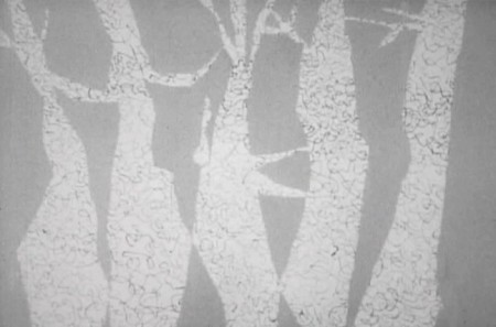
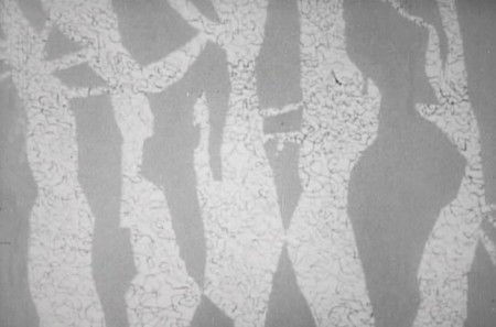
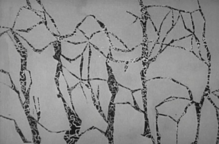
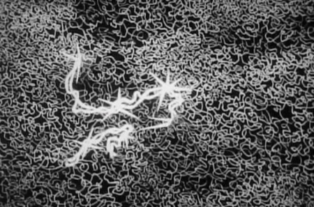
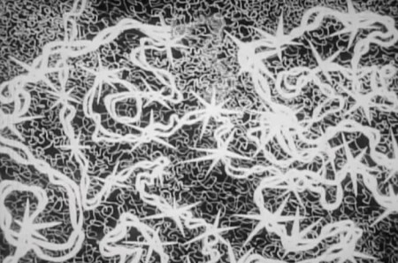
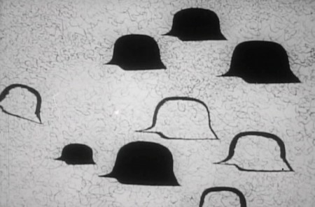
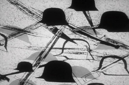
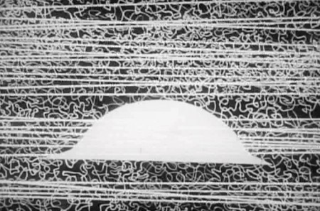
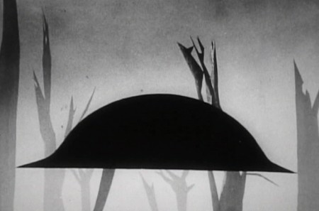
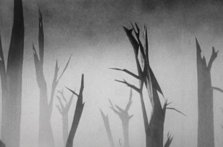
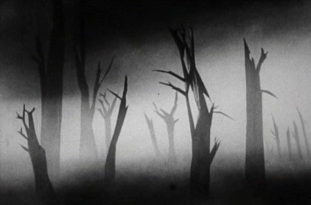
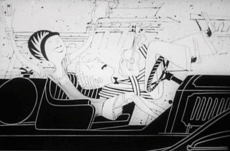
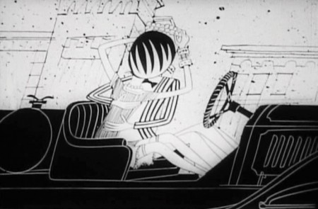
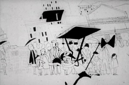
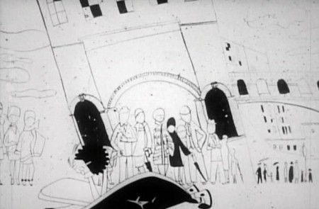
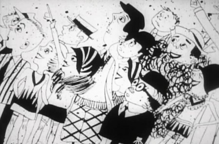
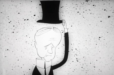
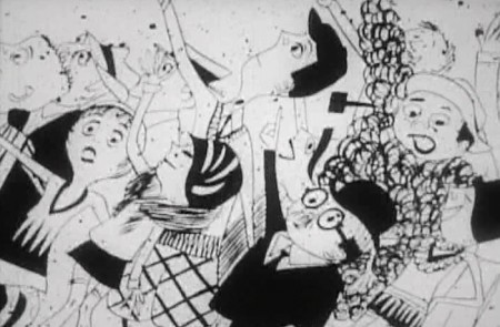
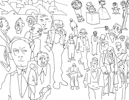
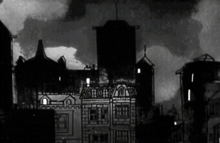
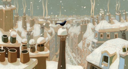
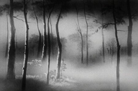
Part 3 starts as the couple’s child has grown up and gone off to War. World War I. The sequence was supervised by Paul Julian, and like most of his other directorial efforts it’s about beautiful paintings and graphic movement.

1

2

3

4

5

6

7

8

9

10

11

12

13

14

15

16

17

18

19

20

21

22

23

_______________________________

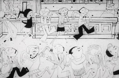
From the death of their son, the film takes us forward into the Roaring Twenties.


1

2
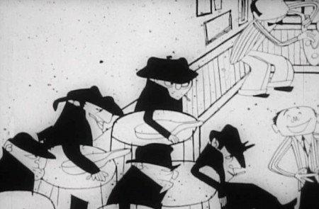
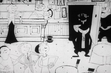
It’s a world of speakeasies.

3
Flappers dancing and living the high life

4
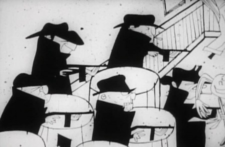
Mobsters

5

6
and their violence

7
Fast cars

8
and flirting

9
High flying inventions

10

11

12
Calvin Coolidge

13
and new ways of travel.

Photos &Steve Fisher 10 Jun 2012 06:26 am

The Intrepid & the WTC

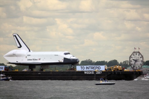
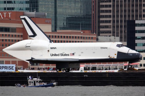
- In the past week the Shuttle Enterprise was ferried up the Hudson to the aircraft carrier, the Intrepid. There it would settle into its new home. Steven Fisher photographed the delivery.

1

2

3

4

5

6

7

______________________

This followed with a photo essay by Steve on the World Trade Center memorial under construction. hese are not only his photos but his words as well.

After quite a few years, I ventured back to the site of the World Trade Center.
Last time I was there, when it was a giant hole in the ground, I stood at the perimeter, alone, and wept. This time, I have to say that I did not experience much of an emotional reaction, and I don’t believe that it was because of the passage of time.

There were the two large pools demarking where the towers once stood; there was the new tower rising ever skyward alongside the original site; there were the myriad of names carved into the metal band surrounding the pools; there were the crowds of people, tourists mostly, strolling among the trees, sitting on stone slabs, photographing the views and each other. But it did not have the impact that I expected.

1

2

3
As well-detailed as the fountain walls are (and they really are
quite lovely to watch and listen to,) I get a mental image
when viewing the pools that distracts me.

4
The central secondary depression reminds me of a floor drain in a tub.
I wish the water would disappear magically, out of sight, instead of
so blatantly going down a drain. It somehow lacks respect.

5

6

7
I think, too, that the presence of the visitors, an obvious
unavoidable necessity, is a detraction from the sense that
something horrific happened here. It’s like traipsing about
the ruins of Greek temple sites among so many tour groups
– it makes it more difficult to relate to the scene that
transpired here one September morning.

8

9
I do believe that the plaza will work better once the trees
have a chance to mature; perhaps it will be easier
to reflect and contemplate then.

10
Anyway, here are a bunch of photos I took, which are
probably like the millions of images being snapped by
thousands of others, but I found it still compelling to do so.

11

Commentary 09 Jun 2012 05:54 am

Snow White & Paul Williams

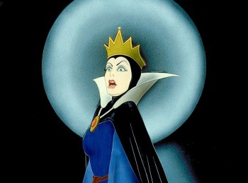
- We all know Snow White was the first animated feature. On Thursday I got to see the most recent version of the fairy tale, Snow White and the Huntsman. Times have changed, and animation is no longer animation. In reality, today, animation is a combination of live action combined with a digital puppetry. The purest form of these films, to me, is not the product of Pixar or Dreamworks; it’s these live action hybrids that overuse special effects, to the point where they’re no longer special. They’re just a bombardment of effects. Snow White and the Huntsman is a good example of one of these overeffected films.

Like the film, Mirror Mirror, another pathetic attempt to rework the same tale, this film stars a superstar actress as the Queen mother/witch. That means that the film is no longer Snow White, but it’s about Snow White’s mother. To boot they get some young “star” who isn’t up to the challenge to play “Snow White.” Kristen Stewart gets top billing over Charlize Theron, yet, in my opinion, she can’t walk in the shadow of Ms. Theron. She can’t act as well and she sure isn’t as beauiful as the Stepmother/Queen. What you really need in this role is a young Elizabeth Taylor, someone as stunningly beautiful as that. She has to be more attractive than Charlize Theron. That’s what it says in the script; it’s key to the story. Maybe my values are messed up; but I don’t see Kristen Stewart as anything more than ordinary looking, and I don’t call her aimless self-reflective movement anything close to acting.

For the first half hour of the film things move along like a traditional animated feature. Lots of beautiful composed and constructed sets and costumes and really special effects. It’s hard to tell the animation from the live action. Trees are moving of their own accord, costumes move, animals move in orthodox ways. It’s thoroughly engrossing. Then the film goes Celtic as they leave the castle on the chase/journey. Through the scary dark woods, past a village of women, into the realm of fairies where the seven dwarfs are a wonderful special effect. Great British and Irish acors like Ian McShane, Eddie Marsan, Bob Hoskins and Toby Jones are shrunk to look like dwarfs. The effect is totally believable, and the actors are wonderful.

This is where the film tells us it’s an animated movie. There are two creatures literally ripped right out of Miyazaki’s Princess Mononoke. Scenes from that animated feature are reproduced exactly for this Snow White. It’s not even original enogh to create its own gods, it has to steal Miyazaki’s.

Then there’s the journey back after a couple of fights. Then there’s the poison apple (well done, I might add) and eventually the first love’s kiss brings on the resuscitation of Snow White. The problem is, that isn’t the end. Now Snow White has to become Joan of Arc or is it (Henry V) to do battle with the evil Queen.

They’ve taken the fairy tale and turned it on its ear, so that it really doesn’t have much significance anymore. Her name is “Snow White”, she’s supposed to be innocent! Love’s first kiss should be the end of the story. It’s just the introduction of the heroine, who earlier told us she could never kill anyone, who will lead us into battle. The film is ultimately just the means for a lot of effects. The one that gets a bit old is the transition of objects (birds, soldiers, anything on screen) into shiny shards of shale-like stone. Flecks of things go flying everywhere, over and over again. It works well the first three times but a dozen times later, we’ve seen it.

The film, at one point, really is onto something, but that gets lost and it certainly loses the message of the fairy tale.There’s something there until it’s no longer there. Too bad.

But it’s still miles north of The Avengers or some of the superhero films we’ve seen this summer. And it does have Charlize Theron. Onto a screening of Prometheus, this coming Monday, also with Charlize Theron. A different kind of animated feature. Personally, I wish it were a new Miyazaki film.

______________________________

- For many years, I was a big fan of songwriter/singer/actor, Paul Williams. I collected all of his albums back in the 70s and 80s and went to see him in concert a couple of times. I tolerated his acting in a lot of horrible movies (like the Smokey & the Bandit series) and tv shows (like Baretta, The Gong Show and The Love Boat) which almost mocked the seriousness of his music, and I still remained something of a fan.

In the past couple of weeks, I received an invitation to attend a new documentary called, Paul Williams:Still Alive, at a private screening and then to meet up with Mr. Williams at a post wine and cheese thing. Naturally enough, I jumped at the chance and went to this screening last Monday evening at the HBO screening room in town. The fear I had that this might be more like one of those bad 70s movies that Mr. Williams starred in was negated immediately when I’d read an interesting interview he did with the NY Times. It got me in the mood to see this film.

Surprisingly, the film started just about on time. It was introduced by its director, Stephen Kessler. His introduction was very short and led us right into the film. The theater was full, as a matter of fact this screening room has a second room attached which projects the film onto that second screen simultaneously. Both were full, and I’ve seen several reviews come out of this particular screening..
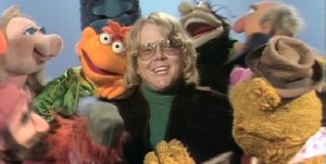
The film starts out about a fan (the director) who hounds a celebrity until he gets to interview him and then makes him the subject of his documentary. At first, it almost seems as though the film were more about Steve Kessler than about Paul Williams. But in the small moments with Mr. Williams, on film, you see that he is beginning to control the film, for the better sake of the movie. Right at the start, Willliams suggests that the film should not be one of those where the voice of the questioning film maker is cut out, so the ego of the “star” is hung out to dry. He pulls Mr. Kessler into the shot and tells him that the film has to be about the two of them.
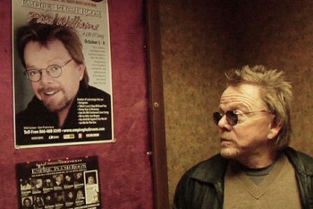
He then makes it clear when and if the camera should be running. He lightly cajoles Mr. Kessler into giving him, Mr. Williams, moments alone with his wife, and the film gets to be funny at the director’s expense. The film takes a very pleasant shape and finally comes solidly together during a concert tour of the Philippines, where Stephen Kessler is terrified that there are terrorists around every bend and their lives are in jeopardy. A bonding happens between the star and the director, and the film really takes hold. The intelligence of Paul Williams definitely comes through and shapes this documentary for Mr. Kessler, and the movie gives us a lot to care about. At almost every turn the treacly ideas of Mr. Kessler are often squelched by the good taste of Mr. Williams. At the point of the big climax, toward the end, Mr. Kessler proposes they sit down and watch some of the tv moments of the past for Mr.Williams. The idea being to watch Paul Williams squirm at some druggy moment cohosing the Merv Griffin Show. Finally, they do get to it, and Mr. Williams walks out on it. doing so shapes the climax and gives the film what it wants without any squirmy moments. It’s a good finale for the film, and gives Paul Williams all the dignity he deserves and gives the film the high point Stephen Kessler is searching for.

I also have to say that the editor, David Zieff, knew enough to follow the guide posts and let the film seem to fall together naturally. You know this doesn’t just happen, and it takes a good editor to make it work in a documentary such as this.
It’s a very good film, with a broad view of Mr. Williams’ career and a strong view of how his life has changed and ripened, post-rehabilitation. It just about concludes with Mr. Williams becoming ASCAP’s president with a mission to help protect the music rights of a lot of younger composers.

After the screening, they did have that wine and cheese event, and I recognized several people who I talked with, and some minor celebrities (Richard Kind) who I didn’t talk with. As I was leaving I passed Paul Williams and director Stephen Kessler, and I was tempted to say something. But I didn’t. The film answered any question I’d had, and I am too shy to just nose in on a celebrity and take up their time. Though I suppose that’s the purpose of such an event.

Actually, the film didn’t answer one question I had. Back in the very early 70s, I wrote to Paul Williams (care of his record company) seeking rights to a song he recorded called Lucky Old Sun. I thought it’d make a great animated short and wanted to find out what to do to get the rights. Of course, I never heard back from him and assume that he never got my letter. After all, it probably felt more like a fan letter than anything else. Even I wasn’t naive enough to believe it’d get to the right channels.
Bill Peckmann &Books &Illustration 08 Jun 2012 04:59 am

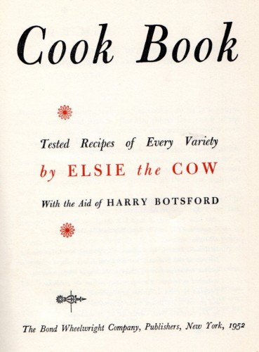
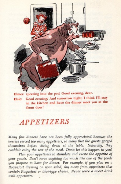
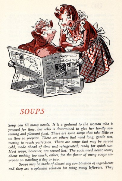
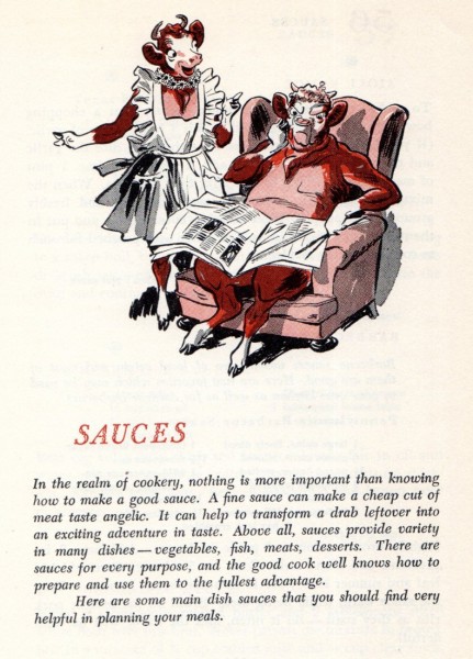
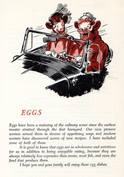
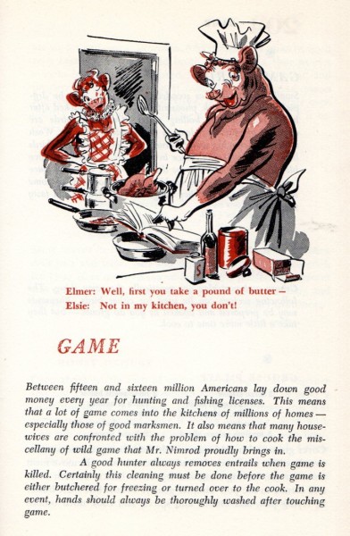
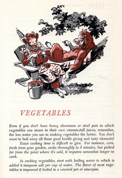
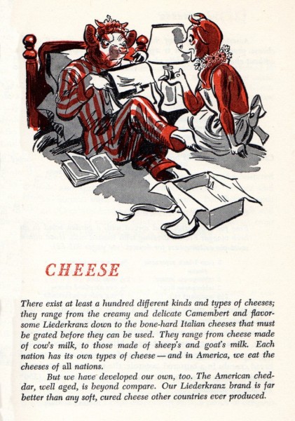
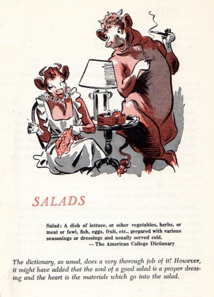
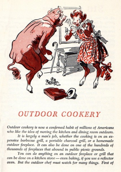
Ward’s Elsie Cookbook

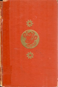
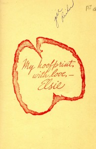
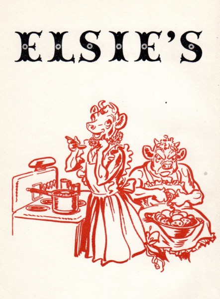
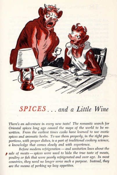
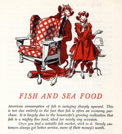
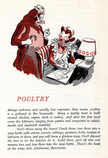
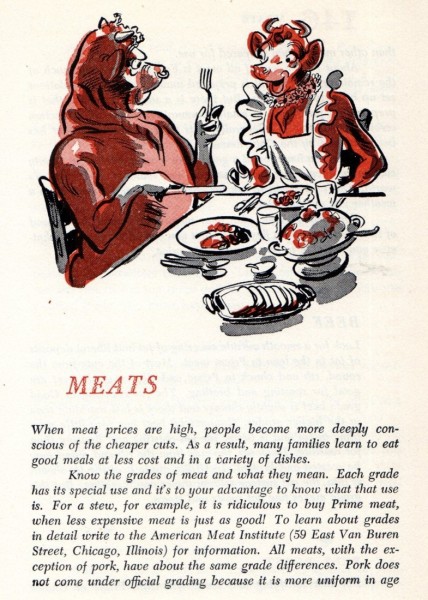
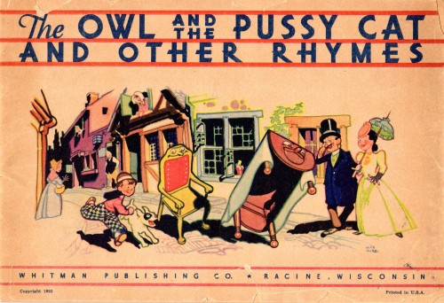
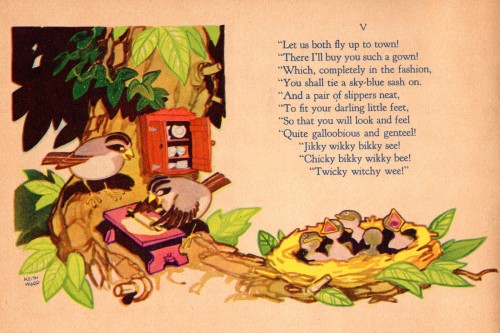
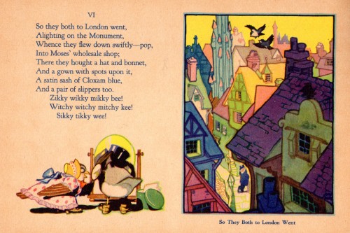
- Bill Peckmann sent on these scans of Keith Ward‘s illustrations for Elsie’s Cookbook. This book was a commercial product tie-in to Borden’s Foods who used “Elsie” as their trademark.The book was loaned to us by Denis Wheary. The two-color spot illustrations show off Ward’s ability to draw making it look like the most natural thing in the world. The ink line is also quite beautiful.

The remainder of the comments under the book’s pages are Bill’s.

1 2
Book cover / inner dedication

3
Main title page

4

5 6
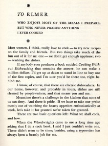
Elsie’s dedication to Elmer the bull. I’m assuming this
was before he went off and started hawking his glue.
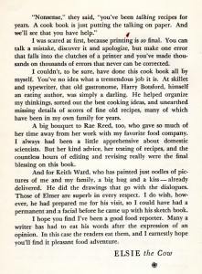
Keith Ward is not listed in the credits, but Elsie gives
him his just due here in the dedication.

7

8

9

10

11

12
13

14
Whoa there, this chapter takes on a little bit of a
surreal quality, but the human condition being
what it is, always has a way of making
everything seem okay.

15

16

17

18

19

20

21
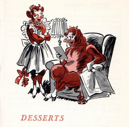
“Desserts”, this is the last chapter heading in the book, and kudos
again to Denis Wheary for sharing these not easy to find treats
with us! What a gift KW had to make animal drawing look so,
so easy. One wonders what he could have done in the animation
field given a chance, or if he had authored a ‘How to Draw’ animal
book, ala Ken Hultgren. In the ’50′s he did venture into
sculpting Halloween masks.


_________________________


.
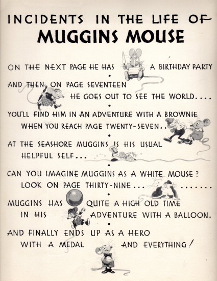
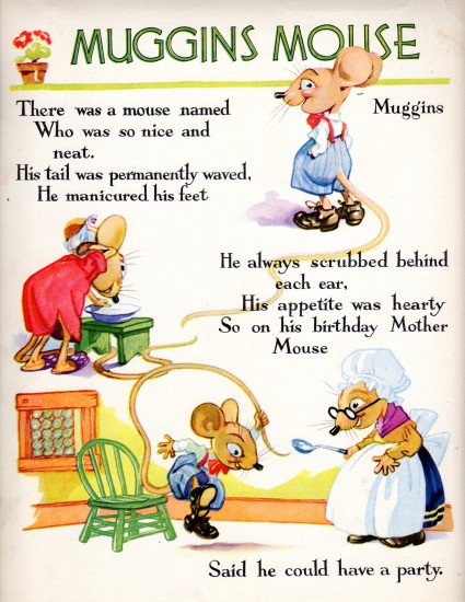
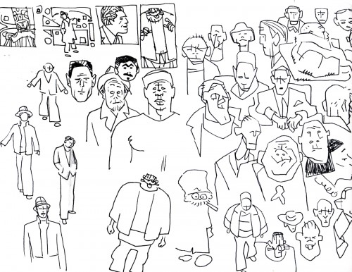
From the years 1932 to 1952, from ‘Muggins Mouse’ to ‘Elsie the Cow’, from the age of 24 to the age of 44, we’ve seen in our last few postings of his work, artist Keith Ward‘s amazing range of talent. Here, at the end of our last posting of Denis Wheary’s marvelously, shared, book collection, we’ll reprise a few of KW’s charming, early examples of breaking into the field of illustration in 1932.

1
(We’ve posted some of this material before, but these scans
came from the original books rather than copies of the books.
We thought it worth revisiting to show the varity and depth
of Keith Ward’s work.)

2
3

4

5


Many thanks to Bill Peckman and Denis Wheary for forwarding this book to us.

Bill Peckmann &Comic Art &Illustration 07 Jun 2012 05:23 am
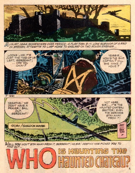
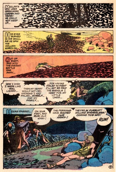
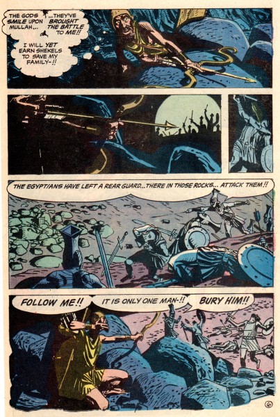
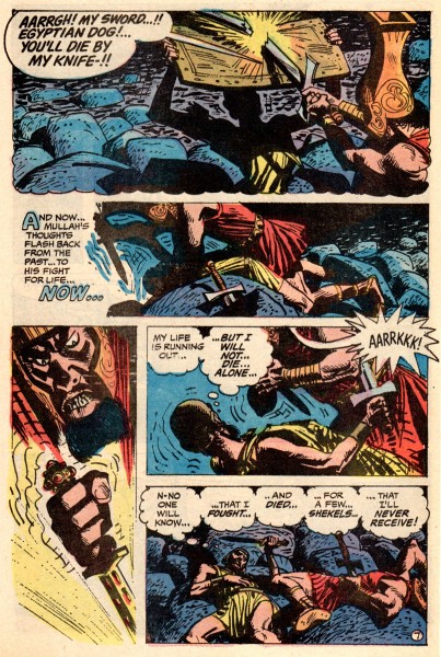
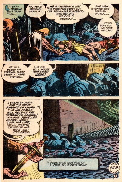
More Toth War Stories

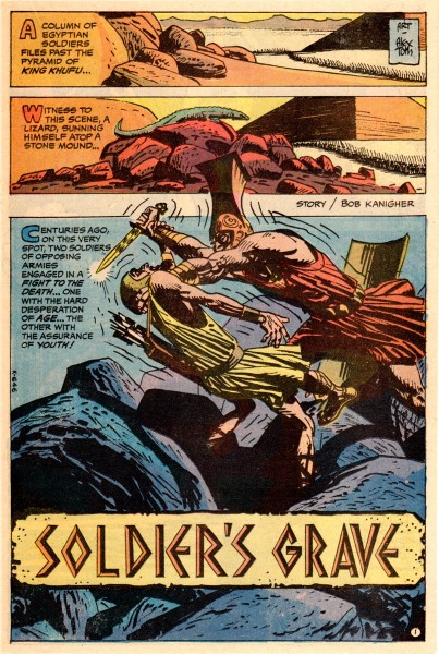
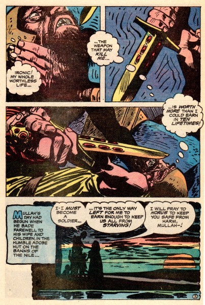
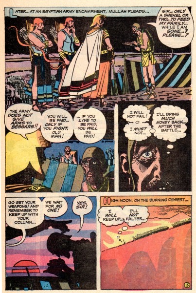
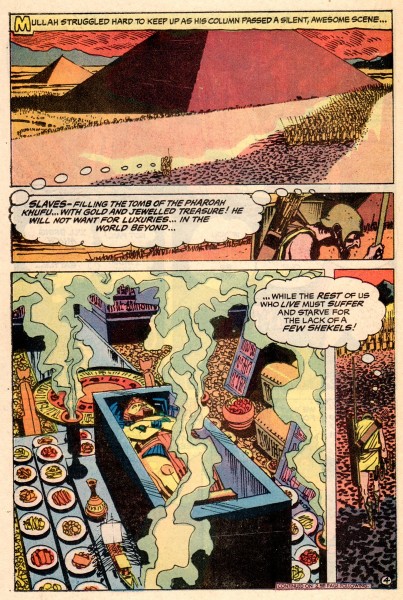
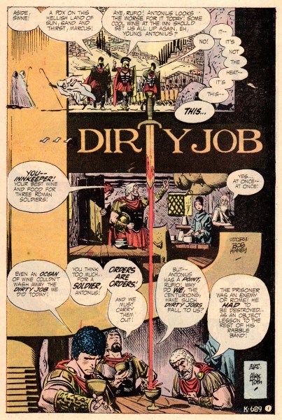
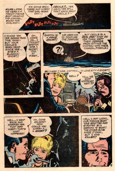
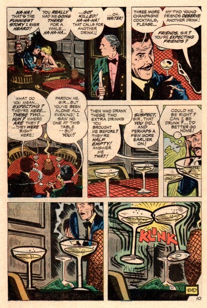
- Bill Peckmann has recently sent me some comic pages by Alex Toth, and I’ll let him introduce this post:

    I thought that with the advent of Dean Mullaney and Bruce Canwell‘s second volume of their Alex Toth series, ‘Genius Illustrated‘ coming out later this year, that your readers might enjoy a few stories from that time period in Alex’s life that the book will cover.

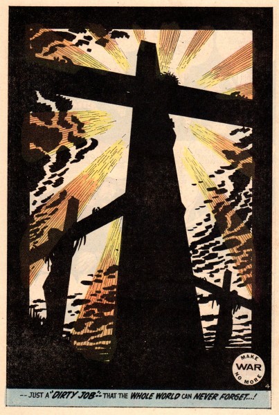
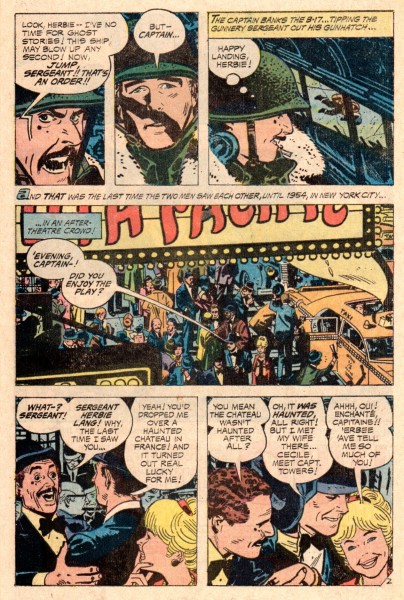
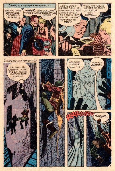
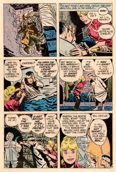
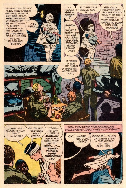
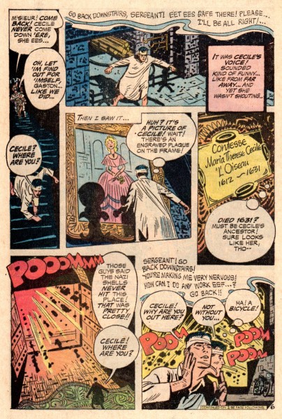
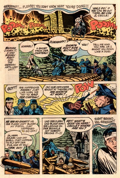
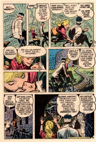
    All three of the short stories that I’m sending you are from DC Comics’ war titles from the early 1970′s.

    Alex is firing on all cylinders in these three stories. Always learning his craft and searching to add to the esthetics of continuity art, lucky for us, it all seems to be culminating at this point in his life.

Just prior to each of the three comic stories, I’m posting a sheet of doodles that Alex Toth did, and Bill Peckmann saved. It’s a good way to separate the three war stories.


The first page of doodles. These three pages have
nothing to do with anything here. But they’re a
great example of a brilliant artist’s ramblings.

1

2

3

4

5

6

7

8

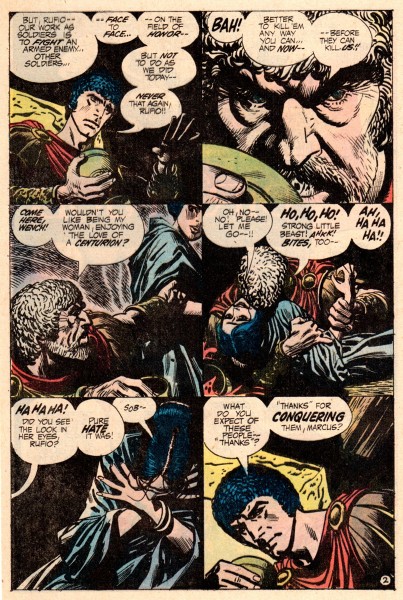
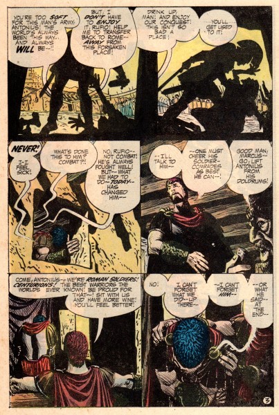
Here is story 2 of 3. A short four page story but very powerfully done. Of special note, see how well the hands are executed to further the emotions of the characters, especially the very last panel.


This is the second page of doodles by Mr. Toth.
The guy could draw.

9

10

11

12

Here in the third story of this post, Alex was able to combine his love for aviation and his fondness for 1940′s Hollywood movies that had a light touch. The writer of the story is Shelly Mayer, who as editor at DC Comics many years before, broke teenager Alex Toth into the comic book business.


The third and last of the doodle pages.
I hope they were, at least, interesting.

13

14

15

16

17

18

19

20

21

22

Many thanks to Bill Peckmann. The rare comic stories aren’t enough, he spoils us with some private doodles by the master.

Animation Artifacts &Fleischer &Models 06 Jun 2012 06:06 am

Miscellaneous Models from Fleischer

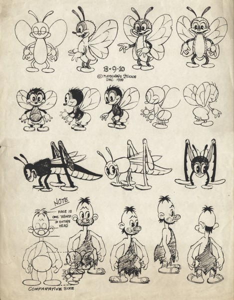
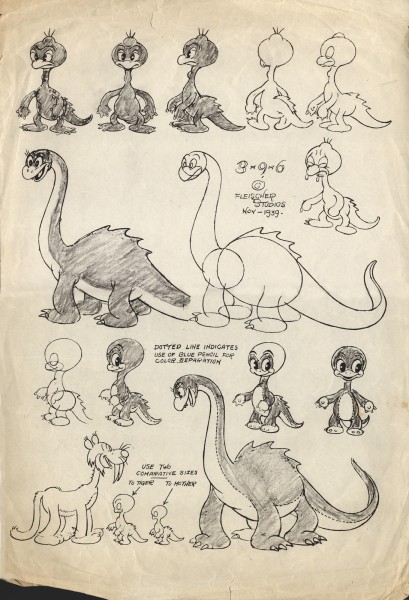
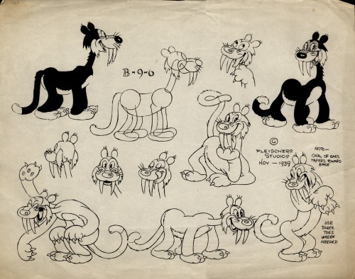
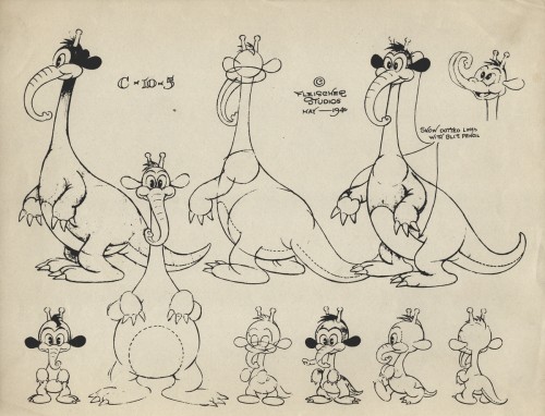
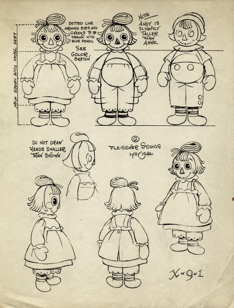
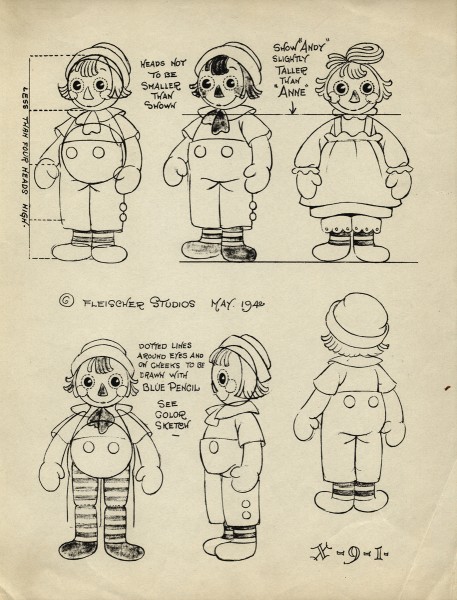
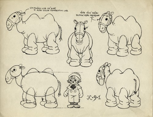
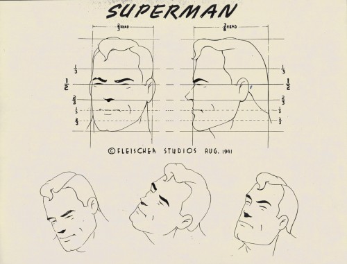
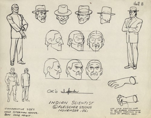
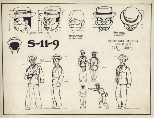
- Continuing with artifacts from the late Vince Cafarelli‘s collection, here are a bunch of model sheets from a number of different Fleischer Studio productions. I’ve mixed some from the Raggedy Ann shorts, the Stone Age films, the Superman films and one ersatz model from a solo cartoon.

We begin with The Stone Age films. Long before the Fllintstones, there were these inventive shorts about the very same subject, a caveman family living
as though it were the modern day world though they’re still in caveman attire. (Not too different from the Jack Benny caveman in Chuck Jones’ Daffy Duck and the Dinosaur.)

1

2

3

4
(Actually, with this model I’m guessing it’s from a Stone Age cartoon.
For all I know, the Fleischers may have tried their hand at Dr. Suess.

There are a couple of models from the Raggedy Ann films. Quite different from the Dick Williams version.

1

2

3

The Superman cartoons are key to the world of the Fleischer studio and their ultimate attempt at a high quality.


1

2
But of course, it wouldn’t be Fleischer without a hint of racism . . .


. . . or more than a hint. They should have tried Dick Tracy.

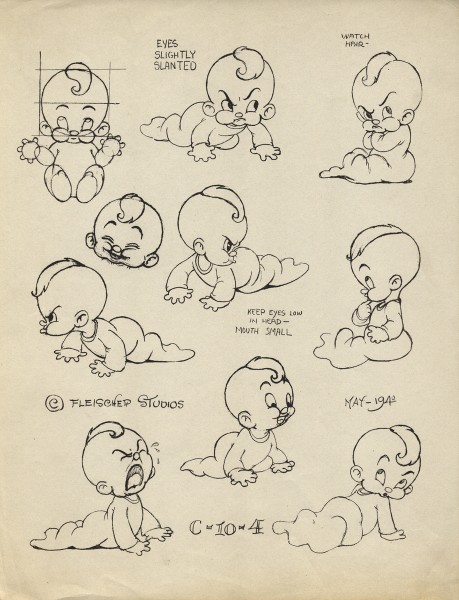
Finally, for today, there’s this left over baby. It isn’t labelled, but it looks to be the baby from the “Gabby” cartoon, All’s Well. If anyone out there knows otherwise, please don’t hesitate to leave a note in the comments section. This model sheet is dated 1942, and the cartoon has a 1941 copyright date on it.


There’s an excellent article in AWN about Charles Thorson who designed the characters for the Raggedy Ann cartoon as well as the Stone Age films. He most probably did the model charts. He’d worked at every known studio in the late thirties, early forties and had settled in to Fleischer’s Florida location whn=enthe brothers were let go, and Paramount took over. It was at this point that Thorson decided to move on to comic book illustration.

The article is by Gene Walz who also wrote a biography of Thorson which was publlished as: Cartoon Charlie: The Life and Art of Animation Pioneer Charles Thorson.

Comic Art &Illustration &T.Hachtman 05 Jun 2012 04:52 am

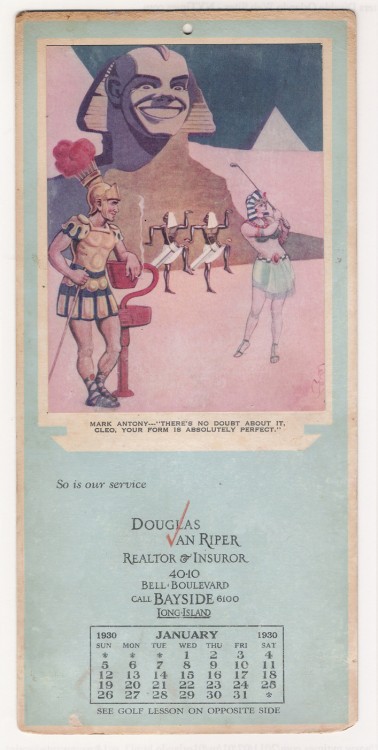
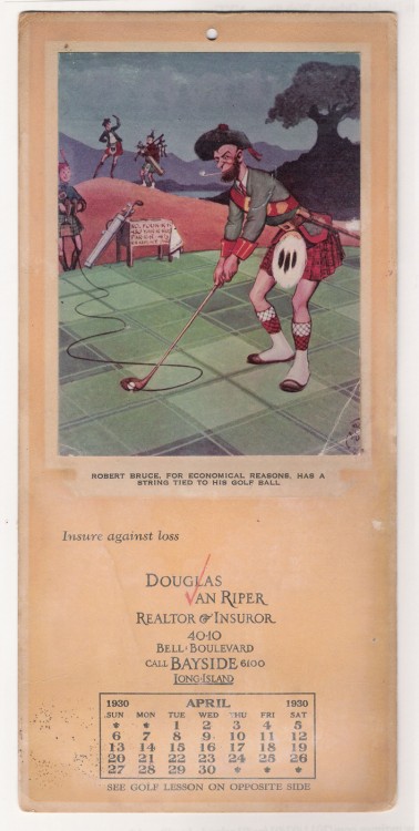
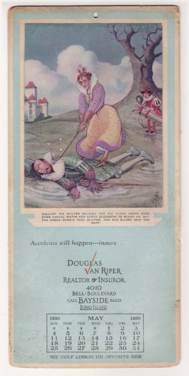
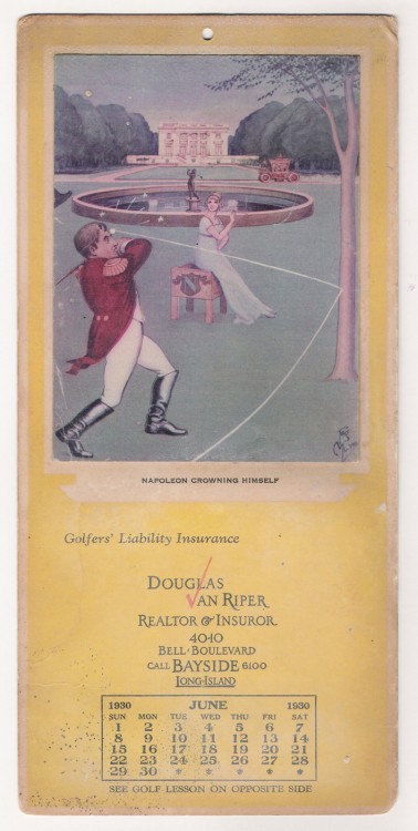
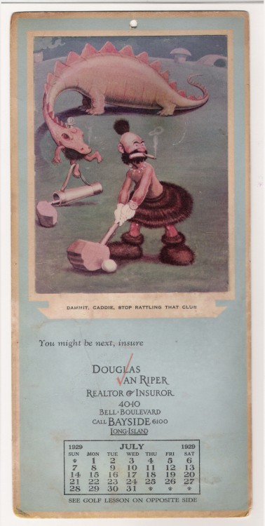
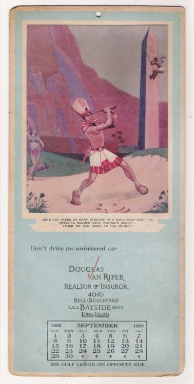
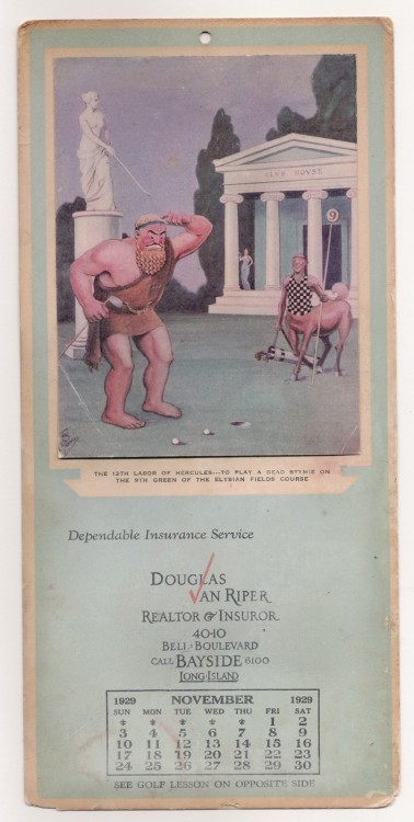
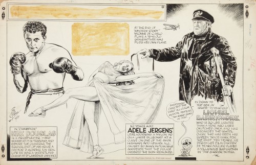
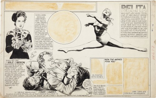
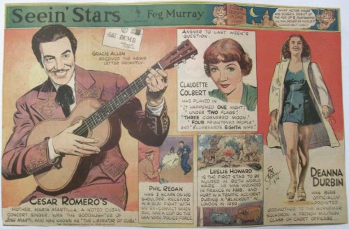
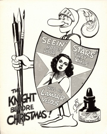
Feg Murray Calendar 1930

- A while back Tom Hachtman sent me a calendar illustrated by the sports cartoonist, Feg Murray.

Tom wrote: Here’s a “‘treasure’ I found in the basement today. They’re mildewed and have been through floods but they are still great art.”
Sorry I don’t have all twelve – there are golf lessons from Walter Hagen on the backs if you’re interested.”
The calendar dates back to 1930.

Not being the golfer, I wasn’t really interested in the lessons. Here are the extant calendar pages.


January


April


May


June


July


September


November

Here are some examples of the comic strips that Feg Murray had in syndication.
He was considered, primarily, a sports cartoonist, and this strip is a good example of what he did.

1

2

He also had a strip called “Seeing Stars” which focused on celebrities.’

Finally, here’s a Christmas card he did while working through King Features Syndicate.

Frame Grabs &Hubley &UPA 04 Jun 2012 06:54 am

The Four Poster – part 2

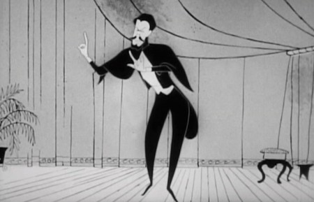
I’ve recently purchased what, I think, is a much better copy of this film. When it arrives, I’ll replace this and the last post with better images and continue on from there. In the meantime, I’ve done this post.

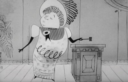
- Last week we bit into the UPA animated sequences from The Four Poster. These were directed by John Hubley, with Paul Julian credited as designer and Art Babbitt and Lew Keller credited as animators. Of course, more people were involved in that they broke the film up into segments with different teams doing individual segments.

The animation, naturally is in B&W (to match the live action film they were designed to interecede.) The boring live action film is an unimaginative adaptation of the Broadway play by Jan de Hartog. It became a travelling show that was often performed by husband and wife teams. In fact this film stars a husband and wife: Rex Harrison and Lilli Palmer. It was produced by Stanley Kramer and directed by Irving Reis. Kramer, who was very political in his film making (High Noon, Guess Who’s Coming to Dinner, Judgement at Nuremberg) no doubt stayed away from the set rather than deal with the volatile actors on the set. He had an easier time of it hiring the animation studio; he just stayed on the Columbia lot.

The film never strays from the bedroom of this couple, and we get the life story of the couple from the vantage point of the bedroom, which features the titular fourposter bed. Quite claustrophobic. They expand on it using the animation, and one almost wishes they had done the entire film in animation. It was later adapted into a musical called, I DO, I DO, and starred Robert Preston and Mary Martin on Broadway. It was written by Tom Jones and Harvey Schmidt (who also wrote THE FANTASTICKS.) That’s a much better show; the songs make it tolerable.

Here are frame grabs from the next two sequences: 3 & 4.

1
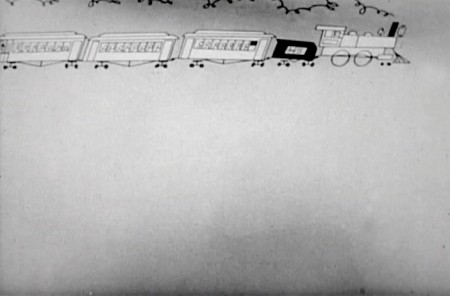
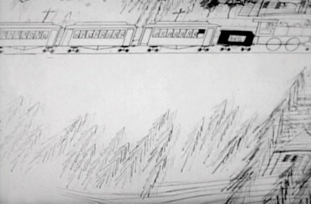
A train enters and the camera moves in on it.

2


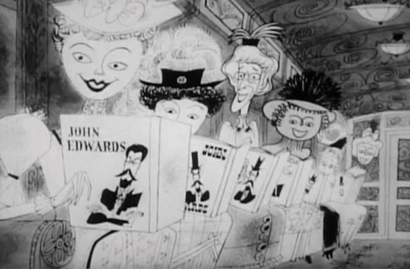
A pan (right to left) shows a lot of women reading
books by our lead character John Edwards (Rex Harrison).

4
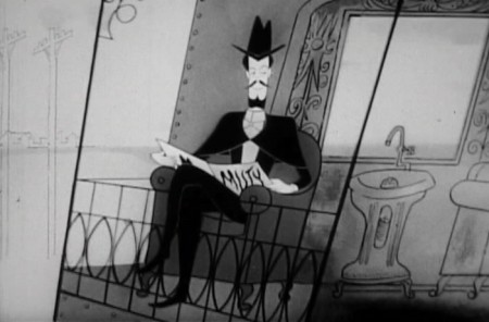
The pan ends on Edwards seeing
the full car of women staring at him.

5

6
He acknowledges them as . . .
7a
. . . the train moves on, and . . .

7b
. . .there’s a slow transition . . .

8
. . . to an auditorium.

9

10
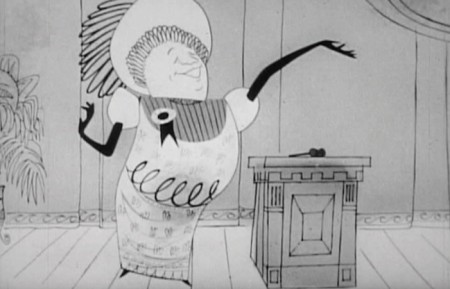
A woman speaker introduces him.

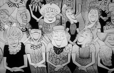
11
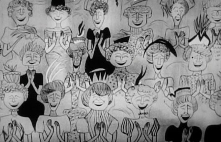
The female audience applauds enthusiastically.

12
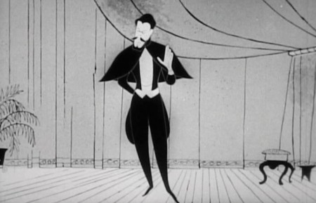
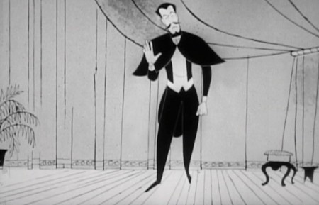
He stands to speak and . . .

13
. . . gives his speech in mime. We don’t hear his words.

14
The woman laugh enthusiastically at his joke.

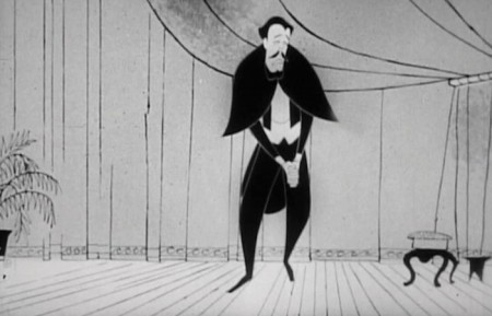
15
Now he gets sad.

16
I can only wonder whether this had any influence
on Hubley’s later film, Zuckerkandl.

17

18
The women are in hands. They’re crying.

19
He brings them back.

20
They wipe their tears.

21
The Big Finish.

22
They audience is overwhelmed.

23

24
He’s chased from the stage.

25

26
They rush him leaving feathers flying from their hats.

27
There’s a transition back to the live action bedroom.

.
__________________________

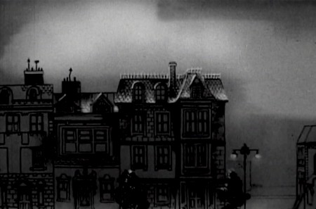
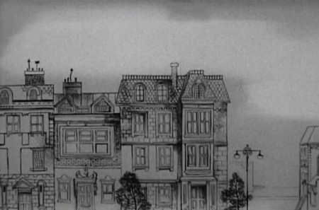
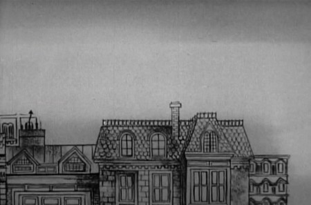
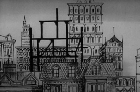
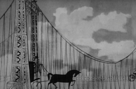
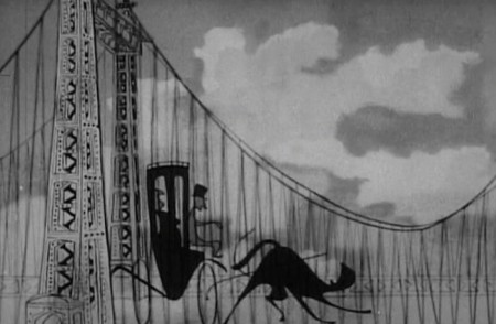
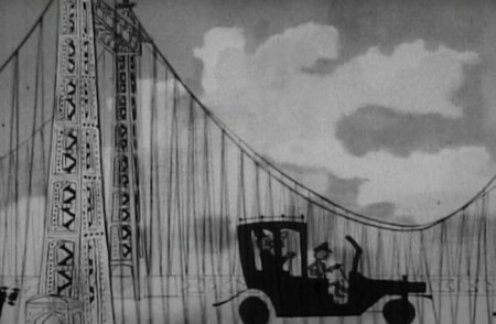
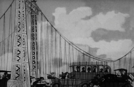
The fourth section is designed only to show us that time has passed and the city is growing up around their ears. They remain in the same house the went to after first getting married (obviously, or the film’s title would be pointless.)
.

1

2

3

4

5

6


As we pan from left to right, the city builds up for the camera.
The bridge, on the far right, is the last structure to be constructed.

8
Cut in to the bridge as a horse drawn carriage enters . . .

9
. . . and before our eyes , , ,

10
. . . turns into an automobile.

11
All automobiles.


Pan back (R to L) at night with the fully developed city.

13
Go back, into our newly developed house.

Photos &Steve Fisher 03 Jun 2012 07:46 am

Robin Follow-up

Steve Fisher sent some follow-up photos to the story of the newborn robins which I posted last Sunday. We have to finish this story, don’t we?

1
This morning, the day Vegas odds-makers said that
one of the chicks would be first in flight, one of the
adult robins brought some strange looking stuff in his beak.

2
Although it looked more like nest material, the chicks
seemed enthusiastic enough about eating it.

3
Later in the day, the most mature of the chicks
[probably the first-born] looked anxious
to explore the world outside the nest.

4
He even got up on the rim of the nest and
poked his his through the latticework.

5
He stretched his legs and flexed his wings.
He hopped around a bit, outside the actual nest,
making sure the wings were working properly.
Orville and Wilber would have been proud.

6

Then in a flash he was gone, flying straight
across the yard to the cover of trees, too
quick to photograph him in flight.

I haven’t seen him back at the nest, yet, but
I’m told they will hang around for about a week.

Meanwhile, there are three other chicks who have to
follow in their sibling’s footsteps, or wingflaps, rather.

Our work here is almost done. Moral of the story,
don’t bet against Vegas, or Mother Nature.

_________________________

On another day, Steve had sent me these photos.

11
Going up.

12
Going across.

13
And going down.
No this is not oriented incorrectly;
they really are all nose-diving simultaneously.

14

15

16
A red tailed hawk.

Commentary 02 Jun 2012 06:30 am

Processing Onward


A Cat In Paris

- A Cat In Paris opened officially in New York, yesterday. You may remember that this film, a smidge longer than one hour, was one of five nominees this past year for the Best Animated Feature Oscar. It is a French film animated in 2D and is a satisfying film. It is far from great but also far from bad.

It was a year of films like Cars 2, the sequel to Pixar’s Cars, which had a budget north of $200 million, or Kung Fu Panda 2 the sequel to Dreamworks’ Kung Fu Panda with a budget of $150 million or Puss In Boots, the spin-off of a character from Dreamworks’ Shrek 2 with a budget of $130 million. Two of these three were also nominated for the Oscar (a hint – not the Pixar film.)

This film, The Cat In Paris, received a mix of reviews in NY. The NYTimesA.O.Scott called it, ” . . . a refreshing reminder, at a time of large-scale, highly polished cinematic spectacle, of the essential, elemental sources of movie-watching pleasure.” There was no doubt that Mr. Scott was charmed with the film.

Lou Leminick of The NYPost gave it two stars and wrote, “. . . it seems slight and unremarkable, especially compared to two other wonderful French-language nominees in this category in recent years, “The Triplets of Belleville’’ and “The Illusionist.’’

Michael Atkinson of The Village Voice wrote, “A sketchy trifle of French animation grabbing time in theaters thanks to its recent Oscar nomination . . . seeks shelf space beside Sylvain Chomet’s deft and rapturous hand-drawn cartoons (The Triplets of Belleville, The Illusionist), and the required self-conscious Frenchiness is spot-on.”

I saw the film last year toward the end of a two week screening of 18 animated features contending for the Oscar nomination. By the time I saw it, I’d been filled with horrendous cgi films like Alvin and the Chipmunks and Puss In Boots and, god help us, Hoodwinked 2. The Cat In Paris came over as the height of sophistication and whimsy. I’m sure I need to see the film again to properly judge it, but I do remember it as nicely designed in a European cartoon style, with a very nice music track and serviceable animation.

I enjoyed the movie and am certain I’d feel the same on viewing it again. My thoughts were closer to siding with Mr. Scott’s review in the Times. It wasn’t great; it wasn’t bad. It was a wholly entertaining hour.

________________________________

- Tom Stathes is one of those incredibly dedicated people who’ve made animation history their life. As a result, the work he’s done, particularly for the silent animated film, has become an enormous contribution to the medium, especially given the internet’s total lack of interest in the subject. This is a rare focus that is wholeheartedly needed for the preservation of that part of the form.

His establishment of the Bray Project has given attention to the studio that was certainly the first very large animation studio in the world with an enormous product and a strong control over the medium of the day. Established in 1911, the Bray Studio produced generally poor cartoons, (most silent cartoons of this period were poor films) but they allowed many pioneers to begin their careers on the right step. From Walter Lantz to Max Fleischer to Paul Terry, many of the giants sat in this studio first.

Mr. Stathes recently sent out this email note announcing that the Bray Project is now one year old. I thought it important to post the email and give a little nod to Tom and all the great work he’s doing.

    Dearest Friends and Colleagues,

    It is now one year since the Bray Animation Project website launched. And it’s been a great year at that!

    Many incredibly exciting rare film finds have been made since the site’s debut and I’ve shared a little bit of information about that in a special blog post here.

    The Bray site will see some fixes, updates, and further add-ons in the near future. More excitingly, though, please keep posted for some very important announcements from yours truly to follow in the next few weeks. I once again invite interested parties to discuss research or post questions at the site’s discussion board.

    Thank you all for taking an interest in this project or for being a supportive element in my film history and archiving endeavors in general. I wouldn’t be able to achieve much of what I have without the help of many of you.

    Cordially,
    Tom Stathes

________________________________

- Thad Komorowski is someone else who continually surprises me with the depth of his knowledge about animation history. I shouldn’t be taken aback whenever I go to his blog and column. The reportage is always first rate, thorough, and the subject is often something I hadn’t even thought about. Yet, a lot of research and work has gone into those columns, and I can only admire them and bookmark their pages so that I can come back and reread it another time or two.

Often, Thad talks about the process rather than the ideology behind the animation. This week, for example, he wrote about the Technicolor backlog once WWII had ended. Studios working in IB Tech weren’t able to get their negatives developed or their print orders met. Waiting years to get their films to market had to have hurt the market, especially given the break up of theater monopolies by the studios. Some of the smaller studios had to turn to Cinecolor to get even second rate prints made. All to go to market.
Thad also gives us an example of a Columbia short that was printed on Cinecolor. We can see how lacking it is in its color quality, and we can also see how dreadful the cartoon is in the quality of its art. It’s one of those shorts you know is so bad you can’t understand why you’re continuing to watch it, yet it’s THAT bad that you can’t stop watching it. The Cinecolor is only the icing on the cake.

And speaking of process just read the posts The WB Production Number Project or MGM Cartoon Filmography by Production Number. These are all about accounting, but since it’s part of the principal production of those glorious Hollywood shorts, it’s information that should be relayed. And I have to say, in my fifty odd years of reading about animation and its history, this is the first time any of these subjecs has come up. It’s not something I need to know, but it’s something I’m astonished to realize I didn’t know. And, believe it or not, this is information I want to have.

As Thad’s work matures, so too his reviews. His lengthy review of Adam Abraham‘s book, When Magoo Flew, is a first rate look at Abraham’s work. It fairly points out the shortcomings of the book, but also tells how important this book is given the lack of other material available on the subject of UPA’s birth. More importantly, Thad has a separate blog post about the Jolly Frolics shorts.

Like most good reviews, there are treasures built into them. Thad appropriately assays Bobe Cannon‘s career in a short and on-target side note. Since Cannon directed many of the most famous UPA cartoons, this is entirely necessary.

    Bobe Cannon was one of animation’s most puzzling treasures. He came up through the ranks at Schlesinger’s and is said to have been critically involved with the concept of smear animation with Chuck Jones. He ultimately abandoned all of what was fun in his own animation in the cartoons he directed at UPA. There are still traces of it in “The Miner’s Daughter” and “Georgie and the Dragon,” and Cannon and Paul Julian (one of the studio’s real unsung heroes) also helmed “Wonder Gloves,” a vastly underrated cartoon with simple but highly pleasing design and animation.

I don’t always agree with Thad, but he gets me to read his evaluation and think about what he’s had to say. Something any good historian or writer would do. I enjoy attending to his blog and appreciate it every time there’s something new. If you’re as much a sucker for animation history as I am, you’ll want to do the same. What About Thad.

« Previous PageNext Page »

eXTReMe Tracker
click for free hit counter

hit counter