Animation Artifacts &commercial animation &Illustration &Photos 01 Jul 2012 06:08 am

Animator Photos

- I love shots of animation people at various functions. It’s particular fun when you know the people and the pictures show them from a different time and place. Here are a few that nicely fill the bill.

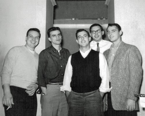
- Ralph Bakshi was in touch after seeing the Fleischer model sheets that I posted. He sent me a photo from the early 1960s.


(L to R) Al Chiarito, Vinny Bell, Arnie Levy, Nick Alberti, Bill Ackerman

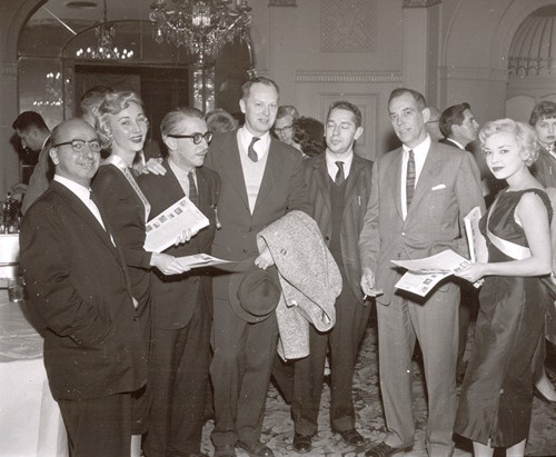
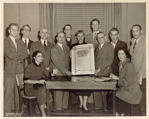
Candy Kugel had a couple of other photos from two events. The first two are from a Lcl 841 u-nion meeting. Candy and I tried to ID the people in the photos, and we’ve named a number of them. If you notice an error or can name some others, please just drop a note in the comments.


(L to R) Cliff “Red” Augustin, unknown, Izzie Klein,
Marsha Kaplan (seated), Johnny Gentilella, Gordon Whittier,
female center unknown, unknown, unknown, unknown,
unknown woman seated, Nick Tafuri


Johnny Gentilella (L), unknown fem, Pepe Ruiz,
unknown, unknown, Gordon Whittier, Unknown fem.

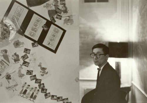
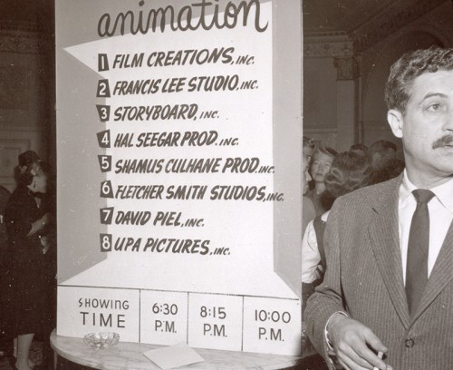
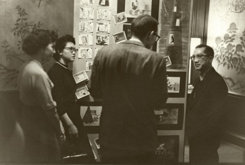
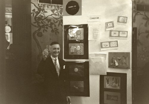
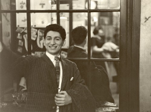
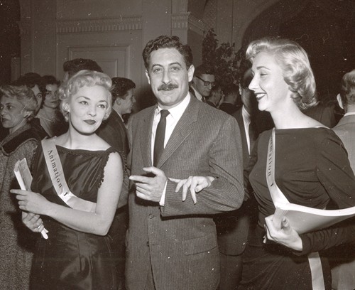
Other photos are from an exhibition of animation art and screenings from the different commercial studios in NYC. This was held in April 1952.


Pauk Kim was the artistic designer of the exhibition.


This is Lu Guarnier in front of a sign which lists
all the studios at the time that participated in the
exhibit of cels and artwork – and a screening of spots.


Rose Eng (?), Anne Eng (Fred’s wife), unknown visitor, Fred Eng


Francis Lee


Pablo Ferro


Lu Guarnier


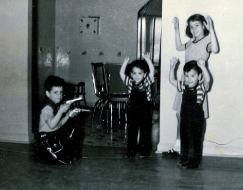
And at the very same time these animators were being
photographed at the animation function, I was holding up
my twin brothers and older sister dressed in my cowboy garb.


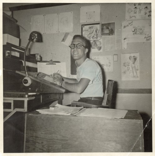
Among Candy’s photos was this one of an inbetweeener,
Fred Diamond, at his desk in Famous Studios. I thought
it interesting to see what the setup looked like at Famous.

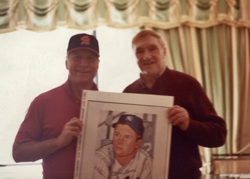
Finally here’s a picture of Assistant Animator, Gerry Dvorak, who painted baseball cards in his early days, then went into pictures of snow leopards.


This is Gerry posing with Mickey Mantle at Mantle’s hotel room.
They’re holding up Gerry’s baseball card painting of Mantle.

____________________

Commentary 30 Jun 2012 07:11 am

Awards, Animated Oscars and other movies

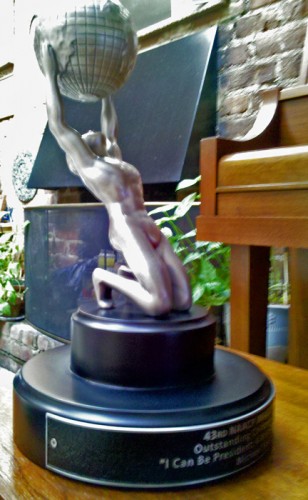
- Back in February, I got a real kick when I found out that I’d won the NAACP Award for Outstanding Children’s Programming for my show, I Can Be President. HBO told me that they would get my award and send it to me. Great to have a big-sized advocate.

This past Monday, I suddenly remembered that award and emailed HBO about it. I wondered where it stood. They found it at HBO and said they’d send it to me. Since I live about a dozen blocks from HBO, I planned to pick it up, myself, from HBO. They said it might be better if I let them deliver it.

Turns out that the award weighs a ton, and is pretty big. I’ve taken a couple of pictures of the prize and am posting them here. I couldn’t be prouder. Yet, again I thank the artists that worked with me to get out this film: Matt Clinton and Katrina Gregorius. I also thank Christine O’Neill who did all the behind-the-scenes work to make the production possible.

The Award

1
It has to weigh somewhere between 25-30 pounds.

2

3

____________________

- Congratulations to Emily Hubley who was just voted in as a member of the MP Academy. Another New Yorker in the group! If you ask me, it’s been a long time coming. She’s been making films longer than many of the other members, and is such a serious and devoted
animation artist. She’ll be a credit to the group.

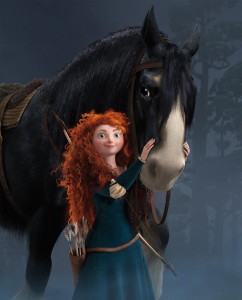
I like the fact that there seems to be a large number of strong animated features coming out this year. Brave is the formidable release this year, and I expect it’ll be hard for other films to beat it. Madagascar 3 has gotten such positive attention that I’m almost encouraged to see it, myself. Ice Age 23 will be out mid July. Just in puppet animation we have Frankenweenie, ParaNorman, and Hotel Transylvania; all of which feature monsters. And there are many more a comin’ It’s a big year for animation.

Epic looks like the most interesting of them all, though shades of Arietty overshadow it for me. (Actually, Arietty has been my favorite release of this year.) Epic will be released by Fox in 2013. Maybe that’ll be a big year, too.

____________________

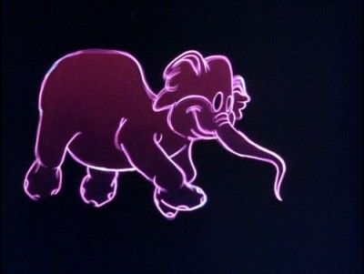
- Bill Benzon has another excellent article on his site, New Savannah. This time he discusses the “metaphysical implications of animation as a medium, specifically, animation as opposed to live action film-making.” It’s a good read about animated elephants, particularly those in Dumbo.

____________________

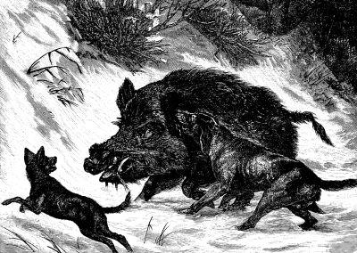
- And speaking of Miyazaki, the new movie, Beasts of the Southern Wild, features a few scenes right out of Princess Monokone. There’s a slew of enormous wild boar with tusks and temperament that torment the lead character, Hush Puppy. The confrontation scenes at the end of the film have almost as strong emotional weight and power as Miyazaki has brought to them, even though this seems to be live action (with cgi help). A.O.Scott of the Times said that “Beasts of the Southern Wild is a work of magic realism and, to some extent, an exercise in wishful thinking.” It’s a raw version of Terrence Malick, but that could just be the immaturity of the filmmaker. This is his first movie, and he’s only 29. But then his brilliant star is just six years old, and she gives the year’s best performance so far.

This was certainly the movie of the week, far better than To Rome With Love (even though I’m a Woody Allen junkie.) This film seemed miscast, poorly acted (Penelope Cruz just is wrong for the part and not trying to act in it) and sloppily written. I haven’t seen Ted, but I’ve enjoyed the trailers I’ve seen. I’d expect the worst from Seth MacFarlane, though I usually laugh at some of his stupid jokes. He’s, at least, sweeter than Adam Sandler.

There is another animated feature currently playing in New York. The Korean film, King of Pigs, will play at the Korean Film Festival at the Walter Reade theater in Lincoln Center Saturday & Sunday July 7th & 8th. The film has been compared to Lord of the Flies.

The film and the Festival were reviewed well in the NYTimes yesterday. There are also another two animated korean features in the Festival. There are also Asura Thursday, July 12th and Gyo Saturday, July 14th. Go to the schedule to read more about these films or to buy tickets in advance.


____________________

Tomorrow, I have some old photographs of animators from days gone by (the 50s).
I like that post, and I think you will too.

Bill Peckmann &Comic Art &Illustration 29 Jun 2012 05:03 am

Jesse Marsh Comics

- A while back I posted a Jesse Marsh piece contributed by the indomitable Bill Peckmann from his wonderful collection of material. Now, just in time for the release of the new book on Marsh’s Tarzan strips, Tarzan: The Jesse Marsh Years – vol. 8, Bill has sent me a stash of new strip pages.


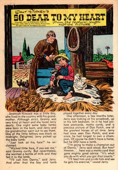
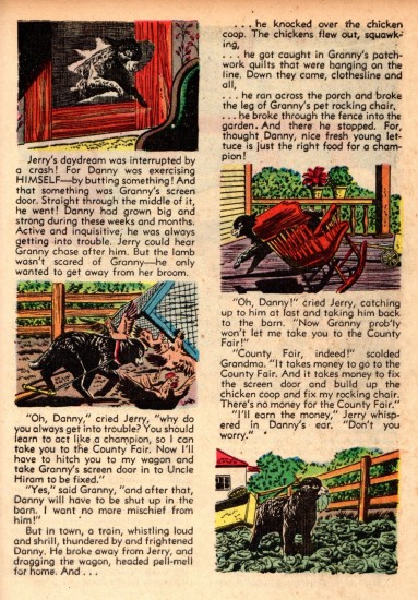
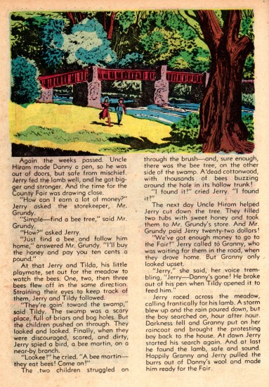
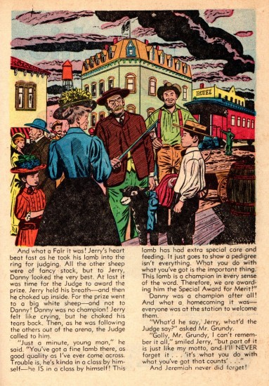
Here from ‘WD’s Christmas Parade’ No. 1, 1949, are the
illustrations Jesse Marsh did for the
text of the 4 page story, ‘So Dear To My Heart’.

1

2

3

4

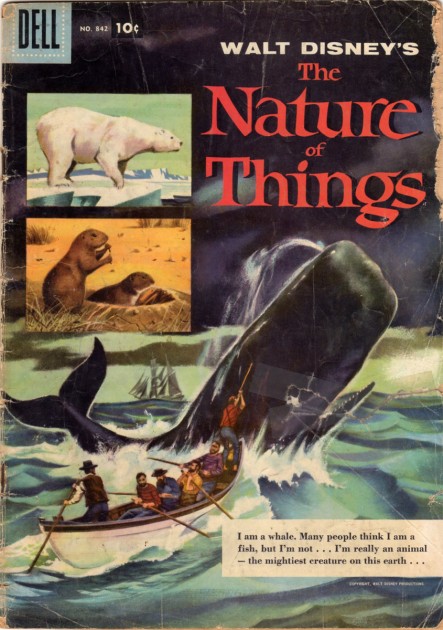
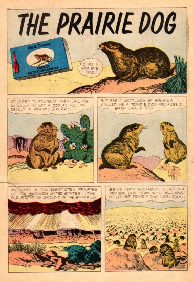
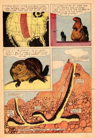
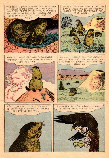
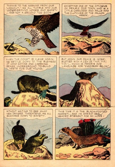
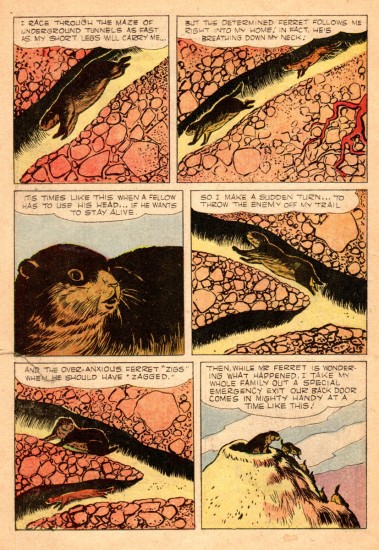
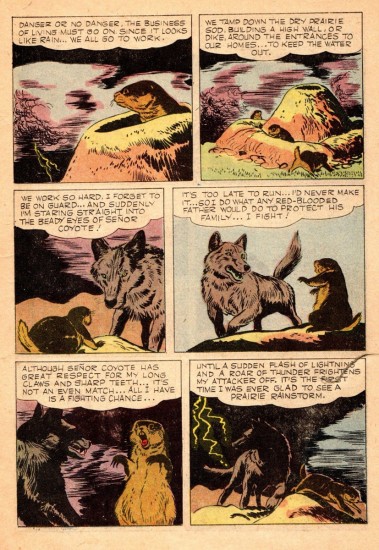
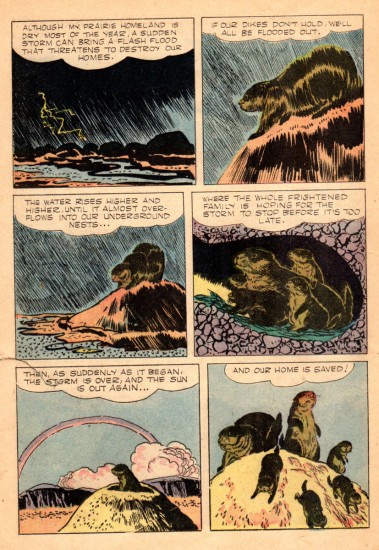
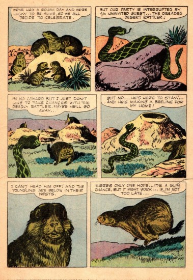
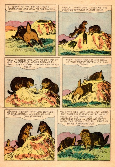
We’ve already posted the polar bear story from this 1957 Dell comic book ‘Walt Disney’s The Nature of things’. Here is the Prairie Dog story from that issue.


Cover of this 1957 magazine.

1

2

3

4

5

6

7

8

9

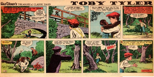
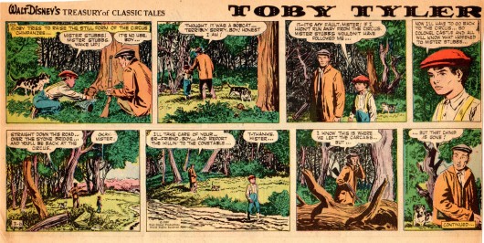
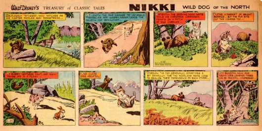
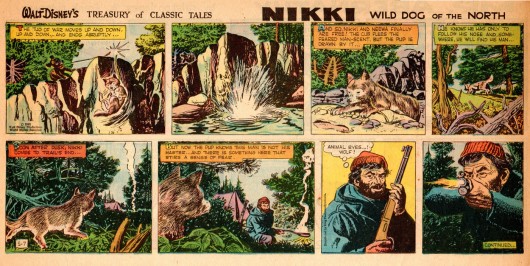
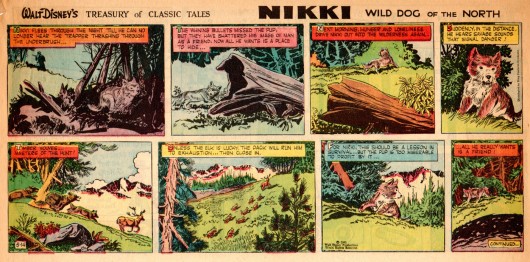
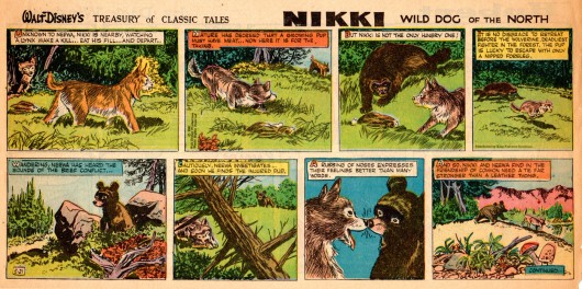
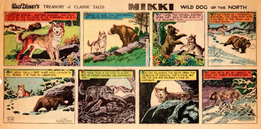
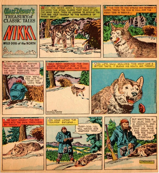
In the 1960 Sunday New York Journal-American funny papers we find Jesse doing the strip ‘Walt Disney’s Treasury of Classic Tales,’ meaning Marsh was adapting Disney’s live action feature length films.

Unfortunately, this is not a complete collection but just a few of the strips to show what two of the adaptations looked like.


Just the series titles: TOBY TYLER and NIKKI, WILD DOG OF THE NORTH
is enough to send “Baby Boomers” like me into a nostalgia tail spin.


I remember reading this strip on Sundays in
the NY Journal American: Puck the Comic Weekly.


Bill Peckmann &Books &Illustration &Rowland B. Wilson 28 Jun 2012 06:24 am

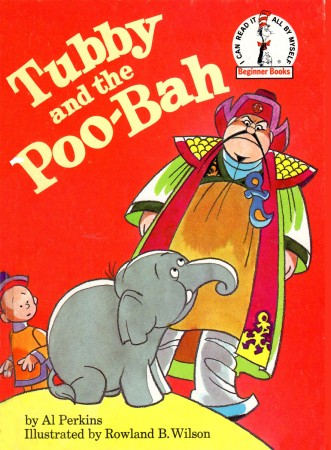
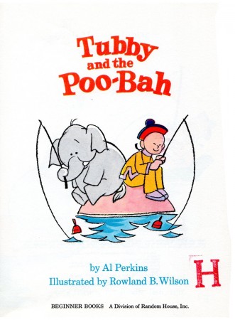
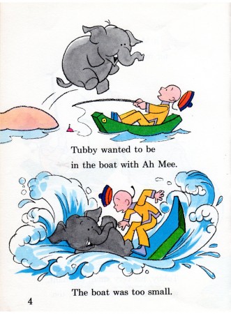
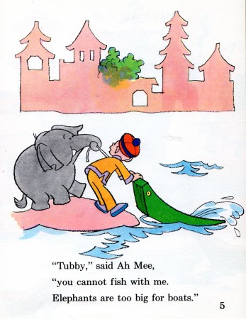
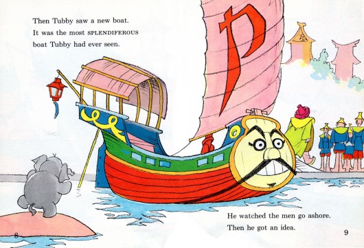
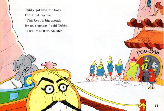
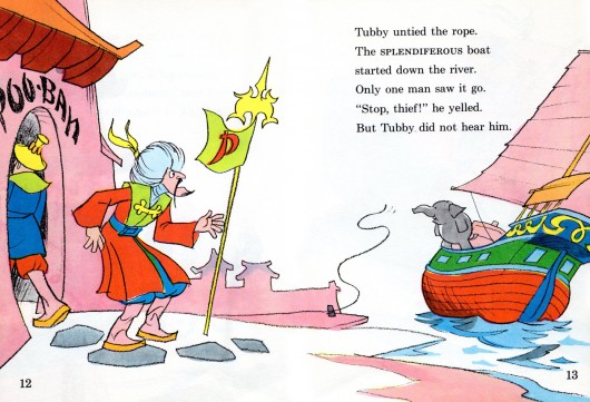
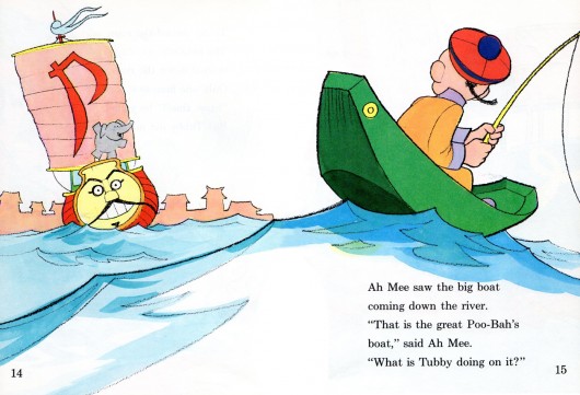
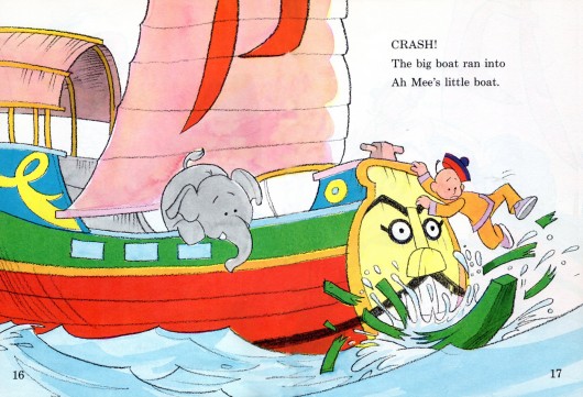
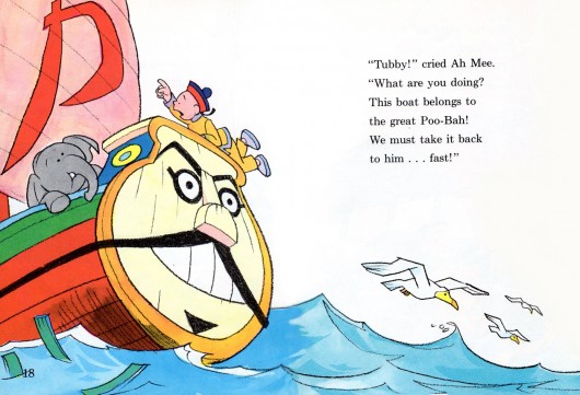
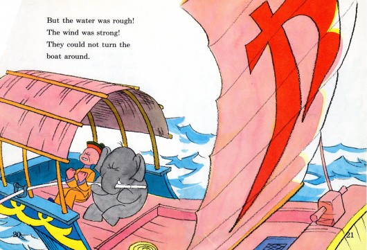
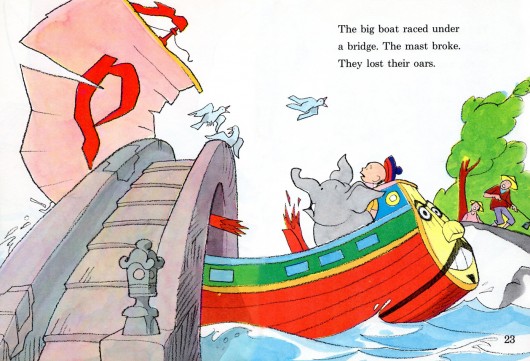
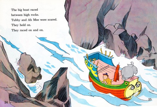
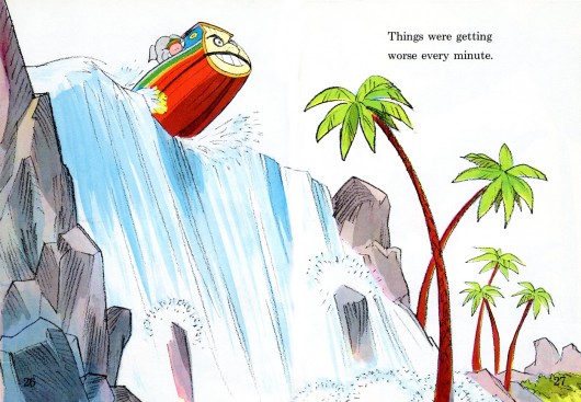
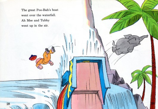
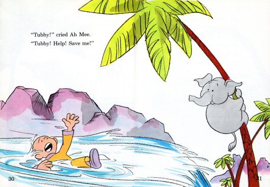
Rowland Wilson’s Tubby & the Poo-Bah

- In 1972, Rowland Wilson published another book featuring his character, Tubby. (We’ve posted the first here.) Bill Peckmann surprised me with scans from the second in the series, Tubby and the Poo-Bah. Here’s what Bill had to write:

    Here is Rowland’s ‘Poo-Bah’ book. Lots of good news here, Denis Wheary‘s copy is almost in mint condition, the spine seems to be laying very flat for the scanner and RBW is really getting in the groove on this his second ‘Tubby’ book from 1972!

    I would also say that the editors let Rowland run with this like the art directors did in his early print ads and TV spots and because of that, we all came out winners!

Here’s the first half of the book. The second half will come next week.


The book’s cover

2

3

4

5


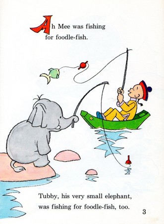
This double page spread is beautiful in it’s simplicity. The three levels
of foreground, middle ground and background are very neatly realized,
especially the up front wave swell with it’s sculpted boy and boat,
all those different shapes singing!

.

Bill Peckmann followed up this first half of the book with this:

    Suzanne Wilson and I were admiring Rowland’s deft handling of water in ‘Poo-Bah’ and she was kind enough to send me these two ‘Mermaid’ pieces that RBW did. Add ‘em to your collection!

1

2

Animation &commercial animation &Layout & Design &UPA 27 Jun 2012 05:44 am

UPA Commercial Layouts

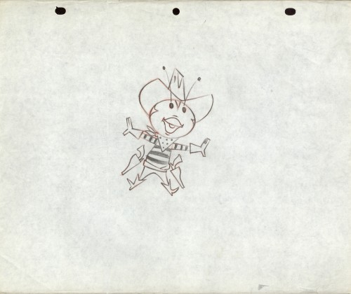
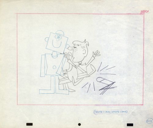
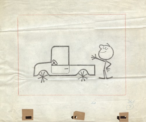
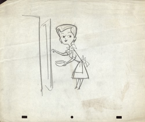
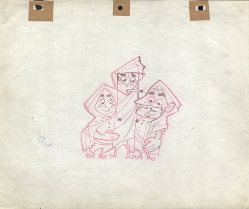
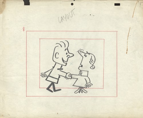
- Having swept through Vince Cafarelli‘s collection of Fleischer/Paramount artwork, We move onto the next box which is his commercial work. Vince was an Assistant Animator at UPA New York. He saved a group of layout drawings for some of the commercials. Unfortunately, only a few are marked as to what the sponsor was. so it amounts to a number of drawings which often have no relation to each other.

However, the drawings included all are good representation of the beautiful and diverse design employed at the studio. Here are a first group; when I can identify the spot, I will. If you recognize any of them, please let me know.

The peg system used throughout is called “Signal Corps.” This is where the size of pegs was first used. By this time, New York animators had three different sized pegs to use: Acme, imported from California;
Signal Corps, a hold-over from the Army, and
Oxberry, invented just after the War by John Oxberry.
They all had their different advantages, and they all remained in use through the 80s, when Acme finally took over.

1
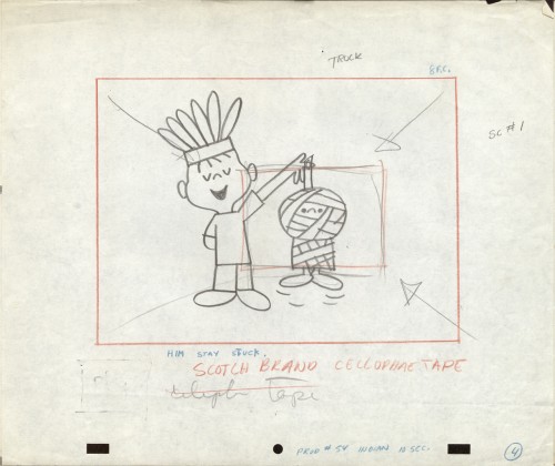
Mark Kausler commented: “… the first two are “Buffalo Bee” from
the Nabisco Wheat Honeys commercials. Mae Questel was the voice,
they appeared on the early Mickey Mouse Club shows, 1955-56.”

2
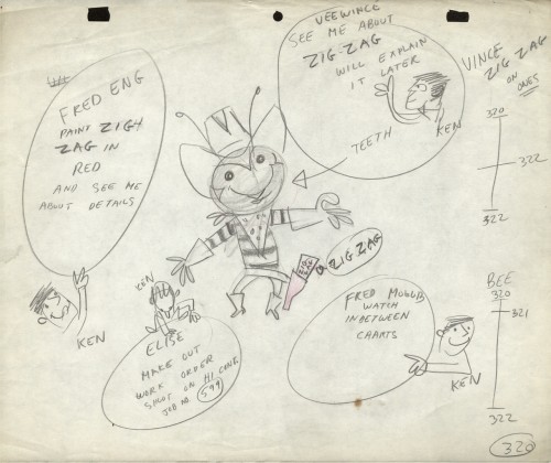
Note how the animator leaves notes for the crew who will work on the spot.
“Vince” was the Assistant Animator. “Fred Mogubgub” was the inbetweener.
“Elise” was the checker/Prod. Coordinator, and “Fred Eng” the talented inker.

3

4

5

6

7
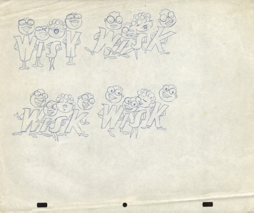
This is obviously for a Wisk commercial.

8

9

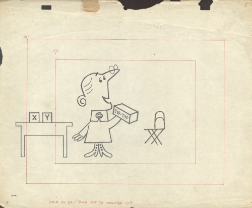
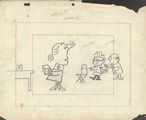
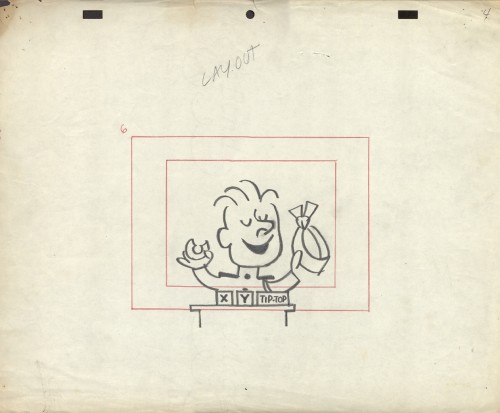
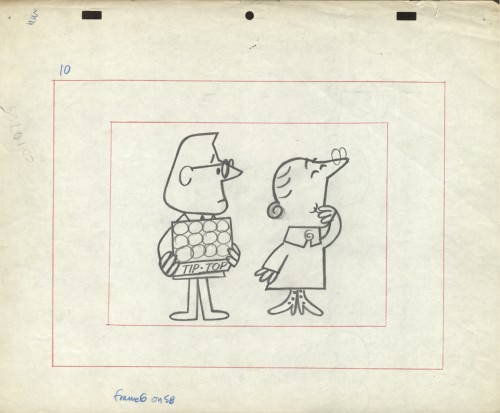
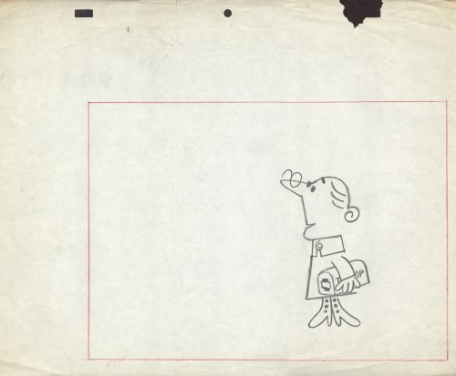
The final six LO drawings are Emily Tipp for Tip Top bread.
She was a very successful spokesperson for the bread company.
These may have been done at Kim-Gifford Studios rather than UPA.
I kept them with UPA because the peg system is consistent
with other UPA commercials.

10
To see some of the Emily Tipp spots go here
at the Buzzco website.

11

12

13

14

15

Bill Peckmann &Books &Comic Art &Illustration 26 Jun 2012 06:31 am

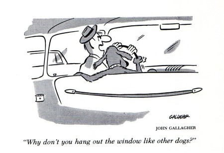
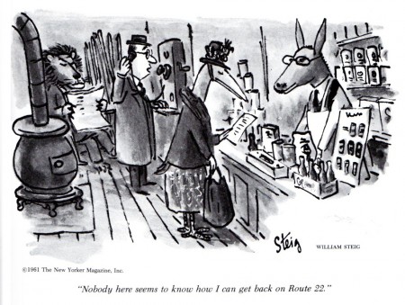
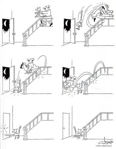
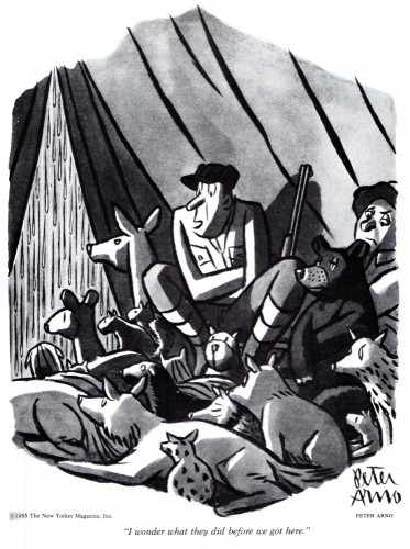
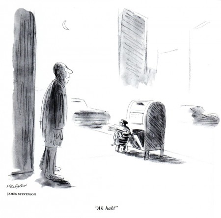
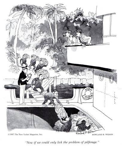
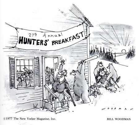
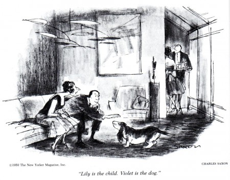
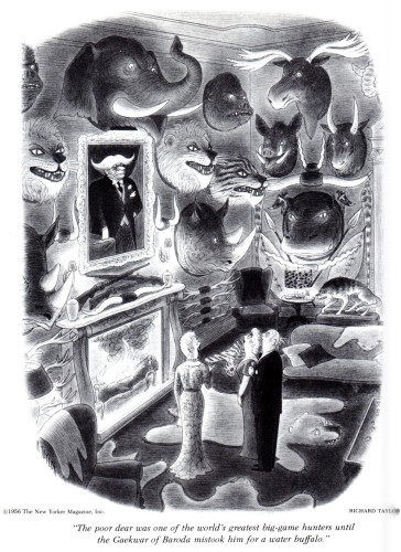
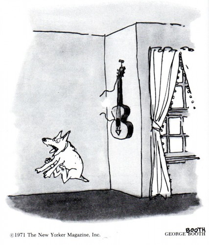
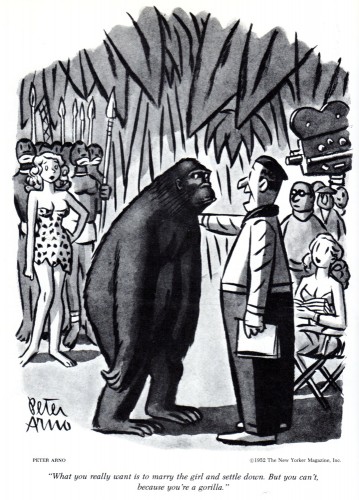
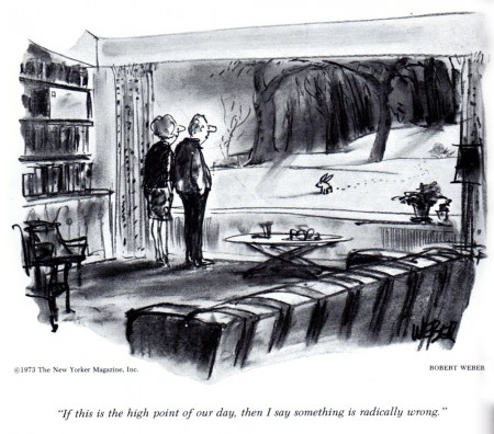
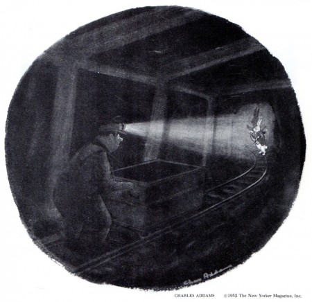
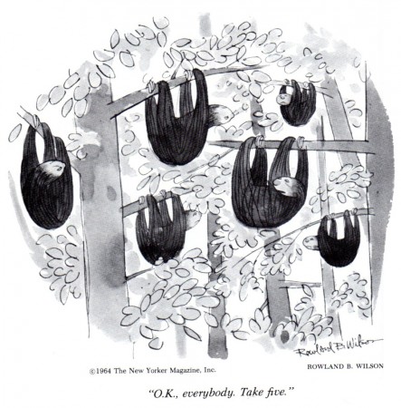
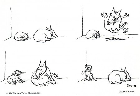
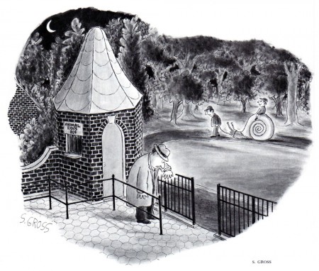
Animal Gags à la the New Yorker

- I love getting these out of the blue emails from Bill Peckmann, followed by a flurry of great cartoon scans.

Here’s the latest and his comments prior to sending:

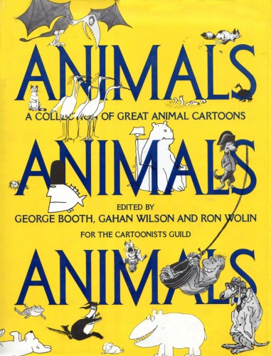
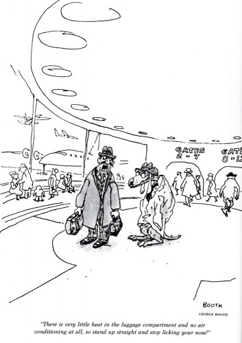
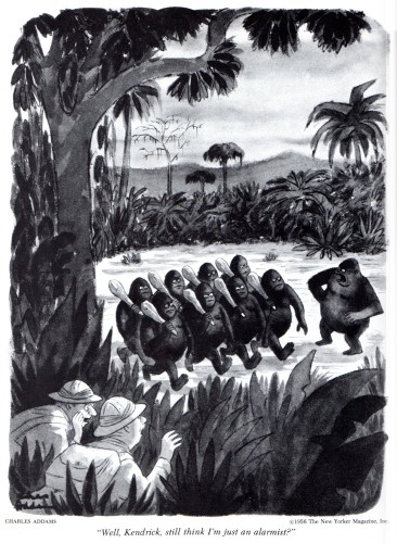
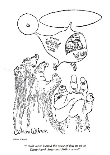
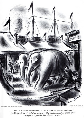
    I just came across this 1979 book of mine, a collection of animal gags, all collected from past New Yorker cartoons, it has a bunch of our favorite cartoonists in it, Rowland B. (only 1 gag of his, but it’s a good one not seen before), 4 Peter Arno’s, 3 Whitney Darrow Jr.’s, 6 Charles Addams’, and of course the author/editors Gahan Wilson and George Booth, plus many more, all rib ticklers

    With not one, but two legendary magazine gag cartoonists editing this 1979 collection of animal gags, what else can I say but enjoy!

    Here’s a small portion of their pick of the litter.


The book’s Cover

2

3

4

5

6

7

8

9

10

11

12

13

14

15

16

17

18

19

20

21

22

23

24

25

26

.

Many thanks to Bill Peckmann for the scans.

Animation &Commentary &Hubley &Independent Animation &Layout & Design &repeated posts 25 Jun 2012 06:29 am

Everybody Rides – repost

I posted this in the summer of 2008. I’ve ganged two parts together to make one read.

- Back in 1976, I was working on John Hubley‘s Bicentennial flm, PEOPLE PEOPLE PEOPLE. This was a short film, four minutes long, that had about a million scenes. It told the history of the US (from the standpoint of populating and overpopulating) beginning 17760 BC and ending in 1976 AD.

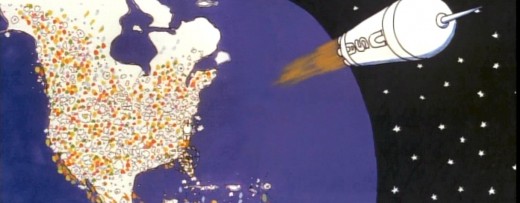
It started with some lengthy scenes. As the film moved on, the cuts came faster, until they hit about 6 frames apiece toward the film’s end. The final scene, from space, was the longest in the film.

There were no characters that appeared in any more than one scene. That meant that with each scene, there were new setups, new characters, new colors, new everything. As a result, it took much longer than other films and was a difficult one to pull off. But like all other Hubley efforts, it was fun. Tissa David, Jack Schnerk, Lu Guarnier, Phil Duncan and Bill Littlejohn animated it. I colored about 2/3 of the film and animated at least a dozen or two scenes (some really were only 6 frames – like that auto shot posted). I also assisted/inbetweened all of the animators.


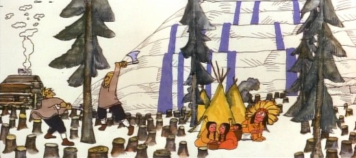
Swedes cut down all the trees in PEOPLE PEOPLE PEOPLE.

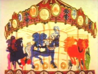
The studio, at the time, was buzzing because John and Faith had just sold a dream project to CBS. EVERYBODY RIDES THE CCAROUSEL was an adaptation of Erik Erikson‘ 1956 book, Eight Stages of Development. Erikson was a psychologist who theorized that man goes through eight stages of development from birth to death, and he proceeds to break them down. The Hubleys took this book and broke these eight stages into horses on a carousel.
The three half hour Special shows for CBS would be about these carousel horses and the ride.

Each of the stages would be broken into two different subsets, and these would be depicted through stories which were roughly developed visually by John and Faith. Once the funding started to tricle in (about $450,000 for all three shows) they would cast their many actors and have them improvise in the recording studios to the storyboarded set pieces.

While those recordings progressed, the small studio staff was busied in completing animation, artwork and rendering of PEOPLE PEOPLE PEOPLE.


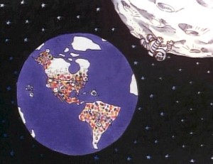
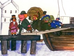
The man on the moon and the Irish immigrants.


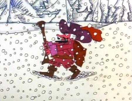
Jack Schnerk animated the French trapper sequence. There was such a rush
on the scene that I remember Jack bringing it in saying he hoped it would work.

He’d done two drawings of snow for the blizzard. Both wildly different from each other.
He asked me to ink them, then flop the drawings and ink them again.
He’d exposed the four drawings on fours. He also had the trapper with
snowshoes walking on fours. He felt it would help us feel a struggle in his
walking through the snowstorm. He felt the fours might add weight.
The scene worked beautifully, and was excellent the first time out.
Not quite the way they’d have done it at Disney. Tricks of the trade.


Tissa animated a majority of the film. The ending, the man going to the moon to escape
the overpopulated earth was hers. I have the drawings somewhere and will post some of them soon.

– We started slowly on Everybody Rides the Carousel. There was a six month schedule for about 72 mins of animation. Three half-hour original tv shows for CBS about 24 mins each. They’d air in the late summer of 1975 just prior to the start of the new tv season. Each show would air a day apart from the others – three nights in a row.

John and Faith spent a lot of time – a lot of time – at RCA studios on 45th Street. (It’s
____ The carousel was bottom lit & became soft focus.____-_ now an IRS office.) They recorded many of the voices playing the numerous parts in their show. I tried to time meeting them there a couple of times hoping to meet some of the actors (I particularly wanted to see Jack Gilford in action. He was doing an hilarious part with his wife, playing a couple of cranky old people in a diner.) It didn’t work out that way, but I did see the facility and heard parts in process.

The key staff working IN the studio (not counting animators who would, for the most part, work freelance) included Ida Greenberg. Ida was a brilliant checker / coordinator who’d started back in the Florida days of the Fleischer studio. (She told me a few great stories about Gulliver’s Travels.) Ida was a great woman, with the thickest New Yowk accent, who never seemed to buckle under pressure. I grew very close to her. I tried after that to have Ida everywhere I worked. She led Raggedy Ann’s I&Pt and R.O.Blechman’s special.

Kate Wodell was a student of the Hubleys at Yale. She was a talented artist who’d moved into production during the making of Cockaboody and continued on staff there. Sometimes she colored, sometimes she animated, sometimes she did whatever was necessary. This was exactly how I moved into the studio and loved the experience. She worked with Faith for many years after John died.

Earl James was an animator who’d worked in the backroom of many NY studios from Paramount to Terrytoons to NY Institute of Technology. He also had done some comic strip work.

Earl was given the carousel to animate. This came from a couple of elaborate drawings John did. Earl worked 16 fld. using a 96 drawing cycle. It gave us a lot of opportunity to move in tight or stay wide. However, it was a nightmare that took forever. Joe Gray was hired to assist Earl. (Joe started during the Terrytoons strike and never left. Many of those who knew him as a “scab” never forgave him and had only horrid things to say about him to me some thirty years later. He was a lifetime assistant like a handful of other noted names in NY.)

This scene moved so slowly through production that I kept jumping in to assist as well. I was a fast assistant, but that carousel slowed even me down. 8 horses moved in perspective in a circle; there were 96 different rotating views of all the horses. I’d guess the scene took about 10 weeks to complete.

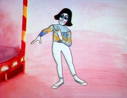
I was also doing layout and animation of a lot of connecting scenes throughout the production. These were scenes that would have to blend from one animator to another, or John had decided to go in tight for a closeup. In one case with Art Babbitt’s mime character, I was asked to change it from two’s to four’s with a dissolve technique John taught me (he said they’d used it on Fantasia.)

There were four people in my room, Earl, Joe, me and Mark Hubley. He worked alongside me for most of the film. He colored artwork given him by Ida, who was working in the larger room next door. Mark and I had a good releationship going back the many years I worked there. He joined the studio once he completed college. Emily Hubley worked alongside Kate and Ida.

Two younger, more experimental animators were brought in by John. Adam Beckett had made a name for himself with the films he was doing at CalArts.
Fred Burns was doing some incredible work at UCLA. They both were very different and added their unique touch.


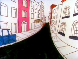
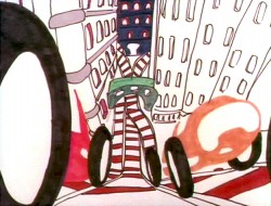
___________ Adam Beckett’s scenes included these two surreal images.

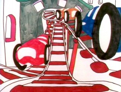
Adam did a scene a couple of scenes wherein office furniture floated about in a very complicated surreal cycle. Fred did this amazing scene of a roller coaster from the POV of the rider. He and I worked together a number of times after that, and we’ve stayed friends.


______________ Fred did this very elaborate sexual roller coaster.

______________________

I hope to have more to say about some of these films I worked on.

Animation &Animation Artifacts &Fleischer &Models 24 Jun 2012 05:33 am

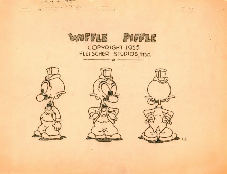
Wiffle Piffle – repost

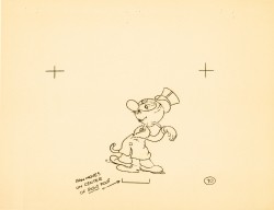
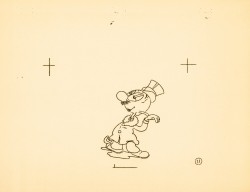
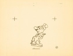
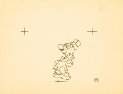
This character is really every thing you need to know about Fleischer animation. Animated by Tom Johnson the guy’s alive, and he’s nothing more than a wacky cartoon character. He couldn’t be anywhere else. Where’s the cgi equivalent? Oh that’s right; it couldn’t exist.

Time to post it anew.

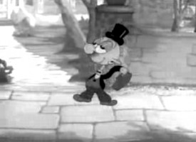
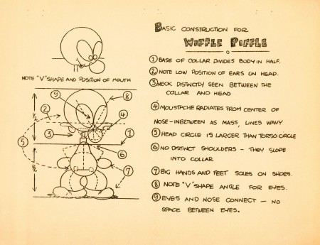
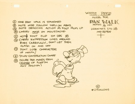
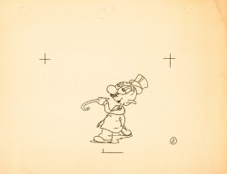
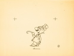
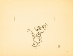
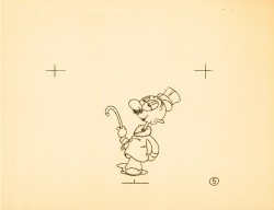
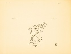
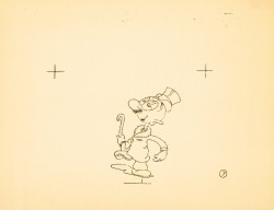
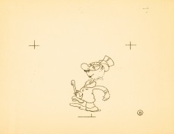
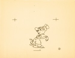
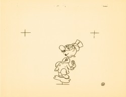
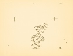
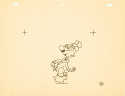
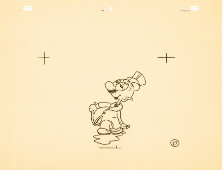
- Wiffle Piffle was a character that the Fleischer studio tried to develop out of the Betty Boop series. The first appearance was in a Screen Song: I Feel Like A Feather In The Breeze released in 1936. He appears as a waiter in the opening. The animation of the character was by Tom Johnson (as was this model sheet.)

Two follow-up films were made with this side character in Betty Boop shorts.
The first, released in February 1937, was Whoops! I’m A Cowboy, and the second, in March 1937, The Hot Air Salesman. The opening scene features an expensive multiplane shot behind him.

He seems to have been an Egghead type character whose sole character trait was a silly walk. Needless to say, they couldn’t find a job for him.

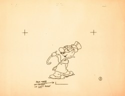
The model sheet for the character was an 18 drawing walk cycle with a bit of a turnaround. Cross-hairs keep the character in registration; only a couple of the pages were punched.

1 2

3 4

5 6

7 8

9 10

1112

1314

1516

Wiffle Piffle walk cycle
On ones at 24FPS
Click left side of black bar to play.
Right side to watch single frame.

Commentary 23 Jun 2012 05:36 am

Sarris & Scher & Assorted Other Things

- When I was in the Navy, 1970 to be exact, I was stationed in Adak Alaska. Adak is a small island centrally located in the Aleutian Islands. There were 250 of us on the island, separated from the principal part of the base by seven miles. A very tough ride to make on days off – if weather allowed it. Not only did I feel separated from the real world, I was.

Out of the blue, one day, I received a wonderful little package. It was copy of Andrew Sarris‘ giant of a book, The American Cinema: Directors and Directions 1929-1968. Sarris was the film critic for the Village Voice. He had introduced America to the French idea, the auteur theory of film criticism. This theory flatly stated that it was the film’s director who authored movies.

Back then, this new idea was mocked. It was easy to appreciate such thoughts about Europeans like Bergman, Truffaut or Rossellini. But how ridiculous to bestow entertainers like Hitchcock, Ford or Hawks with such esteem.

During the 60s, 70s & 80s, Sarris and Pauline Kael conducted bitter and open arguments about film theory. John Simon and Stanley Kaufman were often participants in these debates which often lifted the evaluation of many films and made film theory and criticism almost an art in its own rite.

I, personally, was just beginning to shape my thoughts about film. Sarris came to me at the perfect time. The book was broken into a number of categories like “Pantheon,” “Expressive Esoterica,” or “Less than meets the eye.” Within these categories some 200 American film directors are ranked, and more than 6000 films are evaluated. I didn’t know who many of the directors were nor had I even heard of the majority of the films.

However, I was so taken by the book’s content that I reread it at least a half dozen times – over and over and over. Having consumed the book, I rushed back to it as reference any time I saw a film or read about a director. I just about memorized what Sarris had to say about many many American film directors. What’s more I often agreed with Sarris as my opinions grew stronger.

The book directed me to a full knowledge of American cinema and a strong appreciation of its history. First I have to thank my friend, jim Weslowski, for sending me the book, but, foremost, I thank Sarris for all the information and film theory he’s given me.

I write this only a couple of days after Andrew Sarris has died of complications from an infection after a fall. Reading this news disheartened me. He was among the “Pantheon” of film critics. He didn’t resort to thumbs up or down; he turned to words which could help educate us about the Art of Film. Everything smart and good seems to be passing.

________________________________

- I’ve been reading the local reviews of Brave and have found hem interesting. They seem to break into two types:
there are those that casually give it 2 or three stars and add another 500 words.
Then there are those that go into depth and analyze the film’s story and substance, including all the elements that make up the film.

It would seem that those who give the film more space seem to like it more than the quick-star reviews.

The two I particularly liked were Manohla Dargis’ review in the NYTimes.
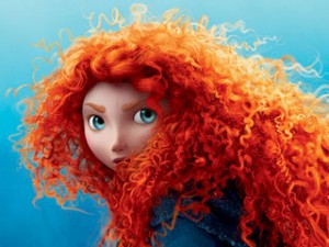
    “The riotous mass of bouncy curls that crowns Merida, the free-to-be-me heroine of the new Pixar movie, “Brave,” is a marvel of computer imagineering.”
    “Merida is active instead of passive, a doer rather than a gal who hangs around the castle waiting for Prince Charming to rescue her. More to the point and to the movie’s marketing, she is Pixar’s first female protagonist, which means that there’s a lot more riding on her head than that ginger mop.”
    “Merida doesn’t dream that her prince will come; she doesn’t have to because it’s clear that, within the logic of the movie, the alternative is comically unthinkable. It’s no great surprise that she wins the struggle to determine her fate. But hers is a contingent freedom won with smiles, acquiescence and a literal needle and thread with which she neatly sews up the story, repairing a world where girls and women know exactly where they stand. “

and Melissa Anderson‘s review in the Village Voice.

    “Advancing the story’s Grimm-like grimness is a suitably dark color palette, hues that sometimes suggest Rorschach inkblots. For all female audience members with memories of their struggles of individuation from their mothers, Brave is its own kind of psychological projective test. But again, as convention dictates, these almost-unbearable horrors—a child’s guilt over turning a parent into something unrecognizable, of “destroying” her family—are quickly ameliorated, as Merida sets out to ‘mend a bond torn by pride.’ “

________________________________

- The indomitable animation artist, Jeff Scher, has a new OpEd piece on the NYTimes. Summer Sketches. To quote Jeff: “Water is the most animated substance on the planet, and when I’m not drawing it or painting with it (watercolor) I often find myself photographing it.” Water, this is the heart of the film.

I’m a bit disappointed that the score is not by Shay Lynch – Mr. Scher’s pieces have brought me two artists, both Jeff Scher and composer, Shay Lynch. However, this score is taken from “. . . the first movement of Viktor Ullmann’s Piano Sonata No.7, performed by the concert pianist — and my old friend — Paul Orgel.” Orgel was killed in Auschwitz by the Nazis in 1944, and this sonata was never completed.

The film is short, take a look.

________________________________

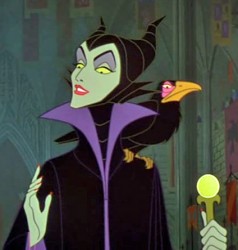
- There was a shot of Angelina Jolie photographed as Maleficent this past week. However it was a tight closeup that didn’t reveal very much. Then the newspapers offered more in the photos on Friday. The pics were from a British tabloid, so they’ve no doubt, been circulated. The one, above, was among them.

The brown costume seems wrong to me, but what do I know? As a matter of fact, another fairy tale named after the villain of the piece tells me a lot about how they’re all going wrong. A bunch of poor movies. Disney, rerelease Sleeping Beauty in 70mm and save yourself a lot of money instead of making a vanity piece for Ms. Jolie.

________________________________

- I wrote a bit about Brad Bird the other day.
Harvey Deneroff has a good interview with him on
his site, harvey@deneroff.com.
The interview was conducted when The Iron Giant had just started production.

________________________________
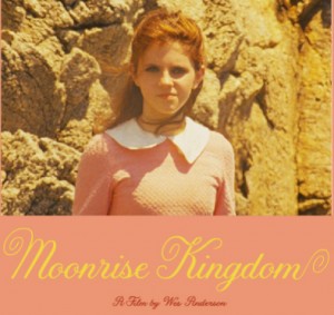
- On his site, Oswald Iten writes about Wes Anderson‘s animation for Moonrise Kingdom. It seems that the producer, director of The Fantastic Mr. Fox, is still in love with animation. In his new film, Moonrise Kingdom, his character reads aloud short snippets of several books she’s been reading. Originally, Anderson had planned just to show the books produced for the film, but ultimately he decided – regardless of the fact that they are not seen in the film – to animate the story bits. Here‘s the link to the animation.

I haven’t seen this information elsewhere, so I’m glad I read it on Oswald’s blog. He also writes in another post about the Anderson film, and its well worth reading (especially if you’re a fan of Mr. Anderson’s work.)
Bill Peckmann &Illustration &Rowland B. Wilson 22 Jun 2012 05:40 am

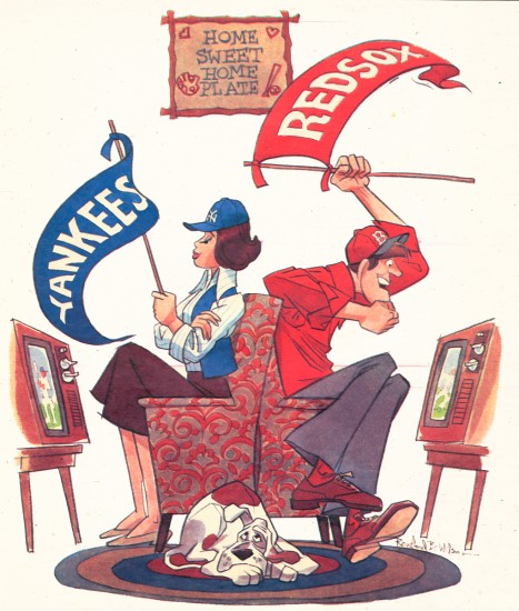
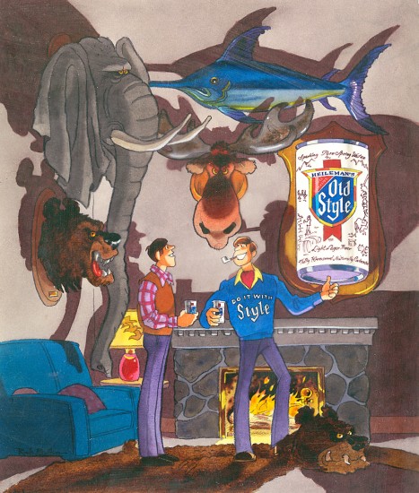
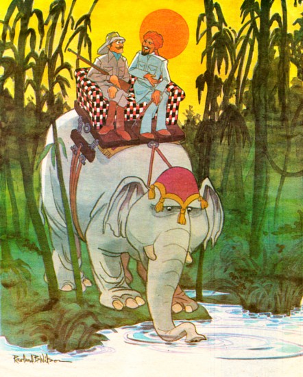
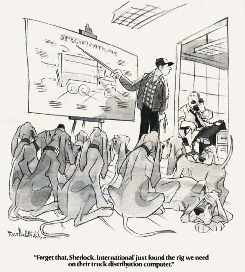
Another RBW assorted

- Suzanne Wilson has sent me some scans of beautiful artwork by her late husband, Rowland B. Wilson. What magnificent draftsmanship. His compositions are extraordinary and his color design is just beautiful. I takes my breath away to see how simply these are composed, yet the drawing is just so expert.

1
“Jean and Stephen are a loving couple–she loves the Yankees
and he loves the Red Sox”
Sunday News Magazine, New York, August 6, 1978

2
Old Style Beer
“…and I downed this one at the corner bar!”

3
“All my elephant chairs are upholstered with fabric made of “Belviva” yarn.
Under a sun like this, we need all the fade resistance we can get.

Collins and Aikman
HFD, Retailing Home Furnishings April 3, 1978

4
“Forget that, Sherlock. International just found the rig
we need on their truck distribution computer.”

International Trucks, The Wall Street Journal, September 21, 1976

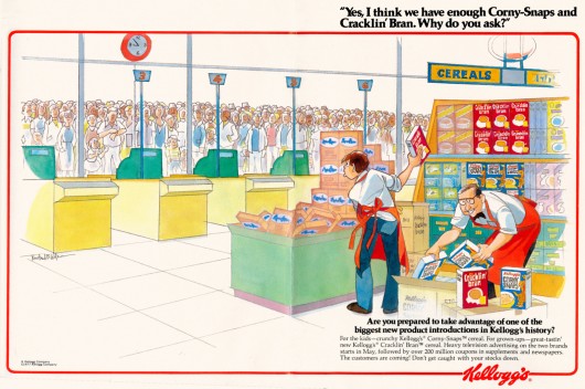
“Yes, I think we have enough Corny-Snaps and Cracklin’ Bran. Why do you ask?”

Ad text: “The customers are coming! Don’t get caught with your stocks down.”
Kellogg’s for magazine ads, 1977

6
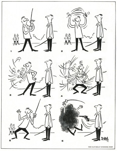
Way before Indiana Jones!
The Saturday Evening Post, May 19, 1956


Esquire Bourbon Dog
This was obviously a header for an Esquire article.


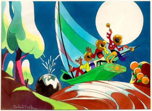
Calypso

9
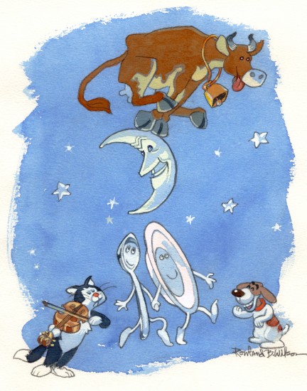
Over the Moon

10
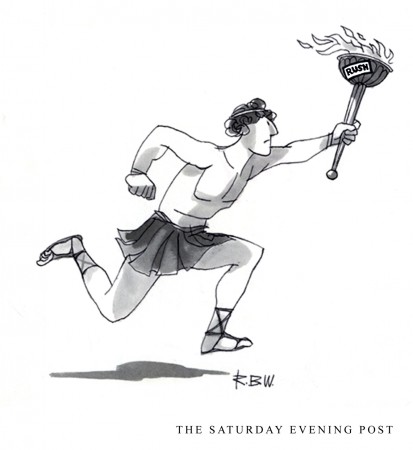
The Olympic Torch for
The Saturday Evening Post

11
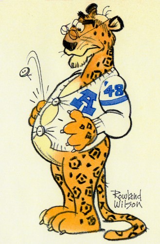
Leopard AHS

12
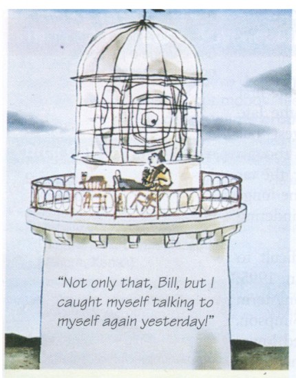
Carl Jung used this cartoon in “”Man and His Symbols”

13
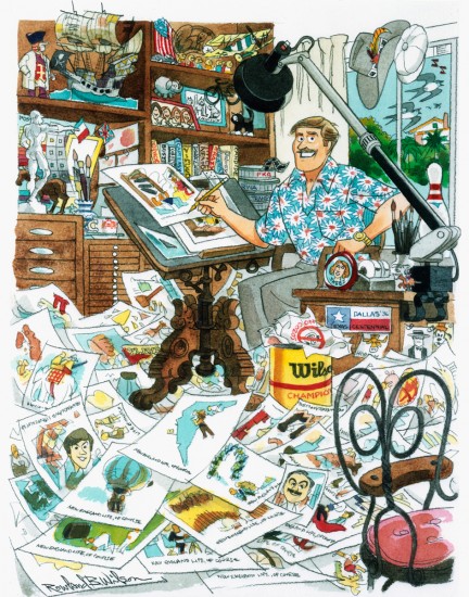
The Wilson Studio

« Previous PageNext Page »

eXTReMe Tracker
click for free hit counter

hit counter