Animation &Animation Artifacts &Hubley &repeated posts 30 Jul 2012 04:55 am

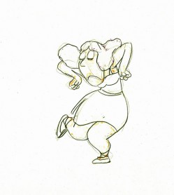
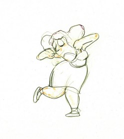
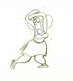
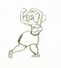
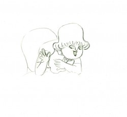
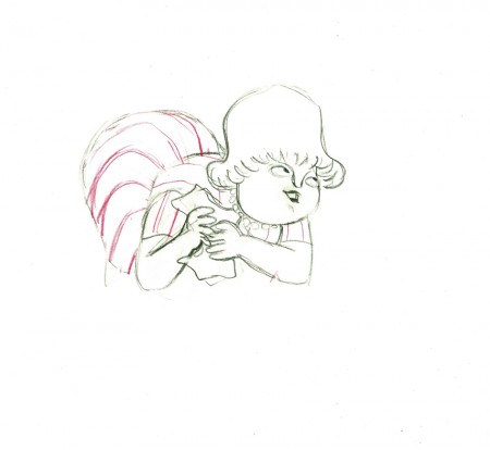
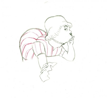
Tissa’s Glad Gladys – revisited

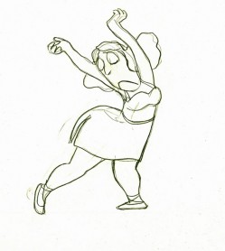
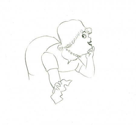
-Tissa David animated a lot of the Electric Company pieces for John Hubley. Hubley would design and write the spots, and he would get some real pros to do the tracks. In the case of this film, I believe it was the jazz legend, Billy Taylor, who wrote the music and did so for a number of Hubley’s Electric Co. films.

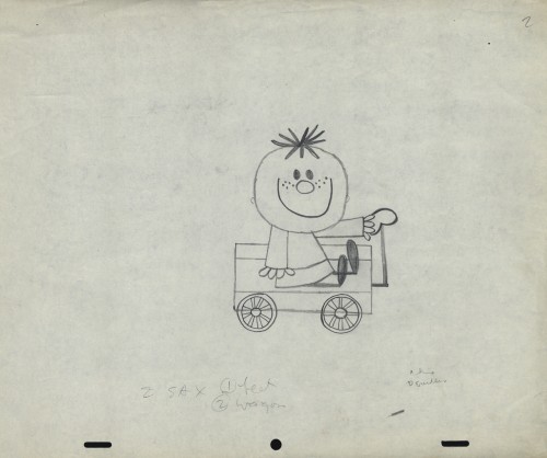
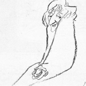
I’d like to post John Hubley’s LO drawings and follow it up with a few of Tissa’s animation drawings. John would usually do the loosest of layout drawings – usually in the presence of the animator as part of a discussion – and then hand it off to this person he trusted. Of course, the more he trusted the animator, the less he had to do in the LO.

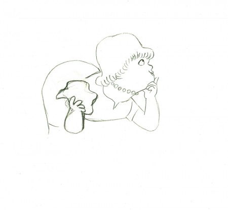
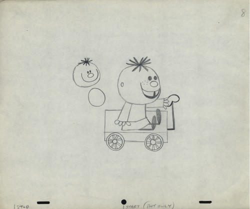
In the case of this spot, Tissa received the following drawing. (That’s right ONE drawing.)


(If you click any the image, you’ll
reveal the full sized animation drawing.)

Enlarge the image, and you’ll notice tape marks and pin holes where Tissa attached it to her wall.

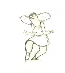
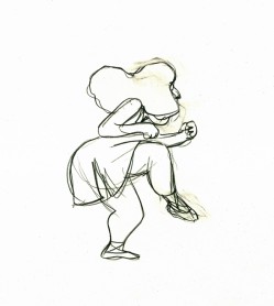
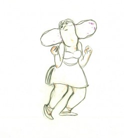
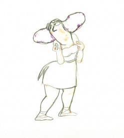
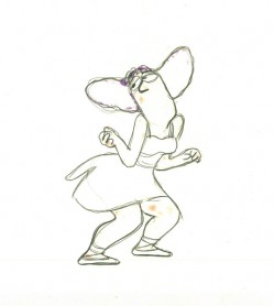
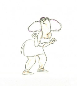
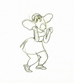
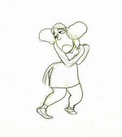
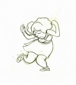
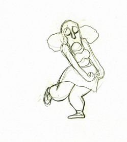
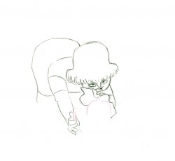
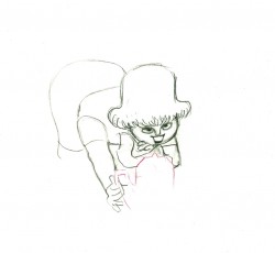
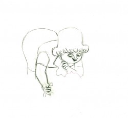
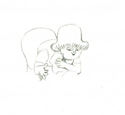
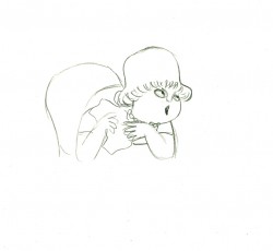
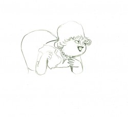
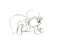
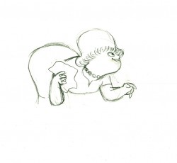
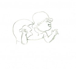
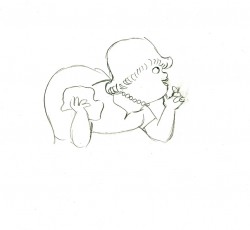
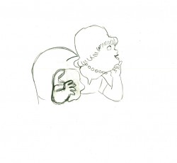
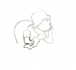
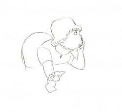
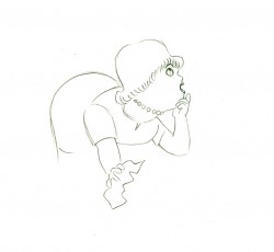
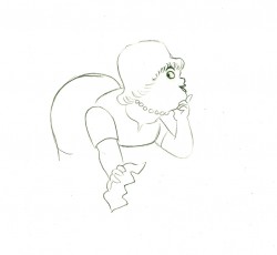
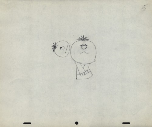
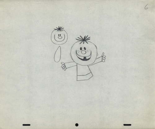
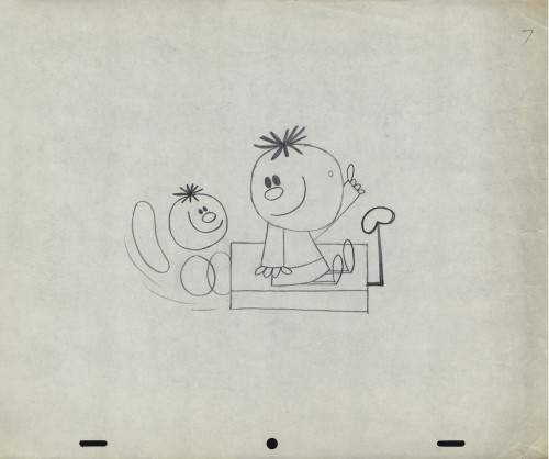
Here’s a short sequence of drawings done by Tissa. The missing mouths are on a separate level. This piece is built on reuse done artfully.


48 49

50 51

52 53

54 55

57 58

6061

62 63

64

Here’s how the drawings looked when they were colored. They were colored on heavier paper. Sharpie outlines and marker coloring. The white background was all they used for the final. The animation carried the piece.


7373

Finally, here’s a copy of the film found on YouTube:


Art Art &Theater 29 Jul 2012 08:20 am

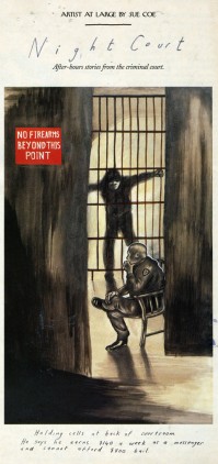
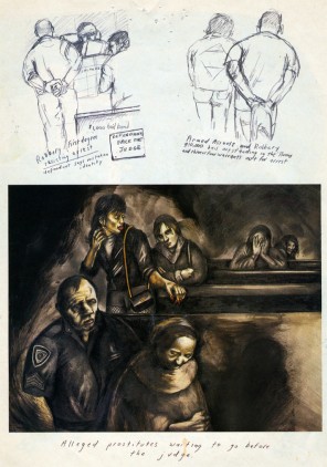
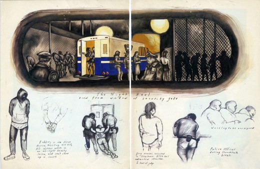
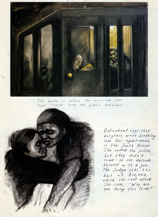
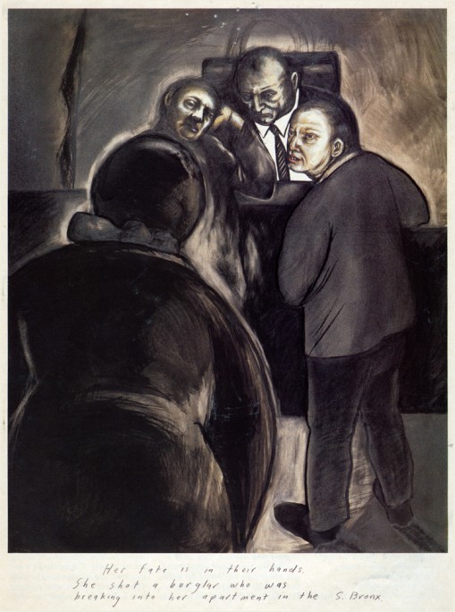
Sue Coe in Nightcourt – revisit

- Just in the past couple of weeks, one of my favorite current artists, Sue Coe, had a show in NY at the Galerie St. Etienne. Ms. Coe is very much akin to my favorite current playwright, Caryl Churchill. They’re both so brilliantly political. Last night, I saw an excellent production of Ms. Churchill’s anti-Thatcher play, Serious Money. Despite the very low budget, off-Broadway production, the show was every bit as great as I’d hoped. I tried to find something that was marginally related for today’s Splog, and I’ve decided to recap this Sue Coe post. Especially because it links to others about Ms. Coe’s work, I thought it very appropriate.

I feel as though I need a larger dose from the Coes and Curchills of the world as Mitt Romney bounds about the airwaves these days.

Sue Coe is one of my favorite current artists. A wholly political artist, it seems to me that she is the extension of the German Expressionists, focusing on man’s inhumanity to man, or Goya‘s Caprichos or Ben Shahn‘s attention to political injustice. All of her work seems to fit into this form, and I am completely attracted to it.

She is represented by the Galerie St. Etienne, in New York. Years ago, I was there, arranged by HBO, to see some paintings by Grandma Moses. While they pulled out the paintings for me, I was able to see a stack of lithographs by Sue Coe, and it made for a memorable day for me.

I’ve posted a number of other pieces about her and will probably do it again. You can view a couple here and here.

About 15 years ago, The New Yorker magazine, printed a number of pictoral essays by her, and I’ve saved several of them. Here’s her study of “Nightcourt” in the Bronx. I believe these images were represented by Galerie St. Etienne.

___
___(Click any image to enlarge.)

_
_

_

Books &Commentary 28 Jul 2012 08:03 am

Books and Things

Some Great Books

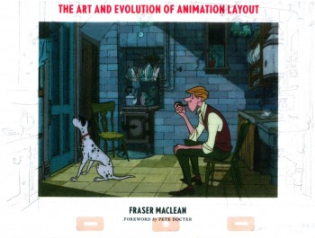
I’d received a note from Fraser MacLean this week. He’s the author of the brilliant and beautifully illustrated book, Setting the Scene: The Art & Evolution of Animation Layout. It was odd that I’d just been talking about his book when I’d heard from him. This got me to think that I might post a reminder of a couple of the excellent books that were released this year. I’d reviewed a number of them, and would like to keep them at the front of your mind, so to speak. Here are three easy picks to tell you about.

Setting the Scene: The Art & Evolution of Animation Layout is a book about Animation layout, obviously, and it belongs on every bookshelf of those who work in the medium or are interested in it. I guarantee your first visit to this book, though, will be your ogling the incredible illustrations. They’re just wonderful. From 101 Dalmatians to the Cobbler and the Thief, from Pixar to Dreamworks. It’s an attractive book.

The book covers layout from the point of traditional 2D animation, preparing for the camera, as well as for the computer. It also covers the Layout of animation for cgi films. (See my full review here.)

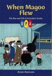
At the top of the list this year would have to be Adam Abraham‘s fine book, When Magoo Flew: the Rise and Fall of Animation Studio UPA. It is a gem. This is an intensely researched book about the studio that changed the direction of animation in the late 40s.

The book is a very political one, or at least it’s about the politics of the studio that grew out of the Disney strike and pushed on through the McCarthy hearings with their hot design influences. The politics also refers to the ins and outs of the studio, whether it’s John Hubley not liking Herb Klynn’s artwork or Jack Heiter losing his job for refusing to listen to Jules Engel‘s thoughts on color.

There’s a lot in this book and it’s a treasure for anyone interested in that studio or those people. It also helps that a brand-spanking-new DVD was released at the same time with many of the important films from the studio. Jolly Frolics, the UPA Collection. We’re still waiting for the Magoo Theatrical Films to be released, as promised, on DVD. Mr. Magoo:Theatrical Collection

This book also has a companion website, When Magoo Flew, hosted by the book’s author Adam Abraham. There’s material there which you won’t find in the book. (Se my fuller review here.)

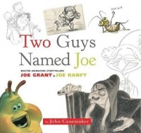
The third book I’ll mention here, is a big, lavish, picture book. Two Guys Named Joe: Master Animation Storytellers Joe Grant and Joe Ranft is the story of two story writers and artists working at opposite ends of the Disney Studio, and it was released almost a year ago today.

Joe Grant was one of the old timers who made it through the Golden Age in the 30s & 40s as well as the Golden Age in the 80s. He was a force in the studio, and brought some real art and artistry to the characters and designs he helped develop. Joe Ranft was a youngster who helped put Pixar on the map. His expertise in developing and telling stories made the early cgi features all that they were.

John Canemaker pulls their two stories together and showcases their lives and studio experiences to give an interesting viewpoint of the Disney studio. This is an unusual but excellent book, and in case it’s fallen off your radar, I might suggest you take another look if you don’t own the book. It’s a worthwhile volume to enter any animation collection. (View my full review here.)

________________________

Benzon’s Dumbo

On his blog, the New Savannah, Bill Benzon has focused in on Disney’s Dumbo and his in depth analysis features quite a few blogposts. Hearty reading for those of you who’d like to see more about this Disney great. (I sometimes think Bill is writing specifically for me; I love it.)

________________________

McLaren Animation – Tooned

Dennis Hermanson of Hillsborough, NC sent me a video that he thought I should post on the site. This is not really my kind of video. It’s trying to be Pixar and does a good job of it, but it doesn’t do anything to get me excited about animation. But I can see that it would excite others, so I decided to post it here, just the same. I hope you enjoy it.


Episode 01 (Wheel Nuts )

________________________

Daria

MTV is offering something called MTV’s Retro Mania. But I come a bit late because it’s ending its Summer run with the return of Daria this next week. Some of their favorite Episodes from the New York produced show, Daria, will air Monday, July 30 until August 3, 2012 from 9:00am to 12:00pm.

If you miss that, you can go to the MTV website and watch episodes on line. Daria.

There was a time, I think, when this show was cool. I guess I have to catch up; I still haven’t made it through a show. I did root for the show to do well in that a lot of people who had left my studio went on to do work on the series.

Bill Peckmann &Books &Comic Art &Illustration 27 Jul 2012 06:46 am

Whites of Their Eyes – 3

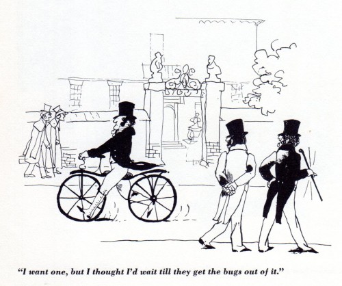
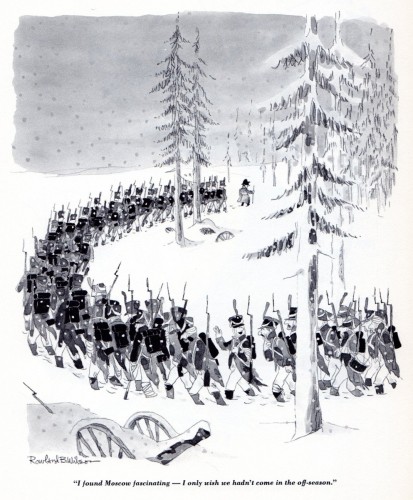
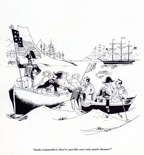
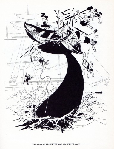
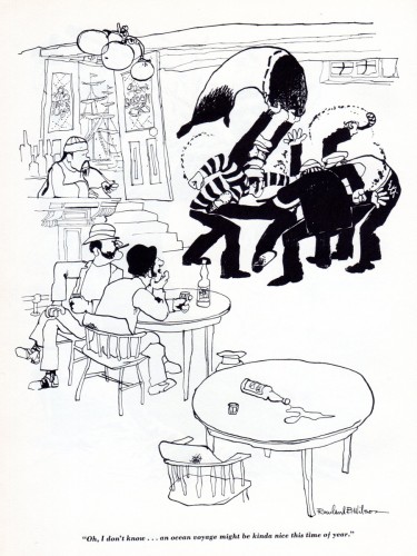
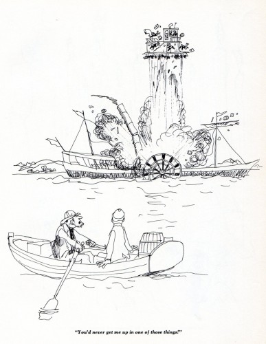
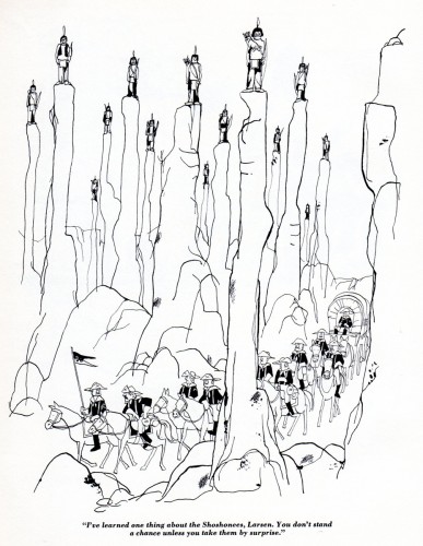
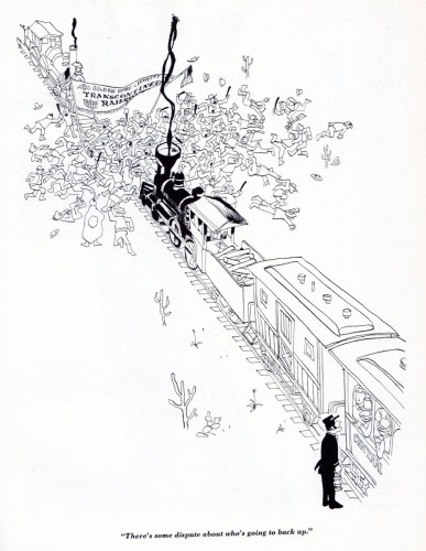
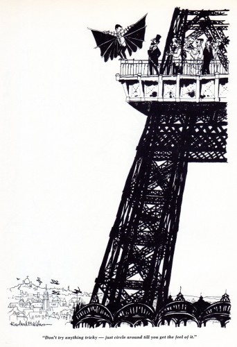
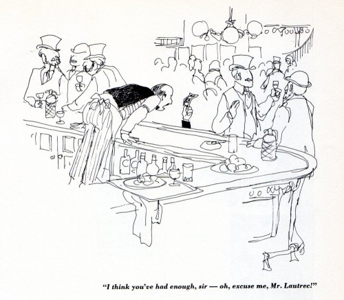
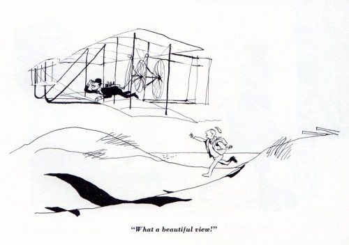
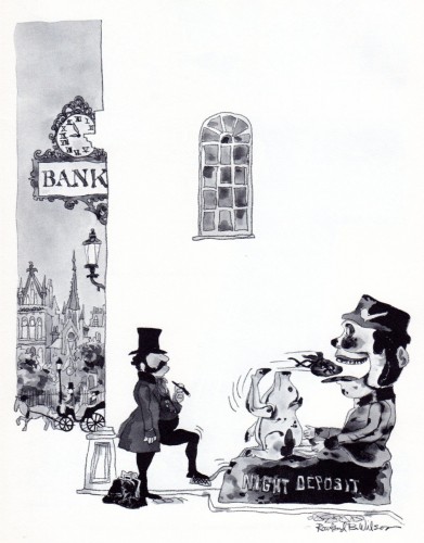
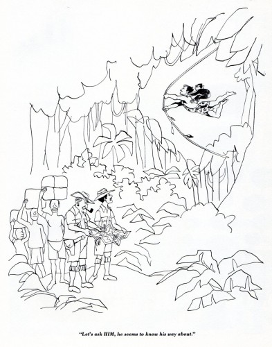
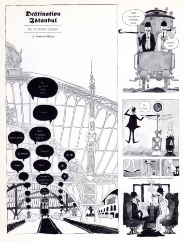
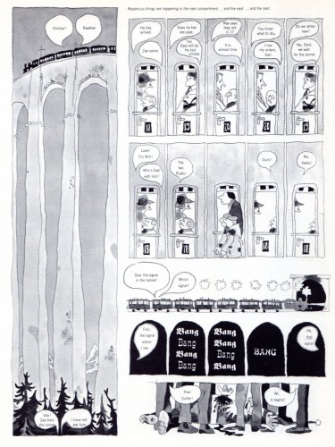
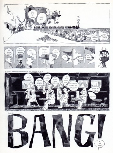
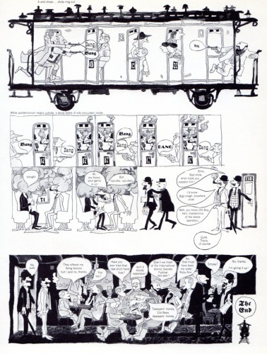
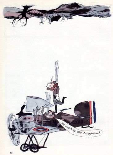
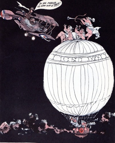
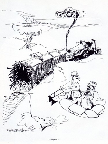
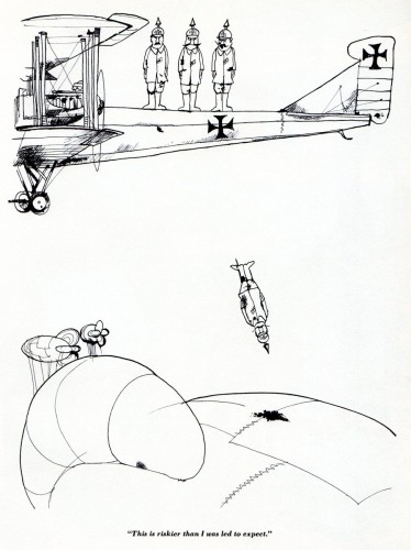
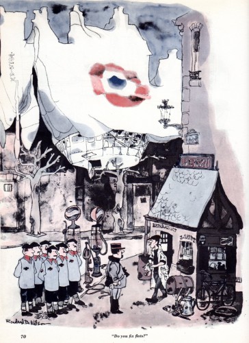
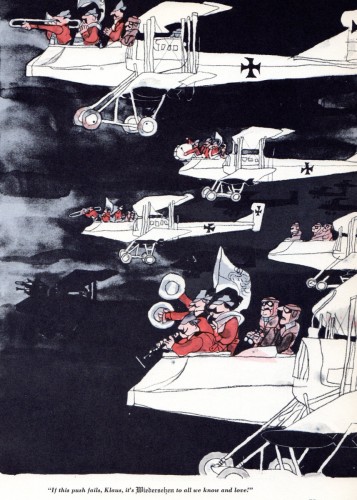
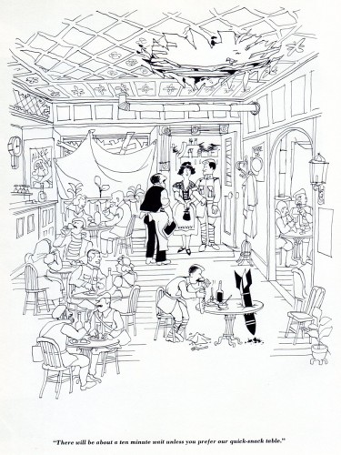
Whites of Their Eyes, Rowland Wilson‘s book (1962) which collects his early cartoons, is the subject of this and a couple of other recent posts. (Part 1 & Part 2)

Bill Peckmann has been kind enough to share some scans with us, and I’m ravenous enough to hurriedly post every scrap of Mr. Wilson’s work. I came into animation fully aware of his great work, which I’d often cut from many of the magazines in which they were published. I think I’d first met him, rather briefly, at my short stint inbetweening at Phil Kimmelman’s & Ass. I had little more than the opportunity of telling him how much I admired his work. I worked on a number of Schoolhouse Rock pieces (Lucky 7 etc.) that he’d designed. Later on, I got to know him a bit better through my association with Dick Williams. I also knew his daughter, Amanda, through animation circles at the time. She worked on Raggedy Ann, where I was a supervisor. My connection, in real life, was limited, but my appreciation for his work great. Here’s Part 3 of Whites of Their Eyes.

1

2

3
Does it get any better than this cartoon?

4

5

6

7

8

9

10

11

12

13

14

15

16

17

18

19

20

21

22

23

24

25

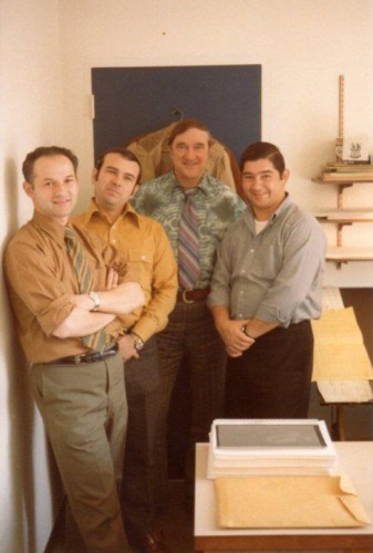
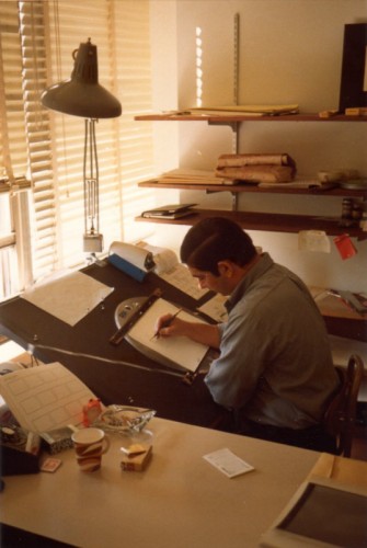
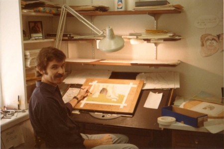
Here are some photos taken in 1970 at Focus Design Studios.
They are of some of the crew that produced and work on
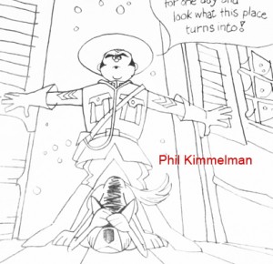
Rowland’s early TV commercials, like Utica Club’s ‘Mountie’ beer spot.


This is Sid Horn, producer and Phil Kimmelman, director.


Dante Barbetta, Roger Mejia, Gerry Dvorak and Victor Barbetta.


Victor Barbetta


Bill Peckmann


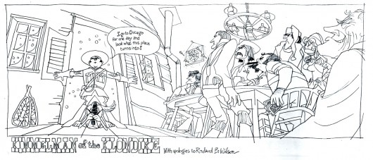
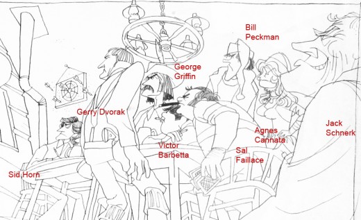
from Bill Peckmann: I’m sticking this drawing on the end because
it was done about a year (1969), before the photos were taken.
It’s one you’ve posted already quite a few years ago, but
maybe this photostat might be of better quality?

.

.

.

I’ve split the drawing up and used George Griffin’s notes to mark up and identify the people within the caricature and to make it a bit easier to read.

The Mountie ad starts at 3:31.

Another Rowland Wilson ad starts at 0:31.

Action Analysis &Animation &Animation Artifacts &commercial animation &Hubley &Tissa David 26 Jul 2012 07:22 am

A Simple Move – recap

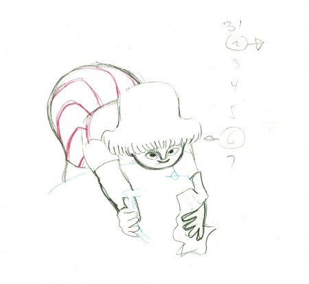
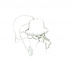
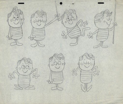
- Here’s what looks like a simple move done by Tissa David when she animated this Viva, paper towel commercial. It was produced, directed and designed by John Hubley. A very simple and beautiful character.

The character’s move in this scene is a complicated one done simply. She has been bent over, cleaning with her paper towel, and she moves up. You can follow the overlapping action as her eyes pull her up, head turn, and body follows.

The stripes will come and go. Tissa depends on someone else to concentrate on this material when she’s working on a commercial.

e37
(Click any image to enlarge.)

3839

4041

4243

e44
Her eyes point in the direction she wants to go,
and the rest of the scene moves her up and into profile.

This key move is hidden under the exchange of the
paper towel from one hand to the other.

4546

4748

4950

e51
She stops to think (accenting her monologue.)

5253

5455

5657

e58
And she slyly looks back to camera to respond with her thought.

e59
She continues, all through this move, talking.
She’s pitching the product.

Here’s a QT of the piece:

Cleaning for Viva
Click left side of the black bar to play.
Right side to watch single frame.

Animation Artifacts &commercial animation &Layout & Design &UPA 25 Jul 2012 05:21 am

Even More UPA Spots

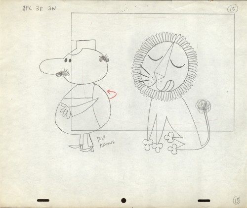
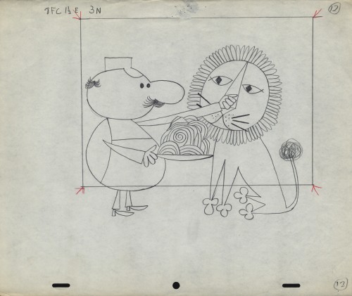
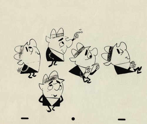
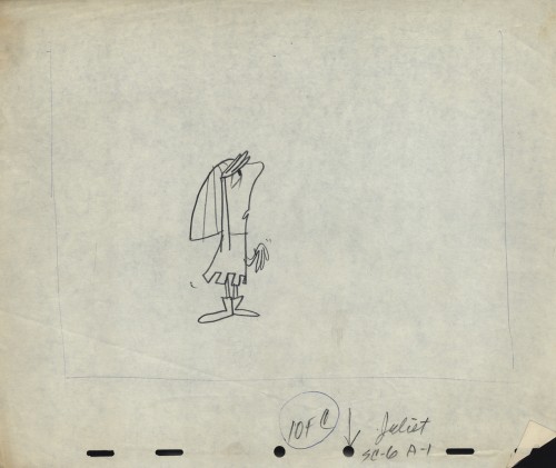
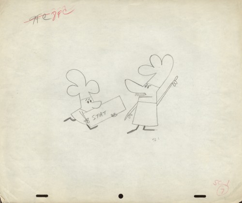
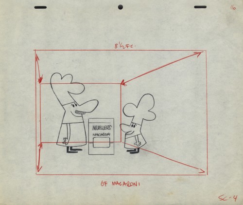
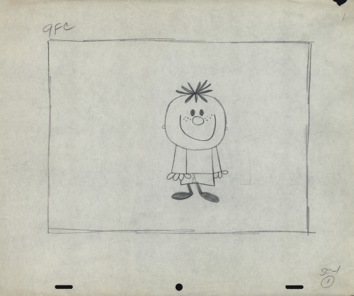
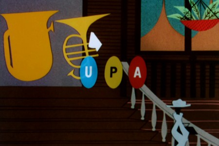
- Here are more Layouts and character poses for the commercial work done at UPA. They are all pulled from Vince Cafarelli‘s collection of artwork. I assume these all come from UPA since Magoo models were in the same folder. The design styles are consistent with what we’ve seen from UPA at the time.

1

2

3
A photostat of a character model sheet

4
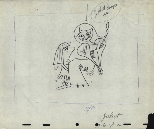
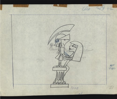
An ad that features Romeo and . . .

5
. . . Juliet

6
Cleopatra was obviously cut out of the spot.
Note that the pegs were cut off the NG drawing.

7
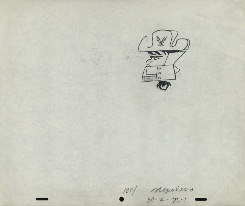
Napoleon, but it looks like it comes from a different spot.

8
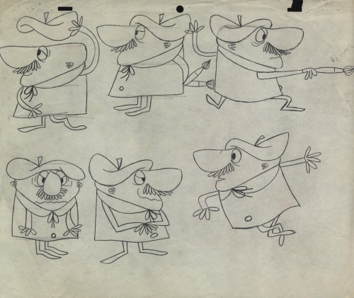
Was this something that stuck in Gene Deitch’s mind before he left
UPA to go on to run Terrytoons? Shades of Gaston le Crayon.

9

10

11
Obviously, an ad for Mueller pasta

12
An interesting series of Layouts. I’m not sure if they’re for an ad . . .

13
. . . or a short film for the McBoing Boing Show.

14

15

16

17

Commentary 24 Jul 2012 05:53 am

Dormant

There are a lot of sites I’ve enjoyed visiting regularly. Unfortunately, many of these same sites/blogs freeze for many months at a time or fall by the wayside as the creator gets too busy to regularly contribute any more to the blog, or finds out how long it takes to keep it running, or gets disinterested after the sheen has worn off. For whatever reason, many excellent sites go untouched for many months or even longer.

I thought I’d write about a few of them and express my thoughts about a couple of them.


Reconstructed bg from Lady and the Tramp

Animation Backgrounds For years, Rob Richards worked on this site which featured only reconstructed backgrounds made from multiple frame grabs taken off DVDs. Characters were eliminated and camera moves were taken into consideration in these reconstructions. It takes a certain artistry just to be able to do this, and hours go into the making. In 2010 Richards, who writes several other blogs, decided to stop work on this one. It was our loss, but at least the blog and all the work that went into making it remains up there for us to view.

Animondays David Levy has moved on to a more complicated job and had to let his writing blog posts go. His weekly posts were well received. He has a straightforward and earnest style of writing, and it was much appreciated on this regularly written blog. It echoed the feel of his fine books and often acted as an extension to some of them even printing some of the interviews he’d recorded for those very books. He also acted as a good voice for NY animation. When he moved on to a new job, he simply posted a “Gone Fishin’” notice, and that was the end of this blog. It was sad, but we all understood that David ws moving on to something bigger, and we wished him well.

Animation Who and Where was one of my favorite blogs. The depth of some of the strongest animation history on the net was enormous. It was all the work of Joe Campana.

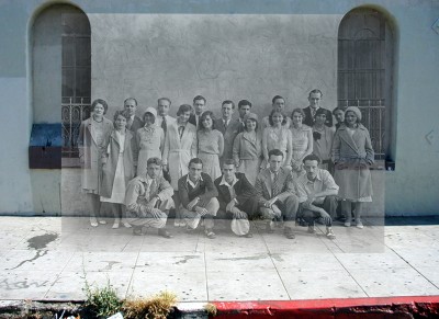
His post Ghosts of the Charles Mintz Studio really got to me, and I returned to visit this same post many times to reread it. He shows how several photos of the staff were taken outside the building’s structure. He’d celebrated the centenary irthdays of many of the animation legends: Joe Grant, Dick Lundy, Roy Williams, and Fred Moore. As a matter of fact, the last post for Fred Moore’s 100th birthday reads:”I have a great post coming, but it will appear here soon…” That was the last we’d heard of this blog on Sept. 7, 211. Almost a year ago. I still return to see if there are any updates.


September 15th, 2009
Happy 68th birthday, Yuriy Norshteyn!

from niffiwan’s site, Animatsaya in English

Animatsiya in English was a favored site of mine which I visited regularly. This was a way to really be able to delve into Russian animation. Many fine examples, both historic and current, were often displayed and analyzed on this blog. Many YouTube versions of Russian films were given English subtitles, and this opened a world for Westerners. However when a company called Funtik decided to claim the copyright ownership to many of those films and pulled them from the internet it destroyed years of work by niffiwan. Animatsiya in English bogged down to a halt. Niffiwan’s last post came September 18th, 2011. When you go to the home page of the blog, you’ll see a detailed explanation for the removal of the videos. There are still many videos worth seeing on the site, however when you go there you’ll find that a good number of them now give you the message: This Video Has Been Removed by the User. That’s unfortunate, but it’s still worth scouting for the excellent films still available on this site.

Blather from Brooklyn actually carries the full title: Blather from Brooklyn: Life in New York City by a Resident of Beautiful Brooklyn. Needless to say, this is not an animation related blog. But it is a wonderful journal of events in New York City, and I love reading it. Many fabulous street festivals (complete with numerous great photos), lots of found signs and notices, and even a trip to see The View (live). The site gives you advice on: Where to eat, How to get around, Where to shop, and where to go when ou hit Brooklyn. This is another great site that hasn’t posted since Nv 5, 2011, almost a year ago. Again, I continually return to see if there are any updates. (The site is hosted by “Annulla” which happens to be the title of autobiographies and a play by the playwright, Emily Mann. One suspects it might be Ms. Mann who wrote this blog.)

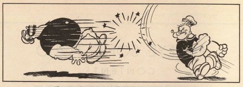
I love Bob Jaques‘ site Popeye for Animators. There are so many good posts here that I find myself sometimes coming back just to reread some of the oldies. It’s all about Popeye, as you may have guessed, and the love of animation is apparent in every post Bob posts. This infectious feeling can easily be pulled out of the Fleischer films, and Bob can do that with the best of them. Unfortunately, his last posting was in February of this year. I have no doubt that this site is still very much alive, but I’m sometimes impatient.

At first I was going to hold this post off for a while and make it much longer. There are about a half dozen other sites I thought of mentioning but decided not to. There’s material for another post, and I’ll hold it for a while.

Animation Artifacts &Frame Grabs &Story & Storyboards 23 Jul 2012 04:33 am

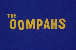
Oom Pahs

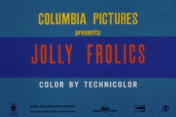
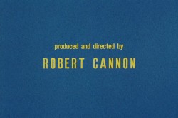
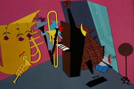
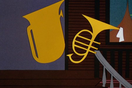
- I’m a fan of T.Hee‘s work. I bought the storyboard he did for the film The Oom Pahs a while back. How could I go wrong since I also love UPA and Bobe Cannon, who directed it. This was the first collaboration between T.Hee and Bobe Cannon.

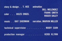
The short was a 1952 UPA film directed by Bobe Cannon. The film’s music score was by Ray Sherman who worked with Ben Pollack’s group, the “Pick-a-rib Boys.”
T. Hee boarded and designed the film with Jules Engel doing the bgs, and the animation was by Roger Daley, Bill Melendez and Frank Smith.

The film isn’t one of the best UPA shorts. I find the style interesting (cut out colored construction paper) but the story (which to me seems to be a variation of Warner’s I Love To Singa, which was a take on Jolson’s Jazz Singer) is a jazz vs classical music riff. The film talks down to its audience a bit – a frequent problem with many of the UPA films.

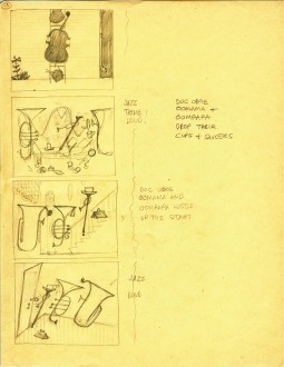
The pages I have obviously are not the whole thing nor are they consecutive in number, but they’re a good sampling.

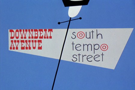
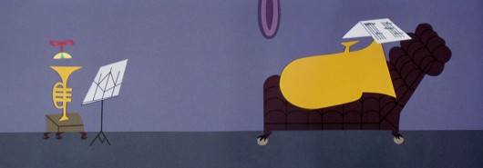
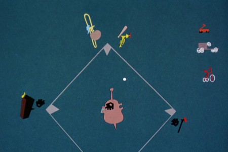
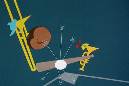
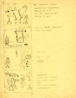
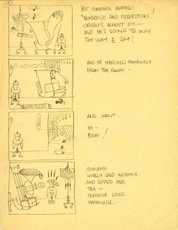
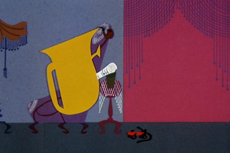
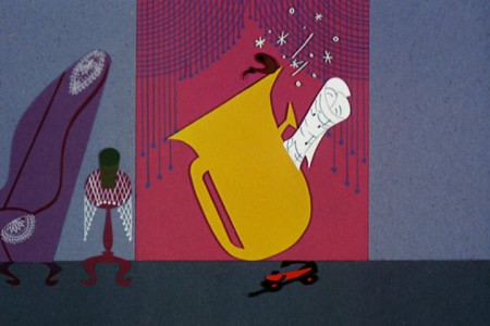
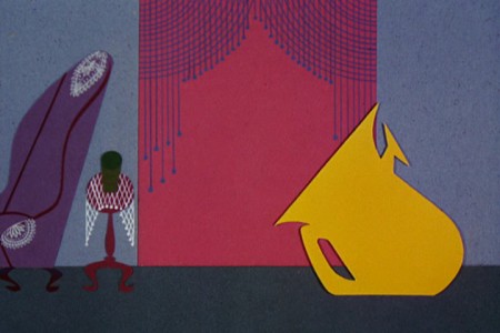
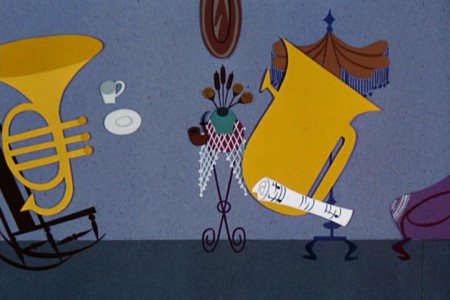
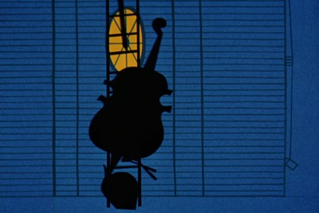
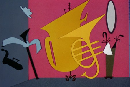
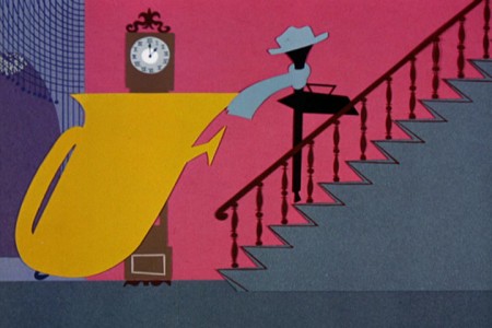
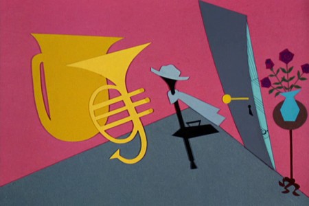
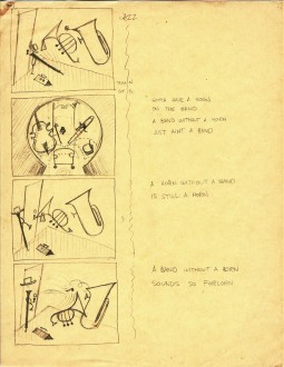
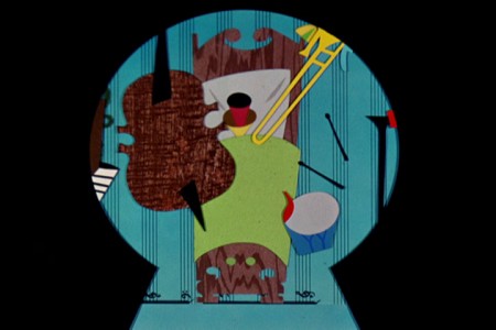
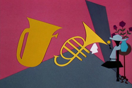
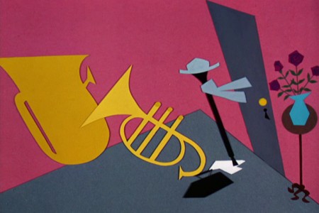
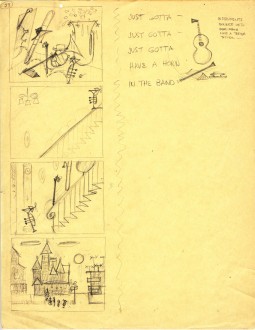
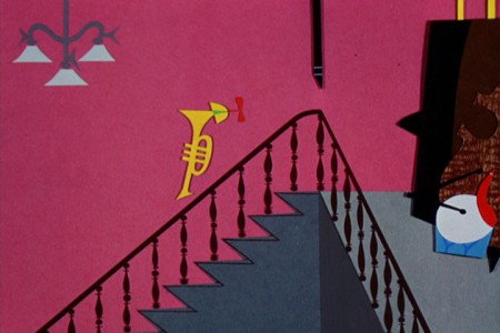
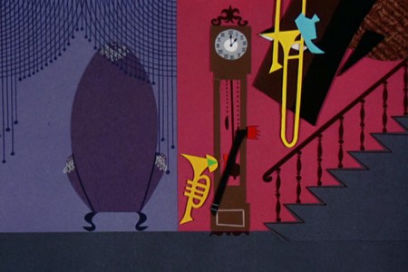
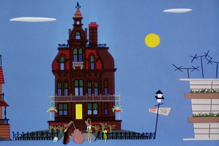
Here are those board pages intergrated with frame grabs from the same sections of the film so you can see how closely the cutout animation followed T.Hee’s board.


The story tells of a young trumpet in a family of horns.


He gets in trouble playing baseball (jazz) when he should be . . .


. . . practicing his classical music lessons.

1 2
#1 is a rough version of #2. Both are page 13.


“… And he’s going to play the way I say!”

There’s no doubt the cutouts are pasted to cels.


“And he marched pompously from the room.”

The animation repeats itself exactly, and it could not
have been animated under the camera, on the fly.


“And went . . . ”


” . . . KA BOOM!”


“OomMama wisely said nothing
and sipped her tea.”

3


Jazz . . .


“Doc, OomMama and OomPapa drop their cups and saucers . . . ”


“. . . and hustle up the stairs.”


Jazz, loud.

4


JAZZ


“A band without a horn just ain’t a band.”


“A horn without a band is still a horn.”


“A band without a horn sounds so forlorn.”

5


“Just gotta, just gotta, just gotta . . . ”


“. . . have a horn in the band.”


OomPapa agrees that sometimes you need a break.


The End

To see a couple of layout drawings for this short, from Hans Walther‘s collection, go to site here and here.

Articles on Animation &John Canemaker &repeated posts &Tissa David 22 Jul 2012 04:46 am

Tissa – 1975

- The 1975 issue of Millimeter Magazine is an animation issue. There are a number of enormously informative articles. I was rereading a copy of the magazine, this past weekend, when I came across the Close Up section, wherein a couple of bios appear.

I’d like to show one for Tissa David that was included. I assumed John Canemaker authored the piece; there is no byline. When I asked him, he responded thus: “I wrote the article on Tissa. The quotes are from my first formal interview with her. It was for Millimeter when I was the animation editor and put together special animation issues.”

Tissa looks so young in that photo.

TISSA DAVID
    “I am a frustrated comedienne, for sure,” Tissa David will tell you, only if you ask. “I am a clown. If I weren’t shy, I’d probably be on the stage.” Instead she is an animator, one of the world’s best and busiest, and one of the few women to have reached the top in the traditionally male-dominated animated cartoon field.

    She joyfully toils in her East-Side New York apartment, a warm, plant-filled place that often smells of baked apples. Classical music swirls quietly from a radio and the glow cast from the light under her animation board gives her the look of a sorceress.

    The lady has class—a fact one gathers upon first meeting, but a fact that is reaffirmed by catching a look at the creatures she is conjuring to life on her drawing board. The graphic line is strong and free, yet elegant (as is the artist); and when the drawings are flipped, the creatures move through their paces with a deliciously droll humor, a wit that is uniquely Tissa David’s.

    As a child in her native Hungary, Tissa saw Disney’s SNOW WHITE and thought (as so many others have thought after experiencing that film masterpiece), “Now this is something I want to do.” After graduating from art school, she became an assistant animator at Magyar Film Iroda in Budapest; a little more than a year later, in 1945, she was a co-owner of the Studio Mackassy and Trsi supervising all phases of production including story and camera and was sole animator of the puppet and cartoon films.

    She left Hungary in 1950 during the height of the Stalin regime, and finally landed in Paris.

    Jean Image Productions hired her in September 1951 and for two years she read sound tracks, planned layouts, animated, and did the entire editing of the feature-length, BONJOUR PARIS (1953). That studio closed and Tissa animated at La Comete next, a studio that had been Paul Grimault’s.

    “I had absolutely no relatives outside of Hungary except in the United States. So I asked for a visa in 1950. It took at that time five years to get a visa, that was still the quota system. So I came to New York…I loved the U.P.A. cartoons. I decided I wanted to work in that studio.” In 1956, the United Productions of America’s New York Studio was the last tenant in a brownstone on Fifth Avenue and 53rd Street slated to be torn down for the construction of the 666 Tishman Building. There was a French girl in the UPA studio and so she introduced me,” Tissa recalls. “I had no sample reel. I went in once to make a sort of tryout. I was scared; I didn’t speak English, so I was just waiting, waiting, and Grim came by…Grim Natwick is the history of animation and I can rave about him. He created Betty Boop and animated the character of Snow White all the way through. UPA had an awful lot of work and they needed an assistant to Grim.”

    At that initial meeting, Natwick boomed, “Now, you know what animation is!” Tissa quietly answered, “Animation is—animation.” Natwick laughed, “You can’t argue with that!” and thus began a professional partnership that lasted twelve years. “Isn’t it strange,” says Tissa today, “that SNOW WHITE got me into animation and I really learned my animation from Grim. I know a great deal about animation, I know I know, because even today I don’t do one line without something in my brain Grim told me.”

    After UPA closed in 1958, Tissa and Grim freelanced as a team on countless TV commercials, and since Grim’s retirement, Tissa has soloed successfully and most notably on several John Hubley projects, i.s.: Of Demons and Men (1970), Eggs (1970), Children’s Television Workshop segments Cool Pool Fool, True Blue Sue, Truth Ruth and others, and Cockaboody (1973). Her latest animations include three CTW Letterman episodes, a scene in Shamus Culhane’s Noah’s Ark production, and over 110 feet of Hubley’s Bicentennial film, People, People, People. She has just completed some experimental animation fora Dick Williams project and is now starting, also for Hubley, a TV special based on Erik Erikson’s writings.

    A description of Tissa David’s style of animation is difficult; for while it is a distillation of the Disney influence in timing, the UPA sense of humor-through-graphic-design, and the strong, poetic John Hubley mode, it also contains a different character, unique to Tissa David, that she calls the “female difference…If the same scene is animated by a man and by me, there will be a great difference, not in quality but in interpretation. John Hubley told me I have a fine sense for detail, not in the drawing itself because I make very loose drawings, but in a scene, in expressing feelings. I am a very intuitive animator—I never know when I sit down to work what will happen.”

    For all her gentleness, Tissa also contains an inner core of strength exhibited in her single-minded devotion to her art. Her opinions about that art, herself and other topics, is disarmingly to-the-point: “I believe very strongly that one must know how to draw,” she will offer on the subject of how-to-animate. “Even if you just animate objects, you must have a knowledge of drawing.” As for her struggles securing her place in animation, Tissa will admit, “…its very hard. Women can find work in animation if they have enough will to follow through and really do it. Even today, I’m always saying if I keep busy long enough, I will become a good animator.”

At the time this piece was written, Tissa was completing work on a pilot for Dick Williams’ film, Raggedy Ann & Andy; this one minute piece got Dick the film over Joe Oriolo and Shamus Culhane. She would thereafter work on John Hubley’s Doonsebury Special (just as he died mid film); and she was to animate for R.O.Blechman’s Simple Gifts.

Here’s a more recent photo of Tissa.


Tissa David was 91 last January.

Commentary 21 Jul 2012 06:37 am

Passing Week

Passing

Two people who I respected enormously died this past week. They’d both touched my life, however briefly, and I had to comment on them.

I worked with Celeste Holm when she did a VO narration for me for a five picture set I did for the United Nations.
Ms. Holm was a star, one of the big ones from the era just before mine. My mother was very impressed that I was meeting her (so was I.) Take a look at her NYTimes Obituary for information about her great Oscar-winning career.

Things started off a little rocky when she arrived late with the UN representative who went to meet her and accompany her to the studio. There was some difficulty
with traffic. I had no problem with the late start, but my recording engineer – who had never heard of Celeste Holm – asked, “Is this the talent?” as she entered the room.

There was a long introductory narration for her to read, and I suggested we try going through it once so she would get familiar with it. Ms. Holm read it with many halts and huffs and stops and starts. But her expressions were basically right on the mark. I asked her for another take. With that she said she’d worked with William Wyler on her first film, and she’d done her first scene, she felt, perfectly. However, he continued asking for take after take finally ending with take 100. He used the first take. I listened and understood she wanted to read it only the one time. I responded by saying that William Wyler deserved 100 takes, but would it be possible for me to just get two? She did it perfectly on the second take. (It WAS a hard read, written by someone at the UN, not a script writer.)

By the way, I’ve never been able to find any film she did with Wyler, yet I’m sure he’s the director she’d named.

Richard Zanuck is a producer whose work I followed for ages. From Jaws to Driving Miss Daisy; Butch Cassidy & the Sundance Kid to Tim Burton’s Alice in Wonderland he was my idea of the consummate producer. Someone who put good films together and nurtured great talent.

At one screening, I recognized him sitting in the row behind me at the Academy theater and cautiously approached to say hello. After that brief meeting we always said casual greetings whenever we saw each other. I’ll miss seeing him in the world and so will Hollywood.

_________________________

Emily Hubley’s Film
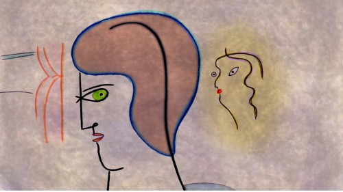

Artist and muse

I was completely under the spell of Emily Hubley’s latest film and/or, a 5½ min short poetic meditation on creativity. The film plays in a semi-abstract mode as it animates from scene to scene always moving in beautifully colorful transitions. The music, while always melodic, doesn’t hit on a theme until the old piano kicks in behind the finalized work of art. A coda of sweet animation playing out on the blank slate we’d seen at the film’s start. This is a wonderful movie with constantly repeating images and symbols. The voices change from male to female – before the idea gels and after, while a muse (female) whispers to the artist. I sat through the film three times, and it continued to grow with each viewing, and I’m sure it’ll get bigger the next time I see it.

Look for this movie on the festival circuit. It’s one of Emily’s finest, a fully developed, visually exciting movie.

music – Yo La Tengo
voices – Kevin Corrigan, Emily Hubley and Tiprin Manday
compositing – Jeremiah Dickey
sound design – Eliza Paley

_________________________

Films I’ve Seen

This past week was a good one for movies, from my point of view. I saw what I thought were three of the best so far. Two docs and one French.

The French film, on Tuesday, was Farewell My Queen by Benoît Jacquot. It was the story of Marie Antoinette in the last days before the storming of the Bastille, as told by a young woman servant who acted as a “reader.” She read to her Queen and, therefore, had limited access to Royalty with a bit of knowledge about the politics surrounding both the King and Queen. The film was quite entertaining, seriously thoughtful about the period and certainly more illuminating than a couple of other recent films about the subject. Well acted, directed and scripted (an adaptation of the book by Chantal Thomas.

Thursday night the Academy offered a documentary double feature. I didn’t really feel up to going but pushed myself and was glad I did.

The Queen of Versailles by Lauren Greenfield told the story of a billionaire couple as they attempt to build the largest private home in the world. Construction of the private home is just a symbol for the problems this couple face as they build their house on sticks assembled on easy money with loose mortgages which collapsed with the recession in 2008. All their money collapses as well and while the husband tries to regroup the wife, acting as if she understands, continues to spend wildly and unnecessarily. The husband who works, as he says, 24/7 to rebuild his company – which is also his private funds. It’s a struggle, and the film – which starts out like a reality TV show – turns into serious questions about affluence and waste. It’s a wonderful film.

Ai WeiWei: Never Sorry is a film by Alison Klayman which focuses on the Chinese artist/activist and dissident. The film offers a sympathetic but rounded picture of this admirable artist. The artist is all about communication, and his primary theme is about the political situation within his own country. His work is well known internationally (probably more so outside of China), and we get a very intimate portrait of the man, his work and his views. While being thoroughly informative, the film reveals a lot about the society in Beijing and we get to see how changes have developed quietly over the years. Ai WeiWei, himself, says that his not being imprisoned is enough of a proof that things are changing. (He does disappear for months and is obviously affected by the arrest once he’s been released – it takes him a number of months before going back to his constant twittering.) The film could have gone much deeper than it does, but the filmmaker is obviously trying to tell the story to an audience who doesn’t know who Ai WeiWei is. It’s a primer, and a bigger film is deserving, but we do get into the human side of the artist, which is well appreciated.

I’d heartily recommend all three films to anyone looking for something intelligent and adult. They’re all three very different from each other and offer what ever mood you’re looking for at the theater. Unless, of course, you yearn for Batman rising again.

_________________________

How Cheap Can You Go?

Something has hapened to animation in the past few years. The budgets keep getting lower and lower and lower. Clients have no qualms about asking you to produce a project for free. Another, producing a series of short films, asks you to do a five minute film for $2000. That’s $400 for a minute of film. And the worst part is that you not only think hard about taking it (if you don’t), but you try to calculate how much more work you’ll get from the same producer when you do a brilliant film for them.

Naturally enough, after you’ve done the job you don’t get more from them, and you have to wonder why they don’t love you any more – even though you’ve done a great job.

It’s a horrible situation we’re in. The small studios are being squeezed to death by these low budget backers and times are getting tougher.

Richard O’Connor, at his site Ace & Son, starts a dialogue about this state of affairs. Worth the read, worth adding to the commentary.
« Previous PageNext Page »

eXTReMe Tracker
click for free hit counter

hit counter