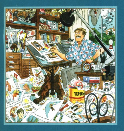
John Canemaker &Photos &repeated posts 19 Aug 2012 07:00 am

John & Joe’s Garden

- Last year at about this time, Heidi and I went to visit John Canemaker and Joe Kennedy at their wonderful Bridgehampton house. That weekend I was so overwhelmed by the flush and beautiful gerden as well as the wonderful floral paintings John had done. I reported it on this blog, and was quite pleased with that post.

This weekend we’re repeating the excursion and have come to a different trip. For one, as Joe told me, the flowers bloomed much sooner this year, including those that usually bloom late, probably because of the peculiar weather we’ve been having. Consequently, the garden looked very different this year. It is now very green without much color.

This year we had more than overcast clouds affecting the weather. Rain stayed with us on much of Saturday. I didn’t mind very much, but there was little opportunity to walk through the garden with the ground so wet.

I’ve taken a few pictures this weekend and will add those later this afternoon once I get home, but for now I’m repeating last year’s post (with some minor changes).

- This past weekend, Heidi and I spent a lovely quiet time in Bridgehampton at the invitation of John Canemaker and his companion, Joe Kennedy. It made for a very restful and enjoyable time despite the grouchy weather.


The garden gives you the illusion that it’s larger than it is.
Even walking in it you feel that you could easily get lost in it.
.

The first dominant site you take with you as you visit the house is the amazing yard and the enormously colorful and tender care Joe and John have taken to cultivate their garden of a back yard. It’s stunningly beautiful. It feels almost as though these plants grew naturally next to each other and happen to take the shape it’s taken. The amount of weeding and nurturing and debugging is left completely behind as you bask in the warm glow of this garden with its variety of flower and shrub. It’s beautiful and peaceful and inviting. I couldn’t help myself over the course of the weekend; I took many walks in the area and sat and enjoyed it. I loved it.

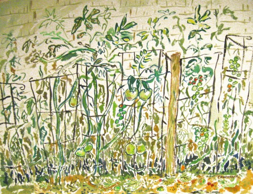
The second thing that captivated me during the visit was a painting John had done. It sat on the wall of the guest room we stayed in. In the first few hours in the house I kept coming back to the painting. I liked it enough that I took out my camera and photographed it. As I did, I realized that there were other smaller paintings in the room, and I found them almost as lovely. There’s no doubt John has been taken with the amazing garden out back, and this has helped to color these fine watercolors.
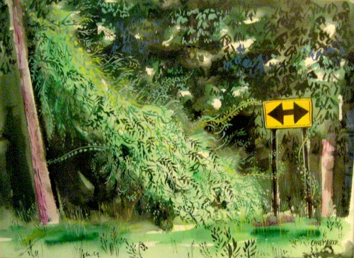

This painting obviously is not from the garden (given the road sign).
However, one can’t help but feel that the life in that garden spills over
into this painting – as it does in all the others.
.

At some point in the weekend, I asked John if he minded my photographing some of the paintings in the house and posting them on the blog. John, as always, was quite open to anything I wanted to do, so I went about quickly taking some photos. I also intended to mix in pictures from the garden. After all, I see these paintings and the flora as intermingling and working together in a lovely way.

There were some problems. The paintings lost some of their verve when photographed. The delicate colors were lost, and the shape of the pictures altered. (The lens of the camera seems to have slightly distorted the frames of the images.) I saw the pictures in some way influenced by Mary Blair’s work, but John took her colors and softened them. (The brashness of Blair’s work has always bothered me.) In the end, I found myself adjusting the pictures slightly to try to give them a bit of the feel of the originals, but I’m not sure I’ve succeeded. However, better you should get to see these images than none. My apologies to John.

So, I hope you enjoy the quick tour.


One of the larger paintings John had in his office, downstairs.


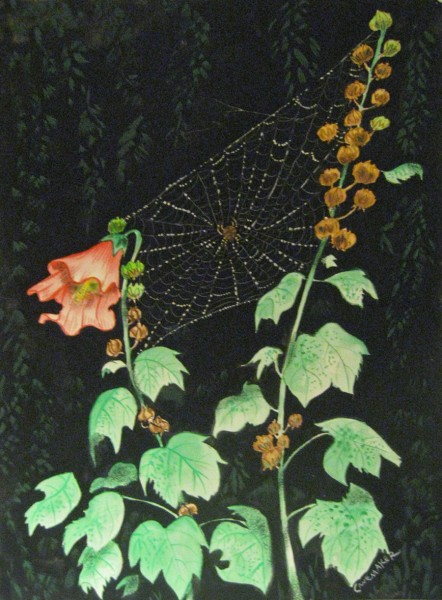
A beautiful flower that opened the day we arrived.


Spider web in the grass


Heidi sitting on the porch just to the front of the garden.


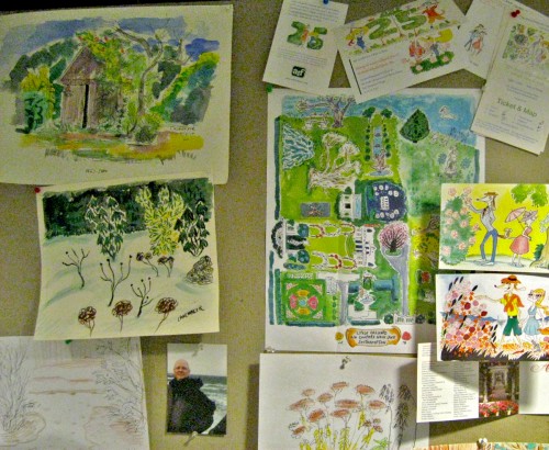
John has done many small quickly sketched watercolors.
Here, you can really feel the distortion of the camera’s lens.
Again, my apologies to John.


The wall in John’s office.


A post in the garden.


I had a hard time photographing this one.
The reflections in the picture frame’s glass was difficult to avoid.
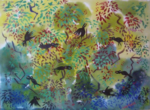

Another painting that just totally caught my attention.


Finally, a lovely little statue sitting just off the porch.
It’s a stone rabbit that once belonged to Bill Tytla.
Adrienne Tytla, Bill’s widow gave it to John as a gift.

Many thanks to John Canemaker and Joe Kennedy for a lovely weekend and all the wonderful inspiration, not only in the paintings but in the garden, as well. It was more than a small retreat.

_______________________________

Well, it’s later that afternoon, and we’re home. But I’m beat.

There are too many pictures I’ve taken and the post would be endless if I added them here, so I’ve decided to post a couple of pics of John’s paintings, and I’ll save the remainder for next Sunday. I’m sure you won’t mind. Though they are good pictures. See John, Joe and Heidi sharing a kitchen as they make linguine with clam sauce; see the four of us romping on the beach; see more pictures of the garden sculpture Bill Tytla’s widow gave John and Joe for their garden. And see some great pictures of the garden in the rain. I’m sure you’ll want to return next Sunday for that. (or not!)
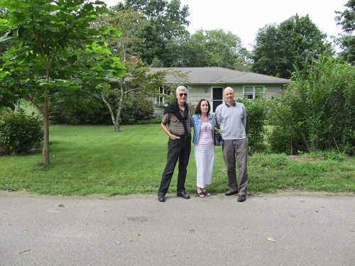

Here’s John, Heidi and Joe outside their house.
It looks as though they’re greeting us, but in reality
Heidi and I are about to leave on Sunday afternoon.


These two small paintings by John were
hanging in the guest bedroom we occupied.


This gem of a painting hung over the mantelpiece
in the living room. It belonged there.

Commentary 18 Aug 2012 04:11 am

Reaching into the Grabbag

In truth, I’ve been wholly absorbed and entertained by the political Presidential race. The choice of Ryan for Republican VP just made the whole thing so juicy, it’s all I can watch on tv. Even the Yankees have taken back seat to Chris Matthews, Joe Scarborough, et al. It was fabulous watching Ann Coulter throw a hissy fit after a Romney aide talked about RomneyCare in Massachusetts. She screamed on Hannity’s show demanding that the aide get fired. Hilarious and wonderful. A real Reality show.

I’ve had to wait a full week to be able to post this, sorry. However I couldn’t resist sharing it, and by now, you’ve probably all seen this . . .


Right after the announcement that Ryan was the Republican choice for VP,
this came in my email.
Spam
of a sort.
But pretty funny (and accurate).

________________________

Just released this week is the trailer to Toys in the Attic a mixed media animation feature directed by Jiri Barta. It was made in the Czech Republic. The film will play in NY next weekend as part of the International Children’s Film Festival. That will take place on:
Saturday & Sunday, August 25-26, 11:00am
at the IFC Center.

The English version of the film stars the voices of Forest Whitaker, Joan Cusack and Cary Elwes and is being released to theaters on September 7th.

Here’s that trailer:

________________________

- Movies I’ve seen this week are numerous.

It all started with ParaNorman, which I kinda liked even though I didn’t find it as dramatic as I would have liked. The pacing seemed a little stodgy until the big climax at the end. And then it turned a bit too preachy in its obviousness. However, the animation is slick almost to the point where it vies with cg for fluidity. I still like my puppet animation in the Ray Harryhausen mode; I want to see the fingerprints on the puppets. George Pal seemed to have it down perfectly, and there was something to the great design of Pal’s animated films. No other like them, he was a total original. The ParaNormal characters look like they might have been designed for a Sony cg film.

However the film is very amiable and I have no real complaints. It beats out the Ice Age films.
You can see my full out review here. I also did a talkback at the screening with the two directors, Chris Butler and Sam Fell. They both seem to be intelligent and knowledgeable guys with a real love for animation.

The NYTimes‘ Manohla Dargis loved the film. “The story . . . is principally a vehicle for the movie’s meticulously detailed pictorial beauty, which turns each scene into an occasion for discovery and sometimes delight.”

The NYDaily News‘ Joe Neumaier wasn’t so thrilled with the film. “The 12-year-old boys who go to see “ParaNorman” — and who are the only ones who might enjoy it — should double up on the sugary treats to stay awake during this gorgeous-looking but zombi-fied stop-motion animated creep show. It’s as slow as a corpse, and half as interesting.”

The NYPost‘s lead critic Lou Leminick loved it. “So good, it’s scary.” ““ParaNorman’’ is probably the year’s most visually dazzling movie so far, and the stunning climax centering on an 11-year-old witch is too good to spoil.

Let’s just say this is the first movie this year that warrants a 3-D surcharge.”

________________________

- On Tuesday I saw a double feature:

The Campaign, the Will Ferrell and Zach Galifanaikis film which parodies the political battling going on around us as the two play two candidates vying for Congress. Shoddy politics play out even before either of them are elected. This is funny. Funnier than I expected but not as funny or serious as it should have been. 2 stars.

The Awakening was a British ghost story that just didn’t make it. Rebecca Hall‘s a fantastic actress as is Imelda Staunton. That didn’t matter for this film. It was dead on arrival. The ghosts in ParaNorman were more fun. 1 star for the great camerawork.

- On Thursday I saw a small little film; Robot and Frank did matter that Frank Langella
starred in it. This guy is a great talent and can bring anything to life, including this movie and the robot that works for him. (Though Peter Sarsgaard‘s voice of the robot makes it quite creepy.) It’s a sweet little film that’s pleasantly short. A nice metaphor between an aging forgetful man and a robot that wants to have his brain rebooted so he can’t testify against the inveterate thief. However, a couple of scenes, particularly one toward the end between Langella and Susan Sarandon make you realize how good the film should have been if the script and direction were better. 3 stars because it should’ve been better.

________________________

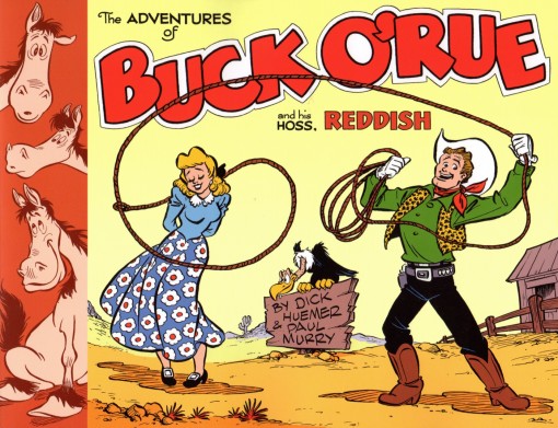
Thad Komorowski has an excellent article on his blog What About Thad which talks about Paul Murry and Dick Huemer‘s work.

Thad is doing a followup to the new
The Adventures of Buck O’ Rue
book currently out on the market. This book is a collection of rare comic strips by Huemer and Murry of a short lived strip.

The article includes plenty of Scrappy talk and links to many interviews.

________________________

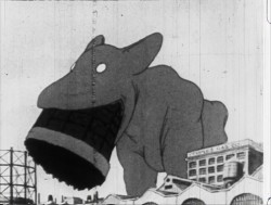
- Bill Benzon has an absolutely great piece on his blog, The New Savannah. He reviews the under appreciated Winsor McCay gem, The Pet. He takes a break from his detailed analysis of Disney’s Dumbo to review this movie (which he also adds to his post), and it’s worth the read. Please do it before Bill Plympton tries to rescue this film, too – or maybe I should have said wrest this film from the history of Winsor McCay.

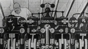
- Speaking of Bill Plympton and Winsor McCay, his bastardized version of McCay’s film, The Flying House, is now available on DVD. I’m included as part of an amateur documentary included saying how much I dislike what Plympton has done. The one good piece on the DVD is a fake documentary (also amateur production values) supposedly showing where McCay had lived. Among the ruins Bill finds a discarded McCay film, which turns out to be . . . . but tnen, this is the only good joke on the entire video, so I won’t give it away in case you persist in buying this.

I’ve tried in vain to find a link so that you can buy the DVD. None are out there, so I assume it hasn’t been released officially. I’ve linked to Plympton’s own site where it should eventually show up. Go here.

________________________

- I’ve been going crazy (a good thing, I think) animating and reanimating and reanimating a scene from the opening sequence for POE. It’s taken a while, but I think I’ve finally gotten something of a style for the film which will enable me to incorporate all that Tissa’s done with new work from lesser animators and artists. In all honesty, the color styling and photography of the poor film I saw this week, The Awakening (see above), led me to it. That film was bad enough, but my mind was completely overwhelmed with thoughts of the work I was doing at home. Thank you Academy for getting me to that film, thank you Tissa for being so brilliant, thank you Daumier for all the inspiration, and, especially, thank you all you investors at Indiegogo for making it possible for me to work on this.

By the way, investors, the goodies are in process right now, and you should have the promised benefits heading your way, soon. I’m sorry for the delay.

Animation &Animation Artifacts &Bill Peckmann &commercial animation &Layout & Design &Models 17 Aug 2012 06:23 am

Peckmann & Schnerk’s Utica Club

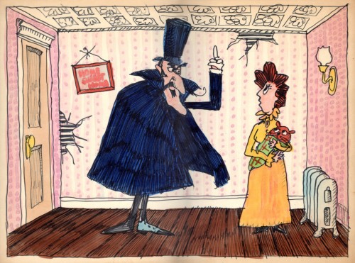
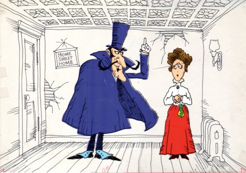
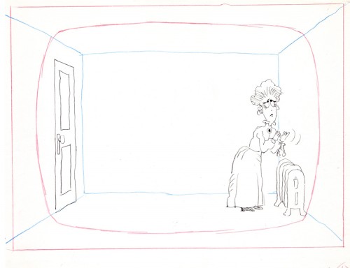
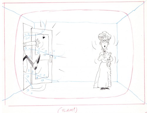
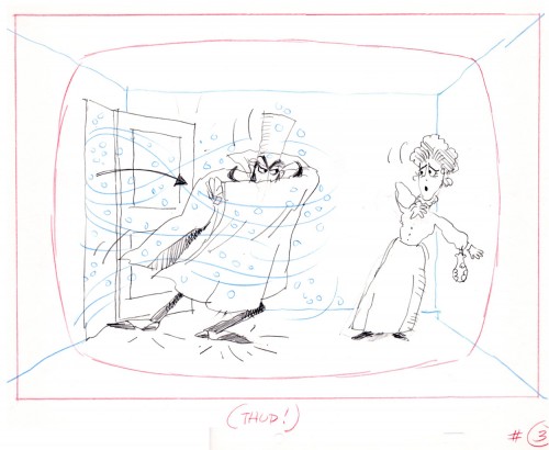
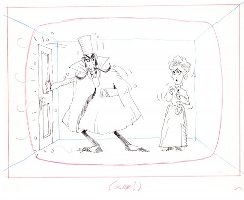
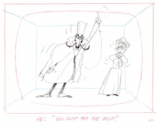
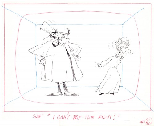
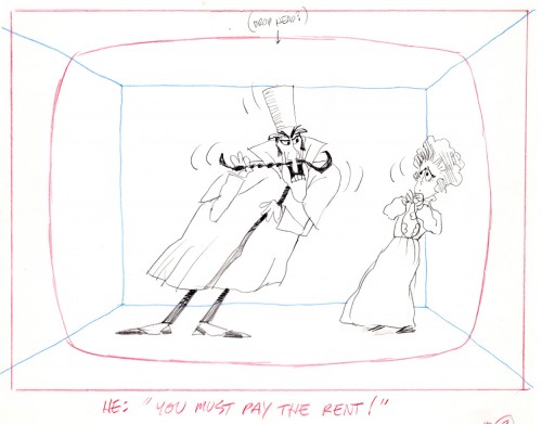
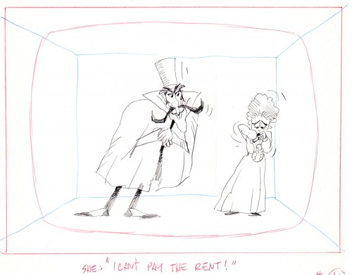
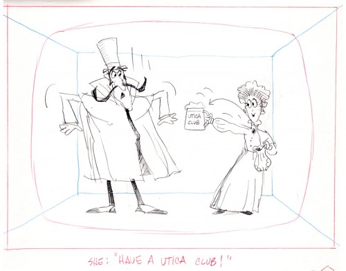
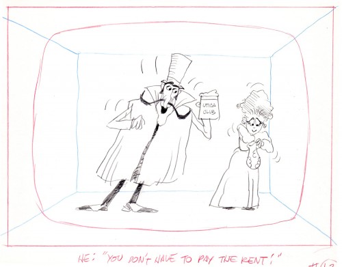
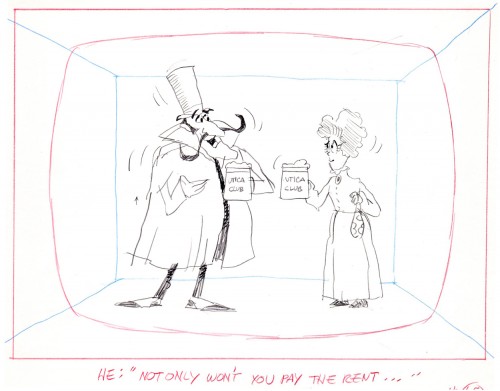
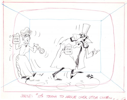
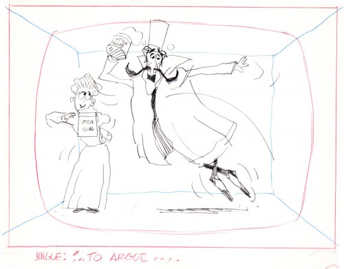
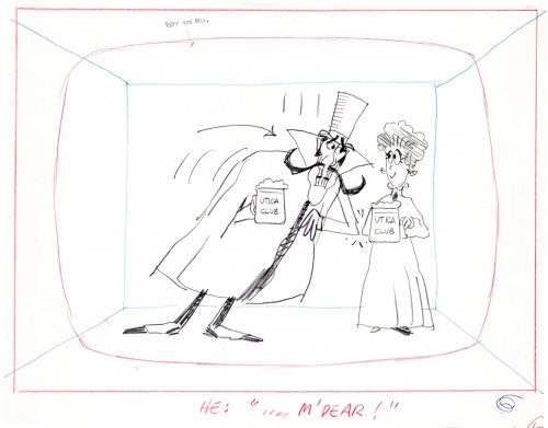
Another spot on Jack Schnerk‘s reel was Utica Club’s ‘Landlord’. Here with the little bit of art that I have from that commercial, I will try to illustrate some of the steps that went into making the film.


Here is the ad agency’s concept art.


Here’s my tweaking of the agency art design.
This is a cel color model against a line version of the bg.

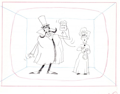
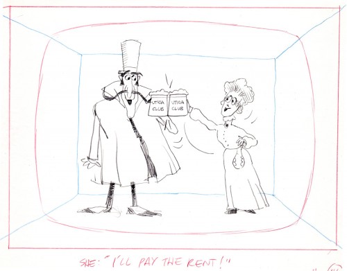
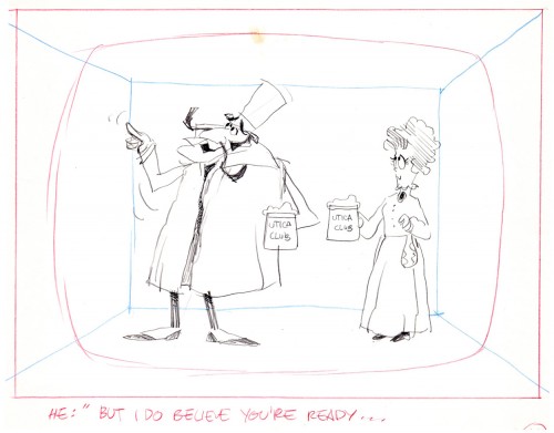
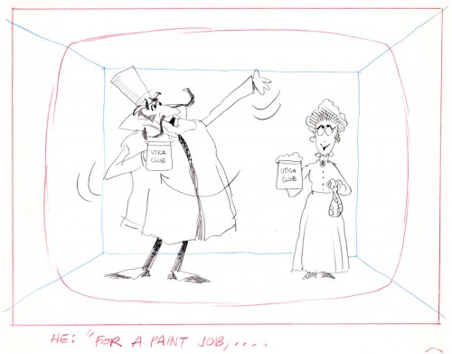
Next will be my first six rough layout drawings of the spot.

1

2

3

4

5

6

7

8

9

10

11

12

13

14

15

16

17

18

19

20

21

22

The following are animation key drawings by Jack Schnerk.


1

2

3

4

5

6

7

8

9

10

11

12

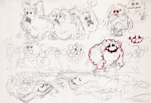
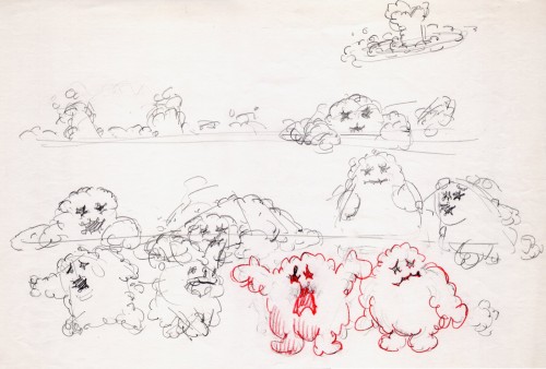
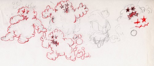
Once when we were doing designs for a soap bubble character, Jack took a break from animating to do these quick sketches. They are full of life, like all of Jack’s work.

1

2

3

I hope for those who were fortunate enough to work with Jack, his drawings will bring back some good and happy memories, they do for me!

You can watch this spot on Jack Schnerk Sample Reel 2 starting at 3’01″.

Bill Peckmann &commercial animation &Layout & Design &Models 16 Aug 2012 04:43 am

Weber & Schnerk Vote Toothpaste

Bill Peckmann shared these great LO sketches for one of Jack Schnerk‘s animation samples:

    Since one of the first spots on Jack Schnerk‘s reel was his ‘Dragon’s MouthVote Toothpaste commercial, I thought you’d enjoy seeing New Yorker cartoonist Bob Weber‘s key LayOut drawings for the spot. Unfortunately they are not the full color original illustrations but black and white stats that were made to fit in a comfortable field size. These are for the first half of the spot.

    These were the only keys that Jack had to guide him on this spot to work his animation magic. It was always a super treat to clean up Jack’s roughs, especially when he animated ‘named’ print cartoonists. The essence of the pose was always there in those terrific sketchy lines and the body proportions were also always bang on!

1

2

3

4

5

6

7

8

9

10

11

12

Bob Weber had a great sense of what to do in animation, his poses are beautiful. You only wish he would have been given more spots to design.

The following QT is the final commercial animated.

You can also go here and just watch the first spot to see a larger version.

Animation Artifacts &Models &Photos 15 Aug 2012 05:13 am

Another Vince Cafarelli Miscellany

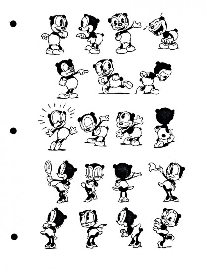
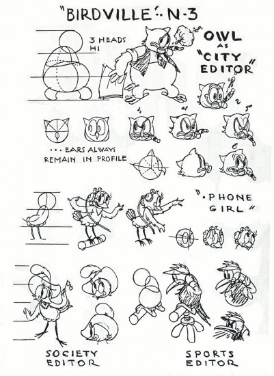
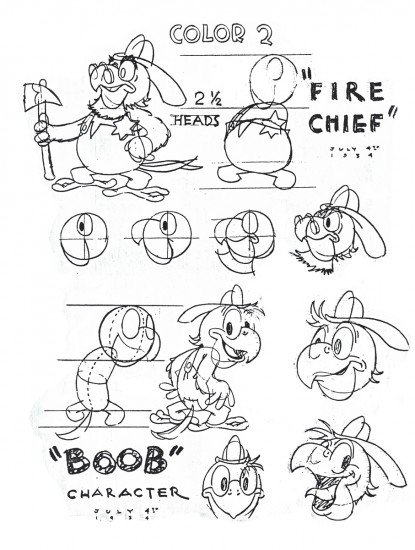
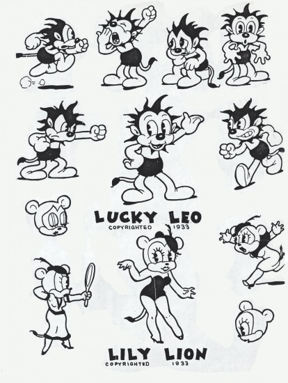
- I continue to weave through the boxes that make up the collection of animation art assembled by Vincent Cafarelli. This week I have anothe rmix of artwork; these pieces were all xerox copies (sometimes copies of copies.) I’ve tried to make them all presentable having to photoshop out some of the schmutz that came with old copiers. Since these are all models and pieces from the 30′s, I thought it worth the trouble.

Let’s start with the mix of models:

1
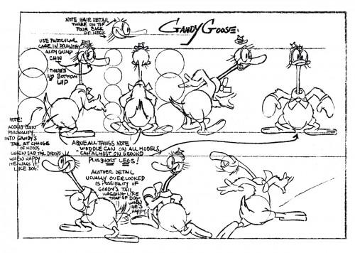
Gandy Goose a Terrytoon character. Not the best quality copy.

2
Cubby Bear, an early Van Buren character

3
Parrotville, another Van Buren product from their last years

4
Another Parrotville model sheet

5
I have no idea where this character was created,
though I’d bet on Van Buren.

6
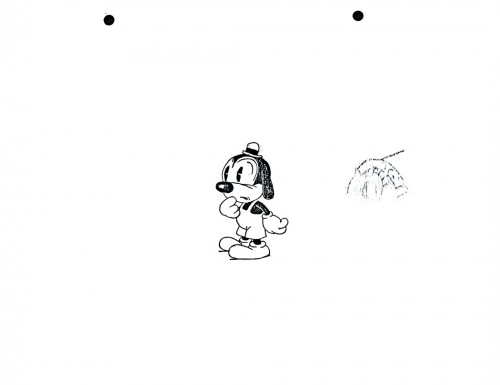
A Fleischer character to play off Pudgy

7
Another kind of Fleischer dog.

8
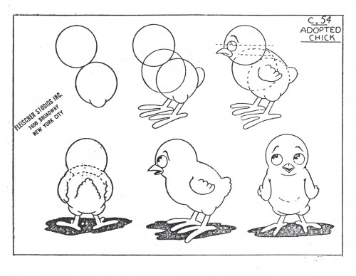
A Fleischer chicken

9
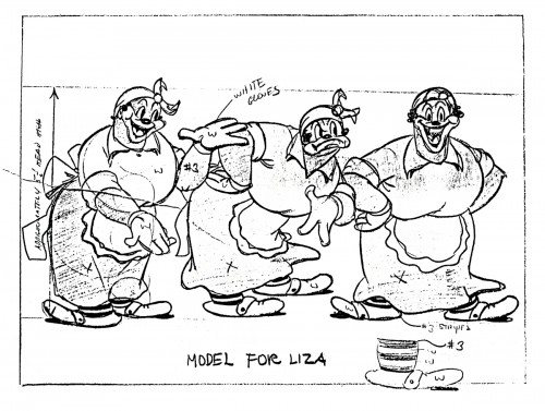
A typically racist character from Fleischer’s ethnic types.

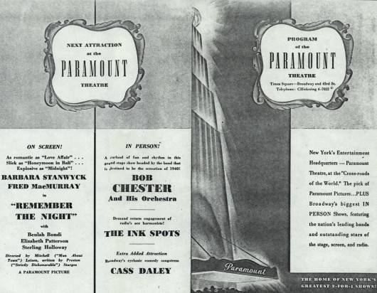
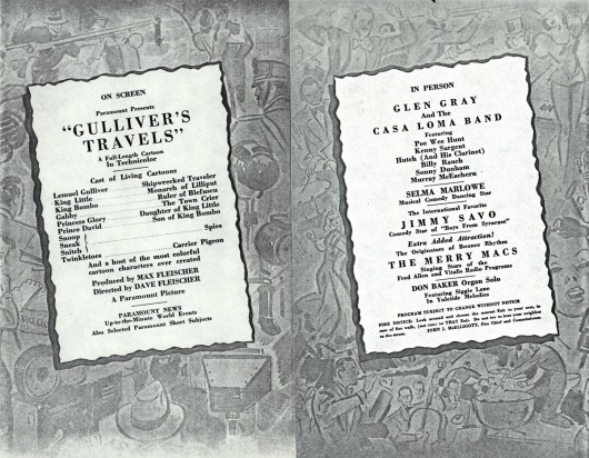
Here’s a copy of the program from the Paramount theater in New York on their premiere of Gulliver’s Travels.


First the outside pages (folded in the center)


Then the inside pages.


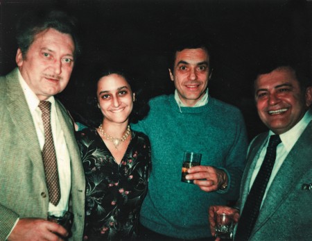
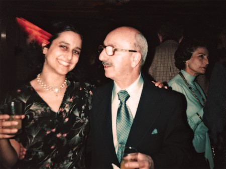
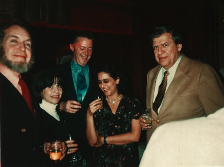
To add to the post, I thought I’d throw a random group of photos taken over the years with Vince and Candy at Perpetual Motion/Perpetual Animation or Buzzco.


Nick Tafuri’s party for animators
(LtoR) Jan Svochak, Candy Kugel, Vinnie Cafarelli,
And u-nion rep Gerard de Salvio.


Candy Kugel and Johnny Gentilella and Mrs. Tafuri


(LtoR) Howard and Iris Beckerman, Doug Crane, Candy Kugel and Ed Smith


Perpetual Motion Pictures:
(LtoR) Animators Vinnie Cafarelli, Jack Dazzo and Vinnie Bell


Buzzco: (LtoR) Candy Kugel, Lu Guarnier, Vinnie Cafarelli


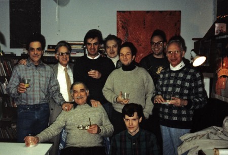
Buzzco: (LtoR standing) Vince Cafarelli, Jack Dazzo, Vinnie Bell,
Jan Svochak, Arnie Levin, John Lopez, Max Seligman
(seated) Lu Guarnier, Bryon Moore


Some NY animation Academy members:
Vince Cafarelli, Candy Kugel, Jimmy Picker,
Frank Mouris, me and John Dilworth

Commentary &Puppet Animation 14 Aug 2012 03:48 am

ParaNorman Screening and Talkback

- This past Sunday at 10am there was an industry screening of ParaNorman at a theater two blocks away from my home. I’d planned to go. I was asked to moderate the talkback, a Q&A with the directors of the film: Chris Butler and Sam Fell. Naturally, I said yes.

– Heidi and I arrived at 9:30; there was a bit of a line outside the theater. I was told to ask for Kia Muhammed of Focus Pictures. The doors to the theater were locked, so we had to wait until someone arrived to let me in and bring me to the Focus front desk. No other films were screening this early, so there weren’t many other places to go.

I wanted to be prepared to find out how long the talkback would be; would there be mikes for the three of us as well as for audience members who were going to ask questions. I learned that they’d planned for a smaller theater but were given the one we got. That meant they cut off the front section and planned to put three tall stools there for us to sit and for me to ask questions. Easy. I’d planned on getting a bit of background information from the two directors about the genesis of the film as well as their backgrounds. Then I’d open it up to the audience’s questions.

But first the film.


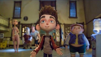
The Babcock Family
Grandma, Mom, Dad, Norman and Courtney

Laika, the producers of this 3D stop-motion film had first done Coraline under the direction of Henry Selick. Amusing that Coraline was on cable tv this morning just prior to the screening. I stopped and watched a couple of minutes. There’s some beautiful animation in that film, but in some ways it also felt limited in its animation.

_________

I’m not sure if there was a bit of a projection problem, but we had no picture at first, just triumphant logo music. It then cut into a smaller screen mock-low-budget zombie flick. It didn’t take long to realize that Norman was watching it on tv with his grandmother – his dead grandmother. Apparently Norman could see dead people. We learn that he gives more attention to them on his walk to school than he does to the real people on the street who just stare at the strange child.

Norman, it turns out, is being bullied at school for being a bit strange, and he has only one friend. The fat kid, Neil. These characters are beautifully developed as are many of them in the film. I also liked the voices quite a bit. Just looking over the cast, I was surprised to see John Goodman’s voice on the list. He does a bit of acting this time out, so that’s a pleasure to hear his character. I recognized Jeff Garland’s great voice as Norman’s father, but I didn’t recognize Elaine Stritch as his grandmother. I’m not the biggest fan of her work. She normally chews the scenery in overacting everything she does, but I think she did a great job here.


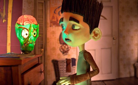
Norman with the John Goodman character

The animation was superb. Everything seemed to be on ones and beautifully fluid. There were a lot of peculiar and erratic moves that seemed totally natural to the characters on screen. The directors told us there were a number of scenes, particularly crowd shots that had some cg characters added since it would make the FX work much easier.

The climax of the film involves a lot of FX as the witch’s curse is brought to a close so that the dead, seen by Norman, can go back to rest. Very arresting imagery here makes it strong visually.

My only problems with the film had to do with the story. I found it sagging quite a bit midway. The emotional wallop isn’t strong enough because everything for some time seems to be at an even pace. I would have liked to see it vary a bit more, heightening and lightening throughout. This is the hardest part of filmmaking; it’s something I have my own problems with, and I think it changes with experience.

I enjoyed this film more than Coraline, and I think they’re onto something with the stop-motion animation. There’s a tactile sense to the film that you never get with cg. I’d recommend it, and I think it’ll do well.

_________

As the credits started to roll, I went outside to meet the two directors. I told them basically what I would be asking about and asked if there was anything they wanted to get across. From there we went inside to our appointed seats and microphones. The microphones, of course, turned on but didn’t work. We just spoke loudly, and I instructed the audience to do the same when they asked a question.


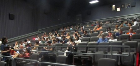
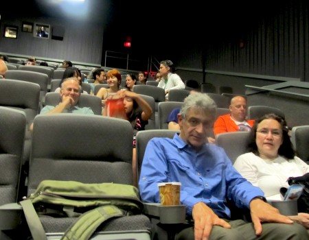
Half the audience in that kind of uncomfortable theater

They kept the lights on the audience down low, and the lights up front, where we were, a bit brighter, though I learned we were basically in the dark.

We got into it. Midway through the conversation the house lights went on, and I knew we’d soon hear our voices booming. Sure enough, the mics turned on, squealing across the theater. We just shut off the mics and resumed talking in our natural voices.


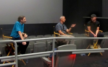
(L to R) me, Sam Fell, Chris Butler

Chris Butler was the sole credited writer, so I asked about the script. He, apparently, had started it while he was working in the story department on Coraline. He got the chance to show it to Travis Knight and sold the script as their next film. From his vantage point there was no break between the two features. Sam Fell, who’d started animating for Aardman got to direct Flushed Away and The Tale of Despereaux. From there he met with Chris Butler. The two hit it off, and they got to work together on ParaNorman.


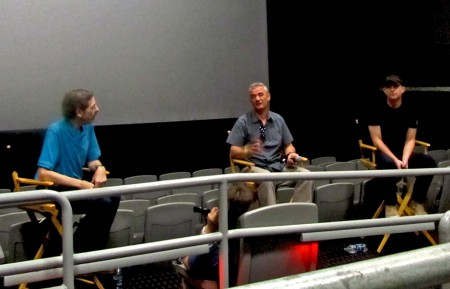
(L to R) me, Sam Fell, Chris Butler

I asked what differences had happened to stop-motion animation in the recent past since we’re no longer doing the clunky animation of Alice in Wonderland anymore. He talked about playback, photography, replacement faces (which are printed out from computers so that the animation is much smoother) and apparently, they do rehearsed versions of the scenes, whether on 2s or 10s, sort of an animatic rough of the scene, so that the director will know exactly where they’re going. Digital was the magic word to make the stop-motion animation better,.


the other half of the audience

The questions from the audience typically ranged from good to dumb. Bill Plympton asked what it was like directing animation from Travis Knight, their boss. They said they didn’t have to be critical since he was a very talented animator who usually did his rehearsals on 2s. Someone else asked the budget, and they said they really had no knowledge of that aspect. (What else should they have said?) There were a number of questions about the replacement faces that were printed by computer, and other questions asked about the sets – how many and how large.

Basically, the directors were friendly, courteous and pleased to be able to talk about their work. I think they’ll have something of a hit on their hands.

Aside from all the other press material available on line, there’s a nice slide show on the NYTimes site as well as an article about the making of the film.

There were many others from our local talent at the screening. Admittedly I wasn’t paying much attention since I had the talkback on mind. Here are a few of those there that I can roll of the top of my head; they included Candy Kugel and husband, Chuck; John Dilworth and girlfriend, Marie; Bill Plympton and wife, Sandrine; Signe Baumane with a couple of her interns; and Jaime Ekkens.

Animation &commercial animation &Frame Grabs &Hubley 13 Aug 2012 05:28 am

Hubley Bumper – recap

- Last week, Emily Hubley told me that some people up at WNET (previously WNDT), the local PBS chapter, saw this piece on my blog. They were hoping to get copies of the Hubley spots to show in celebration of their upcoming 50th anniversary. It’ll be great to see these films alive again.
Here’s my post on a couple of the films.

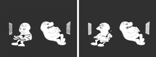
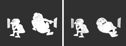
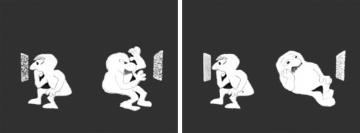
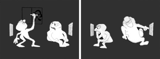
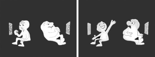
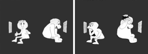
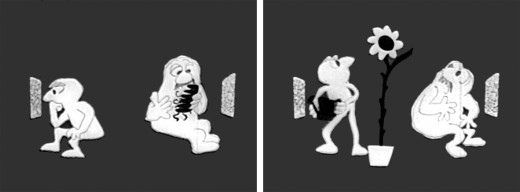
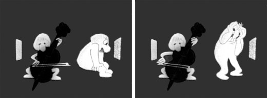
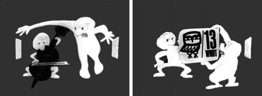
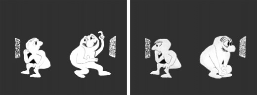
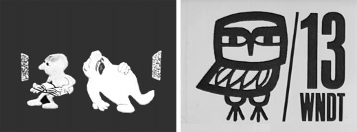
- One of my all time favorite pieces of Hubley animation was a station ID for WNDT-TV, New York’s public service station back in the 60′s. I thought of this spot last week when I posted the piece about Stanley Kaufman’s Art of Film for that station. It ultimately became WNET, NY’s PBS channel 13.

This spot was undoubtedly animated by Bill Littlejohn, and I think it’s one of his finest pieces. The timing is excellent. He obviously animated straight ahead; the characters distort and morph to the needs of the animation. It’s a full 2mins: 40 secs, so it would qualify as a short film these days,

The piece ran in B&W. It employed the multiple exposure technique. The characters had black paint filling everything but the animation drawing. This was double exposed over the BG, hence a see-through quality to the characters. This technique was used on Moonbird, The Hole, Of Stars and Men and several other Hubley shorts.

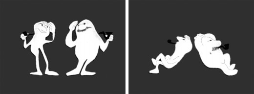
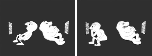
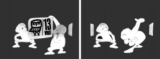
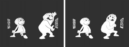
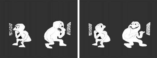
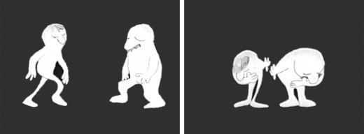
Here are some frame grabs of the spot.


The two guys come out on to the stage and take a bow.


They greet each other, light up and sit down.


A little bored, they both turn on TV’s. The little guy gets involved.


He takes out a book and takes notes comparing it with what’s going on his TV.


He goes back to watching. The big guy laughs at something until he gets bored again.


The big guy practices some wrestling moves until that gets dull.


Little guy does some brush painting. Big guy laughs again.


Little guy practices Russian. The big guy gets annoyed.


The big guy takes out a comb and starts combing until . . .


.. he has grease all over his head. The little guy grows a plant.


The little guy takes out a cello and starts to play. This annoys the big guy.


He pulls up the little guys screen. Public Television !


Embarrassed, he bows to the “Arts” station.


He turns to it on his own TV. He’s planning for something great.


They watch intently until the big guy makes sure little guy knows he’s still watching.


“Brain food” They watch intently.


The big guy falls asleep while the little guy goes back to his book. Dissolve to station card.

I love how the shapes of the characters shift and distort and change throughout the piece always coming back to the original models. This is a sure sign of straight ahead animation, and it almost makes the acting feel like an improvisation exercise by two actors. It supercedes animation and becomes acting.

The obviously loose time of the piece shows that the animator was probably given a lot of leeway with his timing, and he took it. As I said, I have no proof that Bill Littlejohn animated it, but I’ve never doubted it for a moment. It’s certainly as much his style as it is Hubley’s.

That is the odd thing about working for a director with a strong personality. I remember the day that I looked at one of my drawings and realized that it looked like one of my drawings, but there was no doubt it was a Hubley. Something happens, and you just end up drawing in their style.

Commentary &Photos 12 Aug 2012 05:19 am

America the Beautiful

- Given the selection of Paul Ryan as Romney‘s running mate, I had to tune in to the speeches of excess. The pair followed the George Bush lead as they appeared, running off a Navy ship (albeit a retired one), to make their speeches. Thus we can see that these great Republicans are would-be military men (except that neither of them has served any time in the military.)

I had to celebrate today by selecting some well placed flags from past blog posts and wave them high.
Again.

God Bless America.
(Of course, I’m nervous that Obama won’t win and these two will get in and completely derail America. They sure try hard but are completely unsympathetic to me or my family or my way of life. Read the editorial in today’s NYTimes.)


The first and last pictures are the brilliant handiwork of Steve Fisher. Thank you, Steve.

That’s about enough of that.

Happy Sunday.

.

Commentary &Puppet Animation 11 Aug 2012 06:16 am

Puppet Animation

This has been the week of puppet animation

- When I was young I was into puppets. All kinds of puppets. I made puppets, all different type of puppet. Marionettes were made of wood and string or muslin and string. Hand puppets were made of muslin and other types of cloth. I never really went into sock puppets; they were too easy. But I did buy puppets. There was a whole line of marionettes made of a wood-like resin of the Disney characters I had the Tramp and Lady. I had Mickey Mouse and Donald. I had a puppet theater in the back yard, and the kids of the neighborhood would pay to see shows I put on with a couple of siblings. The candy counter made a lot more money for us.

Even more interested in animation, I spent most of my time trying to teach myself everything about film. Naturally, puppet animation was something I worked a lot. It’d take time to animate drawings and then more time to color them and shoot them. It was faster to animate puppets. Once you had the model, you could just keep going. I have all this 8mm film of different types of puppets animated. For some reason a “Twist-o-flex” Goofy running from a Lionel train chasing him down a track stands out. It was fun.

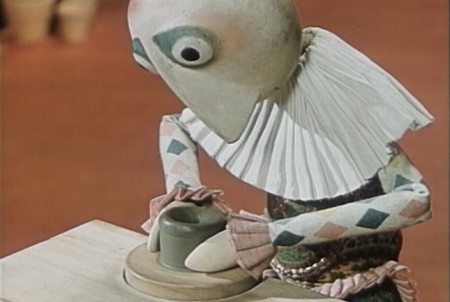
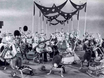
I was in love with Georg Pal‘s films and watched all that I could get my eyes on. I watched a lot of European animation on some of NY’s local channels. They’d infrequently have stop-motion Eastern European films. Once in a while some local channel wold run Lou Bunin‘s feature, Alice in Wonderland, or I remember watching Jiri Trnka‘s feature version of A Midsummer Night’s Dream. Richard Burton narrated it and did all the voices. That Sunday afternoon was heaven. I’m not sure if it was the film or the fact that I had some alone time in my house. (When you have a family of seven, you appreciate those quiet moments.) It didn’t take much for me to become a fan of Trnka’s work; his work sang to me. The more I looked into it, the greater he became.

This was just when Jim Henson was breaking on the scene. The muppets didn’t exist yet. I give this all as introduction to what this past week has meant to me. It was a week of puppet animation in New York.

______________________

Alice

Monday night, the Museum of Modern Art had a screening of Lou Bunin‘s 1950 feature film, Alice in Wonderland. Heidi and I went to the screening that had about half of the seats filled. I’d forgotten that the film was shot in AnscoColor. This was post WWII, and England didn’t have access to the three strip Technicolor. The film was limited to red and green colors, so everything looked chartreuse or orange. In other words, ugly.
The brown mixture grew more and more annoying as the 90 minute feature progressed. The costumes were designed to exploit the two strip color hues, and this might have been a mistake. Alice was dressed in a chartreuse and orange dress, and she might have stood out more attractively had she been wearing white. In fact, the film looks much better when shown in B&W.

The state of puppet animation wasn’t quite so sophisticated in 1950, at least as it would seem from this feature. Many clunky character moves revealed the budget constraints of the film. The magic and grace of the George Pal shorts felt missed on Lou Bunin’s film, but there, again, the disparity of the budgets had to have been noticed.

I briefly met and worked with Lou Bunin in the early days of my career. John Gati, a stop motion animator in New York hired me to work on a Care Free Sugarless Gum commercial. Care Free and Trident gums undressed and jumped onto a scale with Care Free weighing more for your money. It took a week to do the 20 secs. of animation in the spot. But just as we were completing animation, we learned that Trident had changed their packaging, and we had to redo the entire spot. At the end of the second week, and the second version of the spot, we learned that Care Free would update their packaging, as well, and we had to do the spot a third time. One week’s work stretched to three, but the work was getting redundant and irritating.

In the middle of that third week, Lou Bunin moved into a corner of the studio. I learned that he was doing a test spot. He was doing a version of the Lucky Charms elf as a puppet and animating it. The puppet was a beauty, and I convinced Lou to allow me to work for him (for free) to assist in the spot. I enjoyed myself for a few more days, and got to meet the man who’d made the only stop motion animated feature.


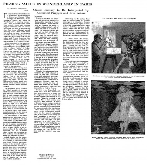
A news item during the making of Lou Bunin’s Alice.
______________________

Quay Brothers

- Just 12 hours later, at 10am on Tuesday, there was a Press showing of the Quay Brothers exhibit at MoMA. I was invited, and I took the opportunity to see the show with the fewest numbers of people who would gather around the smallish artwork. They told us where to go in the Museum (which had another hour before opening) and left us on our own. I went back in the evening to the opening party. Go here to read my review.

I reviewed this in detail this past Thursday. The show was exhilarating for me. Since getting the first taste of the Quay brothers back in 1980 when I saw their early film Nocturna Artificialia at the Ottawa Animation Festival. A good half of the audience didn’t know what to make of the movie and were impatient. The other half were completely taken by the film and knew it was one of the best of the films we’d seen. The jury at that festival deservedly gave top prize to Tale of Tales. That was the same year that Yurij Norshtein took the world with his masterwork of a film. Indeed, Tale of Tales was (and still is) a greater film than Nocturna Artificialia. (Interesting that Tale of Tales is a cut out animation film – essentially also stop motion.)

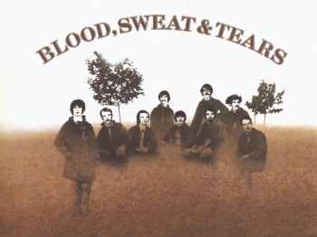
Of course, the brothers Quay are more than stop-motion filmmakers. They’ve done live action as well as documentary films; they’ve designed theater sets and books and record albums. The Blood Sweat and Tears first album cover is theirs. They were asked to design the cover without heads on the musician’s bodies. According to the brothers, the record company didn’t trust them to do the heads correctly; so the producers pasted hi-contrast images on the heads of the bodies, and they didn’t match the graphics the brothers had done. (Actually, the story isn’t properly told on the museum’s wall note; they make it sound as if the brothers had decided to leave the musicians headless, and the record company had to correct the situation. At the very least, it’s ambiguous and led to someone questioning the brothers during the museum’s Q&A.)

______________________

ParaNorman

- Then there’s ParaNorman. This film is scheduled to open next week. It’s a stop-motion animated feature from Laika, the company that backed Henry Selick in the making of Coraline. They got rid of Mr. Selick, and made a follow-up feature about zombies called ParaNorman. I’m scheduled to see that film tomorrow morning in an industry screening. In fact, I’ve been asked to lead the talkback, a Q&A with the directors: Chris Butler and Sam Fell. Mr. Butler had been the storyboard supervisor on Coraline, and Mr. Fell had been a director of the cgi features, Flushed Away, the first non-puppet feature from Aardman, & The Tale of Despereaux.

I’ll report on the event and review that film on Tuesday.

By the way, when I last spoke to them yesterday, I was told there’d be some extra seats. So if you’d like to see ParaNorman on Sunday at a 10am show try going to this link: ParaNorman. Note that they say that RSVPing doesn’t necessarily guarantee a seat. At the moment, I know there are seats available; hopefully everyone will be able to get in.

RSVPs.
SUNDAY, AUGUST 12TH
10:00 AM
AMC Loews Kips Bay 15
570 Second Avenue (@ East 32nd Street)

The NYTimes today has an article about ParaNorman and puppet animation.

______________________

Some After Thoughts

Gene Deitch‘s birthday was this week (he likes to point out that his birthday was 8/8 (August 8th when he turned 88.) He’s still keeping the blog up and he’s writing a new book. (If you haven’t read his book, How to Succeed in Animation, on AWN, go get it now – it’s free.

There are a couple of key things about puppet animation on his site, Roll the Credits. The information about his firendship with Jiri Trnka is worth the price of admission.It’s just great reading with lots of key photos.

Gene also has a video tour of the Kratky Puppet Studio, a walk-through with Bretislav Pojar. This is a handy llittle treasure of a video. Thanks to Gene from all of us who love puppet animation.

______________________

Articles on Animation &Books &Rowland B. Wilson 10 Aug 2012 03:34 am

Trade Secrets

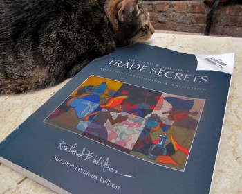
– Finally, I’ve received my copy of the book by Rowland and Suzanne Lemieux Wilson.
Rowland B. Wilson’s Trade Secrets / Notes on Cartooning and Animation.

I’d been waiting for this book to come to me since last April when I ordered it. With barely a few hours to scan through it, I can attest to the fact that I think it was well worth the wait. There’s so much there there.
The depth of information on every page is enormous, and just perusing the book, flipping the pages, takes time because the material within is elaborate and complicated. Yet, watching Rowland Wilson break down the information makes you realize what you already know from studying his cartoons: this guy knows a lot, and all of it goes into the choices he’s made in every cartoon.

Consequently, with the book in my hands for only a couple of days, I can’t possibly review it. It’s going to take a long bit of time. I’ll give you a couple of sample pages from the book, so you can see what you’ll be getting if you buy the book (and let me tell you, you should buy this book. It’s a gem, a masterwork of information that’s near-impossible to see collected anywhere. But it takes time.)
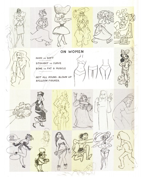
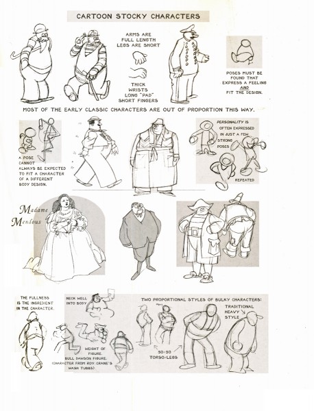
The book gives many and varied sheaves of information. At first, I’ve scanned a couple of pages of thoughts on character models. Here are two:

one on women:

1

and one on stocky characters:

2

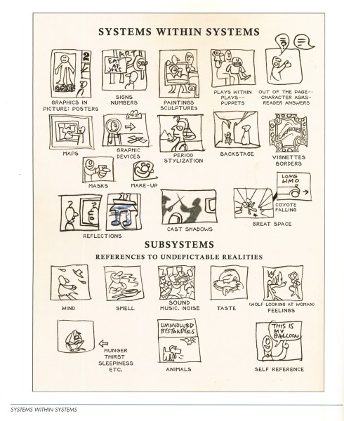
When he gets into the images being created, there’s even a page about iconic imagery within the images being developed. Drawings within drawings.

3

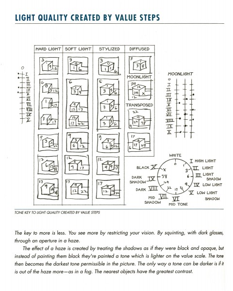
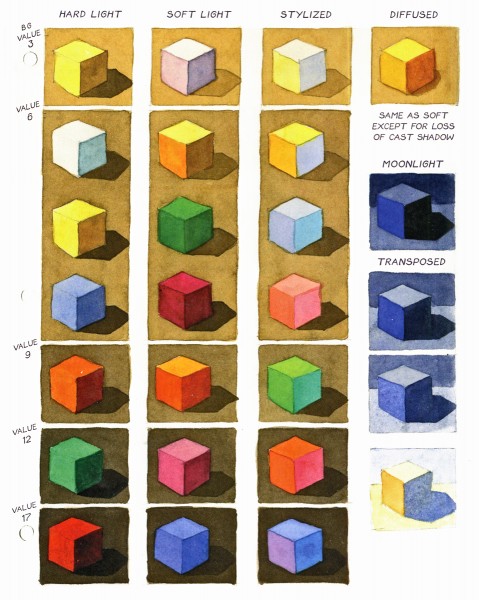
Rowland gets very serious about color and color theories. Here are two adjoining pages which give an overview of color created by varying lighting systems within the drawing.


4

5


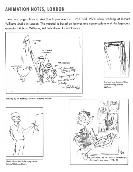
Then there is the section on notes by the great animators, Grim Natwick and Art Babbitt. This section comes from notes Rowland took at the Richard Williams studio when the two came through the London studio. There were lecture courses given for the studio, and this first page includes some caricatures done at the time.

6
Caricatures done at the Williams’ Studio in Soho Sq.

Here’s a bit of the commentary on Grim Natwick’s lessons:

    GRIM NATWICK AT RICHARD WILLIAMS STUDIO, LONDON
    Grim Natwick was considered one of the world’s greatest animators. He gave a series of talks to animators and was also available for informal conversation during this period (1973-74). We shared the same block of flats and I talked to him often at the studio and after hours. The following is a summation of these talks rearranged according to subject matter.
    GRIM AND THE TRACK— At the time Grim was here I was working on Count Pushkin Vodka (The Trans-Siberian Express animated commercial) and searching for a way to visualize dramatically a musical track. Grim placed great emphasis on the track and the importance of getting to know it thoroughly in order to draw it. At the time he was here I had not started to evolve the the theory of musical form being the basis for animation form. Although Grim never spoke of animation structure as being the same as music structure, on looking back, I see that a number of things he advocated fit into music structure. Art Babbitt’s successive breaking of joints and overlapping action is comparable to the idea of sounding a group of notes in succession, rather than simultaneously. I suspect that the best animators have worked intuitively to principles that are analogous with musical principles. Grim and Art never expressed them that way, exactly.
    DRAWING/ECONOMY— The most controversial theory of Grim’s was to set up a series of related drawings and go into them and out of them and through them in the course of a scene. The animators here felt that the system was not economical due to the amount of mental calculation it took to incorporate a pose in a new way once you had used it. They found the numbering confusing and the doping difficult. Grim presented the idea as an economy and they rejected it on that basis.
    Later in music class it occurred to me the analogy of Grim’s practice with musical practice. The practice of starting with a first and second subject, going through it, repeating it, et cetera,
    I think that Grim’s idea could be called “using a series of HOME KEYS” (animation keys] and is vindicated on aesthetic grounds if not on economic ones.

There’s plenty more where that came from.

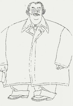
Of course, finally, I had to copy this chapter page which includes this great self-caricature by Rowland.


This is a book filled to overflowing with knowledge and information. It makes me realize how little I know and how much there is to learn from masters like Rowland Wilson. He talks briefly about the ad he designed/directed for Riichard Williams, Count Pushkin Vodka. Seeing this ad, alone, is enough to tell you how brilliant Mr. Wilson is and how key it is to learn from such a master. It also says a lot about the man that he spent time preparing these lessons. It also tells me how grateful I am to Suzanne Lemieux Wilson for organizing this material and getting it into shape for publication; I’m sure that was no easy task. I’ll have this book in hand for quite some time to come. In a way, it compares favorably to Richard Williams’ own book on animation, The Animator’s Survival Kit. The difference is that Williams’ book is about acting, performance, and animation; this book is about design, direction and the bigger picture.
« Previous PageNext Page »

eXTReMe Tracker
click for free hit counter

hit counter