Events of the Week
 - Tuesday brought an Academy event. Howard W. Koch Jr., known widely as “Hawk,” succeeded Tom Sherak as president of the Academy last August. He came to New York to meet the East Coast members, here, and to congratulate this year’s crop of new members. (Emily Hubley is one of the brand new members in New York.)
There was an excellent reception at the Stone Rose Lounge, a relatively new eatery in the Columbus Circle area. The event was pleasant with a notable number of celebrities milling about: Daniel Craig, Rachel Weisz, Billy Dee Williams, S. Epatha Merkerson, Richard Gere and Michael Douglas. There was plenty of drink (martinis seemed to be the drink of choice) and some great hors d’oeurves. The lobster tacos (about 1/2 inch long) and the meatball sliders were both delicious.
The speeches were kept to a minimum. Howard Koch was the only speaker and he spoke for maybe five minutes. The rest was the members chatting each other up. Heidi and I got to talk with Mr. Koch in a relaxed situation for about 15 minutes. We spent plenty of time with John Canemaker & Joe Kennedy, Emily Hubley & Will Rosenthal, Biljana Labovic, and Candy Kugel with her sister, Tina Hirsch. As I said, it was a pleasant evening.
- Thursday evening I saw a screening of Burton’s Frankenweenie. See my review, below.
- On Friday ASIFA East and The School of Visual Arts Animation Department had a regrouping of the original commercial animation studio, Perpetual Motion Studios. I wrote about this in depth with some pictures from the event, at the end of this post. Scroll down.
While I was watching this event, the Yankees won the division series over the Baltimore Orioles. Buck Showalter and his Orioles put up an amazing fight. I’m exhausted having gone through the competition with this team that came out of nowhere. Onto Detroit, next.
_______________________________
the Brew Makes Some Changes

I didn’t get the note from anyone that Cartoon Brew was changing their look. It was a surprise one day to go to the site and find something that looked wildly commercial, all headlines and no stories. Oh, wait. The stories are there, you just have to keep clicking on things. It looks incredibly commercial and blaring so early in the morning. I guess it’s good for them. It was a surprise to me, and it feels a bit overwhelming. I’m not sure I like going to the site of loud headlines. Though they do have all the information in cartoon town. What’re you going to do? You have to go with the flow, even when you’re heading downstream or so it often feels. Congratulations Cartoon Brew.
_______________________________
Katsuhiro Otomo at Platform Festival

- I received this in my email folder:
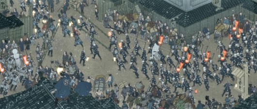
I’m excited to share some big news with you. Anime legend Katsuhiro Otomo is slated to appear at the PLATFORM INT’L ANIMATION FESTIVAL at the end of this month, where they will be screening his new short film, COMBUSTIBLE, and also honoring him with a Lifetime Achievement Award. See attached for a full press release.
It would be great if you could cover this great event and also run the announcement ASAP. I’m including an image as well, and can provide a couple more if you’re interested. As space is limited at this event, please let me know if you are interested in a press pass to the event, and also if you’d like to interview Otomo 1:1 while he is here.
How could I not partake of such an interview. I immediately wrote back to say, yes., I wanted IN.
 But first, I had to find out who Katsuhiro Otomo is. I looked him up on Google and found out he had directed Akira.
Now, Akira is one of those films that I’ve never been able to sit through. Lots of overworked, integrated animation takes place in a very convoluted story that is virtually impossible to follow. I didn’t make it past five minutes on the first attempt. Fifteen minutes on the next half dozen times. The film is magnificently rendered large, but totally impossible to sit through.
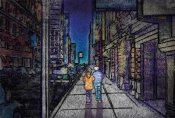
Look at that still, at the top of this post. Crowds of people running and milling about. No focus; no individuals. This is the chosen still to send out accompanying the film. A crowd shot. Busywork. No focus on characters, no identification with any personality. A crowd. That, to me, is Akira.
Sure, I’d like to meet the guy who made this film. It’s such busywork, that it defies itself and its own creation.
However, the Platform Animation Festival will take place in Los Angeles on Friday, October 26, 2012 to Sunday, October 28, 2012. Jerry Beck will interview Mr. Otomo on Sat, Oct. 27th at 9:30 PM. It might be worth attending. Jerry knows what he’s talking about when it comes to Manga, and Mr. Otomo will be making a rare visit to LA.
_______________________________
Burton’s Frankenweenie

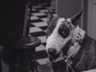
The dog from the original short

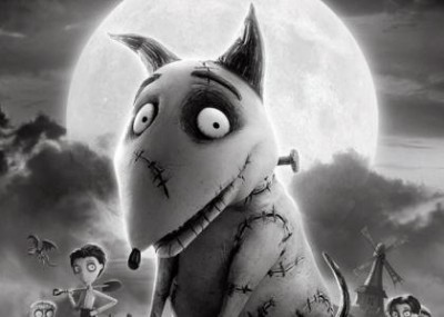
The new, improved puppet-animated dog
On Thursday evening, I saw Tim Burton‘s most recent puppet animated feature, Frankenweenie. This, as many of you already know, is a reworking of the live-action short Burton did in 1984. In many ways it doesn’t improve on that short. It basically tells the same story with an added number of homage sequences devoted to various horror flicks that Burton obviously loved.
The film is sweet with no strong conflicts to trouble little children. The animation feels ever-so-slightly limited, but I liked it. It often felt like there was a smile behind the movement, and that the animators were having fun on this film. Quite a few eccentric moves helped to make the gestures feel more individual. Unlike Para Norman, the film isn’t overly slick. That Leica film felt as though it might have been cg animated. You couldn’t really feel the fingerprints on the action. I do like that aspect of Frankenweenie. I always was sure it was real objects being animated, not some cgi puppet.
However, there was often a stiffness to the motion. In some of the first scenes, the lead boy walks as if his legs had no knees.
This might have been less noticeable if I had been more involved in a deeper story, but that is a big problem with the film. The story isn’t particularly engaging. It’s just sweet.
Of Burton’s three animated features this was the least of them.
_______________________________
It’s Such a Beautiful Day

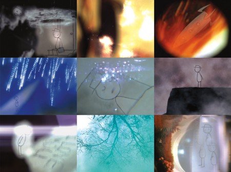
It’s Such a Beautiful Day is the title of the feature which Don Hertzfeldt compiled of three shorts he produced: Everything Will Be OK (2006), I Am So Proud of You (2008) and It’s Such a Beautiful Day (2012). These shorts formed a trilogy which Hertzfeldt designed to create this feature.
It opened at the IFC theater in New York and received modest reviews from the NY press.
Neil Genzlinger of the NYTimes wrote on Oct 4th: “Considering that he’s a stick figure, Bill, the main character in “It’s Such a Beautiful Day,†sure does have a complex internal life. And this animated film by Don Hertzfeldt does an amazing job of making you feel it, in all its sadness, terror and transcendence.”
The film will continue to tour around the country playing at many cities from Columbia, Mo to Tucson, Az to Chicago, Il. The planned schedule for the tour cn be found here (scroll down).
There’s an excellent interview with Hertzfeldt in The Onion‘s AV Club section which was printed last April when Hertzfeldt initially toured with the film.
_______________________________
Perpetual
- Yesterday, ASIFA East and The School of Visual Arts Animation Department had a regrouping of the original commercial animation studio, Perpetual Motion Studios.

Candy Kugel spearheaded this event working with support from JJ Sedelmaier, who started in Perpetual. Quite a few past employees of the studio came back for the celebration and made for an interesting evening. For them, it was no doubt a reu-nion, for the rest of us it was a visit to a key commercial studio in New York.
The event was prompted by the recent deaths of three of the key personnel. Vincent Cafarelli, Buzz Potamkin and Hal Silvermintz all died within six months of each other, this past year. Rather than making it a memorial for the three, they made it a celebration of the studio’s work.
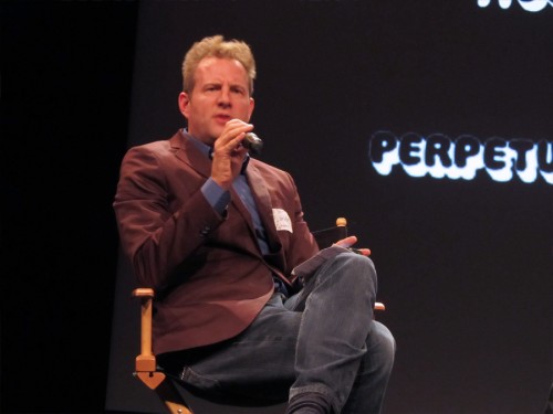
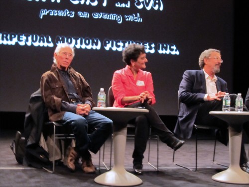
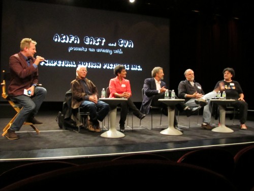
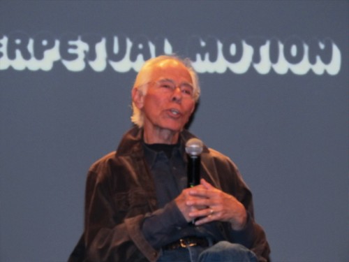
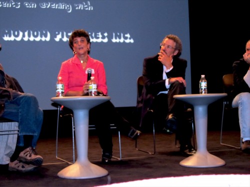
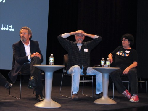
Tom Warburton acted as the host for the evening. He originally was an intern starting out in Buzzco Associates, the studio that followed Perpetual. Mordicai Gerstein, Russell Calabrese, JJ Sedelmaier, and Thomas Schlamme all came in for the event and sat on a panel up on stage in front of the screen.
This panel talked about the work done at the studio and the different roles they all played,from designing to animation to making music and sound effects.
In the audience there was quite a fill of other artists and past employees from the studio. Rose Eng and Marilyn Carrington were key people in I&Pt. Background Artists Linda Daurio and Cotty Kilbanks, Animators Doug Compton and Doug Crane, Layout Artist Wayne Becker, Editor Jon Levy, Producers David Sameth and Marilyn Kraemer all reunited.
I came from a different crowd of that same period. Mine was less commercial and more theatrical a group so I didn’t know many of these people. Yet, I knew of many of them and was glad to finally meet some. I was pleased finally to meet Mordi Gerstein, having animated his children’s book The Man Who Walked Between the Towers.
I’ve seen Wayne Becker‘s drawings for years, so it was a pleasure to finally meet up with him. I’d worked frequently in my own studio with the brilliant Doug Compton, so I was glad to see him, and I knew Doug Crane from Raggedy Ann.
It’s amazing the number of people who started out at Perpetual and went on to become important directors, designers, and creators within the industry. They must have been doing something right.
As one who sat in the wings watching the planning for this event, I got to see how enormous the amount of work and the number of phone calls it took for Candy to get the event together, and Rick Broas did a lion’s share of the technical work in planning the video and graphics for the program. They did everything from a film retrospective, to announcement invitations to name labels. They’re both to be congratulated for pulling off a fantastic night’s entertainment.
 The program ended with Candy’s latest film, The Last Time, which is a memorial to her close friend and working partner since 1973, Vince Cafarelli. Although it wasn’t a Perpetual product, it celebrated the end result of that studio as Perpetual merged into Buzzco with Buzz Potamkin, Candy and Vinnie continued on after Hal Silvermintz moved to open his own studio. After Buzz moved on Candy and Vinnie continued on with the studio which remains open and busy to this day. The film is sad, but it proved to be a positive ending to the evening. look for the spanking new short on the festival circuit.Go to its Facebook page to see a clip. Candy & Rick are appropriately proud of the short.
Here are some stills I took last night:
 1
1
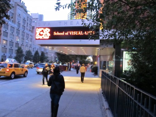
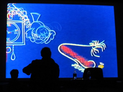
The theater where the show took place.

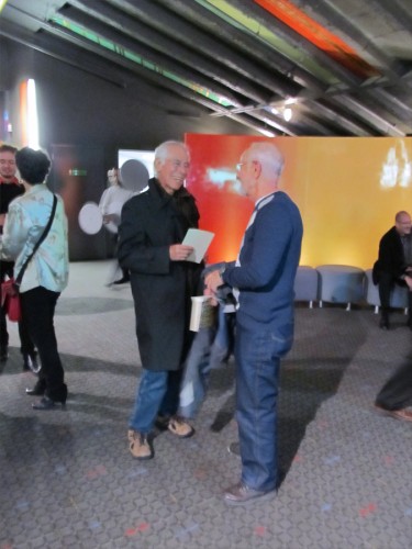
Mordicai Gerstein and Wayne Becker chat in the lobby.
 3
3
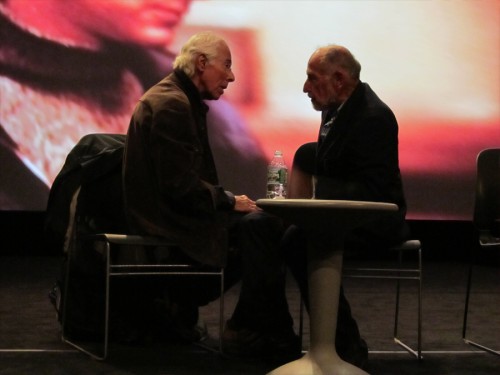
Mordicai Gerstein and Don Duga say hi on stage before the show.
 4
4
Tom Warburton moderated the panel on stage.
 5
5
(LtoR) Mordi Gerstein, Candy Kugel, Thomas Schlamme
 6
6
(LtoR) Tom Warburton, Mordi Gerstein, Candy Kugel,
Thomas Schlamme, JJ Sedelmaier, and Russell Calabrese
 7
7
Mordi Gerstein and Candy Kugel remain on stage during the
opening filmmontage constructed by Richard O’Connor for the show.
 8
8
Mordi Gerstein reminisces.
 9
9
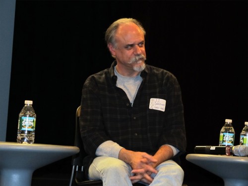
JJ Sedelmaier listens to the conversation.
 10
10
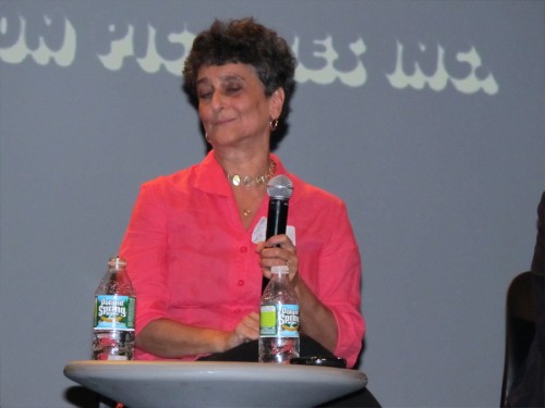
Sorry Candy. It’s a good closeup even though
my cursed camera caught you with eyes closed.
 11
11
Candy and Thomas Schlamme remember.
 12
12
Tommie Schlamme, JJ looking out and Russell Calabrese.
 13
13
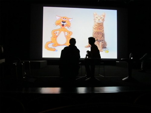
Mordi Gerstein watches some commercials
which he designed many years ago.
