Animation &Animation Artifacts &Commentary &Guest writer &Tissa David 15 Nov 2012 08:05 am

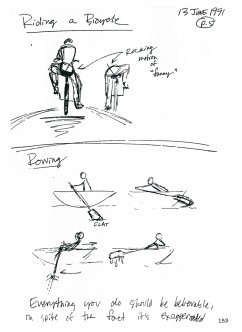
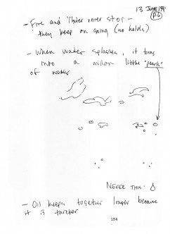
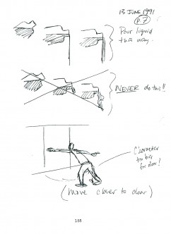
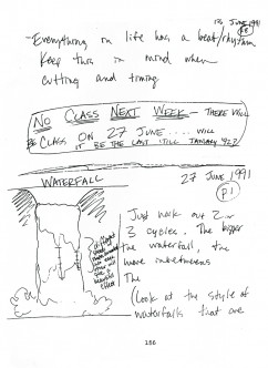
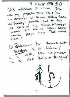
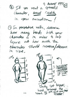
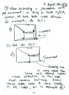
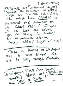
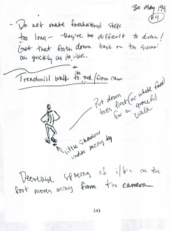
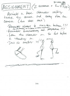
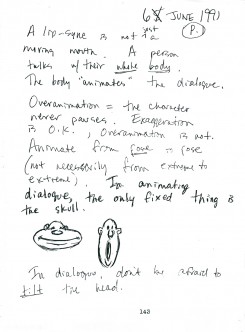
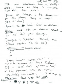
Tissa’s Class – part 6

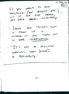
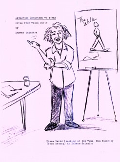
- From 1991-1992, Tissa David, taught a class in animation which was open to anyone who wanted to attend. R.O. Blechman offered his studio, The Ink Tank for a loction where the classes were held after hours. Those who worked in the day could attend the evening sessions..

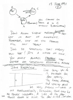
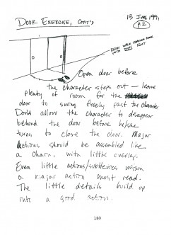
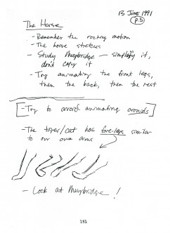
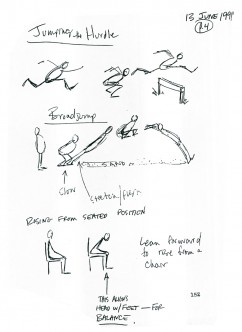
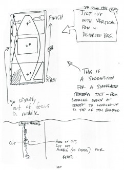
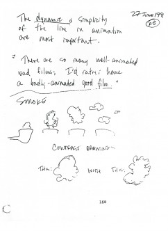
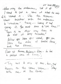
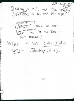
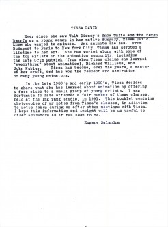
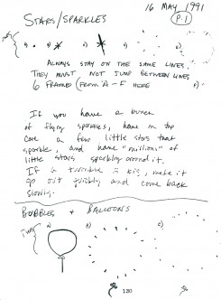
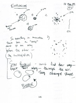
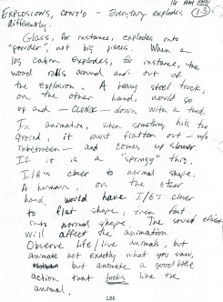
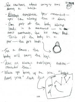
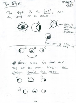
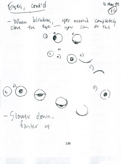
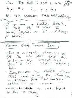
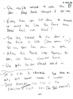
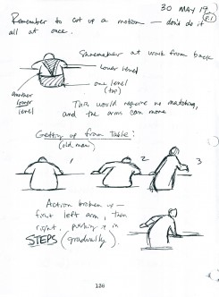
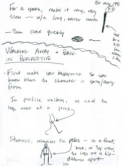
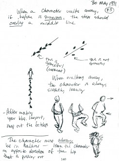
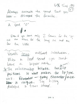
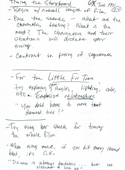
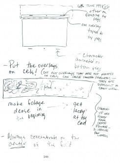
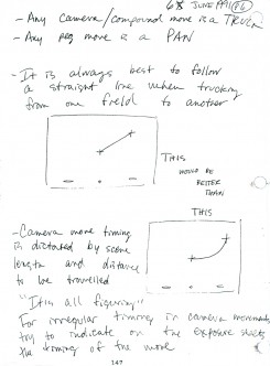
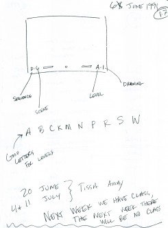
Eugene Salandra, a talented young animator, took notes in the classes, and recently I’ve been posting those notes here, with his permission. Some of the lessons seem a bit dated since they were done for 2D animation which was shot under a camera. However, all of the notes are important since learning the information will help you understand the proper use of the “camera” even if the camera is a computer.

Unfortunately, this is the last of the notes. Eugene also did tighter notes which were more cleaned up, and I may post those as well. I have to read them all before I decide one way or the other.

You can see the earlier parts by going to these links:
____________________________________part 1, part 2, part 3. part 4, and part 5

Here is part 6:

49 50
(Click any image to enlarge so as to be legible.)

51 52

53 54

55 56

57 58

59 60

61 62

63 64

65 66

67 68

69

Daily post 14 Nov 2012 08:30 am

Mogubgub 3

- Fred Mogubgub did a lot of varied work. Here are three pieces which were done large. In all three cases I’m posting them in the full format and then breaking them up to allow you to see them in a larger size.

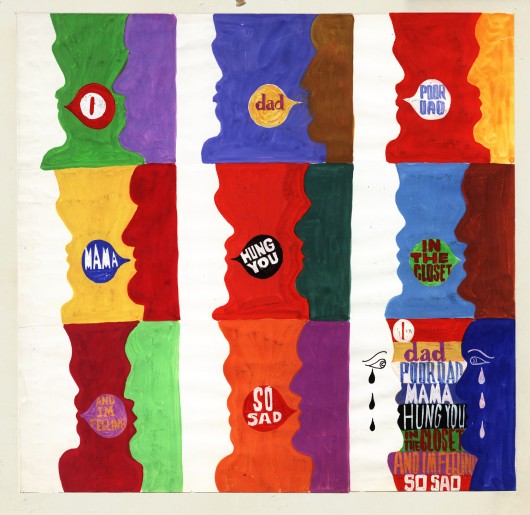
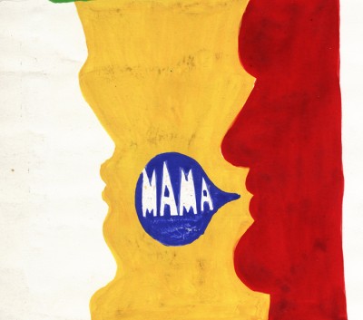
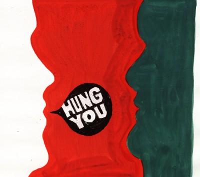
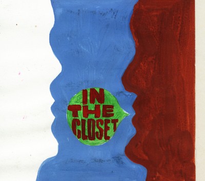
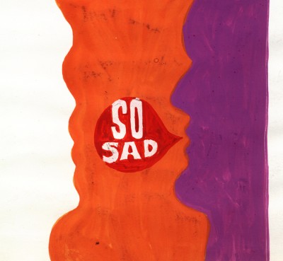
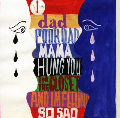
Here is what, undoubtedly, was a storyboard opening for the Broadway show, Oh Dad Poor Dad Mama’s Hung You In the Closet and I’m Feeling So Sad, Arthur Kopit‘s furst play; it opened on Broadway in 1963 for 47 performances. The show was directed by Jerome Robbins, and the animated prologue was done by Fred Mogubgub and Pablo Ferro. This is only one of three animated films done for the Broadway stage. This piece accompanied music written by Robert Prince. (The other animated films were both done/directed by me for Woman of the Year, a number of segments that incorporated dialogue as well as a musical duets between a character and a stage actor. The third film was an animated overture done for Meet Me In St. Louis, animated archival-looking postcards, animated. The final one turned into a live setting of the town ice skating.)

This is Oh Dad, Poor Dad, a full image of the board:


The final art used flat colors.

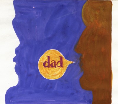
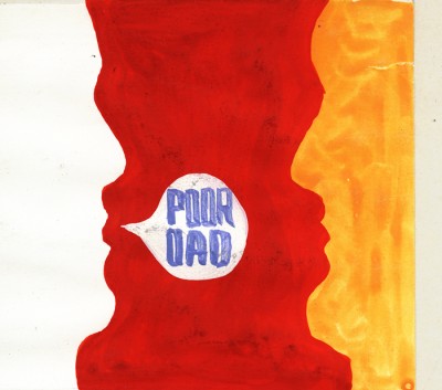
This is the same thing broken down into panels
to allow you to see them in a larger format.

1
(Click any image to see them at a larger size.)

2

3

4

5

6

7

8

9

__________________

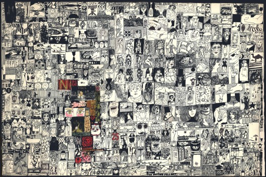
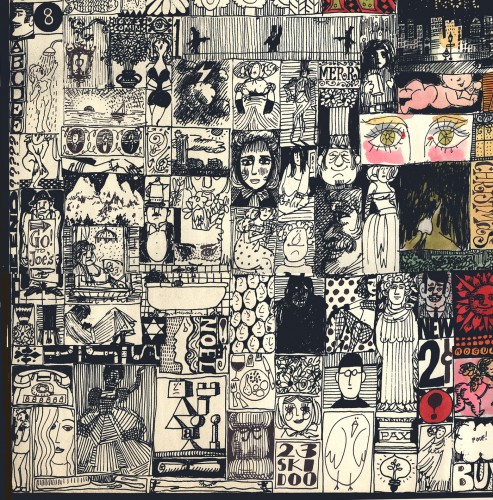
To follow that famous piece, there is a Christmas card, or it seems to be a Christmas card. The thing is so large it took a lot of work in photoshop to put it together. The whole is 30″ x 24. I’m posting it twice. Once full size, then in pieces so you can see/read it.


The full thing

(Click any image to enlarge.)

1
The six parts of the card. Top Left

2
Top Center

3
Top Right

4
Bottom Left

5
Bottom Center

6
Bottom Right

__________________

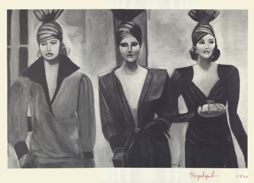
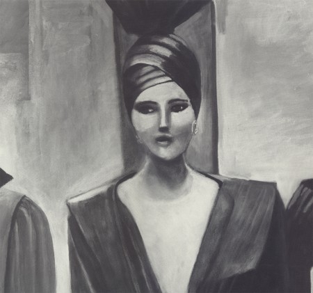
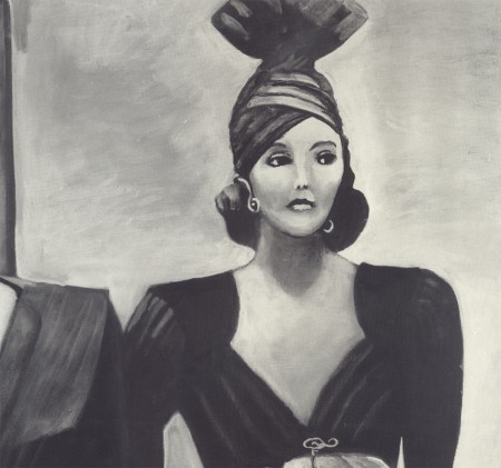
- Another large piece by Fred Mogubgub is a painting from which he created 500 photographic prints. It was a major part of an exhibit Fred had, and the prints were sold by the gallery. As with the other large pieces, I’m posting it whole and then again, in parts.

The painting is entitled, “Paris Streets.”


The full image

1
The first woman on the left.

2
The woman in the center

3
The woman on the right.

.

__________________

.

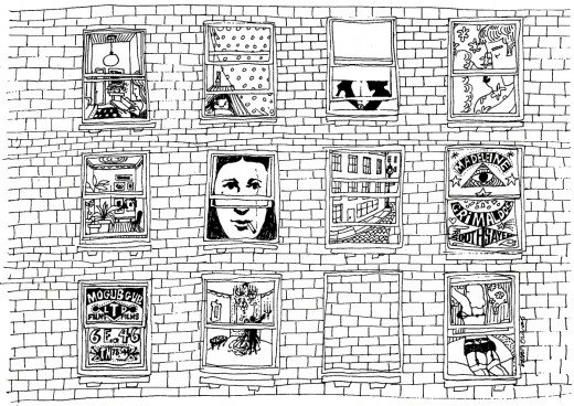
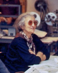
An ad for the company drawn by Irene Certas.
Very interesting. She was a brilliant checker, inker,
production coordinator who, for years, managed a
number of small studios including J.J.Sedelmaier‘s.
She is also Janet Scagnelli’s sister.
Obviously, brilliance runs in that family.

Bill Peckmann &Comic Art &Disney 13 Nov 2012 07:27 am

Eisenberg’s Mickey – part 1

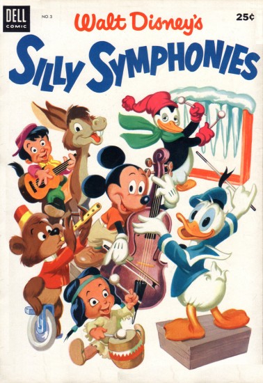
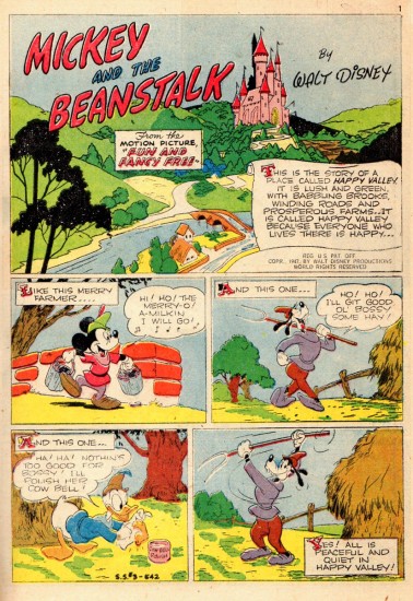
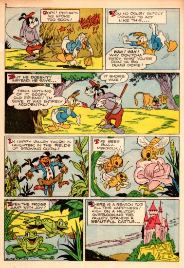
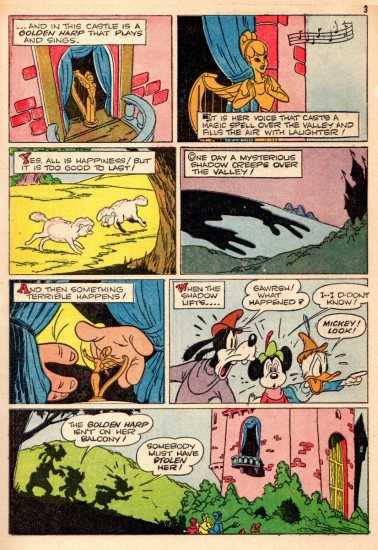
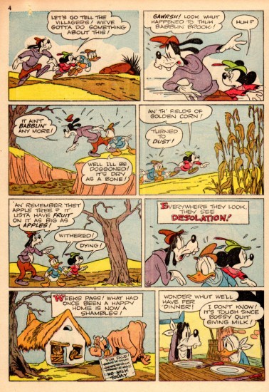
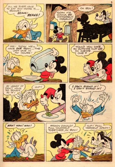
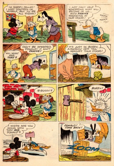
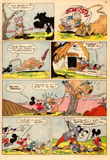
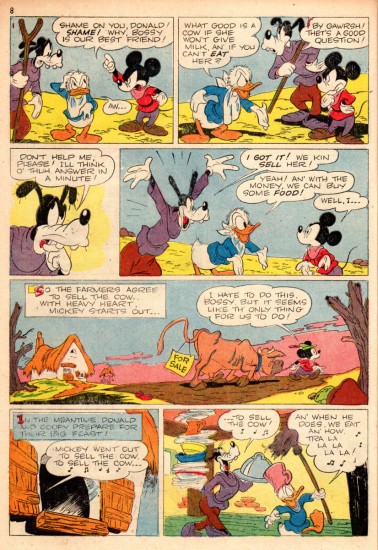
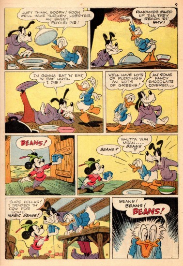
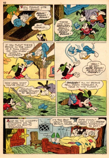
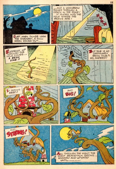
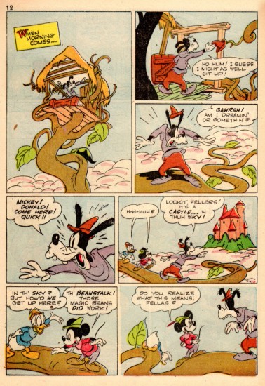
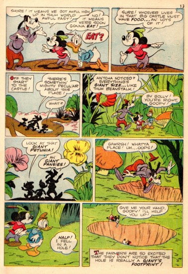
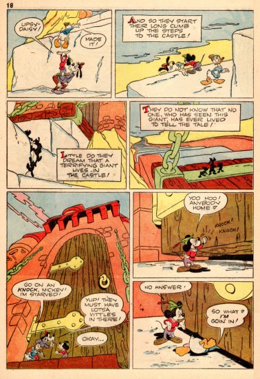
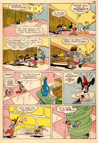
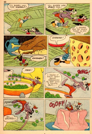
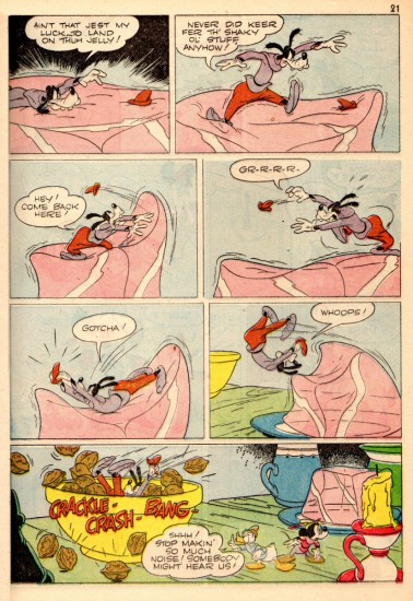
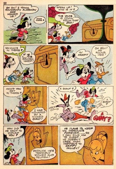
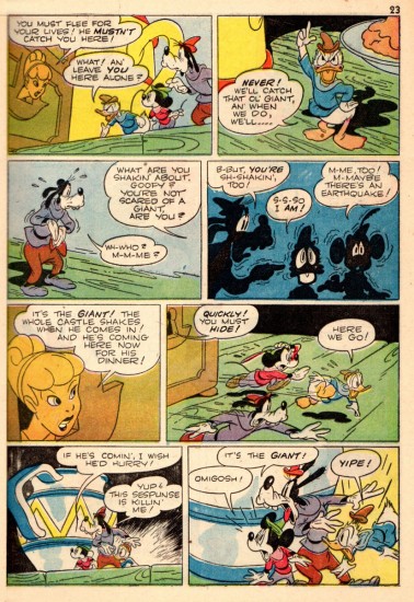
- Here’s a gem of a comic story/adaptation drawn by Harvey Eisenberg for Silly Symphony Comics. Bill Peckmann scanned and sent the book, and I am enormously grateful. Here’s the magazine and bill’s comments:

    As a kid reading Dell Funny Animal Comics there were a number of ‘good guys’ cartoonists who one always looked forward to seeing. Harvey Eisenberg (of course we didn’t know his name then, just like Barks) was always near the top of this ‘good guys’ list. He was sometimes called the Carl Barks of ‘Tom and Jerry’.
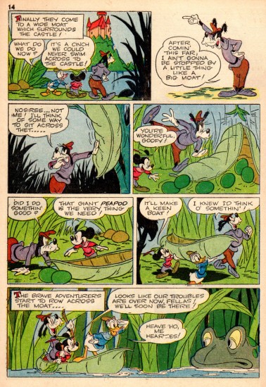
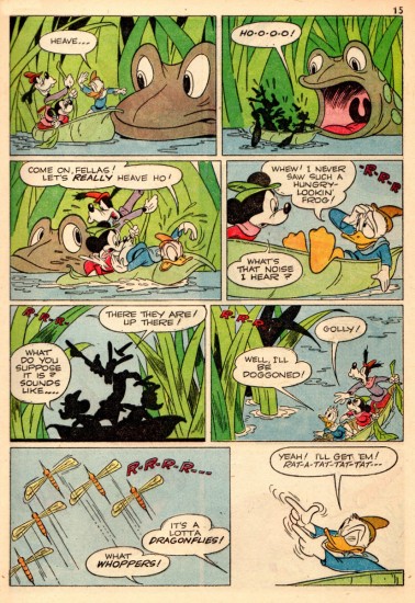
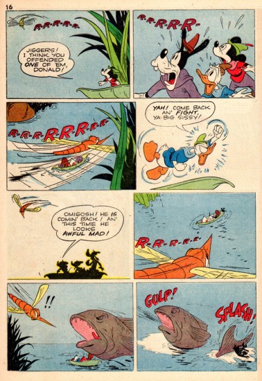
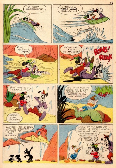
    Harvey Eisenberg‘s ‘Mickey and the Beanstalk’ first ran in 1947. This here is a reprint from 1953 which was in ‘Silly Symphonies’ no. 3, 25 cents comic book. If you think about how daunting it would be to bring a Disney movie to the comic book page, all I can say is that Mr. Eisenberg did an excellent job.
    Here are the front and back covers of the comic book. They were penciled by Paul (”Buck O’Rue”) Murry and the finished art was done by Donald T. MacLaughlin (see comments). As a kid I was always a sucker for these Disney illustrated/painted covers, and still am.


Front Cover


Back Cover

1

2

3

4

5

6

7

8

9

10

11

12

13

14

15

16

17

18

19

20

21

22

23

.
To be continued, on Friday, Oh migosh !

Bill Peckmann &Books &Guest writer &Illustration &Rowland B. Wilson 12 Nov 2012 07:26 am

The Secrets Behind Trade Secrets

- Suzanne Lemieux Wilson, wife of the late Rowland B. Wilson, just sent me a guide to how she, with information from Rowland, put together their invaluable book of notes called Trade Secrets. Seeing the skeleton come together for this book is quite an informative document, and I couldn’t be happier that she trusted my blog to relay the information..

Some of these illustrations and pictures have passed across this blog before, but they take on a very new meaning here, so I’m glad to post them anew. I have to thank Suzanne for the gift of this post especially given some of the hard work I know it took to scan and send documents that are large enough to work here.

By the way, if you don’t have this book, you should. The book offers an enormous amount of information about his design for animation as well as for the printed cartoon and illustration trade. How ofen does a genius of his craft offer such a guide to the “trade secrets”? Trade Secrets is an invaluable book.

May I suggest that you click any image as you go through to enlarge them and get a better look at the illustrations and the type. It’s great stuff.

1

2

3
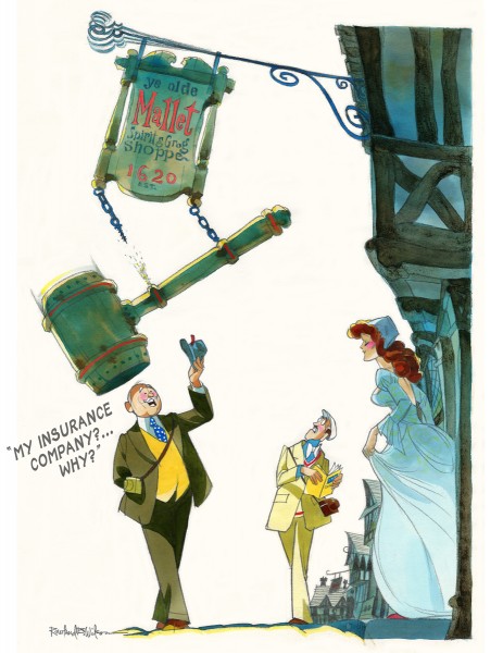
New England Life

4
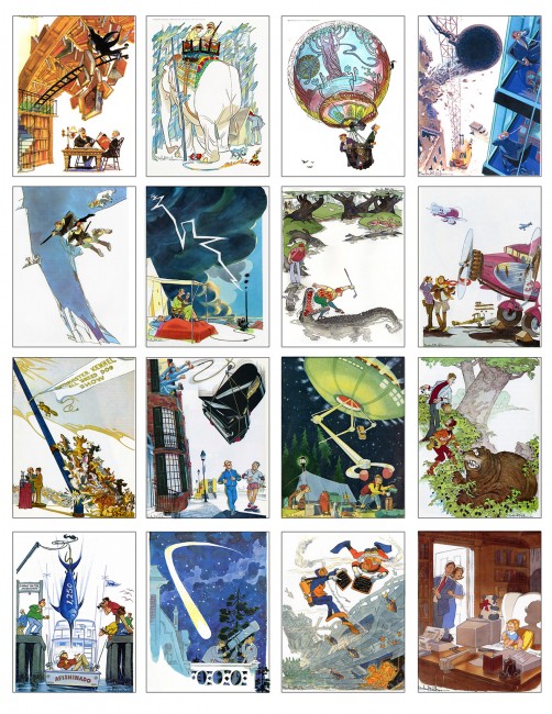
The insurance campaign ran for eighteen years–

5
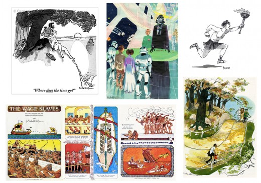
Rowland also drew cartoons for the New Yorker, Esquire,
The Saturday Evening Post, Playboy and others.

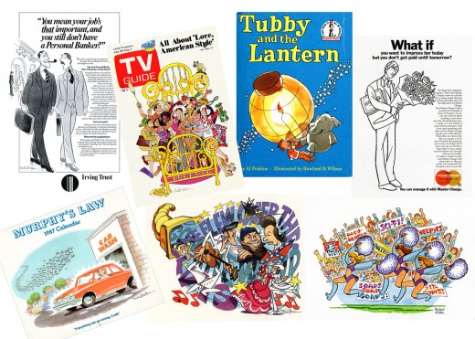
6
As well as illustration and advertising.

7
Rowland’s first and last jobs were in Animation, with many
interspersed throughout his career.

8
Rowland devised illustrated instruction pages as quick reference
guides for the Layout, Background and Animation staff when he worked
at Don Bluth and Walt Disney Studios.

9
He worked on the Captain Pistol series of cartoon novels
from the 1970′s onward.
Captain Jack Pistol was a Retired Pirate and Rich Man who met with a
series of misadventures as he moved through various literary genres,
from swashbuckler to romantic comedy to spy thriller
to Western to science fiction.
Rowland sculpted three-dimensional models of the characters.


Rowland endeavored to apply the principles of drawing to life.


He created an artful environment to work and live in–

He designed and constructed a sunflower gate for the garden.


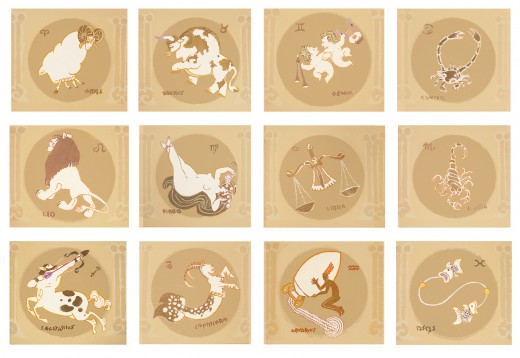
He painted the signs of the Zodiac around the base of a vaulted
ceiling…

He built a workbench for his woodworking projects and decorated it . . .

15
. . . with caricatures of Laurel and Hardy.


Because he worked in a variety of disciplines, Rowland sought
solutions that would apply to all of them and save him from “solving
the same problem over and over again”.


He consolidated the information into charts and hung them in his studio,
whether it was in Connecticut, New York, Ireland or California.


Rowland documented many techniques and observations.


The writings and illustrations filled dozens of
notebooks, binders and sketchbooks.


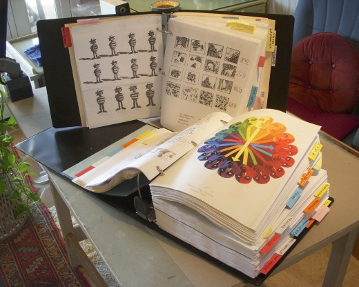
Much of it was xeroxed and consolidated into two giant binders as
resources for the book entitled Rowland B. Wilson’s Trade Secrets.


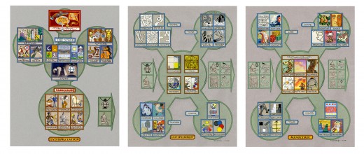
But the genesis for all of the notebooks and for Rowland’s oeuvre
were three flow charts that outlined procedures
that could be applied to any project.

22
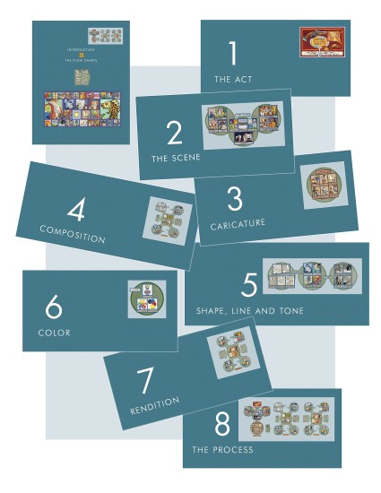
The Introduction of Rowland B. Wilson’s Trade Secrets describes the
Flow Charts in general. Then each chapter is based on an aspect
contained in them. The logo at the top right shows what aspect is
covered in the chapter.

23
Chapter 8, the Process, follows a project from idea to finish
as it progresses along the Flow Charts.


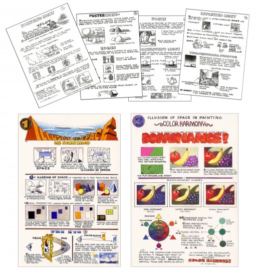
Chapter 9 presents many of the charts and posters
that actually hung on the studio walls.

25
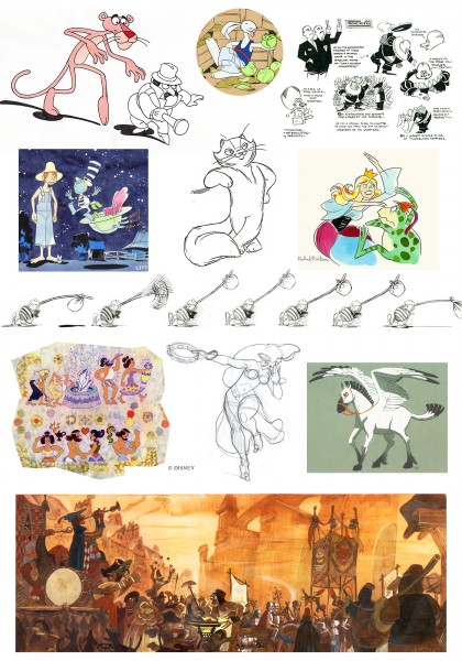
Chapter 11 shows a gallery of artwork throughout Rowland’s career,
including well-known images and some of his personal art,
never before published.

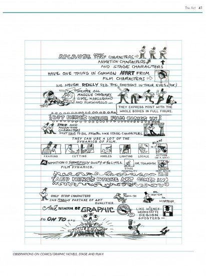
26
A page of observations on comics, graphic novels, stage and film:

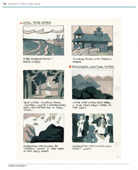
27
One of three pages illustrating Styles of Notan:

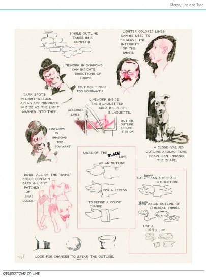
28
A page showing notes on various aspects of Line:

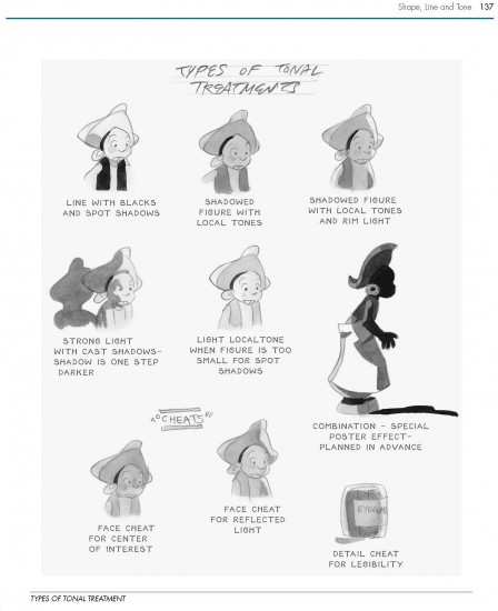
29
A page depicting various types of Tonal Treatments:

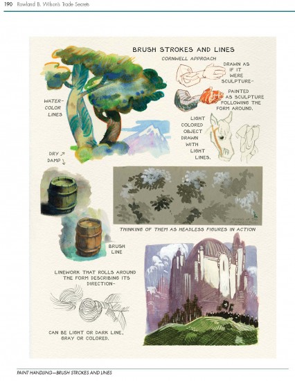
30
Demonstration of watercolor techniques:

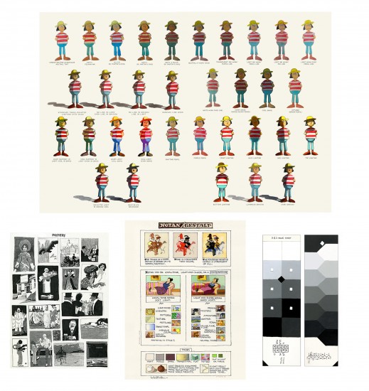
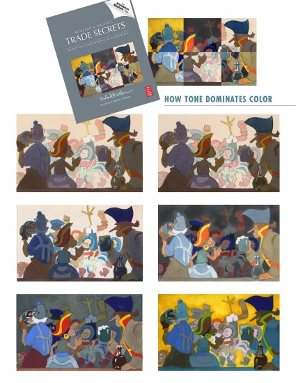
31
The cover image is a composite of 6 Value Studies showing the
dominance of Tone over Color:


We hope you enjoy Rowland B. Wilson’s Trade Secrets and find
inspiration within.

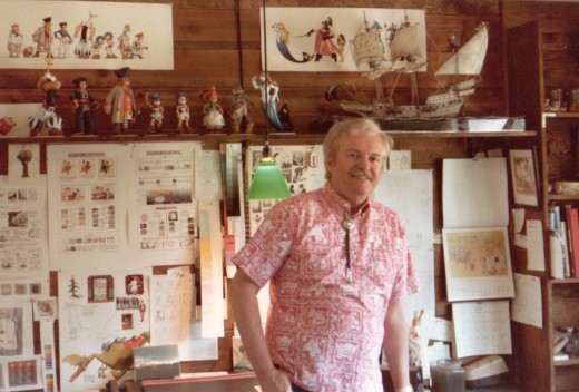
With Special Thanks to Bill Peckmann for photograph of
Rowland B. Wilson in his studio.

_______________________

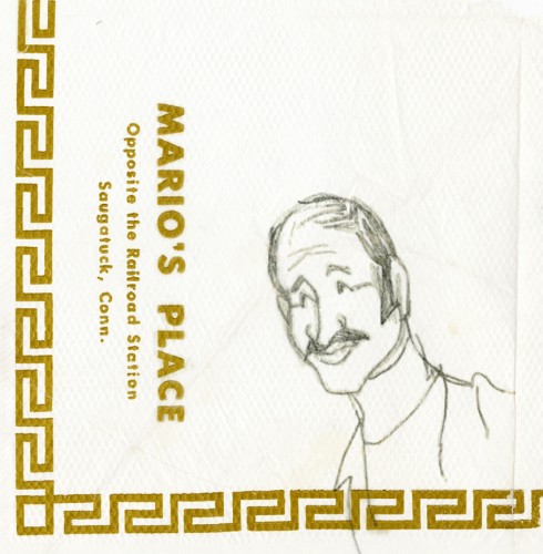
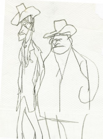
And as a bonus to this post, here are some drawings RBW did on a napkin at a lunch with Dick Williams.
Suzanne wrote:

    I discovered some vintage Rowland B. Wilson “doodles”, sketched on
    napkins at Mario’s Restaurant in Westport, Connecticut–thought you
    might enjoy them. The caricature of Suzanne and Rowland (image 2)
    looks to me like the RBW take on Richard Williams’ drawing of us (image 3).

1
Mario

2
Suzanne and Rowland caricatures

3
Dick Williams’ caricature of Suzanne and Rowland

4
Man

5
two Dudes

Commentary 11 Nov 2012 06:00 am

Lincoln

KNZJAH59VWUM

Early Lincoln

- I’m a sucker for silent movies. I think I’ve read at least a dozen biographies of D.W. Griffith, and I’ve seen a lot of his films (probably all of the features) at least once. I’m impressed with the drive and the love those people put into their work. They didn’t think of it as an art form, and they weren’t considered artists in their time. But in the end, there can be no doubt that some of the filmmakers of the time were creating art.


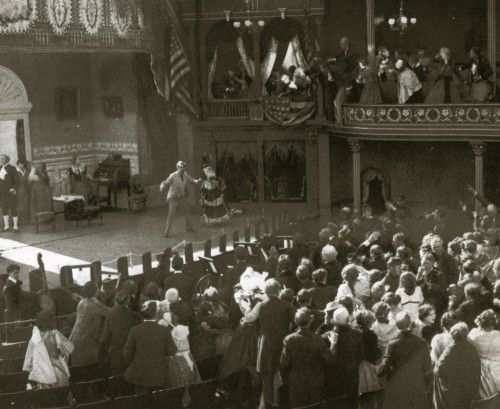
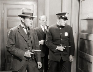
A scene from Griffith’s The Birth of A Nation. It’s a recreation of
Ford’s Theater as Lincoln gets shot.

I once saw a silent feature with no musical accompaniment. The silence was deafening. It was amazing how silent the audience remained throughout the feature film. I guess the film was absorbing enough to make that audience unaware of the silence. That was about 15 years ago; I wonder if the same would occur today.


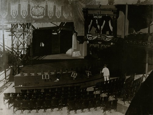
DW Griffith on the Booth Theater set under construction.

Watching silent films with organ music playing background is not the ideal way to see them. Most piano players who back up these films also aren’t really up to the task. But when you see a film with a great pianist or a good orchestral score it makes all the difference. There’s a musical group called the Alloy Orchestra that enhances the films they accompany, and allows the movies to live up to their full potential. I suggest you try to attend one of their programs if they’re in your neighborhood. (Or just buy one of their cd’s; you won’t regret it.) I suggest Metropolis or one of their sampler albums.

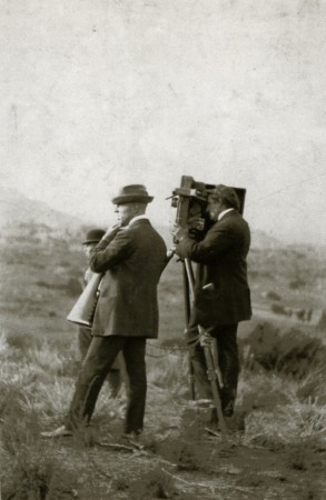
To the left, a rare picture of D. W. Griffith and Billy Bitzer on location for Biograph around 1912. Bitzer is lining up a shot through ground glass, which he has inserted into the gate — there was no viewfinder on the Mutograph camera. This large machine, which punched its own sprocket holes, was smaller and more portable than Biograph’s first cameras. Negatives made with it are still providing superb quality prints.
________(Click any image to enlarge.)

One story from the book Adventures with DW Griffith by Karl Brown has stuck with me for many many years. He and Griffith both lived near 14th Street. Daily they’d walk together to the studio on 125th Street, walking through Central Park. Brown said he once talked about how dangerous it could be walking so early in the morning. At that point, Griffith pulled a long nosed pistol out of his inner jacket pocket, and told Brown he was prepared for any event. This made me realize how volatile a society they must have lived in that early in the century. Thank god times have changed.


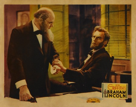
DW Griffith was obsessed with Lincoln and did a number of films that featured the 16th President. One of Griffith’s last films was an early talking film called, Lincoln. It starred Walter Huston (John Huston‘s father) as the President.

________________________

Spielberg Lincoln

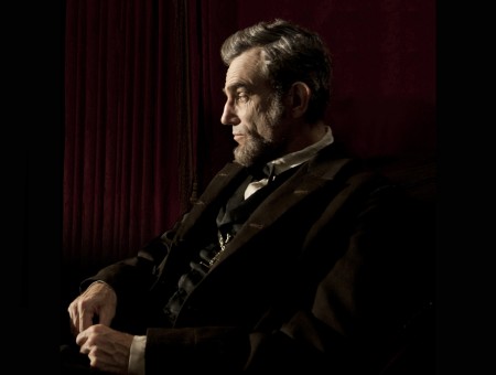
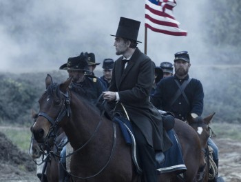
Spielberg has a new film, Lincoln, in theaters, now. Take a look at the picture of Daniel Day Lewis, above. It may as well be a penny. Incredible, the makeup. Lewis got me even before I saw this film. The voice – what he did with his voice – just took my breath. He
spoke throughout the film in a higher register than was natural for him. The expected dulcet tones and stentorian readings were not there – on purpose. I keep wanting to say a Nebraskan accent, but that’s wrong. It has to be Illinois, the accent. Daniel Day Lewis obviously worked his voice off for this one, and it’s just amazing.

The brilliant makeup nowadays was expected, but it’s only the acting under the makeup that could pull it off. Stick a lot of makeup on James Caan, and you still have James Caan in makeup. But Daniel Day Lewis knows how to act beyond the mask outside his head, and that performance is astounding. (No, it’s not better than what Jean-Louis Trintignant has done in Amour, both performances are formidable.)

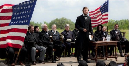
For the first half hour of the movie I was astounded. Everything melds so well together and moves seamlessly in a wonderful recreation of historic Lincoln in the White House of the era. Daniel Day Lewis has you searching the screen for him in every scene. He’s remarkable. Spielberg makes us feel Private Ryan, Gone With the Wind, Birth of a Nation and all of movie history; what a glorious feeling. But the film gets down to business and unfortunately the 2½ hour movie feels rushed. A lot was undoubtedly cut out and consequently the film feels smaller than it is. The story is basically about politics. Getting a vote across in a lame duck Congress. (Great idea for a story.) But you want more – or at least, I did, and I’m sure it was once there. They just took it out to get the film down to a reasonable length. Our loss and the movie’s loss; it makes the movie smaller.

There’s a brilliant scene where the exhausted Lincoln, toward the film’s start, goes into his office. His son (I originally thought it was his daughter, but I was corrected) is lying asleep on a newspaper. (The scene of him on the floor is beautifully done and feels as thogh it’s an outtake from Gone With the Wind. Beautiful in every possible way, and it brings us back to another great Civil war movie.) Lincoln lies down beside him on the floor and embraces him. He wakes up and climbs onto dad’s back and Lincoln takes him off to bed. S. Epatha Merkerson is a character who enters in the very end of the film. She should have been seen earlier. They certainly reduced her part to nothing (even though it’s a key character to the epic version of Lincoln.) And you know there was more of the character once upon a time. The character doesn’t just enter for two scenes and is gone, not in a script by Tony Kushner. No they had to have cut her character onto the editing room floor.

The film needed more breathing room. It’s 2½ hours, and they should have gone for 3. It may have made it a bit stodgy, but it deserved the time. Toward the end it also has too many cherished moments for Spielberg’s romantic side. Lincoln becomes too noble in those beautiful shots, and the music soars in case we missed it. Yet we didn’t need it. A drier film would have been a better film.Still, I’ll see it again. This film should be on a double bill with Spielberg’s Amistad. Then send them both out to the schools of the nation.

See it for all that it is, and all that it should have been. See it for the performances – so many fine ones. See it for the photography. Unfortunately, it’s not the best film of the year. I still don’t know what that is, but this one is not quite an A, maybe a B+ or an A- in my opinion. Great work that was pushed to completion doesn’t always get the full regard.

Since seeing this film three days ago, I haven’t been able to stop thinkng about it. No, not the story, but the actors. The three who try to con the vote out of the opposition, James Spader, John Hawkes and Tim Blake Nelson keep popping up, as does, of course, the incredible Daniel Day Lewis. Even Sally Field is on my mind, particularly in the one scene she, as Ann Todd, argues violently with her husband in their bedroom. I very much want to see the film again. I’d guess that’s a good thing to say for a film.

___________________________

Tragedy

- To write about another film seems almost blasphemous, but here goes. The NYTimes‘, Robert Ito, writes at length today in a story about Marcell Jankovics‘ new animated feature, The Tragedy of Man. The film took almost three decades to complete and is premiering at the Hungarian Film Festival of Los Angeles on opening night, Nov. 15th. If you live in LA, it sounds like you should be there.

Commentary 10 Nov 2012 12:44 pm

Nor’Easters and other stuff

The following films made the short list for the Oscar’s 10 selections for animation short:

    Adam and Dog, Minkyu Lee, director here
    Combustible, Katsuhiro Otomo, director
    Dripped, Léo Verrier, director here
    The Eagleman Stag, Mikey Please, director, and Benedict Please here
    The Fall of the House of Usher, Raul Garcia, director here
    Fresh Guacamole, PES, director here
    Head over Heels, Timothy Reckart, director here
    Maggie Simpson in The Longest Daycare, David Silverman, director here
    Paperman, John Kahrs, director here
    Tram, Michaela Pavlátová, director here

Congratulations to all of those who worked on the films, and my sympathies to those who didn’t make the cut. I liked many of those on the list and liked others not on the list. It’s a crap shoot, sometimes. I’ve been on both sides – those wwho made it and those who were left off. So I know how you all feel.

________________________

Animated Feataures & Oscar

Cartoon Brew posted a list of 21 animated features being considered by the MPAA, the Academy, as potentially eligible for nomination. It was pleasing to see that the number has increased, yet it was annoying for another, more personal, reason. As you know I’m an Academy member and voter, and I take great pride in that. I make it my duty to see every film available to me on the big screen, projected. I don’t want to give short shrift to any movie by watching it on the DVDs that they send me. It’s a movie and should be seen as a movie, in a theater with full attention.

This year, the Academy made it harder on us. There are a lot of films to see. Yet, for the second year in a row, the Academy moved up the date of the Oscars and, consequently, the date of when we’d have to vote for the nominees. This year, it basically means that we have to vote by the end of the first week in January. We have to see all the films and vote by then. If you want to see the films on a big screen, it’s hard to do.

I’ve been a judge for a couple of film festivals. (I’m not talking about animation festivals, now.) I was sent dozens of DVDs and had two weeks to see them all and vote. That can be done. You push through a film and if, for any slight reason, you don’t like it, you shut the film and go onto the next. It’s not fair to the movie which may be purposefully gaining strength as it goes on. It’s not fair to any film, really, because that’s your mindset as you turn on the DVD player. It’s not the proper way to watch a movie. You’ll take a phone call and keep talking while the movie runs; you go to the kitchen, get some food and return, eating, while the film keeps rolling. You’re just treating the film like a TV show. Yet, that’s the only way you can get thirty films into two weeks. And you’re judging them!

On to my point. Last year was the first time those on the East Coast were given the opportunity to vote for the nominee list from the group of films that had been proven eligible for Best Animated Feature. Last year there were 18 films and the Academy in NY squeezed out two screenings of each film so we members who were voting could participate. Unfortunately, not a lot of animation members came out for the vote.

This year there are 21 films, per Cartoon Brew‘s list. That’d take a full month to squeeze those screenings in among the many other screenings at the Academy Lighthouse theater. That and, given last year’s low turnout, the decision has been made to cut the vote in New York. To be able to vote for my category, I’d have to move to LA for a month to see the films. I’m bummed about it. Not because I want to see all the mediocre Hollywood fare that’s thrown our way (Rise of the Guardians, for example, is horrible but will probably get nominated) but because there are small gems in among the big films. I think I’ll get to see The Rabbi’s Cat and From Up On Poppy Hill thanks to GKIDS arranging screenings of several of the films they’re representing. That pleases me. But I don’t know if there’s another hidden gem I’ll miss.

I suppose it’s not the Academy’s fault that circumstances aren’t going my way. I love being a member, and I do everything possible to support the best films and the Academy, but I feel left out. Of course I’ve sent a letter of complaint to the board in LA.

________________________

The Historicist

OneStop NewsStand is a Canadian news site that includes a weekly column, the Historicist, which is devoted to talking about people who helped shape the city of Toronto. A recent piece focuses on George Dunning and features a number of video clips of Dunning’s films. You might want to take a look at it.

________________________

Week in Review

- There weren’t many events I attended to make the week very memorable. Other than the Election. Actually, that was my week. I was up most of that Tuesday night listening to speeches and wrap ups and analyses from those who do so for a living. It wasa all fun, especially since my guys won, and I wanted to savor it as long as I could. Oddly, there never felt like there was much tension involved with it, except for any dirty dealings which could’ve taken place. Too many stories of hundreds of lawyers from both sides at polling stations, made me uneasy. That would be the only way Romney could have won Ohio, and I was made to feel uncomfortable about the possibility of cheating. As it turns out, it didn’t matter. If there was anything crooked, it didn’t affect the final tallies. {Look at Florida. Those corrupt people in power did everything they could to hurt the vote of the underprivileged, and the end result is that even today – two days later – the Florida vote hasn’t been tabulated. The results of all those people having to stand for 4-7 hours waiting to vote, is that the results from that state have been made meaningless to the final number.}

We’d arranged to go to a screening of Spielberg’s Lincoln. This is a film, as I’ve said before, that I wanted to see. However, when Wednesday arrived a Nor’Easter came with it. Rainy snow and heavy winds made it annoying to be outside. So I gave that up and planned to see it on Thursday evening when the Academy had their own screening. This change of plan meant Heidi couldn’t see it (she wasn’t available Thursday) so I’ll have to go again.
I’ve written a longish piece that I’ll post tomorrow, Sunday, about the movie.

Also on Thursday there was a luncheon for Anna Karenina at which the director, Joe Wright, and the star, Keira Knightley, would be in attendance. The meal was at the Waldorf Astoria, so it was a definite place to go if nothing got in the way. As it turns out, Joe Wright was fun and entertaining with stories of making the film, and Keira Knightley was quite charming. She was very tall and very thin and every bit the star. Although she was completely personable and talkative. It was a good luncheon. I look forward to seeing the film which will be screening at the Academy this coming Monday, so there I’ll be.

On Friday there was a screening at School of Visual Arts of a documentary on the making and unmaking of The Thief and the Cobbler. However, the asking price for admission was $16. Sorry, too much for me. I suspect it’s a DVD projection, and I don’t know that it’s worth that entrance fee. Maybe I’ll see it in the future. Since I was involved in the Williams feature, however tangentially, I kinda know the story. It just would have been like reviewing material for me. I can wait.

Oh yeah, there was a Nor’easter this week. It didn’t really have much affect in NYC. There was a light and wet snow that left about an inch of snow – a dusting. I didn’t even use an umbrella despite the fact that I went out in it often enough. IIt was cold and nasty and wet. What else is new for NY n the winter.
Bill Peckmann &Comic Art &Illustration 09 Nov 2012 06:40 am
Bernard Krigstein’s “Master Race”

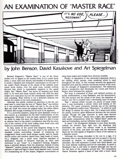
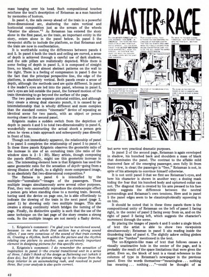
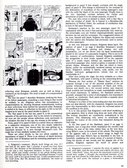
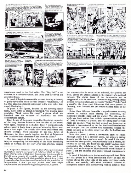
Bill Peckmann continues to introduce me to new and interesting artists. Here’s what he wrote abot Bernard Krigstein:

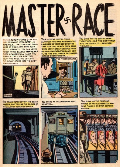
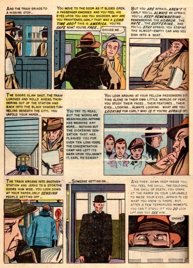
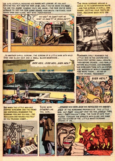
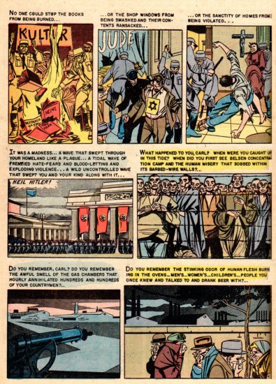
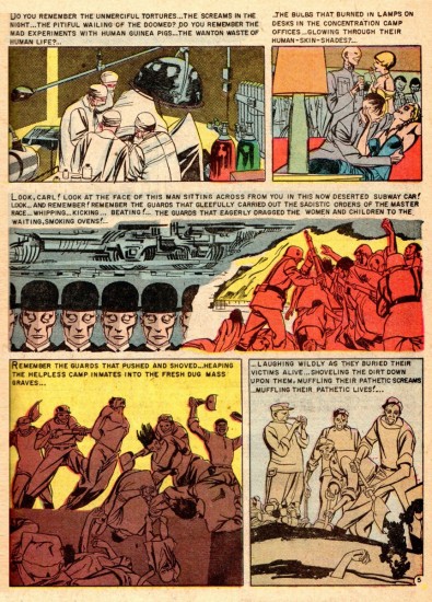
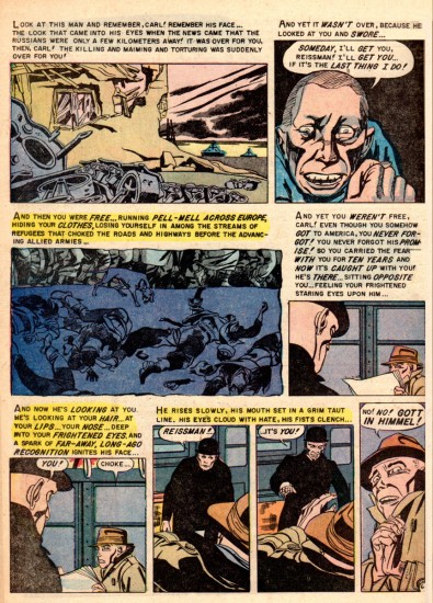
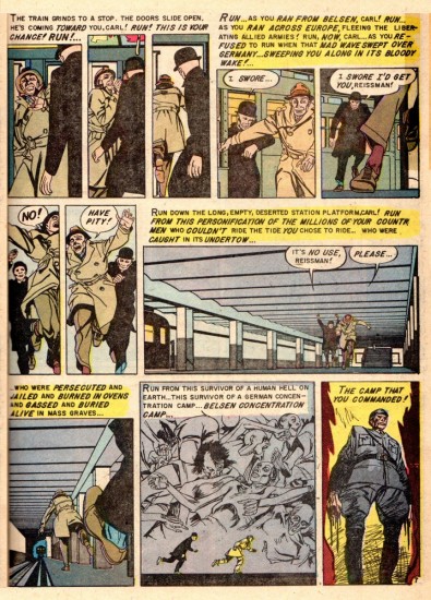
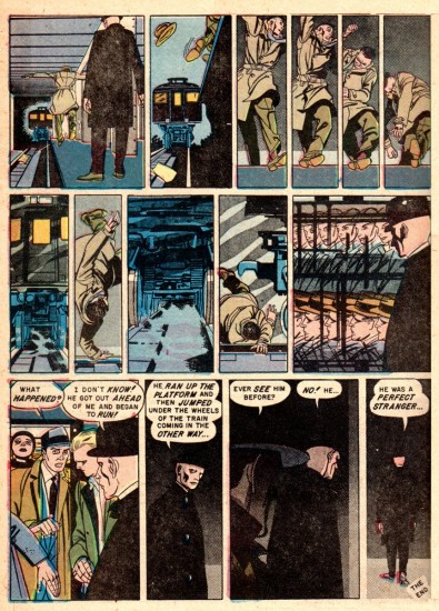
    Comic book artist Bernard Krigstein, like animation artist Fred Mogubgub, was ahead of his time. In the 1950′s, Krigstein’s page and panel designs with their distinct breakdowns set the pace for comic book art that followed later in the century.

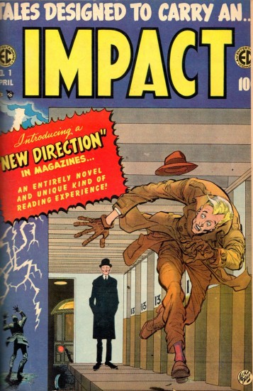
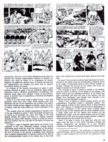
    Here from the original 1955 comic is his most reprinted story, “Master Race”. It appeared in the first issue of EC Comics’ “Impact”. It will be followed by an excellent essay/examination of that story which appeared in the EC fanzine “Squa Tront”, in 1975.


This is the cover of “Impact” No. 1 drawn by Jack Davis.

1

2

3

4

5

6

7

8


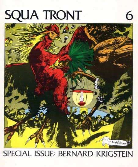
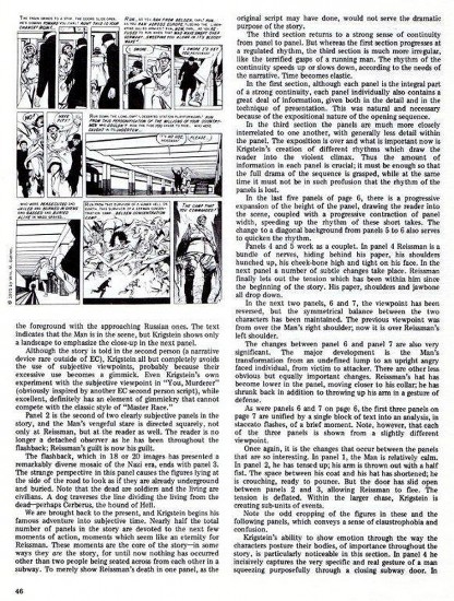
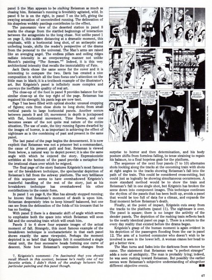
Here is an article which appeared in the fanzine, Squa Tront in 1975:

The Squa Tront cover

1

2

3

4

5

6

7

Animation &Commentary &Guest writer &Tissa David 08 Nov 2012 07:24 am

Tissa’s Class – Part 5

- In 1991, Tissa David taught a class in animation for free, open to anyone who wanted to attend. This was sponsored by R.O. Blechman out of his studio, The Ink Tank. It was held after hours, so that those who worked in the business could attend.

The talented animator, Eugene Salandra, kept key notes of the classes, and with his permission, I’ve been posting those notes here. Some of them seem a bit dated these days since they were done for 2D animation that was shot under a camera. However, all of the notes are completely relevant since learning the information will help you understand the proper use of the “camera” even if the camera is a computer.

You can see the earlier parts by going to these links:
_____________
____________________________________part 1, part 2, part 3. and part 4

And, here’s part 5:

1 2
I repeat these first two pages.

(Click any image to enlarge.)

30 31

32 33

34 35

36 37

38 39

40 41

42 43

44ab

45 46

47 48

To be concluded next Thursday

Many thanks to Eugene Salandra

Illustration &Layout & Design 07 Nov 2012 06:19 am

Hal Silvermintz

- Hal Silvermintz was the Art Director and Designer for Stars & Stripes Prods. Forever Inc. as well as Designer and partner in Perpetual Motion Pictures. His design work hasn’t gotten much attention lately, so I’d like to offer a couple of pieces in the archives held by Buzzco Associates. Candy Kugel, is sending a lot of their past artwork to the Museum of Modern Art, so I’d like to showcase a few of these pieces before they’re out of my hands.

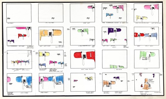
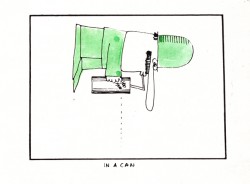
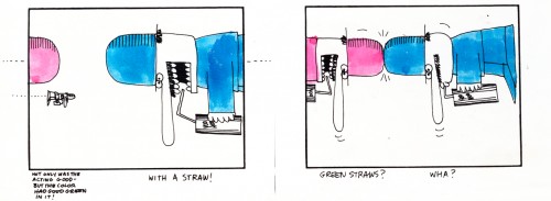
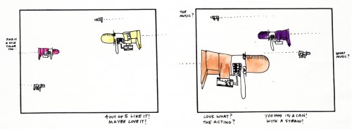
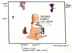
I’ll start with one of the screwiest looking storyboards I’ve ever seen. It’s for some kind of Chocolate Energy Drink. Since it’s one page and very large, I’ll present it in the one page version. Then, for you to be able to read it, I’ve broken it down into panes and will present it a second time. So here goes:


Full sized storyboard

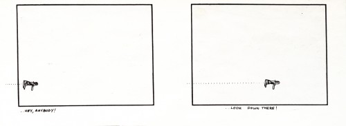
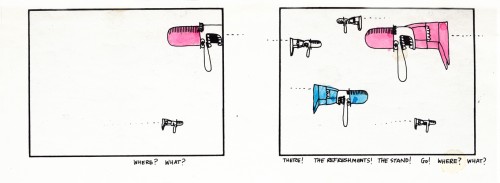
The following are individual panels from the same board:

1
(Click any image to enlarge to read.)

2

3

4

5

6

7

8

9

10

11

12

.

At one point Hal had designed “Fast Food Matador” for a personal film done by Hal, Candy Kugel and Vince Cafarelli. While the studio worked on the short Hal continued to turn out sketches of dancers (paint on cel) that really had nothing to do with the short, except mood.
Here are two of these.

1

2

.

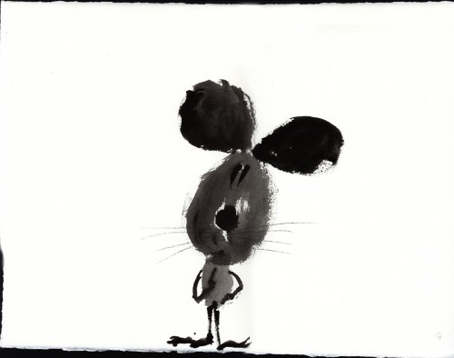
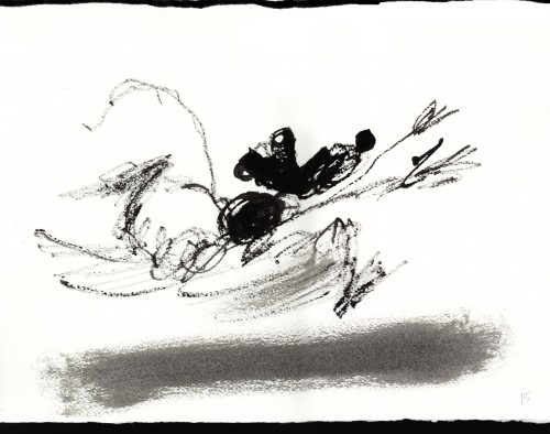
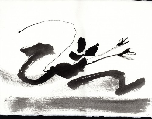
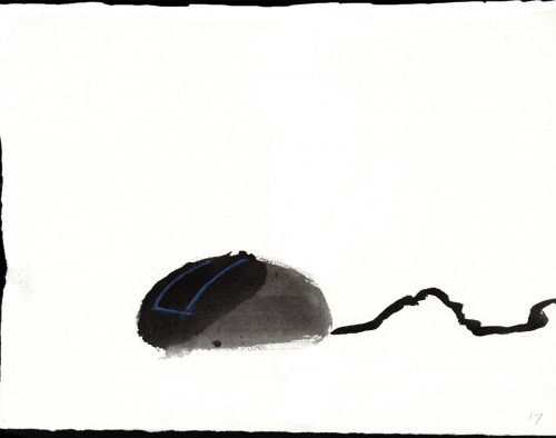
The following 18 pieces were done by Hal in preparation of a short the studio, Buzzco, was going to do called “Mouse Potato”. This was in 2002. The idea was it was the computer equivalent of a “couch potato.” Circumstances made them stop work on the film, but these large paintings still live on.

1

2

3

4

5

6

7

8

9

10

11

12

13

14

15

16

17

18

.

The following 4 pieces were done by Hal Silvermintz as personal works of art.
They weren’t done for any specific films.

1

2

3

4

Daily post 07 Nov 2012 02:07 am

Winning

Romney finally gave in and gave the best speech of his campaign.
It was truly graceful, articulate and intelligent.
I liked our President’s speech, too.

« Previous PageNext Page »

eXTReMe Tracker
click for free hit counter

hit counter