Commentary 15 Jan 2013 06:30 am

Oscaaars & Tyers

- I’m not sure if this is a complaint. It’s been tossing on my mind all week, and it’s good to get it out.

The Oscars!
I know, what now? you’re saying.

Well, there’s been a big change in the Oscar voting and it affects the animated short and who will become the winner. To understand the whole thing, let me give you a little history.

Back in the fifties – up to the very late fifties – the animated short (and, as it turns out, the live action short) were voted on by members who never saw the film. Say you work for WB in the costume department. The nominees for animated short are listed, and one is for Disney (naturally), one is for Terrytoons (20th Fox) and one is for WB. You haven’t seen the films, who do you vote for.

Naturally, you work for WB and WB has told you to vote for our own company.

So you vote for Knighty Knight Bugs.
Paul Bunyan and Sidney’s Family Tree lose your vote. Guess which one won?
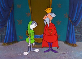

Knighty Knight Bugs

The same thing happened the year before – 1957 when a WB, Tweety cartoon won over a Droopy, a UPA and a Disney.
1956 they were all UPA cartoons, so a UPA cartoon won (Mr. Magoo, naturally.)
1955 a WB Speedy Gonzalez short beat out Disney, MGM and a Walter Lantz (Tex Avery) short.

So in 1959 a bunch of animation Oscar members sought to change things. All they asked was that the people who voted on the short subjects have to SEE the short subject. And what do you know, they changed the rule. If you wanted to vote for animated and live action short subjects, you had to see and prove you saw the short films.

Suddenly, things changed.
The nominees included a WB short, Mexicali Shmoes (Speedy Gonzales), a Disney short, Noah’s Ark and
2 Independent shorts were nominated:
John & Faith Hubley, Moonbird and
Ernie Pintoff, The Violinist
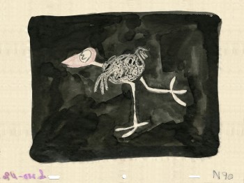

Moonbird

This time the WB short did not win, the Independent film did. Moonbird won the Oscar for the 1959 animated short.

Let’s get back to NOW.

This year, they are showing the shorts – all of them – in a screening. We can go, see 5 animated and 5 live action shorts and vote for them.

Or there’s another choice.

They’re sending out DVDs to ALL OF THE MEMBERS. The person working in the costume department will get a DVD with your short on it. (S)he might watch that DVD and vote for the film (s)he thinks deserves it. OR she might not put the DVD in the machine and vote for the film she heard of.

What! There’s a Maggie Simpson short in there. Aha. I like the Simpsons. Give it to them.
Oh wait! There’s a Pixar short in there. They do good work. And I think I saw an ad they took out in Variety. I’ll give it to the “Arty” Pixar film.
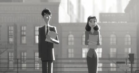

Paperman

Hmmm.

So I expect the “Arty” Pixar film to win or else the TV cartoon – the Simpsons. They’ll win.

The more things change, the more they stay the same.

____________________

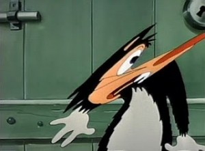
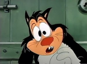
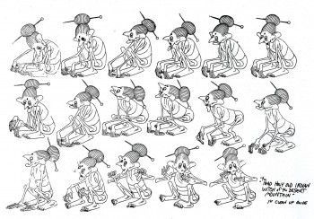
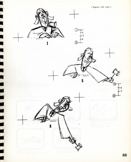
- Jim Tyer never won an Oscar. Actually he was never nominated for one. Too bad. He was a man before his time. His art was in distortion of the character trying to get to the emotional center of that character. At the same time, his drawings made you smile. It’s unfortunate that most people didn’t get it. The people of the period within which he worked. Younger generations today stop frame Jim Tyer‘s work and study it. They want to do it, themselves. But it’s a vain attempt if they do try. His guy was a one-of-a-kind, and no one else could really do the same thing.

You can find in LA, at Bob Clampett‘s unit at WB, someone who tried for something similar. Rod Scribner was deeply affected by the comic strip work of George Lichty in his daily panel, “Grin and Bear It.” The distortion was too exciting for Scribner not to try pulling into his animation. He got permission from Clampett, and they did this wild style. It didn’t quite turn into the

abstractions of Tyer, but it did its own thing. Scribner followed the animation rules too closely to be able to get what Tyer did. Scribner knew that if you distort a character you have to keep the same mass in the body of the character, and he did just that. If the eyes got wildly large, the rest of the body diminished to make up for it. If an arm withered, something in the body took on that mass. It kept the 3D masses to remain true.
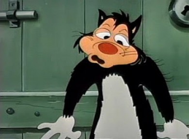
Tyer’s work was completely graphic. The body became an abstraction and the timing was wildly geared to Tyer’s own version of a “take” or “anticipation.” Even something like a “sneak” became a graphic excuse for his his own abstract movements.

Tyer gave up 3-dimensional drawing and allowed the line to take control. He gave the forces in the animation full strength, but allowed the rules of animation to stay in place. Essentially it’s not a new language just a new
dialect. A very thick one, but new – just the same. It’s to animation what Creole is to English. Of course, the saving grace is that it couldn’t be funnier. The other animators weren’t crazy about the work Tyer was doing, but they didn’t know how to stop him. They just assumed he had permission to speak Creole.


Many thanks to Kevin Langley who posted these images back in 2008.
He has the best frame grabs on the web, at least the most enjoyable.


There are many more frame grabs of the Jim Tyer material at Kevin’s site. Check out here, or here or keep browsing. It’s a treat of a site.

.

.

Books 14 Jan 2013 07:25 am

Heath Book – 5

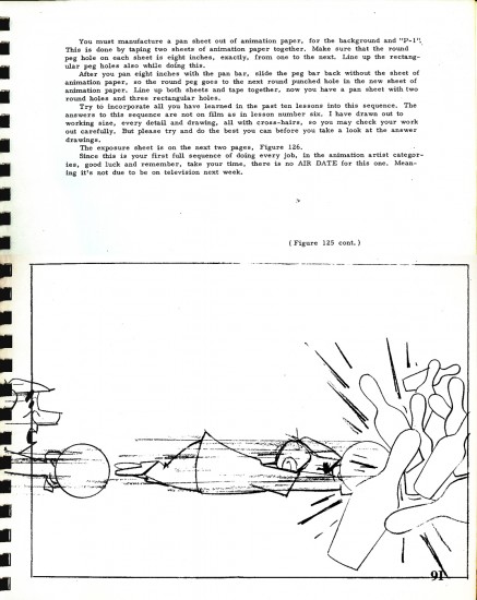
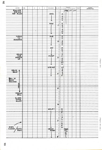
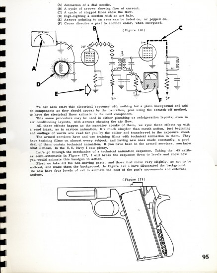
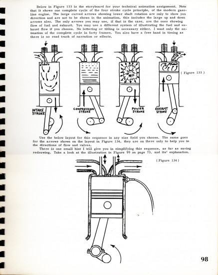
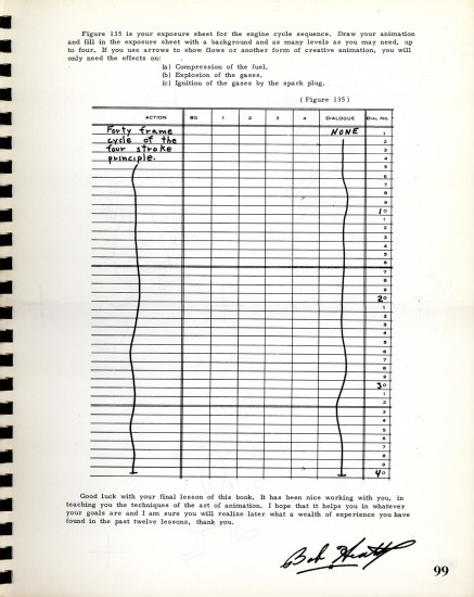
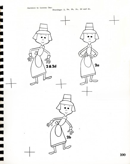
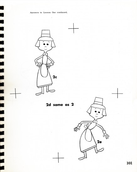
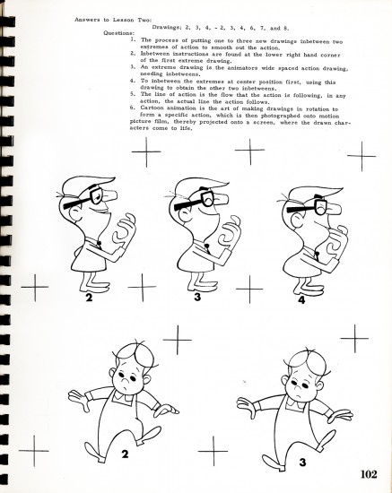
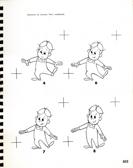
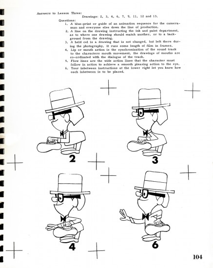
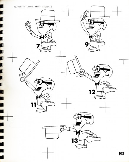
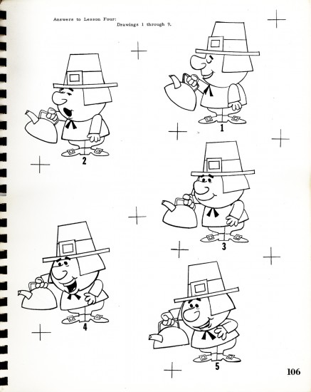
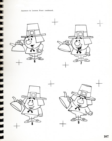
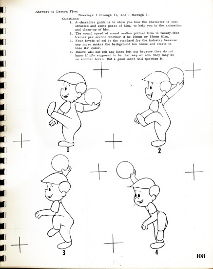
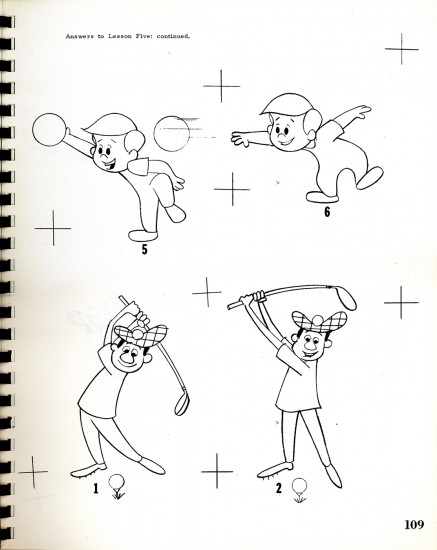
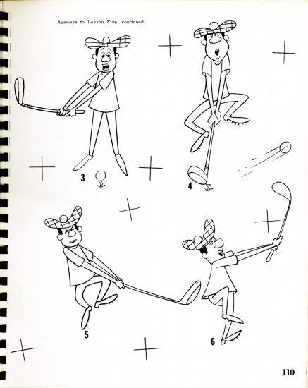
Essentially today, we finish the book. All that remains is a long section which gives answers to questions raised with each lesson. We’ll post a couple of them today (once we finish with lesson 12) and will complete the remainder next week. The “Answers” alone is 35 pages long.

To read past posts go here for: part 1, part 2, part 3, 4.

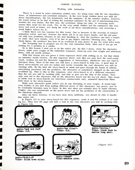
We pick up this week with page 89, Lesson 11:

89

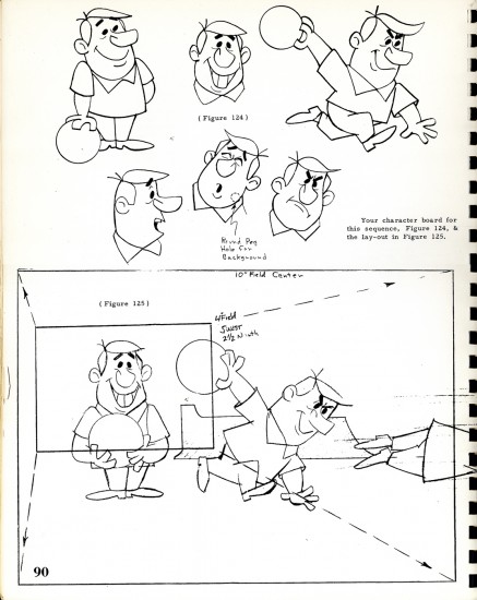
90

91

92-93

94

95

96

97

98

99


This is essentially the end of the book, the end of Lesson Twelve.
The remainder of the book offers “Answers” to questions posed at the end of each of the 12 Lessons. These are the first of those pages. I’ll complete the final post of these next week.
100

101

102

103

104

105

106

107

108

109

110

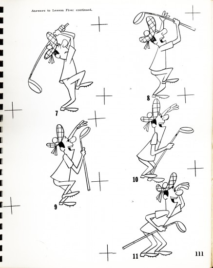
111

Animation &Art Art 13 Jan 2013 06:58 am

Ken Brown’s TekServe

- Two of my favorite friends in the NY animation community are Lisa Crafts and Ken Brown. These two guys spend a lifetime making art and making art of animation (among other media). They both have different ways of doing it and they both have an simpatico art that supports the other. It’s a treasure just to visit them.

Ken, this weekend, opened an art exhibit. It was at your typical gallery; it was at a Mac service center. A big sales shop of a place with monitors, printers, laptops and other hardware all about the art. I went yesterday to this opening and brought my camera to give you an idea of what was going on.

1
This is TekServe. It’s a hardware store that’s focused on all things Apple.
Everyone who’s into Apple and mac and computers knows TekServe on 23rd St.

2
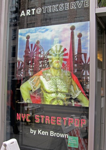
Get closer to the window and see the poster promoting a new
art exhibit of the work of genius/friend, Ken Brown.

3
When you’re in the store, it is just a store.
It took me a while to be convinced that the art was everywhere.
I had to open my eyes and take a couple of good looks.

4
Right inside the front door are some plastic cubes full of stuff pulsing
from the mind of Mr. Brown. Great to peer through these miniature things.

5
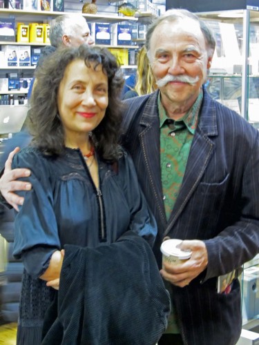
Here they are, Lisa and Ken, the dynamic duo.

6
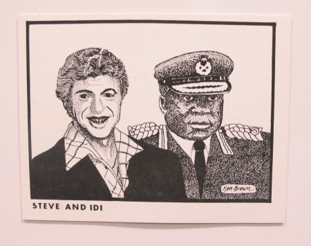
This is a very old post card of Ken’s sitting in those cubes up front.
I used to own a bunch of them, but mailed them out to get my friends to smile.

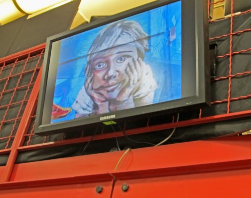
7
Throughout the store tere were plenty of video monitors playing Brown films.

8
From live action to video cartoons. Lots of variety plays for you.


Meanwhile, T-shirts hang frm the rafters and float all about you.
Lots of these are collector’s items and are no longer available.
Bt you can look.

10
There were walls of pixpop post cards.
A good way to pull a smile in the middle of the afternoon.

11
See what I mean.

12
No, it’s not Steve and Edie but Chuck and Candy.
That’s Candy Kugel and Chuck Hunnewell, her husband.

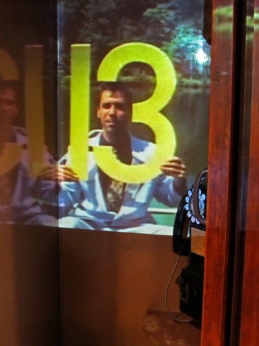
13
One of the hits of the exhibit was the phone booth. Projections
were going on within, and they got attention from the crowds.

14
Another shot of the same.
He’s not live; he’s memorex.
The phone booth is live.

15
That’s animator, Debra Solomon with
artist of the day, Ken Brown.

16
Video projections were at all levels and moods.

17
And they were everywhere you looked.
Truly MULTI – media.

18
and A-OK T-shirts that are now collector’s items.

19
The poster for the exhibit,
in the store window,
said it all.


TekServe is at 119 West 23rd Street

The exhibit runs Saturday, January 12th through Sunday, February 24th
hours: Mon – Fri 9am to 8pm; Sat & Sun noon to 6pm

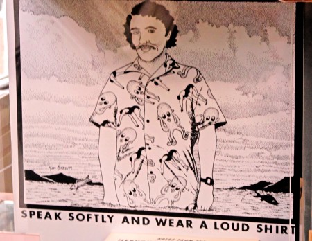
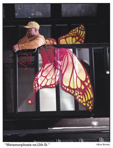
At the door, TekServe passed out a free calandar of Ken Brown’s pictures.
Here are a couple of the images from that publication:


July


August


April


December

Commentary 12 Jan 2013 06:00 am

Movin’

Oscar Toons

- The Oscar nominations came out this week. It was an odd mix, and a curious grouping of those in that mix. I couldn’t be happier than that The Life of Pi (left) did so well. Let’s hope it wins one or three awards from those 11 nominations. I like that film a lot. I wouldn’t be too disappointed with Lincoln or The Master winning either, but I really like Pi. How can you not like a film that proves the intellectual existence of god?

Skipping down to the animated shorts, I’m not allowed to say much, but I am surprised at some of the choices. The ones that were eliminated so that a tv cartoon could make the list is embarrassing to me. Perhaps the hollywood people wanted to vote in something they had worked on, or maybe it’s just that it was supposed to be funny. Presumably they must have laughed in LA. They didn’t in NY. Oh, well. As Groucho would’ve said, “Why a duck?”

Best Animated Short

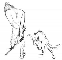
    Adam and Dog – Minkyu Lee
    Fresh Guacamole – PES
    Head over Heels – Timothy Reckart and Fodhla Cronin O’Reilly -
    The Longest Daycare – David Silverman -
    Paperman – John Kahrs

Congratulations to all five nominees.

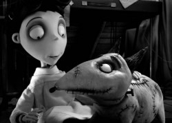
– As to the features, is it an accident that both the animated short nominees and the animated feature nominees both have one film that’s about the love between a boy and his dog? It seems too much of a coincidence. Hmmm. I never thought of myself as a conspiracy theorist, so I must be onto something here.

I’m impressed that there are three puppet animated films nominated. Not bad. I also don’t mind Brave‘s nomination and think that Wreck-It Ralph will probably win. It was pretty damn popular though I lost interest half an hour in. Maybe I should play more video games. Somehow, though, it seemed to be about so little as compared to all the others.

Best Animated Feature

    Frankenweenie – Tim Burton
    ParaNorman – Sam Fell and Chris Butler
    The Pirates! Band of Misfits – Peter Lord
    Wreck-It Ralph – Rich Moore

They all involved a lot of work and they’re all pretty good. Personally, I’d like to see Tim Burton win one after all the animation work he’s done. There haven’t been that many stars who have been consistently supportive and attentive to the medium. The Nightmare Before Christmas has become something of a classic, and The Corpse Bride was so gracefully attractive. The guy deserves a win.

This actually gives me an idea for a blog. Lately a lot of live action people are turning to animation. I guess animation people are trying o turn to live action as well. There must be something worth discussing there, and I’m going to find it.

_____________________________________

Muhammad’s Cartoon

- Talking about animated features brings me to this oddity. While tooling around YouTube, I came across a feature I’ve wanted to see. It was Directed/Produced by Richard Rich. That guy made a lot of animated features, and they all have some strong semblance of professionalism. I have to give it to him. Features are hard to do, hard to raise money for, and hard to maintain the enthusiasm, not only within yourself, but for the whole crew. As a director, if you’re not up to it, neither is your crew. You’re the backbone of the energy level of a film, and a feature goes on for a long time.

After all, before he left Disney, Richard Rich had directed The Black Cauldron and The Fox and the Hound. On his own, he had a bit of a hit with The Swan Princess in 1994. Good enough to get four sequels out of it, including The Trumpet of the Swan, the biggest. He also did an version of Rogers & Hammerstein’s The King & I as an animated feature. A daring idea that didn’t really work. Then there’s Muhammad: The Last Prophet which sneaks in there among dozens and dozens of Christian shorts about Christ and the apostles. He also produced Alpha and Omega, and another sequel called The Swan Princess Christmas. Those last two were cgi done in India.

John Celestri, a good friend, was an animator on all of Rich’s work done outside of Disney. We’re set to talk sometime soon, but John is buried with work. (I’m glad to hear that.) I’m also glad that Rich recognized John’s talent and held onto him all those years. I only wish some of the films were better. At the very least, better than Don Bluth’s output. At least Richard Rich keeps going. That’s positive in its own right. I’m also sorry he deserted 2D animation. I can’t blame him, though. It’s tough holding onto the 2D world.

Anyway, here’s Muhammad. I suspect it’s better on a big, theatrical screen.

Muhammad, the Last Prophet

_____________________________________

J.J.’s History

– I had planned to post a piece about the study J.J. Sedelmaier did for Imprint Magazine. But then Mark Mayerson did another of his perfect posts, tight and to the point excellently written and finely thorough. Though I’d already spent a lot of time looking at the Imprint Magazine piece, Mark’s writing got me back to read it again.

J.J. has an article with a lot of good pictures, about animation discs, pegs and desks. This is the old style hardware where anmators called themselves at home. Hours staring into desks made of cheap drawing tables with holes cut into them; lighting housing built on the underside of those desks, and animation discs were placed into the holes. This allowed man-made light to shine into the artist’s eyes revealing the animation in process through several layers of paper.

Divine.

For many years I’d collected a bunch of his animation hardware. I have a Fleischer disc – the earliest one I have didn’t use the foot-pedal peg release system. They’re just Acme pegs in that disc, though I have at times changed the pegs to Oxberry system or Signal Corps style. Now they’re Acme. I do have one of the bars of three round pegs from the Fleischer system.

I also collected X-Sheets. They’re all different. Most used the 80 lines on the page. 80 lines representing 80 frames or two 16mm feet or five 35mm feet. Some studios used 100 frames to the page. Shamus Culhane’s studio used those. Mathematically they meant nothing, but Shamus told me he liked that even number. The even number was pointless, really. Some other studios liked using 96 frames on a cover sheet and 80 frames on all sheets that followed. Disney did this for years. There was also a lot of room for I.D. info on those cover sheets. I liked the basic 80 frames; they made sense mathematically.

So you can see why an article like J.J.’s piece on discs and desks and pegs would interest me.

J.J. had also put together an exhibit about the history of NY animation and the studios here. Like most exhibits, they move on. However, Imprint Magazine posted an article covering that exhibit. J.J. also wrote that article. You can click this link to see It All Started Here. The article will live on, fortunately.

As a matter of fact, scroll through J.J. Sedelmaier’s articles while you’re there. They’re all interesting.

_____________________________________

Ken Brown’s NY Street Pop

- Today at TekServe, Ken Brown will open an exhibit of his artistry. Slide Shows, Post Cards, Short Films, Prints, Drawings. Multi media, in short. From 1pm-3pm there will be a feast of all that magnificent material Ken collects and reconstructs to create and artform that’s all his. There’s no charge and it’d be great to get out and support one of our best artists. (I’ll try to post some photos if I can remember to bring the camera and then take my eyes off the art to make stills.)

TekServe is at 119 West 23rd Street

The exhibit runs Saturday, January 12th through Sunday, February 24th
hours: Mon – Fri 9am to 8pm; Sat & Sun noon to 6pm

Just cherck out these sample photos which are displayed in the article on HuffPost. Sheer fun. you’ve gotta see the show live. If you can’t make it today, follow up in the next month while the exhibit stays up and lively.

_____________________________________

Gaiman’s Game’s on

- You’ll remember that I recently posted some photos of Tom Hachtman‘s waterlogged house at the Jersey Shore. His home was a victim of Hurricane Sandy, and that wasn’t too recent. Take a look here if you missed the pictures and want to see them. I received this email from Tom this past Wednesday:

    Neil Gaiman gave a commencement address to the graduating class at U of the Arts and it went viral on Youtube.
    Now it will be a book – any book designed by ‘Chip Kidd is of interest – so I am forwarding this.
    Not animation news but interesting I think.
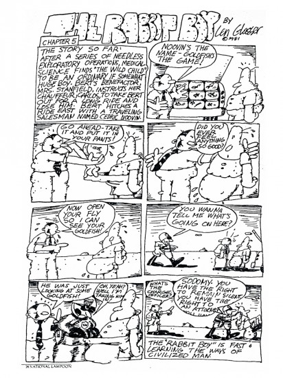
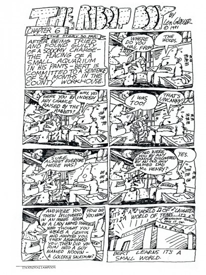
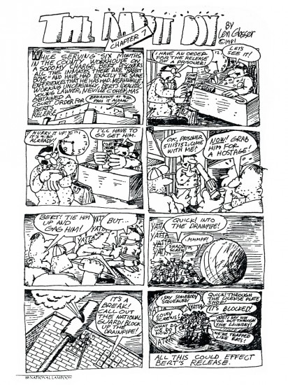
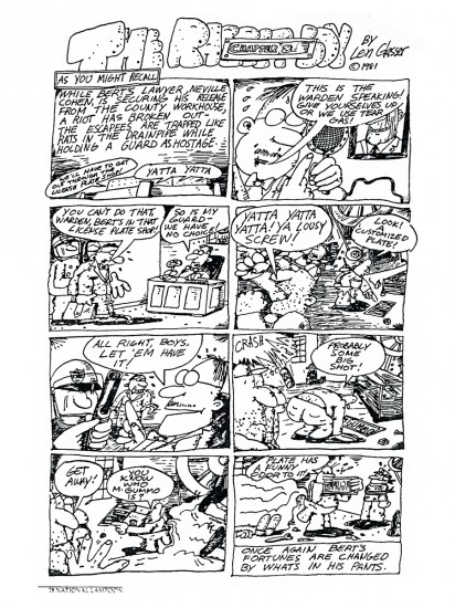
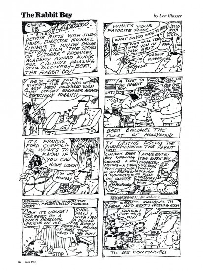
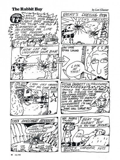
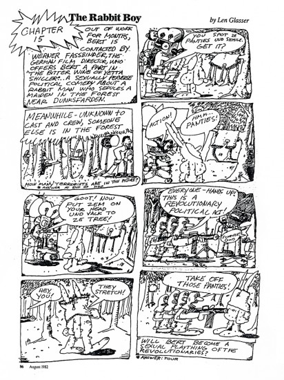
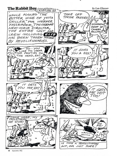
    Love those Rabbit Boy strips you posted today.
    btw: Len Glasser went to the Museum School that became PCA our alma mater (Phila College of Art) that became University of the Arts.

    We are just getting back into our house.

    We have heat and hot water again.

    Woody is home from LA.

    going to celebrate now – talk later

(Finally, afer all this time, heat and hot water. Some kind of frustration/joy sound; that’s all I can emit.)

Commencement speech? Neil Gaiman?

It’s a comic book. I’m not a big fan of Gaiman, so I have to have a reason for posting about it.
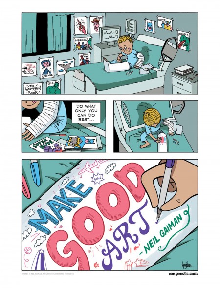
Gavin Aung Than illustrated it.

Ok, here’s part of the HuffPost article about it:

    Gaiman, known for his short fiction works including “Coraline” and “The Sandman,” gives a 20-minute speech on the difficulties waiting in both failure and success that emerge in the pursuit of art. The standout passage reads:
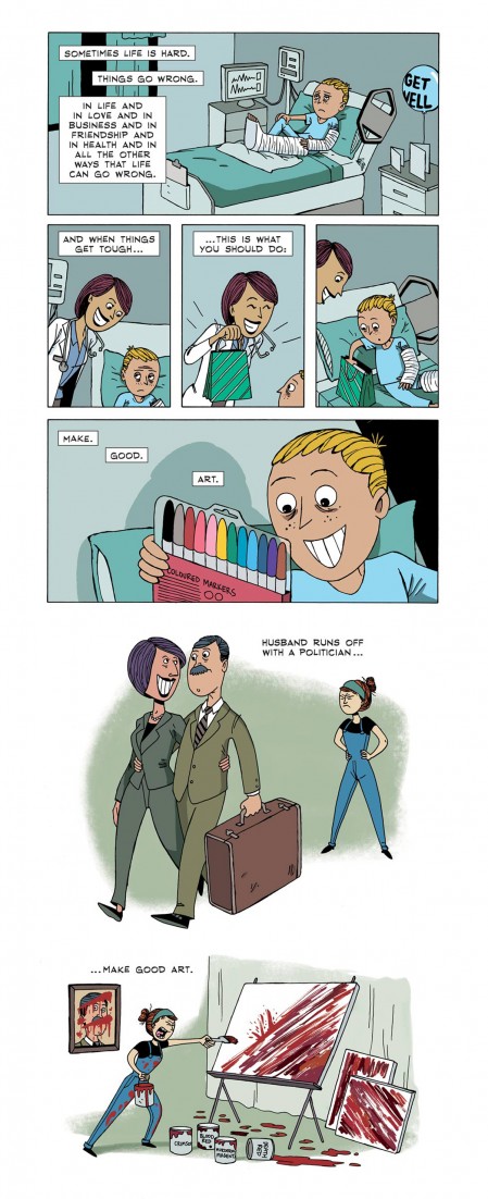
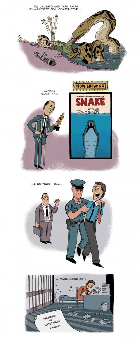
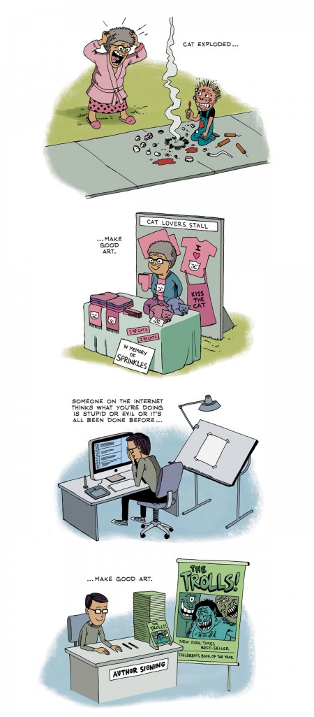
    When things get tough, this is what you should do: Make good art. I’m serious. Husband runs off with a politician — make good art. Leg crushed and then eaten by a mutated boa constrictor — make good art. IRS on your trail — make good art. Cat exploded — make good art. Someone on the Internet thinks what you’re doing is stupid or evil or it’s all been done before — make good art.

If you’re an artist, do you really need Neil Gaiman to tell you this?

Seriously, though, the only one like Gaiman out there is William Joyce. His books have also attracted a lot of features: Robots, Meet the Robinsons, Rise of the Guardians, and Epic (coming soon).

Anyway here’s part of Gavin Aung Than‘s strip.


Looks très commercial and way too tight for my taste. But if god serves you lemons, make some art.

By the way, here’s the video of Gaiman’s commencement speech, just in case you’re a fan and haven’t caught it yet.

_____________________________________

Bill Peckmann &Books &Illustration 11 Jan 2013 07:09 am

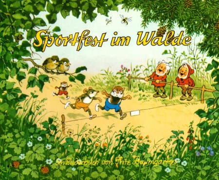
Baumgarten’s Sports

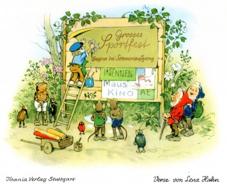
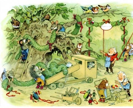
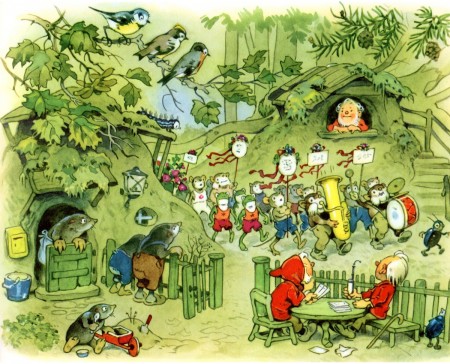
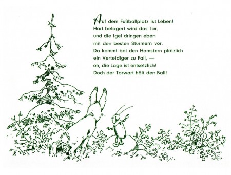
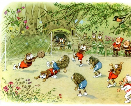
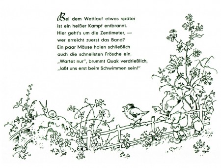
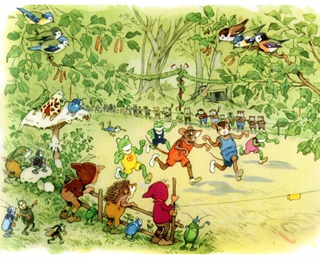
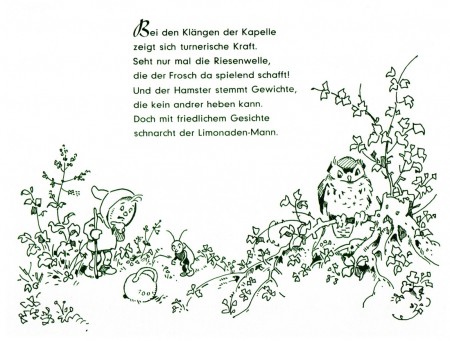
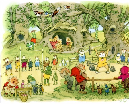
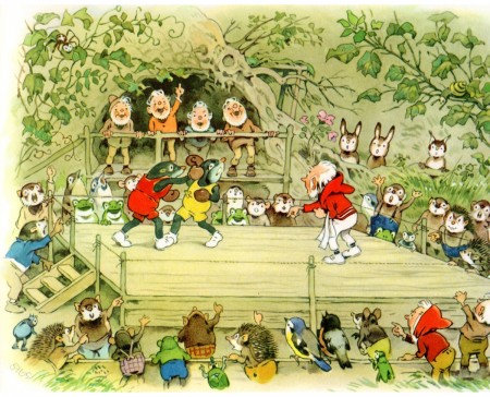
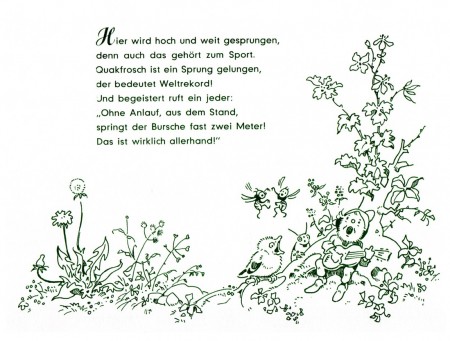
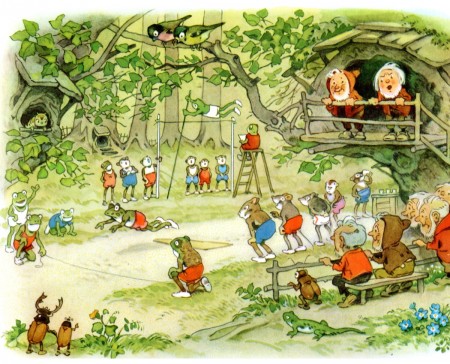
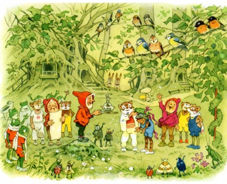
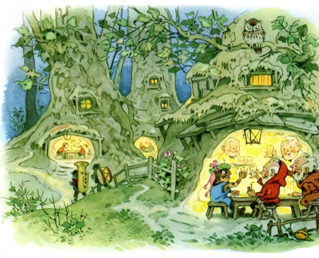
- Bill Peckmann has given us a wide assortment of beautiful books by Fritz Baumgarten. The illustrator has written many books built around a world of creatures and their environs that he’s created. His style is so affectingly attractive with the very rounded turns that we almost miss the beautiful inking and the fine watercolor techniques. The books are all very different, but there is a bit of a sameness to the work in that we don’t stray from the woods where the creatures – the small animals and dwarfs – make their homes.

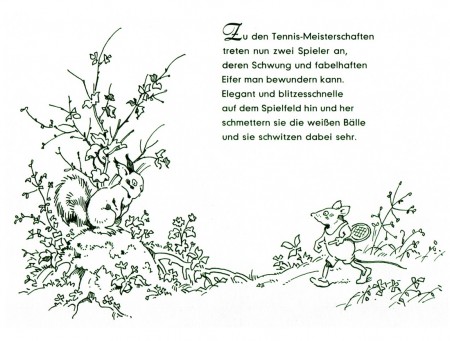
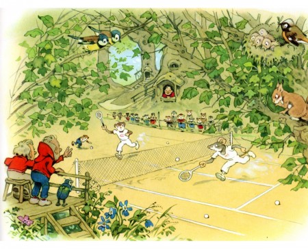
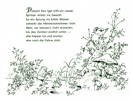
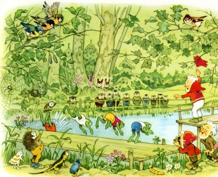
This book takes a different turn and gives Baumgarten a chance for some fun. Sportfest im Walde is obvious in its subject. The dwares and animals compete with a number of sports. From tennis to racing to boxing, activities abound.

I hope you enjoy it; I do. It’s a world I wouldn’t have otherwise seen, and I wish there’d been an animated version somewhere along the way. When Goebbels set up an animation studio to promote all things German, he should have animated hese books. They would have been wonderful as a series. They still are.

Many thanks, yet again, to Bill for the scans and the book, itself.


The book’s cover

2

3

4

5

6

7

8

9

10

11

12

13

14

15

16

17

18

19

20

21

22

23

24

25

Animation Artifacts &commercial animation &Layout & Design 10 Jan 2013 06:25 am

Emily Tipp Rerun

Tip-Top Bread Repeat

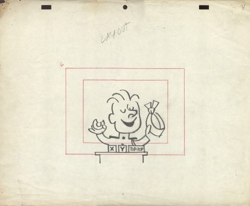
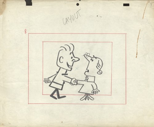
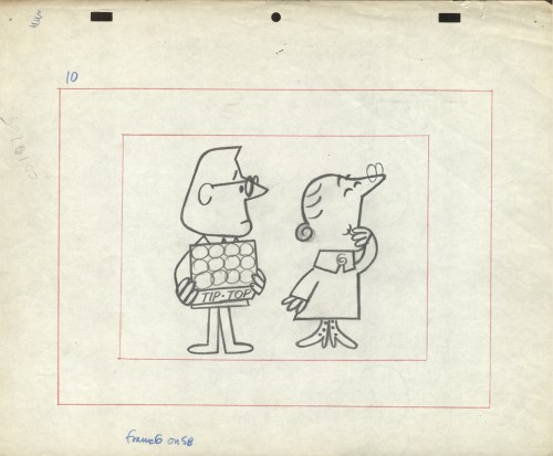
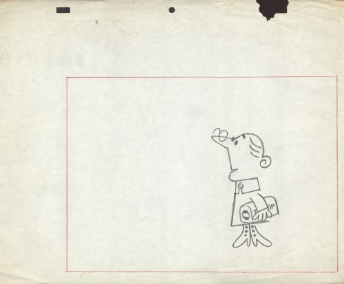
- Originally, after Vince Cafarelli had died, I was shown the boxes and portfolios full of artwork that Vince had very briefly and casually discussed with me for years. What I thought were a couple of drawings, ended up being a lot of brilliant work beautifully contained by Vinnie and his partner Candy Kugel, over the many ears they had their studio. It was work – meaning drawings, sketches, layouts and animation – that Vinnie had held on to and in some cases preserved because he knew it was valuable (not financially, but historically).

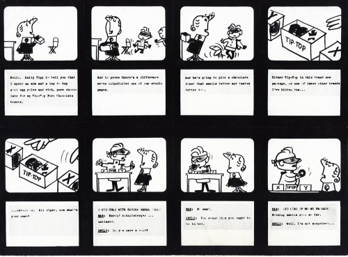
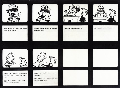
In the not-too-distant past (6/27/12 and 10/24/12), I posted material about an Emily Tipp commercial for Tip Top Bread. This spot, like all of those of the series, was well designed and animated and stood out among other spots on TV. It was commercial cartoon animation at its best during the 60s. Margaret Hamilton, memorably, the Wicked Witch of the West from The Wizard of Oz, provided the voice for Emily!

The problem for me was the disorganization. So little of it was labelled or attached to any others that were gathered in those boxes. So I started digging in and organizing while at the same time pulling art for display on this blog. What happened was pretty much what I expected. Some things got mislabeled and other items were separated from art which they should have been attached to. Here we have a prime example. Emily Tipp.

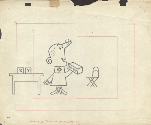
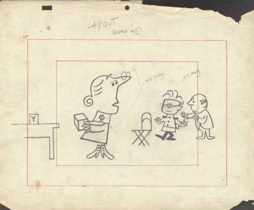
Gathered in one group/box were some of the layouts for this typical TipTop Bread spot. We’d already assembled some of the drawings that belonged together despite the fact that the were found in separate boxes representing different studios. It turns out that some work that was credited to Kim-Gifford Studio (the laouts below) actually were done by Elliot-Graham-Goulding.

So here, we have some story boards to connect with some layouts. Compare and contrast and enjoy.


1

2

To see some of the Emily Tipp spots go here
at the Buzzco website.

1

2

3

4

5

6

Comic Art &Illustration &Miyazaki 09 Jan 2013 06:39 am

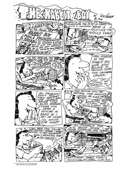
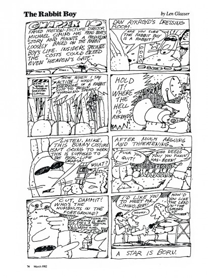
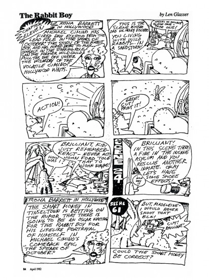
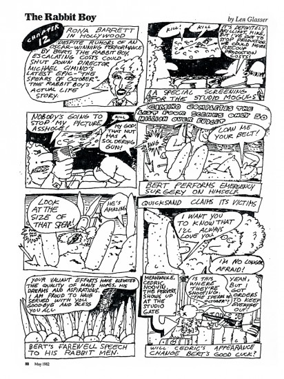
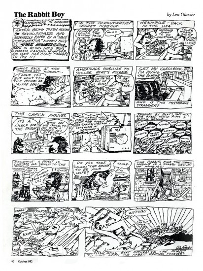
Len Glasser’s Rabbit Boy

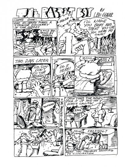
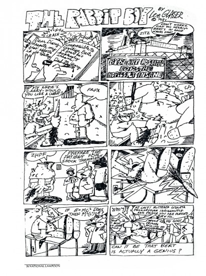
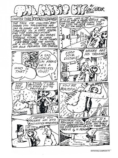
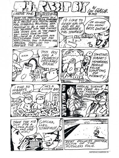
- In 1981 and 1982, designer Len Glasser did a comic strip which appeared in the National Lampoon Magazine. This was a full page strip that appeared once a mnth. I’m not sure how many episodes there were of the strip, but I have copies of 17 of them. Mr. Glasser’s style seems well suited for a strip, and the writing is a large part of it. I hope you enjoy, Rabbit Boy.

1

2

3

4

5

6

7

8

9

10

11

12

13

14

15

16

17

Commentary 08 Jan 2013 06:41 am

Some Movies I’ve Thought About

Cobbling

- The feature length cut of The Cobbler and the Thief as was assembled by the remarkable Garrett Gilchrist can be found on line:

here.


A beautiful copy of the workprint.

Let me tell you some thoughts I have about this incredible movie.

It’s sad watching it again. I had only the slightest of involvement on the film. It touched my life more than I touched it. I’d seen the documentary on PBS back in the early sixties. The Creative Person: Richard WIlliams. I was impressed. I scoured the newspapers and any other media searching for words about this film or its mad director, Dick Williams. His London studio had sent me a packet they produced full of publicity articles on papers slightly larger than 8 1/2 x 11. I read and reread all those non-bound pages, and they grew dog eared. Williams, his studio and his film was my obsession for a while. It seemed to be the only place where real animation was being done anymore, back in the sixties,.

John Hubley was my hero, and his studio hired me in NYC. It was supposed to be a three day line of employment, but the job ended up lasting the last six years of John’s life.

On the second day there, I met Tissa David. During our first conversation, maybe 15 minutes long, I told her that it was my intention to eventually leave New York to work in London for Dick Williams. (We’d written, and Dick said that he’d see me the next time he came through NY.) On telling Tissa this story, after she had just introduced herself by saying I had done the worst inbetweens she’d ever seen, she – in the most sincere and pleading voice I’d heard – said, “Please don’t leave America. We need you here, animation needs you here.” Or it was certainly something very much to that effect.

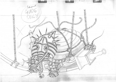
The story never quite worked, the Cobbler’s story never quite worked. I remember once reading the script and thinking it’s a feature length Road Runner cartoon. There was too much madcap humor at the Thief’s expense. I may have been wrong. The film seems to have been made to challenge animators. It’s difficult to animate the old Holy, Mad witch, but if you put her on a swinging basket while she talks, it’s even more difficult. Two uneven and oddly attached ropes makes it an extraordinarily difficult challenge. The weight and balance become everything. That’s what’s been done. It’s that way with every scene or character or motion in the film. If the challenge to the character in the scene can be made more difficult, then do it. Grim Natwick loved the challenge, helped develop the character, and Dick accomplished it.

This, of course, is not only fine, it’s fun for the very talented animator – animators such as Dick Williams – but the problem is that it doesn’t really advance the story. The animation for this film is beyond complicated and done so extraordinarily well. The more you know about it, the more you realize how hard it was to do and how well it was done.


A couple of Roy Naisbit War Machines


Roy was one of the great Artists Dick introduced to animation.

Today, of course, we have computers that could animate most of the objects in this film. I’m not sure the “War Machine” would be any better, but it would have taken fewer man-hours. All that glorious drawing, Ink & Pt coloring and design was dependent on the perfect timing. The animation. Perhaps in time a computer would’ve gotten it.

In the first third of the film, there are two lovely scenes animated by Tissa David. Both are pencil tests of the princess, Princess Yum-Yum, in the bath. We’re looking over her shoulder and she looks back toward us, where we are off screen. The hair is up in her scenes, appropriate to a bath. In between there’s another pencil test scene of the princess with her hair down, and it no longer looks like the same character. The art is flatter. Tissa’s princess was voluptuous. As a matter of fact, her princess was two. Two mirroring twins who echoed each other in animation (anything to challenge the animator). Princesses Yum Yum and Mee-Mee. At the suggestion of the brilliant Jake Eberts, one of the two princesses was dropped. Mee Mee.

Tissa in working for Dick out of her NY apartment had purchased a Lyon-Lamb machine. Large and a bit cumbersome, this video machine came in the pre-computer days and was wholly a video tape machine. It employed reel to reel tape and was rather large. It had the distinction of being able to shoot something at 24 frames per second and also play back at that speed. After buying the machine, Tissa had built for herself a piece of furniture which acted as an animation stand that could sit alongside her desk. She saved all those video tapes (reel to reel, remember). She intermixed commercial animation she did for R.O. Blechman at the same time. (She needed the commercial work to be able to afford working for Dick Williams. He was self-financing his movie then, and Tissa loved working on his project. It was her only passion for several years.) This occurred for the years immediately following Raggedy Ann & Andy. Tissa had supervised Ann and Andy. I saw it all, I watched Yum Yum and Mee Mee grow. I heard all the stories first from Tissa’s side, then from Dick’s side. I was in a wonderful place in the world.

I also got to see several screenings of Dick’s developing workprint. Just prior to Dick’s making the Ziggy’s Gift TV special, he’d had a screening of 40 minutes of the feature. Many key people were there, and I can remember a few of them. Tom Wilson (Ziggy’s creator) was there with Lena Tabori. They were a couple, though I don’t think romantically. She was an editor who had developed many big Disney art books for Abrams before forming her own company, Stewart, Tabori & Chang and Welcome Books. She was the daughter of actress, Viveca Landfors. She, Wilson and Williams were the producers of Ziggy’s Gift, though ultimately Dick Williams was pushed out when the budget continued to rise as it did on most Williams films. Midway through production, Eric Goldberg got the chance to take the directorial reins and complete the film in a make-shift studio in LA. It was a packed screening. I sat next to Chuck Jones with Sidney Lumet sitting on my left. We three had great things to say about what we’d seen afterwards. How could you not? The animation, coloring, graphics, everything was extraordinary. There was no hint of a story in the 40 minute presentation; I was starting to notice that. I can’t remember many animation people there, though Willis Pyle was one. Tissa, of course, was there. She was getting to see her pencil tests projected.

In time, things broke somehow between Dick and Tissa, and she was pulled from the project. It broke her heart, but she never once mentioned how or why to me. Dick was like that. He loved an animator (or any craftsman/artist) to death until he didn’t. Eventually, he’d worked up enough venom to decide, finally to split from the person. Things might right themselves again, but most people didn’t even know what was wrong. (The same happened between me and Dick. I know why he stopped caring for me, and I know when we split. I didn’t stop loving him or what he was doing. He came close to animation “Art”, there in the seventies.)

_____________________________________

- As long as we’re posting Richard Williams‘ remarkable movies available on-line thanks to the work of Garrett Gilchrist, let me direct you to this one movie title sequence.


Prudence and the Pill
was an comedy done in the sixties starring David Niven. It got its share of attention thanks to the title. The “Pill” was in the headlines and had made its way onto many newscasts when Congress legalized the contraceptive for women. Richard Williams studio did the titles and credits for this movie, and one thing stands out about them. Sharing the title with Dick Williams is the incredibly talented artist, Errol LeCain. He is credited as “animator”. The only other “animator” credit listed for this genius of an artist was for the Sailor and the Devil.

_____________________________________

Pi

Honestly, I’ve been hooked on The Life of Pi. I saw the film in a theater twice, once for myself and the second time I went back to see it for Heidi’s sake. On the second viewing she seemed to love it more than I did. I found some things that bothered me, but I couldn’t really respond properly to them. Then this past week I got a new DVD player, and I tried it out, once the basic part of it was hooked up. The Life of Pi, a screener copy, was played to test run the machine. I was hooked up. I couldn’t stop watching it. All the faults I’d found on the second screening melted away, and I loved it again.

The Mychael Danna music played in my head over and over and over. I watched those opening credits at least another half dozen times. They’re beautiful and magic. It’s still playing in my head while I write this.

I wrote to the Effx house Rhythm & Hues saying I’d like to write about the film and its Effx. I haven’t heard back from them. I’ve been annoying enough about this subject that I received a comment from James Nethery saying he’d contacted a Rhythm & Hues animator asking if he’d be interested in being interviewed by me about PI. Thank you, James. That’d be fun.

For me, this year, the best animated scenes were many of those of Richard Parker, the tiger, in Pi. I was also equally astounded by most of the work of the Gollum in The Hobbit. One is straight cgi; the other is what used to be called “motion capture” and is now something much much more. There’s real feeling in both those films, and in both those films those characters exist. There can be no question of it. In essence I have a theory that this – the work in these two films and others like it – is the real purpose of computer crafted animation. Some people have learned how to make a living by faking little dolls talking, but that work – to me – doesn’t have far to go. It’s all in the writing for those films, and writing lately, especially for animation, is poor. Anmation, itself,
is stunned, stultified, unable to advance given the short sidedness of the “Producers”. This would seem to be the era of its greatest potential growth, but then some of our finest animators are forced into an early retirement. Milt Kahl, Frank Thomas and some others were afraid to retire for fear of animation dying. Perhaps it has.

Books &commercial animation 07 Jan 2013 07:32 am

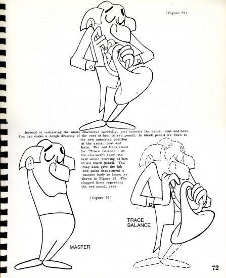
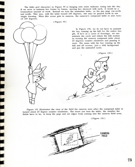
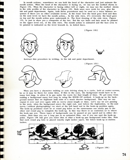
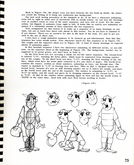
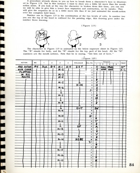
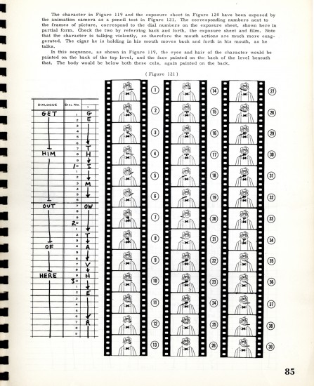
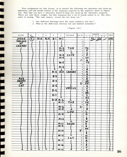
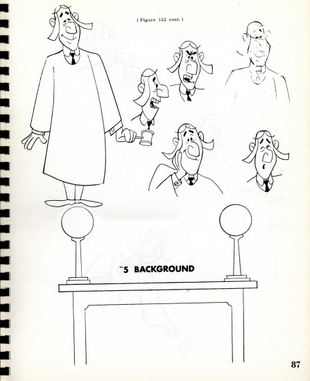
Heath Book – 4

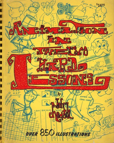
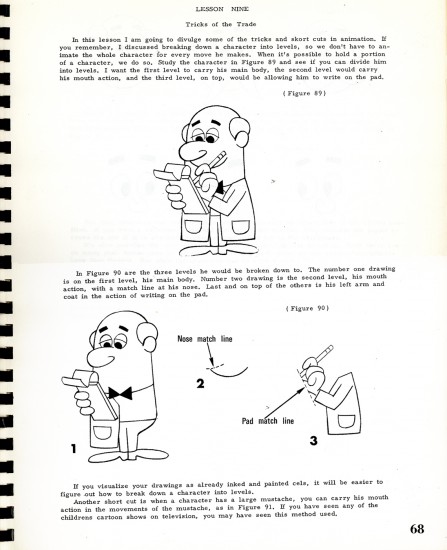
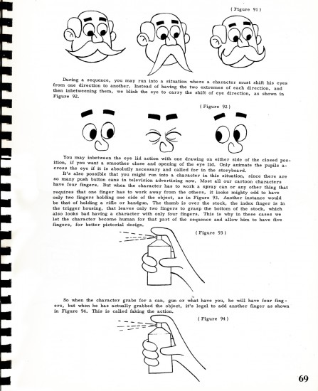
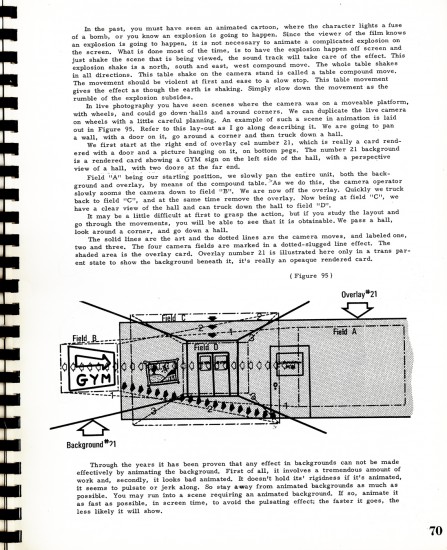
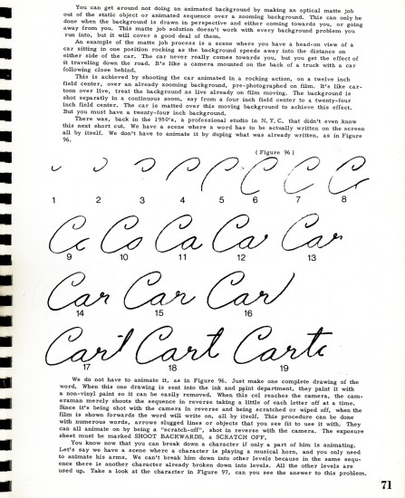
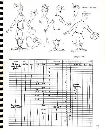
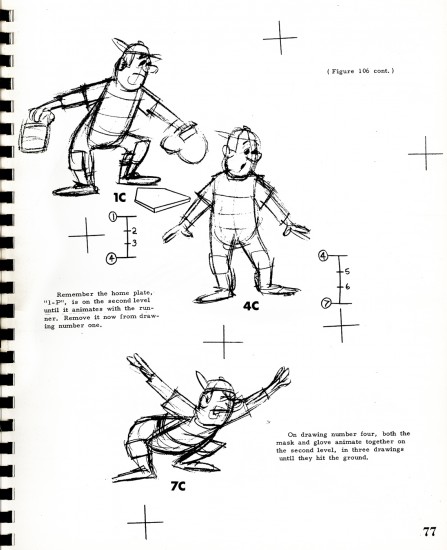
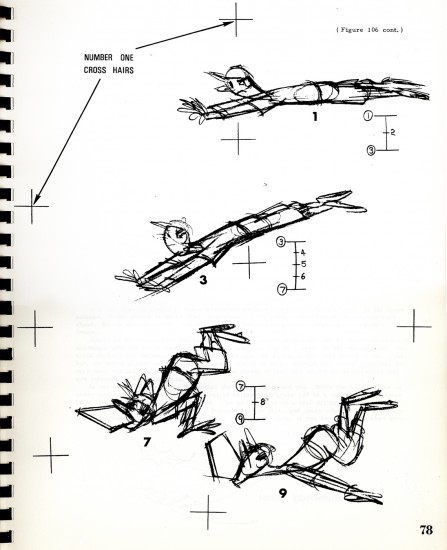
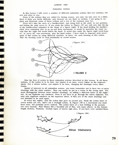
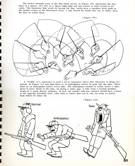
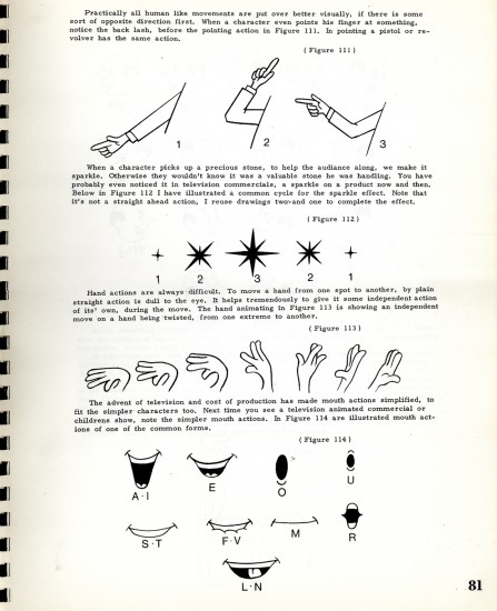
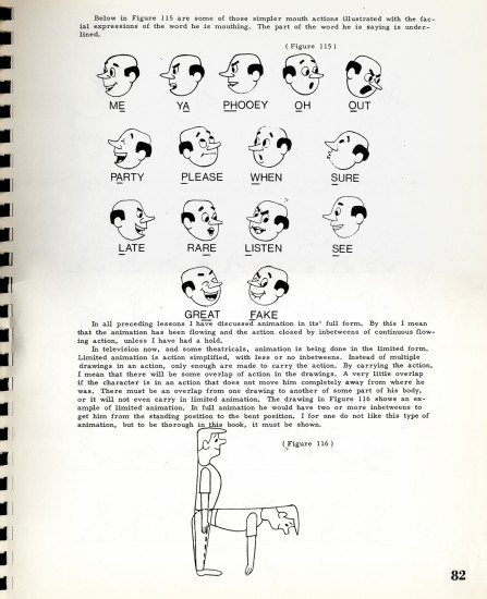
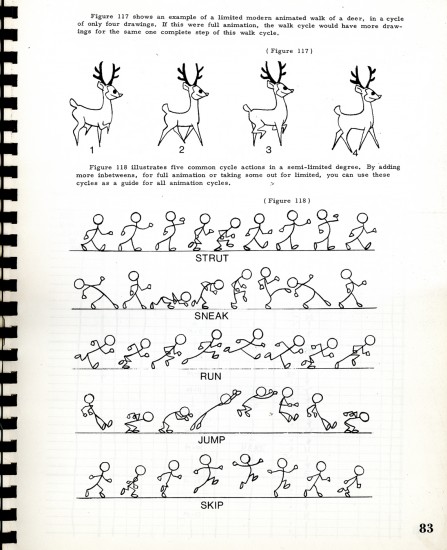
= For the past three weeks, I’ve been posting chapters from the Robert Heath book: Twelve Hard Lessons in Animation.

The book is an exercise in itself. It includes extremely complicated material mixed with the most basic. It’s an oversized book printed in the most basic way. A plastic binder holds it together and makes it feel like the workbook it is. There are plenty of exercises with the lessons and lots of examples (though these are often drawn pretty crudely) all designed to impart the information they want to get across.

As I’d written in the past, Tony Creazzo was one of New York’s finer Assistant Animators and Bob Heath was a cameraman. Together they make for an odd couple of a pair to author such a book. Yet, there’s no doubt that this material is first rate and there’s a lot to learn from the book they’ve given us.

To read past posts go here for: part 1, part 2, part 3.

We pick up this week with page 68, lesson 9:

68

69

70

71

72

73

74

75

76

77

78

79

80

81

82

83

84

85

86

87

88

Commentary &Frame Grabs &Miyazaki 06 Jan 2013 07:02 am

Happy B’day Hayao

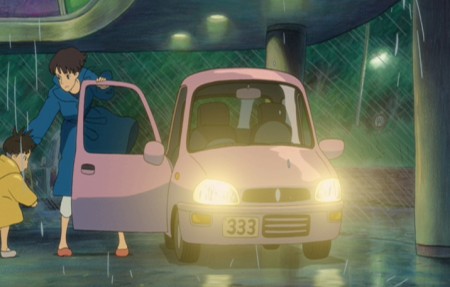
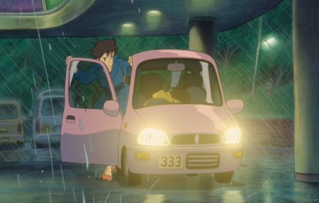
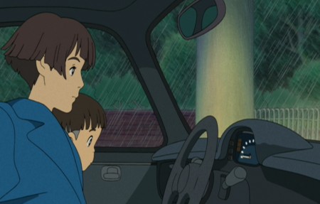
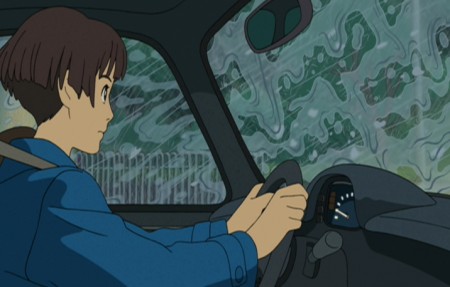
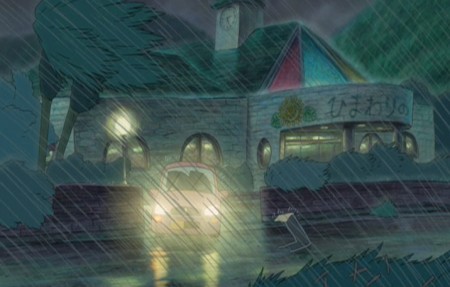
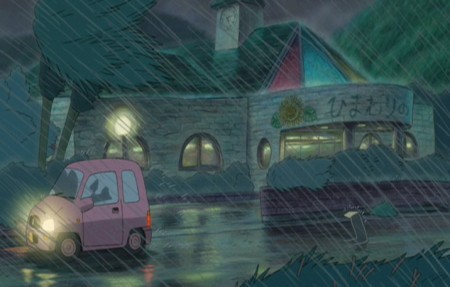
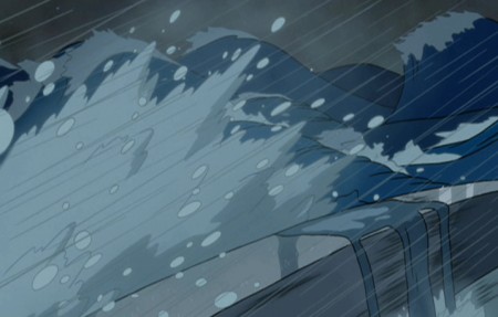
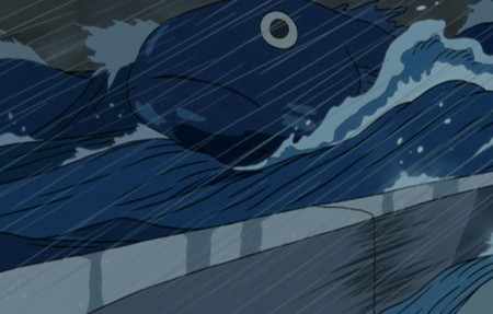
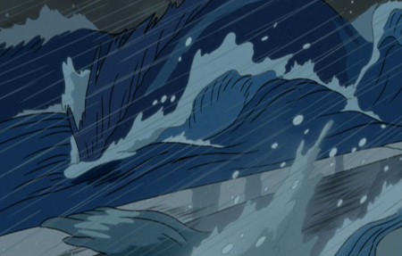
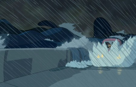
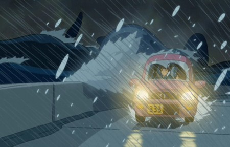
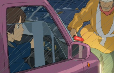
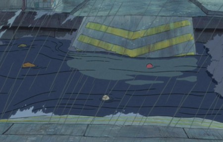
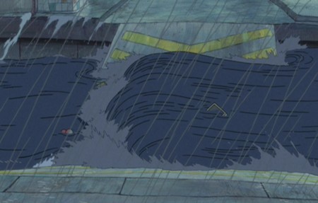
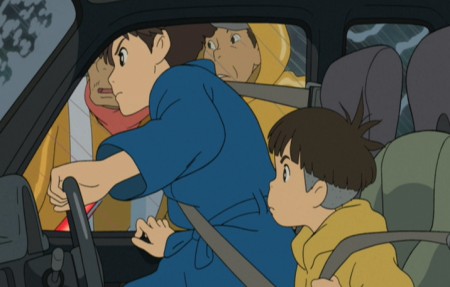
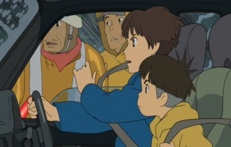
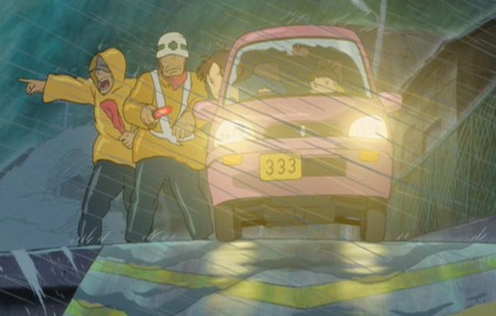
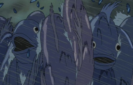
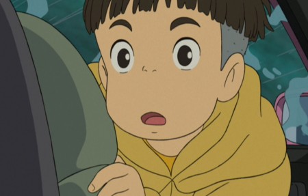
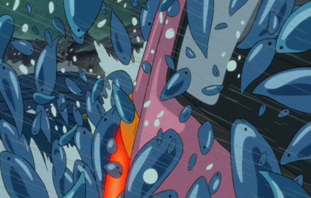
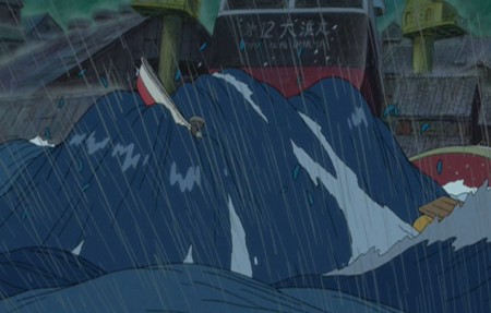
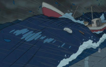
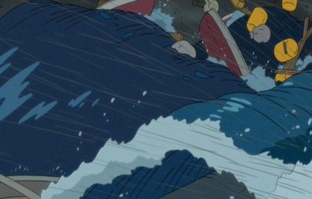
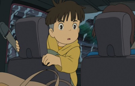
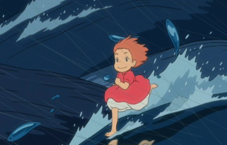
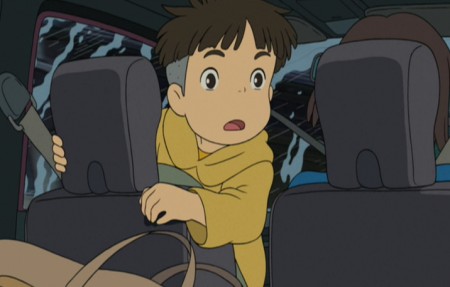
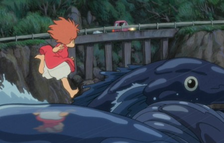
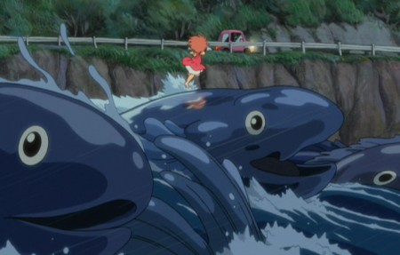
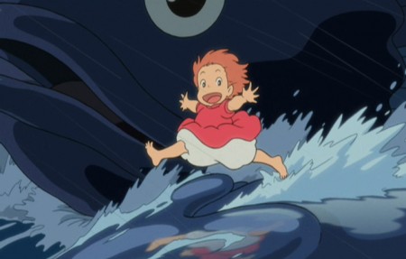
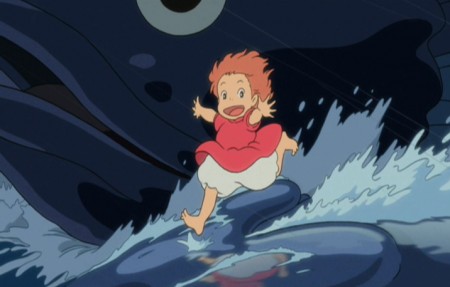
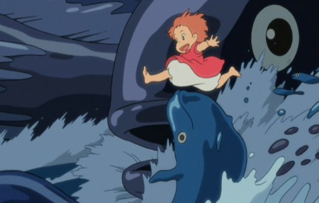
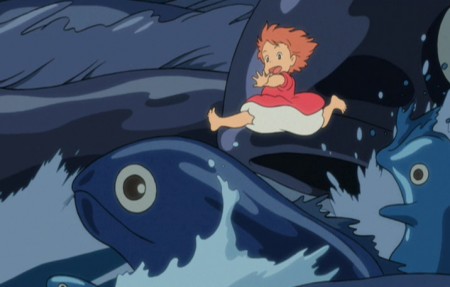
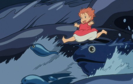
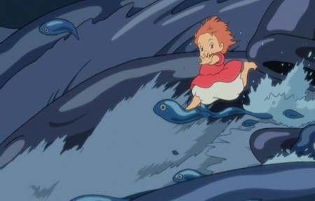
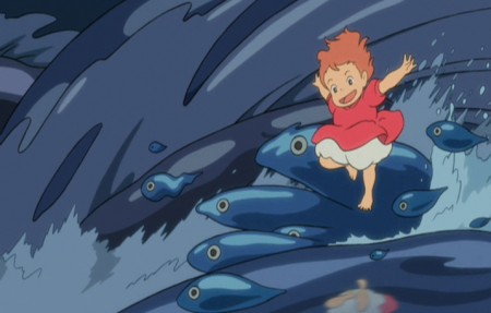
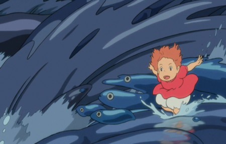
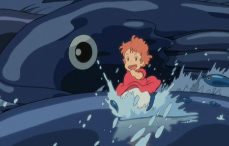
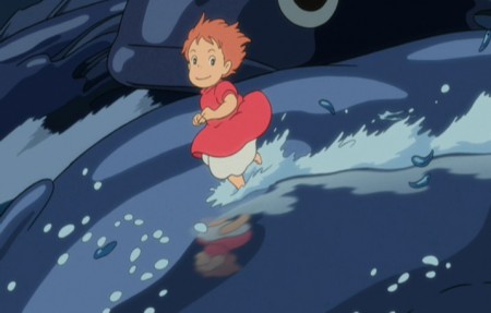
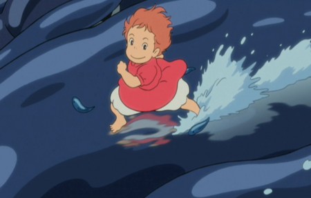
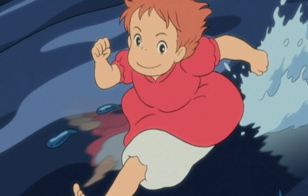
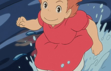
- Yesterday was the 72nd birthday of Hayao Miyazaki. Most people found out through his Facebook page. He has a lot of friends. In celebration, I’ve chosen to post frame grabs from one of the most exhilarating film sequences ever made – animated or otherwise. It’s from Ponyo, a film I absolutely love. The treat of seeing it in a theater a couple of times is just a veritable high when this sequence rolls around. Here. I cut it short a bit, since I felt I’d gotten the point across by the 100th frame grab, and it was also a perfect place to cut out.

1
2
3
4
5
6
7
8
9
10
11
12
13
14
15
16
17
18
19
20
21
22
23
24
25
26
27
28
29
30
31
32
33
34
But you can’t go that way . . .
35
The bridge is out!
36
37
38
39
40
41
42
43
44
45
46
47
48
49
50
51
52
53
54
55
56
57
58
59
60
61
62
63
64
65
66
67
68
69
70
71
72
73
74
75
76
77
78
79
80
81
82
83
84
85
86
87
88
89
90
91
92
93
94
95
96
97
98
99
100


Happy Birthday, Hayao Miyazaki

« Previous PageNext Page »

eXTReMe Tracker
click for free hit counter

hit counter