Daily post 28 Oct 2013 08:40 am

Dairy Farming for Ward

Ward Kimball once gave me the advice that I should forget animation and go into something more lucrative . . . like, Dairy Farming. Not one to listen to my elders I pushed on with the animation plans.

The passing of the animation bloc voting for the animated shorts made it all the nearer to dairy farming than I’d like. On Saturday they ran 60 shorts for us; on Sunday the remaining group. We were supposed to intelligently narrow the groups down, and I guess we did. How dull it all seems when you post then all one-on-top-of-the-other. Eyes start to water and turn blookdhot, and a decent coversation is abnormal.
Over the corse of the first 60, I found myself getting ill and frequently having to run to the bathroom.By the time we hit 45 I was a goner. The stuff just kept coming out and wouldn’t stop. no help immodium, Live with it my body screamed, You got yourself into this mess, now get yourself out of it,

On Sunday I was still out of it and couldn’t make it back. I called a voice of support every once-in-a-while, big deal that did.

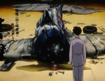
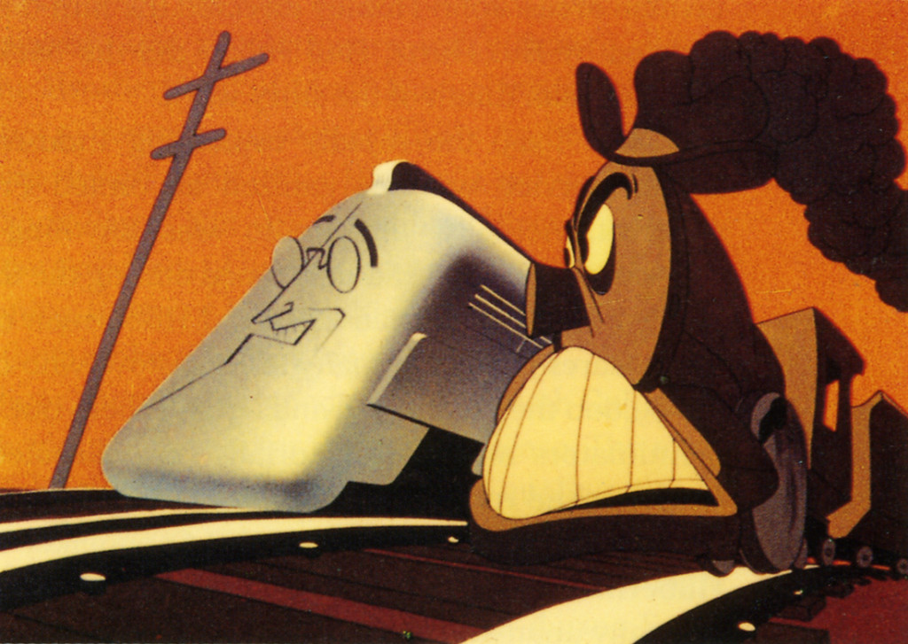
There were replacement films for some of the past. One about an underground war vs a machine. It reminded me so much of Consumption (a film from last ear) that I decided it must be a follow up of sorts. There was the cgi Courage the Cowardly Dog, so interesting an exercise – but just that. So many others my head’s been blogged shorted out – though, I’m getting over it.

Canndy Kugel had a nice little dinner for some remaining Canadiens who came down to vote. Heidi and I joined them for anoth-*****************************************************************er large meal rousted together by Candy’s Chuck. We stayed about two hours not wanting to overstay our welcome.

I’ll meet up with Jacques Droin for an interview for the blog and I’ll go with them, Candy and Jacques to see FROST. The more the merrier for these mass screenings. I’d already seen THE WIND RISES last Thursday; and had hoped to see it again next weeek, That’s a very strong film.

Commentary &Daily post 27 Oct 2013 05:10 am

aol.com

I have to say that the new WordPress is not easy for me. If there are slip ups, my apologies it’s all my fault. If there are typos, it’s my haste in getting something out…. I do have the option of writing fewer posts, and I just may do that. For now,though, nothing is changing.

Saturday just went whizzing by. I was sick all day while trying to screen some 40 short films. There were some obvious great films in among the bunch, but a large majority of them remain as mediocre. Things like the Pixar short where they follow some umbrellas with eyes through a rushing rain storm. Tedious is about the only word I can come up with for that. There were others which were enormously delicate and had lost none of their political themes.

The typical film by Your Head creator, Bill Plympton. It’s hard to imagine using drunk jokes at this point in history. There was the cgi version of Courage the Cowardly Dog. It was as funny as all the other episodes of Courage despite the cgi makeover. I’m obviously prone to the hand drawn version, but I can’t take too much away. The show probably got less whacky for the cg elements. Perhaps John Dilworth will get his oats in doing it cgi soon.

Lots of flying children and floating monkeys.

The last half comes today. Can’t wait and hope for the best. It’s still a damn hard job making a film short or long…..
I give all these filmmakers courage.

I look forward to the second half of the program today and hope several films will stand out.

Bill Peckmann &Chuck Jones &Comic Art &Commentary &commercial animation 25 Oct 2013 10:39 pm

Ever Rising, the winds of change

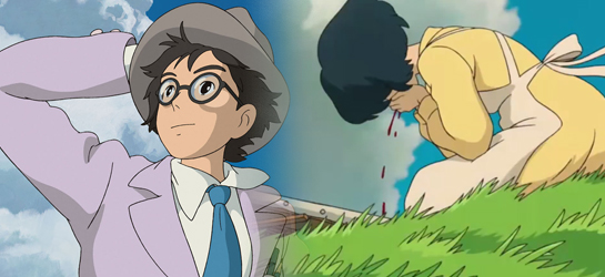
burmoutJumping in to Miyaakii’s most recent feature – to cross the seas, we find a very complex film with an aggressive approach to ward the telling of a love story. The architect of a bomb designed to destroy lives in fighting that war is the precise subject behind this longish film. It is not endearing (though that would be questionable in discussing these masters of violence for their country.

An horrendous look straight down the nose of a blistering work of nature, the Hurricane, as lovers are brought together afterward she gets ill and suffers from the pangs of war without having been near the font lines of the tumult wherever it is.

From therre to the end is a military mission wherein the architect shoots at the world. A scientist who accomplishes his mission while killing more people than the earthquake he met at the film’s start. This is one fine movie from a thinking man. He’s seen enough sorrow to want a peaceful ending for his children. It isn’t coming.

Animation, you wait and beg to do it, but in your heart you want to do brave things with positive things to say. I want so desperately to do the good stuff. At this point I’ll take the mediocre, with some sadness.

______________________

I wish . . . I wish . . . I wish . . .

Theree were only good and responsible pieces of animation anymore. But no they just grow Mickey and his private parts larger and larger in Flash until the money doesn’t sow and then they blow them up.

Just like that SCTV show they blowed him up real good.

Noone knows what will happen. It hurts you know. Croods and Monsters and Incredible him. He was incredible; he made a big success and now the second one. Incredible Him. I guess those turkeys should be big too, a holiday out of Thanksgiving. What do you know? Maybe one or two of the shorts will be fun. Not umbrellas making eyes at each other. We need some Prince Valiant to come along and save us all. Maybe that’s me.

Commentary 25 Oct 2013 03:58 am

Cherry picking in Animation Styles

bourseDisney was beginning to experiment artfully with his colors and shapes if not with his stories. He gave his designers a lot of free reign, and they slowly started taking it. The Silly Symphony films allowed them to push new areas in storytelling and the animators went for With films like Fantasia and Bambi that experimentation bled over into the feature films and excited the new guys enormously.

Walt had set up departments for story and designing, and newer artists like Joe Grant brought a verve to the stuffiness that had been settling into the artwork. Grant was a cartoonist – caricaturist who took a job at Disney doing caricatures and art for Mickey’s Gala Night Out and Mother Goose Goes Hollywood. Grant did a lot of great caricatures which leave us laughing through today. He went from starring artist of those two films to designing plenty of others whether they needed caricatures or not. His color work was every bit as good as anyt hing he’d done, and he kept the films rolling. Grant arrived as an artist and ended up being a star, taking full control over the newly devised Character Models department. While he was one of the better artists in the Thirties story department, he worked closely with Bill Cottrell as his storyboard partner. Cottrell didn’t do much drawing for his part of the partnership. The two were often also joined by Bob Kuwahara, a sketch artist, in doing the boards. The trio was inordinately successful (including the very fine films Who Killed Cock Robin? and Pluto’s Judgment Day); when they mined theeir work for shortsl they had a peculiar method to their madness in the making of the boards something that workekd well for them.
aaai, omn tr othrt hsnf, nrrf domrtning lrdr to fo thr job1

Came goodThis was a peculiar way, for these Hollywood artists, to create their stories.

Meanwhile, overseas the Europeans were predominantly influenced Fleischer – or so they’ve often been quoted. Seeing the first Danish animated feature: The Tinderbox, one of my favorite fairy tales and it’s by Hans Christian Andersen, it carries so many of his they definitely do try to get into the heads Fleisher animators – Fleisher during Gulliver. The characters can’t hold their own lines. They distort, come back together and seem, always, to be living in a land of “takes.

“However, it’s not quite completely true. You have a film like The King and the Chimneysweep (done in France by Grimault) and they’re definitely modelling their work after Disney. Distribution to the Far East is covered by Ghibli, Miyazaki’s company. Miyazaki also controls rights to Kirikou et les hommes et les femmes by Michel Ocelot. They also have several of the 2D films done by Trnka in the late forties early fifties. Trnka didn’t follow the guidelines of Disney, but he was escorting himself. He had a style all his own found under the animation camera. He stuck with the original,

The man did great work.

Trnka Chimney Sweep1When the Nazis stepped in and took over the Fischerkoesen Studio they gave orders that their studio should emulate Disney. And that’s what they did. They tried to supersede some of the most brilliant multiplane work done by Disney. In fact they did an exxcellent job excpt for the muddy movement.

You can show how animated films were influenced by others but you also have to show the results. In the case of all the Disney tied work, the working layout is stunning, but the animation left a lot to be desired. The needed a dominating animator who could get the artists to express themselves. This, of course, was also true of the Fleischer-inspsired work. The films are really lacking for good animation.

David Hand tried this in England just following WWII when he set up a studio outside London and tried to train new workers to the medium. The Ginger Nutt series was born, and didn’t last long. But quite a few animators grew out of this system. Harold Whitaker was probably the foremost animator, and. I know Gerry Potterton made it through this system. His look is far from Disney, ever farther from Fleischer. Maybe that’s why he was successful.)

So it started when Fleischer went to Hollywood/Disney where it got slicker. Europeans and Japanese picked up what they wanted from those cherry-picking from Europe. I hope soon to write about the “moderne” art of Russia.

Miyazaki has his own style which is different from other Japanese animation studios. Like his aircraft and air battles, it’s more European than Japanese and more Japanese than any other’

European. It’s his style, though. That’s to be sure.

wind-rises

Daily post 23 Oct 2013 11:30 pm

Trick or Treat

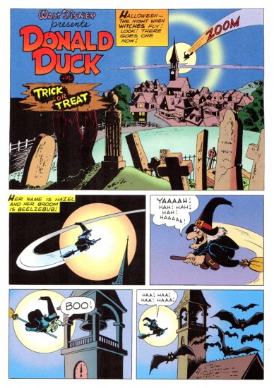
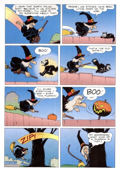
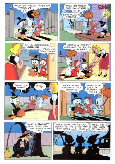
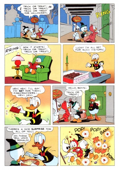
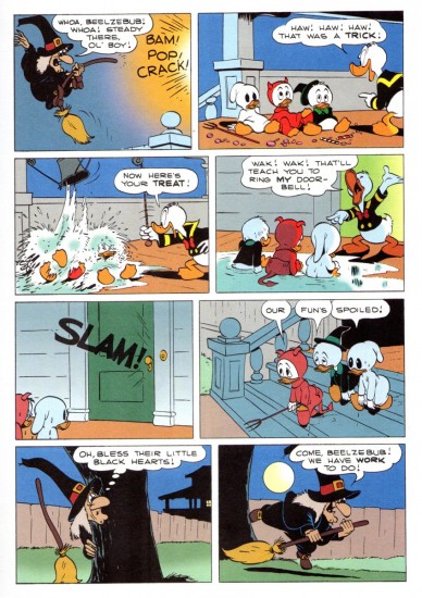
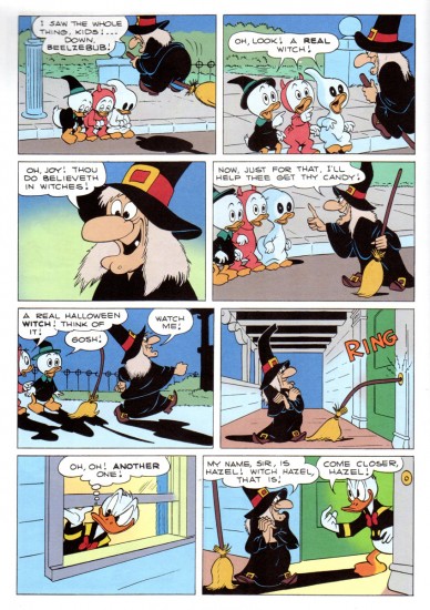
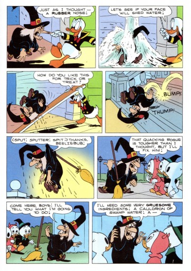
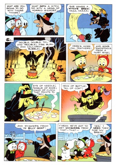
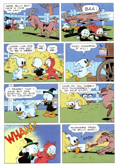
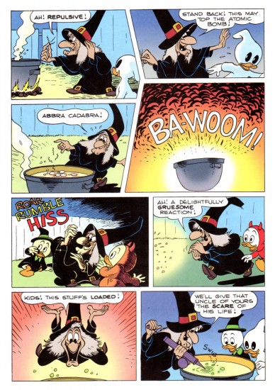
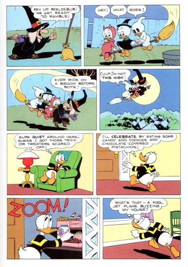
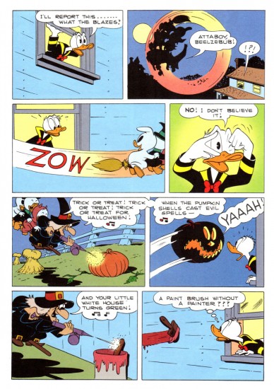
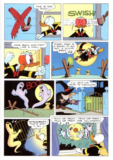
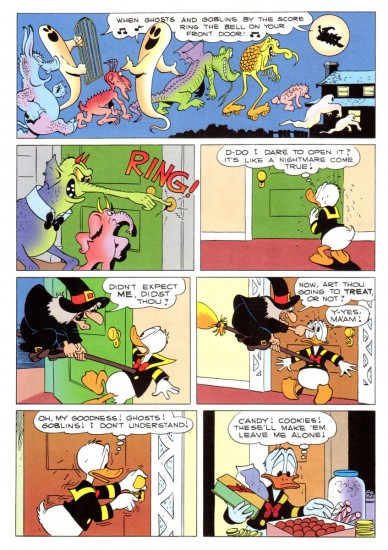
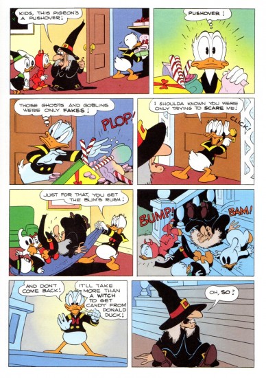
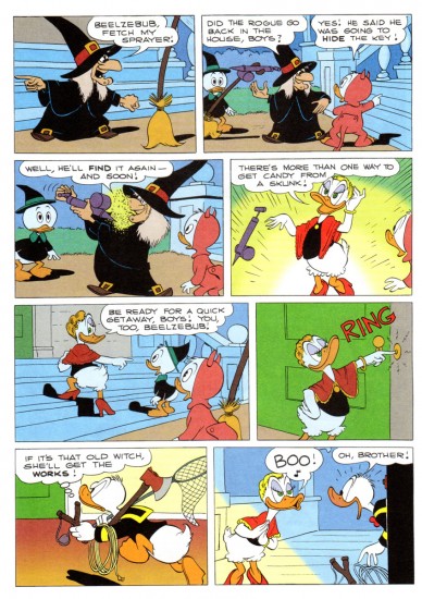
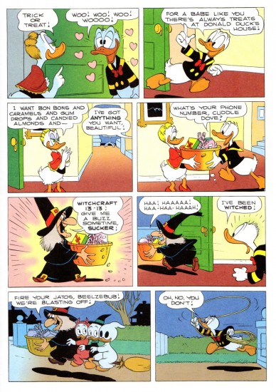
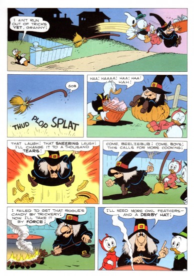
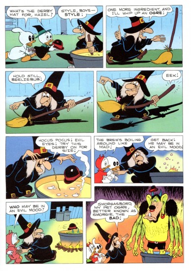
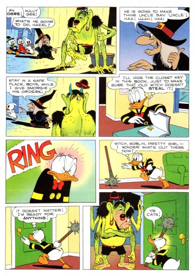
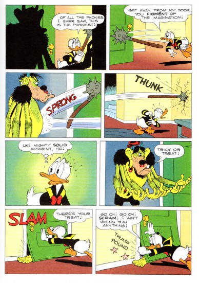
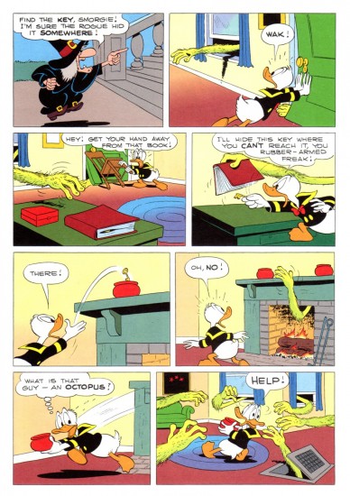
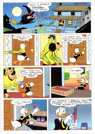
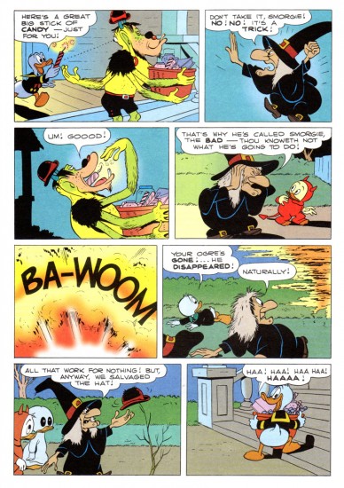
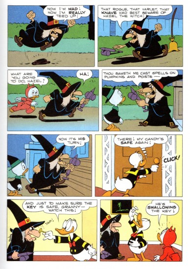
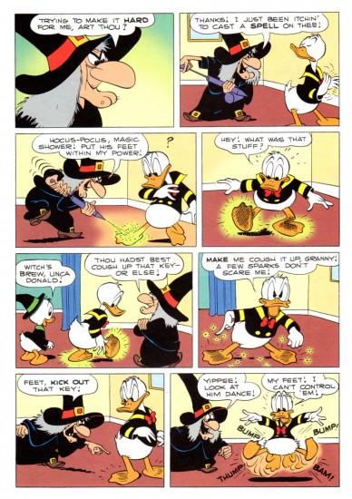
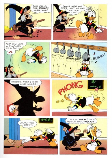
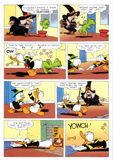
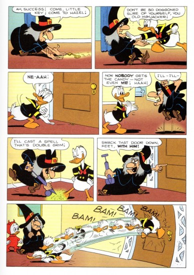
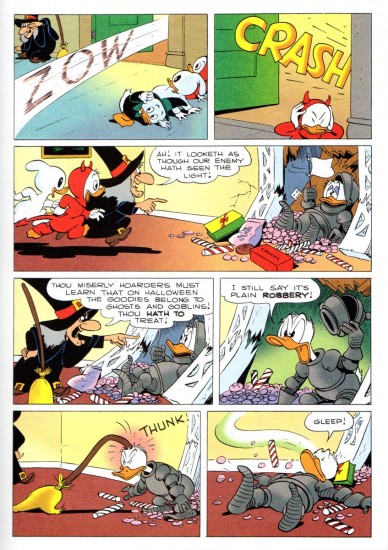
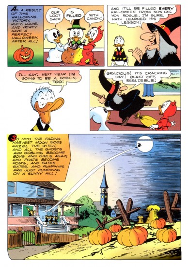
Halloween’s just about here, so it’s time to revisit this wonderful Carl Barks’ story. Many thanks, once again, to the great Bill Peckmann.

- I remember as a kid seeing the annual Halloween show on the Wonderful World of Color. Featured was the Donald cartoon wherein Hazel the Witch was introduced, Trick or Treat. Carl Barks went wild with this character and the premise, and it was a treat every year to get the new Donald story featuring the great character. (All that was missing was June Foray’s great voice. But I could play that in my head when I read the comic book. t was her first voice for Disney and her big break into animation voices. She started with a homerun; a classic the first time out of the box.)

Bill Peckmann has forwarded scans of the following story. Here’s his introductory words to the piece.

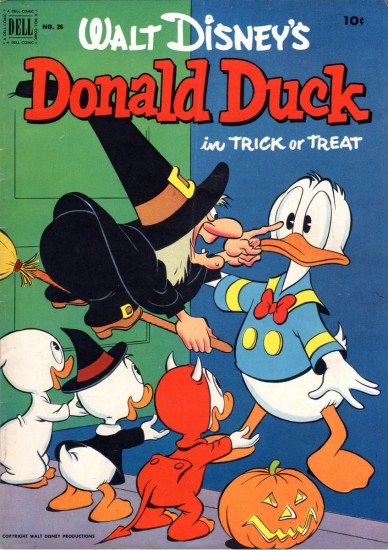
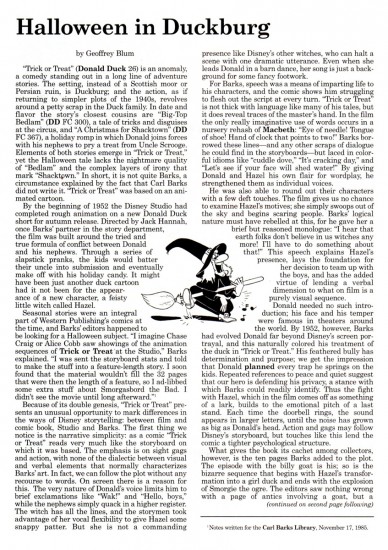
    In 1952 Carl Barks did a ‘Donald Duck’ comic book titled ‘Trick or Treat‘. It was a rare instance where a Barks story had its origins in a Disney Duck short. (Geoff Blum‘s excellent essay/history of the story at the end post will explain how the ‘Trick or Treat’ book came about.)

    Here, with no tricks and all treats is Carl at the top of his game, this is the cover of the original 1952 Dell comic book.


Comic book cover

1

2

3

4

5

6

7

8

9

10

11

12

13

14

15

16

17

18

19

20

21

22

23

24

25

26

27

28

29

30

31

32

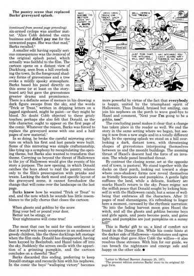
Here’s the article by Geof Blum writing about the genesis of this comic book story adapted from the animated short.

33
(Click any image to enlarge to make it legible.)

34

There’s a good post about the color of this strip for the Gladstone publishing version of Trick or Treat. Posted are a number of color guides for that version.

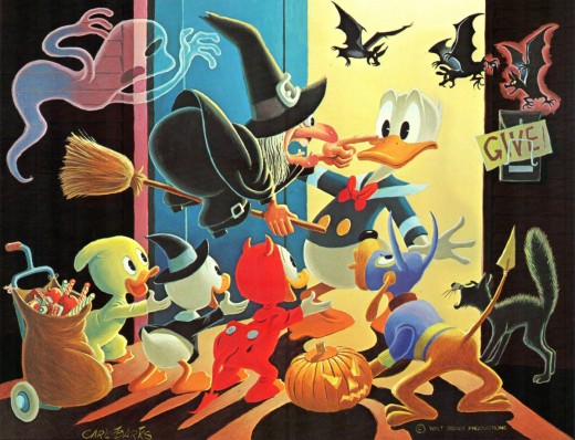
Finally, here’s Carl Barks’ oil painting based on the artwork for his classic comic book.

To be honest, I think this is the best of this series of oil paintings that Barks has done. It doesn’t feel like something overworked and trying too hard. It just captures the spirit of the original magazine as well as the spirit of the animated short from which it was adapted. Not only a Barks gem, but a Disney gem as well.

Commentary &Daily post 23 Oct 2013 08:02 am

“Animated Week”

This is a week for 2D animation. Last Sunday I watched the 1991 film ONLY YESTERDAY. That was a brilliant film, and it was so quiet and delicate and touchingly perfect. Directed by Miyazaki’s partner, Isao Takahata. What a gentle and near-perfect movie. It’s probably too quiet for most people, but I loved it. I have to thank Nat who left the comment on my blog about it.

Last night, there was John & Faith Hubley’s 1962 feature, OF STARS AND MEN. This was the first Hubley film I saw in a theater. I was only 17 at the time. It was a little bit of genius living around the corner from me. It’s a feature, a great one, without having all the low wit you’d usually see these days.

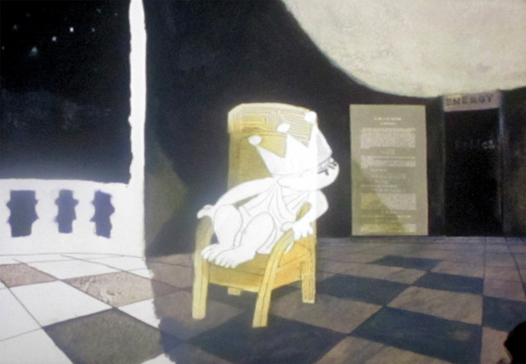
It was the first film by the Hubleys that I ever saw in a theater. Only 53 mins, it takes your breath away. It’s very much an adaptation of Dr. Harlowe Shapely’s book, “Of Stars and Men.” This is a pure and unadulterated look at the science as studied by Dr. Shapely. Every inch of glorious painting and remarkably strong animation layout is used with the 2D animation camera. As many as 10 passes through the camera are used for every frame.

John definitely went for the abstract, where he found a beauty that couldn’t have been replicated any other way – including in the pre-historic sequences of the original Fantasia. I’ll try in an upcoming blog post to post some of the frame grabs from this movie, gorgeous as it is in all its delicate motion.

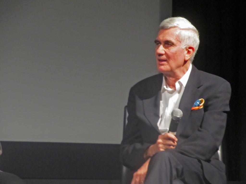
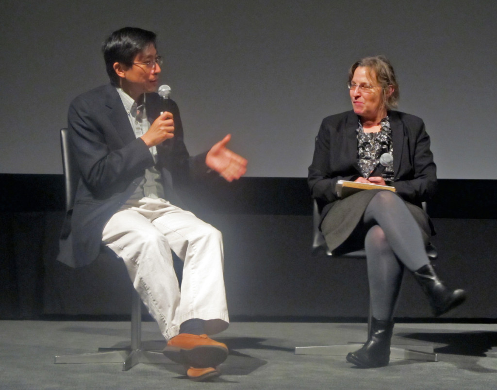
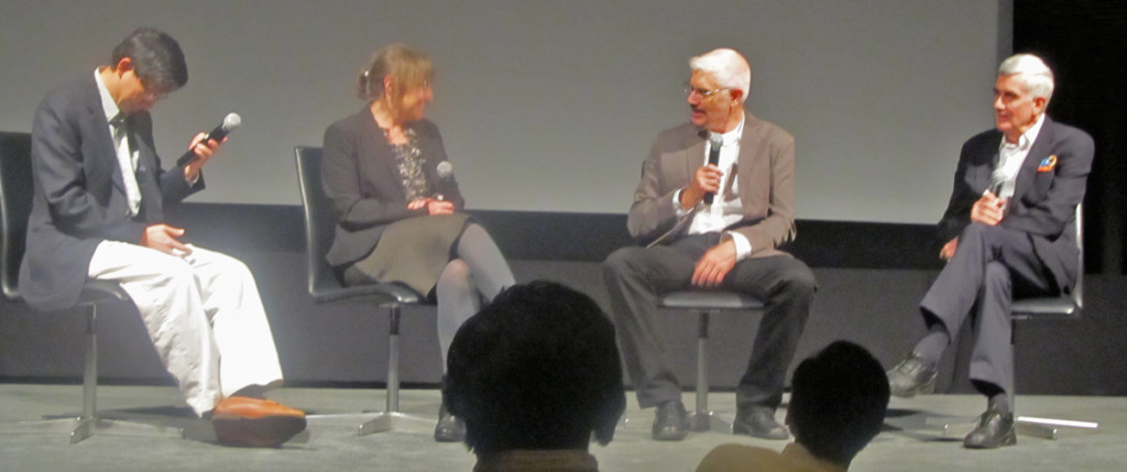
Talk Session for “Of Stars & Men”

JrOFSTARS&MEN1 1
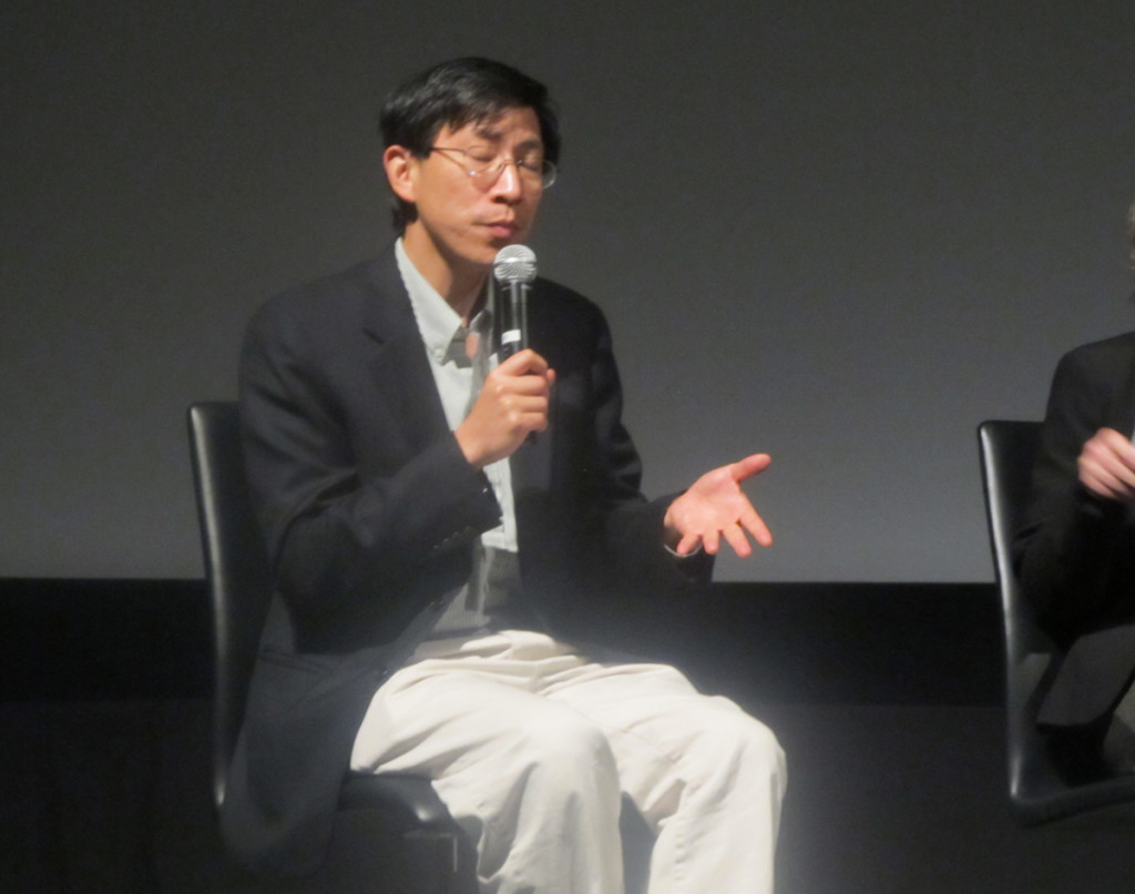
Dr. Charles Liu, a scientist supporter of Dr. Harlow Shapely

JrOFSTARS&MEN2 Emily 2
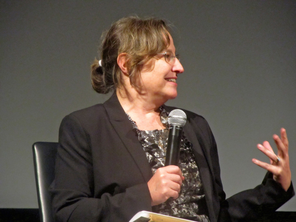
Emily Hubley

JrOFSTARS&MEN3 JC 3
John Canemaker

JrOFSTARS&MEN4Em&Pi 4
Dr. Charles Liu and Emily Hubley

JrOFSTARS&MEN5Mark&Max 5
Mark Hubley and nephew, Max Hubley

JrOFSTARS&MEN6Ray&Geo 6
Mark, Max and Emily Hubley

JrOFSTARS&MEN10PiEmGaryJC 7
Dr. Charles Liu, Emily Hubley, curator, Ron Magliozzi, and John Canemaker.

JrOFSTARS&MEN 8
Will Rosenthal, Emily’s husband and Ira Kaplan Georgia’s husband were also there.

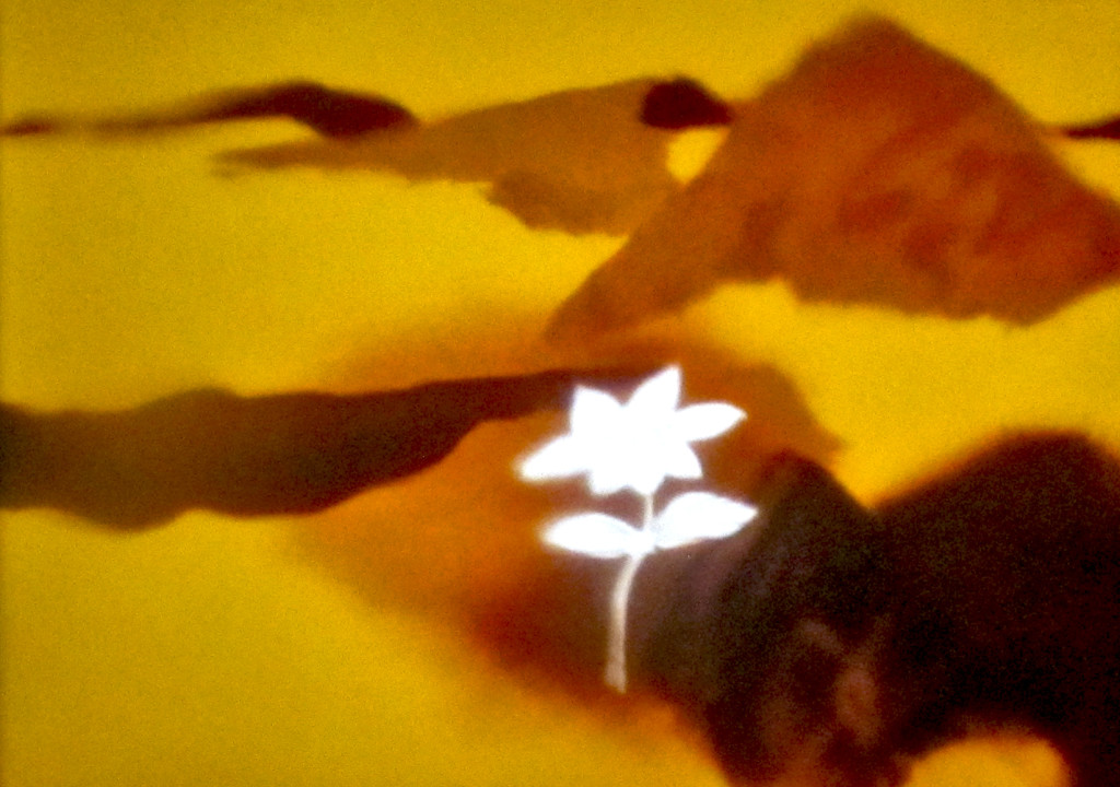
JrOFSTARS&MEN13flower 9
On screen flower
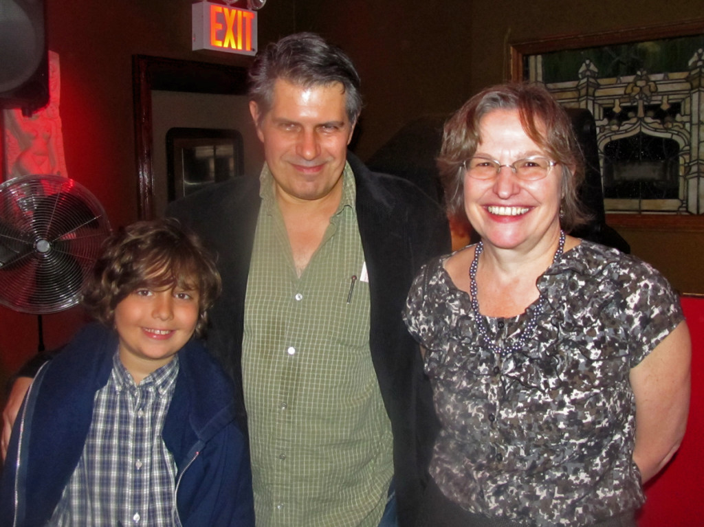
Also iin the audience were Candy Kugel, Jannet Benn, Joe Kennedy
Biljana Lobovic and Jeremiah Dickey.

JrOFSTARS&MEN9Jeff&Em&Osc 10
Oscar and Jeff Scher, and Emily Hubley

JrOFSTARS&MEN7Mark&Mike 11
Mark Hubley and me.

JrOFSTARS&MEN8Mike&Mark 12
More of Mark and me.

At the end of the film, my wife, Heidi, asked where the credits were. She’d forgotten those were
at the film’s start. The entire crew amounted to 15 people.

    Cast (in credits order)
    Harlow Shapley Harlow Shapley
    Mark Hubley Mark Hubley
    Ray Hubley Ray Hubley

Produced by

    Faith Hubley producer
    John Hubley producer

Cinematography by

    Jack Buehre

Film Editing by Faith Hubley (as Faith Elliott Hubley)
Animation Department

    Pat Byron … background artist (as Patricia Byron) / rendering artist (as Patricia Byron)
    Nina Di Gangi … background artist / rendering artist
    Faith Hubley … background artist / rendering artist
    John Hubley … background artist / rendering artist

    Bill Littlejohn animation director (as William Littlejohn)
    Gary Mooney … animation director

Music Department

    Roy Friedman music recordist
    Walter Trampler … musical director

THAT’S IT!

Thursday we see Miyazaki’s The Wind RIses, and on Sat & Sun we see all of the AMPAS entered animated shorts. Mine eyes hold up.

Books &Commentary &Illustration 22 Oct 2013 06:20 am

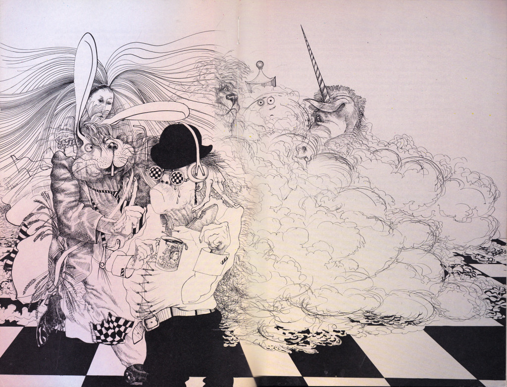
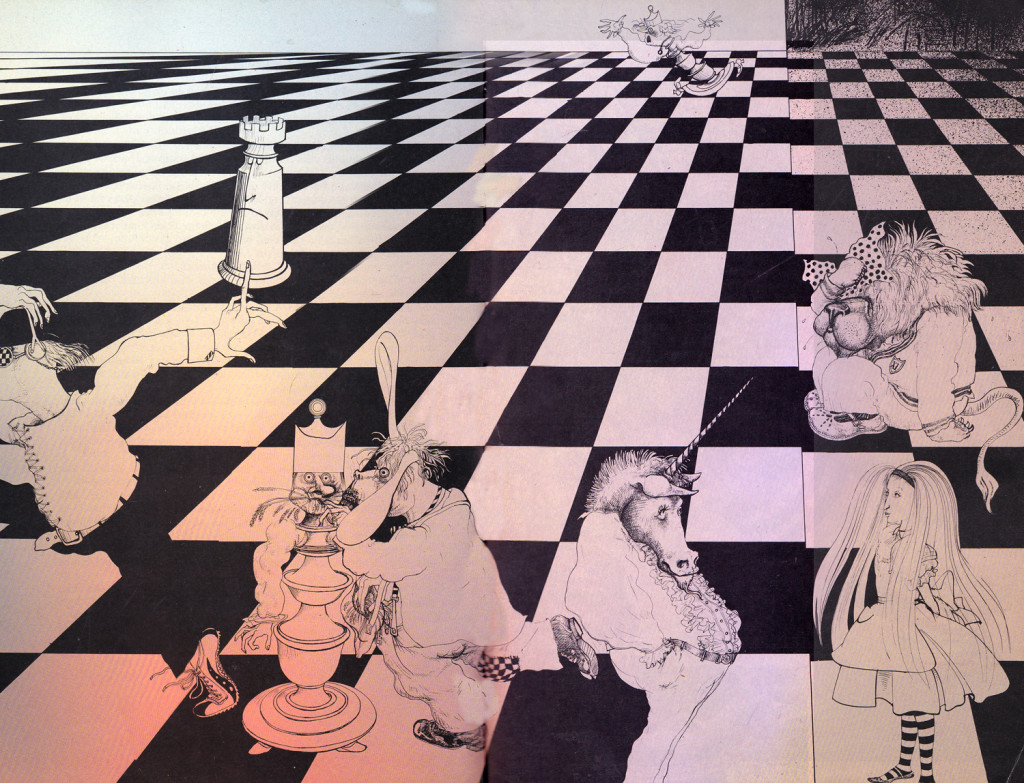
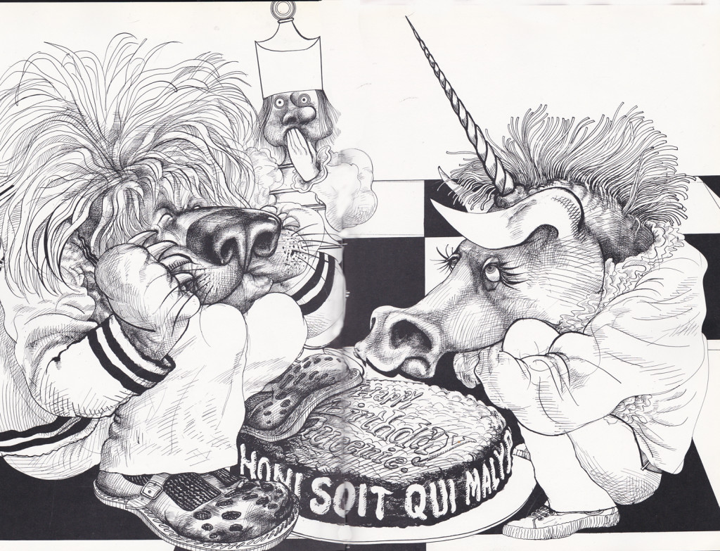
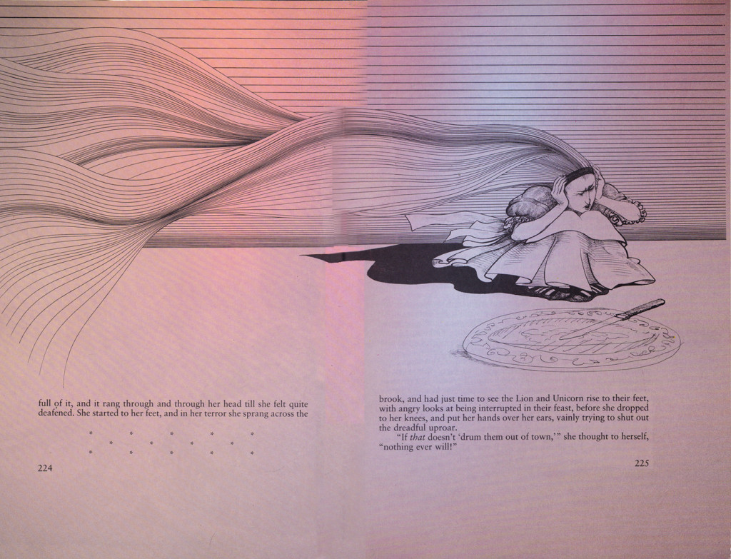
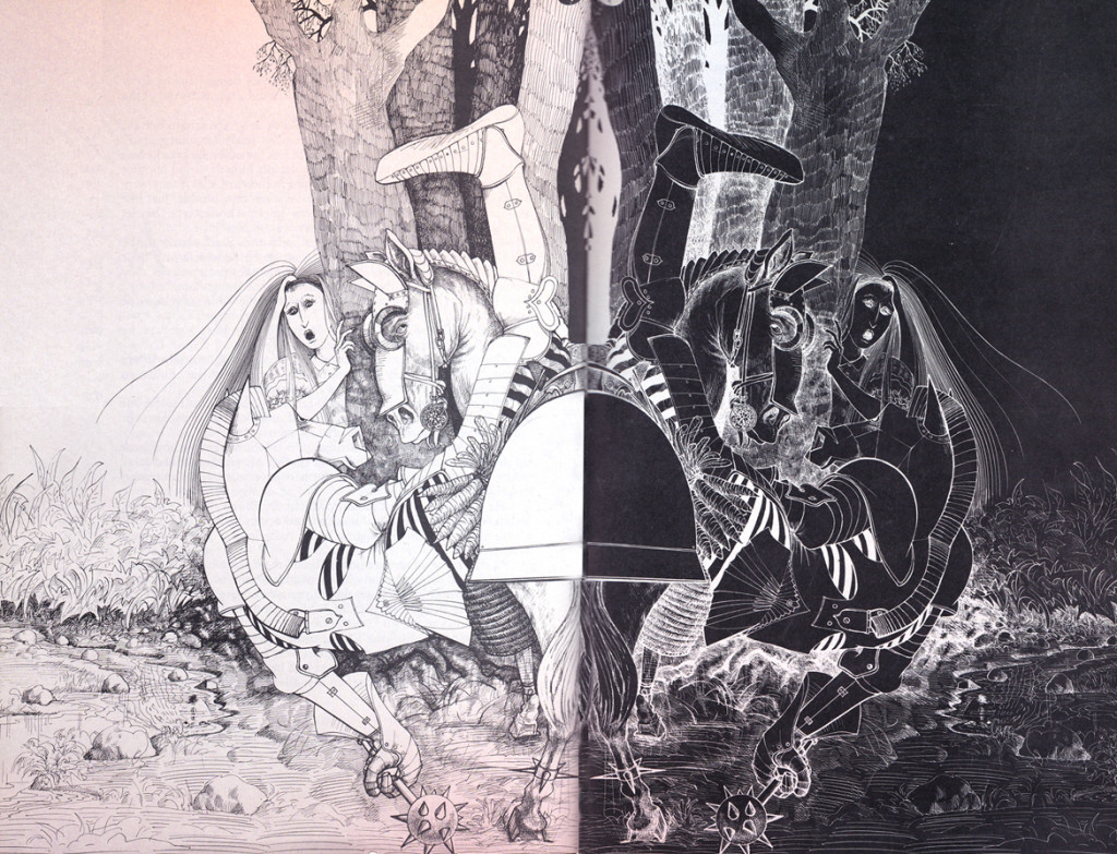
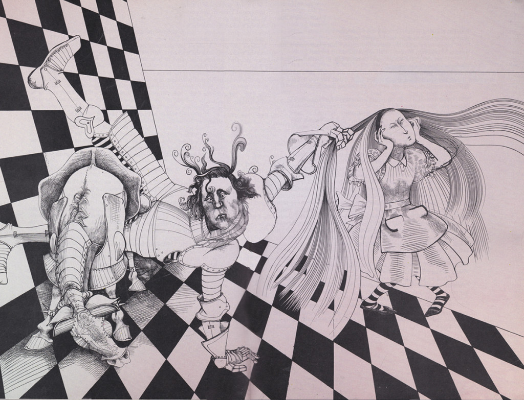
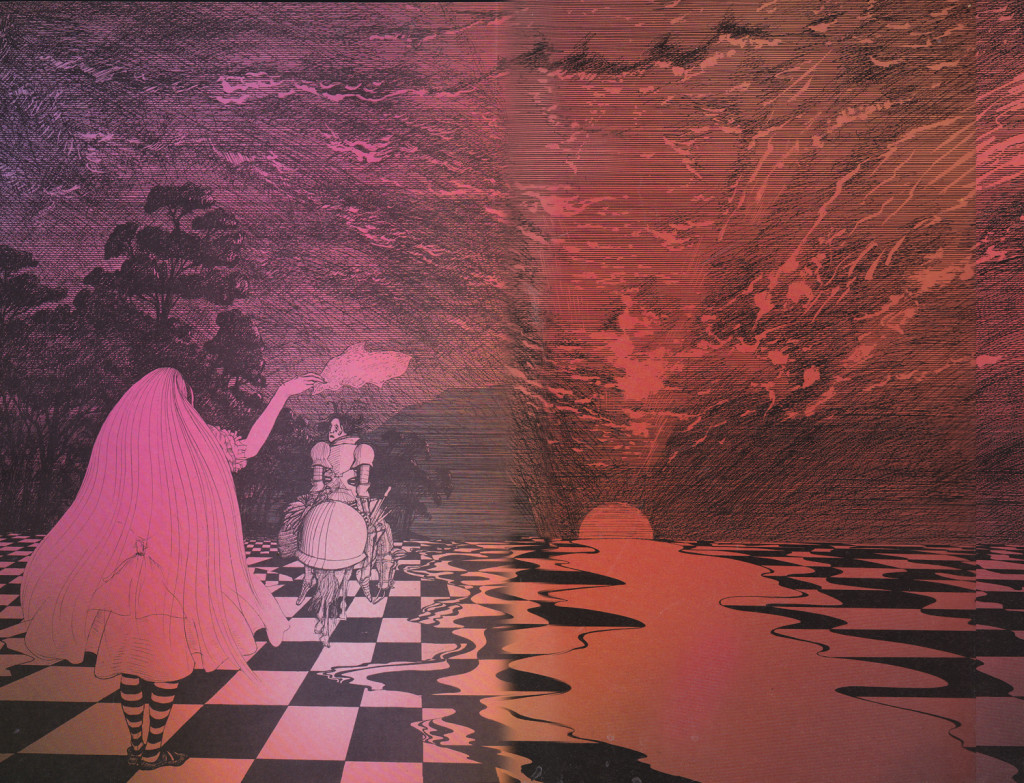
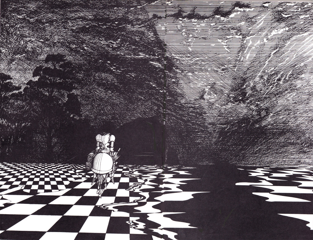
Steadman meets Jabberwocky

Ralph Steadman has reached the White Knight, who gets to recite Jabberwocky for the first time.
It’s a brilliant delight, of course, and the illustrations are completely up to the task. But this is from a wholly different book. (It’s published out of order within this volume. If it weren’t out of order it’d be too long to fit dramatically, here.) I believe I may have once posted Jabberwocky or some of it, anyway. I can’t find it just now. I also have the version by QUentin Blake which I know I didn’t post. (THAT book is a rarity.) I really do love Lewis Carroll’s work.

Soon after the White Knight is defeated by the young, imbalanced Red Knight (don’t ask, read it), the Red Knight tries to recite his poem but has a bit of difficulty. He has to keep time with his right hand while trying to stay in balance on his horse.

However, he keeps falling off the horse when his isn’t reciting. The man has a problem.
Tell me, don’t you think the Red Knight looks a bit like a young Prince Charles? My thought, of course. Would Steadman be that rude to treat his royalty so?

Here, uninterrupted, are the illustrations:


Alicia1 1

Alicia2 2

Alicia23 3

Alicia34 4

Alicia65 5

Alicia56 6

Alicia7 7

Alicia8 8


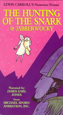
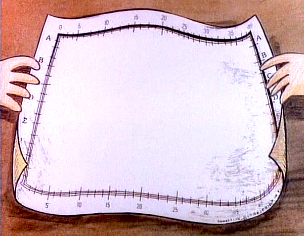
Starting today, I’m going to end a lot of my posts with images from Michael Sporn Animation Inc films. I have to say, in all the years of making so many films, too infrequently have I posted pictures of the work we’ve been doing. It’s about time.

Michael Sporn


Sporn images
from
The Hunting of the Snark

hunting-of-the-snarkbox
The individually wrapped video box from First Run Features 1

hunting-of-the-snark3 2

hunting-of-the-snark4 3

hunting-of-the-snark1 4

hunting-of-the-snark2 5

Action Analysis &Animation &Commentary &Disney &Guest writer 21 Oct 2013 06:13 am

Women and Men, Boys and Girls, & Toads and Horses

I can’t believe all this nonsense I’ve been reading about what Joanna Quinn might have said about this Disney film or that. She’s right and anyone who argues with her has to be a real dullard and a total fake. If she says it’s easy or hard to animate women, take her word for it. (Not just because she knows how to animate women better than anyone on the planet, these days, but because what she’s saying is common sense.

Women are people, too, not just insipid cartoon characters the way the Disney people draw them. If a male is easy to animate, it’s because they’ve figured out how to design them as the cartoons they’re making. If women are hard to animate, it’s metabecause the lead character in FROZEN looks like every other generic female these guys can draw. Give it up. Hire a few good women who can animate, and we’ll see what we see. (I expect nothing different unless the woman drawing the figure is a good animator (not just great, like Joanna Quinn) and knows how to draw well (not even great, as JQ can do). But the character they’re animating is well designed (unlike the lead in FROZEN).
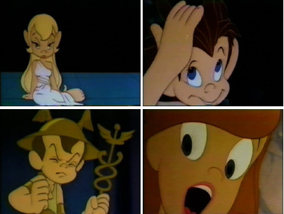
It reminds me of the in-house joke around the film METAMORPHOSIS. The principals didn’t have names, and the model sheets read: “Lead Boy” and “Lead Girl”. The animators usually read their names as “Led Boy” and “Led Girl” because they looked generic and they could only make them move like “lead.”

________

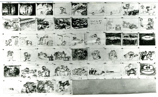
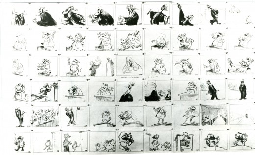
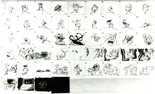
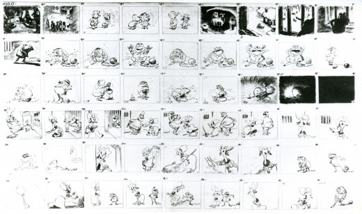
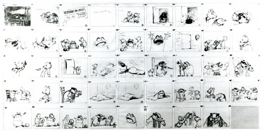
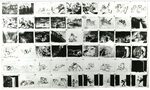
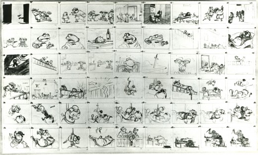
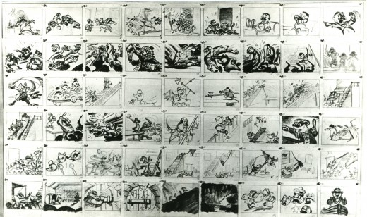
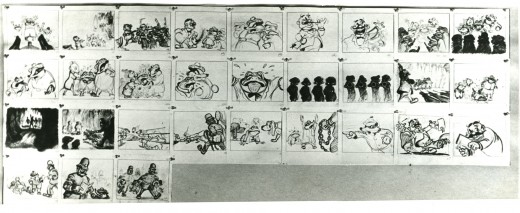
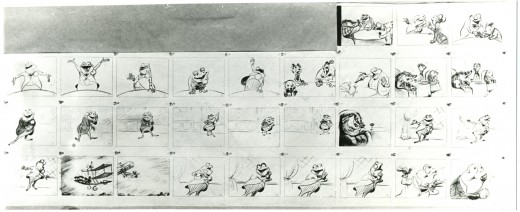
As long as we’re talking about drawing and designing and animating women let me repeat a segment of an older post. It includes storyboard from Disney’s The Adventures of Ichabod and Mr. Toad. Of course, the original of this was The Wind in the Willows by Kenneth Grahame.

My reason for repeating it has more than a touch upon Joanna Quinn’s fine comments. I received a letter from the great Borge Ring who pointed out who the artist was of this storyboard. An excerpt from his letter:

    hi Michael

    Re Give me a Drawing
    Daan Jippes who worked on The Prince and the Pauper saw the storyboard of “The Wind in the Willows” and said:
    “The story sketches of that opening sequence look exactly like the finished scene. How can they give an animator credit for something that has already been done ?”
    The draft said the scenes were animated by Frank Thomas, and I asked Thomas:
    “Frank,who drew the storyboard of the sequence?”

    “I did – I am not sure I did much else”

    greetings
    from
    Borge 92

    PS
    You mention Oscar Wilde
    He is supposed to have said:
    “Sexual gratification is so useful to us humans. Because it enables us to think
    of other things too”

So here, then, is a bit of that storyboard – more from the end rather than the beginning.
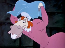
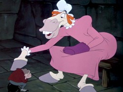
Talented those men were (they could even draw men, a toad and a horse, dressed as women pretending to be women – with very little success.

________
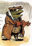
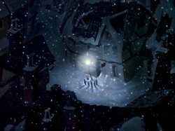
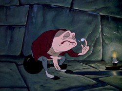
– Probably my favorite children’s book is The Wind In The Willows. There have been many animated adaptations of this book since it became a public domain item, but for years there was only one version, Disney’s Mr Toad half of The Adventures of Ichabod and Mr. Toad. The loudest most raucous parts of Kenneth Grahame’s delicate novel, blared their way onto this animated compilation feature.

We all know that the book was planned as a feature way back when Disney, in the late 30s, was buying up titles of famous children’s books to prevent other competing studios from turning them into animated features. Work began on adapting the book. They never quite broke it as they hoped, and it ultimately became a featurette with its primary focus on the loose cannon, Mr. Toad.
. . . .The film, as it exists now, has some positive elements and some fun animation, but the story was always a bit too quiet and British to successfully survive a proper adaptation in the Disney canon.
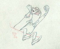
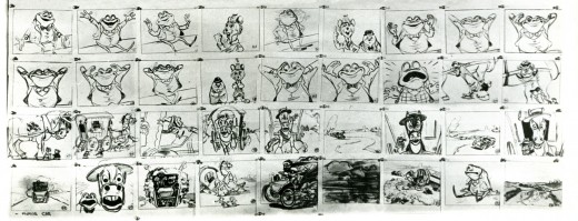
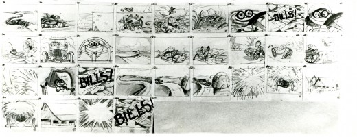
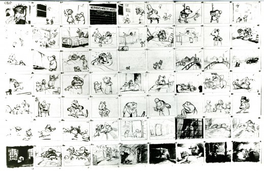
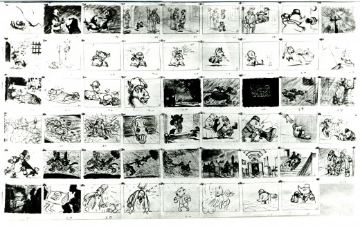
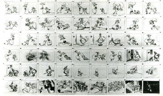
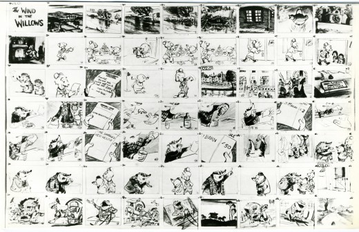
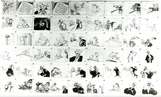
When John Canemaker loaned me his copy of the Pinocchio boards, he also brought The Wind In The Willows (not titled Mr. Toad). There are few captions here, but this obviously is designed for a full-out feature not an abbreviated featurette. The images on his original stats are small, so I’ve blown them up a bit and tried to marginally clean them up.

As suggested by Michael Barrier, this board was probably assembled to produce a preliminary Leika reel. The giveaway is the lack of dialogue and commentary underneath the drawings. The assembly was made to be photographed.

1
(Click any image to enlarge.)

2

b

3

b

4

5

6

Disney’s Mr. Toad first aired on the Disneyland television program on February 2, 1955. You can buy the dvd of Ichabod and Mr. Toad on Amazon among other places.

If you’re interested you can read the entire book of Kenneth Grahame’s work (minus the beautiful Shepherd illustrations) here.

You can buy the book here.

Dave Unwin‘s version is my favorite adaptation in that it retains some of the flavor of the original book and isn’t afraid of being quiet at times.

7

8

9

10

. .

11

. .

12

13

14

15

16

17
Commentary 20 Oct 2013 03:39 am

2D 2D 2D & Poe

Noble Book

nob15

In case you didn’t notice in yesterday’s post, I started to write about the work of designers (particularly designers who worked outside of the Disney studios, or respond in their work – post Disney.) I had written quite a bit about Maurice Noble in sort-of-but-not-really reviewing Ted Polson‘s book on the designer. Let me say a few more words and finish the job.

I felt that Maurice Noble was a very talented artist who often worked at the top of his game and really gave us some beautifully imaginative film work. What’s Opera Doc, Duck Amuck, Robin Hood Daffy, Duck Dodgers in the 241/2 Century are among the greatest animated films of all time, and that is in large part because of Mr. Noble’s work. There are others that include work equally as great, and it’s worth while studying each and every one of his animated shorts. The man was a strong talent within the industry.

Tod Polson‘s book is every bit as good an animation book as Mr. Noble’s work is an animated wonder. I strongly suggest you get and read this book. READ this book; there is a lot to say about animation within it.

_________________________________

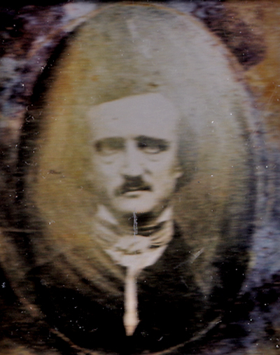
The Poe Show

poeLast week I went to the Morgan library to see the exhibit they put together on the writings of Edgar Allan Poe. The show is remarkably small and within it there are very few strong pieces.

They have only a couple examples of Poe’s writing. Given all the original letters and correspondence I’ve seen of his and have read much of what I’ve seen, I found this disturbing. They have several long original stories and poems (hand-printed rather small on long, narrow sheets of paper.) Perhaps he was trying to keep exact to the size of the would-be printed article.

They also displayed correspondence by other authors such as J. D. Salinger, Oscar Wilde, Charles Dickens and Elizabeth Barrett Browning. This all precedes an upcoming chat with Lou Reed who will talk about the upcoming biography, Terror of the Soul.

The cost of the one small room exhibit is pricey. I suggest you go for free on Friday evenings.

_________________________________

The Wind Rises Soon

I have watched the above trailer about two dozen times , now, and I can’t wait to see more. I’m scheduled with the Academy to see a screening this coming Thursday, and I’ve bee drooling all over my video screen. I also have my Droid set to play it on YouTube whenever I’m down.

It looks like the kind of animated feature that I am completely in love with. I see a “young love” story about something. On the surface, the story is obviously the bio of the architect of one of Japan’s famous airplanes. However, it’s obviously about the story of the troubles Japan witnesses with hurricanes, tremors, Tsunami and other natural disasters. While we focus on the nonsense going on in our Congress, Japan watches a nuclear holocaust in slow motion. It’s almost no wonder that Miyazaki wants to leave animation; there’s too much horror to avoid in real life.

This film is what Art is about, and it’s about real life. The film has a heavy story to tell, and it looks as beautiful as all of Miyazaki’s films. I don’t care about The Croods, Monster University or Despicable him, too. They are a waste of my time, especially when you compare it to such a film as this. And I haven’t seen it yet. But, do I have to?

_________________________________

Of Stars and Men

The MoMA will have a special screening of 3 Hubley films, including the Hubley’s first feature film, Of Stars and Men including a newly preserved and beautiul print. The program is listed as follows:

7:00 PM
Of Stars and Men

1964. USA. John Hubley. 53 min.

Urbanissimo
1967. USA. John Hubley. 6 min.

Eggs
1970. USA. John Hubley. 10 min.

Introduced by Emily Hubley, John Canemaker

Daily post 19 Oct 2013 03:44 am

Hubley & Julian samples

HellBent1In his book, When Magoo Flew, The Rise and Fall of an Animation Studio – UPA,writer, Adam Abraham details the story of a group of artists working together a new series of films. John Hubley wasn’t always happy though he was undoubtedly one of the leaders of the artists who came together from different sources. Many from Disney, some from the US Army Signal Corps, others from Chouinard Art Institute -a school supported by Walt Disney in his attempts to gain artists for the films he made in LA.

The stories behind the films were done wholly to advance the new art forms being discovered in Los Angeles. It was their notion that by breaking the rules of 19th Century Art animation could begin to come truly alive as an original.

Two of the artists were truly original in the approach, and when they started working together a curtain unveiled something new.

trtlootJohn Hubley was one of the bosses and one of of those who brought strength to the films he created. In the beginning he worked with the animator, However, he was bothereed by some of the color choices made others, particularly by BG artist artist Herb Klynn. Hubley was incensed at the ugly yellow/green that Mr. Klynn would incessantly choose. For this reason (among others) he brought in the gifted master painter Paul Julian to do the the background coloring. Hubley, himself, was a strong designer and a master painter. Who could question what he wanted to do with the department.

Once past a couple of near-sighted Fox and Crow films; Hubley wanted to do films about humans, not animals, and he eventually got his series featuring the near-sighted Mr. MaGoo. In the big picture, though, they were forced to follow many artistic constraints. Despite this, they two did a number of very successful shorts in changing the look and feel of animation globally.

The films done by both Hubley and Julia
Continue Reading »

« Previous PageNext Page »

eXTReMe Tracker
click for free hit counter

hit counter