commercial animation &Top Cel 06 Feb 2013 04:27 am

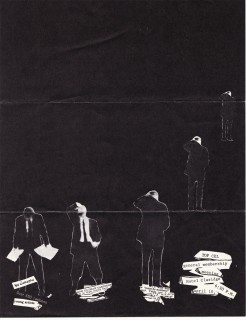
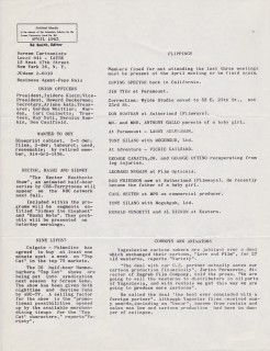
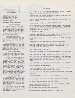
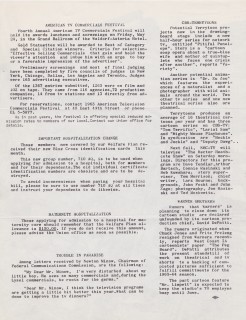
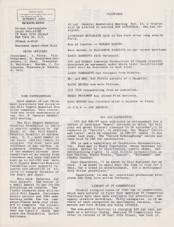
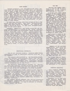
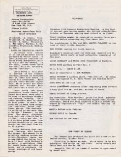
Top Cel – #3

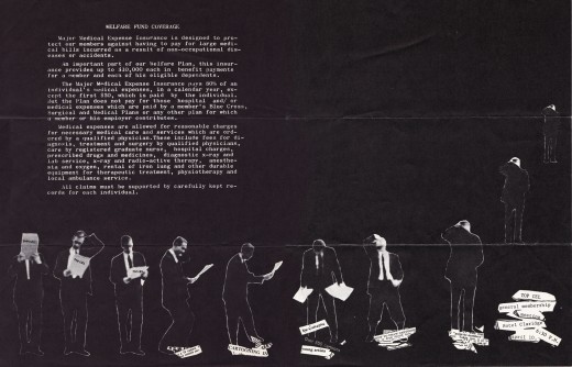
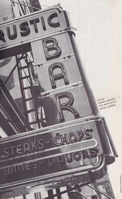
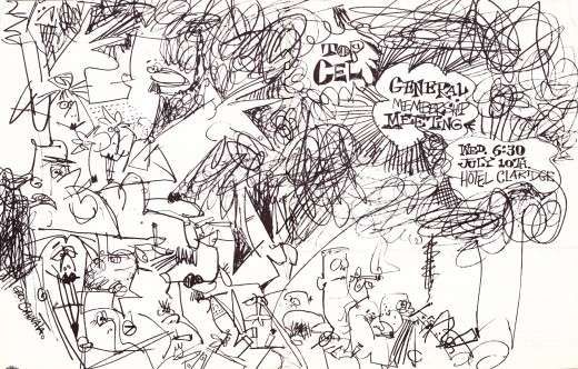
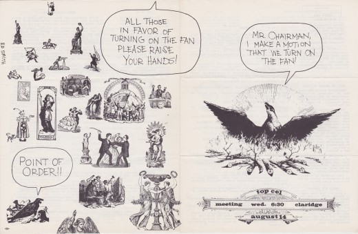
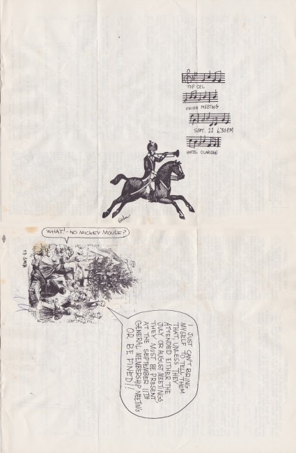
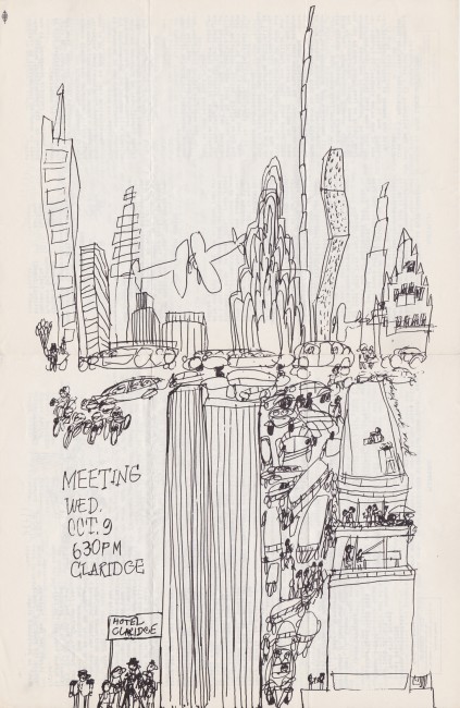
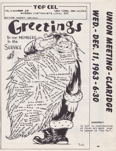
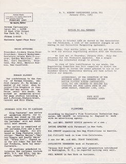
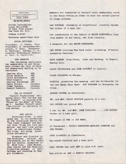
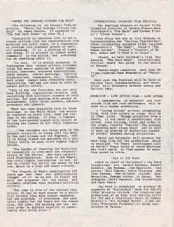
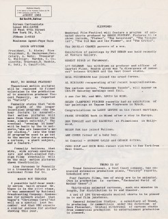
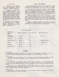
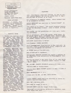
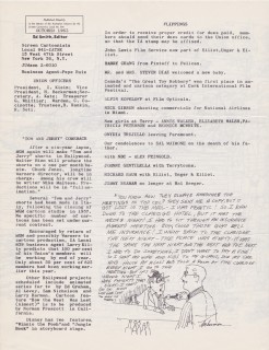
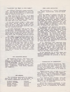
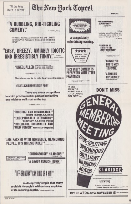
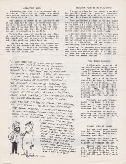
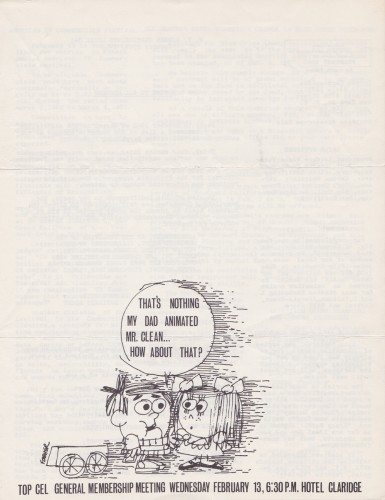
This is our third installment of Vince Cafarelli‘s collection of the Ed Smith edited issues of Top Cel the u-nion organ. Local 841 of the MPScreen Cartoonists had Pepe Ruiz as their Business Rep., Izzy Klein as the President and Howard Beckerman as VP.


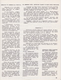
Feb 1963

2 3

4

5
Pages 1 & 4 wrap around 2&3
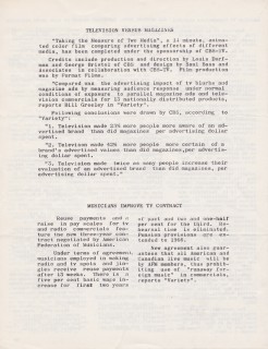
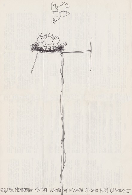
March 1963
Cover unsigned but it looks like Ed Smith drew it

67


Pages 1 & 4 wrap around 2&3
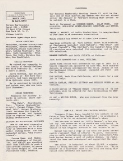
April 1963
Drawn by Ken Kimmelman

9 10

11

12
Pages 1 & 4 wrap around 2&3
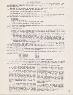
May 1963
Designed by Bill Feigenbaum & Karl Fischer

1314


Pages 1 & 4 wrap around 2&3
July 1963
Drawn by George Cannata

1617


Pages 1 & 4 wrap around 2&3
August 1963
Desiged by Ed Smith

1920


Pages 1 & 4 wrap around 2&3
September 1963
Desiged by Ed Smith & Karl Fischer

2223


Pages 1 & 4 wrap around 2&3
October 1963
Drawn by Gloria Graves Kougal

2526

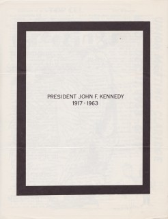
2829


This cover was probably the most famous Top Cel cover.
It was originally printed in two colors – red & black and
was 8½ x 14 in size. Ed Smith did justice to it in this reprint.

3132

33

Bill Peckmann &Comic Art 05 Feb 2013 08:29 am

Jack Davis – Cowboy

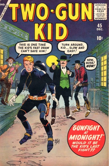
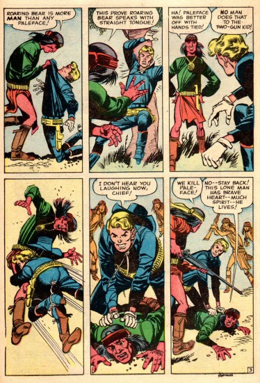
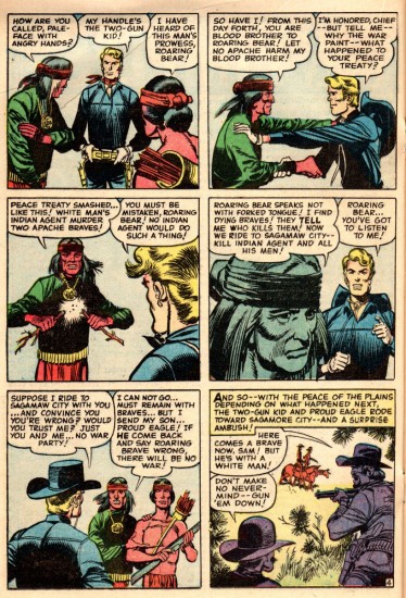
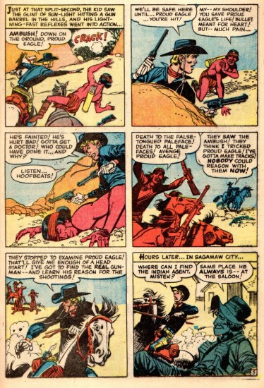
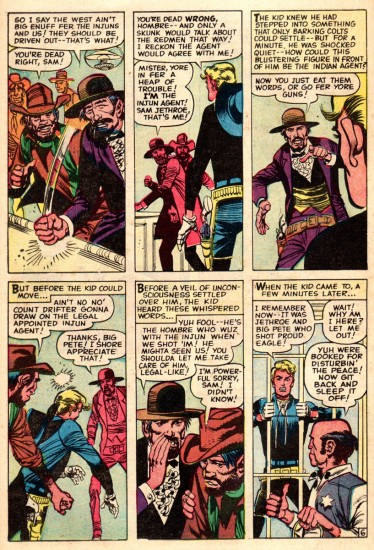
The Two Gun Kid, is illustrated by Jack Davis. It, of course was sent by Bill Peckmann. Here is some of the story behind it:

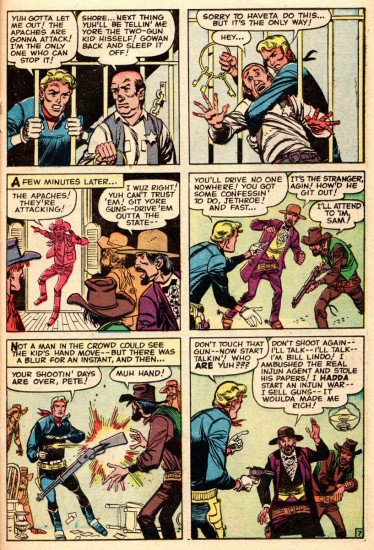
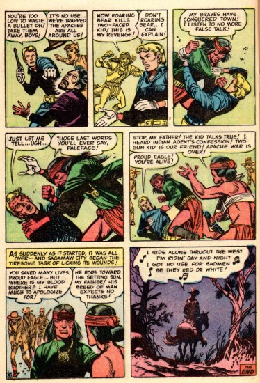
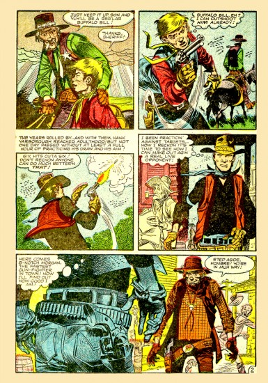
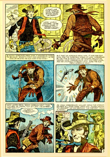
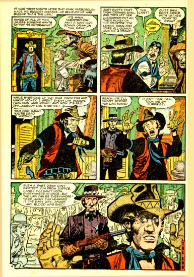
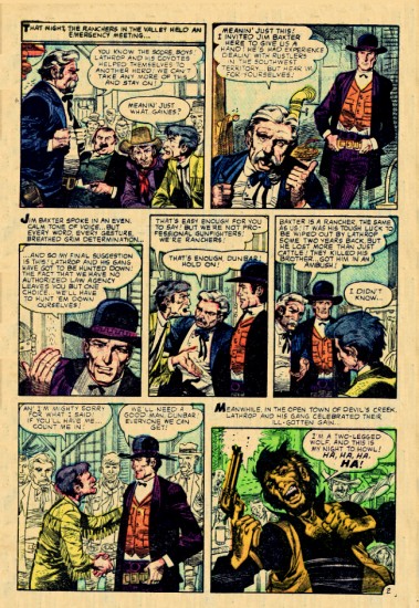
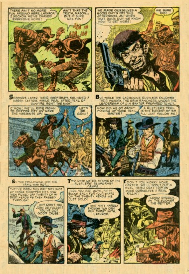
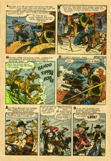
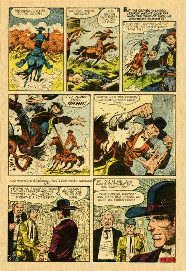
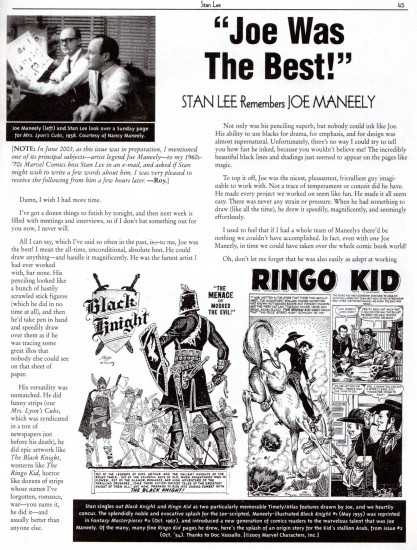
    A famed/named comic book team that is seldom heard of, is that of Stan Lee and Jack Davis. Short lived as it was, they did work together, Stan wrote and Jack did the art back in the late 1950′s. At that time, Stan Lee had quite a roster of western comic book titles, and when one of his most gifted, young cartoonists, Joe Maneely met a tragic and untimely death, he had Jack Davis step in and finish the job.

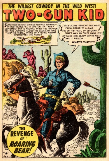
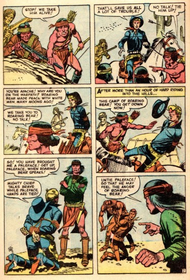
    Here is Jack Davis’ first “Two Gun Kid” cover, (he did three) along with the story from that issue that was started (first page splash panel) by the very talented Joe Maneely and completed by Jack.

    Because of the difference in page rates from Stan Lee’s company and Jack Davis’ more lucrative alma mater EC Comics, Jack had to be a little quicker on the drawing board, and it shows a wee bit. But, a faster Jack is still better than no Mr. Davis at all!


Magazine cover

2
(Joe Maneely’s opening page.)

3
(Jack Davis completing the story.)
4

5

6

7

8

9

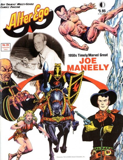
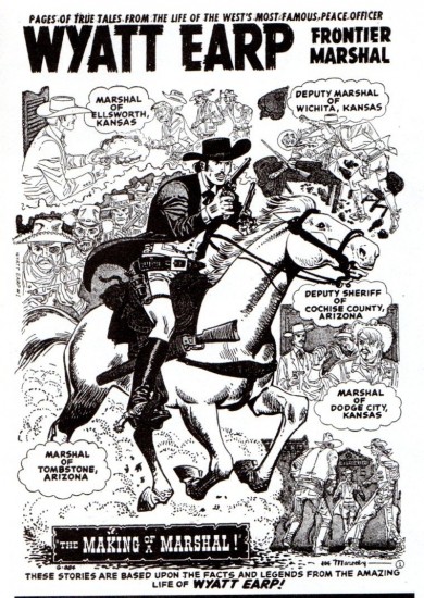
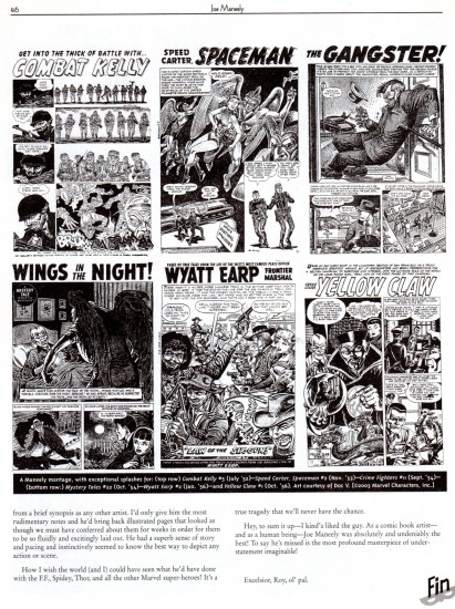
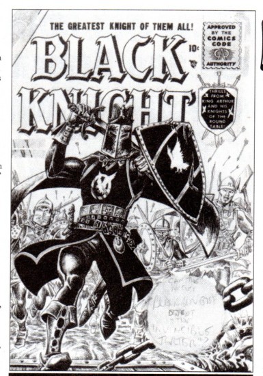
Having featured Joe Maneely, we thought it a good idea to give a few samples and background of his work:


The cover

1

2

3

4

5

6

7

Bill Peckmann writes about the following two stories also from the Stan Lee work:

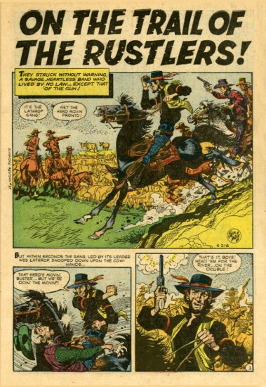
    Here are two of Jack’s Stan Lee western stories that Manuel sent me. Sorry, I don’t know the name of the comic book it came from.

1

2

3

4


And the followimg is the second story:

1

2

3

4

5

Disney 04 Feb 2013 07:14 am

The Story of Dogs

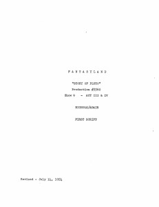
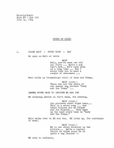
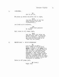
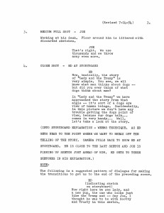
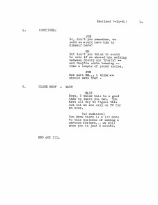
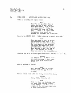
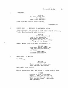
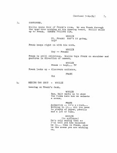
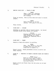
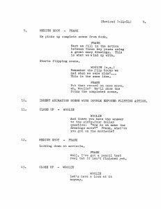
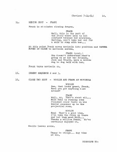
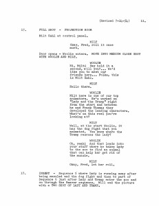
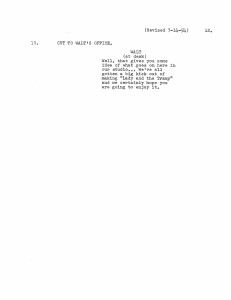
- A friend (who asked to remain anonymous) sent a copy of this script of “The Story of Pluto,” an early episode of the Disneyland TV show. This document obviously follows the show very closely, but I think a lot of the on screen dialogue is actually missing. Regardless, I thought it a good opportunity to go back to the show (which when it hit TV was called “The Story of Dogs.” (At least, the video on the Lady and the Tramp DVD, which has the same date listed is longer.)

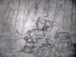
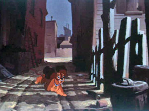
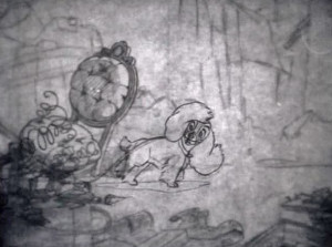
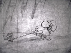
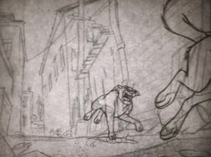
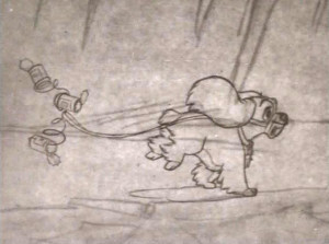
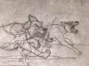
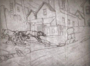
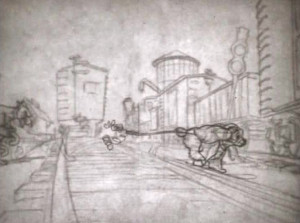
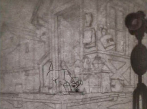
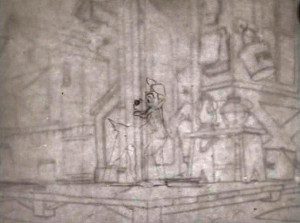
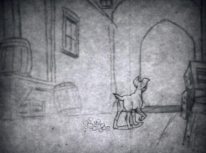
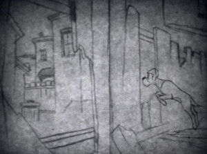
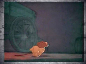
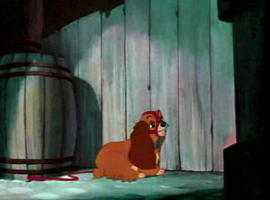
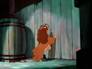
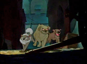
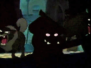
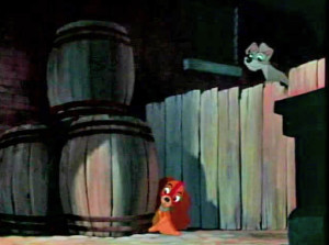
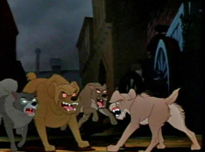
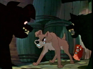
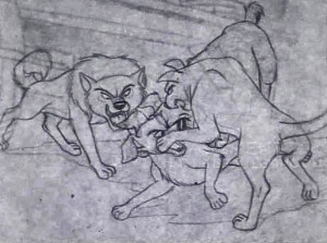
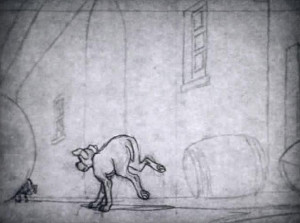
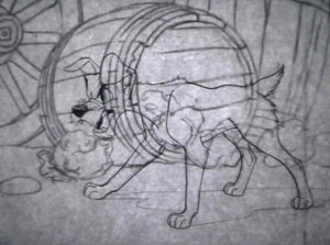
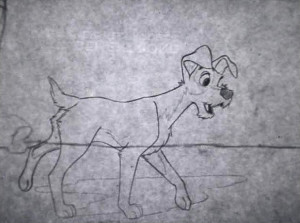
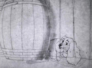
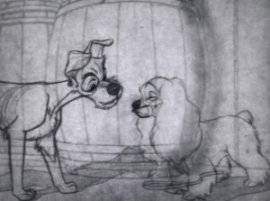
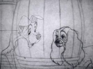
I’ll first post the “script” and then will follow with frame grabs from the TV program wherein Lady runs from some rough dogs who are chasing her, and Tramp comes to her rescue. The original show aired in B&W, but this version mixes B&W PT to color ruff-cut. It’s one of my favorite sections of the film with a lot of animation by Woolie Reitherman. (It comes on page 11 of the script.)

Here are the script pages:

LTScriptCov
Script Cover

LTScript11LTScript2 2

LTScript33LTScript44

LTScript55LTScript66

LTScript77LTScript88

LTScript99LTScript1010

LTScript1111LTScript1212

L&TChase1 1

L&TChase2 2

L&TChase3 3

L&TChase4 4

L&TChase5 5

L&TChase6 6

L&TChase7 7

L&TChase8 8

L&TChase9 9

L&TChase10 10

L&TChase11 11

L&TChase12 12

L&TChase13 13

L&TChase14 14

L&TChase15 15

L&TChase16 16

L&TChase17 17

L&TChase18 18

L&TChase19 19

L&TChase20 20

L&TChase21 21

L&TChase22 22

L&TChase23 23

L&TChase24 24

L&TChase25 25

L&TChase26 26

L&TChase27 27

L&TChase28 28

L&TChase29 29

L&TChase30 30

L&TChase31 31

L&TChase32 32

L&TChase33 33

L&TChase34 34

L&TChase35 35

L&TChase36 36

L&TChase37 37

L&TChase38 38

L&TChase39 39

L&TChase40 40

L&TChase41 41

L&TChase42 42

L&TChase43 43

L&TChase44 44

L&TChase45 45

L&TChase46 46

L&TChase47 47

L&TChase48 48

L&TChase49 49

L&TChase50 50

This sequence is followed immediately by Milt Kahl‘s sequence where Lady and the Tramp go to the zoo. They seek the help of the beaver to remove her muzzle.

Commentary 02 Feb 2013 02:42 am

Some things

He’s Alive!

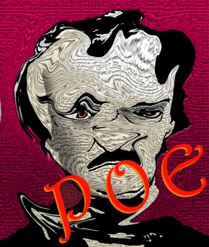
- I thought I’d make the small announcement to say that POE‘s alive. Having completed my presentation for HBO, I’ve put all energies back into completing the opening and trailer for my li’l feature. The brilliantly talented, Matt Clinton is back with us working on the sequence, and we hope to be able to go directly into production once that trailer is done.

We still have a couple of storyboards to work and another couple to rework. With that we’ll complete an animatic of the whole. It’s going to be a fun ride, and I’m glad to be back with Matt on board.

By the way, the artwork at top is sort of a new logo for the film.

______________________________

Splog’s Alive!

- For the past couple of days, I was playing with/fighting with/working with the enormously helpful Matt Clinton to get my Splog back. And then at 1am on Saturday, Hostgator became more of a host and less of a gator and they told me they made a mistake. The problem that was created was THEIR fault, not mine. They put things back together again, but I feel like Humpty Dumpty, sitting on the wall but knowing that my shell is cracked. I gotta get outta this place and find a new webhost.

Since lights were out most of yesterday, this post is going to sit tight through Sunday (though I’ll probably add some stuff to it). So because it hasn’t changed on Sunday doesn’t mean we’re down again. It feels good to be back.

______________________________

The Dick Williams Tribute

- As was noted on Cartoon Brew, this past week, there will be several programs at the downtown YTribeca celebrating some of the more famous work of Richard Williams.

On Wed, Feb 27th, at 7:30 pm there will be a screening of Who Framed Roger Rabbit. This marks the 25th anniversary of the ground breaking feature which took the combination of live action and animation to a new level. Tarring character actor, Bob Hoskins, the film features almost every character ever created for motion pictures, from Bugs Bunny to Mickey Mouse to Betty Boop.
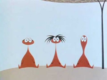
On Thurs, Feb 28th, celebrating the upcoming 80th Birthday of Richard Williams (March 19th), there will be a retrospective of some of Dick’s best short animated films, commercials and sequences. This program is called The Little Island and More. This will conclude with his first theatrical short, The Little Island (1958), which gained immediate success for the young animator. I was asked to host this program, and I couldn’t be prouder than to do so. I’ll also be excited to see some of the commercials on the big screen again. here are many beauties among thee, and, not yet knowing the list of films, I’m hoping some of my favorite gems are among them.

On Friday, Feb 29th, at 7:30 pm there will be a program featuring Persistence of Vision, Kevin Schreck’s documentary about the making of Williams’ long-in-production feature, The Cobbler and the Thief. This film will be followed by a Q&A between director, Schreck and Amid Amidi. I’m really looking forward to seeng this. Having not yet see the doc, I’m hoping some information will be revealed for me.

I felt very torn when Dick’s feature was ripped from him by the insurance bond company. I remember going to the reworked film they patched together to complete the movie. Tissa David and I sat side-by-side sinking into our seats as some of the most glorious animation ever done skipped by alongside some of the worst animation we’d seen. (The princess’ opening song is one of the most dreadful sequences ever done.) I will definitely be present for that showing.

I’ll, of course, write more about this before the event. For now, I would order tickets if I were you; it’ll probably sell out soon.
Go to 92y.org

Dates: Wed, Feb 27th, 7:30 pm, Thu, Feb 28, 7:30 pm, and Fri, Feb 28th, 7:30 pm

Venue: 92YTribeca Screening Room
Location: 92YTribeca, 200 Hudson St

Price: from $12.00

______________________________

Rocks In My Pockets – Kickstarter continues
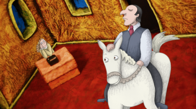
- “Rocks In My Pockets” is Signe Baumane’s feature in-production.
She’s mid-way through a Kickstarter campaign, raising money to finish the film. She needs help.

This week she sent out a mass email saying:
“We have only a limited time left, and we would love for you to join our efforts.”

If you would like to be the first to see the film when it is done, please pledge $10
and get a password protected link to the film.

If you would like to have a hand made animation drawing from “Rocks”,
you can pledge $75 and the drawing along with the password protected link is yours!

A rare treat – animation cells from “Dentist” – is on the rewards list, too.
Who is making films on cells anymore? This is an historic gift.

You could also be part of our small team in other ways:
- ‘LIKE’ “Rocks In My Pockets” Facebook page?

- Promote the link to our Kickstarter campaign to your Facebook friends

We are excited to welcome you to our small “Rocks” family!

THANK YOU!
Signe

PS if you are curious how other people feel about this project, please check out
the video testimonials of 15 test audience members we compiled into 3 minute video.

As I wrote in the past, I’ve seen a rough cut of the film, and I love what I’ve seen so far. The combination of 3D backgrounds with textured 2D animation works excellently well and is an inspired decision. The best part about this film is that it’s about something. It’s not just funny for the sake of being funny. I wholeheartedly support what she’s doing and recommend strongly that you look into it and support it in any way that you can.

To prove how much I like Signe’s work so far, I’m in one of her videos. Me and Bill Plympton. We were born just days apart, Bill and I, and now were just minutes apart in this video telling you how great we both think Signe is. Actually, I was prepared for the worst, and I don’t think I did too badly. Shifty eyes, but otherwise OK. This week, I’ll give you the link. Next week I’ll put the video on my blog.
Here’s the link.
the link.
the link.

______________________________

Hitler à la Glass
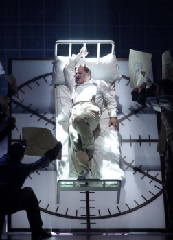
- The Perfect American is a Phillip Glass opera of the book by Peter Stephan Jungk which opened in Madrid this past week. It found its way to a review in the NYTimes by Zachary Woolfe. Many of Glass’ operas have been biographical sketches of some well known personality. This production doesn’t make it seem like there a Glass gem buried here. ‘s review includes many lines such as “a pleasure to listen to but dull as drama” which make one inclined to isten to the recording and skip the production which was, “Archetypal and specific, good and bad, Disney is, in other words, an ideal operatic character. But Mr. Jungk’s tight, strange novel has been transformed into a slack, mild pageant with an alluring soundtrack.”

“The opera is a score in search of a story. Dantine has gone from narrator to bit player; the tension between him and Disney, Old World and New, has vanished without being replaced by another drama. The book’s most ___ Time is running out for Walt Disney.
“striking set pieces . . . (Sounds like
some of the later animated features.)

“Dantine has sought out Disney’s family, friends, colleagues and acquaintances, from Salvador Dalí to Peter Ustinov, reconstructing a bizarre narrative of Disney’s illness and death.”

Let’s just say that even though I’m a fan of Phillip Glass’ work, I’m not going to rush to Europe to see this production (which is headed for London to open there.)

Mike Barrier has brought a lot of attention to the piece protecting the memory of Walt. Apparently the book includes a connection between Disney and Hitler just prior to WWII. It certainly never happened, but neither did a conversation between Disney and the audio-animatronic Lincoln that Disney built for the World’s Fair. There’s a lot of other fantasy in there, apparently, and I’ve come to expect such things of Mr. Glass in his operas.

By the way, no mention is made of Hitler in this review.

______________________________

Kahrs- In case you haven’t noticed it, John Kahrs, the director of Paperman – the Disney animated short which is among the five Oscar nominees this year – has a little piece published in today’s NYTimes.

They ask him for some of his likes and dislikes, (actually, it may only be his likes) and he shares them with us. This is one of those cute little pieces that money buys. Disney advertises so many dollars in the Times, and the Times pays off with so many pure puff pieces. It was my fortune to get some big time space back when Woman of the Year was on Broadway.The producer bought some ads, and my animation was as puff as they could go for the cover of the Weekend Section of the Times.

I somehow doubt that some of the poorer animators nominated this year, might get their likes or dislikes printed in the NY Times. Minkyu Lee and Timothy Reckart what favorite books are you reading these days?

______________________________
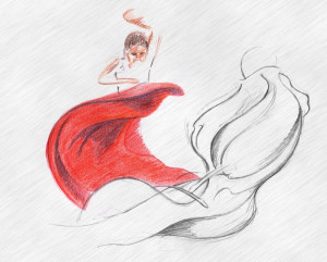
Aprecito

- The lincoln Center Gallery is hosting an exhibit of drawings by Spanish animator, Diego Agudo Pinilla. His short animated film, , premiered last Friday and will be shown again on Monday Feb. 04 at 8:30pm. His film is part of a program called Dance on Camera, program 1.

The gallery is on 25 Central Park West at 62nd Street
Gallery Hours
Friday February 1- Monday February 4
1:00pm – 8:00pm
Tuesday February 5
1:00pm -6:00pm

Take a look; it’s rare for animation art to go on display at Lincoln Center and usually worth catching when it does.
Disney &Frame Grabs 31 Jan 2013 06:35 am

Operation Wonderland Redux

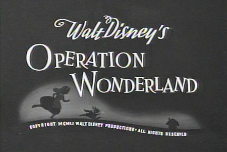
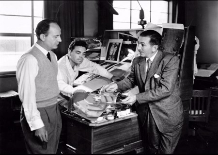
- On the DVD of Alice in Wonderland, there’s an extra little short that supposedly gives you a tour of the studio and a lesson in how animated films are made. (Do you think we’ll ever see one about Dreamworks or Pixar? I’d like to get a video tour of either studio.)

Since I’ve been focussing on Alice’s Milt Kahl scenes, I thought it’d be interesting, as an accompaniment, to post some frame grabs from this theatrical short that was done to promote Alice.

1
(Click any image to enlarge.)

2
Of course, the film has to start with Walt
riding a toy train around the studio.

3
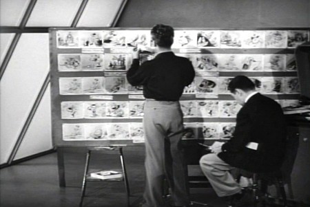
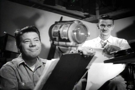
Two storyboard guys sitting in the middle of the studio.

4
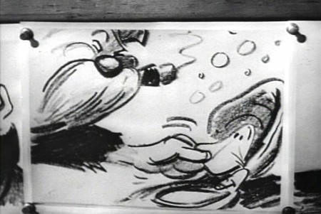
Storyboard: the walrus grabs a clam.

5
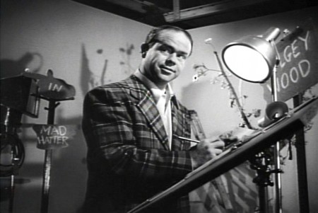
Ward Kimball in a funny jacket.

6-7
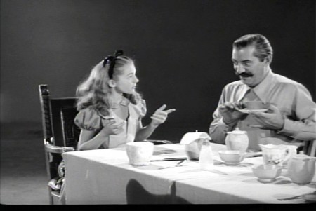
The actor posing as the Walrus for the camera.

8
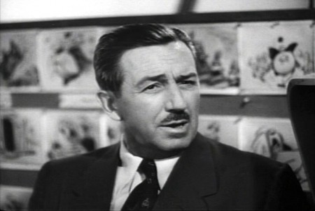
Walt in a funny pose.

9-10
The Walrus & Carpenter sequence.

12
Walt and Winston Hibler. Hibler eventually narrated
most of the Disneyland shows and True-Life adventures.

14
Flowers from storyboard to final film.

15
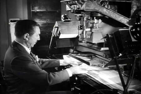
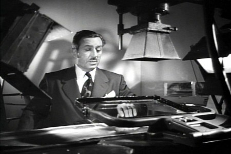
Walt gives a demo of the animation camera and
seems to be wrinkling the cels as he does this.

16
Walt operating an animation camera. Ludicrous.

17
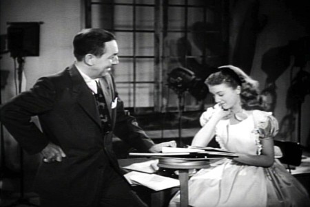
Walt and Kathryn Beaumont (who’s
supposed to be doing schoolwork.)

18
Kathryn Beaumont and Ed Wynn.

19
Les Clark.

20
John Lounsbery on the right. The other animator looks to be
Fred Moore. Older and heavier than we’ve seen him in the past.

21
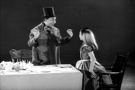
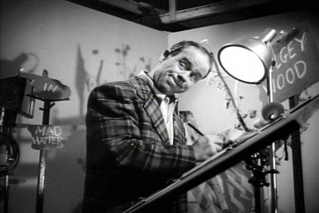
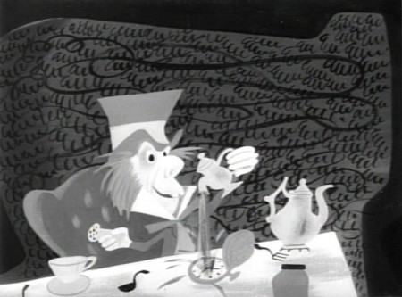
Ed Wynn as the Mad Hatter.

22
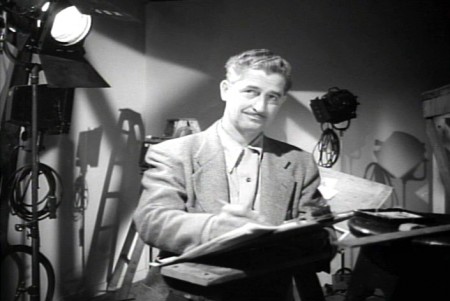
More of wacky Ward Kimball pretending to draw.

23
Kathryn Beaumont and Jerry Colonna.

25
Jerry Colonna leads us into pencil test of the scene.

27
This scene was animated by Ward kimball & Cliff Nordberg.

29

31

33

35

37

39

41

43

45

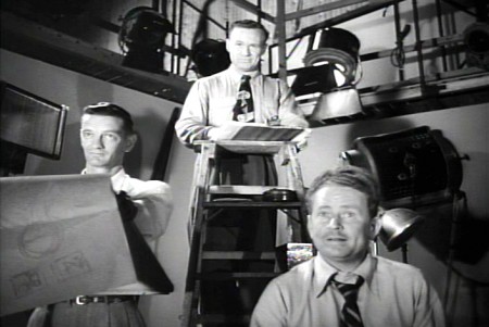
46
John Lounsbery is on the left.
I’m not sure who the other two are.

47
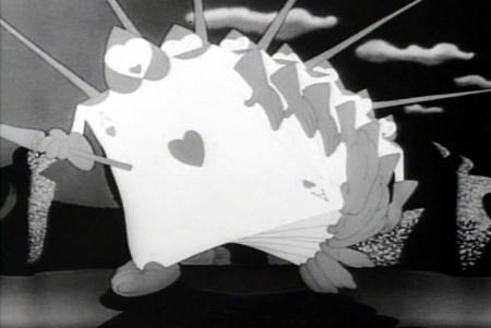
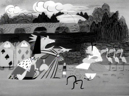
The cards in action in the film.

49
One of the highlights of the film is this dancer doing
march steps for the cards – to be studied.

50
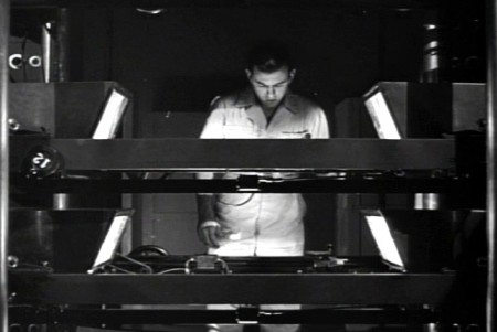
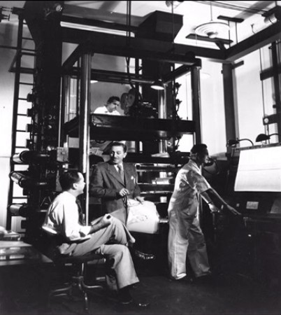
The multiplane camera in operation.

51
The cameraman at the top always looks a bit devilish.

52
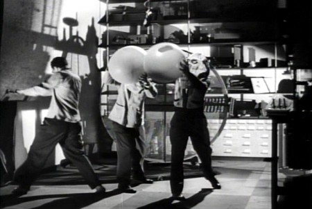
No “how animation is made” film would be complete
without the sound effects guys making a racket.

53
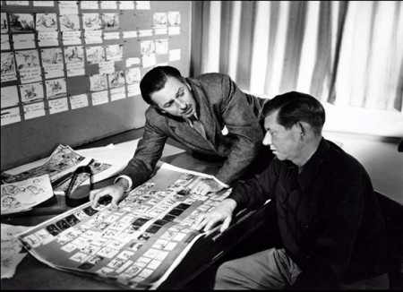
Walt and Wilfred Jackson.

54
Walt going over some artwork with
John Hench (L) and Claude Coats (center)
Thanks to Hans Bacher and Gunnar Andreassen for identifying them.

55
Before riding his toy train into the sunset, Walt sits
in front of his real toy, the multiplane camera.

If anyone can identify any of those I couldn’t, or if you think I’ve mistakenly identified anyone, please leave a comment.

There’s an art gallery of images, many of which are by Mary Blair (and I’ve already posted her pictures a while back.) I’ll finish this post with some more of the images on the dvd.

1
Mary Blair in B&W.

2
More of the same.

3

4
Thiis looks like it comes from HOPPITY GOES TO TOWN.

5
Lots of David Hall designs, here.

6

7

8

9

10

11

12
13
More Mary Blair.

14

To see more Mary Blair designs for Alice go here.

Animation &Animation Artifacts &Bill Peckmann &commercial animation &Illustration &Models &Story & Storyboards 30 Jan 2013 08:26 am

More Misc Commercial Art

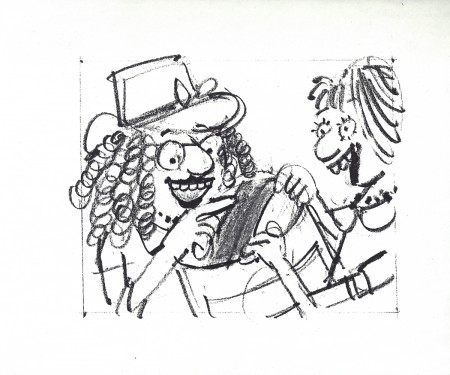
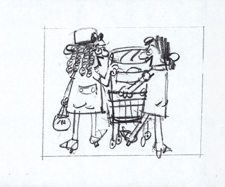
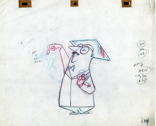
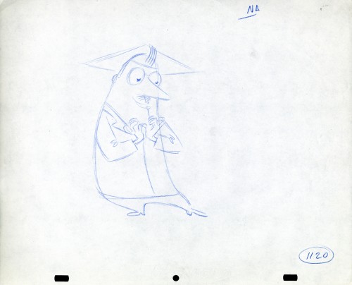
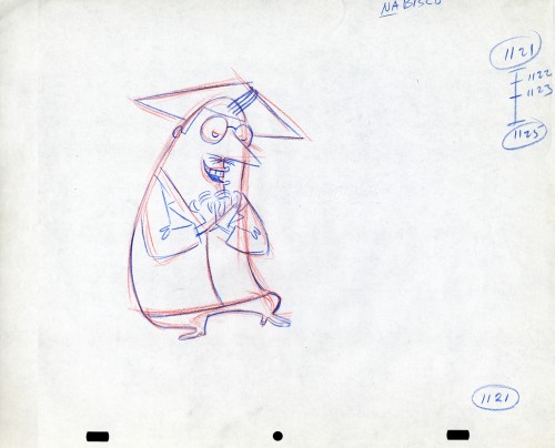
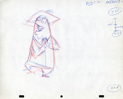
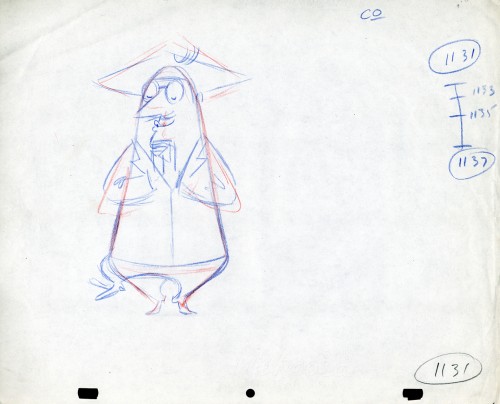
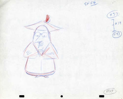
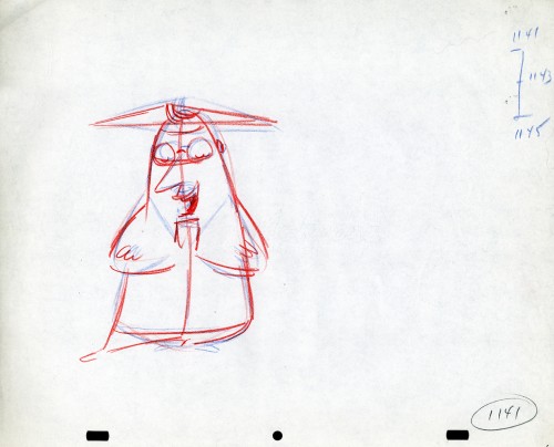
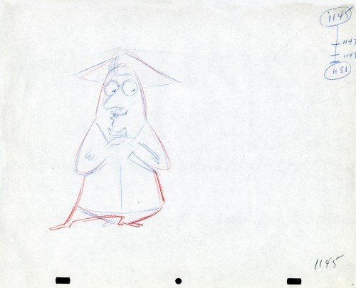
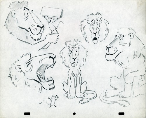
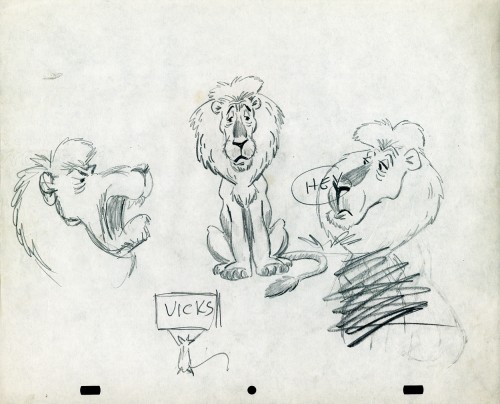
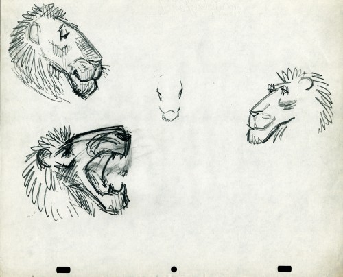
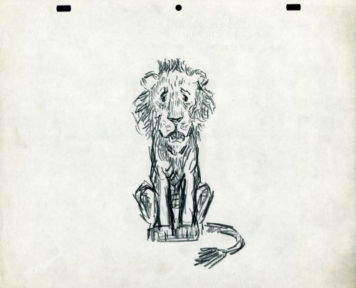
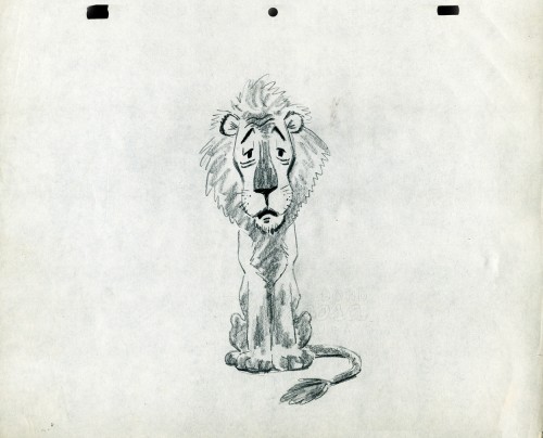
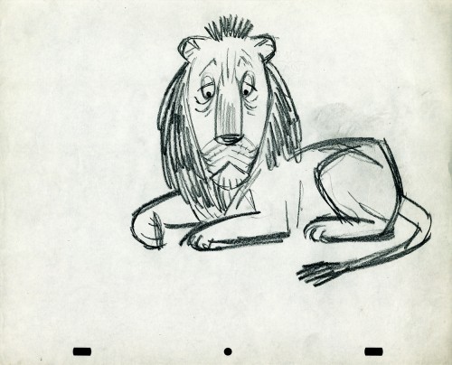
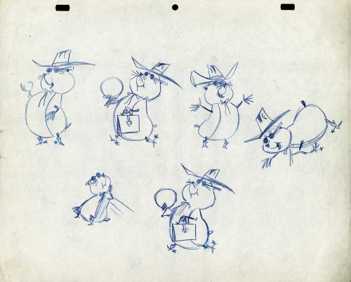
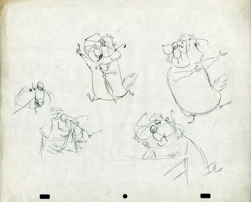
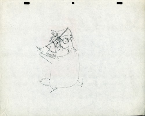
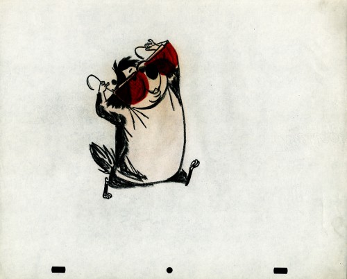
- Still left in the Vince Cafarelli collection of drawings from commercials he did, most probably, at Goulding-Elliott-Graham (for the moa part) are the drawings below. We know through some small bits and pieces of information what a couple of the sponsors were. (The wording of dialogue the professor speaks that the sponsor is Nabisco Shredded Wheat; the lion and the mouse ad is obviously for Vicks – drops or vap-o-rub.) However, too many other bits leave us empty handed. I can recognize cartoonist, Lou Myers‘ work anywhere, but no clue what they’re for. Candy Kugel and I were also able to delineate Lu Guarnier‘s drawing style (Vinnie was his assistant for years), and I know Jack Schnerk‘s great work. I recognize the brilliant and great hand of George Cannata from similar work that Bill Peckmann had recognized (see here) in a past post. So it is great to learn as much as we can, even though there’s a lot of guesswork in it.

The following are three storyboard drawings by cartoonist Lou Myers for some spot:

1

2
3


The following drawings are for Nabisco Shredded Wheat. They’re animation drawings/ruffs by Lu Guarnier. The delicate pencil lines of these years turned into dark rougher ones in his later years. The timing charts were always the same right out early wB years. You’ll notice a lot of quarters and thirds in the breakdowns. This is something you’d never see from Disney. There, everything is broken into halves and halves again and again.


1A

1B

1C

1D

1E

1F

1G

1H

- The following lion is designed and animated for a Vick’s commercial. (Note the second model sheet.) There were quite a few commercials during the period that reworked this great Aesop tale for the sponsor’s use. The lion obviously has a cold. Rather than pulling out the thorn, the mouse introduces him to Vicks’ cough drops and the lion feels a whole lot better.

What has been left behind of this ad includes a couple of model sheets of the lion as well as a couple of animation drawings. I don’t know who the designer is, but the animation drawings are most definitely the work of Jack Schnerk. I suspect all the drawings here are by Jack. He probably kept reworking the model sheet until he got the character in his hand. I can remember him lecturing me on the quality of my drawings. Unless my drawings became roughs, rather than tight clean ups, he was convinced I couldn’t get good animation in my pencil. Jack’s work was rough. and it became much more rough than this, certainly by the time I knew him and was assisting him. He also had a peculiar style of roughness; very choppy angular lines chiseling out the fine drawings. You can get a good example of that with drawing labeled “2D”.

The last four drawings are all animation drawings. “2D” is a rough, “2E” is a clean-up by Jack. The last drawing is a beauty and probably the final look he hit upon.


2A

2B

2C

2D

2E

2F

Here we have some drawings by a designer. I suspect that it’s the work of George Cannata. I did a couple of posts on a designer at Robert Lawrence Studio a few weeks back. Bill Peckmann identified the primary designer whose work screamed out to me. Since then, I’d recognize that line anywhere, and it’s most definitely below.

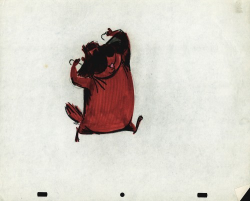
The Groundhog below is obviously a character with a southern drawl. The first step was to try the obvious making him a cowboy (“3A”). But that soon changed. and the character got plenty more sophisticated (“3B & C”). After that the line got juicy and the color got bold. There’s really so much to a character like this who just about animates himself.


3A

3B

3C

3D

3E

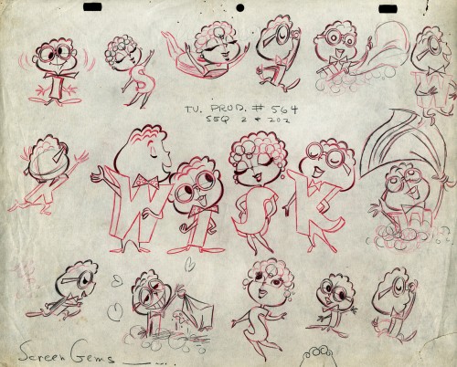
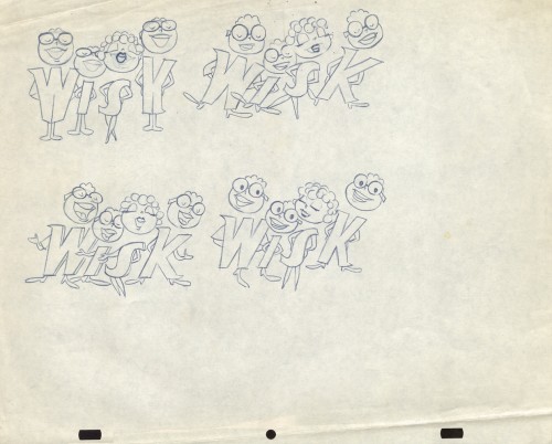
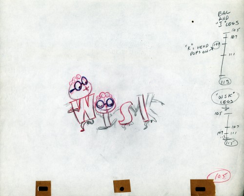
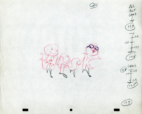
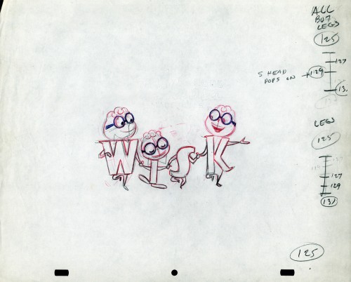
The following five drawings are for a WISK commercial. There are two model drawings and three animation ruffs. The primary model indicates that the spot is done for Screen Gems which was a viable studio in the early 60s and 70s. However, I don’t know who the animator was. Neither Lu Guarnier nor Jack Schnerk fill the bill.I know that Irv Dressler was at Screen gems for many years, but am not sure about this time especially since IMDB has him free lancing for King Features and other entertainment studios. The drawswing style of these animation drawings is right out of the Paramount/Terrytoons mold. Many animators’ work looked like these. People such as Johnny Gentilella, Marty Taras et alworked in a very similar style, though these are a little harder lines than either of those two.

A
This is the primary model for the entire family. It’s a
beautiful drawing, and the characters have a lot of play
in them despite being connected so obviously.
Just look at the father’s hair. Beautifully done

B
Here’s a secondary model. I suspect this is the animator
tracing off the characters and seeing what he can do with them.

C
Animation drawing #105. Those breakdown charts are something.

D

E

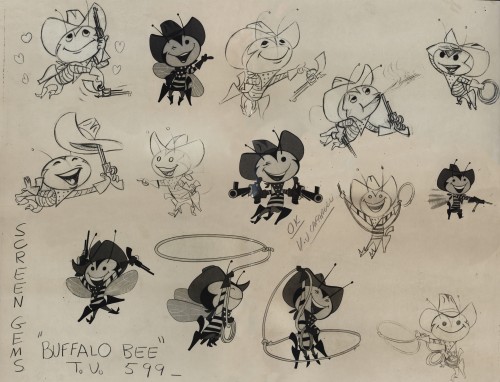
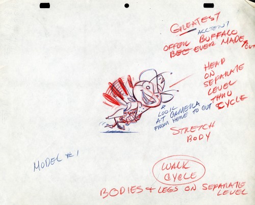
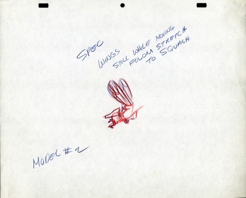
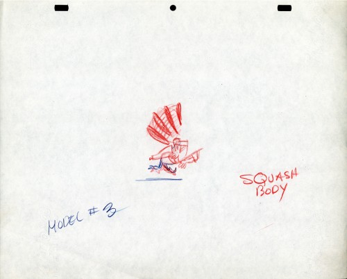
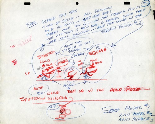
The Buffalo Bee for Honey Nut Oats is also a model sheet from Screen Gems. With it come an animation model sheet for the walk cycle of the character. These drawings look like Lu Guarnier’s to me, but there’s no official way I could confirm that, of course.


Model sheet

1

2

3

4

Daily post 29 Jan 2013 07:23 am

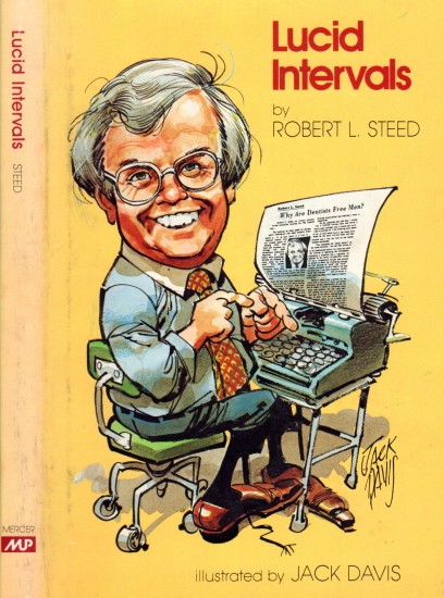
Lucid Intervals

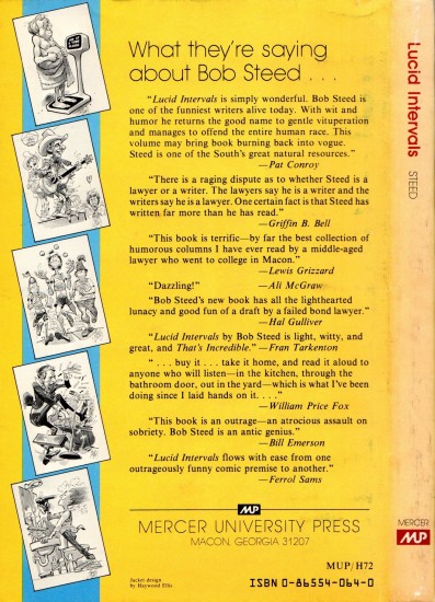
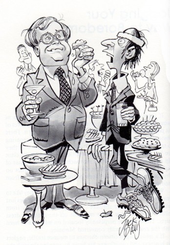
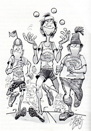
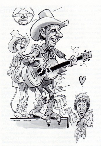
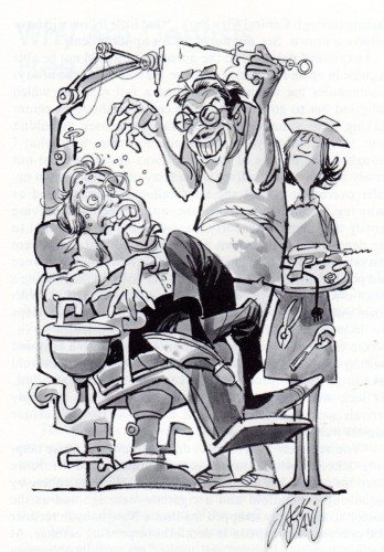
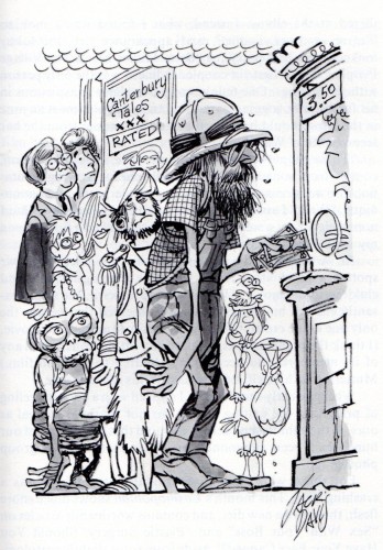
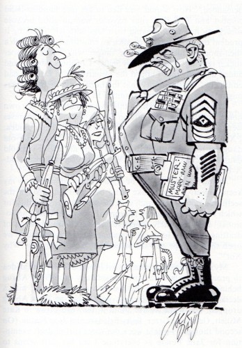
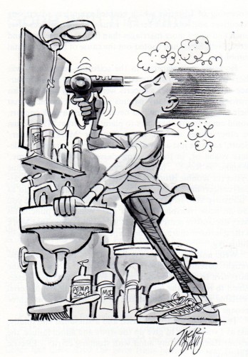
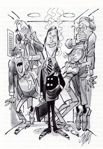
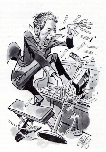
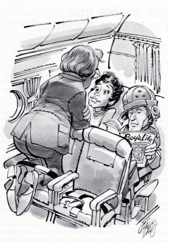
- Bill Peckmann sent me a number of pieces by Jack Davis. This post is composed of cartoons from the book he illustrated, Lucid Intervals.

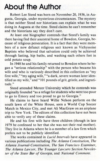
    In 1983 Jack illustrated a book titled “Lucid Intervals” by the author Robert L. Steed, a fellow Georgian. Because of collector/historian/publisher Manuel Auad, who fortunately for us also happens to be a big time, long time Davis fan, we get to see the fruition of Jack’s endeavor. Thank you Manuel! (We can only hope that one day publisher Mr. Auad will turn his sights on Jack and get the same results he got by zeroing in on illustrators Robert Fawcett and Albert Dorne!)

Here’s the cover.


Front cover


Back cover.


“Jogging Your Way to Boredom”


“Democracy on the Run”


“Ernest Tubb Lives!”


“Why Are Dentists Free Men?”


“Canterbury Tales (X-Rated)”


“The Female of the Species Caught in the Draft”


“Gone with the Wind”


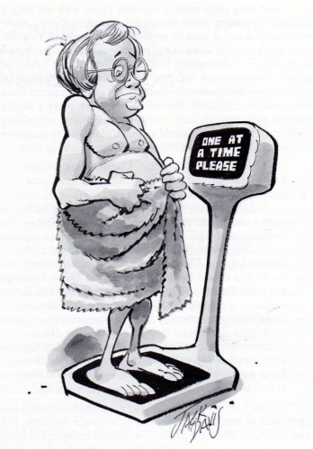
“Obese Abuse (or, Fat People need Love Too)”


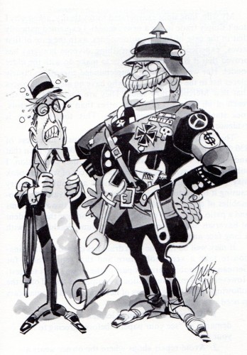
“Herr Gutwrench uber Alles”


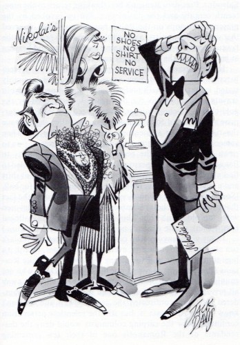
“Fit to Be Tied at Nikolai’s Roof”


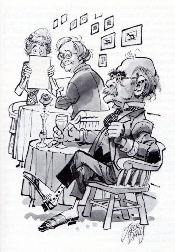
“Angst for the Memories”

(Bill’s note: One of the ruddy, bloomin’ best caricatures of Rudyard Kipling!)


“I’m O.K., You’re O.K., But He Smells Funny”


“Turning the Other Chic”

(Another great caricature, this time Jerry Lee lewis!)


“Yes, It’s Me and I’m in Love Again”

Frame Grabs &Layout & Design &Title sequences 28 Jan 2013 06:18 am

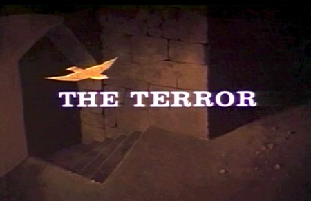
Paul Julian’s The Terror titles – redux

After posting the book, Piccoli, a week or so ago, I’ve grown more interest in Paul Julian‘s work. He’s known predominantly for the Bgs he did at Warner Bros and the art direction he did on The Tell Tale Heart. However, there’s more film work he did independently.

The Hangman was a short film he did with co-director Les Goldman. Maurice Ogden’s poem is read by Herschel Bernardi in a very earnest tone. The artwork by Julian absolutely saves this film which was nomainted for the Oscar.

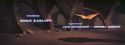
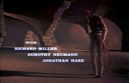
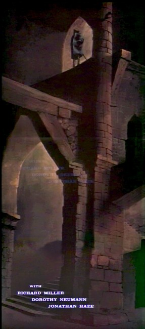
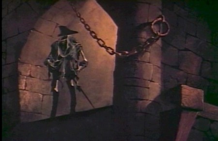
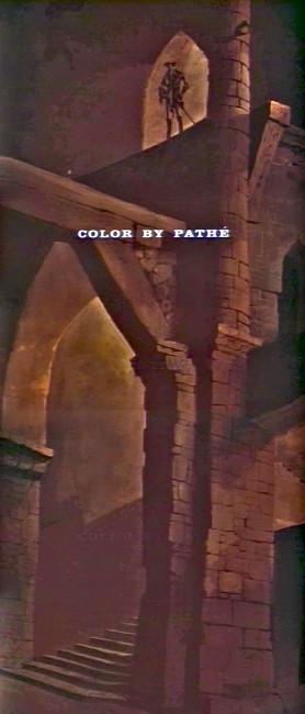
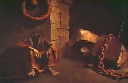
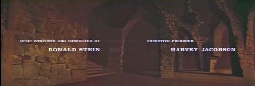
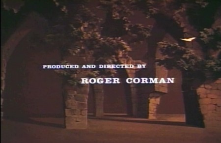
Roger Corman also used Paul Julian for a number of opening title sequences for the low budget films he did in the 60s. I’m going to try pulling some frame grabs from a number of these title sequences so that I can place some focus on Julian’s work in these forgotten films.

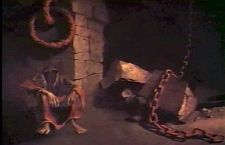
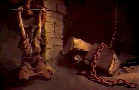
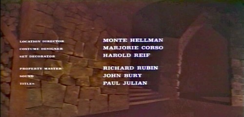
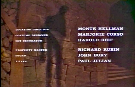
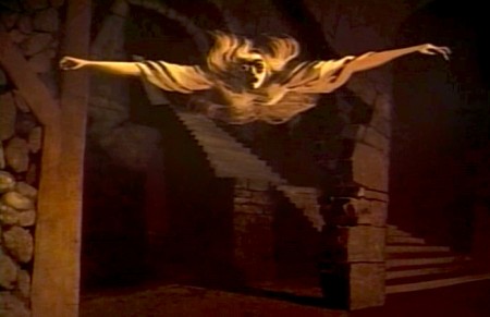
I start here with The Terror a film Starring Boris Karloff and Jack Nicholson. Julian uses a couple of pieces of artwork that he works over the course of the sequence with lots of lateral camera moves. Quite expressive work, though certainly not on a par with Tell Tale Heart.

1
(Click any image to enlarge.)

2

3

4

5

6
Starts at the bottom and pans up.

7

8

9
Monte Hellman directed Two Lane Blacktop.

10

11

12
13

14

15

You can watch a grayed-out version of this video on YouTube. The credits come on about a minute into it.

Daily post &Photos &Steve Fisher 27 Jan 2013 08:01 am

West Side Story

Steve Fisher sent me a reworking of West Side Story. Like the Broadway show, this photo essay doesn’t need words to let you know what’s going on. All I know is I can’t let my two boys see these pictures, or they’ll be furious.

Onto the pics:

1

2

3

4

5

6

7

8

9

10

11

12
13

14

15

16

17

.

Many thanks to Steve.

.

Animation &Books &Commentary 26 Jan 2013 08:53 am

George and Friends w/Books

- I admit it; I am getting older, and I have completely different thoughts on what animation is than most people half my age. I have no intention of apologizing for that, because that’s what I believe and cherish and enjoy.

This past week there was a program of animated work by George Griffin. He ran the show in achronological order starting with the most recent material and ending with the oldest. That show was animation. Everything in every frame (though there are no more frames) or bit of particle of George’s work and being is animation. He not only loves animation, but he is animation. It was a wonderful show to attend.

George enjoys showing the hardware and the techniques, the guts of the animated creature and the sprockets of the projector, if in fact there is a projector. His first “films” were bits and pieces live and animated. His very first piece was a filmic trick that Méliès and Blackton probably did in their first movies. George took the crumpled piece of paper in his hands and unfolded it to a crisp, new sheet of clean paper – he played the film backwards, of course, and with that, he started the show.

All of the films shown utilized such tricks and bits, punching and stabbing with animated games, study and punctuation. Even taking his film, Flying Fur, in which he originally took a great Scott Bradley score for an MGM cartoon and put his own visual accompaniment. Not leaving well enough alone he remade his own film with Flying Fur Fragments. This has George, himself, go into his basement and rummage through odds and ends and artwork from the original short and we see these pieces come to life in his hand with a reconstructed, rehashed version of the great Bradley score. Skips and hops, walks and chases are pulled from the original to accent the accents in the music . It’s just pure joy in early 21st Century seeing what feels like be bop animation to a wildly modern musical score written in 1944.

Speaking of be bop, George did just that when he animated a short homage to Charlie Parker in the film, Ko Ko. Taking a piece of music performed by ther great Parker in 1945, George visualizes every note and muscle of that great piece of music. The animator has found the heart of the music and given us all the fun in it with his very singular view of that score. This film’s a treat that can be watched over and over.

George shared a commercial he did in the style of Keith Haring, and though the animator apologized for the “bad animation” in the film, I didn’t see a bad bit in it. As a matter of fact I’ve seen about a half dozen Harings animated, and I can’t think of a better match for that graffiti artist than George and his own style.

The one film that was very representational was a film he did with his daughter, Nora. It’s a very sweet movie called A Little Routine. It’s a wonderful little piece that illustrates the daily routine with the father putting the daughter to bed. George uses lots of imagery in a semi-abstract way as something so simple as escorting his daughter from the bathroom to the bedroom involves trekking over countryside terrain bringing the little girl to the safe part of the woods where she will have no worries or fears. When she wakes in the night desperate for a glass of water, we hear daad shouting miles away that he’ll bring the water and we see him making that routine trip to the bedroom to protect his little girl. It all happens in a flash, of course, something that can be done so easily in animation. The film seemed to touch many in the audience that wanted the more representational world for the break of it, and they didn’t seem in any way disappointed when we were back to sterner stuff.

George Griffin understands animation; it’s in his lifeblood and he offers it to us an any way he can: flipbooks, mutoscope, dgital refilming of 16mm, movie files or purly digital sections. He feels that there is no need for the apparatus as long as we want to get out the animated bits.

The evening was an inspiration. Thank you, George.

___________________________

Some Children’s Books

- Some friends and past employee/friends have been busy writing and illustrating children’s books. I thought I’d show off three of them and write a few words about them. (If you can’t promote your friends’ work, who can you promote?)

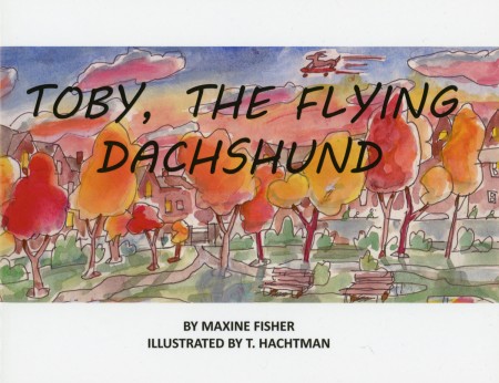
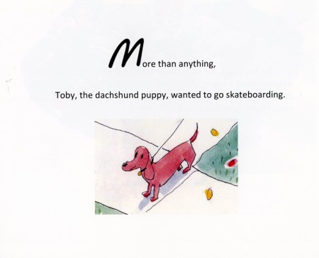
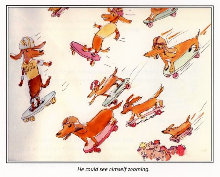
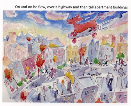
Three long-time very close friends have joined together to do a children’s book. Maxine Fisher has written most of my scripts (including POE) and she and Tom Hachtman put together a book about a dachshund. Max loves her pet, of course, and has now immortalized her in this book. Tom did the illustrations and Max’s brother, Steve (who does all those brilliant Sunday photos for me) put the book together and they self published on Lulu. That means you can buy it directly from Lulu, and I think it’s worth it. They’re still looking into Amazon, so maybe soon.

But I thought I’d post a few of the pics from the book and let you see how great it turned out. Tom wrote that he was finishing the last illustration as his yard (and eentually house) was being flooded by Hurricane Sandy.

Go to Lulu to find out more about the book.

Here are a couple of other sample pages.

1

2
3

___________________________

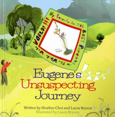
- Laura Bryson worked with me for years doing backgrounds for a number of the half hour shows (like The Red Shoes and The Marzipan Pig). Now she’s out freelancing and painting and has recently turned out her second children’s book which she co-authored and illustrated.

The book uses the Chinese Zodiac within the theme of the book offering Laura plenty of opportunity to paint nature and animals. The color palette is quite controlled as is the quiet story. The book can be found on Bestboypublishing.com.

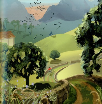
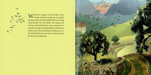
Here are a few other samples from the book:

1


Illustrations on every other page give plenty of opportunity
of using flat colors to set up the next page.

2

3
And, of course, Laura who loves her horses
makes sure to include one to illustrate.

___________________________

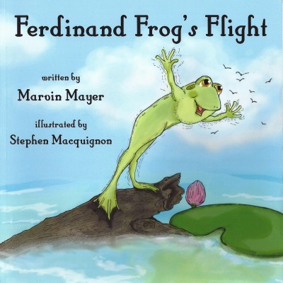
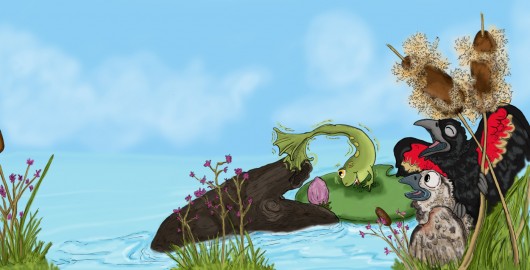
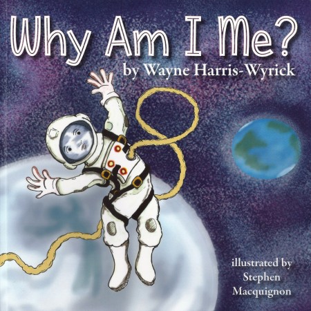
- Finally, we have Stephen Maquignon. Steve’s illustrated many books since he left animation, and each one gets more sophisticated than the last. I asked him to send me some art from a couple of books he wanted to highlight, and he did. I’ve chosen the following pieces from both books.

1

3
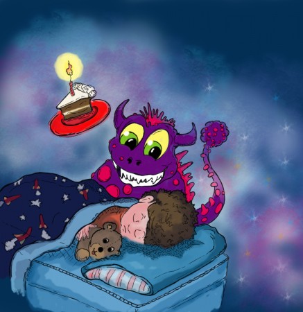
This second book, Why Am I Me? seems very clever. Steve wrote the following about the book:
When I read this one I could not see one main character in it, a big question, and
I thought it deserved many voices so each time the question why am i me pops up
I put in a different kid in a different situation.
Kind like the ride at Disney world “It’s a small world after all”

4

5

Stephen has a number of sites on which you can see more of his artwork and order copies of his books if you’d like to:

This is a link to his bio page on amazon it shows all the books he illustrated.

likewise Barnes & Noble

This is his primary personal site as a Children’s Book Illustrator

« Previous PageNext Page »

eXTReMe Tracker
click for free hit counter

hit counter