Commentary 16 Feb 2013 05:22 am

Coming

Bankrupt Pi

life_of_pi_8

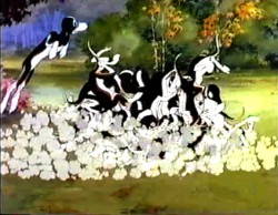
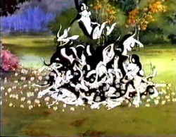
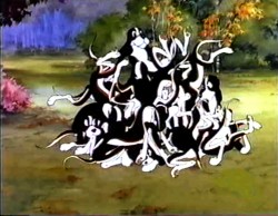
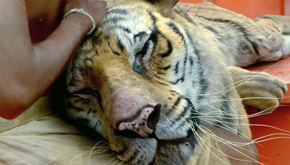
The Life of Pi has been winning awards left and right for the best special effects. They won the BAFTA (British Oscar equivalent) just last week. These effects were done by the Los Angeles based company Rhythm & Hues Studios a company which has come to specialize in creating photo realistic animals for films with such wonders as Babe, the animals in The Chronicles of Narnia as well as “Richard Parker,” the tiger in Pi.

On the Monday following receipt of their award, Rhythm and Hues called a meeting of the entire company to announce that all jobs were on notice. The company had to file for bankruptcy protection, which they did that same day. It was thought that they’d resolved their financial problems getting the Indian visual effects company, Prime Focus, to help them out. However, that deal fell through and the Chapter 11 went forward. There was limited cash on hand. and they were not able to meet their immediate payroll.

The company is scheduled to do quite a bit of work in the upcoming year with films such as The Hunger Games II, and Universal’s Percy Jackson among numerous others which are ready for effects work. 160 employees were already part of a lay off last week and their remaining employees had to be put on notice this week. At this point, there’s no other decision as to where they will go for cash flow.

Hopefully they will win the Oscar for Pi (they’re also nominated for Snow White And The Huntsman), and that will somehow help them financially. They definitely deserve the award.

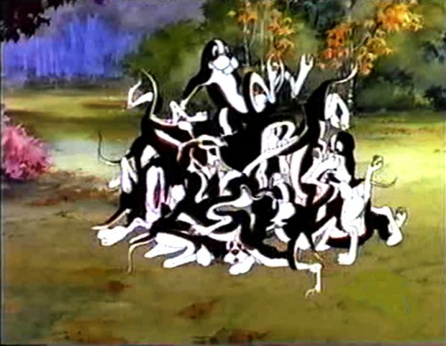
There’s a short EFFX film on the NYTimes site, worth a look. See the scene above come together from scratch.

______________________________

Dick’s Tribute

Wms flip

There will be something os a Richard Williams tribute this coming Wed., Thurs., and Friday. It’s in celebration of Dick’s 80th birthday on Wednesday. The programs will be shown at the downtown Y – Tribeca celebrating some of the more famous work of the master and culminating in a screening of the Kevin Schreck’s documentary, Persistence of Vision, about the making and undoing of The Cobbler and the Thief.

On Wed, Feb 27th, at 7:30 pm there will be a screening of Who Framed Roger Rabbit. This marks the 25th anniversary of the ground breaking feature which took the combination of live action and animation to a new level. Tarring character actor, Bob Hoskins, the film features almost every character ever created for motion pictures, from Bugs Bunny to Mickey Mouse to Betty Boop.

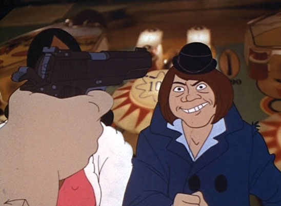
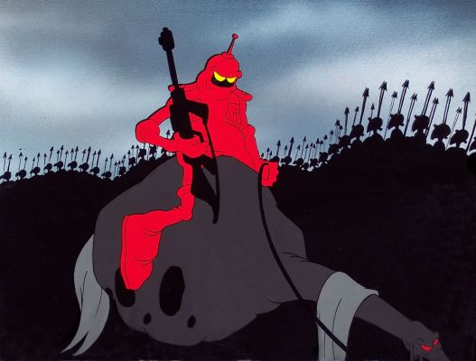
Wms villain

On Thurs, Feb 28th, celebrating the upcoming 80th Birthday of Richard Williams (March 19th), there will be a retrospective of some of Dick’s best commercials (including including Cresta Bear, Jovan, Pushkin Vodka and others), title sequences (“The Charge of the Light Brigade”; “The Return of the Pink Panther”; and “What’s New, Pussycat”) and the program concludes with Dick’s first theatrical short, The Little Island (1958). The short gained immediate success for the young animator and his studio.

I was asked to host this program, and I couldn’t be prouder than to do so. I’ll also be excited to see some of the commercials on the big screen again (particularly the Puskin Vodka spot). There are many beauties among these, and I’m hoping more of my favorite gems are among them.

On Friday, Feb 29th, at 7:30 pm there will be a program featuring Persistence of Vision, Kevin Schreck‘s documentary about the making of Williams’ long-in-production feature, The Cobbler and the Thief. This film will be followed by a Q&A between director, Schreck and Amid Amidi. I’m really looking forward to seeing this. Having not yet see the doc, I’m expect some information to be revealed for me.

This despite the fact that I’d watched the entire history of this film from my armchair.

Go to 92y.org

Dates: Wed, Feb 27th, 7:30 pm, Thu, Feb 28, 7:30 pm, and Fri, Feb 28th, 7:30 pm

Venue: 92YTribeca Screening Room
Location: 92YTribeca, 200 Hudson St

Price: from $12.00

_______________________

Sicko

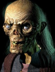
cryptMy appearance should be somewhat disarming to some of you. I recently had a dramatic bout with the flu and really suffered for a full two weeks with fevers, chills and less attractive ails. In the course of the flu, I lost a full 15 pounds (over th two weeks) and have also lost a lot of strength. Consequently, don’t be surprised by the Cryptkeeper hosting the Thursday event. The worst part is that my voice gives out easily, and I’ll be shouting in a whisper to host the program. It’s a sidebar of the event that should be entertaining for you.
_______________________

Bobby Driscoll’s Window

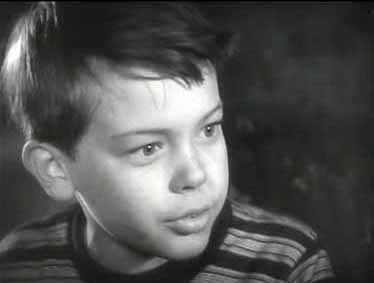
bobbyDriscollThis past week TCM aired a small little film called The Window. It was for this film that child actor, Bobby Driscoll, was awarded an Oscar as the Outstanding Juvenile of 1949. You’ll remember that Bobby Driscoll would then go under contract to Walt Disney, for whom he starred in Song of the South, So Dear to My Heart, Treasure Island and as the voice of Peter Pan.

The film was a curious little “B” movie that was about a boy who exaggerated once too often, and after witnessing an actual murder no one believes him. The film is cast in dark and looming shadows coming close to a film noir stylization. Bobby’s acting is very “A” movie as his dilemma keeps you spellbound for the entire 90 minutes. The father, Arthur Kennedy, is also excellent in the film.

Bobby Driscoll had an unfortunate end. He came into hard times as an adult and died in 1968 of hepatitis. His body was found by two children playing in Greenwich Village. He was buried in a pauper’s grave until his fingerprints were later identified.

_______________________

Credit

The New York Times, today, has an artricle about film titles. It suggests that film titles should also be honored by the Academy Awards. They decide that if there were a film to win the Oscar this year they would offer up some possible nominees.
Their suggested choices are:
- Jorge Calvo‘s titles for Red Lights, a thriller directed by his compatriot Rodrigo Cortés.
- The opening titles of Prometheus, the science fiction film directed by Ridley Scott. They don’t name the title designer or production company.
- The Chilean design group Smog for its work on the closing sequence of Joven y Alocada, directed by Marialy Rivas.
- Raleigh Stewart for Crave, a thriller directed by Charles de Lauzirika.
- The U.S. design group Prologue Films for its work on Ben Affleck’s political thriller Argo.

Personally, I love Life of Pi. They’re delightfully buoyant and openly playful titles that just wholly set the mood for the great movie to follow. These were designed by Garson Yu, founder/creative director of yU+co in Hollywood, California. I will follow his work in the future.

_______________________

Cartoon Research

Something’s happened over at Cartoon Brew, ant the two partners, Amid Amidi and Jerry Beck, have split. I’m sure most of you already know this by now. Jerry has set up a new “temporary” blog called Cartoon Research, and has just begun posting there. It’s obviously, at the moment, dedicated more to cartoon history, than Cartoon Brew. I’ve put the link i the sidebar of my Splog and will follow if it changes address.

Good luck to both guys. Their both good animation historians worth reading.
Bill Peckmann &Comic Art &Disney &Illustration 15 Feb 2013 05:18 am

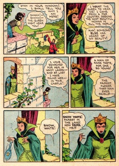
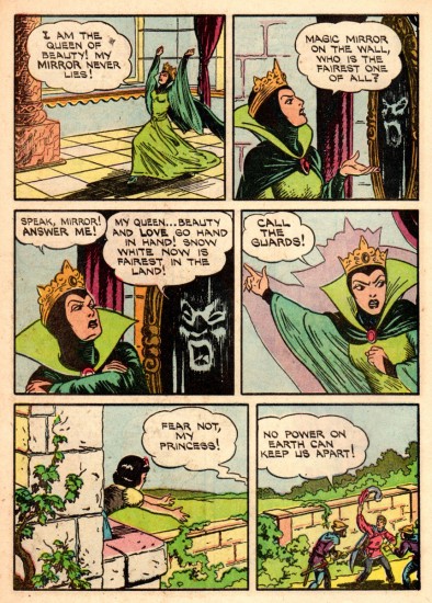
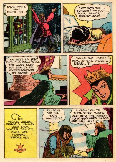
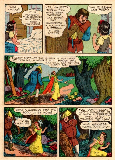
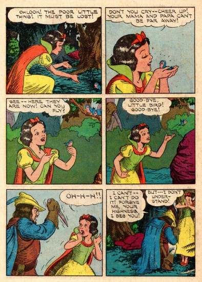
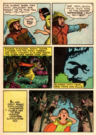
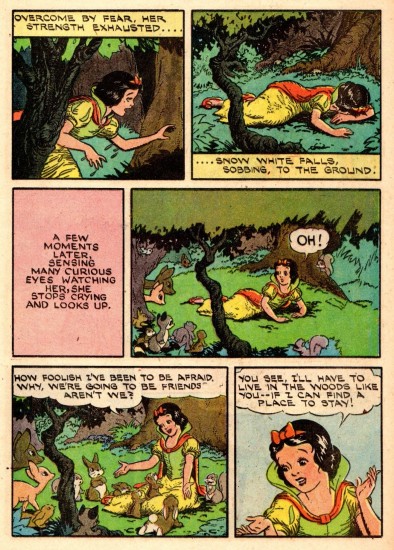
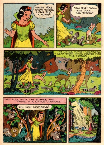
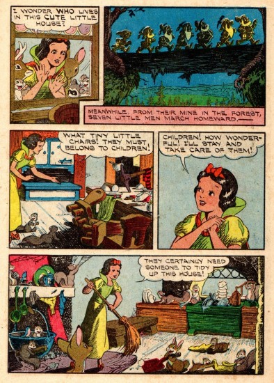
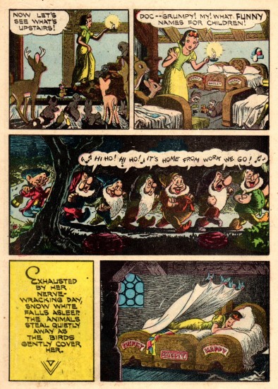
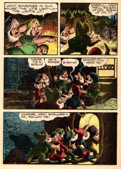
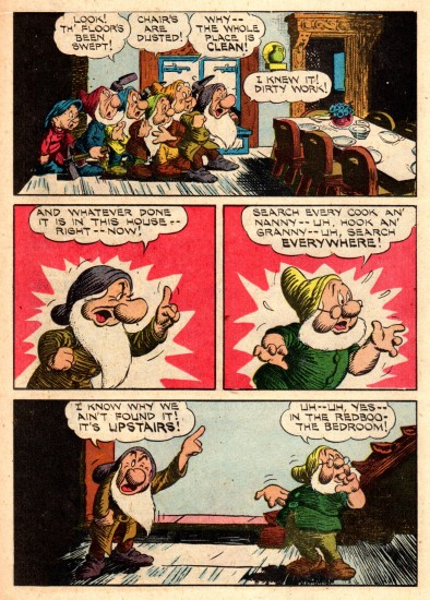
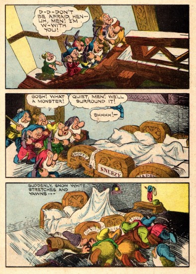
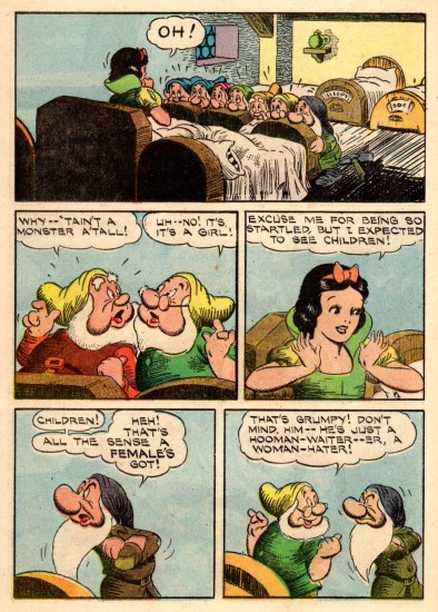
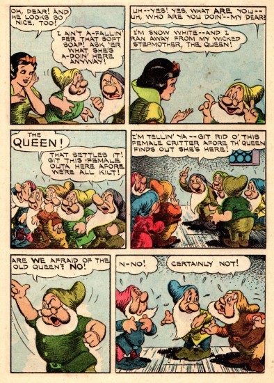
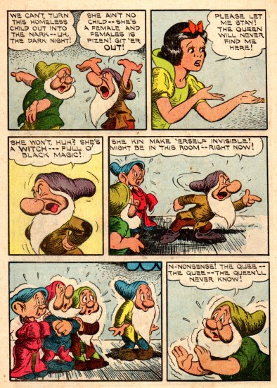
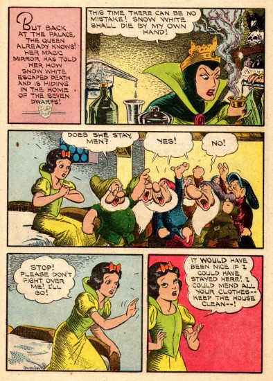
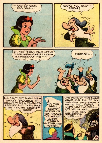
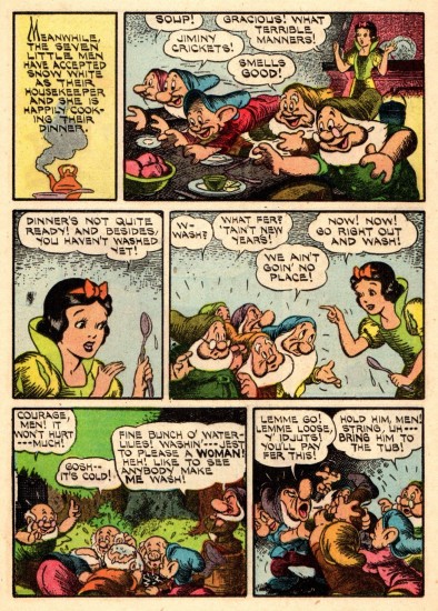
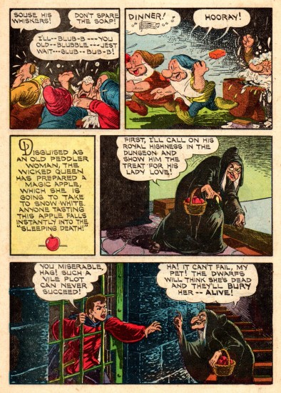
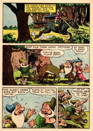
Snow White Comic – 1950

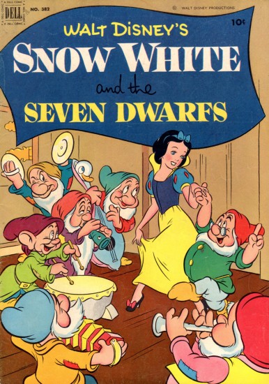
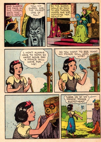
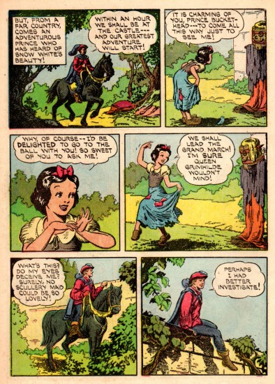
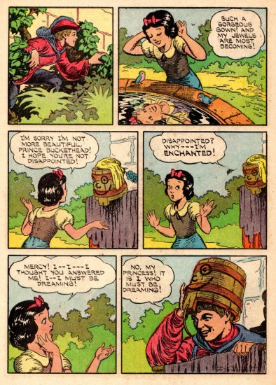
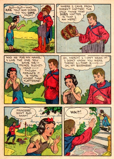
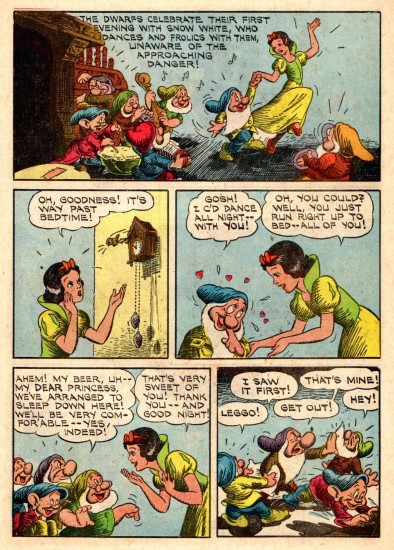
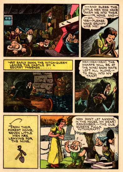
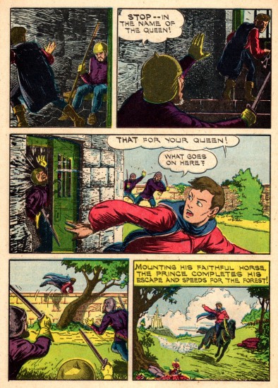
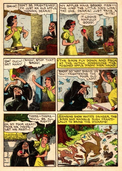
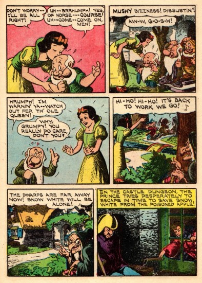
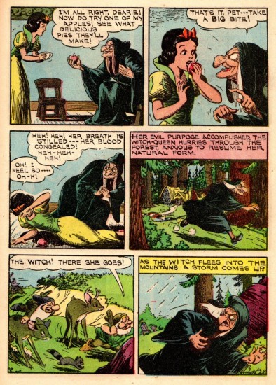
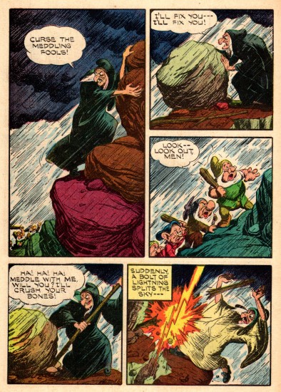
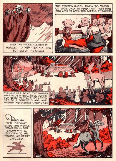
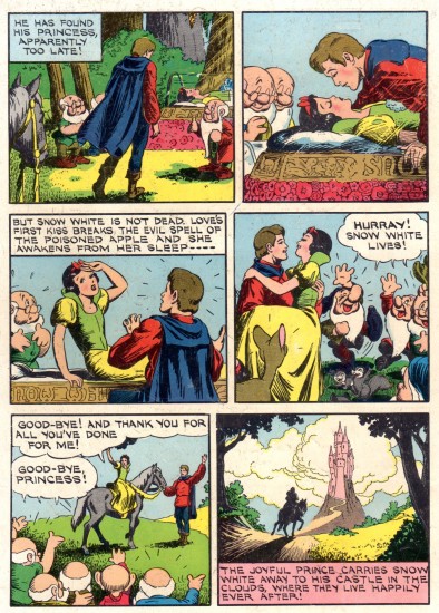
- With the re-release of Snow White, came an overhaul of the comic strip. The strip that had been syndicated in the newspaper in 1937, was now shoe-horned into a comic book version, with some modifications. This is that revised edition. Again many thanks to Mr. Bill Peckmann for having such an amazing archive and for sharing it with us. This is the note he sent along with it:

    Dell Comics’ early 1950′s ‘Snow White’ comic book. They took the original 1937 SW comic strip and cut it up to fit the comic book page format of the day. Seeing the book now only shows how good those original strip layouts were. This adaptation was first done 1944, that comic book had a Walt Kelly cover and was colored differently. I believe since then it’s been used for reprinting many, many times.

I’d posted that original 1937 version last week here.


The brand new cover with artwork
by Walt Kelly.

1
Inside Front Cover

2

3

4

5

6

7

8

9

10

11

12

13

14
The cheap printing on the newsprint
adds something to this version.

15
The cross hatching stands out and brings out
the expressionist feel of the original artwork.

16
That’s a great looking piece of art.

17

18

19

20

21

22

23

24

25

26

27

28

29

30

31

32

33

34
Inside Back Cover

35
Back Cover

Commentary &Disney &Layout & Design &Models 14 Feb 2013 05:47 am

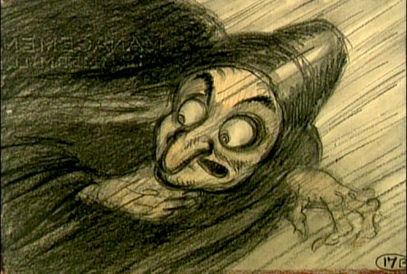
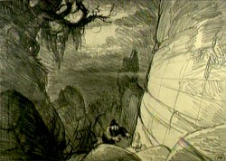
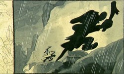
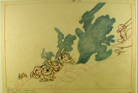
Witch – redux

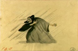
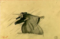
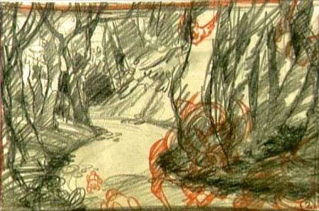
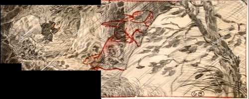
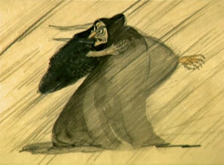
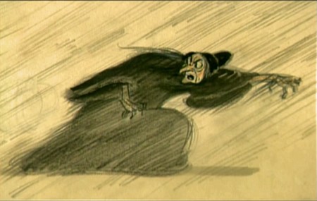
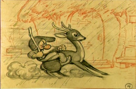
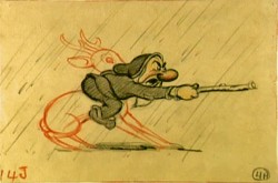
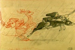
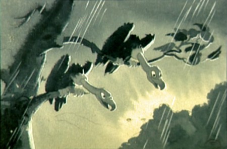
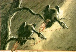
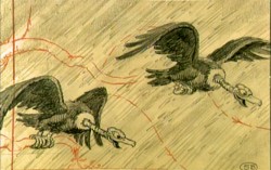
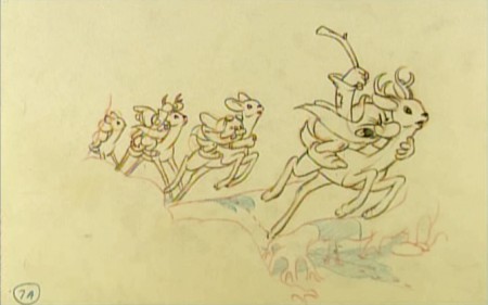
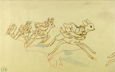
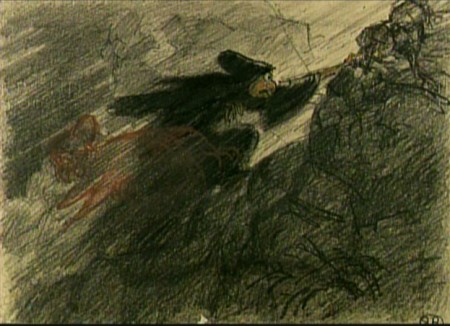
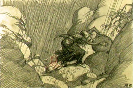
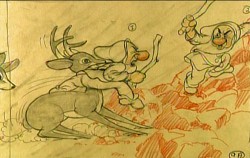
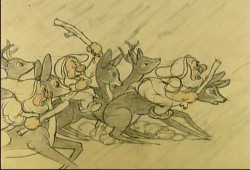
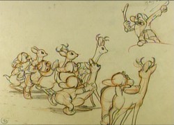
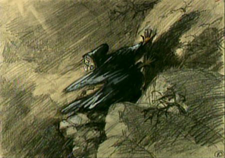
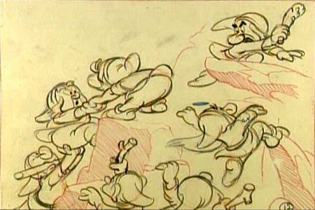
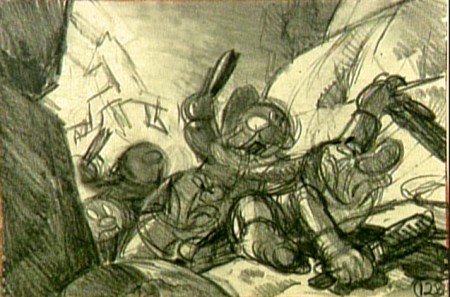
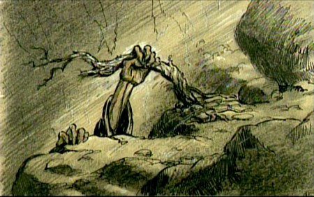
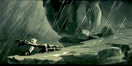
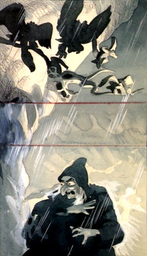
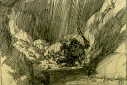
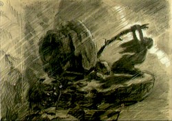
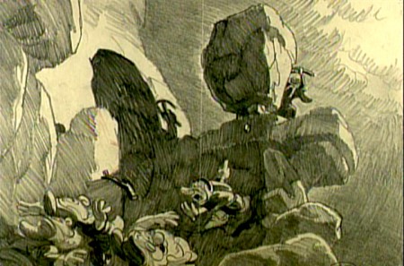
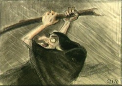
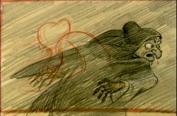
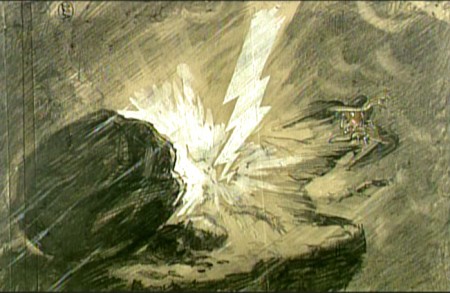
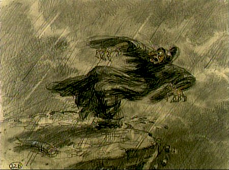
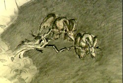
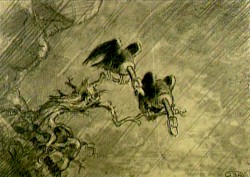
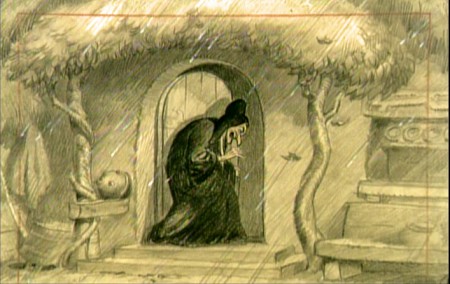
- It’s not always easy to kill a witch. This sequence from Snow White couldn’t be designed better. It’s short, it’s tense, it’s a tight sequence that handily does its job. The witch is killed in record time. Today, the sequence would be dragged out for half the length of the film.

Some of these drawings are great.

1
(Click any image to enlarge.)

2 3

4

5

6

7

8

9 10

11

1213

14

15

16

17

1819

2021

22

23

24

25

2627

28

29

30

3132

33

3435

36

3738

39

40

4142

43

44

45

Daily post 13 Feb 2013 06:33 am

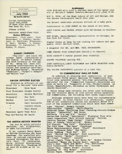
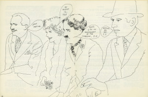
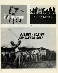
Top Cel – 4

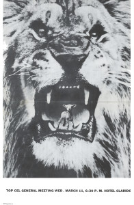
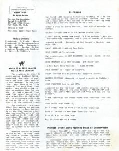
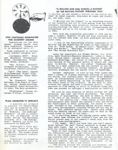
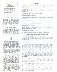
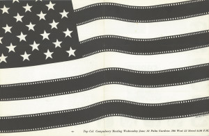
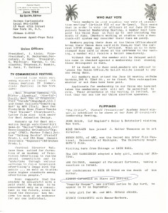
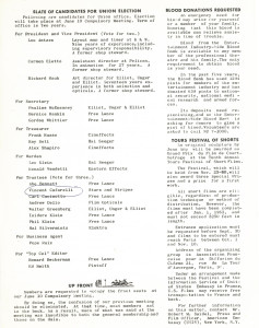
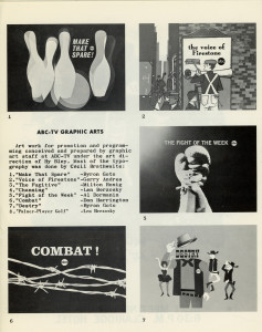
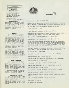
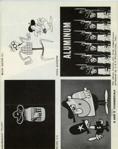
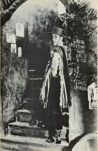
- Dabbing back into the folder of Top Cel issues, I’m posting the next year’s worth (minus a month or two). Vince Cafarelli saved these issues from the period in which Ed Smith edited the newsletter. I’m glad he held onto them; there’s a lot to be learned and some great drawings from some very good artists.

LongFeb
February 1964
Drawing by George Cannata

2-222-33

TallMarch
March 1964
Designed by Bill Feigenbaum

3-223-33

4-224-33

TallMay
May 1964
Designed by Karl Fischer

5-225-33

LongJune
June 1964
Designed by BillFeigenbaum

6-336-44

6-55

7-1

7-227-33

LongAug
August 1964
Unk Illustrated “C.C.” ?

7-447-55

7-66

8-11

8-228-33

TallOct
October 1964
Designed by Ken Kimmelman & Howard Basis

10=2210-33

TallNov
November 1964
Drawing by Karl Fischer

11-2211-33

11-4411-55

TallDec
Dec 1964
Designed by ?

12-2212-33

LongJune3

L6-16 6.1-6

Animation &Animation Artifacts &Commentary &Layout & Design 12 Feb 2013 07:16 am

MGM Hounds – redux

- Cable TV has changed and not for the better, just toward the more corporate. In the old days you could turn on the Disney channel and catch some Disney animated shorts – the classic kind, not the Flash kind. You could see some of the 60s Paramount cartoons on Nickelodeon. You could tune into TNT and see early MGM cartoons. Today, if you’re lucky, you might see one of the more popular Harman-Ising shorts sandwiched in between two late-Droopy cartoons on Boomerang’s MGM show.


(Click any image to enlarge.)

I was a big fan of those Harman-Ising MGM cartoons. The sheer opulence of the productions was staggering to watch. For over a year, I taped an early morning program on TNT trying to grab all of the Harman-Ising shorts they aired. I was able to capture about 90% of them. It’s unfortunate that no DVD has been released of these gems so that collectors like me can feel satisfied. The Turner transfers were pretty good, and a simple DVD release of these would be worth a lot to me.

Not too long ago, I was able to buy a couple of drawings on ebay from the Harman-Ising shorts. There wasn’t much competition for them, and I was able to afford them.

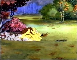
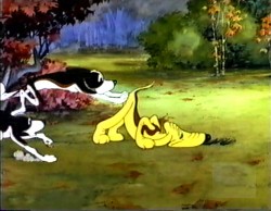
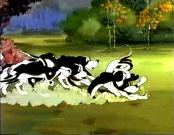
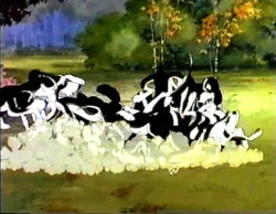
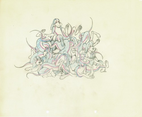
One drawing is from the odd series featuring the “two curious pups.” I had an old Blackhawk 8mm copy of this short (in an edited version) and would run it back and forth still frame. I’ve captured some stills of this very scene to give you an idea of what’s happening.

The Pups’ Picnic (1936)


I don’t know who animated this scene,
but the drawing is a beauty, as far as I’m concerned.
The paper siize is 9¾ x 12 w/two round holes.

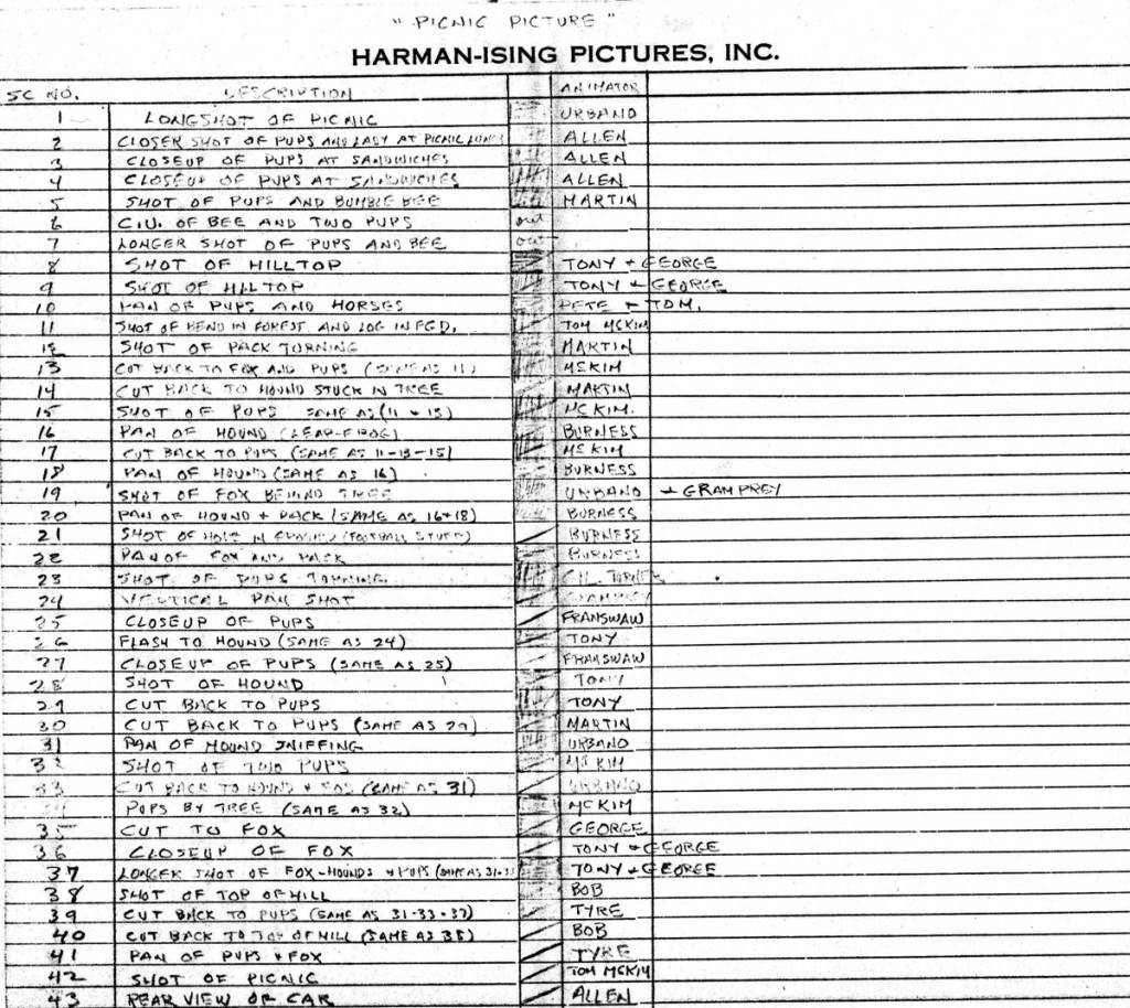
Mike Barrier just contributed the draft (below) to this film. It indicates that Pete Burness animated this scene. (I did buy the drawing from the Burness estate.)


PupsPicnicDraftsm

Daily post 11 Feb 2013 07:07 am

Snow White à Trois

SMMirror
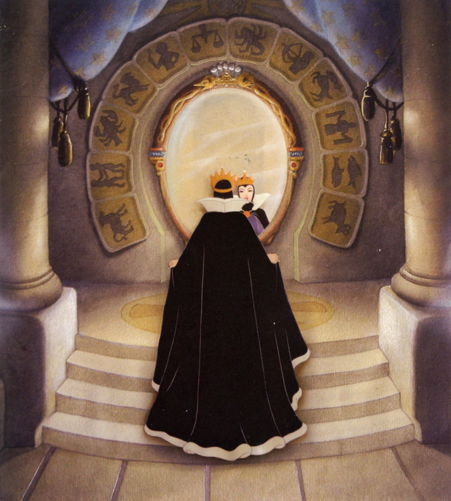
The Queen stand in front of her mirror.
The mirrpr is circled with signs of the zodiac.

- At Christmas I found myself the owner of two enormous and excellent books, both by author J. B. Kaufman. Both were extensive studies of Snow White and the 7 Dwarfs.

Snow White and the Seven Dwarfs: The Art and Creation of Walt Disney’s Classic Animated Film is a beautiful book that almost acts like a guide to the gallery showing of art at the Walt Disney Museum. Page after page reveals more and more beautiful art. The writing is strong and pointed and occupies far less space than the images.

The Fairest One of All: The Making of Walt Disney’s Snow White and the Seven Dwarfs is the second of the books, and it is the larger and more detailed in the writing. The writing is deeper and richer, the research revealed is far more detailed, and the story of the making of the film is certainly strong. The images in the book are at least as beautiful as the first book (there are several I love in this second book that do not appear in the first book.

There are so many pictures here, that I find it quite amazing that so few images appear in both books, simultaneously. It makes you feel the value of both since here is such a focus on the images. As I said, the first book feels somewhat like a guide with short bits of history doled out among the artwork. The second goes into enormous depth following the production of the film by sequence number one after the other. As such it feels as though the film was constructed this way, scene by scene, and a lot of time is spent with the story, itself, rather than the making of the art. Don’t get me wrong, there is both, but the story, certainly by the book’s end, is dominating. There’s nothing wrong with this; it’s just the book’s approach.

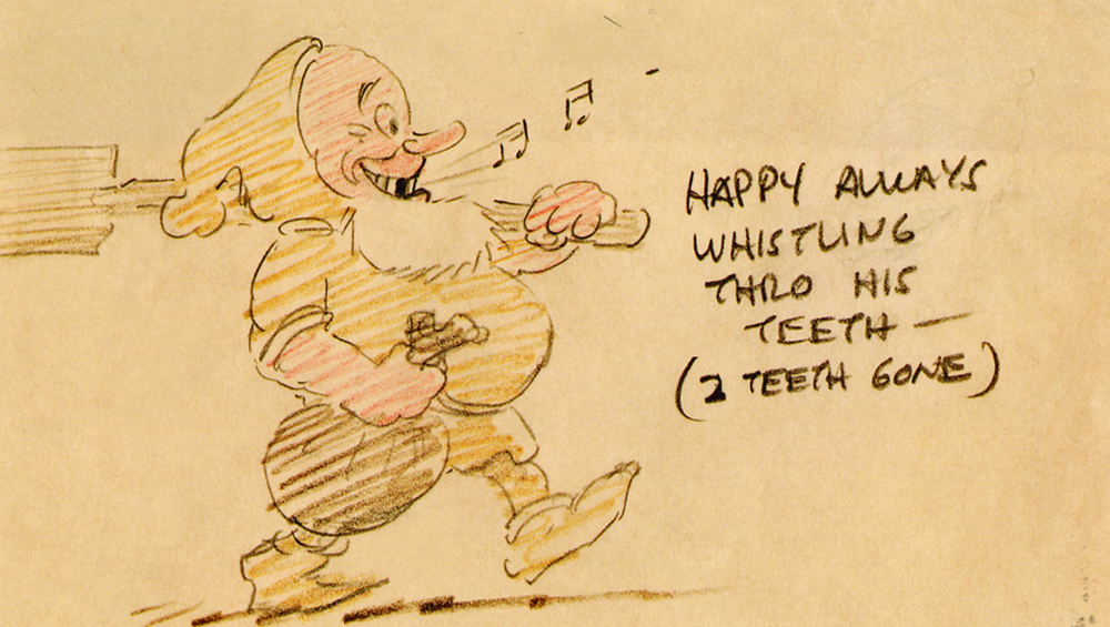
SMDwarfThe feel in the first half of the book is to tell more about the work that went into the creation of the film, and, as a worker in the field, that was more of my interest.

I treasured skipping back and forth between the two books, reading The Art and Creation first, for a section, then moving to the second book, Fairest of Them All for the same section of work. It made for a good process and allowed me to take my time, not only comparing the books, but watching how the stories develop.

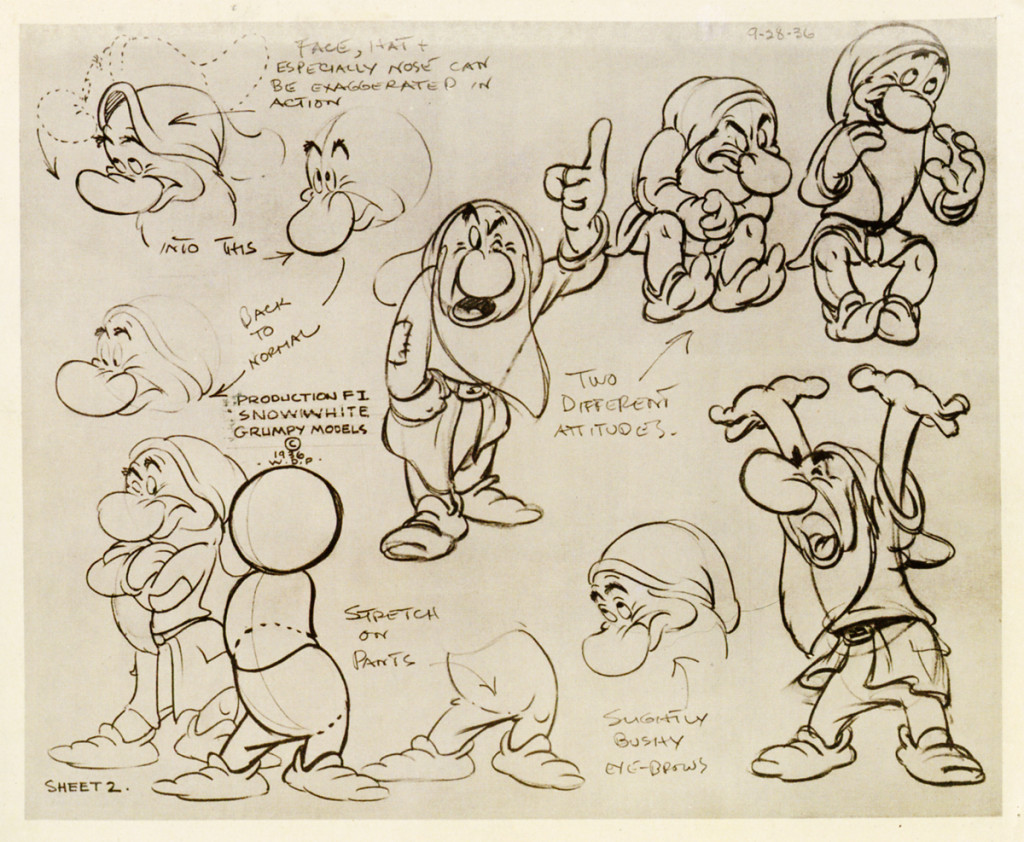
SNGrumpyModelSome of the details in the thicker book are precious. When the film is released there is enormous detail on the completion, screening and release of the feature as well as a strong focus on the materials that followed to sell the film, as well as the merchandise, itself. Details, for example, of the many books and comic books issued is interesting.

I felt completely satisfied with both books, by the time I’d finished. However, I felt that I had to go back to Mike Barrier‘s book,
Hollywood Cartoons:______________No doubt Tytla had a hand in this model
to reread what Mike had written.
Indeed, in shorter space he paints a different, and in some ways, stronger picture of the period, the work that was done and the analysis of the story. Barrier puts complete focus on the animators that had developed to the top of their game, Tytla and Moore and analyzed what they did on the film with the dwarfs. His analysis of Tytla’s study of Stanislavski and Boleslavsky makes for great reading. This information appears nowhere else in such detail and understanding. (There’s no hi hint of Fred Moore studying these acting techniques.) Luske and Natwick get a bit more attention in Kaufman’s book, but certainly no short shrift in Barrier’s eyes. Barrier is more attentintive to Natwick’s animation; it was the more developed. The rising stars, particularly Frank Thomas, gets quite a bit of attention, pointedly over the dwarfs crying at Snow White’s bier, and we see the growth of an artist in those pages. In fact, we understand that the medium is growing up with these scenes, and it’s Disney, himself, that pushes it forward. The other new, young animators,Johnston and Kahl get more attention when they’ve moved onto Pinocchio, in Barrier’s book.
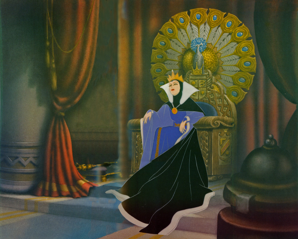
SMQunsthrone
The Queen sits on her elaborate throne.
What a pose! What an amazing Bg!

If you want to pass up all these incredibly gorgeous illustrations, but want to feel truly informed about the making of Snow White, reread Barrier’s book. His attention to detail is quite amazing, and his information couldn’t be richer.

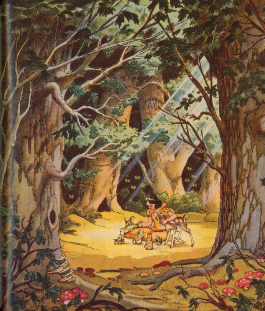
SMSWWaterColor
A beautiful watercolor of Snow White and animals in the forest.

Photos &repeated posts &Steve Fisher 10 Feb 2013 06:34 am

Ice Storm – repost

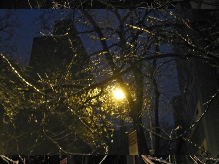
New York has had another snow storm. Oh not as bad as Boston has received, but bad enough. To tell the truth, I didn’t want to include pictures of snow in this week’s post, but what the hell. How do you avoid it? However, I do think one snow storm isn’t too different from others, and since I have one from the past from which I really like Steve Fisher’s photographs, I decided to repost those images. So here they are – the ice storm February 2011.

Here they are, NY in a different light.

1
These first two pics were the ones I shot at 6am
but wasn’t crazy about.

2

3
The rest of these are by Steve Fisher.
They’re all color shots.

4

5

6

7

8

9

10

11

12

___________________________

- It’s a couple of days later. The weather has gotten a bit warmer by Saturday, and another smaller snow dusting is expected. I decided to walk to the studio at 6:30am and figure out how to use my camera-phone thing. I’ve had it for two months and haven’t really figured out the machine. So here are some pictures. Note that a light hail was falling throughout the two mile trek.
1
First off I walk through Madison Square Park.
I haven’t been here since Christmas, the first big snowfall.
I mistakenly had left the B&W feature setting on the camera.

2
This tree looks to be dead. They’ve cut off a lot of it.
(See the logs on the ground.) Masses of squirrels are
climbing into the hole at the top of it.

3
This is that light “Art-piece” I featured last year.
The lights (you have to look for them) aren’t on,
and the piece is silent.

4
Then I walk down Fifth Ave. to Washington Square Park in the Village.
Some homeless person left their bin parked near a bike stand just
outside of the 23rd St. subway entrance. I guess they’re keeping warm.

5
I almost forgot why I’d shot this photo.
If you look closely you’ll see that the entire building is
“For Rent”. I guess they gave up on the idea of selling it.

6
Are these Christmas tree lights, still hung?
They look nice (in person) under this construction tunnel.

7
The First Presbeterian Church on 13th Street and Fifth Ave.
I’ve realized I’d been shooting in B&W.
This is the first pic in color.

8
Here’s the Arch at Washington Square Park , shot from 8th Street and Fifth Ave.

9
Here’s a closer shot.

10
This is Judson Memorial Church near NYU shot from within the park.

11
A sort-of famous restaurant a couple of blocks from the studio.
All they serve is PB&J hundreds of ways. I haven’t been in there.
I keep PB and Jelly in the studio and my home; I love it.

12
I turn West on Bleecker to Downing which leads me to Bedford.
“Hey ma, I can see our house from here!”
Finally, I reach the studio. The hail’s getting heavier.

Commentary 09 Feb 2013 05:25 am

Campaigns

- Congratulations to Bill Plympton on an amazing Kickstarter campaign< . $75000 and the needle goes right there, so Bill ups it to $100000, and that’s how much he raises. I hadn’t seen anything like that before, and I’m impressed. Let’s face it the guy’s a star.

signeThen, Signe Baumane begins her Kickstarter campaign to complete her excellent movie. A $42900 goal, and she’s attained that total with five days to go. Excellent! I love this film and think it’s going to be brilliant when it’s completed. Maybe in the next five days, she can get a bit more so that she reaches a nice, small comfort zone to complete it. She interviewed Bill and me for a little testimonial of a DVD, and just posted it last week. (I think that’s what brought her the money raising it so high – joke – joke.)

In case you hadn’t noticed there’s a third Kickstarter Campaign to notice.

Ralph Bakshi.

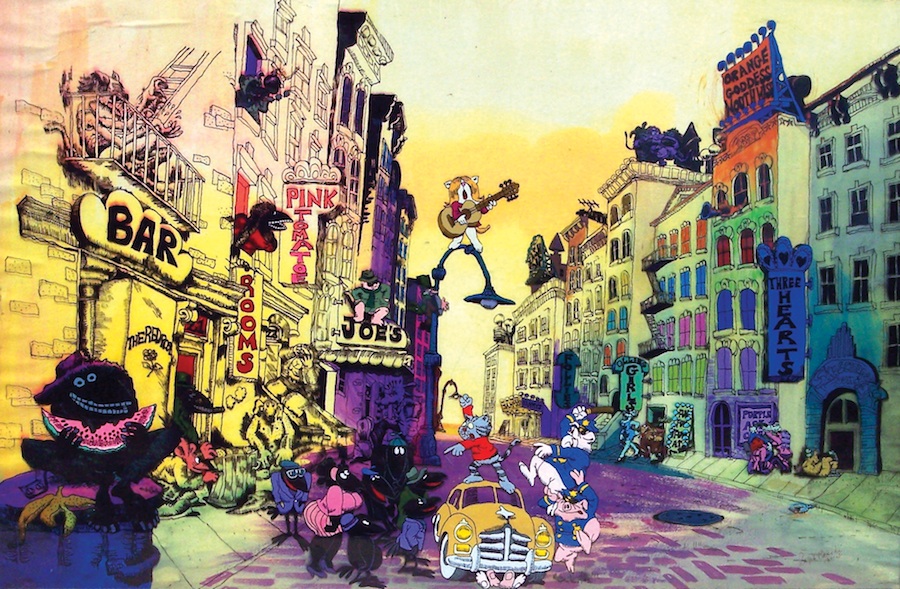
The Last Days of Coney Island. Talk about great titles!

Bakshi’s hoping to raise $165,000 and he’s uncovered almost $40000 so far. With only 20 days to go, he’ll need a quick infusion of cash to get things moving, so I’m not sure it’ll work. I hope so; this project interests me.

The idea is to do a series of 6 to 8 minute films which eventually will be grouped together as a feature. This could be nice if it’s well orchestrated. Somehow, given his track record, I have a lot of faith in Ralph. He has the ability to do it. He has Ian Miller aboard as a background designer. I was never one for fantasy art – all that Lord of the RIngs and The Hobbit stuff never touched me. I saw most of the films based on the material and didn’t like much of it. I looked at all the fantasy art and wasn’t captured.

Except for Ian Miller. This guy’s work is just extraordinary.

I’m watching this campaign pretty closely. Very interesting

________________________________

- I realized, having written this piece, that I haven’t really written about Ralph Bakshi and his films over all the years I’ve done this blog. It’s not an oversight on my part. I have written about Fritz the Cat (here too) several times and I did write about Heavy Traffic once. Many times I’ve thought of writing in depth about this man’s amazing body of work. However, this is not going to be the right time, either, so don’t expect an elaborate Bakshi post now. I would have to spend much more time on it to properly get it right. However, I do see his work as intimately related to my history in animation.

bakshi1Fritz the Cat was released n 1972 just as I escaped the Navy and became a citizen – meaning a potential animation worker. By the time it hit screens, I had already grown out of my love for Disneyana. I was a Hubley convert and a big fan of UPA. Bakshi came from the grit of animation – those lst days at Terrytoons under the aegis of Bill Weiss. The shoddiest of films had emanated from them in those last few years, but there were also hidden great ones. I was always a fan of Deputy Dawg and earlier on, Clint Clobber. Hashimoto Sam and those Astronaut cartoons, not so much.

bakshi2A hop skip and a jump away, and we find Bakshi directing Fritz the Cat for Steve Krantz. He’d made a nice living writing cheesy books that were very successful, and now he’d taken one of the best know underground comics and gave Bakshi the chance to turn it into a feature.

Needless to say it created some waves, and that was good for animation, though I have to say most animators protested the material. It was a pretty good film with plenty of solid moments – some not so solid, too.

Bakshi could have followed it up with The Nine Lives of Fritz the Cat, but he went personal, instead. Heavy Traffic was the result, and it ended up a selection by Vincent Canby of the NYTimes as one of the top ten films of the year.

bakshi3Bakshi played his career much the way Quentin Tarantino ha. A couple of films came out that caught the racist accusations. The films couldn’t fight the press, and it took Bakshi’s switch to Sci Fi with Wizards and Lord of the Rings to gain some modest success.

All of his movies got attention and all deserved more attention. There was usualy excellent material there and a chance for animation to start growing up. By this time, Bluth and Spielberg were challenging Disney for the family audience, and they got all the attention.

I miss the sore paw of Ralph Bakshi and I’m glad to see he’s pushing the Kickstarter campaign and hoping he has some success with The Last Days of Coney Island.

Bill Peckmann &Comic Art 08 Feb 2013 05:14 am

Alex in Hollywood

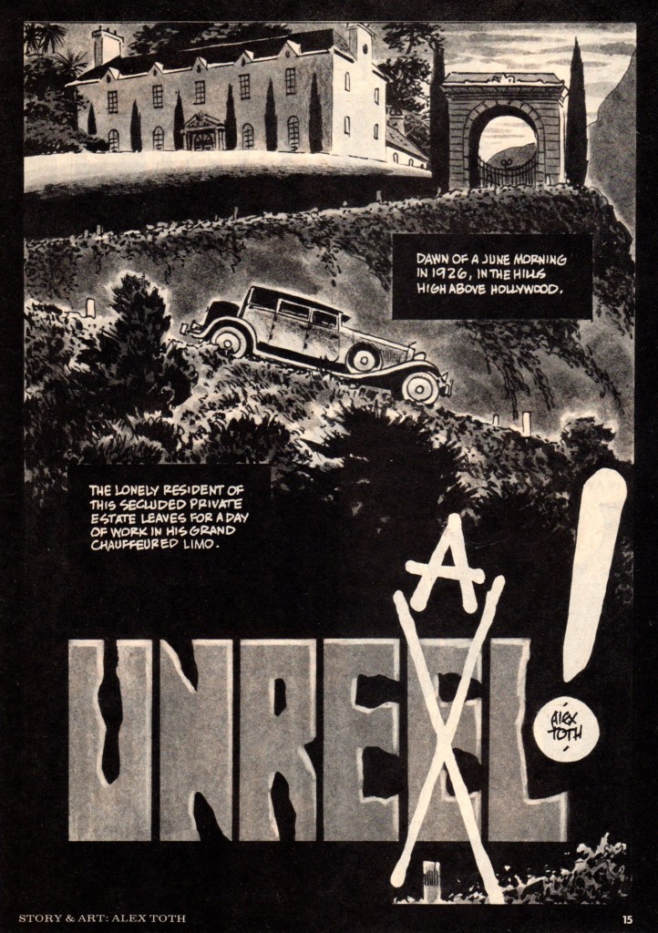
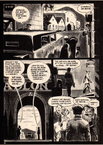
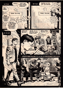
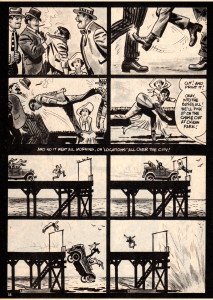
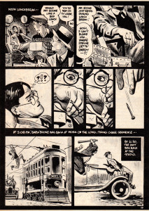
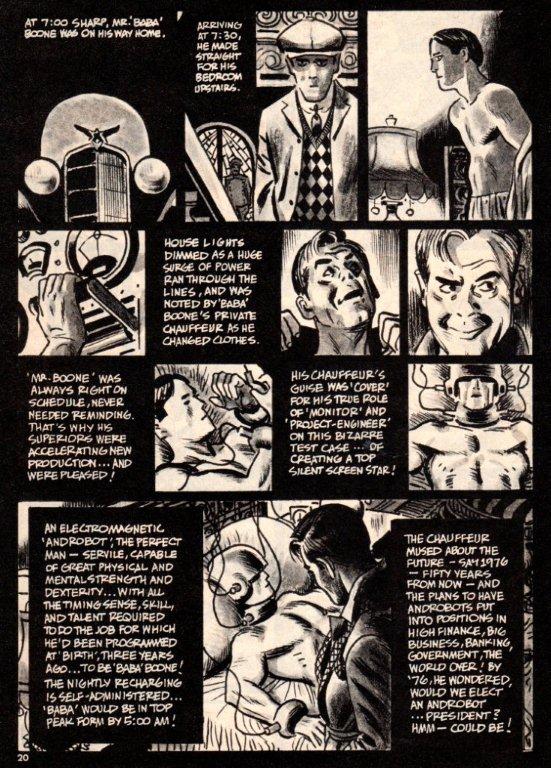
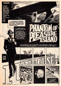
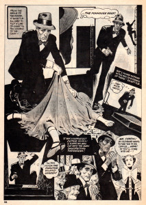
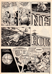
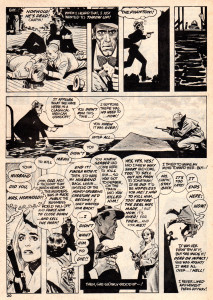
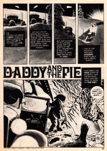
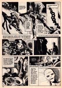
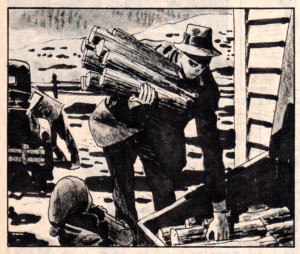
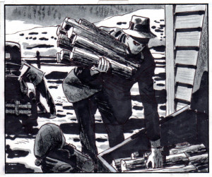
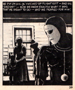
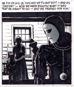
Alex Toth had a lot of different wonderful sides, and they’re all rich and exciting. Bill Peckmann forwarded this material whcih is just great. Take a look with me; Bill takes over writing from here:
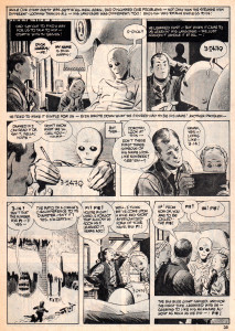
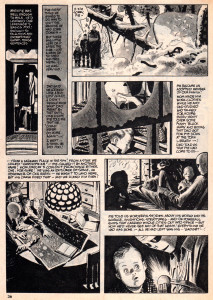
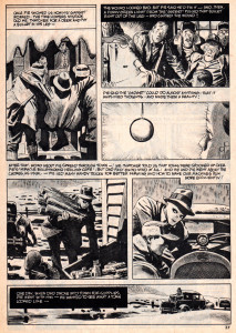
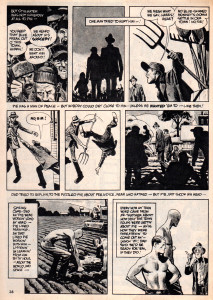
    In anticipation and in celebration of the new, long awaited Alex Toth book, “Genius Illustrated” by Dean Mullaney and Bruce Canwell due to come out in a few weeks, (check out LOAC’s site and Amazon) I thought it’d be appropriate to post three of Alex’s stories from this time period in his career that the new book covers.

    This Toth triptych could be called “Alex in Hollywoodland” because that’s where he lived the bigger chunk of his life, and it also illustrates his love for the “good” things that came out of Hollywood. Ever the west coast movie aficionado, it really shows in these Warren Publications stories.

    The first story, Alex’s take on the comedies of the silent film era is from the March 1976 issue of Creepy magazine.

unreel1 1

unreel2 2

unreel3 3

unreel4 4

unreel5 5

unreel6 6

Here is Mr. Toth’s tip of the fedora to Hollywood icons Sam Spade and Humphrey Bogart.
This appeared in the November 1975 issue of Creepy magazine.


unreel7 5

unreel8 6

unreel9 7

unreel10 8

unreel11 9

unreel12 10

unreel13 11

unreel14 12

This last story would probably fall into the 1950′s Hollywood Sci-Fi category, and it’s a pretty good fit, but I also believe it’s Toth’s ode to the great Americana illustrators of the Saturday Evening Post magazine of the ’40′s and ’50′s, of which Alex was a great fan. No jazzy panel layouts, just solid art story telling. And, the ol’ curmudgeon really pulls it off, this story of all heart!

unreel15 13

unreel16 14

unreel17 15

unreel18 16

unreel19 17

unreel20 18

unreel21 19

unreel22 20

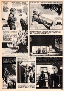
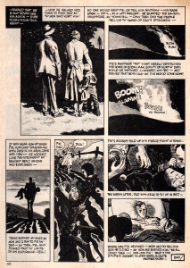
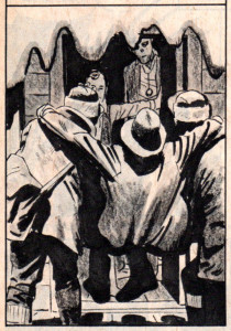
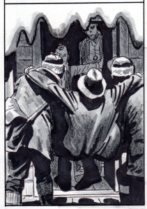
Here are four panels from the ‘Pie’ story, the first version is the printed one, the second version is Alex’s original art. I thought you would like to see what got lost during reproduction. Happily, the new “Genius: Illustrated” book will have quite a bit of original art in it. So, we will get to see a lot more of what Alex’s art looked like when he finally laid down his pens and Pentels!

unreel23 21a

unreel24 21b

unreel25 22a

unreel26 22b

unreel27

unreel28

unreel29 25a

unreel3025b

Bill Peckmann &Books &Comic Art &Disney 07 Feb 2013 04:56 am

Snow White – the original strip

Well involved with the two J.B. Kaufman books on Snow White, and about to re-read Mike Barrier‘s writing on the making of the feature, per his book, Hollywood Cartoons, you can be sure that a lot of Snow White material is going to comve your way via this blog.
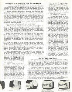
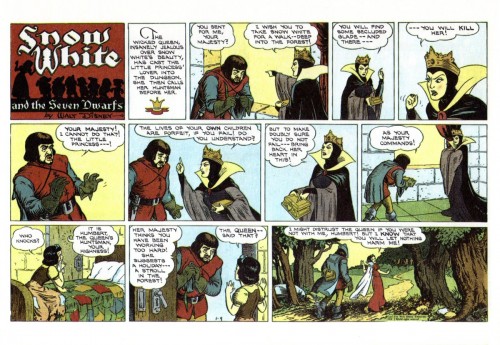
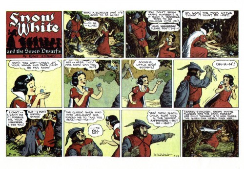
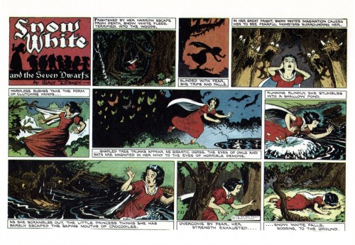
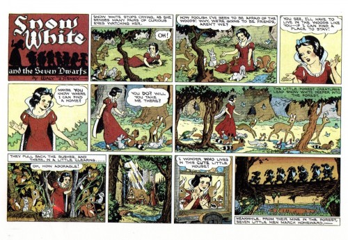
Bill Peckmann offered to send the initial strip done to coincide with the release of the feature, so thank you, Mr. Peckmann, I couldn’t be happier than to offer this.
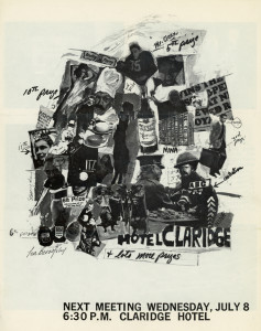
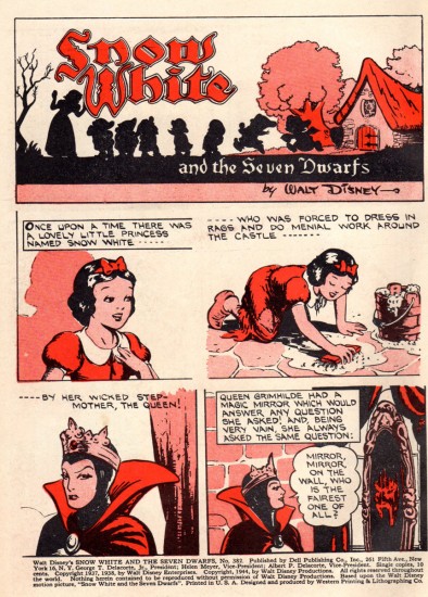
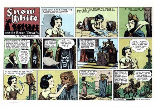
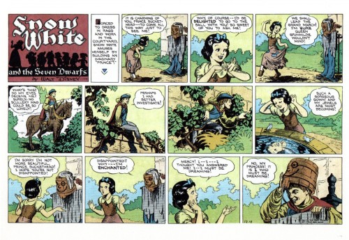
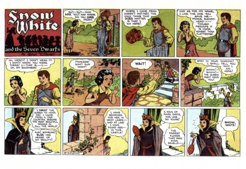
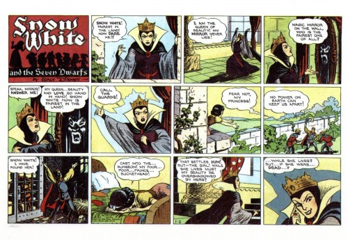
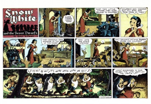
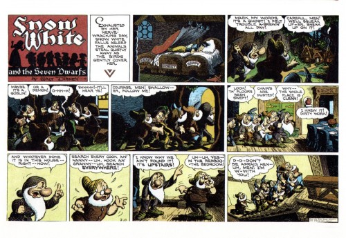
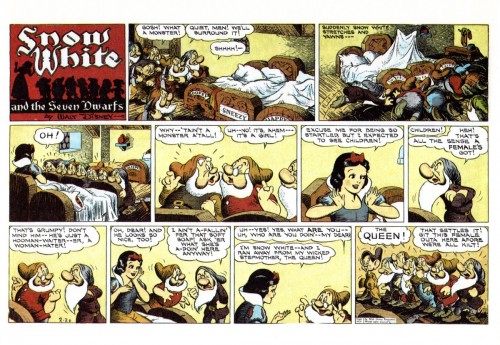
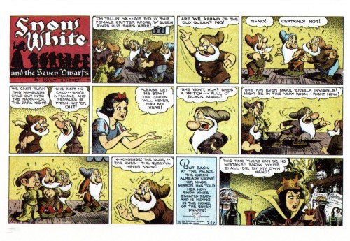
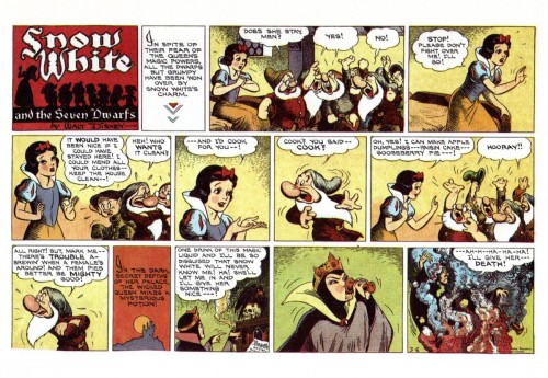
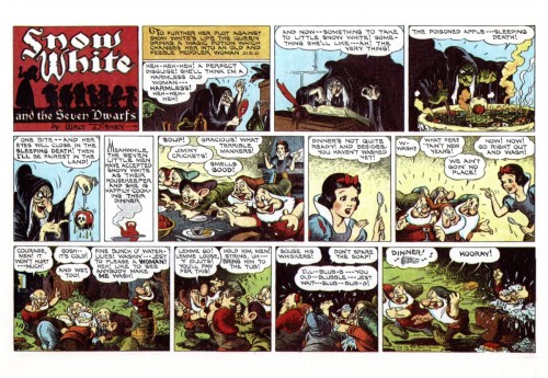
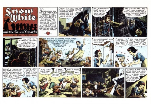
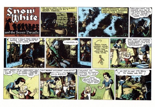
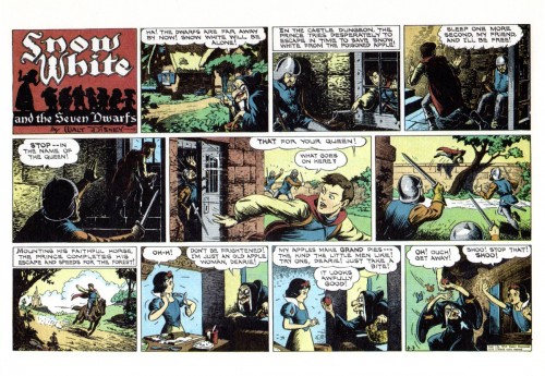
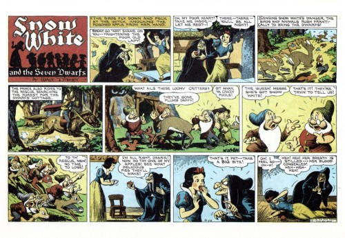
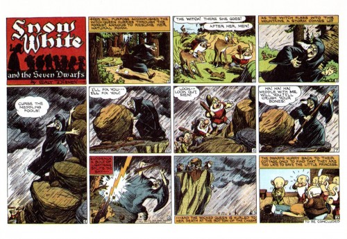
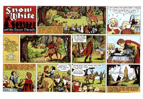
Disney had, since 1932, a Silly Symphony comic strip that ran weekly. With the release of Snow White, the strip’s regular writers were replaced with writer, Merrill De Maris, pencils artist, Hank Porter, and the inker, Bob Grant. The strip continued for a full 20 weeks, beginning on December 12, 1937.

There are noticeable differences between the story in the strip and the released film. The movie’s story, from the start, had a sequence called “Prince Buckethead” which lasted in the original storyline until the last months in making the film. Then the sequence found itself dropped from the film, but, oddly, reappears in this comic strip version. It’s a game the Prince plays was supposed to play with Snow White at the beginning of the movie. The Prince also is imprisoned in the original story in the caverns of the castle; the same is true here. Other things like the huntsman having the name, “Humbert,” return to the story. I’m curious as to who made these decisions to keep the noticeable differences. Many versions of the stirp appeared over the years and in many languages. You can check them out here.

Without wasting more time, here’s the original strip.

1

2

3

4

5

6

7

8

9

10

11

12

13

14

15

16

17

18

19

20

Thanks, again, to Bill Peckmann for putting this all together.

« Previous PageNext Page »

eXTReMe Tracker
click for free hit counter

hit counter