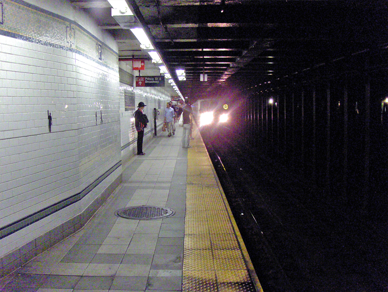
Daily post &Norshtein 20 Aug 2007 08:10 am
Bits ‘n’ Pieces
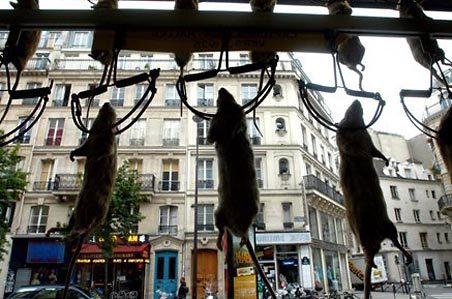 – The Seattle Times has an article which features the shop in Ratatouille which displays dead rats in their window. I was taken aback by the scene in the film and felt that it was too ridiculous an image to get us to believe that such a shop existed. Of course, I was wrong and here’s confirmation of that fact. Quite peculiar.
Still I wonder how many other people didn’t know about this window display, and whether one should put images of this kind into a film when you’re sure it’ll pull some of your audience out of the movie. There’s a fine line to draw when you’re trying to keep an audience involved in your film. Once they’ve looked at their watches or question the authenticity of a scene, you’ve lost them for a bit which might turn out to be for the rest of the movie.
Thanks to Upcoming Pixar for notice of this story.
For some reason, I’ve always been attracted to paper sculpture art. There have been a couple of examples of this medium done in animation. Immediately, a few films come to mind.
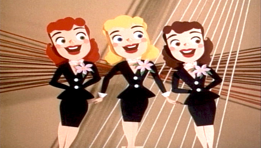
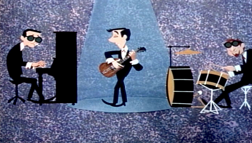
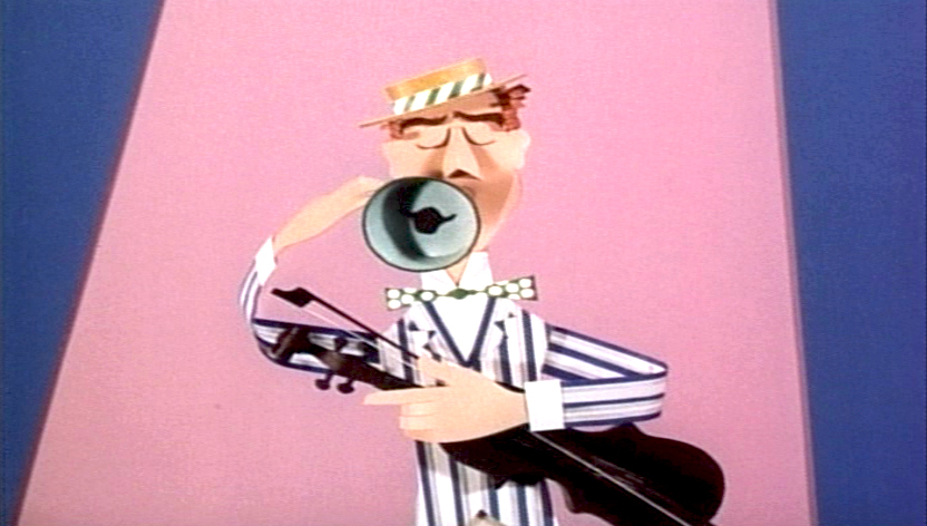 The best known is Symposium of Popular Song done by Bill Justice & Xavier Atencio. They use Ludwig Von Drake to string together a number of music videos done with paper constructions. I remember seeing this film on its first release. (It played in theaters locally with PT 109 starring Cliff Robertson.)
_ _
_
Michel Ocelot, who has now grown to great heights directing animated features such as Kirikou or Azur et Asmar did a number of elaborate and beautiful cut-out animation films in his earlier years. You can see a clip from The Insensitive Princess on YouTube. His films were an outgrowth of Lotte Reininger‘s extraordinary work and, to some extent, his love of Yurij Norstein‘s work.
Megan Brain has two sites featuring her paper sculpture art, and it’s certainly beautiful. Her blog has more information; her website has more art. There’s also a good interview with Megan at the Character Design site. Her blog was once featured on Cartoon Brew back in 2006. The site and blog have both developed since then. It’s worth checking out (again if you haven’t been there in a while.)
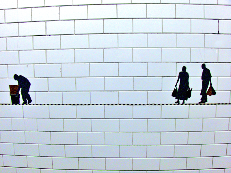
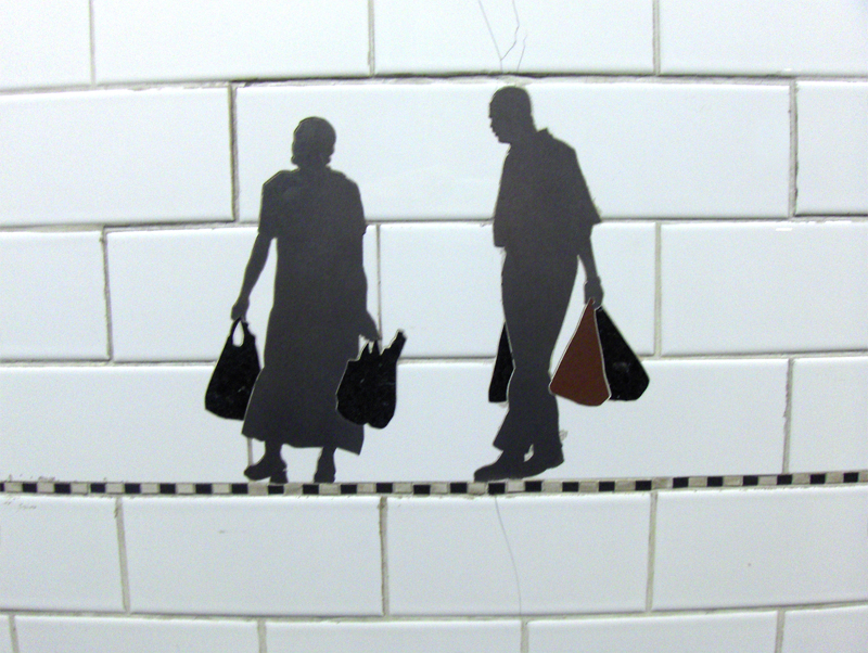
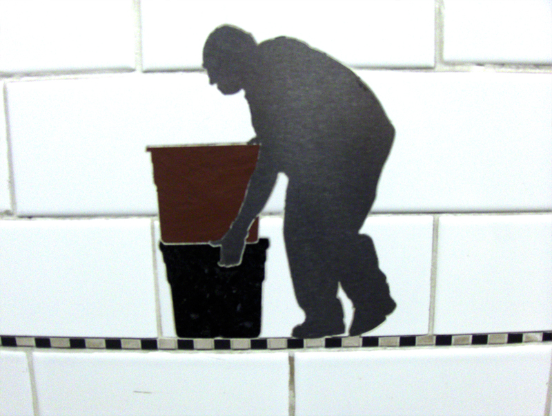
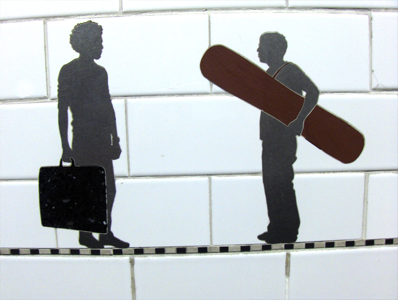
Béatrice Coron is a french artist who specializes in paper sculpture and cutouts. She has a page of simple animations to watch. There’s also a wealth of information about cut out art on her site Eclectic Iconoclast. Plenty of good, interesting links.
Speaking of Michel Ocelot, this year, he’s directed a Bjork music video that combines silhouettes of people (made to look like Reininger characters) against cg abstractions. Have a look: