Books 24 Jul 2008 07:12 am

Webb’s Faces – 1

- Back in August 2006, I posted one of my most popular posts. Since then, (even as late as this past weekend) there have been many comments by people remembering and speaking positively about this featured book.

Since I’d only posted half a dozen pages, I thought I’d yield to the many requests to see more. Consequently, I’ll post the entire book in two parts. (Mind you every other page is a blank “Practice Page.” I didn’t scan any of those. If you want to practice, you’ll have to get your own paper.)

These pages are taken from a book I have, published in 1940, called How To Make Faces. The author, Frank Webb, was a comic strip cartoonist who drew the cartoon panel ‘Kartoon Kollege’ from 1940-41. When this strip ended, he created the comic strip ‘Raising Kane’, which ran until 1944.

___(Click on any image to enlarge)_______Other than that, I haven’t been able to learn
____________________-_______________much about him. I find it interesting that he signed each page of his book almost as if he expected it to run in a newspaper on a daily, one-page-at-a-time basis.

His approach was to use the alphabet and build up from there. When he runs out of the alphabet, he just turns to shapes then just asks you to copy his picture or finish the page.

This first part includes all the drawings made from the Alphabet.

Daily post &Disney &Events 23 Jul 2008 07:44 am

AMPAS Ink & Pt Exhibit, etc.

- My friend, composer, historian, Ross Care, sent me some comments on his viewing the show at the Academy exhibit in LA. This is a large exhibit of work done in traditional methods of creating animated films.

Here’s Ross Care‘s report on the show:

    At the July 18 AMPAS screening of the recent digital restoration of Disney’s SLEEPING BEAUTY I had another chance to take a look at the Academy’s excellent exhibit: “Ink & Paint: The Art of Hand-Drawn Animation.”

    This unique exhibit focuses on the art which preceded the actual productions, i.e., the conceptional drawings and paintings which inspired and determined the total “look” and style of the final film.

    These concepts often turned out to be sensitive and vivid works of art in their own right. The Disney studio, which took particular care (and time) in the production of its often long-in-progress early features, was well represented.

    An entire section was devoted to the small, jewel-like paintings of color stylist Mary Blair who keyed the looks of Disney’s late-‘40s/ early ‘50s features. Most were from CINDERELLA and PETER PAN.

    The Blair section also revealed that some of these pre-production works were also used in Disney’s prolific merchandizing of his films. Blair’s colorful painting of a stylized pirate ship can also be seen on the first page of one of the three Little Golden Books that were published at the time of PETER PAN’S release.

    Eyvind Earle, whose controversial style keyed the look of the evening’s SLEEPING BEAUTY, was represented by several panoramic paintings for that epic film. There was also a small painting from the short TOOT WHISTLE PLUNK AND BOOM that the artist even had the nerve to sign.

    Aside from the many Disney and Warner Bros. works, art from lesser-know films is also represented. I was especially struck by several pieces from SHINBONE ALLEY, an obscure 1971 animated feature which I have not seen since I saw it at a Saturday afternoon kiddie matinee back in Lancaster, Pa. many years ago.

    SHINBONE is based on the archy and mehitabel stories of Don Marquis (and a Broadway musical based thereon). Maltin calls it “genuinely odd” and “not really for kids,” and I have never forgotten having seen it. A character study of the blond cat, mehitable, by Alvaro Arce, brought the experience vividly back.

    UPA’s GAY PURR-EE was represented by an amazing Paul Klee-like painting of the money cat sequence by Corny Cole, some vivid backgrounds by Gloria Wood, and character studies – the especially droll money cats – by Abe Levitow.

    As the Academy flyer notes: “The magic of animated film depends on the ability to being to life not only animated characters, but the worlds they inhabit.”

    “Ink & Paint” provides fascinating, witty, and often breathtakingly beautiful glimpses into the process of the creation these worlds.

    The exhibit continues through August 24 at the Academy of Motion Pictures Arts and Science, 8949 Wilshire Blvd., Beverly Hills, CA.

Ross Care‘s website is here.
Ross Care‘s Blog is here.

________________________

- For those of you who are fans of Kung Fu Panda, you may enjoy the “Animated comic books” for viewing on Yahoo. These are basically Flash animatics featuring some very dynamic graphics. It’s worth a look to see what’s out there.

________________________

- An interesting website for those of you into cartography, is the Strange Maps site. This site features a variety of interesting and curious maps all with their own explanations.


The map above, for example, details where
occurrences of cannibalism took place.

See other many, varied maps on this site. They come complete with extensive explanations – making for excellent reading.

________________________

Finally, here’s the new kitten living in our studio, Lola. (Whatever she wants, she gets.) She’s found the top of my 10 foot bookshelves; it’s where she sleeps during the day.

Animation Artifacts &Disney &Story & Storyboards 21 Jul 2008 07:57 am

Sleeping Beauty – storyboard Seq 19 Pt 1

- Continuing the post of last Monday, here’s the storyboard to seq 19 of Sleeping Beauty. It’s the beginning of the dragon fight, the climax of the film. It’s on loan from John Canemaker‘s collection, many thanks to John for sharing.

Here’s the full page as is:


(Click any image on the page to enlarge.)

Here’s the board broken up into segments, half a row at a time.

1a

1b

2a

2b

3a

3b

4a

4b

5a

5b

6a

6b

More of this sequence next Monday.____

Photos 20 Jul 2008 08:33 am

PhotoSunday – Hitching Posts

- Back in the wild, wild west, they used to have hitching posts so cowboys could tie their horses outside the local tavern to keep them from running wild. If there was no hitching post, cowboys in movies used the stanchions in front of the saloon or store.

We don’t have horses in the big city, but we do have bicycles. Hitching these with chains and locks and anything to try to prevent theft has
________(Click any image to enlarge.)_____________been a primary difficulty for
_______________________________________-_____messengers and other bike riders.

My studio has two entrances (or exits depending on how you view the situation.) At both, there are wrought iron fences which sort of act as bannisters going up/down the steps. Leaving work the other day, I noticed that the back entrance was used as a “hitching post” for a couple of bike riders. Presumably they were working out in the gym just next door.


Good thing we rarely use this exit.

This made me start looking at other hitching posts I could find on my way home, and I took some snaps.


Sign posts and trees seem to be likely candidates.


Sometimes both come in handy.


Though, any pole will do.


The upside-down “U” seems to be designed for smaller businesses
that want something curbside.


For one or multiple bikes.


There’s also the “M” shape for a couple of bikes.


I’m not sure if these are supplied by the City or the storeowner.
There’s a uniformity around town that makes me wonder.


In places there are a number of these for the high bike traffic.


Sometimes this isn’t enough and a subway entrance serves as a backup.


Even though many “M”s have been placed in the same area.


I did like noting this one unit outside a “Circuit City” store that offered
an overhead to protect the bikes outdoors.

Commentary 19 Jul 2008 08:40 am

Politicks a-plenty

- I’m surprised and a bit pleased that my little piece on the New Yorker cover got such attention. I can’t imagine what slings and arrows the magazine had to face, but I hope it was disastrous for them. They’re the leader in published cartoons, as far as I’m concerned. If the cover of last week’s issue created such problems, I think it probably needed another draft before they published it. We should have understood the perspective of the artist.

The little gem to the right is a reworked piece by Tom Hachtman on the subject. (Though I messed it up a bit with some color – it was too white posted here.)

- Joel Stein in the LATimes had a funny piece about how to tell jokes about Obama. There are a couple of good ones in the article (an a couple of
bad ones.)

- I have to applaud Judith Warner‘s opinion piece in yesterday’s NYTimes. It discusses in length John McCain’s attitude toward women, yet
it doesn’t bring up the many crude remarks, snide jokes, and rude actions that have been attributed to McCain. Check here if you’re interested. This seems to be information that hasn’t gone past the blogs to make it to television, yet Judith Warner has successfully avoided this part of McCain’s actions in her article. __ David Remnick with Barack Obama
Warner simply uses his voting record to back up
the worst. (Note that I admit to having no compunctions about referring to McCain’s crude jokes – past or current.)

I look forward to Frank Rich’s Op-Ed piece tomorrow to see if he broaches the subject. However, I suspect he’ll be writing about the trip to Afghanistan/Iraq etc. It seems to be today’s hot subject.

- Am I the only one who’s had it with Lou Dobbs’ obsession with illegal immigrants. This guy has had a daily hour long show on CNN, and he deals with nothing else but immigration. I live in a city of immigrants – legal and illegal – yet I can’t see that it’s that great a problem. Maybe it is in Lou Dobbsworld. Also, aren’t his teeth a bit TOO white. I think they’d shine in the dark.

- I also have to say that the new Jib Jab cartoon is the first one I’ve liked. Usually, they’re a bit too milquetoast for my taste. A cartoon without a POV is just pointless. In this one they do a bit more than just “jab” everyone. It’s funny. I assume NBC must give them a good part of the budget. They always premiere on the Leno show then receive endless repeats on MSNBC the next day.

_________________________

Space Chimps had the misfortune of opening against The Dark Knight and Mamma Mia!. Though I like looking at review of animated films, I kinda missed this one. I didn’t know it was opening. Mark Mayerson‘s article clued me in.

    The NY Times, the one glowing review, said: “Space Chimps is hilarious. . . If “Wall-E” pushes the boundaries of what can be done in an animated movie, “Space Chimps” proves that the old formula is still pretty effective when executed well.
    The NY Daily News said “Nothing to go ape for.” One star.
    Newsday/AP said: “‘Space Chimps” sucks a whole lot of talented people into a wormhole of lousy.” One star.
    The NY Post said: “No Ape-peal!” ½ star

Fox, the distributor, obviously was prepared to just dump it on the market. Barry Sonnenfeld is one of the producers; I’m surprised he didn’t have more clout – or didn’t use it.

Animation Artifacts &Books &Disney 18 Jul 2008 08:01 am

Country Cousin book

John Canemaker has loaned me a couple of books to be scanned for posting. These are all storybooks for young children, and they’re all adaptations of Silly Symphonies.

These books are some of the first bits of merchandising to piggy back some of the more popular short films. Aside from the “Mickey” craze, there was a demand for Silly Symphony merchandise. The biggest book featured the original Three Little Pigs, which I posted back in Feb. 2007.

There’s no doubt that The Country Cousin was one of their more popular shorts. It’s been called one of the great advances in character animation – specifically the drinking scene animated by Art Babbitt. This all led up to the film’s Oscar win.
_______(Click any image to enlarge.)
___________________________________________I’m amazed that this book has such
thick paper with very crisp colors. It’s held up well all these years later. The book is slightly larger than posted; I cut some of the extra white space around the images.


These are the two inner cover pages. (The pages are much larger,
but I just took the drawings.)

_______

The title page
_______

Commentary &T.Hachtman 17 Jul 2008 08:13 am

The New New Yorker


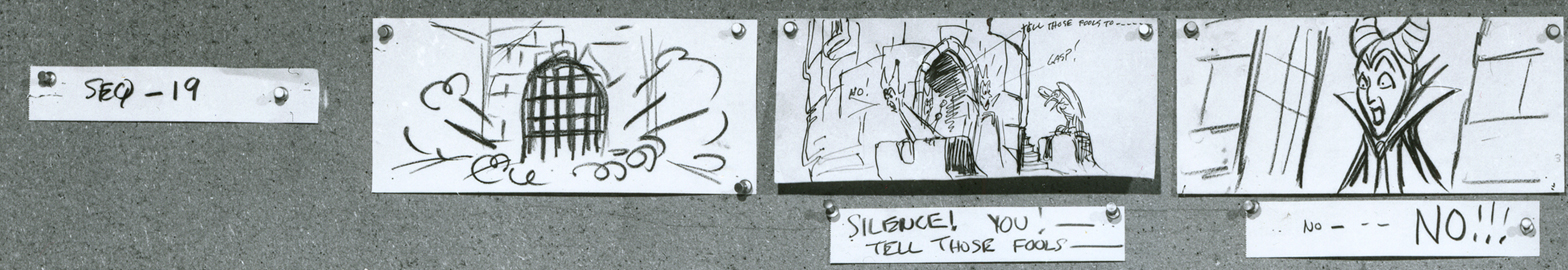
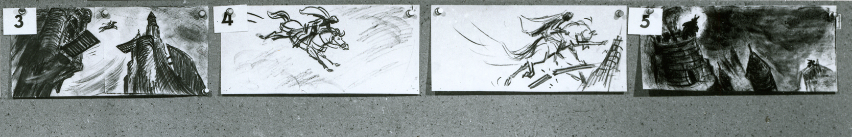
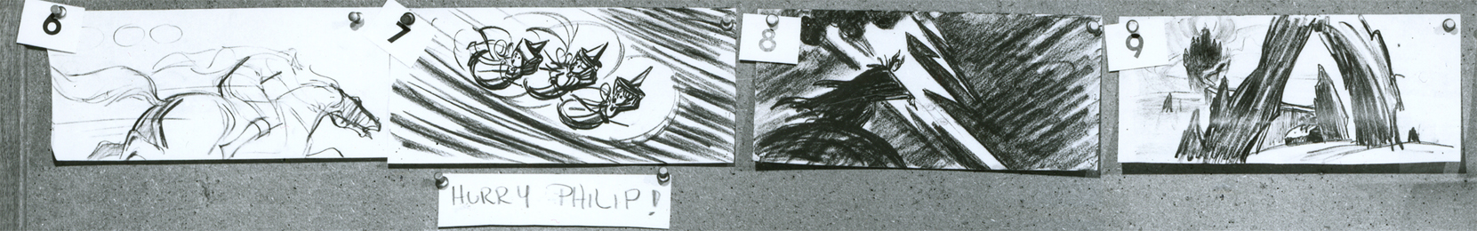
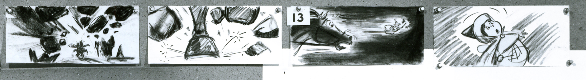
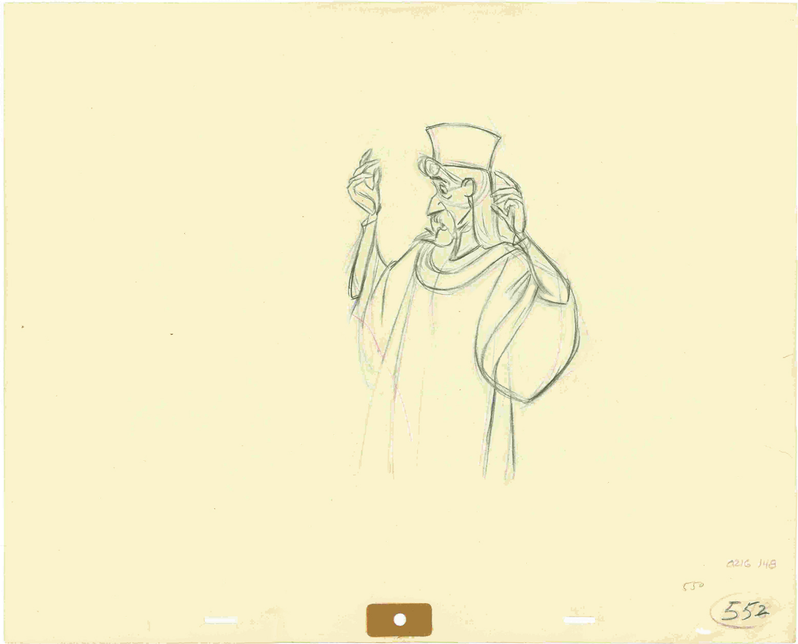
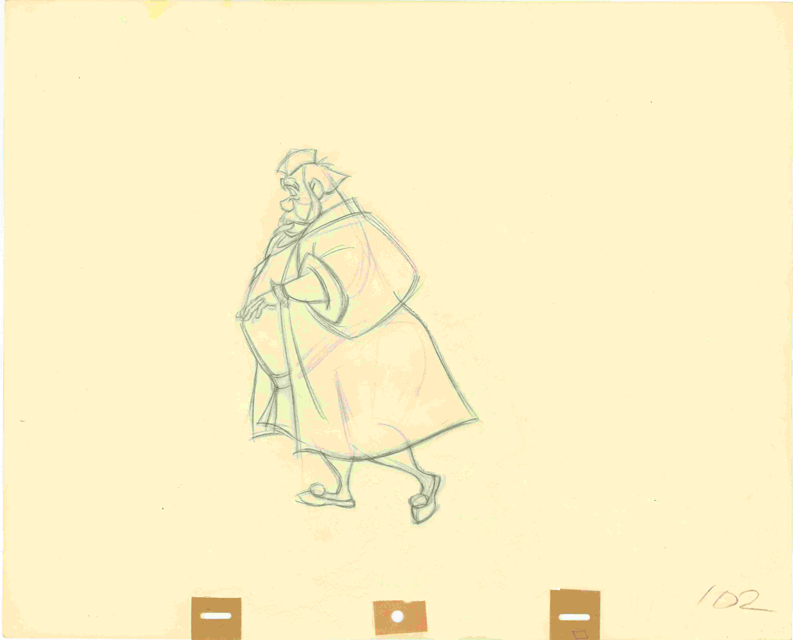
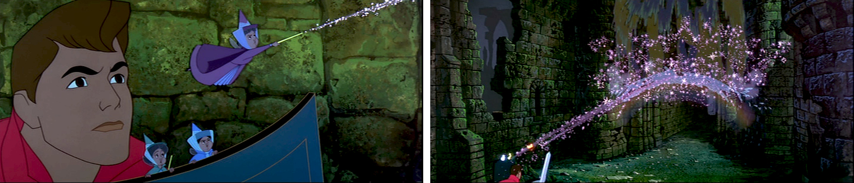
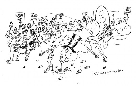
(Click if you want to enlarge any image.)A poignant cartoon by Tom Hachtman that
should be published in The New Yorker, but that
would involve good taste.

_
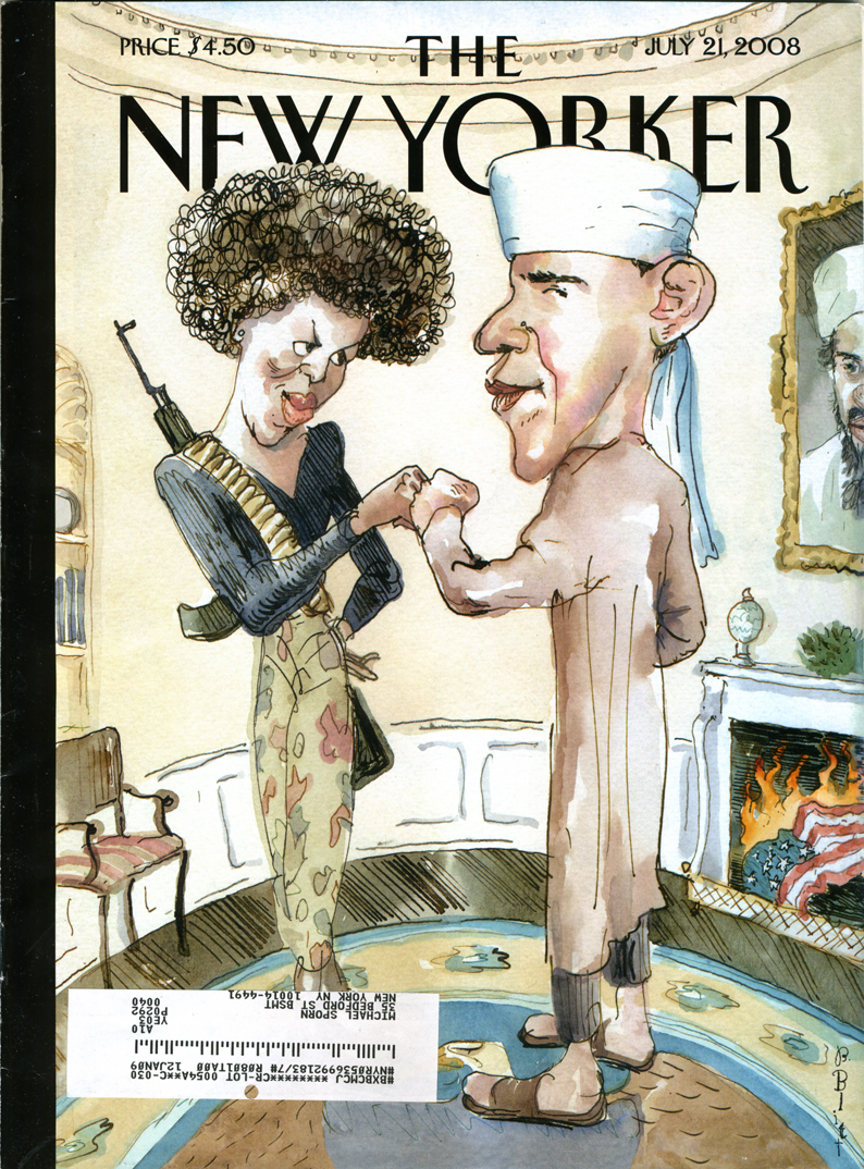
- I haven’t noticed any animation blogs that are screaming about the New Yorker cover that 
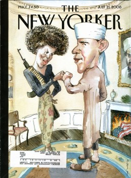
made all the headlines this week.
(Pictured to the right.)

The thing had me furious when I received my subscription copy this past Monday. I’m an ardent Obama supporter, but the subject matter isn’t what had me irritated. I appreciate a vile caricature as much as the next guy. The best political cartoons are sharp, pointed and acidic. The magazine doesn’t generally post political cartoons on their cover, yet it isn’t the fact that they’ve chosen Obama as their target. I’ve gotten used to it. There aren’t too many left wing magazines posting anti-McCain cartoons, so they may as well attack their own.

What bothered me was the obvious attempt by The New Yorker to be racy, vicious and caustic for the sake of sensationalism. They wanted to sell magazines, so they thought they’d create a stir.

I’ve been a subscriber of the New Yorker for almost 40 years. I’ve read almost all of their issues in that time. This wasn’t the standard they shot for in all those years. Tina Brown came on as editor and tried to shake the magazine up to get subscriptions and ad revenue up. She was replaced by David Remnick, and he seems to want to up the ante. This issue takes the magazine out of the realm of tasteful writing and cartooning. It got vulgar for the sake of sales. This is what they did with that other Condé Nast publication, Vanity Fair. It’s a magazine I dislike enormously.

Now I have to rethink my subscription. OK, I don’t. Within the same magazine is a great article about Obama and the backroom politics that had to be scaled to make it in local Chicago politics. This is the kind of article no one else is writing. Unfortunately, the racist, scurrilous cover is the sort of thing you can find anywhere else.

The edition of the magazine, of course, has just about sold out. Here’s a NY Post article about the business side of the story.

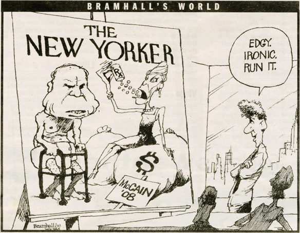
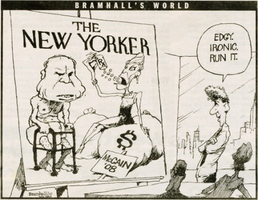
Below is a cartoon I ripped out of The Daily News by Bill Bramhall. It’s hilarious and touches on the “irony” of the situation. Since most of you probably missed it, I thought I’d showcase the cartoon.

____________________

- Jeff Scher has a wonderful new animated piece in the NY Times. Fly By Night is a film he’s made by shooting flying bugs and showing their flight paths and motions. I have to admit, I was amazed by it. Go here to watch the 1 min 34 sec film.

____________________

- I attended an Academy screening this past Tuesday night. It was the most crowded event of 2008. The place was full. Only one animation member wasn’t there, an oddity in itself. Generally three or four animation folk show up; this time there was even an animation guest, Tom Sito (currently visiting New York).

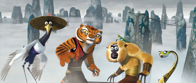
What was the film? Wall-E? Kung Fu Panda? Space Chimps?

No, it was Mamma Mia! Having seen it, I can testify that it was the most energetic film I’ve seen all year. Meryl Streep doesn’t settle down for one second. She’s all over the place. It had more action than Indiana Jones 4.

Too bad I hated it. It was nice seeing all those people show up, though.
We’ll see if The Dark Knight is as packed next Tuesday.

____________________

The Emmy nominations for animation are:

Outstanding Animated Program (for Programming Less Than One Hour)
Creature Comforts America • Don’t Choke To Death, Please
King Of The Hill • Death Picks Cotton
Robot Chicken • Robot Chicken: Star Wars
SpongeBob SquarePants • Inmates of Summer / Two Faces of Squidward
The Simpsons • Eternal Moonshine of the Simpson Mind

Outstanding Animated Program (for Programming One Hour Or More)
Blue Harvest (Family Guy) • FOX • Fuzzy Door Productions in association with Fox Television Animation Studios
Imaginationland (South Park) • Comedy Central
Justice League: The New Frontier •Warner Bros. Animation

Congrats to those nominated.
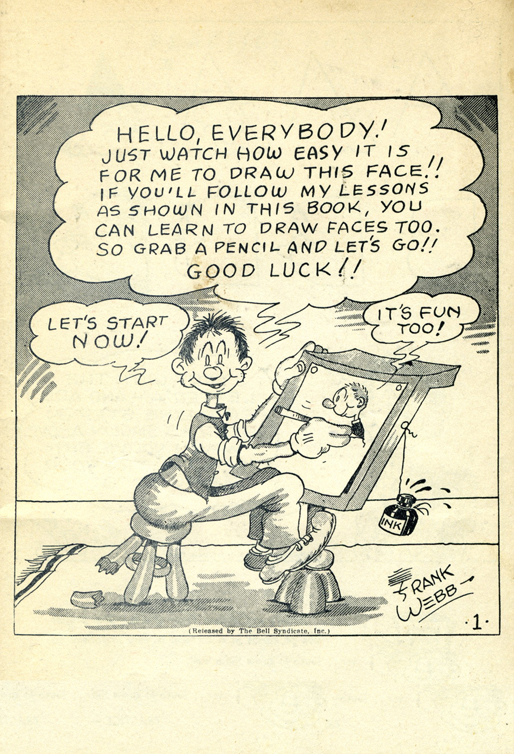
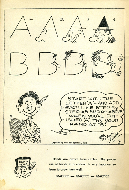
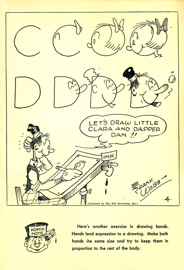
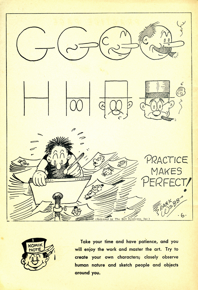
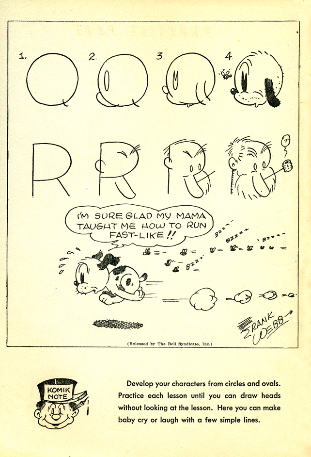
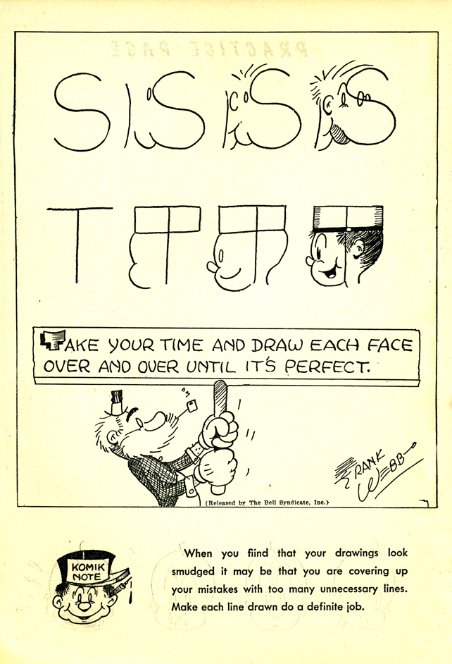
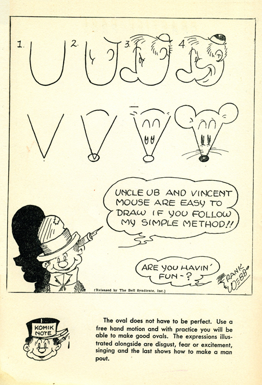
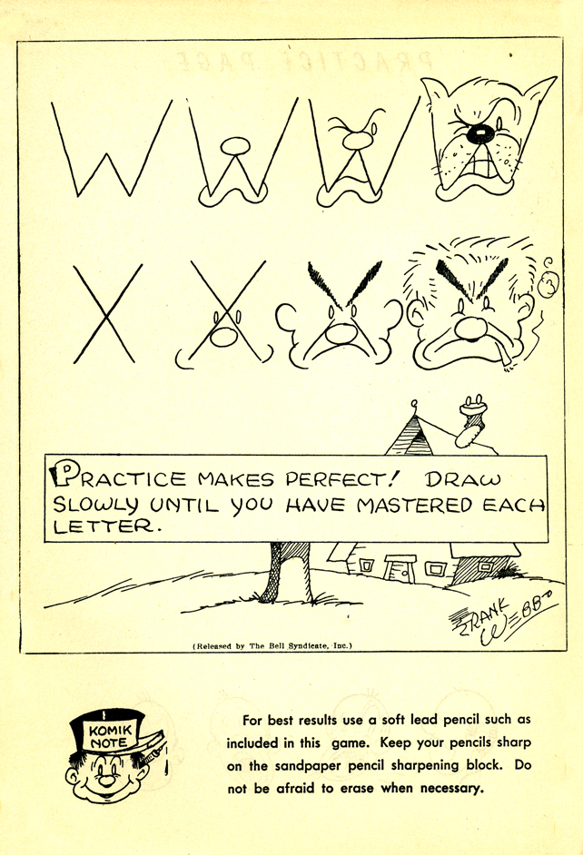
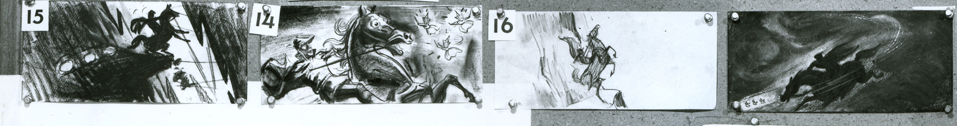
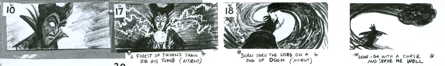
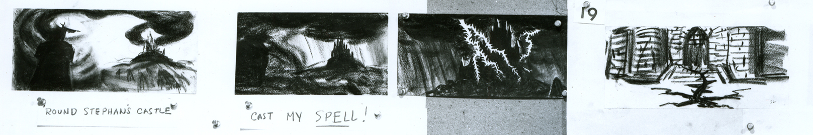
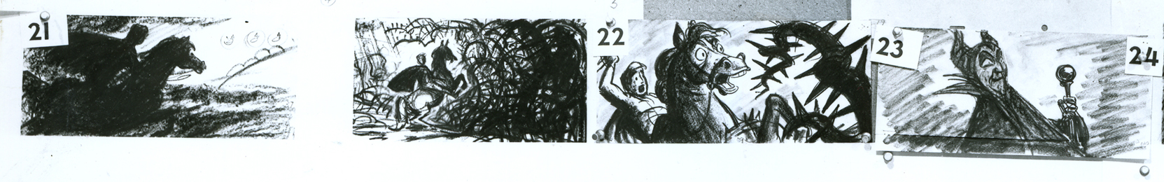
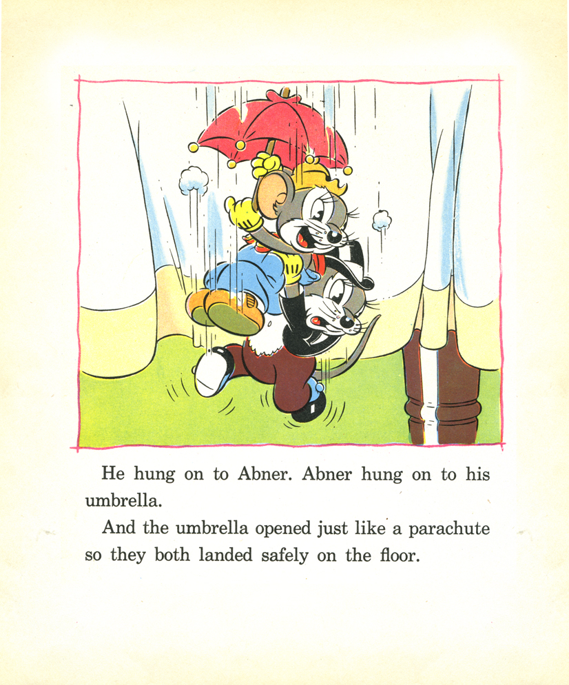
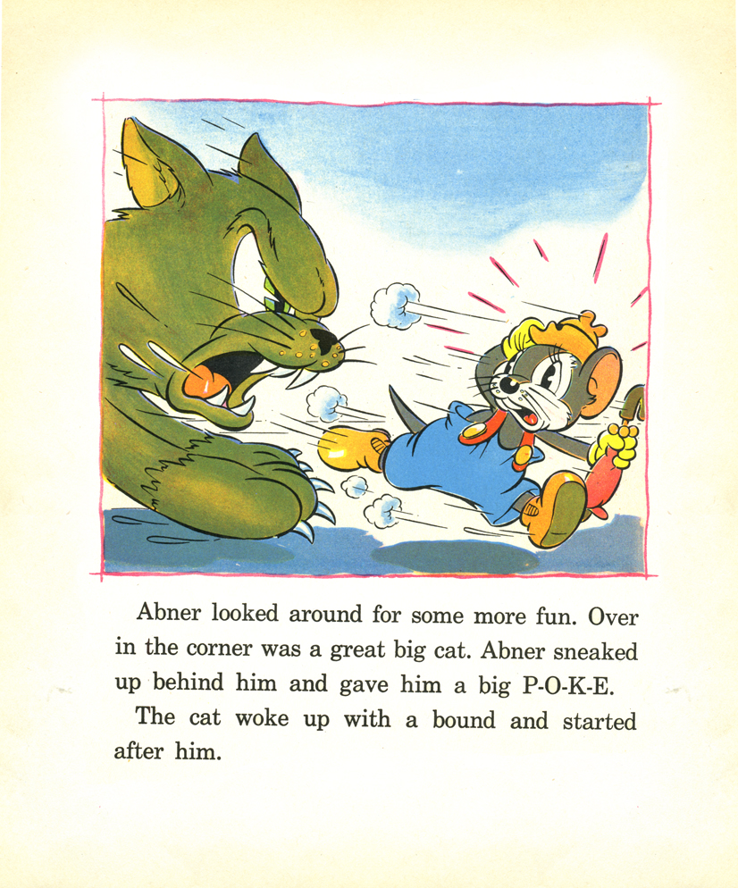
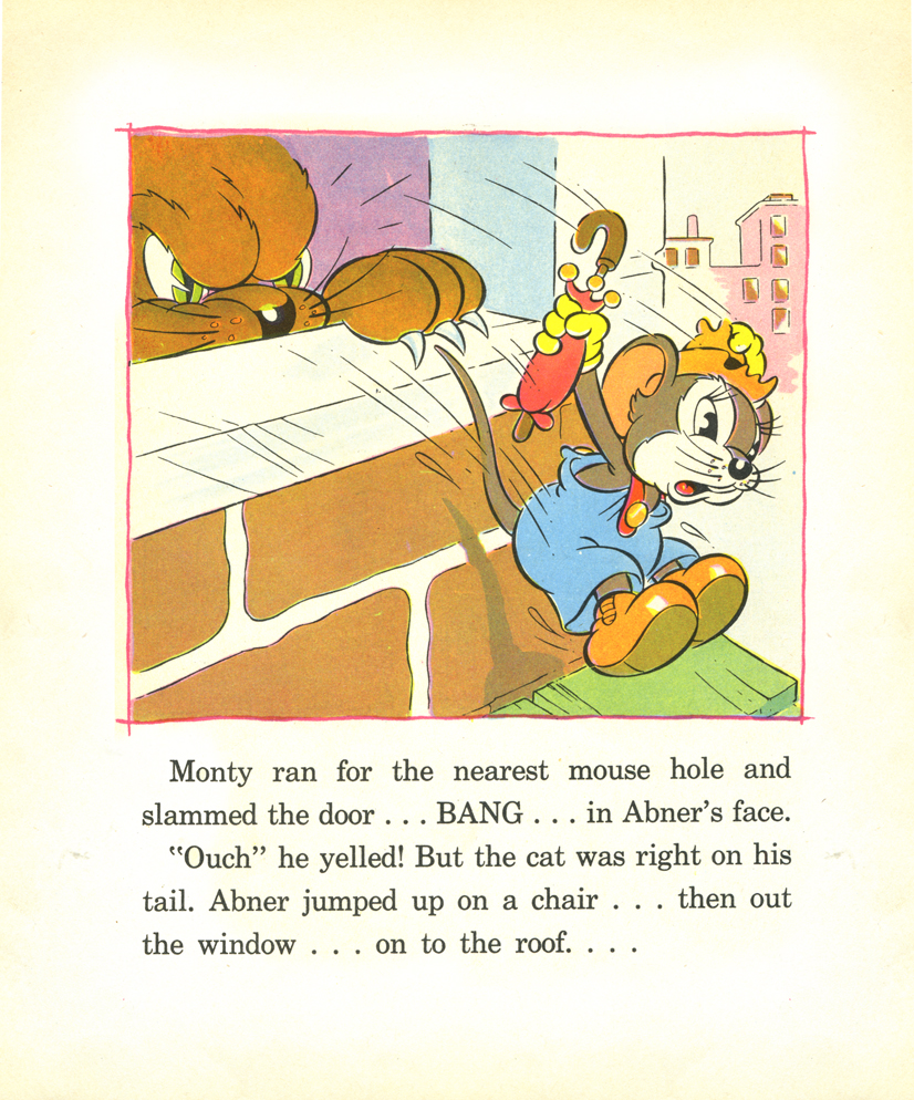
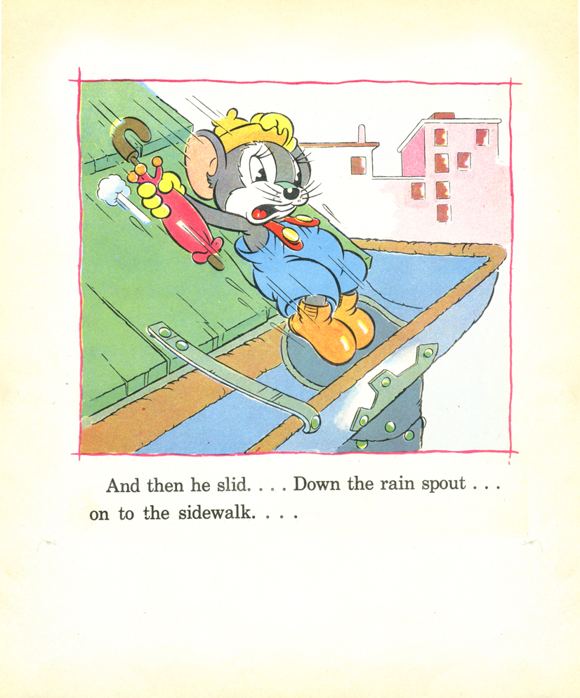
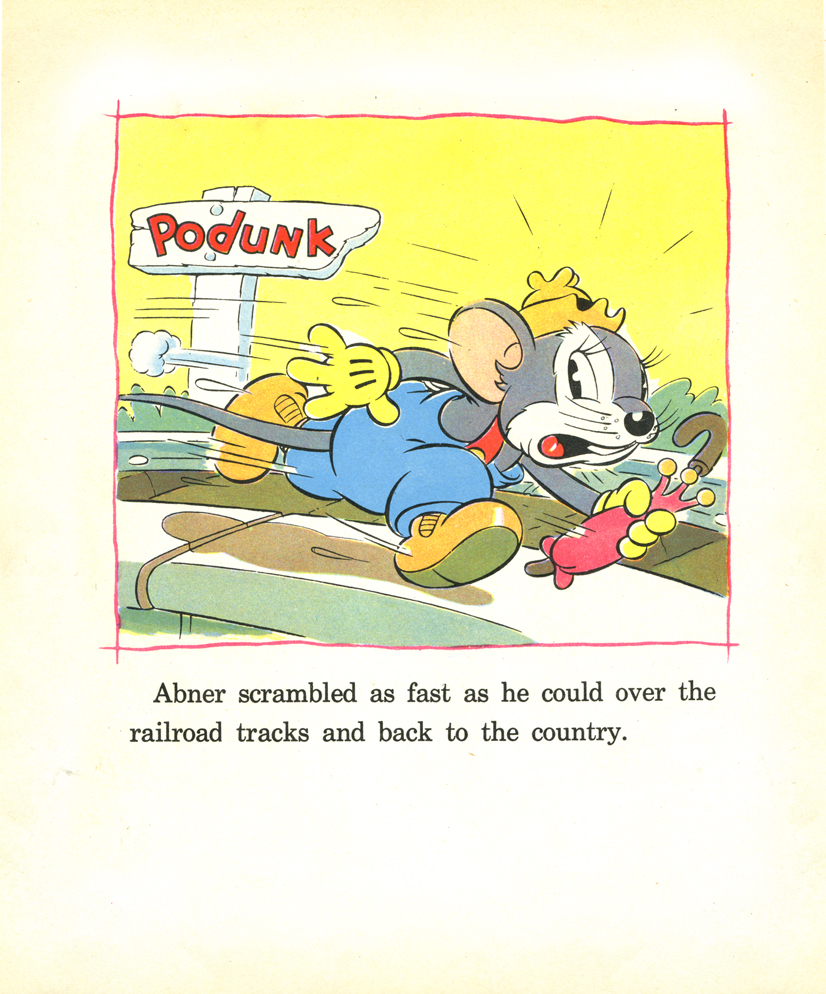
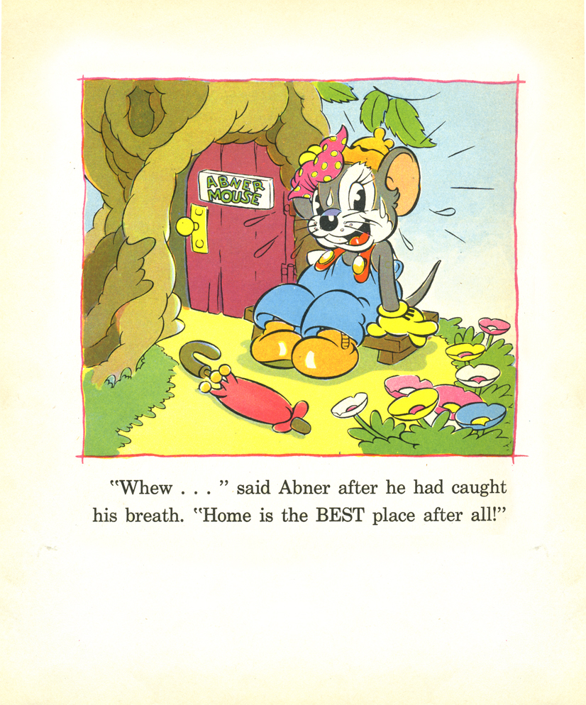
Animation &Animation Artifacts &Disney 16 Jul 2008 08:02 am

Skumps Dwngs

- This will be the last Sleeping Beauty post of the week. (Having lately seen a number of negative posts about this film, I’m sure some of you will be glad about that.) I promised to post a couple of drawings I have for the “Skumps” sequence once Hans Perk had completed posting the drafts for this sequence so that I could I.D. the animators. (I have to say I guessed correctly in three out of four shots, so I’m pleased with myself.)

I’m posting closeups of the drawings. By clicking on any of them you’ll see the full sized animation paper. I’m also posting frame grabs beneath the drawings so you can see how they looked in the film.


This is a Milt Kahl scene, seq 13 sc 8. This drawing is undoubtedly a clean up,
so it’s not one of Kahl’s drawings – just his pose. It’s an extreme.


It is interesting that Kahl animated both characters.


This is a John Sibley ruff. Seq 13 sc 17.


It’s a very odd, uncoordinated dance number by the drunk lackey.


This is my favorite of these four. It’s a John Lounsbery ruff of King Stefan.
Another extreme from seq 13 sc 26.


I like this character.


This is also another beautiful ruff by John Lounsbery. It’s King Hubert in the
very last scene of seq 13, sc 57.


it comes just prior to Hubert’s turning and sitting on the palace steps.
___________________

And now for something completely different:

Bruce Knapp, who has worked with many of us in the New York industry, has a film competing in WNET/ch 13′s On Air competition. Every Saturday night they air two features and a short film. However, the public selects the short films from three on line contestants.

Bruce’s film Keep This Coupon, which won an ASIFA East award last year, is in the running for an airing this coming Saturday. Can I urge you all to go on line and vote for his film (prior to Thursday at 5pm)? Let’s get an animated film in the mix. Go here to vote, and/or see the films and VOTE.
Thanks to Masako Kanayama for letting me know about this.

Disney &Frame Grabs 15 Jul 2008 07:24 am

Grabs – SB ending – 1

- Continuing with yesterday’s post on the end of Sleeping Beauty. I’ve decided to get the frame grabs for the sequence and post them as well. I thought the comparison of board to actual film interesting.
__________

These images come from the “Special Edition” of the dvd, not the “Platinum Edition” now on the market. Using Hans Perk‘s posts of the drafts for these scenes, I was able to identify the animators’ names. (Trust me, I’m nopt trying to compete with Mark Mayerson‘s brilliant “Mosaics”. This is too hard; I have no intention of keeping it up.)


sc 82 (L) Milt Kahl – sc 82.1 (R) Frank Thomas


sc 82.2 (L) Kahl & Thomas – sc 82.3 (R) George Nicholas & Jerry Hathcock


sc 82.4 (L) Nicholas – sc 82.5 (R) Nicholas & Hathcock


Nicholas & Hathcock (L) sc 82.6


Nicholas & Hathcock (L) sc 83


sc 84 (L) Ken Hultgren – sc 85 (R) Nicholas & Hathcock


sc 87 (L) Nicholas & Sibley – sc 88 (R) Nicholas & Hathcock


(L) Nicholas & Hathcock – sc 89.1 (R) Hultgren


sc 89 (L) Nicholas & Hathcock – sc 91 (R) Hathcock


sc 91 (L) Hathcock – sc 92 (R) SA sc 49 seq 8


sc 95 (L) Hathcock – sc 93 (R) Hathcock


sc 96 (L) Hathcock – sc 97 (R) Dan MacManus


(L) MacManus – sc 97.2 (R) Hathcock


sc 98 (L) Hathcock – sc 99 (R) Sibley


sc 100 MacManus


sc 100.1 (L) Hathcock – sc 101 (R) Les Clark & Fred Kopietz


sc 102 (L) Hultgren & Kopietz – sc 104 (R) Hathcock


sc 107 (L) Hathcock – sc 108 (R) Hultgren


(L) Hutlgren – sc 109 (R) Hathcock


sc 110 (L) Ollie Johnston & Blaine Gibson – sc 110.1 (R) Gibson


sc 110.2 (L) Johnston – sc 110.3 (R) Johnston & Gibson


sc 110.4 (L) Johnston – sc 111 (R) Johnston & Gibson


sc 112 Johnston & Gibson


sc 112 (cont) Johnston & Gibson

Animation Artifacts &Disney &Story & Storyboards 14 Jul 2008 08:06 am

Sleeping Beauty’s End – 1

- To continue my attempt to keep up with the invaluable drafts that Hans Perk has been posting on his blog, I have some more storyboards to offer. John Canemaker has loaned me the final sequences of the film detailing the dragon fight and climax of the film. It’ll take a couple of weeks to post them all, so let’s get started.

We’re not sure exactly who did the artwork, but there’s a good chance it’s Ken Anderson‘s work. As with past boards, I’ll post the whole photograph as is, then take it apart row by row so that you can enlarge them as much as possible. Here’s the storyboard sequence #18 from Sleeping Beauty.


(Click any image to enlarge.)

1a

1b

2a

2b

3a

3b

4a

4b

5a

5b

6a

6b

7

« Previous PageNext Page »

eXTReMe Tracker
click for free hit counter

hit counter