Animation Artifacts &Comic Art &Commentary 16 Aug 2008 07:58 am

Odds and More Ends

Today’s NY Times features a Blog/Article that analyzes all of the Star Wars movies. The author, Chris Suellentrop, says the new video game is “small consolation for the realization that the franchise that dominated their lives for 30 years has ceased to matter.”

Lucas’ Cloned Wars received one star from all of the NY papers, including the NY Daily News. JOE NEUMAIER says of the film, it’s “chock-full of video game-style action scenes and drawn to resemble the puppets in the 1960s British TV show “Thunderbirds,” is just as wooden as the last few live-action movies…”

NATHAN LEE in the NY Times says: “it isn’t the most painful movie of the year!”
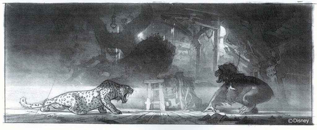
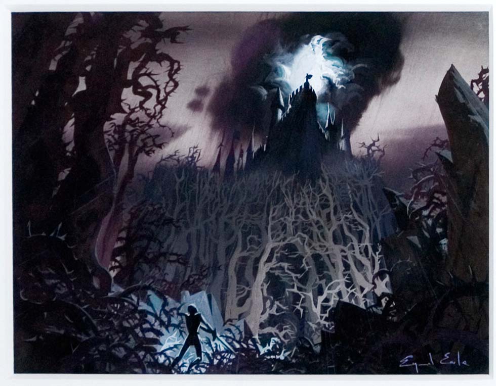
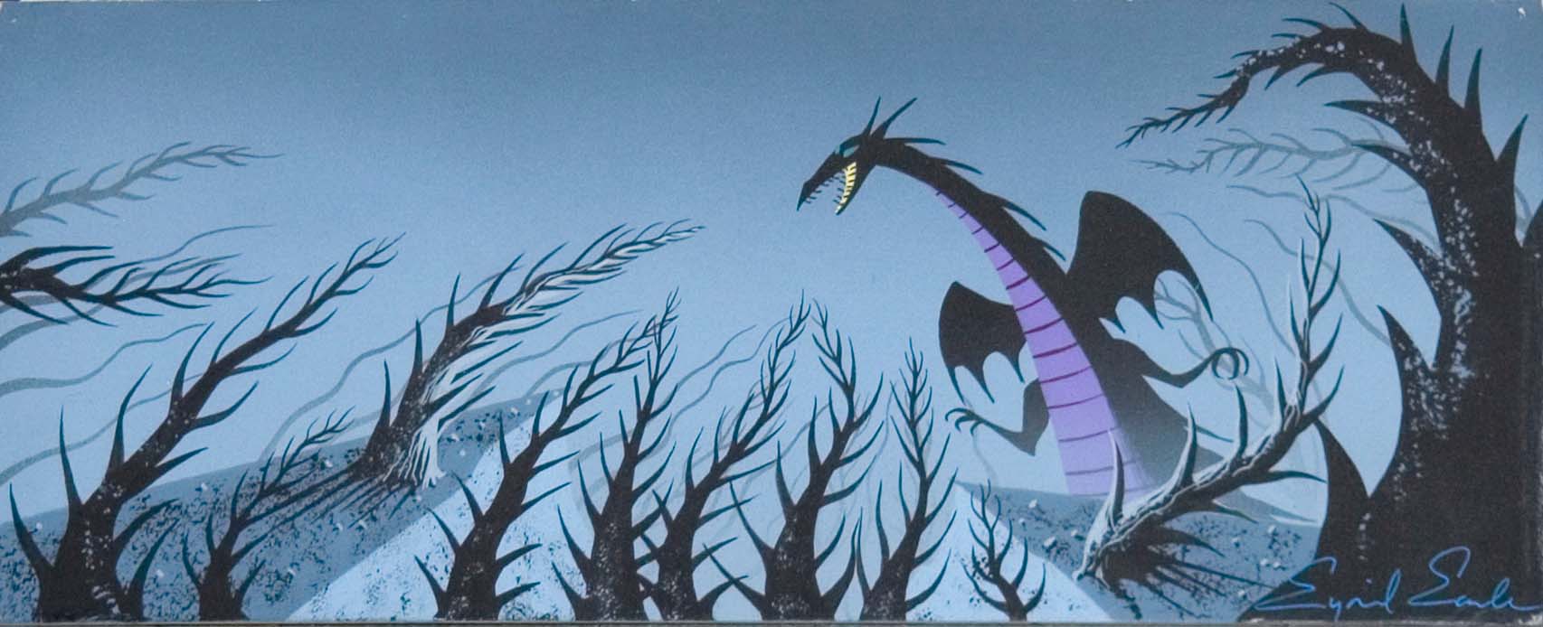
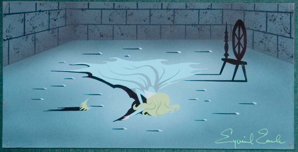
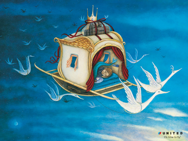
The NY Times also has a slide show feature of “concept art” from the film (five images.) That’s where I pulled the image to the left.

Newsday‘s RAFER GUZMÁN (AP) says: “the film feels like an unauthorized knock-off, one of those “tribute” shorts that pop up on fan Web sites.”

Apparently this is the pilot for a new series coming to Cartoon Network. It’s obviously part of their push to get more 14 year old boys to watch. I guess it’s a positive that it’s not a live action series for CN. I wonder how long it will be before Lukas clones “Indiana Jones”?
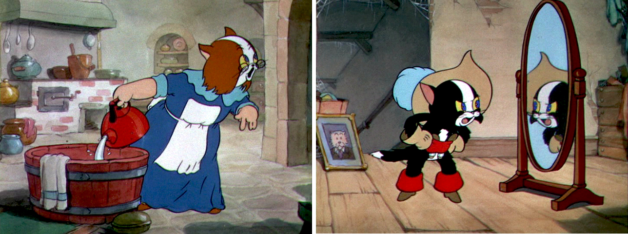
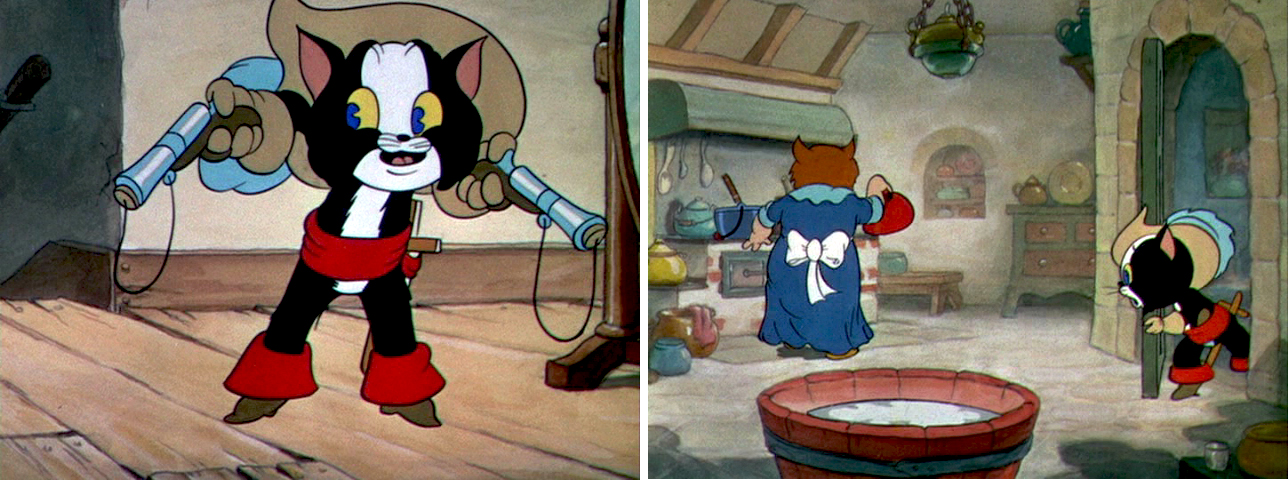
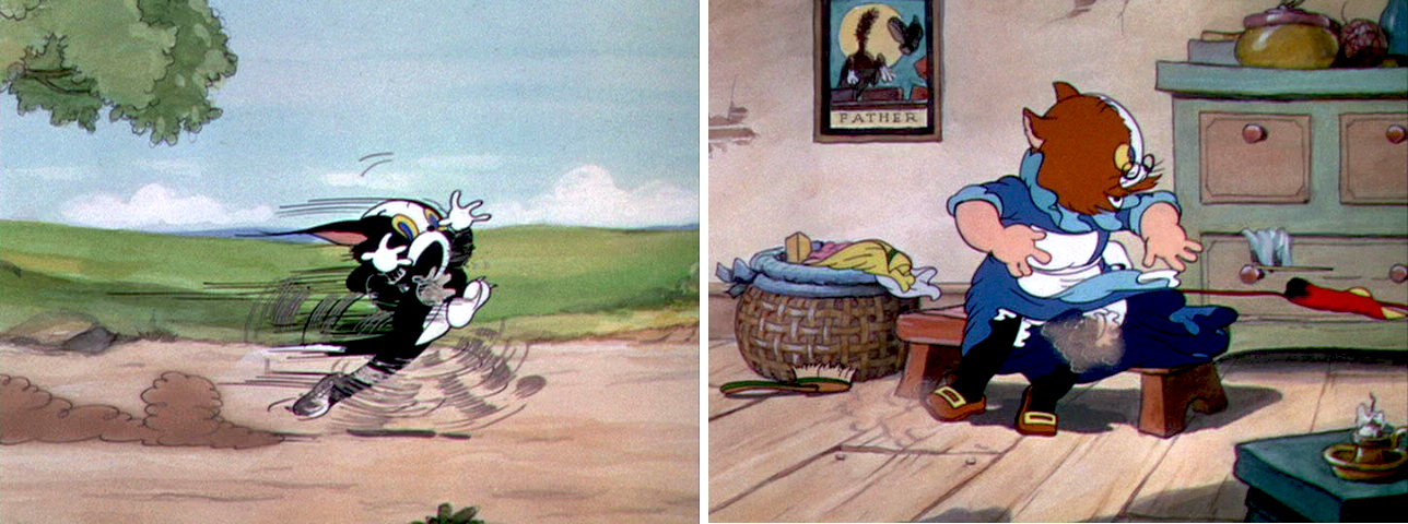
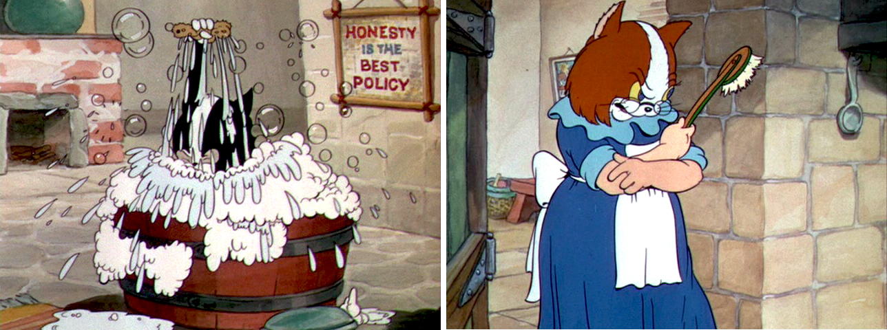
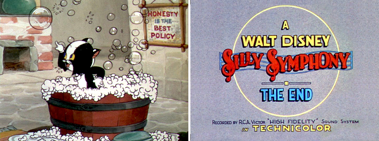
_____________________

Mark Mayerson, as you probably know, still continues to post his wonderful Mosaics on 101 Dalmatians and gives the excellent commentary with it. I write this only to remind you to keep up. Mark’s work is an enormous resource that can be too easily taken for granted. I wish he were able to print these up in book form. Perhaps, some day Disney books will realize there’s an excellent publication for grab here. “?

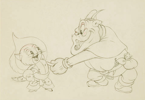
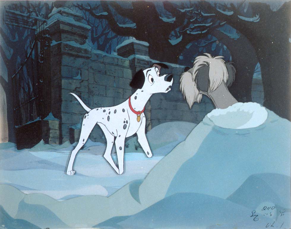
- Robert Cowan‘s art collection includes a cel set-up (above left) that seems to jump right off Mark’s mosaic. How interesting that Mark chose that particular set-up. How great the Cowan collection is; take a look at the site if you’re not familiar with it or if you haven’t been there in a while. You should also look at his Comic Art collection. There, you’ll find everything from Burne Hogarth to George MacManus to Winsor McCay.

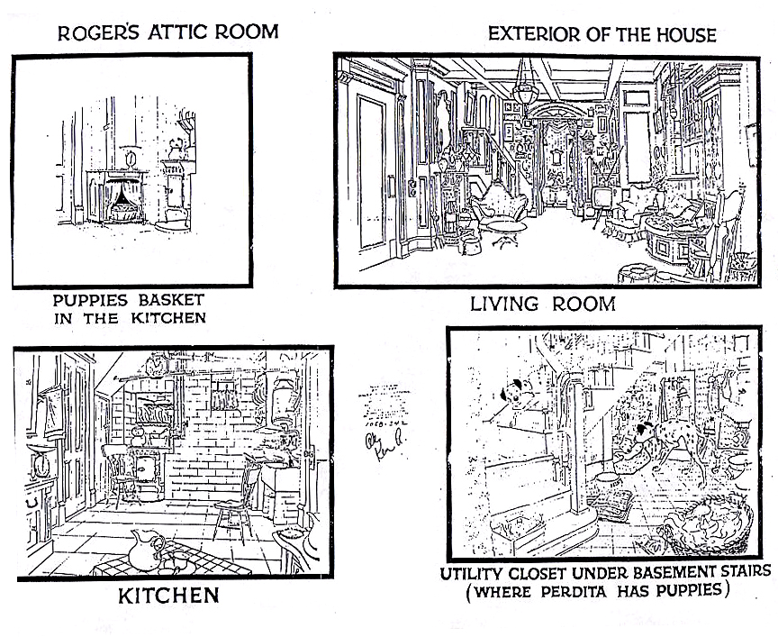
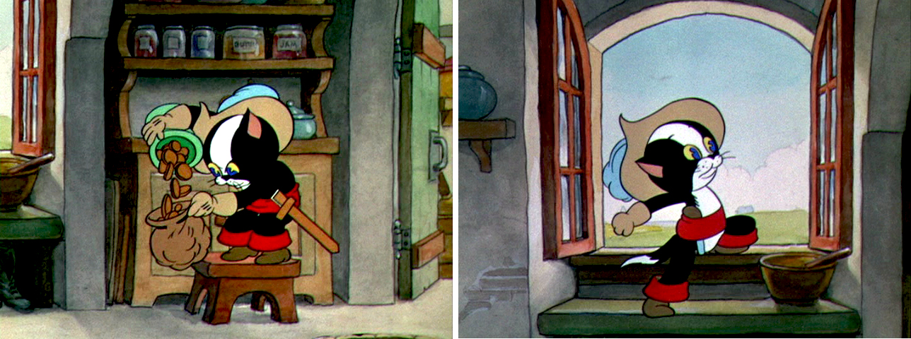
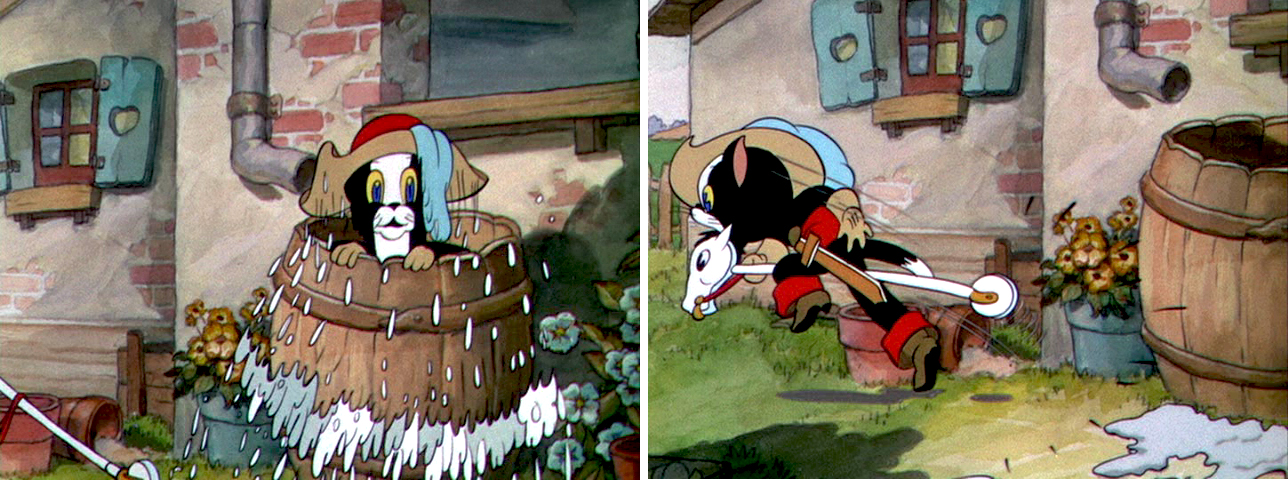
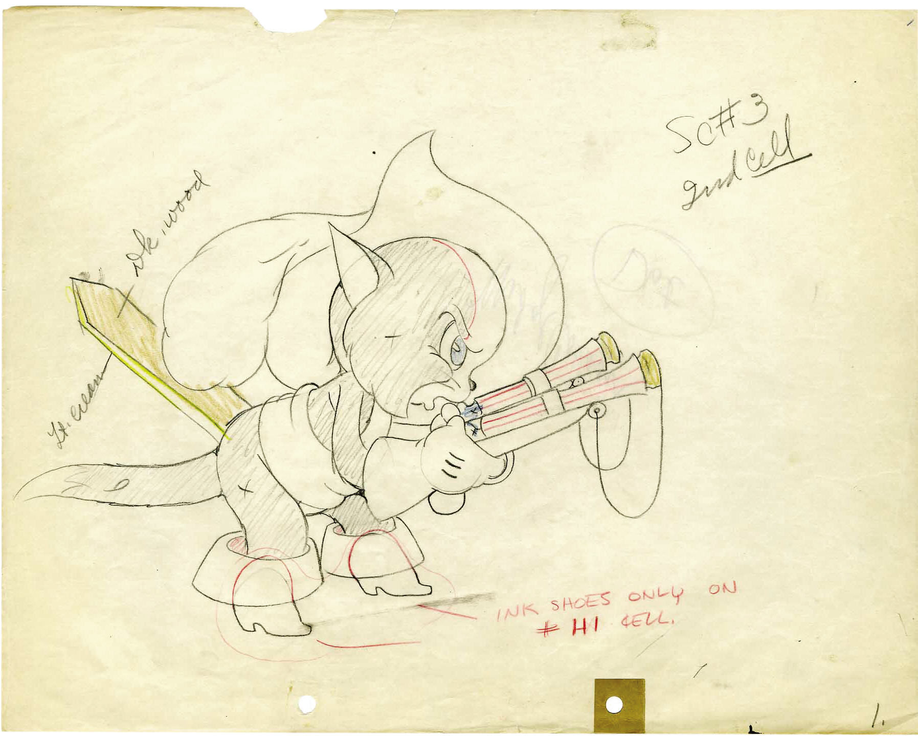
- On the Animation Archive site, I found these Bg. plans for 101 Dalmatians. It really defines the layout of the house. In case you don’t know this site, they have dozens of model sheets for viewing. Some are brilliant, some are bad copies, all are worth checking out.

_____________________


- I received an interesting art link yesterday which displays accredited art colleges to create a comprehensive directory for potential students to browse. Since I’m sure a lot of students check out this blog, I thought it might be a useful link for some readers out there. It’s called FindYourArtSchool.com.

For those considering an education in fields relevant to animation, this may be helpful.

.

Animation Artifacts &Guest writer 15 Aug 2008 07:59 am

Irv Spector – II

- On Wednesday, I’d posted some wonderful drawings and an excellent piece by Paul Spector about his father, Irv Spector, in the Signal Corps. There are many more cartoons and caricatures Paul has to share, so here’s a follow up to that post.

On Cartoon Brew, Amid Amidi had this response to one of those commenting regarding the cartoons, and I think it worth adding here:
Gag drawings done at animation studios are very ephemeral. It’s hard to know fifty years later what the situation was that prompted this drawing by Cobean. Then again, these drawings were never intended to be viewed decades later or seen by people outside of the studio.


Irv Spector – “God – but”


Lars Calonius


(Click any image to enlarge.)


Animation Artifacts &Daily post &Disney 14 Aug 2008 07:43 am

Blogged Me & Eyvind Earle

In the past two days I found myself the subject of a couple of animation sites. This is, no doubt, due to my two new dvd releases. Both have received a lot of attention on review sites and have been favorably reviewed, but these animation sites deserve to be mentioned.

- Last week, I’d received an email from Mike Barrier with a letter he’d received from “anonymous.” The letter was a not-very-positive comment about Mike’s positive reviews of my film, The Man Who Walked Between the Towers. So I wrote a slightly annoyed response which Mike posted. I think if “anonymous” had had the courage to stand behind the letter by using his(her) name, I would have been more patient with it. Just the same, it all makes for a peculiar read. I can’t say I mind it, in the end. Take a look, here. ____________________ An image drawn by me that duplicates one in the book.

______________________ ____________

Mike Dobbs, the estimable animation historian and former editor of Animato and Animation Planet, has posted an interview with me on his site, Animation Review.

By the way, Mike Dobbs has two other sites:
_____ Made of Pen & Ink is his book on the Fleischer
_______studios
which is posted on line as he writes it.
_____ Out of the Inkwell is Mike’s general blog.

______________________

- Finally, David Nethery has posted a recommendation for my two new dvd’s on his site, Academy of Art Animation. Thank you, David. It’s much appreciated.

______________________

- And now for something completely different – let’s go back to Sleeping Beauty and Eyvind Earle. Bob Cowan responded to my posts of the art direction for that film by sending me some beautiful color pieces Earle did for the film. He’s given me permission to post them here. They’ve all been posted on Mr. Cowan’s site. There’s a lot of amazing artwork there – if you haven’t been following it, go. These five paintings are beauties.


(Click any image to enlarge.)


Animation Artifacts &Articles on Animation &Guest writer &Photos 13 Aug 2008 07:51 am

Irv Spector – I

– Not too long ago, Paul Spector and I had an email conversation about his father, Irv Spector.

Irv was an animator that I knew periferally in New York during my first days in animation. We saw each otherat Union Meetings and some animation events in New York, but I didn’t really know about his start and key days in the business.

I jumped at the chance to ask Paul to share anything, anytime with this blog, and I’m pleased and excited to post this first entry from him.
__(Click any image to enlarge it.)

________________________

In 1941, during WWII, my father was an animator at Flesicher Studios in Miami, FL. At the the time, many cartoonists were being drafted into, or enlisting in, the miltary. Knowing he would soon be one of them he left Florida and drove across the country back to Los Angeles — where he was already registered for the draft — to push up his induction. (He began his career in LA at Mintz and Schlesinger, before taking a job with Fleischer when they were still located in New York).

Like a lot of other cartoonists my dad was assigned to the animation unit of the Signal Corp, making training films and other industrials; in his case back at the east coast unit.


In this photograph, my father is second from the right.

While many of these films incorporated animation as well as live action and photography it was not just those in the animation field who worked in the Corp. Although those of us with an interest in the animation field tend to focus in on that aspect, the Corp also produced pamphlets and manuals, etc. One of these non-animation inductees was Sam Cobean whose illustrations appear in many of the images below. Some of the most striking are done by him. A quick note about Cobean: during the war he was taken under the wing of The New Yorker magazine cartoonist-extradinaire Charles Addams, who introduced him to the editors at the magazine. Cobean soon began publishing there, and his star rose quickly through the post-war years until he was tragically killed in an automobile accident in 1951. The majority of those below came out of a manila envelope with “Sam Cobean, Bob Perry, Others” written on it. Several others were from untitled envelopes. Very few are signed by the artists, although you’ll notice several that are, especially two straighter drawings by the magnificient Lars Colonius. However, the vast remainder are pretty much gags and caricatures. Mostly funny, ludicrous, or just really nice to look at.

Some poke fun at army life, but most of all they lampoon my dad, who appears in almost all of them along with a cast of other cartoonists in the unit. (But whose else would I have? Naturally, about 98% of what I have is his work. This is the other 2%). The joke in some of these is that my father began to lift weights in the army, hence the drawings where he is muscled, or the mention of “Spector’s Health Roof”, or referred to as Simian(!) Here is are some real photographs of my dad in those years, so you can get a fix of what he really looked like then. Make sure you scroll down, and maybe someone out there can identify the three other gents in the image of them sitting along a wall (my father is second from right, with his eyes closed.)


Irv Spector


I’ll leave it up to all of you to try and identify anyone depicted throughout. One who is obvious to me is animator Herman Cohen, a longtime friend of my dad’s and our family in general. Here are some photographs on him — that’s his wife Juliet sitting on his lap.

An anecdote about Herm: In the mid-late 1960s, Herm and one of his sons, and my dad and myself, were shooting pool at our house. On one of Herm’s turns, we watched him take his cue stick and line it up by the 1-ball, sizing up angles. However, when it was time to take the shot, he actually hit the 1-ball with his cue — as if it were the cueball — to sink another ball. A moment later my dad says, “Hey, I forgot all about it. Herman is color blind!” Yep, Herm mistook the solid yellow 1-ball as the cueball. Just goes to show there’s hope that you too can have a lifetime career as a respected animator without being able to identify colors.


In this image, Herman is first in line.

(Here are a few more of Irv’s caricatures of the period.
None of them have any background info on them.
If you can ID any of the people, please feel free to comment. MS)


Health Roof


(R) Veronica Spector – (L) Edmond Kohn

For the historians out there: There seems to be a dearth of information on the internet regarding the Signal Corp Animation Unit, east coast and west. If it helps, I’ve pieced together some of my father’s own moving around — date-wise, using some of the mail he received during this time. Maybe this info can be extrapolated…I dunno, but perhaps it can help.

    April 1942: Bob Givens (also in the service) writes him at Ft. Monmouth, NY (from Ohio).
    August 1942: Givens writes him c/o of the Signal Corp Animation Unit at Long Island City, NY (no return address).
    September 1942: Jack Rabin (just about to be inducted) writes to him at the Training Publications Dept. of the Anti Aircraft School, Camera Crew Unit #1, at Camp Davis, NC.
    July 1943: Written to at the Signal Corp Photographic Center on E.32nd St., NYC, NY.
    Jan/Feb, 1944: Carmen Eletto writes to him, again at the Signal Corp Photographic Center on E.32nd St., NYC, NY.

Here’s an undated item from the TAG blog. Givens is in it, at Ft. Monmouth. So, pre-April ’42 maybe? Before he was shipped out to Ohio, of all places.

More images will follow on Friday.

Commentary 11 Aug 2008 08:27 am

From soup to nuts

- To me, the most valuable posts of the last week or so came from Hans Perk on his blog, A Film LA. There he displayed some amazing artifacts showing patent papers and many photographs of Disney’s Vertical Multiplane Camera stand.

Ever since first seeing the drawings and photographs of the multiplane camera in Bob Thomas’ 1958 edition of The Art of Animation. I searched all the Disney films after that looking for where the camera was used. I scouted for information about the camera. Once I started filming my artwork (in 8mm) my brother-in-law and father teamed to construct one for me. It employed 12 levels of glass and about 6000 watts of light. Each level was about 24″ x 36″. I used this for many many film bits done between ages 14 and 17. (I still have it in storage, though I assume all the glass is broken and the lights are gone.)

In the last week, there has been more hard information here on the subject than I think I’ve seen in my lifetime, and believe me I’ve looked. I can only thank Hans for taking the time to offer this selection of material. If you haven’t seen the seven part series, go.

_______________________

- Taking a 180° turn, I found this article in the Hollywood Reporter over the weekend. It is about new developments in Performance Capture. You can’t access the article without a subscription to the magazine, so I’ve reprinted the first few paragraphs.

    Man-to-man discussion
    Creating CG actors on agenda at Siggraph
    By Carolyn Giardina


    A computer-generated face has replaced the real face on this live-action body.

    LOS ANGELES – Advancements in creating photoreal CG “human” characters and the related subject of motion capture will be key topics at Siggraph 2008, the international conference and exhibition on computer graphics and interactive techniques that opens Monday at the Los Angeles Convention Center.

    “We are now at a point where we can create photoreal characters, but it is hugely labor-intensive and it is really expensive ” said Oscar-winning VFX supervisor Michael Fink (“The Golden Compass”), who recently was named president of VFX worldwide at Frantic Films VFX and Prime Focus Group.

    “Can we do an absolutely, totally realistic Elvis Presley? Probably not. But that is because he is so well known,” he said. “But if we had to create a character that nobody had ever seen before ? That might be possible at this point. And in a few years it will be possible to do EMs. Alot of people think it is possible now. I don’t.”

    Motion capture, also called performance capture, is the process of digitally recording an actor’s movement. It is not new, but the technology involved is advancing, making the process faster, more accurate and more flexible for VFX/animation houses to incorporate into their CG character creation.

    This summer, Industrial Light + Magic used the technique to capture Robert Downey Jr.’s performance for their CG Iron Man. And Digital Domain similarly captured performances for its CG terra cotta army and foundation army in “The Mummy: Tomb of the Dragon Emperor.”

    “It went from a reference tool to a body-animation tool. Now we are getting to facial motion capture — and all with less and less constricting systems,” Digital Domain CEO Mark Miller said.

As I’ve stated in the past, I’m not sure how long 2D animation will exist, but things are certainly changing quickly. Pixar keeps getting more and more realistic in their approach; obviously they know something.

And yes I am being provocative – for a reason.

_______________________

– The beautiful new ads for United Airlines are worth viewing. They’re quite stunning. Thanks to Amid on Cartoon Brew for directing me there. It’s a strong collection of mixed media pieces – from cgi to 2D to 3D/puppet. They’re quite the finest work in animated commercials.

Commentary &Photos 10 Aug 2008 08:07 am

PhotoSunday: Sidewalk Sculpture

- Public stauary in New York City is much like trees. Within the many parks, there are lots of trees as well as statues; outside of the parks, the trees are less obvious as are the statues. However, there are still many.

Outside the park the sculpture is a bit more modern and often abstract. Let’s move from one to the other.

This statue of Garibaldi is typical of the many statues from the early 20th Century that depict somewhat realistic images of heroic and public types. There’s usually an attempt to make the people a bit larger than life. Some of these are more daring and/or dynamic than others.
Garibaldi sits in NYU’s Washington Square Park, downtown, and has an important place within that park.
_____(Click any image to enlarge.)


Giovanni Turini’s statue was made for an Italian American organization
and donated to the park in 1888. It has developed a handsome patina which
allows it to nestle in among the beautiful summer greens around it.


Just outside of Washingon Square Park there’s a mall of a street
filled with small shops and restaurants, LaGuardia Place. Among and
in front of theses shopos is a statue of Fiorella LaGuardia, the mayor of
New York from 1934 to 1945. The statue is by sculptor Neil Estern.


All I really know about LaGuardia was that he read the Hearst comic strips,
“Puck, the comic weekly,” on Sundays over the radio. An odd little fact that
Chuck McCann told us in his weekly Sunday kiddee show in NY during the 60′s.


In a very small park off Sixth Ave. and Bleecker St., called
Winston Churchill Square, there’s there’s this armillary on a pedestal
centered in among park benches and greenery.


The park was designed by George Vellonakis.
He may have designed the sculpture.


What looks like a more abstract version of an armillary sphere sits among
the buildings of NYU. Here are two views from both front and back.


I haven’t been able to name the sculptor as yet.

These sculptures are all within six city blocks of my studio.
There are thousands more in New York, and I’ll post more soon.

Daily post 09 Aug 2008 08:12 am

Dil & Dali

John DIlworth wrote from Spain that his film, Life in Transition, will be playing this month at the Museum of Modern Art. The film will be on the same bill as Federico Fellini’s The White Shiek.

The description, according to MOMA’s catalogue states that, “Dilworth explores metamorphosis, a main concept in Surrealism, in Life in Transition, unquestionably an homage to Dalí.”

The first screening will be this coming Wednesday, August 13, at 7:30 p.m.
It’ll repeat on Saturday, August 23, at 5:30 p.m.

________________________

- It’s nice to have been ever-so-slightly ahead of the curve.

Recently, I had a post about bicycle stands around the city and the various shapes they take. What I didn’t realize was that David Byrne has been obsessed with all things bicycle, and he has designed a number of bike racks around the midtown area. There’s an article in today’s NYTimes about his recent artwork/sculptures for the bicycle. It’s worth a look.

________________________

Now, back to John Dilworth:
John also sent the following interview that was conducted by Lindsey Hawkins, they’re all questions from fans about Courage the Cowardly Dog:

    1. You have indeed met Simon Prebble, how did he like his role?

    Simon enjoyed his role very much. He had a natural rapport with the personality of the Computer. However, Simon is an English gentleman who liked to laugh, where the Computer is a clever, but remote cynic, not concerned with human pathos. I had wanted a symbolic object to represent contemporary obedience to technology as “master” for Courage to confide in. The “home” computer was the logical “paternal” replacement.
    I’m a bit of a fan of his other work in other things so I’d like to know.

    2. Is there any hope of continuing Courage?

    Well, humans have a tremendous capacity to “hope”. I have written so often on this. There is no corporate economic rational to make any new episodes. I’ve read that there have been petitions signed by many many fans that never even got to Cartoon Network. Maybe a campaign of a substantial nature of this kind, that actually got to an exec, would be a provocation. However, the lack of courage by the merchandisers still remains. “Pink” or “fuchsia” dogs will not sell in a boy dominated market place. This is rather complex, but the undercurrent of conservatism in America is strong and easy to intolerance.

    3. What was your inspiration when you created the various villains?

    Well, the villains were archetypes of human qualities or beliefs. Greed was a big character quality. Many of the villains were needy or hungry for something more; power, possession or privilege. Yet, I wanted to show a
    “human” frailty in these villains, that they were vulnerable. Courage often was able to soften the villainous acts of these characters by being a “therapist”. For me, contemporary society is unable or unwilling to listen anymore. Maybe this is a product of conditioning over a long period of technological change that doesn’t promote much more than insecurity. The further humans retreat into the virtual, the more it appears the qualities that make humans “human” are endangered, qualities like tolerance, attention, inquiry…

    4. What was the original intent of the show when you created it?

    Science fiction is a genre that appeals to me so I may disguise my “rescue fantasy” complex. I wanted to “help” people, “save” someone, do something romantic and noble as “sacrifice” my safety for the safety of others. Courage was capable of doing this in the unreality of the animation landscape. Animation are dreams visualized. Visualized dreams are human desires calling out for an audience. Let’s not omit the common desire to make audiences laugh. In many ways, producing Courage enabled me to explore my sub-conscious and reveal some of my demons like abandonment of devotion, loss of honor, lack of self-expression. I was able to find mediums to best portray emotional landscapes like clay, CGI or cutouts. Any long term commitment develops as nature develops, things grow where non did before and as an artist/custodian I decide what to nurture and what to reverse. Then, like in nature, some things develop on it’s own while others don’t make it at all.

    5. Where did you get that guitar sound from the beginning of the ‘Heads Of Beef’ episode?

    Jody Gray and Andy Ezrin are exception musical talents who enjoyed to work intuitively and spontaneously. Although I cannot recall any specific guitar experience, often we would sit around experimenting with what sounds come out of objects and instruments. Other times I would bring in ideas I heard outside the studio that would inform a new sound. I recall one inspirational moment was on an episode when Nowhere was underwater from the construction of a dam. Jody and Andy found an abandoned grand piano and opened it up. They began plucking, hitting and scratching the guts of the thing and recorded it. These sounds were used as the aquatic ambiance for the show.

    6. Where did you get your inspiration for Courage, Eustace, and Muriel?

    Three is a cultural number representing both the secular and the divine, the single child of working class families and a geometry, the pyramid. I have always been intuitively attracted to this number. Curiously, I was reminded of the my mythological trilogy of personae in a recent text. My films have exhibited this contradiction to “three’s a crowd” from the beginning of my life as an artist. When Lilly Laney Moved In, Smart Talk with Raisin, the Noodles & Nedd films and Angry Cabaret featured “three’s”. But it is in Raisin that the closest ancestors to Courage can be found. The dog star of the short was named Hamilton, and resembled Courage physically and even emotionally. Raisin’s brother, Malcolm is the Farmer as a boy. I recently gave a talk at a museum in Barcelona on how animation liberates the human spirit. I analyzed the mythological motifs of several of my films as a demonstration of auto-discovery through animation. It is apparent to me that the archetypes of the emotionally sensitive deliverer, the remote and rancorous brute and the nurturing “maternal” figure recur often in my work. Inspiration is also a matter of subconscious processes made conscious through will.

    7. Why did you add words with sound like ‘smack, bang, bonk’ when a character screams or gets hit?

    Originally I aspired to be a cartoonist and studied under Will Eisner at the School of Visual Arts in NYC, a very print dominated facility. Print cartoons are merely the beginning stage of the next, movement. Visual sound effects are a part of my vocabulary of animation as the grin or irrational reaction. I am also aware of how elements from different studies can compliment one another and add a bit of variety to a visual language.

    8. Chris Gammon would like to know when you can get in touch with him again.
    Chris is a good soul. Thank you for the message. I shall send him a Dilly greeting.

    9. Where you got the ideas for The Queen Of The Black Puddle and Fred? Particularly if you got the inspiration for The Queen from mythology.

    The Queen from the Black Puddle is a parody of the sci-fi film Creature from the Black Lagoon. Many of the Courage episodes were parodies of my favorite horror/sci-fi/supernatural films. Queen/Creature had an implicit sexual message. The object of desire was to be “taken” at any cost. The irony in Courage is that who would imagine the Farmer as being the object of anyone/anything’s desire?

    10. Why did you make it the middle of nowhere? If you use Google Earth you can find that there is indeed a real Nowhere, Kansas! Did you get the idea for it from that town?

    I had no idea that a town with the same name existed. I wanted to portray a pseudo-village, a reverie and melancholia of places in America that proved no longer an economic imperative. To me, when a national chain or an international company decides to shut it’s doors the town that was dependent on that industry becomes enchanted, as if put under a sleeping spell, went from somewhere to nowhere.

Disney &Frame Grabs 08 Aug 2008 07:56 am

More of The Robber Kitten

- Having posted, yesterday, John Canemaker‘s copy of the book version of The Robber Kitten, a 1935 Disney Silly Symphony, I thought it’d be entertaining to go back to the film to take a look. Here are frame grabs from the film. It’s not the greatest of the Silly Symphonies, but it certainly came at the height of that series and is filled with enormous charm, technique and excellent animation. The staff was doing films like this better than ever before. It’s a solid little movie. (Too bad the copy on dvd is made from a print with a yellow haze running down the right side of the print.)
You can see this film on line here.

The book Walt Disney’s Silly Symphonies by Russell Merritt and J.B.Kaufman givews the credits:
Directed by David Hand
Script by Bill Cottrell
Music by Frank Churchill
Voices: Billy Bletcher (Dirty Bill) & Clarence Nash (horse whinny, Tarzan yell)
Animation:
Bob Wickersham (Ambrose, from opening through sneaking downstairs)
Marvin Woodward (Ambrose’s mother; Ambrose running back home)
Hardie Gramatky (Ambrose steals cookies and runs away from home; Ambrose flees from Dirty Bill)
Ham Luske (Ambrose and Dirty Bill before flashback)
Bill Roberts (Ambrose’s story: Ambrose, stagecoach, horses; Ambrose and Dirty Bill after flashback)


(Click any image to enlarge.)


This sequence seems, to me, to be quite ground breaking.
Two characters have an extended conversation without interruption –
up to the point where Ambrose tells his fabricated story.


There’s plenty of business for the two of them, and their characters
are well defined through their dialogue, as well as the performances.


I suspect that Bill Cottrell had a lot to do with it.
He was more an writer than an artist, and his script was probably just that -
a script.


I have to presume he wrote this conversation between brigand and boy (kitten).

Here are a couple of production drawings I found for sale on line:

Books &Disney 07 Aug 2008 08:07 am

The Robber Kitten

- In John Canemaker‘s collection is a children’s book I lust after. It’s a 1935 publication of the Silly Symphony. The illustrations are out of this world. John’s loaned it to me to post the images. Every other page is filled with the type of the story, and the remaining pages are illustrations – most in B&W with tone. The book was published by Whitman Publishing.


(Click any image to enlarge.)


These two full pages drawings grace the covers’ interiors – front and back.

Commentary 05 Aug 2008 08:10 am

Tarzan

- On Sunday night, Telemundo ran Tarzan, and I watched about half of it. (I have the dvd but never think to pull it out.)

I remember taking my studio to the first screening of this in New York. A past editor of mine, Greg Perler, had edited it, and I was particularly interested in seeing his film and supporting the work. A number of things bothered me, and I suppose I didn’t give the movie as high a review as I would today. The event was colored by seeing Sting at the ticket booth as we were exiting. He turned and I nodded to him; he nodded back though he didn’t know me from adam. I remember well his beautiful camel hair coat. A brief memory.

Anyway, looking at the film again, many years later, I see that there’s some really fine animation in the beginning of the film, and I was almost in awe of the excellent assisting and cleanup on the film. The line work was quite fine. I very much like the animation of the cheetah/villain. It must have been pretty hard to do the character walking on the net as seen from a 3/4 overhead shot. Hard work to pull off.

The film has an interesting style. It uses quite daring closeups throughout, almost as if it were trying to get into the heads of the cartoon characters. This is quite effective at times. I suppose it was during one of these early closeups that I got in tune with the amazing linework around the apes’ noses.

Walt Disney once said that if a closeup were on the screen too long it would become obvious to the audience that it were no longer looking at Donald Duck but at a drawing. I always questioned that thought and wondered how long was too long on a good closup. This film seemed to try to challenge that idea and really, for the most part, pulled it off.

The length of the closeups also played nicely against the rollerblading through trees which, to me, moved too quickly. (I also thought it challenged the laws of probability. If the character were real, the skin of his soles would have been ripped off his feet immediately. It was just Glen Keane’s attempt to inject a popular fad into the film. But then we also have an elephant using his trunk like a periscope. He looks to see above water with his nose; a handy trick elephant’s can perform, I guess.)

The computerized backgrounds really was a break through. I found it hard, at times, to tell the difference between the painted BGs and the computer rendered ones and thought that some of the computer rendering quite graceful.

The film in Spanish was better off without Rosie O’Donnell’s voice but suffered a great loss without Minnie Driver’s. Her voice work has to be one of the great female voiceover performances post Beauty and the Beast feature length film.

________________________

- While watching this film – even in Spanish – it was obvious to me how much better the performances of the characters were in comparison to anything I’ve seen recently. I know there are a lot of fans out there supposting the new technology, but I still don’t see how the animation part will get any better. The technology will improve, and the realistic representation of the characters will improve, but I’m not sure animators will be able to find the soul of any of these characters and then be able to translate that through the medium to us.

The closeups in Tarzan were so well done that I was forced to think of Mark Mayerson‘s writing about animated acting. I have often compared animated characters to the performance you would get from a live actor. The slight change of the eyes, the actual thought process that is revealed through the camera. The slightest motions. Perhaps they were onto something with Tarzan. Of course, this family friendly film meant it had to have superfast gliding and swinging and fighting. However, it’s in the slow scenes that the film gets any magic that it has, and the animators have well earned it.
___But does it breathe?

________________________

Don’t miss Hans Perk‘s series this week on the multiplane camera.

« Previous PageNext Page »

eXTReMe Tracker
click for free hit counter

hit counter