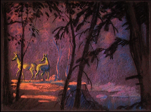
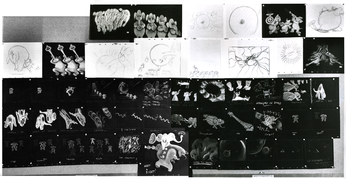
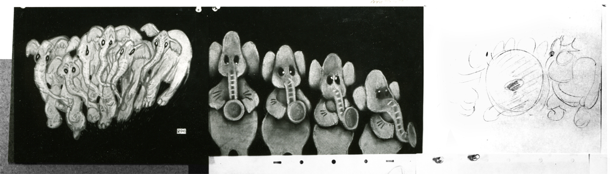
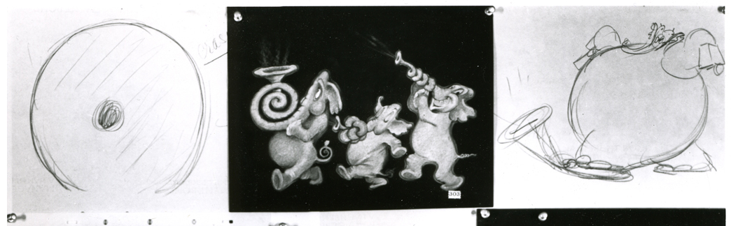
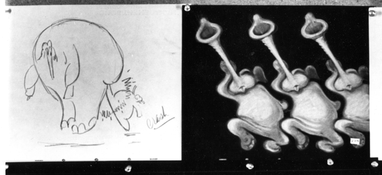
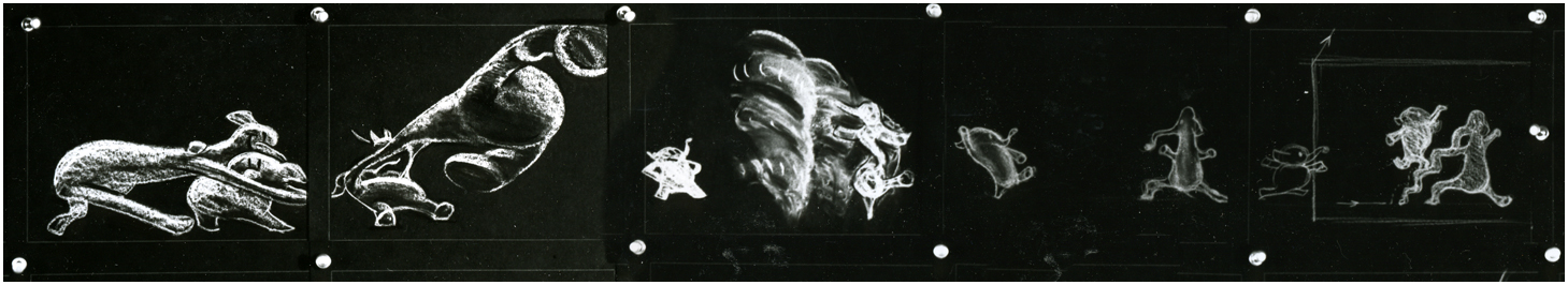
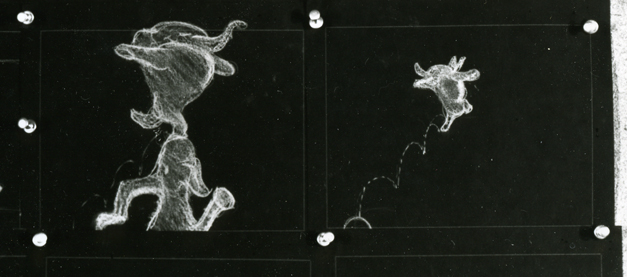
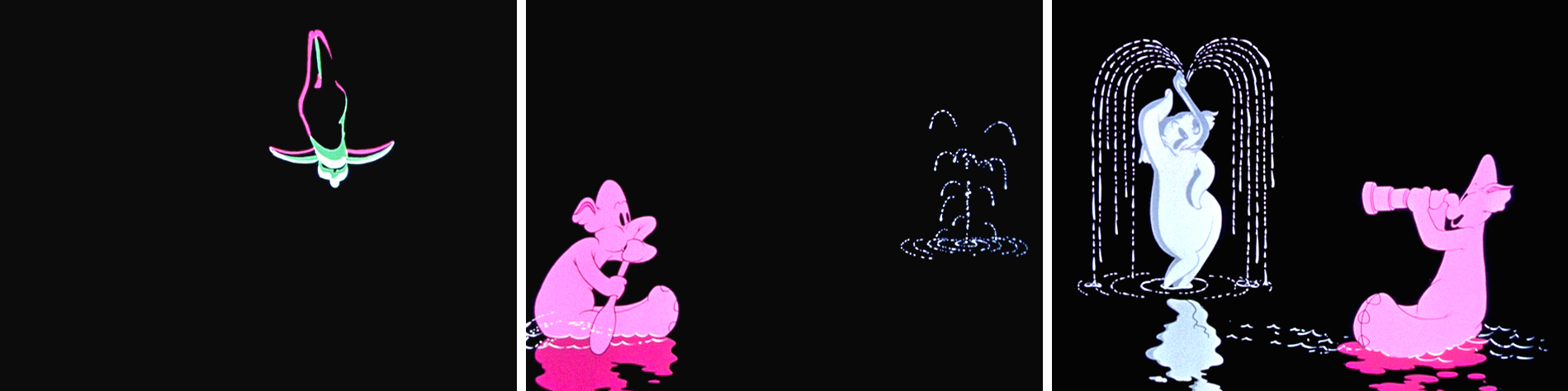
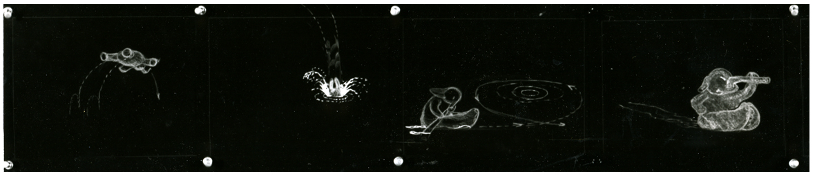
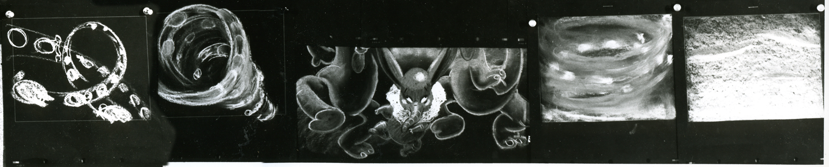
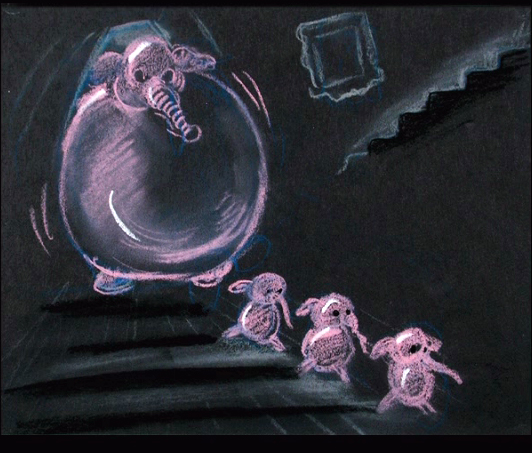
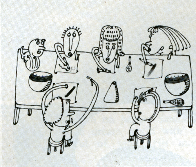
Articles on Animation 04 Dec 2008 08:48 am
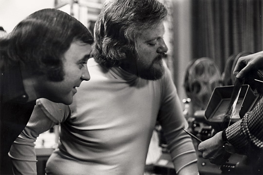
Kurtz & Stott

- Last Saturday I featured a “Close Up” article from Millimeter Magazine circa 1976 which showcased two NY producers. To be fair, I’d like to post these two portraits of LA producers also featured in Millimeter.
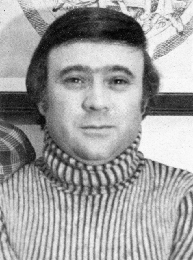
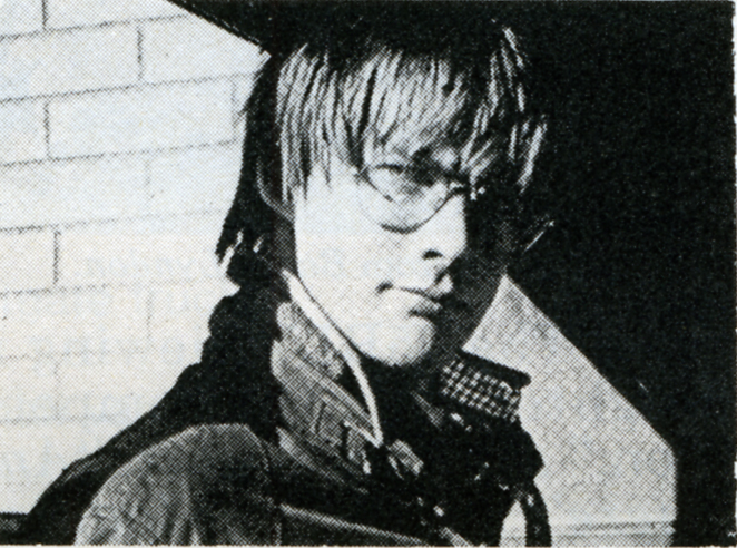
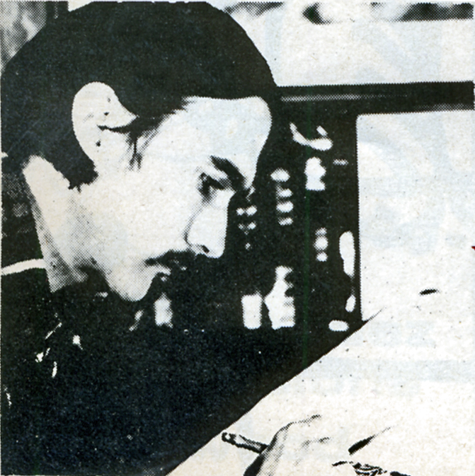
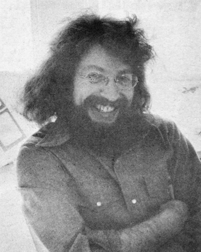
Close Up

BOB KURTZ

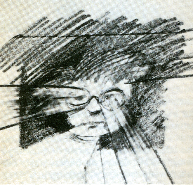
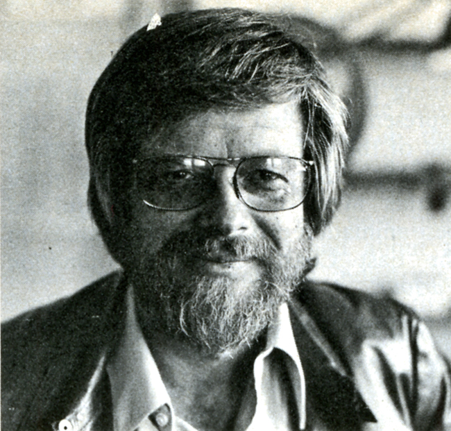
Bob Kurtz, of L.A.’s Kurtz and Friends, is clearly one of the brightest stars in the animation firmament. Bob, a slim, beared fellow with an elfish face and flashing eyes, operates out of 18 compact rooms housed in two charming bungalows enclosed in a small, idyllic courtyard just seconds from the noise and commotion of Hollywood Boulevard. 1728 Whitley Court used to be a private residence, but Bob and his “Friends” have put the bungalows to excellent use: the shelves of the large kitchen cupboard are stocked with jars of cartoon color paint; the living room is now a most handsome reception area and the second-floor master bedroom has been magically transformed into a cozy, intimate projection/screening space.

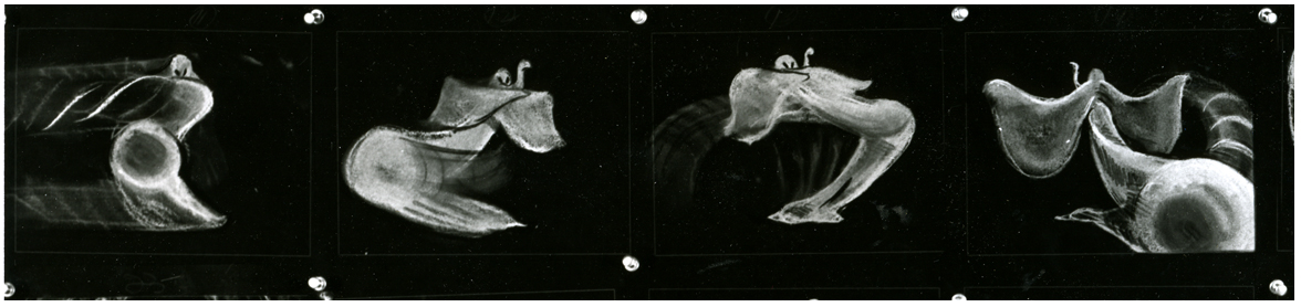
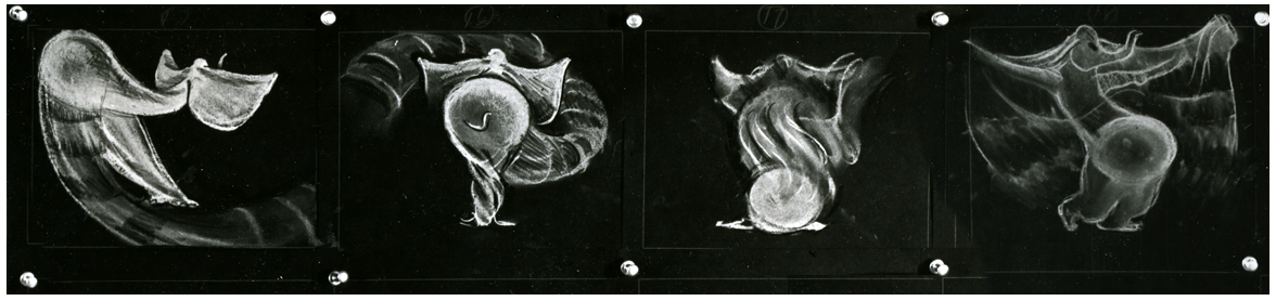
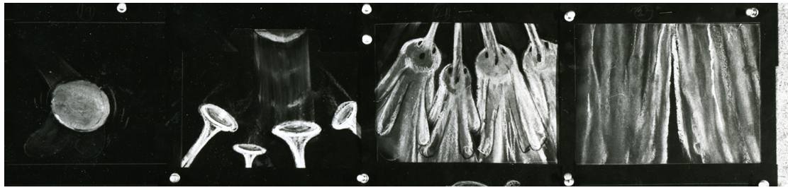
It is here that Bob shows us his sample reel. “The sample reel is what enables—or denies—the animator the opportunity to get work; it’s his resume and must be continually updated and kept current.” Bob’s fertile imagination and liquid creativity are showcased vividly in spots for Levi Strauss, Chevron, Seven-Up, Log Cabin and Sunbeam. (The latter spot won a Clio in 1972 and was shown at the Los Angeles County Museum of Art as part of an “Art in Advertising” exhibition).

Bob’s art school background and his year as a trainee writer/director at the Walt Disney Studios are distinctly evident in the accomplished agility and precision of his work. A graduate of Los Angeles’ celebrated Chouinard Art Institute (now, sadly, defunct, but once considered – the “Cooper Union of the West”), Bob, in his sparkling, inventive brush strokes and consummate pencil drawing, displays the results of his long years of intense, dedicated art studies. After his stint with Disney, he returned to teach at his alma mater for two years before striking out on his own. He is still, however, very much involved with education: every year he hires a recent art school graduate for on-the-job training and “pencil testing,” as he jokingly calls it, at Kurtz and Friends.

Bob and his wife, Glenna, (who is also his producer) feel very strongly that new blood and fresh ideas should be continually channeled into the company to keep the output brisk and vigorous. Also, they want to try to eliminate as many bureaucratic roadblocks and union restrictions as possible in order to provide an opportunity for young people to get started in the animation business. “I’m trying to create the kind of atmosphere for these kids that I know I would have wanted and needed when I was first starting out.”

Of course that means that the young trainees must be willing to work the same kind of endless, grueling hours that are regularly put in by Bob, Glenna, Bob Peluce (Kurtz and Friends’ designer) and the other eleven staff members. “What I’m really offering these trainees,” Bob explains with a mischievious grin, “is the chance to work their asses off . . . but, you know, that’s the best kind of training they can get.”

Kurtz and Friends has always worked exclusively in animation—does Bob foresee the possibility of any live-action shooting in the near future? “No, I really don’t think so,” he answers without hesitation. “In live-action there is just too much that is uncontrollable and time-wasting. Things like negotiating to get the talent, trying to make an animal “act,” ego trips by people involved—all of that can distract you from your real work: telling a short but memorable story. Animation, compared to live-action, is pure and clean. After all, in animation you’re only limited by your imagination.”

After a couple of hours with Bob at Kurtz and Friends we can assure you that ole Mr. Imagination is alive and kickin’ at 1728 Whitley Court, in the heart of Hollywood.
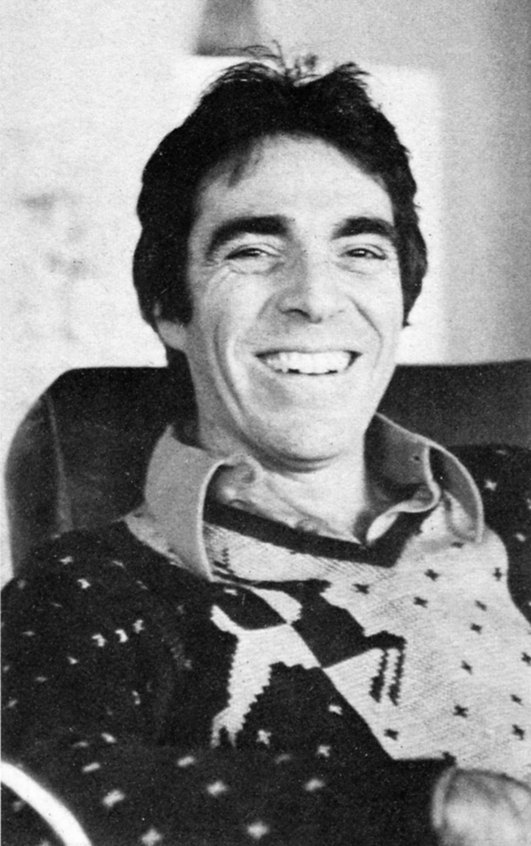
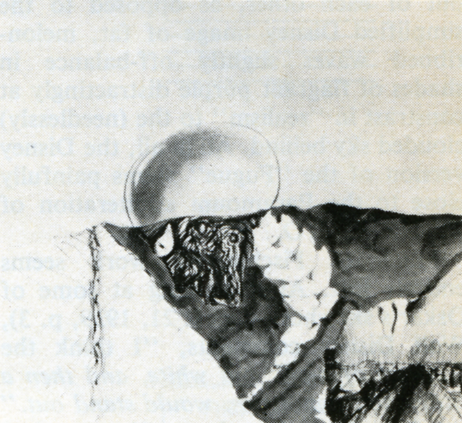
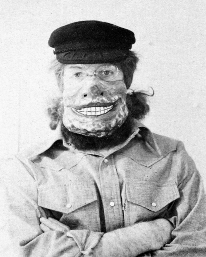
HERB STOTT

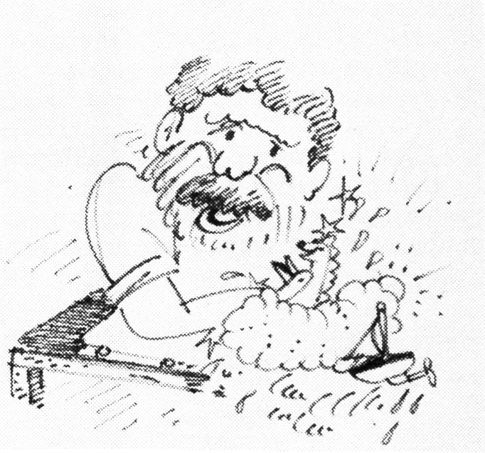
The offices of Herb Stott’s Spungbug-gy Works are located at perhaps the most glamorous spot in all Los Angeles, the corner of Sunset Boulevard and La Cienega, not more than a stone’s throw from Dino’s Lodge, for all you 77 Sunset Strip devotees and just a hop, skip and a jump from The Source, L.A.’s best organic restaurant, for all you health food nuts. Herb is a bearded, sandy-haired fellow of 42 who looks more like a trim, fit 32. He began his career at Disney Studios in the early Fifties; after a stint in the service he did some L.A. free-lancing before forming Spungbuggy in 1963. For the first ten years it was all animation for the company but within the last three years Herb has branched out into live-action. Now it’s 50-50: the Spungbuggy staff does animation under the capable leadership of Animation Directors Gary Katona and Randy Akers and Herb himself shoots the live-action spots. Despite this Herb still considers animation his metier and first love. He remembers his early, formative years at Disney with great affection: “Working there was like going to a small, rural liberal arts college. (Herb himself attended Ohio State.) There was a sports league comprised of members of the various departments that competed against each other in volleyball, tennis and softball. The employees used to have their lunch all together on the studio lawn, like one big picnic, executives and third assistant editors. There was this amazing camaraderie. Lots of genuine affection and respect, especially for Walt himself. Do you know that the studio has kept Walt’s office exactly as it was the day he died?”

While free-lancing Herb also put in time at Hanna-Barbera when they were in their infancy as animators. He loved it there—”Animators are a different breed, they’re far more affable, accessible and sincere than their counterparts in live-action. Perhaps it’s because we’re filled with an awful lot of whimsy. It might also be because ours is a one-on-one business, an animator really depends upon himself and his own imagination. Also there are no star trips or ego problems; animators create their own stars.”

Art school graduates are constantly coming to Spungbuggy seeking jobs, even if it’s only as a “gofer.” “Maybe one out of twenty-five has something special,” Herb reports. “If it’s something truly special I’ll find a spot for them, if not here than hopefully with another animator.” Herb stays in constant touch with his fellow L.A.-based animators and is, in fact, a close friend of Bob Kurtz, who was the subject of a February ’76 Close-Up. Herb is quick to praise and give credit to other practitioners of the art of animation; there seems to be none of the professional jealousy or rabid backbiting that is so commonly found among major Madison Avenue agencies. Perhaps it’s due to all that “whimsy” that Herb was talking about…

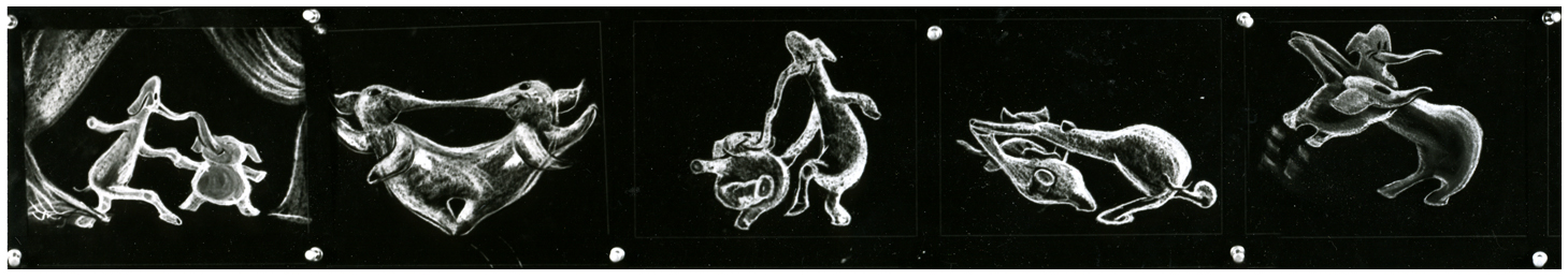
In looking at Herb’s reel one soon realizes that Spungbuggy’s client list reads like a veritable Who’s Who of television commercials. Among the clients represented are Levi-Strauss, Clairol, Raid, Nestle’s, Kellog’s, Mr. Clean and a series of spots for American Cyanimid of which Herb is particularly proud. Among our own personal favorites were a wickedly clever Tootsie Roll spot where a child’s tongue has an argument with his teeth about who gets first taste of the chocolate center, is it better to suck or chew?? And a wildly imaginative Illinois Bell spot extolling the virtues of touch-tone telephoning. This spot, not surprisingly, picked up a Clio in 1972. Perhaps the most visually impressive spot is for United Airlines: an outlandishly animated map of the U.S. complete with geographic landmark caricatures for each distinct section of the country. (Example: Marina Towers in Chicago doing a spirited version of a kind of “skyscraper Hustle.”) It is a vivacious and memorable one minute look at this diverse land of ours; yet it still succeeds most admirably in getting across United’s “friendly skies” message.

Herb’s future plans for Spungbuggy? “Nothing grandiose—I just want to continue the way we’re going. I look forward to another strong, successful year. I’m just grateful that we’re able to stay alive and healthy in such a competitive field.”

Spungbuggy is, indeed, alive and well and thriving in L.A.. Just stop by the corner of Sunset and La Cienega and see for yourself.

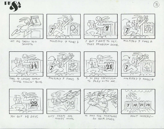
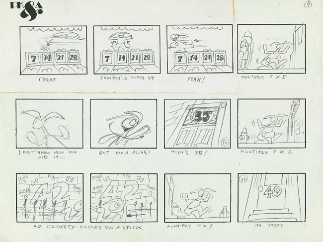
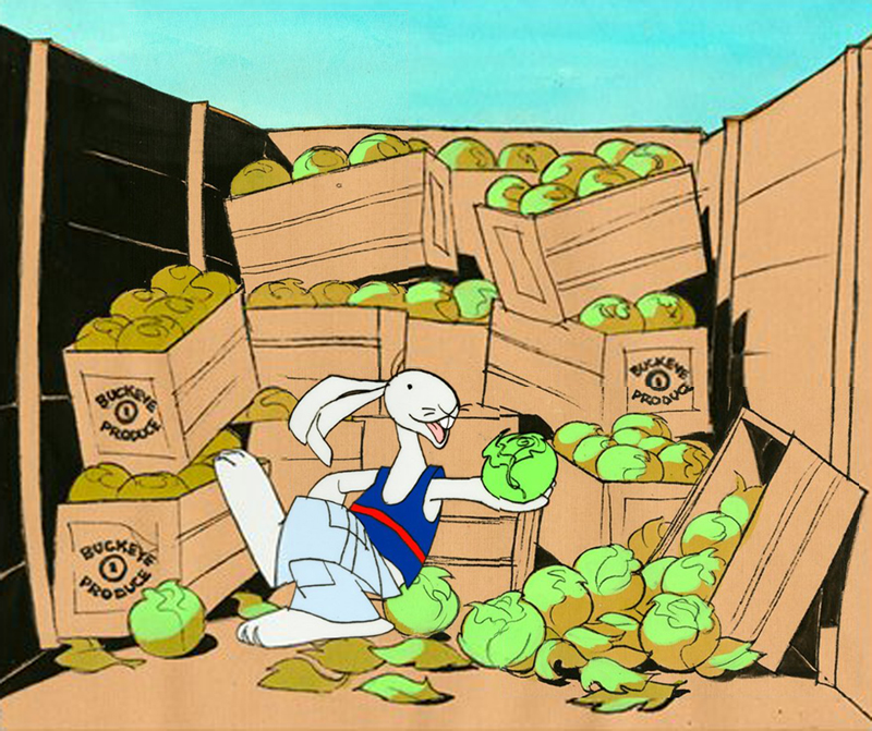
The Bob Kurtz article came from Millimeter Magazine, Feb/1976
The Herb Stott article came from Millimeter Magazine, Feb/1977

Commentary 03 Dec 2008 09:23 am

SB Pro & Con

- The new dvd of Sleeping Beauty has prompted a number of opinion writings on the blogs. Many of them are thoughtful, but they’re full of the usual ranting comments added on.

    The most articulate of the cons is certainly Mark Mayerson ‘s “Sleeping Beauty Puts Me To Sleep.”
    The positive piece “Once Upon A Dream” appears on Brian Sibley‘s excellent blog.

As for me I understand both viewpoints, but I am an enormous fan of Eyvind Earle’s work and having seen this film many many times I have grown attached it. I love the subdued nature of it all, the use of the Technirama camera, the stunningly attractive design, and some brilliant animation. It has a majesty and a formality to it that is unique unto itself. I frequently compare the film to opera whereas most of the others are musicals.

I once posted a piece (see it here) by Marc Davis wherein he compared animating Cruella deVil vs Malificent. He said Malificent was always giving speeches whereas Cruella was conversing with others. Two very different moods. That also, in a nutshell, describes the two films. 101 Dalmatians is chatty while Sleeping Beauty is presentational. Opera vs musical theater.

The film was born into struggle. The animation industry was challenged by a new modernity. The art was moving away from the 19th century graphics and into the 20th century. UPA wrought Toot Whistle Plunk & Boom which led to this film. Oddly enough, Sleeping Beauty aimed its art at the 15th century style of illustration; at least that was Eyvind Earle’s aim in designing the backgrounds. Tom Oreb’s character design was angled to try to work with the backgrounds almost as an amalgam between 15th & 20th centuries. For me, it works very well; others seem bothered by it.

I suspect that the general love of this film’s style has strongly influenced modern animation. Pocahontas, it seems, took it’s backgrounds directly from Earle’s work.


Pocahontas concept art by Michael Giaimo from the book “The Art of Pocahontas.”

The angled squirrels, owls and other forest animals, appeared in many other Disney features & shorts. Those characters were perfect designs to build on, and, what I call the CalArts style, seems to have grown out of that. Angles not circles. Flash was ideal for angles; so was this design. And so it goes. (Or, at least, that’s how it feels to me.)

- Speaking of Brian Sibley‘s blog, he has a fine piece on Eyvind Earle on his blog. His is a regular and enjoyable stop in my weekly internet reading.

Articles on Animation &Rowland B. Wilson 02 Dec 2008 09:10 am

Rowland Wilson

- Rowland Wilson was one of those artists/cartoonists who was loved by everyone.
Long before I saw his connection to animation, I knew his amazing cartoons in Playboy. They were full page color images that were gorgeous to look at, and it was irrelevant whether they were funny or not. They were beautiful.

I met him only once on the School House Rock pieces he designed for Phil Kimmelman‘s PK&A back in 1973. I was an Asst. Animator there working on the spots that were animated by Jack Schnerk, Sal Faillace or Dante Barbetta. My meeting was little more than a hello.

I knew Rowland’s daughter, Amanda, who worked on Raggedy Ann, opaquing. We kept in touch for a short while after the film’s
_..__ Phil Kimmelman and Rowland Wilson__________completion. She continued in the NY
__________________________.__________________animation community for a while, until work dried up. Unfortunately, I’ve lost track of her.

Of course, it would have been Richard Williams that put him to work seriously in animation. Together they created the stunning ads for Count Pushkin Vodka. This was the
high water mark of his and Williams’
ad films. I think this ad campaign was one of the high water marks for advertising, in general. The Wilson and Williams’ work is extraordinary.

He did design work on The Cobbler and the Thief after which he worked with Bluth for a short while in Ireland on Thumbelina and A Troll in Central Park. For Disney he did “Visual Development” and “Character Design” on The Little Mermaid, Treasure Planet, The Hunchback of Notre Dame, Hercules, Atlantis and Tarzan.

Creative Talent Network has a nice page up for him here. They also offer an extensive resume here.
Mark Kennedy offers a number of Wilson’s handouts on color, light and shadow and composition.

AWN had a fine memorial piece to Wilson written by John Culhane. here

I’d like to post here some of Myrna Oliver‘s obit from the LA Times 7/11/05:

    Born Aug. 3, 1930, in Dallas, Rowland Bragg Wilson grew up drawing Disney characters at the kitchen table. He received a bachelor’s of fine arts from the University of Texas at Austin and then moved to New York City for graduate work at Columbia University.

    To support himself, he began creating gag cartoons for the Saturday Evening Post, Collier’s, Look and True magazines. He was drafted into the Army, serving from 1954 to 1956, where he used his artistic talents to draw classified charts.

    In 1957, Wilson joined the Young & Rubicam Inc. _____a poster done for Dick Williams
    advertising agency where he spent seven years as
    an art director, doing conceptual drawings for print ads.

    At the same time he stepped up his freelancing of cartoons to magazines and became a regular with Esquire in 1958. In the late ’50s and early ’60s he also had cartoons published in the New Yorker.

    He established himself as a freelance advertising artist in 1964 but never gave up cartooning, which he described as “picture writing.” Forced by his lucrative advertising contracts to limit cartoon work to a single magazine, he focused on Playboy after Esquire abandoned its full-page cartoons.

    In 1967, he also drew “Noon,” a short-lived comic strip for the New York News-Chicago Tribune Syndicate (Tribune Corp. now owns the Los Angeles Times).

    As Wilson once described the strip, “The name of the main character was Noon Ringle, an unemployed cowboy in a dying small Texas town in sort of modern times.”

    Wilson illustrated two children’s books in the early ’70s, “Tubby and the Lantern” and “Tubby and the Poo-Bah.”
    It was advertising that moved him into ________a Rowland Wilson cartoon for Playboy
    animation, and from 1973 to 1975 he worked in
    London as a designer for the primarily commercial animation studio of Richard Williams. On his return to New York, he joined Phil Kimmelman and Associates, which concentrated mainly on advertising work.

    In his cartoons, advertisements, designs for animated characters and illustrations, Wilson was known for three-dimensional drawings filled with historical detail.

    “Ideas are easy to come by,” he often said, according to his daughter. “It is the drawing that takes a long time.”


    A sample of the strip “Noon”

    As an animator, Wilson won a daytime Emmy Award in 1980 for his work on ABC’s “HELP! Dr. Henry’s Emergency Lessons for People” and worked on educational animation, including the television series “Schoolhouse Rock.”

    In 1975, Wilson won awards at the Venice and Irish Animation festivals, and his animated commercial film “The Trans-Siberian Express” won first prize at the third International Animation Festival in New York. He also won a Clio.

    He worked for Walt Disney Feature Animation as a visual developer and served as a layout designer for “The Little Mermaid” in 1989. He also contributed to “The Hunchback of Notre Dame” and “Tarzan” among others.

    But Wilson’s greatest legacy may be on the printed page. His cartoons, widely published in magazines, were reprised in several anthologies, beginning with “Don’t Fire Until You See the Whites of Their Eyes,” a collection of his Esquire work published in 1963. He earned Playboy’s Cartoonist of the Year award in 1982 and his work was included in the 2004 anthology “Playboy – 50 Years: The Cartoons.”

    For all Wilson’s love of animation, “It was sketches for a new Playboy cartoon that were on his drawing board when he died,” said his daughter Megan Wilson.

    Wilson also worked extensively in advertising and was particularly lauded for his 40 or so humorous works for New England Mutual Life Insurance Co. Each cartoon-type ad depicted a person in dire straits – such as an executive with his back to a high-rise office window as a wrecking ball swings toward him, proclaiming, “My life insurance company? New England Life, of course. Why?”

    Wilson’s first marriage to Elaine Libman ended in divorce. He is survived by his second wife, artist Suzanne Lemieux Wilson; four daughters, who are all commercial artists, Amanda Wilson of Piermont, N.Y., Reed Wilson of London, Kendra Wilson of Leicestershire, England, and Megan of New York City; and three grandchildren.

The storyboard by Rowland Wilson for “Lucky 7″ Schoolhouse Rock.


Thanks to The Deep Archives.


Art available on Amazon from Creative Talent Network.

.

Animation Artifacts &Disney &Frame Grabs 01 Dec 2008 09:16 am

More Bambi

- Lately, I find myself unable to get enough Bambi.

I’ve gone back through all the deer skeletal drawings by Rico Le Brun which were sent to me by Sky David. Part 1, Part 2, and Part 3.

I look and look again at the wonderful posts on Hans Bacher‘s site. To see some of these go: here, here, here, here and here.

The more I look, the more I want to see. So I went to the recent dvd release and found the following sketches and BG paintings among the Extras. I post them in no particular order, but they should be seen.


(Click any image to enlarge slightly.)


It’s just stunning. What else can I say?

Photos 30 Nov 2008 09:00 am

Photosunday – NY Lintels

- Walking to work one early morning this week, I noticed the decorative archway pictured above. This is an outgrowth of what in classical architecture is called a “lintel.” A lintel is, in it’s basest form, a block placed over an entranceway. It solidifies the two columns that reach around the portal. As it says in Wikipedia: The lintel often rested on pillars made of piled stones such as in the building of the Treasury of Atreus in Mycenae, Greece. In architecture around the world however, a lintel is not considered (as it is in the very narrow view of classical architecture) as purely an element of the Post and lintel.

I decided to pay a bit more attention to the overhead arches that decorate doorways leading to my office.
Here are some of those I found:


(Click any image to enlarge.)


All are decorative additions, but some are more decorative than others.

Some are downright cheap, and one even wonders why do it?


Some are beautiful in their simplicity.


A number even imitate the look and feel of the
“Rosetta” window over a cathedral’s door.


The awning introduces a wholly new element.


Some are near identical to others. The same architect?


How solid this looks.


Brick buildings present a new problem. The doorway is an add-on.


This can be decorative cement-work.


Here’s an attempt to create the decoration in brick.


Wrought iron filegree creates a whole new element of decorative design.


This building is typical of many of the buildings one sees midtown Manhattan.


The decoration gets to imitate gold and excess;
it has an attractiveness all its own.

Articles on Animation &Bill Peckmann &Rowland B. Wilson 29 Nov 2008 09:46 am

Producers of 1976

- Last Tuesday I featured the Young Independent animators of 1977. Today let me showcase a couple of commercial producers from the same period. This article came from the famous Raggedy Ann issue of Millimeter/1976, edited by John Canemaker. It was part of their regular column:

Close Up

PHIL KIMMELMAN

Phil Kimmelman is a New Yorker who stayed. “My love was always animation,” says the cherubic President and Director of Animation at Phil Kimmelman & Associates. At 17, he gave up a three-year scholarship to go to work for Paramount Famous. It was the 50′s; Hollywood was doing fine; budgets were big in the New York animation departments. “I’m delighted to have been a part of that. It really did a lot for me.”

After gaining some experience at Kim-Gifford and Chad Studios in New Jersey, Phil served a stint in the army as an illustrator. In 1961, he joined Elektra as an animator and animation director. “Elektra was into experimenting. We were really into exploring new areas. I think that’s where it all began for me.”

After five years, Phil left Elektra for Focus. Four years later (1971), he opened his own shop. “Fortunately, I wasn’t enough of a businessman at the time to realize how bad things were. We staffed up rather heavily at a time when everybody was resorting to freelance … we got into some problems, but now we’re busier than ever.”

“I consider myself part of a team, the other part being Bill Peckman, one of my associates. We’ve been together through Elektra and Focus. I think Bill’s one of the best talents in this business . . . and I’m glad he’s with me.”

Phil’s other associates are Bill Hegman, designer, and Sid Horn, production manager. Morty Gerstein, a former competitor, is now affiliated as a designer/director. Working madly in the next room is Roland Wilson, a Playboy cartoonist beloved by ad folks for his New England Life campaign.

These gentlemen are just the tip of the iceberg. PK & A is crawling with creative types, and the company has recently leased additional space. “One of the things that has made us successful is the versatility of our reel. We’re great admirers of a lot of cartoonists and designers from outside. If a job comes through that we feel requires a certain look—like a Gahan Wilson or a Jack Davis—we’ll put our own egos aside and go after them. I’ll give you one example: Harvey Kurtzman. Harvey is the creator of Little Annie Fanny for Playboy. He’s best known, I guess, for starting Mad Magazine (he’s no longer with them). We’ve always been fans of Harvey Kurtzman—I think the man’s an absolute genius. Bill Peckman and I chased after him, and he was very apprehensive about working in animation. He said he had a bad experience at one time. But we got him to look at our reel, and at the end of it, he applauded and said he’d be willing to chance it again. So we had Harvey design and write some scripts for Sesame Street, which we’ve sold and produced, and we’ve won a lot of awards with them. They’re beautiful spots—and they’re one example of the ‘Kimmelman look.’ ”

Yes, but how does he work with agency art directors and writers? “When an agency board comes in, I like the option of taking the board and recreating it to our way of thinking. Generally, that’s why they come to us—for our input. I think a lot of art directors and writers are not really geared, you know, to think animation. When he or she gets involved in animation, there’s a long time period where there’s very little to do. You know, it’s difficult for the people in agencies who are making the schedules to understand the time element. Where we used to have a good eight weeks to do an average 30-second commercial, we’re constantly being asked to do it in four or five weeks. It’s what I see happening more and more today that kind of upsets me. We’re working nights—around the clock—too often. That’s what it’s become. I guess we love it enough to keep doing it. I do have a line I won’t go over. If I really feel it can’t be done, we won’t do it. I’ve been in that situation many times.”

What about Ralph Bakshi and his controversial coonskins? “Fantastic. Whether you or I like his films, there’s no question that they’re breakthroughs. He’s gotten animation into the adult mind. For that reason alone, I’m delighted it’s happening.

“I think it’s sad. So much more should be happening in this industry. I think animation still hasn’t been scratched. It’s an extension beyond what live can do. There’s no limit. There are people who think it’s a dying art. I don’t think it will ever die. I’m very optimistic about that. I think, if anything, it can only go upward.”

JERRY LIEBERMAN

Jerry Lieberman says he originally “wanted to be a doctor,” and he endured two years of pre-med before allowing all the “fantasy, other-world head aspects involved in growing up in corny, carny, show-biz pizzaz-zy Atlantic City” to take over. As a kid he “always drew” and worked three summers as a caricaturist on Atlantic City’s Million Dollar Pier.

He admired John Hubley’s Moonbird (1960) and Saul Bass’ titles and he constructed his own make-shift 16mm camera stand to “experiment with stop-motion, and even some professional work for WCAU-TV in Philadelphia doing promos for a local kids’ show.”

After studying design and graphics on a scholarship to the Philadelphia Museum’s School of Art, and a brief stint in the Army, Jerry came to New York City in 1964. “My first year in New York,” says Jerry today, “I made a storyboard six feet by ten feet long with 200 panels. It was my portfolio and it used to knock people over when I unfolded it.”

He managed to get work right away doing animated films for NBC-TV’s Exploring, “but I learned success doesn’t come easy. There were times when I walked the pavements going from one local production house to another for six months before getting work. One time my portfolio was so severely criticized by one potential employer, I stopped seeing people and had a phobia about work and my talent.

“I worked very hard; I paid my dues; eventually I made a lot of money in a short time and went to Europe. I thought foreign influences might be good for my work.” In London, Jerry met George Dunning who told him “the best place to go for work is Italy.” In Rome, Jerry was hired by American Harry Hess, a former UFA animator, and he worked for a year doing storyboards, design and animation for Italian commercials both in Rome and Milan. He even acted in a few live-action beer commercials.

Jerry returned to America with an excellent reel and his next big break was to be hired by Jack Zander at Pelican Productions as a designer. “Because animation does include every form of art, I wrote to Lee Strasberg and asked to join the Actor’s Studio Directors Unit, and I was accepted and studied there for two years. After a year at Pelican, he freelanced on educational films and was, for a short hilarious time, Phyllis Diller’s painting instructor.

“In 1968, Art Petricone, Howard Basis and I got together and started Ovation Films, Inc.,” says Jerry. “Howard and Art met at Kim and Gifford, and I had worked with Howard on a job. We started our business during the decline of the ‘Golden Years’ of TV commercial production, but we didn’t know that at the time. We had our reputations, things built up slowly, and in March of ’76 we’ll have been in business for eight years.”

Ovation is one of the top commercial houses on the East Coast, a successful studio whose award-lined walls attest to their excellent work done for clients who include Eastern Airlines, Volkswagen, Levis, American Cancer Society, Clairol, and Children’s Television Workshop. At first, duties at Ovation were sharply defined, with Jerry doing designing, Howard handling the animation, and Art the super salesmanship, but today Jerry explains that “each of us get involved in producing and directing different commercials. Sometimes we work separately, sometimes we work together. We are now doing a little live-action work, and we are interested in doing a feature animated cartoon. Creativity, budgets keep getting tightened up, but we manage to maintain quality in our product.”

In 1973, Jerry enjoyed “a great personal success,” as La Cinematheque Quebe-coise directrice Louise Beaudet describes it, at the Annecy Animation Film Festival. “His films were so American and he looked so American when he took a bow that he was a big hit with the French,” says Madame Beaudet. Ovation’s Yes My Sweet took a prize at Annecy that year, as their Parrot and the Plumber had at Zagreb the year before.

“I admire live-action directors who are interested in the visual aspects of film,” says Jerry as he ticks off the names of favorites Warhol, Fellini, Russell, and Hitchcock. “But I love animation because you have to be so multi-talented and involved in so many fields. It’s very demanding, always a challenge, and very satisfying.”

__________________

- For a short period in 1973, I worked for Phil Kimmelman’s studio PK&A. I was an Asst. Animator alongside Larry Riley. We had a brilliant time for a period, until work got a bit shy. The studio was very tight, and the mood was one of searching for the highest quality. Rowland Wilson was a designer of many of the Schoolhouse Rock pieces I assisted on. Phil was a pleasant guy to have for a boss, and I certainly enjoyed the experience.

He retired a few years back, but he’s back producing more Schoolhouse Rock episodes for Disney. I’m glad to see it.

Jerry Lieberman was someone I came into contact with frequently. We never worked together. Somehow I think he always saw me as a rival – I don’t know if that’s a reality, but it’s my perception. The last couple of times I met him he was directing theater and loving it.

Commentary &Daily post 28 Nov 2008 09:25 am

A Bit More Thanksgiving

-Thanksgiving, of course, is a time for saying words of thanks. I thought it also a good day for admitting some recent things found on line that pleased me and for which I am grateful. So here are a few things that come to mind.

    - As a big fan of Bobe Cannon‘s work, I was ecstatic to see a couple of his rough extremes on the TAG Blog. Boy I love the internet; bits and pieces like this would never have come my way otherwise. I have a few of his drawings from a scene from Moonbird, with inbetweens by Ed Smith. I’ll post these sometime soon. ____________________Not by Bobe Cannon;
    __________________________________________it’s from Herky Jerky Turkey.

    - I’m pleased to see a number of the children of great animation artists who have established sites to honor their parent’s work.
    I think of Roberta, Judy, and Jon Levitow offering us the site for their father, the brilliant Abe Levitow, or
    the recent site hosted by Paul Spector for his father, the excellent artist Irv Spector.
    Just today I heard from Peter Svochak that he’s put up a MySpace page for his father, the fine NY animator, Jan Svochak.
    I’ve established permanent links on my blog to all three of these memorial sites.

    - There are a couple of videos that appeared in the last couple of days that encouraged me to feel that there is still art in the world of animation:

    . I’m thankful for Cartoon Brew which led me to the films of Stephen Irwin. After seeing the first one on the Brew, I went to Irwin’s site and watched all of the rest of them. They’re all fine films, some are great. I’ve gone back to the site some four more times to watch the films anew, and all of them hold up for me. I urge you to check them out.

    . I look forward to the NYTimes‘ posts of the monthly video by Jeff Scher. This month’s film, Newscycle, is a good one – or, at least, I think so. It just went up this week.

    . The Chicago Tribune also posts cartoons by Joe Fournier though the last one posted was at Halloween. Fournier’s work is worth looking for. He employs a muscular drawing style somewhat similar to the work of Bill Plympton.

    - Mike Barrier‘s site has gotten down to some serious nitty gritty of animation history. The photos he’s been posting are just impossible to see elsewhere. (Where else could we have seen Walt in a gondola in Venice. He seems giddy, carrying an award he obviously won at the film festival, while his wife and daughter look sober – if not bored.) Mike’s many years of committed study of the art is certainly paying off for the likes of me. I look forward daily to checking out any new posts on the site, and continue checking daily even when there’s an announced break.

    - Actually, the same is true of a couple of other sites that offer thoughtful discussion of the medium. Hans Bacher‘s site is a daily must see, as are Mark Mayerson, and Hans Perk. For a daily smile, Eddie Fitzgerald‘s site can’t be skipped.

    - One site feeds my love of NYC. Blather from Brooklyn is an excellent photo site hosted by Annulla. Her recent post on NY Prayer Booths,
    was a gem. (The photo to the right comes from her blog.) These are street booths that could be mistaken for telephone booths placed around the city. My mouth dropped when I saw these photos. Annulla’s wry sense of humor and love of the city can’t be faked; it’s wonderful.

I say a prayer daily in thanks that America has finally selected a literate, organized, intelligent guy into office. His recent optimistic statements have done nothing less than given Wall Street a reason to have a bit more confidence in the system. I look forward to more of the same once he gets started. Just think, he has no authority as yet, and still he’s doing more than the fool occupying the White House at the moment. (For a while, I was begging god to stop Bush from making public comments on the economy. Every time he appeared, the market dropped precipitously.)

The future does look hopeful.

Photos 27 Nov 2008 09:37 am

Good Eats

Happy Thanksgiving

Photo by Steve Fisher

.

Animation Artifacts &Disney &Peet &repeated posts &Story & Storyboards 26 Nov 2008 09:35 am

Recap – Pink Elephants

- Recently, I saw a small part of Aladdin on television. A large part of the Genie’s song reminded me of Pink Elephants from Dumbo. I thought then, that I should post anew the models/sketches and drawings from that sequence. It originally was broken in two parts when it saw daylight here in 2007. I’ve combined there into one.

Once again, thanks to John Canemaker, I have several photo images to display. Some frame grabs accompany the piece.


These are rather small images, so by cutting up the large boards and reassembling them I can post them at a higher resolution, making them better seen when clicking each image. It’ll take two days to post them all, so this will be continued later this week.

I’ve interspersed some frame grabs fromt the sequence to give an idea of the coloring.


(Click any image to enlarge.)

The following images were in the gallery part of the dvd. These are the color versions of some of the images above.

_ _

_ _

_ _

Articles on Animation &Independent Animation 25 Nov 2008 08:37 am

The New Animators of 1977

- Jenny Lerew reminded me, this past weekend, of Richard Protovin. Richard was an Independent animator and the head of NYU’s animation department from 1979-1988. In that position, he inspired quite a few people, and Jenny’s comment got me trying to remember where I saw an article about Richard.

I came up with this article by Thelma Schenkel from the animation issue of Millimeter Magazine in 1977. I got a kick out of revisiting this article and thought it definitely should be shared.


A new generation of American animators is coming into existence. Trained in art schools and college filmmaking programs, they are turning to animation on a scale unprecedented in independent American filmmaking of the past. Mainly in their 20′s and 30′s, they were brought up on comic and storytelling cartoons, but their films are rarely broadly comical, although they’re often very witty, nor are they illustrations for stories. They are staking out a new territory for animation, one that until recently was the province of the poet. Whether their films are erotic, whimsical, or abstract, they are all in some way exploring the inner landscape — feelings, the workings of the mind, the mechanisms of perception. Although the techniques they use vary widely, they all share in the poetic impulse — in the search for new expressions of personal visions.

Until fairly recently, only a few names came to mind when one thought of experimental poetic animation in America. Today, the ranks of talented young animation poets are growing. Despite the dearth of effective distribution channels and outlets, and the difficulties of finding time and mental space to make their “personal films,” while often supporting themselves by doing commercial projects, they are making some very exciting, extraordinary films. The following are only a few of the many talented young animation artists whose films merit being seen and re-seen, talked about, and written about:

ELIOT NOYES, JR. — Since Clay, made at Harvard’s Carpenter Center in 1964, Noyes has been dazzling audiences of all ages with his witty inventiveness, his bold handling of materials, and his humanism. In Clay, an 8-minute version of evolution, he spawns a universe out of a lump of clay with the playfulness of the ancient gods of creation. Noyes makes magic with the simplest materials: Alphabet (1966, Canadian Film Board) is drawn on milk-glass with felt-tipped pen; In a Box (1966), a tale of the barriers people and cities erect to keep out beauty and freedom, is drawn on paper; Sandman (1973) (Pictured below right) creates a dream world with an underlit handful of sand. His most ambitious film, The Dot (1975), combines live-action and animation in a half-hour allegory on the liberating power of the imagination — the animated dot becomes the catalyst that frees the “prisoners” from the confines of school and home. Constantly exploring new techniques, Noyes is currently completing Glove Story, using actors in combinations with video-animation, and Pitcher’s Feathered Bird, which experiments with chromakeying live actors into Noyes’ drawings. If his brilliant use of technique, his wit, and the humanism of his films of the last 14 years are any indication, we can look forward to an innovative, compassionate, and refreshing use of videotape when these tapes are released.

GEORGE GRIFFIN‘s self-referential films explore the tricky territory of animated illusion with marvelous wit and ingenuity. Paradoxical though it may seem, he often uses the most rudimentary of pre-cinematic toys — flip-books — to explore the most modern of ideas. Trikfilm No. 3 (1973), a complex orchestration of flip-pad metamorphoses alternating with the creation of the same sequences by the artist, combines live-action with animation, all the while delightfully fragmenting the illusion it is creating. The most elaborate of his “anti-cartoons,” as he calls them, is Head (1975), (pictured below left) an ingenious, witty essay on making filmed, photographed, drawn, painted, and Xeroxed images move.

Reverberating between multi-media versions of the same events, playing with disjunctions between figure and ground, Head is “a trick-film meditation on portraiture; the animator, as actor, lives through his drawings, which in turn become actors who influence his own self-image.” An insider’s diary on the process of creation, Head is a brilliant encyclopedia exploration of the circular relationship between the animator and his creation, of the nature of animated illusion itself. L’Age Door (1975), a one-minute flip-book film about a man and a door, shows what a witty intelligence can do with just a memo pad and a pen. His most recent work, View-master (1976), drawn in parodied cartoon styles, is comprised of 8 circular drawings with 12 characters in a run cycle on each drawing. The characters, including a troupe of dancing headless waiters and a selfpropelled shoe, chase each other around until the full circle of characters is revealed at the end — a contemporary Zoopraxiscope, with Eadweard Muybridge’s running man at the center, Griffin’s tribute to one of the greats of pre-cinema. In his witty elaborations on the simple techniques of pre-cinema, Griffin is unique among young experimenters in animation today. Informed by the refreshing playfulness of film’s 19th century origins, his films are very much of the 20th and even 21st centuries, in their incisive and witty insights into the nature of time, perception, and what we call “reality.”

KATHY ROSE‘s insignia is the remarkable cast of “characters” who people her films and who can be traced through The Mysterians (1973), The Moon Show (1974), Mirror People (1974), and The Doodlers (1975), all made at California Institute of the Arts. In The Mysterians, her silly-putty creatures, capable of any transformation imaginable, begin playing their surrealistic metamorphic games — which become more complex in Mirror People, as the figure-ground manipulations reveal space to be as much of an illusion as corporeality. To a sound-track of fun-house screams and cackles, Mirror People, a tribe of Halloween hallucinations, fuse into each other and get absorbed into their reflections and their environments in a universe where all is flux and nothing is stable, except for the constant delights of metamorphosis. The Doodlers (pictured Right) carries the game of illusion still further. Through Miss Nose and her clan of doodlers, whose curvilinear outlines and splashes of color come to life through a magic cat’s-tail brush, Rose makes some witty observations on the art of animation and on the symbiotic relationship between the artist and the characters. Although she was very excited by the films of Yoji Kuri, whose surrealistic pranks are echoed in her films, Rose’s characters have an indescribable uniqueness. It might have something to do with the way she draws them: all her characters are drawn upside-down. Yes. When she creates them, it is as if she wanted someone sitting on the other side of the table to be able to see them rightside-up, without having to turn the drawing around (of course, when they are filmed, they are rightside-up). She finds that it’s like “drawing with the eyes closed, you have one less level of consciousness.” But only the characters are drawn that way; the constant swirling changes of perspective, the simulated camera movements — all require tighter control and are drawn rightside-up. The battles and games between Rose’s characters are at some level intra-psychic encounters; she sees her characters as “parts of my unconscious” and is currently working on a film in which she and her characters confront each other. She feels that the new uses of animation have to be more than personal. They have to have an “inner truth about something real, a truth people can feel.” In their delightfully whimsical way, Rose’s films about the joys and struggles of creation succeed in conveying that truth.

AL JARNOW‘s films, which seem to be playing with the malleability of perspectival logic, with fluctuations between the subjective and objective viewpoints, have a marvelous sense of spatial humor. At times reminiscent of Escher’s disorienting figure-ground enigmas, his films often lead us through an architectural nightmare (he studied architecture at Dartmouth), but manage, through the integrity of their visual logic, to create a spatial universe which seems to make perfect sense. Rotating Cubic Grid (1975) and Four Quadrant Exercise (1975) are marvelously precise architectural games, but Auto Song (1976), his most elaborate “story” film, pushes the play between subject and object the furthest. Drawn on index cards, it narrates the journey of an invisible eye (Jarnow’s) from its (invisible) reflection in the mirror of a VW bug, across impossible highways and oceans, up stairs and through tunnels, ending in the black hole of space. Purposely starting with a recognizable image set in recognizable space, the film very soon goes off into its own space which, because we have been well teased from the beginning, we accept without question. Jarnow’s latest film, Shorelines, combines objects (shells, stones), live-action pixillation, drawings, and Xeroxes. Although it represents a move away from the draftsman’s precision of the earlier films, it continues to play with space and perspective in Jarnow’s inimitable way.

DENNIS PIES‘ early films, Nebula and Merkaba (both made at California Institute of the Arts in 1973), which he calls “experimental graphics,” already manifest his preoccupation with cosmic, mystical imagery. In Aura Corona (1974), he improvises a dance of two vertabra-like creatures which develope auras, depicting the delicate evolution of animate forms in a haunting, suggestive way. Pursuing his exploration of organic abstraction, in Luma Nocturna (1974), the “dark twin of Aura Corona” exquisitely nuanced crystalline textures float and fuse in a kind of lyrical, ecstatic cosmic dance. All done without the use of the optical printer, the effects in Pies’ films are reminiscent of the work of Belson and Whitney, influences he readily acknowledges. He is currently working on Sonoma (pictured right) (an Indian word meaning “Valley of the Moon” — the general area in California where Pies lives), which deals with material from his journal of the last year. It is shot in 35 mm. color negative and is fully animated, “the full image in constant flux.”

MARY BEAMS made her first animated film, Tub Film, in 1972 at Harvard’s Carpenter Center, where she now teaches. A whimsical view of a bath from a bather’s perspective, done in rough line drawings on paper, Tub Film ends with a slurp as the woman disappears down the drain, after the cat pulls the plug. Seed Reel (1975), a series of 3 sexual haikus, is done in the same rough outline style: in “Hungry Poem,” (pictured Left) (reverse printed with white lines on black), a penivorous flower devours its mate and swells into a pregnant belly; “Sniff and Lick” portrays the encounters of some very erotic flowers, and “12 Dancing Penises” dance to the tune of “Turkey in the Straw.” In Going Home Sketchbook (1975) and Paul Revere Is Here (1976), she experiments with rotoscoping and shows her deftness in handling a technique that, in other hands, can become tedious, but which for Beams becomes an exciting way of recapturing the spontaneity of the hand-drawn image.

ADAM BECKETT, of California Institute of the Arts, feels that “we are at the beginning of a wonderful golden age of animation”; his innovative, unconven-tional films will have a lot to do with making it happen. Evolution of a Red Star (1973), for example, made with a 6-drawing cycle which evolved under the camera during a 6-week period, is an excellent example of what can be done with a convention — the cycle — when the principles of painting directly under the camera are imaginatively applied to it. Flesh Flows (pictured Right) (1974), done in black line drawings on paper, reflects Beckett’s continued fascination with the evolution of polymorphous matter. Animated male and female body parts flow into, around, and through each other, evolving into proliferating, multiform creatures in a surreal pulsating dance. Beckett is currently trying to combine work on Life in the Atom (which he has been working on for 7 years), a new version of Dear Janice, and Knotte Grosse with his commercial work.

RICHARD PROTOVIN‘s films have a naive, story-book quality about them which is definitely not what they’re about. This soft, innocent front, the delicate lines and candy-colored pastels, is an intentional disguise to arouse expectation for a simple story, expectations which he astutely manipulates for very different ends — “to turn things around, to go on the other side of the mirror.” Flamingo Boogy (1974), drawn on paper, starts out in a drive-in movie and ends up in a flock of flamingoes and winged turtles embracing the sun. The ocean itself is drawn into the sun in the mythical epiphany that ends the film. Everything flows and pulsates at the same time, disturbing movement echoing “opposites coming together in a spiritual union.” Heyzeus (1975), reflecting Protovin’s interest in Tantric Yoga, is an orgiastic dance of phallic and vaginal creatures which culminates in the creation of a


Left – Richard Protoviin/self caricature Right – “Flamingo Boogy”

mysterious bird creature exuding a powerful mystical energy. Like so many experimental animators, Protovin plays on the expectations associated with cartoons, only to turn them upside-down in an unexpected haunting way.

KATHLEEN LAUGHLIN‘s films explore a wide range of techniques: saturated color printing in A Round Feeling (1970), stop-motion single framing in Opening/Closing (1972) and Susan Trough Corn (1974). Her recent film Madsong (1976) (pictured Right) combines animation and live-action in a young woman’s personal everie on being female. With a polyphonic voice track (the woman’s inner voices echoed by the chorus of voices outside), it parallels the flow of her unconscious with the movement of the cycles of nature. In its artful use of live-action/animation overlap, which echoes the agitated flux of the voices of her mind from fantasy to reality, from “inside to outside, from backward to forward simultaneously,” Madsong is one of the few films about women today that succeeds in being intensely personal and univeral at the same time. Laughlin is currently working on a film about Meridel Le Seuer, a 76-year old midwestern poetess.

MAUREEN SELWOOD — The delicate lyricism of Maureen Selwood’s style is already evident in her first film, The Box (1969), which combines live-action and animation in a lively fantasy of the Astor Place cube sculpture coming to” life. The Six Sillies (1971), made at New York University’s Institute for Film and Television, in 35 mm eel animation, is rich with the luscious color and delicate Matisse-like line that evolve in the public service and commercial projects she has done since then.

In her current project, Odalisque (pictured Left), she moves away from story-tellling into poetry; a series of mythical women undergo the most extraordinary transformations — the kinds of dreamlike metamorphosis that Selwood’s lyricism brings to life beautifully.

The short post script as to where are they now is not going to be written by me. I know that a couple of these people have died (Richard Protovin & Adam Beckett), several are still animating (Dennis Pies and Eli Noyes are both in California), others are animating and are connected with excellent schools (George Griffin teaches at Pratt, Maureen Selwood at CalArts). I believe Al Jarnow still lives in NY state, and the last I heard of Thelma Schenkel, she was teaching at Baruch College in NY. I’m not sure of the rest.

If any of you reading this know more, I urge you to let us know in the comments section or I’ll be glad to write a more extended piece in the future. I’m already thinking about some of the Independent animators from 1977 who were left out of this article.

« Previous PageNext Page »

eXTReMe Tracker
click for free hit counter

hit counter