Articles on Animation &Books 04 Mar 2009 08:36 am

Tekenfilm

- Marten Toonder lived through much of the history of Dutch animation. (Like many other throughout Europe he gained the moniker of the “Walt Disney of Holland.”)

He was born in 1912 and died July, 2005. In 1940, with puppet animator, Joop Geesink, he formed the Geesink-Toonder Studio. The break-up of the two led to his forming the Toonder Studio in 1942.

He left this studio, as tituilar head, to get back to illustration in 1965, and ultimately retired in 1977.

Toonder is probably best remembered for his several successful comic strips. You can visit a sample of these here or here.
He made animated shorts of his comic strip, Tom Puss, which you can see on YouTube.

I make Toonder the subject of this post because I have an early book about animation which he wrote. Called Tekenfilm, it seems to have been written in 1946; at least that’s the only date I can find in the smallish publication.

It’s in Dutch, so I’m not able to read the book. However, I thought I’d post a couple of pages of the book . I haven’t been able to find any reference to the publication to date. ___________________The book’s flyleaf – in Dutch


The book’s Front cover & Back cover


(Click any image to enlarge.)


Here the Fleischer studio gets credit for the Multiplane Camera.


Felix develops.


I like the way Popeye is drawn. Koko looks more on model.


A wierd looking Oswald leads to Mickeys.


How to try to draw some characters.
Where’s Bugs?


Some basics


Pay attention to those arcs.


Here’s a lesson you still don’t see in many animation books.
How not to draw the mechanical inbetween.
His solution isn’t the best.


Ending with two European cartoons of merit from 1944:
The Snowman in July by Hans Fischer-Kösen
and Voleur de Paratonnerres by Paul Grimault

Animation Artifacts &Commentary 03 Mar 2009 09:39 am

Dope Sheets

Kayvon Darabi-Fard wrote the following letter to me:

    THE DOPE SHEET!!!

    I’m a student, of animation in the UK seeking the answer to the neglect of the dope sheet. No matter how hard I try I can’t seem to find a good reason as to why my classmates and production teams refuse to use the things.

    It’s not mandatory for us to use the dope sheet, but its seriously being ignored to the extent, some directors think its just time wasting or some kind of magical adventure only the technically minded pursue.

    At the college I’m studying at, we’re all broken off into production teams of around 5 people a team to produce a 2 minute short. I went round and had a look at what everyone was doing. Out of 11 teams, only one director was using the dope sheet system defined in Richard Williams Survival Kit, while the other directors and animators were either creating their own systems and methods, or just ‘doing it’.

    I was looking at the Steamboat Willie dope sheets you posted a few years ago. _____________X-sheet from UPA NY circa 1956
    Even with music there’s always a use there. All
    I need to do is convince the other 150 animators and directors that it’s not a lost cause.

    After I found the one director who had an actual system (according to RW’s), I found that he was using the dope sheet you use for your studio, tailored with the 400 frames on the one page.

    Seriously, Do we change the dope sheet to ‘appeal’ to the new age of animators, or just crack the whip?

    How would you go about teaching the dope sheet in education, and in the Sporn studio? What’s the system, and what are your views on the argument in keeping it alive?

    I know there’s a war even with it becoming digital in things like Toon Boom and other CG applications, but what’s your opinions when it comes to training and producing the work within 2D traditional animation?

My answer is that, YES, I do believe in “Dope Sheets” (or as they’re known in the US, “Exposure Sheets” or “X Sheets.”)
Pelican NY circa 1960
Because I was trained in using the X-sheet and
took a great interest in the differences these forms took from studio to studio, I amassed a collection of about 50 different sheets from varying studios. When I started my own studio, I took every element I thought key or helpful and put them all together on my studio’s sheets.

They were all designed, (I’m talking visually) more for the camera operator than for anyone else, but the usefulness of these sheets is enormous. A large amount of information can be placed on these sheets, and the more sophisticated animator created artpieces out of these sheets.

The 400 fr sheet, you mentioned was a composite I put together from my standard X-sheet. An exposure sheet should have 80 frames per page. The 400 page sheet acted similarly to bar sheets for me, as a director, more than anything else. It gave me an overview of a larger bit of the track so I could plan the cutting of the picture.

You see, when you get used to reading X-sheets, you see them as time. You don’t see the lines, you see seconds and footage, instantaneously. As an animator, you get an overview immediately of the scene; as a director you read the track, how the animator has constructed the scene, and what camera moves are indicated and why.

Of course, the real purpose of these sheets is for communication. If you’re doing a film by yourself and don’t think you need the sheets, then fine. But if you’re working with other people, how else would you communicate what the track is doing or how the scene is constructed?

Certainly, as students, you should be obligated to learn how to use sheets so that you’ll have the knowledge and the experience in your grasp. The more knowledge you’re armed with, the better you’ll make it in the real world.

With the advent of the computer, and as you mention programs such as Toon Boom (which employs its own version of an X-sheet,) studios presumably have reduced their dependence on such charts. Since I know how valuable these sheets are in relaying information, I’ve kept them up in my studio. The sound track is read on the prepared sheets. I don’t demand that anyone fills them out – certainly not when many animators today are developing their animation in the computer – but the sheet gives an excellent way to plan the scene, and the animators can take that information and use it as they like.

In studios of the past, a folder was designed. X-Sheets, when folded in half would sit neatly into the folder (and often be stapled into it) so they would always stay with the scene and not get lost.

I don’t quite know how other studios transfer such info from person to person and keep any oversight on the film as a whole, and your question raises a curiosity that sits in the back of my mind. How does a PIXAR or DREAMWORKS deal with such track readings and director’s notations? Is it all digital or do they actually have a form of X-sheet? If anyone out there knows definitively, I’d be curious.


The UPA NY sheet pictured above, is well designed except for the fact that it
does not include dial numbers. I guess someone can write out all the
numbers, but it doesn’t quite make sense to me.

The Pelican sheet includes the dial numbers, but it’d be nice if they were
also alongside the soundtrack area.

.
Shamus Culhane Prods circa 1972 | Murakami-Wolf Prods circa 1974

The Culhane sheets are designed for 100 frames per page. I’ve never understood
this calculation. If you do an 80 fr. page, you get five 35mm feet or two 16mm feet.
100 frames gets you nothing but an even number.
There are also no lines on the page making it harder to read.

The Murakami-Wolf sheets include 96 fr. per page or six 35mm feet.
These sheets are also unruly in their length.

.
Preston Blair Prods circa 1967 | MPO Prods circa 1970

The Preston Blair sheets are close to perfect except for a red line that was added
at every tenth frame. What use is there for it?

The MPO sheets have no lines and are confusing.
They’re similar to Culhane sheets but a bit more legible.


I have more of these sheets, but I think this may interest only me.
I once spoke to my staff for about 2 hours about exposure sheets. Interestingly enough,
I didn’t have to wake anyone at the end of the chat.

I’ll have a bit more to write about this soon, when I pull it together.

Animation &Animation Artifacts &Disney 02 Mar 2009 09:05 am

Tytla’s Dwarf Fight

Here is a scene from Snow White, animated by Bill Tytla, in which four of the dwarfs fight Grumpy. The drawing above is the first of these drawings and it shows what it looked like in color – lots of red pencil notes, yellow pencil for rough structural lines. The rest of the drawings I have are B&W copies.

By the way, if you like this material check out Hans Perk ‘s site today. It deals with forces vs. forms in animation. This is what Tytla was all about in animating.

222
(Click any image to enlarge.)
223
224
225
226
227
Check out Happy’s face on this inbetween.
Then check out Tytla’s drawing (the next one) of Happy.

228
Tytla marked his own drawings with an “X” in the upper right corner.
The other drawings are the work of inbetweeners. The writing looks
to be all the work of Tytla.

229
230
231
232
233
234
235
236
237
238
239
240
241
242
Some of these drawings are just hilarious in their own right.

243
244
245
246
247
248
249
250
251
252
253
254
255
256
257
258
259
260

The P.T. on ones at 24FPS.
Click the black bar on the left to play.
Click on the right to single frame it.

Photos 01 Mar 2009 09:05 am

Graffiti’s Back

- While walking crosstown the other day, Señor Swanky’s caught my notice. This is some kind of restaurant that’s been sitting at Bleecker and Laguardia and was originally something that annoyed me, but has become part of the environment. What I noticed was that it had been covered with graffiti.

The yellow brick walls became a canvas for some graffiti writer.

Multicolored spray paint was used on the walls, and eggs were washed over the plate windows. This woke me to the fact that graffiti had come back to the walls of the city. Tough times brings out the spray paint, markers and illegible handwriting.

I started noticing the graffiti everywhere and it took only a couple of blocks of walking to capture a bunch of photos.


In the old days, it was the subway system that was overloaded with writing and drawings. Today, there are few specimen that can be found underground. Here’s the only bit I saw
at the popular Bleecker St. station – a trash can scratched.


In this new world of graffiti, it seems that it’s essential for the writing
to be completely illegible. Even the simplest of scribblings is incoherent.


Word to the wise: if you want your artwork to be noticed, don’t
write on top of print. Your illegible scribbling becomes even more so.
As a matter of fact, through all the mess, I now notice only that a
shoe repair shop is selling batteries. I wonder if they’re cheap?


Construction sites and gate guards are the obvious canvases
for the erstwhile but illegible correspondents.


A good example of the articluate. When confused, cross it out.


Menu board at a Spanish Restaurant with something added.
Is that GOOD or GODD or who knows?


Oh wait, that’s not graffiti !


This one might be some sort of code.
ZOOT! B$ Y.O.K!
A Twitterer without a computer or a celphone.


Mail boxes. When you don’t have anything to write or draw
make sure you’re using silver paint so it looks better.
For some reason, these brown boxes are targeted more often than the blue.


The mailbox (a Federal offence) has been the target of this person
who has earmarked quite a few places in the city.
Sort of a Taki183 for 2009.

I guess the most noted of current Graffiti artists is Banksy, but I think
he’s been too mainstream recently to really be considered a graffiti artist.

Daily post 28 Feb 2009 09:32 am

Sita Singing

- Nina Paley‘s Sita Sings the Blues is getting some well deserved attention.

The NYTimes reported that the film would screen on New York’s PBS station, WNET ch 13, on March 7th. But they didn’t report that the PBS link would also offer the entire film for free on line. You can watch that now and here: Sita Sings the Blues.

The quality is excellent.

However if you’d like to see it projected, and you’re in NY, the film is part of the
NY International Children’s Film Festival. Yes, I did write “Children” in the title. As it turns out, there’s an article now in the NYTimes which offers the thesis that the best children’s films are not, actually, children’s films.

The film will play today, Feb. 28th at IFC – 11am.
It’ll play March 14th at Symphony Space – 1pm.

It’s a hot ticket. Rush.

The sad tale of this film is the music copyright problems. That pushed Nina into some difficult decisions.

To quote a NYTimes article about this:

    Because of an exception in the copyright act, public television stations can broadcast music without having to clear individual licenses, and “Sita” will be shown on the New York PBS station WNET on March 7, after which it will be available on the station’s Web site. “My thing,” Ms. Paley said in November, sounding glum, “is that I just want people to see it.”

    Recently, though, the licensing fee was negotiated down to approximately $50,000, and “Sita” is close to being sprung from what Ms. Paley calls “copyright jail.” Still, she hopes to release it in a manner as alternative as her film. Using the free software movement — dedicated to spreading information without copyright restrictions — as her model, she has decided to offer “Sita” at no charge online and let the public become her distributor.

Unfortunately, that means it will not qualify for the Oscar next year. It’s certainly better than any feature that was nominated on the most recent Oscarcast. I can pretty well wager that it’ll be better than most of the next year’s product.

If you’re a Facebook fan, check out the “Watch Sita Sings the Blues” page.

If you appreciate/enjoy/love animation, you have no excuse. Watch it for free – on line.

_______________

Commentary &Puppet Animation 27 Feb 2009 08:56 am

Puppets

- Brian Sibley has written a quite wonderful piece on Viewmaster slides. He shows people prepping to photograph these little sets and characters for the 3D setups. It’s a chance for many of us to get a quick joyride from the past.

Brian’s post had me do a bit more research, and I came across Brian Butler‘s site, What My Dad Saw which has many posts on the subject and actually posts a number of the slide images recreating the 3D effect.

Likewise, this led me to Brian Hunn’s site Mystery Hoard which had a longer piece on Florence Thomas and Joe Liptak who created many of these scenes.

_____________

.

.

.- For those of you who’d like to see more puppets on parade, Ken Priebe sent me the link to a beautiful copy of a hard-to-see George Pal Puppetoon on YouTube. Rhythm in the Ranks.

The color on this piece, given the format, is exceptional, well preserved.


. .

_____________

- For those of you who get excited reading new material about puppets, Wade Sampson has an excellent article about Bob Baker’s puppet productions of Walt Disney’s animated musicals. This is an entertaining read.

_____________

- I’ve yet to see Coraline, but I’ll have to get there.
I would prefer not seeing it in 3D (polarized glasses HAVE to grey/green down the image, and I’d prefer seeing actual colors on the screen, despite the 3D effect. However, I don’t believe it’s playing in Manhattan except in 3D. The film seems to be top of the craft, though I’ve read enough semi-negative about the story. I like most of the voice talent and expect that to give the animators something good to work with.

Like Tim Burton’s Corpse Bride, Coraline enhances the 3D stop-motion animation with cgi enhancement. This is a distinct advantage modern animators have. Even 2D animation isn’t solely dependent on the Pencil Tests and computerized compositing; animated 2D films are also filled with cg embellishment. And they should be. All tools are available and should be used (although I’m not sure many cg films use 2D enhancement.) I think that’s why I get such joy out of the old George Pal and Ray Harryhausen films. What they saw was what we got. If they opened the shutter, they were usually committed to that frame. It’s amazing that we still haven’t improved on Pinocchio or Bambi or, in some ways, John Henry and the Inky-Poo

Books &Disney &Illustration &Peet 26 Feb 2009 09:08 am

So Dear #2


- Yesterday, I offered some illustrations by Bill Peet done for a Little Golden Book – excuse me, Golden Story Book.

There are some 126 pages (almost the size of a novel) and an illustration on most of them. These are all spot illustrations done in ink with confident watercolor coloring.

In some odd ways, these illustrations remind me of those for Mike Mulligan and His Steamshovel. Yes, they’re very different – very different. But the feel of them all adds up to something very homespun and similar. Perhaps it’s the coloring process that’s done it, a very washed out look. Despite the fact that these are four color illustrations and those in Mike mulligan are two color.


(Click any image to enlarge.)

More to come next week.

Books &Disney &Illustration &Peet 25 Feb 2009 09:03 am

So Dear To My Heart


- If the Little Golden Books had ever published a novel, this is it. So Dear To My Heart is an encapsulation of the film by Helen Palmer with illustrations by Bill Peet “adapted from the film.”

This collectible item comes from the amazing John Canemaker collection, and I thank him for the loan.

The pictures are mostly small spot illustrations done in ink and watercolor. They’re very simple and give a good indication of Bill Peet’s future books (though he often used pencil for that and allowed the scumbled pencil to add texture.)

Here are the first 20 illustrations (more to come in a future post); there are many. One illustration per page with 125 pages.


(Click any image to enlarge.)


To be continued

Commentary 24 Feb 2009 08:56 am

Cartoons

- I’m writing this Monday morning having just returned from an interview at Fox Business TV where Amid Amidi and I answered questions about the difference between Disney and Dreamworks. It was a surreal and pointless way to start a week, but it was somehow appropriate after the Oscar telecast last night. I don’t know if I or anyone will ever see it, but I assume the video will show up on YouTube someday. A cartoon in its own right. (You can view the mercifully short video on Cartoon Brew, of course.)

- The Oscars, on Sunday night, were, for me, something of a bust. I was pleased with the animation winners and the documentary winners, but all the Slumdog Millionaire stuff was just a bit too much. I’m not sure Beyoncé or John Legend is going to be singing the winning song, Jai Ho, anytime soon. Not unlike the year that Shaft won for best song. And that tedious musical number that Hugh Jackman led. They weren’t able to settle on any one song, so they did a medley of 200 songs in four minutes. It was ridiculously ludicrous. Actually, Ludicris would have done a better job of it. If they want to go for populist entertainment, they should go for it and stop pretending they’re artists. (Tom Sito offers a nice You Are There feeling on his blog about the Oscars.)

___________________

- Cartoons, these days, are ripping through the headlines. Protests and editorials shouted commentaries about these cartoons.

First we have a Danish cartoonist threatened with Jihads from all of the Muslim world for depicting Muhammed in a cartoon. Mind you, he didn’t make fun of the Prophet, he just drew his image. The Arabic world went berserk. They don’t go crazy for all the killings and ravaging going on in their own lands; it’s the image in a cartoon that upsets them.

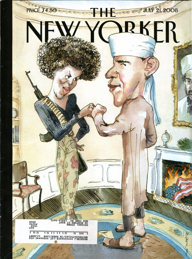
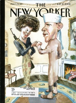
Then The New Yorker, of all places, depicts candidate, Barack Obama and his wife, as terrorists. Cartoonist Barry Blitt didn’t defend himself, it seemed, but the editors of the magazine defended the cartoon as a way to depict all of the fears of people who saw in the next President.

This past week, The New York Post presented an editorial cartoon by Sean Delonas depicting the rabid chimp that maimed a woman in Connecticut dead in the street while cops talk about the author of the stimulus bill. The immediate thought, of course, is that the chimp represents Obama in the cartoonist’s eye. How else could “stimulus bill” connect to a chimpanzee?

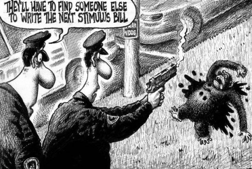
Prostest marches have moved through the streets, Al Sharpton has been in front of many a camera, and there’s been a lot of shouting on cable tv. Editors and writers at The New York Post have announced their displeasure with this cartoon. The NY Post apologized and finally Rupert Murdoch, who owns the Post, has apologized saying in part, “I am ultimately responsible.” (Expect to see a change of editors at the paper – all done quietly.)

I enjoy seeing cartoons take some of the headlines. I wish they were a bit more enlightened, though these seem enormously stupid comments by the cartoonists. Perhaps that’s what makes a cartoon so outrageous and gets readers stirred up. Daumier, of course, led the way with his cartoon “Gargantua” in which the King of France devours the taxes of the people and has grown to obese proportions. This 1831 cartoon followed the riots of 1830, and Daumier was imprisoned for six months for his cartoon.

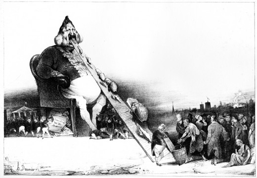
There’s no comparison to what Daumier was doing and the racism (or is it just muddled stupidity) of Delonas, but it’s good to see that cartooning is still alive and that our government isn’t insane enough to imprison cartoonists for attacking the President.

Just a stray thought . . . can you remember the last ANIMATED cartoon that caused a stir?
- JibJab‘s cartoons poke ribs but offer nothing more than mocking entertainment, otherwise they certainly wouldn’t make it to Jay Leno’s show. They actually seem to go out of their way to elbow everyone so as to hurt no one.
- Wall-E‘s political statement is confused enough that it really doesn’t make any points.
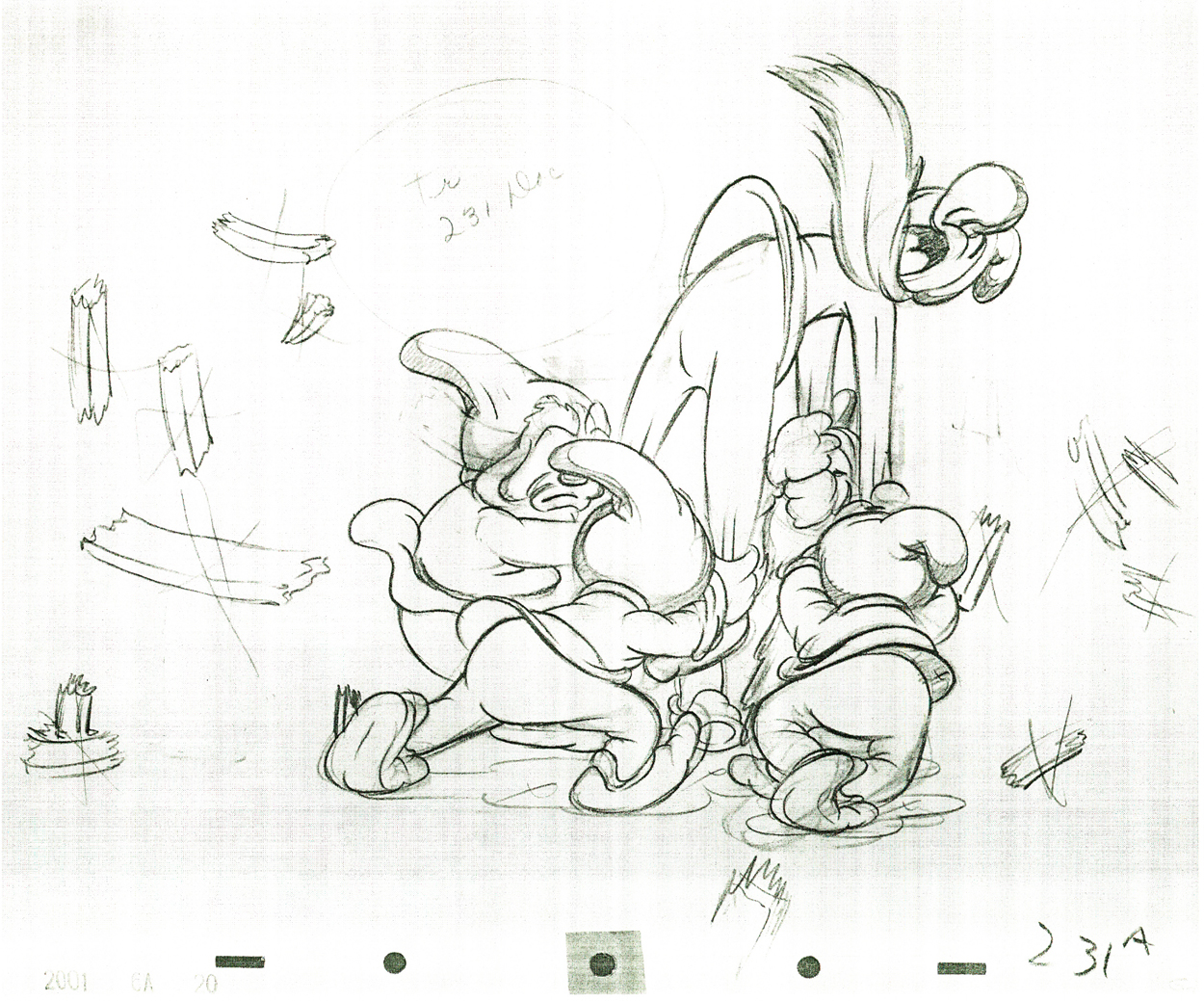
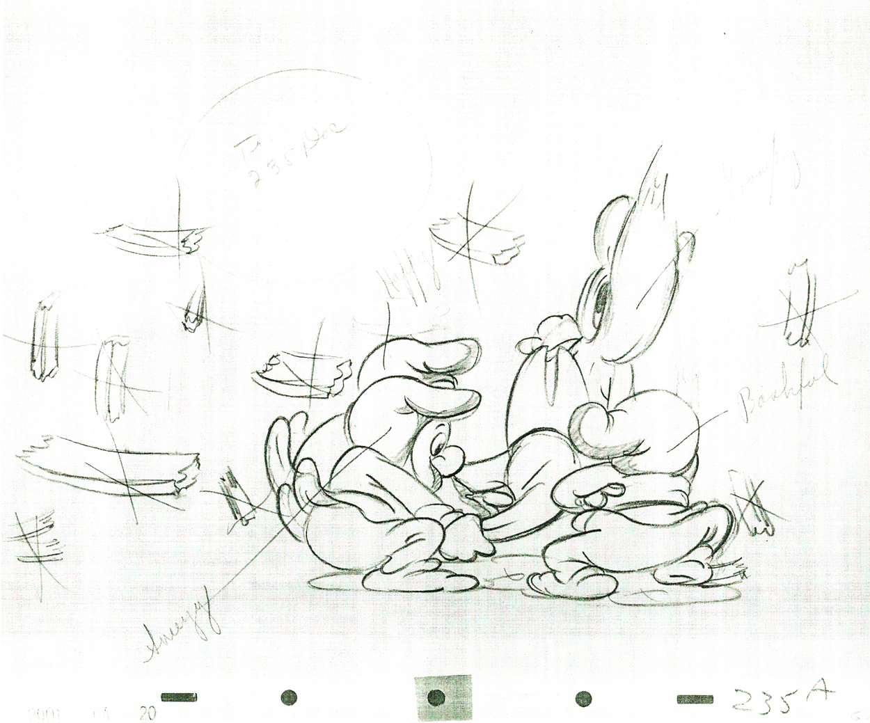
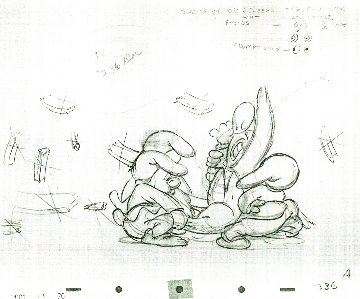
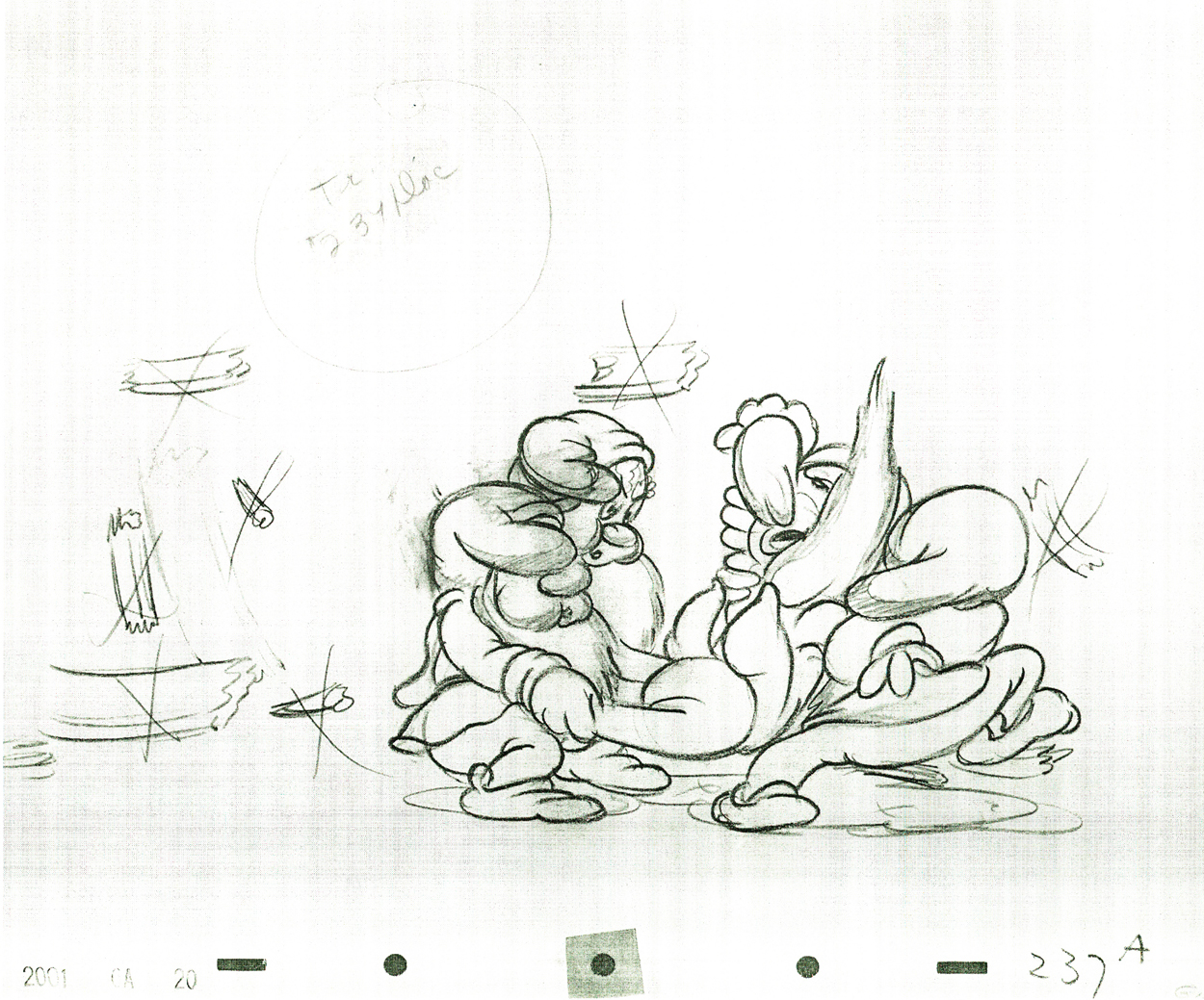
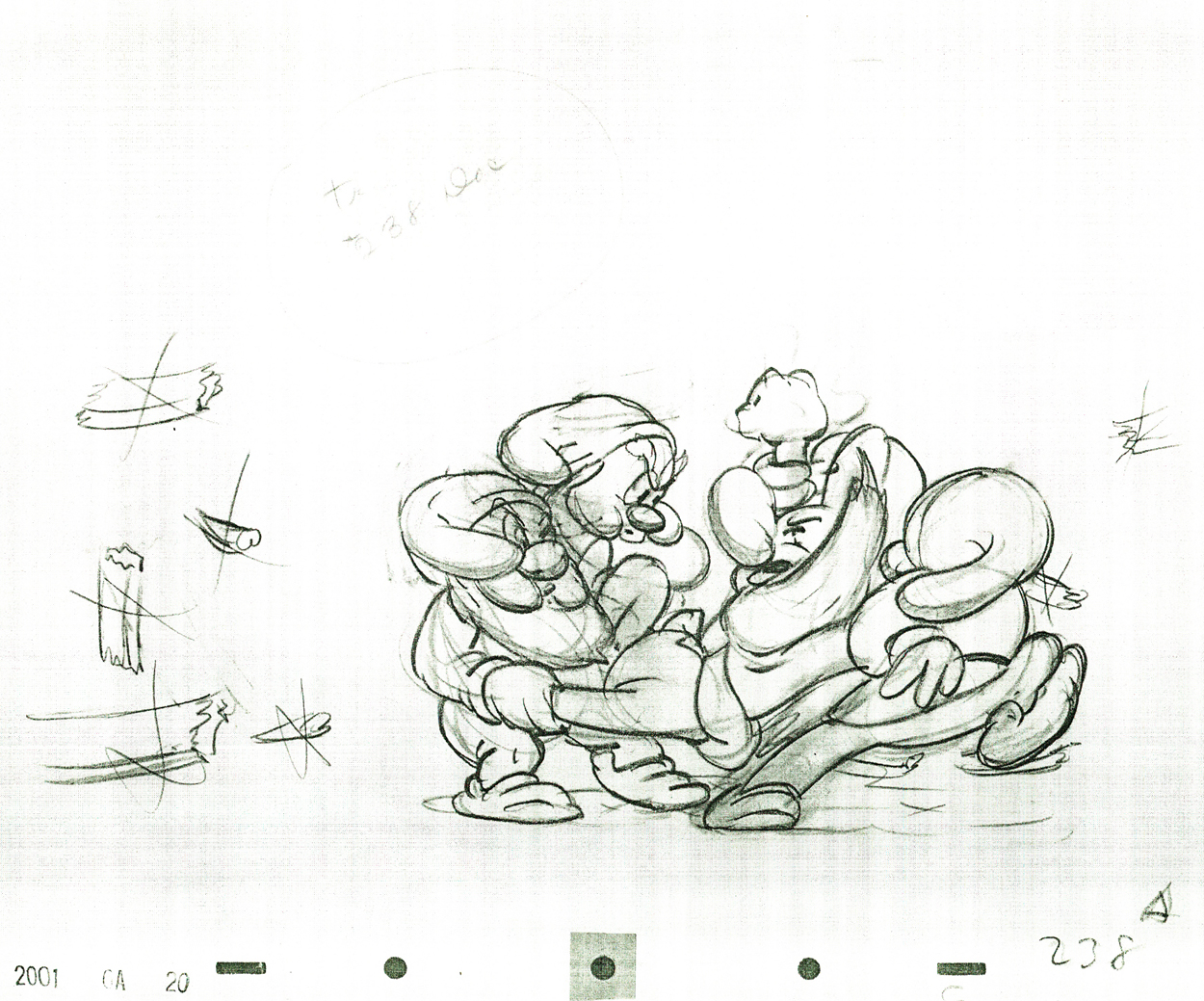
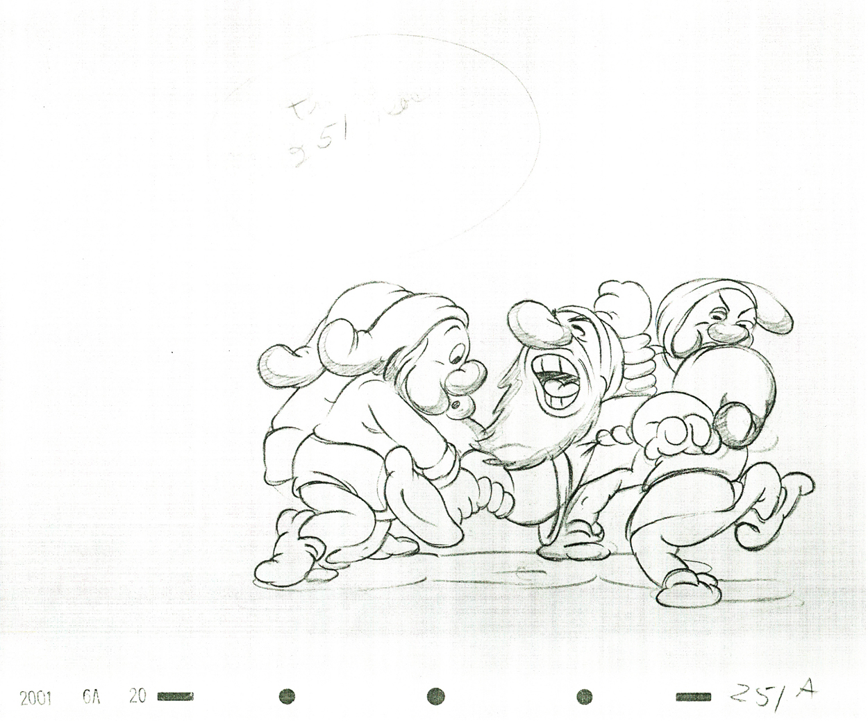
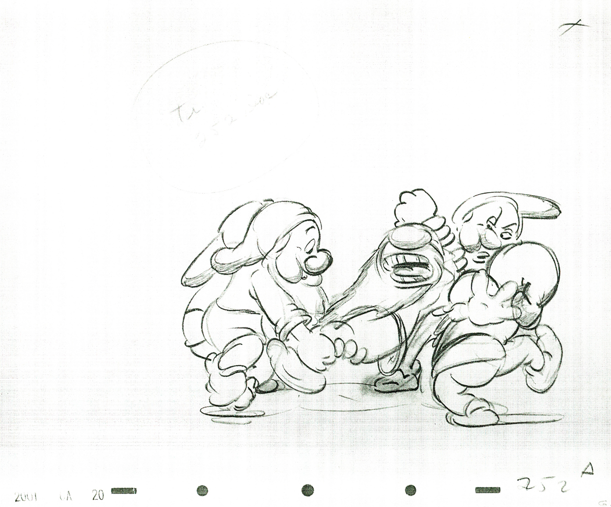
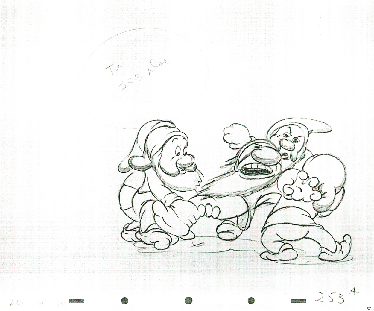
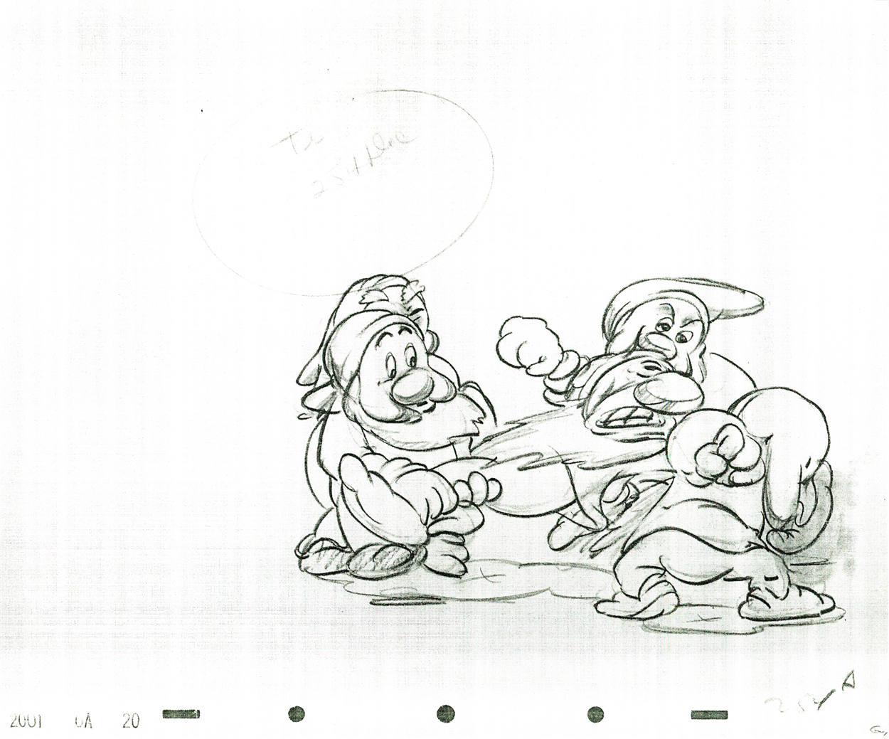
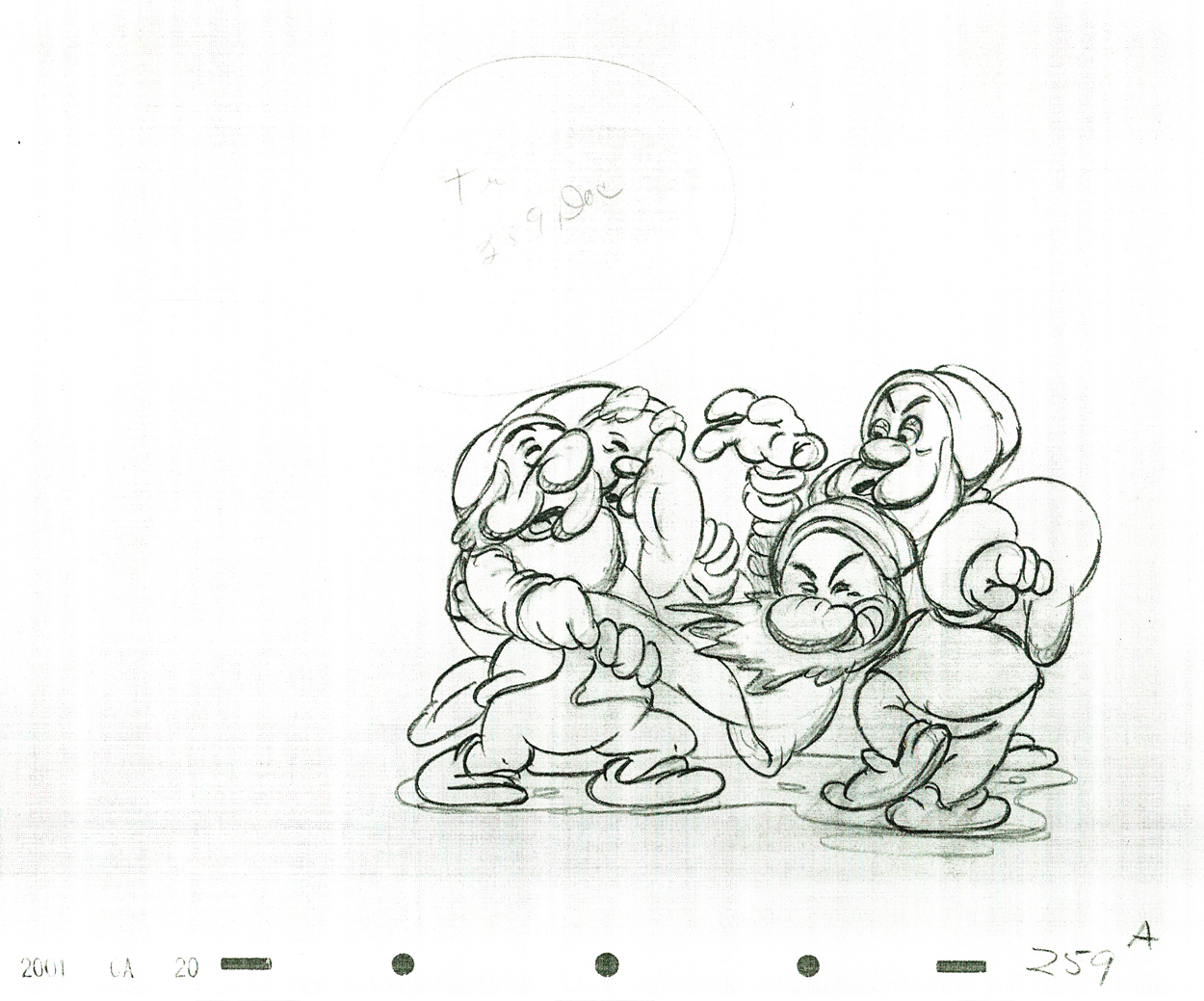
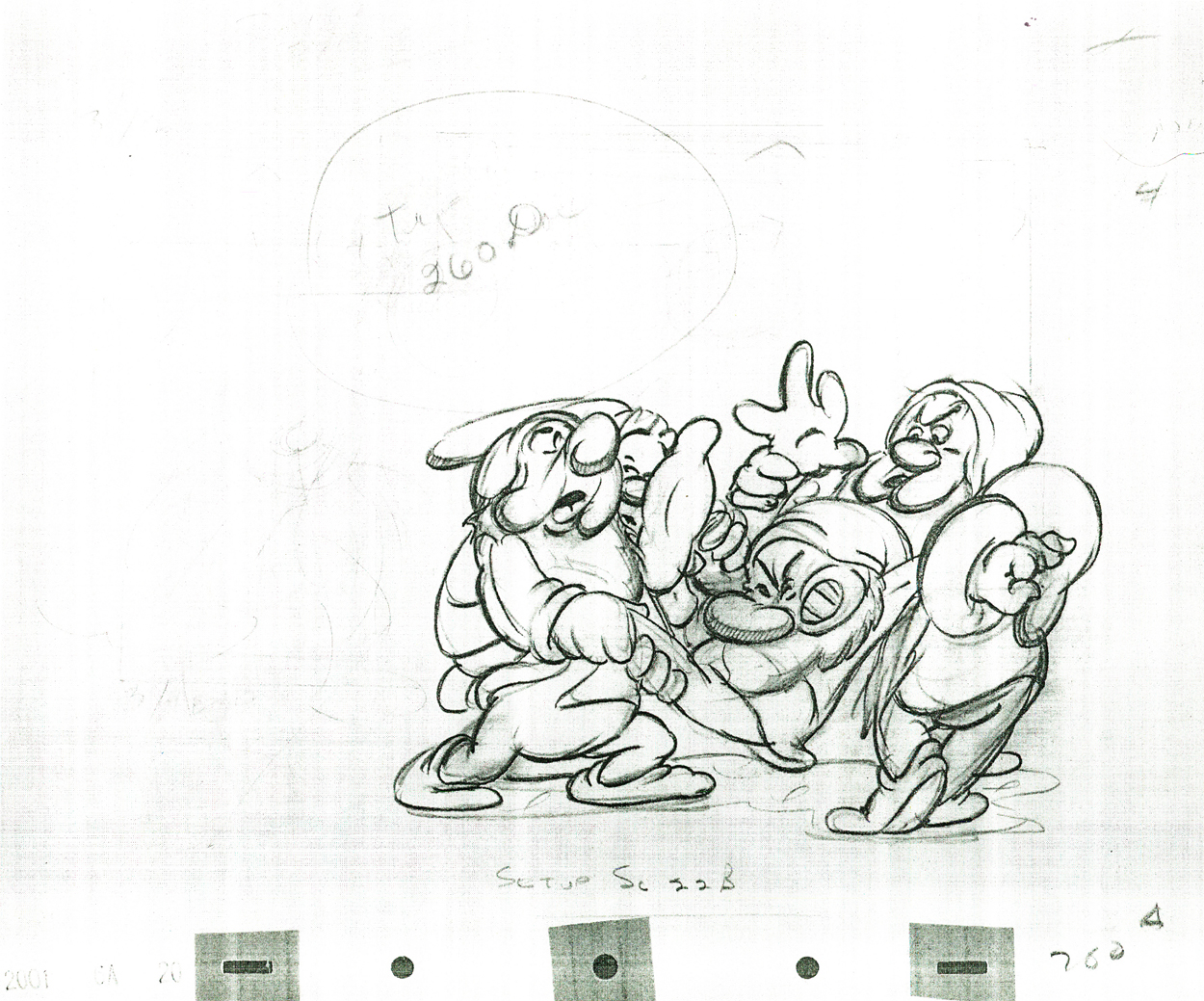
- Hugh Harman’s Peace On Earth may have been the last stirring short. It challenged the idea of World War II as America was stepping boldly into it. But that cartoon was nominated for the Oscar; it obviously didn’t create much of a stir.

Actually, there were a few features that did create a small stir.

Bakshi’s Coonskin was attacked for its blatant racism and CORE protested loudly outside the small eastside theater showing the film. Actually, the only thing racist about Coonskin was the title. Those who protested and got the film removed from distribution (only to be reworked and rereleased years later as Bustin’ Out and/or Street Fight) hadn’t seen the film. But with a title like that it had to be racist.

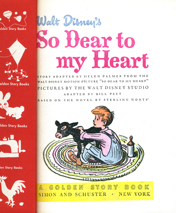
Much the same was true of Disney’s Song of the South. The protests weren’t strong enough to stop the film’s exhibition or to stop it from winning an Oscar for best song and a special oscar for James Baskett, who played Unle Remus.

The other film to get some attention was Bambi. Picketers were out in droves to protest the film for its anti-hunter attitude and editors commented on hunters’ rights. The stir seemed to have been partially used by the studio for publicity and didn’t have much of an effect on its audience.

___________________

- Chris Doyle has started a new forum for classically drawn 2D animation. Chris writes,
“It’s a tribute to the Nine Old Men and all those who made those great films during the ‘Golden Age’.”
You know what I think about 2D animation, hence I think it’s a good venture worth joining. Take a look. Here.

___________________

- “Thomas Phillip” asked me to point you to this recent short by Reza Dolatabadi, Khoda. A mix of painting, animation and art. It’s worth a look.

Jeff Scher has another of his fine, monthly animated pieces in the NYTimes. In Your Dreams is about watching the person you love, while they’re asleep. It’s a poetic and romantic short piece.

- I also found this excellent short, Gary, on line, via Alan Cook‘s site, Cooked Art. I usually figure I’m late to the game in viewing these things. If you haven’t seen it, do. Computer, 2D and character animation. Surprising and excellent.

___________________

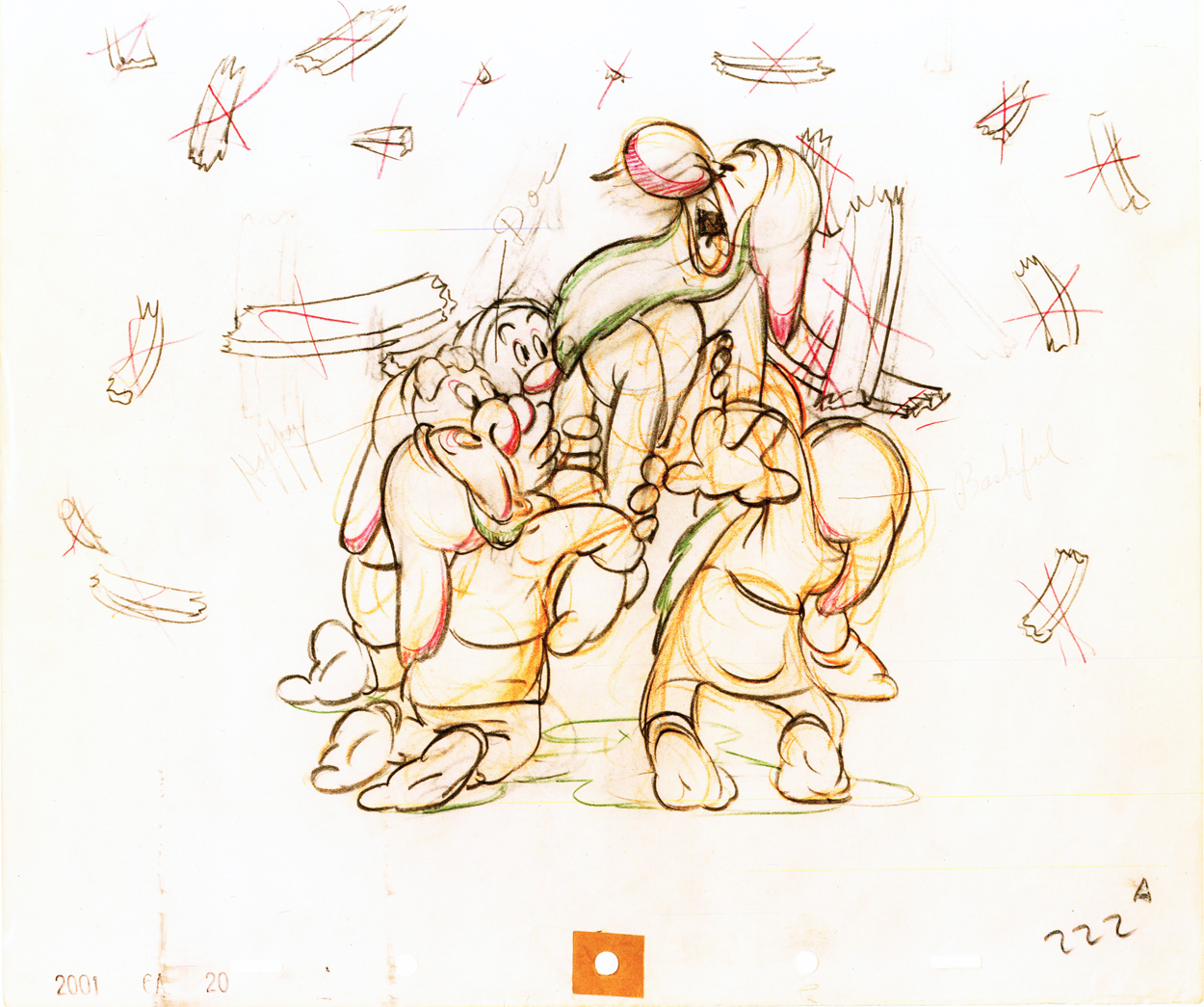
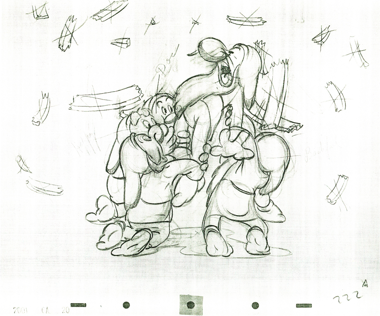
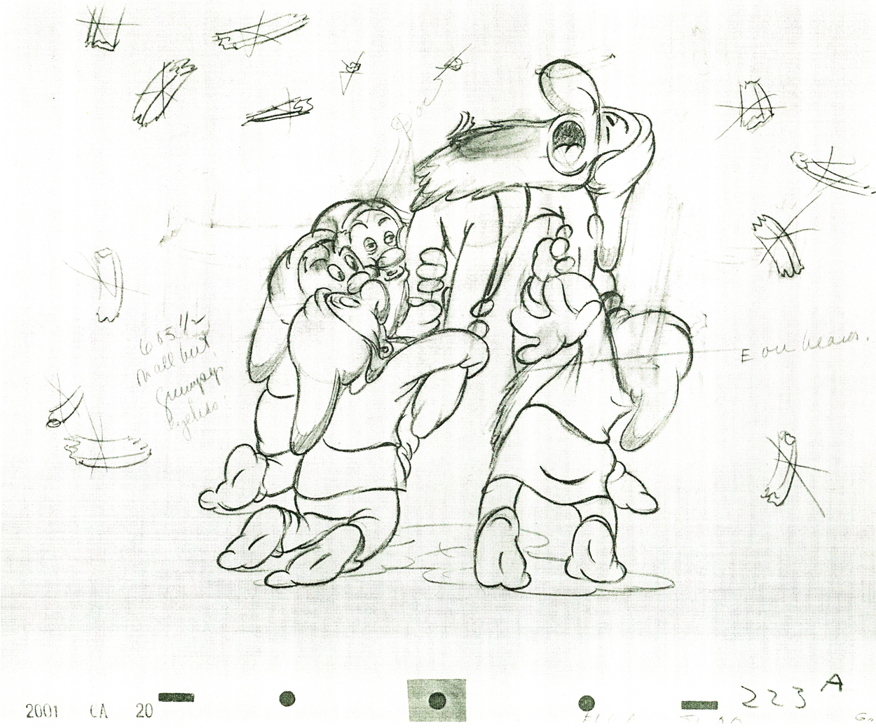
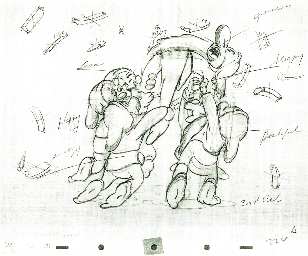
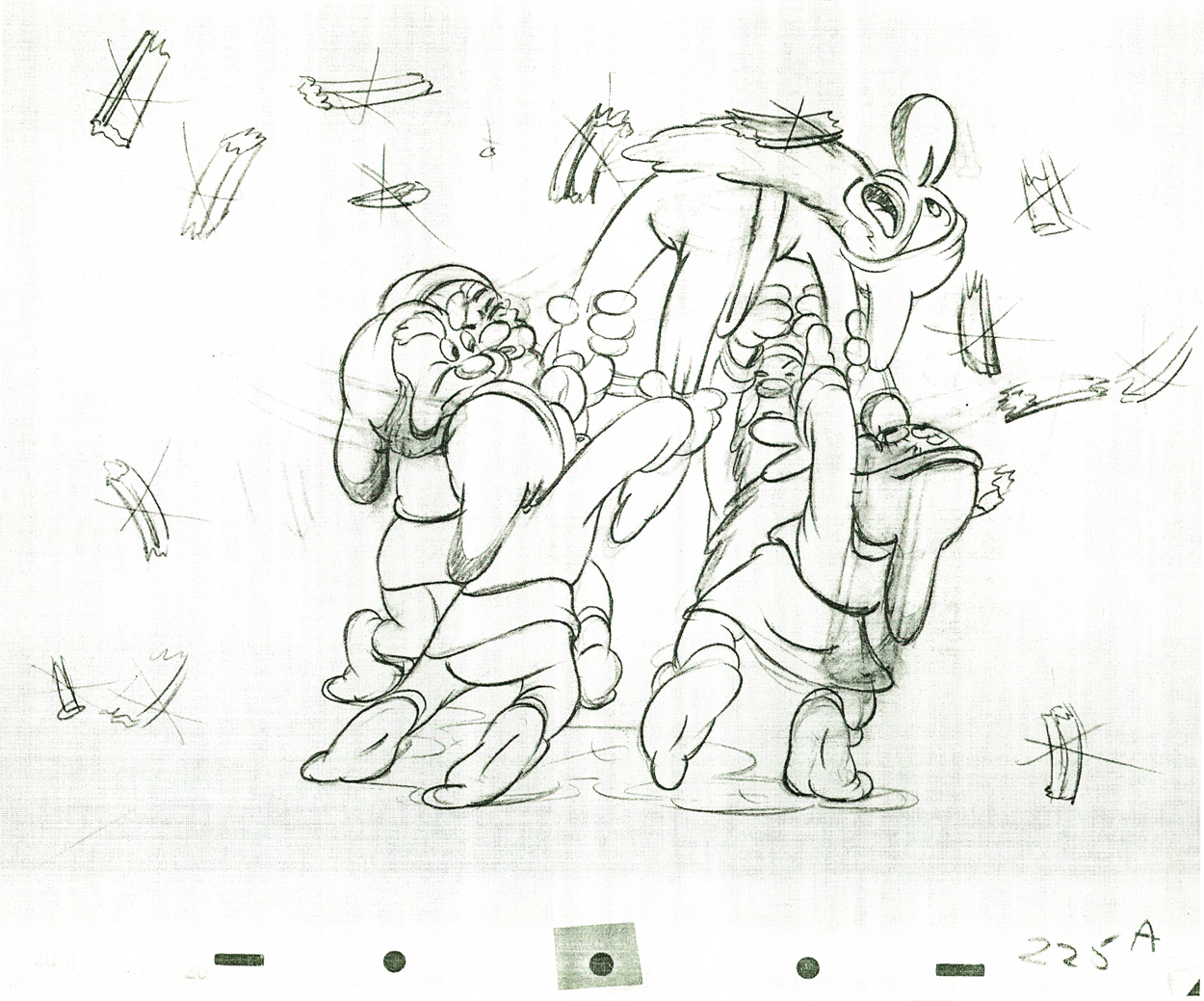
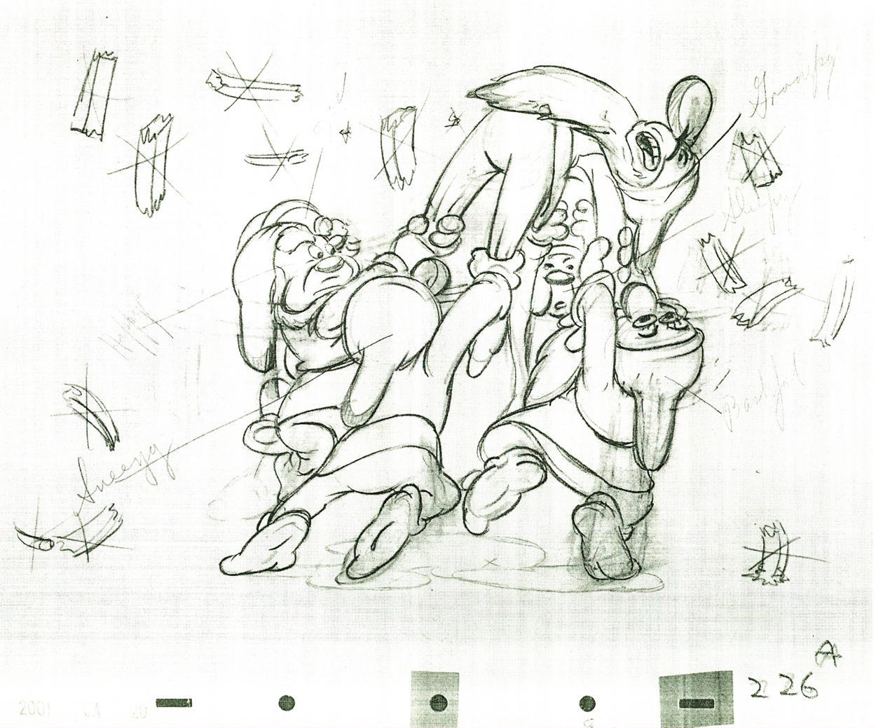
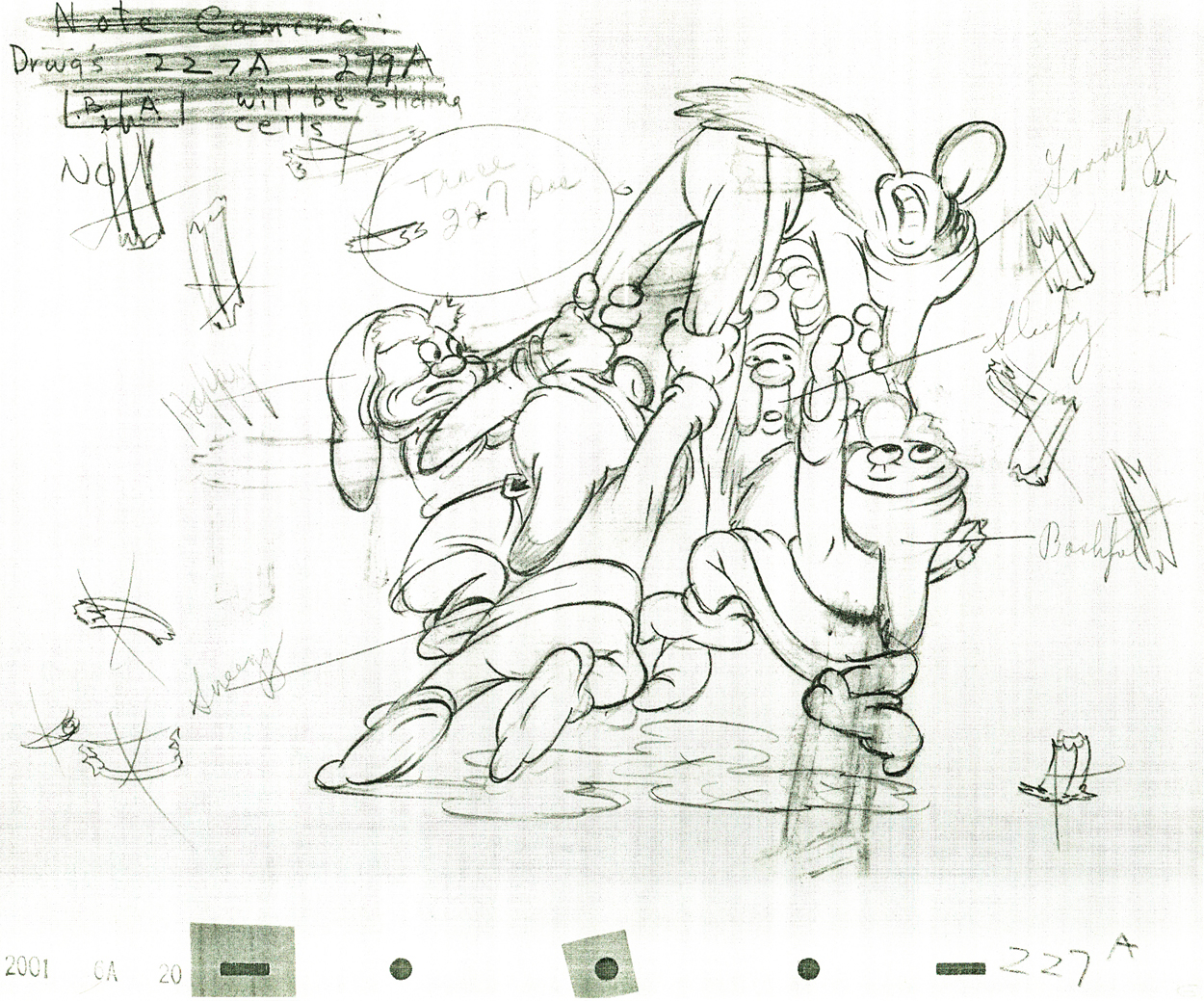
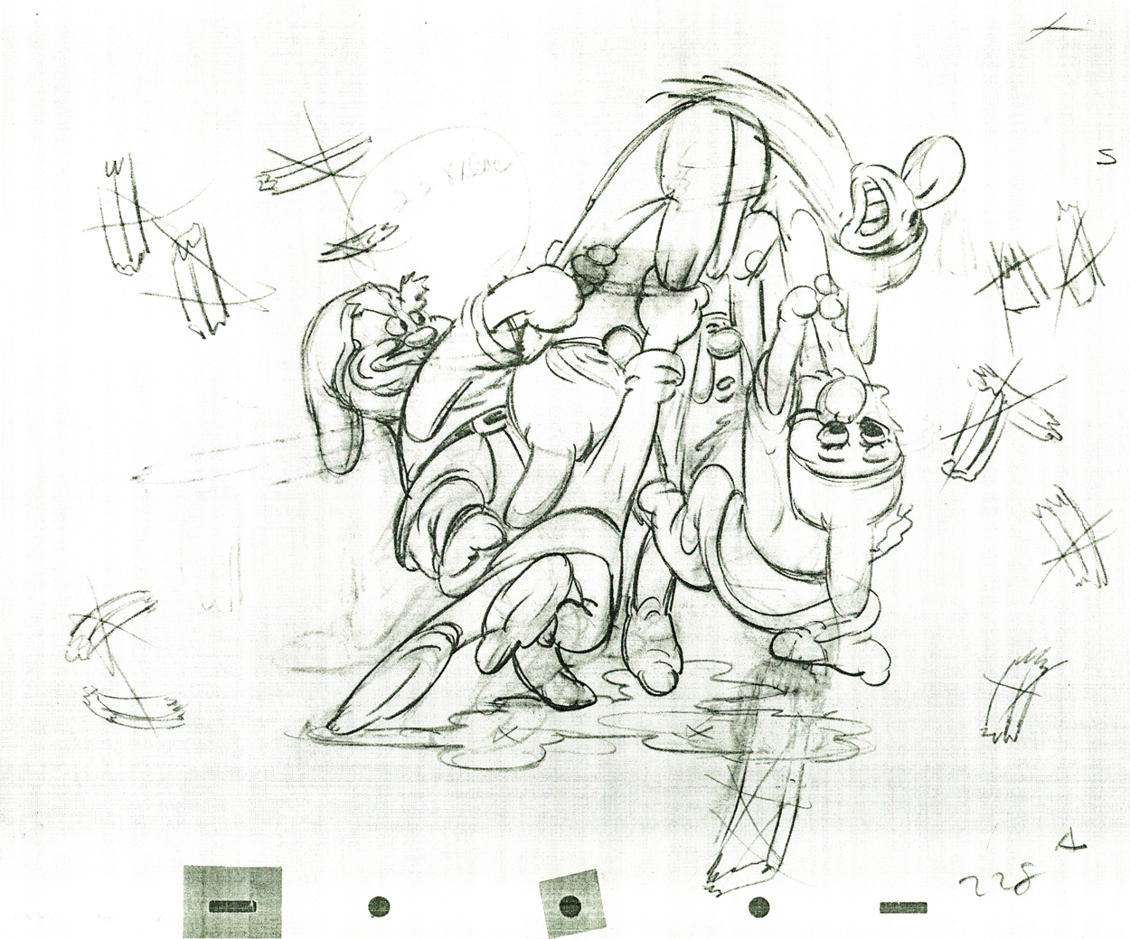
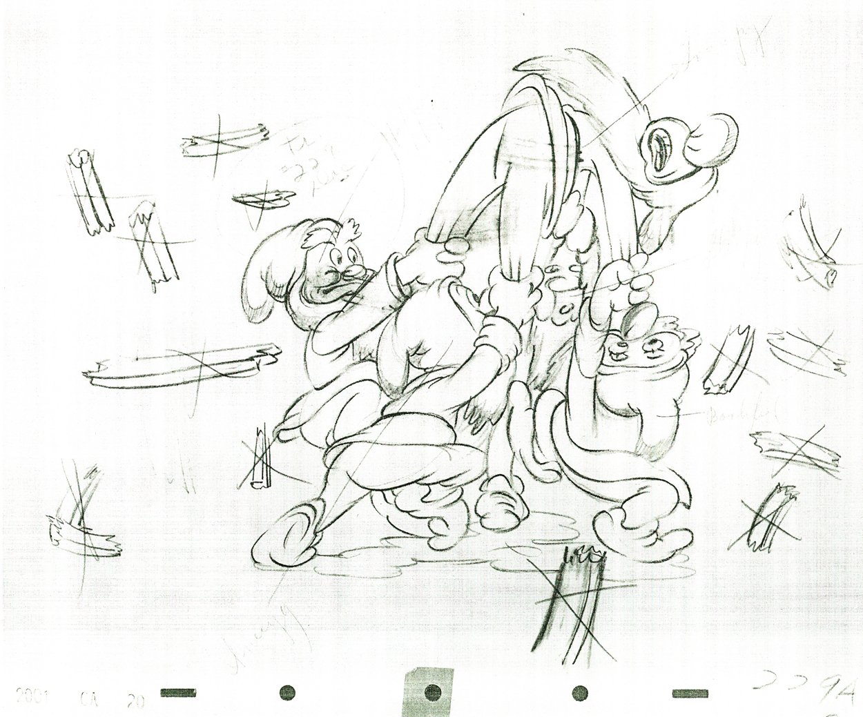
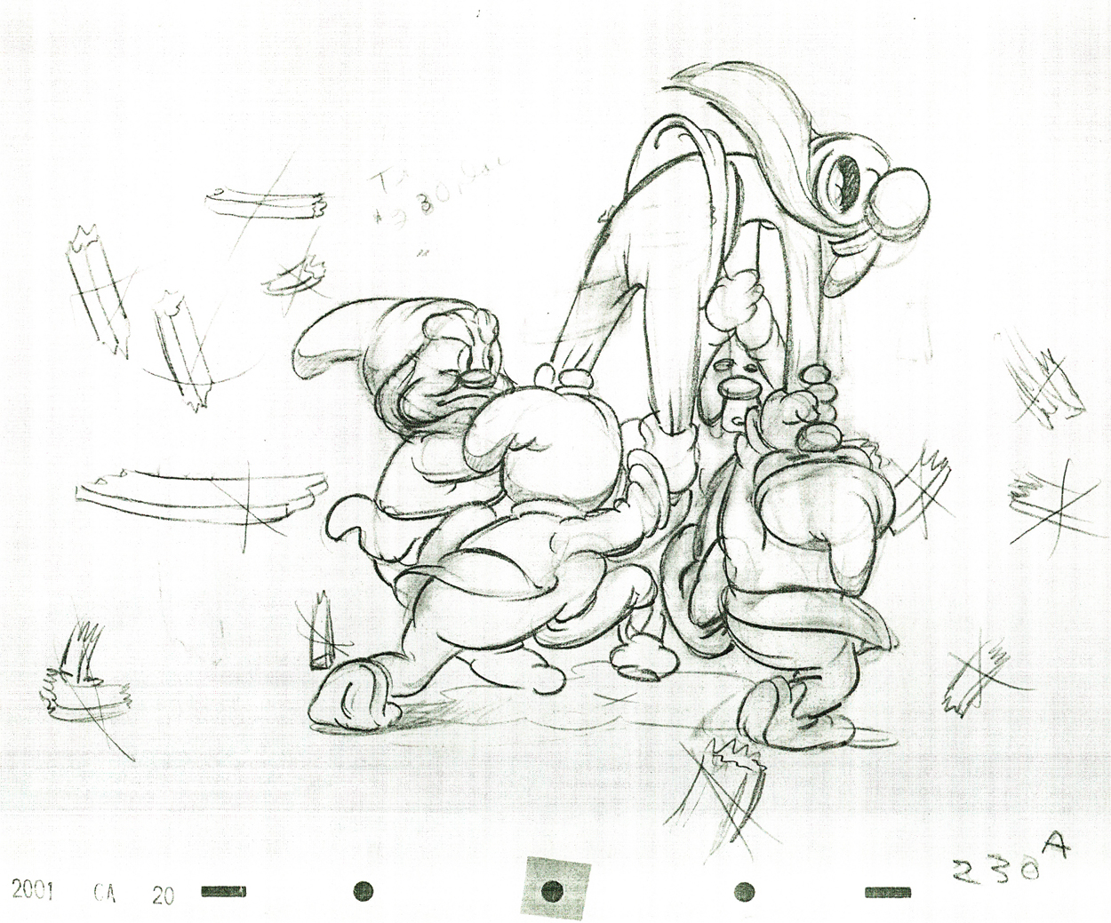
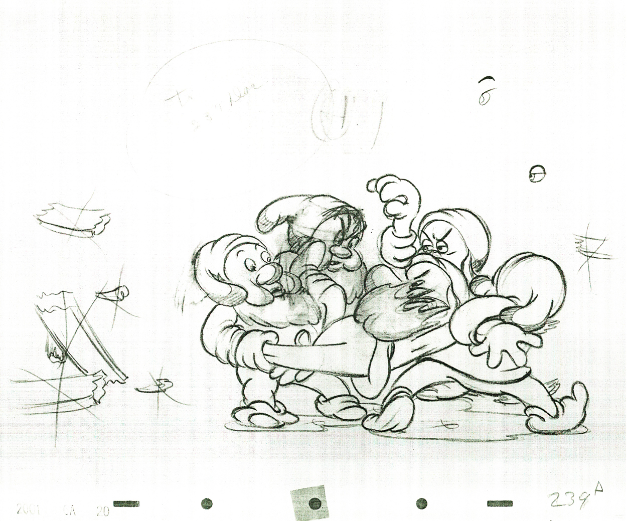
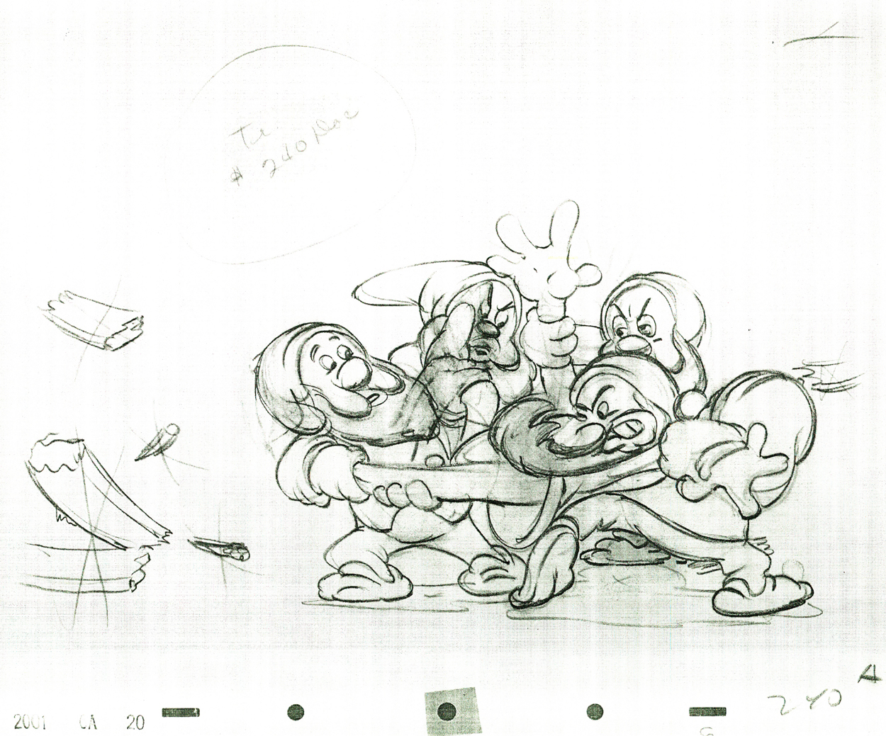
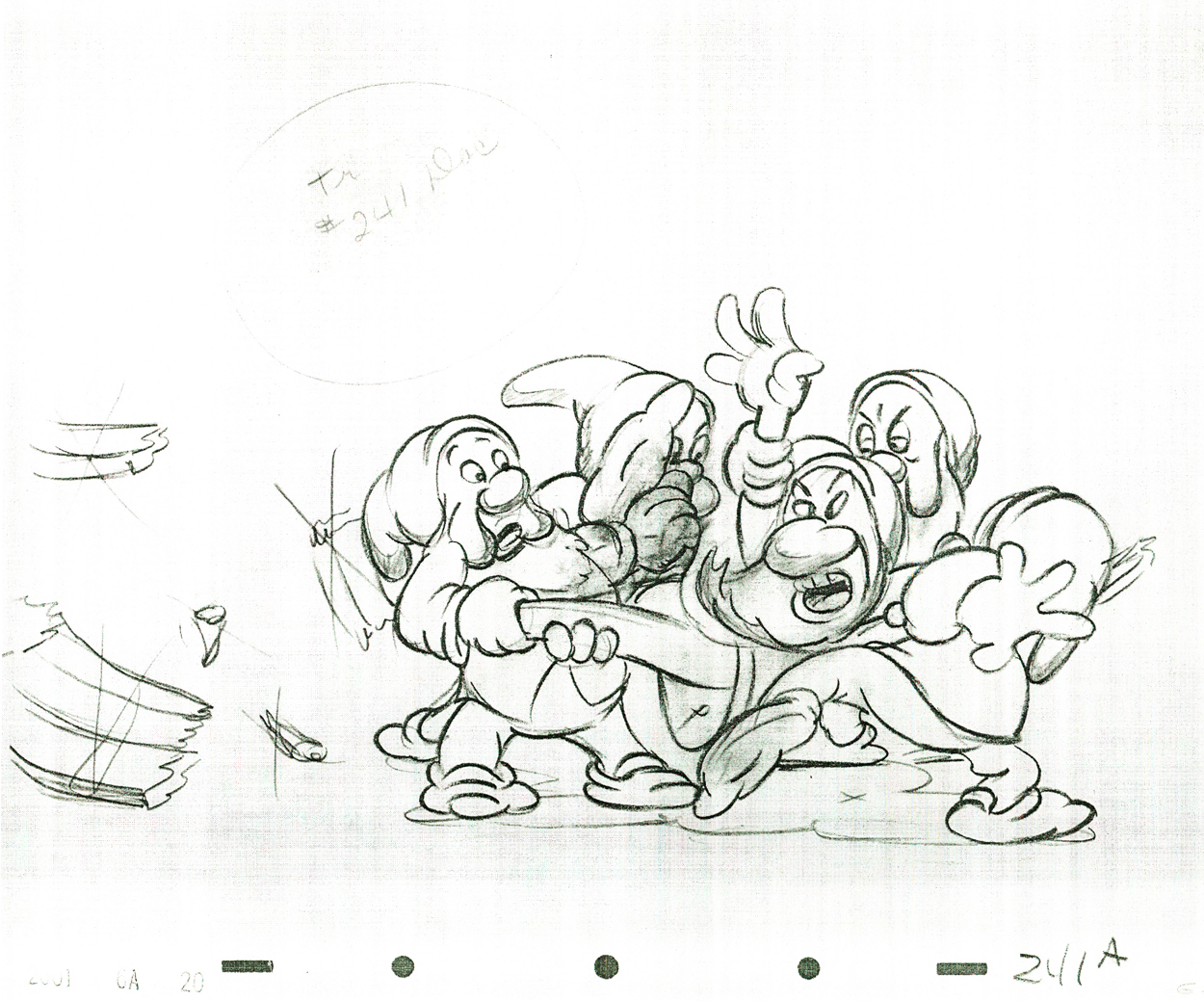
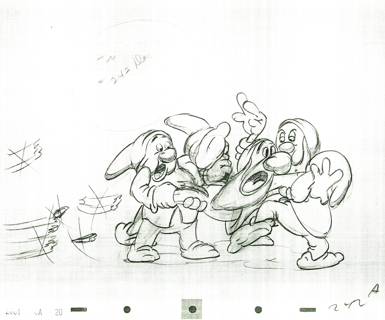
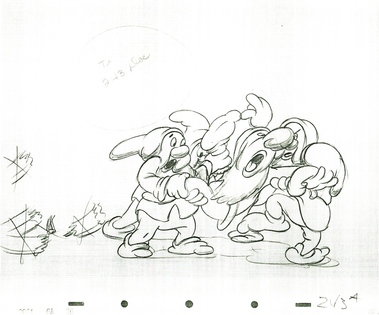
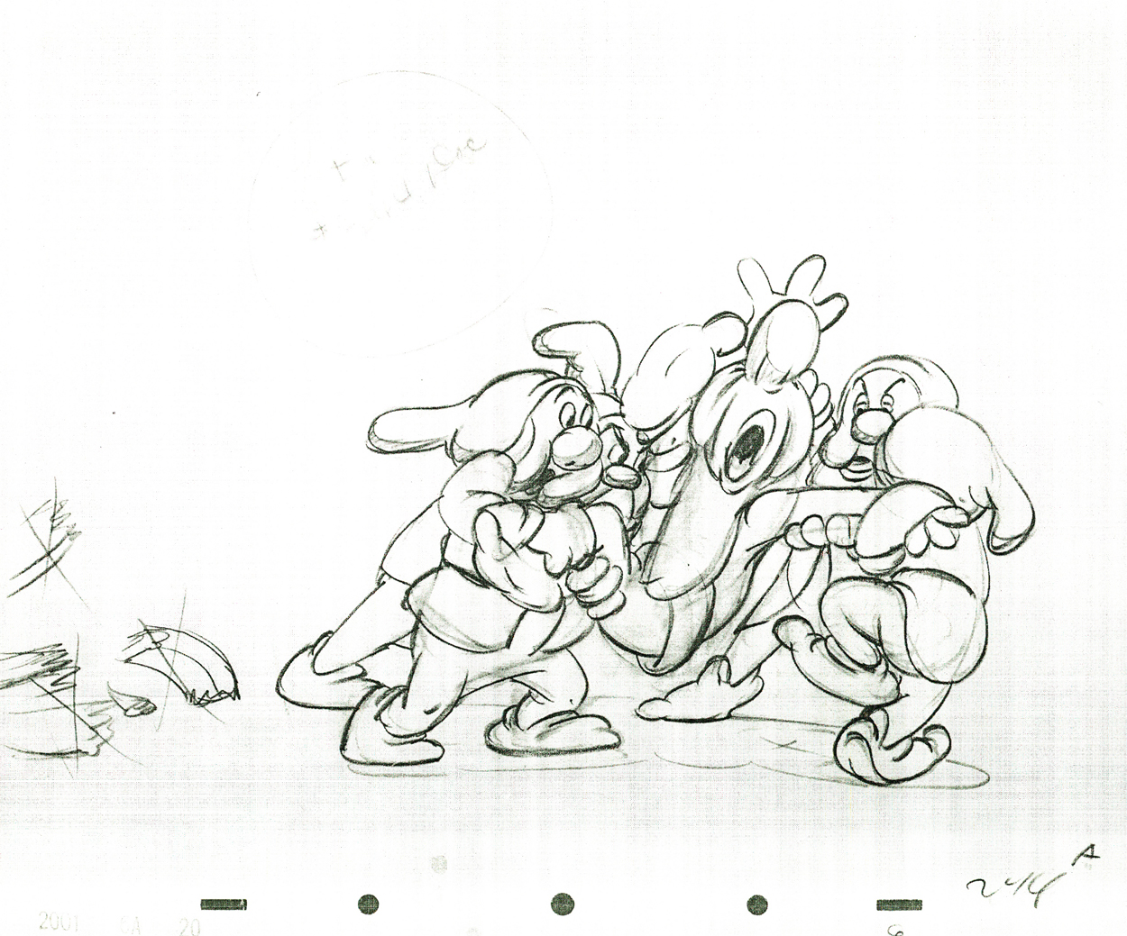
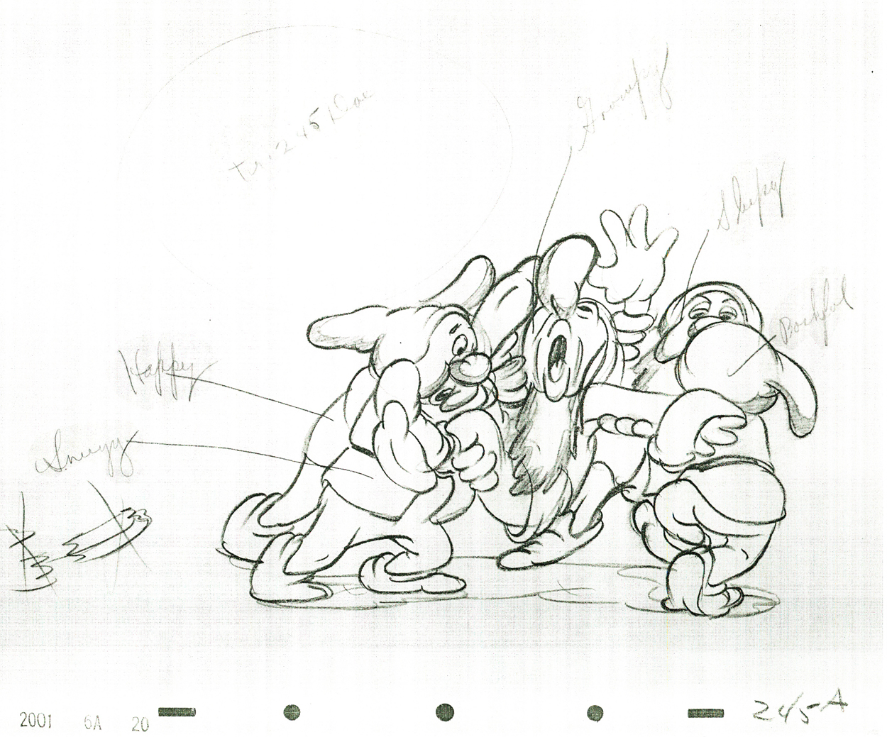
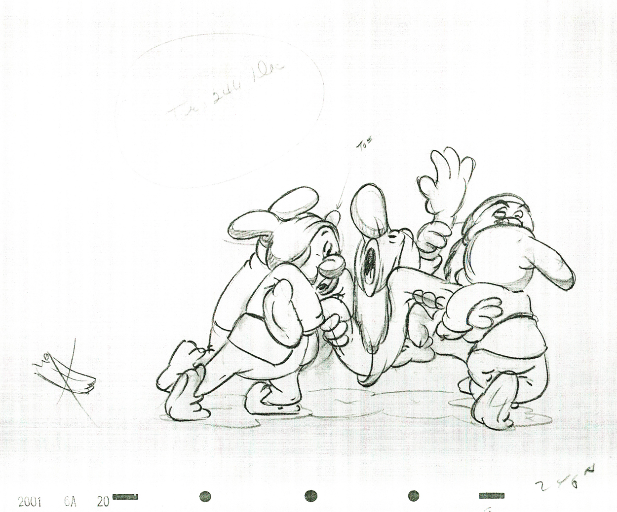
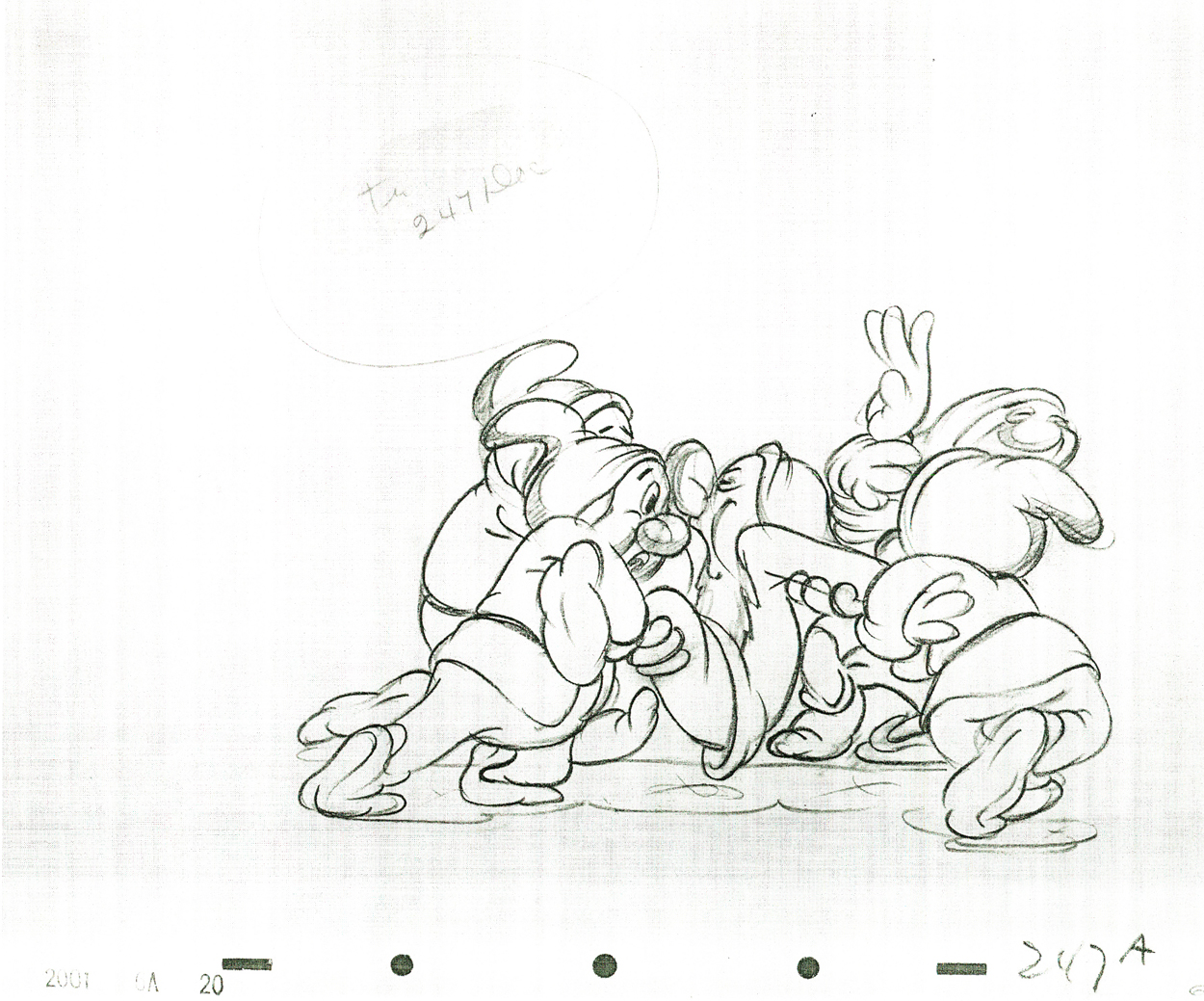
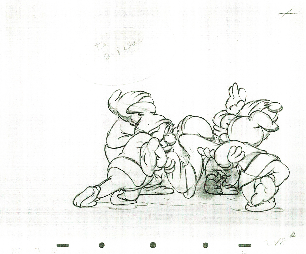
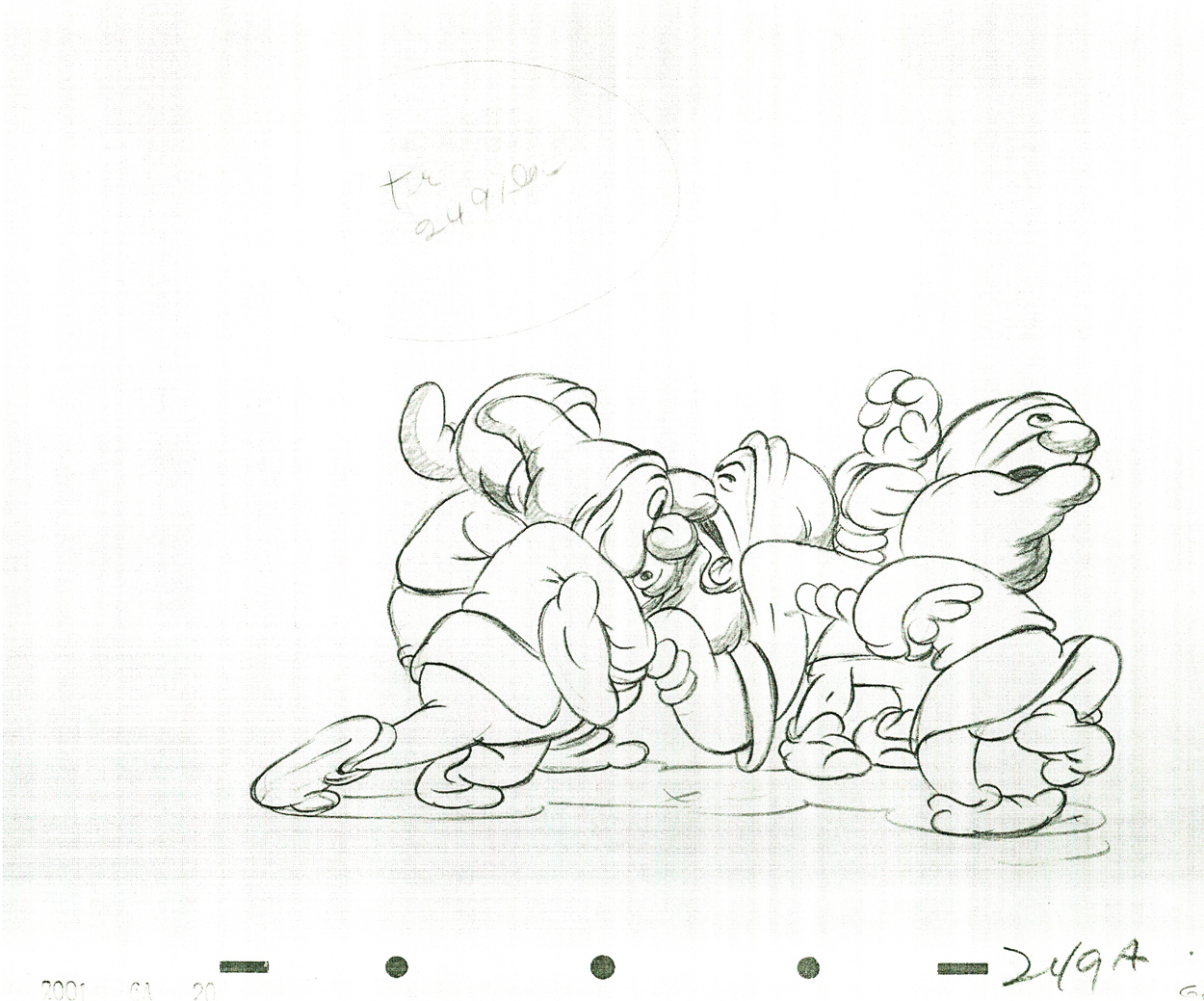
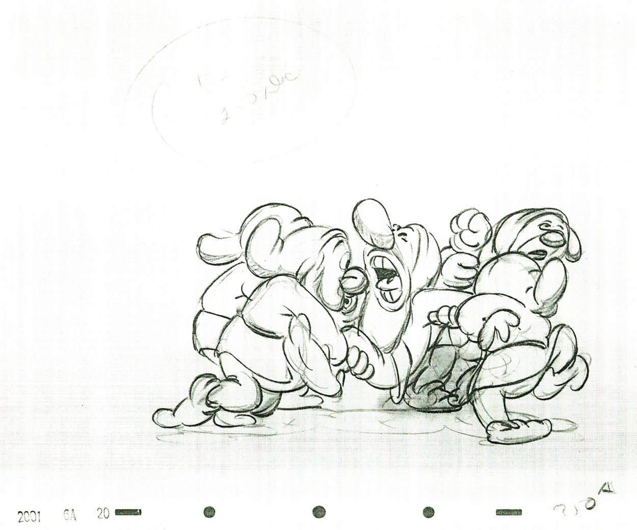
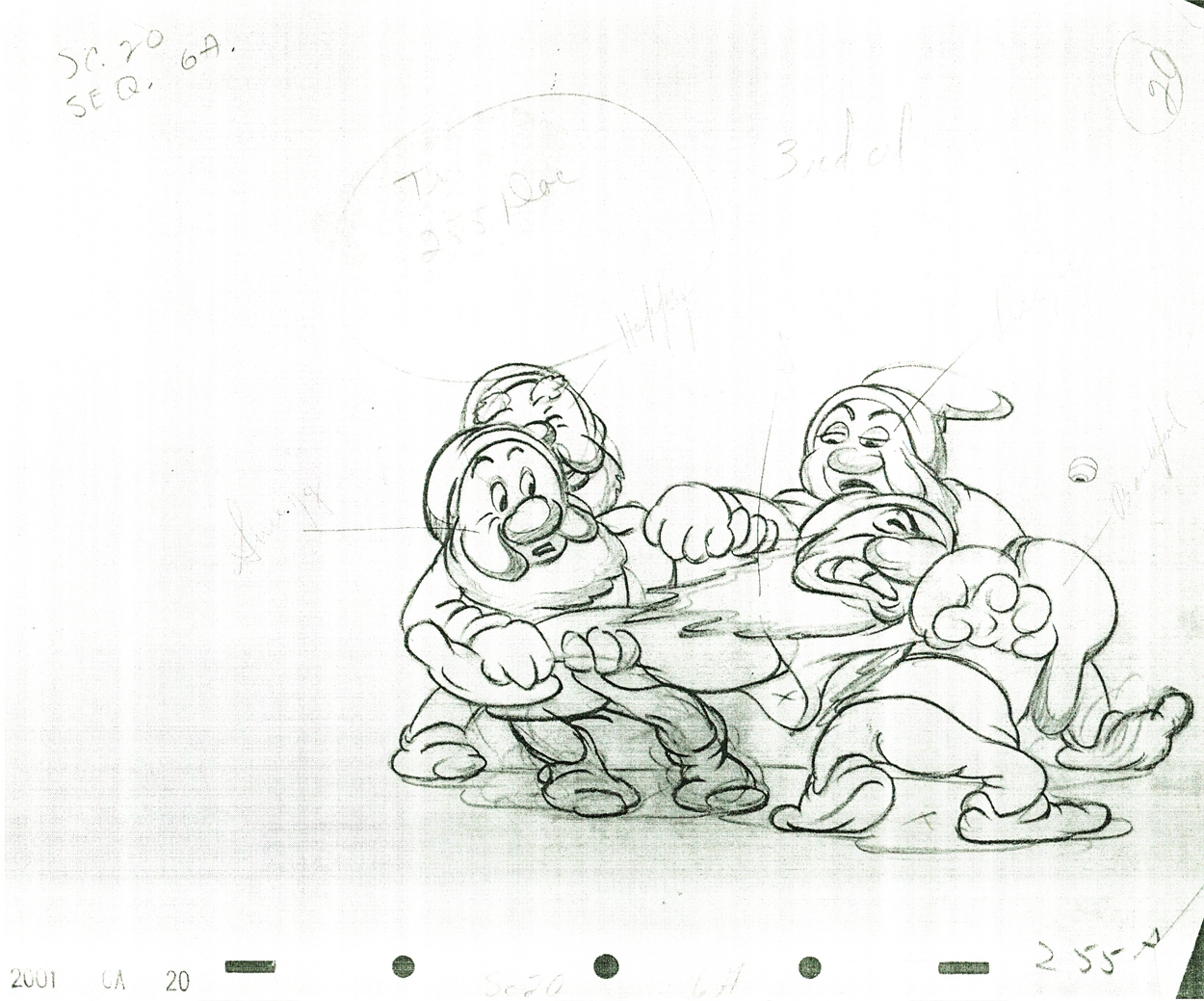
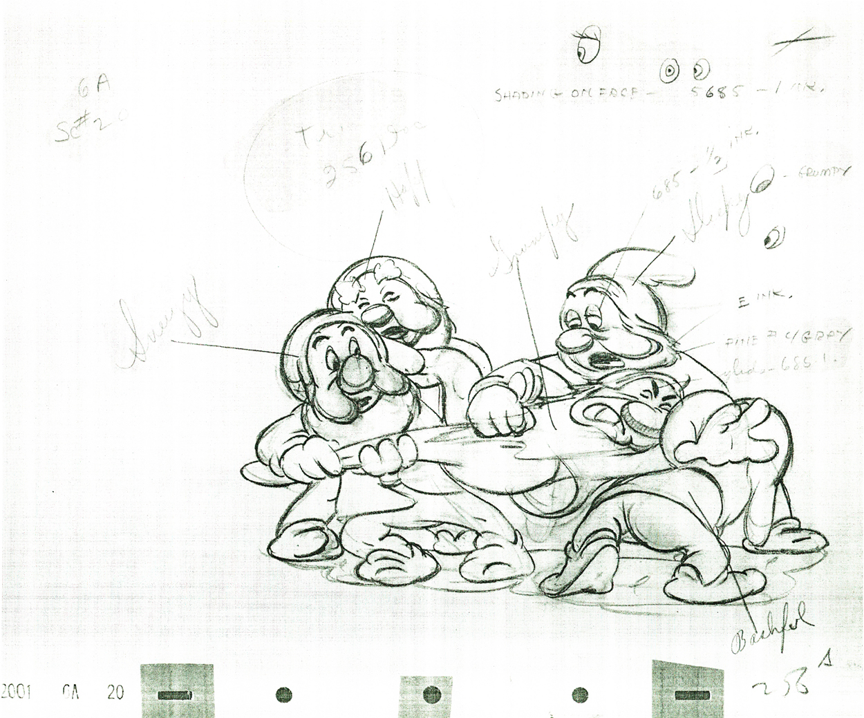
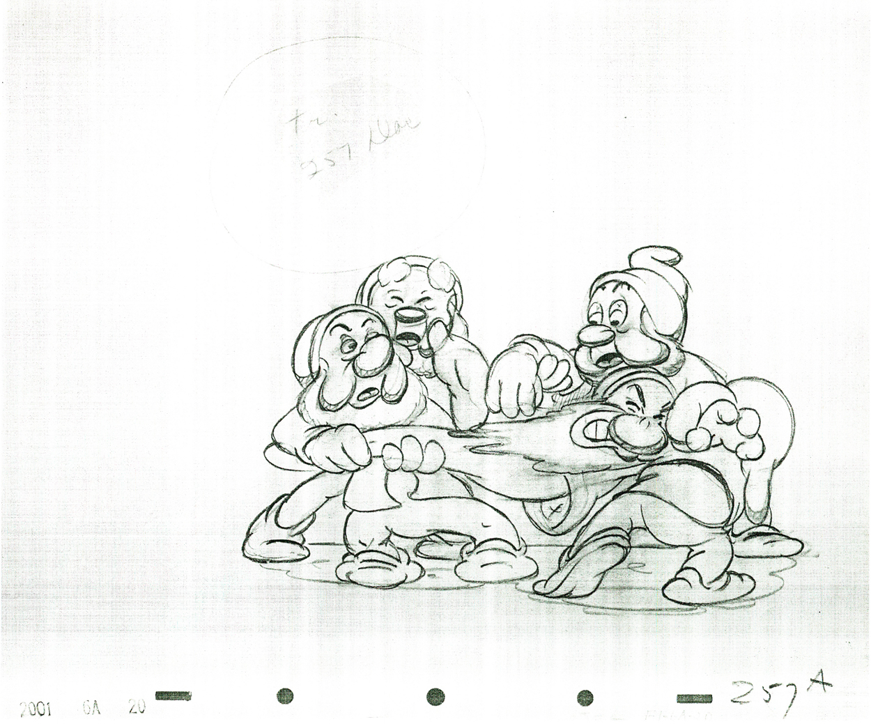
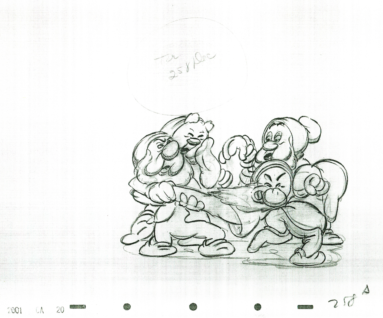
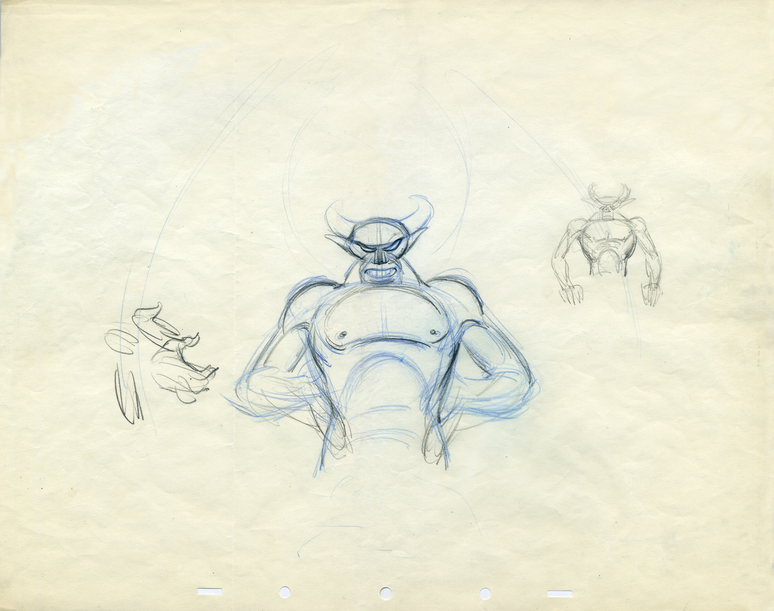
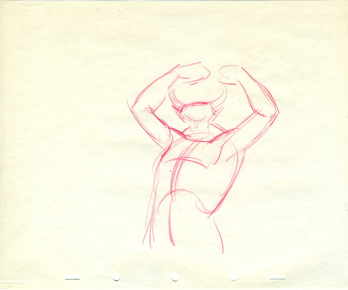
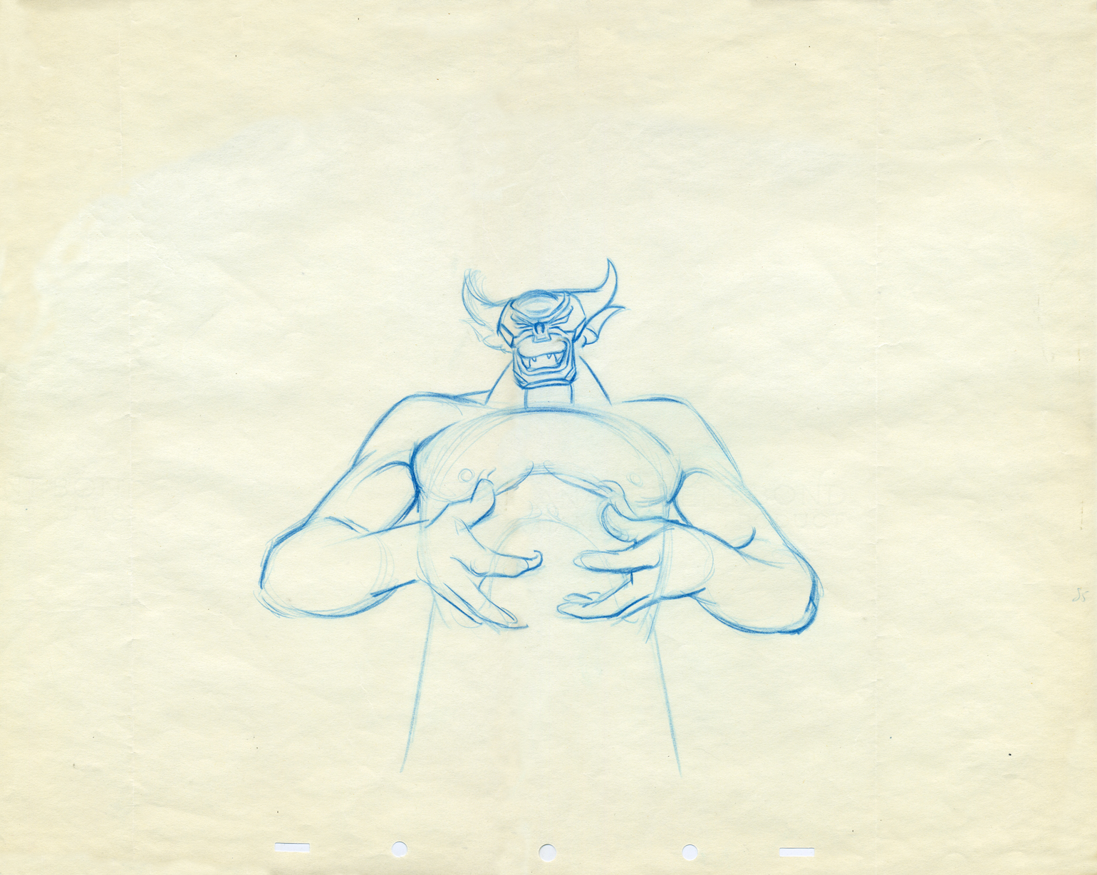
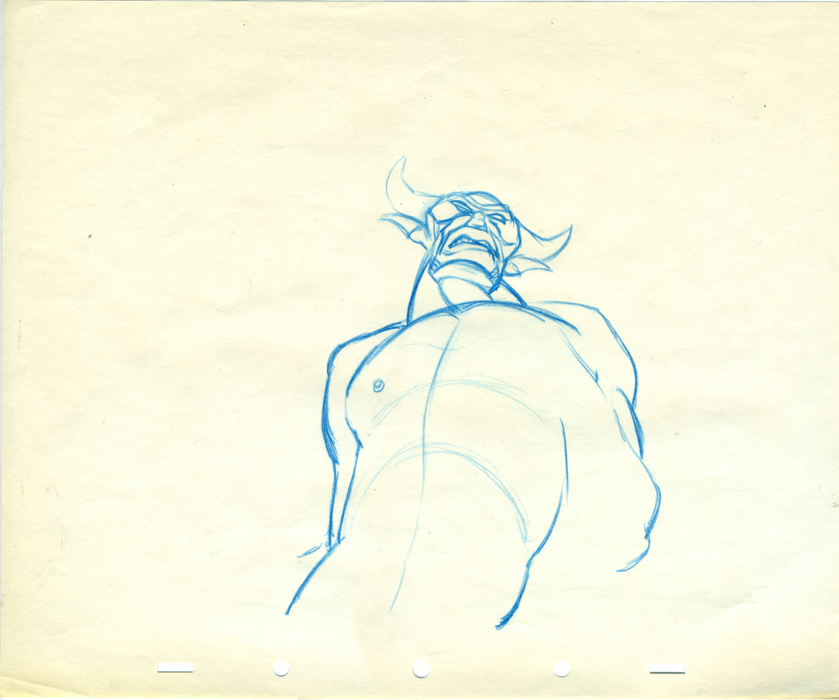
- The MUST READ today is Mike Barrier’s excellent commentary on acting for animators and Bill Tytla. If you haven’t read it, you should.
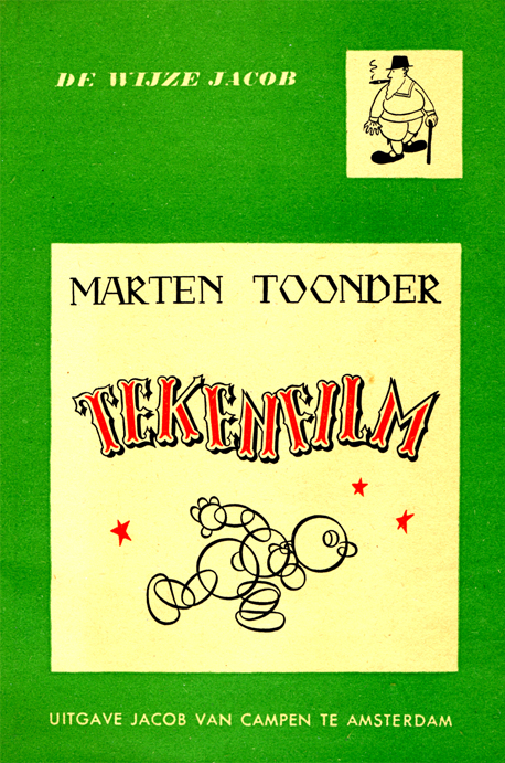
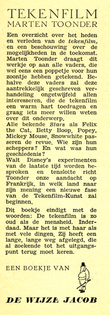
Animation &Animation Artifacts &Art Art &Disney 23 Feb 2009 08:00 am

Tytla’s Devil in the Rough

-i Here’s what for me was a real treat to scan and post. I had some limited access to actual drawings by Bill Tytla of the Devil from Fantasia’s Night on Bald Mountain sequence.
The drawings are mostly roughs by Tytla, and they give a good sample of what his actual work looked like.

I don’t need to write about it; let me just give you these mages.


A good example of a Tytla drawing.


Here’s the clean up of the same drawing.


Later in the same scene.


Some Tytla sketches.


Animation roughs don’t get any more beautiful than this.


A side-peg pan.


Rough heads.


Art. What else need be said?
The individual drawings are stunning, and they’re
in service to a brilliantly acted sequence.
It will never get better.

« Previous PageNext Page »

eXTReMe Tracker
click for free hit counter

hit counter