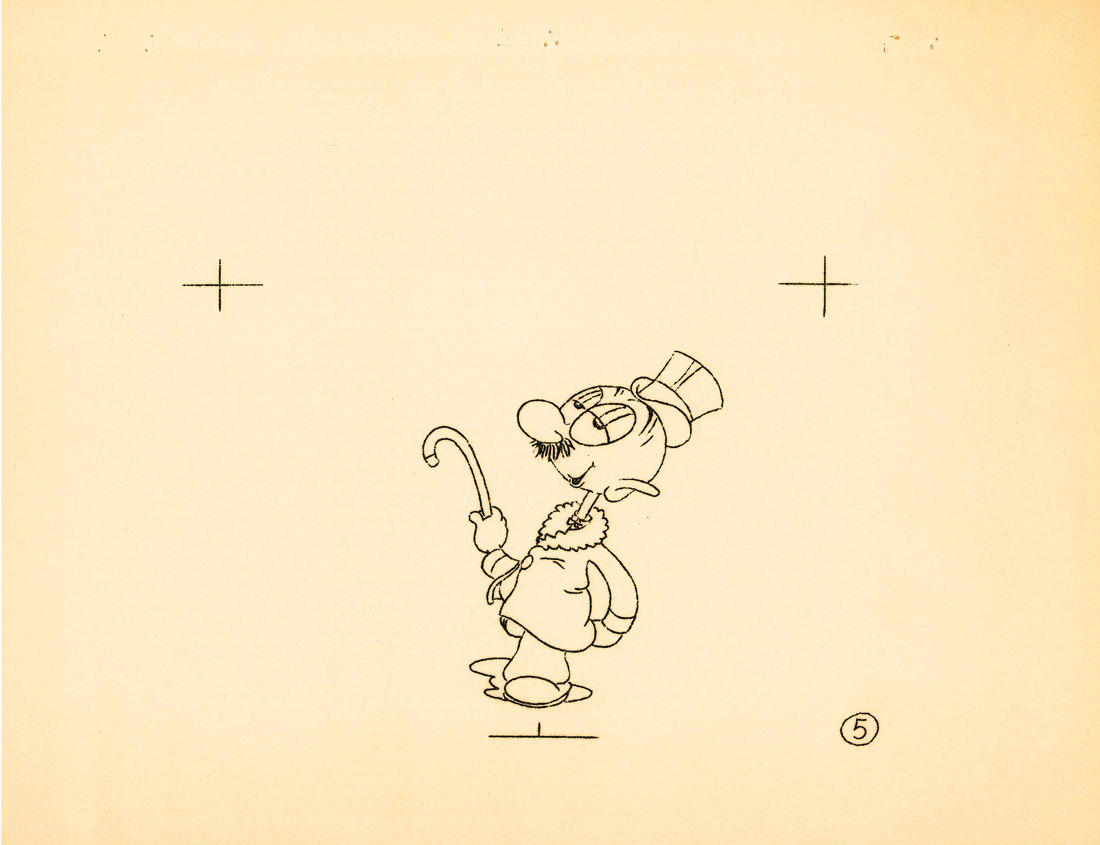
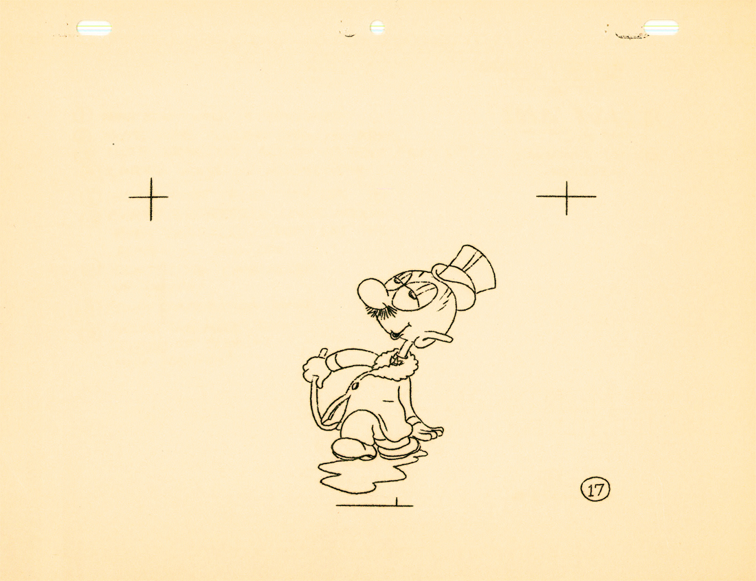
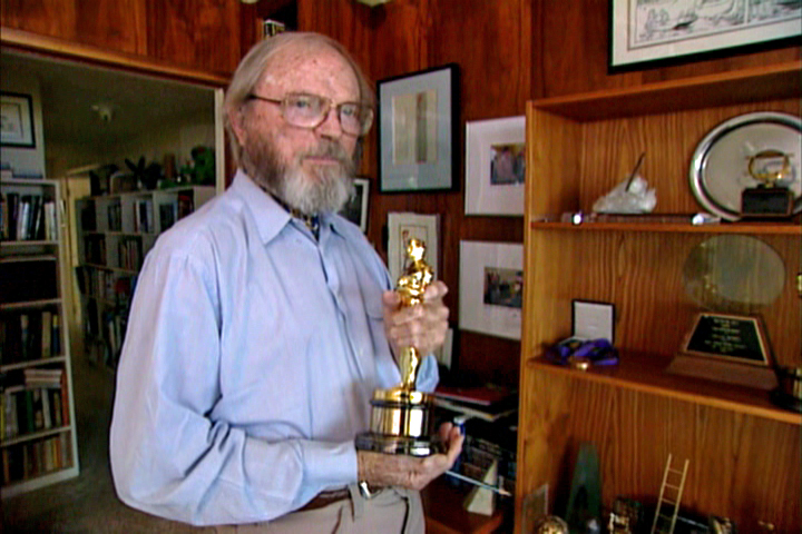
Chuck Jones &Commentary 24 Mar 2009 07:41 am

Chuck’s Memories & Coraline

__
- Tonight on Turner Classic Movies there’s going to be a Chuck Jones jamboree. This is all occasioned by the screening of Peggy Stern & John Canemaker’s fine film,
Chuck Jones: Memories of Childhood at 8:00pm/10:30pm/2:30am EST.

Along with this film a number of Jones’ works will air:

The Night Watchman____Prest-O, Change-O
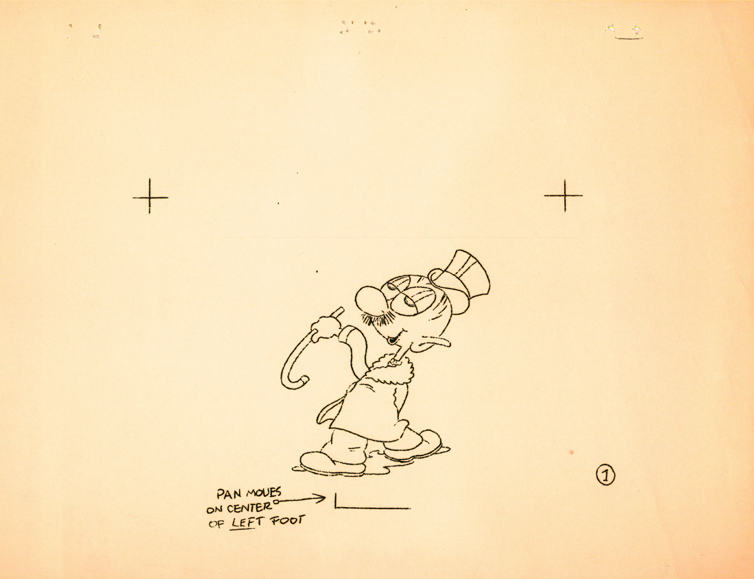
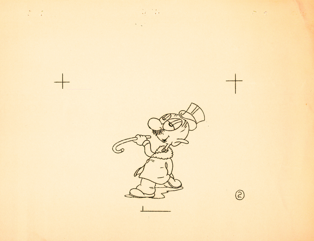
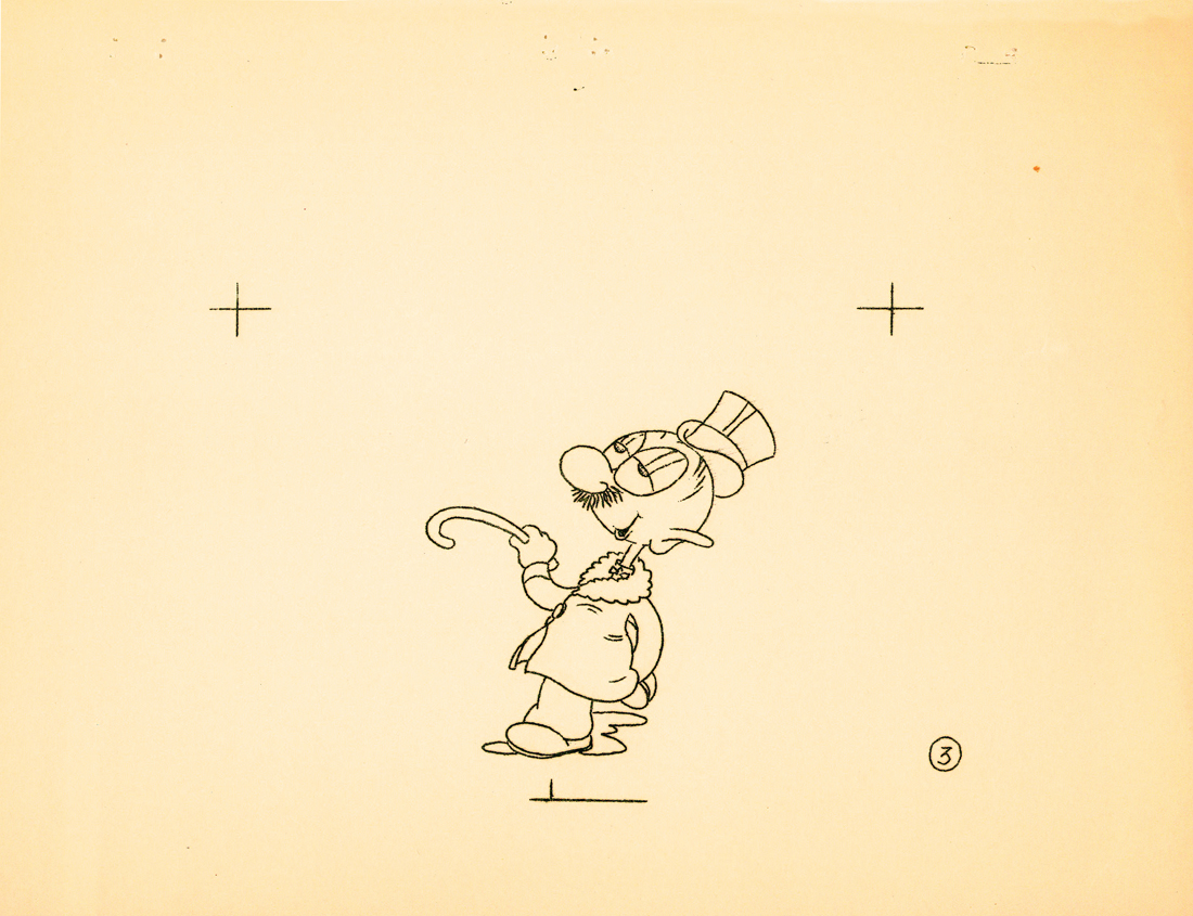
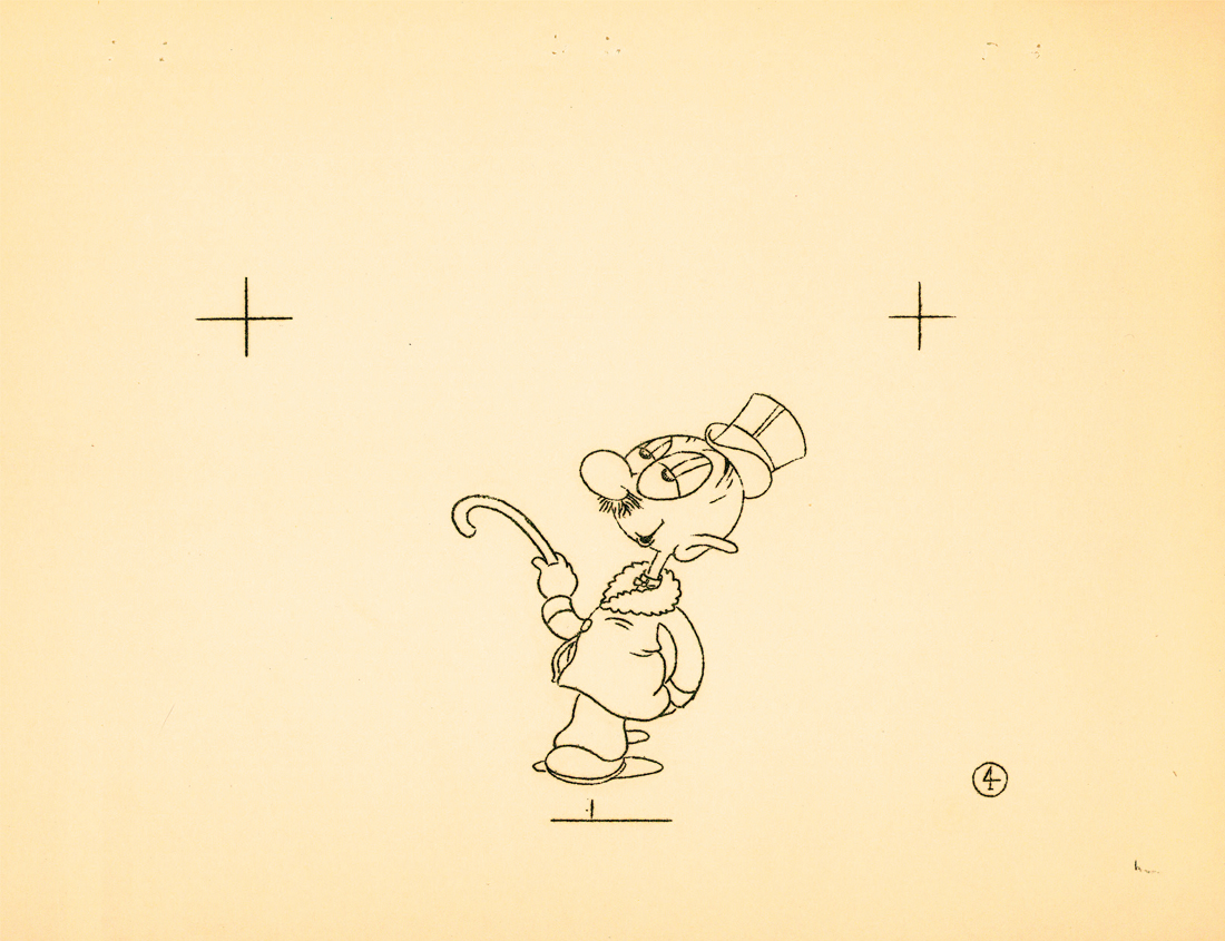
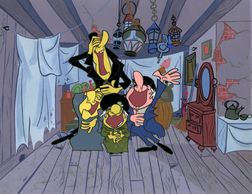
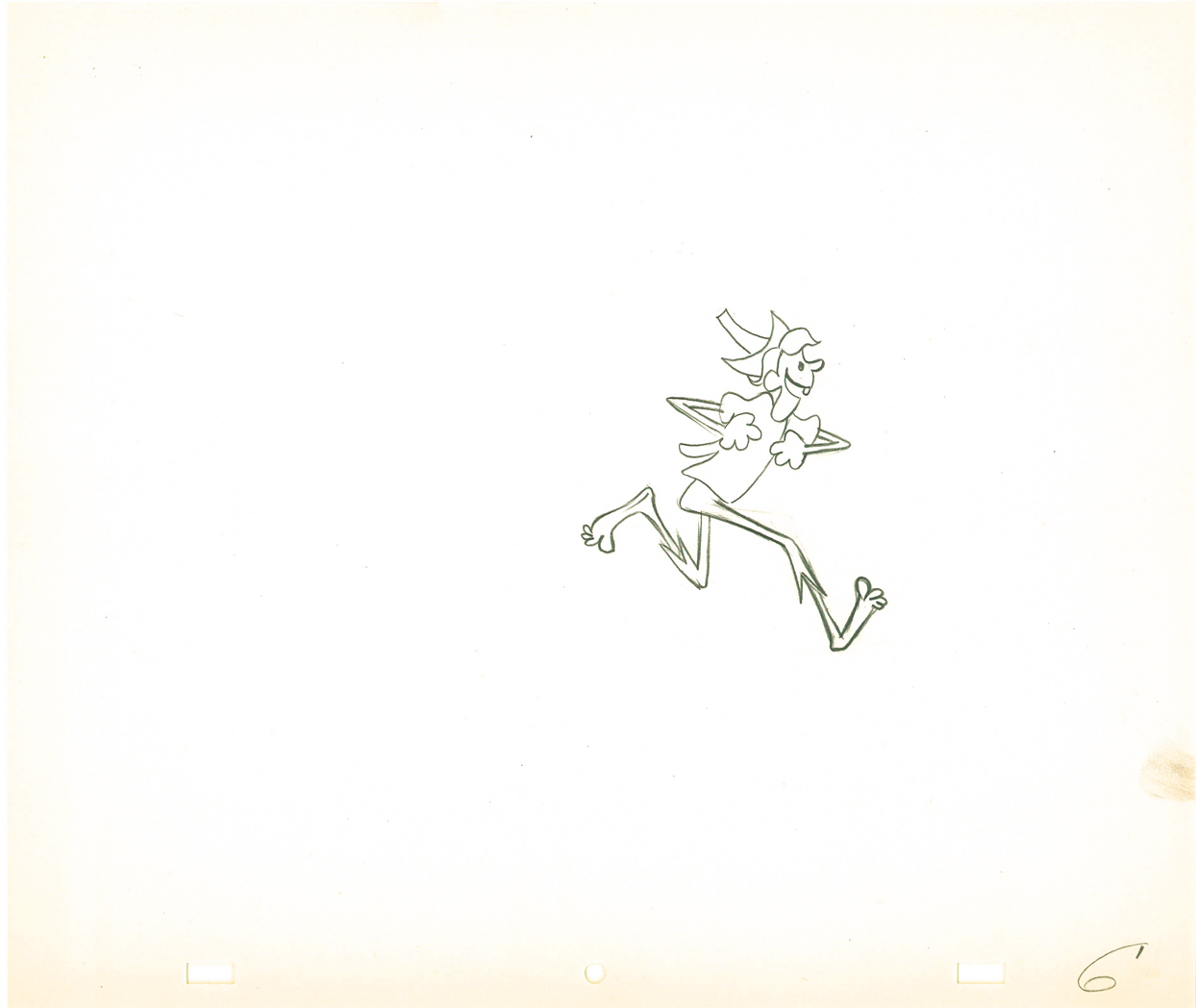
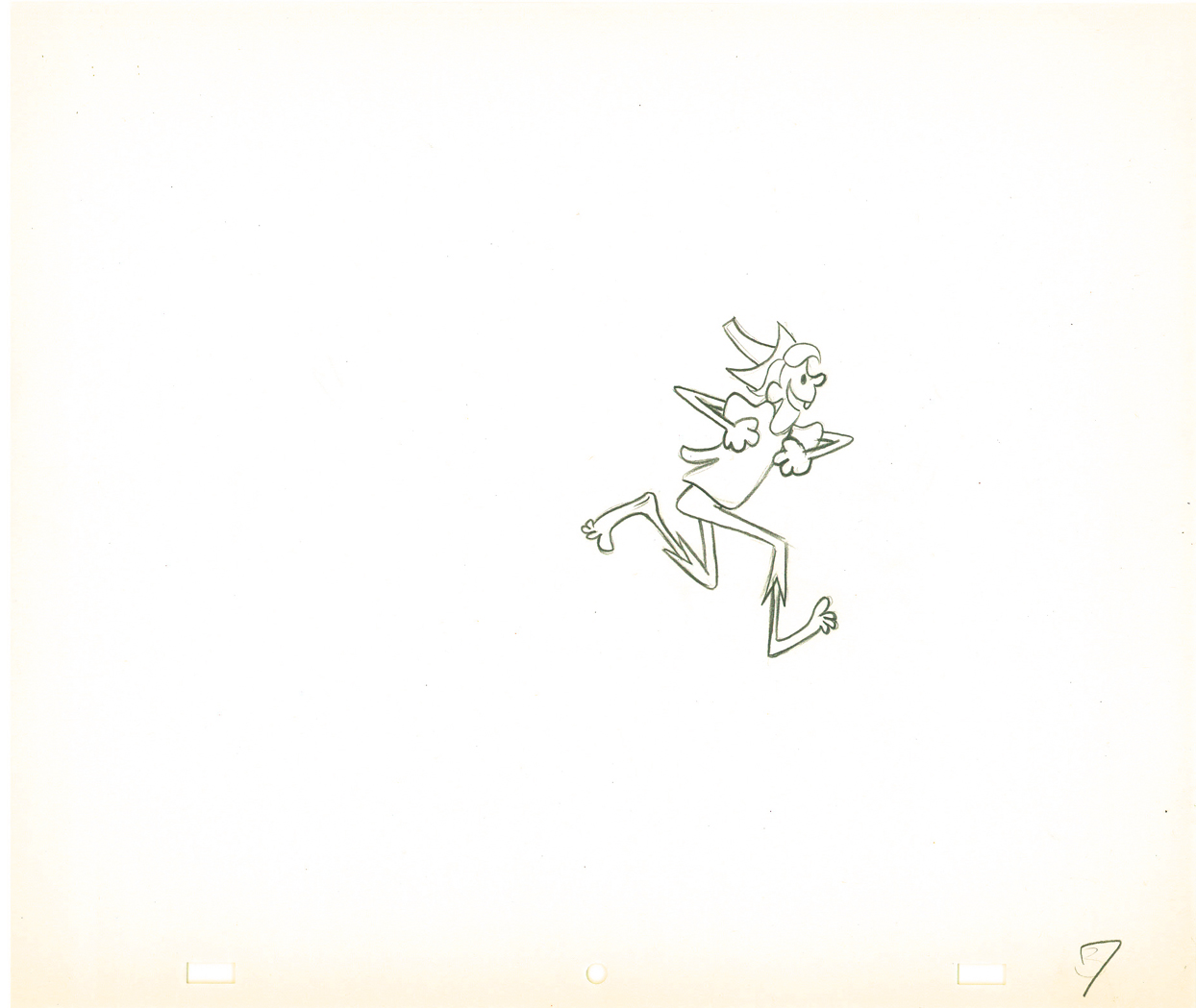
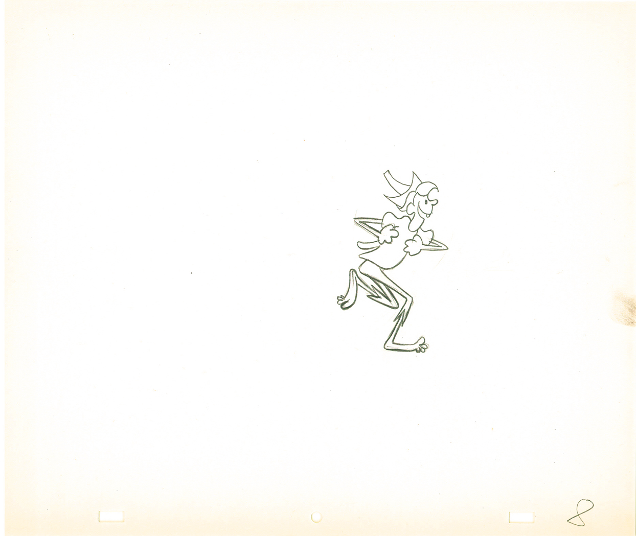
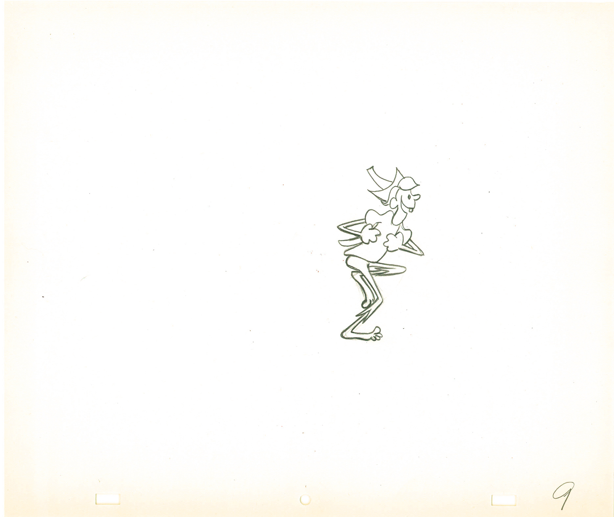
Sniffles and the Bookworm____Elmer’s Candid Camera
Scent-imental Over____You Haredevil Hare
Duck Amuck____One Froggy Evening
What’s Opera Doc____The Dot and the Line
The Bear That Wasn’t

These shorts will be followed by two features on the late night schedule. (Go here to see a full schedule.)

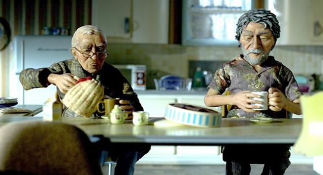
The Phantom Tollbooth was the less-than-stellar feature Chuck Jones co directed with Abe Levitow and Dave Monahan.
1001 Arabian Nights with Mr. Magoo follows that. I’m not sure why since I don’t remember Jones having any involvement on this film. Nevertheless, I’ll be glad to see it again.

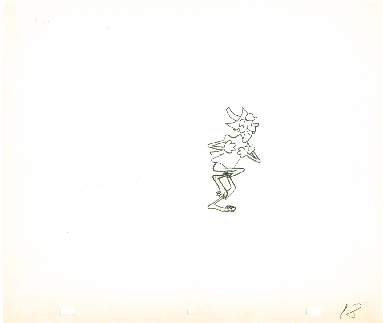
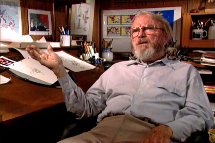
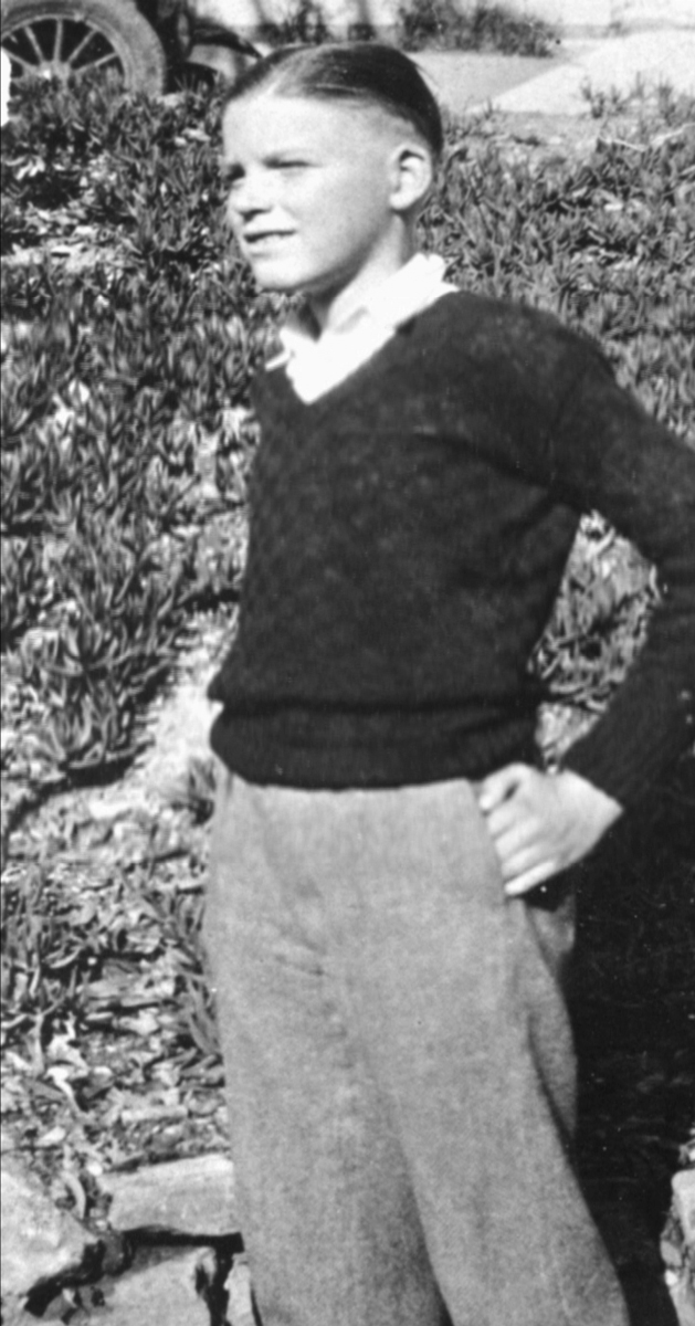
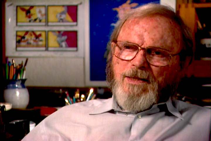
The Stern/Canemaker film is a delicate piece that quite nicely gives Jones the opportunity of relaying many of his memories from his pre-animation days. You get to see what a wonderful draftsman Jones was as he quickly draws from memory on-camera. There’s one quick portrait he does of his uncle that impressed me very much.

John Canemaker has done a lot of good animation here which illustrates well some of the pieces Jones is remembering. The animation nominally attempts Jones’ style, but John’s own style is so pervasive that the animation comes off as much his. I guess this is probably appropriate for such an independent film. Audiences who aren’t sophisticated about animation wouldn’t notice a difference. Why should they?

Much has been made about the “abuse” Chuck Jones’ father layed on the son. This amounts to strong beatings. I suspect that this treatment was typical of most families in the 19-teens. “Spare the rod and spoil the child.” One wonders how this may have affected Jones’ art.
Thank heaven for our more “enlightened age.”

The film moves quickly and informs quite gently. It deserves the attention TCM is giving it, and it also deserves the attention of the animation community, as it properly will receive.

Here’s the four star review in today’s NYDaily News.
Here’s The Boston Globe review.
And here’s The Cleveland Plain Dealer.

___________________

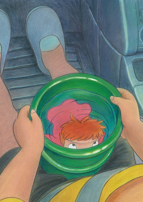
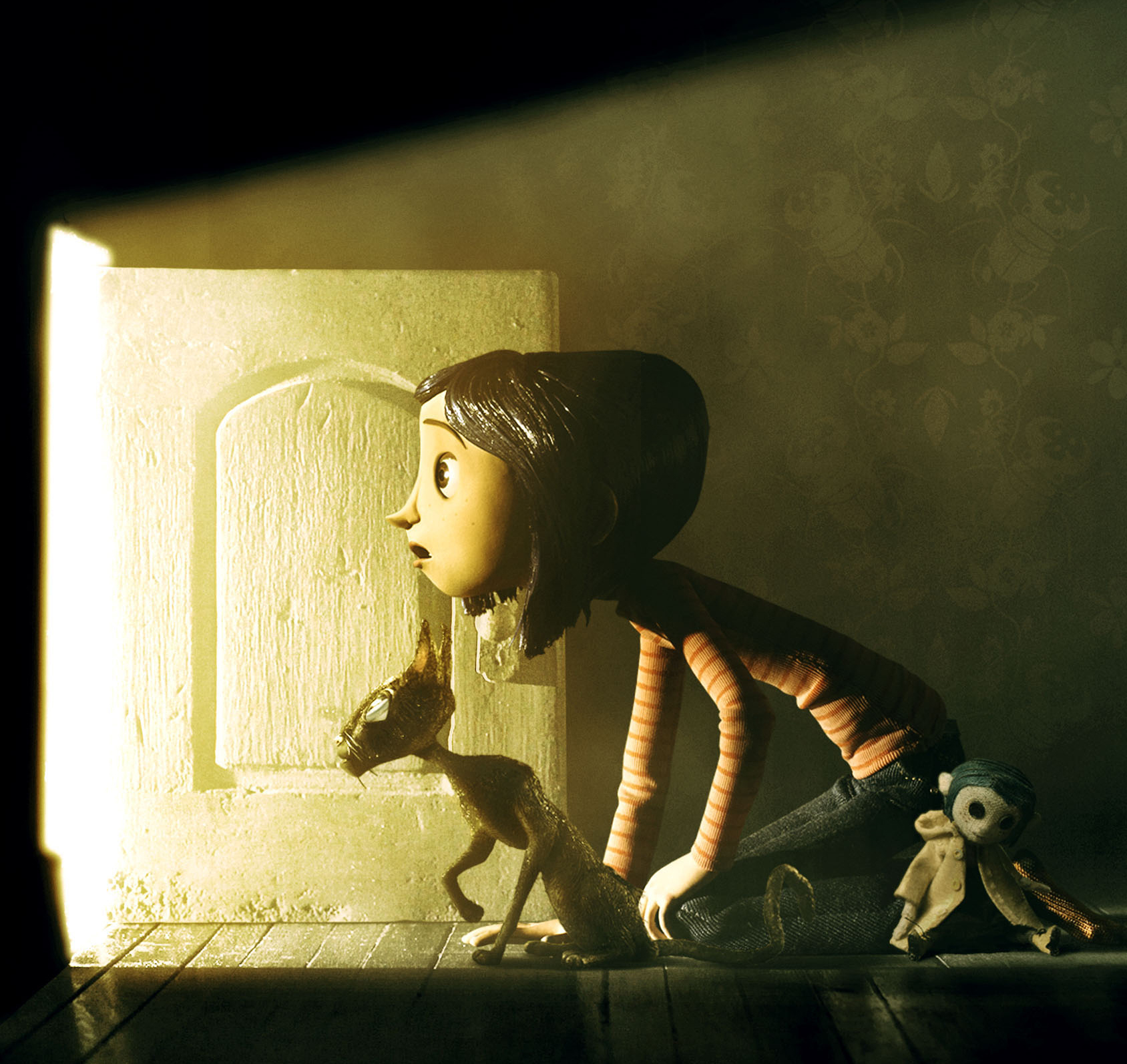
- I finally got to see Coraline over the weekend and have to complete some thoughts I gave prior to actually seeing the film. This is the first of the recent 3D films that I’ve seen in 3D. The effect worked well but, to me, was a complete hind-rance to the filmgoing experience.

When we filmed Raggedy Ann, there was a significant problem with cel flare because of the black backgrounds during the Greedy sequence. It was troubling. I’d recommended using polarized filters. This meant that the lights had to be filtered, and a second filter had to be placed on the lens to offset the lighting. The positive was that the flares were resolved. The negative was that there was a graying of all colors. On film, especially in animation, this problem can be rectified in the timing of the final print at the lab.

With Coraline we’re wearing, essentially, the same polarized filters to interpret the 3D effect. We don’t have built-in laboratories to adjust the colors in our head. We’re viewing grayed-down colors, and I was totally annoyed by it. By lifting the glasses, the screen would often look normal in 2D. But the colors were excellent. This aspect of the design was completely lost in the polarized flters over our eyes.

The 3D effects weren’t principal or necessary to the whole, and the film would have been just as good in 2D. However, in 3D I was never able to enter the screen. The glasses were in the way and annoyed me. My eyes watered up often during the film, and I spent a lot of time wiping away tears. This is not the best way to watch a film.

But then, I once saw Hitchcock’s Dial M For Murder in 3D. It’s rarely projected that way, so it was fun to see how the master would
handle the effect. He used it to create a wall between us and the characters. The bar in the apartment, flowers, other furniture often stood between us and the characters in marked 3 dimensional separation.

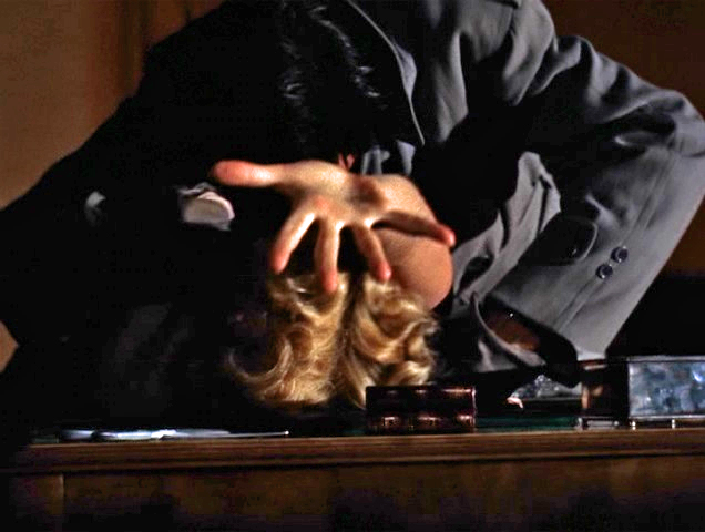
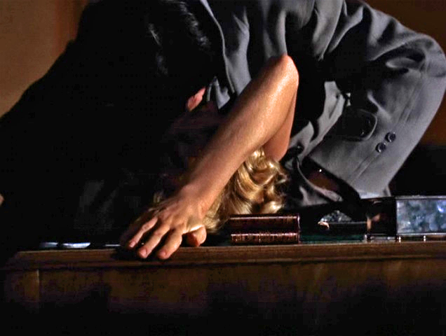
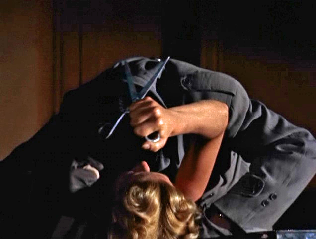
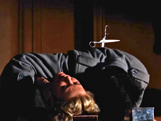
Only once did he bring us into the film via 3D. A murderer has Grace Kelly bent back over a desk. We’re watching from the back side of the desk as he strangles her. She reaches out of the screen searching for a pair of scissors to defend herself. However, the effect was
that the hand coming out into the theater seems to be imploring the helpless audience to get up and save her. It was frustrating and exhausting and completely involved us, the audience.

She eventually grabs the scissors and kills the guy. However, despite the red/green glasses we were totally drawn in. Much was added as part of the film’s effect. I’ve seen the film numerous times in 2D and always remember the scene in 3D when I’ve seen it again.

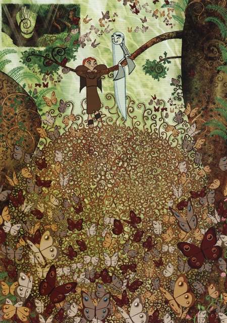
No such scene exists in Coraline nor is there any necessity to see it in 3D. I liked how Henry Selig created 3 dimensional differences between her real home and the “other” home. However, this is too subtle to be a necessity. Consequently, to me the 3D was little more than a gimmick.

The film, itself, seemed quite impressive technically, but I’m not sure the story was well told. I’d have to read the book, but I saw a lot of interesting fairy tale elements that were set up and violated before the film was over. I’m not sure that’s a product of the original.

The story wants to talk about mothers and their black/white role in our lives, yet it ultimately doesn’t work with the telling.
The story goes in and out of dreams, and for much of the film could have been a dream, yet the end gives us no opportunity to interpret the film for ourselves that way. Let’s just say I was disappointed on many levels despite the technical agility on display.

Regardless of all my negative comments, this is an important animated film to see. It will probably be one of, if not THE best of this coming year. See it if you’re at all involved in animation.

Monsters vs Aliens is about to open and a long trailer ran in 3D before Coraline. Obviously, the 3D effect is more dramatic in that film. However, on the basis of the trailer alone, it felt even more of a gimmick in that movie. I have to say that there’s nothing there for me in the new Dreamworks product, and I’ll save a viewing for Oscar time when I won’t have to pay an additional $5 to have my eyes water and be annoyed.

(By the way the great Hitchcock stills come from a brilliant website:
1000 Frames of Hitchcock.
___________Mark Mayerson originally led me to this invaluable site.)

Animation &Animation Artifacts &Fleischer &Models &walk cycle 23 Mar 2009 07:59 am

Wiffle Piffle

- Wifle Piffle was a character that the Fleischer studio tried to develop out of the Betty Boop series. The first appearance was in a Screen Song: I Feel Like A Feather In The Breeze released in 1936. He appears as a waiter in the opening. The animation of the character was by Tom Johnson (as was this model sheet.)

Two follow-up films were made with this side character in Betty Boop shorts.
The first, released in February 1937, was Whoops! I’m A Cowboy, and the second, in March 1937, The Hot Air Salesman. The opening scene features an expensive multiplane shot behind him.

He seems to have been an Egghead type character whose sole character trait was a silly walk. Needless to say, they couldn’t find a joh for him.

The model sheet for the character was an 18 drawing walk cycle with a bit of a turnaround. Crosshairs keep the character in registration; only a couple of the pages were punched.

1 2

3 4

5 6

7 8

9 10

1112

1314

1516

Wiffle Piffle walk cycle
On ones at 24FPS
Click left side of black bar to play.
Right side to watch single frame.

Photos 22 Mar 2009 08:08 am

Bits and Odds

This odd assortment of photos doesn’t quite fit into any group so I’d like to post them together.

- You’ll remember that a couple of weeks back I posted a photo of a building not far from my home which seems to be zooming up, several floors at a time. Within four months at least eight floors have been constructed.


(Click any image to enlarge.)

The image above right shows the building in December 2009.
To the left, we see the building on February 22, 2009.


Here’s the building today. Zoom.
The sign for the cel phone is completely covered.


Well, perhaps they’ve worked TOO quickly.
This past week a man fell off a scaffold and died.
The building inspector then found some 15 violations, and
construction was shut down until that was corrected.


How ironic that this sign greets the passersby.
I guess management hasn’t read it.

_____________________


In the South Bronx, I came across this stained glass window
in the exit to the SUBWAY.


Credit goes to Romare Beardon, Benoit Gilsoul and Helmut Schardt.


These two side windows make it a five window display.
I couldn’t get back far enough to include all five at once.

_____________________


Finally, the Bleecker St. subway station is undergoing some construction work.
Just off to the side of the construction is this beautiful and old mosaic.
I’m a bit nervous that it may disappear, but I’m hoping that it’s too
beautiful for even the dullest executive to eliminate.

Daily post 21 Mar 2009 08:15 am

Magoo’s Book

- Darrell Van Citters has written a thoroughly researched book which tells the story behind the 1961 UPA film, Magoo’s Christmas Carol. He spent considerable time contacting all surviving cast and crewmembers of the production and also interviewed surviving family members of those who are deceased. He worked closely with the estates of the producer, director, writer and songwriters in assembling the material for this book. Information and photos were also gathered from several archives.

Darrell writes:

    There are dozens of photos, including extremely rare shots from the song recording session. A great deal of art from the film illustrating all phases of production has been scanned or acquired for use in the book. There are over 230 pieces of art, including rare early concept sketches and at least two dozen background paintings, all of which were thought to be lost.

    The story of the making of Mr. Magoo’s Christmas Carol will reveal
    previously unknown information regarding the production as well as
    dispel a number of myths currently circulating on the internet.

A labor of love, this book will be self-published by Darrell Van Citters who is a director at Renegade Animation.

According to Cartoon Brew, it will be on sale at the San Diego Comic Con, July 23-26. I won’t be there, but I’m looking forward to this book.

_________

- I can remember waiting with great anticipation for that very first airing of this show. I had seen 1001 Arabian Nights with Mr. Magoo two years earlier and loved it. As a kid, I was more than a bit partial to high design in animation. I haven’t lost that thrill of beautifully designed artwork for the medium.

TV Guide had printed a fraction of a treasure that I studied endlessly; it was a bit of the storyboard for this film. I saved it to this day. (It’s in storage or I’d post some of it.)

The show won me over, and I’ve seen it dozens of times since. It’s still about my favorite holiday tv special. What’s not to like? Jule Styne and Robert Merrill were at the top of their game and had just come off the high of writing Funny Girl for Broadway. They brought equally fine, melodic songs to this show. Walter Scharf who orchestrated it, was a strong film musician. he’d worked on everything from Danny Kaye’s Hans Christian Andersen to Jerry Lewis’ Nutty Professor. He had scored or orchestrated many other films, even working on Mr. Bug Goes To Town as an orchestrator.

The animation was limited, but it was superb. Abe Levitow was at his height as a director and animator, and he
directed with snap and intelligence. Duane Crowther and Gerard Baldwin offered superb animation. To this day, I think the tight script stands as a lesson in how to adapt a story. It has to be one of the two best adaptations of the Dickens classic.

It’s a staple that should be aired every christmas.

For more on Abe Levitow and this film check out his site: here.

Art Art &Daily post 20 Mar 2009 08:17 am

$9.99/Patti/Natasha

- Tatia Rosenthal‘s clay animated feature, $9.99, will make its NY debut as part of the Lincoln Center Festival: New Directors/New Films. Her film will be screened twice:

Sunday March 29th at 70pm at MOMA and
Wednesday April 1st at 9pm at the Walter Reade Theater in Lincoln Center.

Tickets can be bought on line or at the door for $10.

___________________________

.

.

A show of photographs by artist, Patti Smith opened last night at:

the Robert Miller Gallery
524 West 26th Street
(212) 366 4774

The show will run from March 19 through April 18th.
Like everything else from this extraordinary artist, the work is beautiful, poetic and well worth your interest. Go.
.

___________________________

- Speaking of wrenching, following the sad events leading to the death of Natasha Richardson was so sad.

Months ago Heidi and I happened to be sitting just behind her and Liam Neeson at a performance of Les Liaisons Dangereuses at the Roundabout Theater. They made a couple of small quiet comments during the show. She rested her head on his shoulders several times. I’m sure they felt unwatched (as much as any celebrity in public can be) and were so obviously in love with each other.

The funeral home used for the wake is a block away from____They left at intermission,
my studio. It’s listed as “Greenwich Village Funeral Home,____though they undoubtedly
but they obviously use another name over their front door.___went backstage to see
___________________________________________________Ms. Linney. Throughout this entire week’s events, I was only able to think of the two of them as they were at that performance. She with head on his shoulder. Alive and human.

Commentary 19 Mar 2009 08:34 am

Gates of Heaven

- Back in 1980, I was an ardent follower of the NY Film Festival. There were great films entering the market. It was tough to get into screenings, but I’d figured out a way and was able to attend whatever I wanted. One of the films I saw that year was a Gates of Heaven by Errol Morris. Morris had been working with Werner Herzog on Strozek. Herzog was my god at the time, so I was particularly interested in seeing Morris’s work and went to see the film and hear a Q&A with him afterwards.

The slow and purposefully timed “documentary” was about a pet cemetary that moved its site from LA to SF and the people that were involved with the pets buried there. During the film there were many groans from the crowd. At least ½ of the audience left mid-screening. It was an odd film, very different in approach from Herzog. As a matter of fact it was very different from any documentary I’d seen before. I loved it.

The first question put to Morris during the post-film Q&A came from a woman up front who said, “I think your film would have been better if had been cut in half.” Morris’s instant response was, “I think you’d be better if YOU were cut in half!” That’s when the festival director and moderator of the program, Richard Roud, put his head on the table in front of him and realized it was going to be one of those sessions.

While watching the film, I was entranced. About 3/4 of the way through it, I started thinking about my medium – animation. Here, in front of me was an “Anti-New Wave” (my label) film.

However, my medium hadn’t gone through anything comparable to the “New Wave” yet – never mind be ready for an “Anti-New Wave”! Oh, despair.

Where was there to go with this? Animation had gone from 19th Century realism to 20th Century art styling, yet it hadn’t grown up in the bigger picture – content.

In the post screening discussion with my companion, I expressed my thoughts and depression. I needed only one reminder to pull me out of it. Tale of Tales.

Something had happened with that film (on the back of the Hubleys and some of the other modern animation filmmakers) to literally push the medium beyond itself.

To this day, I’m not sure anything has gone beyond Norstein to the next step in developing animation to a bigger level. As a matter of fact, I think things have retrogressed. Sure the current films would pass Robert McKee’s story structure tests, but they aren’t rich. CG movement is smoother, but the films aren’t bigger. In a way, we’re back to the Bobby Bumps era … happy about the movement and ignorant of the complexity of storytelling.

I sound so pessimistic when I reread this, but I that’s not how I feel. I think I’m enormously optimistic. I hope and expect someone to surprise me with something that will turn a new corne and thrill me. Animation hasn’t done that for quite some time, but I know it will.

There’ve been lots of exciting pieces that almost make the mark, and I could start naming a long list of films that were enormously encouraging. Schizein and Madame Tutli-Putli were the most recent to excite me. But I’m looking for something that’s at least as good as anything done in live action. (Even that’s not a high threshold, these days.) I’m looking for something that will change the way I think. It’s going to show up soon – maybe, I’ll be the one to do it. In the meantime, I’ll keep looking.

Books &Disney &Peet 18 Mar 2009 08:06 am

So Dear #5

- Here’s the conclusion to the Little Golden StoryBook, So Dear To My Heart. The book is an adaptation, of course, of the movie by Helen Palmer with illustrations by Bill Peet.

At 128 pages, the book is quite long and chock full of gems by Bill Peet. It’s one of his first publications and shows a lot of the hallmark look he’ll have once he bagan writing and illustrating his own books, although they’re considerably shorter (averaging about 30 pages.) These ink and watercolor illustrations are all spot drawings and fill usually about a third of the page. The colors are limited with an inexpensive printing process used on inexpensive paper. At 5″ x 7″, the book is also a bit smaller than the usual Golden Book.

Here are the last two chapters:


(Click any image to enlarge.)


This drawing, alone, is worth the entire book. It’s beautiful and shows
Peet’s brilliance at capturing characters in a specific moment of time.


Most illustrators would probably have ended the book on this image of
the grand prize winner – such a temptation, the climax of the book.


Peet is character driven and knows that the book is about the boy.
The last image has to be a shot (did I say shot? this isn’t a film. I meant
to say) picture of the real hero of the story . . . the boy.

Daily post 17 Mar 2009 08:19 am

St. Pat, the Book of Kells & Ghibli


(Click any image to enlarge.)


There are those who are Irish, and those who
decorate their windows as if they were Irish.


A day to spend in the New York Tavern.

Thanks for the photos from Queens by Steve Fisher.

_________________

-Brendan and the Secret of the Kells seems to be the animated feature to watch in 2009. Over the weekend the film was the big winner at the Berlinale at this year’s Cartoon Movie in Lyon, winning best European director and best producer.

More than six hundred participants voted for the Cartoon Movie Tributes which recognise companies or personalities exercising a positive and dynamic influence on the European animation feature film industry. Irish animator Tomm Moore was named best European director of the year for his feature debut which had had its world premiere in the Berlinale’s Generation sidebar last month.

This film was directed in Ireland by Tomm Moore at his studio (partnered with Paul Young) the Cartoon Salon. His codirector was Nora Twommey. The film was produced in cooperation with the French company, Les Armateurs, the company that produced the wonderful The Triplettes of Belleville. The €6 million budget was raised from a number of European countries.

You can see a one-minute trailer on line here.

You can see three good clips here.
(Thanks to Koen De Koninck for the lead.)

Here are some reviews:
Variety
______Space is distorted so that everything looks deliberately flattened, yet there’s a very high level of craft deployed throughout to build up patterns within patterns. This may be the perfect film for children whose parents are art historians specializing in pre-Renaissance periods.
______That ‘s not to say others won’t enjoy it, but finding an aud is going to be a challenge for marketing departments. Despite the many participants from across Europe listed in the credits, the pic’s most fruitful territory is likely to be Ireland, and even there, competition with Hollywood fare will still be tough.

The Irish Times
______The story does have a neat arc and the voice-work is first rate, but the thinly drawn characters are sometimes upstaged by the bold images and by the fine, insistent music from Kíla and Bruno Coulais. Moreover, the desire to pack in so much research seems to have occasionally overpowered the need to create a clean narrative line.
______These are quibbles. The Secret of Kells remains a surprising piece of work that should appeal to smart children and open-minded adults. Chemically befuddled students may enjoy it even more.

Screen Daily News
______Director Tomm Moore and his team really excel themselves in these forest sequences, where Irish monasticism meets Busby Berkeley. At times, motifs from megalithic passage graves and Celtic jewellery float in the background like micro-organisms under a microscope, or fall in the form of snowflakes. Perspective is flattened out, and Brendan and Aisling are framed inside branches, just as Biblical characters were framed inside the opening letters of illuminated manuscript pages.

_________________

- Now on to Japan

- Studio Ghibli has teamed with Toyota to start a new animation training system for young people. Beginning April, 20 new employees will be sent to Aichi Prefecture in western Japan for a two-year course to learn animation techniques while being exposed to robotics and other Toyota technologies. Miyazaki and other veteran Ghibli animators will give lectures to the group.

The intent is to give students an appreciation for the traditional handcrafting skills still found at Toyota. This training, Ghibli producer and former president, Toshio Suzuki believes, will make them a better fit with the Studio Ghibli aesthetic.

It’s an unusal path, but the goal seems to be for the students to learn the hand-drawn art form in conjunction with the latest cg technology. I don’t think there’s anything comparable in the US.

Animation &Animation Artifacts &Tissa David &walk cycle 16 Mar 2009 07:43 am

More Mt. Dew

- Last week I posted some animation drawings done by Grim Natwick which he animated in a spot for Mountain Dew. The drawings I posted were actually the assistant’s drawings done by Tissa David. The spot was produced by Robert Lawrence Productions.

This is another run cycle from that same film. Again, all of the drawings, here, are Tissa’s clean-ups.

1 2
(Click any image to enlarge to actual animation sized drawing.)

3 4
You’ll note that the character leaves the ground for 1/3 of the spot.
5 6

7 8

9 10
He actually comes down in the crossing position rather than the
classically designed walk where the head moves up.

11 12

13 14

15 16

17 18
Tissa’s tnedency is to have the crossing position the lowest in the cycle.
The character bears the weight of his walk with feet solidly on ground.

Run Cycle
On ones at 24FPS
Click left side of black bar to play.
Right side to watch single frame.

Commentary &Photos 15 Mar 2009 07:58 am

Peevish

- Walking around New York one starts to see a lot of small annoying things that get catelogued somewhere in the recesses of one’s brain. Eventually, I think those annoyances have to be released. Let me tell you, I have a lot of them. What’s a blog for if not for that release, so here I am sharing. Sorry about that.


This uninteresting little bit of Broadway meeting Fifth Avenue is getting me
more and more annoyed as time goes on.


Last year, Mayor Bloomberg’s administration decided that several areas of
street traffic should be closed and turned into a sit-down area with tables.
IN THE MIDDLE OF FOUR LANES OF TRAFFIC!
The two middle lanes were turned into a rest area where people
could sit their weary bones and watch traffic swirl about them.

I shot these pictures early morning. Tables and chairs had to be set up,
and someone does this daily. A guy was in the background sweeping
the area at 6:30am Saturday when I took the pictures.

You can’t see it vivdly in my photos, so I’ve done a quick aerial map.


Left: You can see that three lanes of traffic on Broadway crossed and
ran into three lanes of traffic from Fifth Avenue.
Right: After the “Fun and Games Area” has been added to the center of this
traffic center, cars are reduced to four lanes total – including lots of busses.


Now you can sit watching the swirling traffick, swallowing plenty of exhaust fumes
while you look across to Madison Square Park a distant 20 feet away.
What sense makes this!?!


Rocks like these line both sides of the triangle so that any careening car
won’t crash through the seated folk resting.


The lovely foliage adds to the experience.

A similar area was done in Times Square!
This summer, the cars will be turned away from these areas, and the streets
will become a pedestrian mall. No cars on 42nd Street and Broadway!
Try walking with the other thousands of people enjoying a delightful
hot summer evening in the middle of the street – Times Square.
Try getting a cab after the theater.

It’s the mall-ization of New York. Every eve’s going to be New Years Eve!
Every day Christmas.

____________________


Left: For years, we put up with this mile-high crane on 23rd Street –
always waiting for it to come crashing down on us.
Right: The end result is this hideously unattractive building. I tried to make it look interesting by shooting it from the park, surrounded by trees. It didn’t work.

____________________


Finally, for today, could someone tell me what the hell this is!

In an area surrounded by enormous posters painted or draped onto
the sides of buildings on Houston Street, this one has this.


Are these clips or hangars or what?


Is it an artwork? An ad? Something different from Banksy?
A year it’s been there, and I don’t know what or why.

________________________________

On the positive side. There’s New York’s newspapers and the on-line versions.
Today’s NYTimes includes an informative article about William Kentridge and includes one of his animated films, Tide Table. It’s a must-view for those interested in animation as an art form.
Better yet, if you live in San Francisco, go to the San Franciso Museum of Art where a retrospective of Mr. Kentridge’s work opens next Saturday.

« Previous PageNext Page »

eXTReMe Tracker
click for free hit counter

hit counter